#''why didn't u look at ham-ham heartbreak instead'' dont talk to me. heartbreak's environments are all hamster sized.
Explore tagged Tumblr posts
Text
Point of view (making it harder than it has to be)
Learning RPG Maker MV is going well - as well as one can judge that when they're on the third 10-minute tutorial video - but the thing that struck me once I ran the thing was how small every tile and character is.
That doesn't pose a problem in and of itself, but the player character in this project is a housecat. Since cats are tiny in relation to their surroundings, I had already intended to double the size of each tile. At this point I'd have to blow up each non-player sprite by four just to get the scale right! I'm already going for a pixelated look, but scaling to that degree is excessive - not to mention that it'd make placing even a single item a multi-tile ordeal. What I'll likely do is double each person-sized sprite, then find a plugin to double the zoom level from there.
That's a minor concern, though. What really bothers me isn't the size - it's the perspective.
The perceived size of a sprite is going to carry the tone far more than the actual height and width would. I could quintuple the size of the entire game, but if it's all in top-down view, the player is still stuck looking at the top of everyone's dome. They're going to feel bigger than both the character and the scene, which is antithetical to what I'm trying to convey.
The 3/4ths view is MV's default - not because of anything inherent to the engine, but because every innate sprite resource is drawn in that perspective (as are most user-made resources). It's something we're all used to seeing by now, so we usually ignore the implication that the viewer's watching things happen from the sky. Since most people interpret this view as the "normal" perspective, though, I worry it would struggle in communicating situations where the player character themselves is smaller than the average person.
Side view...just feels flat to me. I don't think anything scary has ever happened in side view.
If I want the player to really feel too small for their surroundings, the only other option I can see is to put the camera in between those two views - something approaching a 1:2 perspective. But I had no idea just how hard it is to find examples! Just about every pixel art tutorial focuses on 3/4 view, side view, or isometric. Isometric actually is pretty close to a 1:2 ratio, but the viewpoint is always at an angle! It's made up of diamonds more than it is squares, and even if that's something MV is capable of handling, I really don't want to mess with all that.
I realized today, though, that working from zero like this is going to get me so wrapped up in theory and research that it's going to be half a year before I ever put tile to map. Why not do a case study of other games?
Hamtaro: Ham-Hams Unite!
This is a weird pick, but this Game Boy Color title informed about 80% of my taste in games (the other 20% was Fallout: New Vegas.) Just a straight-up adventure game. No combat. Just puzzles. It's clearly inspired by point-and-click adventure games without any of the clunky UI weirdness of other genre titles ported to console (COUGH, Maniac Mansion for the NES). I really could talk about this game all day if I don't rein it in, though, so I'm going to focus purely on the visual design.
Hamsters are about three inches tall, which means everything in the environment has to be HUGE in comparison. This is way more dramatic than what I'm planning, but looking at an extreme example may make it easier to see what makes it tick.
Here's what's interesting: the perspective in this game is all over the place.
Locations are divided into chunks that I'd say are roughly twice the size of the GBC's screen. What's funny is that the perspective often changes from one chunk to another.
The environments are often in plain old 3/4 view - like in this first screen of Sunflower Market - while the characters are in profile. They don't feel conflicting...though the scene kind of breaks apart if you stare at that bicycle for too long.
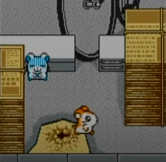
But then you get scenes like the very next room - the characters, floor, left wall, and cardboard boxes (including the "alley" between them) all seem to be at a closer angle, with only the slide being somewhat off.
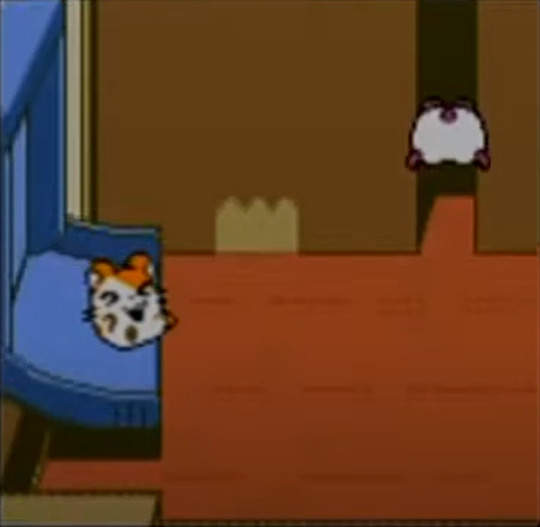
Look at the left wall and where it meets the floor - it's angled towards the horizon because it's in perspective. But in the previous screen, the angle of the newspaper stacks and the little curb behind the sick hamster are completely straight, because they're purely being seen from a top-down perspective.
The produce shelves are in 3/4 and straight:
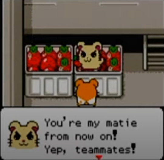
But the outside of the fridge is in perspective again:
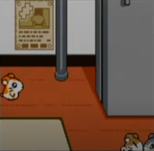
There's also this screen, which is fun despite the front and back shelves disagreeing on where the vanishing point is:
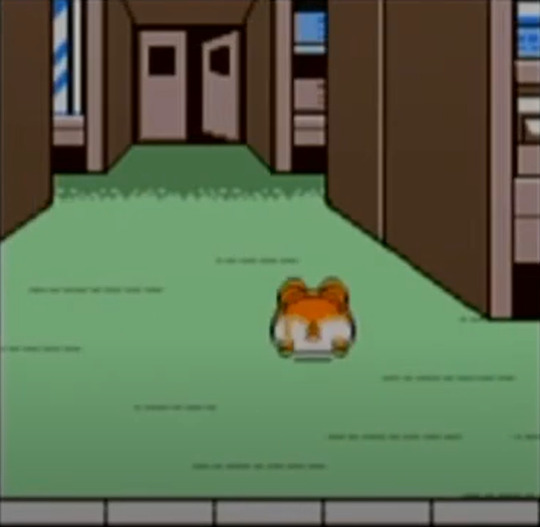
So the artists couldn't decide what view to use either! But one thing you notice when looking at all the screens together is how every single one includes something that reinforces how small you are and how big the world is. The newspapers, the strawberries, the tape on the cardboard box. The fridge door's handle peeking from the top of the screen places it far lower than it should be in relation to Hamtaro, but it was included for readability; if it wasn't there we might mistake it for a building or weird wall.
Let's leave the market and look at this classroom "cafe" from Sunflower Elementary:
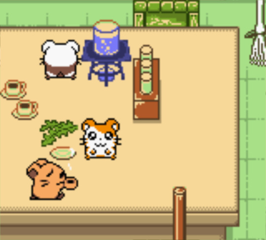
You access this tabletop by climbing up a broom handle (bottom right). The artist could've just colored the floor and wall and called it a day, but they made the conscious decision to have the foot of the life-sized skeleton model visible in the corner. You can examine this model when on the ground floor, and it's enormous. What point is there to include it, other than to emphasize how this grade school child's desk is a staggering height for the player?
Little Nightmares
Maybe it would've made more sense to start with this one? Well, whatever.
I knew I'd have more luck finding write-ups and dissections on this game than an obscure licensed title from 2002, and I wasn't disappointed. In an article published on Game Developer (formerly Gamasutra), Chris Priestman writes "The world that you travel through in Little Nightmares is clearly built for people who are much bigger than Six and so travelling through it is both unwelcoming and challenging. To enhance that, shapes and bodies are exaggerated and bloated, stretched into surreal and sometimes horrific forms."
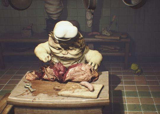
And he hit the nail on the head! I've actually been playing with the perspective of the cat's owner specifically, tweaking the angle and exaggerating the proportions of his body to make it seem like he's looming over the world around him. But there's a fine, fine line between "mild fish-eye lens effect" and "this guy's straight up drawn in the wrong angle." There's also a drastic difference between pixel art and Little Nightmares' 2.5 D space, but seeing the latter successfully convey that feeling just makes me more determined to make it work.
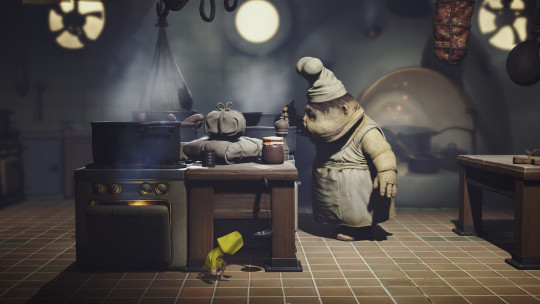
Focusing on the environment itself, it's not that the player doesn't fit in their surroundings - it's that they're entirely, completely engulfed by them. A good few rooms wouldn't feel unusual in another game with a human-sized character, but open stretches of floor feel yawning and insurmountable. And it's not actually all due to size! Speed plays an enormous role. Six is small, but unlike the lumbering giants of Shadow of the Colossus or RPGs where everyone has the same walking speed, she's also not very fast. In fact, Little Nightmares' giant enemies are pretty spry!
The Legend of Zelda: The Minish Cap
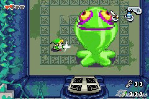
Let's not look at this one for perspective tips, okay?
Stuart Little 3: Big Photo Adventure
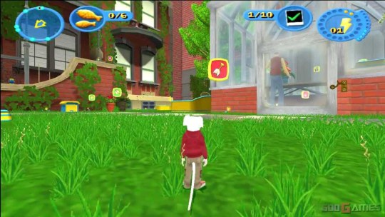
Sure, why not? I didn't think 3d sandbox games were worth looking at since there's no real shot composition and you can, y'know, just make the models bigger, but I like this shot. Placing the camera just a couple inches off the ground stretches out the stage more than I expected.
In any case, I've got a lot of playing around to do before I find something that clicks, but I think I've got more direction than I did before.
#i was trying to figure out what to title this post and every option sounded like a m/m fanfic title#including this one. whoopsies!#''why didn't u look at ham-ham heartbreak instead'' dont talk to me. heartbreak's environments are all hamster sized.#hamsters having a pop up cafe on a school desk is realistic but having a hamster-sized ferris wheel and coaster? dont be goofy!!!!
0 notes