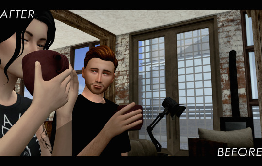
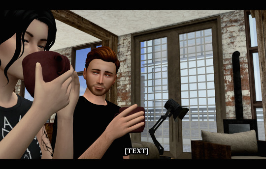
#{ still working on tweaking the psd but i don't hate these }
Text


𝗘𝗠𝗠𝗔 𝗠𝗔𝗥𝗧𝗜𝗡 𝗖𝗔𝗠𝗘𝗥𝗔 𝗥𝗢𝗟𝗟 : 30 / ∞
— 𝘮𝘶𝘵𝘶𝘢𝘭𝘴 𝘮𝘢𝘺 𝘪𝘯𝘵𝘦𝘳𝘢𝘤𝘵 / 𝘳𝘦𝘣𝘭𝘰𝘨 —
#{ baby girl angel :) }#{ still working on tweaking the psd but i don't hate these }#୧ ‧₊˚ ☁️⋅♡𓂃 ࣪ in love with being noticed and afraid of being seen ⌗ visage .
2 notes
·
View notes
Note
hiiii I’d love to hear about 2,5,8 and 22 for the gifmaker questions 💚💚
i am so sorry that i responded to this so late 😭😭 but thank you for asking!!
2: do you do something 'creative' irl as well?
no i do not :( unfortunately i do not consider myself a very creative person at all so i dont really do anything creative. i do have interests in crocheting and making clothing though, but i haven't found the time to properly hone in on those hobbies just yet.
5: what do you dislike the most about making graphics/gifs?
with gifs i always hate when the outcome i envision never translates into the actual gif...i also dislike when i really wanna gif something but i cant find the file/ the file in a high quality. i don't make graphics that much but it's the same sentiment where i envision something but i can't make my ideas come to life.
8: your favourite graphic/ gif created by yourself:
there are a few that i really love but some of them would've been on my deleted blogs :') any of my red velvet gifs are always my fave though, namely: yeri 'dumb dumb' m/v set / yeri 'birthday' set and this red velvet 'dumb dumb' m/v set.
22: what is your biggest improvement since you've started making gifs/ graphics?
i definitely think it's my colouring. when i first started making gifs, i used psds by other creators almost exclusively (nothing wrong with that btw), but since then, i have developed my own style(s) of colouring that i like and i've learnt how to tweak certain adjustment layers a bit better to get my desired outcome. colouring is still the trickiest part for me, but i can 100% say that i have come a long way. i also think my mindset towards my work has changed a lot...i'm more confident with whatever i put out.
ask a graphic/gif maker.
1 note
·
View note
Text
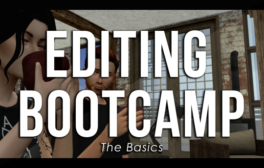
EDITING BOOTCAMP: WARWICKROYALS EDITING PROCESS
So, about five hundred years ago (or somewhere in that ballpark), an anon kindly asked me to share my editing process. It's been a long time coming because I've recently stopped using Pixlr (a free online photo editing program) and have moved on to 2020 Photoshop. I really recommend using Photoshop, it might be confusing or overwhelming at first, but I think it's worth it and ultimately it cuts your editing time in half once you get the hang of things. However, you can still use this tutorial if you're using GIMP, PIXLR, or whatever else. So, let's get into it (YUH)!
STEP 1 | ASPECT RATIO & SIZING
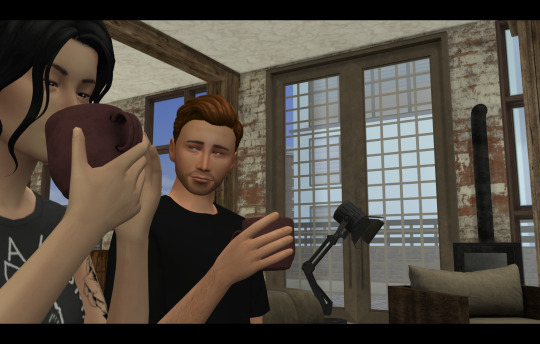
Alrighty, so what we have here is what I call a "raw screenshot." After playing around with multiple versions of ReShade and countless presets, I have come to the conclusion that I hate it. It makes my game slower, switching between filters is a pain and they just get in the way. But this is just my opinion, there are some very pretty ReShade filters out there, I just don't think they're necessary for a pretty screenshot.
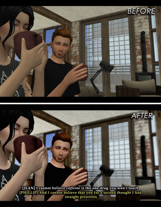
When I load up my screenshots they are almost totally vanilla. I do use Luumia's NoGlo and NoBlu mods, but that's about it. I do not resize my screenshots at all, they are 1600x900 by default. However, one of the first things I do is add an aspect ratio (those two black bars you see at the top and bottom of the image) to give it a more "cinematic" feel.
I do this by adding a background layer and resizing the width from 900 to 1020. With the untouched screenshot in the centre, there should be two bars above and beneath it that are 60 px wide. I then colour the background layer black with the paint bucket tool. BOOM. Aspect ratio. Technically my edited posts are 1600x1020 when edited, but the screenshot remains 1600x900.
STEP 2 | PSD/PHOTOSHOP ACTIONS
The next step is for me to add my PSD. Think of it as your own personalized filter that changes how your screenshots will look. What your PSD does to your images is really just based on personal taste. For me, I love a rich screenshot with lots of contrast and strong blacks and more dramatic shadows. So, that's what my PSD does!
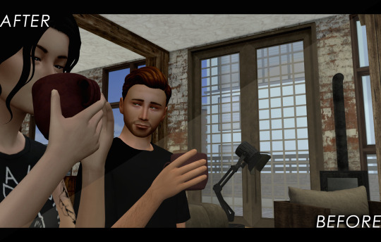
Your own PSD might look totally different for you. Maybe you what a lot of brightness, with warmer undertones, and lots of bloom. It's totally up to you! I recommend you play around with Photoshop's setting until you find an aesthetic that suits your own taste.
You can also download some Sims 4 PSDs and Photoshop actions from other creators. I really recommend those from @/intravertt here on Tumblr. They make ReShade presets, PSDs, and have a variety of other resources that are stunning.
Here's what my PSD looks like.
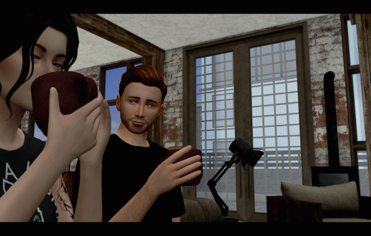
STEP 3 | SHADOWS AND HIGHLIGHTS, BRIGHTNESS, AND SHARPNESS
After adding my PSD I do some further edits to change how my screenshot looks. Because the shadows are so overwhelming, I add some highlights and might tweak with the exposure just to make sure nothing is too dark/under-exposed. I sometimes draw in some light shadows, but this is quite time-consuming so I don't most of the time. I also add a bit of sharpness to make certain details stick out some more. If the screenshot is taken outside, I will add some vibrance just to regain some warmth and make it look like my characters are in the sun.
Like PSD what you chose to edit, and how, it 100% up to you and what you what to achieve from your screenshots. I again recommend playing around with different settings to find something that works for you.
STEP 4 | ADDING TEXT
I recommend a text size of at least 35 pt. My texts are also bolded, outlined, and have a drop shadow, just so that it's easier to read for some people. Text tends to blend into the background and it's super annoying, so those elements help a lot. I also recommend using a sans serif font (ironic, I know, but I'm using a serif font exclusively for this arc for a reason, I swear). Also, make sure that the spacing is all good so the text isn't jumbled or crammed together. If your posts are word-y like mine (lol) you might feel the need to lower the spacing, just don't go crazy with it.
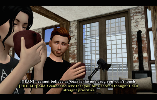
My text is centre justified. I write the name of the character who is speaking only once before their first line [LIKE THIS]. I start a new paragraph each time a new character starts speaking. To tell characters apart I assign different colours to each character, based on the order they are speaking in. The first character to speak is white, the second is yellow, the third is blue, etc. I recommend having some colour variation between characters' dialogue. Even if you have the name of who is speaking before each line, text of the same colour blends together easily.
Fun fact, I also often don't close off my paragraphs with a period or any punctuation (unless it's an exclamation point). Screw grammar, I just prefer it that way.
Here are some of the fonts I recommend, both serif and sans-serif:
Arial
Garamond
Century gothic
Book Antiqua
Josefin Sans
Perpetua Titling MT (this is the font I use in my banner)
Alte Haas Grotesk (My main sans serif font)
Can you tell I'm a author?
My loser ass legit has a list of favourite fonts
STEP 5 | BLUR/OVERLAYS/FINISHING TOUCHES
Adding blur to my posts is something I've just started doing at I don't know why. It's a great way to focus on certain objects/people and put things into perspective! It doesn't have to be a lot, but it does wonders. I just use a brush tool to go over the areas I want blurred. However, there are other faster ways to do this for sure such as cutting out and blurring the area you want out of focus separately.

If there are any clipping issues, like skin poking through clothing, I will go in with a tiny brush tool and paint over the skin with the same colour as the clothing's fabric. Sim's joints always look strange and jagged when bent (like the skin clips around a sim's bent elbow or leg, so annoying) so I'll often go in with the smudge tool with very little strength/hardness in order to remove that
Sometimes my posts have lens flares or little dust particles. These are just simple overlays I add with a layer mask + reduced opacity. You can find overlays like that easily online and maybe I'll make a post about how exactly I use them but we're DONE 'N' DUSTED for now. I hope this tutorial is useful for someone. This was fun! I'm totally down to do more in the future.
32 notes
·
View notes
Note
6, 19, 20 and 21
Thanks for sending an ask Jake 💜
6. What is your least favorite movie/TV show to gif?
Hmm I don't really think I've ever giffed for a fandom where I hate making any gif for a set, but more like... shows that have really dark scenes that I like to gif are probably the most difficult. I think like, stranger things has a lot of good scenes that are dark, which is frustrating bc I always wanna make sets using them but sometimes that colouring is just too much work lol
19. What is your giffing process like?
I use the same process that I used years and years ago so i know it's not very efficient but I'm too lazy to learn lmao. I import the frames straight from the episode/movie, cut it down to the frames I want, crop and sharpen, colour, save, check out how horrible it looks on mobile, recolour, resave, moan and groan, recolour and resave and then give up and post 😂
20. MAC or PC?
PC all the way. I truly dislike macs and have never owned one
21. PSDs or original coloring for each gif?
Bit of both. A long time ago I used to use psds that I'd saved from resource makers, and then tweak them a bit. I still have a lot of those files so sometimes I'll open some up to get some ideas, but since coming back to tumblr last year, I started doing base colouring for individual gifs.
Send me gif maker asks!
1 note
·
View note
Last Seen Blogs
ultimatetenkaiwarrior
The Ultimate Warrior of Tenkai
norway-plate
leah

maestranelperdere
Just me

aajaustralia
Untitled
