Don't wanna be here? Send us removal request.
Text
Contrary to popular belief, Jackson Pollock did not invent the drip method of painting. Thomas Hart Benton was the one to show the drip method to Jackson Pollock, during his time in school. Pollock then grew very fond of the type of painting and started to do it on his own and soon realized he really enjoyed it. Pollock used to drip method to create his own abstract art, and it became really popular as he was named of the best painters. To some drip paintings may seem like a bunch of dots, dashes, and blotches, but to others is the purest form of art. It seems like artists and viewers either love the drip method of abstract art or have a dislike towards it. Personally, abstract art is my favorite and the drip method I think is one the most beautiful forms of art to exist.

This abstract art reminds me of one of my best friends like in the paintings there are some dark times (areas) but there are also a lot of bright and happy times. Our friendship can seem very chaotic like the painting, and sometimes it is, but when you take a step back you can see how the dark and the chaos makes something beautiful. Someone once told me, without any darkness, or bad times, then there couldn’t be any happiness or good times.
0 notes
Text

The painting titled, Esther before Ahasuerus, is an oil painting that is on a canvas, which is 67inches by 123 inches. In the painting, there are a few ladies approaching a man on a throne, presumably a king, and there is one lady that is the leader of the group, she is out in front actually confronting the king. It is a very bright, or vibrant painting that you can tell there is other chaos going on around them, but the main emphasis is on the lady and the king. There is not a lot of contrast in this picture, but enough to have some variety in the painting, but I personally like how the painting is proportional to the other stuff going on around the main characters.
This picture makes me feel inspired, looking at how courageous the lady in the painting was to approach the king, no matter what it was about she was brave enough to stand up for what she believed and wasn’t going to let any man or other ladies stand in her way from keeping her from saying what she wanted to say.
Esther before Ahasuerus is associated with the Renaissance period since it was painted in the 1500s. It was painted by Antonio Palma (Antonio Negretti), I would say that the artist that painting had incredible skill and attention to detail, seeing how perfectly it matches up to a real place in Venice. I personally received a message from the painting, but I don’t know what message the artist was trying to convey, and since art is subject to the viewer, it can mean a great many things to a great many people, every set of eyes and see and interpret something different from a painting, so it can have many messages that the artist never even thought about.
I picked this work of art because of how it inspired me. On my way to the museum I wasn’t very happy about going, and I was planning to just quickly look, pick a work and leave, and it was crazy how quickly that changed, at the end I didn’t even want to leave. This art inspired me more then I thought possible from a painting. Seeing how brave the lady in the painting the approach was a man who had the power to kill or enslave her for no reason, and to speak her mind about whatever the topic was. She was or at least seemed to be, fearless of what would happen to her, and as a result, she decided to choose her own destiny and not let others decide what she was going to do or how to make her feel.
0 notes
Text
1.
A. Unity and Variety – Unity is looking like one or being/acting like one. Variety is about the exact opposite of unity, variety is differences of something, having options. The first thing I think about is humans as an example, we may look different, act different, believe different things, but at the end of the day we all are living and breathing people.
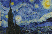
B. Balance – Balance is the being in the state of equilibrium, where everything is equal and fair. An example is Vincent van Gogh’s ‘The Starry Night’, 1889.

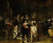
C. Emphasis and Subordination - Emphasis is an area where your attention is drawn too, almost as if the artist put more effort in that area. Subordination is the less attractive, or attention-getting areas in a painting, kind of a neutral area that keeps your focus on the emphasis area. An example is Rembrandt van Rijn’s “Militia Company of District II under the Command of Captain Frans Banninck Cocq, known as the ‘Night Watch’”

D. Directional Forces – Directional forces are sometimes literal lines or implied lines that your eye is supposed to follow when looking at a work of art. Something that I think of as a directional force that we see every day whether we think about it or not is gravity, its always there pulling stuff down without our realizing it or thinking about it. E. Contrast – Contrast is the obvious differences in something, whether it is colors, patterns, or something else is all subject to change in each work of art, but it’s the differences. The biggest contrast we see every day is sunrises/sunsets, the light coming up and darkness going away or the darkness coming all around while the light dwindles out. F. Repetition and Rhythm – Repetition is the things you see that gives a work of art flow, emphasis, or unity. Rhythm in a way is like another word for the pattern, it means movement or a structure of a primary and secondary element in a sequence. An example of repetition and rhythm could be music, pretty much any good song has rhythm and most songs repeat the chorus if it has, there are of course the exceptions of songs that don’t have either but I would say the majority do. G. Scale and Proportion– Scale is the comparing of sizing to one specific thing. Proportion is the comparing of sizes to a whole painting,
2.
Jan van Eyck’s oil painting, MADONNA AND CHILD WITH THE CHANCELLOR ROLIN (Figure 7.11, Chapter 7.5) contains a very distinct vanishing point, it has neutral areas and two large areas of emphasis, the two main people in the painting are highlighted the most, it was many focal points with all the buildings and architectures in the background.
3.
The most beautiful and colorful evening I’ve ever witnessed took place off of a dirt road in the Alaskan countryside. Growing up in Florida you get used to orange skies and pretty sunsets, but this evening was more beautiful than anything else I’ve ever witnessed. The intensity and contrast in the sky were just simply jaw-dropping. I would say the color scheme I would pick for my life is Tint, I like bright colors and always try to look at the good and best in every situation, and not focusing on the bad or negative.
4.

0 notes
Text
2.

This is my refrigerator, I see it several times a day, and visit it way more than I should. I just took a photograph of it using my phone, the primary function of it is to store food. My mom likes to use it to show reminders and to show encouraging photos and quotes, beings that everyone sees it several times a day. I think it beautiful not only because it keeps so much delicious food but there are also nice reminders on the outside.
3.
I am 18 years old, I am also a white male. I like to play sports for fun, and I often watch movies, preferably comedies. I am not a member of any organized group, although I occasionally attend a local church youth group. I currently work as an assistant for my dad, who is a realtor and a housing investor. Honestly, I don't know how I am unique, all my life I have been that cliche high school jock that doesn't care about school or homework, I consider myself a pretty funny guy, normally the clown of the group.
4.

0 notes
Text
Photojournalism
Both pictures are of police/military fighting off rioters. Riots often happen when the citizens aren’t happy with something their government or leader is doing or has done, so they fight back. Riots are citizens way of expressing their opposition or that they disagree with something that is going on. The sad thing is that in both of these photo’s, the riots have gotten violent, I am personally all for individuals right to take a stand and express their opinion, but when you start to attack people and destroy property, that where I draw the line that they are taking it too far, in the world today there is so much hate, if we don’t get what we want we fight back, we have no love anyone but ourselves anymore.


0 notes
Text
Vik Muniz 2008 Woman Ironing, from the series “Pictures of Garbage”AP1 of 3+3AP, digital C-Print, 143 x 101,6 cm /56.3 x 40 in.
1.
a. Vik Muniz is now completely devoted to photography, but originally he was a sculptor.
b. Muniz incorporates the use of quotidian objects such as diamonds, sugar, thread, chocolate syrup, and garbage in his practice to create bold, ironic and often deceiving imagery of pop culture and art history.
c. While on the way to his first black-tie gala, Muniz witnessed and attempted to break up a street fight, where he was accidentally shot in the leg by one of the brawlers.
d. Muniz does not believe in originals, rather he believes that he believes in individuality.
e. The artwork, Woman Ironing, was sold in 2017 for nearly $50,000.
Honestly, my view of art hasn't changed since I researched it. Woman Ironing is still really confusing and I am unsure of what is on the table or in the background. Although my respect for the artist has increased greatly, originally I thought this artist, Vik Muniz, was subpar at best, but this was before I found out that he uses all kinds of random stuff to create his art, and my guess is that he used much trash to create this image, beings that it is from the "Pictures of Garbage." I just noticed that much of the lady's dress and the table is a chocolate color, which he has been known to use chocolate syrup in his art.
1 note
·
View note


