Text
exercise five. OVER | AWAY week 8
final draft plan, sections and elevation drawings.
I attempted to draw the output first and found it to be messy. Instead I made a digital model to show.

design output side 1.
I created a digital model on sketch-up, added cladding and exported sections and elevations.
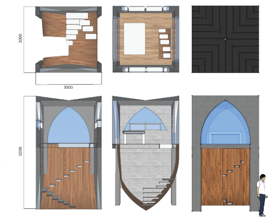
design output side 2.
I tried creating a digital collage using images of the site and watercolour. The additional figures are silhouettes and aren’t very clear, I put two children and a dog to demonstrate who will occupy the space. However, it doe not portray where it’s situated very well.
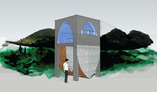
1 note
·
View note
Text
exercise five. OVER | AWAY week 8
precedent.
While finding precedents for my tower design, I came across “Hy-Fi”, a temporary tower outside MoMA PS1, New York, made of mushroom mycelium. The shape of the entrance caught my attention and how it exaggerates the height of the tower.

progress drawings.
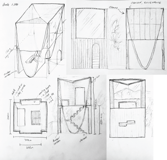
Floor plan, sections and elevations.

I had help developing the shape of the structure, entrance and staircase design. These sketches were done by my brother.
1 note
·
View note
Text
exercise five. OVER | AWAY week 7
task one: site. contextual section and bad weather sketch.
Activities: It could act as a tree house for the children during the say and a place to relax and chat for the adults at night. An additional social space to relax in for the family away from the house and overlooking the ranges.

task two: form.
formal options.


photo overlay.

I chose the parabola tower design as it was the most unique out of all my designs I made so far.
1 note
·
View note
Text
exercise four. UNDER | OVER week 7
design exercise: plan, elevation, section
under exercise theme: history/historical context over exercise theme: light/ views
For this design exercise, taking inspiration from my cross-section from my under exercise I’ve decided to create an immigration centre. This is to help support new settlers and immigrants into the country and area.

location.
Left image: This image is from 1959. I’ve highlighted the first house my parents first lived in when they arrived to NZ which inspired me to choose this location for my immigration centre.
Right image: That building no longer exists and now there is a church and parking lot.

site.
I’ve selected a patch of grass next to the parking lot.

developing an idea.
To introduce as much light into the space and offer views of the area, I wanted to have the building high above the ground on columns. This, to me, was reminiscent of traditional Cambodian houses my father had lived in when he was young.
Here, the concept of history and light intersect.

final design.
The shape of the roof and materials I wanted to use were inspired by surrounding, existing architecture. Weatherboard is a common cladding material used in this area as well as brick. The house I live in has brick columns therefore, I thought it would connect architecture in this area together. I included a clerestory window and sliding doors to enable light into the space.
I like how the roof does not entirely mimic a gable roof however, this causes the roof on the balcony to appear smaller as it blocks the sky view.
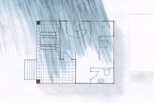
plan.
Although the image isn’t very clear, I found a light blue sky printed on paper and decided to draw my plan on it to reflect what the view was over and under the roof. The grey/blue marker used represents the shadow created by the neighbouring trees. I put white, folded, paper to depict the building next door. On the balcony, there is a seating area where people can wait for their turn to talk to an adviser.
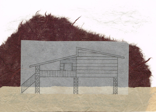
elevation.
I fine-lined the elevation on tracing paper to put on top of the brown papers. The darker brown was used to emphasise the trees and bush in the area while the light brown tissue paper portrays the ground.

section.
I also fine-lined the section using a fine liner on kraft paper with tracing paper as the ground. The trees were drawn with charcoal.
#immigration#columns#pilotis#brick#weatherboard#clerestorywindow#traditionalcambodia#plandrawings#elevationdrawings#sectiondrawings
2 notes
·
View notes
Text
exercise four. UNDER | OVER week 6
under exercise. cross-section: HENDERSON
scale 1:200

History: Henderson is named after an early colonial settler, Thomas Henderson, who owned the land in 1844. He started a timber mill in the area to process kauri trees which were cut
from the Waitakere foothills.
For the "over" section I've included my house and neighbouring houses. I interpreted the "under" section as the history of Henderson and what it meant to myself. I included the
Waitakere ranges, kauri trees and timber mill to explain the history. Below the timber mill is the Oratia stream that runs along Henderson. I added a cross to represent red cross as my
parents and family were sponsored here and lived here along this road as refugees. The kowhaiwhai pattern within the cross symbolizes the country my family turned into a new home.
I also added kowhai as the Henderson sign incorporates these flowers.
over exercise. storyboard

@9am: A small family walk alongside the pathway right next to my house. The house is south facing so from my bedroom there's not as much light. From this side of the house, during this time, I could hear many sparrows.
@12pm: From the living room there's typically a lot of noise from many cars passing by. Fewer cars and buses drive by this road. There was a subtle wind as the trees were swaying gently.
@3pm: Pretty silent on this side of the house, facing north. A lot of sunlight enters on this side of the room and as there's no busy road it’s quite peaceful.
@6pm: Facing west. It was quiet and getting chilly. Usually, the sunsets have a beautiful colourful gradient.
@9pm: It was cold at this time and again quiet.
1 note
·
View note
Text
exercise three. FRONT | BACK week 5
shelter model. scale 1:100

The dock area in front the entrance is space for users exit their kayaks and to carry into the shelter. Enables people to immediately get out of their kayaks and store them safely. I’ve made the entrance double doors to allow easy entry when carrying the kayak.

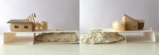
I used clay to translate the rocky ground next to the water. The pillars are submerged in water.

Corrugated board was used to resemble corrugated metal roofing.
I tried adding framing for the bungalow bay window.

I scored multiple lines to replicate timber cladding.

I cut up match sticks to create the kayak storage unit, the four match sticks ae supposed to represent a kayak.

I made a bench and seating wit match sticks.

3 notes
·
View notes
Text
exercise three. FRONT | BACK week 5

micro site.
The yellow circle is where the shelter will be located. The entrance will face East to bring light into the shelter as soon as the sun rises.

The distance between the boat ramp and shelter is around 100m.
I found the distance from the ramp to the desired location to be too far for users to walk while carrying their kayak. To solve this issue, a dock will be made in order for people to immediately get out of their kayaks and store them safely.

concept model one.
I created curved facades to represent the tides in Islington Bay. I’ve also focused on how to store the kayaks with this concept.

concept model two.
The screen/ fence was inspired by the fencing found in the inspiration image above. I created the screen for the users to use the space as a seating area. It also creates a sense of privacy as theres a pathway a few metres away. The gable roof reflects existing architecture on Rangitoto Island as there are bungalow styled baches.

concept drawing.
1. Based off the models made previously. I carried on using the gable roofed structure as I thought it would integrate well with existing buildings on the island. The dock houses the shelter and seating area. The shape of the window is similar to a bay window yet mimics the shape of the facade created by the roof. I’ve placed poles on the edge of the dock for users to attach their kayaks to stop from floating away, giving users the chance to remove themselves from the kayak.
2. I drew a layout based off the first bungalow design. The pathway made to cross over the rocks is 6 metres. The curved screen was adapted from the first concept model using the curves of the facade.
3. To adapt the form of the structure and the shape of the roof, I drew inspiration from John Scott’s Futana Chapel. I was interested in the style of roofing where he links diagonal planes inwardly, like an inverted gable roof. I introduced one diagonal plane and linked it mid way of the gable roof.


refined concept drawing.
I took the last drawing of the Futana inspired form and drew a new layout and added an eastern elevation drawing.
Drawing the roof, I couldn’t comprehend how the roof would work so I had to draft a model of the roof.

experimenting the roof.
As my sketch was not accurate, to grasp a better idea of how the roof would work, I experimented how the planes would intersect. I found I had to add another plane, or piece of roofing, in between the diagonal and gable roof.
0 notes
Text
exercise three. FRONT | BACK week 4
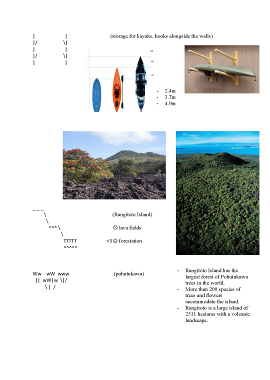
research and emoticon diagrams.
I used images and some research as inspiration when making the emoticons.


0 notes
Text
exercise two. IN | TOGETHER week 3
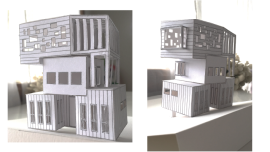
final model.
Inspiring the form of this design was from my fourth design. The layout was translated becoming the inspiration of the facade.
Each floor served a different purpose accommodating different facilities. The second floor was to act as the party/dinning space. I used timber cladding to continue the modernity of the overall building. The use of horizontal and vertical planks were to highlight the different floors. There are elements from various designs I previously made, with the final I added extruding windows to maximise lighting into the stairwell.
To improve: The form and height of the design does not suit a party space in the Auckland Domain. The height is intimidating while the varying shaped windows on each facade is over detailed. To improve, there should be at least two floors, ground and first floor, and similar styled windows to have a better flow in terms of shapes and sizes.

Left image: Ground floor
Right image: First floor
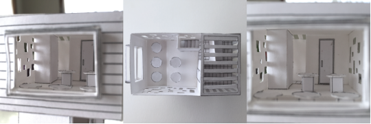
Images of the second floor. Party/dinning area with an outdoor space.
0 notes
Text
exercise two. IN | TOGETHER week 2
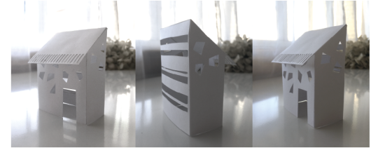
design one.
The focus on this model was how light would enter the space. the rectangular shapes were deformed creating a stone cladding effect. Multiple horizontal windows enabling natural light to fill the room.

design two.
To improve design one, the canopy was designed longer while also adding a patio as an area for people to go outside. Another block was added to the building where the kitchen or dinning space could be. The change of width acts to differentiate the two spaces. I continued using linear windows for plentiful natural lighting and view of the domain.
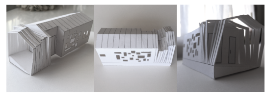
design three.
With this design I took a different approach, creating a continuous shape. To adapt the canopy from the last two designs I used the shape of the building to form the canopy. I also manipulated the strips to discontinue the shape of the building. The aim of the windows was to shape how light would enter the party area while having inspirations from Le Corbusier’s Ronchamp Chapel.
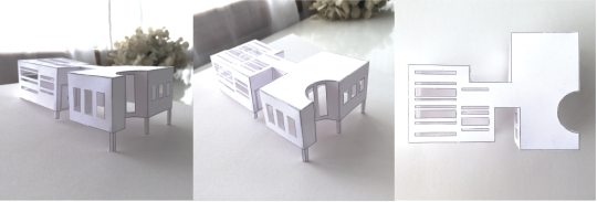
design four.
Again, this design took inspiration from Le Corbusier’s Villa Savoye as it includes a flat roof, pilotis and horizontal windows. I wanted to experiment with intruding and extruding sections as it enables users to quickly identify various spaces within the building. The curved space was to integrate the environment with architecture.

design five.
With this design I chose to create a courtyard house, I designed a gable roof as it’s a traditional style of roofing. The shape and framing of the back window is contemporary and minimalistic.
0 notes
Text
exercise one. HERE | NOW week 1-2

abstract composition.
Using one of my existing drawings, the aim was to explore the piece by changing its scale, cropping and rotating it to become unrecognisable.
Here, the focus is drawn towards the detailing on the left-hand side. Including the pencil gradient enables viewers to focus on the linear lines.

atmospheric model.
Side by side image with the composition. To present similar qualities.
Materials: plastic, skewers, mesh fabric, black acrylic paint, UHU glue, craft knife
I chose the mesh fabric to replicate the grain-like effect from the pencil shading. Overlapping the material and using black paint deepened the colour of the material intensifying the shade. To emphasise the straight, linear lines and rectangular shapes, skewers were used to form the square shapes. The plastic acted as the backdrop highlighting the overall shape the drawing, acted as support for the rest of the materials.

final section.
Trace lines were gathered using a section from the atmospheric model.
While creating this section, I wanted the lines to be the boldest, exaggerated element within the final section. I chose the linear lines to form a vertical and angular framework for a high rise, sky deck. Rather than having the angular lines sit horizontally, I interpreted the positioning of these lines as elevated pathways. The gaps within the lines are areas serving as a lookout where people are able to view the scenery and cityscape.
1 note
·
View note