#would make a cool endpaper
Explore tagged Tumblr posts
Text
Okay so I was thinking I wanted to do something with the house and fairy hill but maybe I do the hare and the hound? I'm floundering.
I don't think I will be able to sleep tonight if I do not figure out what to do for Mabel cover.
#maybe one book hare of the moon the other hound of the sun?#I don't know!!#I'm also thinking maybe some of the various plant imagery that comes up?#oh wait endpapers with the different kinds of plants would be cool. just to make everything harder once again.#mabel binding#mabel podcast
2 notes
·
View notes
Text
My bf makes these really neat handmade leather journals and just started a shop and like
Look how cool these are!
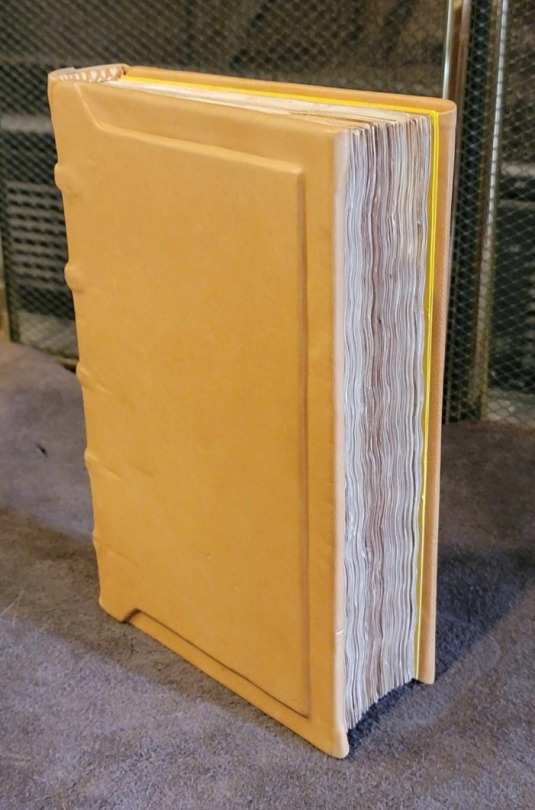
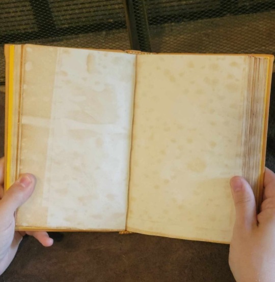
and when I say handmade I mean that he cuts the covers out of wood, sews the pages together, glues the leather, and does all the stamps and decorations and everything
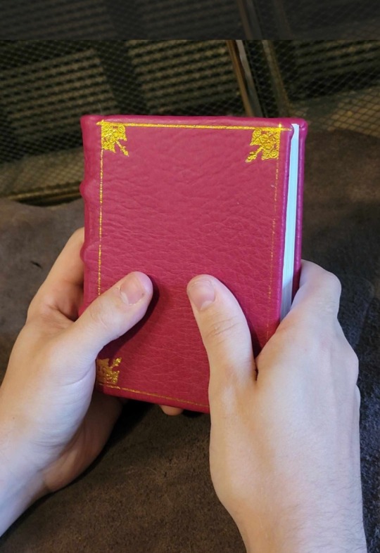
he even marbles his own paper for the endpapers and matches the top and bottom stitching to the colors

Anyway you should check him out because he's a cool guy doing cool things and it would be awesome if he could do this full-time!!
1K notes
·
View notes
Text
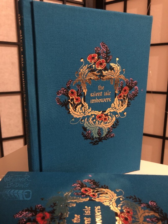
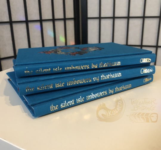

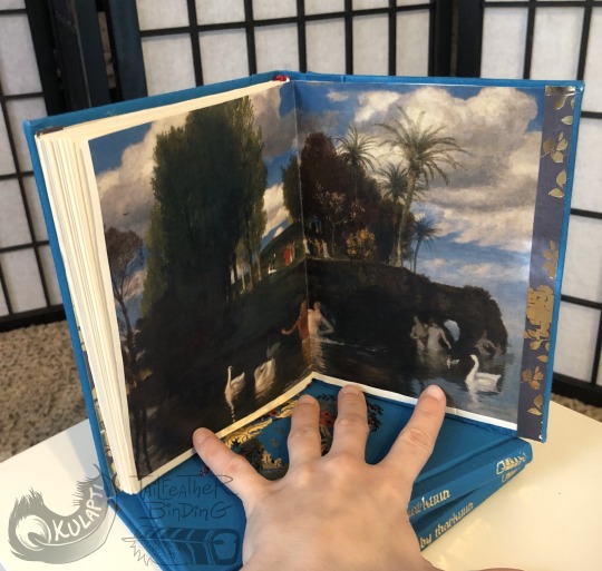
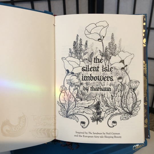
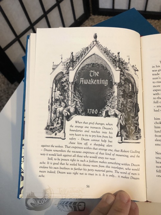
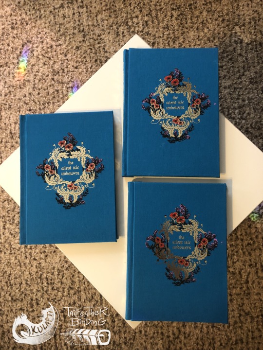
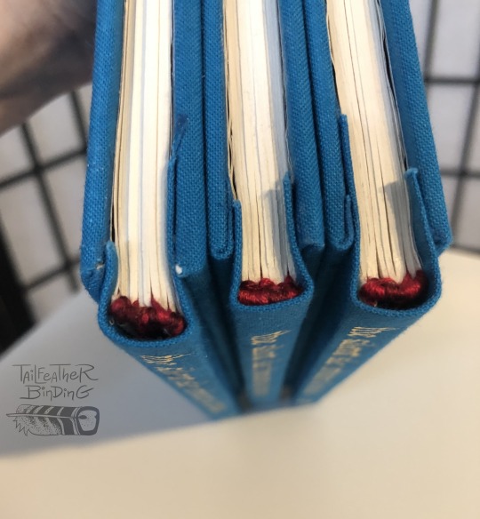
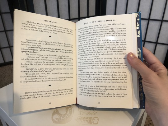
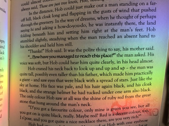
Aug 2023, bookbinding of The Silent Isle Imbowers by Tharkuun.
I’m sooo so so pleased to finally share this! I have been actively working on this for many months and waited until Tharkuun received her copy before posting so the final result would be a surprise.
-----------About this bookbinding under the cut
This binding has been one of the more elaborate pieces I have attempted so far. This has been my first binding where I (1) made three copies of a piece at once, (2) used a modified a historical illustration, (3) collaborated directly with another artist on the decorative elements, (4) finished matching art for the cover and title page, and (5) layered paint and heat-transfer vinyl for the covers. These are also (6) the first non-tiny books I have made with this style of hinge and cover attachment.
Pretty much immediately after I first read this story I felt I had to make myself a copy of this. I had a strong mental image of a vintage-looking cover for a fairy tale, with a deceptively simple design of flowers on the cover, probably with fancy metallic accents, the kind of thing you’d find in an interesting used bookstore with no summary, no text on the back, no dust jacket, just the flowers and maybe a title. I’m going to make a separate post about making this cover design a reality because oh man has it been a journey lol! I designed and drew the digital art for the cover (digital because of the cut and application method), as well as the corresponding title page illustration (pencil and dip pen, scanned, title added digitally).
When I asked Tharkuun about it she was excited to suggest I get in touch with quillingwords, who generously agreed to collaborate with me! Among her talents quilling writes calligraphy, and hand wrote both the book title and chapter headers for me to incorporate into my plans. Check OUT those chapter headers! So fancy! A font could never!! Quilling has also been very encouraging and let me yell about this project in dms for months so the final result could be a surprise for Tharkuun. Thank u so much quillingwords, your calligraphy adds invaluable amounts of swag to this project.
I was going to do some kinda neat font for the chapter headers, but quilling’s work is too cool for that and I decided to use a modified piece of a historical illustration instead. The illustration also happens to be cool as heck: I was browsing the Artstor database (an academic quality resource available for free via Jstor, my beloved) and found E. N. Neureuther's 1836 gorgeous etching for etching of the fairy tale Briar Rose, an illustration made for a printing of a Brothers Grimm recorded German fairy tale with Sleeping Beauty elements. Much to my delight this illustration not only matches the general look I wanted but is actually relevant to the story, itself a Sleeping Beauty spinoff.
Slightly less stylistically consistent are the endpapers, which are prints of two different paintings by Arnold Böcklin: Isle of the Dead (1883) in the front and Isle of Life (1888). The first painting had occurred to me as an excellent visual to go with the story, and Tharkuun and I discussed this and agreed that pairing it with the related later, more optimistic piece was too thematically appropriate to resist.
I had fun and learned a lot making these books and I am very pleased with the result!!
Materials: Archival bookboard, cardstock, cotton cheesecloth mull, archival PVA glue, linen thread coated in beeswax, paper cord, red cotton embroidery floss. Blue cotton backed with archival paper, acrylic paint, machine cut black and gold heat-transfer vinyl. Laser printed text and illustrations. Metallic scrapbooking paper.
#artists on tumblr#bookbinding#ficbinding#fanbinding#dreamling#my art#here there be fandom#the sandman#the silent isle imbowers#tharkuun#described#id in alt text#pls imagine me screaming continuously about this project for oh idk 4 or 5 months? oh I can make shiny books??#im not allowed to @ people in this post apparently#links and fic rec in reblog#laying on the floor I found a few missing words I must have deleted on accident while fixing formatting#poppies (Papaver somniferum) and mugwort (Artemisia vulgaris)#tailfeather binding
788 notes
·
View notes
Text
Here we go! I have some smaller books to share as well, but I've been absolutely VIBRATING with excitement to share a BIG one, and I'm going to indulge myself and post that today, then figure out words for the rest. Because I bound a new cnovel. Check it out, guys, I bound jwqs/clear and muddy loss of love :D
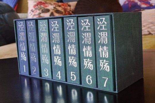
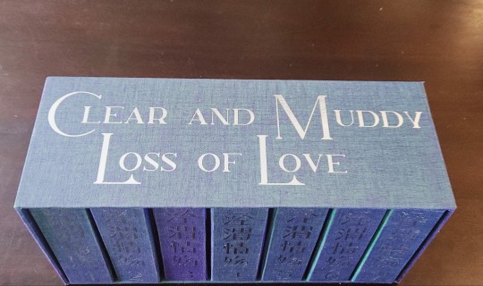
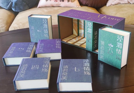
Let me indulge myself and backtrack a little! First, these are quarto books, so they're short. But I think these average a little under 500 pages each, and jwqs is a LONG book (my beloved), and this adds up to a total eleven inches of lesbians. More like twelve once they're in their cases. It's over a million characters in Chinese and I think the English translation comes in somewhere around 890k, it's HUGE
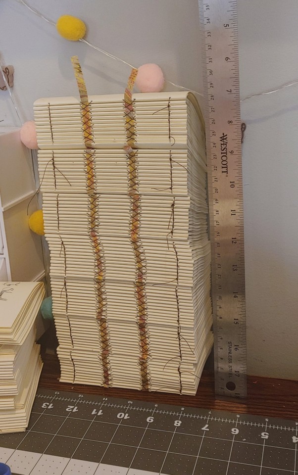
Making these books was SO FUN, I hadn't read jwqs and still haven't, and will probably read on my phone when I do. I don't have any exciting photos of the typesetting, but I knew this was an imperial succession story, and that made me nervous, those stories don't always click for me. Well, the process of typesetting and adding footnotes for this beast definitely confirmed that I'm going to have a good time with this thing when I have the time to read it, but there was also so much going on that only the vaguest of spoilers sank in. I went into an absolute FRENZY of typesetting, and after I printed, cut and folded it, well. That was one afternoon of sewing. You're looking at the reason I'm scrambling to make up a few hours of missed work, hahaha
After that, I needed cases. At the very beginning of march, I received a shipment of some FASCINATING bookcloth. It's called Duo, and it's made by layering a thin gauzy fabric of one color over paper of a different color. Depending on the combos, you get a really cool range of color-shifting effects. And they've gone out of production! But I was part of a group order to get some of the goods, and hadn't yet finished a new project. Reader, I went for it.
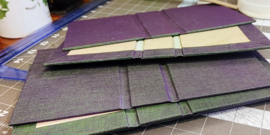
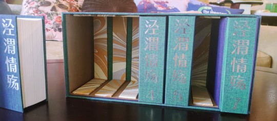
That purple and green is bananas!!!! It's so hard to photograph, this midnight picture of a few cases is one of my most successful attempts to capture the full range up close. Originally I'd been thinking of trying to evoke imperial gold, but I figured this was still the kind of drama and luxury suited the book, and also something something the hidden colors suited Qi Yan's character. I tied it back a little to the imperial gold with the endpapers, then titled them in silver foil, since the endpapers had silver in them.
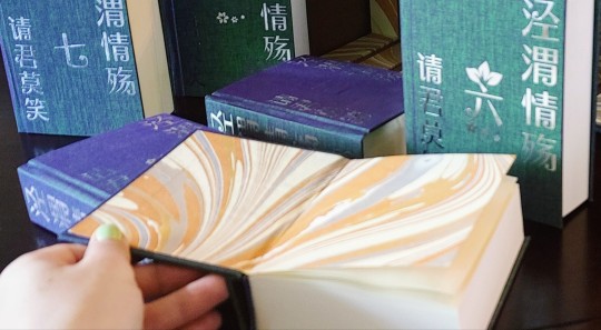
But once the books were made, I felt like it wanted something... more. Something like a BOX!
And me, I chase novelty. A set this large would be tricky for anything clamshell, but a slipcase for all seven would leave books tipping all over if it was wide open, but putting walls between slots would be demanding in terms of precision and would risk similarly-sized books getting stuck in the wrong slots. Then I remembered learning about slipcases where you could put in a little insert to support the weight of the text block, and the concept SNAPPED into place.
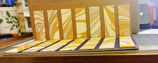
Colors aren't going to photograph well at midnight, but I made the supports using the scraps and off-cuts from my endpapers, to tie it back into the bindings. The back of the case is lined in more of the duo, and the walls are lined with a faux leather bookcloth I like a lot, it feels buttery smooth and seemed like a good neutral material to tie the papers and bookcloth together. I listened to some of the DEEPEST layers from the nine-hour conspiracy theory iceberg video while I was working on this, haha, it was a TRIP.
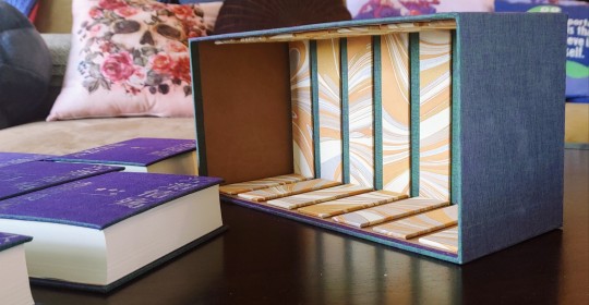
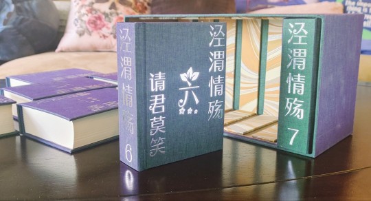
And in the end, each of the supports is sized to comfortably sit in the smallest of the volumes, and evenly spaced, so I believe it will take the books in any order with no problems. It's easy to grab the books without having to cut notches into the walls to grab them from. And even though weight is less of an issue for quarto sizing, the books in here have their weight supported no matter what angle the box is at! I'm so, so pleased with how this concept worked out and definitely plan to do more with it in the future.
So there we are! Jing Wei Qing Shang! I had such a fabulous time with this project, and I'm so excited to get to share it with all of you. The story was fun to work with, the bindings and box were fun to make, and everything here came together just as well as I could possibly have hoped. I'm so proud of this, and incredibly, incredibly excited to show it to you!
#crafts#bookbinding#box making#oh boy what is this story tagged#jwqs#jing wei qing shang#clear and muddy loss of love#I'll pick one to stick with later 😂#long post/#so proud of this one!
1K notes
·
View notes
Text
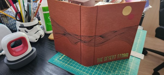
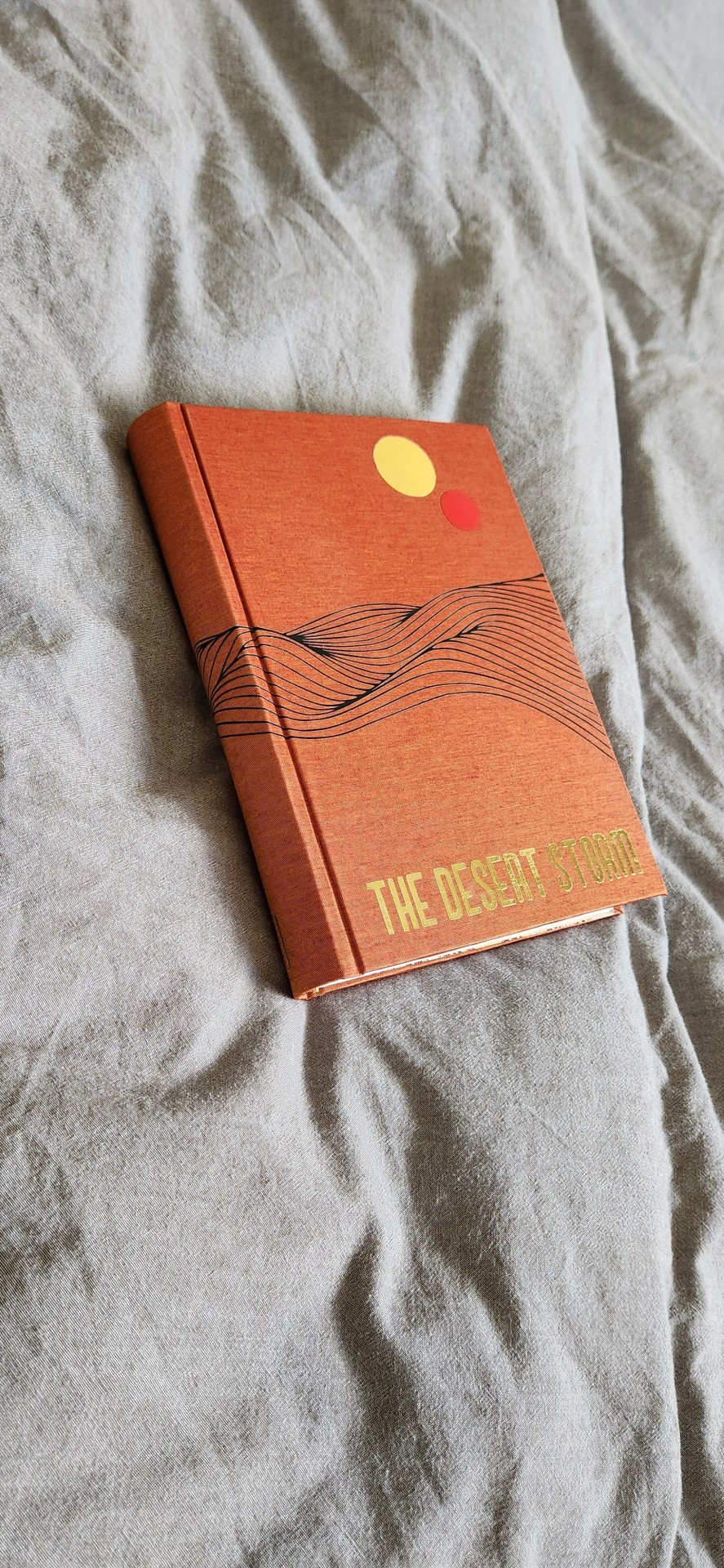
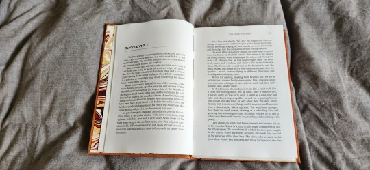
So it's been a while since i posted any books - mostly because i've been hiding my progress like a little sneak.
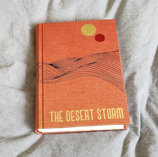
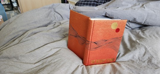
I just finished this bind last night of The Desert Storm by @blue-sunshine-mauve-morning, or really it's volume 1 out of like ??? 15, maybe. Please take whatever i say with a pinch of salt (I have had 0 sleep for more than 24 hours, and that tends to make me a little very sleep-deprivation drunk a.k.a. unhinged). Okay, on to thoughts! The Desert Storm was foisted onto me by @celestial-sphere-press who told me under no uncertain terms that I WOULD FUCKING LOVE THIS SHIT. Well, I did. This more than 1 million word epic about Ben Fuckin' Kenobi is pretty much god-tier fanfiction. It reads like a goddamn novel. I can never think of canon again without thinking that this good shit should be canon. I read it and then consumed half of it within a week, and I have zero regrets. @blue-sunshine-mauve-morning, i absolutely love you and love your writing. It is the best thing since sliced bread. It is better than sliced bread.
I also had the benefit of @celestial-sphere-press saying, hey would you want to use the typeset? MY GOD, i am grateful. I love this fic, i would have typeset it if it hadn't been typeset but Des did such a beautiful job that i am absolutely in awe and thankful that she and the author allowed others to use it. Look at it - it's so beautiful. I only had to think hey, i just gotta design the cover and et cetera and so the book happened.
Please also check out @celestial-sphere-press 's amazing post here and here, who is the only person i know who's started and is almost complete in fanbinding this epic, and is also making an author a copy of the entire series.
Some stats, if you will.
96215 words || 380 pages
Title font: Ghaomiec
I took some inspiration from starblight bindery's lovely desert scape as well as this amazing cover of Dune which i own. I love that the landscape emanates Dune vibes while being oh so Tattooine - just sand and heat, relentless loneliness and melancholy. This fic centres around Obi-Wan Infinite Sadness Kenobi so it needed SAD VIBES TM, which i tried to deliver in desolate landscape form.
Also thank the heavens for Renegade members, who in a masterful stroke of Group Buy Saves Money, managed to source extra-out-of-production colours of Colibri and help a fair number of us get really cool limited edition versions of bookcloth. I am now a proud owner of a lorge stash of Duo and Colibri of which i am now sitting on like a shifty dragon with a hoarding problem. Good luck getting your bookcloth now, Folio Society, ha ha (gloating)! This particular bookcloth is Colibri Copper which has been wholly stashed for The Desert Storm series. I am leaning on transitioning to Malachite for Rise and Fall when I get to it.
The front cover design was done with a stock image and converted to a PNG, which i then fiddled with and did some HTV magic with. It was remarkably easier to weed than expected. I tried something new and ironed the design on the naked bookcloth first before gluing it to the boards, which was a new challenge in making sure everything was aligned.
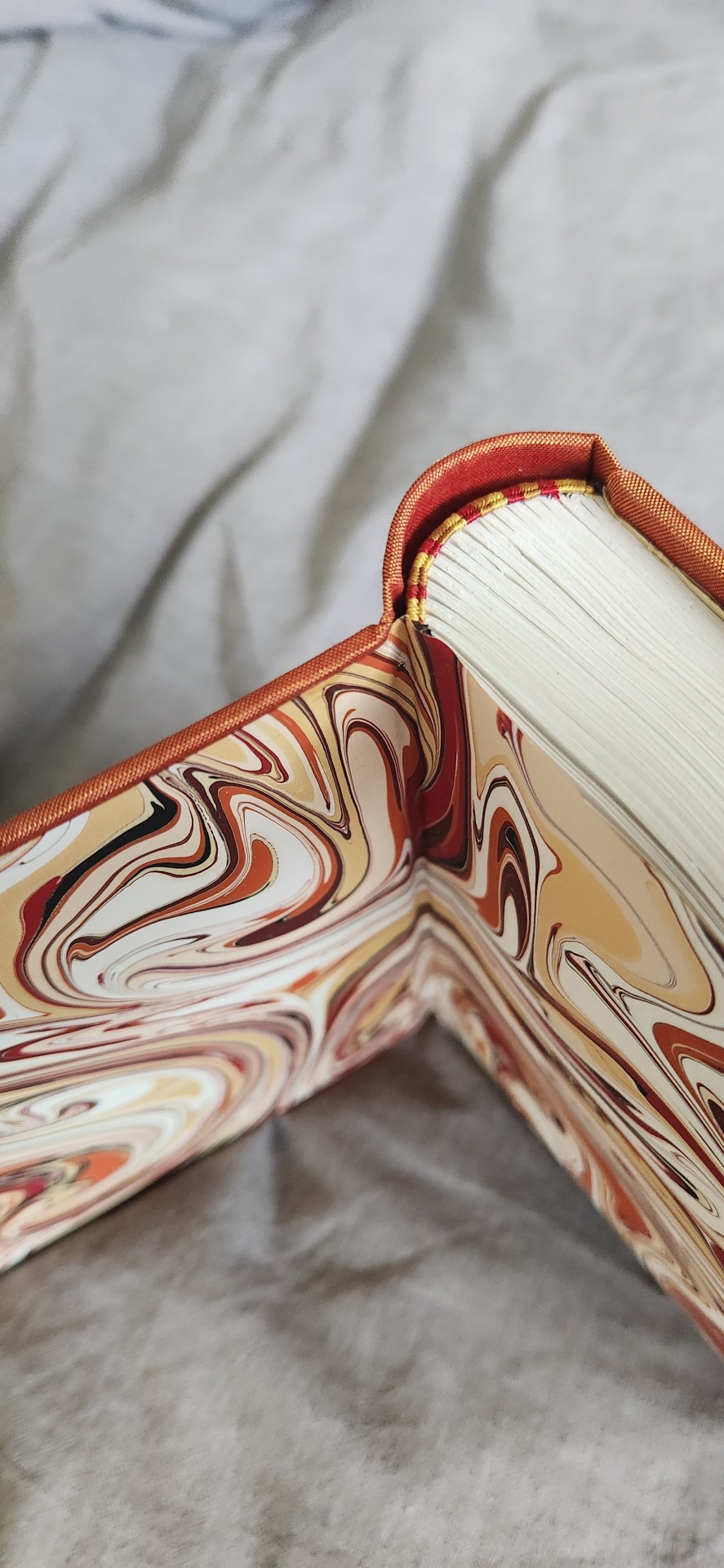
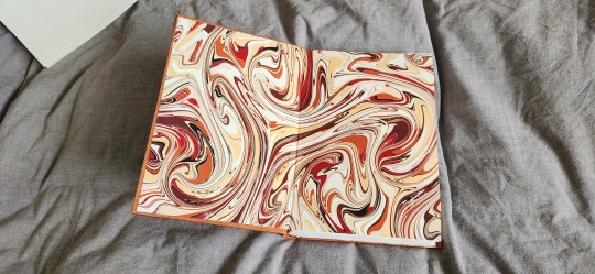
Endpapers are marbled endpapers (Renato Crepaldi) which I got from Hollanders, which perfectly fit the colour scheme of the bind. The only hiccup was as I was cutting, I realized the sheet was running in the opposite direction of his usual papers and half the size, and only yielded 3 A5 size endpapers and so my heart went noooooooooo. oh well. i guess i will use it for quartos.
Endbands are my favourite - silk in 3 colours in the french doublecore style (as i was binding this i did not have the mental capacity to handle the difficulty of 4 strands). the truth is i usually only can do 4 when I have higher brain function and am willing to spend 80% of my time unraveling it from getting tangled.
I also forgot to mention I had mild fuck-ups, I got glue on the front endpaper which I had to hastily remove with wet cloth, and the back square is preposterously bad but I'm ignoring it for now.
Anyway, i've actually managed to complete a few other binds which have not been mentioned here as they've all been gifts/ surprises or event books in some form. I am SO EXCITED, also because I am travelling in the latter half of July to San Diego and L.A. and I get to meet some bookbinding friends in the flesh. Renegade is fucking amazing y'all. I am ready to embrace these crazy lads who have enabled me for the last 1 year, even when i'm the solitary (1) weirdo from my country of origin in the server. Also... potentially bookbinding trip early next year??? I am enthused.
#bookbinding#fanbinding#renegade bindery#my books#star wars#clone wars#obi-wan kenobi#ben kenobi#ben naasade#infinite sadness#the desert storm#the ben naasade epic
706 notes
·
View notes
Text


Books Books Books. The bind I have to share today is The Fabric of Your Hair by @saretton (I have to confess, I left a comment on Ao3 asking for binding permission back in April but I don't think I ever got a response, so I really hope it's ok that I went ahead, and to tag you like this.) This is another really excellent Good Omens human au, with really colorful sensual language. One of our faves is a hair stylist in this one, and the other is a tailor, which is where I got the idea to use dressmaker's forms on the front cover even if there are none in the fic. The cute printed paper came from I think Joanne's, and the sheets had these strange patches of random text and pink roses on them that I had to cut around to get a usable cover, but it was worth it. The spine and corners are brown lineco book cloth with silver metallic htv for the title. Overall it looks a little steampunk for a modern setting but I think it's adorable and I love it.
More photos under the cut!


A couple of images of the front and back endpapers. They're cardstock, and the little images were done with rubber stamps and gold embossing powder. I've only done this on one other book, as it's a challenge to find coordinating stamps that are the right size and shape and also a thematic fit for the story, but I love the idea and think it looks really good. It's like a surprise inside, especially when you turn to the back one and it's different.
I've just realized that I failed to take a photo of the top view on this book like I usually do, so you'll just have to trust me when I say it's got a narrow cream-colored ribbon for a bookmark that coordinates with the rest of the color palette. It's also got machine-made end bands because, while I would have loved to make custom ones, the book is only about 100 pages at legal quarto size, making it a little too skinny for those. The ones I used are an exact match for the brown book cloth though, so they look very nice.


Title page, with scissor image that I got for free from rawpixel, and first chapter header. I kept it pretty simple for the typeset, wanting to let the story speak for itself, and it was actually challenging to find free graphics that would fit the theme without veering even further into steampunk. Cool aesthetic, but absolutely not a fit for this story. I'm satisfied with the end result.


I tried a little something different with the page headers for this one, but it didn't entirely pan out. I printed them in gray so they'd fade a bit into the background, because the title is kind of long and I was worried it would dominate the page on a quarto book like this. It didn't work so well because my printer sucks at printing sharp lines when they're any color but black. So they do in fact fade, but to the point of being illegible on a couple of pages. Left example is a good print, right is a poor one. Oh well, lesson learned, and it doesn't actually interfere with reading so I left it.
And that's it for this one! I really like how the final book came together, more or less exactly as it was in my mind in spite of a fumble or two. I hope you like it too, saretton!
43 notes
·
View notes
Text
Fanbinding of The Perfect Song by dragonofdispair
The Perfect Song by dragonofdispair
To follow his dreams, Jazz offers his virginity and himself to anyone willing to pay. His buyer, Prowl, has a lot of loneliness and a kink for virgins, but dreaming isn’t something he’s capable of. Yet.
Fandom: Transformers - All Media Types Rating: Explicit Archive Warnings: Creator Chose Not To Use Archive Warnings Relationship: Jazz/Prowl Characters: Jazz, Prowl, Ricochet, Barricade, First Aid, Sky-Byte
The Perfect Song by dragonofdispair 429 pages, letter-quarto/ 50,061 words
Accompaniment: Companion Pieces to The Perfect Song (Adagio, Coda, Cadenza, and Famous) by dragonofdispair 72 pages, letter-quarto / 4,751 words
The Perfect Song was requested as a bind during our local Renegade Exchange 2024 event. My giftee mentioned they liked quartos and also blue, and so I had the first inklings of a design. My giftee also mentioned they wouldn't mind additional gifts, so I decided to bind the rest of the series as a separate book, mostly because i thought it would look cool and then i would have a reason to make a case too (corral all those books together).
Photos and more discussion under the read-more!
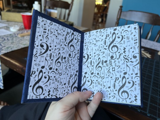
First up is The Perfect Song! I have been wanting to bind a chonky book, and while I didn't reach maximum chonk, The Perfect Song is a respectable size and satisfyingly hefty in the hand. This book is a variation of the bradel binding style, which supports a thicker book well. I ran with the musical theme: the endpapers have musical notations, the text breaks are a treble clef, and I used the written music for Mendelssohn’s Midsummer Night’s Dream as the background image for chapter titles. I chose the font for titles and dropcaps because it reminded me of a musical scale. The blue bookcloth is homemade using a faux-suede fabric: fuzzy texture!
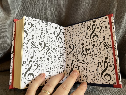
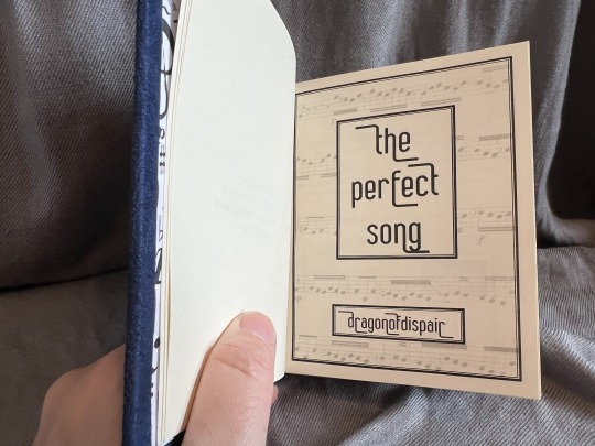
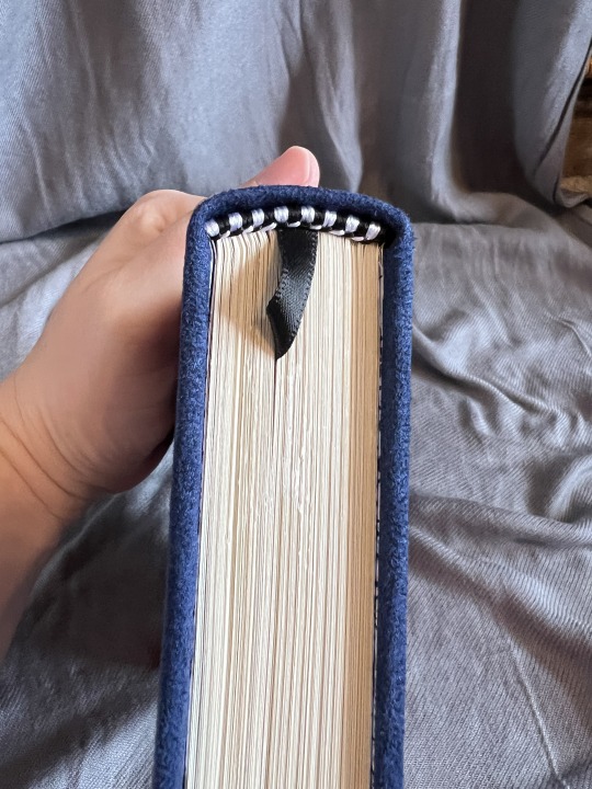
The black and while endbands were meant to invoke a piano keyboard: I'm not quite sure I got there, but they look classy regardless!
Next is the rest of the series (which I called Accompaniment for the purposes of rounding up the series in a second book), and it uses all the same themes. I like the cohesive look, and really, why mess with a good thing? This is a much slimmer book, bound in a different style from The Perfect Song. This is a modified conservation pamphlet bind.
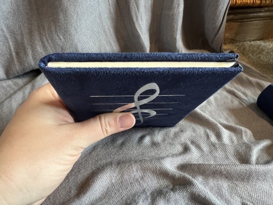
For both books I used HTV to put a treble clef on the cover, and for The Perfect Song I had enough room to title the spine as well.
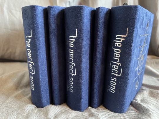
I wanted to make cases for all three sets of books (one for my giftee, one for the author, and one for myself). I ran with the same theme and materials, so nothing surprising there, but I think the books in their cases look really snazzy!
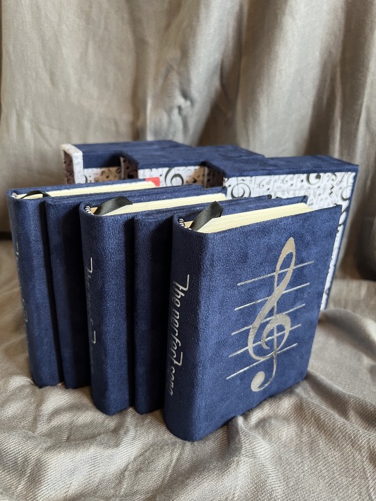
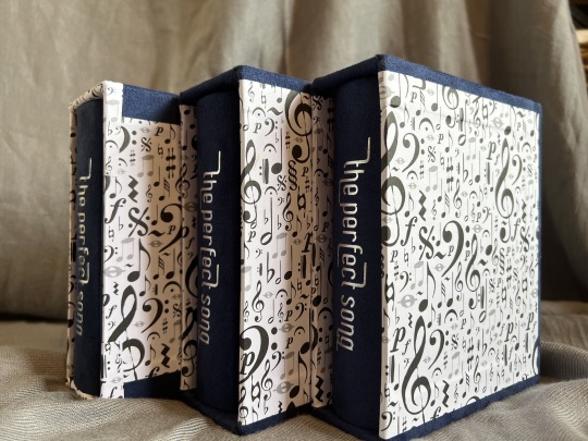
I'm very satisfied with how these books turned out! And I am thrilled to be able to gift a copy to the author! Sharing fandom is wonderful experience for me, and I hope some fanart let's the author know how much I appreciate that they shared their stories.
Also located on A03 here.
57 notes
·
View notes
Text


Up until now my projects were a pretty even mix of me being back on my bullshit and gifts for friends, and now this is something different.
This started with me walking by a wrapping station in a mall and going “I can make something cool with this paper”.
So, this is a collection of six short stories about Hades and Persephone (plus a secret seventh thing which is a poem I used as an epigraph). This is also my first print run of 8 copies (I have a surprising number of dear friends who are into this mythological OTP).
Featured works:
Hades and Persephone, a poem by @agest translated into English by erebusodora she would swallow the world by @spacediino I'm here and I'm ready and I've saved you the passanger seat by lanyon We Are the Next Time Around by @skypirateb Pomegranate Seeds by @centrumlumina Persephone on the Counter-World by weakinteraction When the Seasons Change by ghost_maiden_of_delphi
Notes on construction:
🩸Cotton and wrapping decorative paper on the cover, satin ribbon used as accent strip, title linoprinted on the spine; 🩸 Black endpapers with red flyleaves (seriously, those book look like they’ve got sexy lingerie on); 🩸Six pomegranate seeds printed on translucent vellum over the title page; 🩸Body text set in Alegreya; 🩸Edges painted red (my first time doing this, it was fun!); 🩸I used pieces of coral as charms for the ribbon bookmarks.
Very happy with how these turned out!
#bookbinding#fanbinding#ficbinding#mythril thread books#hades#persephone#greek mythology#pomegranate
413 notes
·
View notes
Text
Doctor Who compilation bookbinding project
Okay, continued the bookbinding this afternoon, and this time paid slightly more attention to the signature order, so now it's all sewed up in the right direction. The textblock isn't quite done--it still needs endpapers and headbands-- but that's going to have to wait because I don't have the endpapers I want.
Anyway, I thought I'd post progress pictures for those interested, and because I realized I haven't taken progress photos of any of the projects thus far. This is the third of my own fics that I've been binding. I'm not doing too much new with this one, but I still haven't figured out the cover so I might try something with that. Anyway, this compilation is of my Doctor Who fics (Pages and Left Behind are the main ones, and then an assortment of shorter fics).
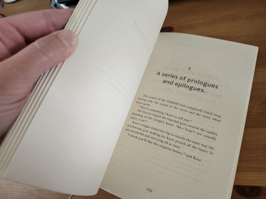
(Confession: it has been so long since I read Left Behind, and I have been so deep in the MCU lately, that I read the opening to this story and my first thought is, "Tony Stark is in this here?!" 😂😂😂😂)
So the first part of fanbinding actually creating the pdf for printing. This probably takes up the most time, because I'm doing a shit-ton of trying to coax Word to do what I want it to do. Luckily, I learned how to do this when prepping Pen's books for printing, and I've gotten a lot better and faster at it over the years. I don't know that I'm any good at it, really--I see some layouts that are frankly amazing and inventive and creative and I wish I could think of those designs, but hey, I think I do all right. You can't see on the above page (it's too light) but there's the faint design of Gallifreyen behind the chapter title there. I also played a lot with using backgrounds on the main title pages:
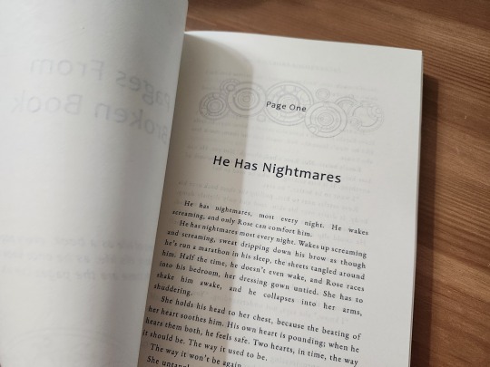
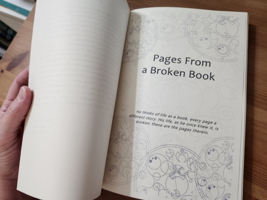
Okay, those show up better. I'm trying to decide if I want to trim the pages so that you don't have that blank outline around the title page decoration. (Word won't let you print all the way to the edge of the page, which I guess is the drawback of home printing? Eh.) The advantage of trimming would be that I get that nice flat side to the textblock; right now it's that choppy sort of look. Which I don't mind, honestly, but at some point I gotta learn how to cut those pages nice and even.
The deets: printed on ivory letter-sized paper, folded in half. The entire file is a nice solid 300 pages or so.
Anyway, with the signatures printed, it was time to put it together. This time, I had an awl-guide and cradle that I had 3-D printed at the library based on a design from Thingiverse. CHECK THAT BABY OUT. Mine is white and gold (because I told the library I did not care what color they used). I have to say, I love it. Made cutting holes soooooo much easier and faster and perfect and painless. Support your local library, folks, they have all sorts of cool toys.
Sewing it together: I'm continuing to use a kettle-stitch, because it's easy and fast and previously I had trouble keeping the stitches even and tight. I think I finally figured out how to do both now, both a factor in the holes being consistent (thank you, awl guide & cradle) and just paying better attention to the tension in the thread. This is probably the thickest I could go without those strappy thing I see some of the thicker tomes using (I cannot remember the name and you do not want to know what I found when I typed "strappy things" in Google; it sure didn't pertain to bookbinding).
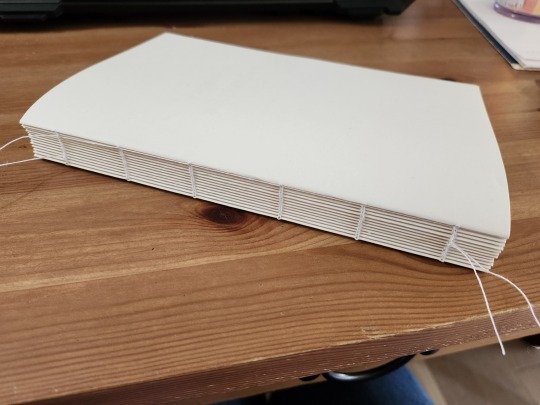
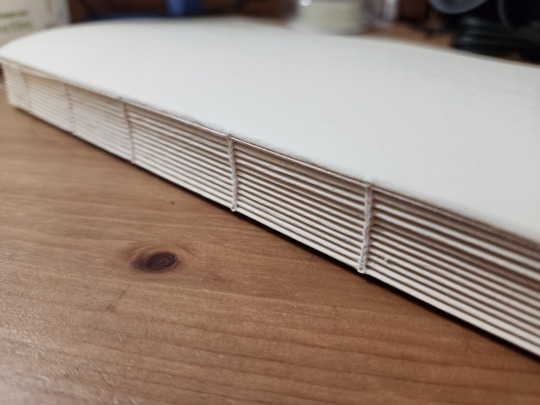
FEAST YOUR EYES ON THE GORGEOUS, PEOPLE.
So that's where we're leaving it; I have a pretty good idea what endpapers I want to use, I just have to get back to JoAnn's to get them. I have ideas about the cover, but I'm not sure how to make it happen, so I'll let that ferment and switch back to one of the other projects. More later.
22 notes
·
View notes
Text
Making my own bookcloth
Back in february I went to a convention for all kinds of crafts and found a lot of cool materials I wanted to try in lieu of bookcloth. This was my first foray:
Finished book!

In a workshop back in 2023 I learned how to back normal cloth with silk paper so that it can function as bookcloth. I was taught, that this is necessary because otherwise the glue would press through the cloth and be visible on the front. With this dragon scale styled cloth I wasn't afraid that would happen. It is very thick and has kind of a plasticky coat. So I disregarded all of that advise and just tried to do it like I would with regular bookcloth:

I noticed very quickly that the cloth kinda soaked up the glue and I needed a lot to get it wet and sticky enough. Than I ran into the problem, that my newly fashioned edge cutter was a little to narrow for such thick material. I had little holes at the corner where the cloth didn't quite overlap. It also would not really stick to the carton. First I tried pressing it down with my fingers, than with a vise. Nothing worked, it just wouldn't stick. That's how I learned there's a second reason for backing the cloth: So that it will fucking stick. The glue is not suitable for things that are not paper. So you have to adhere paper first to the cloth and then you can connect that paper to the carton.


This is how I learned to do it:
Iron the cloth until all the creases are gone. Otherwise they will stay permanently. Leave the iron on. Dilute your glue with wallpaper paste (I used the regular one for paper from a hardware store and used the strongest water/paste ratio; the paste/glue ratio I kinda eyeballed approx. 1:3). Then put it in a laquer dish like in the picture and use a roller without this really fuzzy stuff (this one is more like foam). This will help you put the glue on very quickly and evenly. Lay out the silk paper (normally you should measure the cloth larger than you need it and the silk paper a little smaller than the cloth so that you don't have glue remnants everywhere. I already cut mine so the silk paper is larger here). Roll on your glue (very quickly but make it thin and even). Then wait. Test it with your fingertips. It should still stick but not be really wet anymore. Otherwise it will press through your cloth and you will have stains. If it gets to dry it will not stick. Then carefully stretch out all the creases. If you think it is right, put on the cloth, flip it and go over the silk paper with an iron. Be careful not to rip the paper (this will happen if it was still to wet). Check that the cloth isn't creasing. Try to get it as flat as possible. After the paper is dry, flip it again and go over the cloth side.
After I did that I had less problems. The cloth still needed to be pressed with a vise because it was so thick, but it held.

I mismeasured the back of the bookblock though and had to do it all over again... Well, you learn through practise and the second attempt was much prettier as well.
I used marbled paper I got from that retailer from hell and then I again fucked up with the Cricut (forgot to mirror the letters). Otherwise I am very pleased with the result and my cousin (the recipient) was also quite happy.


Binding Details
Bookblock was premade from schmedt.de
Endpapers from the retailer from hell (that I'm not gonna link)
Cloth from taschen-zubehoer.de
51 notes
·
View notes
Text
Ficbinding: The Bone Eater by CluckU


(Listen, taking pics is not my talent. Just ignore the Wrestlemania tier list in the background.)
The fic: SPN, Castiel/Dean Winchester, E, 119.3k This fic is amazing. It's dark as I like and breathtaking, and it's a fantastic exploration of my favorite character, Dean Winchester. He's completely believable as CluckU writes him, there's not a doubt in my mind that that's how he would react if kidnapped and fed on by a minotaur, even at the times in the story when I wished he'd go against his instincts to protect himself. Also, the monster in this fic is so cool. He's well written, menacing, pathetic in a way, and so terrifying because of the way he feeds and how implacable he is. Special mention to the whole Misery vibe of this fic and especially chapter 15, that was so well done. Read the tags.
The bind: This is one of my most complex works to date, for several reasons. Let's start with the palette. White for te very bare cell Dean lives in and to contrast with other colors; red on the endbands and ribbon for blood (and there's a lot of it here); silver on the edges and endpapers for the medical instruments and table; black because I don't have grey cloth and I thought it'd contrast better with white to make the prison bars pattern.
The first difficulty was trimming and sanding the textblock. It was too thick for my ream cutter and as I said before, I'm losing my faith in it. So I trimmed each one of the 18 signatures by hand, then sanded the block with my new power sander. It took a long time and made a lot of noise, and the heat made it hard to work for long, but I'm loving this new tool. The smoothness of the edges was so satisfying.
Then I spray-painted edges for the first time. And it didn't go so well. It seemed okay, but for some reason paint still rubs off my fingers even though it's dry, so I have to be very careful when handling the book. I'm thinking of giving up acrylic paint in favor of laque spray next time.


Another thing I was apprehensive about was the straight spine. I'm a round spine guy, I have very little experience with straight ones, but it went alright! It's good! I don't think I'll make it a regular occurrence, though, I find it nerve-racking.
The last tricky thing was the cover pattern. (You can see it well in the sun if you click on the picture above.) It wasn't hard to think up or to figure out, mathematically speaking, but it was long, hard work in the July heat to cut the strips and glue them on the cover in a regular fashion. Took me hours. But it came out looking great! I did make a little mistake, though: I prepared the casing last night and I was so tired I glued the book in it by automatism, but I should have added the stripes before putting the book together.
Now, the typesetting!


I could have used a Greek theme throughout, but the minotaur myth is too modernized in this story for that, so I confined these references to the front page. A non-serif font because this is mostly Dean's POV and if you've read my previous ficbinding post, you know my feelings on that. And then bones! For the chapter headings, I used a pelvic bone that cradles the chapter number. The only chapter with a different heading is chapter 15, with the hand, for reasons obvious to those who have read the fic. And a nice femur as a divider. Really, the pelvis, hand and femur are the most important bones in The Bone Eater. The all look crisp, I'm happy with that.
Any reservations?
I wrestled with my printer a while and couldn't get it to print the right shade of red, I'll have to look into that next time.
Wow, I had a lot to say this time! It was a very interesting one, craft-wise.
Fonts: title and chapter numbers: Lethal Craze Demo, author name: Hey August, text: TT Fors Trial. All free on Dafont.
Materials: Black and white cloth from Schmedt, 2mm grey board, 70g/m² white copy paper, synthetic bookmark and headbands. Silver endpaper bought in store.
Feel free to ask me more about materials and fonts (or whatever), it won’t bother me at all to tell you what I used, I just can't think of anything else right now.
31 notes
·
View notes
Text
the process of binding a study in scarlette:
SO. i had a Vision for this fic, right from the start. so many new things i wanted to do and almost no idea how to do it. but let's start from the beginning, shall we?
i usually don't do anywhere NEAR this amount of brainstorming and designing but the fic has so many motifs and details that i knew i wanted to fit in, so i had to draw it all out and piece everything together.
here are a few of my behind-the-scenes brainstorming notes:
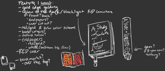
this was the very first brainstorm i did, it was basically me flinging a bunch of cool book stuff i saw other people doing at the wall and seeing what stuck in my brain.
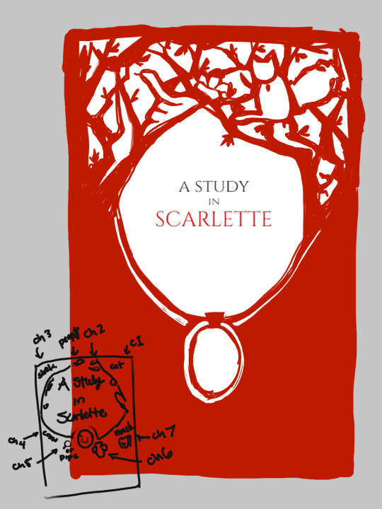
this was an idea for a cover which incorporated symbols for each of the chapters inside the branches, but i just wasn't fond of the execution of the draft. so i scrapped it, eventually settling on the silhouette cover for the final.
i had big dreams! and not much experience to back it up with ! so after finishing the typeset, i put it aside for a bit and did a couple other binds first.
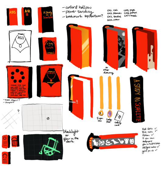
this was my second brainstorm, i started to figure out the direction i wanted the illustrations to go in, no longer aimlessly tossing vibes around!
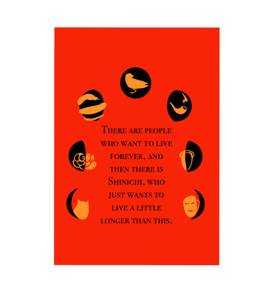
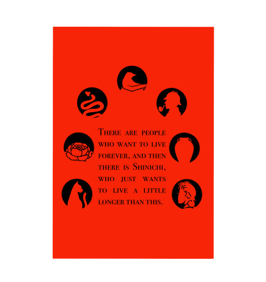
i did a lot of waffling about different versions of the back cover design. here's a couple that i scrapped!
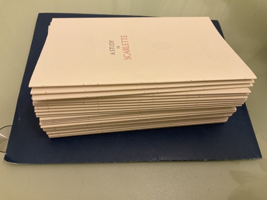
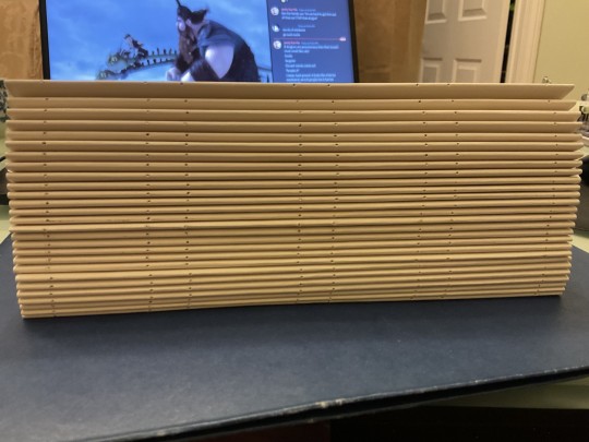
over the summer, i decided to finally stop procrastinating and printed out the typeset (after making a few revisions to it). it's a Chonk. i pressed it some, which helped, but it definitely still had a lot of swell.
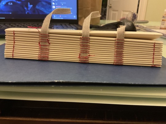
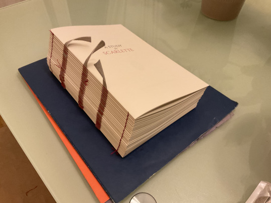
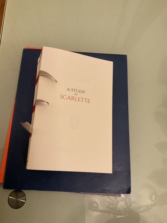
sewing with red thread.
endpapers cut, glued, and a glow in the dark paint test.
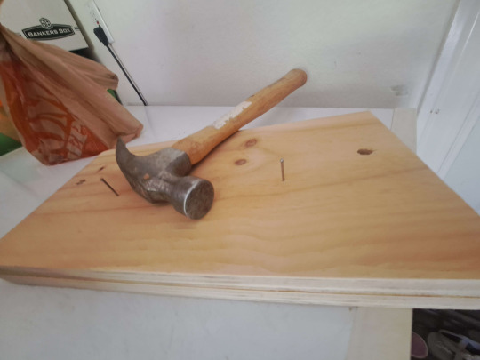
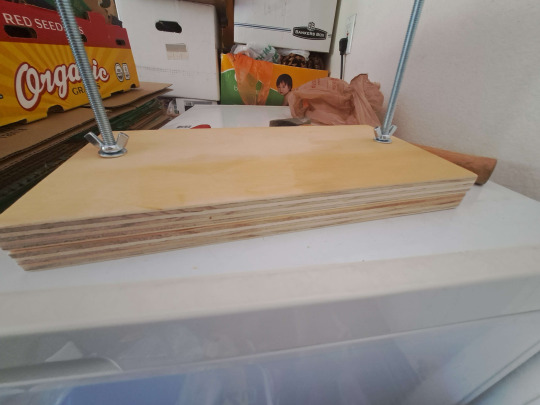
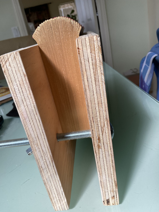
built a press...up til this point i'd just been stacking a bunch of thick books on top of my binds, but for this one i needed a lying press to sand my edges, so i finally caved. who needs tools? my edge painted book needs tools :(
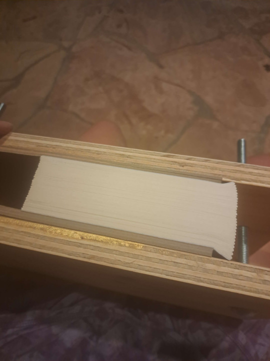
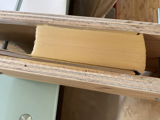
sanding edges with power sander
so. this was my first time doing anything with edges, so i did a little test on a book i already had; it was a bit of a process trying to work out how much i should dilute it, and it took a bit of trial and error. doing the bottom edge first was the right call ^^;; it's the flakiest out of all the edges on the final bind. i'm really happy with the fore edge though, i got a really even and nice coat on it.
rounding, gluing and (an attempt at) backing
so. it was the day before i was moving. i had run out of time to procrastinate any more. the rounding was quite rushed and i barely backed it at all. there was also the fact that i don't have backing boards and was winging it with absolute unfounded confidence. it still turned out okay though so i got away with it!
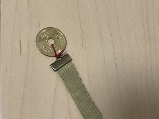
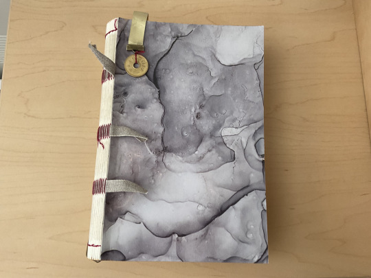
dug out a 5 yen coin from who knows where for the bookmark. didn't have pliers with me yet so i had to close the crimp with a metal water bottle and arm strength. who needs tools right
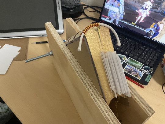
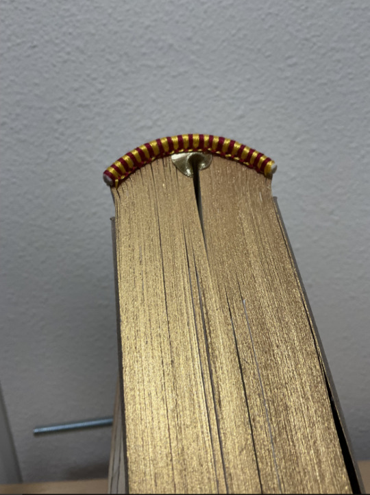
endbands. i love sewing endbands, but man, for chonk fics it gets Long. i think they each took like 2-4 hours to do. i briefly considered learning double core endbands for this bind but decided against it as i barely just got a handle on regular ones. discovery: my ambitions have limits!
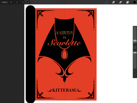
this was my finalized cover design. i had planned to do it all with htv, but last minute decided to do the silhouette as a linocut instead. i'd never done one before but i had the materials and the fearlessness that only a beginner (who does not know the limits of fear) can have; i think it turned out good :>
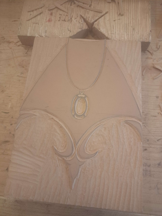
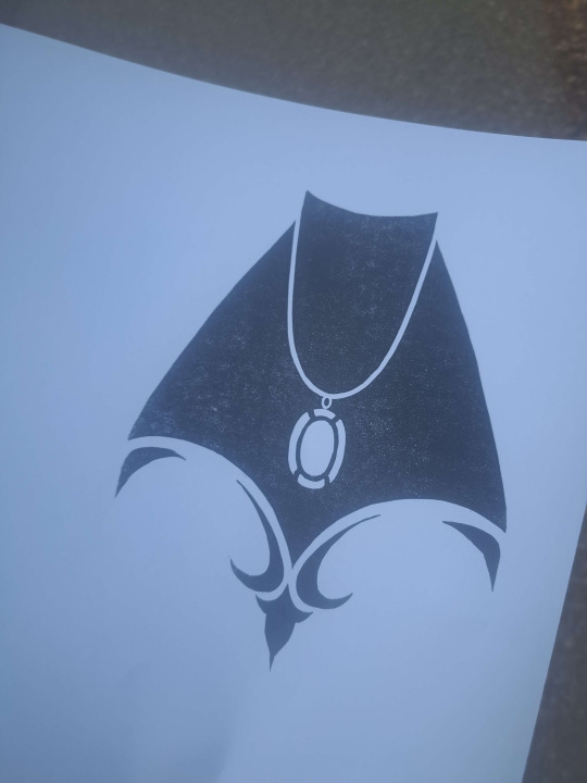
the final stretch!!!! it was at this point, when i realized that the size i'd carved the linocut at would be too wide for the half binding case i had planned. improvisation time. i decided to switch from a regular case binding to a three piece bradel. i have only done case bindings and stab bindings at this point...and with only mild panic and stubborn hubris to fuel me, i went for it. i had already attached an oxford hollow and cut my boards, but it probably wouldn't make too much of a difference! fuck around and find out!
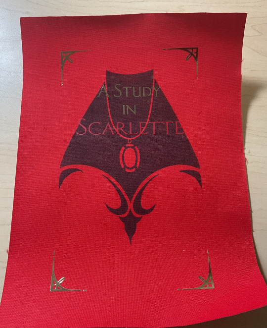
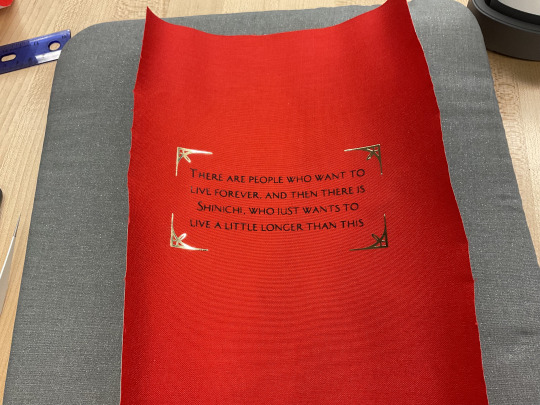
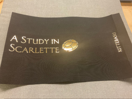
cutting the cloth and adhering the htv. the summary on the back was HELL to weed, and some of the letters ended up crooked. i should've just printed it letterpress, but i was running out of patience.
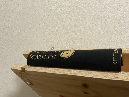
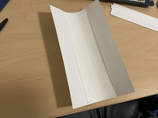
i followed DAS bookbinding's tutorial on youtube of his in-boards three piece bradel and the part where i had to tuck in the spine cloth in between the hollow was definitely the trickiest, but it went okay in the end!
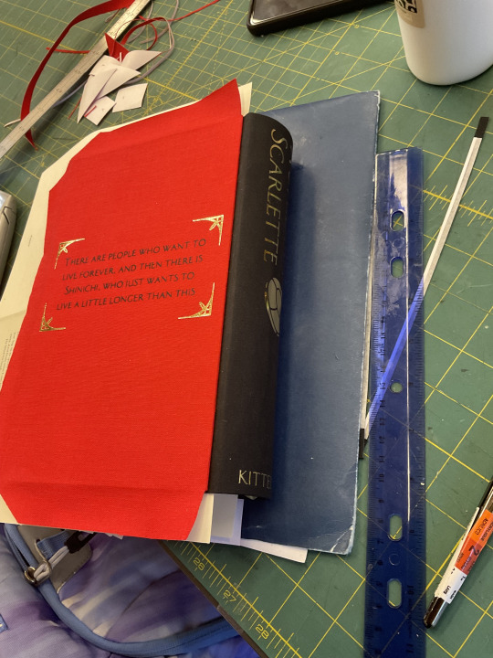
after attaching the boards and gluing down the endpapers i was finally done!!!! after months and months of the unfinished textblock guilting me from the corner of my room, it's finally finished! fancy pics coming soon!
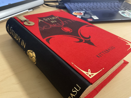
i learned SO MUCH from this bind, sanding edges, painting edges, linocuts, multiple colors of htv, oxford hollows, and a whole new style of binding....yeah. it was a ride! thanks for reading to the end!
#process#wip#in progress#a study in scarlette#for the amount of new stuff i was bullshitting through i cannot believe i did not make any huge fuck ups#one of the gold corners isn't mirrored#and the edge painting isnt perfect#and the spine got a couple small wrinkles#but honestly those are all pretty minor
84 notes
·
View notes
Text
So I’ve been into bookbinding lately (thanks, adhd randomized hyperfocus) and have wanted to try my hand at binding a novel, instead of just blank books. But, alas, I have not written a novel and didn't want to do a collection of short stories. Plus printing and binding my own stories feels, I don't know, kinda weirdly egocentric.
Then I read @applecrumbledore’s Pine sweat and fell so in love with it that I asked Roni if I could bind their story into a book. I offered to make two copies and send them one. They graciously agreed and I set out on a months long slog through learning typesetting and figuring out the logistics of printing a book.
I had to pick the right paper (went with a 24 lb 100% cotton in ivory), the right fonts, find the right leather and fabric for the quarter binding I wanted to do, and find a coordinating endpaper.

And figured out how (and where) to print it.


Finally had two copies printed! Now onto assembly...
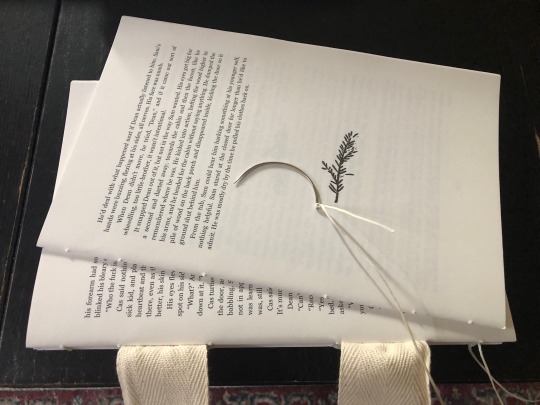

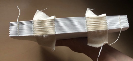
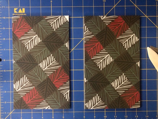


So once I had my copy done, and figured out what I was doing, it was time to move onto the author’s copy…
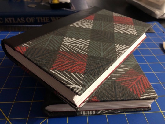
Done! So much better than the first copy (hooray for learning as we go). Mistakes I made that I fixed for the author's copy...
As I was sewing the 2nd copy together I realized that I'd double printed one of the signatures and, sure enough, my copy has pages 155-174 twice... *sad trombone* But I caught the error in time so the 2nd copy doesn't duplicate any pages. And luckily I didn't accidentally skip any pages, that would have been a much more upsetting problem.
On my copy I'd tried to trim the leading edge of the pages, but I don't have the proper tools to do it so I butcher the edge. This is bugs me, but I took it as a learning experience and my copy will serve as a reminder to not do that again.
I cut the case boards a little too small on mine, adjusted on the 2nd copy and they turned out perfect.
I didn't get the end papers lined up quite right on mine, and although the front end paper creased weirdly near the spine on the 2nd copy, it still looks so much better that it's an acceptable flaw.
All in all, this was a really positive experience and I'm still riding the creative high that comes from making a thing that is, frankly, beautiful. Now I want to make more, I just need to find a better way to print since I don't think my work would appreciate me printing smutty fan fiction on their laser printers 😬
September 7th, 2023 - I mailed @applecrumbledore the second copy today and it wasn't lost on me how fitting it seemed that the mid-Atlantic region, where I live, is having a heatwave (high of 93ºF/34ºC today). But I'm not posting this until they receive it, so as not to spoil the surprise of the reveal, so maybe, things will be cooler then.
Sept. 14th, 2023 - It arrived! Happily in good condition. And it is cooler!!! Not as cold as the end of the story certainly, no blizzards anytime soon (I hope) but only 66ºF/19ºC at it's destination. So it's cracking me up that the book's journey took it from sweltering heat to cool-ish temps sort of like the story.
122 notes
·
View notes
Text
Fool in the Moon binding
All right, time for a successful binding post, how about that? This was for @arahir's amazing work, Fool in the Moon. As you can probably tell by the rest of my feed right now I'm a little obsessed with Trigun at the moment (it's okay, it's normal, I feel normal things about all of these people, I'm not obsessing and listening to the soundtrack 24 hours a day, I haven't watched the whole thing twice in two weeks, all of my targeted ads on my computer aren't about plants right now, I'm fine) and suffice to say this story was just an emotional gut punch. It's so good, you guys. Go read it.
Anyway. The binding.
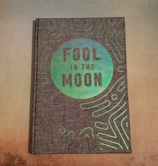
This was my first time using holofoil vinyl, and it turned out AMAZING. Look how pretty it is. And the color change in the light is just crazy.
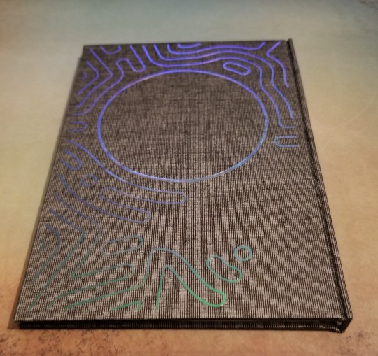
Here's the back. Sorry I don't know how to make a gif, or I would totally show you guys how it shimmers and ripples. At certain angles it's green, blue, purple, orange, sometimes you can get it to be all of those at once, it's a really neat effect.
Also, I love the effect it gives when you open the book up (hard to do once it's bound with the textblock, but doable. This picture was taken before I cased in).
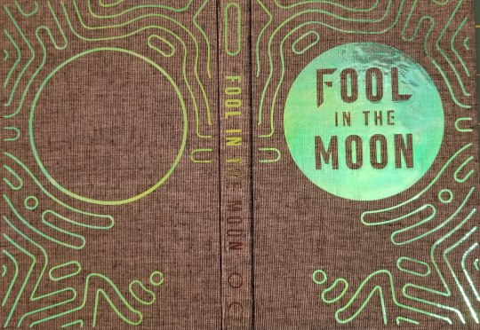
You have to squint your eyes a little but it's supposed to be reminiscent of Vash's sunglasses, and the way (spoilers? maybe?) his face looks when the plant lines come out. I think it's just the super neatest thing.
Here's the endpapers and the title page:
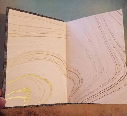
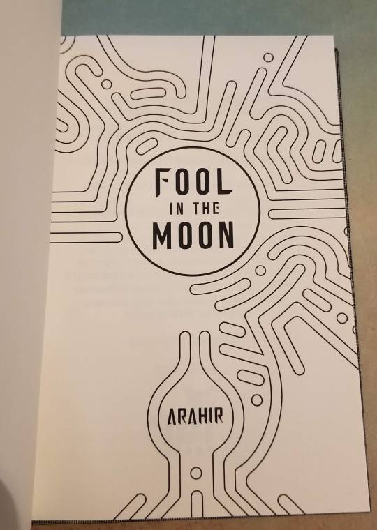
Isn't the title page just the coolest?
And here's a pic of some section breaks:
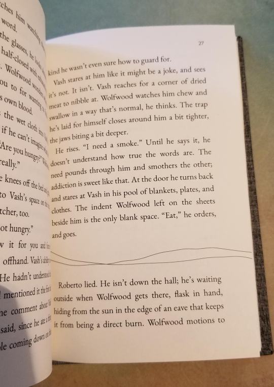
I just made them with the draw tool in Libreoffice, I wanted it to reflect the lines of the endpapers and maybe (?) look like dunes. Either way I think it turned out really great. I kind of maybe wish that I could have incorporated some of Wolfwood's imagery into this, but the design pretty much made itself and I'm super happy with it. Plus at the end of the day everything is about Vash, isn't it? He's Vash the Stampede! (I'm not crying YOU'RE crying!)
Anyway, I figured out the reason my previous book was so crooked was because my guillotine is messed up. It can't cut straight (which is...kind of the point) but it does okay on smaller works like this. So this one cased in very nicely. I used the 5 mm gutters again, and duo bookcloth (magpie I want to say?). The cricut vinyl came in a sample pack and unfortunately didn't come with a name (the sample pack was called Berry something), but it's very similar to Siser's Rainbow Pearl HTV, which is what I used for my copy. Once again the siser was a pain to use, with little bits flying off everywhere and wanting to wrinkle underneath the iron. I don't know why I keep buying that brand. But it worked in the end, and the effect of the holofoil is so cool I'll probably use it again. Endpapers are from Mulberry paper, I love those guys so much.
Let me know what you think! And if you have any questions please feel free to ask, I could talk about bookbinding stuff all day!
#fanfic bookbinding#fanbinding#bookbinding#trigun stampede#vashwood#ao3 author#fanfic#I'll get over that Trigun finale some day#but it won't be this day#my binding
152 notes
·
View notes
Photo


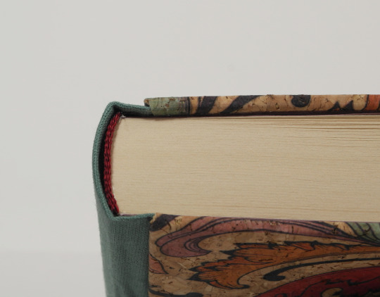
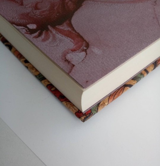
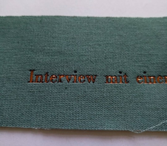
Interview mit einem Vampir - details
Here are some detail shots of my latest re-bind. I worked with a couple of unfamiliar materials and lets say, I made a lot of new experiences.
I already mentioned in the WIP posts, the book cloth was self made. I pre-washed the cotton fabric and used thin paper and wheat paste glue to back it. Sadly the wheat paste was not strong enough to hold firm at the hinge. This I only found out after it was completely finished, when training the book. (naturally it shows on the front side of course).

I considered taking a syringe and injecting some glue into the loose pocket, but finally decided against it. The loose cloth there is an aestethic flaw, not one of integrity. I’m fairly certain I’d end up with glue stains pressing through and still some loose cloth if I tried it and decided to save me the pain. As for the self-made cloth, I’ll see how the next book turns out before making more bookcloth now. See, how the different fabrics are to work with first.
The cloth also gave me quite some trouble when hot stamping the title on it. Originally I planned on titling in copper, but for some reason the foil would not adhere to it. I increased, pressure, temperature, stamping time, but nothing got me satisfactory results. Then I tried stamping in black and that went without any trouble. On the first go I got crisp and clean lines with no blank patches at all.

I considered getting creative and use the black as a base colour and simply stamp copper on top (usually that actually works). It did not work though. The copper still came out mostly patchy

It has a certain grunge look to it. But I decided against it in the end.
As for the corkcloth. The turn ins were a bit of a hustle to glue down, but I’m quite satisfied with the result. It gave me no crisp edges, but they do look clean and neat, no air pockets under them and the corners turned out really well, the fix is even hard to see when knowing there is one. Also the cork feels like it’s really lenient when it comes to stains and, something I like a lot, it has a warm feeling when holding it. Even leather feels cool in comparison.
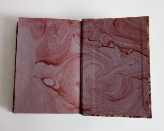
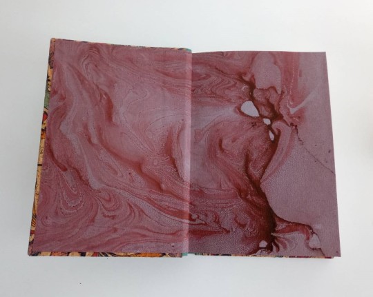
Lastly, I noticed I didn’t even show off those endpapers. I had the hole sheet sitting in my stack for years now and never knew what to use it for. When I made it did not consider it a success, simply for the large blank patches and the brownish red colour that looked a bit weird in contrast (this was another ‘hm I imagined that to turn out different’-moment). The blank areas don’t even look like there’s something lacking here though.
#bookbinding#re-binding#three piece bradel binding#interview with a vampire#marbled endpapers#details#self-made bookcloth and its troubles#hot stamping troubles#endpapers
42 notes
·
View notes
Text
Process - or really Nic doing random shit and hoping it works
Recently, a few bookbinders have been describing their creative process and i love how aspirational and amazing they are. these people are amazing, my friends- they come up with so much cool shit in the setting of their home, with things they have on hand, and it shocks me at how great these bookbinders are.
i think comparatively, my process is fairly simple (i.e. chaos gremlin), and I've decided I'd like to use a previous book i took process pics of as a general outline as to how i come up with what i want to do.
My first step is usually to fixate on a particular design element and move on from there - this is usually a chapter font or an image header or a cover image i’m interested in using, and then moving on to putting things together to form something cohesive. most of the time i have to see how it’ll look visually before i can decide, which does make choosing design elements challenging and hence made me a little into a pantser (despite being an asshole who likes to measure things). half the time, i change things like endpapers or endbands or colour of bookcloth or even the whole freaking design right down to the wire because i just won’t know what will work until i can see it.
To make this a little fun for me, I'll outline the general stream of consciousness (let's face it, it’s not that much of a process, I just think things and sometimes a book happens) along with 45% of the foul language that accompanies it when I try new things with books.
(Please be aware that I am 90% made of foul language and i sometimes frequently blaspheme like a sailor)
See below for thought process, process pics and much swearing.
Day 0 minus 14 - Ok, let's be smart about binderary, shall we? I have a week of leave in February, let's make it count... Proceeds to prepare 10 typesets with 2 ready-made ones and then an additional notebook for a total of 13 books for Binderary. Ooh boy. Yeah, that’s achievable.
Day 1:
Attends queercore workshop at 0630am in the morning. Fuck, am I sleepy. Did I succeed in making a book? Not really. Okay, let’s fudge it. Converts glueless notebook with nice stitching into case bind. Convenient gift for mothers day - booyah, 1 gift done.
Oh hey. I have a thing. What about the Oh Mercy // Oh Love book. Hmmm, I have a nice image for this that I didn't use for the typesetting. Wonder if I can stitch it.
20:00 hours: Oooh, Neenah Illusio Laser paper - it looks so shiny. And Metallic. Very circuit board-y. Just what i was going for. Is it a paper? Is it cloth? I have no fucking idea. Hope it takes foil alright.
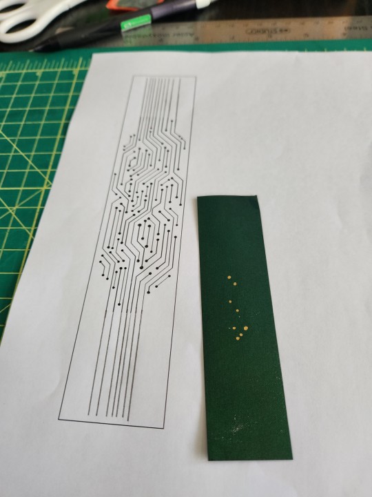
20:30 hours: Ooh ok, success - Jesus that's a lot of holes to poke.
Day 2:
Okay, procrastination. Gotta make a case.

JEsus i hate the turn ins and THE SPINE DFJKLSDFKLJ;SDF;LKSDF paper why you gotta do me a dirty?! Stiff and crinkly!!!!
17:00 hours: okay, case is nearly doneish.
Time to use foil quill to outline the holes to give it that soldered look and then do all the hole pokery. Dinner first.
19:00 hours: Dinner sorted. But like you know, let’s do some hammering with an awl in an apartment complex and pray none of the neighbours complain.
Shit these holes are small.
22:30 hours: I might finish this by Christmas, maybe.

JFC i am collapsing under my hubris. THE FACT I THOUGHT I COULD DO THIS. Oh god @&£#'€¥ what possessed me to try this - oh I know, I thought it would look cool (90% of why I do things when I make books).
Go easy on the thread - do not rip it through the space between two holes. JESUS FFFJB;N;KLGH CHRIST WHY.
Okay I can do this. I can do this. Stitches for 4 hours and nearly collapses.

Stitching is done!!!! Hmmm design looks a little plain. And awww shit you can't see any of the gold around the holes anymore. Okay let's try going over it in foil quill again.
00:30 hours: OH FUCK OH FUCK WHAT A FUCKING BAD IDEA.
Jesus djdjsbsbdjdsbdbddnc * MAKES MISTAKE and adds dot of gold on the side of a hole, plainly not in the hole*
Frantically googles ‘how to remove we r memory keepers heat reactive foil from paper’
Tries to remove it with an eraser and tape as per google recommendations- but removes a fuck ton of the green colouring on the bookcloth as well. JESUS.
I am ready for death.
Day 3:
10:30 hours: Okay I am ready for a new day. Am I really ready? Unclear. Time to weed the shit out a fucking complex design and go blind in the process.
12:30 hours: Ok fuck, that only took 2 hours.
But oh shit endbands and glueing of the spine. Time to do some glueing. At least it’s somewhat therapeutic. Jesus my endpapers and mull are still not on.
14:00 hours: On to the case it goes
14:30 hours: Time to do some HTV application
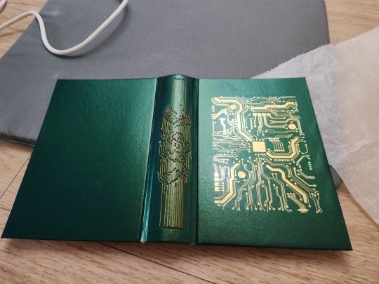
Fuck why isn't the HTV sticking JESUS cricut is an evil corporation out to take my money and yet I did not want to use Siser HTV today because I Was Not Ready for Death and Ruination.
Proceeds to iron for the next 1 hour.
16:00 hours: Fine it's finally fucking on?
Is the spine done? Hmmm. that little blemish isn’t covered. Should I cover it? Ugh.
Cuts out little squares of gold foil - but it looks foul. Okay, nope, not good.
Fuck I need a nap. Somewhere along the way, spouse comes home. Dog has been fed. My job is done.
Naps for 3 hours just because.
20:00 hours: Okay moment of truth. Time to case in. Book is gonna be held together with glue and prayer. Shit why do the squares look so small- fuck it's because there's some stitching on the spine so I can't push the textblock all the way in. I DID NOT PLAN FOR THIS EVIDENTLY. please do not stick out please do not stick out please do not stick out
20:30 hours: hallelujah it is FINE - into the press of a million books it goes
So that was a wild ride-- i wish i could say i exaggerate, but this is how it is with me tryin’ to do a book especially when trying new things i haven’t previously done before. Will a book happen? Sometimes I don’t really know.
#bookbinding process#or just me being a disaster#you know#renegade bindery#fanbinding#bookbinding#oh mercy oh love#my books
69 notes
·
View notes