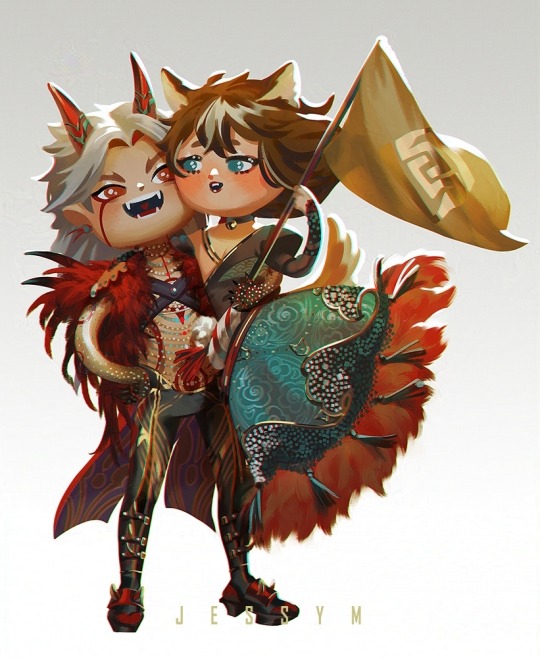
#took some liberties with their designs hehe
Text
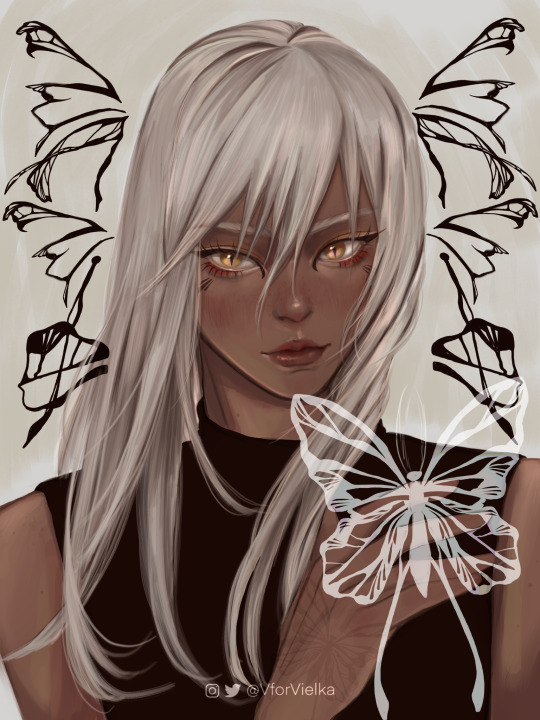
metamorphosis 🦋
#trigun#trigun maximum#zazie the beast#zazie#my art#illustration#portrait#another (more recent) zazie drawing!#took some creative liberties with their eyes bc i thought yellow eyes looked cooler in this version of zazie hehe#very pleased with the typography i designed for this one#hopefully it reads as zazie lol#lmk of yall want the whole alphabet i may or may not be considering making it c:
245 notes
·
View notes
Text


its wangxian valentines day !! theyr on a date <3
#mdzs#wangxian#忘羡#mo dao zu shi#mxtx fanart#魔道祖师#wei wuxian#lan wangji#their fits r based off that official modern wangxian design although i took some liberties in the design hehe
204 notes
·
View notes
Text

Gem gem gem :D 💎💎💎💎 took some liberties with the design hehe
#geminitay#geminitay fanart#hc 10#hermitcraft 10#hermitcraft fanart#mcyt#mcyt fanart#rare sketchbook#ha sooo much fun with this!!! :DDD
150 notes
·
View notes
Text


Did my own designs of some Sonic characters just for fun! I might use it in the future when I make other Sonic art, just for myself hehe uvu
The original sketch I did is under the cut as well as some description and explanation for different details! Hope you like it ^^
I tried to make them look more fitting for their descriptions and professions. For example, Tails is a mechanic/inventor and flies on a plane, so I wanted to give him goggles and tools.
I also wanted to give Rouge more comfortable yet still cool and stylish clothes, without over-sexualising her. It still fits her kind of spy-ish persona.
I made Silver look more futuristic/cyberpunk looking. He already looked like that, but I wanted to elevate his style a little bit.
I did the same with Sonic and Knuckles, where I just kind of elevated their original designs (and got rid of the horrendous shoes Knuckles had, jesus christ).
I gave Amy a bit more comfortable-looking, yet cute dress. I already love her outfit, so I just changed a couple of details to make her look a bit more unique.
Shadow got a punk rock/goth kind of treatment, where I wanted to make him kind of a more extreme and dark version of Sonic with tall boots and piercings.
I took all the colors (mostly) from their Sonic X designs (yes, even the colours from Knuckles horrible shoes were interpreted into the design) and tried not to deviate from them too much. I diiiidd take the liberty of changing the skin tone of some of the characters and making the colours a bit less neon, coz they hurt my eyes ahhaha. Plus, I just put my own head canons into it hahaha.

#sonic the hedgehog#sonic#amy rose#tails the fox#miles tails prower#knuckles the echidna#rouge the bat#shadow the hedgehog#shadow the ultimate lifeform#silver the hedgehog#character design#redesign#character redesign#trans sonic
46 notes
·
View notes
Text

hello hello helloo lovess! Carnaval is gone, but today I bring 2 arts I did for a dear friend freyja a little while ago of GI characters as mestre sala and porta-bandeiras, the standard-bearers of brazilian carnaval parade, wearing attire based off their og outfits from genshin but still keeping the og shapes for carnaval -and performing some traditional steps (your spin turned into being lifted gorou. You're too short! 🤣).
It was quite fun to design these! I was a bit torn on what to put on their flags because originally, the bearers showcase their school/group's flag for the competition. But then it occured to me both chs on each pic had the same element, so element flag it was! For gorou I took some liberties in adding some of miss hina's elements bc they are pretty! hehe
Between geo and dendro, who do you think would have the prettiest parade?🤔
#gi#haikaveh#ittorou#kaveh#alhaitham#itto#gorou#carnaval#my fave detail on these is actually the pattern inside itto's outfit there#I thought it would be too plain without anything#but then I remembered he has some patterns going on and they fitted like a glove!#another fun thing but abt haikaveh is that birds are part of their elements#and flag bearers often wear bird-like feathery shapes too#so I was sure to include that for them hehe#and for itto I used a drum queen's outfit for reference! she looked gorgeous in it and it fit him#so why not! hehe
78 notes
·
View notes
Text
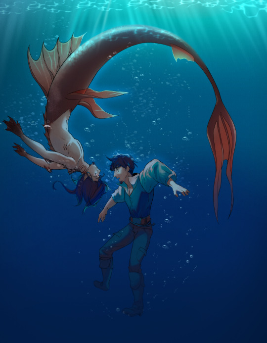
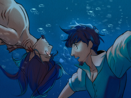
"You must have a death wish, human. or Perhaps it is as they've said, that humans are weak willed to fall for our beauty on sight. Is that why you're here? Have you fallen for me, human?"
-Rip Tide: A tale of changing tails
I decided to make a small piece for Mermay! Although it's based entirely on an AU Meta created (In fact, the little pharagraph of above is an excerpt from the fic she plans to publish, well, someday hehe).
I took some creative liberties with Scriabin's design, but I think it turned out well :3.
Although the AU was created by @metamorphmigus, Scriabin still belongs to @zarla-s
#scriabin#vargas#edgar vargas#zarla-s#digital art#Working on this was a new experience!#And I actually worked with a limited color palette hehe#so that was something new.#and I really had fin with some brushes to make a watery effect :3
383 notes
·
View notes
Note
How do you feel about the BMS Hev Suit? It's my personal favorite design out of every appearance but I can see why people would be upset with the creative liberties Crowbar Collective took with the design.
-LHLP
OHH this is such a good question to get in my askbox... one that immediately made me boot up Black Mesa so i could get screenshots to answer with. im smiling. im grinning

it's probably pretty easy to figure out that my favorite model is the one from the PS2 port, & i think i knew from previous posts on your blog that the BMS suit was your favorite. i love Black Mesa (2015) as a game but sadly, and im very sorry to say it, i do not love the HEV suit from that game :'] it has qualities that i like, but overall it misses the mark for me!
oh, that was an accidental pun. misses the Mark... like the Mark IV HEV suit. hehe
i'm going to put the rest of this post under a read more... i don't say anything suggestive under the cut unless you count like 1 very tame passing remark about the Mk V's hip plates. but this is quite a long and rambling post because i think about the HEV suit so much & want to be in one so bad & have taken a costume visual development class so i ended up having a ton to say ^_^ !!!
i think i was a tad biased against the BMS suit from the beginning when my good friend who started playing Black Mesa before i did pointed out that it looks less like a Mk IV and more like "a modified Mk V." i think it was right on the mark with that comment, and that's probably the source of most the things that irk me about the suit


pictured, in order: HL1 suit, PS2 suit, HL2 suit, BMS suit
i know the HL1 and PS2 renders being in 3/4 view while the HL2 and BMS suits are viewed straight on is unhelpful since this is meant to be a direct comparison, but i'm getting these images (excluding my own Black Mesa screenshot) from Combine Overwiki, which doesn't have a 3/4 view for the Mk V or a front view of either of the Mk IVs!
when you look at them all next to one another, it's pretty clear how the BMS model uses the Mk V as a base as opposed to upscaling one of the Mk IVs or creating one from scratch based on its prior iterations in games and promotional art. i have nothing against the Mk V, but the Mk IV is my true love. to me, the BMS suit is like the Mk V with a Mk IV coat of paint.
however! i do want to rattle off a couple things i feel the BMS suit got super correct. the accordion joints look exactly as they should. they're all the same color (it irks me a little in the HL1 model and promotional art when some of them look more copper/red while some of them are black), and they're present on both the elbows and torso where they belong (HL1 doesn't have them in either area and PS2 is just missing accordion joints on the elbows). i adore how and metallic they look in the PS2 model, but it raises some questions about what material they're made from and whether such a material would actually be both flexible and durable. in BMS they look like they're made of a tough synthetic fabric, and that makes perfect practical sense.
and, really, i have to stress that none of my complaints matter all that much, because Black Mesa positively nails what is objectively the most important part of the suit: the gloves. after the HEV suit's introductory scene and all the way up until Xen, you don't see any part of it but the hands and forearms since the game is in first person. and the hands and forearms are perfect. i don't think the player character's hands have ever looked better in a half-life game. incredibly nice to look at, i think.

it knocked those elements out of the part. sadly i have a bunch of nitpicks about other aspects of the design which don't appeal to me as much as the other iterations of the Mk IV!
most of the areas that were shiny and silver in the original Mk IV have been replaced with a black material that has a more matte texture. it could very well still represent metal, but it's always looked to me more like hard plastic or vinyl. i really like the appearance of the Mk IV's shiny metal parts, probably because i love the texture of metal in real life and it looks like it would feel so so so nice to touch. the change of material is a downgrade for me :[
additionally, some of the elements which felt really three-dimensional in the PS2 model look flatter in the BMS model. i liked all the visible grooves and seams of the PS2 model. by comparison, in Black Mesa, those details either look sanded down or are entirely absent. i think this is most evident on the lower half. the vents on the outer part of the thigh plating take up significantly less surface area, and they also look quite a bit flatter. the boots are missing all the detail they used to have, without even the orange plating on the top of the foot. it just... looks like it'd be less fun to run my hands along, because there's fewer unique textures, fewer seams you could trace with your fingers.
the control panel... it really is just slapped in the empty space left under the lambda logo in the Mk V. i love the way the buttons are set deeper into the chestplate in the PS2 model. In BMS, it's level with the rest of the chestplate and has raised buttons. seems like that'd make it easier for them to be pressed accidentally, which would pose some practical problems. and the black and silver part under the control panel... there just isn't any basis for that in any of the art or models of the Mk IV except possibly in the HL1 promo art of Gordon Freeman if you squint.
i find the level of detail in the greaves kinda disappointing, but to tell the truth, i don't think i like the lower legs of *any* of the suits, so now i'm not even truly complaining about a problem unique to the BMS suit. the ideal HEV suit greaves exist only in my mind. the two silver pieces in the front, though... i really think they need to be interpreted as some kind of closure, or else they're just purposeless greebles. on the Mk V, the function of these metal pieces is not evident based on their appearance, so that area ends up looking confusing and visually cluttered. this is carried over almost 1:1 to the BMS suit. every HEV design kinda breaks down when you think about how it would be put on and taken off, but looking at the front of the greaves on the Mk V and BMS suit *really* reminds me of the fact that this armor just does not make a lot of sense
lastly, i think this is probably a less a popular opinion, but from a design standpoint i do prefer what i've heard people refer to as the "metal diaper" situation in the HL1 and PS2 models over what the BMS suit has going on down there. essentially, they've stolen the Mk V's love handles and then put a sort of rounded flat piece over the groin area that has always felt out of place to me. it doesn't speak to any other part of the design; it's not echoed in any other area/element (which is the same gripe i have whenever a suit design's accordion joints aren't consistent).
i think that's most of if not all my issues with it! to be honest, i really don't think i *have* seen a perfect HEV suit model in any official or unofficial Half-Life game. i'm in love with the PS2 model, but i still think there's things wrong with the greaves on that one, and none of the suits has any visual indication of how a wearer gets in or out. a lot of my dislike for the BMS suit in particular is because i'm a massive fan of the Mk IV, so to see a suit that purports to be the Mk IV when it really has more in common with the Mk V is a disappointment. like i said, though, you really don't see much of the suit in-game, and the gloves are spot-on, so the model achieves the main goal it needs to achieve. i just can't get into it as much as i'm into the PS2's Mk IV.
i hope this seems fair and wasn't much longer of a reply than was warranted :'] i don't want it to seem like i'm trashing your favorite suit design, LHLP, because i can still see the things you like about it even if it doesn't resonate with me! anyway thanks so much for the ask because i really enjoyed getting to answer it. i hope you have a good one!!
22 notes
·
View notes
Text
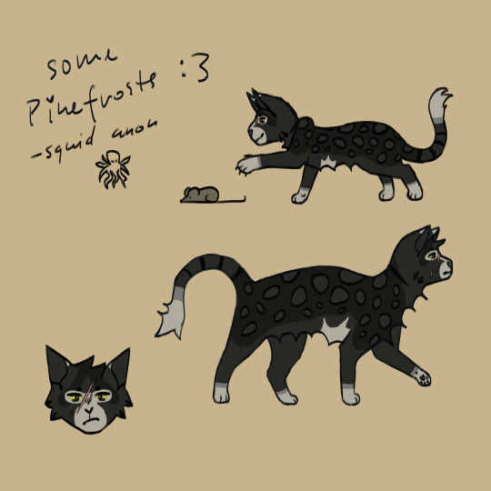
soo i am the number 1 pinefrost fan, and doodled some pinefrosts. you don’t even know how autism i can be abt the lil bg autism guy.
this is fanart for @fallenclan ! :3
i hope you forgive me the liberties i took with his design lol. also i forgot to mention this earlier, but i was actually the one to see his sprite when he’d just been born... pinefrost stand since birth, so to say. hehe
- 🦑 anon
#ignore that his head is way too big in the upper right one#i noticed wayyy too late#i struggle with head:body sizes anyway#a.art#fanart#cat#pinefrost fanart#fallenclan fanart#art
59 notes
·
View notes
Text
meh screw it reposting stuff from instagram GO


Fanmade Zelda totk species: The Mogora ("Mogora" kinda referencing the Mogma from Skyward Sword and the Japanese word for "mole", but slightly tweaked). I based these guys off of those statues in the depths with like... zero explanation. I took some creative liberties here and there (like the rat tail) but otherwise, I tried to stick to the statue's design.

Below is just stuff from my notes app hehe I'll detail character info and species headcanons
Character info - from top to bottom


General headcanons


#botw oc#loz totk#zelda totk#totk#loz#legend of zelda#legend of zelda totk#tears of the kingdom#original character#zelda oc#my ocs#oc art#headcanon#breath of the wild#age of calamity
27 notes
·
View notes
Note
Hello! I come bearing a request for the drawing challenge; your art is always incredible, and I wanted to see you try one of these! >:3 /nf
If you'd like to try this, and have heard of them, perhaps ToonHLVRAI Salesman in 2A and the palette "coconut mall"? If not, then HLVRV Doc in 4F and the palette "yo-yo" works just fine!
I hope you have a good day! Please remember to get some water and treat yourself, friend!
THIS IS SUCH A SWEET ASK Thank you! ToonHLVRAI is actually one I haven't gotten to reading yet, but the designs I've seen for it are SO cool, so I drew you a little Salesman anyways hehe. I took a few liberties with the expression because I wanted to show off their cool eyes, BUT!!
BEHOLD!

#m scribbles#m asks#ToonHLVRAI#ToonHLVRAI Salesman#I'll be taking this as a formal recommendation to go read that blog now. and by now I mean later BUT STILL#Scrolling for references it looks SO cute. and again THE DESIGNS!#Can't wait to see what that one's all about!#I also spotted the updated Salesman design while I was looking around and MAN. They look SO COOL! Buuuut since you picked the blue palette#I figured you were looking for the blue design haha. So the blue one it is!#Also giggling that your second choice was Doc. Tumblr people know me far FAR too well hahaha. I gotta share the attention sometimes! I can'#JUST draw Doc. AND YET. Every single time I do one of these. /silly /pos
12 notes
·
View notes
Text
【WATGBS AU】 IdaTatsu 🖤🤍❤️💙


【WATGBS AU】 IdaTatsu 🖤🤍❤️💙
Recent doodle redraws of IdaTatsu 🐬🐟
Homicidal oreo x magical oarfish wifey! 💘💘💘
Idate the oreorcat 🐈⬛🐬
Idate wears blue eyeliner to match with Tatsumiya's red eyeliner and because her favourite colour is ultramarine blue (群青色, gunjyou iro) 💙❤️
Matching couple eyeliner! 💗💞 I initially gave Idate blue eyeliner just cuz I thought it'd look nice since I chose blue as his theme colour to be the opposite of Tatsumiya...
Idate's theme colours are black, white, and blue 🖤🤍💙 Orca colours and blue
Tatsumiya's are white and red 🤍❤️ Oarfish colours
Takama's are black, white, and purple 🖤🤍💜 Purple, the colour of Poison... hehe.
Oh and I updated the shape of Idate's dorsal fin and his eye patch markings on his hair. Cuz I imagine Idate to be a Bigg's (Northern Hemisphere) Transient Orca (which are often seen near Japan too) 💗
I was trying to balance getting a good shape for his eye patch markings that look close to how IRL Transient orcas' markings look, and good shape language. So I took some creative liberties.
My fave animals are cats and orcas~~ Due to this God forsaken AU /pos
I gained a hobbyist interest in studying orcas and collecting orca plushies 🖤🤍
But the fact that ultramarine blue is Tatsumiya's fave colour makes my colour choice for Idate's eyeliner such a big brain move (all unintentional too) 🥰
Redrew the Idate and Tatsumiya doodles a bit.
Idate has darkened black gradient limbs since he's a demon, but I'll draw that later
My lines and line weights improved a lot since 2023 hehe
I mainly just redrew the face for now (adjusted the eyes and nose and mouth slightly) since they didn't really need major fixes
Oh and I fixed the alignment of Idate's earrings. He wears star and black sun ones (shaped like pointed void spirals), like a black Sun with pointed ends.
I'm planning to give Tatsu star and moon ones so they can match as the Sun/Moon themed couple.
My leitmotif/symbolism choices with them are intentional to match with the story in our WATGBS AU and to give them accessories that represent the other that they're connected with in their designs
I'll redraw the rest later 🙏
#watgbs#watgbs au#watgbs au cotds#idate#wadanohara and the great blue sea#idate orca#idate (watgbs)#idate x tatsumiya#idatatsu#tatsumiya#tatsumiya (watgbs)
4 notes
·
View notes
Text
Artfight 2023: Recap
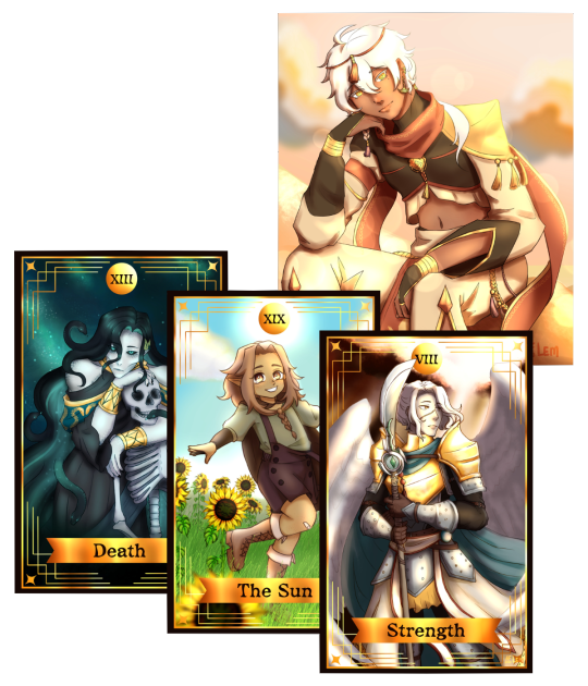
just sharing this year's artfight works and some thoughts on the character and my process in an attempt to start talking more (i should really work on my social skills 💀) please read it if you're interested 👉👈
[character || owner] *owner's names are the ones on artfight
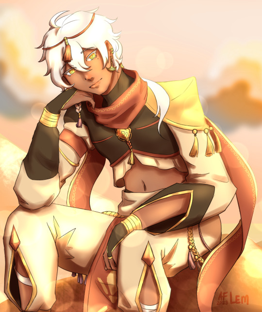
Xenith || lemonteaaa_
i have had this character bookmarked since last year and wanted to draw so bad, he just looks so cool like he can actually be a canon character in genshin, i just had to draw him! i loved reading about him and the entire time i was lowkey brainrotting about how this character would actually be in game.
i took inspo from the official genshin character birthday arts and i think i did a pretty good job. it took me so long to actually finish this one and i worked on it on and off since life was getting busy too. my hands hurt so much drawing all the details but omg was it worth it.
Briorsena || Tarphi
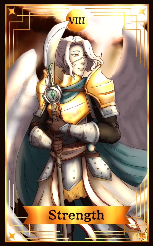
also a character i had bookmarked last year and actually planned for a mass attack but that was a bit out of my skillset so i thought of a different approach and i loved her knight vibe so i thought of this dramatic portrait thing then i blacked out and suddenly its a tarot card lol
the character is so cool and detailed, it was also pain for my hands and the armor was a struggle but i had to do her justice. especially her weapon! i loved the design of it it looks so epic!! although i wouldve loved to know more about the character and her story. aksfdl i love lady knights, so cool
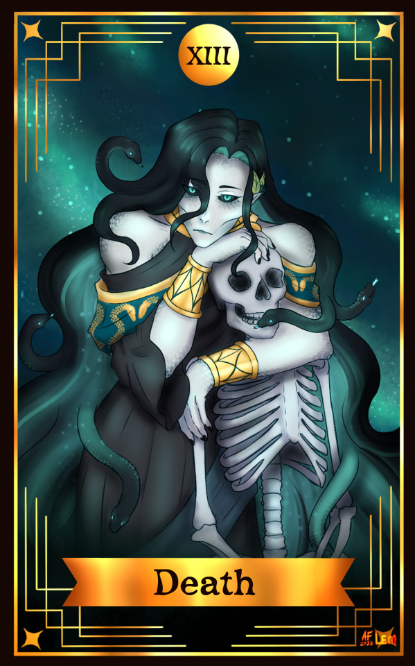
Euryale || WitchyTwink
the next target is a friend's and oh my god is the design so cool, the medusa vibe and glowing galaxy hair is my favorite elements. its the perfect character for the death card.
the hardest part was the skeleton and i was mentally chanting to myself "it doesnt have to be accurate, it doesnt have to be accurate" while i slowly go insane with each rib. but i had fun drawing the sneks and making everything glow and stuff. although i think i made it look more underwater than galaxy now that i look at it again hhhhh
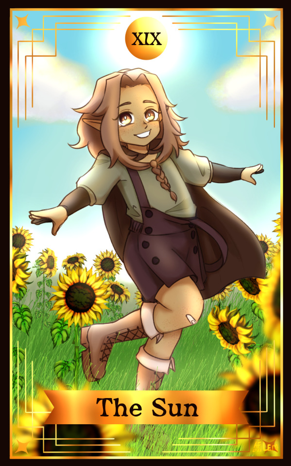
Fern || gluecats
the cutest lil bean!!! shes so adorable!!! it took a bit of thinking of which she fit in but the sun is perfect. her design is so simple and cute but i took the liberty of changing her outfit a bit. i also love her unique hair braid! i wish i gotten to know this character more but alas
i took a shot at doing some backlighting but i think i still need to work on that hehe... also the sunflower brush saved my sanity because if i had to draw and paint each flower i wouldve cried (thanks to poobit who made it! there are some bits where the brush kinda did an oopsie and i only now notice it)
other thoughts:
i really liked the idea of the dnd tarot card themed attack so i will be doing this too for next year's artfight! i will keep on doing these until i've completed the major arcana! so please look forward to that!
i would think i gotten better at art this year but only a fraction since i havent gotten to draw in a long while and i missed doing this full illustrations and i think i want to do more!
life was a bit busy this july with graduating and other stuff so i only got to do 4 attacks (and a 5th one i didnt get to finish so hopefully i can attack it next year!)
if you've read this far, thank you so much!
i am on this whole self-improvement thing and one of those steps is getting out of my shell, i really need to be more social so if you're still reading, drop a comment or message me cuz i'd love to make more friends and moots on here <3
6 notes
·
View notes
Text

Soukoku in a car... probably
#it was supposed to be a quick sketch#how did it end up being 7 hours#took some liberties with their designs hehe#soukoku#dazai osamu#chuuya nakahara#bungo stray dogs#bsd#my art hehe
62 notes
·
View notes
Text


LU Linktober Day 13: "Dark"
~
Commission Info!!
#linked universe#linkeduniverse#linked universe fanart#artists on tumblr#lu dink#lu dark link#dark link#I TOOK SOME CREATIVE LIBERTIES ON HIS DESIGN BC I HATED HIS SWORD BELT THING AND GLOVES IN OOT#pose was inspired a lot by the cover art for deco* 27's vampire#GO CHECK IT OUT IF YOU HAVEN'T YET ITS SO GOOD OMG#my art hehe#legend of zelda#lu linktober#botw#neck is way to detailed oueuf
940 notes
·
View notes
Note
Quick question: in your Kaz/Pyre design, is the tailpiece/draped fabric in the back attached to his jacket or the suit?
Love your art, by the way! The Mighty Med (re)designs and your OCs!
Aw thank you!
To answer your question, it goes under the jacket and attaches to the suit! To not answer your question because I like talking about designs too much, Kaz is actually heavily based off Solar Flare! Me and @sandersauce came up with a hero costume concept for Kaz sometime in early 2021-late 2020, and I drew it!
Oliver was more spontaneous, I wanted to base him off Snowstorm and the other ice-themed hero I can't remember, so I did. Unfortunately ice heroes tend to have plain costumes, so I might redesign him
Both Kaz and Oliver have cropped jackets with logos! Those are taken from Skylar! I wanted some solidarity between the three of them, and the jackets seemed to fit! Thanks for the question!
#dummy answers#hehe me rambling about character designs#Solar Flare doesnt have a cape i know#i took some liberties lmao#Kaz wanted fashion Oliver wanted function#friendship = thermodynamic equilibrium
2 notes
·
View notes
Text

I am REALLY loving this fic To Join the Whispers by @ayamari-no-goshi !!
We have HALFA JASON and I can get REALLY picky with making other characters Halfa’s but this one was a chefs kiss. I took a lot of … creative liberties with Jason’s design haha. I followed a lot of the inverted colours directly, added some ghostly elements like pointy ears and claws, and was like: hey what if his mask made a dark marking on his face? And also just green and black eyes for extra freaky factor? And BLACK GLOW AND ECTOPLASM. Why black?? Maybe as a link to the Lazarus pit, a link to corrupted ectoplasm he may never be able to shake. And maybe his mask morph fangs when he’s REALLY pissed. Cause one of my favourite headcanon is ghosts can change their appearances based on emotion.
Anyway READ THE FIC IT IS VERY GOOD HEHE
#danny phantom#art#danny fenton#phantom#danny#my art#fenton#ghost#au#drawing#crossover#Jason Todd#halfa au#halfa#ghost au#Jason Todd is a halfa#and he’s gonna kick Vlads ass#how funny would it be if he was the weakest of the three because he was dead the longest#he just uses his fists more than ectoblasts#glowing boy#inverted is fun to work with
442 notes
·
View notes
Last Seen Blogs

dbola88
Dbola88
luunaru
Luna

rikamela974
Info Bola

kateeewright
Trust your dopeness.

sangpenghulu
Sang Penghulu