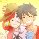
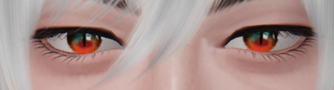
#the color...the bg...the editing were so good!!!
Explore tagged Tumblr posts
Visit Tumblr Blog
Explore Tumblr blogs with no restrictions, modern design and the best experience.
Last Seen Tumblr Blogs


Fun Fact
Tumblr Inc. is funded by 13 investors.
Text


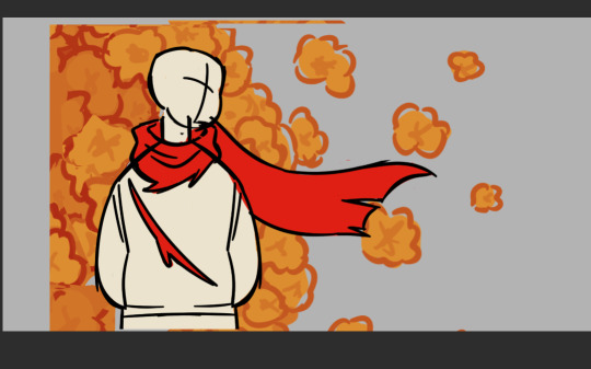
Thinking how CN server's characters teaser and it was very well made
I wanted to learn how to edit like that too...
#world flipper#raylas#belsidia#echo#liam#wafuri#the color...the bg...the editing were so good!!!#AAAAA
10 notes
·
View notes
Text
Not me using anime face claims because I'm lazy and didn't feel like editing irl images because editing with real people is so much more annoying to me
Lavender FC: Kiryu Tsukasa(im@s) Percy FC: Keito Hasumi(Enstars)
Full Collection
At nearly 14k words I have completed Microfic May 2024!
While completely ignoring the whole microfic part um- anyway~
I had a lot of fun doing this challenge and feel like I've improved a lot because of it! even though it's a bit hard to tell since the order the fics went up and the order they were written in is pretty mixed up.
Thank you very much to the hosts of the challenge!! @microficmay I know its the last year you're hosting this so I'm happy i got the chance to participate!
Individual Links and Fic Summaries and Such Below The Cut!
Also keep an eye out for the five marked with a "🪻" Because that means I consider them my favorites c:
🍎 Day 1: Create
Characters/Ship: Molly Weasley & Percy Weasley
WC: 312
Summary:
Percy accidentally staying up far too late to make a shirt for his teddy bear Tallyton.
🍐 Day 2: Warmth
Characters/Ship: Percy Weasley/Oliver Wood (Perciver)
WC: 290
Summary:
Percy brings Oliver home with him and Oliver is confused that something that was always there is suddenly not.
🍎 Day 3: Horizon
Characters/Ship: Lavender Brown
WC: 97
Summary:
Lavender is dying and she knows it.
🪻Day 4: Decision - Wand for a Kiss?🪻
Characters/Ship: Stan Shunpike/Percy Weasley (Stercy)
WC: 820
Summary:
Percy was going to miss his soulmate when he had to go back to Hogwarts. So, he chose to stay home while his family went to Egypt. To be able to spend time with him.
🍐 Day 5: Dreams & Reality - Once you decipher it, what will you see?
Characters/Ship: Lavender Brown/Luna Lovegood
WC: 240
Summary:
A few weeks before you find your soulmate they'll start haunting your dreams.
🍐 Day 6: Flare
Characters/Ship: Fleur Delacour/Bill Weasley
WC: 71
Summary:
Bill is distracted.
🍎 Day 7: Innocuous - Are you sure he would like that?
Characters/Ship: Fleur Delacour & Molly Weasley
WC: 248
Summary:
Fleur and Molly are present shopping for Percy.
🍎 Day 8: Will - I'll bid my farewell to you without saying a word
Characters/Ship: Percy Weasley
WC: 538
Summary:
Percy had only a single hour to change things, to bring Fred back to his family. Another Percy decides to do something to get Fred back for his family at his own detriment fic.
🍎 Day 9: Agony
Characters/Ship: Colin Creevey & Dennis Creevey
WC: 122
Summary:
Dennis will return to Hogwarts even if he has to grit his teeth to do it.
🍐Day 10: Rise & Fall
Characters/Ship: Lavender Brown/Fleur Delacour (fleurvender)
WC: 206
Summary:
Fleur can feel herself being pulled towards her.
🍎 Day 11: Curse
Characters/Ship: Lavender Brown
WC: 298
Summary:
'Her scars don't define her.' Is what they keep telling her but it's difficult to believe it.
🪻Day 12: Vivid - Our path, dyed in blue.🪻
Characters/Ship: Dennis Creevey/Percy Weasley (Denperce)
WC: 736
Summary:
Until you first kiss your soulmate you will only see colour in the places that they have been, on things that they've touched. Dennis only sees colour for the first time when he enters Diagon Alley.
🍎 Day 13: Talisman - Talismans & Rabbits
Characters/Ship: Lavender Brown
WC: 499
Summary:
Lavender needs to find the right item to use for a new assignment.
🍎 Day 14: Humility
Characters/Ship: Percy Weasley
WC: 74
Summary:
Percy thinking about something Penny said once.
🍎 Day 15: Nothing & Everything - Spacing Out
Characters/Ship: Dennis Creevey
WC: 216
Summary:
Sometimes it's easier to just feel nothing.
🍐 Day 16: Squabble - None of Their Concern
Characters/Ship: Fleur Delacour/Bill Weasley (Bleur)
WC: 249
Summary:
Bill and Fleur like inviting others into their bed, some of the Weasleys find that weird.
🍐 Day 17: Worthy - To Be Good Enough
Characters/Ship: Marcus Flint/Percy Weasley (Flintley)
WC: 484
Summary:
Marcus is a fuck up but he's working on it.
🍐 Day 18: Healing - Pamper Me
Characters/Ship: Dennis Creevey/Percy Weasley
WC: 715
Summary:
Dennis wants to be pampered more. Percy wants to finish his work.
🍐 Day 19: Impatience - Listen To Me
Characters/Ship: Marcus Flint/Percy Weasley (Flintley)
WC: 901
Summary:
Tutoring Flint was typically an easy affair. When he's more interested in the clock and window then the words coming out of Percy's mouth though, not so much.
🪻Day 20: Push & Pull - Together with the waves, could we become happy?🪻
Characters/Ship: Lavender Brown/Fleur Delacour/Bill Weasley (Lavebleur)
WC: 632
Summary:
Lavender feels like she barely even knows herself anymore. Acting out in ways that seem to make sense in the moment but feel so cruel later. Luckily, she has someone around who understands what she's going through.
🍎 Day 21: Idle - Everything Changes
Characters/Ship: Percy Weasley
WC: 157
Summary:
Percy never liked moving.
🍐 Day 22: Precious - Every time we talk, "I like you" just loops in my mind
Characters/Ship: Lavender Brown/Parvati Patil (Pavender)
WC: 268
Summary:
Lavender loves days when the dorm is empty of everyone but the two of them.
🪻Day 23: Mistake - Gossip Club🪻
Characters/Ship: Angelina Johnson/George Weasley
WC: 970
Summary:
A normal night in the Weasley-Johnson household. Gossip and cooking just go so well together.
🍐 Day 24: Elation - Doomed From The Start
Characters/Ship: Colin Creevey/Percy Weasley/Oliver Wood
WC: 737
Summary:
Magic will always want you to meet your soulmate and sometimes to achieve that, rules that are known to be true have to be bent a bit. Oliver and Percy handle finding their third differently to say the least. The right answer isn't always so clear cut though.
🍎 Day 25: Day & Night - No Way of Defying The Waves of Time
Characters/Ship: Percy Weasley
WC: 522
Summary:
Percy got a great deal on this house, now if only it wasn't haunted.
🍎 Day 26: Vex - Who Do You Think You Are?
Characters/Ship: Fred Weasley & George Weasley, Remus Lupin/Percy Weasley
WC: 804
Summary:
Fred and George never thought of themselves as protective but learning that your brother's soulmate doesn't seem to want him would make anyone a little angry.
🍎 Day 27: Dandy - He's Not Blind
Characters/Ship: Roger Davies & Percy Weasley
WC: 355
Summary:
Roger is more observant than people give him credit for.
🍐 Day 28: Fetching - Masked Savior
Characters/Ship: Roger Davies/Percy Weasley
WC: 1,103
Summary:
Percy has to agree to social events to keep his family off his back, but he accidentally bites off a bit more than he can chew.
🪻Day 29: Thrall - Touching Those Petals And Asking For Their Name🪻
Characters/Ship: Sirius Black/Percy Weasley (percius)
WC: 599
Summary:
Sirius hates being at Grimmauld Place. Drowning himself in alcohol and avoiding thinking about it too much by roaming around the house.
🍎 Day 30: First & Last - That Time Dudley Almost Let his Daughter Fly Away.
Characters/Ship: Dudley Dursley & Daisy Dursley
WC: 588
Summary:
Daisy Dursley has had bouts of accidental magic in the past, but flying? Floating? He really thinks she's going to be the death of him one of these days.
🍐 Day 31: Fulfilment - Promise
Characters/Ship: Fleur Delacour/Bill Weasley (Bleur)
WC: 110
Summary:
Bill is thinking too much again.
#percy weasley#lavender brown#dennis creevey#Oliver Wood#Marcus Flint#sirius black#colin creevey#Dudley Dursley#roger davies#luna lovegood#fleur delacour#bill weasley#Flintley#perciver#Stercy#Lavebleur#Bleur#pavender#persius#Denperce#Roger Davies/Percy Weasley#fleurvender#Both standing images are from their respective games all other assets used were from Pixbay#It's been awhile since ive done an actual edit edit but im pretty proud of it i think it's cute#i may have accidently merged the bg too early and now kinda want to change the color of just the room but can not so thats fine ig#chose to use Lavender and Percy because they have the most individual fics if i had a good Dennis Anidol fc id probably have added him to#microficmay2024#hp fanfic#harry potter fanfiction#hp fanfiction
10 notes
·
View notes
Text
I think I'm going to switch back to a pixel for my next phone fjndjd
Like there are (very very very) few things I prefer on iOS but for writing stuff, I use my pixel 3a 99% more often. Androids are generally just a lot more customizable anyway
#text#rly the only good thing abt ios is imessage compatibility but the only reason that's an issue in the first place is apple being fucking#stubborn abt maintaining their monopoly lmfao#paersonal#I'd just need to figure out how to move all me photos over but apparently that's easier to do nowadays so#am sad bc my pixel 3a is now out of date n is chugging a bit more lately...#i use my phone Mostly for writing stuff so rly the keyboard and editing cursor and such are most important#and frankly on ios they fucking suck#on pixel the keyboard has a functionality where you can long press a letter and use the symbol associated w that letter#instead of pressing the symbols button and the symbol every single time#numbers too#which is huge when using a ton of quotes and apostrophes and periods and commas#AND IT HAS A BUILTIN CLIPBOARD#WITH MULTIPLE COPY MEMORY#AND YOU CAN PIN COPIED TEXT#honestly if the google keyboard were on iOS and fully functional id be much less inclined to jump ship again...#also u cant customize the color of iphone keyboard its so fucking cringe#iphone has cool astronomy widgets tho. tho at this point google probs also has em if they didnt have em to begin w#and if they arent default its super easy to just. add. bc android is so customizable.#also also u can get moving bgs on android and for some reason thats still not a thing on ios lmao#ALSO iphone camera fucking sucks at focusing#google lens is rly useful too#you can customize notifs a lot more specifically on pixel. it's great
0 notes
Note
ANZUUUUUUU PALLETTE REVEAL PLEASE, MY LIFE IS YOURS😭🙏🏻🙏🏻
(im trying to learn ur artstyle cus it looks so cute😞😞)
good luck with it !
dont really know how to explain this or what you're even asking for ... if its color picking, anzu always picks all colors manually by eye. there are some filters applied (gradation maps at the end of the process) but most of the time its not that big of a change (see below, first is unfiltered and 2nd is after the gradation map applied)

also dont really go that much off refs for colors and always tend to edit them accordingly to what anzu feels like it fits for the current piece at hand. art above is kaneko lumi (vtuber in first pic below) dressed as mayfair from the upcoming phantom brave game (woman in second pic below);


the colors anzu picked for either lumi or the outfit dont match 1:1 with the refs, because anzu prefers to keep a reduced color palette for most pieces (here its black & those blues for the darker ones and red to peachy yellow foe the light ones); given the warm colors were dominant, picked a blue for the bg as well to contrast the chara silhouette.
dont know what else to say, anzu just sort of does all this stuff 'automatically' by now ^^; so hope maybe it helped in the slightest
42 notes
·
View notes
Text
HH/HB Server gets mad at me for making Pentious Tan

I wanted to share Non-Pale. Tan Pentious edit and got dogpiled almost immediately.
Color Coded so people can't complain FAKE FAKE FAKE. The server is not going to be named as it's a pretty big server filled with minors and if you know which server it is, DON'T say it.
People in there are children and I do NOT want anyone getting harassed, this is just another example of people assigning intent. The only party that's uncensored is me.
Color Codes !!
Blue - Discord Friend Yellow - Someone with common sense. Black - Don't like these people Magneta - Someone not involved. Purple - Actual On Duty Mod. Light Green - Unsure if they are on my side or what Red - Person who said something uncomfortable to me.
I sent the render after completing it and using a BG Removal AI Tool to make it a render for my new wallpaper as I am taking Pentious and using him as my own.
People began to point out the "issue"

ID: Sir Pentious PFP with a trans masc flag on the outer ring named "Saint Pentious's Wife" with a small emoji of Vox and a leaf on discord next to it posted Today at 5:57 AM with the caption of "Is this render okay?" attached is a Sir Pentious image but of human and he's completely tanned.
Black #1 replied "He's a lot paler than that" and blue replies to black #1 with "mhh"
Saint Pentious's Wife forwards a earlier message from Purple stating "It's their headcanon" Black #1 said "Well if it's your head cannon that it's a good render then there you go"
Black #2 responds with an image definition of Headcanon which is:
Headcanon is a word used in film/television/comics/etc. fandom that refers to something a fan imagines about the characters (such as a scenario or relationship) but that doesn't appear on screen/on the page.
End ID
After I posted the image more people started being "jokey" which is impossible to tell and most of these people see others using tone tags. They were trying to make me feel bad about what I did. Labeling as racism and the such. I highlighted a few points that stand out.

ID: Saint Repentious's Wife was responding to Black #2 asking about what they should color Adam. "Yes"
Black #2 proceeded to send "?" as a response.
Another person, Black #3 responded to the intial post with a caption reading "Bro blackwashed him" and attached is the original concept of Sir Pentious.
I respond with something logical: "Why are Y'all being weird about it, I just made him tan. He's tan."
Black #3 responded. "But he's pale" and responded in regards to Alastor. "I also noticed that Alastor is still black in his demon form."
I responded. "You think all Londions are pale?"
Black #3 responds to Black #2 "With Adam's colors."
I proceeded to send:
"Thats kinda oddly weird. Like, why do you care what I do, it's not like he's being erased fully. He's still white but tan. Accusing me of racism is wildly crazy and makes me uncomfortable. Please stop it."
END ID.
I sent an image of the color wheel to showcase how pale he is. People still doesn't care.

ID: I sent a image of a hex code website with the hex code being displayed as #EFDFD8 and a caption reading: "This is where he is on the Color Wheel"
Black #??? responded: "He was white though"
I responded: "Why is everyone questioning people on redesigns?"
Red chimes in: "idk whats wrong with being pale"
I responded: "He's from London, not all Londonians are PALE."
Black #??? responded to Red: "Racism." With a blue shocked emoji.
I responded once again: "Nearly all of Viv's Characters are Pale. Imagine saying someone's racist just for making a character slightly tan thats crazy"
END ID
A little info on Red, they have numerous times made me uncomfortable, even after I told them to stop, they did not make the effort to apologize or even backtrack, even with Black #4 not taking it seriously. One of the rules in the server is not to make anyone uncomfortable specifically in regards to questions but also had a rule to be nice to everyone.

Red responds to a Vox PFP (Offscreen) with the caption "OVER FIVE YEARS?"
I responded to the conversation: "I fw Pilot Husk's design. I was a fan since the Pilot ages (Al's design more specifically.)" Beforehand Red also tried to make me feel weird for selfshipping with Husk by saying "He's a cat bro." yeah, and? People simp for Loona the same.
Black #4 responded to my uncomfortableness to Red with a skull emoji.
I responded: ":/ What? Personal trigger of mine, is that wrong of me to wish for people to not say that?"
Red once again doesn't take it seriously and tries to paint it as a light ribbing by saying: "it was sarcasm lil bro do u think im a perv or sum."
I responded: "Please don't call me Lil Bro, also, I dont understand tones. You're talking to someone who has Autism."
Red says: "sorry ma am" which isn't sincere in my eyes.
I correct them "*sir."
Red responds: "what.."
END ID
I clarified to Red on my correction and they were confused because of my name, when my pfp states my pronouns which were Ze/Zir/It/Its which should atleast give them the idea that I wasn't a ma'am.

ID: I responded to Red saying "I'm saying I'm a male? Not ma'am."
Red responded: "but but you ur display name nvm"
I responded: "Malwife doesn't fit" with a sobbing emoji after this.
END ID
I responded to Red on them calling me Lil Bro, as I am a full 20 years old, I don't care if its slang but I don't know you and if you call me Lil Bro, Sis, Hun then fuck off. I told them MULTIPLE times now, and they refused to, once again this server mentions you to NOT make people uncomfortable. This is where they made a "Joke" to my hard drive which has files of my Artwork and DBZ stuff. I'm a CSA survivor. You SHOULDN'T make those kinds of jokes to ANYONE especially IF they just joined the server.

ID: I responded to an offscreen ask by Red: "Sadly gtg trying to recover my corrupted hard drive with my DBZ stuff"
Red went out of left field with this "joke" which they could have NOT said: "ok dont drop the soap"
I responded: "Dont say that please."
Red didn't apologize but said: "ok."
END ID
This is the last image, basically, this STILL became an issue. Mod didn't try and scroll up. And I don't even care. Here's the final fuckfest that made me consider actually killing myself from the stress.

ID: Black #??? replies to me in regards to my offense on the term racism being thrown around as: "I was kidding bru don't take it personally"
Mod responds to my londons not being pale comment with: "in the 1800s before immigration was a thing (THIS ISN'T BEING RACIST) they would have all been really white"
I responded: "Yeah, I really wanted to make him tan"
Green chimed in: "There's a difference between Brown and grey"
Yellow responded: "It's just a headcanon stop being weird"
Mod responded to my tan comment: "Yeah that's fine like ur headcanon do what u want i was just saying information about 1800s uk."
Yellow comments on the double standards: "People in the 1800s also didn't know how to build laver death machines but y'all draw the line at a bit of Melanin."
Magneta replies to my earlier question about how they separates vocals: "weights al has a feature where it splits the vocals and music"
I responded: "I dunno man, people keep on jumping on people who does this, and it makes me anxious I am just doing something fun. I'm sorry for making a character slightly darker But a lot of people here have oddly said some really weird things to me like the whole "hope you don't drop the soap" I shouldn't have to say why that makes me uncomfortable due to personal reasons."
Mod replies to Yellow in regards to their excellent point: "Tesia was close enough"
Then Mod responded to me: "Ur drawings fine ignore people saying that"
END ID
I am aware that these people might be minors, but like WHAT THE FUCK? No ONE is this level of pale, I mean it's POSSIBLE but like NOT to the level of Sir Pentious. Also, if someone tells you to stop you do it, you don't continue with a joke.
This is literally making me want to kill myself. I like to thank Blue and Yellow for trying atleast. Sir Pentious was more Tan, he wasn't black or anything he was just more tan. It makes more sense then pale sheet white as snow template base that the fandom designs have.
I just am going thru alot so if I don't respond I did it.
I'm sorry.
(If I am still here, that means I apssed out, I am too depressed, peroiod ridden and sleep deprived.)
31 notes
·
View notes
Text
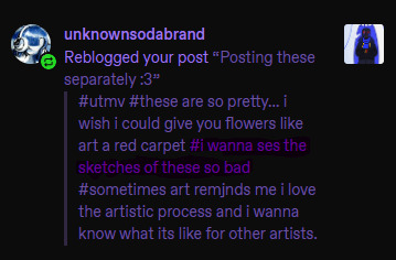
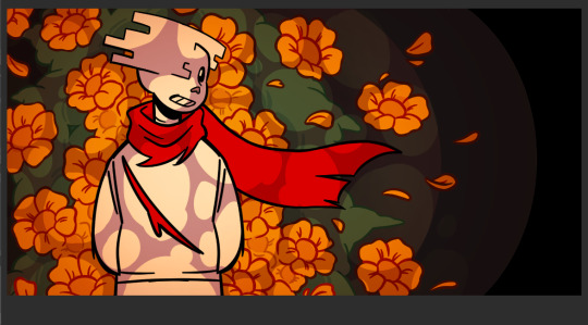
@unknownsodabrand Well Lucky you, I also love the artistic process and I keep all my sketches!! (seriously this is the most self indulgent question I could ever answer, thank you sm I'm gonna ramble a while sorry)
First I was only planning on doing the one Geno Illustration, I mostly wanted to experiment with the long 1000x2000 format bc I thought It could make for an appealing composition and it ended up being pretty challenging to get right.
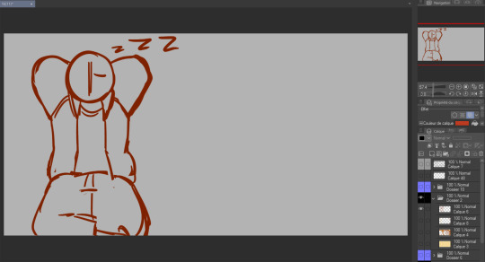
So. I started with some rough planning of where I wanted everything:
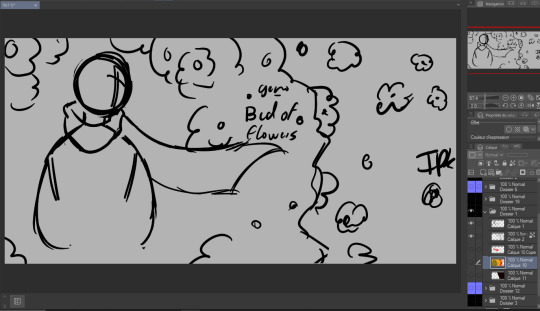
Since this was gonna be a full Illustration I planned the colors earlier than I usually would (I have a love/hate relationship with coloring):

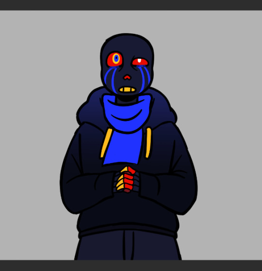
Didn't really like how it came out the first time so I just put a color mask over it, I wanted something a little warmer+brighter cause the flowers looked kinda green to me (Geno's was the one that gave me the most trouble and I liked it the least at first, by the time I finished It was my favourite XD)
Then I decided to make the three parts:
again used the same planning, rough sketch then color.
Then onto actually starting the Illustrations. I worked on these one by one but I'll show the process for all three by the steps rather than saying the same thing thrice.
as much as I wanted to keep the best for last I couldn't help myself and did the characters first.
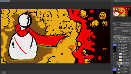
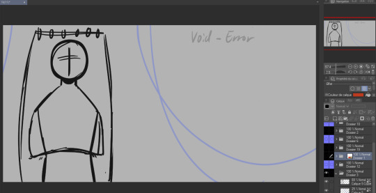
Lineart:
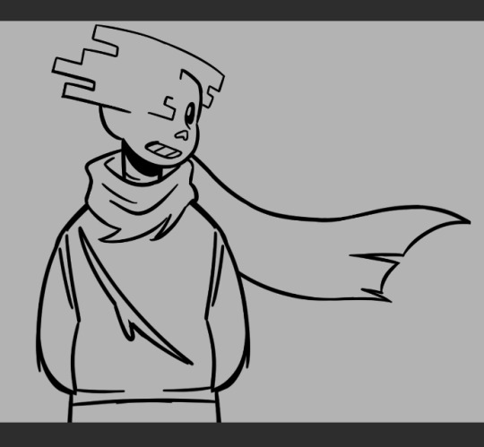
(Error was supposed to be holding a golden flower so I made his hand's lineart and color layers it's own folder so I wuldn't mess it up trying to draw the flower. I looked a bit stupid so I scrapped the idea)
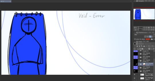
Flat color:


(I think I did Error's coloring after his background?)
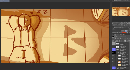
In terms of backgrounds:
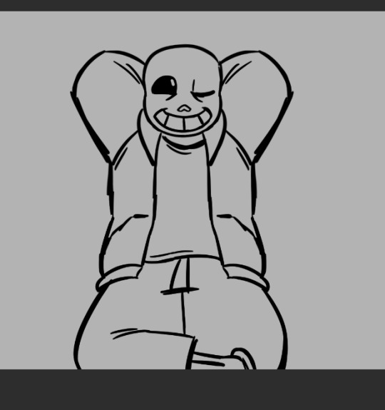
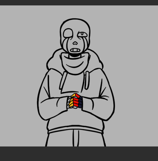
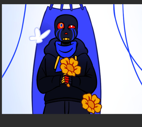
for Sans I started with the grid pattern, so I used a ruler tool and went in with color directly (the gradients are changes I did at the very end but I'm not editting out) Then I added the columns and the flowers were a last minute addition because the piece just felt a bit... naked. (also! I say columnS cause I planned on putting two, couldn't make it work the angle and space so I scrapped the bottom one)
The light is a yellowish white with gaussian blur of orange, it's an 'add' layer? ("ajouter(éclat)" because my app is in french) It's about 50% opacity.
I also shaded Sans at the same time as this with a multiply layer with a dark and light color (reddish brown and like light yellow) I'm not showing it bc I do have a 30 image limit I think
Then for Error's background it's just a case of making the lineart for the hammock, haing a layer underneath for the color, a white bg with blue gradient and the strings
For geno I have underneath the black to grey of the save screen, then I have the moss and the flowers

(The flowers were very fun to make I think I only copy pasted one?)
The lighting is a multiply layer over the whole image made the exact same way as Sans' coloring, I thought it was maybe a bit too dark so I dupplicated geno's lineart and colors folder to overlay over the lighting so he would pop more (seeing this now I think either would have been good. The first one might be better actually)

and that's it I think! If you read all of this, well first of all thank you but don't you have anything better to do?
also revised Geno's sketch once but it didn't fit in any where:
Error with my attemps of making the flowers work
#my art#undertale au#undertale#sans au#pigeon's art stuff#art process#digital art#digital illustration#I hope this is clear#If someone wants me to explain anything in more detail (which I doubt) send an ask
28 notes
·
View notes
Note
carrot bestie pal chum I gotta know……who drew the backgrounds in our wonderland bc they are STUNNING???????????????? like every time I play it with someone they comment on how good the backgrounds look at least once.
also I wanna know some of your inspirations for your art style, especially how you draw characters :3
HELP they are photos???? they are all either free stock photos I got from unsplash or pixabay or photos I took myself that I ran through my secret (lol) series of four different filters all at different transparencies
finding the right photos took me literally hours sometimes because you are pretty limited when it comes to the free stuff and finding the exact vibe or setting I had pictured in my mind was sometimes impossible so I'd just be scrolling through 100s of photos and would finally sometimes just have to choose the best one I could find. some in particular were especially hard: do you know how hard it is to find interior house/room photos that don't look like they come out of catalogues??? 🤣
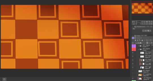
also some photos were kinda pieced together or had additional edits or tweaks made before the filters because there are a lot of OW settings that aren't exactly realistic... (the cauldron shot was a photo I took inside some salt mines that I pasted I think iron smelting cauldrons over the top of and then did a bunch of edits and lighting and coloring stuff)
I'm glad ppl like them tho!! 🤣 I was really at a loss what to do for BGs because I'm not skilled enough drawing BGs and didn't have money to pay for them either (especially so many!!!). I like how they ended up and the look of them in the game a lot. Tho I do sometimes fantasize about having custom drawn BGs that could match everything more exactly. also I've been practicing a lot more with BG drawing and gotten a lot better so probably in the future my games I'll try to draw all the BGs myself
regarding style inspiration hmmm... it's hard to say any one specific thing. I remember the turning point for me starting down the road towards this style was a piece of art for the band creature feature I really liked, and I started drawing some macabre pen sketches kinda pulling some of the style elements. When I look at my art that's the first time I see my noses start to look more like my current noses. And the ears started to grow in size, even as I look at fanart after that for various stuff they all started to have larger ears and the round noses even as I was drawing a variety of different things haha but overall besides that I can't remember a specific thing that inspired the style, I feel like it kinda evolved once I started drawing the more cartoony stuff and I realized I liked the look of the oversized elements and the exaggerated fluidity so over the years I kept amping those parts I liked up more and more
12 notes
·
View notes
Text
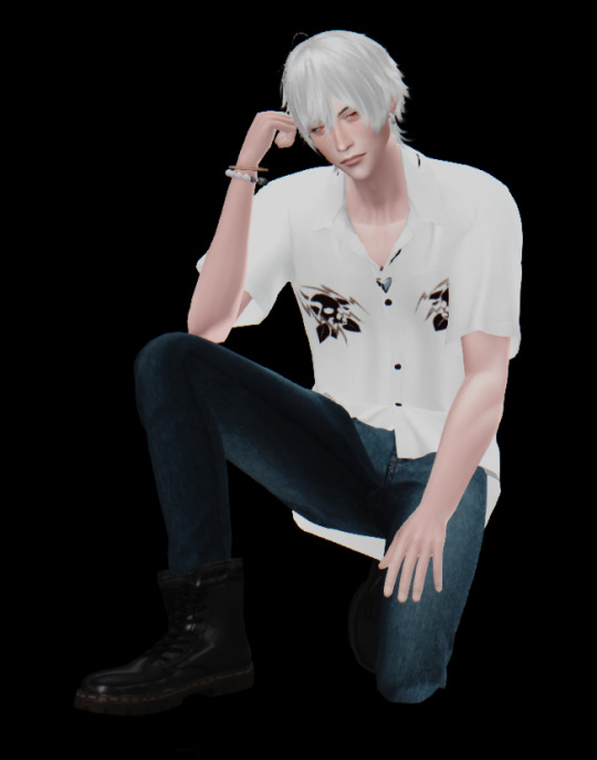
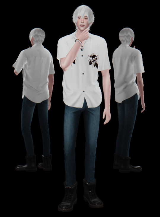
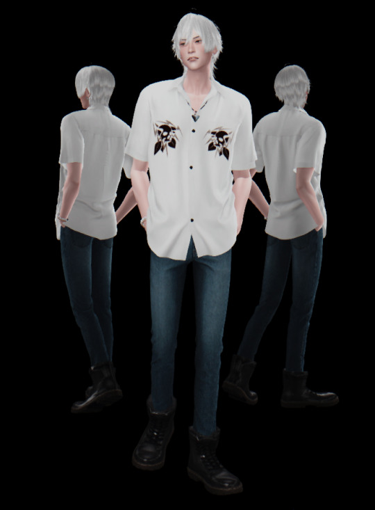
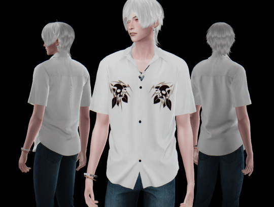
Samatoki Aohitsugi - Hypnosis Microphone 碧棺 左馬刻 - ヒプノシスマイク
Heyo, how’s it going~?
Here it is the baddie of Samatoki xd I dont like him very much (why he has to be so mean to Ichiro sometimes ;-;) but I love how he raps, grows over all the lore and protects Nemu uwu also he turned quite the fine man in 3D lol
Talking about the sims, I had quite the travel with the shirt and boots in... in blender xD I know I said i wouldnt touch the damn program (I am a Maya fanboy (?)) but this shirt was the only one that checked all the boxes, just that it had a pocket and the pocket was a different UV island obviously so I had to re uv a little xd I tried adding more buttons but it didnt go well lol I suppose it is bcs i have to paint weight or add the buttons to the rig but i dont know shit about rigging lol The boots was just scaling them up a little cause they were clipping badly with all jeans I tried unu didnt want the jeans to go over bcs... thats not how Sama wears his boots xd does he have tats? I dont know, but I didnt add any either lol
also see this beautiful eyesss @pralinesims you diy eyes are so GOD uwuwu
cc list uwu:
Skin: https://mousysims.tumblr.com/post/627162293823848448/face-only-skinblend-masculine-feminine-all by @mousysims
Eyes: https://www.patreon.com/posts/di-eye-diy-eye-34678649 by @pralinesims Eyelashes: http://kijiko-catfood.com/3d-lashes-uncurled-eyelashes-edition/ http://kijiko-catfood.com/eyebrow-ver2/ by @kijiko-sims
Hair: https://www.patreon.com/posts/69024002 by @zaozzaa
Bracelet, piercings, necklace amd boots: https://losts4cc.tumblr.com/post/640675057738317824/s4simomo-anime-cc by Simomo, I did scale up the boots a little xd they erased all their cc and sns (i had their cc from long ago xd), be cautious when downloading not from original source >< (that's why I put full links, is not aesthetic, but at least you can select it and paste it yourself and know before hand where you are going xd, I havent had problems with the sim comm but you never know sadly...) Shirt: https://www.patreon.com/posts/kk-collar-shirts-52975513 by @ooobsooo, retextured by me Jeans: https://www.patreon.com/posts/50105559 by @gorillax3-cc CAS BG: https://vyxated.tumblr.com/post/719719135185092608/cas-replacements-set-02 by @vyxated Reshade: https://fiesemietze.tumblr.com/post/641246832367992832/preface-download-at-the-end-reshade-version by @fiesemietze Poses: https://nell-le.tumblr.com/post/189644526639/male-model-pose-pack-n1-27-male-poses-ingame-and by @nell-le https://katverse.com/2019/10/25/pose-pack-22/ by @katverse https://karzalee.wixsite.com/studiok/post/2018/04/28/skc-male-pose-set-4 by @karzalee https://www.patreon.com/posts/request-sitting-48869510 by @helgatisha this time i downloaded all new brand poses so I know which I used xd
If something is missing, you can found it in my last posts maybe xd. As always, if you want some retexture just pm me uwu
That’s all for today~, next comes fancy corrupt cop Iruma Jyuto uwu I really like him xd last year I made his sim but it turned quite bad hope i can re do it and turns smth good xd good thing that I lost that save so I can start fresh xd just sad cause I liked my old Rio (Rio is one of my favs uwu) unu
little extra, wanted to share my buster bros desktop uwu
they look so cool uwuwu I retouched the image a little cause the lighter in me likes a good bloom in a bright image lol also matched the visualizer to their colors uwu
baii!
#hypmic sims#ts4#sims 4#hypmic#reshade#sims 4 cc#cas#hypnosis microphone#mad trigger crew#samatoki aohitsugi#hypmic samatoki#hypnosis mic samatoki#helgatisha
52 notes
·
View notes
Text
Devlog #29 | 03.27.23
Hi everyone!
April is almost here, which terrifies me since the year is going by so fast. Before I get into game updates, I wanted to share a bit of a (somewhat) personal one.
This month, progress on Alaris was overall a bit slow---or at least, slower than usual. I noticed this month I was struggling a lot with working on basically anything, whether it was for school, work, Alaris, or just taking care of myself. And I realized basically a year late that I was feeling extremely burnt out.
For those who have been following Alaris for a long time, you may know that early 2022, I was struggling with a lot of personal circumstances. I had taken a week off back then to "take time for myself," but in actuality, I had continued working on Alaris and other things because sometimes when I have too much time on my hands, it's worse for my mental health. This was a recurring theme for basically all of 2022. Even during the holiday breaks (e.g., summer, November, December, etc.), I continued working on Alaris, partly because I love the project, partly because it helps me cope with irl things.
This past month, I think the break that I've desperately needed since the start of 2022 made itself Very Apparent and made progress slow on my end. I'm very sorry if the update this month is disappointing because of that! I tried to take a break this past week and am feeling a bit better now, so hopefully, things start to get back on track this upcoming month <3 With that, I'll get into actual updates!
Writing
I'm not going to lie to you all; writing was Slow this month LOL. Basically, the entire writing team got taken out by some sickness or another. I would say for 2-3 weeks of the month, there was no progress on editing or writing at all since everyone was sick at the same time <\3 We are starting to pick things back up, but please send your best wishes to the writing team since they were Going Through It this month!! Also, if you got sick this month and got whatever has been going around globally, I hope you are feeling better as well <333
I did update a good amount of the demo script---just rewriting things since my writing style has changed a little. Small things, but hopefully enjoyable changes nonetheless!
Art
As always, we have continued to make progress on BG art. This month, Vui finished the River BG and the Forest BG, both of which appear in Chapter 2 of the demo. We actually only have one more BG to finish, which is the Flower Field, and all the BGs for the demo will be complete (ahh!!!). It's been about 5 (?) months in the making to revamp all the BGs for the demo, but we are finally reaching the finish line, and everything is slowly getting ready for a revamped demo release ^^

preview of the forest BG
I also have a preview of the GUI for you all! There will be some small changes, like colors, before the final version. But a little crumb to feed you all since I didn't make much progress this month

I also mentioned in the last devlog how I might update the personality icons for Alaris, which were completed this month by the same item artist who did the affection point icons!
The overall vision for this was little potions to build on the "magical" setting of Alaris. I think they're much easier to differentiate and so cute <3


My focus was more on demo art assets for this month, so I finished up the individual CGs for each of the LI's introductions.
soft and fluffy updated Etza CG
I also started updating the sprites a bit---mostly small touches so the art looks a bit more cohesive since my style has changed a bit since the demo first came out. Aisa and Kuna'a are receiving outfit changes so that their clothing stands out from Central gang and looks more cohesive with the aesthetic that will be used for Fae.
Additional Notes
Something else I got to work on this month was finally reviewing the demo voiced lines in full. I hope you all are EXCITED to listen to them in the updated demo! A lot of the lines had me giggling (heehee!). I can't wait to see everything together once it's coded into the game ^^
I also opened applications for playtesters. They close at the end of this month, aka in a couple of days. So if you are interested, please don't forget to submit an application! Thank you already to everyone who has submitted something. The response was more than I expected, so as always, I appreciate the support you all provide wah <3
Market Research
Lastly, I actually got to do some "market research" this month (yay!). I finished up Piofiore finally.

the man, the legend: gilbert redford
Touchstarved also came out. I unfortunately haven't been able to play the demo yet since I was traveling when it was released, but I already know I'll love it and I drew Kuras even though I haven't even played the game yet LMAO
gender envy
Anyways, I think that's enough from me, so that is all for this month's update! Stay safe, and see you all next month <3
72 notes
·
View notes
Note
The animation was pretty good, the one thing that bugged me to no end were charlie and vaggies bangs they were really distracting and just off character models but the animators put their all, the camera and editing isn’t good. BG/props/color keys were great but too great like it eat the characters up so much, not even Scott pilgrim or castlevania nocturne had this problem Voice acting was ok. Erika is the best thus far Alastor and nifty are alright, Vaggie Angel and husk were rough, Vaggie just sounds dead, Angel goes from sounding like a nasally teenager to trying to sound like Michael, and Keith doesn’t fit husk. They dropped a new clip of husk and Angel. You can hear Kieth David more and he drops the gruff and sticks with his smooth voice and it doesn’t work with Husk. I know people are tired of hearing this but Keith voice doesn’t fit Husk.
Vox and Vel were really good. I thought adam was bad (he is he’s really bad) but man Valentino is terrible, he’s not menacing, he’s keeping changing accents and he’s voices cracks so much it’s funny but also sad I can’t take him seriously he’s such a joke. This was the guy everyone was hyping up on the crew and fanart? People were saying the dialogue sheets they got leaked were old, they were not old, some of the stuff that was on that sheet made to the Final Cut except worse somehow.
people were saying sir pent new va was good and I heavily disagree he sounds worse than the pilot VA. I couldn’t stand his voice.
agreed on the animation/bg/props/color remarks. especially how Charlie & Vaggie's bangs were distracting, they really were especially when it seems like it was such a struggle keeping them on-model making it even more distracting. for the voice acting it's really interesting to me seeing so many different takes on the VA's various performances.
i do think having many of the fans so enthralled with the pilot, hearing voices that are different is jarring, especially if they don't feel like they add up to or match the previous voices' performances or tones. replacing the cast was a really iffy decision and many are insistent it never should've happened while others feel there "had" to have been *some* reason for it. and of course replacing pilots casts isn't unheard of--Billy West voiced Zim in the IZ Pilot episode and we all know that changed, and Richard Horvitz knocked it out of the park and made Zim into an extremely memorable character for many.
but i won't deny there are some obvious weaknesses. these are my personal takes on the voice acting, and you may disagree:
-Charlie was fine, in some points very good, fun execution. the only thing i wasn't a fan of was the "voice breaking about to cry bc this story i'm reading is just so sad" moments she had while reading the "creation story" at the beginning of the first episode, made me cringe. and i do agree with others who've said her cussing felt out of place. (some were fine/ok enough, but others weren't) -Vaggie was...weird, it felt like her voice didn't match, but i got used to it. tho i agree with what some have said how her voice was "too" low-emotion to the point it was bland. i felt her saying "fuck" in her "what the *FUCK* was that" at Alastor felt forced--later swears were ok--and her duetted line in Charlie's Happy Day In Hell song sounded so off that it startled me. -Angel Dust was in and out--his first few lines were *very* rough. voice was all over and cracked in a way that wasn't natural or charming, felt more to me of an "I'm trying too hard to do a specific voice" type of crack/strain. tho i think it either smoothed out or i got used to it bc i didn't notice it the rest of ep 1 or all of ep 2. -Alastor was fine to me. many say they prefer Ed's performance but i haven't seen the pilot since it came out so i'd have to rewatch to say for sure if i feel it's any sort of "downgrade". but i *did* notice, twice, there were lines where they just suddenly dropped his radio filter? that was really weird. it felt like it was supposed to be for...idk...emphasis? like "oh he meant that the filter turned off" but it was just jarring. i also know some feel that they toned down the radio filter too far, but i thought it was okay, and as someone who has a hard time hearing words if they aren't crystal clear, i had a much easier time understanding Alastor in these first 2 episodes than i did in the pilot. -Husk didn't jar me, Keith seemed fine, but again having not seen the pilot in years and Husk having less lines (i think?) i can't remember what Husk originally sounded like. but you're probably right about the gruff getting lost in his lines later. overall it kinda sounded like Keith really enjoyed the cussing and i'm kinda solidly divided on if that made it feel more forced or more natural. -Nifty i *think* was good/decent? she had fewer lines and very brief moments so they went by quickly. -Vox was good, no complaints -Vel was also good, no complaints -Val, like you say, was a mess. right from the get-go his accent was all over the place. it was there, then it wasn't, then another accent was, then it wasn't, then finally several lines later he slipped into this deeper "sexy" accent and i finally was like "oh *that's* what accent it's supposed to be"--he literally would flip-flop between "saucy/menacing voice with an accent" to "flat American voice that's literally just some guy" and it was bewildering. -Adam i loved and i personally feel Alex nailed the lines, i think if anyone else did it he would've been insufferable to me--but i can see how some felt Adam came off badly / too strong. he made me laugh, altho i kinda expect as a character he's going to get worse, it was only his initial appearance that amused me and to reiterate from my last post i lowkey suspect it only made me laugh so much bc the episode so far had already worn me down. -Lute i wanna say was fine but i kinda frankly don't remember. -Sir Pentious was fine to me--really silly--but i again am gonna say i barely remember his pilot voice so i can't say if it's a downgrade to me or not. hearing it w/o remembering what Stamper's performance was like had me feeling like it was a good voice, and he had good moments that made me chuckle. -Katie Killjoy i already mentioned in a previous post but i *really* don't know what they were thinking having Brandon not only voice her but not even do anything unique with it? it was jarring and felt super out-of-place to me. i honestly think his execution was pretty mid as well. i think that's everyone? lmk if i forgot any or you wanna know anything else. and ty for giving me your two cents in the ask!
15 notes
·
View notes
Note
Don't forget all the racism in Warcraft's writing which has actually gotten worse over the years whilst even DnD has gotten better over the years.
I mean, it’s hard for me to say Blizzard’s racist writing got worse when Warcraft Trolls were incredibly transparent stand-ins for African and Central American cultures/races from the beginning. That’s not even getting into goblins as the banking/neutral race before a goblin faction joined the Horde. Honestly, other people have written about racism in the narrative of WoW lore at length, and I wouldn’t be able to do half as good a job since I haven’t played in a while.
A key problem with Blizzard’s writing in WoW is that there is no coherent story. It’s an amalgamation of plots conceived by writers without any accountability, which results in an absurd number of retcons and contradictions. It’s a collaborative story with no central lore document. Nothing is actually set in stone. Sometimes the change is genuinely an improvement over prior lore (shadow priests, old gods, and the Void Lords, as they were elaborated upon in Legion), sometimes it’s painfully anticlimactic and nonsensical (Tyrande fails to kill Sylvanas in the Ardenweald because her powers suddenly cut out), and sometimes it’s obvious a team got written into a corner by a different team and the plot just needs to move on (no negative repercussions for Illidan killing Xe’ra in front of her Army of the Light on their flagship). That means that some quest lines are really well done, others are plagued with racism and bullshit, and every possible mix in between.
Like, how Sylvanas was handled throughout the Shadowlands expansion is peak WoW writing. Obvious plot armor, flimsy justifications for her choices because half the writers didn’t want her to be a villain, a half-assed cardboard cutout of a redemption arc so they could fridge her for later, and the cheesiest vague dialogue possible so that future retcons wouldn’t feel as disappointing. I was so excited for her to go genocidal in Battle for Azeroth, committing to a truly evil option that the players band together to stop, and then it was followed by that. Because Blizzard decided to walk back the “genocide is bad” message. For reasons.
I haven’t played WoW since the end of Shadowlands, so I can’t speak as to the changes since then. I doubt they’re better. And I want to be clear: I adored Xal’atath. I mained a shadow priest the entire time I played, which was about 8 years total. The lore of my preferred class was all about self-worship and tapping into dark power in one’s own soul until it was retconned into worshiping Eldritch horrors, and I loved both iterations. I had several now-unobtainable PVP titles. I did BGs and Arenas. I did progression raiding. I had max level toons in every class on multiple servers. My main was in the top 10 for achievement points on our server. I had over 400 days played. I was the lore nerd of my raiding guild. I did that silly trivia bot game every time I came across it in the hub city. I collected mounts, pets (before they were even battle pets) , and toys (when they still took up bag space). I spent a lot of time playing WoW and immersing in the experience.
I never played WoW for the story. The writing was always horribly inconsistent. Writers’ racial and class biases always worked their way into random quests, dialogue, and narrative beats. But you know what? I’m a POC, and that’s everywhere. WoW wasn’t unique for that.
WoW has been around for about 20 years at this point, Warcraft for even longer—so now those stances engrained in the lore aren’t as widely accepted anymore. They were always wrong. It’s just that now more people agree that it’s wrong. I’m no longer on the fringes for thinking “man, it would be nice to have a human character with my skin color” or “it would be nice to see elements of my culture shown through something other than a cannibalistic troll empire.”
D&D benefits from the fact that they release new editions, so the lore from prior editions is easier to sweep under the rug. There is no WoW 2. It’s just WoW. If D&D had taken a similar expansion process as WoW instead of editions, they’d be much more comparable. D&D racism isn’t really “better”—I just haven’t spent quite the same number of hours spent learning it to play a game.
3 notes
·
View notes
Text
Art Fight 2024 Final Thoughts
I'm working on probably my last Art Fight attack for the season. If I get an attack during the extension period I'll still try to revenge but if not I want to be done with Art Fight by the end of the month.
Overall I'm currently at 12 attacks given and only 3 defenses received. Which is an 80% attack rate.
EDIT: Since this post I've done another two attacks and gotten 2 more back so my rate is around 75% now, which is awesome. Late attacks weren't something I was expecting but they mean so much to me.
I definitely still had fun despite the attack ratio, lots of great art came out of this month thanks to the event. I'm pretty sure the lower number of attacks received is because I don't have any specific references for any of my characters (only art that I've done of them in other contexts) and the characters that I want attacks for the most (that are at the top of my profile page) aren't the same as the ones others want to draw so they skip my page after looking at my first row. The attacks I did receive were amazing don't get me wrong but they were all from characters on my 3rd row or below so they had to actually go into my characters page and find something, so I know there's a bit of a mismatch there and maybe I could have gotten more attacks if I put my more unique characters up front for more people to see.
And yeah I wanted to compile all my attacks in one place too so here goes.
My favs are probably these 3, the poses were fun and the non-human elements let me leave me comfort zone but like just barely, they're still very much my style.


This year I did a couple sketchy attacks too which was nice. Some started out sketchy but I colored them and did some minor changes after and they still looked good. Definitely gonna start with a sketch and just go from there more often after this Art Fight. I barely did any separate sketch and line layers at all and it was so nice not having to do that step.


And yeah overall I really enjoyed this year's Art Fight. Definitely made me think about my style a bit. Even though I didn't experiment outside of my style too much this year other than trying some animals and a couple unique BGs which I don't usually do, I kind of got into the flow of it and just kept going. I got to a dozen or so attacks done that I'm super happy with overall.


Here's my attack page if you want to check out any of the people who made the characters or anything like that.
2 notes
·
View notes
Note
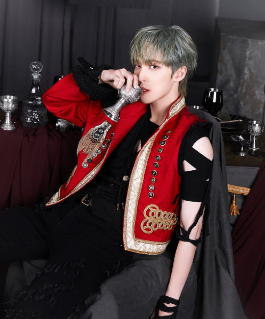
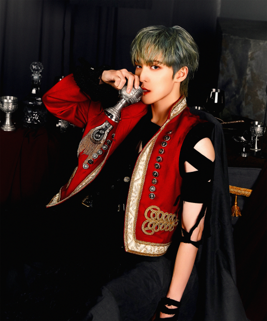
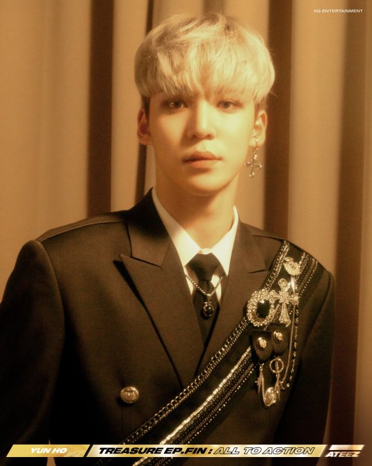
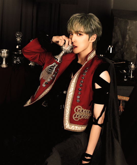
OK THANK U SOMEONE ELSE ALSO DOESNT LIKE ATEEZ TEASER PHOTOS. Like don’t get me wrong the guys themselves are serving, esp love Sans hair. But can we just talk abt the fcking clothing and background colours??? Hongjoongs hair literally melting into the bg?? Le sigh. And how overly photoshopped the pics are😭😭😭😭
oh wait i really do like the concept pics LOL 😭 i really love the clothes and outfits as a whole esp, as far as the background, it sorta looks like they went in after the fact and changed the color of the background and it maybe wasn't that color originally 😭 i don't quite get what you mean about hongjoong's hair, in the og concept pic it stands out quite a bit from the bg imo? the way i personally edited it, it def melts into the bg but that was a personal choice bc i prefer darker tones and deeper contrast TT black red and gold are one of my fav color combinations i really love that, and i do think a grey bg was a smart decision considering the detailing and embellishments on the outfits themselves but the bg itself looks a bit odd to me?? esp in this photo you can really see where they did some weird weird things in editing
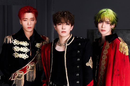
like these portions of the background look very heavily edited in a bad way and from what i saw of the other photos it seems that grey grainy looking thing is indeed part of the set and it's a hanging banner but i think overall they should not have included that in the trio pic bc it leads the eye there in a bad way
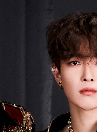
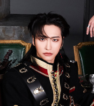
and personally to me it looks like they overedited seonghwa's face in this photo or maybe its how they did the makeup bc the saturation of his eye makeup is not the same on both sides and the way they styled the mullet looks like they just attached a triangle of hair onto the back of his head rather than something more natural TT
if i were an editor for kq i personally would've done something like this to the pics, but this is also a preferred personal style of editing. i think higher contrast in the background would keep it from looking muddled, and more saturation to the skin and bright reds and golds would keep the photo from looking so greyed out and muddy as well as provide some nice contrast to look at ^^ i always do some sort of noise filter on pics i edit but i think that would look esp good with this concept since it's a royal concept and since it's harkening back to wonderland, even a sepia filter might look nice to mimic the gold tones of wonderland pics! but again that's all just personal opinion and what my eye would have preferred seeing.
2 notes
·
View notes
Text
Thanks for tagging me @solarotters !!!
tag someone you want to know better
favorite color: blue (all shades of them are pretty)
last song: ODDTAXI by スカートとPUNPEE
last movie: Nausicaa... *sighs dreamily* I've rewatched it a ton... It's up there in terms of Ghibli movies
currently watching: nothing right now oof... Just finished one piece live action though!
other stuff i watched this year: Spiderverse, Good Omens, Gundam: The Witch from Mercury, Skip and Loafer, Slam Dunk: The First (not a lot,,,,,,, oof)
shows i dropped this year/didn’t finish: The Vampire Dies in No Time... I tried to watch it cos a bunch of Japanese artists I follow were drawing fanart for it and i got curious but welp
currently reading: Dracula Daily (dk if that counts), all my fucking readings.
currently listening to (sneaky additional question!): nothing right now... I'm pretty drained so I don't have the energy to continue or start a podcast... Currently, if I need bg that isnt music, I listen to SaveData's The Great Ace Attorney playthrough
currently working on: Honours Thesis... (it's a game project whee but also ughh). Also, I'm editing Good Omens to a Cantonese song :D Very excites about that one.
current obsession: GOOD OMENS 100% I rotate aziraphale and crowley in my brain!!
Tagging @dystopian-intellectual-pigeon @yurissweettooth @seeveekat @phoenixwrightismydad @mbpokemonrulez
Only if u want to of course
4 notes
·
View notes
Text
+more rambling (these are my thoughts as someone who's only read early twsb(up to ch 92) so if u know any later spoilers that contradict any of this dont tell me👁️👁️)

+ also I think about this constantly but... I think since the original QPB novel was narrated from Ga-in's perspective (as a transmigrator who knew nothing abt the world she woke up in, just like yeseo...or even less)... there would have been so much, like, latent settings of the world and characters that would've just never been touched upon in QPB? Stuff that existed in the bg, but were never brought to light bc they weren't relevant to the het romance narrative and/or Ga-in was never aware of them... From what I know, none of the 3 original leads had powers, and QPB was just a normal romantic fantasy novel, centering around the love triangle of the FL, ML, and SML... Cedric and Christelle's eye colors were different, evidence of their lack of ether... Cedric's red eyes proof that his powers were already gone, & he successfully suppressed them🥲... So I'm thinking it's likely that she never knew he had fire powers to begin with? Because the fact that he had them was a tightly guarded secret to begin with, and his "problem" would have been "solved" when he got the water treasure (and again we can assume it was successful bc of his eyes)... As far as Christelle & QPB readers know, he's just a normal(jerk) male lead with red eyes...
So accordingly, I'm guessing QPB didn't say anything about Cedric's condition of chronic ether depletion and turning into a child?? This would have a "hidden/latent setting" of the world & cedric's chara that never came to light bc it wasnt relevant to the narrative... But came to light in TWSB's narrative due to the chain reaction caused by Yeseo gaining ether and the specific choices he makes (like taking confessions --> fated encounter with Sadie)... And I strongly suspect this is the case just because of how strongly Eunseo hates Cedric, and the fact that she never mentions anything like this... I feel like if she knew about Cedric's tragic backstory & "curse" which turns him into an adorable little child she might feel more sympathetic toward him?? Or at the very least, wouldve definitely mentioned it in her ramblings, and since it's news to Yeseo we know she didn't... And we know QPB likely didn't mention anything about cute divine beasts like Demi either... Like there were so many hidden settings about the QPB universe that were very much still there but just never touched upon in the og novel... And I really really love this concept. It's so good... I can't stop thinking about QPB vs TWSB...
(edit:) + I get so sad thinking about how the original Cedric didn't have yeseo to take care of him... How he was suffering alone as Sadie and no one else knew the secret... he never got to hear yeseo's words about how he was never cursed... his "problem" was "solved" thru suppression in QPB but was that really the best option... his unresolved trauma... circling back to this but IM. SO HAPPY. TWSB PRESENTED A NEW ROUTE FOR HIM T__T cedric i diagnose u with UR GAY🫵🏳️🌈❤️🔥❤️🔥❤️🔥🔥🔥🔥
im rereading the twsb novel from the beginning and its so so good... and every single minute detail of cedric's slowburn developing crush on prince jesse(yeseo) makes me feel like im lit on fire...... also its even better on 2nd read im catching more details and that i missed/forgot and AAAAAH

ALSO I MADE THIS CONNECTION AND... HNNGFHHH... I LOVE TWSB... thank u for resetting the timeline... 🥹😭 AAAAH THE LGBTNESS OF IT ALL. IM IN FLAMES
also: 🫠🫠🫠🔥🔥🔥 (not posting excerpts but this is all from ch 15)


#twsb liveblog#idec if anyone reads this tbh i just gotta get the word vomit out of my head#im so sleep deprived so this is v wordy and messy
64 notes
·
View notes
Text
GUYS I’VE DISCOVERED MEDIBANG AND I’M SO HAPPY
#it's so good for text and editing and bg and all of the somewhat more technical things#it's probably good for lineart and flat color but i started using it after the drawings were done so haven't really tested it#literally its only shortcoming that i've found is the relative lack of brushes other than that it is so much better than autodesk#but i can use autodesk for at least the drawn effects (shading- texture- anything with special brushes basically)#and then move that to medibang for everything else#hhh i'm very happy with this#it's got so many awesome tools you guys#the color pallete tool is unbelievably better than ad (names for colors#the color pallete tool is unbelievably better than ad (names for colors- you can move and delete the colors- takes up less space)#it's got multiple panels#the fill tool is so cool too you can make outlines you can fill in holes in the linework#theres stuff for comics and speech bubbles#its got those snaps and the mesh transform like firealpaca and also the free transform like ad#its got the mini preview of your work in the corner with tools to move it around and flip it just right there easy peasy one button#every little layer selection isnt an undo#way less lag#(though i think that one was on me bc of the amount of layers but still)#less layer dropping glitches#for some reason there's different tools for moving text than for normal stuff but that's okay#anyway its fantastic ill end my positive rant now#fishing for pennies
4 notes
·
View notes