#so i dub them as maxis match still
Explore tagged Tumblr posts
Photo



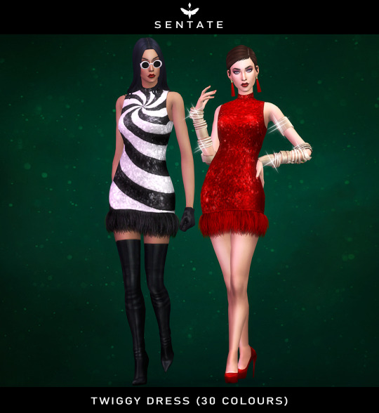
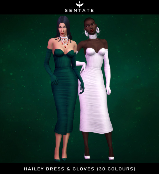
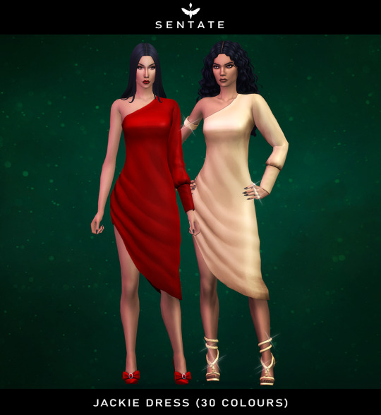
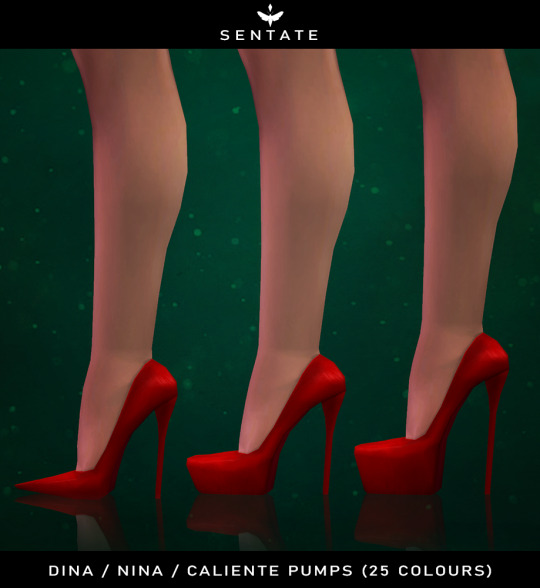
December 2022 Collection
Once again It’s the holiday party season! I wanted to end the year on a fun, flirty and glamorous note. Included in this set are 5 glamorous cocktail dresses featuring feathers, satin and sequins. And who doesn’t love new shoes for christmas, right? So I also also included a trio of patent pumps that were a much needed update to expand your styling options.
The collection will be public on the 23rd of December.
DOWNLOAD: Patreon (Early Access)
MORE DOWNLOADS | TERMS OF USE | LINK TREE
#ts4#ts4cc#ts4mm#sentate#sims 4#sims 4 cc#sims 4 custom content#sims 4 download#the sims 4#maxis match#im pretty sure this still counts as maxis match#i know the feathers look kinda real but i did hand draw them#so i dub them as maxis match still
6K notes
·
View notes
Photo


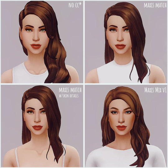
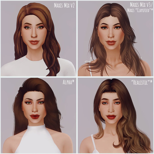
So awhile back there was this tag going around where you showed your sim with and without cc. Then there’s the one where you re-do your alpha/mm/nocc/whatever in alpha/mm/whatever style you don’t normally do.
This is kind of a combination of that, plus I’m currently sort of redoing my DL folder (nothing traumatic, I just wanted a clean slate, I still have my old stuff!) and wanting to play around with different styles.
So. This is the same sim (made without sliders because I forgot to add them. I didn’t spend ages making her, if I’m being honest, but I did fiddle with all her features) in different CC styles. Aside from occasionally lowering her brows when I changed her eyebrows I haven’t changed anything.
I feel like this should be obvious (but this is also the internet) but this is obviously not here to make the case of any one thing being better than the other. It’s not. It’s your game, your fun, do it your way.
The No CC version isn’t technically cc free because it does use a skin default+a hair color default+eye defaults but the actual content on the sim aside from that is no cc.
Maxis Match comes in two versions because one uses skin details, the other does not.
There are two different Maxis Mix version because... I couldn’t make up my mind.
The Maxis “Clayified” is dubbed as such because I suspect it’s not technically Clayified, but it’s not exactly alpha so... Yeah. I had too call it something.
Alpha and Realistic were thus dubbed because I thought they were different enough in style and I feel like alpha can be both realistic (bordering on uncanny valley) or just... alpha. So yeah.
The last two are just the same pictures again, but edited like I’d normally do. The first ones are unedited save for reshade + a little bit of vibrance and levels added.
Also, I chose the style names based on what I’d call them. I know there are people out there who can make very realistic sims without adding quotes to the word. I’m not one of them and I didn’t want to do that, so, quotes it is.
Is this useful in any way? Uh. Probably not. Did I have fun? Yes.
It also helped me get an idea of what sort of CC I want this game to have and that’s the real reason I did it, so. Mission accomplished!
Personally I think Maxis Mix v1 is my general style, though I quite like v2 as well. V3 I like, but not enough to actually do again I think. Alpha is cool, but doesn’t really fit my aesthetic (which boils down to “whatever looks kind of okay next to Maxis stuff so it doesn’t annoy me”, specific, I know). Realistic is one of those things I love seeing from other people, but don’t want for myself.
Essentially I just don’t want to have to make over every single sim in a save with skin details and stuff so that my sim doesn’t stand out like a sore thumb. Especially when I’m playing. If I’m just taking pictures... Eh. Doesn’t technically matter but I like being able to use in game content and Maxis Match and Maxis Mix works best (for me) for that so...
Aaand, end babble.
#ts4#the sims 4#ts4 cc comparison#i should name her#she has no name#all her different versions are just named#no cc#maxis match#maxis match w/skin defaults#maxis mix v1 + 2 + 3#al pha#and real istic#so yeah#also#seeing all of these standing around in game is mildly creepy#not gonna lie#have i used this to procrastinate writing and finishing up my new dl folder#yes#yes i have#i kinda want to do this again with the same sim but just in a bunch of different fashion styles#because#why not?#anyway#end babble#find food
22 notes
·
View notes
Photo

Lightning in a Bottle, where do I even begin? Once again I’ve been enchanted by my favorite festival. Once again I've left thinking that this time it was even better than the last. Once again I've left inspired, recharged and more comfortable with who I am.
It's always hard to put into words exactly what this festival is about and what it means to me. When I come back after the weekend everyone likes to ask, and I find it hard to use just a few words to explain the feelings it gives me and the world it creates. So this piece might be a little rambly and long, but I want to paint a picture for you of the full experience.
LIGHTNING IN A BOTTLE - THIRD TIME'S THE CHARM
On Friday, we arrived Lightning in a Bottle (LIB) bright and early. This was the first time we'd decided to do car camping. We were there by 10 am and I found the car camping area to be pretty packed already. It seemed that Thursday was the busy night for the LIB team, with the bulk of campers arriving then. Luckily we had a friend who came in Thursday night and saved a nice space next to his tent for us.
Let me tell you, car camping is a total game changer. I will never not car camp again at LIB. Moving our stuff from the car to camping was 100x easier. It also really helped that it was overcast Friday morning when we arrived. By the time we set up our tent, the sun was clearing out the clouds and warming up the day.

We got a new tent this year too. It was a Coleman 10 Person Instant Tent. We got it at Costco for about $200 and I have zero regrets. Previously we used a six person tent -- which holds six people if you're laying side-by-side next each other in sleeping bags with literally nothing else in your tent. With the 10 person tent, and four of us in it, we were able to fit two queen air mattresses, stand up to get dressed and have a lot of room for all of our other stuff inside the tent this year. We didn't even need to set up a canopy to keep us shaded because it came with a really great one that attached to it.
Setting up the tent and seeing the lake was totally amazing. For those of you who don't know, this was the first year that LIB has been at the San Antonio Recreation area with a lake. It's incredible to see that we had so much rain this year in CA.
After setting up our camping area, we grabbed some beers and went for a walk to check out the lake. It didn't take us long to realize how the lake was affecting the San Antonio recreation area. Over the course of the weekend we saw two snakes, some half-dollar-sized spiders, and lots of little flies/mosquitoes. Surprisingly, none of these bugs bit us and I don't have any marks which was a really nice surprise. The snakes were also harmless, mostly just scary. This was solved though by a guy next to our campsite who we ended up dubbing "Jake the Snake". This crazy guy collected the snakes for us and moved them away from our campsites. (Thank you, Jake the Snake).
It also turned out that the festival had to be reorganized a little bit, because of something else the lake brought with it. Where the Woogie stage used to be, a bald eagle had made a nest and laid some eggs in the tree. Talk about amazing. Some people even got to see it. We tried to look for it once but we couldn't find her or the nest.
We had one friend arrive at our campsite after us because she had to take a separate car. To offset the carbon emissions, LIB charges single car drivers $30 to park at the festival. Once she arrived, we changed into our first looks and headed into the festival for the first time.
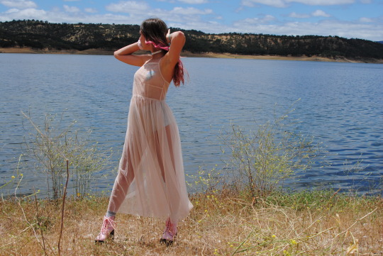
Friday we themed "holographic space lamb". My group and I really like coordinating themed outfits. I wore my Glamorous UK blush pink mesh maxi dress, holographic J Valentine bottoms, lightning bolt pasties, and some new platform pink boots I had purchased from Hot Topic. It didn't take me long to need to put some insoles into those shoes. They were cheaply made but became much more comfortable once I had the shoe pads in. They were a ton of fun to frolic in around the festival. I always recommend bringing a pair of insoles to any festival. They can be a totally game changer.
The weather Friday was perfect with the morning haze, then even still once it cleared up. During the day it never got too hot and then at night I layered my look with some leggings and this really cool faux fur jacket I got off Poshmark for $20.

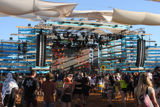
Once changed we headed into the festival to explore. The Thunder and Lightning stages were the same beautiful set up they've always been. A new Pagoda Bar, Woogie stage and other some other new structures were set up with beautiful bright colors reflecting on the lake.
Because of the way the festival was reorganized, it did feel a little squished in some areas. I felt like there was a stage near the Gong Sanctuary and The Cauldron tents that was a little too close. The music overpowered speakers there and the meditation space. I also felt like there were a lot more vendors than previously, which was fine, but it just took a little learning curve to learn the new festival grounds.
We checked out a class in the Learning Kitchen, "Digestive Psychology" on Friday. It was about how we often just try to treat an problem vs finding the underlying issue. For example: perhaps we have back pain and we're dealing with a lot of stress; we should learn to deal with the stress primarily vs medicating the back pain, because the stress could be causing the pain.
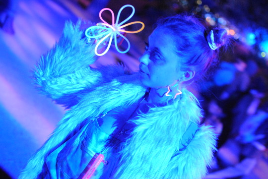
Friday night was a lot of fun bouncing around to check out how art pieces transformed into glowing night structures, dancing to music at multiple stages, and eventually closing the night with Rufus Du Sol. We're not really the group of people who stay up past 2am haha, we were beat and called it a night after 2am. There's of course music all through the night for those who want to stay up.

Saturday I wore matching tie-dye overalls with my boyfriend, which we dyed together the weekend before. This look was totally his idea and they turned out amazing. Everyone loved them, I swear I got more compliments on my outfit that day vs any other day. We purchased the white overalls from Forever 21 and got a tie-dye kit from Michael's with a coupon. I actually ended up having to dye the overalls twice because the first time we didn't properly fill in all the white space. That worked out fine and they turned really great. I loved having all the pockets and it wasn't too warm to wear during the day because we didn't wear any shirts underneath. and at night, I just added my coat again and I was perfectly content.

Saturday we ventured out and checked a few different classes. First was "Sex, Love & Awakening: 4 Keys to Ecstatic Partnership" at Haven. Let's be real, we wanted to check out at least one class that had sex in the title. I really ended up liking this class and the speaker. She was super well spoken and had a lot of interesting points. She talked about the fours stages of a relationship that she's studied as a psychologist, and my friends and I had some great discussions after about our own relationships.
Then we went to "Tarot Readings with the Tarot Woman" at Craft-Folk Arts. Each reading was $20. After, we went and checked out a favorite from last year, Benjamin Pixie and salmon skin tanning. This year the class was hands on and we saw a little of the process he uses. Mr. Pixie has some great stories and a love for sharing them that makes his smile quite infectious.
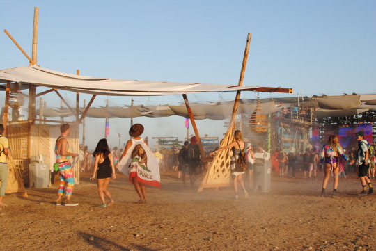
We checked out another Learning Kitchen class Saturday called "Flavor Tripping: A Trip Down Sensory Lane" which was really cool as well. This one was presented by New Belgium Brewery, and they had some beer samples for us while they talked about the process and different tastes of each. They also told us about this thing called a Miracle Berry and let us experiment with it. It's a plant native to West Africa that contains glycoprotein, something that causes sour foods to taste sweet temporarily. We all got to have one of these little pill versions of the fruit, then they passed out lemons and limes to taste. It was totally crazy because you really did have a tastebud change!

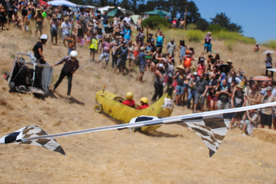

Saturday we also checked out the 2nd Annual Soapbox Derby which was so awesome, and spent most of Saturday night at the Grand Artique which is set up like an old Western town, and played some arcade games. I won a rabbits foot on my first try.
While it may sound like we had very organized days, it was was really made up of a lot of hopping around. We'd taken a look at the schedule before and picked a few things that sounded interesting, but for the most part we would check out a class here, listen to some music there, grab a snack or sit by the lake. There's really no set schedule you have to abide to at LIB and that's one of the things that makes it so much fun. We weren't living by the clock and rushing to keep to a schedule. Most people also have no service at the festival, and you either decide it's too frustrating to try to keep to posting things, or you just don't care anymore and you put your phone away to just experience everything.

Sunday was the hottest day. We woke up feeling hot for the first time, and decided it was time for us to venture down to the lake for a swim. The water was so refreshing and felt so nice. The shore was rocky but once in the water you could swim or float without touching it. Everyone was in the water Sunday AM it felt like. Pockets all over the grounds were filled with colorful floats. One of my favorite things about LIB is how we all accept the fact that just because we're adults doesn't mean we can't enjoy life and have fun. We still like to play in the water, climb on playgrounds and be silly. I love that we're given this freedom there. I love that no one judges anyone there. The festival had artists build a few climbing structures on land, then a few floating art pieces as well for us to all play on to further facilitate our play.
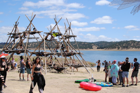
I think what always keeps me coming back to LIB is this overarching theme of freedom. I get to wear all my "crazy" outfits with lots of colors, dye my hair pink and do my makeup with tons of glitter. I get to play dress up and people don't stare at me like I'm a weirdo, but appreciate the creativity in it. I get to walk around with a backpack filled with cold beers and drink responsibly instead of trying to drink a ton before getting into an event so I don't have to pay ridiculous amounts to drink once inside. I never feel harassed by security or pestered by rules. It's an adult playground; we're given the freedom to explore, take charge of our own bodies, take charge of our own time, and express ourselves in our own creative ways. It's one of the most freeing experiences of my life each time I go.
Sunday we went back to Craft-Folk Arts to listen to "Storytelling - Animal Awareness with Rainbow Dreamer". It felt like story time in school again- Rainbow Dreamer was a flawless storyteller, with a mesmerizing cadence. From there we went to one of the last Sound Healing sessions at the Gong Sanctuary. Here you lay down with your eyes closed and they play all these sounds around you like rain sticks and gongs for about 20 minutes as a mediation session.

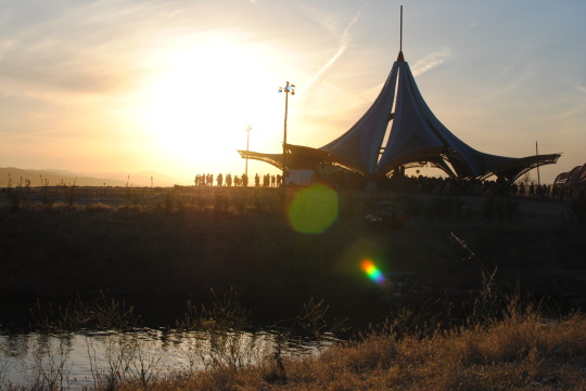
We then hiked up to Mediation Point to take in the view, and ended the day like every other day, watching the sunset from a cliff with other festival-goers. This is always such a magical close to the day, and it was even more beautiful this year with the lake reflecting the light. After howling and clapping at the sunset, we changed for our last night at the festival. Sunday night was the coldest and the most windy, but we had a great time again closing with Bassnectar.
Sunday I wore a hot pink metallic one piece swimsuit I had been pining over since I first saw it online. I waited for a good sale and purchased it, the brand is Motel. I wore it with some fun alien hoop earrings my boyfriend got me for Christmas, and at night with some glitter tights. During the day I had a faux fur purple vest with it from Poshmark, then at night again my faux fur jacket to stay warm.


There's so many things to explore at LIB, but my friends and I felt like we didn't miss a thing this year. We experienced it all as it was meant to be, by fulling allowing ourselves to journey through the festival. We went to some great classes and lectures and then took those further into wonderful discussions together as the sun set each night. We grew together over this weekend, and I know we won't forget the memories we made anytime soon. I love this feeling I leave LIB with, and I hope it stays with me for a long time until it's time to be refreshed again next year.
#words#text#lightning in a bottle 2017#lightning in a bottle recap#lib fest#lib2017#lib recap#woogie#the dolab#san antonio recreation area#festival news#bonobo#rufus du sol#bassnectar#lib#sound healing#rainbow dreamer#learning kitchen#festival life#desert hearts#enchanted forest#edc#edm#festival diary#plur#memorial day weekend
78 notes
·
View notes
Text
Dynamo see Texas Derby clash vs. FC Dallas as litmus test in West
div.video-js { width: 100% !important; height: 0 !important; overflow: hidden; position: relative; padding-top: 56.2%; }
July 19, 20184:20PM EDT
HOUSTON — Twelve points separate first-place FC Dallas from the Houston Dynamo in the Western Conference standings but whenever these two Texas teams meet on the pitch, the game — dubbed the Texas Derby — is about much more than three points.
But while the game is a derby, Houston would love nothing more than to get all three points and keep climbing the standings, where they currently sit below the playoff line with 26 points.
“It’s a game where they’re simply ahead of us in the standings, and it’s a chance for us to test ourselves against the team that’s in first place in the West right now,” Dynamo ‘keeper Chris Seitz said. “For us, we need these games, we need to win these games, and it’s at home and we’ll go out there attacking and we’ll go out there putting our best foot forward.”
Seitz, who’s in his first year with the Dynamo, spent seven seasons with FC Dallas and will be experiencing the rivalry from the Orange side for the first time. With that much time spent with Dallas, Seitz knows just what kind of problems FC Dallas will cause the Dynamo on Saturday (9 pm ET | TV & Streaming Info).
“They press high and the workrate of Maxi [Urruti] is incredible. They look to press up the field and win the ball in their attacking third, our defensive third, and convert numbers from there,” Seitz said.
“For us, we have guys that are starting to press higher and higher and we’re starting to win the ball up the field as well. It’s going to be a great match. And it’s obviously a rivalry and I look forward to joining it from this side.”
While Seitz is new to the rivalry from the Dynamo side, Mauro Manotas, who’s in his fourth season with Houston, remembers when Dallas was the king of the state but says that all changed the past couple of seasons. After FC Dallas won El Capitan three-straight years (2013-15), the Dynamo have taken it home in each of the past two thanks goal differential in 2016 and three draws in 2017.
“I have had the opportunity to be here four years. In my first couple of years, they would beat us soundly. Every time we played them they won,” Manotas said. “This past year we were able to suppress the intensity that they had. This year, God willing, we hope for it to be us winning here and at their stadium.”
For Seitz, who noted that he still has a lot of friends in the FC Dallas organization, is there any trash talking going on?
“No comment,” Seitz said, before admitting that he was kidding. “I have a lot of friends there on the organization and on the team still. So I keep in contact with them but listen, the minute that whistle blows all that goes out the window and I have one goal on my mind.”
<!–
Stay connected: Get access to breaking news, videos, and analysis from North America’s best soccer reporters via “This Week in MLS” newsletter or using our FREE mobile app.
–>
Stay connected: The all-new, completely redesigned, FREE official MLS app is your best mobile source for scores, news, analysis and highlights. Download: App Store | Google Play
#block-block-188 {padding:0;} #stay-connected {border-top:1px solid #ebebeb;margin:20px 0;} #stay-connected p {margin:0;color:#4d4d4d;line-height:1.5em;} @media screen and (max-width: 730px) { #stay-connected {padding:8px 6px 0 6px;width:100%;} } @media screen and (min-width: 731px) and (max-width: 1120px) { #stay-connected {padding:8px 6px 0 6px;width:100%;} } @media screen and (min-width: 1121px) { #stay-connected {padding:8px 6px 0 6px;width:708px;} }
MLSsoccer.com News
Dynamo see Texas Derby clash vs. FC Dallas as litmus test in West was originally published on 365 Football
0 notes
Text
Team New Zealand confirm 75ft monohull for America's Cup, but Ben Ainslie warns protocol is 'conflict of interest'
The new America's Cup class will be a 75ft monohull, possibly with foils, and Prada will be sponsor of challenger series and Cup match. But Ben Ainslie warns of a "conflict of interest"

A 75ft monohull is to be the new America's Cup class for challenger series and match in March 2021. This was part of a tranche of changes to the Cup format announced by Grant Dalton, CEO of Emirates Team New Zealand, as he revealed the new protocol in September.
Joined by team principal and chief financial backer Matteo de Nora, and Patrizio Bertelli, principal of the Luna Rossa campaign and CEO of Prada Group, Dalton revealed that the monohull design chosen, the new AC75, will be a 75ft high performance yacht. It will be sailed by 10-12 crew and be 'suitable for match racing and close competition'.
Initial concept details of the design will be announced on 30 November, but the full class rule will not be published until 31 March 2018.
Most Cup followers believe it will be sport foils. Asked if the new class would feature them, Emirates Team New Zealand chief designer, Dan Bernasconi smiled coyly and said: It might have!
At the press conference, streamed over Facebook Live, Patrizio Bertelli explained that he had helped Emirates Team New Zealand during the last Cup cycle, confirming the widely held belief that there had been a pact to return to a monohull should the Kiwis win. In 2015, he had handed over Luna Rossa designers, sailors including skipper Max Sirena, a test boat after and a rumoured $30 million when he pulled out in protest at the change to the AC50 class.
Bertelli's Prada Group will sponsor the preliminary regattas, challenger series (replacing Louis Vuitton) and be 'presenting sponsor' of the 36th America's Cup Match.
The venue details even left open the possibility that the Cup match could be sailed in Italy instead of New Zealand. 'It is intended that The Match venue and Challenger Selection Series be in Auckland, New Zealand in March 2021,' the announcement read, but want on: 'the alternate venue, included in the protocol, in the unlikely event that Auckland/New
Zealand is unable to host the event, will be Italy.'
The protocol, with Luna Rossa as challenger of record and Prada bankrolling the entire show, has been dubbed a duopoly by Sir Ben Ainslie, whose Land Rover BAR (the only other confirmed campaign for the next Cup) was left out in the cold during consultations. There are clear conflicts of interest in this protocol, he said.
Containing the costs
Ainslie's team may bitterly disappointed that the framework plan to race every two years in foiling multihulls is dead. But a large swathe of the worldwide sailing audience never cared for the AC50s. Hardcore sailing fans found the catamaran racing unexciting and will be pleased to see a return to lots of close action and crew running around hoisting and handling sails.
But it does not necessarily mean an end to grinders powering hydraulics and, intriguingly, the new protocol specifically allows so-called cyclors, or cycle grinders.
The new design is slightly bigger than the active 70ft Mini Maxi class, and could appeal to existing teams and new owners from this field. It would be large enough to look exciting and be fast.
To contain costs, some components will be one-design or single standard manufacture. Teams will be allowed to build two boats, but only one at a time, which the exception of the defender, which is allowed to two-boat test during the challenger selection trials.
Grant Dalton also announced the new nationality rule he had been promising. The protocol stipulates that '20 per cent of three sailors of the total crew (whichever is higher) must be true nationals.'
The rest of the crew need to comply with residency rules, meaning they have to live in the country of the challenging yacht club for a minimum of 380 days between the 1 September 2018 and 31 August 2020 that is, the equivalent of six months each year. The restriction doesn't apply to shore team or designers. This restricts the area in which teams can operate and train; they can no longer be based for continuous long periods near the race venue.
As for the racing format, it will go back to upwind starts and traditional pre-start manoeuvres and tactics, and follow windward-leeward courses
Speaking about the protocol, Dalton said: From the moment we won we have felt a responsibility to release this document as soon as possible to provide the required details that potential teams can now base a challenge on.
The plans are coming together nicely we shall have a very exciting boat that will be fast and powerful. We are pushing the boundaries of what is possible technically and this will test the designers, boatbuilders and the sailors to the limit just what the America's Cup is all about.
Advantage defender?
When his team won in Bermuda, Dalton promised to 'do the right thing' for the America's Cup. He also insisted that the formula would not be one designed from the outset to give the defenders an advantage.
But when there's big money at stake, generous-sounding principles have a habit of withering especially in the America's Cup.
The wait until next March for full details of the new class gives ETNZ and Luna Rossa a big head start in recruiting designers and refining design tools. The agreement with the challenger of record and the defender puts them in a pretty nice position. They know what the rule is going to be and can work towards it, comments Ben Ainslie.
It's not ideal from any challengers perspective because we want to be on a level playing field. But that's the America's Cup.
Ainslie, who has confirmed the intention of Land Rover BAR to challenge for the Cup despite the change to the class, agrees that: There is a lot to be positive about. It will be a monohull the likes of which we have never seen before. A traditional America's Cup would be a good one from a sailing and design perspective. We would still attract the fans we have from foiling multihulls.
But like all other interested sailors and teams, Ainslie's campaign has been left looking in from the outside. The only thing we [knew] is what was leaked through the media; we have none of the details here so it's interesting when they say there will be discussions with stakeholders. We'd love to be consulted and understand what constitutes a stakeholder. That's something we will be pushing for, for more detail.
A huge responsibility
Many will welcome the possibility that the America's Cup could be sailed in Italy, which is a bigger market and time zone for most sponsors and audiences, though it's doubtful the New Zealand public would wear the Cup match being wrested away from them. Either works for the British team: New Zealand or Italy either venue would be fantastic. That doesn't concern me, or us, too much, says Ainslie.
But the close alignment of defender, challenger and sponsor is a different matter.
I don't think we've ever had a challenger of record with so much influence in the whole event, the challenger series and the match, so it's an interesting situation we find ourselves in.
Prada have control of almost everything. There are clear conflicts of interest in this protocol and it is a huge responsibility on Luna Rossa to make sure this is fair for challengers. It's not ideal from any challengers perspective because we want to be on a level playing field. But that's the America's Cup.
Also out in the cold for now is defeated Oracle Team USA skipper. Spithill has said he is disappointed by what he considers a step back from multihulls. We have come from the most amazing boats in the world. It's really tough to think about [not] sailing these things. Whether you win or lose, you feel like you are ready to go into some sort of clinic. How do you beat that adrenaline?
But Spithill, like most of the America's Cup seasoned campaigners, wants back anyway, monohull or multihull.
Key points
Yacht will be 75ft monohull
Cup Match is 'intended to be' in Auckland in 2021, with pre-regattas in 2019 and 2020
Challenger series organised by the challenger of record
Some one-design components but design 'open in important areas'
10-12 crew. Cycle grinders allowed
No tank testing or wind tunnel testing allowed
Longer races of 40 minutes each and upwind start
Nationality rule 20 per cent citizenship and a residency requirement.
The post Team New Zealand confirm 75ft monohull for America's Cup, but Ben Ainslie warns protocol is 'conflict of interest' appeared first on Yachting World.
0 notes
Text
The June issue of BurdaStyle Magazine has been posted. Normally between the June and July issues I tend to find one month great and the other pretty dull. Let’s just say I’m keeping my fingers crossed for July, because there really isn’t a whole lot going on in this issue, which shall henceforth be known as “The Shirt Issue, 2017 Edition.” I kid, but, not really. Regardless, we’ve got another month of Burda to examine, so let’s take a look:

Since I’ve dubbed this The Shirt Issue, let’s look at the tops:
It’s a nice blouse, with interesting collar detail. I’m pretty sure the dangles at the cuffs would drive me nuts though.
A nice, really classic blouse. I like that the bow tie is completely separate as well. The black pipping adds a nice touch as well. Some of the styling is a bit… interesting, and the blue cat print certainly gives new meaning to “pussybow blouse,” but this is a style I’d consider making in the near future.
We couldn’t have a summer issue without a cold shoulder top. The ruffles on the straps are a bit much for me, but it is nice to see subtle details in these patterns.
These sleeves are super on trend. Basic blouse, but a trendy basic blouse. Great to use with a print fabric.
The peplum look is hanging around. The overall silhouette here is a bit boxy for my taste, but I could understand the appeal of wearing a loosely fitted top like this during the summer.
Another blouse pattern – this one with a deep-V neckline. Simple, but, I like it.
This really basic tank is a great way to use sequin fabric since the pattern is so simple.
There are quite a few dresses in this issue as well:
This handkerchief hem dress with spaghetti straps is perfect for the summer. Not particularly new or exciting, but looks very lightweight and comfortable for when the weather turns miserable humid and hot.
A very simple, but slightly more elegant maxi dress. Looks like it would be pretty easy to sew too.
Ok, I know this a a really basic dress, but I’m sort of smitten. The draped sleeve has just the right amount of drama, but the style is simple enough to still be really elegant. The color isn’t hurting any either.
The green version of this dress is exactly what three-year-old-me would have chosen to wear to prom. Clearly, I was an 80s baby. Now…. maybe not so much. It’s a bit frilly, but, the nostalgia sentiment is giving this design a pass for me.
I’m not really in love with this dress as styled, but I do actually like the silhouette. All those seam lines will be great for fitting too.
Another pretty basic dress. The ruffle detail is minimal, but it does add some interest to the dress.
I’m not such a fan of this dress, mostly because it reminds me of a lot of this one floral dress I wore to a wedding as a kid. I really didn’t like that dress, but I couldn’t find anything else that came even close to fitting. So I’m not liking this dress, though it is very much for personal issues.
I’m never a really big fan of these boxy, ruffly shaped dresses. I’ve seen people who can style these things and look great in them, but I am not one of those people. Moving along!
There are only a few other styles in this issue:
I almost love this jumpsuit. the bodice top has some nice detail with the gathering, and I do love me some pockets, but I’m not sold on the proportions of the pant legs. Not that that couldn’t be easily changed, but something about the width to length ratio of the legs isn’t working for me here.
In a complete reversal from everything else in this issue, we have a super structured tailored vest and trousers. Lots of nice detail here.
This month the Burda Kids section is mostly fluffy dresses for little girls, with a top that matches one of the full sized adult tops as well:
The Burda Plus section isn’t overly exciting either, but it does have a lot of relaxed styles for summer:
I do like the color blocking options on this top; this certainly looks like something that would be a great wardrobe piece for the summer.
A simple dress, but it shows off this print beautifully, and I bet it could look great belted too.
I would personally want this tunic dress to be a bit longer, but I do like the details at the collar and the shape it has when belted.
This slouchy sweater would be the perfect cover up for a cool evening at the beach.
Not my style of pant, but I do like the subtle pocket placement.
This shirt is awesome! The cut out in the back is very on trend, but it looks comfortable and relaxed too. And it has pockets!
And that’s it! Burda has definitely scaled back on the quantity of patterns that come in a single issue, which has its pluses and minuses. On the upside, it is much easier to trace from the sheets this year. On the downside, fewer patterns means fewer chances to get something really amazing, and I sort of feel as though that is what has happened in this issue. Nothing really amazing, but nothing absolutely terrible either. Which makes it really challenging to pick the top and bottom looks for this month, but I will make a valiant effort.
For June, I have decided to give the Best of BS award to:

I’ve decided to embrace the simplicity of this style. Plus, it has found a way to get me on board with the giant sleeve trend. Has Burda made styles like this before? Sure. Would this have been a top pick in other months? Likely not. Did it win because it has a particularly striking model photo? Perhaps. Was it a close one between this and the top with the pipping? Yup. But I went with the drama.
The bottom pick was similarly tough, but I’m going to give BWTF for June 2017 to:

There really isn’t anything wrong with this boxy frilly dress, I’m just not a fan of this style. The problem with having a lot of meh designs is there isn’t a real clear top or bottom look, so, unfortunately, this one is taking the bottom spot for June.
And there we have it! Lot’s of perfectly wearable items, and definitely lots of things that are heavy on the various ruffly sleeve trends this summer, but no real stand-outs for me. Not a whole lot that falls into my personal aesthetic, though I can appreciate the trends that Burda has showcased in this issue. I may have to make a button-down top with pipping, though probably not in a cat print. What do you all think? Have you been dying for a great button front shirt or a basic summer dress? Or is this issue a bit of a letdown, especially after last month? Feel free to discuss in the comments!
June 2017 BurdaStyle Magazine #sewing #BurdaStyle #magazine #patterns #summerfashion The June issue of BurdaStyle Magazine has been posted. Normally between the June and July issues I tend to find one month great and the other pretty dull.
0 notes