#sisu redesign
Explore tagged Tumblr posts
Text
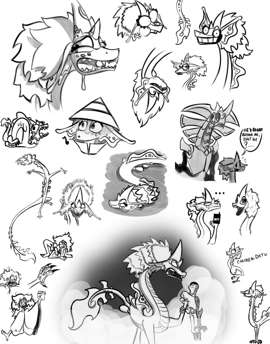
silly Sisu redesign doodles
#sisudatu#sisu dragon#raya sisu#raya and the last dragon#Raya and the last dragon Sisu#Raya and the last dragon fanart#Sisu fanart#Sisu redesign#Nammari#Sisu human#like a dragon#dragon#dragon art#doodles#expressionart
19 notes
·
View notes
Photo

Sisudatu
(live action Raya and the Last Dragon)
#ratld#raya and the last dragon#the last dragon#dragon#dragons#draconic#sisu#sisudatu#sisu concept art#sisu redesign#datu#pengudatu#pengu#praneedatu#ambadatu#jagandatu
18 notes
·
View notes
Photo
Once i saw her concept art for the first time i thought it was gorgeous, but when i watch the movie trailer i got sad T^T

Jumping on the band….dragon I liked Sisu’s design from the earlier concept art, so I drew that, with a few small changes :>
#artists on tumblr#sisu the dragon#raya and the last dragon#eastern dragon#sisu redesign#i love what you do to her design#i like the water marks on her skin 🌊#and the catfish whiskers.....YOU GAVE HER WHISKERS 🥰🥰🥰
665 notes
·
View notes
Text
Does anyone else feel like these Wish songs are all AI generated?
Because that seems to be the popular consensus, and honestly that sounds about right
The strikes were going on, studios did say they would start using AI, and Disney definitely would pull something like this
#wish disney#AI music#it would make a lot more sense that these were ai generated as the strikes were going on#then have me believe actual music writers came up with these lyrics and titles#this is the same studio that had artists design some really cool concepts for Sisu that were culturally accurate and fun#only to have them redesign her to look like elsa since she's marketable
85 notes
·
View notes
Text


Line ups of Sisu’s siblings and Hans’s brothers designs I made of my own and also inspired by other people and friends.
Note: Hans has a different design because he’ll have a big part in the Daniverse I’m planning to do, also with some headcanon about his family’s secrets probably some relatives he doesn’t know about (which explains the magic he got).
Pengu and Pranee have necklaces, while, Sisu, Jagan and Amba have bandanas and scarf, Sisu’s is mostly her hoodie bandana from her fox form (A.K.A Zhen).
Hope you like it.
Frozen and Raya and the Last Dragon (c) Disney
Designs (c) Me
#frozen#disney frozen#raya and the last dragon#disney raya#character design#redesign#lineup#hans frozen#prince hans of the southern isles#sisu the dragon#sisudatu#fanart#my arts#my artwork
12 notes
·
View notes
Text

Art from @Cammiko
I’m 3 years late but I’ve decided to throw my own redesign of Sisu into the mix.
While I love her design in the movie, I think some tweaking could have been made to make her less…mark able plush-like. Mainly some tusks and more vibrance to her fur. Thoughts?
#animated movies#disney#raya and the last dragon#raya sisu#sisu the dragon#raya fanart#dragon#redesign
7 notes
·
View notes
Text
(Read Below Poll Before Voting)
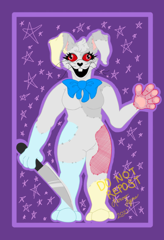
Thanks so much for all the love on my Poppy Playtime Kitties art. I didn't expect it to get so popular, but I'm glad so many people love it. I'm working on more Playtime related art right now.
I've been drawing since I was 9 years old and was very religious about doing it every day. Since my life fell apart in 2020 and lost my spirit, I fell out of practice. I've only recently gotten back into the habit of regularly drawing again and was planning on posting stuff on here.
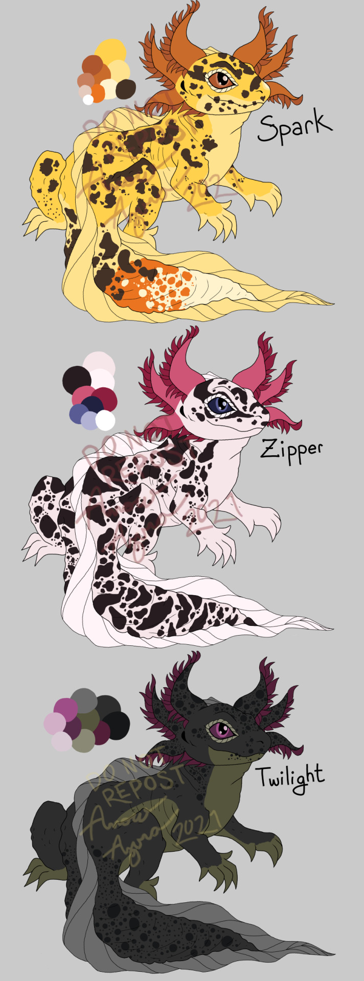
My art consists of mostly animals, especially canines. I have done abstract art and humans before, but am not as well experienced in them. I'll probably be posting fan art, concept art, and sketches for Spitfire Curse, and other fanfics, as well as my original concepts and stories.
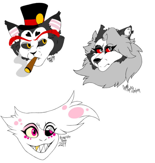
Currently, my hyper-fixations consists of Adventure Time, FNAF, Stranger Things, Poppy Playtime, and Hazbin Hotel. So, my drawings will probably revolve around these subjects for a while apart from animals.
Examples from my previous blogs and deviantART under the cut (I'm not actively posting on these pages anymore):
(It's been two years since I've done any digital art, so please be gentle with you critiques)


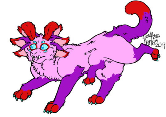
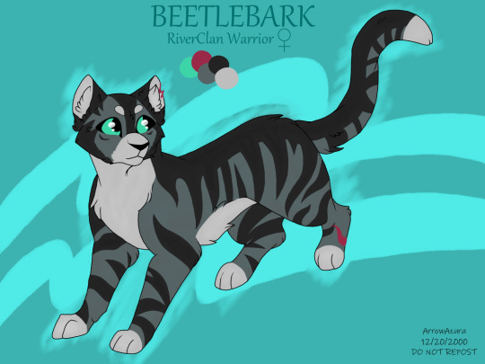


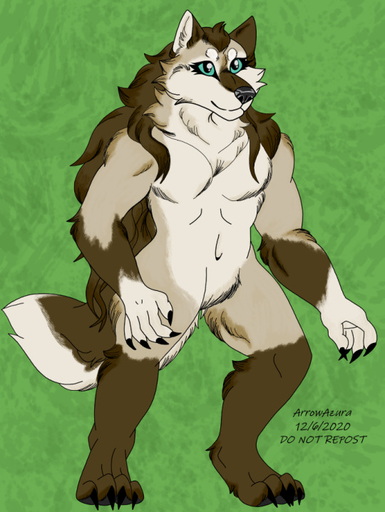


#my art#artists on tumblr#tumblr art#digital artist#artwork#digital art#astra greenwoode#reptile#axolotl#fnaf fanart#fnaf vanny#fnaf sb#abstract#sisu#redesign#hazbin husk#hazbin angel dust#helluva loona#wildlife artwork#fox#fox art#fursona#helluva fanart#hazbin hotel fanart#death stranding#warrior cats#wolf art#werewolves#kivouachian#the august few
1 note
·
View note
Text
been looking for a downtime activity outside of drawing as drawing is my job and it's healthy to find hobbies that are away from my tablet / workspace
found this pretty damn good condition sisu figure at a thrift shop for less than five bucks today, so i'll be planning to redesign and repaint her in my free time ☆

124 notes
·
View notes
Note
Hello! Love your Princess art, any chance you will ever be doing Raya and the Last Dragon or Encanto?
Thank you! I don't think I'll do Raya or Encanto. (With what I know now, things can always change as I learn more about things).
Most of my redesigns are about "historically inspired" versions of older animated heroines. And a part of that inspiration stems from an American company made up of mostly white-American men from the 1930s to 2000s using modern, inaccurate, fetishizing or bizarre character design choices. And while I wouldn't say any modern Disney movie is perfect either, movies like Raya and Encanto were actually championed/written/designed by people from the cultures they were depicting (to my knowledge from behind the scenes clips), which puts them at a significant advantage in the "accurate" category.
Encanto is still a perfect masterpiece to me so I have no notes. They have thought about the character's personalities and how they have altered their clothing to their preferences.
Now if memory serves Xiran Jay Zhao published a youtube video after Raya came out that was an incredible community discussion/critique/celebration of Raya and the Last Dragon. If you haven't seen that, I recommend it! But (from my memory) I don't think they went into the costumes very much as there is a distinct feeling from Raya that it is set in a fictional semi-futuristic amalgamation of South East Asia. (Which has its pros and cons that other people have gone over much better than I could). I also... don't really like Raya's movie. Sisu was... a choice. Starboy should have been a talking humanoid and Sisu should have been silent. The amalgamation of SE Asia works against the movie (in my opinion) and makes "redesigning it" "accurately" more complicated. How would I choose one of many interesting and beautiful historical cultures?
33 notes
·
View notes
Text

a little late for the official start of the Year of the Dragon in the lunar calendar. anyway here's a redesign of Sisu from "Raya and the Last Dragon" if she actually looked like the paintings of her in the opening prologue. Her final design is just...a little bland and underwhelming? And her face looks uncomfortably Elsa-like, which is just weird on a dragon. This version based on the painting style tries to omit more of the overly-feminine features, since she's again, a dragon and doesn't need to conform to human beauty standards, and given she's a talking dragon I suppose a female voice would be sufficient to tell viewers of her gender. Plus dragons in Asian mythology are a lot more ornate in design, Disney's version seems a little too minimalist.
#fantasy biology#creature design#dragons#raya and the last dragon#sisu the last dragon#asian dragon#lunar new year#year of the dragon
14 notes
·
View notes
Text
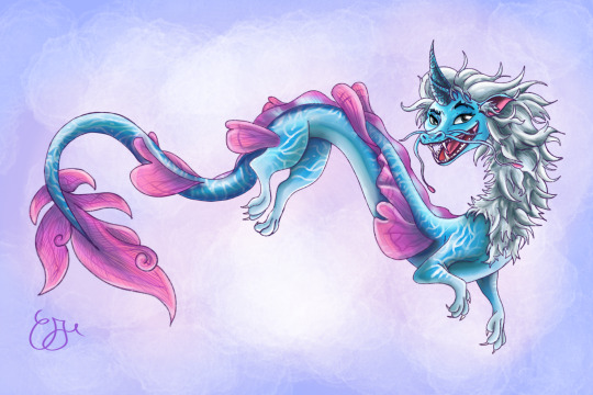

For today’s theme, “acquatic”, here’s a redesign of Sisu from “Raya and the last Dragon” I did a while back
#sisu the dragon#sisu#sisu the last dragon#sisu movie#disney#raya and the last dragon#drawing#i drew this#digital art#dragon#art#dragon art#painting#procreate#smaugust#smaugust 2023
8 notes
·
View notes
Text
Practice 1- Developing Skills Blog #3


Exercise:
These are some shape studies that I did referencing work for Shiyoon Kim's instagram account. He is an incredible artist who has worked on movies such as Spider-Man: Into Spiderverse, Raya and the Last Dragon, Puss in Boots: The Last Wish, etc. My goal was to understand the shape language behind his character designs and learn why and how the shapes reflect the characters personalities.
I was rather intrigued while analyzing the shape language of 'Perro' and found many similarities between him and Piglet from the animated series 'Winnie the Pooh'. Both of the characters displayed characteristics such as friendly, outgoing, helpful and sometimes even timid. The character design used circles and rounded squares to show mentioned characteristics.
The design of 'Sisu' use mostly circles and triangles. Triangles are used when a character can be unpredictable but the triangles here often had soft edges and curved lines as well. Her face is pre-dominantly round and inviting. Namari the antagonist of the movie had quite the opposite shape language mostly using angular and hard edges along with a triangular shape language. The shape of Sisu's hair is similar to that of Goku from the Dragon Ball Series and I believe Goku also shows characters of unpredictability however using a dominantly squarish design to signify sturdiness and strength.
Analyzing Green Goblin (specific to the Spiderverse movie) was rather straightforward. Shiyoon Kim wasn't shy with the extremely triangular design showing off a sense of danger, evil and unpredictability, etc.
I also did a character design comparison between Uncle Aaron and officer Jefferson. Jefferson had a top heavy, squarish design showing characteristics like strength and sturdiness. His overall boxy design with rounder features (arms and face) makes him look slightly intimidating but also very dependable. On the contrary, Uncle Aaron has a more narrow and rather lanky build. He has a mix of rounded curves and hard edges is areas such as his face. His rather slim design shows some aspects of speed and agility as well.
I then tried a small exercise where I tried redesigning the Green Goblin to make him more approachable and slightly timid. I attempted to reduce the triangular design by introducing more curves and circles. However, I feel like I have failed the exercise and I feel that the characters I drew do not feel like Green Goblin. On asking a friend if they were able to identify the character, they did but I feel that has more to do with the props than the character itself. On thinking deeper, maybe changing the character traits to approachable does not work very well and being cunning and sharp is a fundamental trait of the character. As I write this blog I think using the goblins from the Clah of Clans game as inspiration could have been a good starting point as well.
Tl:Dr :
In these reflections, I dive into my shape studies inspired by Shiyoon Kim, an incredibly talented artist known for his work on films like Spider-Man: Into the Spider-Verse. My goal was to analyze the shape language in Kim's character designs and understand how these shapes convey personality traits.
While examining the characters Perro and Piglet, I noticed many similarities between them, particularly their friendly and timid characteristics, which are represented through circles and rounded shapes. On the other hand, Sisu's design uses soft triangles, hinting at unpredictability, while Namari, the antagonist, has angular shapes that convey danger.
When I looked at Green Goblin's design, I saw that it employs sharp triangles to evoke a sense of evil. I also compared Uncle Aaron and Officer Jefferson, noting how Jefferson’s strong, boxy build contrasts with Uncle Aaron’s lanky, agile appearance.
I even attempted to redesign Green Goblin to make him appear more approachable by incorporating curves. However, I felt unsuccessful in that effort. It seems that the character's cunning nature is a fundamental aspect that’s hard to alter. Looking back, I realize that drawing inspiration from different sources, like the goblins from Clash of Clans, could have been a helpful starting point for my future designs.
(This is a concise summary of the text written using chat-gpt)
0 notes
Text
Hey! Hyperpop au fans, I need help!
Ok, I need help with redesigning the characters but all I need is a aesthetic to work with.
Here are characters that already have an aesthetic.:
Penny proud - candy core
Hiro Hamada - Scene core
Vanellope and Molly Mcgee - kidcore
Ethan clade, Anne boonchuy, Russel, and Merida - adventure core
Moana - ocean core
Sisu - (Blue) fairy/dragon core
Luz - Bat/Cat core
Mirabel - Butterfly core
-
Feel free to send anything in!
1 note
·
View note
Photo

YES I wish she looked more like an actual naga. we can only dream.
#raya and the last dragon#sisu#dragons#character design#sisu redesign#is it a practical design? maybe not. but it is sexier and thats what matters#creature design#naga
5K notes
·
View notes
Text

omg my sister drew me another raya!!! its so incredible 🥺🥺 plus concept art version of sisu eternally grateful to my sister she also a big help in me learning art
#raya and the last dragon#raya#ratld#raya disney#sisu redesign#the raya concept art sisu designs were so gOOD#we were ROBBED#my sisters art#my sisters art is so amazing#unfortunately not my own art it could never be this good
373 notes
·
View notes
Photo

*Redesigns the Elsa-Dragon clickbait*
Took a while to work on this one, but I’m feelin proud of the final result!
You can check out the base/bases here. :3
#raya and the last dragon#sisu redesign#dragon#dragons#eastern dragon#reference sheet#fangs#neffertity#disney#my art
28 notes
·
View notes