#photoshop logo
Text
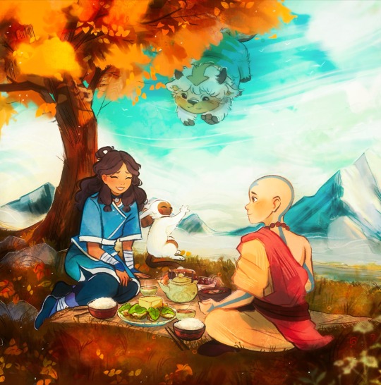
#artist on tumblr#digital art#art#illustrators on tumblr#illustration#fanart#photoshop#logo#poster#branding#avatar#avatar aang#avatar the last airbender
1K notes
·
View notes
Text
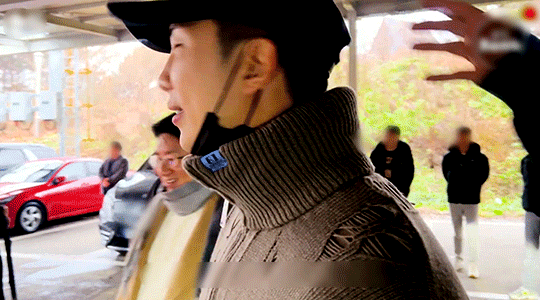
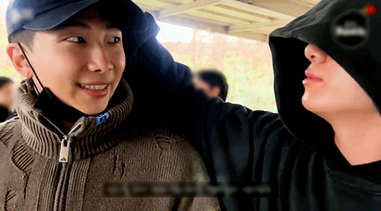
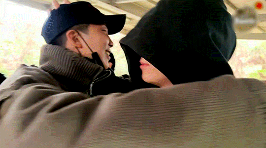
joon and his little one 🐨🐰
#namjoon#jungkook#bts#bangtan#namkook#jeon jungkook#kim namjoon#btsedit#dailybts#btsgif#mori*#*instant critical mental damage*#my fbi agent just saw me ugly cry because of namkook while blurring logos on photoshop#I gotta stop posting at night when no one's around lol
588 notes
·
View notes
Text


More old Chaos Theory crew memes ft. Mitch, stretched child Darius and Kenji, soulless layout animation, secondary animation meme, and Bumpy tower + Bumpy tower with trench coat
#jurassic world chaos theory#jurassic world#jwct#chaos theory#Heidi took the first screenshot and I 'made' the logo because we didn't have an official logo at that point lol#And the bumpy tower itself is mine but I think Dako was the one who photoshopped it and drew the trenchcoat??#I finally found the original images lol
162 notes
·
View notes
Text
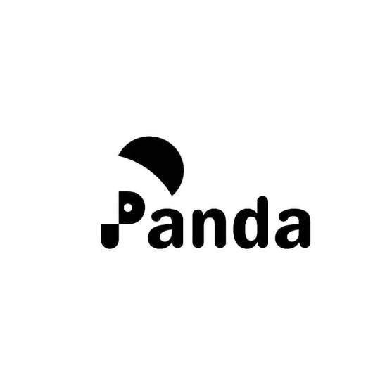
Panda logo design - creative concept 🐼
Need a unique and creative logo for your business? Send us a private message! 💌
#panda#typography#logo#design#artists on tumblr#illustration#negative space#vector#adobe photoshop#adobe#macbook#ios#iphone#canada#toronto
43 notes
·
View notes
Text
still thinking about this incredible fridge magnet I found at a friend’s place last night
#and Lo! He truly did#kira for ts#supernatural for ts#spn spoilers#was like. Well I Simply can’t explain why I’m in hysterics over this#sorry for briefly reposting remembered to photoshop out the logo in case it’s specific
273 notes
·
View notes
Text

figma vibes
feito em: 06/05/2024
#social#capa design#capa fanfic#elly#design#spirit#capa para fanfic#newpost#fanfic#babell#ds#ux#ui#ux design#logo#cat#gatos#kitten#cute cats#kitties#kitty#kittens#cute animals#pets#catnap#cats of tumblr#warrior cats#portfolio#canva#photoshop
25 notes
·
View notes
Text
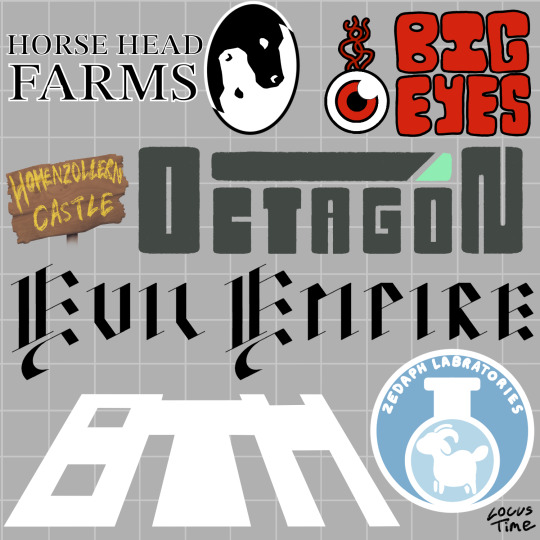
Fake logo designs of various districts/companies in Hermitcraft S8! Something about Hermitcraft brings out the graphic designer in me (*cough* it’s because I love worldbuilding and making tiny details in a world) anyway!
Design notes under cut! (Alongside some headcanons - it is quite long)
Horse Head Farms: this is the logo that started this idea basically. I got such a cool image of an eclipse with a repeated b+w horse head pattern and I really wanted to make it happen. M.C. Esher has done designs like these but as tiles, which I used as inspiration. I think I could have made it look a bit clearer but for my first time drawing something like this I’m pretty happy. The text is from one of the default Procreate fonts and kinda makes HHF look like a law firm (which is the vibe I was going for, soul-stealers and lawyers are often sorta linked in fiction, and supposedly xB and Hypno are their own legal team). xB and Hypno are the only employees other than the people they blackmail into doing stuff for them.
Big Eyes: I wanted a red eyeball as a reference to Tango’s amazing prank on Boatem and I imagine it’s a goofy little mascot for the company. Some big goofy text felt fitting alongside this. I wanted to make a Pass n Gas specific logo too but I wanted to focus on the main “districts” rather than specific shops. I feel like this is kind of obvious but in-universe Big Eyes are VERY unsuccessful and actively losing money.
Hohenzollern Castle: not really a company but Joe and Cleo are cool so I wanted to include them and I had a tiny bit of blank space left on the page so here we are. I actually really love how the sign looks, the wood texture came out nice. They don’t have a logo as much as they do a sign outside their area, created by Joe, with the text written by Joe’s dyes. The “Hohenzollern” is kinda squished because he began to run out of room but was too stubborn to split the word in half. Cleo argues that it isn’t a logo and is just a sign with the castle’s name on it. Joe argues back with a deconstruction of “what is a logo, really?” and something about companies and capitalism and Cleo doesn’t care enough to respond.
Octagon: I am a fool who initially thought it was spelt “Octogon” and had to fix it well after I finished. Oh well. I wanted this to have a very evil look about it. You can instantly tell they’re the evil tech company running experiments on the quantum realm or whatever in a Hollywood movie. Between the unsafe work conditions and the tax fraud, it is a miracle they haven’t been shut down (reason: the government is scared of Doc)
The Evil Empire: the “the” wouldn’t fit so I had to make some sacrifices. Evil Xisuma is dramatic and edgy so he wanted the logo to be in fancy black calligraphic medieval looking text. It fits the evil castle aesthetic the whole area has pretty well too. The Evil Empire is kinda like a Hot Topic store and a Renaissance Fair combined, but it is also involved with Crypto. Despite being so weird it has a perfect niche of marketing to edgy teenagers so it is quite successful. The employees hate it there because their work mandated uniform is to “dress like an evil minion”. Jevin is a slime monster, Wels cosplays a knight and Beef turned into an alien so they thankfully didn’t have to change.
Boatem (BTM): heavily inspired by Grian’s simplified logo he made in Minecraft, where he shortened it to BTM. Despite already having a reference to work off, this was the hardest design. I knew I wanted it to be simple, all-white and leaning back dramatically but I spent ages fiddling with it. Boatem is the most successful company, being perfect for the general public and their shopping district a tourist destination in of itself. It nearly went into bankruptcy when Mumbo was CEO but has been very successful since his Robot took over.
Zedaph Laboratories: my favourite design. Hand writing the text was a nightmare but it came together nicely other than that. Sheep symbol because sheep are his brand. I used the same colour palette as his laboratory. “Laboratory” is misspelled for two reasons: 1) I realised my mistake too late to change it, 2) I think it is completely in character for Zedaph to not know how to spell laboratory and only realise after Tango points it out and be forever haunted by his mistake. Don’t let the sleek corporate design fool you, Zedaph is still wild and is the only person in the “Zedaph Labratories”.
#btw I did this on procreate rather than photoshop#and it was such a pain. Procreate is better for drawing imo but text editing and transformation options are so limited#locus fandom time#locus art time#long post#how the hell am I supposed to tag this lmao#Hermitcraft#hermitcraft s8#hermitblr#Boatem#horse head farms#Zedaph#logo design#graphic design#fanart#hermitcraft fanart
103 notes
·
View notes
Text

#nasa#nasa meatball#nasa logo#pasta#pizza pasta put it in a box#bad photoshop#graphic design is my passion
13 notes
·
View notes
Text
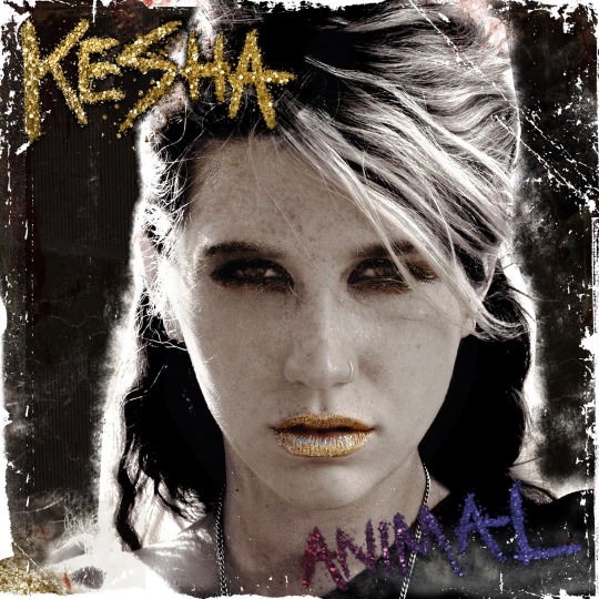
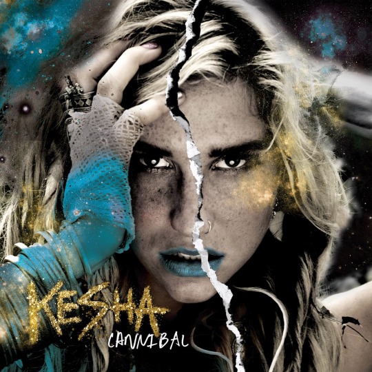
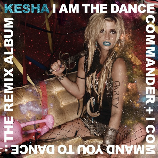
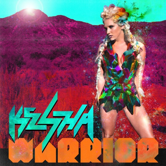
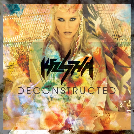
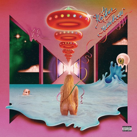
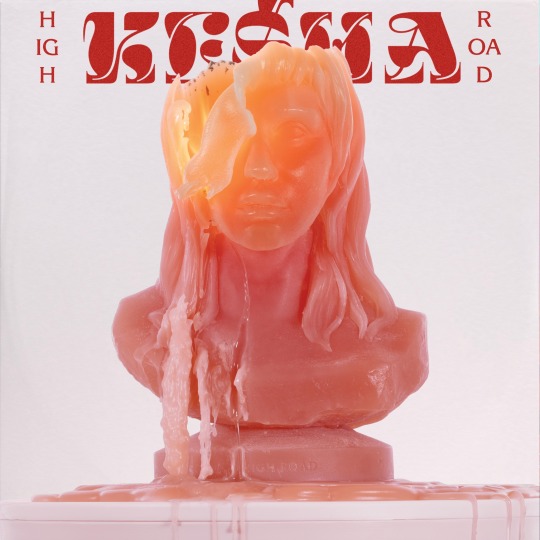
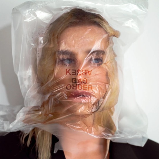
Ke$ha/Kesha Albums with the logos reversed. All edits by me :)
#gravity falls#kesha#graphic design#ke$ha#art#kesha animal#kesha high road#kesha cannibal#kesha rose sebert#kesha warrior#kesha rainbow#cats of tumblr#uswnt#deadpool#olympics#artists on tumblr#transformers#photo#logo#photoshop#adobe#adobe photoshop
17 notes
·
View notes
Text
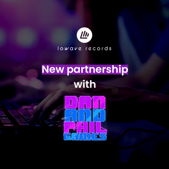
lowave_records: Recently, we have been collaborating on an album with our new partners @danielhowell and @amazingphil
We hope you are as excited as us about this partnership and are loving the tracks!
Check out DanAndPhilBEATS on Spotify!
royaltyfreemusic #royaltyfreemusicforcreators #copyrightfreemusic #synthwave #streamingmusic #contentcreator #danandphilgames #danandphil
#dnpg spotify#instagram#dnpg logo is photoshopped. so dnp definitely didn't give them the og file if they even have it in layers. but i like the hustle
17 notes
·
View notes
Text
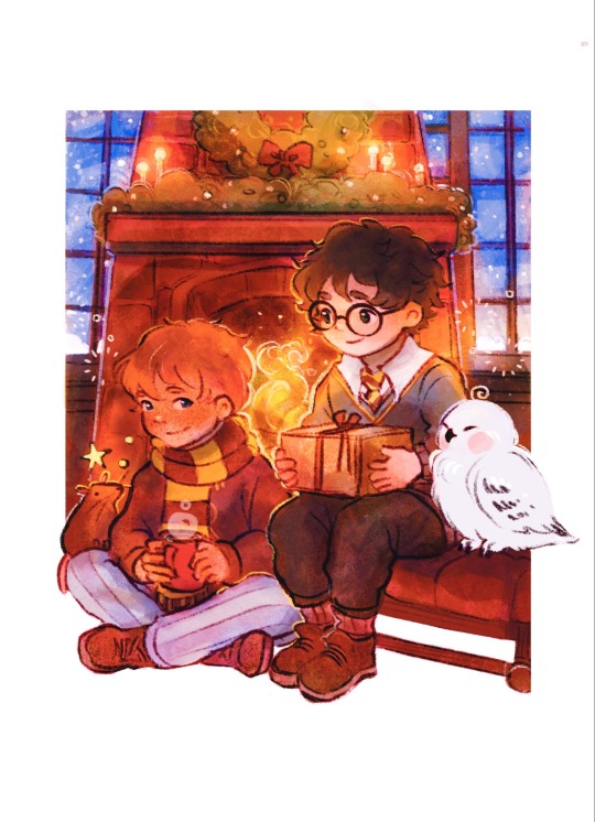
#harry potter#artist on tumblr#art#digital art#illustrators on tumblr#illustration#fanart#photoshop#logo#poster#branding#ron weasley#hogwarts legacy#hogwarts aesthetic
237 notes
·
View notes
Text

hey guys! have you seen the new tumblr logo??
#nickapocalypse#nicolas cage#tumblr logo#id in alt text#for the record#this is a joke!#I have photoshopped the logo#this is not how it actually is#but god it would be funny if it was#tumblr#staff#nic cage#nick cage#memes#meme
277 notes
·
View notes
Text

inspiração para o promposal: (x)
James estava decidido a ir ao baile sozinho. Não queria dar uma de emocionado como sempre e nem quebrar a cara convidando alguém, mas tinham duas garotas que rodeavam seus pensamentos e ainda tinham espaço em seu coração que o faziam repensar a decisão. No entanto, não falava mais com uma delas e a outra havia terminado a relação há mais de dois anos. Não fazia o menor sentido! Até o dia em que Fahriye havia o chamado para conversar antes de uma reunião do clube de teatro.
Veja bem, não era como se ela tivesse dado qualquer esperança para o rapaz ou dito alguma coisa, mínima que seja, que soasse como um "eu ainda gosto de você, por favor, insista em mim". Mas, bem, James tem a fama de emocionado por um motivo, não é? Acreditou que a conversa amigável dos dois era um sinal e foi em frente, sem pensar duas vezes.
Com ajuda de um filho de Perséfone, preparou um buquê de dálias - ele lembrava que ela dizia que eram suas favoritas -, escreveu um cartaz com alguns dizeres em uma "check list" e partiu para o chalé de Hipnos. Bateu na porta, pediu que um dos irmãos a chamasse. O buquê em uma mão e o cartaz em outra, segurando uma caneta junto. O sorriso largo no rosto e o coração acelerado, quando a viu sair pela porta. Para sua surpresa, e alívio, Fae havia marcado "check" no cartaz.
com @opiummist
#* . ⊹ 𝐵𝑅𝐴𝑉𝐸𝑅 𝑇𝐻𝐴𝑁 𝑌𝑂𝑈 𝑇𝐻𝐼𝑁𝐾 › extras#vergonha de postar isso mas ok#ficou muito ruim mas eu tentei#eu não sei photoshop então é tudo no canva#logo mais vem aí os lookinhos (com edits igualmente ruins)
13 notes
·
View notes
Text

Creative Owl Logo - lineart style ♡
Contact & inquiries at:
#the owl house#owl#night owl#monochrome#monoline#lineart#digital art#illustration#logo#visuals#social media marketing#web development#uiux#startup#identity#vector#adobe#photoshop#portugal#lisbon
24 notes
·
View notes
Text
Bad Corporate Pride Moon Theatre Logos


Sing 2 Year and Regular Logo below the cut


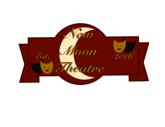

#sing#sing 2#sing 2016#sing 2021#the new moon theatre#i made these for a discord server im a mod in lol#but it counts as pride month art so ta-da#idk if there was ever an official logo for the theatre but i personally believe buster just messed around in photoshop for like 10 mins#and then just presented the result to mizuki. mrs crawly. and eddie. and no one was gonna tell him to get one professionally done atp
11 notes
·
View notes

Last Seen Blogs

hautemet
hautemet


tanukipp
the larvae children club

abbysimsfun
Abby's Just For Fun Sims 4 Legacy Stories
unusual-raccoon
Idiot Writer