#obsessed with. the colors you use
Explore tagged Tumblr posts
Text


since Eng is getting 7.5 soon(?), I felt motivated to go back to my Meleanor rig and make her a couple of lesson animations! ...except for alchemy, because the cauldron bubbles proved too hard to photoshop around, whoops.
maybe she just got lost on her way to the classroom...?

(credit: backgrounds are from the game, I just put her on top of 'em)
(aside from the backgrounds, this is not an edit, I drew her from scratch! please do not tag or treat as an edit!)
#art#twisted wonderland#twisted wonderland spoilers#twisted wonderland episode 7 spoilers#twisted wonderland book 7 spoilers#twisted wonderland episode 7 part 5 spoilers#twisted wonderland book 7 part 5 spoilers#gif warning#gifs that will inexplicably never get a perfect no matter how many cupcakes you use warning#let's just say she hasn't been added to the alchemy schedule yet#AS PER USUAL#(sam sneaks in at night and messes with the schedule so we have to buy candy from him instead)#(i promise i will stop spamposting eventually) (they gotta stop giving me characters to obsess over first)#anyway in my continuing efforts to manifest a meleanor card into existence#it's time to remember i made this a million years ago#just blow off some of the dust and cobwebs that have accumulated here...#'i'm only gonna add a couple of things i won't do too much'#(spends ten minutes trying to decide what color goggles she should have)#(flipping back and forth between green and purple) it's no use she looks good in everything#spineposting#(not me stealth editing because i didn't realize the wrong arm attachment had somehow popped in whoops)
4K notes
·
View notes
Text


HOUSE OF THE DRAGON S2E1 "A Son for a Son" | S2E2 "Rhaenyra the Cruel"
#house of the dragon#hotd#hotdedit#rhaenyra targaryen#alicent hightower#jacaerys velaryon#aegon ii targaryen#gameofthronedaily#gotedit#userzaynab#dailyhotdgifs#tvedit#dailyflicks#team black#team green#can you guys tell idk what tags to use#anyway. vvvv obsessed with this#the coloring was a challenge but honestly love the contrast#it's so delicious#rhys.psd
868 notes
·
View notes
Text
I think 90% of my gripes with how modern anime looks comes down to flat color design/palettes.
Non-cohesive, washed-out color palettes can destroy lineart quality. I see this all the time when comparing an anime's lineart/layout to its colored/post-processed final product and it's heartbreaking. Compare this pre-color vs. final frame from Dungeon Meshi's OP.
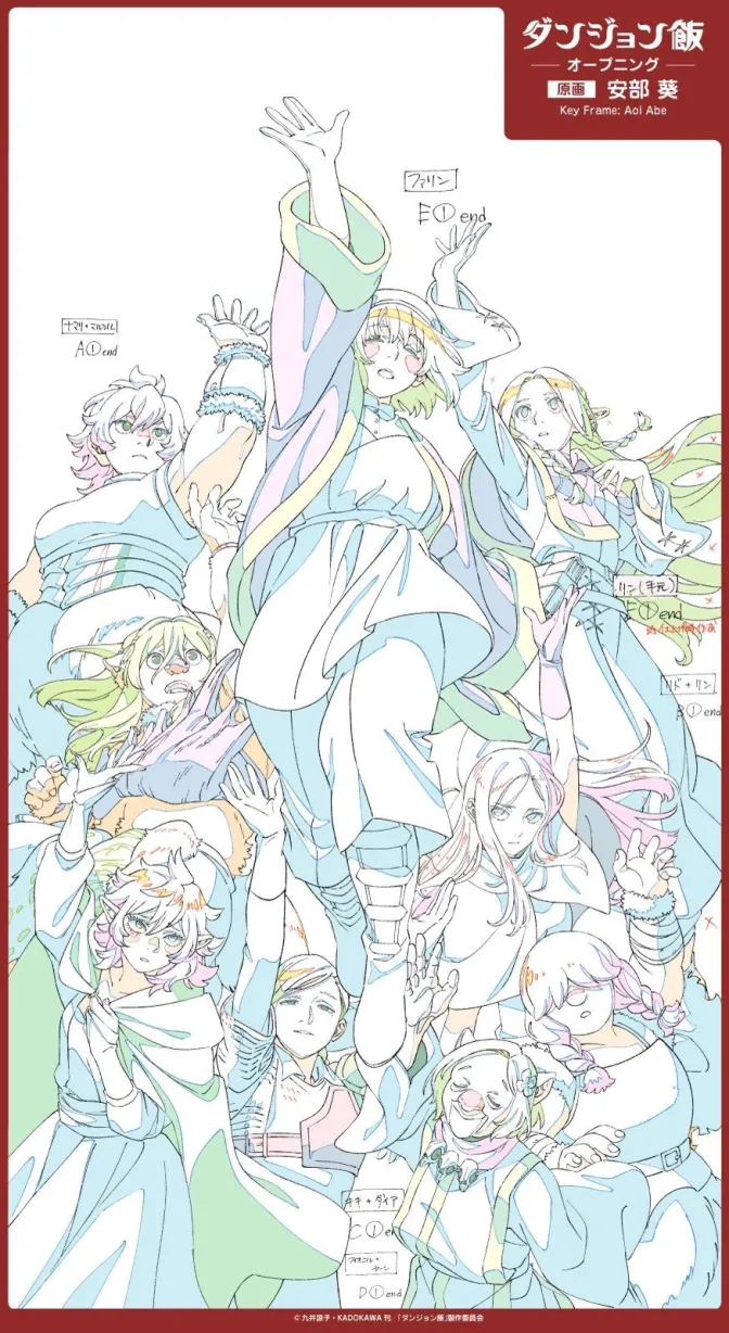
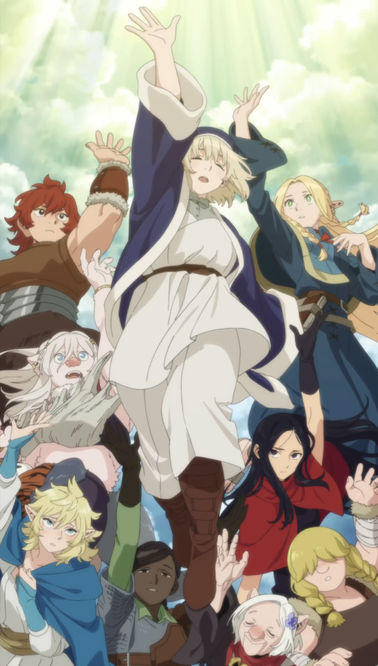
So much sharpness and detail and weight gets washed out and flattened by 'meh' color design. I LOVE the flow and thickness and shadows in the fabrics on the left. The white against pastel really brings it out. Check out all the detail in their hair, the highlights in Rin's, the different hues to denote hair color, the blue tint in the clothes' shadows, and how all of that just gets... lost. It works, but it's not particularly good and does a disservice to the line-artist.
I'm using Dungeon Meshi as an example not because it's bad, I'm just especially disappointed because this is Studio Trigger we're talking about. The character animation is fantastic, but the color design is usually much more exciting. We're not seeing Trigger at their full potential, so I'm focusing on them.
Here's a very quick and messy color correct. Not meant to be taken seriously, just to provide comparison to see why colors can feel "washed out." Top is edit, bottom is original.
You can really see how desaturated and "white fluorescent lighting" the original color palettes are.
[Remember: the easiest way to make your colors more lively is to choose a warm or cool tint. From there, you can play around with bringing out complementary colors for a cohesive palette (I warmed Marcille's skintone and hair but made sure to bring out her deep blue clothes). Avoid using too many blend mode layers; hand-picking colors will really help you build your innate color sense and find a color style. Try using saturated colors in unexpected places! If you're coloring a night scene, try using deep blues or greens or magentas. You see these deep colors used all the time in older anime because they couldn't rely on a lightness scale to make colors darker, they had to use darker paints with specific hues. Don't overthink it, simpler is better!]
#not art#dungeon meshi#rant#i'm someone who can get obsessive over colors in my own art#will stare at the screen adjusting hues/saturation for hours#luckily i've gotten faster at color picking#but yeah modern anime's color design is saddening to me. the general trend leans towards white/grey desaturated palettes#simply because they're easier to pick digitally#this is not the colorists fault mind you. the anime industry's problems are also labor problems. artists are severely underpaid#and overworked. colorists literally aren't paid enough to do their best#there isn't a “creative drought” in the anime industry. this trend is widespread across studios purely BECAUSE it's not up to individuals#until work conditions improve anime will unfortunately continue to miss its fullest potential visually#don't even GET ME STARTED ON THE USE OF POST-PROCESSING FILTERS AND LIGHTING IN ANIME THOUGH#SOMEONE HOLD ME BACK. I HATE LENS FLARES I HATE GRADIENT SHADING I HATE CHROMATIC ABBERATION AND BLUR
2K notes
·
View notes
Text
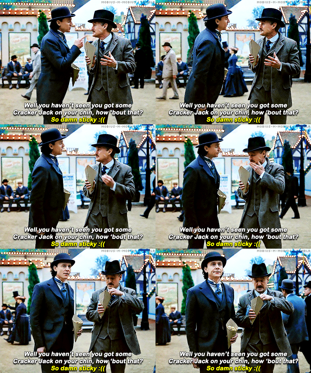
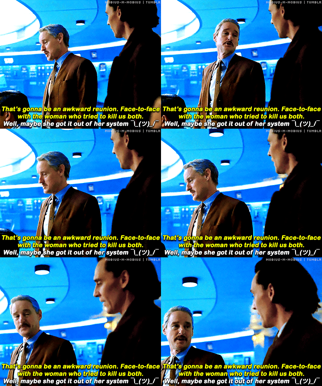
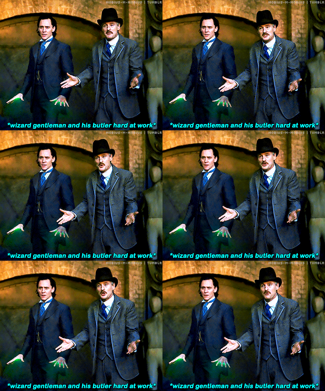
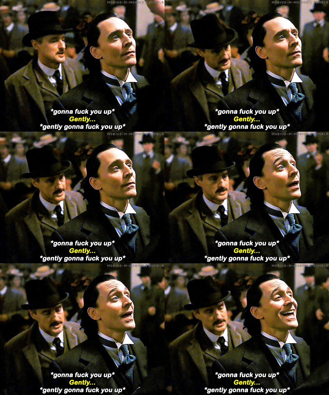
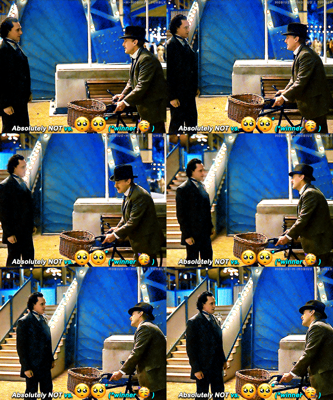
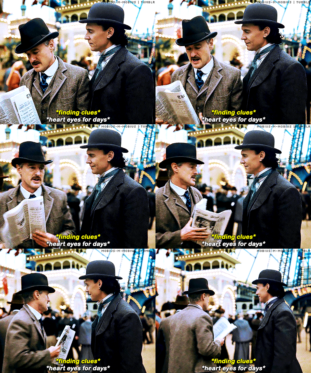
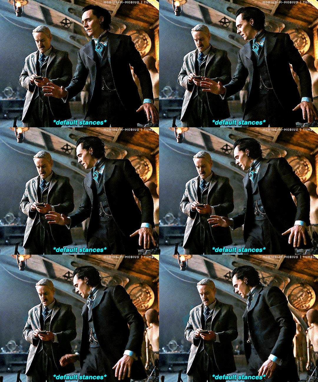
Lokius in Loki 2x03 - "1893"
#mobius#loki#lokius#mcuedit#lokiedit#marveledit#loki spoilers#owen wilson#tom hiddleston#god they really said we're gonna be glued to the hip and MEANT IT hello 😳👀#something's definitely coming bc i've never won for this long in my life but i'll take every second they want to give us 😅#btw kind of obsessed with them both having the same haters and ravonna being the og??#you're either on board or they're the most insufferable duo you ever met wreck your plans that's my man lol#one particular coloring (clearly) almost killed me dead but i did it for you tandem bike scene of all time 😭😭#loki s2 spoilers#marvel#owenwilsonedit#dianagifs
2K notes
·
View notes
Text
NORA OH MY GOD THID IS SO SWEET HELLO????? AEEWTWTDHDUFJFKGJGJHKHKHK OH KY GOD THIS IS ADORABLEEEEEE

HAPPY BDAY MY BEST MIC BUDDY!!!!! (Aka @maxphilippa)
I wanted to draw our micsonas together if thats okay :3
94 notes
·
View notes
Text

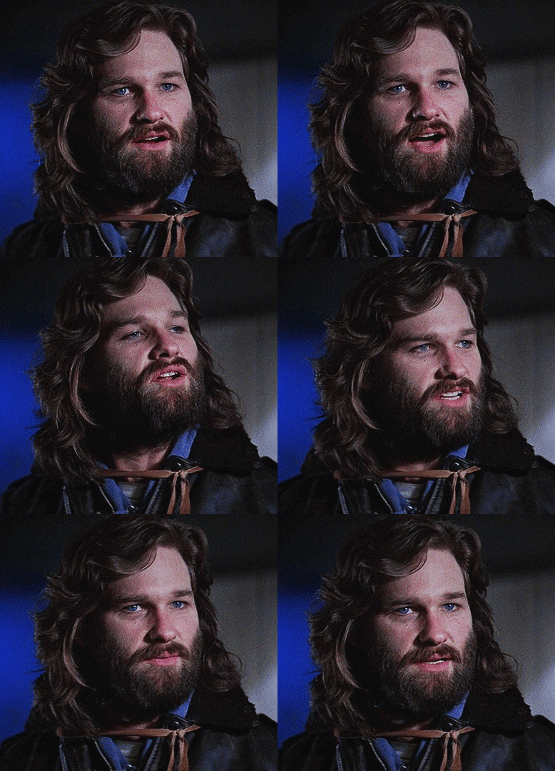
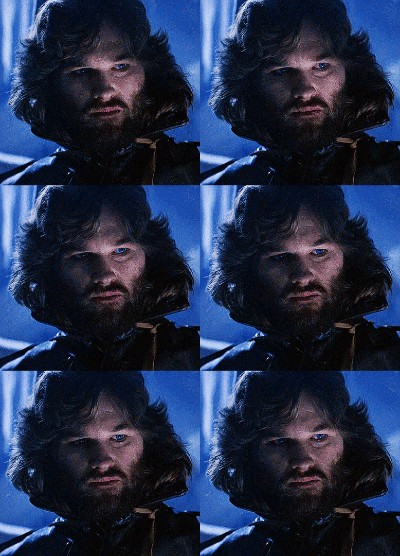
Kurt Russell as R.J. MacReady THE THING (1982) dir. John Carpenter
#the thing#the thing 1982#r j macready#kurt russell#filmedit#horroredit#scifiedit#mine#a macready gifset? on tumblr dot com? groundbreaking.#<-this is all to say that these scenes have been giffed 7397493849 times before in far more gorgeous detail#but I'm throwin these in the tag anyway. bc we should all ponder our orbs about him from time-to-time#I played around w/colors on these and I'm kinda digging the blue#obsessed w/the fact that universal was leery about hiring kurt russell for this part bc he was ''too young and pretty'' fhsdjfhdsjhfdsjhfd#incredible. valid concerns. he was indeed v young and v pretty here#to use my previous tags:#macready if you read this im free on thursday night and would like to hang out#please respond to this and then hang out with me on thursday night when I’m free#guy of all time truly
1K notes
·
View notes
Text
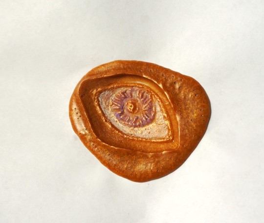
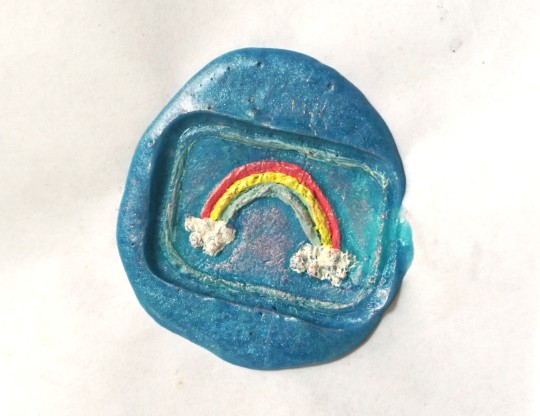
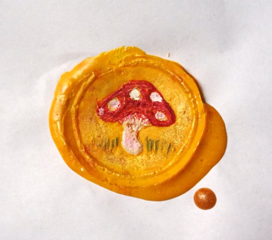
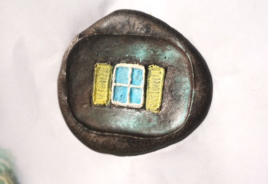
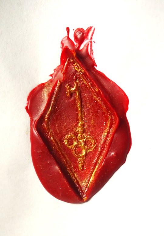
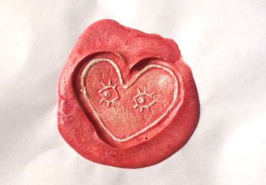
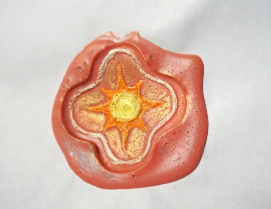
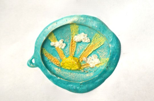
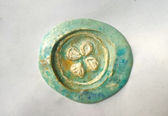
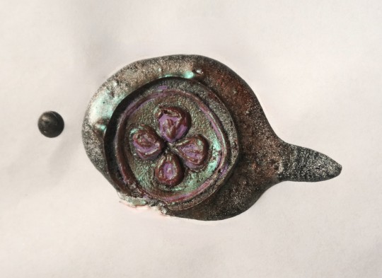
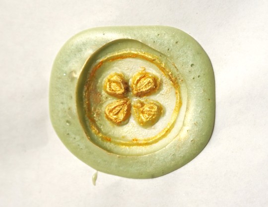
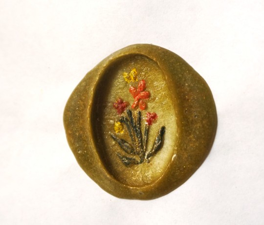
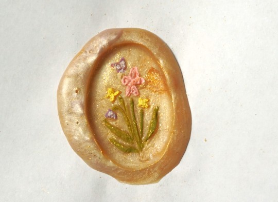
I made a few new wax seal stamps out of clay (like the ones I did for my worldbuilding stuff forever ago), this time just of random symbols that I thought might look good done in the style of painting over the raised part of the wax or etc. :0c Some of them aren't carved deep enough to really show up that well, but overall they worked okay for being clay lol
#wax seal#crafts#wax stamp#stationery#Window one is kind of stinky.. I was imagining like a swirly night sky sort of looking thing so it would be a surreal contrast of a night#sky with a window in the middle that shows a daytime sky - but the silver and purple wax kind of mixed too much together#with the black and it just looks very plain black and not all that starry or anything hjbhj.. Of course the eye is probably my favorite#since all I ever do is draw eyes and still like eye imagery for some reason. The four leaf clover is very lumpy and skrunkty but also it wa#the smallest in size out of all of them so was easier to do multiple stamps of just to try it out.#The heart with eyes wax is actually more swirly in person. I wanted it to be a mix of light pink and red and white. and the wax#did kind of all blend together but in person you can definitely see MORE of the intentional swirlyness. in this it just looks plain pink.#I was going to do one eye in the heart but it looked weird. but now two seems too plain. i could have done 3?? in a pattern.. hmm#alas. I wish I could make actual metal ones. With the clay i have to paint them in a thin layer of olive oil before stamping because#otherwise the wax just kind of gets stuck in the grooves of the clay and then you can't pull it up. Very wacky ''unprofessional'' looking#set up where I'm hot gluing circles of sculpey clay to short stumps of a wooden dowel that I sawed apart with a serrated bread knife#and then using an old paintbrush to put olive oil on them whilst holding a spoon over a yankee candle flame hjbjh#ANYWAY.. I think if I were middle class/rich/etc. this would be one of the main things in my crafting room is like.. SO many colors#of wax. and all different custom made stamps designed by me. which could be much more elaborate in actual metal.. muahaha.... >:)c#RHGghhh... I actually don't want to talk much about it since (this is probably just my Obsessed With My Own World Artist Delusions) I#think I have a really cool idea for a game that could genuinely be successful if i ever get to make it and I don't want to give#everything away and spoil the whole plot/concept in hopes that one day I can actually do it - BUT - a game that I'd like to make after the#visual novel I'm making now has partially to do with the main character working as a sort of writer/scribe/artist assistant in an elven#city (set in my world/with my worldbuilding species and versions of elves and etc) and I was thinking of maybe incorporating#somehow being able to collect little writing type items like these like.. you can get different wax seal patterns or pens or etc. when I do#stuff like this in Real Life it always makes me think of that like.. ouh... this is good research.. what it shall be like to be a littol#elf collecting wax seals and such.. indeed... GRR i need to be finished with my current game NOWWW... i MUST work on other#thingss... aughh... ANYWAY.. yay. accomplishment to do One Single Thing other than Sit In The Summer Heat And Rot#though also hilarious as this was the first cool-ish day that was below 80F in a while hgvh#waking up like 'wow.. i actually feel okay today?? like I could do things?? how mysterious.. I wonder why..?? :0'' Its The Weather You Fool#Tis Always The Weather
202 notes
·
View notes
Text
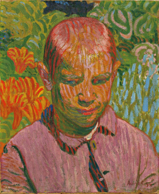
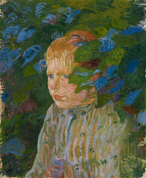

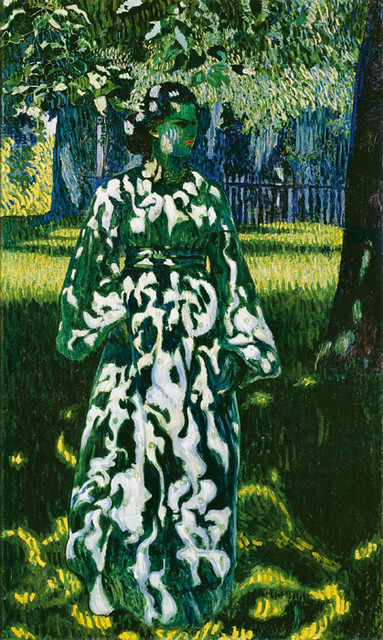
works by swiss painter CUNO AMIET (1868-1961)
#artwork#cuno amiet#just discovered him and im OBSESSED obsessed obsessed#the shape language...the use of color...ohhhh my goodness#thank you instagram. for once a good recommended post
1K notes
·
View notes
Text
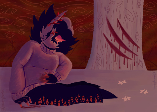
{ Click/Tap for better quality. }
And the day we became one.
#folly regretevator#regretevator folly#folly#regretevator#regretevator fanart#digital art#digital fanart#digital artist#fan art#artists on tumblr#I get honourable mention in a monster design competition; gets very motivated to draw more; starts coughing; gets a fever; got burnout#Aaaaall that and I finally managed to draw this#I am still thinking about The Cleave; it fucking broke me. I feel unimaginable pain whenever I remember#The Cleave.... The Cleave!!!!!#*Gets sick; falls down a flight of stairs*#I was looking through my previous work before I start working on this#I miss the rendering style and colors I used to do... (think the AM fan art and the Alina Grey fan art)#I'm bringing this style again for this and GOD IT'S SO GOOD!!!#Folly always brings the best of my art; see this is why as an artist you should get obsessed with a fictional character#blood tw#tw blood#cw blood#blood cw
86 notes
·
View notes
Text
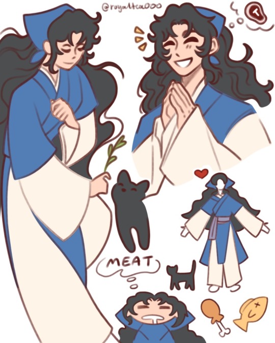
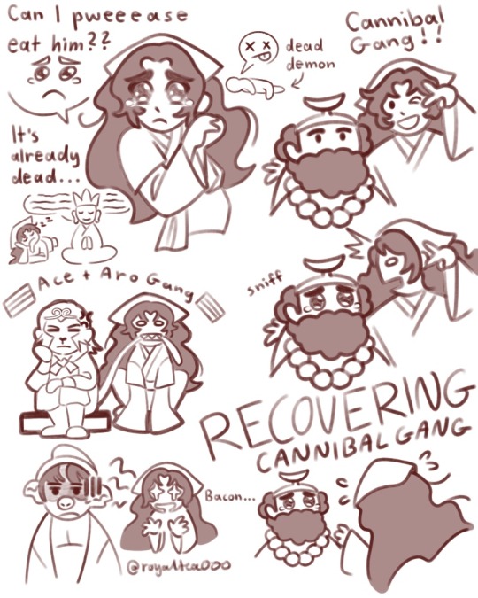
[jttw oc] cursed to be an obligate carnivore, ate his entire family one particularly bad winter
#guys im being indulgent hear me out#im not giving him a name he just goes by woodcutter#cuz he feels like he doesn’t have the right to use the name his parents gave him#not telling you what it is tho cuz I don’t know either lol#jttw oc#journey to the west 1996#journey to the west#jttw sha wujing#jttw zhu bajie#jttw tripitaka#jttw sun wukong#jttw fanart#digital art#my art#what’s he doing here? searching for a way to break his curse and make amends#yes that’s his cat he calls lucky#when I mean obligate carnivore I mean it is entirely possible for him to grow weak and hungry if not given meat in his diet#not a monk just happy to be there lol#yeah it’s the 1996 version cuz I love that group and im obsessed with it rn :)#I see so many cool jttw ocs on here I wanna make one too :(#he smokes a pipe btw I just forgot to draw it#it keeps the cravings and hunger away and also looks cool af#close enough welcome back luo binghe#real aroace solidarity is letting each other use you like a chew toy when teething#I’m just now realizing I did not draw those flags correctly#or colored them in…#just know they’re supposed to be the ace and aro flags I drew them from memory and was like eh I’ll look em up later#I did not
55 notes
·
View notes
Text

yay
#my art#smallishbeans fanart#ethoslab fanart#trafficshipping#or whatever.#could be read as romantic or platonic. whatever you want. I dont care#have i mentioned that i HATE COLORIng. because that is why this is grayscale.#i love colors. i suck at using them. they are my mortal enemy#anyway i kind of did this on a whim lol. i hadn’t planned to finish the sketch but i picked it back up today and just.#got in the groove of things. ya know.#so like. don’t look too hard. because i KNOW there are fifty bajillion mistakes in this lmao#if you COULDN’T tell boat boys has been my obsession for the past month#or so#rhis drawing is the 10th page on a canvas named more smalletho#and i HAVE drawn ghem kissing. once.#which is not exactly crucial information but i did feel like it deserved to be known
92 notes
·
View notes
Text

[**VINE BOOM**]
#pkciv#pkciv spoilers#pvpciv#pvpciv spoilers#yeha. i am not immune to the minecraft...#i would say that this is a consquence of my covid obsession with dsmp#but honestly#i think it's more an extension of webnovel's decline. for me#i yearn for free easily accessible “power fantasies” with quirky worldbuilding and strange names#died 202X born 202X close enough welcome back chinese webnovel#also i feel like jay from absolute shopping addict would take pvp!evbo under his wing immediately#“i wanted this chestplate... but when i realised there were other colors... i could only use one but i needed them all...”#“i think we'll get along nicely. have you ever heard about magic limited edition sneakers”#liam and tabi shake their heads together in the corner before tabi realises that liam's weird too#anyway *slaps designs* this baby can hold so many headcanons in them#i love pvp civilization sm
43 notes
·
View notes
Text
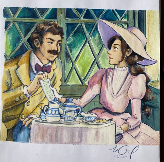
Sebastian had a few days leave from duty so he visited Eloise😇😇
#im literally OBSESSED with Eloise😩#and this AU😇🙏#they are maybe late 20s/early 30s here I wanted to experiment a bit#anyways I was reading A Little Life at the beach today#and ngl I was tearing up literally ALL the time!!! 😤😤😤#it’s just so beautifully written & I find myself relating so heavily and I get gut punches every few pages where I need to stop reading#and just process it#idk maybe I am sentimental today LOL#It’s just…it’s making me think about the fact that I’ve never really Belonged in any one place and neither have the characters#my mom is the product of Bulgarian/swedish immigrants to the US and my dad is a Spanish pueblo man 😂#and their experiences/culture/languages etc etc have shaped my life soooooooo much🙏#but like at the same time. too reserved to truly fit in with the Spanish but too open/blunt for the midwest#idk it is weird to explain#anyways I just keep moving forward & make my own way🙏🙏🙏#thank you for coming to my free Therapy Session in the hashtags (bc nobody reads these😂😂😂😂)#also if you did & you also read a little life please🙏 or if you want to talk about books in general🙏🙏#hogwarts legacy#hogwarts legacy fanart#hphl#sebastian sallow#hogwarts legacy mc#hogwarts legacy oc#eloise#oh also this is a recreation of a Porco Rosso scene😇😇🙏🙏#but I changed the colors a LOT & also a bit more when I sketched it up
71 notes
·
View notes
Text


TAYLOR TOWNSEND [USA] & KATEŘINA SINIAKOVÁ [CZE] in their runners'-up speeches || WTA FINALS RIYADH DOUBLES FINAL || 11 09 2024
#sorry. i thought i was done and then i decided i was not.#taylor townsend#katerina siniakova#wta finals#i tried to make the text different enough in color i hope its legible :(#i usually do white or yellow but it was ruining the aesthetic to use yellow and i felt bad giving only one of them a nice aesthetic color#but the background is pretty dark so i could only use really light/bright pinks/purples.............ah well.#i keep trying to formulate a joke about katka and all of her doubles partners being in love with her but none of them are hitting well#so i guess take that as the joke.#there's like a 50/50 chance you walk away from a doubles partnering with katerina siniakova completely obsessed with her#and honestly? understandable#proven by science or something. idk#i am also obsessed#comms were hyping her up a bunch after the match#not to be too selfish here but would anyone care to ask her if she'd be interested in dragging karo along for one of her exploits#she might be the only player capable of carrying karo's flopism to a trophy
32 notes
·
View notes
Text
idk maybe it's because I see all art as various fields of craft work, ie skills composed of a series of linear steps that can be taken to produce certain results, but it irks me when people lose their shit over really basic pieces simply because the end result was able to produce a realistic image. like. especially since I've noticed it shows up a Lot more often in reference to categories of art dominated by women.
like, it's great y'all are gaining a respect for quilting and fiber work, but maybe loudly declaring that you either don't see or don't care about the immense display of skill in pieces unless they conform to what's mildly difficult in the one(1) genre of art you have deemed respectable isn't like. cool.
#this tapestry is so realistic! its the best- its a straight weave. You convert your reference image into a spreadsheet#and then just put the colors in their place. You two could do it with like. 10$ of supplies from Walmart and part of a cardboard box#This quilt! is really basic aplique work.#it lost to the granny quilt because the granny quilt made several hundred corners in cut pieces of fabric line up perfectly#like i know its in part because western art has been obsessed with depiction for a good long while#instead of the geometry of arabic art or expression of lines in a lot of east asian art or symbolic conveyance found across#massive swathes of african art#but its also just. 'I dont take art forms associated with women seriously unless it looks like the art of (a list 90% men)'#idk man. expand your horizons and learn more about art forms other than paintings#and also learn this: realism isnt hard#it's the lowest rung on the tree of advanced art. its the easiest to fake. it can be used to hide massive issues with your fundamentals#it just Looks impressive to the lay person who doesn't know jack or shit about the processess involved in making a Thing
45 notes
·
View notes
Text

for when the whole squad is clowning
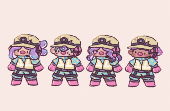
no text ft. @tigersnails, Sandri (Twitter), @thedarkfreack
#also feel free to use this as a general meme or something i might start sending this everytime SR is going shit#4 high EVP players clock into work. what happens next will surprise you (everyone misses flyfish basket)#ok but obsessed w/the new slopsuit its so silly its grown on me now that i stared at it for a bit. its like candy colored..#||lost kin doodles#//vaporwave#||friend chars#splatoon#splatoon 3#salmon run
320 notes
·
View notes