#near my dorm
Text


hcs and more drarngs below the cut:
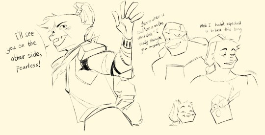
basically they first met during the early days of the revolution, when Raph was still there. He even encourage him saying "there's no way he's str8 with a v-neck that low" (it was a sleeveless hakama...) to which leo responds with "were at war, I don't think his sexual orientation is on our need to know basis" "JUST GET OVER THERE"
Sagi thought he's cute, duh its Leo. But he wasn't struck with the idea of romance at first glance. they become friends, competitive in developing their skills and leading their separate groups of the same rebellion. Usagi picked up the nickname fearless for Leo from the rebellion soldiers, He uses it (both for teasing and as an endearment).
Sagi's group had to separate in order to help other colonies prosper but before he leaves there was a vague confession of Leo's feelings. Sagi, (the ahole) only smiles and says that he "admires him equally".
they don't see each other for several years, but when they got back together they grow closer than ever. Thus, old married couple behavior...
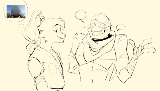
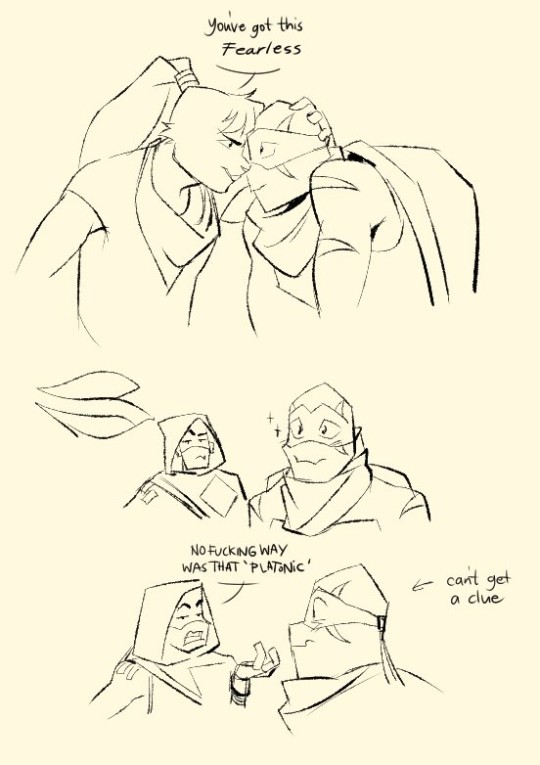
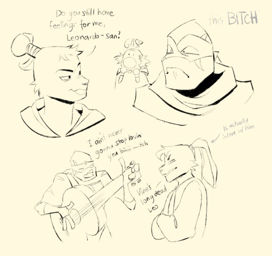

thas all thank you<33
#this be the last of me for a while...#i am moving to a dorm near my college tomorrow#the semester is about to start#may we all be as fearless a leader as leonardo hamato#*dies*#leosagi#yuichi usagi#future leonardo#future usagi#leonardo hamato#rottmnt#rise of the teenage mutant ninja turtles#rottmnt leo#rottmnt fanart#rise of the tmnt#rottmnt donnie#rottmnt future mikey#rottmnt future donnie#my art stuff
4K notes
·
View notes
Text


#only 2 months late 😎#idk what it is about the 2-part illustrations bros but i underwent a character arc working on this#tbh i think it could use at LEAST another hour of tweaking but like. considering im packing for my dorm NOW …#speaking of! :) im going off to college! so unfortunately i don’t expect ill be very active here in the near future but who knows#i hope you guys enjoy though! im very proud of these#it’s SO weird bc it’s like. if i gave like 20% more of a shit i could actually have Something here#in a weird transitory phase rn. will let u guys know if i survive it#UMM. UH ANYWAY#game grumps#dan avidan#arin hanson#10 minute power hour#honeyart#danny sexbang#<- yeah sure. lol#also yeah the dan one does kinda blow a little bit. but the arin one 🩷
186 notes
·
View notes
Text
if isagi, kaiser, and ness were in a roommates situation isagi is bringing his own rice cooker (he won't let the other two buy a rice cooker. his rice cooker is good. they don't need a new ricecooker). ness likes the rice cooker. it plays little melodies and adjusts its cooking time so the rice is pretty much always perfect (it's like magic. he knows it has internal sensors but it feels like magic). kaiser won't let isagi put english or german labels or furigana on the buttons (ness has a labelmaker and isagi knows the kanji is difficult so he offered to) because that feels like losing. using a dictionary or google translate while trying to cook rice for dinner also feels like losing. kaiser takes a picture of all the buttons and studies the meanings in private, then figures out how to cook a pot of rice in the middle of the night.
they should probably not live together.
#not ship solely because if they were in a romantic relationship they'd deal with this better. it's funnier this way#ness knows how to use the rice cooker because he asked isagi. he would've explained it to kaiser but kaiser radiates malice when he's near#the rice cooker and ness just watches him from afar and cheers him on.#isagi wakes up in the middle of the night to the smell of rice cooking and goes into the kitchen to see kaiser standing completely#motionless in the dark. he probably wouldn't have been able to tell he was there if his eyes hadn't adjusted to the dark.#anyway. as an asian person i am so picky about rice cookers because i just be eating plain rice i can't have a rice cooker that's ass#blue lock#isakainess#post inspired by me missing my mom's rice cooker. god it's so wonderful my dorm rice cooker is shitty.
51 notes
·
View notes
Note
The art style of Cloud Castle is absolute ass bro why are their eyes so big
Idk man it just looks.... off
I wish they brought back the og art style like Blue Scarab Hunt because that was gorgeous
Well if you’re referring to the book's artstyle as a whole, then calm down buddy the illustrations as a whole are pretty good all things considered (believe me some of the illustrations in the later books are waaaaayyyyy iffier)
But if you are referring to Danilo Barozzi’s illustrations in the book then uhhhhh… yeah I don’t blame you, I didn’t like the big anime irises either, she didn’t cook with this one,,,
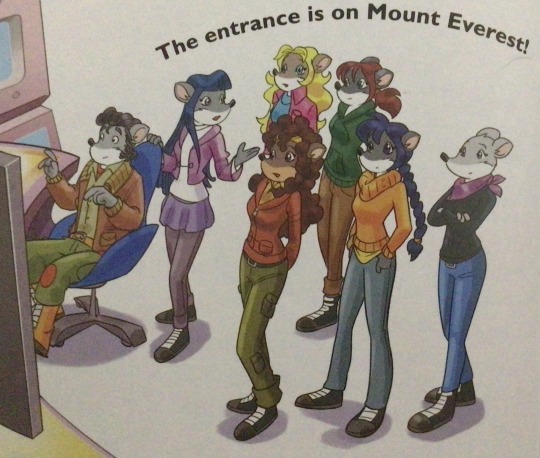
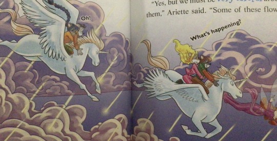
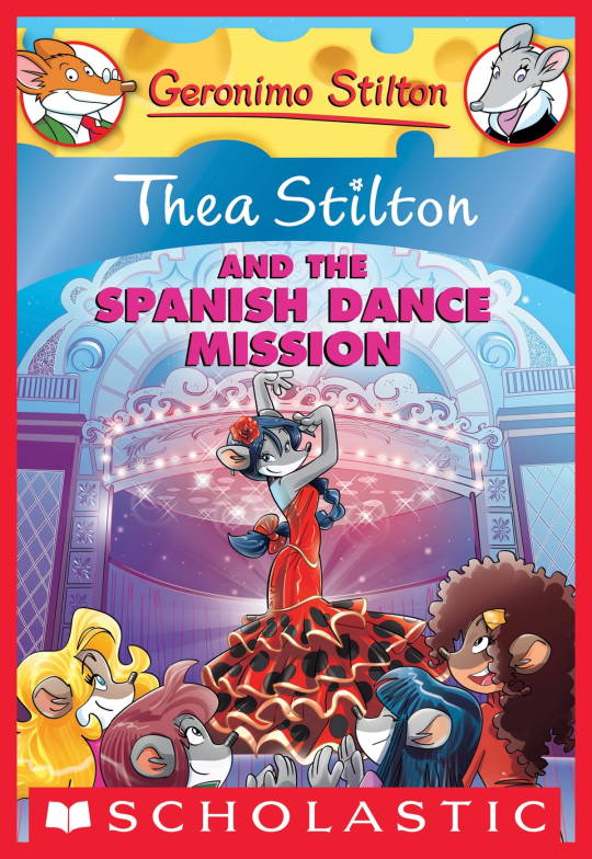
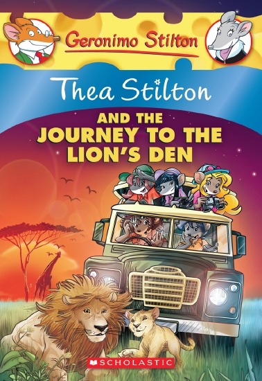
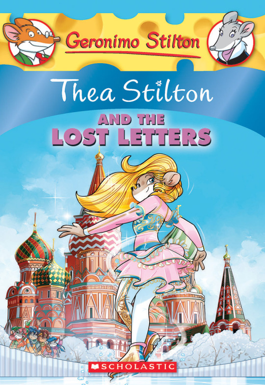
The interesting thing is Barozzi also did pieces for Secret of the Snow and those looked fine (she did well enough that I have to squint to determine which ones were done by her). My guess is either she did a lot of the illustrations for the latter half of SotS and we just got used to it, or it’s because the artstyle of special editions 2 and 3 were more… experimental? Books 4 onwards developed a very specific… look for the artstyle that adhered very closely to the main book illustrations of Spanish Dance Mission onwards, thus the illustrators had to follow suit, resulting in whatever looks off to look especially off.
(Even with this set of pictures, I’m only about 70% sure these are Barozzi’s because of how alike yet different the styles are from each other in the book. The first one could be Barozzi’s, but it could also be Giuseppe Facciotto’s, since he also did illustrations for SotS and his stylization means he sometimes puts the eyes really close to each other in a way that’s weird but still makes sense somehow.)
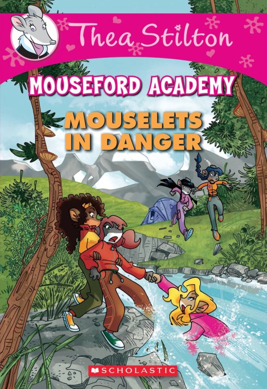
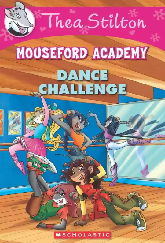
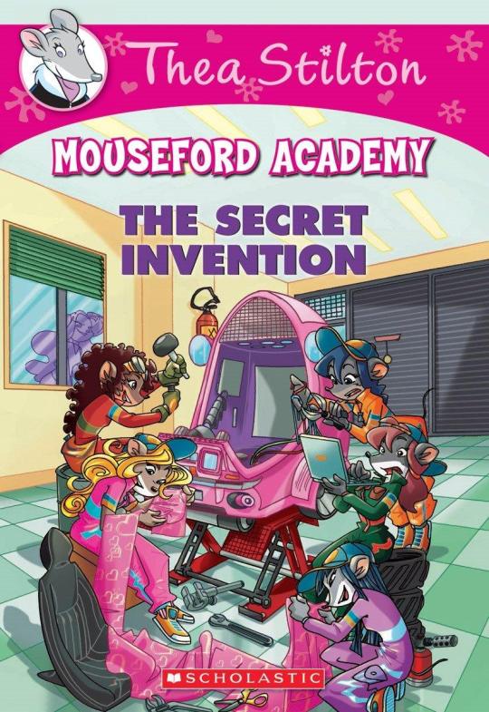
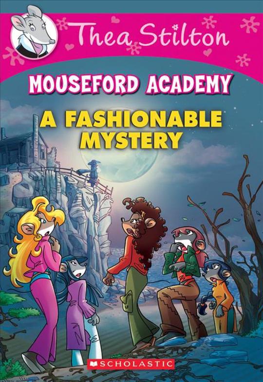
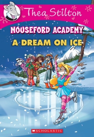
On the contrary, books 2 and 3 (and I would probably even include book 1 there) had a more experimental look to the illustrations, which seems to be based more on (and this is just a theory of mine) Giuseppe Facciotto’s iconic work for the covers of Mouseford Academy books 2-12, 14, 15 and 17 in the English books (he did waaayyy more covers for the Italian Mouseford books— he was basically the cover guy for the Mouseford books for a WHILE) as well as the books from Spanish Dance Mission to Lost Letters. If you’re wondering why those covers go as hard as they do, then now you know why.
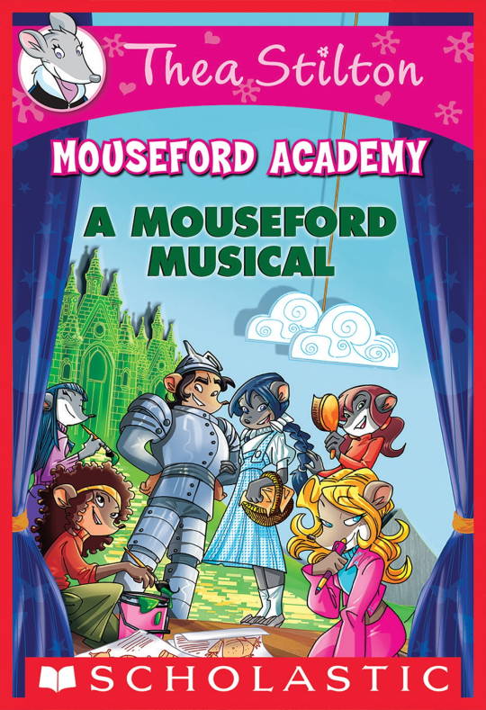
(These aren’t all of Facciotto’s works for the covers we know in English but you can see that he popped off <3)
But yeah as you can see with special editions 2 and 3, the art direction seems to be heavily inspired by Facciotto’s artstyle.
However, when Barbara Pellizzari’s works became the aesthetic poster child of the books’ brand, that was reflected in the illustrations and how their aesthetic changed, as seen in the main books and how they look currently, special editions 4-9, and the Treasure Seekers trilogy.
This new profile thing of the girls? This was done by Pellizzari (coloring was done by Flavio Ferron), and thus it became the main reference for how the girls look in the book’s illustrations.
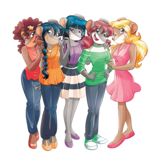
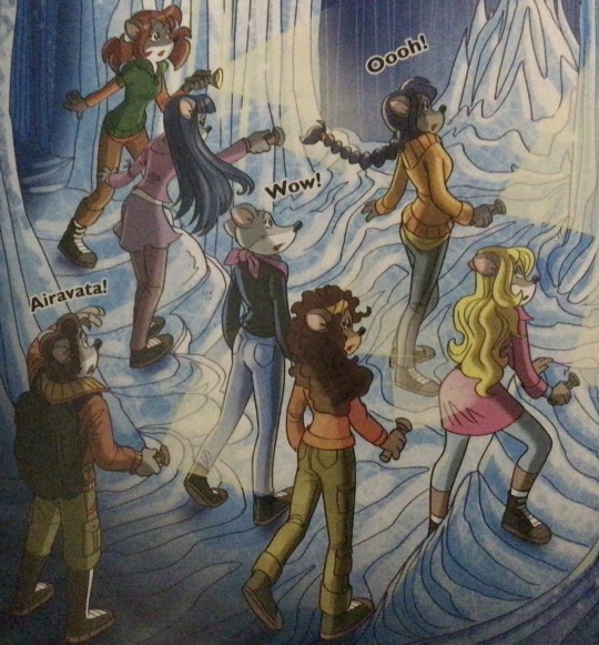
And it’s not just in the general direction to the artists for how to draw the Thea Sisters, but also in the direction given to the colorists. Alessandro Muscillo was the colorist for the special edition books since book 1 and the Treasure Seekers trilogy, and you can see that the direction for the style varied through books 1-3, like maybe direction was experimenting with the mood the illustrations were to convey, beginning with the cartoony and bright colors of book 1, easing into the more grounded and layered palettes of books 2 and 3
Then book 4 was when they transitioned to using digital art /j
I jest, but seriously book 4 was the debut of the coloring style we end up keeping for the rest of the special editions and for all of Treasure Seekers, which is very… bright :D
(I would show more picture examples but I manually took pictures of my physical copies for the Cloud Castle and SotS illustrations and gwuh I’m too lazy to grab my entire collection just to take pictures,,)
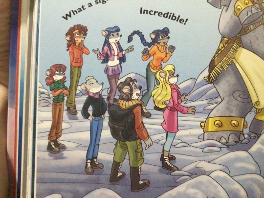
Bright as in like… the colors are very defined and saturated. I dunno how to describe it, but when you see it, you get what I mean. It’s very bright and pretty and colorful and it stands out. There are still variations that happen on occasion (Star Fairies in particular uses a good dose of airbrush for the lighting and shadow effects, and Crystal Fairies looks like someone had a bit of fun using sparkle brushes), but other than that, it’s very bright. I don’t hate it, but I do acknowledge that yeah, if I was introduced to the series when it had fully transitioned to the new style, I never would’ve gotten into the series in the first place, because the older books had something that didn’t make it feel specifically catered to girls. The colors were bright, but not too bright. Colorful, but unified. They weren’t that complicated, and they didn’t have to be because the colorists (plural, there were at least 3 per book once upon a time) were popping the hell off with the colors they were given. But y’know, the newer books’ consistent style did give me a good spot to practice drawing mouse furries so I’m not complaining too much about the newer style, haha.
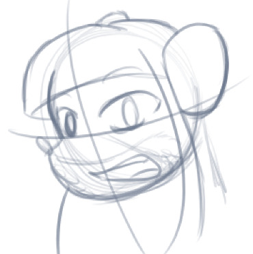
(Tiny baby E’s (it’s literally from 2020 what’re you on about mate) her first mouse Violet drawing using Barbara Pellizzari’s artstyle in Treasure Seekers 1 as an anatomy guide!!)
With that said tho, yeah I miss the old books -m- dunno if it’d fit the aesthetic of the special editions but m a n we could’ve had it and it probably would’ve looked cool
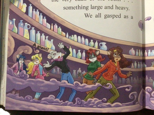
Also the illustrations go way harder in the older books, like Prince's Emerald? I've talked about Prince's Emerald and how it goes hard before, and I still stand by it and say that it does in fact still go hard
Maybe it won't fit the uh splash of color they gave the hardcovers, but imagine they grabbed Giulia Basile's coloring work for the graphic novels and used that as sort've a basis for the coloring style of the hardcovers. Not exactly the same-- would probably still add a touch of whimsical watercolor and/or paint to the very cel-shaded style, but we could've had something pretty dope -m-
Anyway that's my ramble simultaneously defending the hardcovers' artstyle and reminiscing on what could've been haha
#geronimo stilton#thea stilton#thea sisters#questions with e#rambles#the style of the older books is gorgeous but the main thing I'm wondering is can it pull off fantastical whimsy#that's the main thing i dunno if it can do (i would love to be proven wrong tho)#the style is so grounded that i'm wondering if it can pull off what the hardcovers needed it to do#which is convey the otherworldly fantastical thrill of exploring the fantasy worlds (which uh the newer books were able to do but#my main gripe is that fantasy and reality are near indistinguishable in vibes coloring-wise#sure there are sparkles and stuff is more saturated but the girls' dorm in book 4 still has the same-ish feel of the land of clouds#i dunno what it is. the bright colors just feel mundane somehow and don't take a shift when returning to reality)#looked at my books again and i think it might be the fact that the later books have no grounding color?#compare book 3 to book 5 and you'll see it the most distinctly methinks#the newer coloring style doesn't have a color that grounds the illustrations' palettes and thus everything's always bright 100% of the time#the girls' colors are always at their most saturated#like they're always under broad daylight in terms of lighting#it's not eyebleeding or anything but they don't look affected by the lighting in the setting they're currently in#and the result is it looks.... meh?#we get so used to the bright colors that they end up looking meh somehow#i'm not an art expert by any means this is just my observations as someone with a little too much brainrot
39 notes
·
View notes
Text
i need to write a lawlight au where l and light are contestants on an idol survival show à la idol producer (2018)
#i just got this idea two seconds ago and im obsessed with it. i think its fucking hilarious#l is not idol material whatsoever but what's fiction without a lil suspension of disbelief#this would NOT be a oneshot/flash fic btw it would be a ridiculously long multichapter fic with 2 chapters dedicated to each episode#everyone is fucking each other off camera and Manipulating the Narrative on camera. all song titles / challenges listed in gratuitous detai#there would be a list of rankings at the end of every arc. light would be the clear frontrunner but l tries to sabotage him every episode +#by giving him a bully arc or some shit. making himself look like a victim as light quietly loses his mind. then they hatefuck in the dorms#should i watch the zerobaseone show for this. isnt that whats trendy these days#my one hesitation w/writing death note ensemble fics is that im terrified of writing any character besides l and light (and maybe misa)#yes near and mello do scare me. matt? dont even start#somehow in my mind death note is a show without a lot of characters to work with (even tho thats not true; theres clearly enough)#me when raye penber shows up to the idol producer au bc i needed another vocal lead.#<- this is my brain when im avoiding thinking about writing the next convergence / tascts chapter#both my wips are so serious i wanna cry. i just want to fuck around and have fun :( why'd i do this to myself
9 notes
·
View notes
Text
getting wigs for characters with the same hair color as myself make me feel like the biggest dumbass around but youd have me fucked thinking im burdening myself with daigos 2000's emo cut just for a weekend
#snap chats#a weekend is generous im only going to the con on saturday#i like how im making it sound like anime nyc is this weekend when its at the end of august LMAO BUT NO LISTEN#unfortunately beauty influencers have finally done their job right and this one guy was reviewing an eyebrow pencil#but the twist is that this pencil was like. SUPPPER STUPID FINE im talkin .08mm and he demonstrated how it could imitate stubble#SO OF COURSE. my ass wanted to see for myself cause as much as i like my sponge-stippling method its not super precise#and that shit gets annoying when most of it looks fine but then i press too hard or i angle the sponge wrong and now i gotta start over#In Any Case the pencil i got did exactly as i hoped and its actually p fun putting on LMAO. i prefer how it looks too#anyway how this all relates to this post. im probably gonna go as y2 daigo again for anime nyc in august#and I Repeat im not cutting my hair for that LMAO so. Wig 😩#i like it when i cosplay him cause i just go by his actual design cause if i even breathe near skinny jeans ill wanna kms#also i just like to be as accurate as i can be yk. plus the leather pants i have are cozy and theyre one of my fave pairs of pants 🤤#in any case. whenever that wig comes in ermmmmm i dont trust myself to take pictures 😞 my selfie game is dick#maybe ill stream yk2 LMAO but anyway. good night i think im gonna force myself to sleep now#i got back to my dorm like four hours ago or whatever and i am not looking forward to doing school shit again. alongside comm shit#OH WELL we ball good night#wait before i Good Night cackling as i have my meds next to my aoki tablet and plush#great reminder honestly. Take Your Meds Or You'l Convince Yourself To Be A Republican#ok goodnight fr now im gonna giggle and kick my feet thinking of cosplay
10 notes
·
View notes
Note
thoughts on leo and shownu being in a musical together?? imo they’re both the best of the best 👏🏻
thoughts? ummmmm *rummaging around in my purse* i think leo looks hot in this outfit ☝🏾
#asks#this a unique situation actually bc im in my monogamous era so i really dont gaf abt any other man#so i have no interest in shownu but he's a good guy i like his voice and we have no beef#so i have no desire to tear him down to prop leo up like i did when him and kyuhyun did frankenstein 😭#i really would wake up call kyuhyun an ugly bitch that was lucky to even be near leo lmaoooooo#the way i get over a boy group and pretend them mfs dont exist is soooo crazy like whats my problem#2017 mbb kendra is def hype like turning flips in her dorm room good for her!!!
8 notes
·
View notes
Text
tbh its not that difficult to win a debate if you do like at least some amount of research before hand and say a lot of bullshit confidently
#the gay club at my school has this “battle of the dorms” thing that we do every semester#its like a set of debates in a bracket to see which dorm is the best or whatever#my dorm is kinda shit tbh but we won this year cause I did research on the other dorms and I like talked fast n shit#I think one of the big things that won my dorm the last round was that the other finalist mentioned a field that was like well lit at night#and was like near their dorm#and I went on a passionate rant about the evils of light pollution lmao
2 notes
·
View notes
Text
hate when i think abt someone just like once in passing during the day and suddenly my whole dream is abt that person. we havent been friends or spoken for like 2 years i dont wanna imagine us all buddy buddy again!!
#this keeps happening bc ill be telling a story and it matters that it happened with an old friend but as soon as i even think the name#my brain is like hmmmm yes and what if you were friends again.. here's some fanfic of that for you#and i dont want it!#had a dream we were all living in college dorms that overlooked the beach and theirs were dr seuss themed?? but mine were normal#and just kinda overlooked a courtyard near the beach
4 notes
·
View notes
Text
my monday schedule this semester might kill me.. bio 10am chem 11am bio again 12pm lunch break chem from 2-4:50. salute emoji
#i honestly dont feel TOO bad about it tho bc theyre all in the same building#and its right near the dining hall#and also right across my dorm. center of campus w#so i wont have to walk too much#nachi speaks#personal
2 notes
·
View notes
Text
Poe Party came out the year I was in art school, and I fell heavily in love with ravens and other corvids cause I was drawing/painting taxidermy ravens a lot. I now wonder how different my life back then would have been if I had known the series existed
Am a little sad, ngl, I definitely would have made it my whole personality (As if antisocial Poe isn't my personality now)
#not important#poe party#edgar allan poe's murder mystery dinner party#shipwrecked comedy#Anytime someone reblogs one of my Poe Party drawings I just get into “what was I doing back then” mode#the art school was a boarding school in the middle of nowhere in the Finnish countryside near a famous 19th century Finnish artist's home#And ofc being stuck there 24/7 I just spent a lot of time in my “dorm room” watching youtube#So I have no idea how I missed Poe Party#Especially when we had our little film making course and we made a short horror film#no I will not tell you how to find it#Also I need to tell you that the art kids at the school had our living area under an old “weaving mill” so we were just sleeping undergroun#and chilling with those infamous shower spiders
15 notes
·
View notes
Text
add “friday night parties” to the list of things I am NOT gonna miss about living in a dorm… I mean noisy neighbors were already on there but this specifically bothers me on so many levels
#see normally I’d just put on my noise cancelling headphones and it’d be whatever but#I am so determined not to fuck up my piercing#and I really don’t wanna tell them to shut up bc it sounds like they’re having fun and I’m in an especially too nice for my own good mood#and! I do genuinely earnestly want them to have fun. I am NOT a hater!! just bc I never got to do any sort of partying and never really#wanted to anyway doesn’t mean I’m gonna project that onto anyone else#but on the other hand friday nights specifically are sacred to me#as the first night of the weekend where I get to sleep in and the first night I don’t have to worry about assignments due the next morning#and also as a kind of religious thing#I don’t really observe shabbat anymore but I never was able to get used to the friday night = party time association#and I don’t particularly want to!! friday nights are for chillin and I like it that way.#anyway all this to say I am trying to enjoy my chill evening and there is NOISE and I’m not gonna do anything about it (at least#until Official Quiet Hours start) but I absolutely will complain#I convinced my mom to get a library card and give me the number so I can read books on libby#(would have gotten one myself but idk if I qualify for one at the library near my school and I’ll be gone in a few months anyway)#and now I am TRYING to read lockwood & co book 1#(yes it is technically a middle grade series. yes I am twenty two years old. if the show is anything to go by it’s a more accurate#portrayal of teenagers than any media I consumed as an actual teen. let me live)#but alas. The Noise#and yeah I know noisy neighbors are not exclusively a dorm thing but I can’t imagine a normal apartment will be nearly this bad#also to be clear this is not a weekly occurrence#I don’t actually think these particular neighbors have given me any issues before#which is part of why I’m feeling so patient with them… probably too patient tbh#I should probably delete this later#probably shouldn’t post it at all but oh well. what’s the point of life if you can’t share every minor annoyance with#a bunch of strangers on the internet?#screams into the void
2 notes
·
View notes
Text
thinking about the cute goth girl and the sweet metalhead from my dreams again. and how they're kinda like alternate universe versions of 2 of my oldest ocs actually. hmm 🤔
#met the goth girl at a goth club night in an old abandoned theater and we had so much fun dancing the night away together <3#the metalhead dream was a bit more tragic near the end. we lived in the same dorm/apartment building and met up to listen to music#he had the prettiest blond hair and the sweetest smile but one day he suddenly died#i was devastated. his parents sold off all his belongings along with his massive cd collection#i tried to get a hold of at least one or two albums at the thrift shop his parents dropped everything off at#but it was all gone already. nothing to remember him by. i cried so hard in my dream/nightmare i woke up with tears running down my face#anyway. both of these lovely dream people felt so nice and i would love to actually meet them one day...#or at least see them in my dreams again without the tragic sad bits orz
6 notes
·
View notes
Text
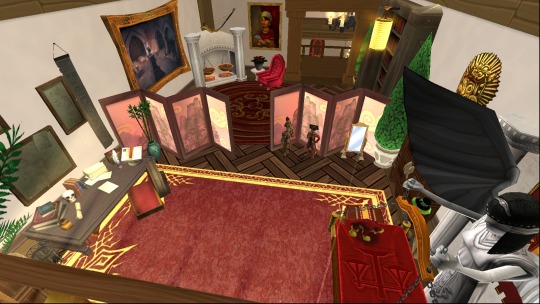
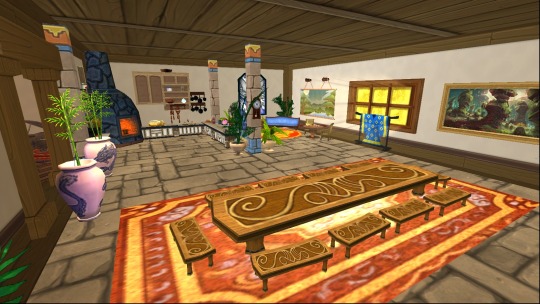
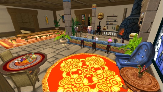
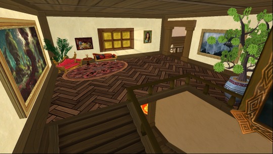
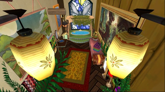
my house is Far from finished, but after uhh. literally over 5 years of on and off working, i thought id share my favorite parts!
ive elaborated on my thoughts + the #Lore below the cut :]
first part is tavia's room! its the most recent area and not quiiiite finished, as i have some empty space by the fireplace i gotta fill. balance bed has my first Truly Beloved Wizard101 Pet on it (and tavia's canon pet) lord hunter the heckhound :] wardrobe + mannequins that have the ravenwood graduation outfit + the dawn jaguar set that i remember being obsessed over. shelf with lotsa azteca trinkets on it; desk; shelves w books... trying to make it look a bit cluttered and lived in!
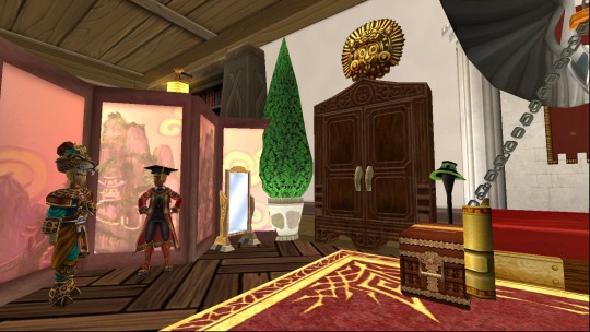
second is the kitchen! counterspace is made of the dragonspyre furniture pack cabinets + azteca castle blocks. there's a large dining table (that i miiiight put some plates/food on someday, if i have the item allowance) and a smaller secondary dining nook that has some small table and chairs + a bar with stools
then the upstairs landing + bathroom (sans toilet, i couldnt get anything to really work) the landing is a simple seating area. the bathroom walls are wooden castle blocks + a darkmoor painting. the door is a wardrobe with a detect player castle magic thing rigged to make it vanish when you walk thru it! spent entirely too long farming for the dresser with flowers, but it was worth it. the sink + tub are from the wysteria furniture packs
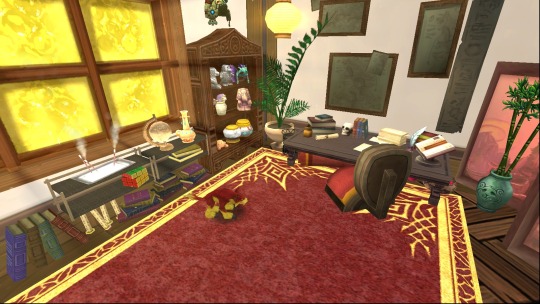
finally the study! took an age to collect enough dwarven bookshelves and now im habituated to buying them whenever i catch them in the bazaar. there's a larger desk and a small reading nook with a fireplace. i would of liked to of added a nook within the bookshelves, but its just a bit too cramped.
i tried to think about how tavia would use each room, and about how ive observed houses being set up from watching entirely too much hgtv. ive also borrowed ideas ive seen from the amazing houses on castle tours - the bathroom's location was a prime inspiration. the whitewash wallpaper is used throughout the house, as its brighter and less complex than the default walls. ive also used a Lot of scaling castle magic lol
not pictured: the entry room that's supposed to be like a living/family room but needs an overhauling. the room thats currently where i randomly place my hoards of objects thats gonna be walled off and maybe turned into a secret lab thing. the basement thats gonna have a secret treasure room. and the outside! the outside's been decorated for ages but ive been messing with it recently. i have a little couch potato farm thats hidden from sight and lots of fountains, trees and plants :]
#cae speaks#wizard101#w101#w101 housing#ive literally worked on this for 5 years and its nowhere near done lol#I GOTTA POST MY DORM TOO.... its so cozy#uhh ill tag tavia too bc this is her house#tavia dragonsong
29 notes
·
View notes
Text
ate a burger and fries and a liter of coke and it was so good and i was so sick and so sad that briefly i. u know what im not gonna make a joke abt americans i just want yall to know that we can make it if we have burger on our side
#next week ill try this new vegan vegetarian place that opened near campus i hope its good#mason jar salads are a gamechanger for dorm life btw. dressing on the bottom meats and hard veggies on top and then leafies on top for maxi#um crunch and freshness i ate the same salad two days in a row and it was still good and crunchy<3333 also grapes in salads are the best#also candying walnuts is easier than i thought and theyre so good#i like cooking#im debating whether to bake smth for my fav classes at the end of the sem especially since one prof is hosting a party#except its like 30-50 ppl per class so i prob shouldn't commit to that or should at least bake smth small and transportable#since i dont have a kitchen or oven or anything in the dorm. maybe like tiny cookies or smth idk ?? hmmz
4 notes
·
View notes
Text
I'm not afraid of becoming disabled for vanity reasons.
I'm afraid because this world isn't built for disabled people.
I'll be confined to my home because of the lack of public transit. Or I'll be stuck having to trust people to go out of their way to assist me.
Airplanes will destroy my expensive equipment.
I might not be able to use public restrooms.
There's nothing wrong with disability itself...
It's the world around us. It's so hostile.
#i dont even think pregnant people have easy access to things#then theres the elderly#like#at my university alone there aren't any reasonably placed handicapped parking spots#wheelchair users need to miss an entire class just to find a bathroom in most buildings#its near impossible to access sidewalks#theres a sidewalk to a dorm that forces rolling aid users to DOUBLE the trip up the walk#because the path doubles back on itself before you can reach the slope that allows you to go anywhere else#i have strong feelings about this#ableism#is absolute bullshit#and it upsets me that disabled people are not thought about until accessibility effects someone who can do something about it#im really sorry#my only personal hangup about becoming disabled is literally just the fear of not being able to do anything l#isnt that irrational?#im afraid of being stuck at home#unable to live independently#i would have to shell out mountains of money for aides#and then#theres the possibility that i wont have any money to live on#im angry#i hate it#i need to do better
2 notes
·
View notes
Last Seen Blogs
risoris
merida apologist

jerzydrozd
Okaybye

sorte-ao-azar
Sorte a minha!

lolita-joy-blog
lolita 수치를 모르는

dramxtical
Bubblegum bitch.