#more so than the late 90s/early 2000s
Explore tagged Tumblr posts
Text
As a pivot from my previous horny post, the “big back” trend on TikTok is disgusting and triggering as fuck
#we’re already seeing a resurgence of ED culture but the big back thing is making it MEANER#more so than the late 90s/early 2000s#stop saying this shit every time you eat oh my god
40 notes
·
View notes
Text
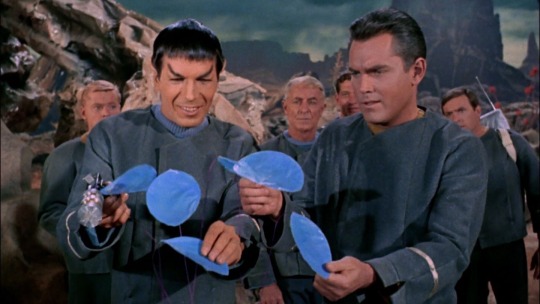
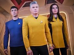
everyone else might already know this but i just think it’s funny that canonically The Cage takes place in 2254, so over 10 years before the start of Kirks first 5 year mission as captain. while SNW takes place around 2258-2260
(with the reveal of Carol Marcus being pregnant it would make most sense for it to be 2259 seeing as TSFS takes place in 2285, which would make David Marcus 25 at the time that movie takes place)
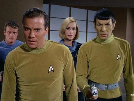
anyways, then the beginning of TOS is in 2265, and here’s a visual representation of why i find that funny (using spock as an example because he’s my favorite)
Spock and Pike circa 2254
Spock and Pike circa ~2258
and then back to Spock looking like this in TOS circa 2265 (Where No Man Has Gone Before was the second pilot but The Man Trap aired first so idk which takes place first in canon so here’s both)
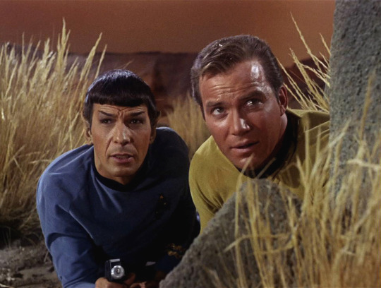
also i know most people are probably just gonna ignore it but i would love to see an in-universe explanation for why the hair and clothing styles changed so much between snw and tos.
#star trek#star trek tos#spirk#tos spirk#tos spock#tos#spock#leonard nimoy#star trek snw#like in star wars there’s an in universe reason for the prequels being so much crisper than the original trilogy#i don’t know the whole explanation but star wars is my brothers special interest so i know some#i like the movies im just not all into it#anyways it’s be cool if the explanation was just that our modern 10-20 yr fashion cycle held up#like we had late 60s to mid 80s we’re all big hair and bright colors#then the late 80s to mid-late 90s were muted grungy styles#then back to bright and fun and show as much skin as you can in the 2000s#then the fashion cycle started to speed up because of fast fashion#so then the 2010s were more conservative business casual vibes (still bright colors tho)#and then late 2010s to early 2020s it’s been a way more rapid fashion cycle#anyways i’m done ranting about fashion now i think
120 notes
·
View notes
Text
I don't follow blogs ran by people being racist about rap so I'm only witnessing the secondhand responses to the recent "discourse" and sadly 'tumblrinas being racist about their bad taste in music & low lyrical literacy' is exactly what I'd put on my 2024 bingo card for this steadily declining shithole....
#between the institutional transphobia and smol bean zionist problem the only thing missing is some classic 1990s* racism#my understanding is that people are reenacting their favorite law & order episodes and fearmongering about vIoLenCe in rap again?#1) violence is often good/necessary. grow up!!!#2) the poppunk groups yall obsess over sing about (& commit!) statutory rape every other song so actually shut the everloving fuck up#3) genuinely: how do you function in the world when you cannot distinguish lyrical creativity & dramatization from real life?#*more like 1970s to now racism obvs bc antiblack losers have always been not normal about rap but im thinking of a specific 90s/early 2000s#obscenity case. i cant remember who it was (& searching for rapper arrested for lyrics uh isnt giving fruitful results to say the least)#but anyway i am so sorry to those encountering these racist freaks in the wild. rest awhile in my glade so you may restore your energy#lately ive just really been into socialist/resistance music so if you need a break we can discourse about which dprk music group is the bes#ponchobo electric ensemble might be my favorite but really it's a trick question bc they are all amazing#here take this with you before you go. may it give you strength *hands you KPASM Chorus song about killing racist american imperial dogs*#a kendrick x kpsmc remix could have a lot of potential but thats for people who are better at remixing than i to ponder
5 notes
·
View notes
Text
"Why are all SK fans proshippers" Silence fetus
#text#mind you SK was released in a very different time period where fandoms back in the day were built different. freaks strived and#everyone back in the day followed fandom etiquette “ship and let ship” and “dont like dont read”. fandoms back in the old day were#peaceful and supported one another. ppl shipped anything and everyone and ppl minded their own business in the early 2000s#thats how almost all old sk veteran fans i know turn out to be what they are today#(ofc there are some. other veteran folks i do not fuck with as theyre also genuine assholes and are hypocrites/ostracizes others.#. but another discussion for another day lol. you must be a level 100+ of friendship to unlock my tragic sk fan backstory)#also news flash all of your favorite anime/manga stories are all written by profic ppl! thats right! everyone in japan are profic#shocking i know#japanese folks dont give a flying rat ass when it comes to FICTIONAL morals because they know how to differentiate between fic and reality#the fact that so many antis keep on twisting the word proship so many times to the point where its widely misinterpreted and ppl#nowadays esp the younger gen easily believe in the misinformation and keep repeating the cycle of misinformation in modern fandoms today#it pisses me off honestly#but yeah what did you expected from a old series that came out in the late 90s. the fact that theyre consuming the series when the series#itself also literally has problematic elements too lol#and see this is why im glad SK is niche despite that i wish it was popular so it can bring in more renmei fans but in the end its better of#being niche#because had it blown up it wouldve attracted all of the chronically online kids/puritans/fandom police and ruin everything for everyone#modern fandom today is the reason why all fandoms suck nowadays and its why i gave up joining and being part of them#theres discrimination everywhere in modern fandoms. oh your a proshipper? gtfo DNI and kys!!!!11111#its like theres eggshells everywhere no matter where you go. you have to abide with morality and puritanical rules its the “automatic” law#but fuck that thats never been the automatic law in fandoms lol. Ship and let ship AND dont like dont read is the real fandom laws here lol#but back to what i want to also say. theres nothing you can do about SK fans being proshippers. the old fans has always operated that way#since the old times. either adapt / cope with it OR you can just. block everyone and preserve your peace. which takes like 10 seconds#this is like maybe the 15th SK puritan fan i know lol. then again i also know theres ALOT of renmei antis who follow the puritan mindset#imao. I say this alot many times but SK fandom is only ugly and almost everyone becomes a puritan when renmei gets mentioned#which has always made me ????????????????? so yall can handle yoyo boy and anna teen preg can handle serg getting groomed/manipulated#by marc and xes laws can handle kids getting their arms and legs ripped off can handle kids getting killed left and right#can handle shipping bruce lee whos like plenty years older than JUN which btw beginning of the series she starts off being 17#but a 4 year age gap between ren and jeanne is too much apparently and should be cancelled. geez louise
1 note
·
View note
Text
"Cancelling plans is like heroin" - John Mulaney
(Sebatian x reader, they're married)
#look at that i finished another one; isn't that crazy#unlike the last one this one wasn't beta read cause i could not ask my friend to read this LMAO#this one's just pure fluff#takes place in spring on the day before then day of flower dance#stardew valley fanfic#my writings#idk how to write summaries but i think this quote summarizes the story quite well so i'll go with it lmfao#also i didn't remember i had to manually add my markdowns with the first fic but i got it this time#tags from the next morning cause there was stuff i forgot to say when i posted this#light spoilers in tags past this point so fair warning#this was entirely based on seb being like ''do we have to go?'' to the dance the day before and me thinking ''no actually. we don't''#so i just. didn't go#was more of a hoedown than i expected/hoped anyways#glad i didn't; from the dialogue on the wiki he sounds miserable; i wouldn't wanna drag him there#to be completely honest the only published books i've read over the last 2 years have been rick riordan's works so LMAO#hence why i reffed percy jackson in there; just thought it'd be fun#goes w the time period i imagine for stardew; taking place in late 90's-early 2000's and the first book came out in '05#so yeah when i said seb had a phone in the last story it was def like. a nokia brick#totally forgot to mention that i made a playlist for this; it's on my soundcloud w the same username#reading the 2nd heroes of olympus rn; i'm like halfway through but i'm very slow at reading actual books#i fucking love kane chronicles; idk where else i'd be able to say that so i'm saying it now
1 note
·
View note
Text
oh also random thing. as much as i loooove gj !!!!some of!!!! you guys cannot be saying “omg idc about how extremely misogynistic this was it goes hard” like all the time 😭 like yeah man sure their music from that era does sound good im not denying that. but idk man its at least a liiiittle iffy to me how these things are brushed off as “haha lol such a weird little detail” and not something that had an actual contribution to people participating in the scene being total douches
#lol i could discuss their lyricism for a while but i am not ever gonna be excusing that#yeah he was like. in college. and it was the late 90s-early 2000s#but actions have consequences! and just because it ‘was a different time’ doesn’t magically make it okay!#happy palumbo has apologized for it also i should mention that#I do not think he’s an evil awful person obviously do not take this post as me saying that#and also the band is not the root of all misogyny in hardcore/hardcore adjacent scenes#obviously#but!!!#!!!!!!! this is more of a rant about something I’ve been kinda pissed about seeing than anything !!!!!!#so forgive me if im not the most coherent#evil neighing compilation#not tagging this as like. the band or any genre or anything for obvious reasons
1 note
·
View note
Text
Everyone gets “The 90s” look wrong and I hate it
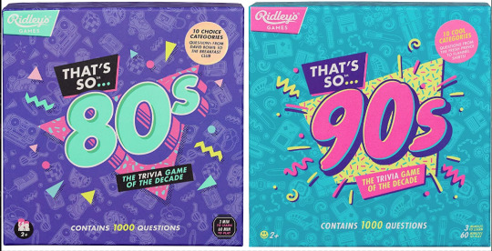
Couple years ago I saw these two board games at the store back to back. Well, not saw them per se, but ya know. Spied them out of the corner of my eye. And for a moment without reading the text, I couldn’t tell you which was which decade at first. Funny. Either they were in a rush to get these out the door or they wanted their throwback trivia game boxes to look uniform. I didn’t think too much of it.
Only, from then on I started seeing it MORE. Every time someone markets a 90s or 80s throwback...

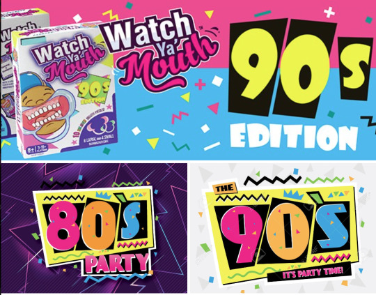
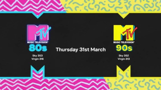
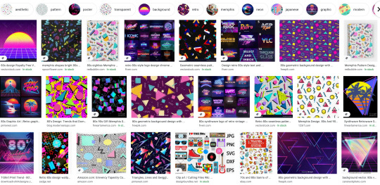
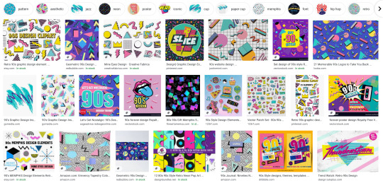
Goddammit they’re identical! What??! How did we let this happen? As a 90s survivor and a designer, this drives me up a wall.
Look, I know I’m late to the party to complain about “the 90s look” when we’re just starting to get sick of the Y2K nostalgia train. But c’mon, the 90s were not The 80s: Part Two™
Trust me when I say that we weren’t all wearing neon trapezoids up until the year 2000. The 90s look being peddled is so specific to the tail end of the 80s and an early early part of the 90s - a part of the 90s when it wouldn’t stop being the 80s. This is Memphis design being conflated with the wrong decade.
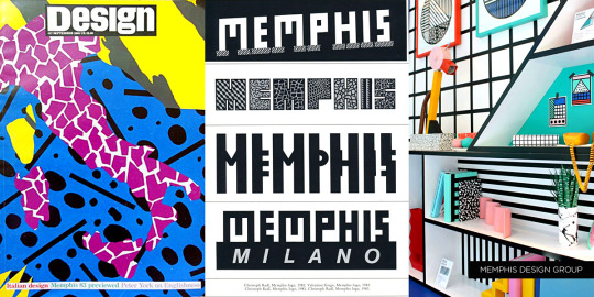

Keep reading for a long ass graphic design history lesson and pictures of old soda and fast food.
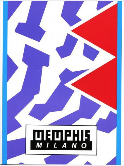
Specifically, the look is Memphis Milano, self-named by the Italian design house Memphis Group. Starting in the early to mid 80s, they made all sorts of furniture, fabrics and sculptures that were like a Piet Mondrian grid painting under heavy radiation. Their whole deal was defying the standards of existing industrial design up to that point on purpose. Chairs had weird arches, bookcases would be in strange alien colors, unusual materials like plastic or elastic were used in place of metal or wood, that sorta thing.

Memphis quickly became the signature look for the decade. You can tell something’s influenced by Memphis design from it’s telltale trademarks:
Clashing, neon colors.
Use of diametric shapes.
Contrasting patterns like zebra print stripes, confetti squiggles and checkerboards.
It wasn’t long before Memphis Milano-inspired design was everywhere in 80s pop culture:

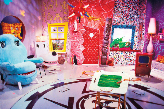
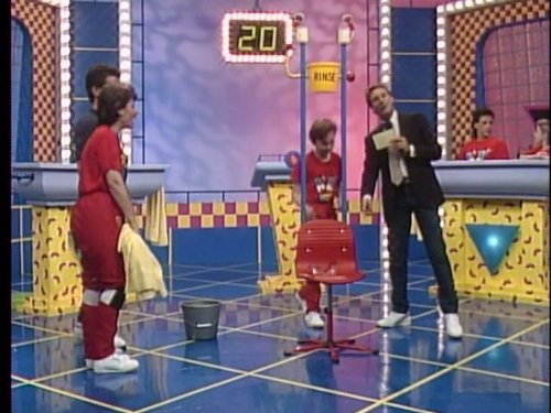
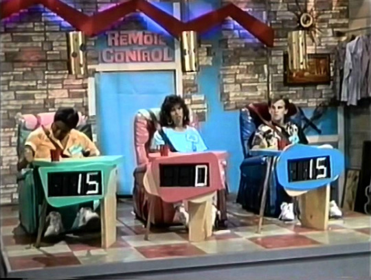
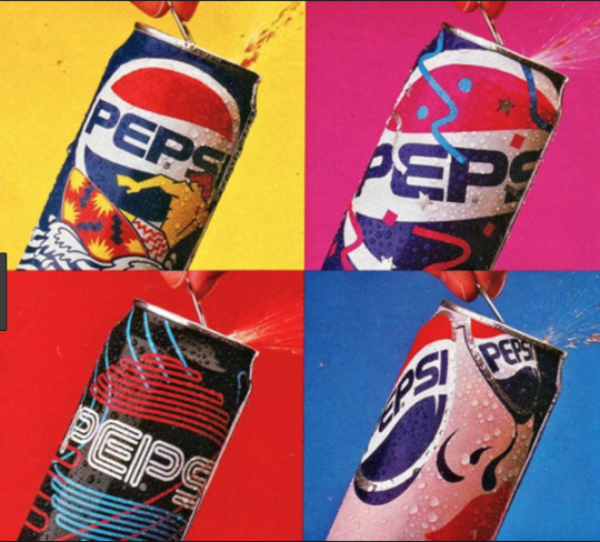


It was a special time, yes.
I was a kindergartener at the tail end of the 80s, so I knew Memphis mostly through the lens of kids media. Toys, clothes, games, tv shows used it like candy colored catnip. Cable channel Nickelodeon more or less adopted the Memphis aesthetic as their signature in-house style and practically built a monument to it at a Florida theme park:
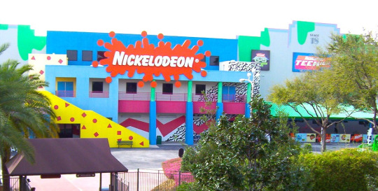
I think this is why folks mistake what decade Memphis is representative of - 90s staples like Nick, Saved By The Bell, Fresh Prince - they all stayed around much longer than the design trend’s expiration date.


Couple that notion with the fact that companies are slow followers to design trends. Something gets popular and they want to get on the bandwagon? Gotta wait for the ink to dry, gotta wait for the production molds to be made. It would take a few years for them to completely work Memphis outta their system.

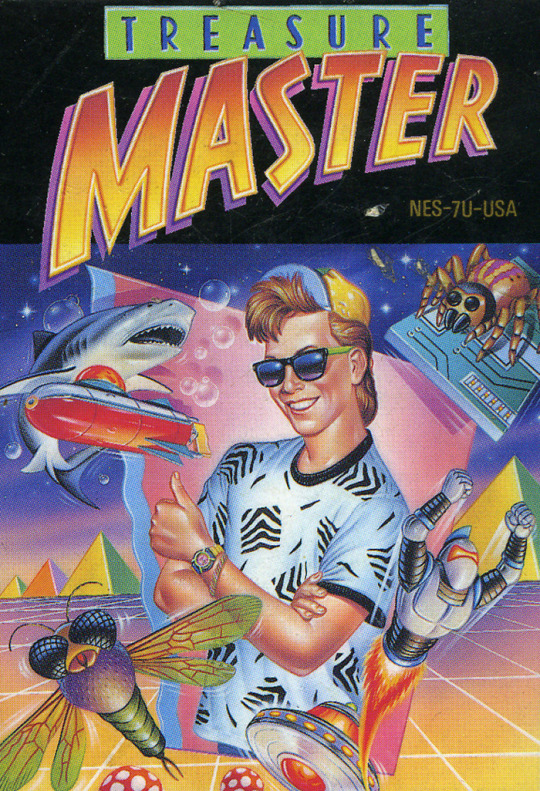
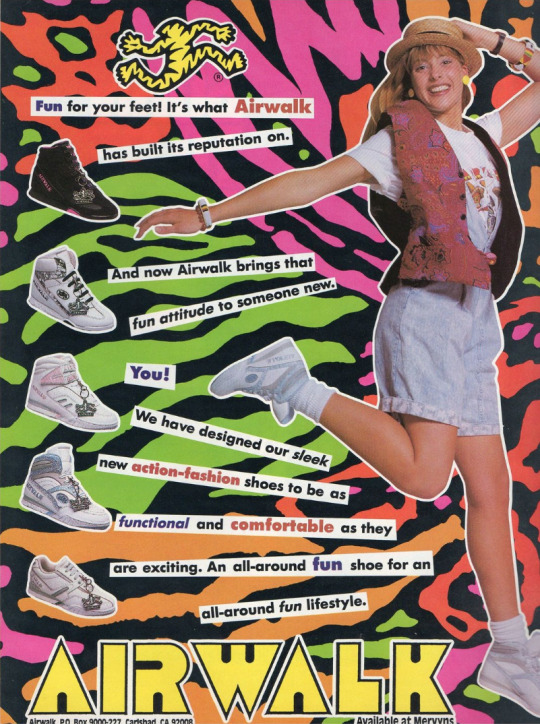
Now, this is not to say Memphis is bad! Personally I’m a fan of the aesthetic, if my neon-drenched artwork wasn’t a tip-off already. But it is a trend, and trends never last forever.
So what took the Memphis Milano look down for good? This part’s up for debate, but I personally think it had something to do with this dude:
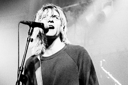
It’s that grunge music from Seattle that’s so popular with the kids these days dontchaknow.
Once Smells Like Teen Spirit hit in 1991, the Nirvana tone drove the rest of the decade. Clean geometry became weathered, grainy and organic. Bright neon pastels became more bold. Bubblegum pop music sounded fake and manufactured. Attitude and apathy was authentic. Whatever.
Things got grungy. Things got grimy. Olestra was invented.
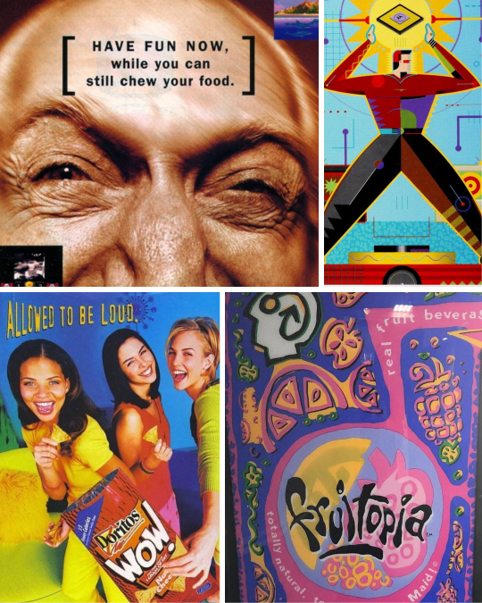
I think the best way to visualize this transition is how Cherry Coke entered the decade and how it left it:
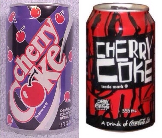
1992 Memphis on the left, 1998 grunge junkie on the right. Fitting that the 90s would end with a design that looked like Darth Maul’s lungs.
Okay, so what should 90s retro design look like?
Continue on to PART TWO! Spoilers: No VHS filters or vaporwave needed, but maybe bring an antacid.
16K notes
·
View notes
Text
What's K.O. CRISIS?
Hey all. Over the past couple months, I've gotten a lot of followers who probably don't know about my OCs and portfolio projects that I'm also working on, so I'm making a quick master-post for it!
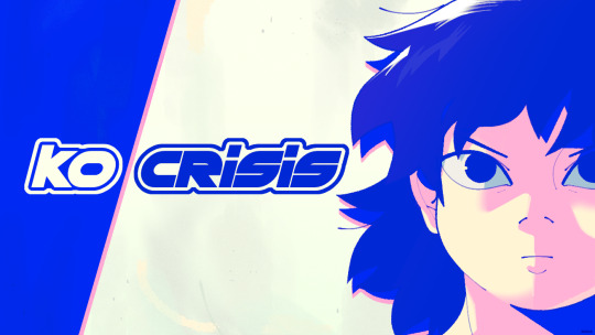
K.O. CRISIS is a series of artwork––character designs, illustrations, sketches, and animations––inspired by late-90s/early-2000s anime and Y2K culture.
Set in an alternate-history Los Angeles in the year 2001, the story follows disabled Taiwanese-American Ashley Tang as she fights her way to the top of the bracket in the national augmented boxing championship.
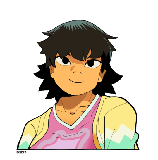
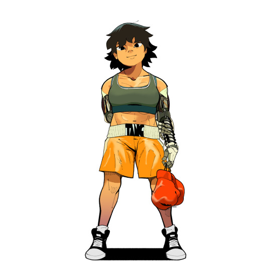
As the youngest female fighter in the championship, she'll have to fight tooth-and-nail to defend her place amongst the heavy-weights. While her rare dual arm prosthetics help even the playing fields, it'll take more than brute strength to prove her worth.
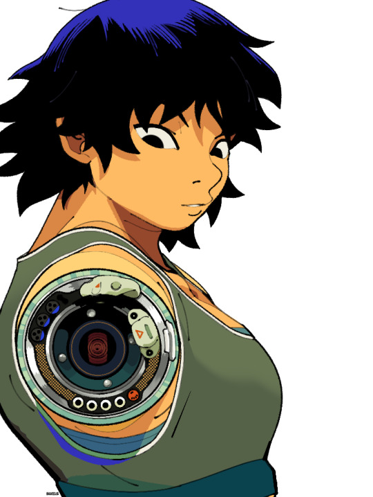
But this isn't a story about an underdog triumphing against all odds. Throughout the story, Ashley will push herself to the limit for the sake of validating her existence under the grinding heel of the sports media machine, in a world that values disabled bodies more than their lives. As the championship rages on, one question seems to linger through the roar: Is Ash strong enough to win, or is she brave enough to quit?
Through the project, I'm hoping to explore representations of prosthetic-users in pop culture as "enhanced superheroes," as well as discussions of trans-humanism under medical capitalism, the fetishization of new technology, and the commodification of disabled people as entertainment.
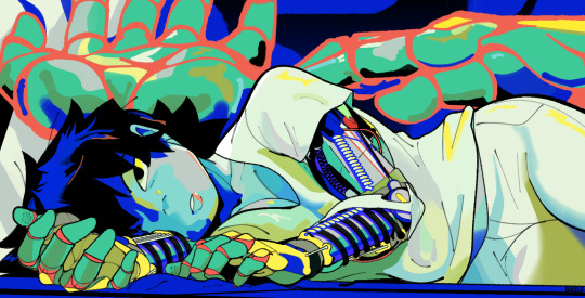
Accompanying her journey include characters like Noora Balakrishnan, a local transfem prosthetics engineer who doubles as Ashley's ringside mechanical cutwoman.
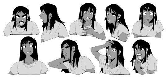
The project is still in its early stages, especially since I sorta rebooted it earlier this year (meaning I'm no longer using past, outdated art for the project). If you enjoy it, you can find more artwork for the project under the #ko crisis tag!
#long post#not art#ramblings#ko crisis#i'm not physically disabled myself so i implore anyone who is to share their thoughts and feedback if they feel so inclined.#if you feel that i show know something/if anything in this project makes you uncomfortable my dms are open#it's funny how half my followers are following me for historical 1920s cottage core art#when my main thing is sci-fi cyberpunk shit#also fun how this project's a live timeline of my art improvement#i was about to use noora's portrait when i went “wait... why are her shoulders so small. thats not right”#thats improvement babey
2K notes
·
View notes
Text
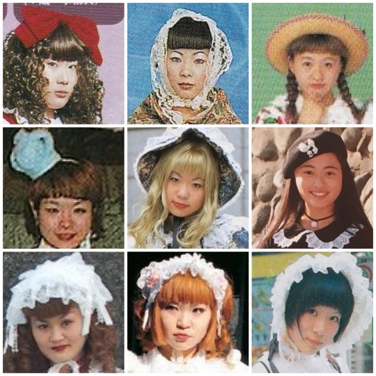
Sweet Lolita through the years
Part 1: Late 90s-2005 (ish) “Oldschool”
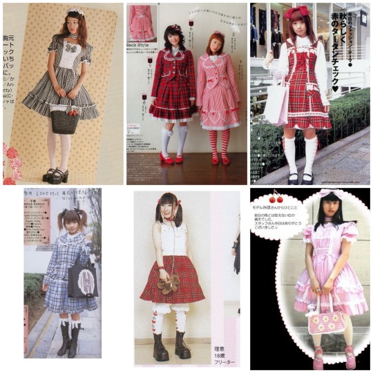
Oldschool sweet is the first truly recognizable form of sweet Lolita
Though during the Oldschool era the substyles had far more crossover and less individual traits I think there’s just enough that you still label coords from the time. When most people think of Oldschool they think of a solid color main piece with lace topped otks and a rectangle headdress… but Oldschool is so much more than that.

Oldschool in general was simpler, though some brands like Metamorphose Temps De Fille , Emily Temple Cute, and baby the stars shine bright were already making prints
Printed fabrics of fruits or florals were very common, but you did see a good amount of screen printed and appliquéd pieces coming out at the time too. Some very common sweet motifs in the oldschool era were:
•cats
•fruit
•alice in wonderland
•bunnies / rabbits
•bears
•alphabet / letter prints
•music notes
•hearts
The closer to the end of the identifiable oldschool era the more prints became popular! Though through most of the 2000’s prints would remain more minimal with the focus being on more structural elements like lace, bows, construction, and interesting fabric choices.
Due to the image limit on tumblr here’s a link to the correct sorting to see examples on lolibrary with examples of some early sweet prints and patterns. If you click the link on any of these items you’ll be able to view their lolibrary entries as well if available
Color balance wasn’t considered as highly as it is today, the overall vibe of Coords was more chaotic and experimental. A very make do attitude can be seen in many street snaps.
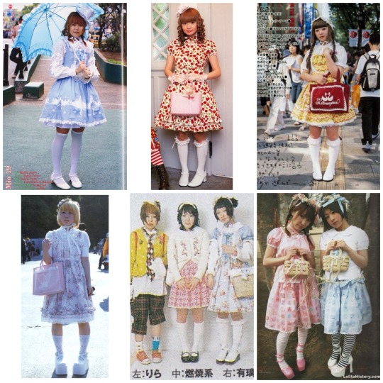
Patterned main pieces were another popular alternative to prints, things like gingham, stripes, tartan/plaid.
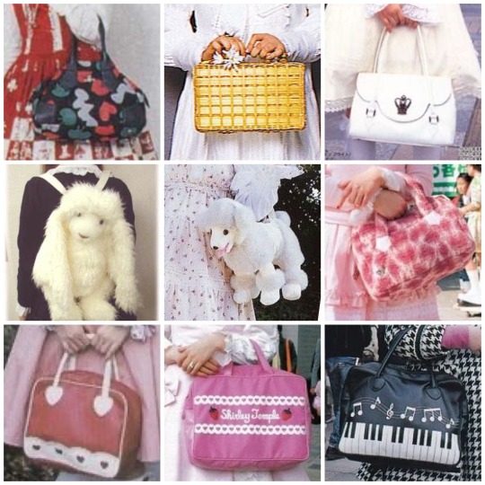
Bag choices were pretty varied, honestly in a lot of oldschool sweet coords people would use unique bags as the visual interest / focal point. You can already see that in someone of the coords above. Faux leather shaped bags like btssb’s heart bags weren’t very popular yet. A few brands had put out heart bags, such as milk, but they were much simpler and often real leather in limited colors. You also didn’t see usakumyas in their modern iteration until well into the 2000’s towards the 2010’s. Plush bags of the era did not have the same clean marketable look. Some common / popular bags were:
-basket / wicker purses
-plush animal bags
-tote bags
-matching fabric bags
-leather handbags
-designer handbags
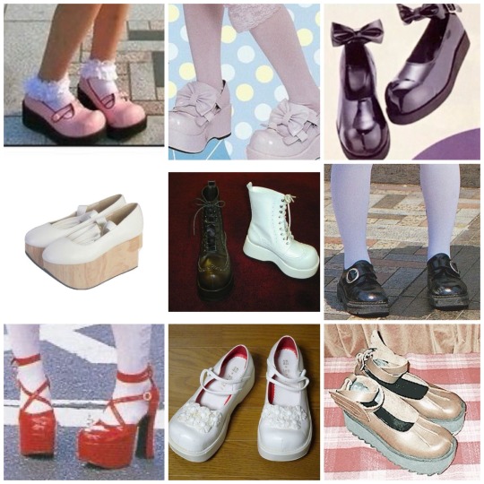
Shoes at the time were much chunkier and much less cutesy even in sweet styles. Tea parties didn’t exist until a good deal past this time period- honestly most popular modern Lolita shoe styles weren’t really seen. Real leather was far more common, in a much more limited pallet. When you did see colored shoes they typically weren’t used to color balance a coord like we do now a days. A lot of different styles were worn though, including:
-Mary Jane’s
-Platforms
-Rocking horse shoes
-Boots
-Oxfords
-sandals
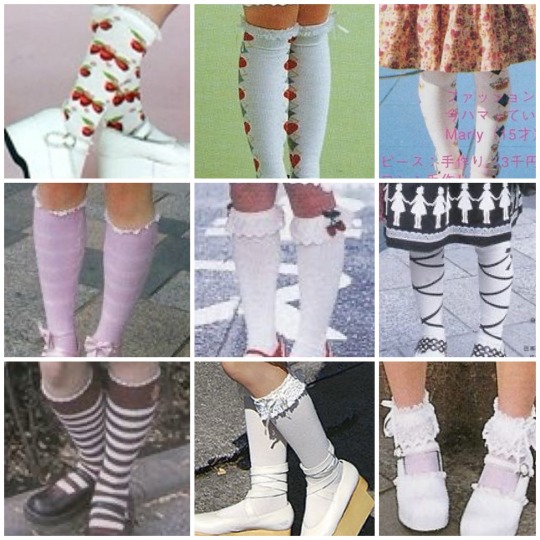
Socks are often overlooked in oldschool. I’ve seen so many people say printed socks weren’t worn even though they absolutely were and many brands made them. Sure, lace topped otks were the trend and the most popular option but simple motif printed socks absolutely existed and were worn!
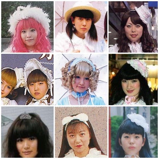
Headpieces were one of the most varied category. So many different styles and kinds were worn.
-mini crowns
-hair ribbons
-hats
-bows
-canotiers
-mini hats
-lace headdresses
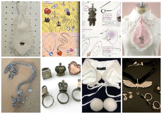
Jewelry / Accessories were one area that Oldschool definitely was simpler. However brands were absolutely making both jewelry and other accessories. Plain metal necklaces with various motifs were common, lace chokers, faux collars, capes, ties, and though extremely uncommon you do sometimes run across wrist cuffs. Hopefully there’s more of an effort to start documenting jewelry and accessories from this time since it’s quite lacking
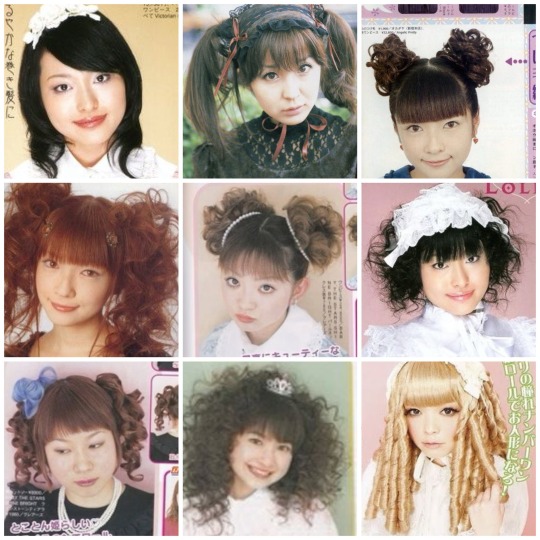
Makeup and hair were something that like all eras of Lolita followed the over all cultural trends of the time. More minimal make or simple 90’s - early 2000’s makeup is seen often. As for hair there’s so many different styles that really it would be impossible to list them all. In older magazines there’s often sections with hair tutorials and makeup tutorials!
Common lace styles included Torchon, Cotton, Eyelet, and Raschel. Many different trims and such were used in addition to these.
Part 2 and part 3
Scan credits @obscuredesireofbourgeoisie
If you want to see more old magazine scans
Lolita history
Internet archive
369 notes
·
View notes
Text
What I Will Be Manifesting This Week :

What I will be manifesting this week:
- Desired Body (Revised)
- Always Waking Up In The Void State Aware
- That my 3D always conforms in under 48 hours
What Will I Be Doing?
- Embodying the state of having my desires.
- Fulfilling myself in imagination whenever I think of my desires.
- Fulfill through visualisation and inner conversations because that is what feels most natural to me.
What Will I Manifest In The Void State?
- Desired Face & Body but with some finishing touches. (doll - like, kind of like Karen smith from mean girls)
- Desired Height (5’7)
- Desired hair (doll - like)
- Desired Name (so elegant and pretty!)
- Desired Personality
- Desired voice (singing & speaking)
- Desired Vibe (90s Supermodel)
- Desired house (so luxurious)
- Desired room (Barbie x Gossip Girl themed)
- Desired Wardrobe (Blair Waldorf type outfits)
- iPhone 15 Pro + Desired Phone Case
- New Desired Biological Dad + New cousins & aunties etc to match
- Revising that my parents got married in Paris
- Rich Family
- All my family members are happy and have everything they want
- Privacy
- Pretty School Interior & Exterior
- Desired School Uniform
- My best friends to live on the same road as me and to have everything they want.
- Perfect mental and physical health for all my loved ones.
- Desired Career to start early (Supermodel for when i’m 17)
- Perfect Posture
- Perfect Eyesight
- Perfect Culinary & Baking Skills
- Fluency in French & Dutch
- Piano Prodigy + being able to play desired songs on it
- Good at playing electric guitar
- Changing Appearance of my family members
- Revising my family’s names
- Always knowing what to say
- Family celebrates holidays like Christmas & Halloween
- Revising my memories to align with my dream life
- Photographic & audiographic memory
- Perfect grades
- Whenever I listen to a song, it feels like listening to it for the first time again.
- Desired Items
- Immune from embarrassment + Revising that any past embarrassing moments never happened
- Life feels like the early 2010’s again
- Life feels like a Gossip Girl Episode (You know I had to XoXo 💋)
- Life feels like a barbie movie (like princess charm school or smthg idk)
- Looking like desired songs
- Can Choose To feel hot or cold
- airport and plane processes to be always extremely fun and quick for my family, friends and I
- Teen Wolf & The Originals to be put back on Netflix
- Season 3 of One Of Us Is Lying to come out
- Some cute things for my pets
- Always know what my pets want
- My whole family to have good taste in fashion
- Go on nice holidays every year
- Materialise something instantly by affirming for it x3
- Kind, Respectful & Secular Family
- Disgusting Roadman fashion in London to be stopped (ew if u saw that shizz)
- Fashion to go back to the 90s and early 2000s
- People At School Don’t annoy me
- High Spice Tolerance
- Always Wake Up Feeling Fresh & Energised
- Never late to school
- Desired ear piercings
- Scary Insects never come near me (especially spiders AAAAH!!!)
- I appreciate all aspects of life
- Never abuse my manifesting abilities
- Everything i manifest manifests 10x better than how i imagined
- Basically revising my whole entire life top to bottom
+ much more personal things
Things I Will Be Manifesting For The World:
- World Peace in all realities
- No wars in all realities
- Palestine being free in all realities
- World healing
- Healed society
- Righteous justice system
- No corrupt leaders
- No corrupt governments etc
- Healthcare everywhere is free
- People are good people
- People treat eachother with respect and kindness
Guys, I will definitely go into more depth when i actually materialise all these and post my success story. + Will probably post some picture proof of materialistic things in my home and outfits etc but not my face or anything personal like that.
I wrote everything i’m going to manifest on here because I know i’m not going to be bothered to type it all out when i’m actually living my dream life in the 3D 💀
Share what you guys will be manifesting and stick to your new story so we can all post our successes together!!!
#void state#void#law of assumption#loa blog#loa tumblr#loassumption#loablr#manifestation#loa#neville goddard#live in the end#living in the end#law of assumption blog#manifesting
450 notes
·
View notes
Text
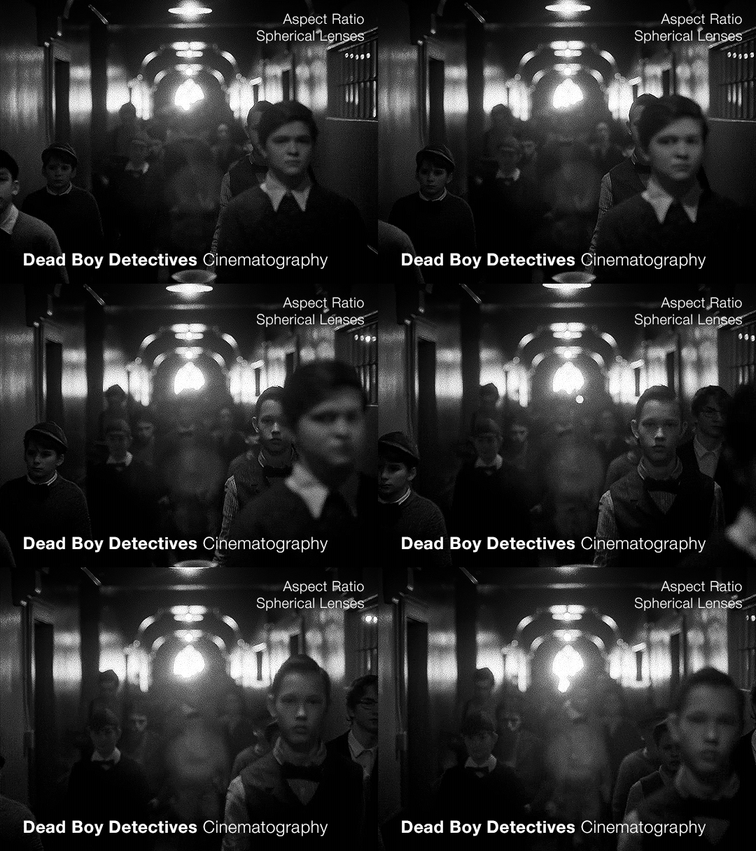
Part 2 — this time with a focus on the flashbacks
(Check out the first post for some background info that will be useful)
When we’re looking at the cinematography of any piece, once we’ve established what the norm is (which is the use of anamorphic lenses, as per the last post) we can then look to see where it diverges. As far as I can tell, the only part of Dead Boy Detectives that doesn’t use an anamorphic lens is Edwin’s flashback scene.
Now this is particularly interesting since not only is it filmed with a spherical lens, but it also is the only scene with a different aspect ratio, and the only scene in black and white. Everything about this scene is glaringly different. The easy and obvious reason is that it sets this scene apart as something important to pay attention to, as well as emphasizing the difference in the time period. But I want to highlight how exactly it does this since it is quite clever.
It also raises the question: Why not film Charles’ flashback scenes differently?
Like last time, let’s start with a review of history and technical information.
What is an aspect ratio?
This is just the ratio of the width to height of the frame. 1:1 is a square, whereas 2:1 is a rectangle twice as wide as it is high. In film, aspect ratios are usually listed as a ratio of x:1, so you get common formats like 1.85:1 and 2.39:1 (the second being a super-widescreen format, i.e. a long rectangle). Other common ratios are listed with different numbers, like 4:3 and 16:9. Any time I write an aspect ratio with other numbers, I’ll also list it at least once with the x:1 format so you can compare things easily.
What are some common aspect ratios and what have the standards been across the past 100+ years of film and television history?
Brief history of aspect ratios in Film
The original silent films were mostly filmed in 4:3 (1.33:1). This aspect ratio persisted until the late 20s/early 30s when the Academy Ratio, 1.375:1, was introduced and somewhat standardized (at least in the USA) until the 50s. Then, widescreen became pretty popular and was used to draw audiences to the theaters. At this point, we get tons of variation in aspect ratios in films. But, for American theaters, common projections are 1.85:1 (which became super common) and 2.40:1 or 2.39:1, whereas in some European theaters, 1.66:1 is a more common ratio.
Some other common ratios deal particularly with 70mm film:
Standard 70mm film is usually 2.2:1. However, using anamorphic lenses will create a higher aspect ratio, and unless using a specific format common in the 50s and 60s (Todd-AO), this wasn’t often the aspect ratio that viewers would see. (The Sound of Music was shot with Todd-AO in 2.2:1, but until recently, most people only saw the general release in 35mm, which had a different aspect ratio)
IMAX, which is 1.43:1 (if IMAX is shot on film and not digital, it uses 70mm film)
Brief history of aspect ratios in Television
Pretty much all televisions until around the 1990s-2000s used 4:3, and broadcasters would show content in that aspect ratio. If a movie was broadcast over TV, sometimes there would be letterboxing (black bars), but pan-and-scan was common, where they would crop the movie to the 4:3 ratio, and pan around to wherever the action was happening. Starting in the 90s, widescreen televisions started to gain traction, and the 16:9 (1.77:1) format prevailed, and TV broadcasting had some more wiggle room for aspect ratio.
**Side note: Computers are often at this ratio, so if you watch older TV shows on your laptop, you’ll probably see pillarboxing (black columns on the sides), whereas newer movies are often shot with higher aspect ratios so they have letterboxing (black bars on the top and bottom)**
A note on widescreen
Movies are usually considered widescreen if they’re any higher than 4:3 (or 1.33:1). However, because of the aspect ratio of modern TVs and computers, and the even higher aspect ratios of most smartphones in landscape mode, a lot of people (especially younger generations) won’t consider things “widescreen” until they’ve got a much higher aspect ratio.
Streaming and Aspect Ratios
A weird effect of streaming services, and in particular Netflix, was the rise of a new standard in aspect ratios, 2:1. It’s used in shows like Stranger Things. It’s widescreen enough that it feels cinematic but it displays well on lots of devices. There’s minimal letterboxing (or none) on your phone, and more letterboxing on your computer and TV, but not enough to seem like you’re watching a movie instead of a show.
Netflix (and Amazon) really like this aspect ratio. In 2017, one of the production requirement documents from Netflix stated that any aspect ratio greater than 2:1 had to be subject to further approval (though now they state “Aspect ratio choices should be discussed with Netflix for approval”). It’s become increasingly common, and these companies have a pretty set standard for 1.9:1 and 2:1. If we see those ratios on a streaming show it isn’t always a creative choice, similar to the way older TV shows were required to be in 4:3.
A brief reminder about lens types with some extra bits about the timeline.
That 2.39:1 aspect ratio that movies use? That’s the standard for anamorphic lenses (discussed in Part 1). Anamorphic technology was developed around 1915 (for military reasons), but wasn’t used for films until 1927, and didn’t become commonly used until the 50s.
So, with that, let’s look at Dead Boy Detectives.
Aspect Ratio
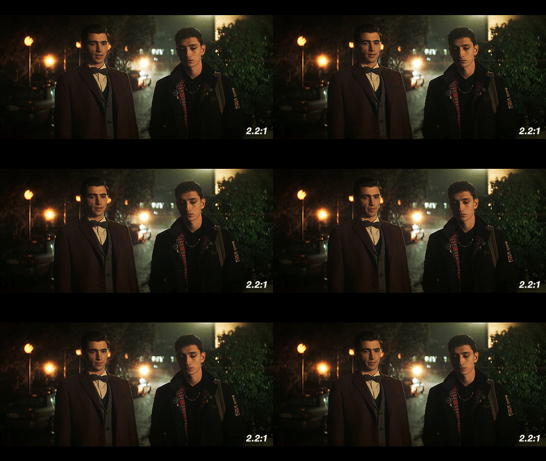
The whole show is shot with anamorphic lenses, but instead of a 2.39:1 ratio, they use a 2.2:1 ratio. This is a really interesting choice since it is an uncommon ratio. It’s more widescreen than Netflix shows (they started shooting before being acquired by Netflix though so we can ignore any impact Netflix may have had on this decision) but not quite the widescreen that anamorphic lenses typically use.
Movies and shows can use almost any aspect ratio today, but it is still common to stick to the standards. When they choose something else, it’s not because of technical limitations, but because of a creative choice.
The one caveat I have is that Doom Patrol used 2.2:1, so it’s possible that HBO and DC originally just chose this for continuity between the two, before the show was shifted over to Netflix and the Sandman universe. But for this post, I’m going to assume that they were sort of starting from scratch when choosing the look.
If we consider what a 2.2:1 ratio has been used for, and what viewers have been “trained” to associate it with, we end up with Todd-AO 70mm prints and a few others from the 50s and 60s. It’s the kind of aspect ratio you don’t see often unless you’re lucky enough to live near a theater with a 70mm film projector. There are a few notable movies shot in this aspect ratio: Lawrence of Arabia and 2001: A Space Odyssey. Some more recent movies that used 2.2:1 include Dunkirk, Tomorrowland, Nope, and the non-IMAX parts of Oppenheimer. It’s also occasionally used in recent TV, but not a ton, and not with many popular shows.
This is an aspect ratio used by large-format, high-budget movies. As mentioned in the previous post, anamorphic lenses are associated with a romanticized notion of “cinema” and this aspect ratio only serves to further that, associating Dead Boy Detectives with the limited pool of content made in this aspect ratio. It may be a TV show, but it’s being shot like a movie.
Another really interesting point that follows up on the previous post is the idea of using cinematography to enhance the sense of the supernatural and separate the characters from the normalcy of the real world. The aspect ratio is a bit unnatural too, which serves to complement and augment this.
Let’s briefly look at what the show would look like in different aspect ratios. As a baseline, this is the 2.2:1 aspect ratio that the show is in:
If they had gone for a 2.39:1, a very typical aspect ratio for the kind of lenses they’re using, it would look like this:
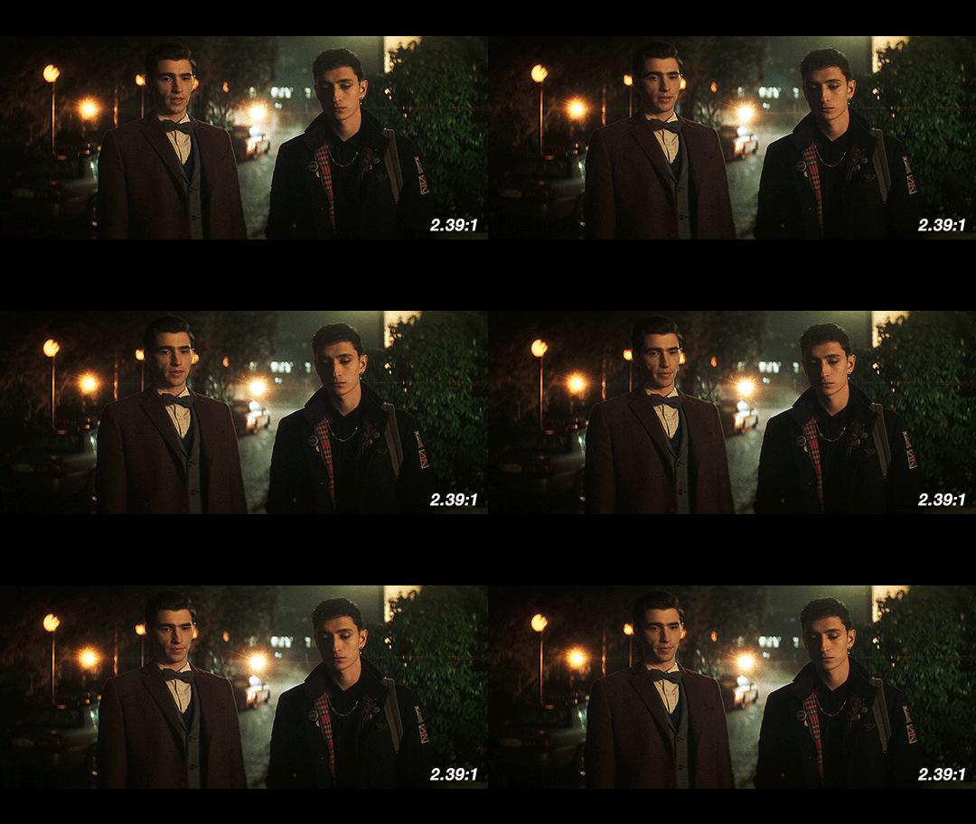
When we see things shot with anamorphic lenses, we’re used to seeing it in a frame like this one. Especially in shots like this with the dramatic lens flares, this is going to look and feel familiar to people who watch a lot of movies. It has more of that Star Trek (2009) look, and feels kind of glossy and polished.
Next up, we have 2:1, the aspect ratio popularized by Netflix. It’s a reasonable possibility that if this show had been produced by Netflix from the very beginning, this is what it would look like.
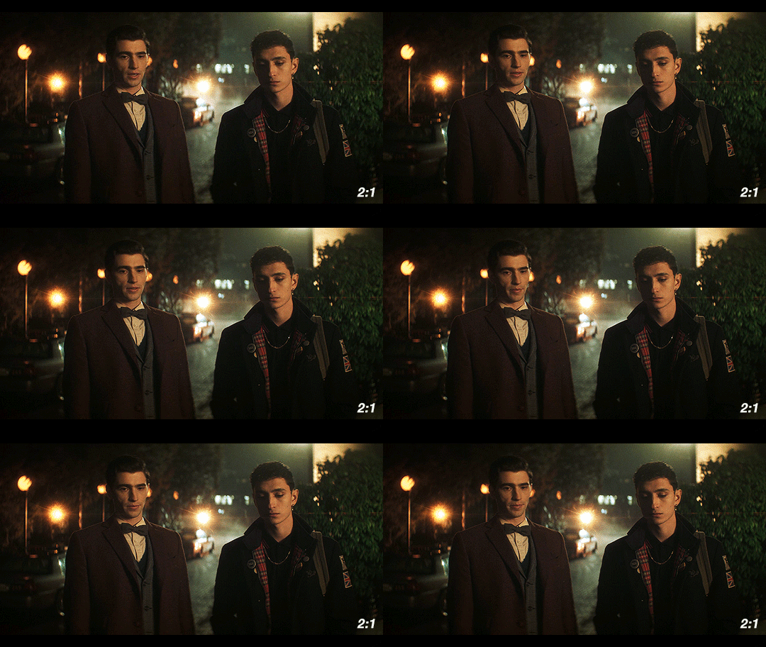
Over the past few years, this has become the “streaming platform” aspect ratio. With the extra vertical height, it’s got some extra space to breathe. We would get less of the background and more of the characters, especially since Dead Boy Detectives favors centered shots of single characters over group shots like this one.
Finally, I’ve got the scene in 1.85:1, a ubiquitous film aspect ratio, yet one that is not used often on TV.
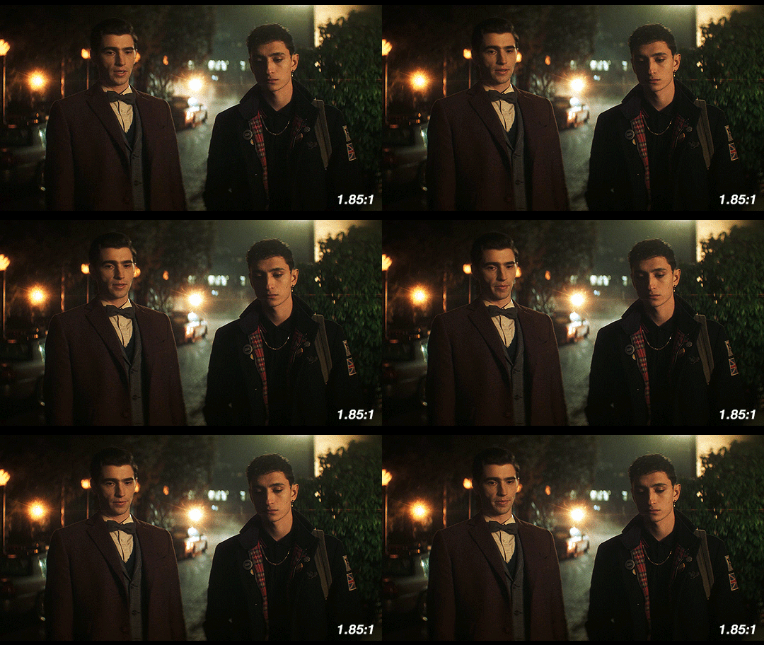
This is considered to be standard widescreen and it’s a great aspect ratio. Given how many creative decisions in this show were made to emphasize the supernatural, this could have been another good option as an aspect ratio, since we’re not used to seeing TV shows like this. However, they’re using anamorphic lenses so this would have required a lot of cropping. Because of how the anamorphic lenses work, this would also necessitate a lot of additional attention during the shoot. If they had gone with 1.85:1, we likely would have gotten a show shot on sphericals instead.
So what about Edwin’s flashback?
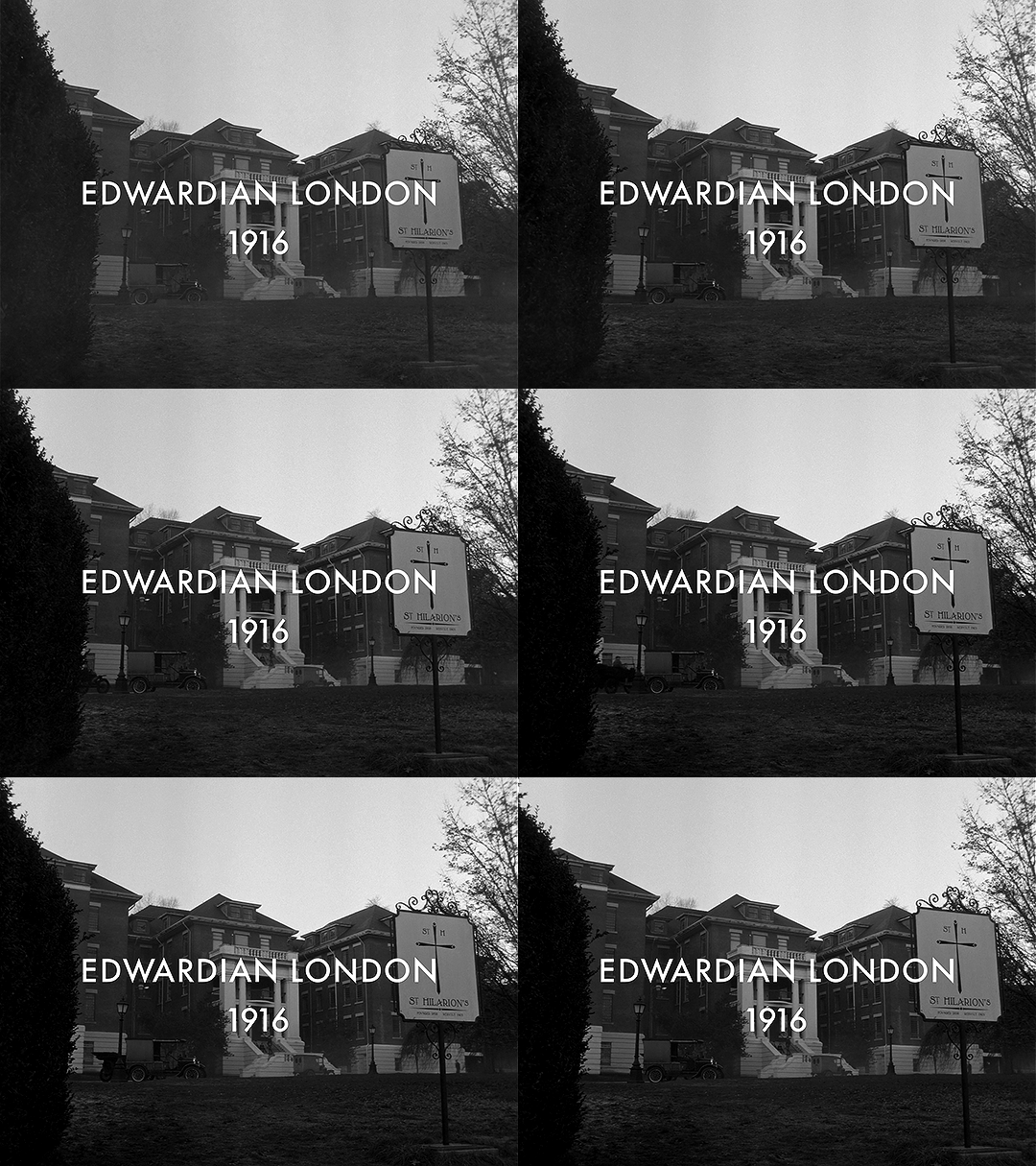
This section is shot in 4:3 (1.33:1). It’s the only part shot in a different aspect ratio. Sure, changing the aspect ratio forces us to acknowledge the difference in time period, but why exactly does it work so well?
Remember the history part? 4:3 was used for most of the early silent films. If we are to consider the “historical accuracy” of shooting the different time periods in this show, anamorphic lenses and 2.2:1 make sense for the present-day parts and Charles’ flashback.
But in 1916, widescreen cinema wasn’t a thing. If Edwin had ever been to see a movie while alive, it would have been in 4:3. The first time he would have ever gotten to see something in widescreen (if we assume he watches any movies at all) would be after he escaped Hell.
Using this aspect ratio is not just a vague decision that a lower aspect ratio and black & white looks older. It is, like many other aspects of the show, historically informed. They could have used the academy ratio here, but they didn’t. They used 4:3.
Not only does the aspect ratio switch for this scene, but also the height of the image changes.
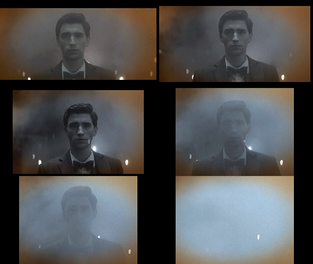
This transition also sort of mimics the breathing effect of anamorphic lenses:
Something you may not know about how Netflix usually works is that regardless of the aspect ratio of the picture, the video file you see is part of a larger container, which is usually 16:9 (1.77:1). The black bars on top and bottom are part of the file, as shown in this screenshot of how it looks when you load up some screencaps in photoshop.
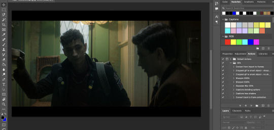
If you make gifs, edits, or are otherwise just used to having video files you are probably familiar with this. The Dead Boy Detectives files have letterboxing that is cropped out whenever people make fan content with it, whereas if you have a file for an independent movie, it usually does not have those black bars. Those black bars being part of the file make this transition possible.
We don’t usually realize that the container extends beyond the picture. For all we know, that’s the edge of the frame. But then it changes and forces us to reconsider what we previously thought to be true. Breaking out of what we think to be the image height is jarring, especially considering that this is the only time it happens (other than the brief flashbacks to the same footage later in the show).
Here’s a mockup of what it would look like if they kept the same image height, and just moved from 2.2:1 to 4:3 without expanding vertically. I find that it doesn’t have quite the same effect.
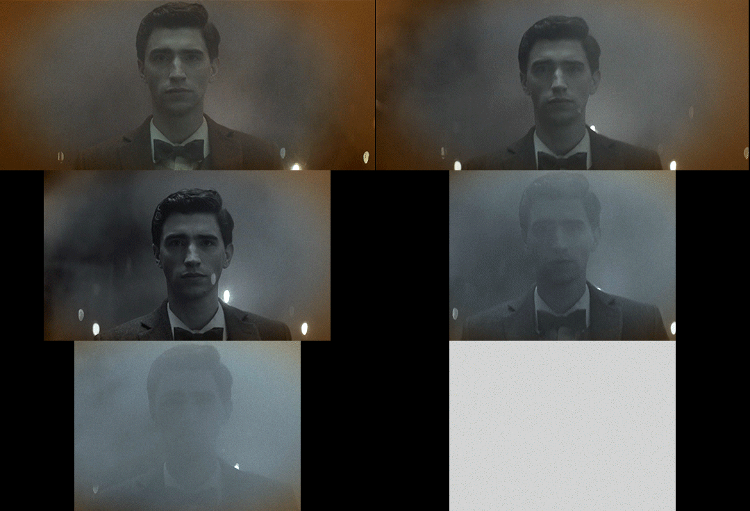
This would look so cool if it was being shown at a movie theater on a huge widescreen, but we’re not watching this show in theaters. We’re watching it on screens where this would make it look small; what they do instead retains the feel of watching something big and cinematic.
So back to the actual transition:

In breaking out of the perceived container, it’s as if it were breaking the fourth wall, an acknowledgment of the video’s format and its true container. This story is addressed to the audience in a way that the rest of the show is not, and it uses the aspect ratio to let us know that.
Spherical Lens
(I would highly recommend you read pt 1 if you haven’t already)
Edwin’s flashback is not only the sole scene with its own aspect ratio, it’s also the only scene shot with a spherical lens. Like the aspect ratio, this is a historically informed choice. Anamorphic lenses technically existed during the last year or two of Edwin’s life, but movies were not being shot on them.
How do we know that a spherical lens is being used, and how does this affect the show?
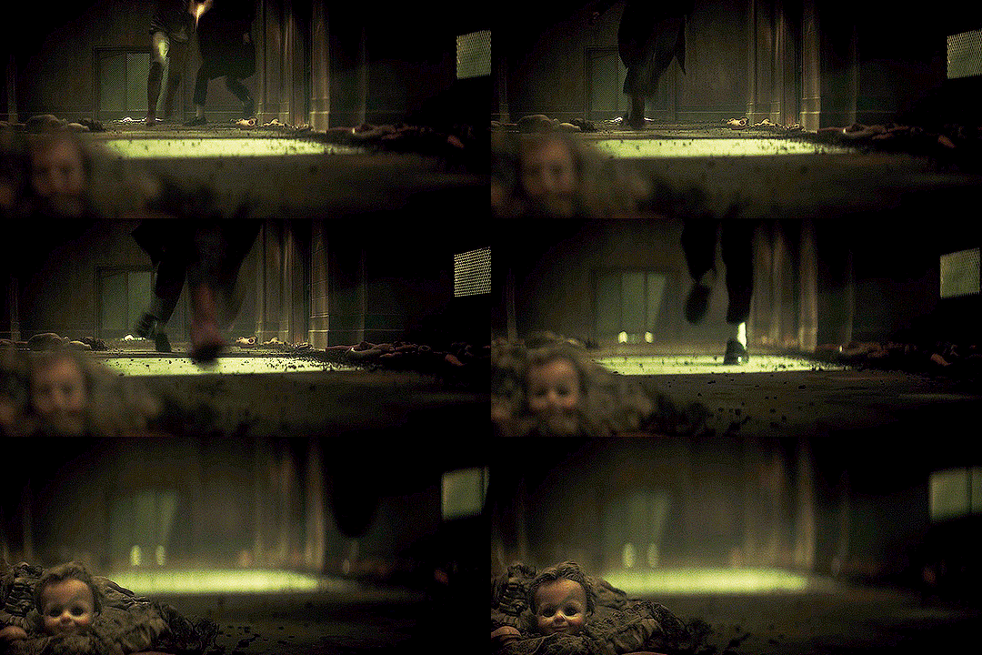
One of the quickest ways to identify the lens is to look at the shapes of the bokeh. There’s not much bokeh in the flashback, so I apologize for the intensity of my first example. But here, look behind Edwin’s head, where the lights from above reflect on the wet basement floor. They’re all circles, instead of the ovals that we get with the anamorphics.
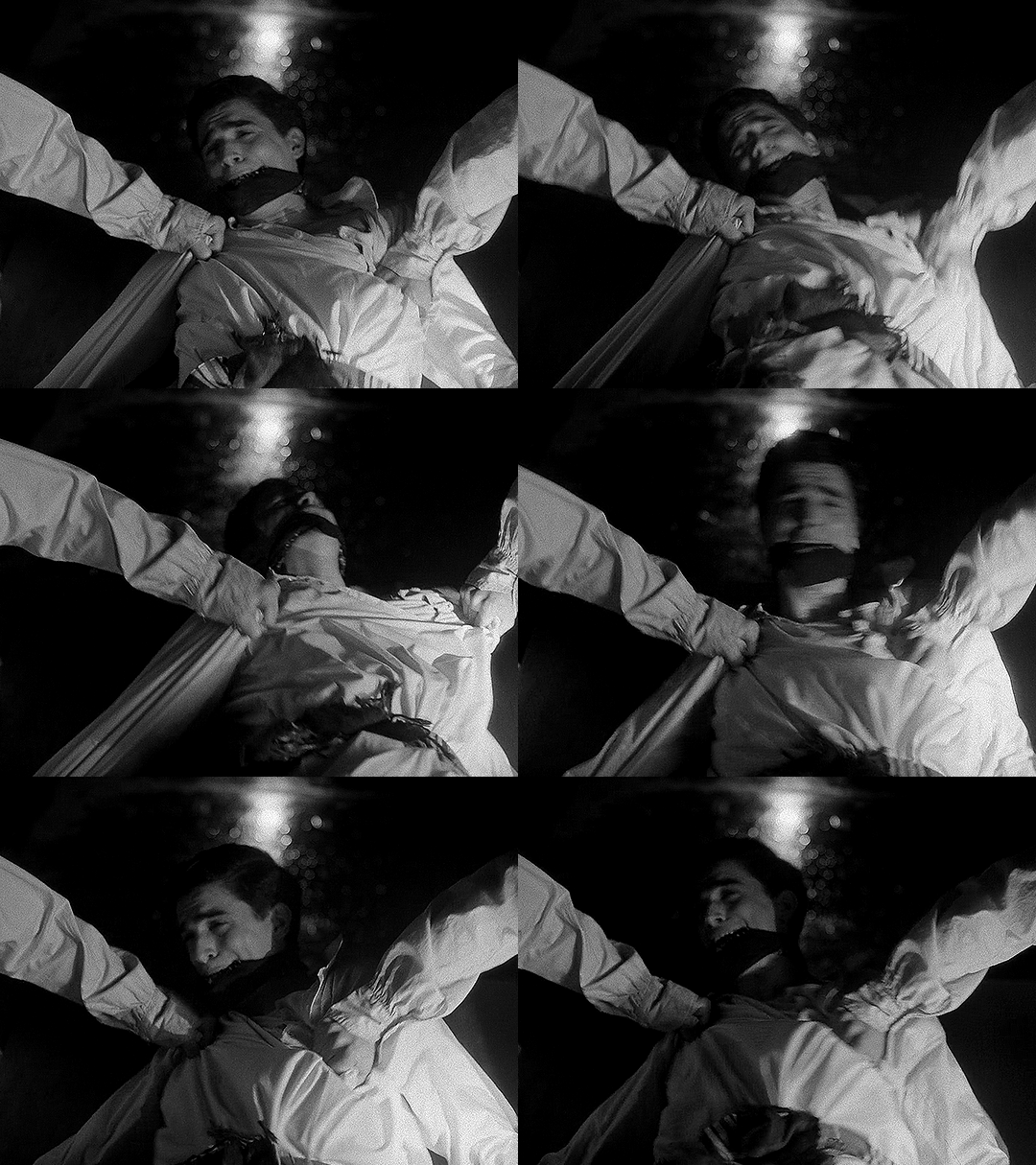
The lens flares are also really different. Remember that the anamorphic lens flares are horizontal lines. Spherical lenses don’t do that, but they can produce lots of different kinds of lens flares. In this shot, the flashlight pointed at the lens lets off lines in lots of directions, kind of like sun rays.
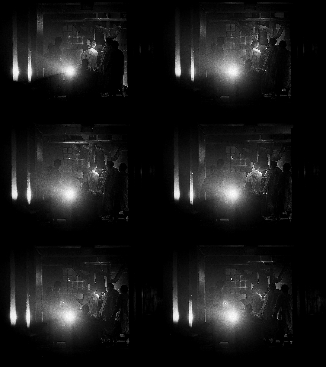
This shot has another cool flare, in much more detail this time:
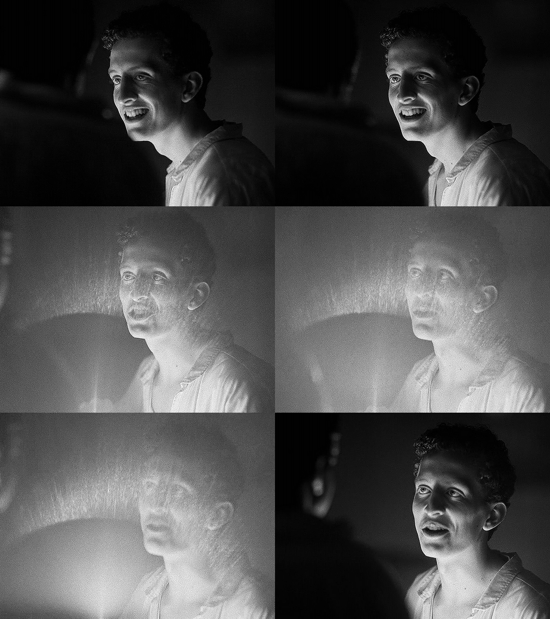
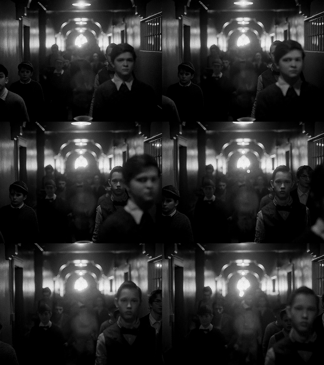
The next shot shows us more of the circular bokeh and another kind of lens flare.
For the bokeh, look at the lights on the ceiling as well as the corners of the out-of-focus architectural details (the semi-arches).
The lens flare here is the bouncing, blurry circle near the middle, as well as the brighter shape near the center bottom.
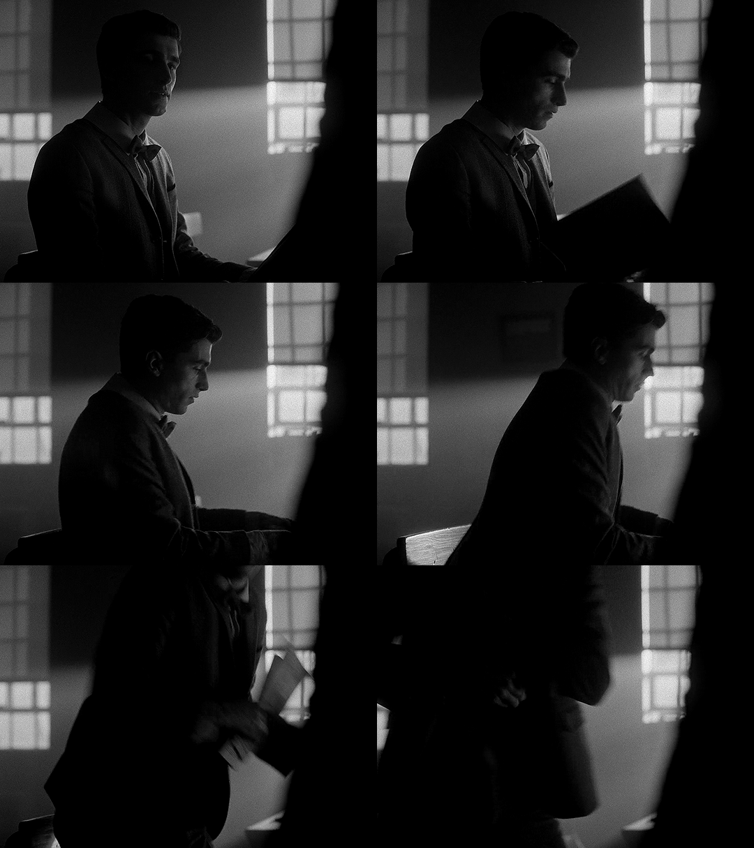
We can then look at the things that are not different, but absent when using the spherical lens: barrel distortion and focus falloff.
In this example, look at the windows in the background, as well as Edwin’s chair. An anamorphic lens would distort the vertical lines, bending them into a gentle fisheye. It would also make that chair and the lines of the window frames a bit blurry, as they’re close to the edges of the frame. Instead, the lines are straight and clear throughout the whole shot.
In this next example, not only do we get a great view of the lack of focus falloff, with clear lines throughout the shot, but we can see more of the difference in perspective and distortion of lines.
You may notice that the windows and doors are not perfectly straight up and down. But is this barrel distortion? If there was barrel distortion, the walls would curve back towards the center of the frame at the top.
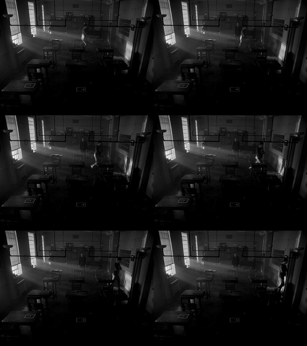
Spherical lenses are often the ‘default’ lens. They’re wonderful and used in a lot of media because they are neutral. They distort less, thus representing the world closer to how it actually is. If we consider the anamorphic lenses in the rest of the show being used to enhance the sense of supernatural and story, changing to a spherical lens enhances the sharp reality. This is Edwin, alive.
The image breaks out of its perceived container, reaching out to the audience, and then changes the lens to be more ‘real.’ In these two changes, not only do we have a more historically accurate image, but it's as if the creators are issuing a warning to us. Maybe the demon isn’t real, but bullies are. Kids can be cruel. Classmates hurt their queer peers. This is not fantasy, and this is as true in 1916 as it is today.
Using a spherical lens in this instance, juxtaposed to the rest of the show, is a dramatic shift to make, as it alters just about everything in the image. In using a less distorted picture, for this, we are reminded of reality and life and the mundane.
On Charles’ Flashback (and an experiment)
Edwin’s flashback got the Cinematography Treatment™ but what about Charles’ flashback? It’s shot with the same aspect ratio and lens as the rest of the show. From the perspective of historical accuracy, this is fine. It’s a scene that could have been shot in 1989, cinematographically speaking. The reason I suspect that it wasn’t given any stand-out look is because, unlike Edwin’s flashback, Charles’ flashback scenes are closely tied to the present-day plot. They aren’t just scenes of Charles remembering things, they are a direct result of the Night Nurse’s “memory magic.”
Maybe changing something here would separate us too much from the plot. Both flashbacks (in episodes 4 and 7) are induced for a specific purpose related to other present-day characters. It wouldn’t make as much sense to have them be standalones.
However, if I were simultaneously the showrunner, screenwriter, and cinematographer, I would give Charles a standalone flashback scene. In that flashback scene, here’s how I would shoot it:
There would be a much deeper depth of field/smaller aperture than the rest of the show, so the background would be more in focus.
There would be harder, less-diffused lighting. This would also impact the coloring, and I’d maybe add some more saturated lights.
I’d try to make an argument to shoot that scene on film (and then argue to do Edwin’s on film too).
There would be a different aspect ratio; 2.2:1 isn’t out of the realm of possibility for the 80s, but it wasn’t common, and it wouldn’t have the kind of impact I’m searching for if it didn’t change.
There are three different aspect ratios I would choose between, and the lens would change depending on my pick.
I’ve made some mock-ups for how these would look, though I cannot adjust things like bokeh and depth of focus, and I can only do so much with the lighting.
2.39:1 with anamorphic lenses (specifically Panavision lenses) This is a super standard widescreen, with a popular lens from the time. We don’t have lens info for the rest of the show, but I think they’re using Panavision anamorphics anyway so the lens may not be a change. Big, blockbuster action movies from the 80s would often be shot in this (perhaps most relevantly, Ghostbusters), and it’s a style that kind of faded in popularity in the 90s and 2000s, so it can have more of a retro look, especially if shot on film. One downside to this would be the aspect ratio change would not be as dramatic.
Movies from the 80s shot with this combo: Raiders of the Lost Ark (and other Indiana Jones movies), Star Wars: Episode V - The Empire Strikes Back (as well as Episode 4, which came out in the 70s. Episode 6 used the same ratio and did use anamorphic lenses, but not Panavision), Ghostbusters
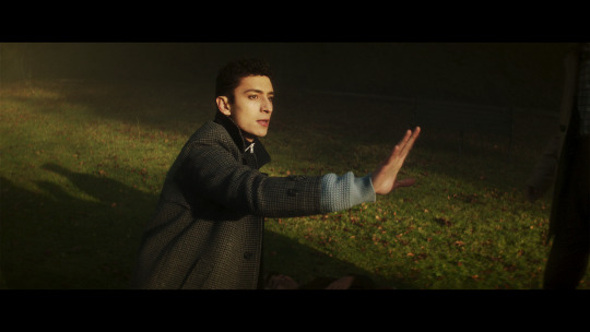
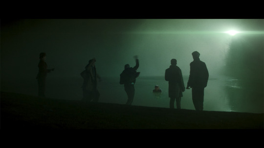
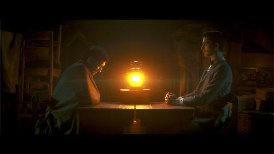
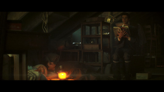
1.85:1 and spherical lenses. This is also ‘widescreen,’ but the advantage of using this aspect ratio is that we could get another dramatic breaking of the image container, just like in Edwin’s flashback. It’s an incredibly common setup, so it’s not really unique, but it would look different from the rest of the show. Given how pervasive ultra-widescreen still is today, I think a lower aspect ratio would also ramp up the ‘nostalgia’ factor a bit. Using a spherical lens we’d end up with the same sense of stark reality that we get for Edwin’s flashback as well (the warning that kids are cruel, but this time to people of color), and I like the idea of that as a parallel.
Movies from the 80s shot with this combo: Back to the Future, Dirty Dancing, The Princess Bride, An American Werewolf in London, Clue, Another Country
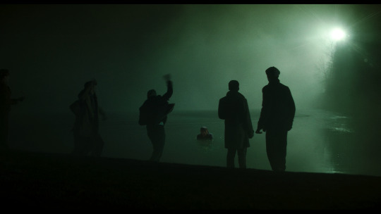
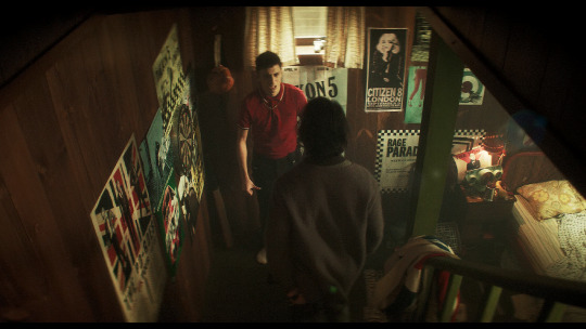
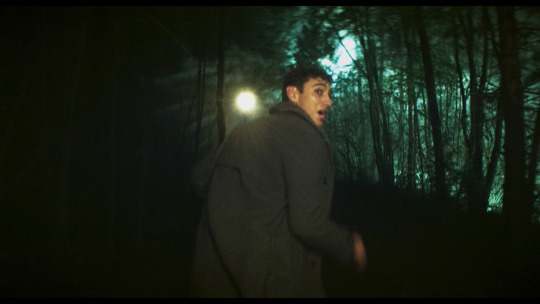
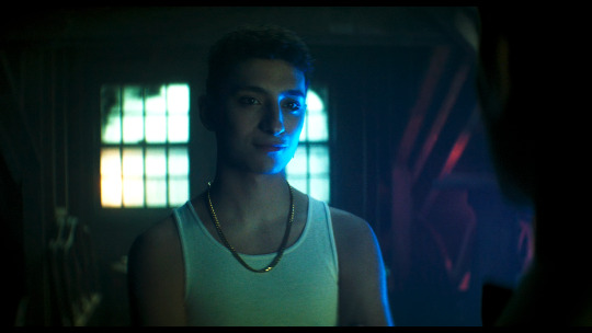
1.66:1 and spherical lenses. This is a ratio that was used widely across Europe, but has never been a common ratio in the USA. However, by the 80s, filmmakers were going for a more widescreen look so it was fading from popularity everywhere. The 80s liked widescreen, so it’s maybe not the best pick for making a scene look “80s”. However, my main motivation for this ratio is that my personal picks for the most Edwin-coded and most Charles-coded queer films are both 80s films shot with a 1.66:1 ratio. We would also get the same benefits from using the spherical lens as I mentioned in the 1.85:1 section.
Movies from the 80s shot with this combo: Maurice, My Beautiful Laundrette, Law of Desire (La ley del deseo), and an honorable mention to Chungking Express, a 90s film that really exemplifies the kind of look I'm going for here
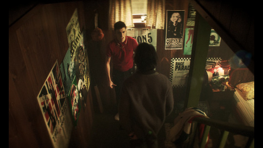
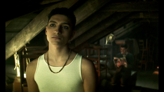
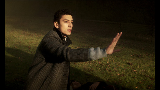
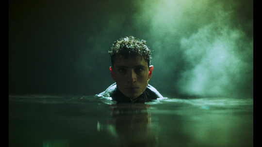
Giving Charles’ flashback a special treatment would probably do a lot to more firmly establish his character as a co-protagonist rather than a deuteragonist, which is definitely not the case but does seem to be how some people view him.
With the impact of the spherical lens and aspect ratio in Edwin’s flashback, the final two options for Charles flashback would be the closest in terms of echoing Edwin’s flashback, and would probably provide the most gravity and sense of crushing reality to the scene.
Setting a single scene (or two scenes) aside like this, with a unique aspect ratio, lens, and color grading (which I didn’t explore much for the Charles flashback), makes us consider a scene more independently from the rest of the show. Edwin’s flashback is a striking moment with a very different look, and that’s deeply memorable. It comes together to push how tragic and unjust Edwin’s story is.
—————
This concludes the planned portion of my cinematography analysis. I had a ton of fun researching and writing this (and making all the graphics) and I hope you all find this interesting/helpful/informative :)
Finally, I want to give another name drop to the cinematographers, Marc Laliberté, Craig Powell, and Pierre Gill. They’ve really nailed it from the very first episode to the last, and there’s so much intention and thought given to every aspect of how they shoot this.
#dead boy detectives#dbda meta#dbda#edwin payne#charles rowland#cinematography#dead boy detectives analysis#cinematography analysis#mygifs#dbdagifs
282 notes
·
View notes
Text
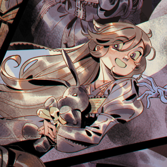
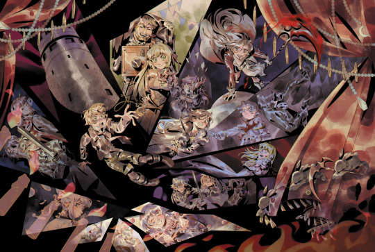
"Lament! Terror! Despair! I shall kindly teach them all to you! And in your final moment, I... shall kill you by my own hand!!"
pandora hearts print for anime north this weekend 🥀🖤🤍
I also put this up on my inprnt! there's a sitewide sale for 40% off right now 🌟
For this drawing, I really wanted to emphasize the gothic and chaotic, convoluted nature of the series. Pandora Hearts has become a lot of things to me, as someone who's read it since I was like, 14 years old. but I eventually found the perfect words to sum up the series - a cross between a Shakespearean tragedy and a Grimm fairy tale.
The ink brush + watercolour brushes I used turned out so well together!! I wanted the style to be kind of a nod to like the manga cover art you'd see from the late 90s to 2000s, kind of like Mochizuki's early approach to traditional art.
A lighter approach to both the lineart + coloring also helped me not strain my arm too much - besides work, I stopped doing full illustrations due to the amount of work being heavy on my arm/shoulder T__T. my last full illustrations were the TGAA/DGS zine + WHA zine pieces back in Dec-Jan, but my heart really lies in illustrations more than anything and I definitely want to get back into it!! (as long as my physical health allows it!!)
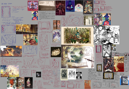
anyways, above is the thumbnail/inspiration board for this drawing! I also did some quick chickenscratch studies of others' drawings to help me get a sense of their composition. I started on the top left and then made a sort of meandering curve through... definitely went through a lot of ideas for this one. If I explained the intended symbolism.. I would be here.. all day..............
the candles were definitely first inspired by an animation of a lighter I did during art skool... and then I did this AA Dahlia animated illust... and then this OC charm (below) I did in 2022...? maybe I should draw fire more often. it's like, the way that fire looks in animated keyframes that I really like drawing out, and I guess I kinda really enjoyed translating that into a non moving visual medium??
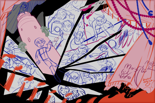
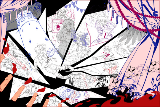
This drawing simultaneously took SO long but I also sped through it?? I had to like... not dwell too long on certain parts... like for example I think some individual character compositions really could be a lot stronger... because I knew this would be a beast of a drawing, I didn't want to spend an unnecessary amount of time focusing on details when I should be looking at the big picture. and I know that's a bad habit of mine!! I'm trying to unlearn my perfectionism!!
thanks for reading if you got this far, hope ya enjoy it!! and I hope I'll keep drawing Pandora Hearts in the future (clearly I haven't stopped since high school omg) and I hope to draw some more Vanitas someday beyond just chibis!
#my art#pandora hearts#oz vessalius#alice (pandora hearts)#gilbert nightray#elliot nightray#leo baskerville#vincent nightray#ada vessalius#oscar vessalius#oswald baskerville#lacie baskerville#will of the abyss#echo (pandora hearts)#alice baskerville#sharon rainsworth#anime north 2023#i think i doomed myself with this post on twitter bc i forgot you cant have words like “kill”#well. die algorithm die you miserable sack of potatoes 😭#edit July 2 2023: this post was really bothering me and i think it was hard to see the details on a horizontal composition#so i added a crop of alice to hopefully spice up the visual interest
1K notes
·
View notes
Note
Hii! You fucking ate with the TDI redesigns and it wanted to know if you'd make a guide as to how you mimicked the TDI style?
hihi !! tysm !! glad a lot of ppl like em !!
as for the style guide, i am far from an expert at replicating art styles, but having a neo-UPA inspired art style really made this easier for me, even if i did struggle on getting used to some design choices.
DISCLAIMER: I do not condone tracing over other people’s artwork to claim as your own final product. I only trace the shapes from the total drama characters to break down and analyze the art style for educational purposes.
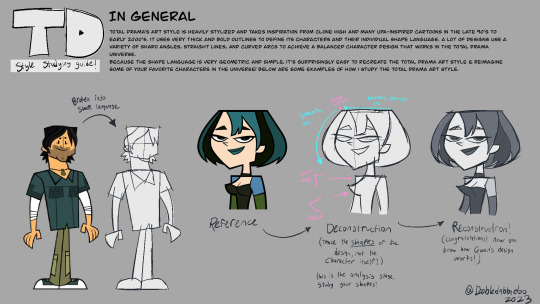
IN GENERAL
total drama’s art style is heavily stylized and takes inspiration from clone high and many UPA-inspired cartoons in the late 90’s to early 2000’s. it uses very thick and bold outlines to define its characters and their individual shape language. a lot of designs use a variety of sharp angles, straight lines, and curved arcs to achieve a balanced character design that works in the total drama universe.
because the shape language is very geometric and simple, it’s surprisingly easy to recreate the total drama art style & reimagine some of your favorite characters in the universe!

BODY TYPES: THE “TYPICAL” WOMAN
a lot of the women in the show follow this base, even more than the “typical” male body type. compared to the men, the women of total drama have cat-like eyes, stylized lips, skinny necks, an hour-glass figure, longer and thicker legs, and pointy fingers. head shapes & features may vary depending on character and/or ethnicity. not all women in the show look like this, though! there’s a decent handful of women with very unique body types, such as beth, macarthur, & emma from the 2023 reboot! it also helps to reference characters from different seasons to get a better idea of the shape language in the show’s universe!

BODY TYPES: THE “TYPICAL” MAN
the “typical” body type for men isn’t as well defined as it is for the “typical” woman, so there aren’t as many examples of what defines the “typical” male body type. However, based on the handful of characters we collected, we can determine that the “typical” male body type in total drama is top-heavy. compared to the women, many of the men have broad chests and shoulders, thicker and longer arms, thicker necks, thinner waists and hips, and shorter, thinner legs. they have flatter, more boxy fingers comoared to the pointy fingers the women have. head shapes and features may vary depending on character and/or ethnicity.
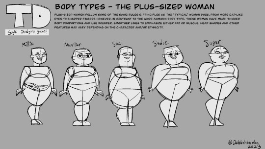
BODY TYPES: THE PLUS SIZED WOMAN
plus-sized women follow some of the same rules & principles as the “typical” woman does, from more cat-like eyes to sharper fingers however, in contrast to the more common body type, these woman have much thicker body proportions and use rounder, smoother lines to emphasize either fat or muscle. head shapes and other features may vary depending on the character and/or ethnicity.

BODY TYPES: THE PLUS SIZED MAN
there’s a pretty good variety when it comes to drawing plus-sized men. while some of them, like ripper, follow some similar principles to the “typical” man, others offer a new, unique design base to work with. their features are generally rounder and wider to emphasize their weight. head shapes & other features may vary depending on character and/or ethnicity.
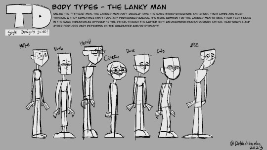
BODY TYPES: THE LANKY MAN
unlike the “typical” man, the lankier men don’t usually have the same broad shoulders and chest. their limbs are much thinner, & they sometimes don’t have any pronounced calves. it’s more common for the lankier men to have their feet facing in the same direction as opposed to the other, though the latter isn’t an uncommon design desicion either. head shapes and other festures vary depending on the character and/or ethnicity.
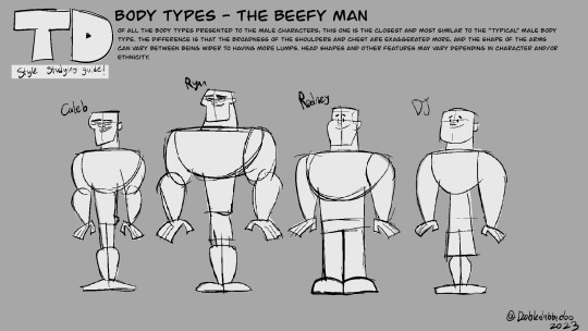
BODY TYPES: THE BEEFY MAN
Of all the body types presented to the male characters, this one is the closest and most similar to the “typical” male body type. the difference is that the broadness of the shoulders and chest are exaggerated more, and the shape of the arms can vary between being wider to having more lumps. head shapes and other features may vary depending in character and/or ethnicity.
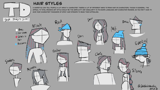
HAIR STYLES
a hairstyle can tell people a lot about a character. theres a lot of different ways to draw hair on characters, though in general, the appeal to total drama’s art style would be the simplicity and angularity in its shape language and character designs, so you don’t have to give your character thousands of spiky hair strands to make them appealing.
im not good at explaining how i replicate art styles so i really hope these help!!! also im sorry this ask took forever to compile lol i just wanted an excuse to study the shows art style more. heres another helpful video to help understand the process of character design !!
youtube
i also recommend checking out harry gold’s channel. he does a lot of art style replication videos & this one explains art style replication exceptionally well!
youtube
tysm for ur ask & tysm for ur patience!!
#dooble moment#idk ask dooble#my art#total drama#long post#reference#hhhhhhgh i really hope this helps#i struggled to communcate this for a while & college is a nightmare when it comes to finding freetime#anyways#more total drama stuff WHEEEEEEEE!!!#art tips#art reference
721 notes
·
View notes
Text
Glitch- chapter one
pairing . . . max verstappen x reader / mason mount x reader )
summary . . . when mason mount finds out that his assistant has been harbouring feelings for him for years, he makes it clear he doesn't feel the same way. but once he sees her become closer with formula 1 world champion max verstappen, he realises he may have underestimated his feelings towards the girl he has now pushed into the arms of another )
genre . . . angst )
song . . . glitch- taylor swift )
warning . . . tbd )
series masterlist . . . available here )
a/n . . .i wanted to thank everyone for the amazing feedback i got on my teaser. i hope the first chapter isn't too much of a let down after how long i made you all wait, i promise the wait for the next chapter won't be as long. also max will be in the next chapter )
Y/N was completely and unequivocally in love, the kind of love that made you feel like you were 14 years old in your room crying to Taylor Swift’s ‘You Belong With Me’, the kind of love that hurt more than it felt good. When she moved to London, desperate to get out of her sleepy town in the English countryside, and applied for a job to be the personal assistant to somebody who was then a relatively unknown professional footballer; she could have never imagined that this is where she’d be 5 years later. Y/N had joined Mason Mount’s team just as he had joined Derby County on lone and due to the fact that the man had just moved to a brand-new city away from all of his friends and family, the pair quickly bonded and developed a relationship that became more than one of an employer and his employee; they actually became friends. So, when Mason moved back to Chelsea at the end of his loan and they gave him the chance to upgrade to an assistant with much more experience working with premier league football players, he turned it down; likewise, when Y/N was scouted by another footballer who was offering more money and better hours, she also turned it down. They were happy. They were friends, maybe even best friends. Why then did Y/N consistently feel like something was missing? For months she couldn’t put her finger on it, couldn’t understand why she wasn’t completely happy, it wasn’t until one day when they were sat having one of their infamous movie nights that she understood what it was she was feeling. Despite Mason living in a penthouse apartment in the middle of London worth millions of pounds, their movie nights always took place at her flat, a much smaller one-bedroom place in, to put it bluntly, a much rougher area of the city. They would sit together on her sofa and put on a movie, (usually a cheesy late 90’s to early 2000’s romcom). And one day, she found herself watching Mason rather than the movie; she watched him watching the movie intently, giggling at the funny bits, tearing up at the sad bits, and she realized that she loved him.
Every so often she thought that she should maybe put some space between herself and the footballer, to try and move on from her feelings for him, but then he would do something that would reel her back in, something that would make her think that maybe she had a chance. He would fall asleep cuddling her on the couch, he would dance a little bit too close to her at a party, he would seek her out after winning a big game and hug her so tightly she couldn’t breathe. But then she would overhear him telling Ben and Reece about his latest conquest or she would get a text message from him 15 minutes before he was due to come to hers for a movie night cancelling because he had a date. To put it plainly, she simply just did not know where she stood with her best friend. Despite sometimes feeling like there could be a chance of more between them, she never said a thing to Mason, valuing their friendship too much to risk it; so instead she just went about her life, following her best friend and the man she loved around the country, always hiding how she truly felt, or attempting too at least. There had been a few times when she was spending time with Mason and his friends, that one of them would catch her looking at Mason. There was one time when Ben actually asked her about it, asked if there was anything going on between the two friends, she had told him that there wasn’t, of course, but she could tell from his facial expression that he didn’t believe her. Truth be told, a lot of their mutual friends were worried about the two of them.
So, when Mason and Y/N walked into the club together despite living in completely different areas of the city, Ben and Reece exchanged a look, wondering how their teammate could be so clueless. The rest of the night they watched the way the pair interacted; they watched the way that Y/N would look up at Mason with such love in her eyes whilst Mason looked at her like he would look at any other friend. They were caught between a rock and a hard place, they wanted to tell Mason what they knew so that he could stop leading her on, but they didn’t want to betray Y/N by telling her secret. Even though she was Mason’s friend more than anyone else's, they both really liked her and wanted to protect her from the hurt that her situation with Mason would inevitably bring. But when they caught sight of Mason sat with his arm thrown around the shoulders of the girl, periodically leaning in and whispering in her ear, they knew that they needed to saw something; and when Y/N walked up to the bar and got chatting to somebody on the way back, Ben knew that this was his opportunity.
“Mason why did you and Y/N come in together, aren’t your places on opposite sides of the city?” Ben asked his best friend already knowing the answer to his question. Despite the fact that Y/N worked for Mason as his assistant, the pair were close, very close; so when they arrived to the party in the same car, Ben didn’t have to wonder too hard about the reason why. “Oh, she was at mine for a movie night last night and she was too tired to go home so she stayed.” Mason told his friend matter-of-factly, not seeing what the issue was or why his friend in front of him looked so annoyed. Even if you took away the widely inappropriateness of an employer having his employee stay at his house, there was the small issue of the fact that Y/N was madly in love with Mason and had been for years now. As much as she tried her best to keep it hidden, the only person in their circle that didn’t seem to know about it was Mason himself. Ben and Reece had a conversation a few days before, discussing whether they should tell Mason as from an outside perspective, even if it was unintentional, he did seem to be leading Y/N on; they both knew their friend extremely well, so they knew that he didn’t have the same feelings that she had for him and they knew that if Mason knew the full story there are aspects of his relationship with her that he might change.
“Look mate,” Ben started, unsure of exactly what to say but knowing he needed to say something. “I think you should know that Y/N has feelings for you” Mason’s brows furrowed, completely taken aback by his friends' blunt honesty. “What? No are you sure?” he asked him, truly hoping that he was mistaken or playing some kind of prank. “I’m 100% sure, it’s obvious to be honest with you mate. You can see it in her eyes when she looks at you, she really truly loves you. Having her stay at your place and being that close to her, it’s going to make her think that someday you two could be more than friends, so if that’s not the case then you really need to reconsider doing things like that as it isn’t fair on her. Y/N’s a good girl, you know that she deserves to be happy.” Ben’s words make Mason’s head spin. Y/N was more to him than just his employee, she was one of his closest friends, but he really didn’t see her as anything but a friend. “Oh, fuck Ben what should I do?” Mason asked with his brain completely frazzled at this point, 15 minutes ago he was feeling great, he had just had a great day with one of his best friends and then then he came to a party to blow off some steam after a very stressful week, but now it seemed like everything had come crashing down. “I think you need to speak to her, make it clear that you value her friendship but you don’t see her as anything else, let her down gently.” he told Mason who simply nodded before starting to walk towards the girl in question who was at the bar talking to one of the other players girlfriends., the second Ben realized what he was trying to do he put a hand out to stop him from going over there, causing Mason to look back at him with a puzzled expression. “Maybe telling her right this minute isn’t the best idea though mate, considering you’re in public. Not to mention the fact we’ve all got that trip planned for the Spanish Grand Prix in a few days, maybe you should wait until after that. If things don’t go well that could make the whole trip so awkward.” Ben pleaded at his friend, but he could see on Mason’s face that his words were going in one ear and out the other. “Fine go, but be nice to her and you better not ruin the race for everyone” he relented, taking his arm off of his friend and letting him walk towards the unsuspecting girl.
“Hey Y/N, can we talk?” Mason asked with no regard for the fact that she was already deep in conversation with somebody else. His bluntness combined with the pained look on his face made her recognize instantly that whatever he wanted to talk about wasn’t likely to be lighthearted. She hesitantly followed the man as he gestured for her to come along to a quieter part of the bar. Before she could ask what was going on, Mason had already asked her a question that made her stomach sink - “Do you have feelings for me?” She had absolutely no idea how to answer his question, of course she knew the answer; she had been pining after him for years at this point, but she just wasn’t ready for him to know that yet. “Will you please just answer my question?” he almost demanded, his harsh tone making her freeze. Looking up at her best friend with tear filled eyes she muttered the last thing he wanted to hear - “Yes”. Her voice was so faint that it didn’t come out as anything more than a whisper but to Mason it was the loudest thing he had ever heard. Y/N had imagined having this conversation with Mason so many times, imagined herself finally telling him that she loved him but in all her fantasies, in all her daydreams, he had never flinched like he had done just now. “Mason I -” she started but stopped in her tracks when she saw tears forming in her best friend’s eyes. “How could you do this Y/N, why would you ruin our friendship like this?” he asked her in genuine disbelief. Mason watched the girl stood in front of him stumble over her words, clearly not expecting to be asked that question, before putting her almost full glass down on the table and running out of the bar.
In all of the daydreams she had had where Mason found out she loved him, he didn’t react like that in any of them, even the ones where he told her he didn’t reciprocate her feelings he was never that harsh, never that heartless. Y/N was nothing if not a realist, she truly didn’t expect him to come to her and tell her that he had always loved him too but she at least thought he would try to be nice about it, try to protect her feelings as much as possible, tell her that no matter what they would always be friends. Instead, he basically told her that their friendship was over, and she was the one responsible. She didn’t even have to wonder how Mason found out about it either, she knew Ben knew and she had also seen Mason and Ben talking moments before he came storming over to her. More than anything she just felt stupid; stupid for believing that somebody like Mason would ever love somebody like her, stupid for putting one of her most beloved friendships on the line over a schoolgirl crush, stupid for running away instead of explaining herself to him.
“Y/N, are you okay” she heard a voice come from above her, breaking her train of thought. She was sat on the floor outside the club, staring into space clearly lost in thought, looking certifiably insane. Looking up she saw Reece James stood before her. There was no question that Reece knew what had happened but even still Y/N wasn’t sure if she should talk to him about it. Whilst she was closest to Reece out of all of Mason’s friends and teammates and she would consider him to be a friend, he was still Mason’s friend before anything else. There was also a good chance that anything she does tell him would be repeated to Mason. As if he could read her mind, he spoke again “You know you can speak to me right, I’m not going to tell anyone. I’m sorry that Ben told him by the way” he sat down on the street next to her. “It’s okay I don’t blame him; I understand that he wanted to protect his friend” her words were met with Reece shaking his head, “No actually I think he wanted to protect you” he said causing her brows in confusion. “He tho- We thought that the way he acted with you was a bit unfair, doing things that were giving you hope that you could be more than friends. Mason’s not a bad guy and he wouldn’t do that stuff on purpose, so we wanted to make sure he knew what he was doing.” Y/N looked up at the man's face, his serious expression laced with sincerity; she could tell that he was telling the truth and that he and Ben truly cared about her and wanted to protect her from hurt. “Thank you, Reece, make sure to tell Ben that I’m not annoyed at him for saying anything.”
“Of course, I will. I know we only know you though Mason but you’re our friend as well okay, remember that.” He said before he threw his arm around her pulling her into a hug. “So what do you think is going to happen now?” he asked her. “Oh I really don’t know, he seemed pretty mad at me. I think I’ll probably leave the Grand Prix this weekend though, give things a chance to cool off”
“What no you can’t do that, you love F1 and it’s your first opportunity to go to a race, you can’t miss that because of him. Worst case scenario, go and stick with me. You can’t give up those sweet paddock passes, what if you meet a cute driver eh?” he said jabbing his fingers into her sides playfully teasing her in an attempt to get her to smile. “I’ll think about it” she said, attempting to fight the smile on her face but to no avail. “You going to come back in or are you going to head home? We probably look crazy sat out here like this” he asked her and she paused thinking about it, she thought about going back in and trying to talk to Mason, to try and fix everything. After a moment she shook her head “No I think I should give him some space” Recce nodded understanding her decision before walking over to a cab and giving them her address along with enough money in cash to cover her journey three times over. “You get home safe okay” she nodded before thanking him for being to kind to her tonight. Just before she had the chance to close the door he spoke again “Y/N wait, are you going to be okay? I could call someone if you need?” Again, she found herself smiling at the care Reece had shown her. “No, I’ll be okay, I always am”
Tag list-
@nightlockcornucopia @jaydensluv @girlytots19 @formula1mount @alwaysclassyeagle @aundercover @sofifiia @dessxoxsworld @lpab @lorarri @thelovehypothesis @torrie421 @ironmaiden1313 @celesteblack08 @glow-ish @urfavouritef1girly
#f1 fanfic#f1 x reader#formula 1#max verstappen#max verstappen x reader#max verstappen x y/n#mason mount#mason mount x reader#mason mount x y/n#football x reader#formula 1 fanfic#formula 1 imagine#formula 1 x you#formula one x reader#f1 imagine#f1 fics#footballer x reader#footballer x y/n
659 notes
·
View notes
Text
one thing that gets lost extremely often when talking about stg (which is to say japanese shmups specifically) in western fandom is that there are several distinct lineages of them that are entirely distinct
below the break, an off-the-cuff (in other words I may be misremembering finer details so don't quote me as an educational source) ramble on STG/shmup design
or, more vaguely, a ramble on taking things for granted
I've gone ahead and included section headers because this is such a long rant, but this isn't an essay or anything. this is me transcribing a stream of consciousness. it's like I'm rambling at you in a pub
you've been warned
-
[1] The Easy Stuff or: quickly defining some things so that I don't go insane trying to describe the Y2K stg revival
the two that immediately come to mind are the "mechanics-side complexity" and the "stage-side complexity" schools of thought. these aren't official terms, but every time I read interviews from stg developers, they gesture towards these competing concepts in their own words. so I'll use be going off of that.
also it's going to get REALLY clunky if I keep using those terms, so I'll use mech+ and stage+ to refer to mechanics-side and stage-side complexity going forward
the mech+ way of going about things is arguably the original school of thought. this is extremely arguable because it was an innovation that started happening in the late 90s and early 2000s (most seem to point to Treasure games as the inciting force here, especially the leap from Radiant Silvergun to Ikaruga) and was, itself, a reaction to a perceived stalling in the development of stg as a genre
(as an aside, this isn't the only time that stg was seen as stalling out and experienced a very notable revival, but we'll circle back to that in a bit)
the argument I've seen come up in response to this is that stage+ design was, itself, a reaction to this and can't really be considered the same as developers making games like that as the norm, because it's not necessarily an attempt to make "traditional" stg.
I'm of two minds on this, but I do think it's at least useful to look at it in terms of...
[difficulty from stage design with a simple craft is the assumed default] -> [mechanical difficulty is consciously leaned into, creating the mech+ school of thought] -> [in reaction to the increasing mechanical complexity of post-Radiant Silvergun games, the stage+ school of thought emerges in earnest]
either way, the fact of the matter is, somewhere around Y2K, developers started making games where the challenge was consciously moved into the space of mechanical demands. people had opinions on this
some developers say that this was in response to older games feeling more like dodging games than shooting games, but that's ALSO a highly contested point (saying this will start fights) and gives away that someone is firmly in the mech+ camp
the experiences of playing a mech+ game and playing a stage+ game are so wildly different that you can usually tell which you're playing just by looking at the controls of the game
when making a stg (and by proxy, when making a shmup) it's actually pretty important to figure out where you stand on this, just so that you don't waste your time reinventing the wheel
not to say that it's bad to make a simple game, but there's definitely a difference between making a deliberate retro homage and unknowingly making a game that feels extremely dated by the standards of its own genre
before we go any further, here's a warning: my information (and memory) of what's coming up is very spotty, so if you already know about what led to DoDonPachi releasing, you won't get much out of this bit
this is mostly aimed at people whose knowledge of the 80s-90s video games begins and ends with assuming the USA video game crash was universal, so feel free to skip to like... the last three sentences if the name "Toaplan" rings any bells
[2] Circling Back or: the messiest part of the ramble where I quickly try to give some context on the early-mid-90s stg revival
speaking of retro homage, let's circle back for a second to that other stalling I mentioned a bit earlier
in the early 90s, there was a bit of a collapse in stg. not quite a full stop, but as a genre that had been around basically as long as video games had, it was quickly turning into something companies saw as a dated format, so they started getting a bit antsy about dedicating their A-teams to making new ones
the problem with doing this is that a lot of these A-teams got their starts pioneering this genre and still felt passionate about it, in spite of how the state of stg had started to (by some accounts) become a game-mill for filling out arcade cabinets
intensifying things a bit further, this period coincides almost exactly with Toaplan (one of the biggest players in the development of the stg genre) dropping stg development, exploding, and scattering its employees all over the place
so, as one might imagine, those A-teams started making highly reinventive pitches for stg, which they still wanted to make, to convince their management to let them do it. alongside this, the employees of Toaplan who still believed in the genre founded their own companies (Cave being a VERY notable mention) to continue their work
(Takumi Corporation also gets a mention here so that people don't kill me with hammers for forgetting it)
I'm a bit spottier on what exactly happened in this window, but the important takeaway is that this was something a lot of developers saw happening, and it effectively rewound the genre's development, nudging it away from the (at the time) popular idea that sidescrollers were going to be the future of Everything, and that top down perspective looked extremely dated
a lot of very innovative games released here, a lot of genre shifts happened here.
if you're going to draw a line anywhere and mark it as the beginning of the modern genre, I think this is realistically where you should do it
this is the point where people really chose to die on the hill that stg wasn't a genre that emerged solely from technological limitations or a need for cheap fodder, but a distinctive tradition of games that should be continued in meaningful ways
[3] Okay Here's Touhou or: I almost get to the point
in the midst of the latter revival, fomented by the former revival, programmers at larger companies were also working on smaller hobby projects that they would release in a doujin capacity, independent of their employers
ZUN is the name I've been dancing around here, because he was very much doing this will working at Taito (and also shortly before it)
I'm not going to get into his full backstory, because now we're in the fast part of this ramble
the most important thing to mention about ZUN's work is that the PC-98 Touhou games aren't representative of the design behind the Windows ones. he was never coming at it from a position of insincerity, but he was much less serious about Touhou early on
I'm not just saying this in a "ZUN developed his vision over the years" sense. Highly Responsive to Prayers was literally a programming experiment he made two years prior to Story of Eastern Wonderland, and likely because of this, he only released the former when the latter was also ready to be released
one thing that gets lost in retelling with the PC-98 games is that they aren't actually all that unique in the genre. even to the extent that they're music-forward games that serve as vessels for their soundtracks, that still wasn't especially unique at the time
so, if Touhou hadn't undergone design philosophy changes between its eras, it likely wouldn't have its current presence. the PC-98 era is absolutely more fondly remembered because it exists in the context of being followed by a series so influential that it's the de facto face of the genre in several countries
in 1998 came the last game in the PC-98 series, Mystic Square. during the four years between this and 2002, the latter revival of the modern stg was in full swing, and this really shows in the direction that the series (which would be easy to classify as stage+ in the PC-98 era) would go on to take
[4] Okay Here's Windows Touhou or: I actually get to the point
Windows Touhou is enormously influential. it is INESCAPABLE.
it's also incredibly good! I'm notably a fan. I dedicated a pretty reasonable amount of flesh real estate to a respectably sized Touhou tattoo
that being said, this does mean that, on average, someone outside of japan with a passing (but active) interest in the stg genre is very likely going to land on Touhou as their series of choice and stick with it. it's one of those cases where a very popular entry into a genre ends up being popular for a reason
but (importantly for someone trying to figure out genre norms by reverse-engineeering them) Touhou isn't a generic stg
Touhou is actually such a specific offshoot that it warrants a separate mention in conversations about how these games are made
Touhou games are so distinctive within the genre that they arguably dip into both schools of design and come out as a weird third one that subdivides off of stage+ -- although, to be fair, it's been increasingly leaning into the mech+ corner of things as the series goes on, which makes sense because Embodiment of Scarlet Devil released after the initial split and the reaction to it
the entire reason Touhou goes so far to contrive a reason behind everyone using spellcards is because they're actually an abnormal mechanic. spellcards are one of Touhou's hooks!
most stg do have similar stuff in terms of attack patterns (especially post-DoDonPachi games, with how those codified the concept of danmaku) but Touhou's big innovation was placing so much emphasis on their presentation, giving the individual patterns names, and establishing them as setting flavour
so this often cuts in the obvious way, with people who have only played Touhou including the spell card system wholesale without realising they're doing a direct homage to just one game series but it also cuts in the opposite direction, with people getting confused about the absence of Touhou-standard features in stg that aren't being designed as Touhou homage
everything I'm about to say is about non-beginner projects. we're talking about things that see release here. there isn't really a clean way for me to draw a conclusion, but it's something that rattles around my brain a lot
on one side of the modern western shmup scene, you have games that are based primarily on ancient stg that have long since been lapped several times over in mechanical innovation. on the other side of the western shmup scene, you have lovingly made games that are almost all entirely based on what can be gleaned from Touhou
in the former case, you get very stiff gameplay that tends to feel satisfied with very slight gestures at innovation, but only ends up retreading a very thoroughly tread path
in the latter case, you either get very loose gameplay that lacks in one of the elements that makes Touhou work or you get a very competent game that nevertheless still does just kind of feel like a Touhou fangame
there's a good bit of middle ground where people are actually working in the genre as it exists, but it reminds me a lot of the state of western-made jrpgs, where Final Fantasy was so popular that a solid chunk of the better modern releases are still basing their genre twists on things that have already been twisted into gordian knots
do I have a solution? is there a problem? who even knows. it'd be nice if people were more willing to look at stuff in the process of making stuff, at least
also if you've read this far, I can at least make a safe bet that you won't get mad when I say the ghost of Morrowind, by way of Oblivion comparably poisoned the western sandbox rpg genre in its own right
93 notes
·
View notes
Text
How an animated series saved Remy LeBeau (again)
It's a bit of a hyperbolic title, but catchy, non?
I was looking over my comic collection as I've decided to reread X-Men's 60 year history over the course of the summer. And it got me thinking about a dead period of 616 canon that I've never actually read. Around the time Rogue hooked up with Magneto and scooted off to the Avengers, I decided I'd be done with comics for a while. And didn't start again until Rogue (and Gambit) came back to the X-books in 2017's Astonishing X-Men. But it made me wonder -- What happened to Gambit in that time??
Well, after his solo ended, he flitted around to X-Factor and hung out with X-23 and then kind of went 'poof' for a good long while.
Why? I can only guess the same reason this is a running motif with Gambit. There's something about him that drives the X-Office crazy. I'm not here to speculate what or how or who of it all. I don't know enough about the back end of Marvel to give concrete answers. But I think what has surprised me (recently) is that he's definitely a fan favorite character.
[Yes, I know he can be a divisive character. Yes, I know elements of his character from the 90s have not aged well. Yes, I know there are those of you who can't stand him. Don't really care - you can get off my lawn, thank you.]
Which got me thinking -- Gambit's original popularity, I believe, stemmed from the original X-Men Animated Series. He had just started showing up in the comics at the time, and had barely any kind of page time. And the X-Men TAS swung and was a hit. And so was Gambit.
I don't really know that Gambit would be around today if TAS hadn't done its thing. Would the X-Office have kept him around? I really have no idea.
But they did try to get rid of him. That was the point of leaving him in Antarctica. And things were just never the same after that. Claremont tried his best in the early 2000s. And then Deathbit happened. Carey's run wasn't bad. But Carey clearly had an agenda for other things... And then, Gambit just kind of faded into the background. (I hear his run as a side character for Laura (X-23) was good - but I haven't read that.)
Bless Kelly Thompson (always) for sparking life back into him with (and his relationship with Rogue). And bless the fact that she actually married him to Rogue. Yes, I understand comics -- my god look what they did to Peter and MJ, no one really gets to be happily married except Sue and Reed. He and Rogue are now really tied together in a way that I don't think is going to be undone any time soon.
Even if the X-Office still isn't thrilled with the guy. Krakoa era has been less than ideal. (I can't comment on it fully - I haven't read much of it, as I'm behind on my comic reading.) But I've heard rumors that one reason Thompson was let go was that she didn't want Gambit killed off. And she didn't like the direction they wanted to take the character.
Which leads me to X-Men 97. Killing him off sucked. Really. As a fan, it really sucked. But - my god, the reaction to it. Gambit was amazing. And all I've heard lately is good things about the character. There's been a Gambit resurgence in the best way. He may have went out -- but he went out with a bang. X-Men 97 made an emotional impact with people. And that changes things.
Gambit is cool again.
And I love it.
What's even more exciting is the fact that the X-Office has changed hands again and Gail Simone on Uncanny who (if her Twitter/X feed is to be believed) is really enjoying writing the character. Which means (hopefully) at least another year or two in the comics of some (hopefully) great Gambit stuff.
And maybe there will be some changing of hearts and minds in the X-Office.
It's actually very exciting.
And, guys, I really (really, really) doubt he'll be completely gone from X-Men 97, too.
Because Remy LeBeau never stays down for long.
But as a fan, it's nice to see him be on top again. And I don't think he's going anywhere anytime soon.
#gambit#remy lebeau#xmen#x men#x men 97#marvel#probably good this is so late at night#it's just a jumble of thoughts I needed to write out#I need to have a marvel meta tag#marvel meta#?#good lord I need sleep
127 notes
·
View notes