#made the pixel art from scratch this time!
Explore tagged Tumblr posts
Text


[Image description/ All three images are of parts of the following description.
Undertale fanart of Papyrus & Sans in a pixel art style with red flaming text below reading “the skeleton brothers”. They both are smiling at the viewer.
The text is on fire and jittering in animation. The skeletons are blinking.
\End ID]
#my art stff#undertale#undertale fanart#ut sans#sans the skeleton#ut papyrus#the great papyrus#pixel art#gif#image described#made the pixel art from scratch this time!#very fun#well ok I Did steal pap’s nose from the battle sprite but it’s just So Perfectly shaped#my partner made the flaming text :)#my art
28 notes
·
View notes
Text
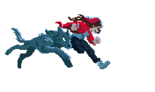
Scarlet Pearl is like evil red riding hood. To me.
#scarlet pearl#pearlescentmoon fanart#pearlescentmoon#my hand slipped while working on another piece-#I love pearl’s evil red riding hood aesthetic ok it scratches something in my brain#even if that’s not what she’s going for the symbolism the mythology - everything in hermit craft/traffic life is actually fantasy/mytholog#y interpretations now#trying to remember the little versions I made in my head before I started engaging with fandom a couple months ago for the first time#I live for the drama#anyway#watching these guys is always delightful I had to recover from surgery and spend huge amounts of time in bed and fr mcyt was a help#secret life smp#secret life#secret life pearl#slsmp#slsmp pearl#my art#art#artists on tumblr#pixel art#digital art#artistsontumblr#this isn’t my best work but hey I made something 🤲#telling myself my deep dissatisfaction w my art as of late is just a sign that I’m growing as an artist my eye has evolved my hand and oth#er skills will catch up I am determined but frustrated lol
618 notes
·
View notes
Text
cyberpunk bunlith meme breakdown thread incoming!!
i wanted to do a little peek behind the scenes for yall cuz i know a lot of u are interested in my process, so lets jump right in!
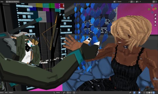
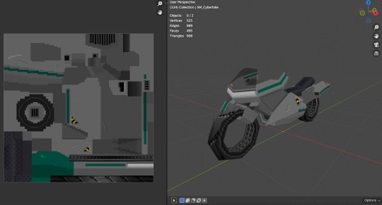
first off here is a look of the animation itself in blender, with the original meme as a comparison, which can be found here btw!
the background itself was made to each shot, so the actual zoom out is a mess of meshes re-arranging themselves to line up for the next shot (i have 2 bunliths with associated cams that switch between shots so i can move things to set up the next shot while the other cam is live)

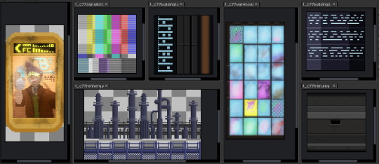
the assets were all made from scratch! this project was essentially a 'dry run' for my next game, which will be made using this style (the same could be said about bunlith herself: testing out the pipeline for expressive, easy to read ps1 style visuals)
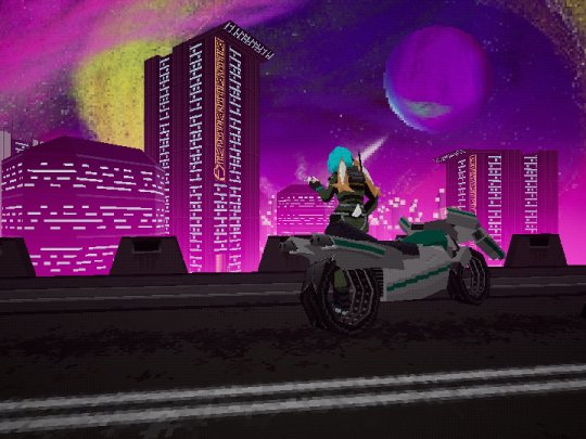
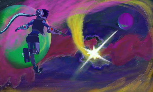
i the space background painted a few years ago as concept art for said future game (this game has been a concept since before bloodborne psx started development!). heres a full res, non pixelated version of the art if you are interested!
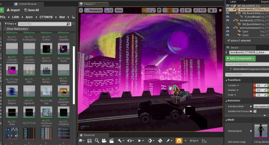
and here is how it looks in unreal engine! note the pink distance fog which was something i really wanted to experiment with for a very long time as changing the ps1 fog color is the quickest way to change the vibe and i was curious if i could pull off a color as bold as pink
and that's basically everything! thanks for checking it all out 😃
once again, very fun project to work on on the side while i plug away at finishing bloodborne kart!
549 notes
·
View notes
Text

STRAWBERRYSNIPES 1K
hi everyone! i want to start this off by saying thank you! i've only been editing for a short amount of time and the support you've all given me has blown me away!!! i don't know how to thank you all! from October 12th to October 20th i will be hosting an event in honor of this, details below!

this event will, as voted by you all, be a prompt event! however (inspired by rookmeo doing something similar), i will also be adding 3 bonus challenges for extra entries into the raffle! prompts are as follows:
day 1 - make something you dont get the chance to make often (make stamps if most of your requests are graphics, make a stimboard if most of the things you make are layouts, etc!)
day 2 - edit something that reminds you of yourself OR edit something that reminds you of someone close to you!
day 3 - edit your least favorite character from a media with your favorite character from a media
day 4 - edit something from my whitelist - bonus points if its something that you've never edited before
day 5 - free day
you must do all 5 days (or replace up to 2 with challenges) to be entered in the raffle, any challenge you do (outside of any replacements) will get you 1 extra entry! challenges are as follows:
challenge 1 - edit something without using your favorite color
challenge 2 - edit something entirely from scratch (minus character art)- all gifs, masks, decals, etc must be made by you. pngs must be official or made by you
challenge 3 - edit something very different from your style, take inspo from other editors that you feel are very different from you!

prizes are as follows:
first place - a full theme pack (layout with pinned header, graphics, decor like stamps and pixels and blinkies, replycons) OR 4 edits of your choice
second place - 3 edits of your choice
third place - 2 edits of your choice
please use the tag strawberrysnipes1k when posting and tag me so i see!!!

Taglist! dm or send an ask off-anon to be removed!
@fawnsologies @pink-sugar @hiddencircus @rookmeo @lovesick-level-up
@phaea @fwuhs @vinylbunni @peachisodaz @lavendergalactic
@beauti @fizzyworks @nomkiwi @v-rtue

55 notes
·
View notes
Text
Over The Phone
Dad Bod!Professor!Miguel x Fem!Reader
TW/CW: Just... NSFW. So much NSFW. Phone sex, masturbating, sexy selfies, sexting, all that shit.
MINORS DNI I AM NOT RESPONSIBLE FOR CONTENT YOU CONSUME
A/N: God this took forever to churn out but I finally got motivation to finish it!!
Taglist: @cupcakeinat0r @tojishugetiddies (if I forgot to tag anybody let me know, pls! I lost the saved list I had for people alshldhd)
Divider by @/across-the-art-verse
Miguel art @ meeee
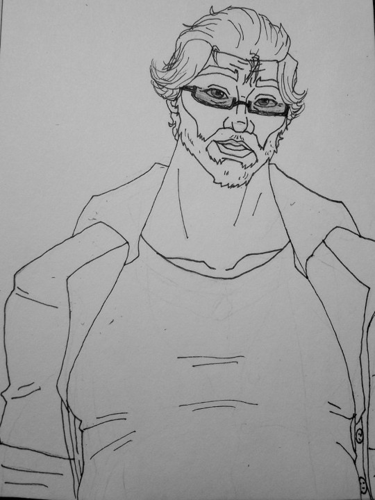

The day had dragged on for what felt like far longer than usual for him; the usual students who showed up late, tried to sneak out, slept through the lecture or just ignored whatever he said.
The students who listened and actively engaged with the lesson were few and far between, and the almost silent lull between classes felt felt almost too short. Sometimes he wondered why he bothered, especially with the growing list of students who were disinterested in his class, or those that only signed up for extra credit and didn't want to do the work...
But, getting cards and thank-you post-its from students who felt like they wouldn't have been able to graduate without him kept him on in this tedium. He loved to hear from his former students about how their new careers were going--careers they credit hi to helping them achieve.
It never failed to make his heart all warm and fuzzy when he thought about them.
Miguel ran his hand across his beard, and a thought came to him about maybe shaving it off. He had grown it out; rather rugged if he had to admit it. But, he quickly shook that thought away--you loved his beard. Oftentimes he would wake up from a nap, you snuggled perfectly against his solid frame, your nails dragging through the short hairs with a content smile on your face.
Oh, he couldn't say no to you, his pretty little wife, could he?
Speaking of which... it was your day off. He couldn't help but wonder what you were--
When his phone pinged, he pushed his glasses up the bridge of his nose and unlocks the screen to see a text from you;
Hiii baby, how's work going?
He chuckled and replied, Same as usual. Only two students slept through class this lime
*time
Your reply was swift.
Awww I'm sry :(
If it makes you feel any better, if I were in your class... wait. I wouldn't get any work done either. I'd just be lookin at you :p
He laughed, his belly shaking a little bit as he grinned at his screen, his massive fingers fumbling the small keys once again on the too-small phone screen.
Yes, you would mafe a very door student, wouldn't you, amor?
*made *poor
Miguel rolled his eyes. He was tempted to try and see if they didn't make phones built for someone with his giant hands in mind... Damn this tiny screen!
Awww my Miggy gettin all frustrated?
Yes.
For what felt like too long, his message was left on "read". He quirked a bushy brow, scratching at his beard curiously at what was keeping you.
And then, his phone pinged again.
Here, maybe this'll keep you entertained ;)
*Image attached. Click to view.*
He hummed in curiosity. Maybe it was one of those silly little doodles you liked to send to him? One of your memes, maybe? Though, it didn't make sense why the image was blurred, when--
His heart lurched up into his throat and he instantly slammed his phone against his desk, screen down; looking around pointlessly as if he were worried someone was standing over his shoulder when the image finally cleared.
Cursing himself for acting like a kid with his hand caught in the cookie jar, Miguel slowly lifted his phone to his face and looked at the picture you'd sent him.
You were nude, laying belly-down in your bed, the blankets askew around you. Your feet crossed one over the other as you smiled at the lens--you must have moved the full body mirror from the living room to your bedroom to achieve this shot--and your back was arched slightly to show off your bare ass.
He felt his cock twitch to life as he examined every pixel on the screen; wishing so badly he were home right now, to touch that soft expanse of flesh he loved so much. To cup your ass in his palms, feeling the warmth of your skin in his palms as his fingers massaged and groped the skin.
He could feel your hands slide up the soft pouch of his belly, scraping your nails delectably through the short, curly dark hairs that ran up his abdomen and covered his chest. He could feel your teeth scrape and tug his nipple before kissing your way back down...
Dios, mi amor. You're lucky I am not in the middle of a meeting! He hastily typed, pretending he wasn't practically salivating over that selfie.
Aw, didn't you like what I sent? :'(
I didn't say--
But before he could finish typing and send the text, he got another attached image from you.
He swallowed hard at the lump in his throat and his thumb hovered over the image hesitantly. He looked towards the clock above the door to his classroom. He had half an hour left...
When the image unblurred, he felt his heart damn near stop.
You were perched on the edge of the bed, your legs spread wide; one hand was holding your phone while the others spread you slick folds with nimble fingers and a cheeky expression on your face.
How bout this one?
Miguel groaned, loudly. He actually slipped a hand over his plush lips, cringing at how damn near pathetic that sounded.
He immediately clicked your contact information and hit "call".
The phone rang a painfully long, droning tone until your bubbly voice giggled on the other end of the line, "Heyyyy Miggy~"
"You are going to kill me, baby." He hissed into his phone, pressing the heel of his palm into his throbbing erection, "I'm in the middle of a school day! The students are at lunch!"
"Ohhh, did I get you all hard and excited for me?" You sigh dreamily into the phone, your voice dropping into a more sultry tone.
"Naughty boy, popping a stiffy in the middle of class."
He grunted, his head dropping back against his chair, the leather creaking under his weight as he tugged the ends of his button-up out from his rapidly-tightening jeans, "And whose fault is that?"
You gasp theatrically, "Mine? Oh, baby, I was just trying to provide you moral support, I swear!"
"Of course," Miguel huffed, eyeing the doorknob, waiting to see if he was unlucky enough that somebody were to walk in right as he pulled his cock free from his jeans, running his fingers over the swollen tip, smearing his precum around it.
He could hear in your voice, the way you were biting your lip in excitement as you spoke. "Baby, are you touching yourself?"
"You tell me, first." He replied, his voice strained as he gave himself a few tentative strokes; trying to gauge if the risk was worth it.
"Oh? Want me to tell you that I'm playing with my pussy?" You croon. "That I'm imagining you, and me, in bed..."
His teeth snagged his plush bottom lip briefly as he sped his hand up to your words, then slowed back down again. The friction wasn't right; too dry. So, he sucked on his tongue until he had a nice glob of saliva; bringing his hand up to his mouth to wet it before slicking his throbbing length up.
"Go on." He grumbled into the line.
"...ooooh." You giggled, your voice a little breathless. He could see you now, laying back on the bed, your fingers plunging in and out of you, pulling out to stroke your puffy clit; your pussy drooling into the blankets beneath you.
"Mmmm~ I'm also imagining you on top of me, my legs on your shoulders..."
He felt the oxygen squeeze from his lungs as he upped his pace, the vein in his cock throbbing and thumping in time with his rapid heart rate.
"Yeah, bebita?"
"Yeah." You huff, a small moan coming from you; "'m imagining you pinnin' me down, fucking a baby into me."
"Dios." Miguel groaned, thrusting his hips up to meet his fist. "You want a baby, hermosa? Want me to make you a mami?"
"Mhmm... want you to fill me aaaallllll the way up." You whined, your panting hot, even through the phone.
Miguel dared a glance up at the clock. Still had some time... He needed to do it quickly; needed to milk his cock so he wouldn't appear "improper" with a massive erection straining his pants.
As if enough of his female students (and even some of the male ones) didn't have enough difficulty paying attention in class...
He'd be lying if he hadn't gotten a few love confessions from students, present and former. He'd always politely turn them down, and then, if they were currently his pupils, politely and quietly have them sent to another class to avoid any improper behavior in the future.
It was as if none of them ever paid any mind to the gold band firmly secured to his ring finger--the matching mate to the one you wore on your own softer, delicate hand signifying your matrimonial bonds. Or... maybe they had and assumed they could tempt him from you.
Well, those assumptions were always wrong. The only person he could imagine bouncing on his cock, sucking it, milking it, stroking it--was you. You and only you.
Sometimes thinking of you when he was alone was the only ways he could get off, before you started dating. Even finding porn of a woman who looked like you wasn't enough. It had to be you.
And after the first time he felt your pretty pink pussy swallow his cock whole? Oh, he was addicted. Addicted and whipped, a few of his colleagues would say...
The professor and the school nurse; a bit of a cliche; but it was a nice one. The two of you had even played with a slutty nurse outfit or two.
You not always being the nurse...
"Fuck, Miggs, 'm so close." You whine loudly. He could see in his mind's eye how fast your fingers would be working your clit, maybe even giving in and plunging one of your silicone toys in and out of your tight hole for him.
In fact, he could imagine it so closely he could hear it.
"Shit, baby..." He hissed, his hand working his length furiously, now, almost in a race with you to see who would cum first. "You on speaker??"
"Mhmm~" You whine, your air leaving your body in wet-hot pants, the sound of your slick pussy being fucked--by your hand or your toy, he couldn't place--but the sound of it had his balls tightening up already.
"Gonna cum for me, mi amor?" Miguel huffed and puffed, more thick precum dribbling down from his tip. He smeared it over himself, using the fluid as lube to help hasten his impending orgasm.
"Yeah, baby~"
He snarled, the sound of stroking skin lewd and loud; your moans the best pornography his ears could ever be graced with.
"Cum for me, honey." Miguel whined, his glasses slipping further down his nose as he released his cock long enough to yank his shirt up over the soft, rounded edge of his tummy.
Immediately after, his hand returned once more around the thick pulsing shaft of him; stroking, tugging, milking himself like he knew your sweet cunt would. Your tight, wet, needy pussy that was dying for a drop of his cum.
As you wantonly moaned; he could imagine you splayed out in bed, legs wide and mouth open as you shout your orgasm out for him to hear, drowning out the outside world... and as his eyes would drift down, he could imagine your belly, cute and round; a baby kicking out at his hand as he caressed the stretched-out skin.
The image of you carrying his baby sent his mind into a blazing fire, the tightening in his balls and swelling of his cock too much to bear. Miguel arched his back, the wheels of his chair squeaking faintly across the floor as he curled his toes in his polished shoes, hot, thick ropes of cum shooting out to coat his belly, fingers, and even the underside of his desk; your name leaving his lips in a flurry of obscene prayers.
His mind was fuzzy as he slowly came down from his high, the sound of your giggle snapping him back to reality:
"See you when you get home, Miggy~"
The phone hangs up, and Miguel is left with his pearly white mess coating his belly, making his skin and hair sticky. At least he didn't get any on his shirt. This time.
The bell rang, suddenly, shaking him to full lucidity from his post-coital haze, his hairs standing on end and making him jolt up straight.
He hastily grabbed a few tissues from his desk drawer and began cleaning up, shoving a few stray stands of his graying hair back into place as he began to hear the chatter and footfall of students in the halls.
Oh, you would pay for this when you got home, all right.
#Db!Miguel O'hara#Dad bod!Miguel O'hara#Db!Professor!Miguel O'hara#Dad bod!Professor!Miguel O'hara#miguel o'hara x you#miguel o'hara x reader#miguel o'hara smut#Db!Miguel O'hara x Reader#Db!Miguel O'hara x you#Professor!Miguel O'hara x you#Professor!Miguel O'hara x reader#atsv x reader#teacher au
86 notes
·
View notes
Text
The death note musical is one of the most amazing pieces of art to have ever reached my ears.
My favorite song is Kira, simply because of the ENERGY and PERSONALITY that Ryuk has. The whole thing is him having a jolly good time, shitting on Light being stupid and all, and then it ends with him cutting of going “oh look now here’s an apple! Mind if i just take a bite?” Which is the best decision they could have ever made for him. It PERFECTLY encapsulates his personality in the best way possible.
Also listening to Lawlight duets are just, magical. Phenomenal. Beautiful. Slightly homosexual, just as I would expect.
LINES THAT SCRATCH MY BRAIN:
“I wonder is this guy for real?” -Stalemate
“Looking down from above I’m intrigued by their love” -They’re Only Human (+the rest of this song)
All of Kira.
“It’s just law not law and order; Not much good and seldom fair”- Where is the Justice
“You don’t load a gun, close your eyes and shoot” -There are Lines
“Elegant solution, flawless execution” -Hurricane
“I sift a thousand pixels until I chase you down at last” -The Game Begins
“What information is eluding me?” -Secrets and Lies
“Don’t you see that you will die today?” -The Way it Ends
I am in no way doing these ANY justice by typing them out they must be heard to be truly appreciated.
#death note#l lawliet#light yagami#death note musical#i’m autistic#rambles#sorry for being unorganized
69 notes
·
View notes
Text

Happy 5th anniversary, Deltarune! (Yes i am a day late i think) A little moment of Kris' reprieve in the time between Chapter 1 and Chapter 2 (5 years since that cliffhanger, huh?) I basically made the entirety of Kris' room from scratch, if you would believe that. I only really used a reference and stole the color palette, but otherwise everything was done from scratch. Wanted to commemorate one of if not the game that got me into pixel art! Deltarune means a lot to me so wanted to do it justice. Happy birthday to Deltarune! Don't forget, I'm with you in the dark
#pixel art#deltarune#kris dreemurr#deltarune fanart#kris deltarune#anniversary#original art#toby fox
80 notes
·
View notes
Text
Game Development in Raylib - Week 1
Recently I've been getting into retro game development. I don't mean pixel art and PSX style game development, those are nice but they don't quite scratch the itch. I'm talking about developing games with retro tools. Because of this, I decided to give Raylib a try.
For those of you who don't know, Raylib is a C framework targeted at game developers. Unlike Godot, which I used for my previous project Ravager, Raylib is not a game engine, it doesn't offer physics, scene management, or any kind of graphics more complicated than drawing textures to the screen. Almost everything that makes a game a game, is something you have to do yourself. This makes it ideal to scratch that "retro" itch I've been feeling, where everything has to be made on my own, and a finalized game is a fine tuned engine entirely of my own creation. Raylib offers bindings for almost any language you can think of, but I decided to use it's native C.
Setting the Scene
Since Raylib is so barebones, there's no concept of how the game should be built, so the first thing I had to do was define my engine architecture. For this initial outing, I decided to build a simple Scene+Actor system, wherein at any given time the game has one Scene loaded, which contains multiple Actors. I settled on this mainly because it was simple, and my experience with the C language was very limited.
Since Raylib didn't have any concept of a Scene, naturally it had no way to build them. While I could just hardcode all the entities and graphics in a scene, that would be unmanageable for even a basic game. Because of this I was forced to invent my own way to load scenes from asset files. This gave me the opportunity to do one of my favorite things in programming, defining my very own binary file type. I won't get into it too much right here and right now, but in this format, I can define a scene as a collection of entities, each of which can be passed their very own long string of bytes to decode into some initial data.
The main drawback of using binary files instead of a plaintext format is that I can't write the level files by hand. This meant that I had to write my own level editor to go along with my custom engine. Funnily enough, this brought me right back to Godot. The Godot engine offers some pretty powerful tools for writing binary files, and it's editor interface automatically offers everything I need in the way of building levels. It's sort of ironic that my quest to get away from modern engines lead me to building yet another tool in Godot, but it sure as hell beats building a level editor in C, so I don't really mind all that much.
Getting Physical
After getting scene management out of the way, I moved on to the physics system. My end goal here is making a simple platforming game, so I wanted a simple yet robust system that allows me to have dynamic-static physics that allows for smooth sliding along surfaces, and dynamic-dynamic collisions for things like hitboxes. For the sake of simplicity (which seems like it's going to become my catchphrase here) I decided to limit physics to axis aligned rectangles. Ultimately I settled on a system where entities can register a collision box with the physics system and assign it to some given layers (represented by bit flags). Then entities can use their collision box to query the physics system about either a static overlap, or the result of sweeping a box through space.
Raylib offers built in methods for testing rectangle overlap, so I didn't have to worry much about overlap queries, but the rectangle sweeping method is something a little more special. The full algorithm honestly deserves it's own post, but I'll give the basics here. The core of the algorithm is a function that determines where along a movement a given rectangle touches another rectangle, and that edges of the rectangles touched. It makes use of the separating axis theorem to determine when the shapes will start and stop intersecting along each collision axis. If the last intersection happens before any have ended, then the shapes do collide, the axis they collide on is that final axis, and the time of collision is the time of the final intersection. Looking back I could easily extend this algorithm to any arbitrary shape, but that's for next time I do this.
Going Forwards
My plan for this game is to build a minimal metroidvania style game. The target playtime is probably going to only be around 30-45 minutes. In the following week I plan on building out my Godot level editor, and working out a system for scene transitions and managing sound effects. I hope to by done by the end of November.
9 notes
·
View notes
Text
Boyhood’s End launches in Early Access on September 6 - Gematsu
From Gematsu

Episodic science-fiction horror adventure game Boyhood’s End will launch in Early Access for PC via Steam on September 6, publishers WSS playground and PLAYISM, and developer Bukiri Clock announced.
The Early Access version of the game features about 20 percent of the full story. The game is planned to have five chapters, with each chapter releasing one-by-one during Early Access. Once the story is complete, final adjustments will be made based on conversations with the community and a full version will be released. The Early Access period will last for around 10 months.
Here is an overview of the game, via its Steam page:
About
When does childhood end? Both humans and the inhuman will find the answer at the end of a cycle of fight and flight. Solve puzzles and explore the world, depicted in hand-drawn pixel art. Watch beautifully animated conversations between the main characters. Join a young boy on his adventure and experience his story set in a hardcore sci-fi world. Boyhood’s End is a juvenile science fiction horror adventure game, in which the world is ruled by a mechanical overlord “R. Karellen.” Every aspect of every person’s life is rated with a “human score,” and R. Karellen decides everything from academic and professional careers, romantic interests, to one’s daily meals. The protagonist, Giovanni, has the lowest human score among the entire human race. Every day, he receives “special treatment” for everything including his meals and classes. On top of that, he gets bullied relentlessly by his classmates at the School, both in real life and online. But one day, everything and everyone in the school starts attacking Giovanni, trying to “remake” him and raise his human score by making him “more human.” A senior student, the famously eccentric genius Campanella, reaches out to Giovanni, and they hop onto (and take over) a driverless train on the galactic railroad. And so, Giovanni gets swept up in a journey to find the “Crimson Southern Cross,” located at the farthest edge of the universe. On their journey, the boys will meet great leaders of the past and pull reckless and destructive “pranks” on them all. Through their encounters with the history, twisted mysteries, and various horrors of the world, they will eventually have to confront the end of their own childhood. Oh, did you hear that? The boys are (pointlessly) sounding the train whistle. Looks like it’s time for the galactic express to depart.
Characters
-Giovanni
“Shut up! I couldn’t care less about your twisted logic, but here’s the thing, I’m a human! And you’d better start treating me like one!”
Has a wanted criminal as a father and the lowest human score in the universe. Gets treated like trash by other people and even the system itself. Has a cynical personality and a sharp tongue, but has a soft spot for his family. Always has to earn money to pay his sister’s hospital fees. Although he lives in an age where humans haven’t had to write programs by themselves for generations, Giovanni knows the ancient craftsman technique of writing his own code from scratch. He frequently uses his coding skills to do shady side gigs on the dark web.
-Campanella
“Come on, show me! Show me the true potential of humanity! Show me something unpredictable, something that could ruin the world as we know it—something a man-made thing could never do!”
Has the highest human score in the Gymnasium, and very talented in everything from academics to sports, but also has the highest total score deduction in the Gymnasium due to his frequent eccentric behavior. Talk about extreme. Campanella holds “humans” in high regard, and acts arrogantly around the inhuman and artificially intelligent R. However, many claim to have seen him chatting and playing around with R for no reason in particular.
Watch a new trailer below.
Worldview Trailer
English
youtube
Japanese
youtube
Korean
youtube
10 notes
·
View notes
Note
How/where do you make your blinkies? I wanna make a few 😁
For generators, blinkies.cafe is great & also the only one I can think of off of the top of my head (and just added a ton of new templates since the last time I checked/rules if you don’t have to have any graphics knowledge or programs etc.) I don't use them often but I see them around the most often & think it's cool how accessible it is. I'll tell people to use this site 56278 times because it's simple & there's plenty of options. (And with the saved images you can kind of dissect them frame by frame if you're trying to learn how they work to make blinkies from scratch, later.)
Example of one of the few blinkies I've made there:

Useless information about how I personally make blinkies:
For blinkies like the ones on my Neocities - I use Photoshop & the "how" is honestly just via being old (I should make a tutorial if I have the time - but I've been making blinkies since the mid-00s so it's second nature, frame by frame - there's a few other people on here have written too! It's just infinitely looping animation at .1s speed @ 150x20px.)
Examples of blinkies I've made myself:


I'll preface this by saying I've been making pixel art in general for fun for over half of my life at this point so being a picky bitch, 90% of the time I make my own templates/frames/borders, & usually make my own pixel art or just resize things. (Pencil tool in any program - set to 1px) For text I either use old mini-pixel fonts (that I've had on drives since like, 2007 - like the text in my pinned post) or hand-make them (The text in both of these I'm fairly sure I did pixel by pixel because I couldn't find something I liked, bare minimum I know the Type O one is my own "font") IIRC you can do the same process using GIMP but I haven't touched that program since maybe 2007 cuz it's not intuitive for me. (Yes, I know this is a totally useless & nonsensical description of how I make things lmao)
(If anyone would actually like a tutorial let me know, right now I'm using PS 2020 but it runs like CS6, which runs like CS3 & the steps for building the blinkies/pixels themselves aren't program specific IMO. I used to save frames in Apple Paint & upload them frame by frame to sites that would make them into .gifs for me!)
#sorry i sound like a bitch lol#ive just been making shitty oldweb stuff since it wasn't oldweb so idk how to explain it properly besides “idk I fuck with it til i get it”#blinkies#asks#also reminder to not give adobe a damn cent!!!!
10 notes
·
View notes
Text
Progress Update : Multi-Adjustments
Sorry for the long delay in posting more information on the progress I am making on this project. Anyway on to the update. Since my last post I've made several Adjustments to the project that I feel will focus my work further and allow me to make better progress.
Content Changes - I've removed the ability to play as "Alex". The reason was it was just providing bloat. There is no real reason for it, as the original idea behind this project was the journey of a young woman and her choices on either accepting malicious assistance or striking out on her own.
Job Sets - Nothing much here aside from I increased the options and made some choices only available depending on if you lived with your mother or father.
Prologue Expansion - I've increased the amount of choices and time you will spend in the village of MudCreek before making the journey to RiverBend where I plan for the majority of the story to take place.
Images - I'm still trying but learning pixel art from scratch is frustrating especially considering my current skill level and the images I want to portray that sit in my head. So I'm still going to be using AI-Images for the interim. This is to break up the text. I can create walls of text but I feel readers/players would end up bored if that was all I was offering.
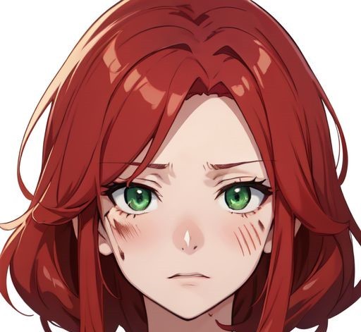

(Images generated using Perchance-AI and NightCafe AI in collaboration)
I've also decided to "attempt" a more realistic art style. As can be seen above. Screen Shot - (Character Bio & First Choices)

Current Stats - 11588 Characters / 1715 Words / 33 Passages / 20 Links
Current Plans - Story/Game -- Push to finish the MudCreek portion and compile a "Demo" so readers/players can try it out and offer feedback on what they see in way of formatting, choices, spelling/grammar.
Info Dump -- I still owe you a promised info dump on the main locations of the story. I still plan to do this in the upcoming days.
SO... there is where I am at with this project.
#original content#update#kinetic novel#visual novel#twine 2.9.2#chapbook 2.2.0#asprite 1.3.8.1#interactive fiction#ai generated images (temporary)
5 notes
·
View notes
Note
What's your favorite game you played this year?
You've activated my “review of my year in gaming” trap card! I was already going to make this post in some form or another, you've just given me the perfect launching point. So, the first thing you should know about asking me for favorites: I never give just one. How could I, when it's been such a banger year of games? (Heads up, this one's going to go long.)
I loved Tears of the Kingdom to death, and it took home my most hours played on Switch. It is a shining example of what devs can do with an extra few months to polish a game. There were so many remarkable moments that testified to how much care and ideas the devs were able to put in. I loved how it used the time since the first game to develop familiar places and characters, adding depth (no pun intended) and also making sure every familiar location had some new twist. The story was a much stronger followup to BotW, and I think this overall has my new favorite ending sequence of anything in the series (I'd love to make a full post sometime about how the final Ganondorf battles just keep getting more spectacular with each new title). I am so, so, so, so normal about this incarnation of Princess Zelda.
Also in my favorites this year is Fire Emblem Engage, which hit at just the right time to scratch my strategy itch. As a long time FE fan it’s not a surprise I enjoyed this one- though it lost the political intrigue of its predecessor in favor of a more traditional/tropey story, I still had a lot of fun with all its gimmicks and gameplay innovations. Also it is hands-down the most visually appealing game in the franchise, a title previously held by the series’ GBA entries which are masterworks from the peak era of beautiful sprite art. From the incredible crit animations to the spectacle of super attacks to the battle maps which are so beautifully detailed that the game lets you free roam around them after a battle just to appreciate them better.
I finished the Link’s Awakening remake this year! It was a charming trip back to an older era of Zelda design philosophy and I found it fascinating to compare the ways where the classic puzzles and challenges differ from what the game would be like if it were made today, as well as the places where modern technology allowed for better QoL changes that weren’t in the original. I really enjoyed the music as well, which I find to be a standout among the series still.
Here at the end of the year, I have to give a shout out to Sea of Stars. It has everything you want in an indie darling- very pretty pixel art, very nice music, turn-based battles with timed hits I joke, but Sea of Stars does a great job balancing evoking/paying homage to icons like Chrono Trigger and bringing new gameplay to the JRPG formula. I like its pared-down take on JRPG combat which revamps skills/mana into a much more dynamic resource that’s constantly being spent and regenerated, and I’m a known sucker for character combo attacks which this game has in spades. The later parts of its story are told with a lot of heart, and again I am a known sucker for certain character archetypes. Surprisingly also, I think the movement and exploration is absolutely a standout- not something that’s typically emphasized in the genre. But this game constantly has you hopping across stepping stones, balancing on tightropes, climbing walls and ledges… the emphasis on interesting traversal and verticality is a strength few games like it can boast.
Before my final pick, I’m including a special section for all the games I didn't play myself but watched my friends play and still want to praise: Hi-Fi Rush, Bomb Rush Cyberfunk, Mario Bros Wonder, Pizza Tower, the Minish Cap Switch rerelease, and more all came out this year and all of them have brought killer music, excellent gameplay, and stunning visuals that I’ve enjoyed to no end. Anyone considering to pick up any of them would find a quality product without a doubt.
With all that said: I think ultimately it has to be Tunic in the end. Underneath its premise of a Zelda/Souls-like adventure game there is a wealth of secrets that goes as far down as you have the courage to delve. It’s a game built to evoke nostalgia for games that you didn’t understand yet, posing as a game that you watched an older sibling play or a game you could only find a poorly-translated foreign copy of. It obscures everything and teaches you its secrets through context, exploration, and discovering in-game pages of the manual (remember manuals?). It’s a game made for lovers of secrets and puzzles, full of hidden paths and trophies that reward inquisitiveness and observation (and taking paper notes). It was when I saw that it not only has a conlang, but that it gives you the hints you need to fully translate it, that I knew I had to get it myself. It spurred me to screenshot every in-game piece of menu text, then spend evenings cross-referencing it to identify phonemes and construct a key.
The rush I got on completing that key is one of two moments I knew this game was absolutely special. The second standout moment is when the game teaches you its hugest secret, and then invites you to prove your mastery of it by presenting you a huge, multi-part puzzle. But, Tunic does the same thing that one of my other all-time favorites, Outer Wilds, does so well: powerups via knowledge, “unlocking” abilities that you always had, you just didn’t know that you did. The pieces to this puzzle are hidden in plain sight; it’s only when the game tells you what you’re looking for that your understanding shifts, everything clicks, and your eyes are opened to the path you have to follow. I don’t say it lightly, but I consider Tunic to be a one-of-a-kind title, and one that delivers completely on its unique vision.
In case that brick of text doesn’t make it clear, I love this game.
I love all of these games.
It's a fine time to be alive.
#i talk a lot tag#skysometric#loz#totk#sea of stars#fire emblem#fe17#link's awakening#thank you so so much for giving me this space to make this post#sorry-not-sorry about the wall of text jumpscare#i mean everything i said sincerely and honestly still have more to say about some of these#that i'll save for another time#long post
15 notes
·
View notes
Text

A Squirrel and Hedgehog OC. OoooooOOOooo. I was about to say it’s my second one (I’ve got a squirrel I never posted about before) but then I remembered Geumseagi’s dad. I think we could also have a philosophical discussion about how many head cannons can you lump up on a character before they become an OC. I imagine it’s when you change the character’s name. That’s just the last straw.
Changing up pre existing characters is a skill I learned from writing real people fan fiction. By the time you’re done writing your femboy pagan priest turned an immortal 20 something sparking dictator after the film market collapsed with the rise of AI, people will scratch their heads as to how this character ever started life as Tom Hanks. But most importantly you don’t get sued!
By the way this was an actual character I made. I never put out the unfinished book on the internet outside of one chapter on AO3. I was getting tired of working on it for I think over 2 years with no results.
This character though is original in that they’re not inspired by any character from Squirrel and Hedgehog specifically. I will talk about my inspiration for them later.
So. Their name is Shiho Tenshi as you can see. It means white angel. Originally they were supposed to be called Shiho Akuma, meaning white devil But it didn’t make sense to me that they would be called that by the weasels. They’re a war hero to them after all. Probably the Flower Hill animals would call them whatever the Korean translation of white devil is. Hayan Agma. Language is something that goes unaddressed in the series. It’s an idea I want to incorporate into my AU. Primary example being that the weasels kept Mulmangcho around as a translator.
Shiho Tenshi isn’t their real name. No one knows their “real name”. I should also mention that they’re gender fluid and use they/them pronouns. Also also they’re a white weasel if you didn’t notice. Growing up they were a poor orphan on the streets. They learned very quickly that by changing up how they behave and look they were gendered differently. Seeing their love for performance a traveling acting troupe took them in. They would preform for soldiers at military bases. Providing cheap entertainment.
One day though the base they’re performing at gets attacked. Using their sword skills they heroically defend the base earning them a place in the military. They rarely use guns or martial art. Preferring their elegant silver sword. The military allows it as it makes for some good propaganda posters. They absolutely despise all Flower Hill animals. Appearing ruthless and brutal. The peak of military masculinity. But when it comes to weasels and surprisingly mice they are kind almost motherly and willing to sacrifice themselves whenever it comes to it. They like mice because the acting troupe was primarily mice.
What do you think? I wanted to play with gender roles when it came to them. My main inspiration was Hoshiko Kawasima. They are a very interesting World War 2 queer historical figure. I would recommend checking them out. Then the character Lady Oscar from the manga Rose of Versailles. They were totally based off of Kawasima. There’s too many coincidences! Lastly their whole acting part was based off of the Takarazuka Revue. It’s an all female acting troupe in Japan. They’re really cool.
This picture was based off of a promotional image of Lady Oscar for their performance of Rose of Versailles. The background inspiration was from @32girassoisdevangogh I am trying to go more abstract graphic design for backgrounds of character art. Mainly because I’m just too tired after 5 hours of rendering. So prepare yourselves for more comic sands and pixelated images of puppies and kittens because graphic design is my passion as you can see from my tumblr banner!
I’m not really sure what I’m going to do with this character. They’re not going to be included in my Super Secret Project. Maybe I can write a short story about them or roleplay. We will see.
Bobby out!
11 notes
·
View notes
Text
Another walk sprite thing.
It's been a while since I did anything focusing on the graphics side of making a game, huh? Let's change that.
Now, I'm not all that experienced with making sprites. I just sort of make them when I'm in need of a little art project so this isn't really a guide to making a good sprite. It's more of a compilation of tricks I've learned for the sake of completeness of this sideblog.
Of course, there's the overview I did ages ago over how RPG Maker animates a set of sprites into a walking character and how to put a png of your character into the game. But even if you're making your own sprites from scratch the Generator can provide some starting points to study from.
Not every character you want to put in your game can be made with the built-in generator, especially if you're not into the default generator's aesthetic. But you can get the general principles of what makes a sprite work from there.

One way to get started is to look at the generator characters at their base. No frills, just a character set that gives you a look at poses and shading. If you want to use the generator's style but don't like the outfits it comes with you can just draw your own outfits over a naked sprite in your art program of choice!
But I'm not doing that. I'm going to create this guy.
So let's look at what we can learn.

It may not be obvious at first glance because it's only a pixel of difference, but a quick study of the generator's sprites shows that the stepping images are actually one pixel shorter than the standing ones to simulate the bobbing of the character's head as they walk.

At the same time whether walking or standing still, the sprites' feet are on the ground. Which makes sense...

... because the height gets distributed into the legs when the character walks.

In other words, once you've built yourself a workable front-facing sprite then making the stepping sprites is a matter of copying that one over and moving it one pixel down from the original height. From there, erase the legs and redraw them in the walking pose.

You can make the back from a copy of the front, too, in order to get an easy pose to work from!

The same trick of removing the parts that need changing (arms and legs) of a copied sprite works for the back and side stepping poses as well. Just remember to make them the same height as the front-facing ones with the stepping ones one pixel down.
Another thing you can learn from the generator sprite?

There's a lot that simply copying and flipping can do. Save yourself time - especially if you're making a lot of original sprites. If the generator sprites look good enough that you don't notice the light source flipped between the right and left facing sprites until it was pointed out then you don't need to worry about it either!
You can test the sprite in the game before it's even done, too. For example to test how the stepping animation looks in game for the front sprite before you've even made the other directions, all you have to do is add the png to the game's character images (as detailed in a previous post) and create an event with the stepping animation turned on.

Then simply save over the test version with your adjustments as you make them.
Now one thing of note about that the finished sprite...

A sprite in one style won't always play nice with the rest of the tiles. Stegrow here is way paler than the tiles and sprites that come with RMXP. If I wanted to use them together I'd change up Stegrow's colors with deeper greens, likely color picked from the greens available in generator sprites or the tiles that came with the base package.
The style is also different in other ways: the generator-created player is a chibi sprite with a large head that takes up as much as the rest of the body while Stegrow's head is more proportional by comparison. Stegrow is pretty much vertical while the barrels from the default tiles are shown to be at a slight angle.
If you're adding to an existing tile/sprite set, you'll want to study it's style and adjust your own work to fit in. Otherwise, you can always make everything in your own style from the literal ground up.

I'll admit, I've kinda been stalling on the next bit, which will be beginning to explore the battle system. I never did much with XP's as Pokemon Essentials had it's own highly customized version so getting used to the one that's built into MZ will be completely new for me. Not all games need a battle system but I have decided that this is a learnalong so I will indeed be learning things instead of just playing with stuff I knew from XP but in MZ this time. Now I just need enough oomph in the tank after work....
3 notes
·
View notes
Text
pre-blog catchup diary
*disclaimer: this is ALL pre-alpha art. these screenshots are BEFORE visual development started. it's ugly. it's supposed to be. i was focused on programming and didn't want aesthetics to get in the way. pretend in your heart that this is all beautiful pixel art

anyway go below the readmore for details!!
i started working on this game in october 2023!! i had been learning gdscript before that, a little bit, but i hadn't fully committed to this project until then. pictured below is. the First build of the game vs the most current build. we've come so far.


the prototype was just a one-week build of the farming sim. so i could test how the time mechanic worked (time only moves when you do an action, you're not on a constant ticking clock)(this makes it much easier to strategize what you'll do in a day and letting the player go at their own pace, making the game feel more relaxed)(you can also... undo actions... which was just me testing out the code in this version but in the full version... will have different Implications)
i am all by my lonesome on this project. mechanically at least. my brother, girlfriend, dad, and my best friends are constantly helping me test things and i bounce ideas off of them all the time. it helps that my brother is a master GM and writer and my girlfriend is a software developer. and i lean very heavily on my dad for music/soundscape assistance. so yes, solodev, but also i am not an island
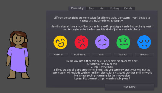
so the prototype was made when i was still learning gdscript past the phase of "tutorials for babies that produce a single number-go-up game" which is. hard!! since this is a much more complex project. it's easy to make anything in isolation, it's harder to figure out how to make new systems weave into a bigger project! fucking hell i didn't even know about custom resources!!!!

the prototype went off with FLYING COLORS though. girlfriend and brother played it over the weekend i gave it to them and it worked, it made sense, and watching the two of them test out the mechanics gave me some very good ideas for future builds. also nothing crashed and gf couldn't find any crazy exploits! (however pictured below is the incredibly fucked up floating rabbit glitch that i couldn't fix)
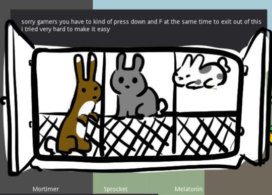
i finished it in june and took a break in july. august will be the first proper devlog for this! i'm excited to have a little dev journal around! i probably will only post consistently about once a month, with maybe some little posts here and there about characters or concept art i'm excited for
so what's next?
TIME TO GO BUILD ALPHA, BABY!!!!
which sounds exciting but i'm basically. starting from scratch again. new, fresh godot file. so it feels like i'm not very far in, even though i have an entire working prototype on my desktop.
and.... geez.... gotta actually make the pixel art and implement it into a working file???? so that it doesn't look like dogshit???? that would be nice. i didn't want to do it for prototyping/pre-alpha because i really wanted to make sure i had the capacity to code the game before putting my heart and soul into the art. and now i'm very certain i do?? it's not hard, it just takes time. and the time will pass anyway!!
i have two campaigns planned for the game, one that's smaller and one that's larger. the bigger one is the typical make your own character farming simulator, played straight in the setting. but i'm working on the smaller one first! you play as a specific character for the first year of the story. not all of the game mechanics are turned on for this mode, and it's more story-oriented than the straight Farming Simulator, so i think it's a good place to put development energy into. get it all ironed out. make it make sense before blowing it up on a larger scale. and it's more contained to test in which is a bonus
anyway. i'm going to post build updates on this on the last day of every month. and!! i'm not going to say a Lot about how the game works quite yet but the askbox is open. i don't think anyone will ask anything cause this is still in really early stages but it's there if you want it i guess
5 notes
·
View notes
Text
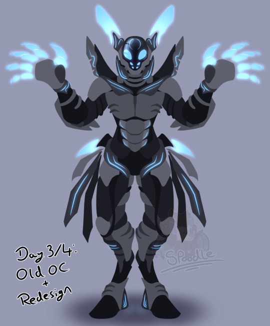
OC-tober day 3/4: Old OC/Redesign
This one took me a few days so I'm combining the two prompts ^^ It would have been the same oc regardless anyway so it makes sense to given the tasks. I very rarely draw mechs so I hope you'll excuse the identical style to Zerrinth's post; symmetry is just so much easier when it comes to designing and basic posing.
His name is Delta, and he's an OC who I've had for a very long time.
Extremely long ramblings, timelapse and original art under the cut
I'll frontload this with the character lore and timelapse; if anyone cares for my breakdown of the oc itself, that'll be the huge ramble at the bottom ^^
D-17, going these days by Delta, is an autonomous multi-function guard unit. Originally from a world shrouded in eternal night, he and his charge Amyss fled its destruction in their ship, the ArchWing, to the planet of Soniterra. Spending their time amongst my other ocs, they now live amongst its denizens in secrecy, studying the world of light and sound through void-borne awe and wonder.
Powered by a zynal core, Delta is mechanically minded and quiet most of the time; tweaks to his functionality by Amyss have given him something of a sassy streak, however, and he's not afraid to giving a gentle ribbing to (or occasionally completely devastate) a poor friend with sharp remarks every once in a while.
Able to rearrange panels and parts of his body, as well as altering the shape and location of the hardlight parts of his form, Delta is capable of minor shapeshifting. He can also very precisicly manipulate tools and objects, capable of working on engineering projects at microscopic levels without any form of magnification or complex set ups with ease. Combining these skills means he is a very capable engineer, and has even rebuilt a living body into a partial cyborg to save someone's life. Though the world he now lives on seems primitive and inefficient by his standards, he does not usually feel arrogant about it; the mechanics of its tech are so different and new to him that he is ever interested in studying it.
A highly capable combatant, D-17's original purpose was to protect the outpost he and Amyss lived within from creatures of void. Energy beams firing from his hands and sharp blades forming from his body kept him and his charges safe, but the planet's end signalled an end to his guarding duties.
Ok, rambling time ;w;
I don't know exactly when I made this guy, but I remember writing about him all the way back in primary school, in blue pen on lined paper that I kept in my little organiser tray. That would be about age 6 or 7, making this guy almost twenty years old in real time ;-;
This OC is old enough to drink and vote in the uk, good fuckin lord
His origins start even earlier, in fact; he's an amalgamation of a couple of simple characters I made as a small child, including one of those 'running along the side of the road' guys you'd imagine on long car trips. Timelines and memories are fuzzy after 2 decades, but I'd imagine those guys are from at least a year or so before I squished all those ideas under one single name. So a solid 19 years, and a potential 20-21 easily :') wow.
Delta is actually old enough that I hadn't done much drawing by this point in my life, and so I mostly wrote things instead. Those old papers are around here somewhere, but design-wise he's never been truly nailed down; just a basic mental image and the odd description or two. The one exception is an old pixel art piece I made of him in mspaint, back on the Family Computer (remember those? ^^). I was a huge fan of pokémon fusions at the time, and I'd spend ages mixing up their sprites to see what I could do. Eventually I moved onto making things from scratch (scratch spriting, what a fun term), and that lead to the one and only time I've ever drawn this guy. It took way too long, it's very clunky, and I no longer have the original file :c Lost long ago in the move between computer to laptop I imagine. Instead, I managed to find it in a gloriously 240p youtube upload set to a Linkin Park song ^^ ah child me, you never left.
All the way from 2010, here's the best surviving version I could find. And yes, the youtube bar at the bottom is in the shot; you want to fight me over it, go find and screenshot it yourself :)
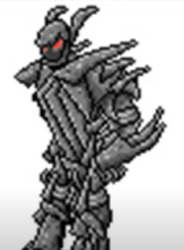
It's weirdly posed, has literally only 1 shade of grey + shading for colour, the design makes very little sense, especially for the chest and torso, and he looks a lot more evil than I intended. Despite a few efforts that went nowhere later in life though, I just never managed to redraw or redesign him in a way I was happy with. So for a long time, this grey pointy spriteart has been all I ever saw of Delta. Figured he was long, long, LONG overdue an update, and so here we are :)
Though he might look very different now and have actual anatomy knowledge informing his structure now, who'd have thunk? I tried very hard to keep intact the core design features that 13 year old me added in. It's the same fella after all! Here's a quick list of basic ones, since most of them are subtle but intentional after all:
-Glass/screen face with digital expression; I think taking the top off frees him up to look cleaner, but underneath was always a smooth screen. This way he can see above himself too ^^ -'Bunny ears'; little antenna/paddles that originate from the endless runner character, who was originally something of a rabbit -Shoulder-mounted boosters. Pretty self explanatory. -Upper arm loops; this one was actually a coincidence! I guess 2010 me and 2023 me both thought the upper arm needed something ^^ -Elbow plates; these were like. A big thing. Originally able to shapeshift into blades and other tools, I had to keep them in. It wouldn't be delta without them. They're just less... accidentally lethal now ^^ old design was POINTY -Split shins; the original shins have a pair of plates on them that form a sort of 'cuff' above the foot. I honoured this by making the feet the same way, the ankle connecting between the two sides. -Spikes! His hips were feeling a little.. empty? So I gave him some electromagnetic spikey blade things he can use as tools, as well as some hardlight claw hands.
#spoodle draws#digital art#art#potatoposting#bweird oc tober#bweirdoctober#robot#redesign#oc#original character
11 notes
·
View notes