#love the distinction between her and every other puppet on the set. puppets with organs and blood and her being presumably a complete-
Explore tagged Tumblr posts
Text
a while back I heard that at the start of Coraline, the tools the Beldam used to make Coralines doll were all tools used in embalming and i thought that was really interesting, but one thing that caught my attention even more was that cotton was one of those common materials and I thought, huh, lesley...... lesley has cotton coming out of her face
#puppet talk#im really unsure if this is reaching i said it awhile ago somewhere else but!!!!!! watever#i doubt they were doing that on purpose but i think its a nice little detail both dhmis and coraline are just jam packed with little fun st#uff to speculate about.#im not leaning towards lesley being dead or anything but . honestly shes so cool weird ass lady#love the distinction between her and every other puppet on the set. puppets with organs and blood and her being presumably a complete-#- flip to that. inside out..... ooooongggggghhgg#dhmis#< WATEVR
43 notes
·
View notes
Photo
Blurring the Line.
As a new Space Jam film beams down to Earth, Kambole Campbell argues that a commitment to silliness and a sincere love for the medium is what it takes to make a great live-action/animation hybrid.
The live-action and animation hybrid movie is something of a dicey prospect. It’s tricky to create believable interaction between what’s real and what’s drawn, puppeteered or rendered—and blending the live and the animated has so far resulted in wild swings in quality. It is a highly specific and technically demanding niche, one with only a select few major hits, though plenty of cult oddities. So what makes a good live-action/animation hybrid?
To borrow words from Hayao Miyazaki, “live action is becoming part of that whole soup called animation”. Characters distinct from the humans they interact with, but rendered as though they were real creatures (or ghosts), are everywhere lately; in Paddington, in Scooby Doo, in David Lowery’s (wonderful) update of Pete’s Dragon.
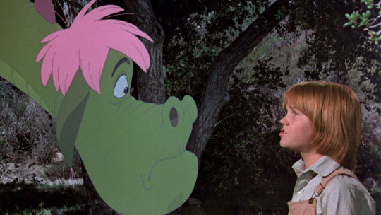
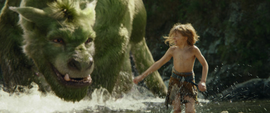
The original ‘Pete’s Dragon’ (1977) alongside the 2016 remake.
Lowery’s dragon is realized with highly realistic lighting and visual-effects work. By comparison, the cartoon-like characters in the 1977 Pete’s Dragon—along with other films listed in Louise’s handy compendium of Disney’s live-action animation—are far more exaggerated. That said, there’s still the occasional holdout for the classical version of these crossovers: this year’s Tom and Jerry replicating the look of 2D through 3D/CGI animation, specifically harkens back to the shorts of the 1940s and ’50s.
One type of live-action/animation hybrid focuses on seamless immersion, the other is interested in exploring the seams themselves. Elf (2003) uses the aberration of stop-motion animals to represent the eponymous character as a fish out of water. Ninjababy, a Letterboxd favorite from this year’s SXSW Festival, employs an animated doodle as a representation of the protagonist’s state of mind while she processes her unplanned pregnancy.
Meanwhile, every Muppets film ever literally tears at the seams until we’re in stitches, but, for the sake of simplicity, puppets are not invited to this particular party. What we are concerned with here is the overlap between hand-drawn animation and live-action scenes (with honorable mentions of equally valid stop-motion work), and the ways in which these hybrids have moved from whimsical confections to nod-and-wink blockbusters across a century of cinema.
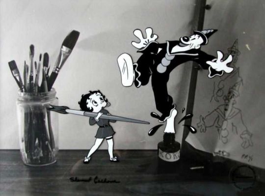
Betty Boop and Koko the clown in a 1938 instalment of the Fleischer brothers’ ‘Out of the Inkwell’ series.
Early crossovers often involve animators playing with their characters, in scenarios such as the inventive Out of the Inkwell series of shorts from Rotoscope inventor Max Fleischer and his director brother Dave. Things get even more interactive mid-century, when Gene Kelly holds hands with Jerry Mouse in Anchors Aweigh.
The 1960s and ’70s deliver ever more delightful family fare involving human actors entering cartoon worlds, notably in the Robert Stevenson-directed Mary Poppins and Bedknobs and Broomsticks, and Chuck Jones’ puntastic The Phantom Tollbooth.
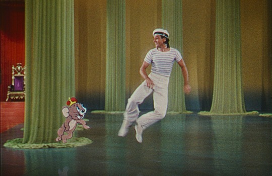
Jerry and Gene dance off their worries in ���Anchors Aweigh’ (1945).
Mary Poppins is one of the highest-rated live-action/animation hybrids on Letterboxd for good reason. Its sense of control in how it engages with its animated creations makes it—still!—an incredibly engaging watch. It is simply far less evil than the singin’, dancin’ glorification of slavery in Disney’s Song of the South (1946), and far more engaging than Victory Through Air Power (1943), a war-propaganda film about the benefits of long-range bombing in the fight against Hitler. The studio’s The Reluctant Dragon (1941) also serves a propagandistic function, as a behind-the-scenes studio tour made when the studio’s animators were striking.
By comparison, Mary Poppins’ excursions into the painted world—replicated in Rob Marshall’s belated, underrated 2018 sequel, Mary Poppins Returns—are full of magical whimsicality. “Films have added the gimmick of making animation and live characters interact countless times, but paradoxically none as pristine-looking as this creation,” writes Edgar in this review. “This is a visual landmark, a watershed… the effect of making everything float magically, to the detail of when a drawing should appear in front or the back of [Dick] Van Dyke is a creation beyond my comprehension.” (For Van Dyke, who played dual roles as Bert and Mr Dawes Senior, the experience sparked a lifelong love of animation and visual effects.)
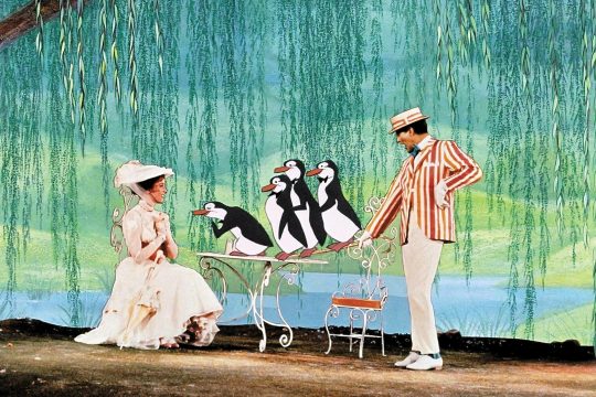
Julie Andrews, Dick Van Dyke and penguins, in ‘Mary Poppins’ (1964).
Generally speaking, and the Mary Poppins sequel aside, more contemporary efforts seek to subvert this feeling of harmony and control, instead embracing the chaos of two worlds colliding, the cartoons there to shock rather than sing. Henry Selick’s frequently nightmarish James and the Giant Peach (1996) leans into this crossover as something uncanny and macabre by combining live action with stop motion, as its young protagonist eats his way into another world, meeting mechanical sharks and man-eating rhinos. Sally Jane Black describes it as “riding the Burton-esque wave of mid-’90s mall goth trends and blending with the differently demonic Dahl story”.
Science-classroom staple Osmosis Jones (2001) finds that within the human body, the internal organs serve as cities full of drawn white-blood-cell cops. The late Stephen Hillenburg’s The Spongebob Squarepants Movie (2004) turns its real-life humans into living cartoons themselves, particularly in a bonkers sequence featuring David Hasselhoff basically turning into a speedboat.

David Hasselhoff picks up speed in ‘The Spongebob Squarepants Movie’ (2004).
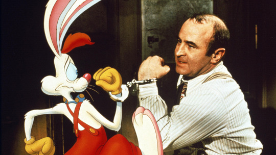
The absurdity behind the collision of the drawn and the real is never better embodied than in another of our highest-rated live/animated hybrids. Released in 1988, Robert Zemeckis’ Who Framed Roger Rabbit shows off a deep understanding—narratively and aesthetically—of the material that it’s parodying, seeking out the impeccable craftsmanship of legends such as director of animation Richard Williams (1993’s The Thief and the Cobbler), and his close collaborator Roy Naisbitt. The forced perspectives of Naisbitt’s mind-bending layouts provide much of the rocket fuel driving the film’s madcap cartoon opening.
Distributed by Walt Disney Pictures, Roger Rabbit utilizes the Disney stable of characters as well as the Looney Tunes cast to harken back to America’s golden age of animation. It continues a familiar scenario where the ’toons themselves are autonomous actors (as also seen in Friz Freleng’s 1940 short You Ought to Be in Pictures, in which Daffy Duck convinces Porky Pig to try his acting luck in the big studios).
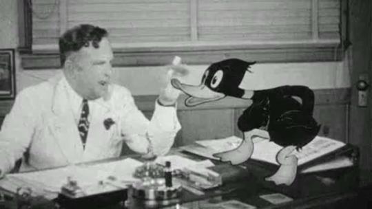
Daffy Duck plots his rise up the acting ranks in ‘You Ought to Be in Pictures’ (1940).
Through this conceit, Zemeckis is able to celebrate the craft of animation, while pastiching both Chinatown, the noir genre, and the mercenary nature of the film industry (“the best part is… they work for peanuts!” a studio exec says of the cast of Fantasia). As Eddie Valiant, Bob Hoskins’ skepticism and disdain towards “toons” is a giant parody of Disney’s more traditional approach to matching humans and drawings.
Adult audiences are catered for with plenty of euphemistic humor and in-jokes about the history of the medium. It’s both hilarious (“they… dropped a piano on him,” one character solemnly notes of his son) and just the beginning of Hollywood toying with feature-length stories in which people co-exist with cartoons, rather than dipping in and out of fantasy sequences. It’s not just about how the cartoons appear on the screen, but how the human world reacts to them, and Zemeckis gets a lot of mileage out of applying ’toon lunacy to our world.
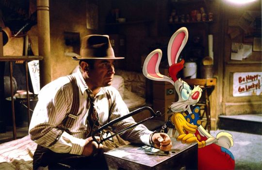
Bob Hoskins in ‘Who Framed Roger Rabbit?’ (1988).
The groundbreaking optical effects and compositing are excellent (and Hoskins’ amazing performance should also be credited for holding all of it together), but what makes Roger Rabbit such a hit is that sense of controlled chaos and a clever tonal weaving of violence and noirish seediness (“I’m not bad… I’m just drawn that way”) through the cartoony feel. And it is simply very, very funny.
It could be said that, with Roger Rabbit, Zemeckis unlocked the formula for how to modernize the live-action and animation hybrid, by leaning into a winking parody of what came before. It worked so perfectly well that it helped kickstart the ‘Disney renaissance' era of animation. Roger Rabbit has influenced every well-known live-action/animation hybrid produced since, proving that there is success and fun to be had by completely upending Mary Poppins-esque quirks. Even Disney’s delightful 2007 rom-com Enchanted makes comedy out of the idea of cartoons crossing that boundary.
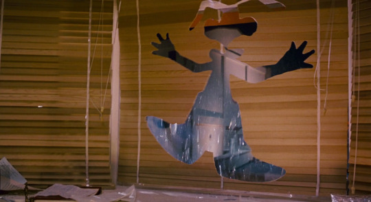
When a cartoon character meets real-world obstacles.
Even when done well, though, hybrids are not an automatic hit. Sitting at a 2.8-star average, Joe Dante’s stealthily great Looney Tunes: Back in Action (2003) is considered by the righteous to be the superior live-action/animated Looney Tunes hybrid, harkening back to the world of Chuck Jones and Frank Tashlin. SilentDawn states that the film deserves the nostalgic reverence reserved for Space Jam: “From gag to gag, set piece to set piece, Back in Action is utterly bonkers in its logic-free plotting and the constant manipulation of busy frames.”
With its Tinseltown parody, Back in Action pulls from the same bag of tricks as Roger Rabbit; here, the Looney Tunes characters are famous, self-entitled actors. Dante cranks the meta comedy up to eleven, opening the film with Matthew Lillard being accosted by Shaggy for his performance in the aforementioned Scooby Doo movie (and early on throwing in backhanded jokes about the practice of films like itself as one character yells, “I was brought in to leverage your synergy!”).
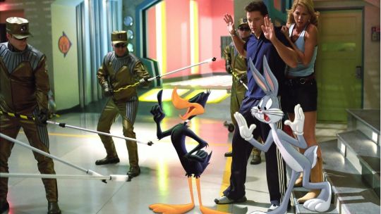
Daffy Duck with more non-stop banter in ‘Looney Tunes: Back in Action’ (2003).
Back in Action is even more technically complex than Roger Rabbit, seamlessly bringing Looney Tunes physics and visual language into the real world. Don’t forget that Dante had been here before, when he had Anthony banish Ethel into a cartoon-populated television show in his segment of Twilight Zone: The Movie. Another key to this seamlessness is star Brendan Fraser, at the height of his powers here as “Brendan Fraser’s stunt double”.
Like Hoskins before him, Fraser brings a wholehearted commitment to playing the fed-up straight man amidst cartoon zaniness. Fraser also brought that dedication to Henry Selick's Monkeybone (2001), a Roger Rabbit-inspired sex comedy that deploys a combo of stop-motion animation and live acting in a premise amusingly close to that of 1992’s Cool World (but more on that cult anomaly shortly). A commercial flop, Back in Action was the last cinematic outing for the Looney Tunes for some time.
Nowadays, when we think of live-action animation, it’s hard not to jump straight to an image of Michael Jordan’s arm stretching to do a half-court dunk to save the Looney Tunes from slavery. There’s not a lot that can be fully rationalized about the 1996 box-office smash, Space Jam. It is a bewildering cartoon advert for Michael Jordan’s baseball career, dreamed up off the back of his basketball retirement, while also mashing together different American icons. Never forget that the soundtrack—one that, according to Benjamin, “makes you have to throw ass”—includes a song with B-Real, Coolio, Method Man and LL Cool J.
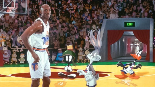
Michael Jordan and teammates in ‘Space Jam’ (1996).
Space Jam is a film inherently born to sell something, predicated on the existing success of a Nike commercial rather than any obvious passion for experimentation. But its pure strangeness, a growing nostalgia for the nineties, and meticulous compositing work from visual-effects supervisor Ed Jones and the film’s animation team (a number of whom also worked on both Roger Rabbit and Back in Action), have all kept it in the cultural memory.
The films is backwards, writes Jesse, in that it wants to distance itself from the very cartoons it leverages: “This really almost feels like a follow-up to Looney Tunes: Back in Action, rather than a predecessor, because it feels like someone watched the later movie, decided these Looney Tunes characters were a problem, and asked someone to make sure they were as secondary as possible.” That attempt to place all the agency in Jordan’s hands was a point of contention for Chuck Jones, the legendary Warner Bros cartoonist. He hated the film, stating that Bugs would never ask for help and would have dealt with the aliens in seven minutes.
Space Jam has its moments, however. Guy proclaims “there is nothing that Deadpool as a character will ever have to offer that isn’t done infinitely better by a good Bugs Bunny bit”. For some, its problems are a bit more straightforward, for others it’s a matter of safety in sport. But the overriding sentiments surrounding the film point to a sort of morbid fascination with the brazenness of its concept.
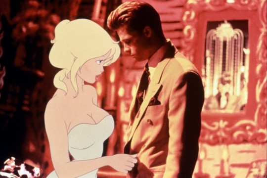
Holli Would (voiced by Kim Basinger) and Frank Harris (Brad Pitt) blur the lines in ‘Cool World’ (1992).
Existing in the same demented… space… as Space Jam, Paramount Pictures bought the idea for Cool World from Ralph Bakshi as it sought to have its own Roger Rabbit. While Brad Pitt described it as “Roger Rabbit on acid” ahead of release, Cool World itself looks like a nightmare version of Toontown. The film was universally panned at the time, caught awkwardly between being far too adult for children but too lacking in any real substance for adults (there’s something of a connective thread between Jessica Rabbit, Lola Bunny and Holli Would).
Ralph Bakshi’s risqué and calamitously horny formal experiment builds on the animator’s fascination with the relationship between the medium and the human body. Of course, he would go from the immensely detailed rotoscoping of Fire and Ice (1983) to clashing hand-drawn characters with real ones, something he had already touched upon in the seventies with Heavy Traffic and Coonskin, whose animated characters were drawn into real locations. But no one besides Bakshi quite knew what to do with the perverse concept of Brad Pitt as a noir detective trying to stop Gabriel Byrne’s cartoonist from having sex with a character that he drew—an animated Kim Basinger.
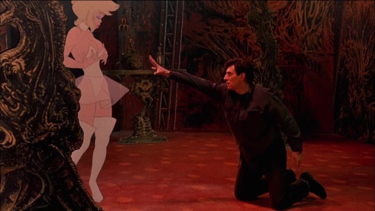
Jack Deebs (Gabriel Byrne) attempts to cross over to Hollie Would in ‘Cool World’ (1992).
Cool World’s awkwardness can be attributed to stilted interactions between Byrne, Pitt and the animated world, as well as studio meddling. Producer Frank Mancuso Jr (who was on the film due to his father running Paramount) demanded that the film be reworked into something PG-rated, against Bakshi’s wishes (he envisioned an R-rated horror), and the script was rewritten in secret. It went badly, so much so that Bakshi eventually punched Mancuso Jr in the face.
While Cool World averages two stars on Letterboxd, there are some enthusiastic holdouts. There are the people impressed by the insanity of it all, those who just love them a horny toon, and then there is Andrew, a five-star Cool World fan: “On the surface, it’s a Lovecraftian horror with Betty Boop as the villain, featuring a more impressive cityscape than Blade Runner and Dick Tracy combined, and multidimensional effects that make In the Mouth of Madness look like trash. The true star, however, proves to be the condensed surplus of unrelated gags clogging the arteries of the screen—in every corner is some of the silliest cel animation that will likely ever be created.”
There are even those who enjoy its “clear response to Who Framed Roger Rabbit”, with David writing that “the film presents a similar concept through the lens of the darkly comic, perverted world of the underground cartoonists”, though also noting that without Bakshi’s original script, the film is “a series of half steps and never really commits like it could”. Cool World feels both completely deranged and strangely low-energy, caught between different ideas as to how best to mix the two mediums. But it did give us a David Bowie jam.
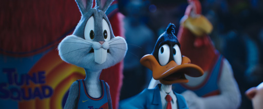
‘Space Jam: A New Legacy’ is in cinemas and on HBO Max now.
Craft is of course important, but generally speaking, maybe nowadays a commitment to silliness and a sincere love for the medium’s history is the thing that makes successful live-action/animation hybrids click. It’s an idea that doesn’t lend itself to being too cool, or even entirely palatable. The trick is to be as fully dotty as Mary Poppins, or steer into the gaucheness of the concept, à la Roger Rabbit and Looney Tunes: Back in Action.
It’s quite a tightrope to walk between good meta-comedy and a parade of references to intellectual property. The winningest strategy is to weave the characters into the tapestry of the plot and let the gags grow from there, rather than hoping their very inclusion is its own reward. Wait, you said what is coming out this week?
Related content
Rootfish Jones’s list of cartoons people are horny for
The 100 Sequences that Shaped Animation: the companion list to the Vulture story
Jose Moreno’s list of every animated film made from 1888 to the present
Follow Kambole on Letterboxd
#kambole campbell#mary poppins#ralph bakshi#hayao miyazaki#ghibli#disney#who framed roger rabbit#roger rabbit#spongebob squarepants#spongebob#animation#live action animation#live action animation hybrid#stop motion animation#stop motion#wes anderson#brad pitt#bob hoskins#genre#space jam#space jam a new legacy#michael jordan#lebron james#looney tunes#bugs bunny#daffy duck#warner bros#2d animation#letterboxd
26 notes
·
View notes
Text
Victoria and John, a contract (part one)
I’m pretty much convinced that not only is John Brown not human (demon or angel would be my best guess), but he has made a contract with Queen Victoria.
We’ve talked about the Albert hand puppet quite a bit, and I truly do believe it serves the same purpose as what Sebastian offered to our earl in ch138 — make the contractor feel as though a dead loved-one has returned.
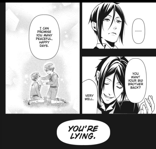
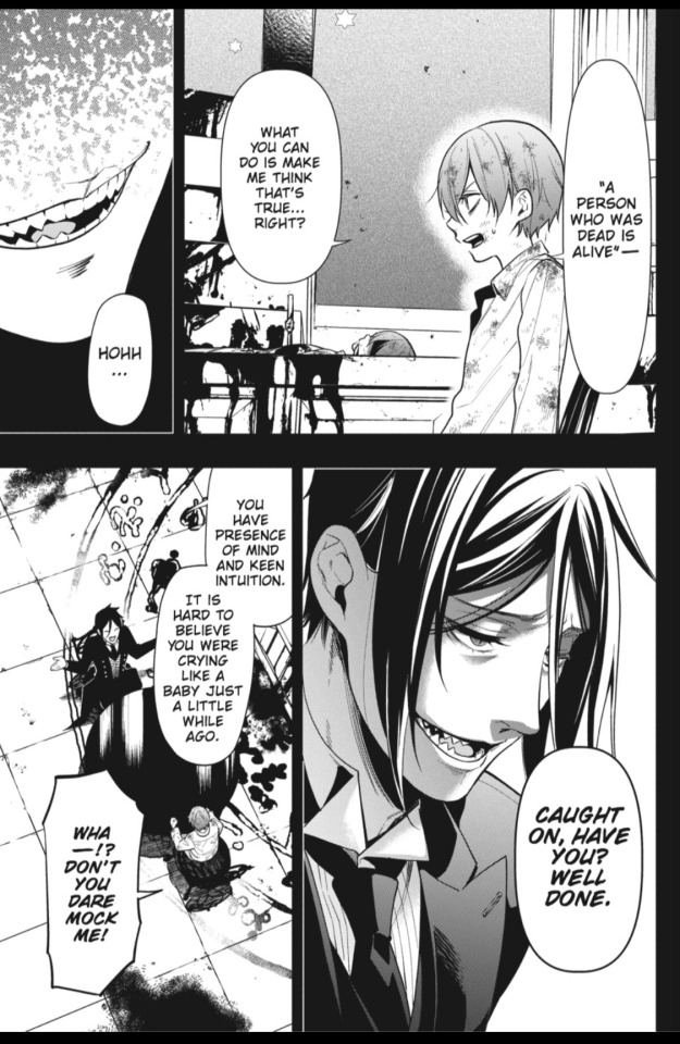
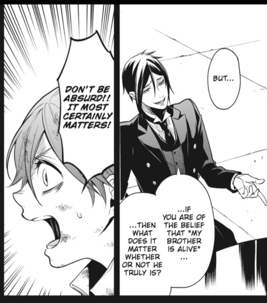
Our earl didn’t fall for such an offer, but I think Victoria found it all too tempting to pass up. Sure, she still dresses in the black of mourning, talks about Albert in past-tense, and then breaks down crying. However, as soon as the puppet appears, she genuinely behaves as though she thinks Albert is there with her.
This is not simply a puppet; it’s a mind control device, a powerful tool to manipulate her feelings, thoughts, and actions. Sometimes John even uses that deadpan Albert voice to give her ideas and plans of action... not just words of encouragement... as if they are coming from Albert himself. We could simply see it as a parody of real life, since Queen Victoria claimed John Brown was a medium who allowed her to communicate with her dead husband, but I think it’s something way more sinister in the Kuroverse.
However, ch21 shows us, right off the bat, that whatever charm/power John has over her with the puppet, it’s not perfect. As I pointed out above, sometimes she realizes Albert is dead and gone. Historically, Victoria stopped making such frequent public appearances after Albert’s death because of her deep mourning. Here, it’s because John/“Albert” suggests she stay home and out of the public’s eye. John realizes her behavior when she’s upset about Albert, as well as her reaction to the puppet, must take a toll on her reputation. If this says anything about the rest of the contract terms, it’s a poorly-made contract.
But, what else would be in the contract, and what might have been left out? I want to look at the wishes and terms spelled out in ch138 for a possible framework, since a contract between John and Victoria would likely parallel the contract between Sebastian and our earl.
I don’t think it’s simply for Albert’s “return”, since there should be some finiteness to fulfilling the contract. Perhaps it’s to make her think Albert has returned for the remainder of her natural lifespan, and then — upon her deathbed — John gets his “payment”, whether it be her soul or something else. Or it could be until she has achieved some other goal. Or John didn’t make it clear the contract had to have a distinct end and couldn’t be extended.... More on that later.
If there is another wish for John to fulfill? That’s a bit harder to guess. Some specified level of power and influence? Some achievement for the legacy she leaves behind? Revenge against some foe (real or imagined)? 🤷🏻♀️ Ch138 might actually give us clues to Victoria’s desires, and not just the one about Albert.
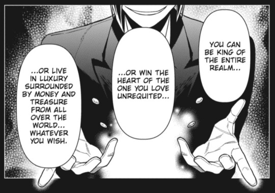
Victoria had been queen since she was 18, she married her beloved around the same time, and she lives in luxury. But her reign saw the new expansion into foreign lands, the wealth raked in by controlling serval industries abroad, and the exotic goods and other treasures that this brought to her and to the British markets... for those who could afford them. Ch21 might essentially confirm this, since John (while being stepped on by the horse) starts listing off her achievements since she’s been queen. The increased power and reach of the nation, her influences on fashion and popular culture, etc. Maybe we should be getting the idea that these grand merits, like creating the “empire where the sun never sets”, are actually achievements made possible only because of John, just like our earl’s successes are largely due to Sebastian’s abilities. It does read similar to ch2’s initial assessment of our earl’s business successes. It also makes sense when paired with Undertaker saying he doesn’t like her, won’t accept “the queen’s coin”, and complains how she sits in comfort and safety while others do her dirty work. Maybe all of her accomplishments are not her own.... More on that later, too! 😏
Some guesses for what might have been included... and left out... of the terms. Let’s go with three wishes, just like our earl was offered. Looking at ch138, we see this about our earl’s first wish:
Wish 1. Speaking the truth.
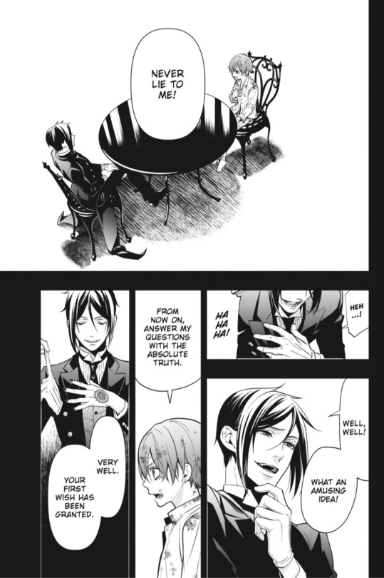
John must be able to lie to her, simply because she might not have been thinking clearly enough at the time to demand otherwise. Sebastian acted like our earl’s demand to always speak the truth is somewhat of a novelty; he was taken by surprise. We know John can lie to her because he does so every time he says Albert is there with her. That entire wish about Albert is fulfilled by lies.
Wish 2. Obeying orders.


Sebastian is being particularly sneaky here to put an extra condition on the terms... after the terms had been agreed upon. This gives him the ability to not follow every order he is given, unless “I command you” is stated. And to accomplish assigned tasks without following very specified ways of doing so. That’s how he was able to “interrogate” Beast for information about the signet ring... instead of going to the two places our earl told him to go. And he was able to say he completed the task, without admitting he never went there... and without lying, because of how he got our earl to rephrase his questions.
John likely has to pretend he’s a normal human, but also like Sebastian, he’s going to pull off some weird shit that’s definitely not normal for humans... and witnesses will just have to remain willingly ignorant to the oddities... much like Finny realizing he had brought Sebastian iris bulbs, not plants full-grown and in bloom.
Sebastian also makes it clear there need to be limits to the contract terms; there cannot be extensions or alterations to the contract terms by way of orders.
How about with Victoria and John? It seems to me that John must have a lot of leeway, when it comes to obeying orders — how he accomplishes them... if he really obeys at all. He might even be able to obey orders in a way that doesn’t always achieve the queen’s desired results... if he doesn’t want to. It’s difficult to see how this part of the contract works (or fails), since we don’t see much of what they say and do.
What we do see, however, is Victoria making hints about what she wants... and sometimes we see John taking note of it. It makes me feel as though the terms could be as vague as “fulfill my desires” or “make my wishes come true”. If so, we run into the issue of contract limitations again. Where does that end? John really might have accidentally made an open-ended contract....
Sebastian is smart to state that he will not accept orders to give more wishes, extend the contract, or make further changes to the terms. Yes, he is trying to take advantage of the kid, but the kid is also hoping to take advantage of the demon. Each one wants as much as they can get from the contract, just like Sebastian says is to be expected. Which brings us to the third wish.
Wish 3. Protection and no betrayal.
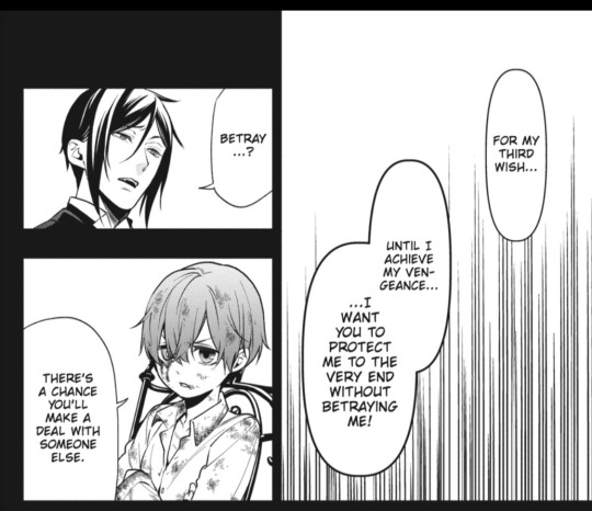

Sebastian threw in the “no betrayal” part as a freebie, since it’s a personal policy of his to not make multiple contracts. He specifies this is a fourth wish that he’s allowing only because it’s an automatic, to him. Our earl set aside the offer to be kept safe from illness; he didn’t think the asthma would return. Besides... imagine how this story would have gone if our earl was stuck inside Sebastian’s body? Very differently, indeed. Entirely different.
I see a setup here for John to be one of those greedy, gluttonous sorts. Charles Grey would be in awe? 😆 I have no idea what sorts of protections John might have offered Victoria, or what she might have agreed to. However, I suspect that 1) the terms might be changeable, so we could later see John do weird things to protect her and 2) John might have another contract with someone else, so betrayal is quite possible. I’d even say it’s likely. With the terms of the contract as loose as I suspect, John could be like Ash/Angela without even changing names, appearances, or personalities.
TL/DR: If John Brown is a demon or angel in a contract with Victoria:
One goal or wish is to make her think Albert has returned.
Other goals seem to be about her achievements and influence as queen. (However, it might even include the crown itself and her marriage.)
He can lie to her, since he lies every time he says Albert is there.
He has to make her wishes come true, but he has a lot of wiggle room on how to accomplish that. And the wishes might not be properly limited.
He probably has to protect her as she achieves whatever goals she has set.
However, he might betray her. Particularly if he’s stuck in a contract that has no well-defined end (other than her natural death).
It’s pretty wild to think about, but it’s entirely possible that Queen Victoria (in the Kuroverse) is a fraud of some kind. What if she made the contract when she was young... and the crown, her beloved husband, her life of luxury... are all just wishes being granted for her? Considering that:
Her birth year is around the time Undertaker rebels and tries to destroy the reaper organization’s HQ... ohh? 🤔
She ascends to the throne the year that Molly G. dies. Her coronation takes place the following year. Hmm. 🧐
And she was, historically, quite attracted to Albert and pursud him to be her husband. As queen, she had to propose to him. Sure, his feelings were mutual IRL, but... maybe not in the Kuroverse? Uh. 🤨
More to come later!
#black butler#kuroshitsuji#queen victoria#john brown#sebastian michaelis#sebbythedemon#our earl#earl phantomhive#demon contract#angels and demons#undertaker#theories#post one#part one#long post#historical figures#historical reference
167 notes
·
View notes
Text
Research: Project Defuture The Future
Randolph Lamonier
Randolpho Lamonier, is a visual artist from Minas Gerais, born in 1988.
He developed several works, specially photography articulated with other languages. He deals with several daily experiences in the city as a form of work, in which photography leads to multiple forms of symbolic exchange.
His work moves between different media, with a leading role in the practice of textile art, drawing, photography, video and installation. In his research, word and image are always together and tend to talk about micro and macro politics, urbanities, sentimental lies, chronicles, diaries and multiple crossings between memory and fiction.
The work done in fabric and embroidery brings sentences like: “ In 2040, we legalized love and other less intense drugs”, and is part of a set of creations in which Lamonier elaborates predictions based on thoughts about the present. “ I always create these works from guidelines that I consider urgent”, explains him.
In the words of the artist himself: “I make flags with what I have. I have never been so foreign. I draw poems, calls for help, war cries, everything is very urgent. The air is contaminated, the floor is covered with debris; sheets, pots, ropes, concrete, broom. Under the rubble the seeds grow in a hurry”.
Perhaps something more interesting than his incredible flags, are the themes he addresses, most of the time making a prediction of the future, about things that could happen in Brazil.
He is indignant with everything rotten that has in Brazil, from the corrupt government, the uncontrollable drug trafficking, the misogynistic society that still exists in Brazil and in several Latin countries, up to the violence itself.
He creates these flags in order to have some kind of hope for Brazil in the future, creating an utopia, where the problems would be thrown away.




David A Smith
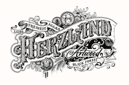
Is a British designer who is specialized in lettering.
He started his own company own sign writing company in 1990 and after 13 years sold the business in 2003 to concentrate more on hand crafting lettering and glass gliding. His main techniques include water and oil gliding, acid etching, French embossing, screen printing and sign writing.
His career in sign writing began in 1984, when he left Westlands school in Torquay, age 16 and was apprenticed for 5 years with Gordon Farr & associates. They were a traditional sign writers, who had come up through the ranks and Gordon, had an uncanny ability to paint letters, accurately laid out, without even a sketch. Under their tutelage, David became an accomplished draftsman, and a accurate letter painter.
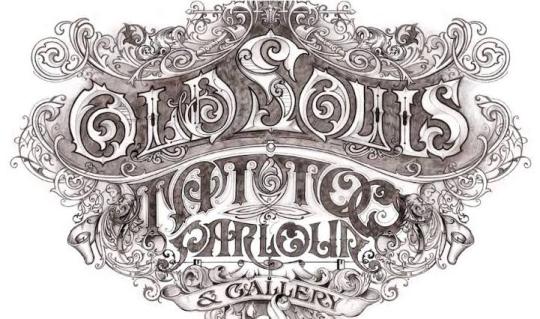
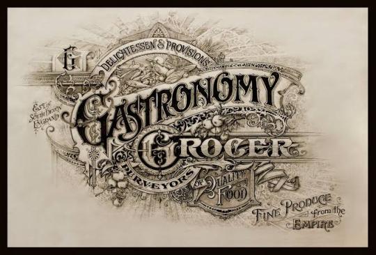
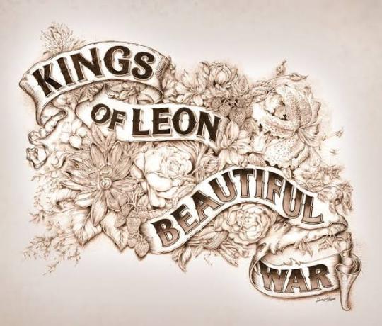
This gathering of talented sign artists, carvers and muralists experts. David passion for creating elaborate, ornate mirrors&reverse glass signs of distinction.
In 1992 he set up his own business in England dealing every aspect of sign trade from vehicle graphics to 3D installations.
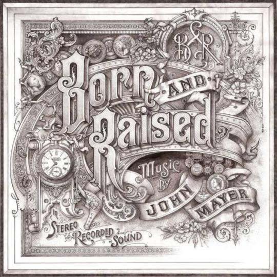
In 2012, Smith was hired by the singer John Mayer to design the album cover, of ‘Born and Raised’. The cover was styled like 1900 trade card.
He has also worked on posters and other merchandise associated with the album and single.
He was also commissioned by Jameson Whiskey to design a st.Patrick’s Jameson Whiskey bottle for the brand.
David sold the business, to concentrate more fully on gilding, painting e acid-etching glass, adding cutting, so that he could fully replicate the Victorian glass work he admire so much.
Thomas Burden
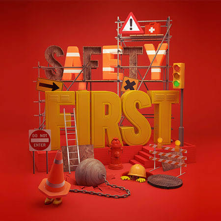
Burden is a senior designer at the design boutique “I Love Dust”.
He likes to produce work that references the pieces of vintage tat and printed material he gets from car boot sales and junk shops. Thomas Burden has created work for book covers, ad campaigns, music videos and magazine editorial to packaging, and even animations.
Thomas Burden was always encouraged to be creative, he was allowed to draw murals on the walls of his house, when he was very young. He had many references to do his drawings, in his grandparents house, full of Alpine memorabilia and indigenous art.
Toys weren’t allowed in Burden’s life as a child, so he was always looking at catalogs full of brightly colored things.
So in his works he tries to transmit that nostalgic journey to his childhood memories.
In each work there is a maximization of colors and textures and his great influences are: the film director Wes Anderson and the artist Mark Ryden.
On his own words: “ I was lucky enough to have a pretty idyllic childhood. I grew up sailing and skiing and traveling, so our house was full of souvenirs that parents collected, along with various bits of old boating junk and pieces of old cars”.
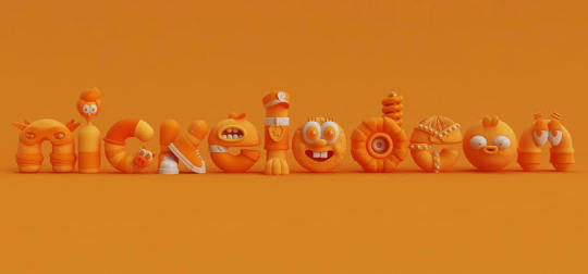
As an 3D illustrator / Art director from UK. He had worked with many different clients such as Nickelodeon, The New Yorker, Apple, McDonalds, Penguin, Bloomingdales and Ford.
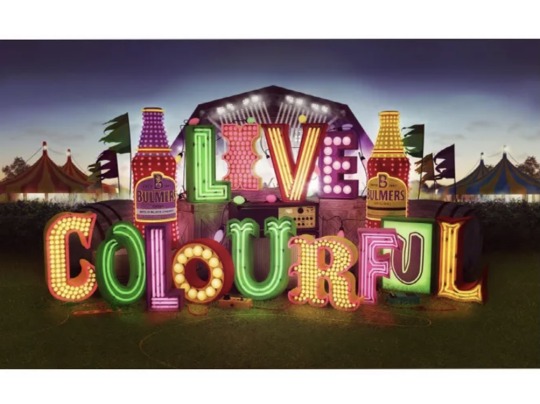
His signature style is mainly the toys that he was never allowed as child, combined with fairground / neon signage and anything bright and fun that catches everyone’s eyes. He create works in Cinema 4D, also using the Adobe Illustrator, Photoshop and After effects.


Barbara Kruger
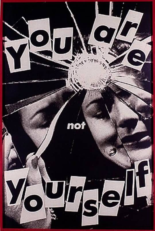
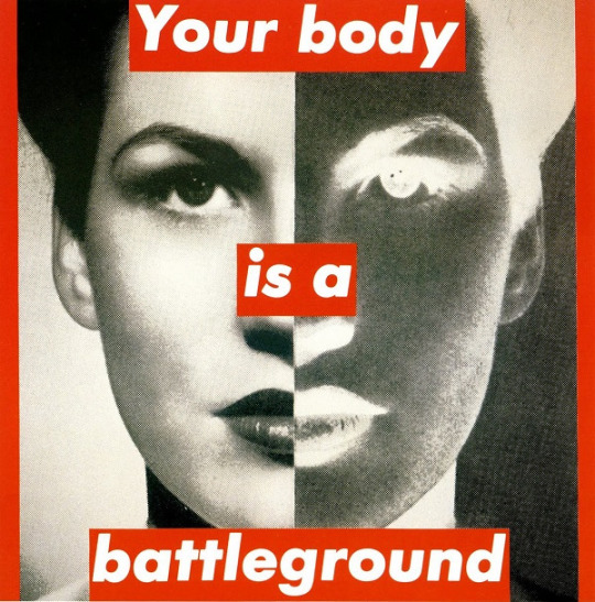
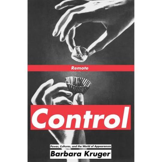
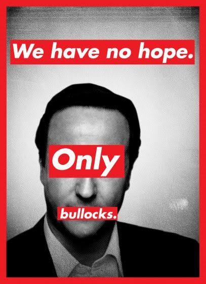
Barbara Kruger is a postmodern artist who was born in 1945 in New Jersey. Having grown up in a middle class family, her first job was as an operator. In 1965 she graduated from The Parson Design School in 1965 and worked as an art director in different magazines. By breaking some barriers of the modern art, Kruger and other women artivists ( art + activism) demonstrated not only against the bonds of patriarchy in society, but also within cultural production. Being an artistic medium an environment built largely by male hegemony, feminist art presents itself as a mean of liberating women. Her works examine stereotypes and the behaviors of consumerism with text layered over mass media images. Rendered with black and white, with a red background, Kruger’s works offer up short phrases such as “Thinking of You” and “I shop therefore I am”. Kruger uses language to broadcast her ideas in a myriad of ways , including through prints, T-shirts, posters, photographs, eletrônico signs and billboards. Despite the work of feminist artists of the twentieth century to change the way women are portrayed in the art world, today this representativeness still confined by a backward ideal. Thus, the work of Barbara Kruger proves to be even more relevant and undoubtedly necessary today.

Mike Perry
Mike Perry is an artist that makes paintings, animation, sculptures, books, public art installations, monographs, silkscreens and more. Mike Perry was born in Missouri, United States, and grew up in Kansas City. He started drawing at the age of four. He attended to the College of Art in Minneapolis, and earned a degree in graphic design. Mike Perry's style of using extremely vibrant colors, and making totally stylized designs with a lot of personality is something that draws my attention mainly. His letters are always around a totally imaginative space, which can be both a forest and even a city. The creativity in making those compositions for his posters is something very captivating, not necessarily making a poster that matches with the reality, but doing something perhaps lysergic. His works can be considered love notes to the abstract, unknowable future that is all possible in the present. Illustrator Ana Benaroya said that , “Mike Seems like a modern surrealist to me. His works feels like a childhood memory of slipping down a giant water slide during summer. Slippery and wet and innocent but not innocent. His drawings feel like they just fell right out of his brain onto the paper”. I think he is a great influence, especially for this project. Because I'm wanting to go overboard with the lyrics and the drawings, wanting to do something totally experimental, doing something absurd and creative at the same time. And with this nature theme, I want to make posters with extravagant animals and unconventional scenarios. How he uses photoshop and Procreate for most of his work. I would like to use Photoshop again for this job to continue to learn painting techniques.
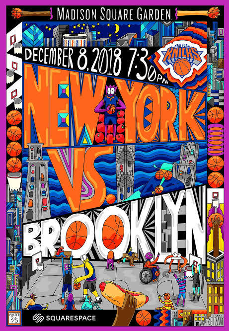
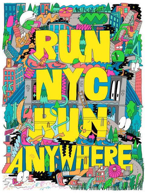
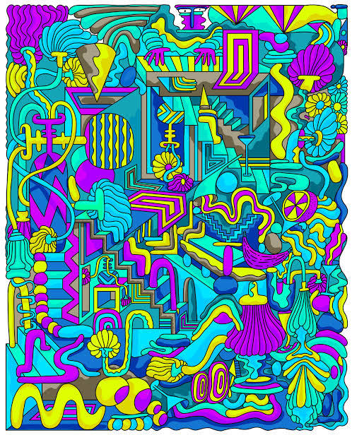
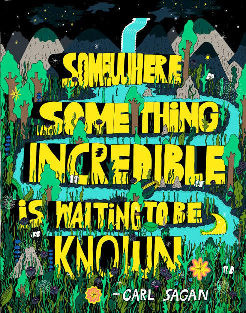
Filipe Grimaldi
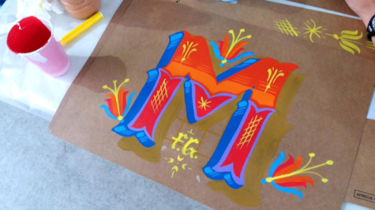
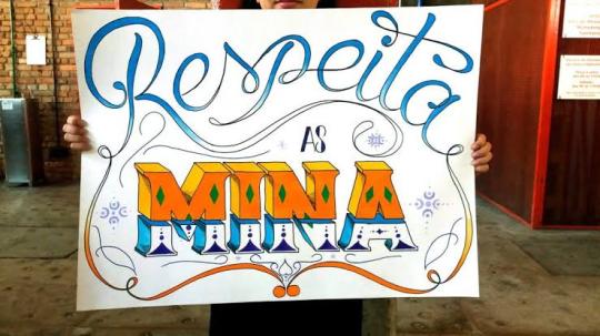
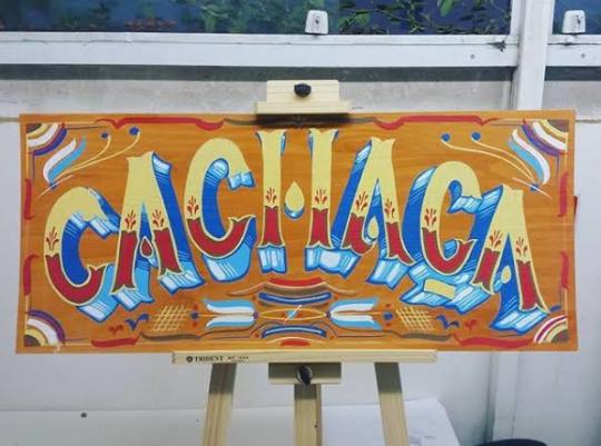
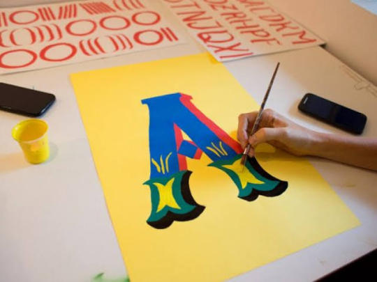
Filipe Grimaldi is a lyricist and designer. He has been working in the graphic design market since 2006 and, in recent years, has been focusing on the study of manual techniques of calligraphy, lettering and letter painting, migrating part of his work to the development of letterings and commercial decorative painting.
He even give practical classes in ateliers of other institutions. His works can be seen on walls, slates and thousands of plaques that circulate around with his characteristic traits.
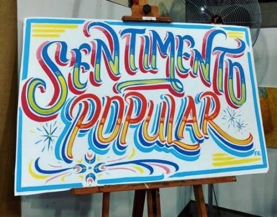
Filipe Grimaldi works on the primary chromatic contrast, a key element for the graphic construction of the alphabet.
Letters, words and sentences are organically raised, avoiding the precise math of right angles.
I met Filipe Grimaldi at EBAC in 2019, when he taught a class of typography, teaching how to make a freehand letter. I was impressed, because I saw great perfection and lightness when he drew those letters.
In addition to using several very vibrant colors in his works, even looking like a lettering of an entertainment show.
He even painted on a mural at EBAC, where even I had the opportunity to give a light brushstroke in one of his letters.
For 13 years, Filipe has been specialized in manual techniques of calligraphy, lettering and letter painting. In his own words: “ My authorial research and commercial activities ended up leading me to rescue the calligrapher profession, an almost extinct activity in the development of technology and printing and clipping machines”.
Currently, he teaches typography and calligraphy, for college students, with the goal of encouraging people to try more hand-made letters.
Wayne White
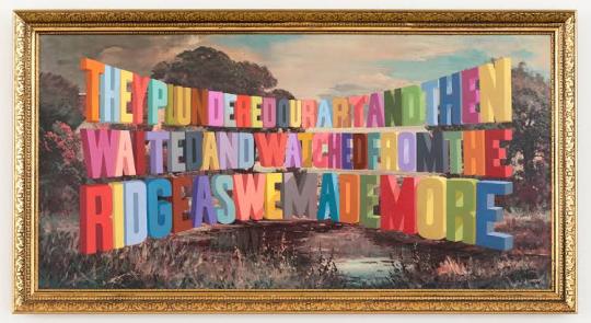
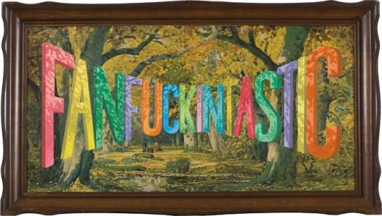
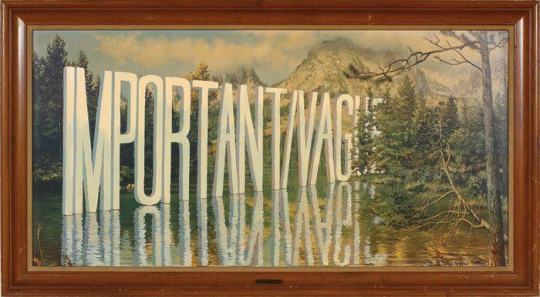
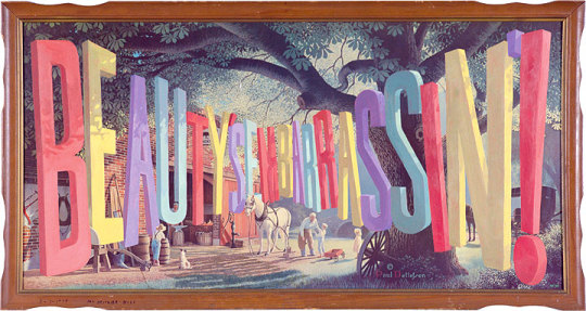
Wayne White is an American artist, typographer, cartoonist and puppeter. A former set and character designer for the television show Pee-Wee’s Playhouse, White produces ironic, often subversive imagery. On Pee Wee’s Playhouse where his work for his set and puppet designs won three Emmys; he also did many voices on the show. He is best known for his word paintings composed of oversized, three dimensional text painted onto cheap landscape paintings he finds at thrift stores and markets. In 2000, he began painting words and phrases, on thrifted lithographs. “When you think about it, you’re surrounded by giant letters and words everywhere”. White said once. “We don’t take for it granted, but the whole American landscape is nothing but a giant letter forms”. One Journalist said his opinion about White’s paintings: “the weirdest landscape painter in America, White uses master painting techniques to create the illusion of words and phrases surreally disappearing into the horizon or jutting out from each lithograph’s place setting.” White’s famous “word art” paintings hang in museums and galleries across America. His paintings features technically proficient and wildly colored phrases that are funny and sarcastic. And critics have praise White’s series for being entryway to the artist mind. Over the past years, White has worked primarily as a fine artist with solo exhibitions of his paintings and sculptures in galleries in New York and Los Angeles. In 2006, he created a giant head sculpture, with a giant lettering next to head. This marks one of White’s other passions, which is sculpting, and he like to exaggerate on the expression, of the characters that he is sculpting.
Joshua Noom
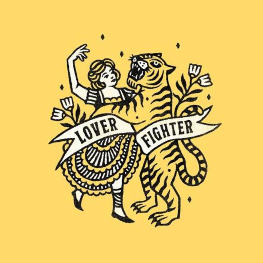
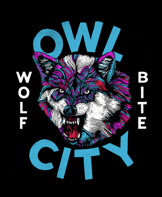
Joshua Noom is a famous illustrator who was born in Australia, in 1988. He is very popular in the social networks, specially in Instagram, where his minimalist illustrations and typography have earned him over 60,000 followers. He had created several illustrations for musicians and major brands like, Miller High Life, Sony, and Warner. Today Noom lives at Florida, and he is specialized in detailed and bold illustrations combined with an organic sense of typography. One of his most recent works, was recreating the Bible’s cover, with many other Christian artists. Each artist offers a visual entry point focused on a particular biblical theme or passage, setting a tone of reflection as readers engage with the Bible. I’ve been looking at Joshua works, and I really like the feeling of gritty and inky that he puts in his illustrations. Some of his works feels military inspired and masculine, while other pieces feel soft and feminine, like some vintage postcards that he produces. Something that Josh uses in most of his work, and that connects with my posters, is the use of wild animals and different situations. It can either make a tiger surfing, or even protest posters for the preservation of wildlife. He has a very intense passion for animals, and he enjoys drawing them in very expressive ways. With strong colors, with its minimalist style, and texts with different fonts around it. In a interview Josh even discusses his style “ My inspirations for my style are mostly from music and other art, but one artist that I’ve been diggin’ is Mark Conlan. My style has just kind of developed over the time and I think I will probably keep evolving. After many attempts of trying new things and figuring out what works for me, and what doesn’t for me. I prefer to draw in a more minimalist style, specially using my ink pens. Animals are one of my inspirations, specially here in Florida, we got many different species of birds and reptiles, so like to sit somewhere, and draw any animal that appears, and try to create a composition with different typefaces, to make future posters.



1 note
·
View note
Text
4 Dirty Little Secrets About the Full Version Games Industry
Control-shift-C-"motherlode." It's a series of commands that every Sims player knows, this infuses your level account with precious simoleans for accepting the fanciest lamps, lay down the plushest carpet, and landscaping with the most extraordinary of shrubbery. Few sports become thus described near their own cheat codes, yet if you want to budge a digital camera children in the expensive abode without giving dozens of hours to building up support, this policy is your ticket to affordable maid mass with lush window treatments.
This approach pay for The Sims as a dollhouse, a role the Sims 4 fulfills with some aplomb. If you want to build but prefer certainly not to micromanage the details, the game comes with various prearranged spaces that you can well together like Tetris pieces, yet if you're devoted to the knack of architecture and interior mean, you have the chains most improved set of acquire and body tools still. Accept and Form modes share the same program, making it plain to combine foundation and honor rather than forcing you to consider each exercise as an opposing section with the same simolean. Expanding and dragging walls in properly modular rectangles? This so straightforward as seeing how to use a mouse and keyboard. Uncertain what class a chess set falls below? Just form a keyword into the search subject with go for the best match. Cause the conflation of two methods into a single, also the amount of categories to strain done, The Sims 4 make a creditable profession of managing you true for the aims with devices you're seeking.

On the surface, there would appear to be sufficient types with goals from which to choose: sofas of appearances with colors, tiles for making your bathroom as 1970s-era-tacky as you'd like, and other course of personalizing the addresses regarding your small computer people. When the time comes to build a energy of amusement, yet, the borders become more rigorous than they first grow. The Sims 3's Create-a-Style options, that allowed people texturize with color your floors and fabrics in elaborate approach, have been dropped, leaving only predetermined colors in their place. Color can make a great throughline for aesthetically linking various conditions and approaches, but should anyone gun for an eclectic interior, you immediately find that objects don't have the same kinds available among them. Mixing and meeting can make a room appear more casual than refined; the Create-a-Style option provided a means of connecting disparate decor, and its loss diminishes creativity.
In fact, The Sims 4 as a rule feels diminished when compared to even the vanilla description of The Sims 3, before this produced the benefit of add-ons to allowed anyone be a ghostbuster and live in high-rises. Much experience recently been made of the functions to performed meet the reduction, but even if you don't have a list of those features on hand if you show, the squashed purview is apparent. I completed mind the small group I originally laid right to until I decided to splurge on a telescope, an entry to at one time was compact enough to fit in a small area in the garden. By contrast, The Sims 4's starting telescope, a vast monster which the majority amateur astronomers would eliminate to have, might in shape, then I finally erected it on the public lot, in front of the library. Previous Sims modders (and a Sims 2 expansion) had created microscopes to the mix, but I had no area for the lab-quality colossus in The Sims 4. Limitations, limitations, limitations. That remained The Sims I had become used to over the last several years.
youtube
The Sims 4 doesn't just take away. It has presents to give, too, such as different kinds of social relationships, objects, and other charming detours that make keeping a close watch next to your own sims a large joy. Multitasking are at the head these changes: sims greet visitors without putting overcome the cereal serving and chat while gardening. Working with the potty is also no event the sims have to fully target, also I laughed heartily when the digital variety of myself remained on the john while enjoying activities upon his drug; it really was like peeking here with a little me. The sim daughter, meanwhile, felt it was correct to swallow her fruit juice while peeing, a combination of activities I happen not sure I can help.
I happen not sure I should share our misgivings with the little lady, although. In The Sims 4, sims are relatively moody, getting embarrassed must people send one sim to the shower after another is seated on the bathroom, also obtaining randy when they're in the vicinity of their spouses. You're constantly pushed to take advantage of these moods, earning positions for small successes that an individual waste in incentives to produce temporary buffs (get energized immediately!) or permanent enhancements (never make shot!). Sims and get gate to modern kinds of social interactions if they become moody--angry sims want to get in fights, embarrassed sims need reassurance, focused sims want to show chess, and so forth.
Switch in feelings are combined with predictably ridiculous exclamations in the gibberish language known as simlish. One sim I strongly held was especially mischievous, fooling neighbors with a side buzzer and insulting anyone to dared assemble in the club while she drew behind a nightcap. I might cover her get enjoyment associated with some other sims' clothing, which the girl performed in an adorable snotty tone, causing her prey to start in horror by the girl obnoxiousness. I presented to even sim the superior trait, and choice a default walk life which held her brain tilted upwards so which she may seem down her nose at the plebeians that challenged walk the same World. Watching her walk her material was constantly wonderful, even if she was there the only digital person worth keeping an eye on: little everyone would handle publications as puppets, frank with finishing them like gates and mimicking what they could about by cracking them friendly and basically reading. Enjoying your sims in action means having a frequent smile stretched across your face.
Try these personal activities into long-form stories isn't so compelling as it was in The Sims 3, however. The previous game's open world, that allowed for smooth travel and easy multi-sim control, has been supplanted with smaller lots divided by filling screens--a scheme that will harks to big games in the sequence. Having to stare at the loading screen when you want to travel to the square is distracting enough; moving to your home lot to maintain other loved ones and getting them put stiffly in front of the house, waiting for the commands rather than naturally move regarding the affair, becomes even more so.
The deeper you wish to try, the new roadblocks you arrive at. Perhaps this sensible that the game with no large freedom to cross would not feature bicycles, although I even miss drive around town, moving over rise and complete valleys until I access the churchyard and pursue the ghosts there. Not solely is moving left, but so are the hills and valleys, all of them smoothed out into a uniformly flat surface that doesn't support basements or terraforming. Elsewhere, the emphasis on specific tasks detracts from the freeform noodling. While offer the former birthday organization, for case, I happened subsequently focused on fulfilling assigned jobs like doing drinks i did not notice how differently The Sims 4 handled birthday cakes than its predecessor. I skipped being able to simply buy the cake, spread about some balloons, and have a wonderful moment. When I got never choose the wedding woman, I didn't air as though I received given everyone a good enough time--I air like I took clicked for the actual factors in the moral direction. It is wearing that distinction that you find the disparity between The Sims 4 and its predecessor.

In short, The Sims 4's biggest issue is how the Sims 3 is, and telling wherever that lands by necessity means peek in where the series has been. This is a lovely and energetic up for in which generates constant smirks, but The Sims 4's moments never feel like part of a larger picture. Improvisation is bound in turn, that creates us to that huge telescope now sitting in front of the library. Looking at the stars means undergoing a charge screen, although I grasp the top-level commands that I can problem to family playing with different lots, simultaneously spending period with additional sims means enduring even more loading screens, or making my family to travel together. I love glare by and listening to The Sims 4, yet those tiny digital people stay so fascinating https://elamigosedition.com/party-games/ like to hold me hooked--not when a decked-out story of The Sims 3 is much more inviting.
0 notes