#just sharing because I noticed some people use simpler icons and etc
Text
GUYS! Really quick note!
I've been in this fandom since tumblr worked amazingly and the Inuyasha fandom was bursting with life, so I know A LOT of posts with free rp icons to use! I even made some! You can find them on my old Kagome blog, and they're all free to use!
#you can edit the icons I made btw#just sharing because I noticed some people use simpler icons and etc#there was a Kikyo roleplayer that she iconed EVERY SINGLE episode and movie of Inuyasha#and the icons were all free to use#back in the day people used to make rp icons for others and it was so cool#she's not around anymore but the icons were already free to use years ago so I think it's ok to use them#┈ ┊ out of shrine || ( ooc ).
2 notes
·
View notes
Text
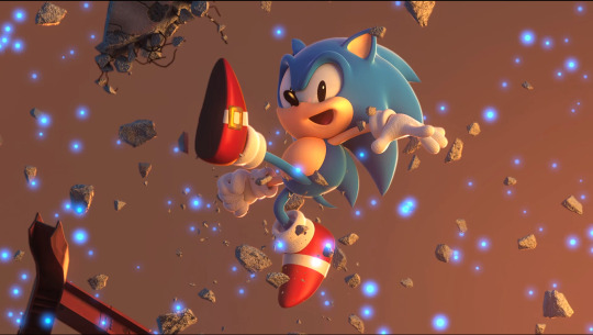
What went wrong with Classic Sonic’s music in Sonic Forces? (ft. beevean)
The following is a project I’ve been cooking for some weeks, trying to find out some reasons behind the general lackluster feeling that surrounds Classic Sonic’s music in Sonic Forces. As you may have spotted already, this is not a solo project, since I’ve had the opportunity to talk about this very same topic with @beevean and she raised quite a couple of interesting points that I’m going to bring up as we go through.
Also, Spanish speakers: you can catch the Spanish version of this post here, it’s probably a more polished experience with additional text.
Long post below, so, bring up a ladder and a boombox, I’ll explain along the way. (there’s also a tl;dr at the bottom if you are that type of person)
Sonic Forces stands as a divisive point in the Sonic fandom, that much we all know, and we are not going to discuss the game’s general quality at all on this post. But we are going to take a solid look at Classic Sonic and, most importantly, its music, since I consider that’s the most clear symptom of a bigger problem with Classic Sonic in general, in this post-Generations Modern Sonic world.
A quick look at Classic Sonic
When Classic Sonic debuted in Sonic Generations (2011) as this new-but-also-old Sonic, gaming as a whole was still being bombarded with this “retro-revival movement” that brought back many classic franchises (like classic Mega Man with MM9 and 10 after a decade since MM8), and SEGA itself was in the middle of that train with the recently released Sonic 4: Episode 1 (2010). While Sonic 4 tried to marry Sonic’s current style with classic level tropes and even Genesis-inspired music in a seamless way (showing Sonic’s physical transition from his Sonic 3 days to Sonic Adventure as a smooth one), this new “Classic Sonic” guy in Generations suffered from a mixed message about his origins: is he Sonic from the past, from an alternate universe, or both? Is his music supposed to sound like arrangements of his classic 16-bits tunes or just modern-sounding remixes like the rest of the soundtrack? The fandom still debates about it to this day.
This all led to the introduction of a character that, although considered a “Sonic” like the other “Modern” one, could not establish his own identity beyond Generations’ anniversary-title plot threads. No unique music style, no unique traits, he was just a simpler Sonic.
Major manifestation of the Classic problem.
Fast-forward some years to November 2017, Sonic Forces’ release date. Besides gameplay, story and character criticisms, the music of Forces turned out to be quite controversial for a part of the fandom. Although I personally consider the Avatar songs as top-tier Sonic music, I share similar concerns as the rest about the rest of the game’s music, specially the Classic Sonic level themes.
With Forces, it seems the composers managed to solve some of Gens’ Classic Sonic music problems, as this time there was a better and more consistent attempt at making Classic’s music sound more at home with the “Genesis days” tunes, but even then the composers fell into other traps that ended up being more damaging to the final product.
Years later after the game’s release, I finally brought up this very same topic during a conversation with beevean (I encourage you that, if you find the following snippets interesting, read the entire conversation), and she had the following thoughts to share as to why Classic Sonic’s music was so... underwhelming:
the classic music in forces is the weakest part of the ost, some tracks are okay while others suck, and the main reason for this is that they hired the wrong people for the job
Okay, that wasn’t a fair cut on my part. She talks a lot more about each and every aspect behind the music, and about the people that composed it, she had the following to say:
Okay, about Forces’ music. First of all, the Classic tracks were handled by two people: Tomoya Ohtani, who also composed pretty much 90% of the OST and has been working solo since 2013 (relevant later), and Naofumi Hataya, one of the two geniuses behind Sonic 2 8-bit’s and Sonic CD’s OSTs (plus some miscellaneous work in Heroes, Colors, Generations, etc.). If you loved tracks like Sky High, Palmtree Panic or Stardust Speedway, you have to thank him.
This is already a reason as to why the Classic music in Forces doesn’t resemble the music in the Genesis games. While I can understand that it would have been impossible to hire Masato Nakamura again, Jun Senoue would have been good for the job, having composed music for Sonic 3 and most importantly Sonic 3D Blast. But apparently Senoue was MIA until 2019, so who knows.
I’d like to point out that Naofumi Hataya’s involvement will play a bigger role later in this post, as we keep searching for what went wrong and we look for a potential solution when adressing Classic Sonic.
Beevean continued with:
There are mainly two problems here:
1) some of the tracks just don’t fit their stage. I already mentioned that Ghost Town sounds way too happy for a city under attack by giant robots. Death Prison sounds vaguely Egyptian and the difference with the original, bass-heavy composition is staggering. Chemical Flow is the most generic thing and would fit everything and nothing, and again comparing it with the original iconic track is just sad. I think the reason Casino Forest and Iron Fortress are my favorite Classic tracks is that they go very well with their respective stages. This is a problem Adventure 2 had as well, associating a particular style to a particular character, and while I think Forces did it better, for me the priority should be fitting a level.
2) Ohtani was once a very versatile composer (the guy could go in one game from Wave Ocean to Crisis City, for example), but since Lost World, the first game in which he had the responsibility of an entire soundtrack, his style quickly became “anime”. Runners’ tracks? “This sounds like an anime opening!”. How do you recognize his only track in TSR? It’s the one that sounds like an anime opening and uses a synth.
And look, I love Ohtani, he has nothing but my respect, and he made some of my absolute favorite tracks in the series. But I do think they’re making him work too much - he’s the best when he can work with at least another person, and has the chance to span a little. I also think his style is incompatible with the Classic music, which was never anime: even at its mellowest in Sonic 1 it always had a little jazzy/new jack swing touch. Basically the only thing they got right in this game is having a wicked bassline :P
It ain’t *only* the composers’ fault
Following beevean’s words, I’d like to add my own take on the problem. You see, I do agree that the composers maybe weren’t up to the task of nailing the classic Genesis tunes’ vibe (Hataya got real close, though), but at the same time I do think they weren’t properly oriented or didn’t have enough time to keep reiterating on the frameworks they were working with. Like beevean said, some of the tracks improve quite a bit after leaving behind that mixed as hell “almost Genesis but not quite” soundfont.
The composers will work on what they were told to make and I have a strong, albeith unconfirmed, feeling that the Classic Sonic composers where asked to “make it sound retro” by someone higher up on the project management chain, and after checking on their progress, simply said “meh, it’s retro enough, no one will notice”.
The “make it sound retro” argument, in my opinion, opens up a big discussion about Sonic music, because there is no easy way to make it “retro” with Sonic. You just can’t pump out a few nostalgic chiptunes and call it a day. Sonic music may have originated back in the 16-bit days of the Sega Genesis, but his identity is so much more than just that Genesis FM sound. I personally believe, similar to another thing beevean point out, that Forces focused too much on sounding “retro enough” instead of fitting each track better to each level theme or even tap into what really made Sonic appealing on the classic days.
This last point is something that SEGA struggled a lot during the past decade, they introduced Classic Sonic as an entity separated from the current Sonic, yet they simply don’t give Classic Sonic enough development as it’s own character. He’s there because he’s there and we don’t know what to expect from him beyond “he represents the good old days”. But not even SEGA itself knows what that means.

So, what really makes up Classic Sonic’s identity?
For me this is the true heart of the post. Knowing full well what makes Classic Sonic should be the key to every project that features him.
There are lots of points to make about Classic Sonic’s identity and how to establish him should he return once again on a 3D Sonic title (not even using the “modern” anymore, and I personally wouldn’t like to see him again on a 3D title for another decade, if ever), but seeing as the main topic of this post has been music, I’m going to focus on what music style makes Classic Sonic shine.
I already said that throwing some generic chiptunes won’t work, but I DO think that Genesis-inspired tunes can still work, should they stick to what made the classics so great.
And what is that? Well, you have several options here: you can choose from more J-Pop and jazzy tunes to some sick R&B and New Jack Swing beats, all the way through to late 80′s Acid House and wacky 90′s Dance music, even cinematic-like scores and ambient sounds.
Personally, I think the heavy R&B (with its fair share of New Jack Swing) influences are a constant throughout Sonic’s first years, and that kind of sound is one that goes well with his cool attitude™. Spring Yard Zone has always been referred to as “16-bit Every Little Step”, while Sonic CD... well, and Sonic 3... well... JAM. Even Masa’s demos of Sonic 2 feature some sick basses that aren’t all that different from what I was thinking (Chemical Plant and Metropolis come to mind). Sonic CD (JP, also the work of Naofumi Hataya and Masafumi Ogata) in particular springs up to my mind as the purest representation on everything that Sonic was about on his old days, but “pure” doesn’t necessarily mean “refined”, so I think the Sonic CD style coupled with some more smooth Pop for emotional moments (straight from Nakamura’s school of smoothness) and harder 90′s raves for boss fights (think how iconic Stardust Speedway Bad Future has become) could make up the perfect blend for Classic Sonic to follow in terms of style points, but also considering the general themes of each zone (Wacky Workbench being this Dance-heavy zone was a stroke of genius if you ask me, the same with Spring Yard being a jazzy urbanscape.)
Sonic is a product of the late 80′s and 90′s pop culture, he has the moves of MC Hammer, Bobby Brown, and of course, Michael Jackson (also his shoes). As such, no generic “retro nostalgic” tune will fit with him, unlike many other gaming franchises. By embracing Classic Sonic’s wacky nature gems like Sonic Mania happened, and just like I pointed it out to beevean, if you were there the week that game was first announced, you probably saw how much people were gushing about Studiopolis Act 1 sounding so much like Sonic CD with that funky beat. People instantly knew that was the Classic Sonic music they wanted to hear.
And just to make this section even better, I recently asked beevean about her thoughts on what makes Classic Sonic’s music identity. I now urge you to go and read her full analysis because it’s so deep yet very accessible, as I’ll be collecting just a few parts of her response for this post. Trust me, that post is so useful, go and reblog it now, I’ll wait here.
About Classic Sonic’s music styles, beevean says:
So… which is the style that fits Classic Sonic better?
The big love letter to the Classic series that is Mania used CD as an inspiration, and while Mania’s OST is excellent and one of my favorites… I don’t automatically associate New Jazz Swing with Classic Sonic. Before Mania, it was only in one game, the odd one in the bunch too.
3D Blast is my favorite Genesis soundtrack, and as I said it combines the best of two worlds (plus it’s just full of bangers), but it influenced the next era more than the Classic one. The same could be said for the American OST of CD - and besides, tracks like this are nothing like Sonic anyway.
Sonic 1 is the first one and all, but that mellow style fits that particular game more than Classic as a whole, I think the closest OST to this style was Advance 1, actually - another slow-paced, simple game.
So the choice is narrowed down to the ultra-popular Sonic 2 and the refined Sonic 3 & Knuckles. And I’ll be honest, while I think S3&K has higher “highs” compared to S2… my brain immediately jumps to the latter. When I think of Classic Sonic, I think of Genesis brass (the real deal, not that fake synth they used in Forces), twang basses, a swingy rhythm (too many to choose lol), and tons of energy.
Only one Classic track in Forces came close to this description. The others sound more like either a pale imitation of Sonic 1 or modern tracks with a bad soundfont, and that’s when they’re not a complete insult (no i won’t link to it you know what i’m talking about :V).
Author’s note: it’s been, like, two months and she still refuses to talk about Faded Hills, lol
youtube
Author’s note: sorry, beev.
(TL;DR) Closing thoughts.
So, what did go wrong with Classic Sonic’s music in Sonic Forces?
A lack of definition on what Classic Sonic even is about, carried from Generations, made the task of defining his style more difficult.
The composers weren’t up to the task, or they were simply asked to make Classic Sonic “sound retro”, generic sound be damned.
This also means management of the project wasn’t that interested in the Classic portion, or they ran out of time to make it better. This is something that the entire game seemed to have a problem with as well.
The music didn’t fit the stages, and even if it did, Classic’s identity was all over the place. He was there just to be there, and his music suffered from that (compare it to Mania).
Tomoya Ohtani (often credited as the maker of the arguably worst tracks of Classic Sonic in the game) has experienced a shift on his musical style over the last few years that led to his tracks start sounding very similar to each other, this, coupled with the fact he was working on the other 2/3rds of the game’s OST, caused his Classic tracks in particular to suffer.
Classic Sonic’s tracks didn’t take from the 90′s Pop and R&B influences that plagued the old games, and as such, the current Classic Sonic doesn’t have an identity as strong as the original 90′s Sonic. Beevean’s take on this point involves Classic Sonic tracks that feature strong, legit Genesis brass, with twang basses, swingy rhythm and tons of energy.
Once again, I’d like to thank beevean for providing such insightful information and opinions (you can clearly see we both tend to have different takes on what made Sonic back in the 90′s, but in the end agreed to a similar set of requirements to make good Classic music, like basslines and lots of energy), which helped this post a lot more than you can imagine. I wanted to post this back in late January, but the extra time allowed me to keep thinking, searching and listening, while also opened the door to ask beev again about her opinions. This is probably the first “big” article I’ve written this year, and I hope to return soon enough with more.
#sonic the hedgehog#sonic music#welp that was a big post#during the last portion something else started picking my attention#the shift in cultural references for sonic starting with adventure#all the cool skater stuff and the like#i might look into that in the future#in the meantime i think my 'make it sound retro' argument could lead somewhere#because i'm sure ohtani and hataya could've made something way better#but something stood on their way#be it time or management i don't know#well that's it folks#thank you for reading
14 notes
·
View notes
Text
Infographic Resumes: 6 Hiring Managers Weigh In
New Post has been published on https://tiptopreview.com/infographic-resumes-6-hiring-managers-weigh-in/
Infographic Resumes: 6 Hiring Managers Weigh In

The trendy job search is extremely aggressive, and technology has made it simpler on your resume and job utility to be neglected and discarded earlier than you even make it to the interview.
Fortunately, expertise is additionally right here to assist. There is not any longer a template for how one can apply for a job — you should utilize social media, web sites, and even interactive campaigns to get your title observed by a recruiter.
One resume format you could not have thought of? Infographics. A extremely participating and visually interesting infographic that explains your abilities and may make it easier to stand out within the crowd and function a piece pattern when making use of for a job.

It is vital to notice that an infographic resume will not be applicable for all job purposes. If you happen to submit a resume on this format by an automated system, you might disqualify your self if the expertise cannot learn visible info, so it is best to stay to the format prescribed by the job posting.
Moreover, whereas an infographic resume is perhaps a good suggestion for a extra design-related position, it is seemingly not a good suggestion for many non-design roles. Right here, we’ll discover what six hiring managers must say about infographic resumes — plus, how one can make one for your self.
The way to Make an Infographic Resume
1. Begin with a very good construction.
You will need to begin by determining which device you are going to use to create your infographic. You may select to create one in Powerpoint, or use pre-made infographic resume templates on a design web site like Canva or Venngage.
When you select your device, you may need to determine a very good construction. Would you like your title and a quick opening description on the high? Would you favor to place the Training part initially, or finish? Are you going to incorporate earlier positions, or concentrate on simply the present one?
Moreover, you may need to work out whether or not you are going to focus extra on icons and pictures, or information.
As an example, check out the variations between these two Venngage infographic resume templates:


Within the first Kyle Fisher instance, you may see he is structured it so there’s loads of white area; he is additionally highlighted inventive and software program abilities, and left area for hobbies.
Within the second Linda Jackson instance, then again, you may see technical abilities and academic coaching take up the vast majority of the area on the resume, together with work expertise on the backside.
When evaluating these two infographic resumes, you may see the construction is vastly totally different. Equally, think about the position for which you are making use of and which info is important to reveal in your resume because it pertains to the position — and which you’ll skip.
2. Pay attention to every thing you need to embody in your infographic resume.
As soon as you have chosen a construction, pull up an current resume and pay attention to every thing you need to switch over to the infographic resume.
As an example, if you’d like your infographic resume to be data-heavy, write down a couple of key metrics associated to your present position, similar to “43% YoY growth” or “12% increase in MRR”. It is simpler to design your infographic resume as soon as you already know what you may want to incorporate.
three. Select a very good coloration scheme.
A cohesive coloration scheme is a important element of any good design, and that is no exception. Think about using clear, complementary colours — like white, black, and orange, or yellow and teal — to assist your resume stand out with out turning into too distracting.
four. Have a robust opener.
It is a finest apply for any resume, however notably for an infographic, you may need to begin with a very good, highly effective opener. Within the examples beneath, as an example, I put: “Passionate, creative, and driven Elon graduate with leadership experience and strong communication skills.”
Finally, your opener is your worth proposition — what’s going to you convey to the position that the hiring supervisor cannot discover elsewhere?
5. Use good design ideas.
Lastly, an infographic resume ought to use the identical design ideas as anything.
These embody:
Creating steadiness, utilizing both symmetrical or asymmetrical designs.
Leveraging distinction to spotlight sure components.
Utilizing motion to create a story and supply a high-quality person expertise.
Guarantee there’s unity in your design — i.e. your composition’s components are in settlement.
Check out The whole lot You Must Know In regards to the Rules and Forms of Design for extra info concerning design ideas.
6 Hiring Managers’ Opinions on the Infographic Resume
To discover when — if ever — infographic resumes are a good suggestion, I reached out to a couple HubSpot recruiters to get their take.
Kenny Nestle, a HubSpot G&A Recruiter, advised me: “I personally love infographic resumes. It’s different and stands out from your typical resume, and it’s easy on the eyes.”
Nestle provides, “I’ve had candidate share graphics on the types of roles they’ve supported, as well as metrics related to their current role.”
Devon Brown, an Govt Recruiting Supervisor at HubSpot, echoes Nestle’s perspective, telling me, “I love when candidates use infographics as an opportunity to highlight their creative or design abilities.”
Nonetheless, she urges candidates to make sure their design is clear and simply digestible. “It needs to be formatted in a method that makes it simply as straightforward to learn as a typical resume,” Brown advises. “The flow of information, and how it’s presented, is critically important if a candidate chooses to go this route.”
Not each recruiter feels that infographics are a good suggestion. Technical Recruiter Sarah Magner, as an example, says, “I could see why people applying for design, marketing, or branding roles might use an infographic to set themselves apart, but I’ve always found them to be a bit distracting. Plus, the graphics can take away from the actual content on the resume.”
“I’d prefer an easy-to-read resume over a pretty one,” Magner provides.
Tríona O’Sullivan, HubSpot’s International Advertising Recruiter, agrees with Magner that infographic resumes are sometimes not a good suggestion. She advised me, “It can be great to see the creative side, but sometimes a candidate can spend so much time designing the template that they miss out on key information, details aren’t aligned, or there are really obvious spelling and grammar issues in the mix.”
O’Sullivan provides, “Given how competitive and busy the job market is today, it’s more important to ensure your resume is easy to review, and states your experience and achievements clearly and quickly, since that’s what someone is going to look for first when reviewing.”
Amelia Towle, HubSpot’s Head of Model Infrastructure & Design Workforce Supervisor, spoke together with her Design crew on the potential deserves of an infographic resume, however agrees that it is sometimes not a good suggestion. Towle advised me, “If I think about the purpose of a resume, it’s a document that your intended audience typically wants to scan as quickly as possible to glean information in an efficient way. If you drastically alter the format, you are perhaps forcing extra cognitive load on a busy recruiter who is just trying to narrow down a potentially vast pool of applicants.”
Moreover, Towle advised me that if an enormous firm is utilizing software program to scan resumes, altering the format may consequence within the resume being unattainable for the scanner to interpret.
Finally, she believes infographics are sometimes unwise, except it suits the enterprise for which you are making use of: “If it’s a huge HubSpot-sized organization, you might be shooting yourself in the foot by altering format beyond what is expected. But if it’s a tiny agency that is solely design-focused, it might be helpful to stand out.”
Towle provides, “Infographics-for-the-sake-of-infographics has arguably had its day, so in that case, you might want to conceive of something new.”
Lastly, there are some recruiters who do not essentially care by some means. As HubSpot Advertising Recruiter Erica Matos advised me, “I don’t really care about what a resume looks like — instead, I look at the content and make sure they have experience that aligns with what I’m looking for. I’d always love something visually appealing, but if I can’t clearly gauge the candidate’s actual experience, it’s not going to help them get the job.”
You will solely need to create an infographic resume if it is sensible for the position. If the position is design-related, then an infographic resume will help you show a few of your abilities.
Nonetheless, even when the position is design-related, there are some dangers related to infographic resumes — together with problem downloading or viewing throughout gadgets, and the design components detracting from the resume itself.
For that reason, you may think about various strategies to showcase your abilities.
As an example, O’Sullivan advised me, “While I don’t love super creative infographic style resumes, I love when someone hyperlinks to their portfolio or website, etc. That’s an amazing way to showcase both their experience and their thought process when it comes to applying for roles. If I see a hyperlink for one, 99% of the time, I will go and check that out.”
If you happen to do select to create an infographic resume, check out a couple of of those examples for inspiration.
Infographic Resume Examples
1. The colourful, graphic-heavy infographic resume.
The resume I created beneath makes use of loads of visuals and numbers to spotlight related info. As an example, there is a graph to showcase the weblog posts I’ve written which have earned a spot on the primary web page of Google; there’s a big “12” to spotlight the years of content material creation underneath my belt; and there is even a picture of 10 stick figures to reveal my individuality.
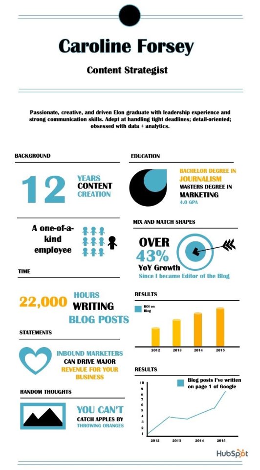
Think about the way you may use one font, and a complementary coloration palette, to create an identical infographic. I designed this one utilizing certainly one of HubSpot’s free infographic templates, so be happy to create the identical one utilizing the templates, as effectively.
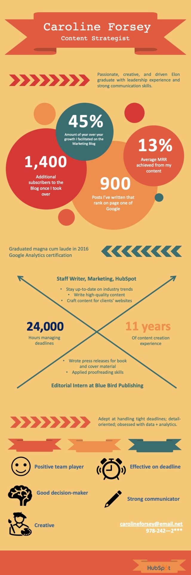
2. The info-heavy infographic resume.
Within the following infographic resume (additionally created utilizing HubSpot’s templates), you may see I’ve highlighted most of my accomplishments utilizing information — such because the 45% YoY progress, 1,400 extra subscribers, or 24,000 hours managing deadlines.
I additionally used icons of a smiley-face, pencil, and painter to reveal a few of my abilities in additional visible kind.
What do you assume? Able to take your resume to the following stage? Seize some starter templates beneath.

Source link
0 notes
Text
What are the types of UX Buttons
Although people may not notice buttons when they are used improperly, they are an essential component of an efficient and pleasant user experience. UX buttons are typically modelled links that draw users in and point them in a particular direction. We may use buttons to navigate to other sites or complete tasks such as submitting a form or making an online purchase.
When we need our users to complete their activities on our website, we use them as CTAs (Calls to Actions). Take a look at this guide to learn about the most popular styles of UX buttons and best practises for button design if you're thinking about improving your button design to make it easier for your users to click through. This will assist you in maintaining a smooth and hassle-free user experience on your website.
Button what is it ?
A button, as an engaging and interactive feature, enables users to receive interactive input from the device in response to a specific command. It's a control that allows users to connect with a digital product directly and sends crucial commands for achieving a particular target.
Because of their successful imitated interaction with physical objects and user-friendliness, modern UX buttons have become very common. These buttons serve a variety of functions. They show an immersive zone with a distinct geometric shape and visibility. For designers to create visible and functional buttons, they must devote a considerable amount of time and effort.
Common Types In Button
Users can make decisions and take action with only one click thanks to buttons. The acts expressed by buttons can be done by users. Typically, they are positioned within the website's user interface, and buttons must be readily identifiable and locateable while clearly indicating the action they allow a user to complete.
Drop Down Button
When you press the dropdown button, a list of unique items appears. The settings button can sometimes show the same type. When a user selects a choice from a list, it is normally classified as active in some way, such as by colour.
Text Button
These text labels appear outside of a text block and are referred to as buttons. When a user presses or clicks a button, the text must clarify what will happen.
These buttons have a low level of tension and are used for less critical tasks. Text buttons can't detract from neighbouring material because they don't have a jar.
Hamburger Button
The hamburger menu is concealed by this button. The menu expands when you click on it. In today's smartphone and web layouts, it's a widely used engaging feature.
Furthermore, hamburger menus free up space, making the UI appear more light and airy. It frees up a lot of room in the layout for other important elements.
There are concerns against the hamburger menu based on the fact that it can be confusing for people who do not regularly use websites. As a consequence, it can have a negative effect on navigation and result in a poor user experience. As a consequence, prior to introducing the hamburger button, perform extensive user testing.
Toggle Button
Users can move between two or more states using toggle buttons. These buttons can be used as on/off switches. You can also use them to group similar options. However, make sure that your interface conveys that such toggle buttons are part of a community.
In a party, there must be at least three toggle buttons. Furthermore, toggle buttons must be labelled with icons, text, or both. Toggle buttons that allow one choice to be chosen or not chosen, such as adding or removing a star from a product, require icons. Toolbars, app bars, toggles, and action buttons are popular places to find icons.
Floating Action Button
This button is made with Google Material Design in mind. This is a circular material button that, when pressed, shows and lifts an ink reaction. This button can be used to execute a promoted operation.
This button is marked by a circled icon floating above the user interface. This button has a transferring anchor point, launching, and morphing motion behaviours.
CTA Button
A CTA (Call to Action) button is another engaging UI feature whose primary goal is to enable users to take a specific action. And this particular action initiates a dialogue for a specific screen or website. To put it another way, it turns a passive consumer into an active one.
As a consequence, this button can theoretically be any form that is supported by a call-to-action document. It stands out from all other buttons on the screen or website because it is interactive. It draws users' attention and allows them to take the requisite action.
Ghost Button
In button design, ghost buttons, also known as illustrated buttons, add depth and focus to the text button.
They essentially denote essential acts on a page that aren't the main operation. These buttons must be outlined only, with no surrounding text indicating an operation.
Raised Button
Contained or raised buttons are rectangular in shape and use a drop shadow to lift them from the screen surface. This shadow means that the button can be pushed or clicked. These buttons are primarily used to add dimension to flat layouts and to provide functionality in large, busy, or crowded areas.
Shared Button
With the widespread use of social media sites, emailing, and texting, share buttons make it easier to link content on a website or app to users' social profiles.
Users may post their content or accomplishments directly on social hubs using this type of button. These buttons are labelled with icons to make the link more obvious. These icons highlight an instantly recognisable brand sign with specific social media platforms.
If sharing is not the user's primary activity on a website, it is not marked as a button in any way (no colour, extra shapes, underlining, etc.) – you just see the icons, but they are engaging. This method encourages minimalism and effective use of negative space.
Expandable Button
An expendable button unlocks various choices after being tapped or pressed by users. This is yet another way to organise the required interaction flow without overburdening the screen, which is especially important for mobile UIs with limited screen space.
Plus Button
The plus icon, when tapped or pressed, allows users to add unique content to the system. It may be a new contact, message, notice, place, or product in the list, depending on the app form – anything that is a basic activity for an online product.
Users are often taken directly to the modal window for creating content by pressing the plus button. In certain cases, users are given additional options to choose from, which makes content development more oriented.
Delete Button
The functions of the buttons will be shown more clearly if you use the ‘Button + Animation' option. When a user clicks the delete button, an animation depicts the action and shows the file being deleted.
This is a creative and straightforward way of displaying the Delete Button. It's a time-saving method that keeps users engaged when they're deleting a large number of files.
Flat Button
If you press this button, it does not rise but instead fills with a rainbow of colours. The key advantage of this button is that it eliminates material distraction.
These buttons are used in combination with paddling to make it easier for users to locate them, on toolbars, and in dialogues to unify the button action with the dialogue material.
What should you consider while designing the UX Button
To build unique buttons, UI/UX designers must focus on button designs. They can evaluate and exchange methods, values, and secrets by reading a variety of articles and arranging the scale, location, shape, colour, and other variables.
Designers can use designs that conform to the core concepts of UI/UX develop. Especially those who can not only efficiently direct users through a mobile app or website, but also encourage them to click for better sales.
Unique ideas, hints, or inspiration are often needed by designers when creating useful and unique buttons for your smartphone or web apps. Let's take a look at some of the stuff you shouldn't forget when designing UX buttons.
Shape Of The Button
If button shapes are a problem, create squares with rounded corners or square-shaped button designs that match the app or website's style. According to studies, rounded corners boost data processing, and the element's core attracts your attention.
If you want to do something different with button forms, conduct usability testing on your designs to ensure that people can easily identify them.
Regardless of the form you pick, make sure that the UI controls are clear so that users can identify basic UX elements like buttons.
Size Of The Button
This is one of the most effective methods for informing users about the importance of a layout feature and establishing a hierarchy of elements.
An important and appealing button should be large enough to be seen right away, but not so large that the layout structure is destroyed. In certain cases, industry leaders include guidelines for exact button sizes in their guidance.
Placement Of Button
Try to use standard UI patterns and conventional templates as much as possible when placing a UX button, as traditional button placement increases discoverability.
Even if it's just a button with no other strong visual indicators, using a standard layout would help users understand what and element's function is. The architecture is simpler when a traditional layout is paired with enough whitespace and a clean graphic design.
Color
To make certain buttons easily noticeable, you must choose an acceptable colour. Human actions and mood are closely related to the visual environment, and colour is a powerful tool in this regard.
When choosing colours for buttons, keep in mind that the background and button colours should contrast well to differentiate the buttons from other UI components.
Microcopy
The strong button microcopy is usually consistent but brief, allowing it to quickly catch users' attention. It is often done in capital letters to make the copy more appealing in the layout.
This is not important, as the decision is made based on the typography, basic design definition, and mood of the text message.
Conclusion
We brillmindz one of the best mobile app development companies in dubai have mentioned what are the ux button and how to implement it and we have a dedicated team to create the UI and UX for the apps
0 notes
Text
Sims 4 Questions
1. What is it about the Sims franchise that draws you into playing the game?
Being able to build with so much control and creativity. Also being able to live vicariously through my sims is a big seller.
2. Are you working on a build right now? If so, what are you building and why?
I am currently working on a recreation of Barbie’s Dreamhouse from the netflix series ‘Barbie’s Dreamhouse Adventures’. From the first episode, I just fell in love with the house. It is such a different take on a Barbie dreamhouse. It truly gives you the sense that the house does exist, whilst still being a complete fantasy. Unlike most barbie houses, you actually get a feel for the scale and the floor plan, whereas others would often have endless closets that just couldn’t exist and didn’t appeal to me. I love how, because it’s with Barbie’s whole family, it’s a proper family oriented house with every colour imagined used within. And the rooms are so inventive and quirky, I just had to build it. I’m currently around, I want to say 3/4 way through and it is easily my favourite build I’ve ever done. Will be creating the whole family soon, including the puppies of course. And then will also make Ken and his house, and the Reardons for their neighbours so that I can fully enjoy my gameplay. I’m also thinking of making Barbie’s friends too to really fill out Del Sol Valley.
3. What is your favourite feature that was introduced in the Sims 4?
I’m someone who never properly played with the earlier Sims games. I played with Sims 2 and 3 with friends but I’ve never actually owned the game myself and played hours on end of it. So my knowledge is somewhat limited where those are areas concerned. But what I have noticed is that the building tools are far more flexible and cross-neighbourhood travelling is much simpler which really enhances the gameplay.
4. Which life stage is your favourite to play?
I have always played as a young adult, they’re my favourite to control as I feel like you can do the most with this age. But I do love having pets and children in my family.
5. Do you like completing challenges? If so, which ones have you done?
I have yet to do any gameplay challenges but I have done a fair share of building challenges which I have thoroughly enjoyed. I’ve done the strictly black and white build, I’ve recreated many existing/fictional houses as a challenge for myself (like I’m currently recreating Barbie’s Dreamhouse for my save file) and I’ve done a few budget builds like creating starter homes and large houses under 100,000 simoleons.
6. What are your current top five packs?
Seasons, Get Together, Cool Kitchen Stuff, Parenthood and Cats & Dogs (that was extremely difficult and I hate that you made me do that).
7. List your top three favourite packs from each pack category:
Expansion packs: Seasons, Get Together and Cats & Dogs
Game packs: Parenthood, Jungle Adventure and Spa Day
Stuff packs: Cool Kitchen Stuff, Laundry Day, Movie Hangout, Perfect Patio and Vintage Glamour
It all varies depending on which style I’m into at the time, but the packs I’ve mentioned easily have my favourite gameplay and build and buy items.
8. What pack would recommend a beginner to purchase first?
As a first pack, I would always recommend an expansion as they offer the most gameplay and items to build with. Sooo...... It’s a tie between Seasons and Get Together. Get Together if you’re more into modern items and hanging with friends. Seasons if you’re more into family time and traditional country houses.
9. Name three gameplay items you’d really like to see in the Sims 4:
I’d love a proper sized telescope that I can place in someone’s room, a cinema screen where you can book certain movies to watch and visit with snacks (I get that you can kinda do this with movie hangout stuff but it’s not the same as an actual cinema), and a mini golf course.
10. What kind of world would you like to see next in the Sims 4?
I’d really love another world that is based around animals. In particular, I reeeally want an farm expansion pack. So we’re talking building your own farm, you can own and ride a horse, flock sheep, take care of pigs, get milk from cows etc. And the whole world could be very country-esque like Cats & Dogs, but instead more land and you could have grocery shops that only sell fresh food. You could live somewhere else but then also own a farm that you can visit/work at. OR!!! I think a Zoo expansion pack would be amazing. Like we could get a new zookeeper career, take your kids to the zoo, feed certain animals, watch animal shows. And the build and buy items could all be animal themed.
11. If you could create and release your own stuff pack, what would you make?
I would 100% make one of two packs. I’d reeeeally like to collab with Disney and release an official Disney stuff pack. Have some really versatile furnishings with plenty of swatches, but also include some very clear disney items. Like disney character toys, disney bedding, maybe even give kids disney vhs tapes where they have to rewind them before they watch the movie. Just little things like that. But one I’d really love to make right now is an actual Barbie stuff pack. Especially if you base the stuff pack on things in the netflix series ‘Barbie’s Dreanhouse Adventures’, you could get so many versatile furniture pieces that all have this modern yet 70′s vibe(each one having every colour swatch available, including pink). You could have iconic pieces like an actual buildable elevator that you can stick in any house, a computer with multiple screens, barbie’s official pink and orange bed spread, a twisty slide, a trampoline, a 3D food printing machine, an inside children’s train that children and pets can ride around the house in… I feel like there’re so much potential there.
12. What are some particular build and buy items that you would like to see in the next patch?
As in the aforementioned, I would like to see a buildable elevator. We’ve seen that they can make them in City Living, but I want to be able to have a working one in my house, rather than just simulate one with clever building. Preferably, I’d love two versions- one that is walled, and one that is windowed, both with many swatches. I feel like four squares (2x2) is the best size as it’s not too big or too small. Another one I’d like to see is spiral staircases. I feel like, moreso than the elevator, this is one the community has been asking for for a while. And whilst the configurable staircase tool they created is genius and I use it all the time, I’d love a simple spiral staircase that fits all wall heights and has a variety of swatches. Another build item I’d like is one I’ve seen in customer content. As someone who plays exclusively on console and never wishes to play on a computer, I rely heavily on packs and patch updates. So I’d really love them to add in infinity windows. Essentially, these work similar to some rugs where you have two items of the same window- one being either end and one that is the glass in the middle. That way, we could have windows that run across the whole wall seamlessly. Another window related feature I’d like is where we have windows that adapt with the line of the roof. For example, in many modern builds, you see windows that cut off at an angle in line with the roof, and I’ve love a tool in the Sims that can help me recreate that. Talking of roofs, I’d like to see an option where we can sledgehammer the inside of the roof so that we can have angled ceilings. And whilst we’re also talking about ceilings, along with having the option for an angle, I’d like to be able to change the colour of the ceiling. I know I’m not a programmer, but I do feel like these are all features that could easily be implemented into the game. As for buy items, I’d simply like to see more swatches of what we already have. We have plenty of furniture, but just give me more swatches of that furniture piece so that I can use it more. Though I would love a nice and simple, large, round dining table.
13. What’s a pack you’ve been waiting for?
I am currently waiting for some sort of farm expansion. Although, whilst I’m in the Barbie kick, I’d love something to do with Barbie. Particularly in the Sims 4, I feel like everyone has created a Barbie house at least once in their life, in one way or another, and would benefit from a Barbie pack.
14. Do you have a least favourite pack?
I don’t particularly hate any packs but there are definitely ones I don’t use or only use for one thing. Realm of Magic for example, I haven’t even delved into the gameplay and I’ve only ever used the items in one build because that build was specifically for a witch. Spooky Stuff pack is great for when you want to experience Halloween and they have a great wooden floor but that’s basically about it. Strangerville, I’ve never even bothered with the gameplay but they do have some nice windows.
15. A pack you feel is underrated?
I don’t think it’s as much now but I feel like Get Together gets extremely overlooked when their game play is genuinely fun and you get a great array of items. I also feel like Spa Day is underappreciated by some people. Like their wallpapers, floor swatches and build and buy items are some of the most versatile that we have in the game. Plus, being able to do various relaxing exercises with Sims is really fun.
#sims4#sims#sims 4 questions#sims 4 buy mode#sims 4 build#sims 4 build and buy mode#sims 4 questions tag#sims community
1 note
·
View note
Text
How to Create a Content Upgrade That Will Automate Your List Building
I am a big champion of the power of email marketing.
There’s no better way to build a community and nurture a relationship with your audience.
It’s hands down the most authentic way to prime your prospects, sell them your work, and grow your revenue.
So, when a powerful list-building technique comes along, I get excited.
After all, a thriving email list is the foundation of email marketing.
I’m sure you’ve noticed this, but I’ll point it out anyway.
Content upgrades are what’s hot right now if you want to accelerate the growth of your email list.
Take a guy like Bryan Harris, for instance. He sees a conversion rate of 20-40% on blog posts with content upgrades.
He now averages almost 80 subscribers a day.
That’s amazing!
Blog posts typically do not convert as well as landing pages because they’re not designed for that purpose.
The point of a blog post is to educate, entertain, and inspire. There’s too much going on to get someone focused enough to sign up to your email list.
Content upgrades have changed that completely.
You can now transform your blog posts into powerful list-building assets. All you have to do is uplevel your posts with a targeted free resource.
Don’t worry—I’ll show you how.
First, let’s define a content upgrade.
What is a content upgrade?
It’s a type of lead magnet you give your audience in exchange for their email addresses.
The typical lead magnet, like an ebook or an email course, stands alone.
It is not attached to any specific piece of content. It has its own thing going on.
A content upgrade is unique to a piece of content.
It’s usually tied to a blog post. But there are other types of content you can uplevel with a free resource.
Webinars, podcasts, and videos are examples.
The point is to enhance the value of your content with this additional resource.
As you can imagine, there are several ways to achieve that.
You can create a resource that helps readers implement what you just discussed. An action sheet, workbook, or toolkit are excellent examples.
You can give away something that saves them time, like templates or cheat sheets.
The ultimate strategy is to create something that will help them delve deeper into the topic.
This is where you give additional strategies, tutorials, case studies, etc.
Your options are endless.
Let’s look at some examples.
CoSchedule published a post “How to Repurpose Content and Make the Most of Your Marketing.”
The content upgrade?
A content repurposing guide and infographic:
If you read this post and were interested in implementing this content repurposing technique, you’d sign up for this upgrade in a heartbeat.
And that’s why content upgrades are so powerful for growing your email list.
They offer something you can’t say no to: value.
I’ll give you more examples later. For now, let’s get into how you can create your content upgrades.
Step #1: Identify your top-performing content
Can’t you just create content upgrades for your new content?
Yes, but it’s not where you should start.
If you haven’t created upgrades, you should first capitalize on the traffic you’re already receiving.
This is the fastest way to see results.
You can identify your top posts with Google Analytics or Buzzsumo.
If you have GA fired up, go to the Reports section and click on “behavior.”
Go to “site content” and then “all pages.”
You’ll find the website pages with the most traffic.
You can also find this info directly from your WordPress dashboard if you have GA set up there.
Buzzsumo is even simpler.
Plug in your site URL and press “Go.”
You’ll find the posts with the most social shares.
Record these in a spreadsheet. They’ll serve as your targets for your new content upgrades.
These are for finding your top blog posts, but the same can be done for your podcasts, YouTube videos, webinars, etc.
Step #2: Find the gap in your content
To deliver that extra value, you need to pinpoint the gap in your content.
Otherwise, your upgrade won’t be worth opting in for.
Select one of your top content pieces found in the first step. Go through it from top to bottom, and consider the following questions.
Q. 1: What problem does your content solve?
If you’ve created something of quality, it should solve a problem.
I understand not all content is instructional or how-to, but the question remains.
Think about what knowledge you’re trying to deliver and what purpose it serves for your audience.
Let’s look at this post.
My goal is to give readers the fastest and easiest strategies to grow their email lists.
If I were to create a content upgrade for that post, it would:
be easy to implement
deliver on the promise of being fast
help you gain more subscribers
This may sound futile. But without going through this exercise, your content upgrade can flop.
When I talk about types of upgrades later, you’ll understand why.
For now, figure out what your content is trying to accomplish.
And your job will be half done.
Q. 2: What’s missing?
You know the goal of your content piece.
Is there a strategy you didn’t mention? A tool required to implement your tactics? Something that fulfills the goal but was not covered in-depth or at all?
Find the gap between the objective and what your content does.
Q. 3: How can you expand the value?
Think of what could’ve been included to make your content more valuable.
You want an upgrade that accomplishes the same goal you established earlier, but with an extra kick.
When people consume new information, they’re thinking of the ways they can implement it for a positive result.
Your audience wants to achieve that outcome better, faster, and cheaper and with more precision, less error, and less effort.
That’s the purpose your content upgrade should serve.
What content do you plan to create in the future?
If you want to make upgrades a key piece of your list-building strategy, here’s what I recommend.
Don’t wait till after you’ve created your content to come up with an idea for your free resource.
Instead, strategize the future upgrade.
How?
Leave an open loop.
This technique uses the power of storytelling to get readers excited about your content upgrade.
Here’s what storytelling does to the brain:
How do you achieve that?
Briefly mention a tool, a topic, a relevant experience, or an action step in your article.
Don’t expand on it in your post. Just mention it, and leave the gap wide open.
This way you’re giving people a piece of the story—not the whole thing.
The objective is to hook your readers.
Then, create an upgrade that closes this gap. I guarantee you, people will sign up to your list just to get the inside scoop.
With this technique, you’re utilizing curiosity, a major persuasion factor.
Step #3: Select an appropriate type of content upgrade
Now that you know what content you’ll cover, it’s time to establish the form.
How will you deliver your content?
Many people don’t give it much thought. They believe the content is the end-all and be-all.
Not true.
Content and delivery go hand in hand.
Imagine you promise subscribers a quick win, and you deliver your content in a 30-day email course.
There’s nothing quick about a 30-day email course.
But that doesn’t mean this form isn’t appropriate for a different result.
Let’s say you promise advanced in-depth training, and you deliver it in a cheat sheet.
The email course would serve your audience way better in this instance.
It’s why I use it. It works.
You could also use a webinar.
Do you see how the type of upgrade you select can conflict with the actual content?
You want the two to work seamlessly.
Otherwise, your subscribers will feel cheated when they receive your resource.
The result?
They unsubscribe and never return to your blog again.
This is why I placed emphasis on establishing your goals in the beginning. It’s going to help you select the right type of content upgrade.
Here are the options available:
email courses
email challenges
cheat sheets
checklists
planners
ebooks or PDF guides
resource kits
case studies
video series
templates
printables
swipe files
transcripts
infographics
workbooks
audio files
These will give you enough food for thought.
Ensure you select the form that aligns with your content and its goals.
Step #4: Design your content upgrade
You’ve got your content figured out. You’ve got your delivery method aligned with the content.
This is where you might have some problems.
Or maybe not.
Designing a lead magnet can be time-consuming and challenging for some people. For others, it’s a breeze.
Here’s the thing.
It doesn’t have to be overwhelming for anyone.
Even if you don’t have one technical or creative bone in your body, you can do this.
And if you don’t want to, you can outsource it for pretty cheap. That’s why sites like Fiverr, 99Designs, and UpWork exist.
For those who want to handle it themselves, here’s how.
First, I’ll tell you my favorite tools:
Canva
Beacon
Google Docs
Word or Apple Pages
That’s it.
The best part? These are free to use.
Here’s an overview of how you can do this.
Step #1: Outline the content for your upgrade in a Google Doc or Word document
Whether you’re creating an ebook, ecourse, or cheat sheet, write out the most important points.
This will serve as a skeleton for your content upgrade.
Step #2: Expand on your outline
Flesh out your main points. I like to use dictation to get through this faster. This way, you can just speak about your topic and let the tool do the typing.
Go through it with a fine-tooth comb to make sure there are no errors.
Step #3: Use Canva or Beacon to create a beautiful layout
You can also do this with Google docs.
You can copy and paste images, icons, create tables, and highlight text to create a sophisticated design within a simple document.
Then, download your document as a PDF.
But if you want to step up your design, Canva and Beacon are the best choices.
Step #4: Create an image of your content upgrade
This is so you can place it within your blog posts or on a landing page. One of my favorite tools to do that is Skitch.
I use it to take a snapshot of the individual pages of the content upgrade. Then, I overlay them in Canva to create an image.
Like this:
Step #5: Create a compelling call to action image to place within your blog posts
Again, you can use Canva to do this.
Here are some examples:
Here’s another:
It doesn’t have to be fancy.
You can use a feature box like this:
Step #5: Set up the delivery of your content upgrade
At this point, you should have all the assets created for your upgrade.
The task now is to set up delivery.
Step #1: Host the file in WordPress or with your email management software
Some email systems, like ConvertKit, allow you to host files. This makes it super simple to deliver them to subscribers.
The alternative is to use your WordPress account.
Go to your dashboard, find the “Media” tab and “Add New.”
Upload your file.
You’ll receive a downloadable URL (“file URL”).
Anyone with the link can now access your content upgrade.
Step #2: Set up a follow-up email in your email management system
This is what you’ll use to deliver your content upgrade. Place the link you got in Step #1 within your email.
At this point, you can set up a system to segment subscribers.
Let’s say someone opts in for a content upgrade on list-building. You can tag them to be transferred to a separate list designated for people interested in this particular topic.
Most email software allows for segmentation.
When you segment subscribers this way, you are better able to deliver emails aligned with their interests.
It keeps them engaged and your unsubscribe rate low.
Step #6: Promote your content upgrade and watch your list grow
The only thing left to do is to promote your content upgrades. The goal is to get them in front of as many eyes as possible.
Place them prominently within blog posts. Do it several times.
When you share your content on social media, let people know there’s an additional free resource that comes with it.
A good way to promote your upgrades is to repurpose them. It’s not necessary to create a new resource for each piece of content.
If you’re covering the same topics, your upgrades will be relevant to other content you create.
Conclusion
If you really want to take your list-building up a couple of notches, content upgrades are a must.
They enhance the value of your posts and give your audience a reason to hop on to your email list.
In some instances, content upgrades are more powerful than stand-alone lead magnets.
Why do people shy away from them?
It can appear to be time-consuming and complicated.
In some instances, that’s true.
But if you follow the steps in this article, you’ll have everything you need to quickly and painlessly create content upgrades.
Why not transform every piece of content into a list-building asset?
That’s the kind of transformation that impacts your bottom line. Try it out, and watch your email list numbers go through the roof.
Do you have any tricks for creating high-converting content upgrades?
https://www.quicksprout.com/2017/09/27/how-to-create-a-content-upgrade-that-will-automate-your-list-building/
Read more here - http://review-and-bonuss.blogspot.com/2017/09/how-to-create-content-upgrade-that-will.html
0 notes
Last Seen Blogs

milkshake-nana
┊ 𝖭𝖺𝗇𝖺'𝗌 𝖬𝗂𝗅𝗄 𝗍𝖾𝖺

antdivine
Untitled
milkshake-nana
┊ 𝖭𝖺𝗇𝖺'𝗌 𝖬𝗂𝗅𝗄 𝗍𝖾𝖺

suyari-suya
Suyari
betterthanthemigraineinmyhead
Anathema