#idk. new talking tag
Explore tagged Tumblr posts
Text
we were sitting on the floor and i was cutting out tiny pictures to make a collage for a friend's birthday. you were on your phone and you laughed about something, and i was still in love with you then, so i asked what had you giggling.
"sorry. i was just..." you took a moment and went back to texting. "i was telling someone about how you're afraid of the dark."
i'm afraid of the dark because something bad happened. "oh." i felt a little slinky of shame crawl down my throat.
you glanced up, and maybe it showed on my face, because you rolled your eyes and held the phone to the side casually so i could see the group chat. "what? was it a secret?"
i looked down to the scissors in my hand. "i just..." no, it's not a secret. it just felt like something private, something serious. saying why would you tell someone that just feels like an accusation. it's unfair. i honestly am not even ashamed of it, it's just a fact about my person that i don't usually share.
what a strange experience. is this a human thing or a generational thing? for our grandparents: did they need to worry about how quickly someone can just... share your personal information? again, i didn't even really have a true objection. what could i say? i want any person in my life to feel they can be honest with their friends. it's not like i said don't tell anyone this.
i cut out another letter to complete the rainbow happy birthday, started hunting for the exclamation mark. i heard you sigh dramatically.
"don't make a big deal about this," you said.
this entire conversation was a pattern for us, and this was when we got to my least favorite part of the pattern. i would get my feelings hurt in some oblique not-technically-terrible way, and then it would be making a big deal about something. you'd get frustrated for me for being soft, but i was born soft. you knew i was soft when you pierced me. it's one of the things that made controlling me so easy.
"i'm not," i felt my voice crack. the question came without my wanting. "why are you guys talking about me?" and why are you saying that thing? why not like - i'm telling them how you're generous and kind and pretty.
you let out this low, tragic groan. "oh my god." you tossed the phone away from your body. "there, see? i just won't talk to them if you don't like it."
the rest of the hour went the way it always went, between us: i said i don't actually mind if you talk to your friends but -, you found a way to call my minor expression of discomfort "being dramatic." you got upset that i had been offended. i ended up apologizing, even though i hadn't actually done anything.
afterwards, you picked up the phone again. after texting for a little bit, you snorted. "okay," you said, "but it is kind of funny you're afraid of the dark. i mean, when you think about it."
#spilled ink#writeblr#i'm trying to write about this really specific and wierd new experience#that i think is specific to the internet generation#where people you trust can just... say whatever??? and while most people are trustworthy#sometimes they'll just like... put ur shit out there????#and the thing is that sometimes it's GOOD - i want you to tell ppl if ur partner is being cruel!!!!!#i want u to be like ''hey is it normal if xyz happens'' ... but stuff like ''she's afraid of the dark''#PARTICULARLY when it's CLEARLY making fun of me....#what is the point of that.#this is huge and complicated and happens outside of romantic relationships too btw#like someone u thought of as a friend will be like . oh did u know she's scared of heights and it's like.#girl why are u fuckin doing that tho?#it's not a SECRET i just ...???????????????????????#and i think that gross feeling of like -- ''i can't REALLY be upset bc there's not a TRUE RULE about this....''#it's just not something talked about. bc it's so specific and yet so complex#bc how could i say like '' this is a violation of trust'' when it... technically I GUESS isn't????????????#idk maybe im just like super sensitive but please tell me in the comments/tags/etc if this is#something u have experienced (a trusted person like spreading ur shit) and if u were cool with it
2K notes
·
View notes
Text
hey, don't cry

tumblr is the new pdf! ok?
#tumblr#tumblr is the new pdf#personal#sbs rambles#art#idk what other tag to put this under but this is definitely a thing I made#the big blue rectangle is 2013-era tumblr blue#the dark blue triangle and text shadow are the current ''true blue''#and the lines and blue corner are what we call ''classic blue'' or ''old blue'' but at 69% opacity#(nice)#in this way I have combined all the eras of tumblr into one#so that I might imagine#just for a moment#that .tumblr is the new portable document format#thank you for coming to my ted talk#graphic design is my passion#anyway hey remember that time yahoo said they wanted to make tumblr ''the new pdf''#wild#bizarre thing to say#but hey#I think it could still happen#we just have to believe
3K notes
·
View notes
Text
STRUGGLING TO BUILD THE PC BUT I FINALLY GOT MW2 AND NOW EMILE IS HOUNDING ME TO PLAY WITH HIM. SO ALTOGETHER I THINK I WIN. christmas
#voice of god#idk. new talking tag#sorry. the all caps felt appropriate for an announcement#anyway he said he would be nice about it and shit too which is new because he usually tells me to drive off a cliff#never look a gift horse in the mouth i guess ill take what i can fuckin get#(nice about it bc i suck fucking ass at fps games i cannot fucking wait to embarrass myself)#this did make me unreasonably happy tho so whatever embarrassment is worth it maybe probably wow i am going to regret this so bad#i was gonna put this on twitter. and then i remembered he checks my twitter like religiously#and id rather gouge my own eyes out than let him know that i like hanging out with him#no one has ever told me to kill myself or tried to shove me over more than him hes so insufferable hes my bestie and i love him etc#bestie being a derogatory term to be perfectly clear#i love him also being a derogatory phrase to be perfectly clear#hes the worst. hes my favourite. i hate his guts. you know#anyway. everyone stay very quiet about this because if he finds out i enjoy his company ill set my house on fire with both of us inside xx
0 notes
Text
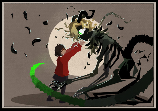
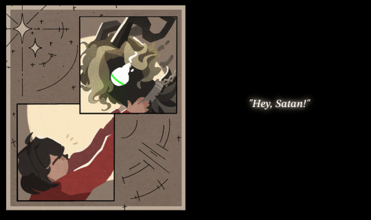
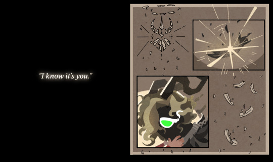
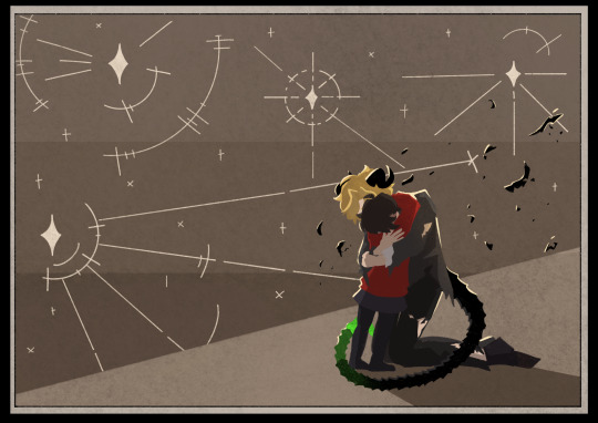
one thing about ik is that she will always reach out
#obey me#art#i had the idea for this and managed to bulldoze through drawing it all without losing motivation halfway through#but Do Not expect me to post art this frequently in future#idk how to do panels so if the middle bit with the text might be laid out weird#i added the stars and feathers and stuff because there was a bunch of empty space around the boxes#obey me satan#jtta ik#(btw the crumbling symbol next to the exploding feather is the wrath symbol from in-game)#(with the pride symbol attached upside down at the bottom)#(not so much symbolism as it is just me whacking you over the head with the point but it looks cool)#i had a lot of fun doing satan's more monstrous design so i might try my hand at some of the other demons later?#i do have some ideas for levi (deep sea creatures are just really fun)#also happy nightbringer release day!! it showed up on my homescreen like half an hour ago and i was like “wait what”#for some reason i thought it wasn't releasing til next week??#the new genshin patch is today as well so looks like i'll have plenty to do with the rest of my free time for the easter hols#(i promise i'm also working on the next chapter of jtta but i am so stuck on how to get lucifer actually Talking)#anyway. here's a gold star for making it through all my rambling in the tags for anyone who did so: ⭐
5K notes
·
View notes
Text
STOP I'm thinking about the part in Gravity Falls where Stan shows up with freshly bought (stolen) light bulbs only to see Ford screwing a new one in surrounded by family.
And OH my GOD. AGH.
Stan gets a little (ir)rationally upset about this because... It's.. Guys,,,
Stan perceives it as Ford once again easily receiving the praise and love of their family when he had to fight tooth and nail to receive even half of it.... I'm not well ✋😔
#listen I might be too deep in the fandom space and i might actually be mischaracterizing them completely#I'm not saying that Dipper and Mabel don't appreciate and love Stan because they definitely do!!#I'm saying Stan is seeing Ford reintegrate into their new family and he's seeing him do it. so. easily.#So easily When Stan had to PRETEND to be FORD to get even a chance to be a part of their family again#Stan FOUGHT to be a part of this family#and Ford just gets to slide in and... just. be a part of it.#and i mean duh but also... man Idk#Stan had to pretend to be Ford to get even a smidgen of a foothold to be able to even just... interact with his family#Stan's a family man that HAS to look out for everyone but Ford's just.. family. He gets to just... be a part of them with no real obligatio#And I'm not saying Ford doesn't love his family I'm saying he's very repressed and bad at showing it sometimes#It's just that... Stan fought SO hard to be a part of his family. THIS family. That is all he has EVER wanted#and FORD- who had it and took it all for GRANTED- gets to waltz back in and just.... take it for granted AGAIN#hang on guys i think I'm starting to take this a little personally i need to calm down wow#Okay.... I think I'm good#But you get where I'm coming from#cole's talking#gravity falls#grunkle stan#stanley pines#grunkle ford#ford pines#stangst#stan twins#These tags really got away from me huh#Ahem-- all that to say I think Stan's vague resentment in that scene is valid!!
277 notes
·
View notes
Text
why Aurora's art is genius
It's break for me, and I've been meaning to sit down and read the Aurora webcomic (https://comicaurora.com/, @comicaurora on Tumblr) for quite a bit. So I did that over the last few days.
And… y'know. I can't actually say "I should've read this earlier," because otherwise I would've been up at 2:30-3am when I had responsibilities in the morning and I couldn't have properly enjoyed it, but. Holy shit guys THIS COMIC.
I intended to just do a generalized "hello this is all the things I love about this story," and I wrote a paragraph or two about art style. …and then another. And another. And I realized I needed to actually reference things so I would stop being too vague. I was reading the comic on my tablet or phone, because I wanted to stay curled up in my chair, but I type at a big monitor and so I saw more details… aaaaaand it turned into its own giant-ass post.
SO. Enjoy a few thousand words of me nerding out about this insanely cool art style and how fucking gorgeous this comic is? (There are screenshots, I promise it isn't just a wall of text.) In my defense, I just spent two semesters in graphic design classes focusing on the Adobe Suite, so… I get to be a nerd about pretty things…???
All positive feedback btw! No downers here. <3
---
I cannot emphasize enough how much I love the beautiful, simple stylistic method of drawing characters and figures. It is absolutely stunning and effortless and utterly graceful—it is so hard to capture the sheer beauty and fluidity of the human form in such a fashion. Even a simple outline of a character feels dynamic! It's gorgeous!
Though I do have a love-hate relationship with this, because my artistic side looks at that lovely simplicity, goes "I CAN DO THAT!" and then I sit down and go to the paper and realize that no, in fact, I cannot do that yet, because that simplicity is born of a hell of a lot of practice and understanding of bodies and actually is really hard to do. It's a very developed style that only looks simple because the artist knows what they're doing. The human body is hard to pull off, and this comic does so beautifully and makes it look effortless.
Also: line weight line weight line weight. It's especially important in simplified shapes and figures like this, and hoo boy is it used excellently. It's especially apparent the newer the pages get—I love watching that improvement over time—but with simpler figures and lines, you get nice light lines to emphasize both smaller details, like in the draping of clothing and the curls of hair—which, hello, yes—and thicker lines to emphasize bigger and more important details and silhouettes. It's the sort of thing that's essential to most illustrations, but I wanted to make a note of it because it's so vital to this art style.
THE USE OF LAYER BLENDING MODES OH MY GODS. (...uhhh, apologies to the people who don't know what that means, it's a digital art program thing? This article explains it for beginners.)
Bear with me, I just finished my second Photoshop course, I spent months and months working on projects with this shit so I see the genius use of Screen and/or its siblings (of which there are many—if I say "Screen" here, assume I mean the entire umbrella of Screen blending modes and possibly Overlay) and go nuts, but seriously it's so clever and also fucking gorgeous:
Firstly: the use of screened-on sound effect words over an action? A "CRACK" written over a branch and then put on Screen in glowy green so that it's subtle enough that it doesn't disrupt the visual flow, but still sticks out enough to make itself heard? Little "scritches" that are transparent where they're laid on without outlines to emphasize the sound without disrupting the underlying image? FUCK YES. I haven't seen this done literally anywhere else—granted, I haven't read a massive amount of comics, but I've read enough—and it is so clever and I adore it. Examples:


Secondly: The beautiful lighting effects. The curling leaves, all the magic, the various glowing eyes, the fog, the way it's all so vividly colored but doesn't burn your eyeballs out—a balance that's way harder to achieve than you'd think—and the soft glows around them, eeeee it's so pretty so pretty SO PRETTY. Not sure if some of these are Outer/Inner Glow/Shadow layer effects or if it's entirely hand-drawn, but major kudos either way; I can see the beautiful use of blending modes and I SALUTE YOUR GENIUS.
I keep looking at some of this stuff and go "is that a layer effect or is it done by hand?" Because you can make some similar things with the Satin layer effect in Photoshop (I don't know if other programs have this? I'm gonna have to find out since I won't have access to PS for much longer ;-;) that resembles some of the swirly inner bits on some of the lit effects, but I'm not sure if it is that or not. Or you could mask over textures? There's... many ways to do it.
If done by hand: oh my gods the patience, how. If done with layer effects: really clever work that knows how to stop said effects from looking wonky, because ugh those things get temperamental. If done with a layer of texture that's been masked over: very, very good masking work. No matter the method, pretty shimmers and swirly bits inside the bigger pretty swirls!
Next: The way color contrast is used! I will never be over the glowy green-on-black Primordial Life vibes when Alinua gets dropped into that… unconscious space?? with Life, for example, and the sharp contrast of vines and crack and branches and leaves against pitch black is just visually stunning. The way the roots sink into the ground and the three-dimensional sensation of it is particularly badass here:

Friggin. How does this imply depth like that. HOW. IT'S SO FREAKING COOL.
A huge point here is also color language and use! Everybody has their own particular shade, generally matching their eyes, magic, and personality, and I adore how this is used to make it clear who's talking or who's doing an action. That was especially apparent to me with Dainix and Falst in the caves—their colors are both fairly warm, but quite distinct, and I love how this clarifies who's doing what in panels with a lot of action from both of them. There is a particular bit that stuck out to me, so I dug up the panels (see this page and the following one https://comicaurora.com/aurora/1-20-30/):

(Gods it looks even prettier now that I put it against a plain background. Also, appreciation to Falst for managing a bridal-carry midair, damn.)
The way that their colors MERGE here! And the immense attention to detail in doing so—Dainix is higher up than Falst is in the first panel, so Dainix's orange fades into Falst's orange at the base. The next panel has gold up top and orange on bottom; we can't really tell in that panel where each of them are, but that's carried over to the next panel—
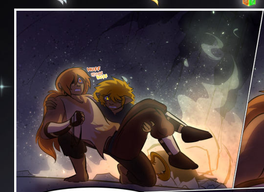
—where we now see that Falst's position is raised above Dainix's due to the way he's carrying him. (Points for continuity!) And, of course, we see the little "huffs" flowing from orange to yellow over their heads (where Dainix's head is higher than Falst's) to merge the sound of their breathing, which is absurdly clever because it emphasizes to the viewer how we hear two sets of huffing overlaying each other, not one. Absolutely brilliant.
(A few other notes of appreciation to that panel: beautiful glows around them, the sparks, the jagged silhouette of the spider legs, the lovely colors that have no right to make the area around a spider corpse that pretty, the excellent texturing on the cave walls plus perspective, the way Falst's movements imply Dainix's hefty weight, the natural posing of the characters, their on-point expressions that convey exactly how fuckin terrifying everything is right now, the slight glows to their eyes, and also they're just handsome boys <3)
Next up: Rain!!!! So well done! It's subtle enough that it never ever disrupts the impact of the focal point, but evident enough you can tell! And more importantly: THE MIST OFF THE CHARACTERS. Rain does this irl, it has that little vapor that comes off you and makes that little misty effect that plays with lighting, it's so cool-looking and here it's used to such pretty effect!
One of the panel captions says something about it blurring out all the injuries on the characters but like THAT AIN'T TOO BIG OF A PROBLEM when it gets across the environmental vibes, and also that'd be how it would look in real life too so like… outside viewer's angle is the same as the characters', mostly? my point is: that's the environment!!! that's the vibes, that's the feel! It gets it across and it does so in the most pretty way possible!
And another thing re: rain, the use of it to establish perspective, particularly in panels like this—

—where we can tell we're looking down at Tynan due to the perspective on the rain and where it's pointing. Excellent. (Also, kudos for looking down and emphasizing how Tynan's losing his advantage—lovely use of visual storytelling.)
Additionally, the misting here:
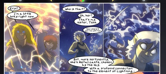
We see it most heavily in the leftmost panel, where it's quite foggy as you would expect in a rainstorm, especially in an environment with a lot of heat, but it's also lightly powdered on in the following two panels and tends to follow light sources, which makes complete sense given how light bounces off particles in the air.
A major point of strength in these too is a thorough understanding of lighting, like rim lighting, the various hues and shades, and an intricate understanding of how light bounces off surfaces even when they're in shadow (we'll see a faint glow in spots where characters are half in shadow, but that's how it would work in real life, because of how light bounces around).
Bringing some of these points together: the fluidity of the lines in magic, and the way simple glowing lines are used to emphasize motion and the magic itself, is deeply clever. I'm basically pulling at random from panels and there's definitely even better examples, but here's one (see this page https://comicaurora.com/aurora/1-16-33/):

First panel, listed in numbers because these build on each other:
The tension of the lines in Tess's magic here. This works on a couple levels: first, the way she's holding her fists, as if she's pulling a rope taut.
The way there's one primary line, emphasizing the rope feeling, accompanied by smaller ones.
The additional lines starbursting around her hands, to indicate the energy crackling in her hands and how she's doing a good bit more than just holding it. (That combined with the fists suggests some tension to the magic, too.) Also the variations in brightness, a feature you'll find in actual lightning. :D Additional kudos for how the lightning sparks and breaks off the metal of the sword.
A handful of miscellaneous notes on the second panel:
The reflection of the flames in Erin's typically dark blue eyes (which bears a remarkable resemblance to Dainix, incidentally—almost a thematic sort of parallel given Erin's using the same magic Dainix specializes in?)
The flowing of fabric in the wind and associated variation in the lineart
The way Erin's tattoos interact with the fire he's pulling to his hand
The way the rain overlays some of the fainter areas of fire (attention! to! detail! hell yeah!)
I could go on. I won't because this is a lot of writing already.
Third panel gets paragraphs, not bullets:
Erin's giant-ass "FWOOM" of fire there, and the way the outline of the word is puffy-edged and gradated to feel almost three-dimensional, plus once again using Screen or a variation on it so that the stars show up in the background. All this against that stunning plume of fire, which ripples and sparks so gorgeously, and the ending "om" of the onomatopoeia is emphasized incredibly brightly against that, adding to the punch of it and making the plume feel even brighter.
Also, once again, rain helping establish perspective, especially in how it's very angular in the left side of the panel and then slowly becomes more like a point to the right to indicate it's falling directly down on the viewer. Add in the bright, beautiful glow effects, fainter but no less important black lines beneath them to emphasize the sky and smoke and the like, and the stunningly beautiful lighting and gradated glows surrounding Erin plus the lightning jagging up at him from below, and you get one hell of an impactful panel right there. (And there is definitely more in there I could break down, this is just a lot already.)
And in general: The colors in this? Incredible. The blues and purples and oranges and golds compliment so well, and it's all so rich.
Like, seriously, just throughout the whole comic, the use of gradients, blending modes, color balance and hues, all the things, all the things, it makes for the most beautiful effects and glows and such a rich environment. There's a very distinct style to this comic in its simplified backgrounds (which I recognize are done partly because it's way easier and also backgrounds are so time-consuming dear gods but lemme say this) and vivid, smoothly drawn characters; the simplicity lets them come to the front and gives room for those beautiful, richly saturated focal points, letting the stylized designs of the magic and characters shine. The use of distinct silhouettes is insanely good. Honestly, complex backgrounds might run the risk of making everything too visually busy in this case. It's just, augh, so GORGEOUS.
Another bit, take a look at this page (https://comicaurora.com/aurora/1-15-28/):
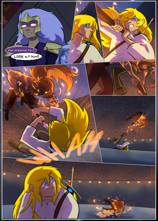
It's not quite as evident here as it is in the next page, but this one does some other fun things so I'm grabbing it. Points:
Once again, using different colors to represent different character actions. The "WHAM" of Kendal hitting the ground is caused by Dainix's force, so it's orange (and kudos for doubling the word over to add a shake effect). But we see blue layered underneath, which could be an environmental choice, but might also be because it's Kendal, whose color is blue.
And speaking off, take a look at the right-most panel on top, where Kendal grabs the spear: his motion is, again, illustrated in bright blue, versus the atmospheric screened-on orange lines that point toward him around the whole panel (I'm sure these have a name, I think they might be more of a manga thing though and the only experience I have in manga is reading a bit of Fullmetal Alchemist). Those lines emphasize the weight of the spear being shoved at him, and their color tells us Dainix is responsible for it.
One of my all-time favorite effects in this comic is the way cracks manifest across Dainix's body to represent when he starts to lose control; it is utterly gorgeous and wonderfully thematic. These are more evident in the page before and after this one, but you get a decent idea here. I love the way they glow softly, the way the fire juuuust flickers through at the start and then becomes more evident over time, and the cracks feel so realistic, like his skin is made of pottery. Additional points for how fire begins to creep into his hair.
A small detail that's generally consistent across the comic, but which I want to make note of here because you can see it pretty well: Kendal's eyes glow about the same as the jewel in his sword, mirroring his connection to said sword and calling back to how the jewel became Vash's eye temporarily and thus was once Kendal's eye. You can always see this connection (though there might be some spots where this also changes in a symbolic manner; I went through it quickly on the first time around, so I'll pay more attention when I inevitably reread this), where Kendal's always got that little shine of blue in his eyes the same as the jewel. It's a beautiful visual parallel that encourages the reader to subconsciously link them together, especially since the lines used to illustrate character movements typically mirror their eye color. It's an extension of Kendal.
Did I mention how ABSOLUTELY BEAUTIFUL the colors in this are?
Also, the mythological/legend-type scenes are illustrated in familiar style often used for that type of story, a simple and heavily symbolic two-dimensional cave-painting-like look. They are absolutely beautiful on many levels, employing simple, lovely gradients, slightly rougher and thicker lineart that is nonetheless smoothly beautiful, and working with clear silhouettes (a major strength of this art style, but also a strength in the comic overall). But in particular, I wanted to call attention to a particular thing (see this page https://comicaurora.com/aurora/1-12-4/):
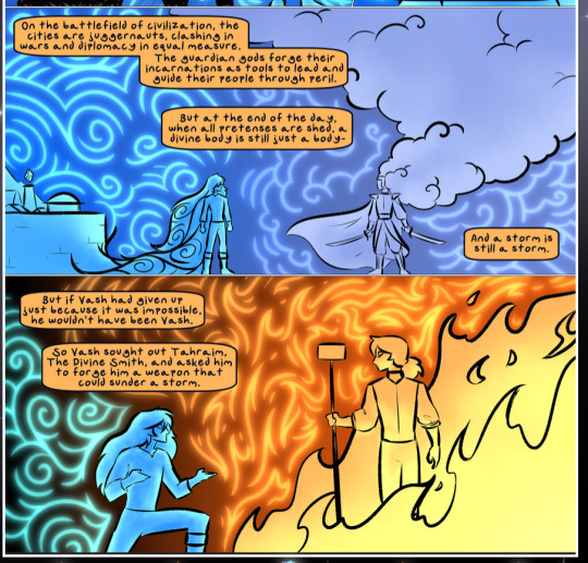
The flowing symbolic lineart surrounding each character. This is actually quite consistent across characters—see also Life's typical lines and how they curl:
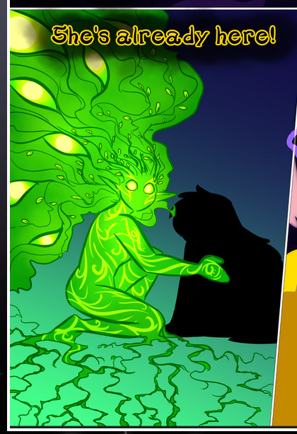
What's particularly interesting here is how these symbols are often similar, but not the same. Vash's lines are always smooth, clean curls, often playing off each other and echoing one another like ripples in a pond. You'd think they'd look too similar to Life's—but they don't. Life's curl like vines, and they remain connected; where one curve might echo another but exist entirely detached from each other in Vash's, Life's lines still remain wound together, because vines are continuous and don't float around. :P
Tahraim's are less continuous, often breaking up with significantly smaller bits and pieces floating around like—of course—sparks, and come to sharper points. These are also constants: we see the vines repeated over and over in Alinua's dreams of Life, and the echoing ripples of Vash are consistent wherever we encounter him. Kendal's dream of the ghost citizens of the city of Vash in the last few chapters is filled with these rippling, echoing patterns, to beautiful effect (https://comicaurora.com/aurora/1-20-14/):
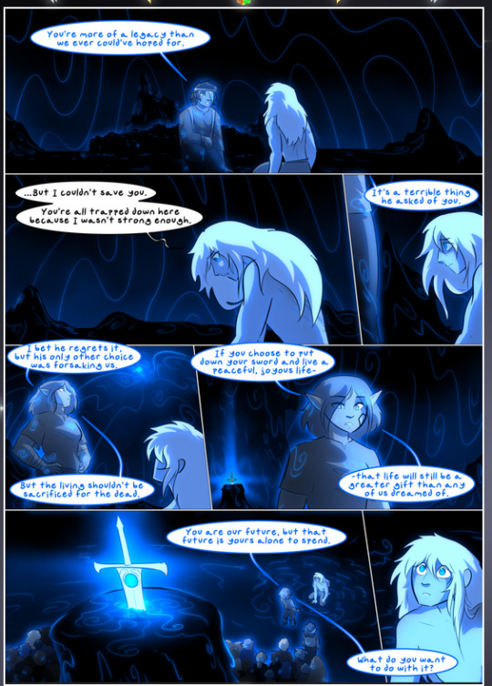
They ripple and spiral, often in long, sinuous curves, with smooth elegance. It reminds me a great deal of images of space and sine waves and the like. This establishes a definite feel to these different characters and their magic. And the thing is, that's not something that had to be done—the colors are good at emphasizing who's who. But it was done, and it adds a whole other dimension to the story. Whenever you're in a deity's domain, you know whose it is no matter the color.
Regarding that shape language, I wanted to make another note, too—Vash is sometimes described as chaotic and doing what he likes, which is interesting to me, because smooth, elegant curves and the color blue aren't generally associated with chaos. So while Vash might behave like that on the surface, I'm guessing he's got a lot more going on underneath; he's probably much more intentional in his actions than you'd think at a glance, and he is certainly quite caring with his city. The other thing is that this suits Kendal perfectly. He's a paragon character; he is kind, virtuous, and self-sacrificing, and often we see him aiming to calm others and keep them safe. Blue is such a good color for him. There is… probably more to this, but I'm not deep enough in yet to say.
And here's the thing: I'm only scratching the surface. There is so much more here I'm not covering (color palettes! outfits! character design! environment! the deities! so much more!) and a lot more I can't cover, because I don't have the experience; this is me as a hobbyist artist who happened to take a couple design classes because I wanted to. The art style to this comic is so clever and creative and beautiful, though, I just had to go off about it. <3
...brownie points for getting all the way down here? Have a cookie.
#aurora comic#aurora webcomic#comicaurora#art analysis#...I hope those are the right tags???#new fandom new tagging practices to learn ig#much thanks for something to read while I try to rest my wrists. carpal tunnel BAD. (ignore that I wrote this I've got braces ok it's fine)#anyway! I HAVE. MANY MORE THOUGHTS. ON THE STORY ITSELF. THIS LOVELY STORY#also a collection of reactions to a chunk of the comic before I hit the point where I was too busy reading to write anything down#idk how to format those tho#...yeet them into one post...???#eh I usually don't go off this much these days but this seems like a smaller tight-knit fandom so... might as well help build it?#and I have a little more time thanks to break so#oh yes also shoutout to my insanely awesome professor for teaching me all the technical stuff from this he is LOVELY#made an incredibly complex program into something comprehensible <3#synapse talks
779 notes
·
View notes
Text
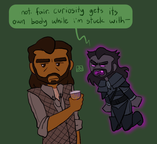
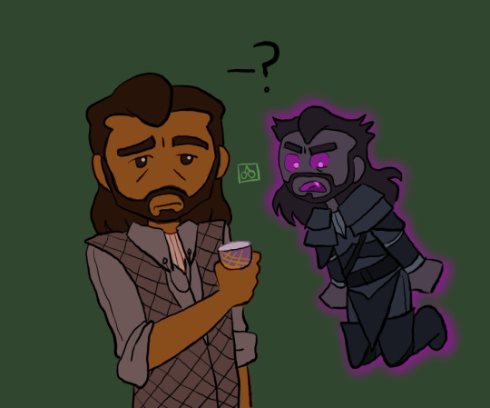
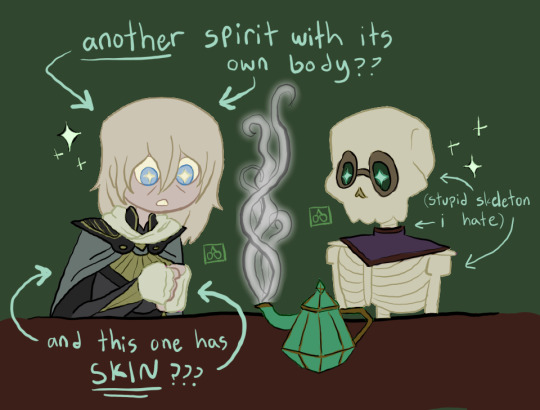
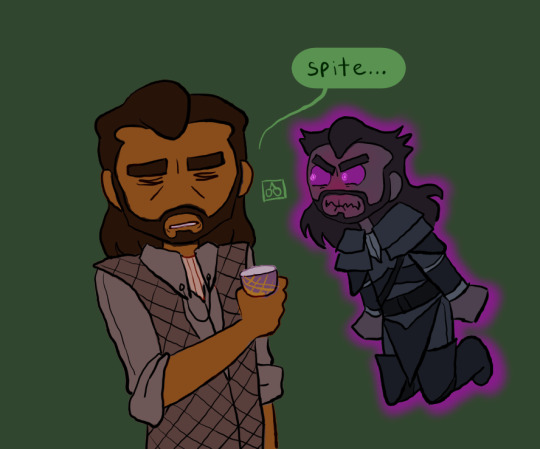
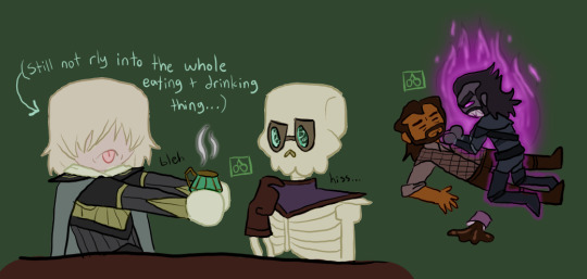
[spite] has entered the chat >:P
#my arts#dragon age#dragon age veilguard#dragon age the veilguard#dav#datv#da4#dragon age 4#veilguard#the veilguard#lucanis dellamorte#cole dragon age#manfred dragon age#dragon age cole#dragon age manfred#cole the spirit of compassion#manfred the skeleton#dragon age veilguard spoilers#<- i guess ?????#also does spite have his own tag...? idk sorry but#heard there was another spirit in the area *twirls hair and kicks feet* I LOVE YOU SPIRITS I LOVE U ABOMINATIONS I LOVE Y#this originally started as a nod to the banter about manfred being “mesmerized by the steam” while making tea#but then i made it about spite as well :] now there are THREE spirit friends (well... probs more like frenemies but yknow) :P#btw i changed coles outfit/design bc i saw the veilguard concept art of him (UGHHH MY BOY HE LOOKED SO GOOD IM DEVASTATED oTL)#also i hc that cole is very picky w food bc he seemed grossed out abt it when talking to blackwall lol#so even tho hes “used” to eating now he has a hard time w weird new things (in this case tea). autistic food aversion :]#which is extra funny in this case bc manfred (and spite) would be like “whats it like” while cole is like “...bad :(”#anyway yeah hope u guys like this one :D im very happy ppl seem to like this series(?) bc i really like drawing them !!! <3
109 notes
·
View notes
Text

who up transfemming they faves
#the art tag#fop a new wish#fop fanart#fop hazel#fop dev#not tagging peri or wanda mwahaha#real talk what do yall think her prefered name would be#Dev is pretty androgynous but idk I feel like she would change it anyway#I was originally very partial to Dove and I think it would fit my future interpretation of her#but also what if she doesn't want to keep the first letter D that runs in her horrible family?#Bev works I think#short for Beverly or something?#Bevin...#I think I still like Dove more though#also unrelated but Hazel is a librarian in this future 🤓#okay im done now
156 notes
·
View notes
Text
i love total drama (obviously) but "hey what's up i'm here to slay" is the worst ick any TV theme song has ever given me
#i know this isn't new ground to tread but#why'd they write that like PLEASE#this is gonna sound so 'my uncle works at nintendo' of me but a friend of a friend's dad wrote the original theme and i'm like....#did he do this too.....if yes we need to talk#total drama#total drama reboot#also <- previous tags are 'allegedly' bc i heard it thru her so idk what he actually did i just know he was involved with td + stoked +6tee
183 notes
·
View notes
Text
“I have to see her.” “But we’ll die.” “I know.” AND THEY BOTH SOUND ON THE VERGE OF TEARS AAAAUUGGGGHHHHHHH
#IM CRUSHED#donnie speaks#epic the musical#epic the musical spoilers#uh#epic the musical thunder saga#idk how to tag for this#me when i make my first actual post in months just to talk about something completely new el oh el
116 notes
·
View notes
Text
i just think it’s so funny that zoro does not even wanna comment on the usokaya situation when usopp explicitly asks and he very pointedly looks away when they kiss and yet he proceeds to butt in every single time sanji flirts with a woman or implies he knows about romance to redirect attention back on himself like god i wonder where your interests lie…
#also the goading sanji into talking with him and just commenting on every single thing sanji says... ok!#zoro is patient 0 of terminal sanji-itis#this is the live action but i mean... this is also animanga zoro and zoro in the movies at times is it not LMFAO#but while they were fighting and then even when he was asking for seconds of the dish and sanji finished his dialogue and zoro CONTINUED#do u want his attention or smth? are you happy you have someone who u can bicker (flirt) with every day and can hand ur ass to u and u him?#also sanji just BEAMING and smiling whenever they bicker is just insane INSANE like yeah they're enjoying this... wow...#also obviously zoro has all the weird UST charged dialogues with multiple MEN like i truly don't know how u can see him as straight lmao#anyways... i just needed to ramble anyways... i fear s2 will be insane with new pet names and arguments I'm actually so hyped#like oh i wanna see the look on sanji and luffy's faces when zoro calls out his finishing move LMFAO (let him be a loser pls)#OK RAMBLING OVER FR... i just like talking about zosan idk#zosan#zs#opla#tagging for spoilers ish#sanzo#zorosan#sanzoro
492 notes
·
View notes
Text
Go hug that cutie now boy!! HUG THEM RIGHT NOWWWWW
(I was gonna wait till like later but I’m impatient asf 😿)

GAHHH MY FIRST DIGITAL RAYCO ART KINDA REMINDS ME OF MY FIRST HADINA ART PEICE NGL BUT THATS BESIDES THE POINT ANYWAYS ENJOY!!
Taglist!!: @re3tro0 @delicatestringbean @persephoneflowerpetals @glacier-alchemist @maddieinheaven @dreamwinged
#GRAHGHH THEYRE SO CUTE#WHAT I JUST#EXPLODED THEM#ALSO HC TIME#so I’d imagine kuzco is pretty iffy when receiving touch (excluding those he’s close with like Ray etc.)#but boy oh boy does he LOVE to cuddle Ray like it’s no biggie#LIKE HE COULD LITERALLY BE ON HIS THRONE TALKING TO SOMEONE AND GOD FORBID RAY IS BY HIM BECAUSE HE’LL LITERALLY PULL THEM TO SIT WITH HIM#HE LOVES HUGGING THEM LMAOO#the emperor’s new groove#emperor’s new groove fanart#kuzco disney#disney kuzco#kuzco#self ship#oc x canon#self ship art#oc x canon art#emperors new groove oc#I 💗 twinks#🍁Rayco🦙#🖇pumpkinzz bs selfships💗#disney f/o#disney self ship#disney self insert#disney selfship#my art 🐺#YEA IDK WHAT ELSE TO TAG THIS LMAOO#EEEEK KUZ’S LIL FACE IM SO HAPPY EEEE#kuzco fanart#HELP I FORGOT TO ADD THAT LMAOI
90 notes
·
View notes
Text


I just love them so much.
#apex bloodhound#apex legends#fusehound#uh idk what to tag more#anyways new season looks amazing#they are couple goals#this post has been edited so many times whoops#not to get confusion lmao#so sad that fuse doesnt talk abt bh with those upgrades#bloodbomb
176 notes
·
View notes
Text
this ones dedicated to the subspace i met on phighting: the zone, i liked them a lot

#orbit splash#phighting#medkit phighting#subspace phighting#subkit#xeno phighting#<- new tag i gotta put the xenos somewhere#idk i wish i spent a little more rime on this doodle but im tired and i gotta sleep#i just let them talk they were super funny#i am not a subkit shipper but its whatever#oh i forgot that subspaces mouth is rotting too i aint care though
54 notes
·
View notes
Note
I know you don't like discussing the muses but i love your takes and perspectives and i had to ask you about this. after listening to ttpd, did you have the impression that she really loved matty more than any of her exes/previous relationships?. And listening to the whole album as a whole would you call it the ''matty album'' or do you think there are more prominent themes in there than their period together?. (hope this doesn't bother you, feel free to delete if you don't feel like answering it)
hey anon! You're right, I don't really like to get into the muses as I don't really think there's anything to add to the conversation at this point, and ultimately I don't think it matters.
That being said, and with the caveat that I am not Taylor and I do not know Taylor so I cannot speak to her thoughts and can only make relatively educated guesses based on being an avid consumer of her work and a student of the human condition (lol), no I do not think Taylor loved Matty more than anyone else. I think there was maybe a brief period in the thick of things where she *thought* she did because she was not thinking clearly and was in full-on denial, but to me the message that is loud and clear in the album (and more or less explicitly stated in the epilogue) is that it was not any kind of real love affair. It was certainly infatuation and lust and the promise of something more, and there may have been some love as well, but he was in no way the love of her life by any measure.
I would call it a "Matty album" insofar as they're about events in which he was present, sure. But I feel it much more as a Taylor album, if that makes sense, even though I know that's a cop out because every album is to a degree. I can't explain it well, but I don't see TTPD as a Matty (or Joe) album in the way that I would maybe say Red is a "Jake" album or 1989 may be a "Harry" album or even Lover being a "Joe" album whatever, because even if they don't figure in all the songs, that kind of heartbreak permeates so much of the material.
The thing about TTPD and the Matty situation is that the Matty situation is really a Joe situation (which in some ways is actually partially a Jake situation). I always say I hate treating Taylor like a character so I hate speaking about her and her work in this way, but you don't get the Matty situation without the Joe situation precipitating it. It's @taylortruther's now-infamous donut vs. hole analogy. The reason Taylor makes the choices she does with Matty is directly tied to what happened with Joe that made her feel she needed to. Which is not to say Taylor isn't responsible for her own actions or doesn't have agency in her own life, but I mean it in that the situation in which she found herself with Joe, and the pain it caused, is what made the alternative so comforting and perhaps even necessary in her mind. It's why it makes it so hard to "paternity test" the album, because the stories are inherently intertwined and you don't get the former without the latter.
The major "theme" of the album to me is the loss of a very specific, very personal dream, and the way in which she lost it, and the way in which grieving that loss drove her to make the choices she did. We're all talking very delicately about it because it's a sensitive topic, but it's late on Friday and few people are going to see this, so I'm going to say it: it's the give you my wild, give you a child of it all. The yearning she expresses both overtly and sub-textually for having a family in the album is palpable in a very iykyk kind of way, and it's the realization that those plans are not going to come to fruition in the way she had once imagined that drives a lot of the pain she experiences, and makes her jump at the chance to find that again with someone else.
I started a draft post about the theme of womanhood and motherhood on TTPD three months ago that I never finished because I ran out of time and ran out of steam, but it was the most striking thing to me on the album, not because I didn't know that she wanted those things because that's been obvious for years (definitely since Lover, and again, peace put it all on the table), but because the vulnerability she expressed about it on the album is incredibly moving, and it's so generous of her to trust listeners with those feelings and experiences.
Again, it's the thirtysomething of it all.
She is in relationship A which she at one point believes is forever, one which she at one point believes is going to lead to marriage and children. She is so committed to that dream that she either ignores or tries to fix serious issues that may otherwise lead others to think the two people in the relationship are incompatible, both because she loves the person deeply and because she feels that this is meant to be the way she achieves that dream. She gives it her everything, and it still dies a slow, painful, onerous death, and she feels like it may take her along with it. The dream of getting married and presumably having a family gets taken off the table: how we don't know and will likely never know because that is private between the parties involved. All that matters in the context of the album is that those plans never come to fruition and never would.
Then you have relationship B, an old flame who knows just enough buttons to push both to trigger and to flatter. A person who she presumably trusts with very sensitive, personal information as her life slowly crumbles, and this person is telling her all the things she wants to hear because he knows about what is happening in relationship A because she's told him. Person in relationship B doesn't get an "in" with her and sell her this dream unless what happens in relationship A precedes it. It's not a grand love affair for the ages, it's not a mutual decision on building their own dream together. It's Person B learning about what is happening with Person A and saying "I can do that!" even if he can't or doesn't. The dream he sells her is a rental car; it's not his own, he's just borrowing it from someone else and selling it back to her.
And the reason she falls for it is because it is what she aches for the most in her personal life, and she is grappling with it disintegrating, so she (unfortunately for her) falls for the easy way out, and in turn sells herself a story about how this must be fated, and this must be meant to be, because this person wants all the same things she does and she didn't even have to bargain for it! Well, yes, because she fed him the dream in the first place. (Like a mark falling for a sleeper cell spy.) It's too good to be true because it isn't true. IMO Person B doesn't come running out of the gate with the marriage/baby/dream life promises unless he knows that is what she most desires. But what's left unsaid out of all of it is that: those dreams were her dreams because they were her dreams with Person A. It was a whole life they had together, and a whole life they had planned for in some fashion, and a whole life that has to be dismantled in the aftermath.
So all this to say, yes, on the surface, Matty is a "main character" on the album, but truly he's a side character to Taylor as the narrator and person experiencing it and Joe as the ghost bit-player-who-haunts-every-scene. (Again, I hate referring to real people as characters, it gives me the absolute ick, but in this case it's the only way to answer the question.) I jokingly call it the Matty album for shorthand or when I want to say something out of pocket, but really, it's a disservice to the album to say that because it's not a muse album as in it's about the romance (like, say, Red often is), it's about a soul-crushing heartbreak that goes beyond it. The romance is the symptom, not the cause.
The loss of youth is tied in with all this: she's not 22 anymore. She isn't even 32 anymore. She had a very specific idea of what her life was going to look like at this point and had planned for that life, and it goes up in smoke. But again, to bring the womanhood into it all: there is, unfortunately, a deadline for these things. You're with someone for over half a decade you think is going to be your life partner and father of your children and and then he's not. You spent half a decade building this relationship for it to crumble, but now you're in your mid-30s and you don't necessarily have another half-decade to build that trust and faith in someone else before being ready to start a family. And maybe you're scared that anyone else who may become your partner will need that much time to build that trust and faith, because that's kind of all you've ever know in relationships. But lo and behold, someone comes into your life you once had feelings for and maybe now do again and is offering you everything you want and thought you'd have by this point in your life right now. It feels like an elixir that as we find out is actually poison.
That youth is not just the chance for motherhood, but it's also the hopes and idealism and belief in the future that often gradually erodes as we age. But for Taylor as well, it's also tied into the trauma of what she went through particularly in 2016, which kicks off a lot of things on the album as well (her retreat, her relationship with Joe, the pivoting in her career, etc.). That event caused a pretty clear before/after in her life (like a few other events, I suspect), and another major theme in the album is her finally grappling with the full weight of that. They're all different branches of the same tree of the story of TTPD and her life.
I could talk about this stuff forever, but I'm going to stop here because it's long enough and I should save stuff for one of the dozens of drafts I have half-baked lol. But this is just something I needed to get off my chest perhaps.
#Anonymous#the tortured poets department#again I am trying to be very sensitive in this#and am trying not to project or speculate too much on main#which is why I'm... cutting it off here#but it's just... there are very specific Things in TTPD and Things in general that you can pick up on in the last few albums#and we don't talk about them in public for good reason#but I think it's also sad that we can't speak generally about these very common experiences for women#because as I've said before I have SEVERAL friends who have gone through similar situations in their 30s#it's just-- all our friends smell like weed or little babies idk#it's tied in to society and expectations and pressures and desires and conflicting signals and--#ANYWAY#writing letters addressed to the fire#Pouring out my heart to a stranger but I didn't pour the whiskey#cause I know that it's delicate#<- new tag for ~sensitive~ things if I can remember to use it
78 notes
·
View notes
Text
LSTR-S2301 and the maintenance tunnel ARAR are best friends to me even though that Elster was only on sierpinski for a seemingly brief time, they’re bros who fuck around on the clock during work. I think Elster was probably more willing to put extra time in however she’s also very “okay you’ve given me a list of tasks I did them. They’re done and done well. That’s it, my time now.” Whereas I see Ara being more of a slacker (very valid of her) or at the very least just a bare minimum type of gal when it comes to work.
Idk I tend to imagine them fucking off in the middle of shifts to go find weird lonely corners of sierpinski to hang out in. They don’t even talk half the time but they love it.
#listen I know sierpinski Elster has Alina as her lover#I don’t necessarily see Elster/ara as romantic although it could be#they’re just tired work bros to me#u have machine autism and plant autism and they’re both silent types I think they’d click#I’ve seen some fun takes on Lilith and Elster as characters too#to me Lilith Itou is definitely the strong silent type but not bc she always means to be#yes she is an intimidating war veteran but I think part of that intimidation factor comes from her being awkward as hell when it comes#to talking#combo of awkward/ just being a woman of few words anyway#which comes through in LSTRs I think#they don’t say much when they don’t feel that they need to ig#anyway idk if this makes sense I’m just rambling#I was also just trying to think abt LSTR-S2301 bc poor thing#imagine being your own individual replika but you’re brought to this place as basically a sacrificial lamb? of sorts#in that you as you are. it’s not what you need to be for a god’s purpose#but it’s close enough that the parts that aren’t needed can be stripped away#and filled again#she was only ever meant to be a vessel for 512 in many ways#but she was still S2301 and had her own life and friends for a brief moment in time#signalis#this isn’t worded well but gets the tag regardless#I should make a rambles tag separate from my personal tag maybe#lynx rambles#<- new tag ig
67 notes
·
View notes