#idk how to properly use palettes
Explore tagged Tumblr posts
Text
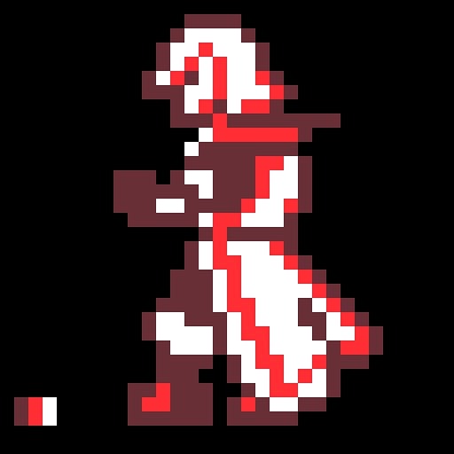

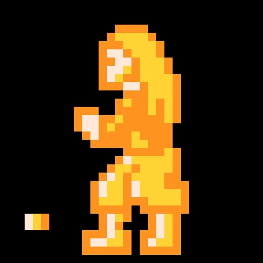
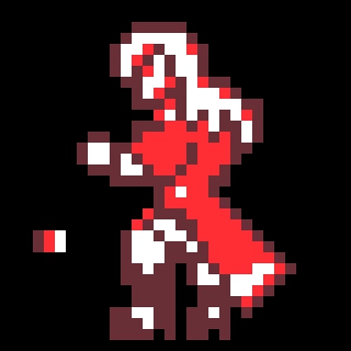
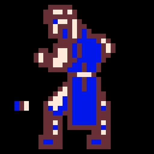

Aaaaa I keep forgetting what I have and have not posted yet, so here’s something I definitely haven’t shared. I made a couple sprites of other Belmonts as NES sprites :3. Kinda an art style study I guess, it was fun! I think some of them could use some tweaking tho tbh, especially since I’m not sure if they actually line up with the NES 256 color palette, I just guessed. But yeah :3. Some dudes!
#castlevania#castlevania games#art post#my art#pixel art#leon belmont#christopher belmont#soleil belmont#juste belmont#richter belmont#julius belmont#hehehe Julius has the same color palette as Simon in these hehe#Soleil’s was kinda inspired by how Sypha got to have a very monochromatic colorscheme just in yellows this time#I feel like I went a little too ‘everyone has to have a brown outline’ for some of them hmmm#but maybe not idk#I think I’m most proud of Christopher Leon and Richter#I didn’t know how to properly scale Soleil oof#cause on one hand he’s like as tall as his dad in his game but on the other hand he’s like 15???#like goddamn bro howd you do that#save some height for the rest of us geez—#yeah pixel art is fun tho I guess (incredibly hard and unforgiving sometimes#aaaaaa idk what else to say uh#maybe someday I’ll do some noncanon and nonBelmont protags
59 notes
·
View notes
Text

[ id: lineless art of a curly-haired anthro sheep, with angel wings and a cracked halo above her head, shown nude except for glasses, hoop earrings, and a choker. she's sitting hunched over with most of her back to the viewer, looking off to the side with a teary woeful expression; there's a single teardrop falling down her face. the image is colored using an 8 color palette consisting of shades of blue, pink, and beige. the background is a blue square, with a multicolored circular shape behind her head. end id ]
oc-tober day nineteen - PALETTE !!
boo hoo hoo.. it's fun working with limited palettes i should do it more often
#bweirdoctober#my ocs#fursona#Dazey Mae#i forced myself NOT to use the purple palette bc shes already Purple & i wanted to do something different#i would love to properly participate this week but idk how to put myself out there like that :-(
6 notes
·
View notes
Text
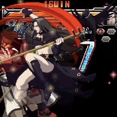
How did they reuse these assets for like 10 years in multiple games without anyone fixing this testament sprite. Dont look at their lil ass im not talking about that right now im talking about the errant green pixels. Just look at the green pixels. Focus
#also the sprites in 1 of their intros arent shaded properly.#i only really notice problems when its with testament i dont think theyre like prone to them or anything#my favorite 1 is a voice line in strive that has WAY too much echo on it they’re incomprehensible#like idk if they applied the effect twice or what but its funny#im kind of curious about how this works tho cuz according to isuka their palette uses like. all available color slots or whatever.#so wheres the green coming from…#maybe that was just their main isuka palette idk. it is a bit different#okay thank you for listening ���#the kat goes meow#gg
28 notes
·
View notes
Text
Some "if Yue is alive and went travelling with the Gaang" designs
With a ton of text about cultural inspiration.
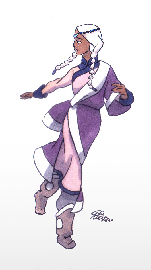


The main book 2 look

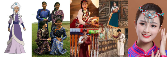
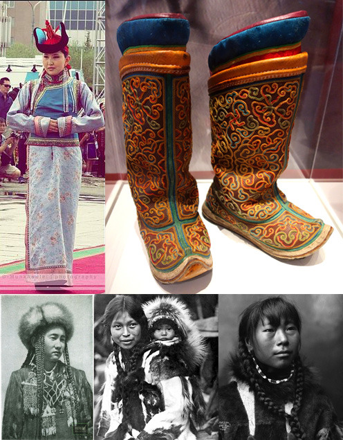
I wanted to show cultural differences between the tribes, so Yue's look is sort of Mongolian. There were Mongolian-styled hats in the Northern tribe, and Yue's dress under the coat looked like a Mongolian deel (thanks @atlaculture for all these posts about clothes and everything else!), so it's not much against the canon information.
So she's wearing a deel again with a second layer - there are chinese actors on photos as far as I know; I hope it's okay. One-shoulder silhouette refers to later Aang's clothes because Yue is still kind of a spiritual person (she wasn't a fighter, so I want her to have some other useful talent – not a bender or healer like Katara or a non-bender warrior like Suki). Violet, pink and white were originally her colors, no changes here. Three blue characters would be too much for a group of five, and total white is not practical at all. I like to think that violet color shows high rank in the Avatar universe; in the original series it was only worn by princess Yue, Kanna, the chief Hakoda's mother, and by king Bumi.
Yue's boots here are mongolian gutals/gutuls (the collage is already big, but I used them again for one of Book 3-looks).
Her hair become simpler – just two braids and a hairpiece, to match her previous decorated hairdo. I guess if she's travelling with the Gaang she's not that much of a Moon Spirit anymore (maybe she returned the part of the moon spirit that saved her and was healed other way?), so I decided to forego the moon-referring part. Also it will be easier to do by herself since she has no servants now... The headdress I took from modern Mongolian dancers; the front part is crescent-moon-shaped.
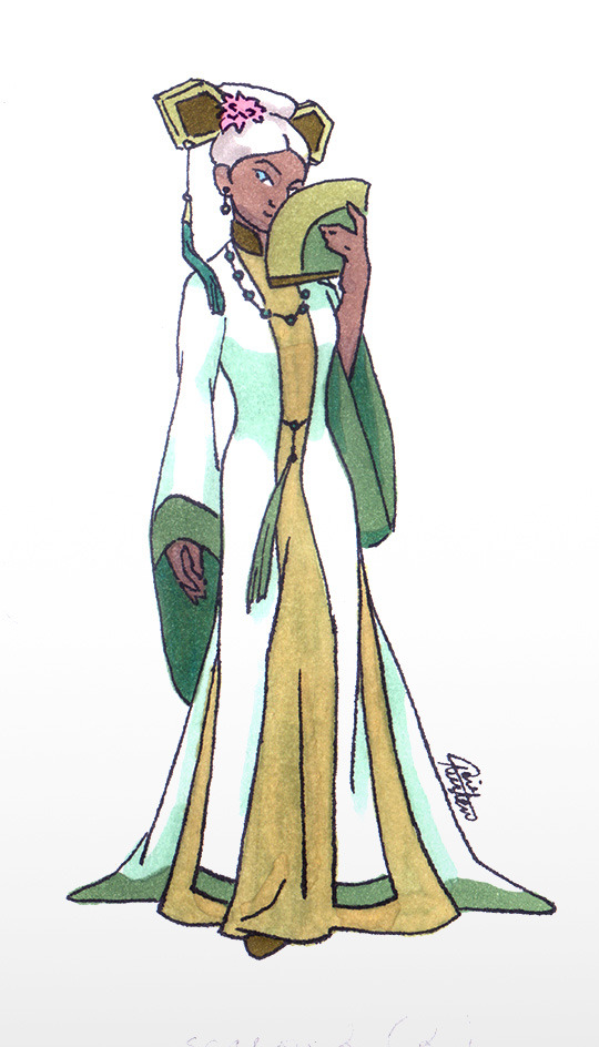
The Ba Sing Se dress


I fell in love with this Ao Dai dress, it's simple, long and elegant. But... it's mostly Vietnamese… and I'm afraid that it's modern and not historically accurate. Also it does not really go together with other Ba Sing Se dresses :( because I did not want to just copy-paste some background look. But there is at least one dress with a tail, thigh high slits and a standing collar on the dress underneath, so... I guess my choice is not that bad? The tail makes her look more royal. The fan is the same which Toph and Katara had. For the palette I chose Yue's white color with EK greens and warm yellow/ochre to match Katara and Toph. The hairdo is copied from the series; I chose one with the tassel on the right, to refer the NWT/Korean accessories.
The Fire Nation disguise
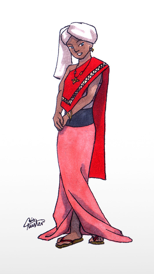
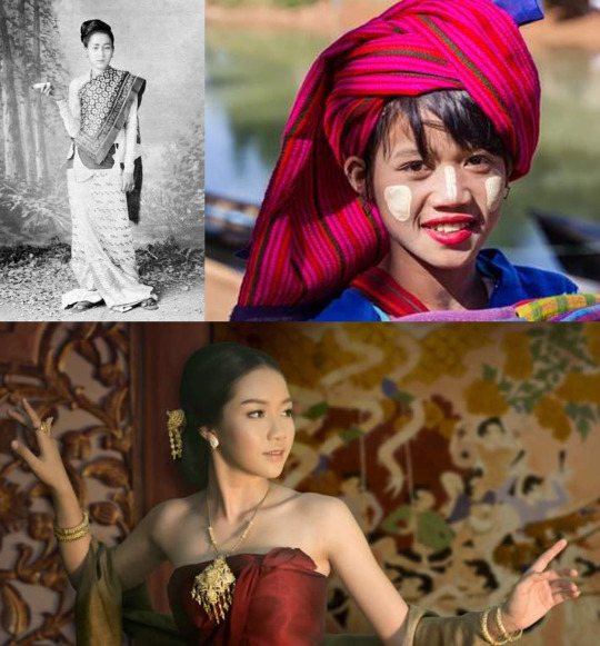
A confession – I don't like FN clothes. I wasn't sure if I would be able to do it properly, so I almost copied that attire (left one) – asymmetry, as a Thai touch, which again matches Aang's Invasion Buddhist-like clothes. The palette keeps Yue's signature white, with some pink of a warmer shade, as they wear it in the Fire Nation. And the "royal" long skirt, 'cause she's still not a fighter. The look is simplified so I could not keep zigzag ornament on her longyi skirt, therefore I moved it onto the top part.
I used Thai dancers jewelry and... flip flops? idk how they are called in Southeast Asia (don't like Sokka and Katara's FN shoes at all, why the design is so complicated?).
For covering her hair I used a turban, inspired by Myanmar turbans; a white one, so if some hair will show, it won't be too noticeable. Also Yue could still be easily recognised on screen/page by her white head. The long end of the fabric on her right resembles burmese hairstyle silhouette.
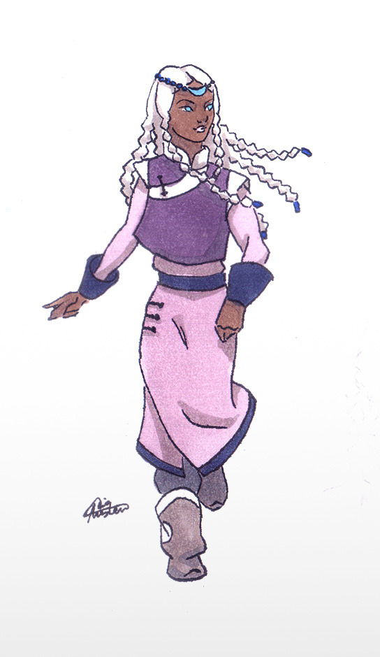
The Invasion-and-till-finale look
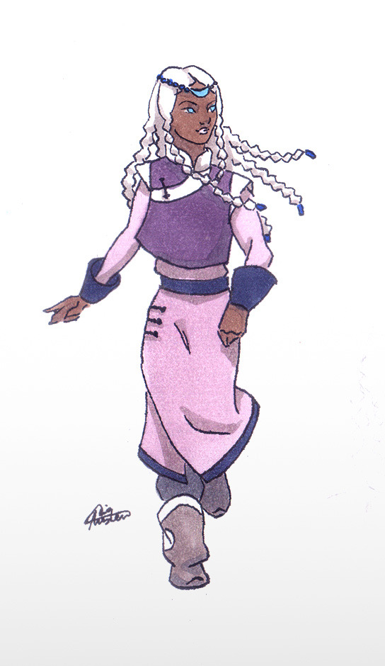
For her dress I used a deel (again); the sleeveless jacket is an hommage to her original design and has some Korean vibes, like Toph's Ba Sing Se dress (at least I hope so). Katara and Sokka's season 1 looks have Korean influence, so I guess it's okay. Gutals are from her Book 2 main look. I have a soft spot for them.
My favorite thing is her hair :)))) It's a mix of Inuit/Mongolian braids and a hairpiece, also from the Book 2 look. This time there will be more braids. Two on the front – I wanted to keep them from her original hairdo, but now they are braided together (I saw this on the Alaskan Inuit/Eskimo women photos). On the back there are five, inspired by a Mongolian hairdo for young unmarried girls, who wore multiple braids. I decided to make five, because Alaskian Inuit language uses this amount for counting and with two front braids it'll make seven, which is a lucky Mongolian number. And in theory a limited number should be easier to animate.
The post-canon noble look
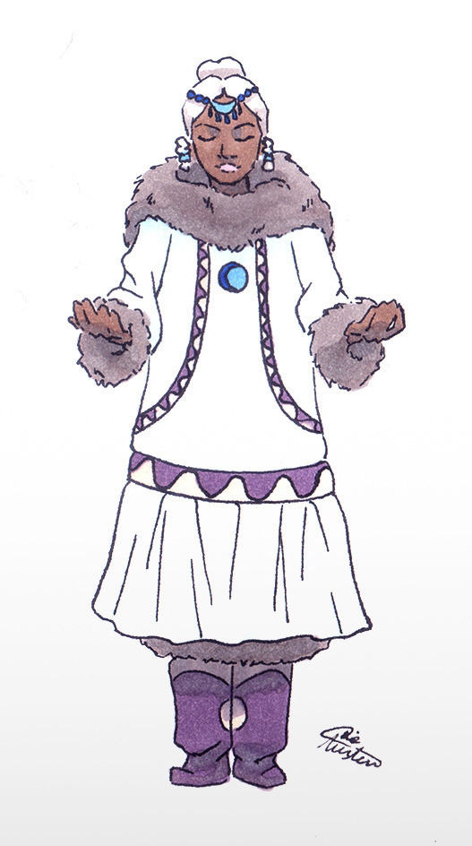
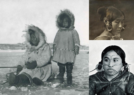
After the final battle I thought Yue will come back to Agna Qel'a and become a more active political figure. I chose a white kuspuk (blue color is still for Katara and Sokka), showing that she is ready to lead her tribe after this journey, not the passive perfect princess she was before. "She is associated in canon with the masculine yang of the yin and yang and the moon which, in most Inuit and Eskimo cultures, is considered masculine as well. While white kuspuks are associated with men and specifically family patriarchs, a feminine kuspuk in white makes plenty of sense for Yue's character" – @mostly-mundane-atla helped me a lot with the cultural meaning of the clothes (I am so grateful!). Also it's an hommage to her total-white Moon Spirit look. And I changed her hair again to Greenland updo with two tied braids on the front – more complicated than the simple braids she wore during the journey. It looks formal.
NWT is less Inuit-inspired and has a strong Mongolian touch (to make them look more "modern"? dunno) but I guess the formal wear for the spiritual princess could refer to older traditions. Which should be the same with SWT, 'cause SWT was originally a part of NWT – or so I heard. For example, Kuruk, the NWT Avatar who lived about 400 years ago, has nothing Mongolian in his look.
All the looks are simplified to match the style of the original cartoon. I know there should be more details and embroidery, but my goal here was to draw something (at least theoretically) applicable for animation. And no Hahn's betrothal necklace of course.
Also I want to mention here other great Yue designs, since they are the inspiration behind the overall idea of the post – the moon looks and "Yue joins the Gaang" outfits by amazingly talented @chiptrillino.
P.S.: an important note
This is my first attempt ever to design outfits that could fit the world of A:tLA. I am not Asian or ingenious, not an expert in their cultures or costume history at all, not a professional character designer. I am just a fan who tried to create designs with respect to real cultures and people. Nothing here was supposed to be offensive in any way. If something still is – please inform me so I could fix it as soon as possible.
I hope, as a fan, I have the right to draw fanarts looking for an inspiration in the cultures that inspired the original cartoon.
If you see mistakes in my post, be it in drawings or a text, also feel free to tell me. I will deeply appreciate it.
#avatar the last airbender#atla fanart#princess yue#yue#yue's alive#yue redesign#yue atla#yue avatar#all these links almost killed me...#i am a nitpicker#bad alt text#sorry i'm so done
1K notes
·
View notes
Note
First of all i can't believe you're 16?? That's fucking insane, you're so talented.Second, would you ever consider making some sort of coloring tutorial?
oh my goodness thank you,, that means a lot hahah. insert chiikawa reaction image here i dont have them on my computer
secondly, sure! my process involves a lot of bullshitting and kinda intuition based stuff so idk how to explain it that well but i will try.

ok here is how i would render a colored ball + grayscale ver. i dont use value ? or darkness to create shading as much as color contrast. ex yellow is lighter than green which is lighter than blue/purple. this is shown in grayscale but since im using the colors to indicate value it shows up better in color (idk how to say it)
this is personal preference but i don’t use color palettes at all, because every setting will have a different kind of lighting or mood that i need to adjust for. so why even bother? i think im just really used to picking things out by eye, buti would not recommend this because stuff can get inconsistent really quick
i dont use blend modes for shadows anymore, but heres an example with multiply for how i do shading (left)

in my art i dont like the look of straight up darkening shades so i always go for a darker, more saturated shadow. i love bright colors so im always pushing for more saturation. enhancing existing color in a 'properly shaded' areas is a fun way to do this
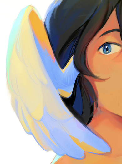
for example in this wing, i make the shadows bright ass blue instead of grayish blue/tan. this is because i made the faint light source from the left yellowish, so the shadow will be blue in comparison. i just amped that way up lol
you can also see it in the yellow on the inside of the wing. the lighting is yellow, so i took the faint bits of yellow that wouldve been present if i shaded it normally and just made it way more saturated
hope this helps, feel free to ask questions because idk what im doing half the time. usually its just 'oh this would look cool lets keep it'
121 notes
·
View notes
Text
What my first (water-soluble) oil painting is teaching me:
Wooden palettes are great if you like splinters and not being able to clean all of the paint out.
It takes forever to dry and I'm going to turn it in for class while it's wet and that's just going to have to be okay.
You need way less black and blue than you think you do and a LOT MORE white than you think. Or maybe I'm doing something wrong? Really unclear. Maybe don't take advice from a post about how I've never done this before.
Don't sketch everything out in pencil unless you want it to mix into the paint when you go to paint over it. I haven't had time to figure out underpainting, but do that instead probably? idk.
Green is an incredibly annoying color to mix properly. There are too many shades of green.
Linseed oil has a really weird, specific smell? I'm getting used to it but everything in my life smells like linseed oil right now.
There is dog hair in my painting. Much like point 2, there is nothing that I can do about this, either. It's just part of the painting now.
Don't let your first painting be on an 18x24 canvas. Don't do that to yourself. Go get some of the cheap-ass tiny ones from Michael's. Oh my god. If this wasn't for a grade I wouldn't be putting myself through it.
If you DO end up having to use a large canvas, just splurge on larger paint tubes. Even if the tiny ones have enough paint, you're going to spend the entire process stressed out that you won't have enough paint and it's really just not worth it emotionally.
Art youtubers and how-to blogs talk too much and I personally feel better off just fucking around and finding out at this point.
All that being said, I painted this and I don't hate it! It's a tiny part of a larger painting that I'm much less happy with, but I like this little rectangle of it :) The last time I painted was probably in like ninth grade so this feels like a pretty okay first current-day attempt, all things considered.
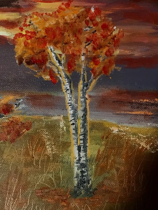
#10.) also learning that I'm kind of bad at oil painting but it's my first one so I'm giving myself some grace here.#I think this has the largest learning curve of any medium I've tried other than maybe learning digital art programs.#it's so difficult but also rewarding in a different kind of way- even if mine kind of sucks right now lol.#I know I can do better but not on this assignment. I do not have time to do better when there's not even time for it to dry :/#I did get some small cheap canvases to practice on though- i'll mess with those later and report back in a few days if it goes well!#tay's tag
55 notes
·
View notes
Text
im so sorry it took me so long to answer these oml but YES i'd be happy to show how i draw and color :)
— SKETCHING
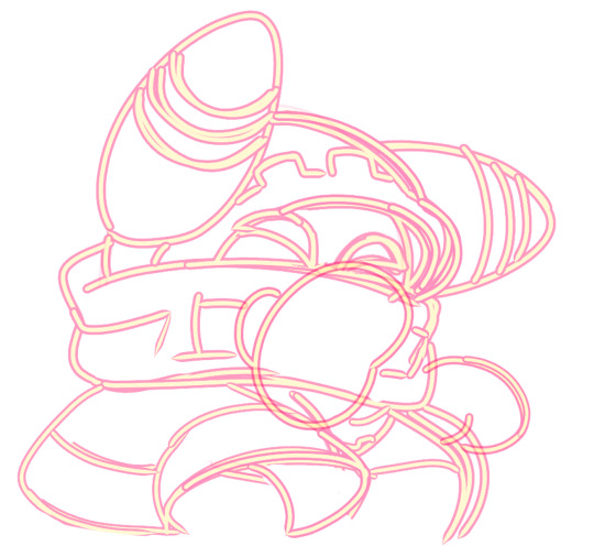
please note that i almost always sketch traditionally first lol it's just a lot easier for me to determine how the drawing is placed that way, but i always go over and re-sketch it digitally
for magolor i always start with a basic egg shape (lmao) and then i add his ears. then I draw the scarf; it's easy to determine the shape and dynamicism based on where the bottoms of the ears are located
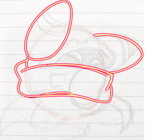
then i usually add the cape and hood together. where and how these are placed and what these look like in general are very important because they're the main area that perspective is directed to (the ears and everything else is important too ofc!! but the hood and cape usually help demonstrate where he is looking and how he is moving the most). then i add everything else, usually his hands last!
— LINEART
ohhhhhh god my worst enemy. Hope youre sitting down because this will be embarrassing LMAO
lineart is easily what i struggle with most and is more often than not the most time consuming and grating step for me. If i had a choice i would drop it in a heartbeat, but my style is so dependent on thick lines and shapes that it's difficult to 😭 a hole i dug myself into unfortunately ITS FINE THOUGH. ANYWAYS I'm getting sidetracked
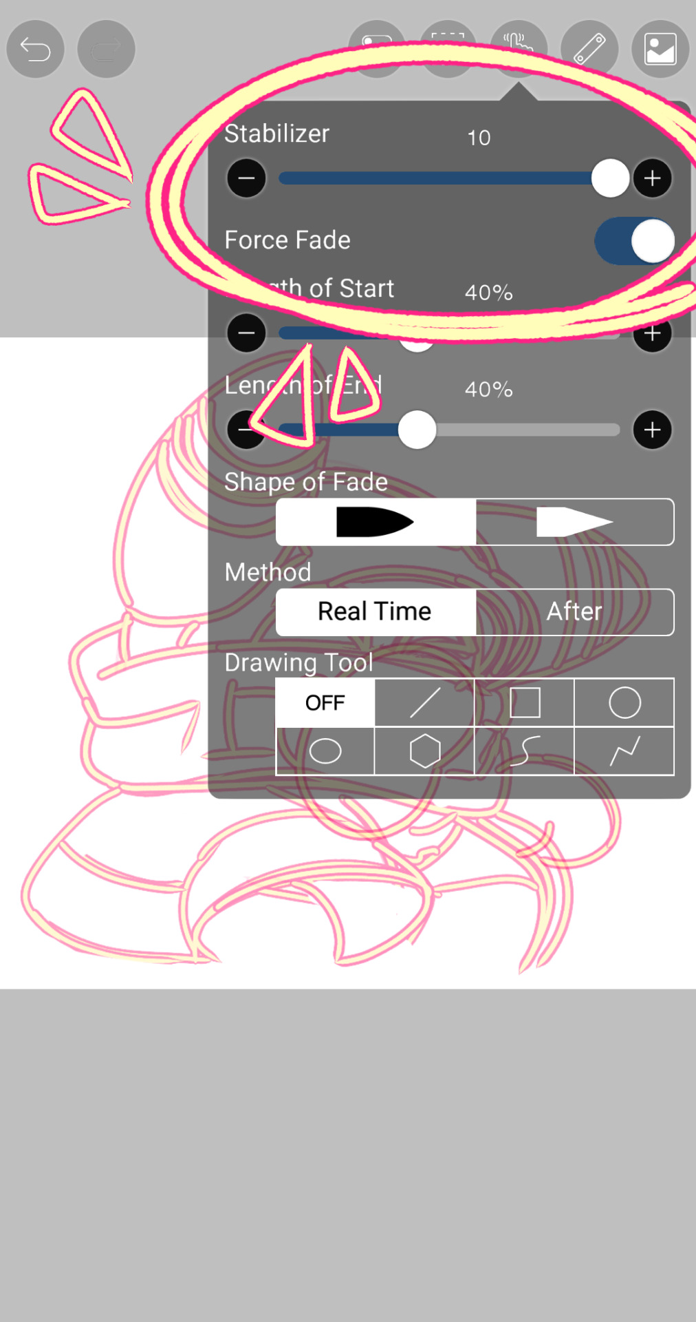
i use my finger to draw all my digital art, which means i usually have to use a Heavy stabilizer to avoid shakiness and staggered lines. Unfortunately ibis paint's stabilizer is actually dog water and doesn't even stabilize more than half the time (in which case i have to repeat lines over. And over. And over again until i get it right) but when it does like me and works properly it's very helpful!
i always use the soft school pen bleed brush as my main tool for lineart. This brush has been my best friend for everything, i even use it for sketching idk it just really like the way it looks lol. sometimes i change the aspect if i want the lines to look more ,, chalky?? or smoother depending on the work

i don't really use this tool much but for this specific piece, force fade was my partner in crime
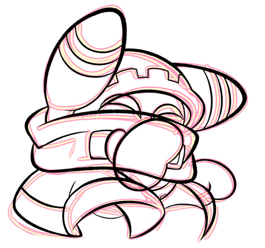
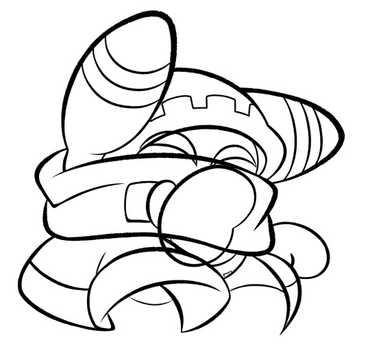
also i think i need to mention that i use so many layers for this. So many layers lol like to the point it's embarrassing. and at the end i merge most of them (except for the gear patterns, rings on his ear, and eyes + hands, which usually need to be by themselves as they're colored separately) Thank you for layers
and i end up with this!
— COLORING && SHADING
yippee yahoo the fun part !!! the part that i love the most
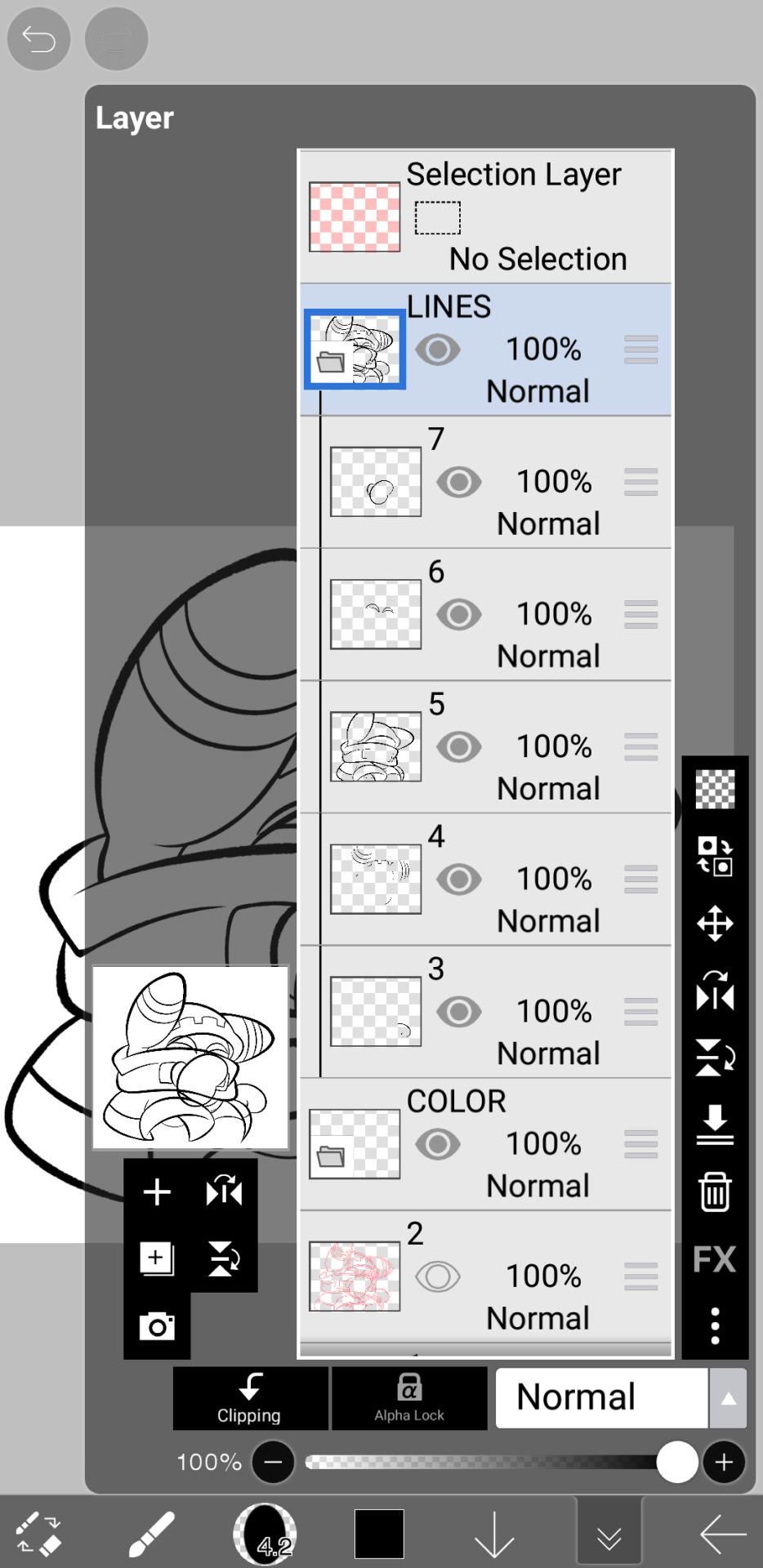
at this point, if i havent already, i always create a folder for convenience in organization because this is the part that i stress the most about what details are on which layers lmao
then i add ANOTHER layer below that for the color, then i put every single color used on their own separate layer!
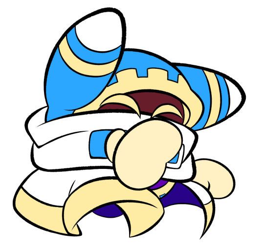
now, for shading, if im working on larger pieces with more complex shading, i'll usually plan it all out. normally when just drawing magolor, i don't really need to do this anymore because i'm so used to it lol, but for funsies i did it here anyways
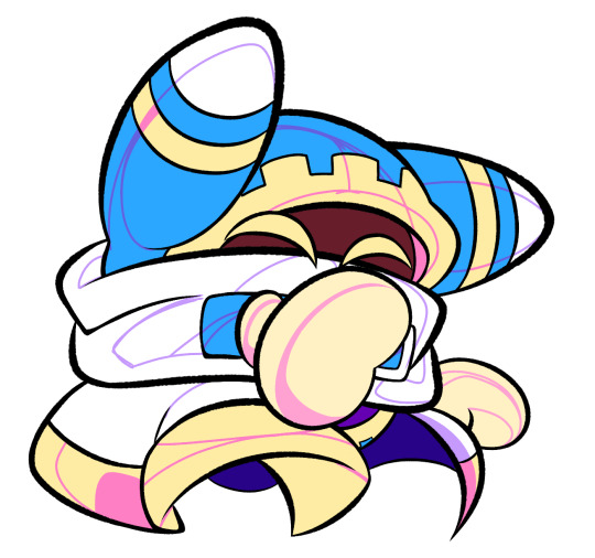
then i use the bucket tool to fill them all in
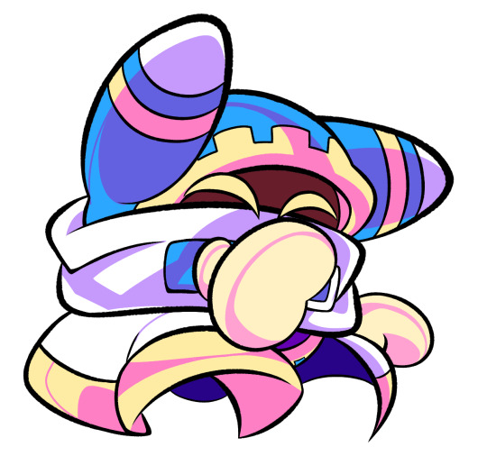
i usually have a set color palette for all the characters i draw (though the way i shade white differs. A lot between my work as you can probably tell fhdfgf). For every color, i have two specific tones that are associated with the shading. for example, indigo + violet are shaded with my blue, pink + light orange (or lighter pink depending on my mood lol) are shaded with yellow, etc.
so, i shade the other areas with the 2nd shading color
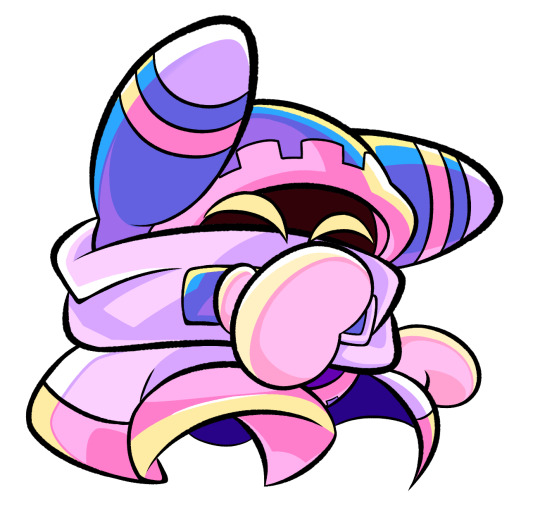
a big tip i can give for coloring is to look at a color wheel when you draw. i know that sounds like. Such basic advice LMAO but that seriously was a huge help for me when developing my shading and something i learned while studying — if you notice, in all of the shading in my work, all of the colors used are analogous on the color wheel. note that not ALL combinations will work together like others obv !! but it's a huge step in knowing where to go with it
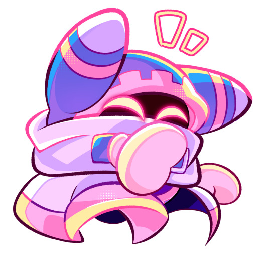
then i add other extra details like extra lighting, halftones (if i feel like it // if it fits the work), glow to his eyes, and color the lines and ta-da!
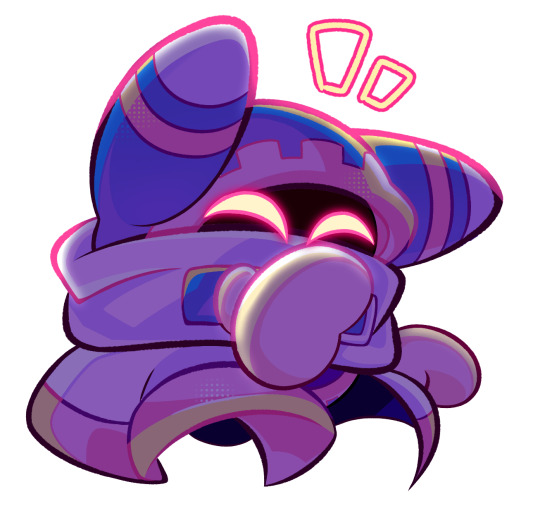
another tool i use a lot especially with my more recent art are blending modes, especially multiply. i use a clipping layer to add a dark color (usually a dark blue or purple) and set it to multiply, then erase the areas that emit light

and this is the end result! this is a very very basic demonstration of it fhdjg i was a pretty messy with the lighting and erasing in this example but you get the general idea right
and that's how i draw :) i hope this was helpful, and thanks for asking and being so patient with the response!
#ask#magolor#kirby#macdraws#ive wanted to make a tutorial for So long and finally found a bit of time to do it lmao
142 notes
·
View notes
Note
Could you explain why idolomantises’s designs fall flat like vivs designs? Just wondering because I love hearing anything character design related lmfao
Oh me too! I could talk about character designs all day!
I think while having very different styles, idolomantises and viviziepop’s designs both suffer from characters who don’t communicate what the character is or reflect the given world building (sometimes they’d just don’t fit at all?)
Vivziepop overcompensates this by having characters with ridiculous amounts of details that usually muddys whatever the concept is, not helped by her preference for thin body types and colour scheme of “red, red and MORE RED”
idolomantises meanwhile just, goes with the most obvious and generic direction without considering any visual symbolism that one can do with more finer details, or if there is detail it doesn’t actually add anything
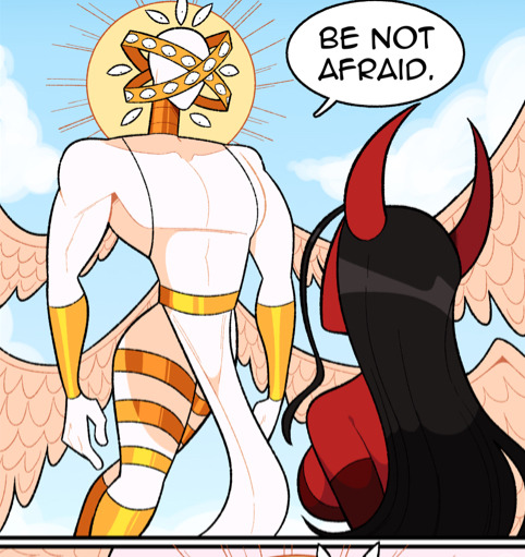
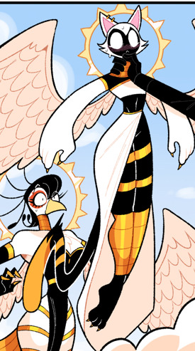

Sera and the angels are a good starting point here in that Sera is the one with the most obvious Angel design with rings floating (I personally think the bird and cat look more Egyptian than anything else, though that’s not an actual design issue here)
Now I will say having Sera’s eyes being in her rings while her actual face is blank is clever but besides that? They’re all just wearing very thigh revealing dresses/robes with random golden bands , the ones on their thighs has got to be painful. Sera has the worst in that her skin and clothing are the same shade of white , so her skin just blends into her outfit
Which seems very conflicting with the fact that 1) Angels/Heaven’s views are so very anti sex that they place kissing and cuddling next to kink acts

And 2) Sera is so awkward and inexperienced with sex as a concept that Lili , her wife, laughs at her for being awkward about kissing her (I also do not like Lili but I’m sticking with design criticisms for now)
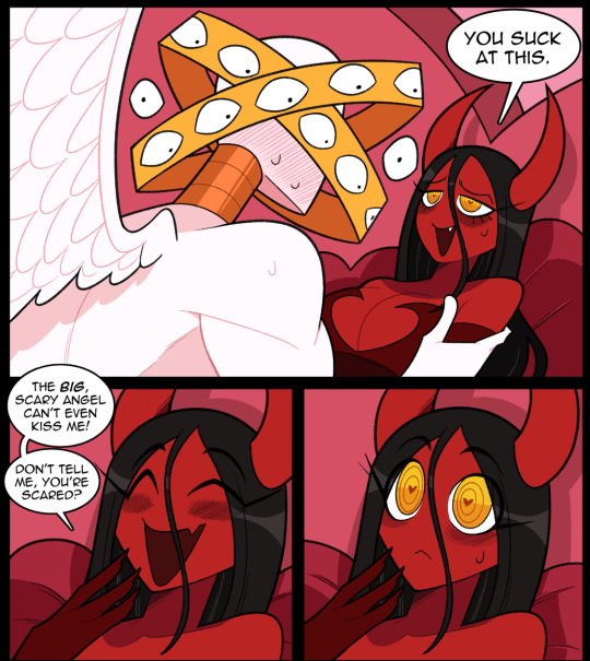
“Skin tight , flowy and thigh revealing robe with thigh bracelets” does not at all communicate that about Sera’s character or her environment. I don’t think you have to dress the angels as nuns to properly communicate their anti sex views, and a little fan service isn’t entirely wrong either . I think one could easily write out the conflicting thigh lore with an excuse that angels don’t see the naked body as sinful, and thus only a sinful pervert would think exposed thighs was sexual! But from what I’ve seen that isn’t the direction idolomantises is doing

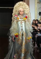

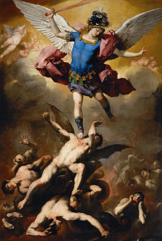
But taking inspiration from both classical paintings and modern fashion, there was more that can be done with Sera and other angels besides “put a chalk white character who is very awkward with sex in a chalk white robe that high lights her thighs!”
Giving the angels revealing designs also makes the contrast between heaven and hell weaker as both angels and demons end up having similar design elements wow that sounds kinda familiar
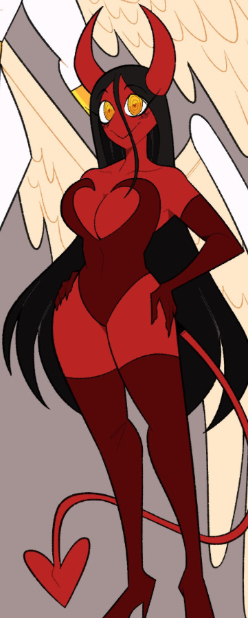
Ignoring my own personal feelings about her, Lili’s a decent design in that you look at her and immediately go “ah yes, sexy demon lady”, she is straight to the point
maybe too straight to the point
See, Lili’s design isn’t an issue until you compare her to how idolomantises draws environments in hell and how he designs other demons
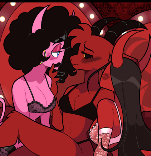
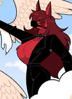

You know , for someone who’s well know to be critical of Vivziepop, you’d think he realise how much he is also guilty of over using red
”well , demons are from hell what did you expect?”
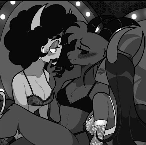

Idk, maybe some better values?
Oh, notice how the pink demon actually sticks out more than the main character?
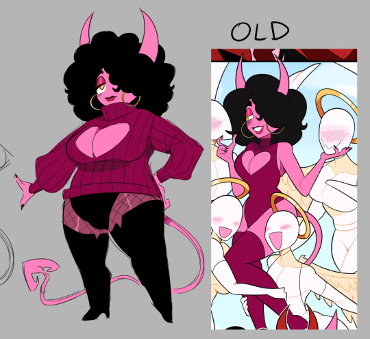
I unironically prefer Mara over Lili and it’s weird she (or least her pink design/palette) wasn’t (used for) the main character considering her pinkness and Sera’s white and gold palette make the lesbian flag

Which is literally the logo of the comic these characters are from
24 notes
·
View notes
Note
how clean are you colors before you merge them into the lines for painting? because i cant seem to find a balance between "my god i need to do this whole thing from scratch (too sloppy)" and "well whats the point of painting here (nothing left to paint if i merged the lineart)". sorry if this doesnt make any sense idk how to word myself better sometimes
I think I get you! Honestly I have a kind of threshold I reach where I know that I’ve done all that I can on separate layers and if I were to keep them separate, I’d just be creating more hassle for myself/forced to select layers and keep everything properly organised and it becomes a drag when I’d just rather be painting. And this is usually because I want to take advantage of the mixing effect of Sai’s paintbrush tool to start blending stuff. Also all my colours are on one layer anyway from the beginning (if I need especially ‘clean’ colours I might have a layer for them but I always merge them to the main colour layer before continuing). (also sorry I am away from my pc for a bit so I can’t show you actual Sai screenshots.. you will have to imagine). I ended up writing out the whole process in a way which is probably unhelpful
So for a painting like that one in the last post, I do my lines. Then I close the lines with a separate layer in the same folder (because the lineart looks better with gaps, but i fill colour by selecting outside the lineart while the folder is active, inverting selection, and paint bucket tool. Then delete the layer that closes the lineart). Base colour is usually the most common one in the palette. When I plan to merge the lines I usually make them solid/normal layer mode and colour the lines exactly to match the colours beneath, which is tedious but helps avoid the kind of translucent look lines on multiply layer give. But for that one the lines are on multiply. I lock the colour layer and paint in the other colours - different markings, materials, etc. It can be pretty rough because I know I can just paint over a wonky looking edge, but not so rough that I will have to go over it excessively later. Then with the lines and colours still on 2 separate layers, I put them both in a folder and clip a multiply layer onto that for cast shadows. Paint in cast shadows (again, it’s pretty rough, I know I will be merging & touching up everything at the end so it doesn’t have to be perfect. I hate multiply as a way to shade but I wanted shadows fast, again like I said it was a sketch I over-rendered I didn’t plan to polish it up so much. Normally I choose shadow colours and paint them like normal in the colour layer).
Then I merged the folder and the multiply layer into one layer (i usually make a copy of the lineart to keep it intact, just in case, and keep it hidden in the psd file). I make a new layer and paint in details that need to be sharp - usually around the eyes and face, where there is a focal point. This is because the default paintbrush in Sai has a slight mixing effect, and if I went in on the same layer it would not be as sharp. I use this new layer to paint in areas that need this sharp contrast and clean, tapered lines - like the stray hair and fluffy bits. Then merge all. Now I paint over the main layer all the things that don’t need that sharp treatment, this time taking advantage of the slight mixing effect of Sai’s paintbrush - I like this effect a lot and it’s what I use to blend the lineart into the colours, you can kind of ‘pull’ the lines out a little into the surrounding colour to make them less stark. Then I clip a new multiply layer to it, all one shade, to dim the entire painting so that the stark white highlights stand out more, clip a new layer on that, do the white highlights, merge all and bam it’s done
79 notes
·
View notes
Text

idk if this should still be labelled as a leak since mhy decided to change his entire design for 4.4 cny/lantern rite event
i first saw this leak before fontaine was even released and i immediately fell in love with lion boy's design, he is based on the mascot for the lion dance, a traditional chinese dance mostly performed on cny and for important personal events like weddings, company openings, etc. to bring in good luck and fortune.
i definitely did not expect them to completely change the design tho

i personally don't like that one random orange strand on his fringe lmfao (his hoodie is so cute tho!!!), i love his first design the best, but the recent leak for the lantern rite event banner which reveals his potentially finalized design disappointed me a lot.
i've never seen a white and blue lion irl, i've always seen either red and orange lions and since they're much more common, it might be why mhy decided to change his colour palette. another that i just realized after mopping around was that they decided to not use white is because it's associated with death and mourning in chinese culture (in opposition to black in the west).
but even so, they could've just changed the colours and not touched his design, now he just looks so basic and lacks the features of a lion mascot unlike the previous two designs ;-;
perfectly understand that these are merely concept arts and are highly likely to change, but as someone who had been waiting so long for him, you can't expect me to not cry over it hahaha
its kinda like the fanart heizou almost two years ago ig, tho most of us are aware that it was a fanart so its different but similar
oh well, looks like i won't be using him, and maybe i can use his first design as a ref for an oc hahaha
edit: i've calmed down a bit sksksk, anyways i saw that there's people who actually prefer his finalised design (which is shocking to me, maybe they're not chinese so they didn't understand)! half a year ago, when i first saw him, i was extremely grateful to mhy for making another culture-ly important character after yunjin who i still love and use for my ayato. while it's hard to tell from the lantern rite leak, bro def didn't have the lion ears anymore and his attire doesn't have any lion design so def a big fat F. idk how to articulate my feelings properly via words (even worse in eng), but i just gotta accept the fact that mhy scrapped an amazing design.
10 notes
·
View notes
Text
Thoughts/wonderings on Dragon Age: The Missing #1, under a cut due to spoilers for The Missing:
Thoughts on the first few pages can already be found here (spoiler warning for subsequent issues of The Missing at link), as they came out via preview beforehand. I'm glad Evka and Antoine made it out alive =)
"It's up to us, and only us, to find Solas" idk that was just a raw metal line. I'm ready to try (ง'̀-'́)ง
flashback scene! love a good flashback scene. that's the Hanged Man, right? I like the choice of different lightings and different color palettes for the flashback scenes vs the present, it helps distinguish them from one another and convey they take place at different times.
Charter has a new hairstyle, I guess indicating time has passed since the end of Trespasser. I like it but I'm not sure about the design choice for the way her ears have been depicted. I wonder, does this scene take place before or after her encounter with Solas in TN? I feel like we'll meet Charter again in DA:D.
Varric literally looks like '(╥﹏╥)' lmao he's so done.
tfw "The Inquisitor"

"there's no one I or the Inquisitor trust more than you" that's present tense, right? 👁️ so they're still called that old title, even now
lmao Varric keep it down man. random drunk people can hear you, never mind Solas spies and Solas agents. I feel like in two different panels the same background bar patron is listening in
Harding's scouting skills must be super amazing
In the "You know that's a terrible idea"/"But Harding sees the best in people" panels Varric is basically doing a grumpy 'but she is too good and pure for this world, precious cinnamon roll'. and he's really not pulling punches when talking about Solas is he (he's voicing things my Inquisitor would think incidentally..) like my wondering from the earlier pages (link above), this dialogue again makes me feel like Varric is kinda a reflection of the Stop Solas choice in contrast to Harding as a reflection of the Redeem Solas choice
"The Dread Wolf, who broke the world" is another metal line. "broke the world" is interesting, like.. the world healed, but into a fucked up state (e.g. Blight, elven oppression, all the stuff Solas woke up to). some people think he's doing to destroy the world to bring back the old one, but in some ways it's more like how there are procedures where to realign things and allow them to heal properly, healthily, medical professionals will re-break bones.
I wonder again if the Inquisition remnants have tried to come up with a countermeasure to the turning people to stone power? it seems like a big obstacle, yknow?
this sounds like it'll be Varric's role in DA:D, right? The person who puts together the new Team. Varnick Fury? he recruits us? maybe the various characters Varric and Harding meet in this comic series (Evka and Antoine, Teia and Viago [?], The 2 Veil Jumpers etc) are part of the wider team in DA:D, contacts, folks we meet?
"We both know what's at stake if you don't" find a way. aaaaa
oh I like Harding's cloak thing with the.. cloak-tassel-belt things. reminds me of Morrigan's belt-skirt
Evka is badass
"there's no one I or the Inquisitor trust more than you" that's present tense, right? 👁️ so they're still called that old title, even now
lmao Varric keep it down man. random drunk people can hear you, never mind Solas spies and Solas agents. I feel like in two different panels the same background bar patron is listening in
Harding's scouting skills must be super amazing
In the "You know that's a terrible idea"/"But Harding sees the best in people" panels Varric is basically doing a grumpy 'but she is too good and pure for this world, precious cinnamon roll'. and he's really not pulling punches when talking about Solas is he (he's voicing things my Inquisitor would think incidentally..) like my wondering from the earlier pages (link above), this dialogue again makes me feel like Varric is kinda a reflection of the Stop Solas choice in contrast to Harding as a reflection of the Redeem Solas choice
"The Dread Wolf, who broke the world" is another metal line. "broke the world" is interesting, like.. the world healed, but into a fucked up state (e.g. Blight, elven oppression, all the stuff Solas woke up to). we wonder about Solas going to destroy the world in order to bring back the old one, but in some ways it's maybe more like how there are medical procedures where to realign things and allow them to heal properly, healthily, medical professionals will re-break bones. like that has to be done to allow it to heal right.
I wonder again if the Inquisition remnants have tried to come up with a countermeasure to the turning people to stone power? it seems like a big obstacle, yknow?
this sounds like it'll be Varric's role in DA:D, right? The person who puts together the new Team, but not a companion per se. so... Varnick Fury? he recruits us? maybe the various characters Varric and Harding meet in this comic series (Evka and Antoine, Teia and Viago [?], The 2 Veil Jumpers etc) are part of the wider team in DA:D, contacts, folks we meet?
"We both know what's at stake if you don't" find a way. aaaaa
oh I like Harding's cloak thing with the.. cloak-tassel-belt things. reminds me of Morrigan's belt-skirt
Evka is badass
Is the Varric&Harding meeting flashback taking place in Skyhold or Kirkwall? the town around it in later panels makes me think Kirkwall. Varric looks kinda soft seeing Harding. that's nice, their dynamic there is nice. and I'm glad to hear Varric is being such a good Viscount and continuing to rebuild Kirkwall :')
Varric is going gray dfesfesffe. Solas Stress has kicked off his ascent (or descent, from his portrayal in this comic lmao) into silver fox territory. that and 'heavy is the head that wears the crown' I guess
Harding is so good :')
hm hm I think the bright sun in the sky, prominent and looming, harshly bright, in this panel, is interesting.. there's all the stuff about spheres, an eclipse, two worlds.. the sun/sphere motif is here on both pages as well in this comic alone for example
with Harding on the cover of the next issue, and the mention of her mother here, I wonder if we'll get to learn a bit more about Harding's backstory. maybe her mom is ailing? (Varric and Harding almost seem to be touching in this panel.) does "you've got more to lose" mean 'your mom would be really sad if you didn't come back from this mission, think twice about it' or 'something would mysteriously befall your mom if you went on this mission, think twice about it'? 🤔 either way its nice that he's trying to look out for her.
Varric taking off the Viscount crown is his equivalent of Ash Ketchum turning his baseball cap backwards
the Inquisition remnants are genuinely worried that Solas' plans will result in mass death
how credible is Harding's lead? how did she find it? I wonder if it's a false lead Solas or the Venatori planted?
eyeball
hmm is it really just the Deep Stalkers and/or the ogre that have been taking people tho?
Wardens Evka and Antoine didn't sense the ogre coming? is the ogre holding a severed limb as a sort of club? the ogre splash page is cool. also lmaooo... varric's face. Harding grim, Antoine in pain, Evka fierce, Varric simply dying a little more inside


a Let Varric Retire / 'Not This Shit Again' moodboard
lmao the ogre literally just yeets him across the room like a sack of fucking potatoes . hasn't he suffered enough . hes just sailing depressedly thru the air like

the ogre's red eyes.. seem kinda glowy almost.. a stylistic choice in the comic because Scary Threat/Monster, or a hint at the red lyrium darkspawn stuff..?
Antoine.. pls
poor Harding
"What I wouldn't give for someone to look out for me like that" Varric you wound me, Hawke would/does (ಥ◡ಥ) I'm going to pretend that I didn't hear that and console myself by reminding myself that it's a default kinda worldstate/not my canon etc
aah, the thing's choice of weapon. so it was indeed a severed limb of some description
so they just come upon a possible former hideout of Solas' just like that, and a note advising where he's going next is the main thing left out in the open in plain view on the table? seems sus. more like he let them find the hideout and left the invitation there for them to see right? and how do they know it was Solas who was here recently? are the papers on the walls some kind of protective enchantments to keep darkspawn away (an ogre could break down a wooden door easily) or part of the research whoever was using this room was conducting? protective enchantments mayhaps, and that's what Varric means with "magical crap" in one of the next panels?
hiding close to darkspawn is smart at least, people wouldn't expect someone to do it and it would help keep wandering or prying eyes away. between them in these panels Varric and Harding hammer home the "oh how weird and surprising" that Solas is staying close to darkspawn almost four times, its almost lampshadey.. maybe he was researching the Blight (more specifically about its origins/how to stop it probably or something).
I kinda feel that it's a kind of a big deal that someone knows how to keep darkspawn and Blight away to this extent using magic
how do they know he left recently and in a hurry? hh, of course solas is up to something. the invitation is all they took? they didnt ransack the drawers, books on the desk, books in the bookcase? or take a closer look at the papers on the wall? I feel like potentially these could have contained a few more clues on whatever magic or other thing the occupant of the room has recently been studying or researching. I'd wanna bring everything that I could carry personally.
I know it's so we the readers can read the note, but seeing written English in Thedas gave me minor whiplash
also I know he probably didnt but the mental image of Solas living in that tiny room in the Deep Roads in hiding for weeks/months/[?]years is kinda funny
Antoine is simply... Evka's babygirl. overall Antoine and Evka didn't do much in the issue, which is a shame.
Harding's dialogue and framing randomly seems sus in the "What? Oh yes. Of course panel" hh

So the person trailing them is revealed to be Venatori. I guess they killed the deepstalker to keep it off Varric and Harding's backs so they would lead them to the hideout, or so they could hear what they were talking about without interruption. I wonder what is their interest in finding out more about Solas/the search for Solas? curious. also at this point I'm definitely feeling that Harding will be a companion in DA:D.
overall not a lot happened in this issue which isn't a big surprise as a] only a few pages in length and b] it's catching us up on what's been happening between Trespasser and now at the same time as explaining about the quest Varric and Harding are on, showing that quest unfolding in the present and generally setting everything up for going forward. I feel like more of note will happen in the next issues, especially issue 3. this was a prologue :)
what will happen in Vyrantium? find out next time on Dragon Ball Z :D
#dragon age#dragon age: the missing#bioware#video games#dragon age: the missing spoilers#solas#long post#longpost#gpoy#dragon age: dreadwolf#dragon age 4#the dread wolf rises#da4#gryff lavellan#lul#logan hawke#morrigan#queen of my heart#super late w/ this post ik.#been so busy (new job!) Then there was leaks etc
40 notes
·
View notes
Note
dramatically slides into frame
ahaaa hi its me again the lil nerd who analyzes ur art a tad bit too much
soooo i just wanted to say (and add onto my last ask) that i love how like, shape-y all your art is.... OHHH AND AND AND your comics too!! they r so well formated and EXTREMELY easy to read and understand and i LOOOOVE IT!!! the shapes the style, all the colors just... being so well with each other... like like in ur current active comic ab leo n mindscape stuffies, the colors or soosos pretty!! AND AND IDK HOW TO DESCRIBE IT BUT THEEE THE WHEN THE LIL MINDSCAPE DRESS LEO DOES THAT "ZIPPPPP" (or was it a different word..?-) THINGY, i love how the colors of that POP OUTT!! ITS SO LIKE, it kind of reminds me of something being suddenly disturbed, almost likeee like a ripple in a pond? or a sudden wind throwing it'self against a tree?? IDK HOW TO PROPERLY DESCRIBE IT BUT ITS SO !!!!!! YES!!!!! anyway nerd moment over (for now) hshfgh sorry </333
awww thaTS SO SWEEETT AGUADSDGH. i try, but tbh i still think i have a ways to go when it comes to choosing color palettes for my comics :')
and im just using my accumulated knowledge of techniques comic artists employ to make reading easier, but im glad its paying off haha.
i was going for a kind of "ripping a tear through space" vibe so a ripple in a pond is basically right. like the surface of the mindscape has been disturbed.
15 notes
·
View notes
Text
new oc ref :33
meet ruby! The goddess of wisdom :3


I think she turned out so cuteee!!!
and if ur wondering about the spots and stuff on the lineart I dooe on my computer with the page marker extension while I am supposed to be doing work lol and I just started putting dots of similar colors on the lines Because you can’t swab the color or whatever it’s called so I just had to guess and it made the mistakes look like on they were on purpose and I think it looks really neat so I may use it more in my finished art Idk tho
also the text box system in medibang is SO BAD so here’s me ranting about it under the cut
ong it actually sucks because you can’t do the thing where u like decide the length of it so it goes off the canvas and so you have to type the enters urself??? like wtf also because of how it is you can’t see the text as you’re typing it so you don’t know how long it’s gonna be with the text size and aaaargh it’s so annoying I can type anything properly also doesn’t have a color palette system or anything so you have to get the hex code of the color and copy and paste it into the text thing to get the text to be that color and it’s like so annoying to do that when you could just do the color palette thing like AAAAAA WTF and also I didn’t really look at it but I feel like there’s way less fonts to choose from idk tho that might just be me but the phones I did see were super similar to each other so yeah
anyway that’s the end of my rant, thanks for coming to my Ted Talk. Have a wonderful day.
#lol#cute art#digital art#my art#:3#artists on tumblr#digital artist#oc artist#ocs#original character#oc#oc art#my ocs#oc artwork#dragon oc#dragon art#goddess#pink#art#artwork#art tag#drawings#illustration#art style#neat#sorry i ranted lol#rant post#rant#ranting#art rant
3 notes
·
View notes
Text
youtube
I love Mera.
She never fails on a video essay of dissecting the obvious and sounding like a poet blessed by the muses while doing it. And she makes me think, which I find harder and harder to find in youtube videos (...or maybe my class of youtube videos has become stale and needs to be revitalized, idk)
This video in particular, did a brilliant job of laying out Itzy’s image as it’s given to us through it’s music videos, and called me out as writer by showing why we see the members in a certain way due to their music video coding. But more than being stunned that the characters I draw from them to write about, it validated and inspired me, and gave me direction for the personas I had created from their coding palette. It felt like a library archive, some secret wisdom I had stumbled on as a fanfic writer...
Now. I don’t often stand to disagree with Mera. She’s brilliant at what she does, and I am learning from her every time I watch her videos. She’s much wiser and more educated than I, and it feels like an honor to sit at her feet and listen to her speak.
...but I feel the need to be in defense of Cheshire.
The core of Mera’s video had been member coding. She took the cinematography and laid out how it presented each member-- a brilliance in the way that Itzy’s core of different and unique and self-confidence stemmed from individuality, and tangibly allowing the audience to feel that with each member. From the costuming, to the camera angles; from the sets to the storylines. The status quo can be rejected, and it doesn’t have to look the same; Ryujin the in-your-face, anti-authoritarian punk; Lia the queen bee, glittering high class in playfulness; Yeji and her feline maturity, aloof and unaffected; Chaeryeong with introverted confidence, girl-next-door, the quiet but no less strong (I... might’ve gotten emotional during this section); Yuna the teenage hero, pop-star-by-night, bubbly, comfortable-in-her-own-skin persona. If I started thinking too hard, I started wondering--
https://twitter.com/redpiper3/status/1610070731932553220?s=20&t=2N_36_XfCJ3X9zGrldQacw
But that’s besides the point.
After Mera properly dissected and laid plain the coding Itzy had debuted with, she laid plain the tracking of this coding through her eras: the debut trilogy cementing their image and personalities as individuals, being vital to their identity as a girl group; the costume era struggling at first and at the tail end, but experimenting with it in new lights, and finding a brilliant visual playground in MITM; and then the shortcomings of the newest era, which floundered in Sneakers, done right in Boys Like You, and seems to break coding in Cheshire, allowing them to seemingly evolve as a group, and take a new direction.
Now, I will not say Sneakers was anything short of a Mess. I remember being glamoured by the costuming and ideas for sets, and then watching on twitter as everyone tried to pin down what exactly JYPe was doing-- a historical concept? Tracking strong independence through the ages and... ending on a sneakers commerical? Was this a branding deal gone bad that they had to rescue?
It feels, after seeing the Cheshire album come out, that something unexpected happened after the ten months of preparation. Their japanese titles were nothing short of brilliant (chef’s kiss at Voltage and Blahx3) but the Checkmate and Cheshire albums were... haphazardly done in planning. I have my suspicions about them feeling like they were supposed to be a full album together... Sneakers would have been a brilliant promoted b-side next to Cheshire: a bright summer song for the group while still maintaining their growth and maturation with Cheshire. Further, their promotional styling being similar before the album release... is suspicious. I have a sneaking suspicion that making Mama 2022 their comeback stage, and having a single release of Boys Like You that played in a different genre and soundscape probably influenced the Checkmate release to be what it was. They needed something before they went on tour, and the Checkmate album-- minus a few gold tracks-- gave them plenty to work with, and prepped the audience enough for Boys Like You. Mera compares Boys Like You to Blackpink’s release of Ice Cream, for trying a different color and taste with the freedom of a western release, and it’s almost for that reason I think the company might have pre-emptively struck with Sneakers-- I’m not into Blackpink and their fanbase, but I think I remember the general reaction of the public being confusion and rejection of Ice Cream due to the strong ongoing themes the group had. And if Sneakers is nothing else, it’s a play with the public.
Now, I am also going to assume that budgeting works like this-- Sneakers had expensive and shiny sets, and Mama pulled certain budgeting, and between time and money between a world tour and preparing for year end stages, the filming of Cheshire was just between a rock and a hard place. I... am probably wrong, but that’s the kindest assumption I can give to the company :)
So with all that in mind-- Cheshire.
youtube
Mera noted in her video that Cheshire leaned more into the flashy editing and the concept of “true or fake?” and group styling similarities more than their general member specific coding and the usual showing, not telling, of individuality. She thought the group is maturing, evolving, and doing away with their original debut codes to do it, seemingly meshing with the rest of 4th gen girl groups, but still standing out because they’re Itzy, and everyone knows them, and they’re on top of the generation anyway-- all of which I can agree with.
Something could be said about the company sending out feelers whenever they feel their girl groups are getting stagnant in concepts and want to try and mature them... something could be said. We won’t say it here.
I might have been a little too much in love with Cheshire. This is my sin-- the vocal maturity and the subtlties of it, the playing into each members’ vocal strengths, it all just makes me very happy and excited for the group as a whole and where they’re headed.
And I can’t stop listening to the song. And watching the video-- first time through I felt... underwhelmed? And not I catch something new everytime I watch it, it truly a testament to subtlety and blink-and-you’ll-miss it messaging. The members don’t seem to own any place of their own, interrupting each others’ sequences and shots, until you watch through and follow each thread.
But when it comes to member specific coding, Cheshire seems to take what we know and play deep into it’s roots, and seemingly turn everything on it’s head as it projects us into the future of this group as it matures. Let’s go member by member, and each “cheshire cat” as they present themselves:
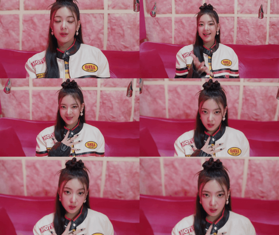
In our game show of discerning lies from reality, Lia has her little corner of comfort, like the princess she is. She’s playing with practical illusions, things that can only be see properly from the correct angle, and she’s playing with facial expressions that make it hard to pin down what her intentions are or how she’s looking at us. There’s something cynical and mean about her from her first scene... darts fall into her set and we’re brought to Yeji’s set.
Later, a piano drops and shatters in the middle of her set (another non-CGI effect) where she tells us she’ll give us a hint and she’s interrupted by MC Yuna, who’s telling us to watch closely.
We move past the game show into the world of the cheshires-- Lia’s is surpringly calm next to some of the other members, giving a disinterested vibe through a computer shot.
But the important scenes are the ones we end on, where we revisit the members in their initial solo sets, and Lia is lying on the couch, everything a mess around her, and we dive into her mind through her ear. There’s rubble falling on top-- this is right before the piano had dropped. It seems like it’s going to drop right on top of her!... except we know from the earlier scene-- she isn’t there. Her final set shot is the piano destroyed at her feet, and her looking up from where we’ve been watching.
It’s just a trick. Lia’s played with us.

Yeji has one of the more key roles in the plot of the music video, and unlike loco, they aren’t using the grand sets and obvious styling to scream CAT! CAT GIRL! CAT WOMAN! in our faces.
They use the more subtle web-plucking.
She’s introduced top down on Lia’s set, and she’s throwing darts at a dart board, in a cute little set-up that spells out YOU. She’s hard to pin down, and she’s playing with the audience the entire time. She steps into the middle of Yuna’s curtains pulled back to peek into Chaeryeong’s scene, she’s popping on all sides of the frame in the office scene, and she’s the one who pulls the plug of this operation when the illusion goes way over our heads. You could even say she’s the top down shots looking at Lia-- maybe she dropped the piano herself.
Yeji’s running this operation.
Out of all the girls, she’s the one who’s directly looking into the character, directly taunting the viewer, deciding when they’ve gone too far into the illusion, when they haven’t looked close enough at one of the girls’ sets, and takes the final bow when all the trickery is finished. She’s in front of the target, twiddling the dart like she could do this all night. She’s the final playful shot before the cat tail teases us, and she’s pulling all the strings.
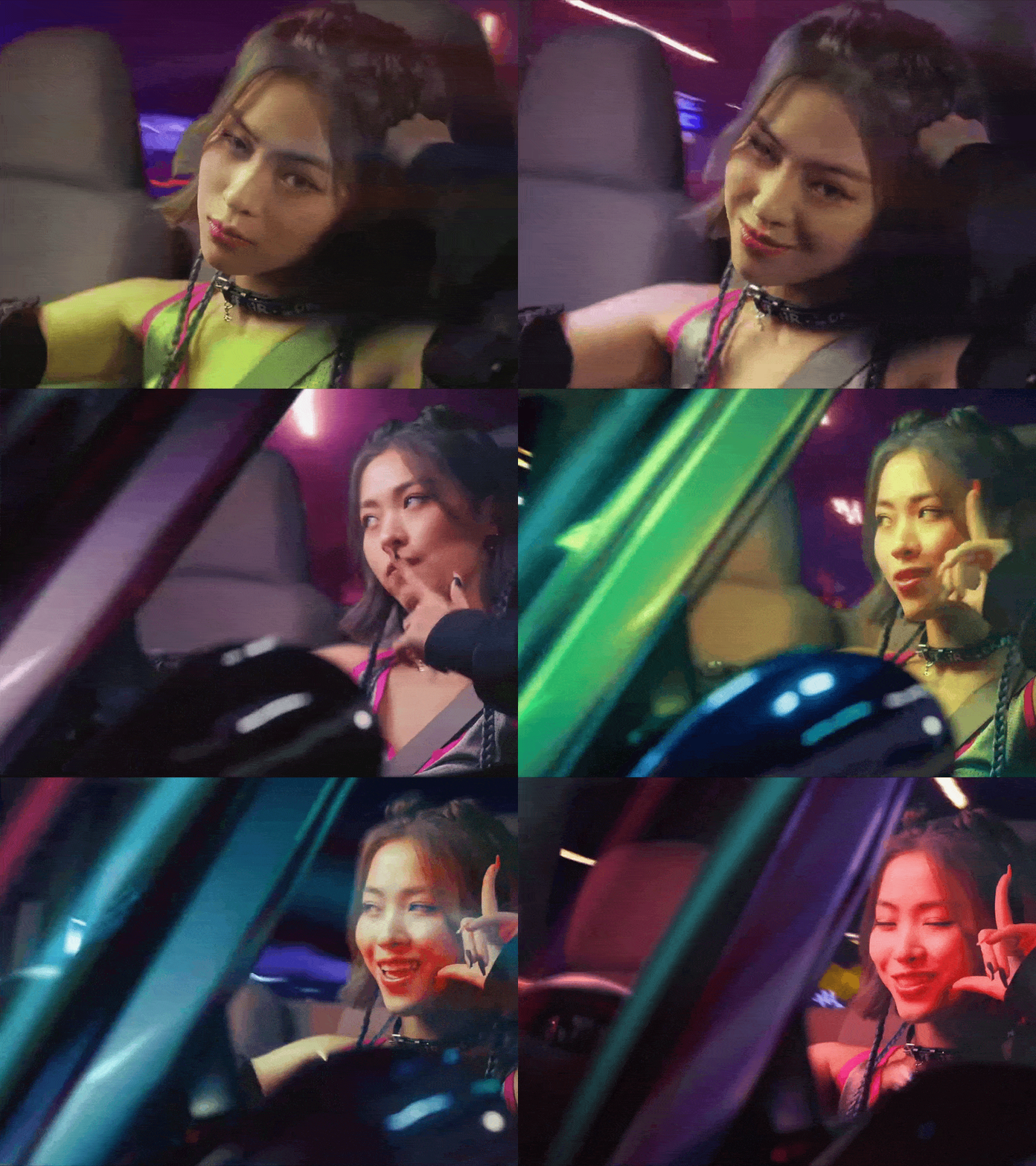
Ryujin’s speeding down the freeway in her truck, and nothing’s going to stop her.
...except she isn’t.
She’s the first one to tell us it’s not real, her car parked, stand-still in front of the set, as she rolls the windows up on us. Windows, it can be noted, that are covered in stickers. This car isn’t meant for driving at all, but Ryujin doesn’t care.
Ryujin is the cat that spoils the ending, the first to make us question everything. She’s the second computer screen, who deletes the background and shows us what’s fake and what isn’t in their MC group dance shot-- and it isn’t much! Only the question marks and arrows, that had been CGI-ed to confuse us on what was up and down, had been untrue. Everything else on set had been...
Then we get to her cheshire in the snow, and she’s not playing. She’s got an icy playfulness that’s asking “why so serious?” before Yeji pulls the plugs, and then she’s the one right in the middle of the gameshow, spinning the wheel and making us question every one of the initial solo sets. She knows, and she knows we don’t know. Her final shot is her sitting on top of her car, twirling her hair and smirking at us for trying so hard.
She’s taunting us. And she knows we’ll let her get away with it.

Yuna’s the hardest cheshire to pin down-- because she shows us her tricks right from the beginning.
She’s the one running the lights, switching us between the game show and the CGI transition to the cheshire snow world. She’s in front of the curtains, and we don’t know what her deal is, except for one unavoidable fact-- she’s moody. She’s either introducing the game show, or morose and haunting. We don’t know whether to be excited or scared at what’s about to happen, we don’t know whether being fooled should terrify us or enchant us.
And Yuna wants us to remain in that uncomfortable place of not knowing.
In her cheshire scene, she’s still playing with lights and shadows, and dancing like a teasing cat. It’s a little scary, but she tells us in this way “someone might find their path.”
When everyone is playing their final trick, she doesn’t offer us a smile, only throws her arm up to present the acts before stalking off and letting us figure it out for ourselves. There are no light switches, nothing to hide or seek, just what’s before our eyes that we still won’t be able to understand.
In her final scene, she laughs at us, but she’s not our friend. She’s almost looking down on us.
We’re not friends.

Chaeryeong probably lays it out as obviously as possible in her solo set.
She gets her own room, and not happy: she’s crying, doesn’t want to talk to us, and wants to lie in bed all day. Moving outwards, two members immediately clue us in to know that this isn’t true-- Yeji stands by the curtains pulled back, to show it’s only a set, and Yuna wears identical fake tears to Chaeryeong’s, only to pull them off and show that they’re fake. Chaeryeong even gives us a smile while she wears the fake tears.
Chaeryeong isn’t upset, we’ve just been manipulated into thinking she is.
As a cheshire, she’s the one who makes us see “true” and “fake” for what it is. She shows a cheery doll can really be something plain and ordinary we’ve been made to believe is something of comfort, and playing catch can seem like a bomb thrown in our face.
Exaggeration and lies.
She throws her bedsheet up to show she wasn’t even in the room in the first place-- the editing leaving her shadow walking out from behind the falling sheet to let the illusion properly register for us.
In her final scene, she’s having fun jumping on the bed and making a mess of the feathers and pillows, no tears on her face.
She was actually having fun with it all. On her own.
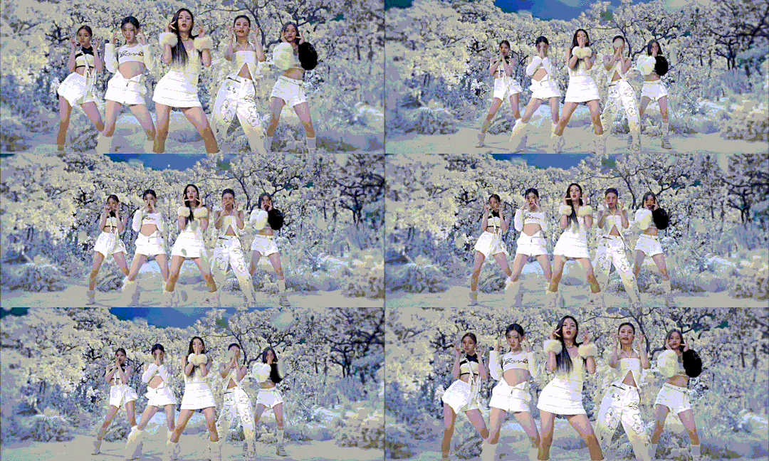
Now what does this all have to do with anything? I haven’t proven or disproven anything, I’ve just spelled out what we’ve seen. Let’s draw some parallels--
Lia: preppy and pretty and playful-- check, check, and check.
Yeji: in command and unaffected and mature -- check and check, and I’ll concede the maturity is a little muddled, but we’ll revisit that in a moment.
Ryujin: anti-authoritarian and punk -- well, you try driving anywhere with stickers all over your window. Or taking over a game show by driving your car right into the middle of it.
Chaeryeong: quiet, introverted but with an inner strength and self-confidence -- check, she certainly wasn’t trying to prove anything to us.
Yuna: teenage hero and bubbly and perfectly made for what she’s doing -- I don’t know if you’ve met a teenager, but they’re angsty as hell.
But she’s not quite the dalla dalla Yuna is she? In fact, scrolling back up, none of these are quite the coding of the girls we debuted with in the debut triology are they?
Now, here is where cinematographic coding and members’ personalities and company advertising could all blur, so I’ll only say this before we stay in the cinematography: I’d like to think JYP gives their groups as much freedom as Stray Kids gets, but you never know. But in a perfect world, Itzy played a hand in their own concept building, and their own very real individualities bled through to build their concept. But if it did or not, Dalla Dalla gave them sets and outfits, fit with colors... and then let them build the scene. The attitudes they brought, the way they commanded presence and attention? Music video building after that worked with the energy they brought to the screen. The confidence, the character, the individuality itself. And the girls have grown a lot in the industry and as individuals since then. These aren’t hot rookies with headlining reputations and everything to prove. These are women who’ve established themselves and been burned in their industry a couple of times.
Subtle maturity is a beautiful thing.
Yuna is still perfectly made for what she’s doing-- only it isn’t showing all of her bubbliness to you. (Side tangent: stop chasing my girl for every little thing she does. She can say “bless me” and cover Love Dive without being put up against impossible standards, alright?) Being in the industry is playing your character close to your chest, and Yuna is made to be an idol. She’s no longer a teenager, but she’s every young girl you know, and she’s impossible to be, and someone only to look up to with awe.
Ryujin is still the punk who sticks it in everyone’s faces, but now she’s got a driver’s license. She’s not playing your game, she’s making her own.
Yeji is still mama cat, she’s still cruella, and she’s still the icon of maturity, targeted for the older age group. But she doesn’t need to prove it anymore-- she’s the oldest who’s taking care of everyone, running the show, and she can have fun while she does it.
Chaeryeong is the girl-next-door, quietly confident in herself, and throwing the stereotype of what we think introverts are so much in our face, it’s almost as though she knows what we think, and has the confidence to rewrite that trope for everyone. (And I love her for it. Mera’s chapter on her in her video made me so emotional, we need to open the conversation about individuality and confidence and strength in the quieter people, and stop trampling over girls who don’t present the way we expect when we see powerful women.)
And Lia is still our princess. She’s got a more mischievious side that’s flaring more now than it did in Icy, but it’s there nonetheless.
The coding isn’t just in the styling, it’s in the subtleties of the members.
And it’s not the same as debut era, it’s growing.
Mera has another video I adore, where she praises Twice and their femininity. Twice as a group matures and their music evolves and tries to find where to go, but the feminine beauty of it remains the same at it’s core.
I think the same could be said of Itzy. Individuality was something they had to scream when they debuted, but now that they’ve told us who they are, and they settle into who they know they are, they show us the nuances and subtle beauties of individuality.
Individuality doesn’t pretend to be anything for anyone, it doesn’t have to play all it’s cards on the table and show who it really is, it’s full of joy in it’s maturity, and while it can be fully rebellious in it’s own rights, it can also be full of life from the comforts of home, where knowing who you are and being strong in that is enough.
#itzy cheshire#music analysis#mera#kpop essay#Red's thoughts#written for the intellects but namely me the intellect who's actually stupid#NOT AGAINST MERA AT ALL I love and respect her#Just wanted to essay my love and appreciation for all the work put into cheshire that I've been able to unravel
11 notes
·
View notes
Text
diona | rainy night

⇢ ˗ˏˋcharacters: diona, diluc [other mondstadt cast]
⇢ ˗ˏˋgenre: angst
⇢ ˗ˏˋ tw!: death of a parental figure; a long, long internal monologue regarding grief and failure; parental negligence; anger.
⇢ ˗ˏˋnote: this is not a ship fic pls don't turn it into smth weird. i wrote this awhile ago (like legit years ago) and i just found it, idk, it made me tear up a bit. when i wrote it i was wondering how diluc would be if he got to be a sort of father/big brother figure for dio.
about:
diona heard the news of draff's death. absentmindedly and unable to grieve properly, she finds herself going to the dawn winery in order to find answers.
↓ read under the cut ↓
When Allan pushed through the Cat's Tail door that night yelling and shaking with a nervous look on his face, Diona's ears stopped being capable of audition. Perhaps her heart registered what the young hunter was saying, because the hitting inside her ribs became stronger, until it was all she could feel. The bar fell silent. Nobody dared move. All the cats' hairs bristled and Margaret dropped a cup as she carefully glared at Diona, but the child did not notice the glass breaking.
Deep, deep down she knew it would happen some day. But... did it have to be today? Diona pressed her hands around the piece of rag she was holding as if her sanity depended on it. As if that insignificant slice of cloth was the only thing keeping her here. Heartbeat going louder and louder, like a desperate bomb. She couldn't blink, and she couldn't breathe.
Allan's words rumbled inside her skull like the faint whisper of a midnight breeze.
“Draff is dead.”
Draff is dead.
Daddy is dead.
────»»❀❀❀««────
Diona could not make sense of it still.
Two days had passed since Draff was wounded by a boar.
“He died of blood loss” she heard the people of the village saying. They would turn their faces when she passed in front of them, as if that gesture would keep her from hearing their words.
Adults are so stupid, she thought every time. “If that young hunter could've been faster... Perhaps Draff would still be here with us”.
Diona did not blame Allan. There was nothing he could have done, anyway. If he had been faster and carried Draff to the cathedral, the nuns would have just been able to prolong his death with bandages and prayers. Diona would have been summoned and Deaconess Barbara would have told her “little one, what I am about to tell you breaks my heart... I am so sorry”.
No difference.
Diona's heart would be troubled nevertheless. She would feel the same void inside her chest, growing towards her stomach.
She would repeat the same words to herself when trying to think about what happened: stupid old man. The day finally came. You left me. Stupid old man.
Diona had not shed a tear. She knew what death was, of course. She was not a toddler. She understood the implications of being gone. And she knew it would happen eventually. If Draff's alcoholism did not kill him, it would be a beast. Diona should have had expected that the real cause of his perish would be a combination of both factors.
She looked up at the sky. The sun was starting to turn bright orange, coloring the clouds in low toned palettes of pink and purple.
I hate you, daddy.
And as if he had heard her thoughts, the sky roared. The rain came down faster than a breath leaving a man's lips for the last time. The villagers of Springvale begun carrying their stuff inside their homes, covering their heads, and taking their children to their warmth embrace. They quietly and carefully glanced at the cat girl sitting over the roof of her house, but none dared speak.
Diona hated the rain. It made the fur of her ears and tail feel sticky and unclean. It also left a scent on her clothes reminiscent of daddy's. A smell of wilderness and sweat.
Diona sighted. Her eyes were stuck on the small taps of the drops vibrating over a puddle. She was cold, but she did not care about the sensations of the rain falling on her skin. Even if a part inside of her was yelling to get inside the house and cover herself, the bigger, more stubborn part that dominated her actions lately, decided to jump down the roof and walk the road towards Dawn Winery.
Her steps worked by themselves, without her fully knowing her real intentions. Why was she going to Dawn Winery in the middle of a storm? What did she expect to find there? Answers? That place could not give her answers.
She knew it was her all along —daddy was dead because Diona failed to take care of him. She should have ended the wine industry sooner. She should have agreed when Klee said to go bomb Dawn Winery.
“I don't want to destroy the industry in that way, Klee” she told her as many times as Klee came up with the idea.
“Well, then Klee doesn't know what you could mean by ‘destroy’.”Diona would try to explain to her that the term was not being used in a literal sense.
But how could a child make another understand that what she really wanted was the comfort of her father's embrace? How, when not even she could explain that to herself?
Diona stopped when she arrived at the Statue of the Seven and looked towards the chimneys and walls covered in ivy of Dawn Winery. The place seemed almost peaceful under the light of the moon and the aggressive sounds of the rain. She took a breath in and ran towards the mansion, her wet clothes sticking to her skin, her tail brushing the grass and her lips trembling as her throat swallowed the tears. Diona did not make it past the entrance —she touched the door and could not knock it.
Her knees bended and the concrete hit her bones with force. That second she perceived the tears starting to fall. Her heart throbbed with the violence of lightning and her cheeks burned.
She left out the loudest scream she had ever held inside her throat. The scream that had been waiting there to be free since the first day she saw Draff take a sip of wine. The heavens carried her feelings and sent them back even louder.
────»»❀❀❀««────
“Did you hear that?”
Adelinde nodded. “It sounded like a scream”.
“Yes” Diluc agreed. “And it come from outside the door”.
Diluc strode towards the entrance of the mansion with a confused look on his face that only got wider when he opened the door to see a pink haired girl knelt in a defeated pose.
“Diona?” he got down on one knee and reached out to touch her shoulders, but Diona pushed him with aggressively. Her small hands felt weak as she punched his chest. “Di– Diona, what–”
She wouldn't stop. Diona kept punching Diluc as if he was a mere thing. One. Two. Three. Desperate hits of her feeble knuckles against his thick skin, grunting, pressing her teeth, tears covering her face.
“It's your fault!” she yelled, once and once again. “It's your fault!”
Diluc grabbed her hands with force yet gentle enough to not hurt her, and Diona struggled to free herself combatively.
“Diona, calm down” Diluc said, “please let me get you inside the Winery”.
“NO!” the strength in Diona's voice was like that of a lioness'. “It was your fault!”
For a second she looked at him in the eyes. Pools of sadness filled her irises but Diluc could not find hate inside of them, despite her words. Instead, he saw himself. He saw his own eyes when he was fourteen and Crepus left. He felt the desperation and anger that filled him, the resentment towards himself and the world. For a second he held a breath.
Diona's lips trembled and then the tears rolled down her cheeks again. Diluc felt the hands he was holding lose vigor. She let her body fall over his chest and held on to him, grabbing the folds of his shirt toughly. Diona buried her face in his chest and cried there.
“You did it” she was saying, this time softer. “You killed my daddy”.
Those words felt like a cold sword piercing his heart. Not because of the slight accusation of murder, but because of the feeling they carried. Because that's what he had been telling himself for years.
Wary, he let his arms fall around Diona. She was freezing. Diluc felt her small body quivering, but unexpectedly, Diona did not push him away. Instead, she buried herself deeper in him. He had been planing to visit Diona and give her his condolences, but now that she was there... he considered that his intended plan would have been a bad idea.
When he felt her cries were getting weaker, Diluc whispered calmly, “let's get you inside”.
He carried her gently and closed the door behind them by kicking it. Diona did not move, but she kept shivering and she let out a small hiccup. Diluc felt her arms get tighter around his neck, and gave Adelinde a glare that she quickly understood. The maiden rushed to return with warm towels in hand and helped him make their way up the guest's room.
#hv.oneshot#hv.angst#hv.diluc#hv.diona#hv.mondstadt cast#diona#diluc#genshin diona#genshin diluc#angst#genshin angst#genshin impact
17 notes
·
View notes
Note
7, 8, and 12 for the ask game?
7. Any funky lil art tips?
Don't be like me. Don't just name your folders, properly name your layers too.

If you use medibang paint (mobile, since that's what I use ^^; but this can probably apply to other art programs as well) and you want to see your art in grey values while you're working on it (this helps me a lot), here's my tip I guess
Imma use the file where Snow's sheet is as an example. This is what the file looks like. That extra layer above the folders is my grey value layer. It's a layer completely filled in white with its blending mode on color.


It's a pretty simple thing. It covers your entire piece and you can turn it on and off at any time. Looking at it in grey values helps me with color choosing to determine if they're too light or too dark and if they fit the piece better. Though choosing color palettes are hard for me in general fjbfjf
In traditional art especially, helps with determining how dark the shading is and how bright a light is on the object you're drawing. If values can't be distinguished from one another, something's gone wrong. Of course that's not a rule, just suggestion.
I know medibang has a monochrome filter. However, the filter only affects one layer and not the entire piece. You'd have to merge all the layers into one and use the filter. But that's a hassle, lol.
Blending layer modes are a blessing
8. Are there artists that inspire you (and maybe shaped the way you draw your art)?
Hmm. Im definitely inspired by a lot of online artists, especially some particular artists on deviantart (since I grew up on there). Like Applecharm Starhorse, a dojo dueler who also posts animations on yt; and Aeniridiae, an old mutual artist friend, she does speedpaints on yt and is barely on deviantart anymore. But I loved her comics. Read her comic!! It's a delight (if you want to of course, but I think it hasn't been updated in a while)
Yuumei (who is also on tumblr with the same name.. I think) and DamaiMikaz (they haven't uploaded on da in a while but I think they're active on instagram? Im not sure djhdkdj
Idk how they've shaped my art? I do usually like analyzing how people have done lighting, shadows, anatomy and the like so I can maybe apply it to my own works.
12. Which OC do you love to draw the most? (And why?)
Miah.


She is my #1 blorbo and poor little meow meow 💕
Though I haven't been drawing her recently, I still love thinking about her sometimes UvU
#ask game#crystalartsandanimation#im sorry suddenly the post got into a community label review#There is literally nothing in this to put a community label this for. The characters shown aren't even human#they're stickfigures.#bdidhodhfo#though tbf I guess it'd be bc of the last two pics of Miah? in that case sure bdjfbfjhf
9 notes
·
View notes