#i rely so much on picked palettes and adjustment overlays
Text
honorable mention for “writing the damn caption”
#i know it changes from time to time for me personally#but i want to resist giving a ‘show results’ type answer#right now it’s colors & putting down flats#i rely so much on picked palettes and adjustment overlays#polls#art#artists
51 notes
·
View notes
Note
Hi I found your art today and jiminy criminy each piece is an arrow through the heart!
Have you ever made an art tutorial, or do you have any tips for how you do colors? Your style is so shiny yet soft 😭 ❤️
I may have to steal 'jiminy criminy' for something because it's been a solid 10 minutes and I have not stopped giggling DJAKLDJLAS
I don't really have an art tutorial, nothing extensive anyway! I find I do better when I'm livestreaming and questions come in through the chat. Easier to demonstrate, and I love having an audience to follow along.
But tips? Sure I can spare a few!
Under the read more because the dashboard is sacred uwu
Don't stay in the same color space
When picking shadows, I tend to edge towards more cooler tones like purples or blues. So if I wanted to pick a shade for this color:

I'd go over to the cooler edge, like so:

And for highlights, I'll edge towards warmer colors, like so:

This helps make the colors more vibrant and dynamic. It's not very realistic, but it does make everything stand out a lot more.
2. Let your brush do the work
Old holdover from an illustration course I took, but the man's lessons stuck with me. But I try not to rely too much on blurring or airbrushing too much. Here's an uncomfortable closeup of some of my brushstrokes:

They're not neat at all and a little quick and dirty, but I like the edge it gives, and it also helps color picking for 'in-between' shades a lot easier. Because my style uses quite harsh highlighting, this obvious brushwork looks a lot more cohesive.
3. Filters are your friends too
Often times when I want to boost the colors or make something look more cohesive, using the Color Balance adjustment or even a soft overlay of a Gradient Map can do WONDERS for finishing off your work. Sometimes I work with palettes and designs that can be pretty contrasting, so doing this helps bring everything together!

I hope these little tips help! If you're looking for more specific advice, I'd be more than happy to offer what I know!
27 notes
·
View notes
Note
Hi! I love the way you use colors on your drawings! Do you have any tips for choosing colors? I always seem to mess them up ;( (Pd: love your comic! ♡)
Hellooo! Aaaa thanks so much!!! Oh gosh! I’m known to be TRULY wild with my color choice so I’m unsure if I’m qualified..! But, regardless, I’d love to help!
To start, there’s no harm in using references for colors, similarly with how you’d use reference for drawing poses, backgrounds, clothing, etc. Here are some sites:
colourlovers - this is my favorite one! Sometimes I’ll search a random word (like “happy,” “friends,” “sunshine,” “sadness”) and pick what I think would fit the mood of my piece. A lot of times I’ll end up editing the colors to fit more what I want, adding a color that complements the rest, or adjusting the values of the colors so my piece will be more balanced. But overall it gives you great ideas and can be a fun exercise to limit yourself with their palettes 💖
colrd
shutterstock labs / palette / spectrum
pictaculous - upload a photo/pic you like and get a limited color scheme for it!
(anyone please feel free to link other resources in the comments!)
If you’re struggling more with technicalities, I have some tips, too 😁:
1) Don’t rely on local color
This is sort of funny but I didn’t even know what the term “local color” meant until, like, my 3rd year of college? LOL anyway, there’s no reason to use real colors ever! Instead of making your color scheme work around your subject, try stylizing your color choice! Settle on a color scheme and substitute the local color with one that might be similar (or just go wild). For example:
red sand might remind you of brown sand
purple sidewalk might remind you of grey sidewalks (or maybe just sidewalks with a nighttime feeling?)
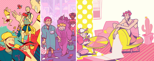
Landon’s hair is pink instead of red + a pink cactus because I’m Wild
2) Limit your color scheme
It may or may not be obvious that I love to use as few colors as possible… LOL. Doing this is super exciting IMO, because you literally only choose the colors you like!!! DOWN WITH BROWN! I don’t ike brown………… except to eat chocolate
1st img, I used the same red for hair + shirt, the same orange in the jacket details + shoes, and for the jacket + pants I used the same grey but used the color slider and made the pants lighter
2nd img, I used a formula where there’s pink hair/shirt/shorts/shoes (note: that kid is a brunette but I made him have pink hair) + grey hair/shirt/pants/shoes + purple accessories…………….. do you see it, like a zig-zag? Fun, right? 😁
3rd img is where I most obviously used limited colors. I’m sure not every furniture in a house will be blue/purple/green but those are the colors I chose when I started so I just used them! You can do the same with clothing. Nothing has to be real 🎉 WE’RE WILD AND FREE 🎉
3A) Try not to use black or grey
I mean, if it’s part of your color scheme, go for it! But black and 100% grey are pretty heavy and don’t always add to color schemes, especially if you’re trying to be more stylized with them.
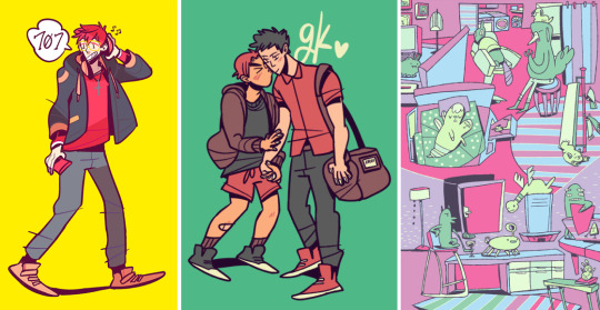
in the first 2 examples, the outfits (including the cat bag) are supposed to be all black–but I used shades of purple instead.
3rd img, rather than using just straight up grey, I gave it a more purple-leaning (RGB color code R: 188, G: 169, B: 188)
3B) DON’T LIMIT YOURSELF WITH BLACK LINEART!
Changing the lineart color makes suuuuch a huge difference. I very rarely use black lines in my colored pieces! I go back-and-forth using a lineart color that:
contrasts most of the colors of the piece ➡️ like using a blue line when most of the colors are oranges/yellows or
complements them ➡️ like using a dark purple line in a piece that’s many shades of purples/blues
4) Experiment with overlays
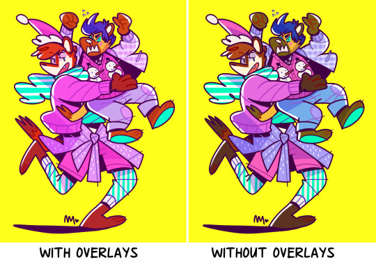
Yeah……… LOLOL.
Add a layer on top of your colors/lines ➡️ fill a color (purple? pink? blue?) ➡️ set the layer style to overlay, screen, color burn, soft light, whatever, anything you like! ➡️ lower the opacity (so it’s not super wild, if you want)! Sometimes this will balance the piece by having the colors all lean towards the one color you filled the layer with.
Don’t be afraid to use fill/adjustment layers in Photoshop and play around with the color balance!
5) Think about and plan your colors
Maybe try thinking about what colors mean? Very basically, as an example:
warm colors, yellows, oranges = feels happier
cool colors, blues, purples = sadder, more somber
like, if your goth kid is sad, maybe you’d use cooler and darker tones
maybe your character is super angry so you’ll use a violent, loud shade of red
I say this but all my works are rainbow, so…… LOLOL 😂
Anyway, those are my ideas! I’m not very fancy… //// in fact, I don’t even like to color LOLOL but those are the sorts of things I go with! If you have more questions, feel free to ask. 😚 Most of all, HAVE FUN! Best wishes!!! 💖💖💖
988 notes
·
View notes
Last Seen Blogs

famouspiepickleduck
Untitled
the-founder-of-rapture
Andrew Ryan - Rapture's Founder

renekoyuki
Totally Not About To Commit Arson
erb23
The Er-ban Ranger

gabriellemac85
Gabby Mac