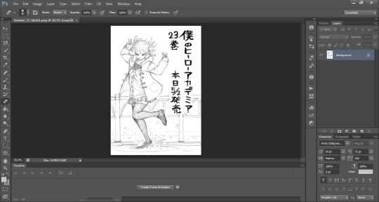
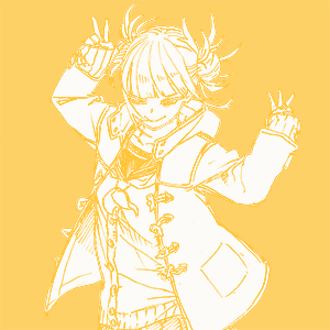
#i needed to redraw it at a larger size
Text


as promised, you can now get the penguins on inprnt (high quality art prints & cards) and redbubble (decent prints and various other items)
ETA: and now as an 8x11 inch print in my etsy shop as well
thanks for all the love on this pic! introducing so many people to penguin species they didn't know about before is my most cherished accomplishment this year.
(src for gentoo head / king head)
#i needed to redraw it at a larger size#tried to resist the urge to change it too much so some beak sizes were adjusted but i did leave for example the messy undefined feet.#relative sizes were also tweaked a little although i left the ''not precisely to scale'' disclaimer#aaand went with someone i could point at as an authority (global penguin society) and just have 1 little species#sorry little buddy ): but it does fit better this way too#penguins#shop update#id in alt
54 notes
·
View notes
Note
I just want to say I love how you do your lineart, it looks so good! ahhhhhhhh!!
I'm gathering a lot of advice about the topic of lineart and I just wanna know how you get it to look like that? My line weight is getting better but the drawing itself just comes out a bit.. weird.
Thank you so much! Lineart is probably the thing I've been working hardest on as I am not a lineartist (and still struggle a lot) but it's something I really need to get better at for my job.
UM there's honestly so much that could be said on the topic of lineart. Big things for me are:
Weight -> Use line weight (aka thickness) to describe form, lighting, contact and scale. Thick lines imply shadow, contact and nearness-to-camera. Thin lines imply tension, recession and light.
Straights vs Curves -> Use straight lines against curved ones for maximum interest. This is partly a character design thing but as we're using lines to describe our characters it's worth mentioning :)
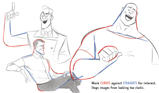
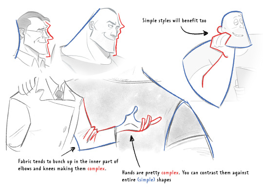
Complex vx Simple -> Use complex lines against simple. Faces are always complex so therefore the backs of heads should always be simple. Chests are quite complex so backs should be simple. Dorsal sides of the arms are complex (Delt, tricep, bicep) whilst the ventral side is more simple (tricep...mainly) etc.
'Think in Ink' -> Lower your sketch layer almost to 0% opacity so you're not getting hung up on how nice/energetic your sketch look and instead are approaching the piece from an ink mindset. BUT it's digital! So if there's something in your sketch that you like just bring it forward (copy and paste) into your ink layer. I sketch and ink with the same brush so I can use this workflow
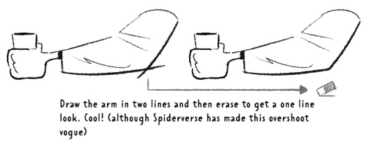
'Confidence' -> small hesitant feathery lines will look nervous compared to big swooping lines. Less is always more. I'll redraw arms/limbs until I can get the appearance that it was done in one brush stroke. Again it's digital so you can erase to cheat this look : )

MISC 01: I always hear 'draw from the shoulder'........meh............it's digital so draw from your wrist...it's fine honestly. If we were working at A1 in a life drawing class then we could get some shoulder action going but most of us are hunched over 16inch tablets. I think this advice aims to pull people away from feathery-nervous lineart honestly which you can improve on without relearning how to draw from your shoulder.
MISC 02: For a 'smoother' look do your lineart at a larger canvas size than you need. Once I'm happy with a sketch I usually double the canvas size and do my lineart then.
MISC 03: In PS (at least) anti-aliasing goes funny at any zoom level that isn't in the 5 times table. So try not to look at your canvas when you're zoomed in to 87% or 71.39% or something crazy. Just stick to 25%, 50%, 75% and 100% if possible.
UNFORTUNATE TRUTH: Lineart is incredibly based on raw draughtmanship I've discovered. When you're working with colour you can hide a lot in rendering (shadows, highlights) or post-processing (depth of field) but in lineart all your mistakes are just...there for people to see.
There's ways round this...which I use A LOT. 'Flourishes' (I use 'flourishes' to mean over-confident lineart where it veers particuarly thick or particuarly thin in contrast to your approach in the rest of the image) can sort of trick people into thinking you're more confident about an area than you actually are.

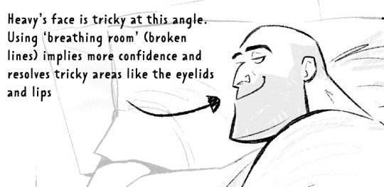
As well as leaving 'breathing room' within your lineart instead of actually...resolving the area. I do this the most around the face and hands.
Hopefully some of this helps? Honestly there's a lot of deep dives that could be done into indivudal things and there's also the massive caveat that all of these are 'guidelines' and not strict rules.
I also favour a more...concept-arty? animation-y? storyboard-y? look to my lineart which favours flourishes and breathing room for a incomplete/work-in-progress feel which would make methodical colouring (ie: for a comic or something) a pain.
Keep up pratice is the main thing and doing studies of artists who you like that have great lineart - you'll pick up draughtmanship skills along with the lineart studies. Here's some of my lineart from a year or two ago...it varies between very 'standardised' (which makes it difficult to read volumes and to be honest, it's boring) and 'TOO EXCITING' (which...also makes it difficult to read volumes and for the eye to rest).
I'd like to share my brushes at some point as I've found 3 that I really like and use for everything more or less. I discovered that a shocking low amount of people use PS on tumblr (shocking to me I guess as i'm so used to PS being the standard) and everyone seems to use Procreate or Clip Studio Pro...so I want to check that the brushes are Procreate compatible at least before I share!
#sorry if none of this makes sense. im on day TWO of a hangover...kill me now#asks#art tutorial#tutorial
737 notes
·
View notes
Text
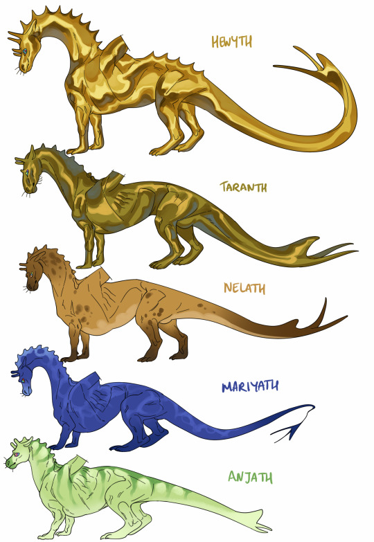
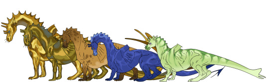
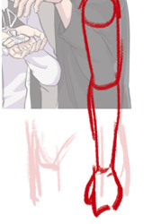
while I was doing the wings lineup I wanted to draw the dragons attached to them, so i did. while giving my take on body types for each colour..
keel depth depends largely on how active the flight pattern is (i.e how frequently do the wings beat). the books always emphasised that the hindlegs are disproportionately long, so here I have them especially big on blues and greens because these dragons are small enough to get airborne from a simple leap into the air from the ground. whereas the larger types need a takeoff roll to generate lift over their wings so their legs are more suitable for running, and their flight types compensate well for the extra weight & drag of long legs. given that the canon build is 'horselike' i tried to fit that in, with wrists halfway up the foreleg.
i gave them a little vertical stabiliser on the tail just for spice hehe. this should decrease in size as the dragon's length increases but w/e i forgot to reflect that in the drawing. completely halfassed the metallic colouring too but u get the idea. i also drew saddles and forgot to colour them lol
head shapes can vary within dragon colour rank, here are just some examples of facial diversity, though neck length is largely constrained by flight type. longer, leaner, and more flexible bodies are less stable in the air and less able to withstand the forces of really agile flight, so the most agile greens tend to be short and stocky, with short stiff tails and thick necks. by comparison, the bronzes and queens have long tails, long bodies, and very long necks (useful for grabbing your mate in flight).
if anyone would be interested in the lineart for these to use as bases?? idk let me know. yes u can redraw the blue's tail.
#dragonriders of pern#i like the green the best hehe. they are probably not graceful on the ground i tell u what
292 notes
·
View notes
Text
🥳🎉 Commissions Are Open! 🥳🎉
If you like my work and would like to commission me for some art or animation concerning TADC, another Fandom or anything else. Then I'd be glad to take you on as a client. I primarily like to draw TADC art but id be happy to take on ALMOST any project you have in mind, weather its OC redraws, custom Fanart or Custom Animation. Please read this whole post before you decide to commission me :)
I will draw, Fanart, OCs, Profile Pics, Banners, Your favourite Shipping, Soft NSFW. Cute, Creepy, Scary, Funny, Gritty...
I will not Draw: Hard NSFW, Racist imagery, Political, Gore.
If you're unsure please DM me.
Process
I need a detailed description of your project I will require references imagery (for instance a drawing of your OC). I will probably have questions of my own to make sure we're on the same page. Once I'm satisfied with your requirements, you will be invoiced. I will start the process once I receive the full amount.
Depending on my schedule I will send you regular updates where possible. All sketches and paintings will be watermarked through out the process.
Payments Info
Payments are in US dollars and done with Paypal Invoices.
Payments are done upfront before any work starts. I'll need your email address.
Any extra fees will be invoiced upon delivery of the watermarked Final. Once that payment has been made, The final full scale image will be delivered.
Prices are NOT NEGOTIABLE, lets make that clear. Prices are subject to change.
PRICES
Simple Line art Sketch- $25 per character


Cel shaded style - $70 per character


Rendered Style - $125 per character


No Background (Any solid colour or 0% Alpha) - No Charge
Plus a Simple background - $25
Plus a Complex Background - $50
Animation
Price on request, depending on the complexity and fluidity, prices start at $80 per second, per character. The type of Animation I do is NOT CHEAP. I'm still currently accepting Animation commissions now but a full list of options are to come soon in a separate post. Consider this a Beta release for Animation commissions right now! lol
Comic Strips
Also coming Soon.
(IMPORTANT) Notes/Feedback
During the sketch stage you are allowed 5 notes (large or small) for free, any further notes will incur a $5 fee per note. If you have major adjustments that need to be made, make them here. Once I progress from here, making any more changes will be much harder and will extend the delivery time.
After the Sketch stage You are allowed to give 3 small notes (adjusting proportions/poses very slightly, small colour tweaks ) at no cost through out the entire transaction. Any further small notes will incur a $25 surcharge per note.
Any larger notes after the sketch stage (such as large compositional changes, large pose changes. major character changes...) will incur a $50 surcharge per note.
My decision is final on what counts as a Small note or a Large note.
Approx. Turnaround times -
Simple line art - 1 day
Cel Shaded work - 2 to 4 days
Rendered style - 4 to 7 days
Animation - 7+ days
(Depending on Schedule and demand, these times are subject to change.)
A Few more things...
Only contact me about work if you are serious about commissioning me. If you cant afford to commission me for work, I wont be able to do business with you. Again please dont feel afraid or stupid to ask me a question if youre unsure about anything here. I will try to answer to the best of my ability :)
Give me as much info about your idea as possible, refs and detailed descriptions, Size, Proportions, Colour scheme, Composition, Duration (if its an anim)...
At the end of the day, I own the copyright for ALL the projects I make and I do not consent for you to use them in any AI image/animation generation or deep learning applications.
I appreciate credit where credit is due. So a link back to my account is very much welcome if you decide to post my commission.
Cant wait to chat! :)
-MD
#art commissions#commissions open#commission sheet#artists on tumblr#animators on tumblr#fanart#fandom#comissions#illustration#animation#tadc fanart#tadc animation#krita#tdac
20 notes
·
View notes
Text
Father’s Day doodles.


I honestly don’t like how these came out, mostly the Brando one. I drew at such a small scale details were hard to do (for context each drawing is like a little bigger than the size of my thumb). I would like to redraw both someday at a larger scale.
I vent/rant a little bit below for anyone who cares to read.
Today was also my first father’s day since my dad has passed. I have been a little sad. Yesterday at work while I was closing the store they were playing a song he liked and I felt emotional but also happy because it brought back memories.
I’m feeling okay now in that aspect but I’m just… really mad with my work for making me close two weekends in a row and now last minute making me work the morning after when I wasn’t scheduled before. And also giving me Monday thru Friday next week. Like I push carts outside in nearly triple degree weather and will be in the 100s in a week or two. I push carts and do trash and the mosquitos like to hang out in the outside trash and bite me. I work by myself and my body is having a hard time keeping up because the heat drains me so fast and leaves me dazed. I need anther position soon or I’m going to work somewhere else even if they pay less. This is ridiculous and I hate it when people try to justify it’s okay to be overworked because I’m young and “my body will be fine”. My youth is valuable and not be cast away to do grunt work for some company that doesn’t care about me as an individual. I know that God provides for me and He provided that job to me and provides my income. I don’t need to work there, I need to trust God wherever He’s leading me, I just don’t know where I’m supposed to go right now. But I know that I should let go when He calls me to. Anyways. Yeah I’m doing okay I need to go to sleep now and work my tail off again tomorrow 🥲👍
#Dio has a lot of babies#did anyone see Jolyne has butterfly tail#it’s so cute please tell me you notice my little design choices#giorno also has like a wing tail like the one on his collar#also if you notice Dio has a fifth baby#HMMMM I WONDER WHERE THAT ONE CAME FROM *coughs in self insert*#Father’s Day#jjba#jojo's bizarre adventure#furry jjba#furry#animal jjba#animal#feral#feral furry#art#dio#dio brando#hartebeest dio#Giorno#ungalo#donatello versus#rikiel#mudad#Jotaro#jotaro kujo#jolyne cujoh#Jolyne#deer#my art
35 notes
·
View notes
Text
Interest check: Urusei Yatsura artists, would you be willing to do a 'Draw this in your style challenge'?
Ok, so I've been wanting to give a fandom related drawing challenge like this for a while now, but I knew the UY fandom isn't particularly a big one (on tumblr especially). But we still have very talented and great artists in the fandom and since the remake is currently airing I felt like it would be a good opportunity to do a challenge like this. But first I want to know how many are interested. The below poll is to check whether a decent number would be willing to do the DTIYS challenge so when I post it, it would be won't be for nothing.
Few things to note:
Anyone can do it no matter what your skill level is or whatever the quality of your supplies are.. If you want to do it, go for it!
The image for redrawing would be one of Rumiko Takahashi's official arts. I have one in mind and I made sure it's a simple one as well. I won't say which one it is yet but I'll give a few hints so you could have an idea of how it is. It has both Ataru and Lum, Both of their whole bodies are visible (they are both posing in a classic fashion while sitting down).
Whether I'll make the actual post following this depends on the results of the poll. It doesn't need a majority vote, it just needs a decent number of them.
There is no due date for the challenge, you can do it anytime you want.
The poll is open for a week, the decision will be made according to the results when the poll is closed.
Reblogs are appreciated for a larger sample size and if you have any queries, feel free to ask!
#urusei yatsura#うる星やつら#urusei yatsura 2022#lum#ataru moroboshi#atalum#i might delete this after the results are out#i thought we can start small thats why the art challenge is fairly simple one#ill reblog this from time to time for the whole week since most of my followers are uy enjoyers#uy polls
43 notes
·
View notes
Text
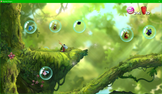
GUESS WHAT!!! a tutorial for rayman origins texture mods like how i made uglette

this is for origins only for now, ill make a separate post for legends later (but itd follow most of the same steps)
first of all. use rayman control panel, if you dont have it somehow then what are you waiting for?? make sure its updated to the latest update too (14.0.0.9 as of writing this) for improved modding support
updated on january 10 2024 for the dds portion
-
step 1: getting the textures
in control panel, click origins and then open the archive explorer

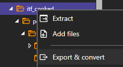
youll get a whole directory of a bunch of folders, what you need for the textures is just the itf_cooked folder. if you want all the textures just right click the folder, click export & convert, and convert them to png or something for convenience
if you converted all the images and dont need any things that arent images, just use windows search on the extracted folder to prune all the remaining .ckd files to save on space, but this isnt as necessary
you can also extract just the sprites you want to work with, or heck get them from spriters resource if you want, but still keep control panel in mind as you need the original directory of the files
if you want to replace the playable characters, their textures are are in the following folders
rayman sprites:
itf_cooked/pc/actor/playablecharacter/rayman/animation
globox sprites (you will also need mosquito sprites for him):
itf_cooked/pc/actor/playablecharacter/globox/animation
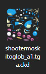
itf_cooked/pc/world/common/shooter/playablecharacter/shootermoskitoglob/animation
teensy sprites:
itf_cooked/pc/world/1_jungleworld/friendly/teensy/animation
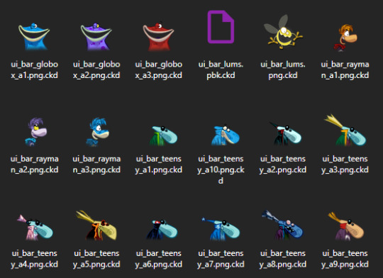
ui icons for everyone:
itf_cooked/pc/world/common/ui/ui_bar
-
step 2: the art itself
once you have the original textures all you need to do is to edit them, or redraw them. this may be a tedious process though! what i did is painstakingly edit each original spritesheet to be 2x size, then aliased to put it into a format that i can easily work with and edit, i mostly did so with a whole bunch of magic wand usage and tweaks
i did finish all the templates for all playable characters, i will see if i can release them somehow eventually? but yeah for now figure out your own way to edit them for now
either way you can figure out some way to draw new art for them. save it in a folder separate from all the other assets obviously. here for example i made a more rayman 3-like grand mimimus. i also frankensteined an icon together

-
step 3: dds things
now that youve done the textures for the mod, duplicate them and save them as .dds files
this isnt necessary, as larger resolutions will also work (probably as long as the dimensions are still a power of 2), but you can resize the textures to the original resolution as well. i will be doing that personally
if you dont have a program that supports dds files, i just use paint.net. i provide a save configuration for it specifically, you can get it here if you need
this is updated!!! after much experimenting this one looks the best to me. the most important settings are outlined in orange, but try to match the rest too
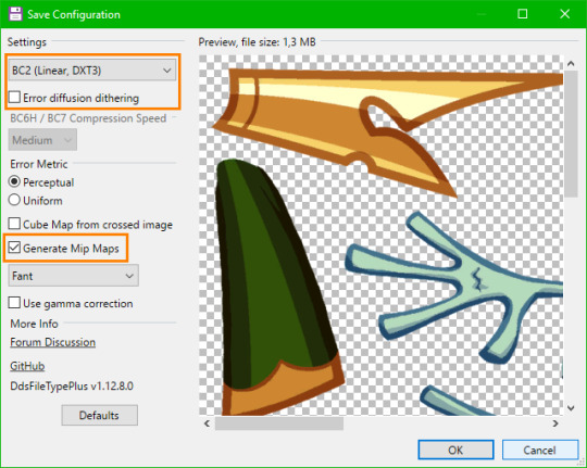
make sure you have generate mipmaps on specifically or else the sprite will end up pixelly

however some additional, more jpeg-y crust will be applied onto the sprite from the mipmaps themselves. so heres the technical part thats probably complicated... if you dont wanna bother with this try to copy the rest of my save configuration, i think it works the best here
i experimented a bit with what looked best and picked fant with no gamma correction, but you can try saving multiple dds files with different settings, viewing them with whatever lets you view the mipmaps themselves (windows image viewer does) and just picking which looks better at a smaller scale
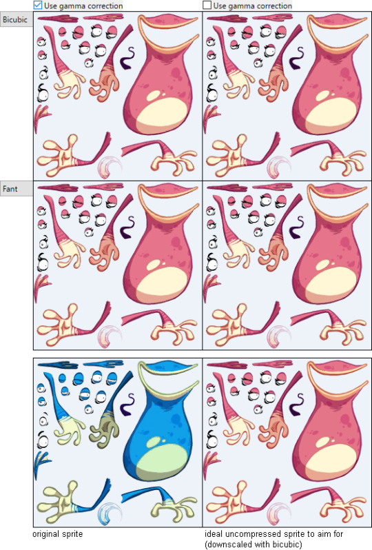
(to see the differences look closely at the eyes specifically, its probably hard without overlaying these one over another and directly comparing though)
one thing i can say is bicubic and fant are definitely the best for matching the original sprites' mipmaps, as theyre not too blurry (like bicubic smooth or bilinear) while remaining fairly good looking
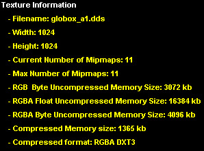
these are the original dds files' settings as viewed in dxt viewer. most of this doesnt seem to be applicable for the save settings but the compressed format is specifically dxt3 (which is also present in its header if you view it in hxd), so for the first save setting you probably have to pick BC2 (Linear, DXT3) as i have
TLDR: i know this is complicated, try to just copy the dds save configuration from the start of this step i guess???
-
step 4: renaming things
once you have done that, the weird thing you need to do is to rename the .dds into files that the game can actually read (even though theyre still dds files, and can be renamed back to .dds for them to function). for convenience you can just duplicate the files again
pay attention to the original file formats which you can see in control panel! as you can see, you should rename the majority of the extensions from .dds to .tga.ckd
windows will stop recognizing them, likely the same for the programs you use, but that shouldnt be a big deal. if you want, you can rename them back to .dds to make them usable
the important part here, dont miss it!!! is that all the ui icons are not tga.ckd, but png.ckd!!! even though theyre actually still dds files under the surface. just rename them correctly and pay attention to the right extension, or else the icon wont work
obviously make sure they have the same filename in general ALONGSIDE the extension
-
step 5: actually making the mod
now that you have the relevant files, click create mod in control panel

select the files module, and then make and select a folder to use as the mod folder, which should give you this result
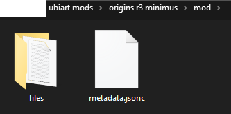
the files folder should have these two

you should create a GameData folder in added_files, after which the entire regular filepath follows, starting from bundle_PC.ipk, then itf_cooked, then so on. for example, these are (nearly) the full directories of my files
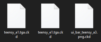
\mod\files\added_files\GameData\bundle_PC.ipk\itf_cooked\pc\world\1_jungleworld\friendly\teensy\animation\teensy_a1.tga.ckd
\mod\files\added_files\GameData\bundle_PC.ipk\itf_cooked\pc\world\1_jungleworld\friendly\teensy\animation\teensy_e1.tga.ckd
\mod\files\added_files\GameData\bundle_PC.ipk\itf_cooked\pc\world\common\ui\ui_bar\ui_bar_teensy_a3.png.ckd
obviously all the textures should have the same filename and the same file path as the textures theyre replacing
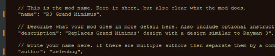
then go back to the base mod folder and edit the metadata.jsonc file in something like notepad++. the file itself has commented-in extensive instructions so just follow them
as the mod creator thingy says you can also optionally create a thumbnail
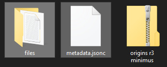
anyway once youve done all of that, select all the files in your mod folder and zip them. you cant just select the folder WITH the mod things and then zip that, as then control panel wont read it because the base of the zip directory doesnt have the metadata file
-
step 6: finally implementing the mod!!!
now that you have the zip ready, click the mod loader and select this in the lower left corner

navigate to your zip and select it. it should appear here under installed mods

make sure you press the checkmark to the left of it and then press the apply button in the lower right

after a short wait for the mods to apply you can go turn on the game and test it

and it should hopefully work !
also yeah ill release the minimus soon enough on gamebanana

if you want to make any further edits to the textures, youd have to resave them as .dds files again, and rename them to tga.ckd/png.ckd and such, then just replace them in the mod's directory (or add new files to it) and just zip it again. its fairly easy to work with i hope
this is overall kind of a complicated tutorial but its not too bad once you get the hang of it
20 notes
·
View notes
Note
I'M IN LOVE WITH YOUR ART, will you ever sell the last ones for the playlist in pdf or something like that? I'm from Brazil so is easy for me in those formats, and i would love to buy one. ❤💚❤💚
Thank youuu!!
pdf? like I sell the fullsize image digitally & you'd print them off yourself? I hadn't thought abt that! I'd still need to redraw them at a larger size for print tho
Here's the current sizing issue:

I genuinely wasn't expecting people to want merch lmaoo, I'm just drawing for my own sake (these were a fun lil side project) But esp since this is the third time someone's asked abt merch of these, I'm considering it! (gonna use these to fund my vitamin d tablet & multivitamin supply 😏)
🥲 i'm really glad my art is resonating w people so much ❤️
I know it's less of a "thing" these days but as w any of my art, u (and all my followers) have my permission to print out the tiny versions i've posted to tumblr [just for personal use, not for profit] & put them up on your wall or w/e. like those old-school anime collages.
If I do ever make a better print-size version, and u still want it, u can always buy it whenever that happens :)
#not art#my policy w printing out my stuff at home is basically “it's none of my business as long as you're not selling it”#especially since everything i post here is sized down for posting on the internet anyways#if i do end up making prints i dont feel like thats gonna interfere w the business model or w/e. 'oh noo somone has a grainy 2“x3” print...#anyways thanks for the interest!! <3#I have a big project i need to finish first before I can start working on this#so gonna be another month at least probably? if i do get around to it#not making any promises bc ive got a brain full of 'cant finish projects'#and historically when ive tried to make money off my art it just makes the process of making art a lot less joyful u__u;#so im trying to approach this really casually so i dont startle my motivation like a wild deer#right right okay enough rambling
21 notes
·
View notes
Text
Animation
Reinvention in story telling
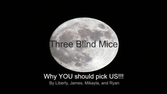
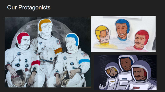
Three Blind Mice, Epic/Historical, Space Age (1957-present)
Week 3, 22-28/04/24
Monday
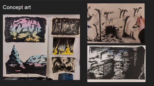
Did a zine workshop during the morning, I made a sad little zine with some bits of rough potential visuals for the project.
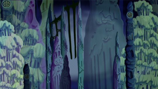
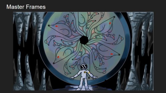
I then jumped straight into creating concept art and trying to figure out how to combine natural cave formations with architectural features. What I ended up doing that day was creating this rough pencil of some stalagmites and drawing arches and doorways on top of it.
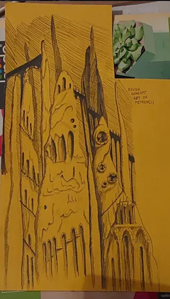
Using this as a starting point I went off and photocopied it a few times, which I then cut up and collaged together on a page to gain a rough idea of what this metropolis could look like.
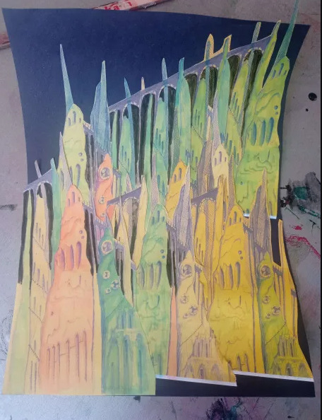
This is what I ended up with. I love how the buttresses came out but the perspective of the piece looks completely wrong, making it look cluttered without purpose. I tried colouring parts blue and pink to separate it a small bit, but I think the main issue is that all of the structures are the same size even at a distance, in future I'll have to make the ones in the back larger and more hazy looking whereas the ones in front smaller and more detailed. This was just an experiment so its not too important.
Later that evening I did a colour study of scenes from Akira to develop my understanding of cel shading, I also watched a few videos on the production of Akira. It ended up being very useful and I found myself very surprised with Akira's colour palette. I quite literally colour dropped the colours from the scenes and and did rough drawings of the scenes using them, I was really surprised to see that the colour I dropped was the same as the one in the scene. It was absolutely fascinating.
Tuesday
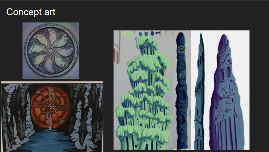
I further looked into combining architecture with cave structures by doing a quick study on Antoni Gaudi's building designs and did a study on different stalagmites.
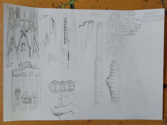
Looking at Gaudi's designs was interesting as he uses lots of organic shapes that almost look like they're melting in a way, and in other works like the Sagrada Familia he has lots of towers with unique features.
I tried combining these features to the stalagmites I studied to gain unique structures that would be believed to have belonged to an underground metropolis. I ended up with some nice designs, I worry a small bit that they might be too detailed but overall I'm happy with them, I still think these designs would have to be further developed but I don't have the time to do so.
At the moment my plan is to individually recreate these digitally and then photoshop them together in different ways to gain the illusion of having more designs than I do.
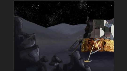
The photo is a small bit fuzzy but this was the first structure I recreated digitally. This took me around 6 hours to do, which was mainly because I've never done a proper digital piece before, so it took me a bit of time figure out what worked best and what short cuts I could take. I actually drew on top of a picture of my original paper sketch instead of redrawing it.
I created this solely using the air brush tool, and I love how it turned out, it looks so drippy. The only thing I can say really is that I wish I got it done a bit quicker, and that the values were much darker on my personal monitor.
I used the background from Akira as a reference for the colours.
Thursday
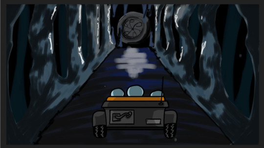
I made 4 more structures, significantly much more quicker too. While I spent too much time on the first one it gave me the experience needed to bang these ones out quickly and more efficiently. These were also done using the airbrush tool. For the backgrounds we actually made it a point to solely use airbrush as a way to commemorate the animations from the 70's/80's.
Since most of my pieces were done I got started on piecing them together. I tried making the buildings further back bigger and transparent and the ones closer to the viewer bigger. This was as far as I got on Thursday. If I'm being honest I'm not happy with the layout. I was using the Akira background as a reference but then realised it wouldn't work as the light source in the background is from behind, in my background the light source is from the front. I knew I definitely had to redo the layout.
Friday
We did a pitch workshop with Paul and Yvonne and then as a team discussed how we would go about our pitch . We discussed who would say what, what we thought a funder would want to know before investing in a project, we worked out costs, how many episodes, how many animators it would take to animate it in a year and ect...
We also did a few rehearsals in the studio improvising our lines and timing ourselves to get a feel for it. We decided that I would open and close our pitch, introducing our Nursery rhyme, genre, & time period while also setting the scene for our animatic.

Before work I managed to redo my background, I thought this one turned out way better. The perspective looked way better than last time too. I feel like with more time I could develop this further but I don't have that time so this is what I have and I'm happy with it.
Sunday
youtube
I made the presentation for our project, and the team went on call to rehearse our pitch. We did this twice.
2 notes
·
View notes
Photo

“Oooh I do not like that guy...”
Now I’m up at 3am.... the devils hour.... drawing Prinxiety... whoops
Sanders Sides Ships:
Logicality & Prinxiety 1 & 2 & Analogical
Sanders Side Fanart Masterpost
#Thomas Sanders#sanders sides#thatsthat24#prinxiety#prince#anxiety#princey#roman#prince roman#virgil#fan art#mine#my art#I made this one larger than the logicality one#so it'll look better if you wanna blow it up for anything#i might redraw the logicality one later so they're the same size#whatever#I need to either go to bed or be productive
1K notes
·
View notes
Text


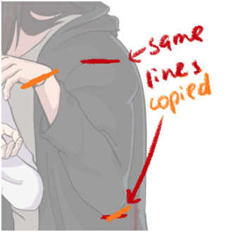
So, I had this sudden itch to compare these two screenshots, and what I found makes me both melt and applaud Fortiche once again for their absolute excellence.
In case you haven’t already guessed, the first one is a screenshot I took from the the bedroom scene. And the second is the flash we see during the oh-shit-dont-damn-well-let-that-be-my-girlfriends-head-on-a-platter. . . “cupcake.” . . scene. . .
Yup. Fortiche couldn’t stand just putting a “halfass” screenshot in, they had to redraw it. I am 90% sure that is just a pure 2D drawing of Caitlyn and I’m about to flip a table over it-
(God it’s like playing where Waldo on crack, but to very obviously see the differences, look at the eyes, head size difference, the purple collar by the neck, and a missing swirly button).
From how I see it, there are a few reasons they did this (apart from just pure flex). First, as the second one is only a second long, (a/n the amount of seconds in this sentence makes me laugh omg), it needs to be clear and crisp enough to be easily recognisable and stuck in the viewers mind: cropped down, larger face, brighter white of the eyes. They need to be able to just flash it, and pow, you get it. Caitlyn might be dead yo- And Vi is going to be very distraught* if so.
(*this autocorrected to straight lol, and I need to send Apple a strongly worded letter now. ;))
But also, I think it’s also a showcase of Caitlyn through Vi’s eyes. Of Vi’s affection towards Cait, not the other way around.
In the bedroom scene, it’s mostly about Vi. Cait is listening to Vi talking about her childhood here, witnessing Vi being extremely vulnerable, and Cait’s expressions are sad and empathetic, as she feels Vi’s pain and tries to understand her and then console her.
But the second one is all about how Vi herself sees Caitlyn, and how she wants to protect her. About how vulnerable Caitlyn was when Vi left her behind, so much so that Jinx was able to take her. (It’s not Vi’s fault, ofc, but she still thinks it is). The wide, big eyes, the closeness, the open mouth. It’s very intimate and vulnerable. (Not to mention sensual, oh my).
Normally, Caitlyn’s design is all sharp lines and sharp features. But here she’s softer, gentler. And something, someone, Vi desperately wanted to protect, which she tried to do by leaving her, even if it didn’t work. . . And, now, this is the moment where Vi might just be about to see her dead mangled body, like her family before her. . .
TL;DR We don’t deserve Fortiche, and I’m not crying, you’re crying. ;D
18 notes
·
View notes
Note
I really love the way you draw anatomy - you are literally perfect. Would you mind one day if you make a simple tutorial on how to draw anatomy, particularly hands and just keeping things in proportion. Sorry if this sounds like a demanding ask - u can definitely decline or not answer no offence taken x
First of all, thank you so much! <3 I’m so happy to hear that you think my anatomy looks good. I’m not sure if I can teach you anything, but I’ll try! And sorry it took me so long to reply.
I wouldn’t call this a tutorial, more like an outline of what I usually do (maybe with some tips here and there). Hope it’s at least a little bit helpful 🙏
I’ll start with how I draw the hands. Well, as you’ve probably seen on my previous post about this topic, I used to have a hard time with hands because I didn’t understand the logic behind them + my only reference was my own small and blobby hands. Practice helps a lot, but imo mostly because as you draw more hands, it becomes easier for you to break them into simpler shapes (this is important!) and imagine them in 3d in your head or as you draw.
When I draw hands, I start with a rough sketch. Basically I just draw a fingerless block first. It’s a bit illegible right now, but bear with me.
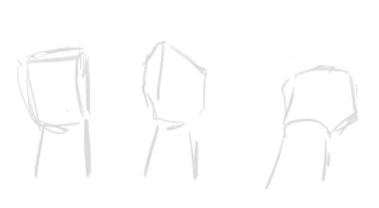
After this I add fingers. Once again, they’re all broken into shapes: a finger is just 3 short tubes connected to the block we just drew. Sometimes some parts of the “tubes” aren’t visible because of the perspective of the hand, sometimes you can clearly see all of them. As I already said, it’s all about learning how to imagine these things in 3d.
Since my sketch is so rough, I tried to make the shapes more clear here. I hope it makes sense.
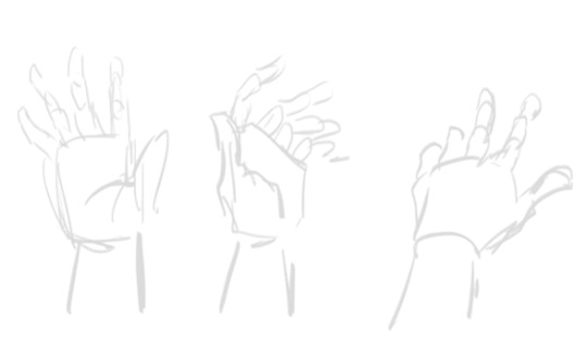
After the sketch is done, I basically just… draw hands. Remember that this is skin and meat, there are going to be folds (??? Idk if this is the correct word) and stuff. And nails, oh nails… I scream when I remember the times when I used not to draw them lol They help to convey the perspective and the angle of the fingers, so for me it’s better to have them than not. I’m not drawing them the exact correct way, though, but still.
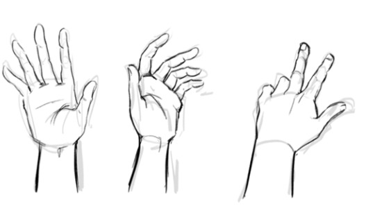
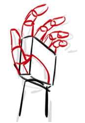
And once again, it took me a long time to start drawing hands more or less properly, and I still fix them all the time. For example, a thumb of the first one on the left is too short. In fact, I’d make all the thumbs bigger…
So yeah, something among the lines. It’s not perfect, but this is the basic idea of how it works, at least for me.
About proportions… Well, I’m one of those artists who like to make 1000000 sketches before I move on to the inking phase, it’s just more comfortable to me. This way, I give myself more control of the pose and proportions and have a lot of time to adjust and fix whatever feels off to me. Many good artists don’t do that because they don’t really need it.
First, I make a very quick sketch just to grab the “feel” of the pose I’m going for, plus it helps with the overall composition of the drawing. It isn’t detailed at all, so it takes about 5-10 minutes to draw, even less if I’m confident about what I want and don’t try to find the pose that would work the best. At this stage I try to keep the proportions in mind, but I don’t think about them too much.
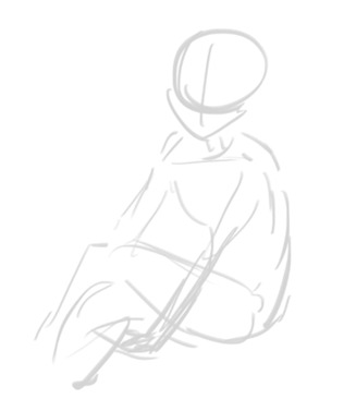
When I’m more or less satisfied with the basic idea, I draw my first sketch. At this stage I’m err building the body. There are a lot of ways to do that, I’m drawing something similar to a mannequin that is made out of meat. Oh no, that sounded horrible…
As you can see, this time I pay more attention to proportions and sketch all parts of the body properly. I make sure that both arms are the same length, both legs are the same length, that the shoulders are on the same level, stuff like that. At this stage I don’t think about the character, just about the body: I’m trying to make it make sense lol
Also you might’ve noticed, but I changed the position of the arms on this sketch because my initial idea didn’t really work (I tried to sit in the same pose and it was uncomfortable lol)
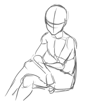
And then I draw yet another sketch. Sometimes this can be the last stage and I ditch the inking altogether and just colour this sketch instead, but more often than not it looks too messy and I have to make another sketch… (This is also where Katsu usually tells me to chill because we were planning to draw something simple and quick and I’m already making it complicated lol)
Here I’m adding more details, like face, hair, clothing, anything else that I need to sketch before inking/colouring. After this sketch is done, I look at it again and see if anything looks off. If it does, I try to fix it, adjust it, sketch it again, whatever works and whatever makes my sketch less stiff and more proportional. It doesn’t have to be super realistic proportions-wise though.
Things that I pay attention to when I check the proportions on my drawings:
Shoulders: they should be the same size (although the perspective can create a distortion, but this is a whole other can of worms) + ideally they should be able to fit two heads in them length-wise.
Arms: I check if they’re the correct length (the hand part should start ~at the crotch level). If the arm on the drawing is bent, I try to visualize how it’d look like if they were straightened up. If it’s difficult to imagine, I just sketch it.
Oh, and the size of hands. I always check if they’re the correct size by comparing them to a face of the character: they should be about the same size (of course some people have larger hands and some of them have smaller hands).
Legs: same with arms, I try to make sure they are not too long and not too short. Also, when drawing arms or legs, you can draw this thing. The shoulder/hip and the hand/foot have the same distance from the elbow/knee. This… sounds confusing, I hope it at least looks understandable lol
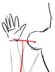
There are a lot of ways to check if everything is correct: sometimes I just put my fingers on the screen to check if all of the lengths make sense lol and sometimes I draw these lil lines to check if the lengths of the parts that are supposed to be the same match.
If your drawing looks off, just create another layer and sketch the body (the meaty mannequin thingie) over it again. It might help you see some obvious mistakes if there are any. Some people might say it’s too much work, I call this practice lol
There are instances when I redraw some parts of the body completely. There are situations when it’s easier to do it all over again than to fix the existing sketch.
Another thing that I do is flip the image as I draw. Not very often though, you need not to get used to the flipped version of your drawing, it should be somewhat new to your eyes, this way your mistakes will be more visible to you. At least I think so…
It also helps to pay attention to details as much as you can, they make a huge difference. I still have a lot to learn about how the abs work, but like a year ago I knew nothing about them aside from “err I think there are 6 or 8 of them?? And they start below the boobs” (my boobs were also more square). After I started drawing them more often and learning how they actually work, my drawings changed accordingly. I think the right one is at least slightly better haha
So yeah, this is more or less my process. It isn’t necessary to draw 10203100 sketches and to go through all these stages, but I personally feel much more comfortable doing that because this way I can be sure that I would’ve noticed if there was a major fuckup somewhere.
To be honest, if we’re talking proportions, this image is literally the only thing you need to know.
Just keep in mind how many heads are in the human body length, how many heads can fit inside one’s torso, etc. Compare body parts to each other accordingly. Just make a habit out of checking if the proportions on your drawings are correct: make a shoulder bigger, make sure that the legs are the same size. It might be too much at first, but it’ll literally become a subconscious thing very soon, and you won’t have to actively think about all of this every time you draw. I google this image from time to time just to make sure that I’m fixing everything correctly lol
You don’t have to be exact with these proportions, but they still need to have some logic behind them. Like here, if we look at Osomatsu, who is clearly very stylized, we can still see that his body is proportionate. His shoulders are too small for his head, and his body surely doesn’t have 8 heads in its length, but he still doesn’t fall apart because there is logic behind his stylization: his arms are still long enough for him to put his hands in his pockets; they aren’t too long or too short. Hope that makes sense…

Sorry for the long read. Once again, I hope it was somewhat helpful or at least interesting. If you have any more questions, please feel free to ask!
Although I’m still learning myself of course, so there are things that I probably don’t know or forgot to mention…
91 notes
·
View notes
Note
What’s your process like? What tools do you use?
I’m glad you asked, so here’s the long post with photos and all !! (there are some spoilers too ahah)
As I’m doing a chimera day, the whole process is dispatched over the daytime and is repeated every day, filling all the little moments where we do nothing : waiting for the bus, waiting for someone, taking a break between two tasks, etc. Sometimes I have time to do everything in one shot too.
Most of the time it takes 40-60 min in total, but the first ones took rather 2h! Doing it every day isn’t always easy but it’s very satisfying.
Equipment
The drawings are very small (A8) so they don’t take too long to do, and everything is in a notebook that I carry everywhere with me for almost a year now. It’s a MUJI notebook but the brand does’nt matter, it just has to be solid (mine is all recovered by tape now). It’s a size A6 and I divided the pages by 4 in pencil, but no matter the size of the notebook as long as the drawings are all in the same format. Personally I choose my notebooks randomly when I think they are pretty ; a lot of them where also presents.
I use my cell phone when I’m looking for references because I don’t take too much time on the computer for that. I can do research anytime, draw anywhere and that is essential to me to make one a day.
1. Finding an idea
For me ideas come by waves so I note them and now I have several thematic lists : more than 1300 Known Ones and more than 300 Unknown are planned ! I’m not sure if I’ll ever draw them all. Not to mention the suggestions I take in priority, the spontaneous ideas that randomly pop in my head, the hundred shittycryptids that I noted for later, or the series (Mermay or Goblin Week for example, and others in progress) .. I keep the most complex ideas for when I’m not too busy (but it’s not often).
2. Finding references
It’s also the moment to choose a composition so it’s a crucial moment : a lot of thing depend on the pose like readability or likelihood. I had nice concepts ruined by a bad composition !
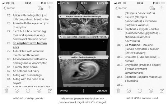
To find interesting animals I try to learn quickly from Wikipedia : for example if I want a butterfly I look at different species before deciding which one I take. It allows you to vary and pick unusual species. I save the latin names of all the animals I use, in case I need specific references to redraw them.
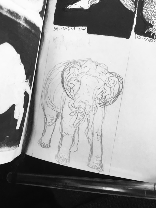
3. Rough sketch
Sometimes I need 2 or 3 tries before being satisfied. I change composition, reference, proportions, sometimes even idea before being sure ! To save time I really have to put the minimum, just a silhouette, and force myself not to put details (but I failed in this example).
4. Inking
I use Pigma Micron, almost only the caliber 005. This is the moment where I can let go on the details, it’s really my favorite. I don’t have any particular techniques and it’s according to the time I have this day or the mood: sometimes it’s a clean grid, sometimes more masses of scribbling, and I try to transcribe as much texture as possible. I try to make nice contrasts, to think about the light, the readability, but somedays I cant do it or I don’t have the time : it doesn’t matter because I know that I will do better the next time!
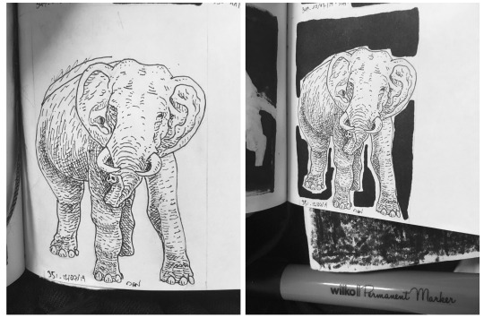
I fill around with a big cheap marker, but as the ink go through the paper I put a blotter behind (see photo), and the back of the page is unusable (see one of the first photo). As it isn’t precise I finish filling with Microns 01 and 08. Sometimes I use correction fluid, but it’s really ugly and I regret every time.
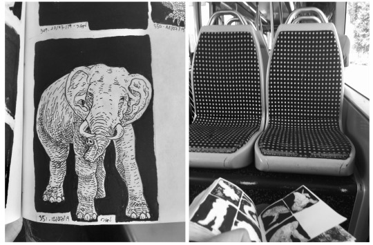
Last photo is to show that I draw everywhere !
5. Scan
No matter the scanner, mine is over 10 years old and I saved it from the trash ! The resolution is set at 600 ppp.
There is a gap of 16 days between the day I draw and the day the drawing is posted. This is because I don’t have time to scan every day and sometimes I go on vacation so I don’t have my scanner (but I keep drawing). It makes me less responsive to suggestions for example, but it allows me to better manage my time and scan when I want. Usually I scan and edit 3-4 drawings at the time.
6. Edition
No matter the software, the goal is to adjust the black and white tones ! It’s an important step to make a clean drawing. You can even do it from a phone, it’s that I use Photoshop for other things and so I have my habits.
I resize them on Preview (macOS) but no matter the software neither
I start by lowering the saturation to the minimum to have a real black and white.
Then for contrast I like to use the Curves tool because it‘s more precise than Brightness / Contrast. I saved a pre-set to go faster but the goal is to darken the black tones and lighten the white tones and end with something truly bicolor.
Sometimes I move the chimera in the middle of the framework on Photoshop if I wasn’t able / didn’t have time to do it on pen and paper !

On exceptionnal occasions a step is added before adjusting the contrast. Sometimes a part of the drawing doesn’t please me at all, and in this case I redraw some of it on Photoshop with my graphic tablet (Wacom Intuos). I really don’t like doing this because I prefer paper, it forces me to put myself on my computer, it takes extra-time, and the rendering is too smooth compared to the rest of the drawing. It’s mostly for human faces, but sometime it can be a big part of the drawing too !
Conclusion
Voila ! To be able to keep doing this for long I wanted all the process to be flexible with my everyday life : it would have been impossible with color or larger formats for example. In addition I really stay in my comfort zone : the goal is to have fun ! I know it’s not perfect, but I’m truly not a professional, nobody pays me for this and so I don’t want too much pressure to do it.
I hope it’s clear (sorry for my english!), I was glad to share you all of this, and I hope it makes you want to draw !
55 notes
·
View notes
Note
hi! sorry for bothering you but,, could you please make a tutorial of your icons? i really like your style
Sure! I’ve been meaning to make one for a while actually so this is perfect.
First, load your image into photoshop, make sure the mode is set to RGB color, and unlock the image by making it a layer from background
Next, take the brush tool and use it to clean up anything you don’t want in the icon (text, backgrounds, other characters, etc). I planned on cropping this one pretty tight so I didn’t worry about too much of the stuff at the bottom, just what might get in the way
Then I cropped the image into a square. Sometimes I do this later in the process but it doesn’t really matter. Play around with it a bit to make sure it looks good, don’t cut anything off at awkward places. You can also mess with negative space and have it be offset to one side or other fun stuff

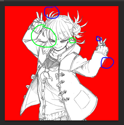
Next use the paint bucket tool to fill in the background and see if there’s anywhere where the lines don’t fully connect or looks weird. This particular sketch was pretty clean, but sometimes I’ll have huge sections get filled in so I have to go and redraw the lines a bit. The blue circles are places I need to either redraw or clean up, and the green circles are places where I need to fill in the color where we should be able to see the background
As a note, if I’m making an icon set I always set my fill color to these settings because they’re the easiest to get consistent. The color itself will change later but things like how light/dark your original fill color is matter for a consistent look

When you redraw a line, zoom in super close and use the color picker tool to select the color of the second or third darkest pixel in the line around where you’re redrawing. Then set your brush to a good size (this one was bigger and used 4 px, usually its 2 or 3) and just... fill in the line. I didn’t try very hard with this one so it doesn’t look great, but usually its fine and no one will notice unless you have a larger section you need to fill. To help blend it out a bit more you can also make the brush a little softer

Here’s what it looks like when it’s all clean and filled in

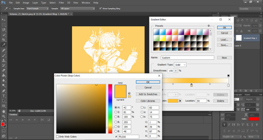
Next, apply a gradient map layer. I use a random preset I found somewhere as a base, but the important thing is that both ends are light (I usually keep it with the preset’s slightly yellow off-white, but I’m sure pure white would work too) with a color right in the middle at location 50
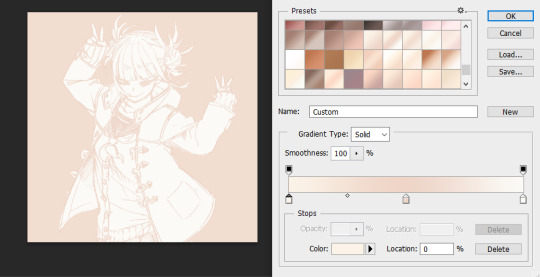
Then all you have to do is make the middle color whatever you want it to be, resize it, and you’re done! I usually make mine either 300x300 or 500x500 for simplicity’s sake, but whatever works
As a final note, I usually like to use sketches for my icons because they’re fun and light. If you’re using a “finished” image with lots of black fill and hard lines in it this will end up looking pretty janky
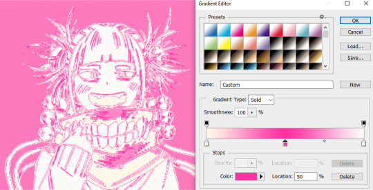
To fix it, you just need to make the far left color the same as the far right one to get the darkness back
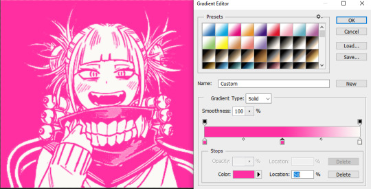
You can also use this on the sketches to intensify the darker areas, but its usually not necessary. However, it still doesn’t look the best if you have an image with a lot of screentones or shades of gray in it unfortunately
Sorry it got a little long, but I hope it all makes sense and you find it useful! If you have any questions or need clarification on any steps just ask, I’m always happy to answer ( ´ ▽ ` )ノ
33 notes
·
View notes
Text


DIY Number Two Piñata
By far one of my favorite birthday party crafts to create for my girls birthdays has been the Piñata. Like this 2nd birthday DreamWorks Trolls theme Piñata in the shape of a number two I made for my youngest princess who is obsessed with Poppy and trolls. While this is a time consuming project it is not difficult or as costly as purchasing a store bought piñata. Below are the supplies I used and a step by step guide to help you create a number piñata 🥳🎉
Supplies:
•Meduim size Cardboard box (I used a diaper box)
•Pen/pencil
•Eraser (optional)
•Scissors
•Crepe paper rolls in desired colors (pink, teal)
•Stickers or Printed Characters
•Tape
•Gluesticks
•curling ribbon in desired color(s)
Steps:
1. Gather and set aside all supplies
2. Flatten out cardboard box (use scissors if needed)
3. Using the scissors cut off the top 4 panels of the box (don't throw them out they will be used for the frame of the piñata
4. Use a pen or pencil to freehand draw the number two on one of the 2 side panels of the box (a pencil is recommended so you can erase and redraw until you have the size right)
5. Use scissors to cut out the number two shape out
6. Use the number two cutout panel to trace a second number 2 on the reaming side panel box
7. Cut out the number two using a scissors
8. As a check I put the two number cutouts on top of each other and make any cut adjustments to get them as close in size as possible
Now that you have the number cutouts you can begin to put the piñata shell together using tape. Simple scotch tape will work but you will need to use some extra tape to reinforce it or you can use a heavier clear tape
10. Use the larger top panel for the side frame of the number two by taping it in place to the first of the number two cutouts
11. Cut the smaller top panels as needed to fit the curves and shape of the number two so you can create the shell.
12. Once you have the full inner shell, place the second number two on top and begin to tape it on to enclose the piñata
13. Cut a 'door' on the bottom panel to create an opening to both fill the piñata with candy and for the pull strings for the candy to fall when kids pull the strings
14. Create holes on the bottom 'door' from step 13 above using a pen or scissors
15. Cut ribbon into long strips (may need shorter or longer length depending where you will hang the piñata) ensure you cut enough so all kids will have a ribbon to hold
16. Group ribbons into 4-6 ribbons and insert them together in each hole and tie a couple knots so the ribbon wont come out of the hole
17. Cut the crepe paper in to strips and then cut in fringes
18. Begin to glue the crepe paper strips to the shell and layer each strip slightly on top of the previous layer
19. Once the entire piñata is covered with crepe paper, glue or tape on any character cutouts or add stickers
20. Fill with Candy & ENJOY!!
❤️thisdiymama
#diy #party #piñata #kidsparty #momlife #mom #momblog #mamalife #mamablog
1 note
·
View note
Text
Version 377
youtube
windows
zip
exe
macOS
app
linux
tar.gz
source
tar.gz
I had a good week. I mostly caught up with my smaller jobs queue, just pushing on work that had piled up.
Qt
Thank you for the continuing Qt bug reports. I fixed a variety of typo-broken buttons this week, mostly buried in less-used UI, and if you have set a browser launch path override in the options, hyperlinks across the program should obey that again. I also believe I fixed the annoying issue where media viewer hover windows that needed to shrink (because of switching to a new media that had fewer info lines or known urls) would linger too tall for one frame. EDIT: I'm still having slight hover window resize flicker in my IRL client when I keep my mouse over the top-right hover, I'll give it another go next week.
Furthermore, all non-menubar menus across the program now open on right-click release instead of press. This sounds trivial, but there was a mix of down/up click handling here, now unified, and some things like thumbnail and tag selection are handled more naturally in the initial click down. This also fixes an issue where users who had menu styles with no significant border were sometimes accidentally activating the first menu item on a slow click (the click down would show the menu, the click up would activate it).
Last week's support for styles and stylesheets for Qt seems to have gone well. There is more to do here, but this week brings better error handling for unusual situations, better 'we already have this set, no need to waste CPU re-applying it' detection, and fewer hacky colour overrides, so custom stylesheets should be able to colour regular panels without lots of unintended grey or white boxes.
the rest
The shortcut system should now be able to support any text key. This includes extended characters like ø or æ. If you need to apply a modifier to get these keys (e.g. ctrl+alt+e), these modifiers are likely to show up spuriously in the shortcut's label (e.g. ctrl+alt+æ), but everything should nonetheless line up in the program correctly. Let me know if you discover any new bugs here!
There are also some new shortcut commands this week, for the 'media viewer' set. They are 'pan_top/bottom/left/right_edge' and 'pan_horizonal/vertical_center'. They move the whole image around to edges, or center it again, and should be helpful if you often look at tall or wide comics at 100% zoom. There will be more to come here in coming weeks.
The work on making the UI smoother is also continuing. Session saving and a variety of 'media refresh' events that occur on file import or maintenance are now significantly faster and do the bulk of that work in the background. Users with very large sessions should experience less juddery behaviour during both idle and heavy work periods.
full list
qt:
all non-menubar menus across the program now launch on click release. some previously launched on click press. a variety of related click event behaviour is cleaned up, particularly with thumbnail/tag selection on the click down. this also fixes some users' menus immediately activating the first entry on slow clicks in some ui styles
I think I fixed the annoying single-frame delayed size-down resize on media viewer hover frames when changing media!
the vast majority of old wx panel background colour hacks are removed, so custom stylesheets should now cover much more of the UI
improved the new custom style and stylesheet setting, resetting, and error handling code, particularly for not re-applying the same style or stylesheet twice, and for handling un-re-settable styles (seems to be defaults initialised by third-party OS-wide Qt style) gracefully
fixed hyperlinks not using the custom web browser launch path as set in the options
fixed the 'migrate entire db' and 'set thumb location' buttons in the migrate database dialog
fixed a typo bug when launching the url selection tree after adding an ipfs directory to download
fixed two typo bugs when editing regex favourites and simple downloader formulae
fixed an issue where custom shortcut sets could not be deleted
fixed a typo in the edit account type panel
fixed sorting the login listctrl when there are session logins mixed with non-session logins
removed some old media viewer hover window display/raise hacks
retired the 'always show hover windows' debug mode
the media viewer will no longer perform any drag calculations on anything but left-click drag
misc Qt code refactoring/cleanup
.
url searching:
the database now stores 'known url' domain information more efficiently. it will take a few moments/minutes to reshape the db when updating
system:known url's exact url search now runs extremely fast. this will only affect new predicates of this type, not those in existing sessions
system:known url's domain search now runs much faster and matches subdomains of the given domain. this will only affect new predicates of this type, not those in existing sessions
system:known url's url class search now runs much faster. this will only affect new predicates of this type, not those in existing sessions
when entering a regex system:known url predicate, the dialog will now not OK (throwing up an error dialog) if the regex is invalid
.
the rest:
the shortcut system now allows all text characters. if it has text, it should work, but it is the wild west in terms of modifier labelling. anything unusual on your keyboard like ctrl+alt+e to make æ will _display_ as ctrl+alt+æ, but the same key combination will match up in the program all correct
added shortcut actions 'pan_top_edge', 'pan_bottom_edge', 'pan_left_edge', 'pan_right_edge' to the media viewer shortcut set that will move the current image so the respective edge is aligned with the larger canvas's
added shortcut actions 'pan_horizontal_center' and 'pan_vertical_center' to do as above but center on that axis
session save now hangs the UI significantly less, whether triggered by user command or auto-saving 'last session'
saving of last/exit sessions on client close is a little faster
the call to refresh thumbnail file info (and redraw if needed) when a file is imported or has metadata-regenererating file maintenance done will now only call for files that are actually loaded, run faster per file, run faster when the client has large collections in its session, and not hang the ui thread when waiting for the new media info to arrive
like regular popups, modal popups (like those created when big vacuum/analyze jobs jump in) will now only appear if the main gui or an on-parent child has OS focus
the main gui/on-parent child OS focus test now includes misc child windows like the autocomplete results hover window
network jobs that fail for one reason or another will now be more reliably cleaned up, and their connections returned to the connection pool. this may fix the 'too many open file handles' errors some users were seeing after long term unreliable network traffic
fixed an issue where some thumbnails that were trashed or physically deleted were being removed from 'all known files' and file repository views when it was not appropriate
connection and downloader retry time options now have a wider min/max range when in advanced mode, with an accompanying warning label for the connection panel
checker options times now have a wider min/max range when in advanced mode, with an accompanying warning label
cleaned up some shutdown reporting text
misc debug improvements
next week
The holidays are coming up. As 379 would normally be due on Christmas Day, I will postpone that to New Year, which means next week's 378, on the 18th, will be the last release of the year. I am due for a 'cleanup' week, which will also make for a nice 'safe' release before the break. So I will clean up code, do some more Qt neatening, and otherwise catch up on smaller jobs like I did this week.
I never strictly marked down the day when I started working on hydrus, but December 14th, 2011, the date of the first non-experimental beta, has emerged as a decent birthday. This week marks eight years. It has been a lot of work and a lot of fun. There are a couple thousand things I would still like to do, so if I can, I would like to keep going as I have into the 2020s. I deeply appreciate all the feedback, help, and support over the years. Thank you!
If you would like to further support my work and are in a position to do so, my simple no-reward Patreon is here: https://www.patreon.com/hydrus_dev
1 note
·
View note
Last Seen Blogs
odleprsala
homesick for places i've never known
odleprsala
homesick for places i've never known
angelsvice
Amnesiac Angel

musicistheair-blog
Music Is The Air

vandit-agrawal
Apex Beast