#i just think its a neat design choice and i love contrasting colors
Explore tagged Tumblr posts
Text
currently thinking about the design choice of having wesker constantly wearing black/darker color schemes while alex is seen as wearing white throughout her appearance...
#alex wesker#albert wesker#my favorite siblings#they are so fucked up#this isn't shipping btw#i just think its a neat design choice and i love contrasting colors
65 notes
·
View notes
Note
Hiiiiiiiii 👀 👉👈 thats SUCH a cool redesign for Zariel, it got me so excited to DM a DiA campaign. Any tips for running it? I LOVE YOUR ART ITS SO AMAZING AND THE COLORS ARE SO PRETTY, THANK YOU FOR SHARING IT OKBYEE
Aww thank you so much! ❤❤❤ I LOVE Descent into Avernus, but my love is a complicated one. I do think it is a really good, albeit difficult module, to learn how to become a better DM, though... I will explain.
The lore in DiA is pretty flat and the campaign is pretty railroady by design. If you have a roleplay-heavy group, I think it is best to heavily alter the module and incorporate things in there, that are very relevant to your players. That is also its magic though, because you can make the conscious decision to just use DiA as a base and structure, that you then heavily alter. The premise of the main quest is cool and imo easy to follow, so taking that and shaping everything around it can be pretty neat. I don't think I would have learned as much as a DM, if I had just used a "perfect" module that already did everything for me. If that is not what one looks for though, that's also understandable.
Tips:
In DiA, the characters start in Baldur's Gate, which is imo the absolute worst decision I've ever seen. Elturel's fate is integral to the story, so I recommend having your PCs at least see what happens to Elturel. I recommend the oneshot The Fall of Elturel for that, where the PCs become witness to Elturel's fate from afar. It will also cover the low-level sessions in a neat way. Having at least one player character with a connection to that city also really helps. Otherwise, your PCs will just go "Oh wow how terrible. Anyway, I'm not from there anyway, don't know anyone from there, never been there, whatever lmao."
Some people cut out the Baldur's Gate part, but my group enjoyed that area a lot, so you can use it for roleplay-heavy sessions and fleshing out the lore. It is also a great sandbox to figure out how you as the DM will implement your characters goals and backstory into the plot, before venturing forth. Having a player character from Baldur's Gate or with a connection from there is also perfect. SPOILERS: Same thing with Candlekeep as well. It is a wicked cool location that is not explored in the module at all, but it might end up a very interesting mini arc for your PCs if you approach it on your own terms.
To flesh out the lore and make everything feel more lived in and logical (note: there are some very silly bits in the module, that would make a thoughtful player immediately go "that makes NO sense lol"), I recommend checking out the Alexandrian Remix. It can go on huge tangents that are unnecessary for your own means though, so don't feel like you have to stick to it 100%. It does have some really neat ideas and fixes for the lore though, and I have ended up using it more than the actual book lmao.
Avernus as a Sandbox is also great. In general, if you find a way to give your players choice in where they go in the Nine Hells, they will probably have a good time. I think they should def feel pressure and know of a goal, but also make sure that they have power over what road they take there, you know?
I mentioned Candlekeep – Elminster's Candlekeep Companion is also an amazing resource if you wanna flesh out that location. I have also heard of some people adding adventures from Candlekeep Mysteries in there, but I didn't do it myself cuz my players felt time pressure.
Contrast the evil, awful and depressing with moments that are nice and calm, even if it's just roleplay opportunities. Otherwise everything will feel like a drag. On the other hand, don't be afraid to then overwhelm your players by throwing a bit too much at them afterwards. High tensions and emotions are perfect for the setting imo, but you need to design it with ups and lows as to not overwhelm.
I have completely rewritten some of the Forgotten Realms lore, changed characters' genders and names and races in the book (Ravengard is a woman in my story, Reya is a dragonborn, etc.) especially about the deities. Don't be afraid to make the story your own. I also incorporated the player backstories heavily into the plot, which makes them sometimes go on completely homebrewed sidequests. Embrace that and don't be afraid of it!
Sometimes players also see connections where there are none, or they speculate about super wild stuff – and this might be controversial – but sometimes it is really neat to take some of those ideas (not all! otherwise there is no surprise) and make them actually relevant, even if they weren't before. If your players are engaged, that is always the best possible situation. Making some of their thoughts true can be on one hand extremely satisfying for them, and on the other hand they will make your own made-up-world much more interesting, because they collaborated unknowingly in making it so much richer and complex.
It really helps the flow of the campaign to have at least one PC that is: Morally dubious, or interested in deities, religion or lore. If not, you as the DM can attempt to make them more interested until they actually get to Avernus, through new goals or revelations. The themes of the Nine Hells have a lot to do with corruption and betrayal and emotions, so having characters with themes that go into that direction will make it easier to keep your players engaged.
This is my own opinion, but maybe play a couple devil npcs with this motto: There are certain good deeds only a devil can commit. Devils are the enemies, but they also have to become your allies. Your characters will be literally walking through a plane that is inhabited primarily by devils, and they will have to speak to some of them or parlay, if they don't want to be ripped to shreds immediately. Devils are smart and cunning, and many would prefer to talk it out, instead of risking their lives in the Nine Hells. This can also be an opportunity to explore corruption or redemption arcs, or to explore fiendish pacts. Both can flesh out the story tremendously. 👀
The setting gives you the opportunity to explore some esoteric and theological concepts. IF that is your jam (it is certainly mine), think about how you make that digestible to your players. They could find lore in a library, find strange ruins, meet a powerful deity, get visions by other deities, be manipulated by archdevils, etc. You don't have to leave it all as subtext, because devils and angels and otherwise literally become a central point of the campaign. Also don't be afraid to get weird about angels and devils. They are from a different plane – making them a little alien, letting them have absolutely wild opinions about the universe, not needing to fit them into our ideas of science – that is rly interesting stuff to explore as a PC and also DM. Resources (optional)
Flee Mortals by MCDM, Tome of Beasts (2023), Tome of Beasts 2, Creature Codex have really awesome monsters
Encounters in Avernus
The Encyclopedia of Demons & Demonology by Rosemary Ellen Guiley is a book that I own privately for some creative projects, but I got some neat inspiration from it for my campaign too!
A lot of the lore in Dnd is very questionable, but especially in the older versions you can find some wild and creative shit (and also lots of problematic rubbish you can just filter out lmao) that is mentioned once and then never again. Little nuggets like that usually inspire me the most and a simple sentence can spawn an entire lore or mission idea for me. Some books that you might find interesting (try to find a pdf version online cuz they aren't printed anymore) are Fiendish Codex I: Hordes of the Abyss, Fiendish Codex II: Tyrants of the Nine Hells (3.5), Guide to Hell (2e), Manual of the Planes (3.5).
23 notes
·
View notes
Text
This'll be a quick one, since I already covered JUNGLE02 on its previous 1v1, and D08 is not a particularly complex one.
So I've already shown a ton of love and appreciation for E08, the room which D08 is usually the follow-up for. And I'd say it works wonderfully in that role.
It was a pretty clever choice to have karma 5 be the one that represents self preservation, not only because reaching it requires quite a lot of self preservation on the player's part, but also because its mural is the point where the low gravity ceases to exist.
My appreciation speech about the mural area is under E08's first 1v1, and I'm not gonna repeat myself here - but as a conclusion to all that, this place works rather well.
There's also the background, which doesn't feel nearly as unique, now that Downpour added in regions like Metropolis and Spearmaster's Looks to the Moon.
But before, this sort of background for a building was quite special, and I think it's real neat that it managed to inspire a bunch of new rooms. (Especially with how the symbols change colors… I wonder if there's any meaning to that, or the Ancients just randomly picked based on what they thought would be pretty. Though blue is prominent in LttM's design, and so is yellow within FP's, so SRS might have orange or dark purple glyphs, while NSH could have lime or bright purple ones)
The lower left part is also quite solid, having a shelter and a Popcorn Plant that often comes in real handy, and a big ladder that actually makes perfect sense to be there (not just for gameplay purposes, but for the lore/world building as well).
And lastly, there's the entry from E08, which I need to note. Many rooms have these longer entries, where the pipe your Slugcat has to crawl through is really long, and you actually get to see another screen before the entrance pipe even appears.
The Echo room in Farm Arrays, and the first Sky Islands room you see when entering from FA are great examples of this, especially with how they utilize this trick to give players a really impressive view, as the devs don't have to worry about the concept of 'gameplay space' there, allowing them to put all their focus into making the screen look as stunning as possible.
But D08… doesn't really do that. It instead makes you look at a bland wall with a bunch of pipes. And honestly, I think it's perfect.
The sheer contrast of that screen, and the vibrant colorful rooms inside Five Pebbles really does a perfect job at establishing that this part of him is not really 'alive', in a sense, and it sets up the expectation that you're about to return to more bleak and mundane areas. Only to then immediately shatter that expectation once you see the city view on top of The Wall.
So to conclude - I do believe that both of these rooms are really strong, and have many great things to them. I wouldn't consider either to be my personal favorites, but I do recognize and value their achievements. And now that I'm having to pick one, I've decided to go with D08, mainly because of how it works together with the nearby rooms, which JUNGLE02 absolutely does as well, but in a way that doesn't feel as interesting, at least to me.
Pick Your Favorite Rain World Room, Day 299.2 R5
There is a hidden slugcat in one of the rooms (they can be in any color). If u can see it comment or reblog with where they are and if u are first, u get a cookie!


Credit for game screenshots goes to: Rain World Interactive Map, Rain World Wiki and me
Congratulations for day 298.2 winners!

36 notes
·
View notes
Text
Allocating Your Aesthetic Budget: Sailor Moon Edition
Sailor Moon is a show that undoubtedly built a powerhouse of a visual brand. Should I even bother posting a screenshot of the sailor scouts, given that I am 100% confident anyone reading this can recall them instantly? I guess it won’t hurt:
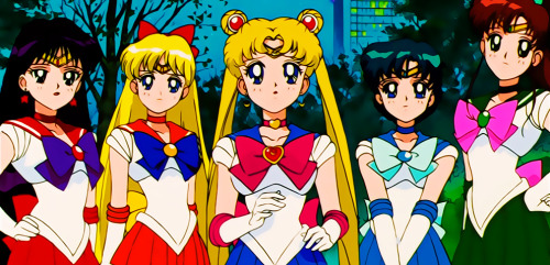
Anime is often really good at creating iconic designs like this, through repetition of the visuals. It is awkward in live action shows if characters just wear the same outfit every scene (what, they only own one outfit? Are they homeless/work in the tech industry?), but animation gives us enough aesthetic “distance”, an awareness that this isn’t accurate to real life, that you can buy into the conceit. By wearing the same outfit every time, it just becomes the character. Not to mention a studio can really save quite a few bucks by streamlining production with neat tricks like having only one character design to animate - when you are on a shoe-string budget, like pretty much every anime in the 90’s was, every cut corner counts.
What is interesting about Sailor Moon is that most of the time it doesn’t really use this conceit at all.
-----------
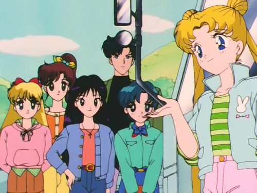
Episode 15 of Sailor Moon’s first season has, in its opening act, this shot of all of the Senshi (at the time) talking to the plot-of-the-day character, who clearly trains rock Pokemon in 16-bit caves in his off hours:
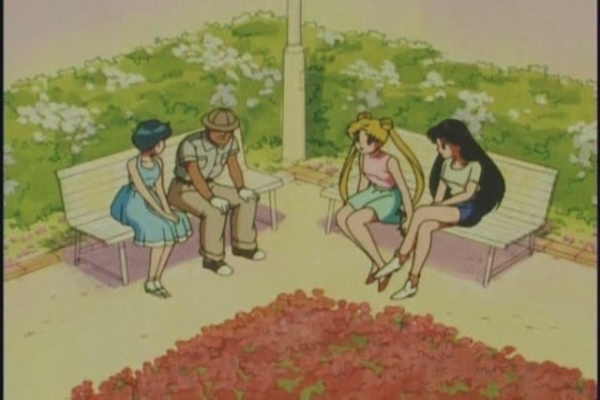
If you knew nothing about these three characters, you could probably infer about 80% of their personality just from their outfits. Usagi (the blond one in the middle, if that's necessary) is wearing:
Light pastel colours, with pink on top of that: girly, feminine, bubbly and breezy
Short-but-not-too-short of a skirt, and red heels: cares about fashion, wants to project an image of being a woman with a romantic hint to it
Long-twin tails w/ buns: Contrasting the shoes, she is still immature and childish. It also means she is the protagonist of an anime
Rei (far right) rocks a very different look:
T-shirt and jean shorts, shoes over heels: sensible, practical, a bit sporty
Very short shorts, long black hair: Confident, a bit aggressive, and suggestive of a more overt sexuality
Ami (far left) settles into a more restrained vibe with:
Full, long, but sleeveless dress, bob-cut hair: Chaste, more conservative, but not to the point of prudishness; particularly with the length (and the hand posture, shielding her body) probably a bit shy
Monochrome blue colour in outfit & hair: reserved, serene, possessing a calm demeanor
I know I have seen the show already, but really none of these details are a stretch - this is just the language of fashion. And all of these outfits are outfits that the characters have never (or rarely) worn before up until this point. The cast of Sailor Moon, far from that animation conceit of “standard outfits”, change clothes all…
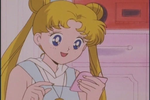
the….
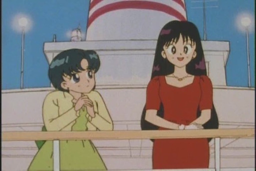
time.
I just randomly clicked on episodes to find these, it requires no hunting
And while it isn’t always as spot on as the top picture, they all in some way embody the language of visual design to speak to the personality of the characters. If you want to see more, check out one of the multiple tumblrs dedicated to the everyday clothing the Sailor Senshi wear, because of course those exist.
If this was a 2010’s Kyoto Animation show, pointing this out would be the end of it - every one of their shows has this level of impeccable detail. Sailor Moon is notable in that it is not at all that kind of show; the animation and designs in Sailor Moon take perpetual shortcuts to get the job done. I don’t think the transformation sequences need to be belabored - the way they permitted the team to recycle identical animation sequences, multiple times per episode, was surely a godsend to the production schedule. Yet not all of the budget limitations are so prettily masked:
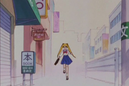
I’m sure they finished the background art in the...VHS release?
The show is filled with dirty animation, unfinished backgrounds, backgrounds that are a simple color gradient for no clear reason, and so on. It is clear that the Sailor Moon team did not have the resources for every detail - which is why the decision of what details they did choose to prioritize is so interesting.
----------
What is the point of Sailor Moon? I do believe that shows have “points”; and by that I don’t mean a message or theme but a core appeal to an audience, something specific that they will get out of the show. Almost every show appeals along multiple axes, and Sailor Moon is no exception, but I want to focus on one: aesthetic identification.
If you learn someone is a Sailor Moon fan, there is the obvious follow-up question you have to ask, namely “which Sailor Senshi are you?” It’s the which-Harry-Potter-house-are-you question of anime, a horoscope where you can choose your sign (in this case literally). The premise of this concept is not hard for media to execute on - it is just personality traits and aesthetics grouped together under a label, a basic building block of media and clickbait internet quizzes. Harry Potter, ironically, raised up its memetic question almost by accident, as its focus is so squarely on House Gryffindor that the others are almost forgotten; it was just so mind-bogglingly popular that it didn’t matter.
Sailor Moon, however, takes this concept and allocates so much of its aesthetic budget into making it a centerpiece of the show. Sailor Moon herself is a klutzy, lazy romantic, Sailor Mercury is a shy, earnest bookworm, and so on, with none of them ever really becoming very complex characters. However, the show devotes itself to making you *feel* these archetypes as strongly and intricately as possible. All of those outfit changes are chosen because not only do real girls care about their outfits and can therefore identify more strongly with characters who do the same, but so they can constantly emulate their archetype in diverse, different ways. The show doesn't have the budget for intense action scenes, so after Sailor Moon engages in her hyper-serious transformation sequences, she proceeds to, nearly every time, bumble through the combat scenes like this:
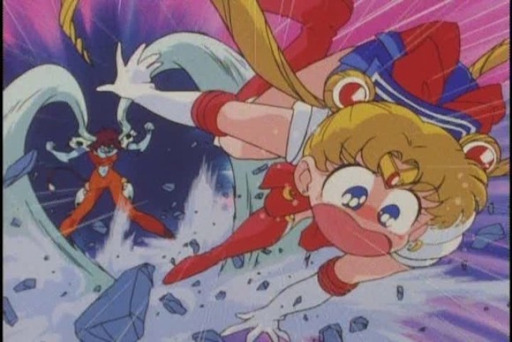
Oh sure, the scenes are done this way because it is funny (and good comedy can be done on any budget - these shots are frequently still frames with motion lines!), but it is also done this way because Sailor Moon is a total screw-up, and if you identify with that it is validating to see someone “just like you” able to pull off wins despite it all. The transformation sequences are not only beautiful animation that showcases aspirational power, but are also crafted to highlight the personalities of the Senshi in question - unless you think aggressive, combative Rei got fire powers by coincidence. Half of the run-time of every episode is spent, not on the plot du-jour, but on light-hearted personal squabbles between the cast because those scenes are not just funny, but also allow for far more moments of character expression.
All of that work pays off in building with the audience, not a connection with a character who reflects their identity in total, but a connection that reflects one aspect of their identity in an extremely deep (dare I say multifaceted?) way. I think if you were to describe Sailor Moon as a “shallow” show, you would actually be right to say so, in a sense. These characters will never have the true depth of personality, themes and so on of a more ‘adult’ show. But those adult shows have to spend their effort somewhere - for all that the themes of say Evangelion or Paranoia Agent are pristinely detailed and impactful, you aren’t ever going to be memorizing the moves of their transformation sequences. The way Sailor Moon committed so strongly to fleshing out the archetypes the Senshi stood for is, I think, one of the keys to how this cast of five became so iconic.
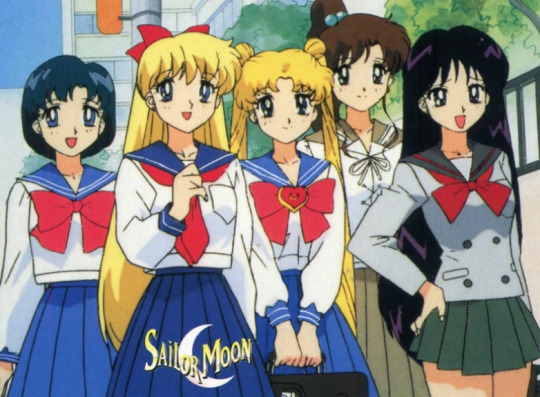
Not even their school uniforms match! They had to spend time in-universe *justifying* this!
----------
A Final Note:
At least, everything I’ve said here applies to Sailor Moon at its peaks. The show, however, is not one without its stumbles, even in Season 1. This section doesn’t flow into the core essay too well, but I wanted to note it because if you were to watch Sailor Moon today, you might struggle to feel the dynamic outlined above. The biggest culprit here is the length - Season 1 is 46 episodes long, and sections of it most certainly drag. They also take a startlingly long time to introduce the cast - this choice builds tension around their arrival, but it also means the later Senshi get a lot less time to establish themselves. Sailor Venus in particular gets hamstrung by this - she is introduced and then immediately arc plot elements sweep the narrative, and so she is left as a hollow shell for some time. The pacing of the show is undoubtedly flawed.
I think Sailor Moon is a show that you do have to keep its time and place in mind for - namely, middle schoolers and anime nerds watching it on broadcast TV in the 90’s. As an adult you “get” the point of the show pretty quickly, and get satiated on it almost as fast. Watching it all in a few sittings only heightens this problem. For a younger audience, and one that is waiting for a week between episodes with no internet for plot reminders, all that extra time is needed to jog memories and build connections. And younger audiences just have that limitless commitment to the things they love! If you think no one could actually enjoy seeing the same transformation sequence for the 30th time, watch it with someone who would have died for this show when they were 10 and you will be disabused of that notion *very* quickly.
Still, we can’t travel back in time - Sailor Moon is a show of its era. There are “filler-reduced” guides out there, though I caution that the plot of Sailor Moon is absolutely not the point of the show in comparison to the character dynamics, and so sometimes the filler is the best part (Cat-Rhett Butler is the best character in the show YOU KNOW I’M RIGHT). Certainly, however, some method must be used to cut down on its length. If you are going to be a first time viewer in adulthood, that reality should be kept in mind, and if you do accept it for what it is you can really appreciate its core appeal - and don’t forget to finish it off with a 1990′s era internet personality quiz to really wrap it up!
61 notes
·
View notes
Text
Thoughts on Dark Fortress #1
(This post is under a cut due to spoilers.)
NB, my thoughts on the first pages that came out in the preview are collected here [spoilers at link], so I won’t repeat myself.
Okay here we go :D I’ve posted up my fav panels but always want a space where I can burble at length.. (I’m late in posting this bc recently for the last few days I’ve been obsessing over politics in my country as it’s the run-up to election time.. I haven’t read anyone elses’ thoughts on it either so I could be behind on prevailing speculation or whats known or something) The preview pages ended at the panel when Aaron says “Vaea is right”, so that’s where I’m beginning.
I can’t put my finger on why but I really like the “don’t tell me I’ve had too much to drink” panel showing a Tevinter street. It’s a neat blend of “Tevinter is advanced relative to much of the rest of known Thedas, but also ominous, but also a place where people live and go about their lives, and also not going too heavy on the cyberpunk angle”. I dig the composition ‘leading’ the eye up the street and the consistency with the recently-seen DA4 materials that have red lighting in Tevinter buildings, similar building shapes etc. ig I’m pretty obsessed with the idea of the DA4 PC & party walking up streets like these.
I wonder how Aaron felt witnessing Tractus’ drunken scenes in the pub :(
Tractus’ attitude towards the barman here shows the influence and power Magisters wield in Tevinter, and the fear of them common among the mundane populace
digging the Tevinter-y motifs & design of the bartop, bar shelving etc. it feels like thought went into it
I’d watch a spinoff show or read a story where Marius and Ser Aaron have to team up in order to achieve something
Vaea is so badass and agile! I appreciate that the shot of her up high was tasteful and didn’t like, weirdly contort her body, have a weird leering angle or emphasize things in that way comic art often does for women at moments like these
so in Tevinter, lamps give off red light (seen in the bar scene). are the windowpanes themselves also red?
good thinking Vaea grabbing the staff. great sense of snappiness and motion in this panel. her landing reminds me of squirrels doing the superhero pose landing actually :)
tfw you and a dog burst out of a wardrobe
Tractus recognizing Fenris, it seems - did they encounter each other when Tractus was young, or does he just know of him (distinctive markings and all that)? if the former, I have a feeling we might get a flashback scene to that time in a future issue
cutting to look at Francesca when Tractus talks about Fenris murdering his father is GENIUS. look at the sadness on her face here; “you murdered your father” is exactly what she’s been telling herself and struggling with all this time
nice to see staff-less magic in action
Tractus seems to have drawn power from the red orb set in his staff. he reaches out to it and it responds by glowing and the staff moving, but he wasn’t doing a Jedi ‘use my Jedi powers to make my thrown lightsaber [staff] return to my hand’, as you might expect, he was instead charging up and drawing magical energy/power from it [the orb], as seen by the red light in his hand in the next panel. this reinforces my earlier wonderings that the red orb is notable and that there’s some connection between it and his red eyes. later in the panel when he’s trying to cast on the floor his eyes seem lit up (altho it could just be lighting & dramatic effect)
I wonder if Fenris thinks of Anders and Justice when Tractus says “justice”. There was once a mage in Fenris’ life who was really focused on justice..
the combat scenes are beautifully drawn, thought out and colored
Fenris’ lines here are really metal, badass and impactful. I could hear Gideon Emery’s voice in my head as I read these bits - the word choice of “hounded” helps with that I think, it immediately recalls Fenris talking with anger about how Hadriana denied his meals and hounded his sleep. they nail how Fenris speaks, the pattern and words he tends to use, etc
PHASING POWERS in action!! this is very cool to see, this ability of his didn’t get touched on much at all in DA2 outside of combat or a few scenes
I enjoy the contrast between the red and blue glows
Fenris is understandably merciless
“Perhaps if you had it carved into you” feels like foreshadowing for the ‘red wraith’
:( the reminder that the very thing Fenris struggles with feelings of hate and fear towards is carved into his skin for the rest of time and always will be
Vaea is brave to step in, standing up for what she believes is right and also re-centering focus on the critical mission at hand
;___; Autumn helping keep Tractus on the ground. she is such a good girl. she Help
“You’re lucky the mabari is here” - having Fenris in a dark light here relative to the rest of the panel is nicely symbolic
oh shit!! some plot advancement in terms of the ongoing story of the wider world. The Antaam have now reached Neromenian!! the invasion is progressing further and further into Tevinter. how far will it have come by the time of DA4? will there be an active war front not far from Minrathous? I appreciate the comics from this team a lot, here and there they push forward the ‘story of Thedas’ not just the story of the comic’s focus. also, I like that the Qunari soldiers here aren’t clones of one another but all look different. different hairstyles, sizes/bodies, clothes
love how our group work together, everyone has a strength and a role to play, the teamwork, the delegation, they’re like a DA basegame party or a D&D party
the way Fenris’ hand and arm glow in this sequence has been drawn/colored is smart - calling to mind the image of blue veins running through someone’s arm or below the skin on the backs of their hands
Fenris has surely picked up Fereldan sayings from Hawke.. stop .. my heart ;__;
the Fenris/Autumn exchange
this is so intense.. why do I get the feeling that Fenris has used this sort of torture technique before in his hunting and extermination of Danarius’ adult children campaign and/or his hunting of slavers as the BW with Shirallas campaign. it feels like he has done this sort of thing before in the time post-Kirkwall. I like that they didn’t hold back with a bit of gore here and there in this issue (phasing a hand and then solidifying it inside someone’s body, the Qunari attack portion in the street etc), while at the same time not being excessive with it.
this miniseries so far has good pacing, things moving along nicely and not being too slow or meandering
it’s smart having Tractus’ explanation of how to get in stay off-screen to the reader while we follow Francesca calling the alarm. It means we get to find out as we watch them infiltrate
omg those puncture wounds from his talons
when Fenris is about to kill Tractus after he tells him what he wanted to know, I’m strongly reminded of how he promised to let Hadriana go then killed her anyway, regardless of player choice. he has his ruthless streak and it feels like a callback. and before, when he was standing over Tractus when he was on the floor, echoes that scene in A Bitter Pill when he stands over Hadriana on the ground, who also reached for her staff
Tractus pale with bloodloss and fear
lmao @ Fran and Autumn’s faces when they walk in on this scene
Fenris listening to Vaea is nicely consistent with his character too imo - there are times in DA2 when Hawke can be like “Fenris no don’t do the Thing” and he doesn’t do the Thing
I have missed the way Fenris’ nose bridge crinkles when he’s angry
I wonder what the consequences of leaving Tractus alive will be. [tv announcer voice] FIND OUT NEXT TIME ON DARK FORTRESS
so the ritual will only take minutes to complete huh 👀
wow Neromenian has truly fallen, reeducation of the people of Tevinter continues as in Three Trees to Midnight in TN
explaining that they are speaking in Qunlat is a nice immersive touch and shows attention to detail of the lore of the world
bobbly-shoulders Qunari, Legolas hair Qunari, septum piercing Qunari, bobbly-brow Qunari, undercut Qunari. I wonder if the shoulder and brow protrusions are aspects we’ll see in the Qunaris’ latest design in DA4?
poor Tractus can’t catch a break lol. it has Not been Tractus’ day
Karasten: an infantry field commander
bit of Tevinter lampshading, lil fourth wall break with “This land and its obsession with magic. There is always a forbidden ritual with them” hhhhhh
Ringwraith on a horse moment at the end there
strong ending, can’t wait for next month weww.. 👀
#dragon age#bioware#dark fortress spoilers#dark fortress spoiler#spoilers#spoiler#fenris#the Fenaissance#dragon age: dark fortress spoilers#dragon age: dark fortress spoiler#video games#dragon age 4#the dread wolf rises#da4#gore cw#blood cw
34 notes
·
View notes
Note
Was reading your post and I was fine with the Warners faces becoming a beige color but now that you've pointed out that their technically no longer black and white, I CANT STOP THINKING ABOUT IT AJSJSKDH,, NEVER REALIZED BEFORE THAT THE AESTHETIC PERISHED WITH THE REBOOT ;_;
aHAHAHAHAHA IM SO R R Y bUT YEAH DLKDLKJD
I JUST LOVE THE STARK CONTRAST OF THE BLACK N WHITE AESTHETIC SO MUCH AND ESP HOW RELEVANT IT IS TO THE WARNERS WHO ARE ENTIRELY BASED ON THE CLASSIC BLACK N WHITE CARTOONS FROM THE 30′s (think ‘steam boat willy’)
in that one song i mentioned on the post when they get to the line “AND JUST LIKE US, ITS RLLY ALL BLACK N WHITE” THEY MORPH INTO THESE WEIRD, OVER STYLIZED VERS OF THEMSELVES AS TOONS FROM THE 30′S ....bUT ITS LIKE

THATS SO UNNECESSARY
THEY LITERALLY ALREADY ARE TOONS FROM THE 30′S THATS THE WHOLE POINT ALSDJKLDJKLD
omg i just realized they got their round noses back for this sOBS
also dont get me wrong i actually really like this song JUST THIS PART FELT RLLY .. WEIRD..
kinda makes me wonder if the song was written before the final color choices were made BC WHY WOULD ANYONE ASSUME THEY WOULDNT BE BLACK N WHITE ANYMORE ITS ONLY THEIR WHOLE INTEGRAL DESIGN PURPOSE SDLKJDL

also i miss their noses staying red when theyre doing the black n white thing, it was such a constant in the og series
it woulda been a neat call back for that part in the song to do
#animaniacs#animaniacs 2020#animaniacs 1993#yakko wakko and dot#clown honks#anon#moonime#yakko#wakko#dot warner#yakko warner#wakko warner#animaniacs yakko#animaniacs wakko#animaniacs dot
17 notes
·
View notes
Text
MONSTER MASH 2020 ENTRY 3
Room Service
Waves hit the shoreline as Y/N scuttles quickly down the sidewalk that borders the beach. Her front desk job at the Hotel Corll is waiting to meet her at the end of the walkway. Light posts slowly line just ahead, then besides, and then behind her, flickering on as the sun sets and the icy fog rolls inland. Out of the corner of her eye, Y/N catches a glimpse of a freshly printed missing persons poster, with bold Arial black letters in contrast to the young pretty redhead with a coy smile, blue eyes peering back. She considers the expense of printing in color ink then moves on. She was already late getting out of her clinicals as it were. As she rounds up onto the hotel property she takes in the sleek lines and wooden facade of the luxury hotel, hoping tonight isn’t as busy as yesterday. She could barely keep her eyes open during her clinicals today, earning a scolding from her nursing professor much to the amusement of her fellow classmates. Bunch of morons.
“Took you long enough!” A voice rings out as Y/N steps into the lobby. Her coworker Soohyun is waiting with a grin, coat on and purse in hand, for her to approach the desk so she could finally go home. The lobby is as intimidatingly large as it is cold. Cream marble floors lead up to the dark oak front desk, with wooden columns lined in neat even rows between the entrance and where Y/N will be standing for the rest of the night. Vaulted ceilings seem to encase the room, a remnant from the hotel prior to renovations. Though the fireplace casts a glow from the sitting area, it is difficult to penetrate the natural draftiness of the building, though its easy to blame it on the shoreline the hotel sits on.
“Jungkook is actually already here, just had to go use the restroom,” Soohyun scoots to let Y/N place her schoolbag into the employee cubby under the desk. “Was pretty quiet today, so should be an easy night, though I’m surprised you didn’t just call off sick. You look…how do I say this, ghastly?” Y/N stands back up, pouting at the comment.
“I would, but rent’s comin’ up soon, and you know my roommate always slacks on her half,” she says as she logs in for the start of her shift. “I’ll survive. Besides, I’m off tomorrow. I’ll just sleep in then.”
“Alright, your choice,” Soohyun responds. “Any case, I’ll see you in the morning! Good night!”
Her heels clack on the floor as Soohyun struts her way out of the building, posh bag in hand and not a hair out of place despite the end to a long shift. Y/N looks positively bedraggled in comparison, her flats scuffed badly on the sides and a small stain on her shirt from her attempt at chugging her coffee before getting on the bus. As she swipes in with her master key, Jungkook steps behind the desk, returning from the restroom.
“Hey Jungkook, how’s it goin’?” Y/N asks. Jungkook just nods his head and grunts in response, doe eyes half-lidded as he quietly prepares for the shift. He is a quiet man who attends the same school that she does, though he is studying photography. Stoic and observant, he only speaks as needed, but is a hard worker and is always at the ready to tend to guest needs. Standing at his computer station, his lean height towering over Y/N, he prints out the list of remaining check ins for the night.
“We have two VIP guests tonight. Looks like Mr. Jung extended his weeklong stay in the Hindley Suite for another night. He requested extra towels for his stay tonight. Kim Namjoon has not checked in yet though he did call to let us know he will probably be checking in late.” Jungkook reads off monotonously from his computer screen.
“Looks like Miss Lim left a note, she says the Holmolka suite is not available to be rented out? Ah geez, did somebody trash it last night?” Y/N crumples up the pale-yellow post it that was stuck on her computer screen and tosses it in the trash.
“Seems so,” he deadpans.
Miss Lim is the long-time owner of the Hotel Corll, a heavy smoker with too strong Chanel No. 5 seeping from her body and too red lipstick trying to make up for lost time. With a plastic personality that matches her new nose and lips, she is a real piece of work. At least the job pays well. That reminder has served Y/N well in her comparatively shorter time working at the hotel. Nothing like the hospitality industry to suck the life out of everyone that deals with it. Miss Lim’s gaudiness reflects in her property from the gold painted- furniture to the overly lavish light fixtures that look like a Versailles fantasy from hell. However, this seems to not be a detriment to the establishment’s business. In fact, despite appearances, the hotel gained a small, loyal, and wealthy following due to the hotel’s strict confidentiality code. It has done well for Y/N’s pockets.
About an hour after the night shift began, Seokjin, the head housekeeper, and Yoongi, the live-in handyman, walk into the lobby wearily. Their eyes are drooping in exhaustion. Seokjin’s blonde tresses gleam as several pieces of hair are left in disarray. Yoongi takes his cap off to run his well-worn hand through his hair and then returns the hat to its original position. They both make their way to signing out of work, looking as if they were both asked to run a marathon.
“Are you two just leaving now?” Y/N asks. She looks a bit puzzled that both employees are still on the clock even though their shifts usually ended two hours earlier.
“Had to finish essentially rebuilding the Homolka suite,” utters Yoongi. “Took damn near all day to complete.”
“The guests from last night absolutely decimated the room, you’d have thought they were raised with by wolves!” Seokjin exclaimed. His irritation was agreed upon by Yoongi with a harumph. “Now if you excuse me, I’ve got to get home and soak my feet,” he continues. “I think they have earned their reward. Good night!” And with exhausted feet, he slowly wobbles out of the building. Yoongi simply waves his hand goodbye and makes his way to one of the two elevators to go up to his small room.
As the evening wears on, more guests straggle in through the hotel doors and up to the front desk. The quiet mumbles of guests checking in, ringing credit cards through the clerking system to confirm their reservations, and authorizing payment becomes the soundtrack to Y/N’s evening. The monotony and false smiles are what’s getting her through the evening. At nine o’clock the long-awaited VIP guest Mr. Kim Namjoon steps through the hotel’s door. He walks up to the front desk with an even and patient gait. A false smile sits on his plush lips though it fails to reach his eyes. Like cold fisheyes Y/N thinks. Jungkook and Y/N both stand to attention, almost as if preparing to be disciplined by the school principal. With stillness and silence, Mr. Kim reaches Y/N’s section of the front desk. He always did prefer young women. The more impressionable the better.
“Good evening Mr. Kim, how may I help you?” Y/N asks. A shiver of trepidation slithers up her spine. His handsome face just serves to accentuate the fear.
“Just checking in, and how are you this evening?” Mr. Kim responds, the partial smile never slipping off his face. Y/N voices her learned pleasantries and decides at that moment she never wants to be caught alone unawares by this man. She takes the black card from his proffered hand to finish the check in process, the sooner the better.
“This is the Lalaurie suite, correct?” he asks. “And to confirm, can you please make sure the complimentary room service is added to my reservation? There was a mix-up the previous time I stayed here and wouldn’t want a repeat of that, would we?” His tone says amicable and easy going, but his eyes say otherwise. His eyes convey zero tolerance for mistakes.
“Yes, of course Mr. Kim, anything for our most loyal guest. Is there anything else you would like added to the reservation?” Y/N weakly inquires.
“No, not at all. Oh, and I have a guest with me on this reservation, though she will be arriving later. Please call my room when she does.” And with that, Mr. Kim takes his room key and makes his way to his preferred suite. Y/N releases a sigh of relief as Jungkook’s shoulders visibly relaxes. He still says nothing.
The night continues as a typical and quiet one for both front desk employees. Jungkook receives requests for extra towels and bathroom amenities which he delivers every so often while Y/N begins the night audit for the hotel. That is until the two figures enter the hotel and disrupt what was supposed to be a normal evening. They are covered in head to toe blue, their badges visible as is their handguns on their waists. Both men step up to Jungkook’s side of the desk. Great, the cops are here.
“Officer Park, how may I help you?” Jungkook asks with the usual lack of enthusiasm. Of the two policemen in the hotel, Officer Park Jimin is a recognizable face amongst the staff as he is an acquaintance of Miss Lim. Or one of her many lovers as Soohyun loves to put it. Between his cocksure expression, his flirtatious demeanor, or an ass designed to fill out tight pants, the sentiment is not too far of a stretch for Y/N to believe. As for the other cop, neither Y/N nor Jungkook have ever seen the officer before. With a knowing glance between the hotel employees and Jimin, this does not bode well. And they all know it.
“Hello, I am Officer Kim Taehyung, and apparently you seem to already know Officer Park,” Taehyung supplies with a suspicious glare thrown Park’s way. “We’re here as we’ve received an anonymous call about this place yesterday. Seems some folks happened to have been walking outside the hotel and happened to hear screaming and pleading from an open window. Would either of you happen to know anything about it?” Taehyung shifts his gaze between Jungkook and Y/N in expectation. They are more screwed than they previously thought.
“No.” Jungkook replies as succinct as possible.
“No,” Officer Kim straightens up and forces his shoulders back, eyebrows furrowing. His demeanor is growing more aggravated by the second. “That’s it huh? Hey, what about you?” He throws out to Y/N, who makes it a point to match Jungkook’s countenance closely. “You see anything suspicious at all?”
“Nope, I wasn’t even working yesterday. Been off all week,” she lies through her teeth. “But, if you need to speak to the owner, you can give us your name and number and we can relay the information to her.”
“See I would, but the girl who we came to speak to yesterday gave me the same bullshit and now I’m here again. So, I will ask one more time, what do you two know about whoever that was screaming bloody murder on your property?” says Taehyung.
“We don’t know anything,” supplies Y/N. “Now unless you got a warrant or something, I going to have to ask you to leave. Now.” Her lips purse in barely retained frustration. She squares her shoulders and lifts her chin defiantly. She refuses to be cowed by this fool. She has encountered much worse than the likes of him.
“You know you two could get in big trouble for lying to an officer of the law, right?” Taehyung encroaches into Y/N’s space, face molded into a sneer, dark eyes peering into hers. He was a man used to getting what he wanted. However, before he could go any further, Jimin steps in.
“Hey, come one Tae, she’s got a point, no warrant not much we can do. And besides, you know Chief told us to drop this. Let’s go.”
Although Officer Kim looks prepared to argue, with his partner standing down, he knows he will have to leave and regroup before anything further happens.
“Fine,” he relents, “but I will be seeing you again. The both of you.” And with heavy steps he exits the building, fury pulsing through his body. Jimin hangs back.
“It might be time for the boss lady to start pulling her connections for that one,” he throws his thumb over his shoulder, pointing at his partner. “Could be trouble if it isn’t nipped in the bud.” Park tips his hat, winks at Y/N, and leaves, easygoing and stride confident. Perv.
Jungkook picks up the phone as soon as the officers leave, speed dialing Miss Lim with the update. She picks up on the first ring, fully aware of Officer Kim’s previous visit. Her words are difficult for Y/N to hear through the receiver. Despite not hearing the words, she can tell her employer is instructing Jungkook to navigate through the clerking system to look up the previous occupant of the suite. It was the Holmolka suite. With a few clicks here and there, it looks like the Mrs. Ushakova that rented the room on the aforementioned date is added to the Do Not Rent list, all her guest privileges cleared and an alert placed on her account. Mistakes as done by Mrs. Ushakova are not allowed by establishments such as the Hotel Corrl, where silence and confidentiality are sacred dogma. Her indiscretions come with repercussions. Jungkook hangs the phone up.
With the hours flowing by, the previous lethargy felt by Y/N has now been replaced with worry due to the police’s visit. She hopes that the remainder of the night shift can continue as normal. Though that remains to be seen, as Mr. Kim’s guest now arrives. Y/N has seen her face before. In fact, she just saw her this morning, at St. Francis for her clinical rotation. The girl giggled particularly obnoxiously, in-light of Y/N’s reprimand via their professor. She just can’t seem to remember the girl’s name for the life of her. She must be more tired than she realized.
“Call Mr. Kim’s room, he should’ve mentioned that I was supposed to be arriving.” she hadn’t even made it all the way to the front desk before she starts haughtily commanding the employees to do her bidding. Jungkook takes this as his cue to simply crouch low under the desk as if he were searching for something. He isn’t. As the girl reaches Y/N, she lays one well-manicured hand on the large oak desk while leaning on the other one. She examines her nails as though she was contemplating different acrylic shades that can replace her current pearlescent one. Y/N hesitates for a beat, a sliver of concern for her classmate becoming more discernible after another second. Unfortunately for her, the girl notices, her eyes flicking upwards.
“Hello? I said I was expected, shouldn’t you be notifying him?” she asks, her snobbishness a blatant fixture on her person.
After another missed beat, Y/N clicks through her computer program. She is aware of exactly who this girl is, and as such, dithers her way around the clerking system. She can’t just let her classmate go to Mr. Kim’s room, can she?
“Sorry, he doesn’t seem to be checked in, are you sure this Mr. Kim is staying here?” Y/N asks. Jungkook side-eyes her from below, still looking for nothing.
The girl narrows her stare, scrutinizing the female operating the front desk. Realization dawns on her as she smirks. She fails to read the near-imploring gaze her classmate working the computer gives her, a sign of precaution.
“Oh, I know you. You’re that dumbass from this morning! At St. Francis Hospital? The one that went into the wrong patient’s room and tried to give her the wrong medication? I remember you,” the girl’s smirk expands. “Now you see, I know my date for the night is here, I have it right here in his texts,” She brings her phone up as if to show Y/N the incriminating evidence. “And I don’t think it would do so well for your job here if I just call him and let him know that you of all people are stopping him from getting my services for the night, would it? How about this, you don’t stop me from doing my job and I will make sure you don’t lose yours!” She flips her hair with a flourish. Y/N pauses for a moment, a sickeningly sweet smile appearing on her mouth.
“Ah, it seems I have made a mistake, he has already checked in.” A few extra clicks on the computer and a newly scanned room key later, she picks up the hotel phone to make a call up to the Lalaurie suite.
“Mr. Kim, your guest is here, shall I send her on up?” With Mr. Kim’s confirmation delivered, Y/N delivers her classmate to his suite, hospitality in full swing.
###
A few minutes after 3 o’clock in the morning, the front desk phone rings. Y/N is reading a chapter in her textbook about proper bedside manner whereas Jungkook is playing solitaire on his computer. Like second nature he picks up the receiver. Mr. Jung is calling. With little being said, Jungkook turns to his colleague.
“Hey, Mr. Jung wants his extra towel service now, you think you could do it?”
“Sure, gotta get away from this book or I might go cross-eyed.” She replies. She takes her master key and walks towards the elevator down the hall. She presses the glass button, standing in front of the elevator doors, a tacky reflective emerald green coating the doors as she waits. She looks up at the electronic number screen above the doors, the numbers still descending, five, four, three, two, one. A ding sounds out as the doors slide open and Y/N steps in, pressing for the twelfth floor, where the most important guests stay. When the doors reopen, this time many stories above ground, she takes a left down the hallway where in a small corridor next to the elevator is a well-maintained utility closet. To provide Mr. Jung his towel service, she grabs a laundry bin, a couple plastic tarps, several bottles of bleach, gloves, and many white fluffy towels made from the finest Egyptian cotton. Only quality at the Corll. Bin in hand, Y/N rolls the container down the hallway, past the elevator to one of the only three rooms on this level. Arms going jiggly from pulling the cart to its designated location she finally stops in front of the Kemper suite, Mr. Jung Hoseok’s room. She knocks on the door three times, and before a fourth one rings out, Hoseok swings the door open, blood coating his clothes and body, from his hands to his neck, splatters across his visage.
“Oh! Thank you! You can put that over here,” he says appreciatively, pointing to a corner of the room next to the flat-screened television. Y/N rolls the bin full of supplies past the lean black haired man, across the blood soaked carpet, past the cold blue corpse lying in a pool of his own liquids, past the California King euro plush mattress to the corner of the room.
“There you go sir. Now you do know that because you are staying in our Kemper suite you have complimentary room service, right? Are you sure you just want the extra towel service?” she asks doubtfully.
“No, no, its fine, I always preferred doing my own disposal, I can get it just right that way!” Mr. Jung smiles enthusiastically. With a smile and a nice hundred-dollar tip in hand she looks over at the redhead splayed on the floor, blue eyes staring wide eyed at the ceiling, fear frozen in their features. She looks smaller than she did on her own poster Y/N notes, before tucking the money away and leaving the room.
She shuts the door behind her and turns towards the elevator when she notices something at the other end of the hall. Someone is crawling. Y/N lets out a deep sigh, tucks her tip into her pocket, and stalks down the hall in exasperation. As she gets closer, she sees its her classmate from before bleeding profusely, begging for help.
“Please, please help me! I’m- I’m dying!” she gurgles out, sobbing in between her words. Y/N bends down, and huff expelled, grabs the girl’s long hair soaked in her own blood before she starts dragging her back down the hall, back to her client’s door. She screams and cries and begs for her life, but Y/N is unphased, continues dragging her classmate to her doom. Three door knocks echo through the hallway. Namjoon opens the door, perplexed by the sight before him. He is freshly showered, a towel slung low around his hips, water still dripping down his built chest. Cold fisheyes looking back.
“Sorry to bother you sir, seems you almost lost one.” She calmly says, as she lifts up the girl’s hair as she screams.
“Ah, my apologies,” he then reaches down into his bag sitting by the door. “I thought I had finished with her. It seems I was incorrect.” With deft fingers he grasps the handle of a large hunting knife from the front pocket of his bag.
“No! No! Please!! Don’t-!” and with one swift slice, Namjoon swipes the blade through the girl’s throat. She falls forward, death rattle sounding out between her lips.
“It’s fine Mr. Kim, she couldn’t have made it far anyway.” Y/N asserted.
“Eh, I still pride myself in thoroughness,” He wipes the knife clean on the towel slung across his hips. “Could you make sure room service comes tomorrow after I have checked out?”
“Of course, sir, I will make sure to notate that for the morning shift. Have a good rest of your stay.” She bows her head a bit in deference and turns to make her way down the elevator.
###
As the morning sun rises, Yoongi makes his way to the hotel lobby for the free coffee and continental breakfast served there. He yawns into the air before grabbing an apple fritter in one hand and black coffee in the other. He turns to Y/N and Jungkook still manning the front desk, counting down the minutes until they can leave. He acknowledges the both of them but before he could go finish his treat Y/N stops him.
“Yoongi, before I forget, make sure the Lalaurie suite gets room service after Mr. Kim checks out. Its his special request.”
“Seriously?” he grumbles, “He is always ruining our mattresses! And we then we have to replace them! Last time, the new housekeeper accidentally walked into his suite before he left and he was honest to God cuddling the body! Who does that?” Y/N shrugs in response, her eyes bloodshot. She’s ready for the nap of a lifetime. Before she gets any more exhausted, Soohyun comes in for shift relief. Thank God. Jungkook offers a short update on the cop debacle and after not much longer both employees pack up and walk out the lobby doors.
Y/N shuffles towards her bus stop down the walkway, adjacent to the beach. She makes it past the light posts fading off, one by one as she walks past them. She walks by the missing persons poster and takes in the crisp clean air. She decides she is going to go home, sleep, and then wake up for a study session. If she wants to eventually be a top-notch nurse, she needs to act the part. She feels the tip money burning a hole through her pocket reminding her of a job well done. It gets messy but the pay is nice.
28 notes
·
View notes
Text
Soul
Breaking news, everyone: Pixar made another slapper.
I’m gonna get it out of the way first, but the only (and yes, only. Not like someone trying to say “only” even though they have many more nitpicks that they just don’t want to talk about) problem I had at all was that the super high realism of the settings of Earth kind of made the more cartoony faces of the people look a little more off. But, it’s kinda like the same thing people were talking about with that cat in Toy Story 4. It looks super real, which is impressive, but I feel like it was almost too real compared to the faces. Obviously it was too real compared to the supernatural settings because that was intentional, but yeah. It’s not even a big problem, it’s just the only one I can think of. I do think the realistic renderings of hair, light, water, etc at least work with cartoony stuff, but apart from that it looked almost like it could’ve been a photograph, with no exaggeration in the buildings or anything else.
I mean, I love the faces, so I definitely wish they went the extra mile showing extra personality and character in the buildings, as faces do with characters. Considering the faces matter like a bazillion times more, I still think they knocked it out of the park on the visuals. People with more investment and knowledge into the topic already said that the faces of any of the people of color felt cartoony and unique while also being true to life and respectful (My family recently stumbled onto some old animations from the 30s and lemme tell ya... We’ve come a long way), but seriously the characters that sold me on the visuals were the Picasso-esque beings who may or may not be the Gods of the universe maybe?
Spoiler boundary of course. It’s definitely worth a watch.
And that’s honestly what made the realistic world so much better. When the accountant guy went into the real world to set the count right, it was one of the most fun I’ve had just watching something. The sheer contrast between him and the world was so much fun, and it even solidified that those beings weren’t even acting in a different dimension or anything. They’re literally just beings that exist, meaning that all the other parts with the unborn souls and such are just as real as Earth. Or, even better, they’re the ones who can just casually rip a hole in dimensions. As far as depictions of Gods go, if they are even Gods at all, I think they’re one of the best I’ve ever seen. They feel like they could actually be how Gods actually exist, since all the commonalities of Gods involve supernatural power, which would suggest they’re supernatural themselves. I mean, I have a story with Gods in it too and they’re basically just that although admittedly a lot less imaginative.
With those guys being my favorite design, second place definitely goes to the lost souls, although obviously for more subjective reasons. 1) They’re purple, 2) They have one eye, 3) That eye is yellow which I always think is the best compliment to purple, 4) Tentacles, 5) Creepy in a kid’s movie. Franky, I would’ve made them a lot creepier, but even then they’re super creepy, if not visually then in their behavior. They’d just be kind of sad if they were just mumbling around, but since the first introduction to them starts charging at the main characters like a deranged monster. Considering how weird everything in that dimension is, finding something that isn’t nearly as innocent as everything else instantly invokes fear, since you have no idea what that thing can and wants to do to you. Sort of similar, I would’ve also made the “In the Zone” moments a bit more crazy and colorful, like when Joe fell through the void between the road to the Great Beyond and the You-seminar (is that how it’s spelled?), but these “I would do it differently”s might just be a fault of my design ideas or just subjective interests. I would’ve watched 2 hours of pure, nonsensical abstract worlds like the You-seminar with no explanation to how they work.
I definitely have a relief with the story, mostly entirely revolving around 22′s character. I was kind of worried she’d be too childish to really enjoy, but I feel like she was done really well. All the major historical figures’ remarks on how hopeless she were both funny and also really tied into her character “flaw” at the end as she was a lost soul. It might not be the most unique character archetype of all time, but it definitely makes sense, with all the people bringing her down implanting in her mind that she was an anomaly, and after a while was just sort of following it. Plus, she seemed genuinely interested in Joe’s weirdness, instead of being super mindlessly irreverent. And her being able to expand Joe’s understanding about his own world, like with the barber and his student, brings her up as more than a whiny, bratty child in the scope of the story. She didn’t JUST learn.
Even though I kind of expected it from the get-go, I’m also relieved that the movie didn’t shy away as much with the dark elements of death. It was kind of suggested that this wasn’t going to be a perfectly casual romp through a magical afterlife like Inside Out was with the mind because of the unborn souls unabashedly saying “Hell” in the TRAILER of the movie. I feel like that alone made the story super interesting, because it shows they’re actually going to be a bit more serious with things instead of just simplifying the unknowable complexities of the before & afterlife. Even with the dead souls going into the Great Beyond, it was a mix of being weirdly peaceful for some and super scary for others. My family thought it was peaceful for the most part, but my mom specifically though it was terrifying, and even though it’s a lot more peaceful than almost all other depictions of death, I can’t blame her. The souls were just kinda accepting it, like they’d been brainwashed or something, but still acknowledged that they were dead and were going into the afterlife. Plus, Joe, being the main character who we are supposed to sort of reflect in a way, was super freaked out by it, so that could easily suggest it’s to be afraid of and the other people are the weird ones.
I think the true message of the story being so strange was better too, because it would’ve been so boring if it fell into a super basic message we’ve heard millions of times. I feel like it has a similar sentiment to the basic messages, but is at least a more interesting way of saying it, if it is even like that in the first place, because it’s also somewhat vague in a good way. I think my brother/mother misinterpreted and simplified things a bit too much, where they thought it was sort of like a happier way of saying “accept your lot in life and don’t change it.” I could probably go on a full other rant about why I think this is wrong, but part of it is I don’t really know how they came to this conclusion in the first place, considering with that scene with that guy who threw the computers off his desk as his lost soul was cured (I guess you could call it that?), who obviously realized he wasn’t okay with his lot in life and was destined to change it. I think they sort of misinterpreted “the spark” and other things it as a 100% for-real, this-is-how-the-real-world-works sort of way, and not as much as a fictional way of saying things. Not necessarily symbolic, but I guess symbolic also? It has some of the same weird logical problems as the Cutie Marks from My Little Pony, except they’re obviously better since Cutie Marks determine your life down to your very job some of the time, while “sparks” are more vague and seemingly up to you. They’re more like when an unborn soul realizes there’s something on Earth they want to figure out, not necessarily their hobbies or jobs. For example, they kind of cited the barber character as the one who supported their point, but I think he does the complete opposite. He wanted to be a vet, but he ended up being a barber. But, they sort of assumed his “spark” was to be a barber, and that his personal interests didn’t matter because the “spark” forced him into a less favorable job. But, in reality, I feel like his “spark” is more his interest in love for the people around him, which is why he decided to get a more practical job to support his daughter (wife? one of the two) when he really needed to. Plus, he still enjoys being a barber because his devotion to love lets him connect to people as he cuts their hair. After all, he seems to be succeeding in his goal, since Joe was just like “Hey, let’s go see this guy he’s the exact guy we need!” People who don’t show love and interest for others don’t make that kind of impression in people’s minds. I feel like if we knew each story of everyone’s life down to the last detail we could fully determine what the mechanics of the world and its people are meant to say from a fictional context, but with such a limited selection I don’t think you can say something so sure. Sure, every choice in a movie is made specifically for a purpose, but I feel like if a movie tries to hard to be like “Oh but don’t worry here’s an exception” a million times it gets bogged down by its own attempt to make the message as obvious as possible.
Anyway...
There are also a lot of neat little details I loved, like how even though they did this for basically no other point in the movie, they made sure to include people from all around the world in that mess of dead souls, firmly sort of putting in the idea that the entire globe is in a sense one single entity that leads to the same place. They could’ve so easily just made everyone speak English for that throwaway scene, but I feel like including people from all around the world was very beneficial. Even the EXTRA little things, like the path to the Great Beyond looking like the neck portion of a guitar with the metal bits that separate the notes, or the facial features of the Gods blurring when they turned their heads in the other direction.
But yeah, who would’ve guessed Pixar made another good movie, right? Even then, Soul’s in the upper echelon of Pixar films. I really hope they (and Disney) realize they can go bonkers with a movie and still benefit/survive from it, since they’re so damn rich and inherently profitable. I think AAA animated movies like this that are the perfect amount of artsy are few and far between, and we need more of them. If anything, I hope they get more artsy, but I guess I’ll still never say no to a fun fantastical romp either. Basically, Pixar has looped me into watching any and everything they produce because it’s never “bad” I think. In the grand scheme of quality, even their worst work (Cars 2) is still not “terrible,” per se, even if it feels like it exists more as a cash grab than a genuine tale.
16 notes
·
View notes
Text
Sekai Seifuku Sakusen Wishlist
Hello people~
Say, does anyone still remember that figure line by Megahouse *retches* ?
Well, it was a short-lived series focused on, as the name (“World Uniform Operation”) suggests, showcasing female characters in their school uniforms.
To my knowledge, all of them were released as 1/10 scaled (eww). And the Precure seasons that had the privilege of getting figures...

Were Futari Wa, Fresh and Heartcatch.
Sailor Moon got theirs as well (the Inner Senshi + Naru) but they were very meh, imo. You were better off getting a more dynamic-looking prize figure at a significantly lesser cost.
Anyways, back to Precure. Not surprised about these three given their seasons’ popularity up to that point. But a shame because as of 2016, there hasn’t been announcement of any new figures. Which basically means, this line didn’t do well. Didn’t do well = the project is more or less cancelled.
On one hand, I’m sorta glad cuz the prices on these figures were ludicrous, especially when made at that scale and with Megahouse’s poor quality track record (I don’t even want to go into all that limited exclusivity bullshit). I bought Tsubomi and Itsuki and they seemed pretty alright. Still too much for a scale with such a simple design, though.
Then on the other, I can’t help but whine to myself a little cuz this is such a great concept. We rarely get merchandise of the Cures in their civilian forms and if they have there Cure alter-egos to go with them, it would be an awesome display on a collector’s shelf.
*SIGH* ...oh well.
That said...if there was a continuation for this series, then here’s my wishlist of the seasons + uniforms I want the most to least:

1) MahoPre - Nobody should be surprised that this is my first pick. MahoPre will always have a very deep, very special place in my heart and as far as uniforms go, the Magic Academy one is indeed my top favorite in all of Precure.
Because duh, it’s for magic school, not regular school, so the design had to match with that idea in mind. And it turned out so charming, didn’t it? I love the magenta/pink color scheme, the plaid bow, the mini sewn-on cape.
Definitely would want the witch hats and wands with them as well. Maybe even the brooms if someone’s feeling generous, enough? hehe :)
Dude, I should just open up my own figure company and make these myself.

2) Go!Pri - I wasn’t a fan of overalls growing up but my opinion of them has shifted to a more positive one recently thanks to seeing the latest fashion trends and Precure’s influence on me.
Really, the character designers draw the girls so cute in overall dresses that I can’t help but think it as well!
Anyways, it seems I have a penchant for academy uniforms or something. There’s a combination of cuteness and sophistication there that I find difficult to resist. Also, the purple undershirt is very fitting since they attend Royal Academy. Wish my school uniform was that nice-looking but alas, I didn’t go to an academy in the Precure world. :P
Anyways, I wouldn’t get all the girls from Go!Pri. Just Kirara and Towa who are my forever favorites. <3
I’ve also seen someone’s fanart of them as a pair (and Haruka + Minami as another pair) based on the Sekai Seifuku Sakusen concept so you can imagine the huge disappointment I felt when I knew Megahouse would never get to this season. *sobbing*
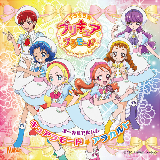
3) KiraPre - As I said in another post, I’m not collecting KiraPre merchandise but the KiraPati uniform is to die for.
I know this breaks the trend of the line needing to be in “school uniforms” but KiraPre’s school uniforms aren’t anything to write home about. These, however, are much more adorable and therefore, more marketable. ;)
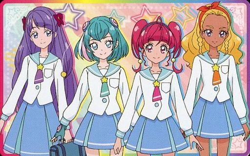
4) StarPre - SERAFUKU BISHOUJO SENSHI
For sure, since they both have space themes, it was only appropriate for StarPre to pay homage to Sailor Moon with having the Star girls wear serafuku.
I like the simplicity of it as well. Hehe~ ^^
And whether I would want everyone or not...it really depends on what kind of poses they’re in and if they can complement each other well.
Also, I suppose since Yuni never went to school, she’d just have a figure in her normal Blue Cat outfit which is fine, too.
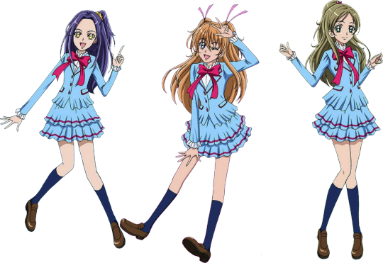
5) SuitePre - Mm, yes, this one I’ve been waiting the longest for, despite the seasons listed before it on this list.
I wouldn’t say Suite’s uniform is the most unique but I do love the contrast of the overall cyan color with the magenta contours and bow. It’s a shade I don’t think I’ll ever see on another school uniform and even so, it’ll probably be hard to pull off nicely.
Suite managed to do it and I’m sure we can find tons of references to give the girls the perfect pose. So yea, I’d definitely consider the whole set as well if everyone can get a great sculpt and paint job.
As for Ako, she doesn’t have a school uniform so we can just put her in the same group as Aguri and Emiru and call it the Pipsqueak Elementary Squad.
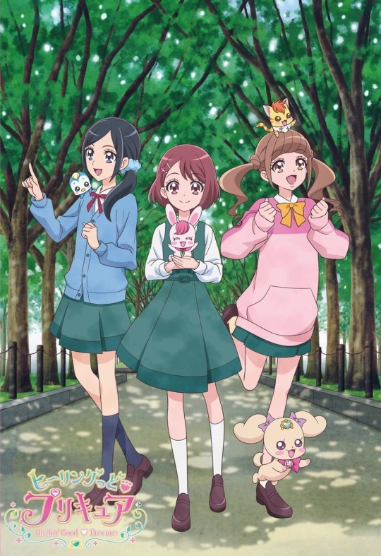
6) HealPre - I love this uniform immensely for how neat and snug it looks. Not to mention, the dark green just makes it look very comfortable to wear overall. I know, maybe it’s just me being weird but it gives off a very calming effect.
And as Precure allows for more variations in clothing and accessories among the main cast, it would make for more interesting figures as well. Then you wouldn’t feel like you’re getting the same figure with only different heads and poses.
...and socks.
Would definitely love to have Nodoka.

7) Hugtto - Pretty much the same reasoning as HealPre’s above.
In all honesty, there’s nothing that special about this uniform so the fact that the Hugtto girls could wear something of their own choice over it really brings out their characters more that way.
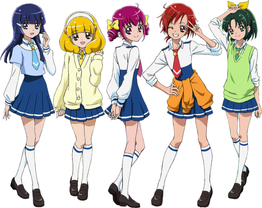
8) SmilePre - Also like Heal and Hugtto above but to a lesser extent, I guess.
Still, Smile is quite favored among Precure seasons so I’d think they sell well regardless.
This uniform isn’t half bad either. I’m not sure why because there’s not that huge of a resemblance but looking at their shoulders kinda reminds me of a military officer’s uniform, especially from the back. Just a little bit.
My pick would definitely be Reika in this pose specifically.
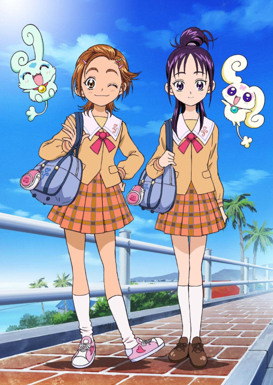
9) Splash Star - Let’s say for the record that I like all the Precure school uniforms (or just uniforms in general). So Splash Star should actually rank higher (around where Suite is) given its more unique design.
Hardly anyone else employs brown or plaid so this combination along with the sailor collar over the blazer (?)... I just think it makes Saki and Mai look very endearing. Hmm, yes, I approve! :D
However, this is a season I’m not familiar with so my demand for it is less than the others. But I do think they deserve to get their figures first. What with being the second Precure installment and all. shouldn’t that count for something?

10) Yes! 5 - Oh, I do love the Yes!5 girls.
But...they suffer from lack of variation the most out of all the other teams. Seriously, even in one set of of their casual clothes, they all own the same shirt albeit in their different, respective theme colors.
It’s...weird. But less so on a school uniform, I guess.
Anyways, pose and sculpt would be the trick here. Even though Yes! 5 does have its fair share of fans, with how old and poorly received both their seasons are, you’d be hardpressed to find a lot of collectors willing to shell out for figures of them. So there would have to be more effort in making them look exceptional to draw a crowd.
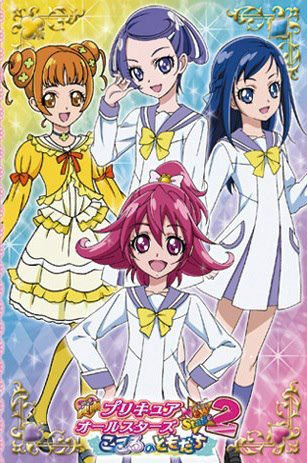
11) DokiPre - It’s hard to find everyone wearing their uniforms in the same shot and frankly, I think I can count all the times I’ve seen Alice wearing her own uniform (it’s this) on one hand??
I mean, does Alice even go to school with all the private tutelage she probably receives or is it just a formality? ...I dunno.
Whatever. I think this uniform looks nice and the girls look nice but it’s not as eye-catching than if they were to wear their casual clothes.

12) HaCha - Feel bad for putting this last because it certainly isn’t the worst of ‘em (none of them are) and I do quite like it (because there’s red and I like red).
It’s just...hmm, I dunno. I guess it’s because the top’s buttons sorta makes me think of a chef suit. It doesn’t bother me or anything but... it’s just the first thing I think of when I see it. ( ^ ^ ;)
*sigh* With how HaCha’s being treated in S.H. Figuarts department and its polarizing reception in the fandom in general, I doubt this would be a priority on many people’s wishlists. Still, it would be wonderful to see HaCha get even some love, y’know?
~~~~~
Yea.
My dreams aren’t that big but they’re long alright. :3
3 notes
·
View notes
Text
‘Leaf’ Pouch, full Build along.
Hi guys, This week I’ve been busy with lots of little projects, all of which I will show on here all in good time. Also busy right now trying to go Self Employed with this which takes forever to sort out here in the uk because there ‘is’ help...but not much and what there is takes a long time to get, anyhoooo, moving on to the fun stuff. Some of you may have seen a few W.i.P’s added to keep you all up to date on whats actually going on, I hope you are enjoying the short snap shots through out the week, I thought it might grab your interest and also just to give you a quick taster of the coming blog. So here it is, the ‘Leaf’ pouch build. This build is ok to try if you are a beginner...but probably more suits people wo have had some experience with stitching, dying, cutting with a swivel knife and tooling. I am now four years into my Journey into this amazing craft but still learning new stuff all the time, so although there will be projects that may seem a bit advanced for Beginners, I will still be alternating between the ‘Beginner’ projects, intermediate and advanced ( As I learn more I will share.) So , lets get on. I First Purchased for about £3.50 (Uk) from a great Lady goes by the name of ‘Downtoearthcreations’ you can find her on Youtube she is a prolific maker and sells some great patterns and has build along tutorials I’d advise you to go have a look, I then down loaded the Pattern.
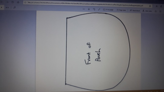
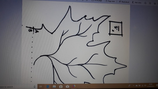
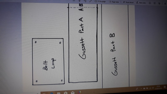
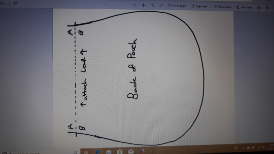
First go to Downtoearthcreations on youtube, find the Leaf bag tutorial video and the purchase this pattern, it’s not expensive and is very easy to follow.
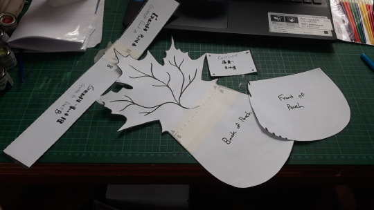
I then cut all the pieces out as shown here and stuck them together where needed with decorators paper tape....why?...coz that’s what I had, no other reason. then Transfer the pattern shapes to the leather of your choice, I used a 2-3 mm veg tan, it takes tooling well, but just be careful, it’s not very thick, don’t press the swivell knife too hard or else it will go right through, how do I know this...guess. Well that’s not hard to guess, Yes I cut through my first one, I’ve always said I will mention successes and failures on here, it’s the only way to learn I think.
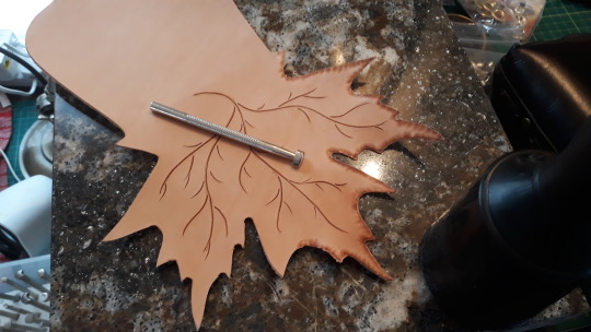
For any really ‘New’ people who maybe don’t know yet what ‘Casing’ means I’ll quickly explain, it just means ‘wetting’ the leather to a ‘certain’ point of saturation..NOT..completely saturated as you might do for wet molding, but that’s a whole other thing. so for now just wet it evenly, whenever I wet leather I usually wet it all over , even the areas that I won’t be tooling, I have learned from other more experienced folk that if you only wet the area you need, you can end up with a ‘tide’ line and the water actually does darken the leather so when you come to dye it the will be a difference in shade between the area that was wetted and the one that wasn’t. some people don’t mind it...but personally, I wet it all over, your choice. Then you have to leave it until it almost looks dry again, then it’s ready for cutting and tooling. First you need to draw your veins on the leaf, you can free hand this part if you are confident enough or trace the given pattern with a ball point stylus tool or similar to get the pattern on the leather, then, use the swivell knife to cut in your design, adding any extra veins or cuts you might like. Take a Pear shader tool as shown above and using the bigger edge..’smash’...in a controlled way...the edges of the leaf as shown above..
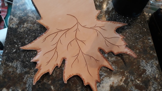
Here you can see how I’ve gone all around the edges and basically flattened them, also here the ‘veins’ have been cut into the leather it’s now ready to tool it. You can leave it exactly like this as it will still look great but for a little extra ‘depth’ to the design I’m tooling mine.
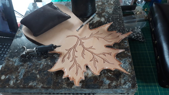
Here I’ve decided after several ‘Coats of Looking at’..that I wanted the veins to really stand out so made a second cut as seen here,
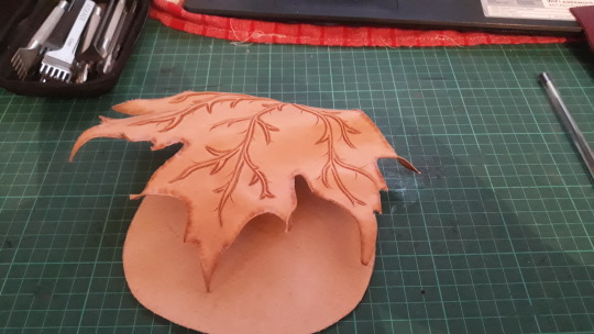
Once the veins are all tooled with the beveler (Number B802) I dampened it a bit more..not a lot as before because it still retains some moisture and I just want to mould it a bit not soak it. (This molding is completely different to ‘Wet Molding’ as such, as with wet moulding you are shaping pouches and bags etc...this is just a thin leaf. If you do think you have over watered it, just leave it to dry off for a while at room temprature, don’t try putting it in the oven or under the grill or using a heat gun..as you will make it solid and brittle...again..yes..I know because I’ve done just that in the past, luckily..I do learn from my mistakes. I then manipulates the leaf into a more acceptable shape, I did this several times before getting a shape that pleased me.
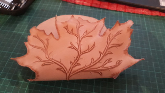
Look closely you will notice I added some small ‘cuts’, just my own preference, you decide what you want if making one of these yourself.
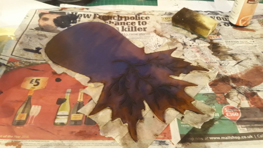
I Layed down lots of paper, got myself gloved up, had some paper towels and old cloths handy, a small tub of water and a sponge, then I got out the Gel Antique dye, made by Eco-Flo. I decided on a Dark Brown. Couple of things here if you’ve never used Gel Antique dyes...firstly get some gloves on because this stuff will dye you and take weeks of hard scrubbing to get off. secondly, this is expensive stuff..for a reason, it actually works. I love it, but you have to get a whole bunch of it on your sponge to then spread it on your piece in circular motion as fast as you can..because then you need to get off the eccess with your towels, the reason is because the antique dyes go darker the longer its on, so get it on...get it off, if not dark enough for you then repeat until it is. this stuff also buffs up really nice. A good video on YT to watch is by a guy called Chuck Dorset at Weaver Leather Craft , go watch him first if you’ve never done this before. If it all looks a bit dark when you’ve finished don’t worry, antique gel dyes can be toned down by wiping with a ‘Damp’ cloth or sponge until it is a shade you like. You also don’t want this stuff on your clothes or furniture...you have been warned ( hahahaha ). Good luck...the results are worth it.
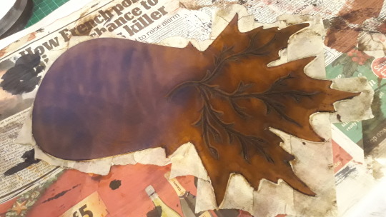
See how it’s getting lighter as it dries out.
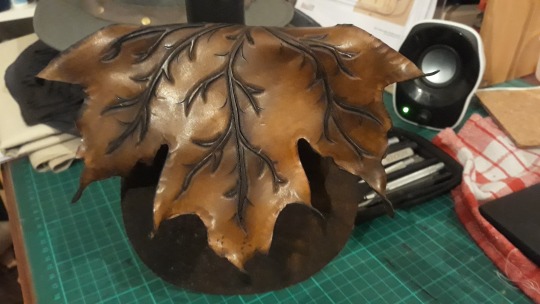
I Like to use a piece of Canvas cloth to buff up my projects, it almost Burnishes them as seen here. note how I’ve twisted some of the ends of the leaf points, the Lady at Backtoearthcreations taught me that neat little trick on her YT video...once again..I advise you go have a look you’ll enjoy it.
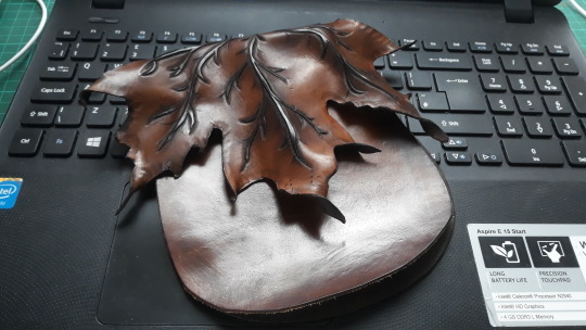
So now we need to think about the stitch holes, I’ve used quite a wide gapped stitch iron as you can see on the following pic’, this is so that when it’s stitched we get the ‘style’ that I want. keep going you’ll see at the end. First I put stitch holes in the front piece, then laid that in position and made the first four holes just to give me the opposite position. I did use a Divider to draw a line to keep my stitch holes straight if you zoom in on the next pic you can see the line, this will be hidden by the thread when finished.
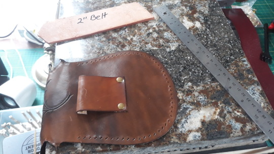
I have also made a strap loop which comes with the pattern, my advice...make it slightly longer so that a 2″ belt will fit through it. it’s ok as is...if you just rivit it ‘flat’ but if you want the extra ‘look’ you get from bending the strap over as shown here it can get a bit tight...your choice. I used a couple antique brass rivits top and bottom to hold it in place. Oh..nearly forgot, by this stage I had already coated with resolene to ‘fix’ the dye, but I guess you can do it at the end too. I dyed the flap side of the pouch on the inside dark because if you twist the leaf points you can see the ‘flesh’ color, didn’t want that, but I left the inside of the front peace ‘flesh’ colored and untouched so that when searching in the pouch in bad light it helps to light the inside of the pouch a little, just another little tip I got from someone far more experienced which I’m happy to pass on to you. I would have left it all flesh colored if not for the leaf points.
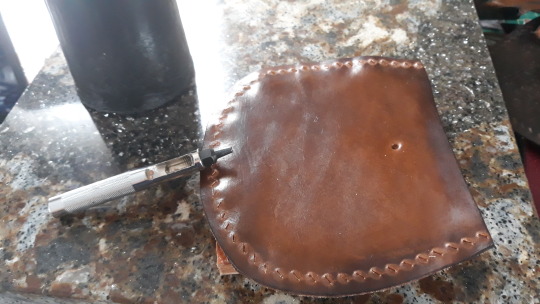
I decided to use an antique brass snap stud as a fastener for this pouch, so punch the hole BEFORE you start putting it all together...it’s just easier. ( guess how I know ???...hahahaha...yup you guessed it..what can I say..I didn’t have people pointing this stuff out to me, but hopefully by sharing my mistakes it will save you from doing the same thing..)
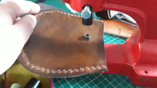
Not everyone has a snap stud fitting machine but the hand tools are easy to learn.
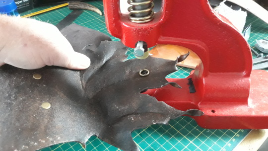
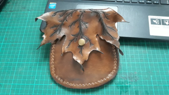
Starting to look like a pouch a bit more now.
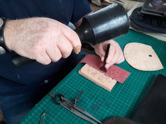
So, all the pieces are almost ready, just the Gusset to make now, I chose a soft leather in Maroon color as seen here, again I drew a line about a quarter inch in as a stitch hole guide. The gusset section is deliberately cut a bit longer than needed and will be trimmed once done.
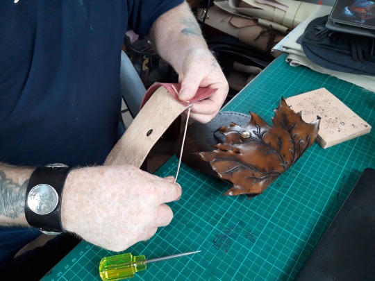
Finally it’s time to stitch it all together, I chose a veg tan flesh colored Lace and I had to stitch it all by hand with nothing more than a scratch awl to widen the holes. ( As I didn’t have the necessary Flat Lacing needle at the time ) but I personally enjoy stitching without a needle. so, I lined up the gusset, at this point you may do well to have the ‘Down to earth’ Leaf Bag Tutorial on as she demonstrates quite well how to begin the stitch which is a little difficult for me to explain on here. Ok, so once you’ve watched how she starts the stitch off you are basically ‘away’ and just keep going to the end and tie off as shown on the YT instructional video.
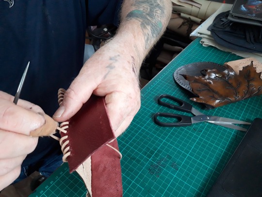
Here you can see the scratch awl in my hand whilst I’m ‘gently’ pulling the Lacing tight. Use good quality lace as there’s nothing more annoying than it keep snapping when you tighten it.
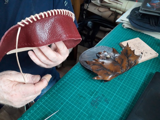
Really starting to come together now, the contrast between the Maroon and the antique colors is amazing...well, to me at least. Here now you can see why I used a wide gap stitching iron for the holes, it leaves a nice gap between each stitch which adds to the over all look of the project.
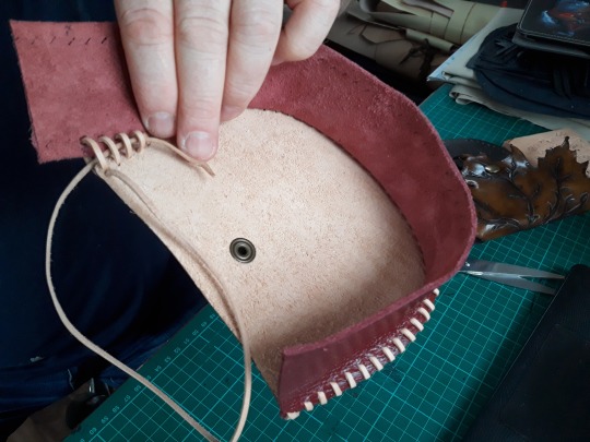
Here I’m trying to show how I finished off the stitching on this side of the gusset. as I came through with the last four stitches I pulled extra thread through so I could widen them on the inside allowing me to back thread the lace as shown here, I then pulled it through and snipped it off.
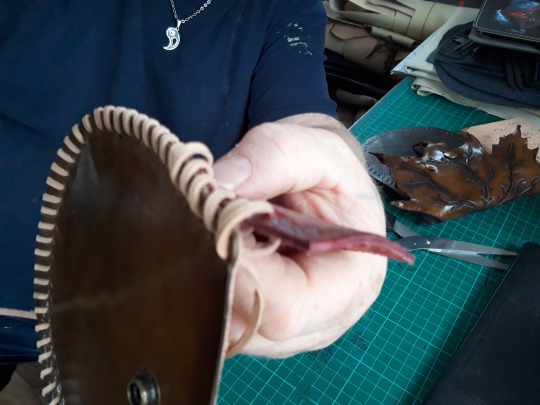
Then I went back and pulled all of the four stitched tight to hold the cut off end tightly. there are more than four widened here but as you saw I threaded it through four, you can do two if you like but I felt that four would hold better.
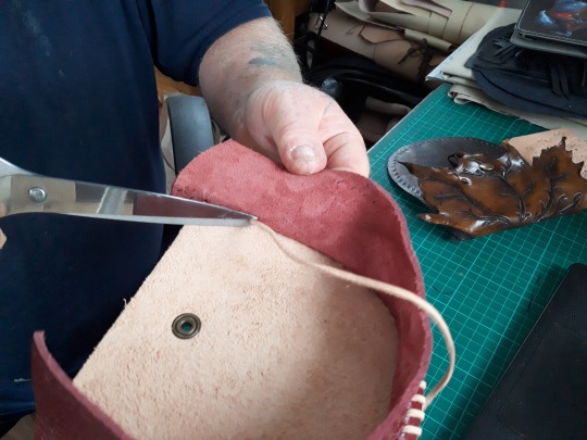
I then just snipped the end .
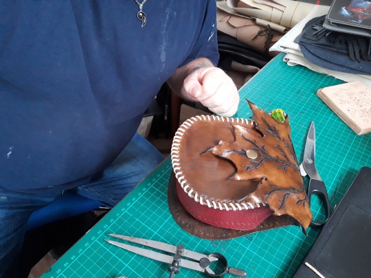
I slotted it in place and ‘snapped it closed just to get an idea how it was looking and have to say I was very happy at this point.
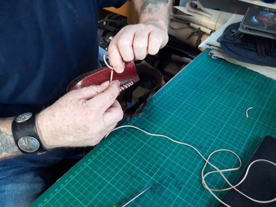
Then it was on to side two.
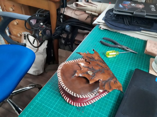
Annnnd..’Voila’ one really nice Leaf Bag / Pouch suitable for every day wear if you are into that sort of thing, or Renaissance / Larping / fancy Dress / medievel / basically any kind of costume event even Steam Punk if you just added some Steam punky bits to it. Well guys there you have it another little project from our new workshop, many more still to come, I’ll keep showing little snap shots through out the week to give a taste of whats going on in the w/shop just to show what I’m getting up to. Hope you have enjoyed this build along set, also hope you have a go yourself and as always I’m free to answer any questions and always happy to receive constructive advice. I’m still not professional, still learning and still sharing it all after nearly four years...yes my little Blog will be four years old next month. Till next time then, Stay crafty and watch this space.
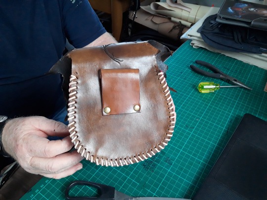
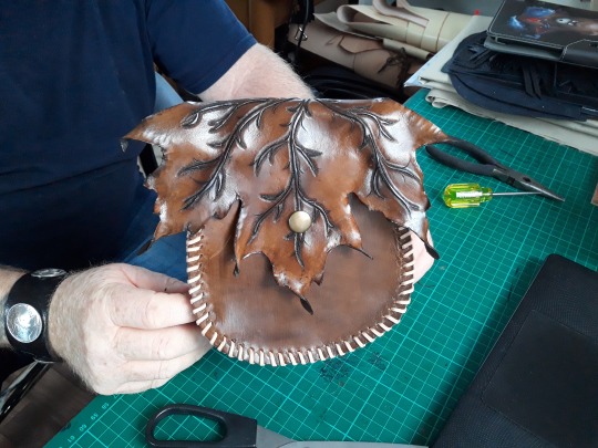
82 notes
·
View notes
Text
April 20th-April 26th, 2020 CTP Archive
The archive for the Comic Tea Party week long chat that occurred from April 20th, 2020 to April 26th, 2020. The chat focused on Only In Your Dreams! by Tuyetnhi Pham.

Featured Comment:

Chat:
Comic Tea Party
BOOK CLUB START!
Hello and welcome everyone to Comic Tea Party’s Book Club~! This week we’ll be focusing on Only In Your Dreams! by Tuyetnhi Pham~! (http://oiydcomic.com/)
You are free to read and comment about the comic all week at your own pace until April 26th, so stop on by whenever it suits your schedule! Discussions are freeform, but we do offer discussion prompts in the pins for those who’d like to have them. Additionally, remember that while constructive criticism is allowed, our focus is to have fun and appreciate the comic! Whether you finish the comic or can only read a few pages, everyone is welcome to join and chat with us!
DISCUSSION PROMPTS – PART 1
1. What did you like about the beginning of the comic?
2. What has been your favorite moment in the comic (so far)?
3. Who is your favorite character?
4. Which characters do like seeing interact the most?
5. What is something you like about the art? If you have a favorite illustration, please share it!
6. What is a theme you like that the comic explores?
7. What do you like about the comic’s story or overall related content?
8. Overall, what do you think the comic’s strengths are?
Don’t feel inspired by the prompts? Feel free to discuss anything else that interested you!
Eightfish (Puppeteer)
5. I like how distinctive the character designs are! The mcs are both very unique and recognizable
8. It doesn't take itself too seriously, but it also explores some real neat concepts
the story is full of personality
carcarchu
the comic's not loading for me shakes fist at wifi, gonna try again tomorrow but i just wanted to say the look of the site is really cute!
Joichi [Hybrid Dolls]
Got the chance to read it So here are some of my thoughts: 1. I like the romantic atmosphere that the comic starts off with warm colours and it gives a vacation ad sensation? 2. My favourite moment is in the pink strange dream world, the colours contrast to the reality of Cara. 4. Fave moment: When that mystery guy shows up and he had corny lines like a romantic parody. It seem so fantastical. 5. I like the colour palette choice of brown tones, shades of pinks. 6. I think the theme is about expectations (it's not clear atm), how Cara is distancing from real relationships and prefer to indulge. 7: I like how the creator shows Cara looking scared of confronting things. It sets an interesting tone of uncertainty. Is she hiding something?(edited)
keii’ii (Heart of Keol)
I'm super curious about the situation of Cara not remembering her past dreams with Richie, and how that ties into the theme.
shadowhood (SunnyxRain)
1. I like how I don’t know what to expect. I also like how the premise is relateable; the idea that you are scared of imperfection making you have high standards in life hit close. 2) Every single time we’re treated to....Tuyetnhi’s lovely use of expression. Also the end part of episode 2, because that’s when I realized it’s going to get dark. 3) A tie between Ana and Richie. Ana because she makes me laugh with her blunt assertions (which...aren’t wrong) and Richie because he’s so flamboyant and extra. I love how much personality they all have. 4) Hands down Richie and Cara. They have a really hilarious dynamic going on. 6) The idea that people seek perfection through their dreams instead of facing reality. Also I really liked how it tackles society’s fixation on everyone to find someone....maybe Cara doesn’t need that and needs to focus on herself first? 7) That I won’t know what to expect. I came into this thinking it was going to be a classic romcom, and then I get hit with implicit horror and trippyness. I have a feeling Tuyetnhi is hinting at some darker aspects of the story we have yet to see. 8) Good lord the expressions. They really do the story justice and make me turn the page every time. Also the colours are beautiful.(edited)
(Whoops sorry keiiii)
7) two moments actually!
The fact that their wide eyed sweaty expressions matched made me laugh really hard
And also Cara’s quick acceptance of the situation was so unexpected and hilarious I took a double take. Also props to the colour dissonance; that looks like meme material right there!
Tuyetnhi (Only In Your Dreams!)
yeah. I want to make it clear that Cara is like "This is really not my day." lol
shadowhood (SunnyxRain)
Well....you portrayed that sentiment perfectly
Joichi [Hybrid Dolls]
Omg yes the wide eyed expressions were also making me laugh! Well that was an expression I didn't expect coming into the story(edited)
I was wondering if that was suppose to be serious or humorous?
Tuyetnhi (Only In Your Dreams!)
both LOL
shadowhood (SunnyxRain)
I see the horror you got going there Tuyetnhi Reminds me of...I dunno Jojo?
Tuyetnhi (Only In Your Dreams!)
well............ yes and no lol
shadowhood (SunnyxRain)
But I can’t wait to see what’s going to happen
Although...if we’re going by the silhouette....is she scared of herself?
WHAT DOES THAT MEAN
Tuyetnhi (Only In Your Dreams!)
C:
Joichi [Hybrid Dolls]
I like that sense of not knowing what's happening? :)(edited)
Tuyetnhi (Only In Your Dreams!)
that will be coming up in Ch. 3 soon
so please wait till then thank u lol
Joichi [Hybrid Dolls]
So far it's tough to choose a fave character right now since I feel the story has just started its first segment. I would like to wait until more content is shown before I can make a firm choice? (I'm analytical, I like to go over OCs flaws and strengths once I know more about them)(edited)
I'm curious to learn about her ex crush, since we only get a glimpse of how Cara precieve him. But what is Dean really like? *Drum rolls(edited)
Tuyetnhi (Only In Your Dreams!)
you got.... good questions
it will be rewarded.... later on LOL
mariah (rainy day dreams)
1. What did you like about the beginning of the comic? I really liked the colors and island vibe. And this was even before Animal Crossing came out and I started hardcore living that island life I just love a good, soft pink to purple gradient generally speaking so the opening of the story was like falling into a comfy brain pillow for me. 2-4 I'm just gonna answer these ones kind of all together because they thoughts on then are all kind of threaded together into one big thought. After having read through the archive I really liked the scene with Ana and Cara. When I first read it I was like "dang, she's giving Cara such a hard time," but after having read the scenes where Cara just refused to admit to Richie she doesn't know what's going on I really retroactively appreciated Ana's willingness to call Cara on her bullshit XD I think it's a really good foil trait to have for a protagonist who seems dead set on avoiding confrontation even though it seems like doing so is most likely just gonna come back to bite her later. I imagine we aren't going to see Ana for a while though unless Cara is able to use her Phone A Friend card in the dream realm XD I am also looking forward to seeing more of the Cara doppelganger and how she and Cara interact with each other going forward. That feels like an exciting and drama filled mystery
Cronaj (Whispers of the Past)
1. What did you like about the beginning of the comic? I also love the atmosphere. The color choices are just so beautiful. 2. What has been your favorite moment in the comic (so far)? Ana pointing out Cara's BS hahahaha. 3. Who is your favorite character? Definitely Ana. She's so down-to-earth from what I can tell, someone I'd want to be friends with. 4. Which characters do like seeing interact the most? Probably Ana and Cara. I like to see good friendships depicted, especially in a romance. 5. What is something you like about the art? If you have a favorite illustration, please share it! In general, everything is so soft and pretty. I also really appreciate the fact that all the characters have larger noses. If I had a favorite panel, it would be at the beginning, the sunset beach waves. 6. What is a theme you like that the comic explores? So far, I'm not sure about themes, but I like the talk about the pressure parents give to their children to get married. 7. What do you like about the comic’s story or overall related content? There's a lot of mystery, so I'm looking forward to learning about Cara's dreams, Richie, and the key. 8. Overall, what do you think the comic’s strengths are? The visuals are really nice. I can't stop gushing about the color choices and the pretty atmosphere.(edited)
Joichi [Hybrid Dolls]
The way Cronaj sums up their thoughts on OiYD, I'm agreeing with the statement on Ana and Cara! Esp friendship part
Deo101 [Millennium]
I'll answer the questions hopefully later this week, but this song reminded me of the comic!!! https://www.youtube.com/watch?v=Q4z5ecLCvSQ(edited)
shadowhood (SunnyxRain)
@Deo101 [Millennium] damn that’s a good song
Tuyetnhi (Only In Your Dreams!)
Oooo
keii’ii (Heart of Keol)
He's definitely hot and extra
Tuyetnhi (Only In Your Dreams!)
lmao
Joichi [Hybrid Dolls]
My joke idea is that Cara is secretly in a reality show starring Richie and her and the bonds they play out is meant for a live broadcast. But she's clearly not agreeing to this(edited)
Tuyetnhi (Only In Your Dreams!)
oh god. i don't think that's good for Cara's mental state lmao
Feather J. Fern
Also I have to say, I do love how the first cover is literally Cara being the meme of "Oh no he's hot"
Tuyetnhi (Only In Your Dreams!)
fjdkalfdjdklfj
Feather J. Fern
Also I finally started it, while a bit late, I have to relate to Cara being an accountant.
Also I think my favourite panel is "Welp that worked"
Also I have to appreciate picking a pink that doesn't grate on the eyes.
https://gyazo.com/71fe22ea6ac2ebf6b3d85531c66bf8ed Another really good panel
Tuyetnhi (Only In Your Dreams!)
I enjoyed making that one LOL
shadowhood (SunnyxRain)
that face is one of my favourites not gonna lie
Feather J. Fern
I really like the surrealness of the story, can't wait to see what happens next
shadowhood (SunnyxRain)
same! I feel like something is about to happen
I'm also wondering how Richie would react to the real world
like....the ex. And her parents.
Tuyetnhi (Only In Your Dreams!)
soon™️
Feather J. Fern
More like everyone reacting to Richie XD
shadowhood (SunnyxRain)
Yeah pretty much
Like can Richie handle the world?
More like
Can the world handle RICHIE
RebelVampire
I like that the beginning really contrasts the dream and Cara's reality pretty quickly. I kind of feel it catches that feeling of coming out of a dream to face reality which kind of sucks, and also plays into the themes of dream vs. reality and expectation vs. reality. It's very easy to idealize things, whether as a route of escapism or just because it sounds appealing. But the reality of things generally is always different, and I like that we're seeing this full force in the comic through Cara's perspective. And the contrasts between the two really enhance those topics. My favorite moment in the comic so far is probably when Cara meets what I assume is Dean. Cause I really loved that both parties were kind of at fault, and I also liked how quickly that convo devolved into a grumpfest, because that felt very realistic. My favorite character right now is definitely Richie, because he is ridiculous and sympathetic at the same time. I adore his exaggerated personality, while at the same time feel sorry for him since for him the memories are clearly there and like...I would not want to be in the shoes of someone where the person they loved no longer remembered them. As for character interacting the most, Cara and Richie because that entire premise of one person remembering and the other not makes for a really tense and awkward situation. It's hard to tell where it's going to go. What I like about the art is the palettes of color chosen, since there's some beautiful scenery as well as fantastic contrasts when needed to make certain moments pop (like dream vs. reality).
As for the story content, what I actually like the most is that Cara is a flawed protagonist. I've read a lot of stories where the protagonist is always 100% right in the relationship and is just eternally the victim because society pressure. But Cara has a lot more going on, since she's clearly been at fault in some interactions, and while we can sympathize with people pressuring her into relationships, she also maybe takes it too far by being avoidant of basically every relationship. However, since she has these traits, I'm more invested into her personal dilemmas since she'll actually make mistakes when dealing with stuff. Which I think this is the overall strength of the comic. Cara is just a damn good protagonist who is easily likeable but isn't perfect and whose imperfections are not just brushed off so easily.
Tuyetnhi (Only In Your Dreams!)
;_; .... thank you.
snuffysam (Super Galaxy Knights)
I love the story so far! When I first started, I figured it would be some sort of awkward story where Richie comes into the real world and he has to figure out how to, like, act natural, and hilarity ensues. But holy cow, Cara losing her memories, and the slide into somewhat of a horror angle - it's not something I expected (though admittedly I could have read the synopsis lol), but it's definitely something I like!(edited)
Comic Tea Party
DISCUSSION PROMPTS – PART 2
9. Do you think the people around Cara were right to try and pressure her into a relationship? Overall, what do you think the comic has to say about relationships and the themes regarding relationship pressure?
10. Is what Cara experiencing dream or reality, and where is the line between them in this case? Additionally, why do you think her dreams have the potential to become reality as opposed to other people? Also, what is the overall message underlying these themes?
11. Is Richie really just a dream Cara dreamt up, or is there something more to him? If he somehow makes it to Cara’s world, do you think he’ll be able to adjust to that reality? Also, can he win Cara over?
12. What do you think the Cara imposter is about, and what does this have to do with the entire situation? Do you think Cara will eventually remember her dreams? Lastly, what do you think Cara has in store for her as the story continues?
Don’t feel inspired by the prompts? Feel free to discuss anything else that interested you!
shadowhood (SunnyxRain)
9. I personally don’t think it was great of the people in Cara’s life to pressure her like that. Sure, they mean well, but it’s most likely bringing Cara’s self esteem down by a lot. I have a feeling that her dreams/reality colliding together is partially motivated by that; the pressure of pleasing society has made her....subconsciously take drastic measures?
10. I’m actually not sure! Maybe there’s a supernatural explanation to it, or it could all just be a dream. Dreams have a way of showing a person’s innermost desires or fears, so maybe Cara’s desires and fears are coming alive in response to external stress factors. So perhaps she opened a portal of sorts between the realms in some way (there’s a key!!!!).
11. Oh I’m thinking they might end up together. But the realist inside me thinks...perhaps what Cara needs isn’t romantic love, but more independent love and being able to love herself. What DOES worry me, however, is the fact that Richie seems...a bit desperate for Cara to like him. Is there a condition to his love after all? If so, that means that it’s possible he’s forced in some way to love her or make her love him. And that’s not really conducive to romance, is it?
12. Ah...the thing that makes me mystified the most. Cara seems to have a negative view of herself, since she told her to get out in the end of chapter two. However, Cara #2 seems to be pretty helpful; knocking on the door to tell her to get out of the house (which Richie has her in), so in a way letting her out. While our Cara seems to dislike her a lot, I think the key to the story would be our Cara needing to accept this double Cara to be really free. Maybe she will, maybe she won’t! But from what I can see from the story and like I’ve said earlier...maybe Cara needs to be able to find love within herself. Love for that Cara double, and enough love to become independent and not bend to society’s overwhelming pressure for outside romance. I hope she finds that as the story comes along, and know that it’s okay to not be ready for love.
As for Richie...hmm. He’s dealing with an amnesiac heroine, and adjusting to the real world. I’m sure it’s going to lead to some hilarious hijinks, but hopefully he can manage! He seems up to the task
RebelVampire
I think whether people were right to pressure Cara is a tricky gray area. On the one hand, no, they were wrong. Nobody should be forced into a relationship. But on the other hand, if you know a person is actively self-sabotaging, isn't it more correct to speak up? So to me this is maybe a situation of good intentions with bad execution. However, I do think overall the comic does say pressuring people into relationships sucks and plz don't do that cause that's how you make ppl run further away. I think it's both, because a dream is reality in a sense. I think many of us have had dreams that caused real emotional affects, whether negative or positive. So the line between them is merely the fact effects are limited. Cara have may have just found a way to cross that line and make a dream a tangible thing that has more consequences. As for why her dreams, I don't know. Maybe she's just super good at dreaming. I do think as the overall message though is that dreams are good but not when we get lost in them, because then we idealize and reject "reality" in ways that aren't healthy. I do think Richie is primarily something Cara dreamt up, but kind of not maybe. Like sure maybe Cara is idea creator, but something else was involved in making the physical reality of that idea. As for Richie adjusting to Cara's world, I'm sure it will be laughably hilarious. I do think he can sort of win Cara over, at least in the sense of being friends. Cause how can you hate Richie? I'm taking a shot in the dark and saying Cara imposter is the embodiment of Cara's missing memories but since they're just memories, all they can do is imitate. As for Cara remembering, I feel like it will be yes but I kind of want it to be no. I like the idea of them having to reform a relationship entire from scratch.
Tuyetnhi (Only In Your Dreams!)
Oo good impressions! I wish I have more to say but it would affect the story LOL. Enjoyed reading everyone's theories tho!
Joichi [Hybrid Dolls]
Ok my turn, let's see what my head theories are: 9: I felt the same annoyance as Cara but it's a mixed feeling, Even though, people shouldn't pressure a lady on her love life, she also has a problem with being in relationships. Or I remember one quote from the story was how she 'ditched her dates by rushing to the bathroom.' although I don't know her circumstance, I do know she has issues to settle too. Relationship pressure is real, especially as a young person grows older. 10. From the comic visuals, it feels much like it's her escapism dream. The only clue I got, is that her holding a literal 'key' connecting both worlds, is evidence that both world could collide. So far, we haven't seen other people's dreams, or whether this is an unusual occurrence in the world? It seems to be a message about idealistic relationships. Since Cara seem to turn away real ones, it manifested? 11. I'm curious about Richie's character too. He seems like a powerful imagination, enough to sway the lead, so he's more than a simple figment. I wonder if his submissive, flirtatious (?) personality was build in him. He doesn't seem to have a 'life' outside his dream house, or so far. 12. I'm not sure whether the 'Other Cara' might be trying to help her or is that.. actually a shadow side? I don't want to say too much, but it's interesting to see where the story goes.(edited)
shadowhood (SunnyxRain)
Oh! You make a good point about Richie; I never thought about that! Do you think maybe he's simply a part of Cara and eventually gains his own sentience/personality?
Joichi [Hybrid Dolls]
Hehe I like analyzing dreams :3 In dream theory, I feel he could be? I was more skeptical whether he should be treated as a real character or something else.(edited)
shadowhood (SunnyxRain)
man this does make me want to look up dream psychology
i have a feeling...Tuyetnhi is using some theories from that
Tuyetnhi (Only In Your Dreams!)
Hmmmm dream psychology you say?
I guess you can say there's some elements of that, but it's not a major chunk of it if that makes sense lol
Comic Tea Party
DISCUSSION PROMPTS – PART 3
13. What are you most looking forward to seeing in regards to the comic?
14. Any final words of encouragement for the comic?
Don’t feel inspired by the prompts? Feel free to discuss anything else that interested you!
Tuyetnhi (Only In Your Dreams!)
13. Maintaining the will power to finish OIYD! so I can see it as its end lmao. As a passion project but also something that I want to invest in when I have the time, I hope ya'll looking forward in reading Ch. 3 very soon lol.
shadowhood (SunnyxRain)
13. I really want to see how both Cara and Richie will develop as characters. Whether Cara will figure out for herself what being both independent means....and whether she does want a relationship for herself and not for other people. Likewise with Richie, I want to see if he'll be able to be his own person...and whether he's real or not. I have a lot of questions that I want to be answered, and I can't wait to keep reading.
14. Tuyetnhi, good luck on the webcomic. It's hard to start one and even harder to pull off a good one, and I know yours is a good one. I really look forward to reading more from you. You're amazing (edited)
Tuyetnhi (Only In Your Dreams!)
thank you
Joichi [Hybrid Dolls]
13. I'm interested in learning more about Cara's conflicts, why she is hesitant about having a real relationship vs her dream one? I love the unexpected dark twist that the story seems to be going. 14. I want to say, no pressure and take your time to complete the chapter. Just know you have my support and willing to read when it is ready. Good luck
RebelVampire
I'm looking forward to more Richie being Richie. Because he is an adorable person. And also because I'm waiting for some 'reality' culture shock. My final words are that this comic has a strong themes game going on and an intriguing premise, so it'll be fun to see where the comic is in a few more chapters since I'm pretty sure we're in for a wild ride.
Comic Tea Party
BOOK CLUB END!
Thank you everyone so much for reading and chatting about Only In Your Dreams! this week! Please also give a special thank you to Tuyetnhi Pham for volunteering the comic and creating it! If you liked Only In Your Dreams!, make sure to continue to support it via some of the links below!
Read and Comment: http://oiydcomic.com/
Tuyetnhi’s Patreon: https://www.patreon.com/oiydcomic
Tuyetnhi’s Ko-Fi: https://ko-fi.com/tuyetnhip
Tuyetnhi’s Twitter: https://twitter.com/tuyetnhip
#ctparchive#comics#webcomics#indie comics#comic chat#comic discussion#book club#bookclub#webcomic bookclub#webcomic book club#comic tea party#ctp#only in your dreams#only in your dreams!#tuyetnhi pham
6 notes
·
View notes
Text

Instead of a summary of my art from each month of 2019 I’ve compiled a summary of my art from every year of this decade! Finding some of that old art was incredibly difficult.
And making an exact image description of all this would be too long to write or read so I’m going to do my best to describe all this in a concise and interesting way.
2010: I was a sophomore in high school, so about 15 years old. These two drawings are in pencil and colored pencil, one of some random girl character wearing brightly colored clothes and a rainbow shawl thing (??) walking on clouds it seems. No idea what that was meant to be about. The other is a reference for my old oc, the very first one I ever had, based on myself. She looks human but with unicorn ears and a horn, plus wings and a tail. I hadn’t figured out animal legs yet either so she has perfectly normal human legs that just end in hooves.
2011: still mostly pencil, colored pencil, I don’t remember if I had a laptop yet. I would have been 16 years old at this time. I picked a self portrait here, a coloreddrawing of myself in black concert dress playing the trumpet because I got to do a solo in jazz band and I was very happy about it. The other art I picked for this year is digital but in the old ms paint program (you know before it tried to be fancy with a few more realistic tools and was only pixel art tools) I do believe I was still using the family computer for this, with a mouse. I was really creative with the tools. It’s my unicorn girl oc again, flying through the sky. I included a progress image, showing how I made it. I’m so glad I saved the steps and posted them it’s really cool to see my old art process for that.
2012: 17 years old, and I think I finally had a laptop with a good art program on it by this time but I still did mostly traditional art, lots of colored pencil work. I found this old experimental art I did that year, a colored pencil drawing of a girl sitting on a tree branch, but the background is all digital, a painting of a fantasy night sky with three moons. It actually looks kinda good, the edges of the colored pencil drawing are crisp and smooth and the digital background doesn’t look out of place. I mean the shading is a bit of a mess and I used white clouds on a black night sky which is a bit funny looking but it isn’t that bad. The other image is a colored pencil drawing that was really ambitious for me at the time. I had this cool idea to draw Death with sunset colored wings, all poetic and stuff. Why did I also draw death with blue skin and horns? I don’t know. Why is death sitting on an ambiguous brown cliff overlooking a cemetery? Well I guess I just was having trouble finding any other way to make a nice background and have death above a cemetery. I should redo this one, it’s a really good concept.
2013: my last year of high school, 18 years old. I was doing digital art a lot more often this year and expanding the diversity of my ocs. One of these images is a digital drawing of two of my first characters of color, two male black elves (black as in African-based) smoochin. My first black oc was also my first queer oc, jayvyn. A gay elf. There are a lot of issues with the way I originally conceptualized his story but even when I was thinking he was the only queer person in his town and there was homophobia towards him (I was only just dipping my toes outside the mindset I grew up in) I gave him a whole massive group of friends (a boys' lacrosse team he was on don’t ask me why lacrosse I have no idea I don’t even know much about lacrosse it was a weird choice) and those friends were extremely loyal and supportive of him, even to the point of going on dates with him just to make him happy. and again, he was the only gay character I had so I was writing a bunch of straight dudes taking their one gay friend on dates in a town full of people who were at least vaguely homophobic, I definitely had a lot of growing to do in my writing and my own mindset but I’m kinda proud of myself for doing that? I could have done so much worse with my first queer oc and my first real step into characters of color, but I made the whole story about this tight knit group of boys who were all such close loving friends. (Gee I wonder if this had anything to do with my being ace and not knowing it yet). Oh yeah, the other image is also there, that one is from a photoshop class I took. We had a three-way folding mirrors the bathroom at the time so I put on a hoodie, turned out the bathroom lights, folded the mirrors in and shoved my face into the gap and then took a photo with the flash while holding my mouth open in a silent scream. The result is this really cool series of screaming faces at different angles, which I then ran through a few filters and major contrast adjustment. Could be an edgy generic horror movie cover lol
2014: 19 years old, and I just finished a year of community college and then left on a church mission for 18 months. I probably should have used some of my first college art class drawings for this year's summary but I was using my old deviantart gallery to collect these old images so I forgot I had all that college art too. These two digital images are pretty dynamic in different ways. Dynamic lighting and dark skin, an experiment I was doing to figure out lighting better for my characters of color. That’s Jayvyn again I think, with lightning shooting out of his hand because I sure love making characters with lightning powers. The other is dynamic in the posing and I’m still incredibly happy with it, it’s a drawing of a grey centaur from behind, bucking in panic because a kitten pounced on its foot. Definitely still one of the best centaur drawings I have ever made.
2015: 20 years old, I was actually on my church mission for this entire year so finding art from that year was very very tricky. One is just a small pencil drawing on another oc, Ronan with his cool mechanical leg playing fiddle I guess? I was doing a lot of synesthesia doodles that year so there are lots of swirly lines coming off the fiddle. I was also surprised to find this really neat digital art I made of Ravio from link between worlds, I almost forgot I did find a way to make digital art on my mission (no access to my laptop, limited apps we were allowed to use, super limited access to normal computers except for emails and such, always busy doing important stuff) I discovered the drawing function in the iPad notes app and every time I had time I would use it until I figured out how to make it work for me, using only my fingers, the limited color palette options, and this marker tool that had one size and only multiplied (except when using white) this is definitely one of the best ones, but I don’t know where the rest went. I had a lot. I was stunned to find this because it really looks like I could have done it on a laptop, can’t believe I forgot I did that.
2016: 21 years old. Had to get used to a laptop again. Also I created my current main oc Morianten during my church mission so here I have the very first full body digital art of him! I’ve definitely changed his anatomy a lot since then, made him much more bird like. Kinda funny to look at this old one and see just how differently I draw him now, only three years later. I also have here a digital painting of some other members of morianten's adoptive family, his dad and little brother having a father son race in nice racing wheelchairs. I still struggle with proportions when I draw characters in wheelchairs.
2017: 22 years old, and back in college. I really had a focus on figure drawing that year, I was back in college art classes and I found posespace.com which is just full of professionally shot art model photos. I’ve got one digital figure drawing of my oc Talib, another practice in lighting on dark skin. The other image is a charcoal drawing of my oc Parva, I think I did that one in a 30 minute time frame where I was taking pictures at different points to show my process but I’ve lost the process images.
2018: 23 years old, and really getting into color depth with my digital art. I found a really old pencil drawing of a dynamic dancing scene and redid it as a digital painting with extreme colored lighting dynamics and new characters. I also got super into mermay so I’ve included one of my favorites, a rainbow trout gal and her elf girlfriend having a chat after a nice swim. I’m super proud of the colors and proportions here, and the shading is pretty great too.
And then it’s 2019! This year! I’m 24! For this one I used three images instead of two, all digital. My ocs Talib and Kouto as persephone and hades in a really quick painting I did but the colors and lighting are intense and fun. No outlines painting of Morianten with some pretty intense lightning lighting. That one took ages and I’m still not entirely pleased with the way I drew his face there but I’m proud of it. And I never actually posted this last one, it’s a new oc created exclusively for the DC superheroes au I dabbled in with @askmissbernadette, a young hero called Lion riding a skateboard in a dark city with a long coat on because that’s a fun way to replace the common superhero cape design.
Overall, it was really fun to go through my art for the entire decade and see how much it’s changed over time. And to see how much my characters have changed. Hope 2020 is a good year, hope the 20s in general are good. Here’s to another 10 years of change and progress!
1 note
·
View note
Note
thoughts on Keanu Reeves Constantine?
y’know this is an interesting question bc i actually have a lot of….if not affection for the movie, at least respect for some of the adaptation choices made. Like the most common line in re: film!Constantine is that it’s a good movie but it’s not a good Hellblazer movie and in a sense that’s right, it’s not – but it’s interesting. A noble failure, definitely.
What I think it hinges on is that it’s an American setting so they went full blown American with it – which is a mistake in my mind bc the point of Hellblazer is that it’s a quintessentially English story, and that’s why every run with an American writer in the comics is meh for me – but in the sense of “American AU Constantine” I think there were some really interesting/clever choices made.
Like starting with their John – Keanu is all wrong for original brand Constantine. His John is broody, he’s brunet, he’s Good At Magic. And comics!John is the opposite of all those things. And while comics!John can be broody, the important thing is the comics themselves tend to undercut that – there’s a lot of kind of snarky takes about John being in a sulk for whatever reason, some of it even from John himself. You get very little of that in the movie, and the movie itself is very TAKE THIS MAN’S PAIN SERIOUSLY about it, so. BUT in a sense that loner self flagellating thing is an American Male Archetype the way comic John has a very English & self deprecating sense of humor, so: ok, I can kinda see it, more as a translation (to American audiences) than an adaptation.
[READ MORE BC OMG WHY DID I CARE SO MUCH???]
They make John Catholic in the movie, which is another kind of interesting choice – in the comics he’s not anything specifically though I would imagine he would’ve been raised Church of England as likely as anything else. But they kind of commit to John’s Catholicism in the movie, most likely because it has more ~mysticism~ (and the association with exorcism in general) behind it. But it also kind of sets John up as An Other, because it’s the religion of a lot of the second class immigrants (like, the Irish initially, then Latinx Americans, etc). White Catholics have a bit of a different rep, but given that the film is set in LA in the late 20th century, for me it set up more of those associations than anything else. It’s also so much more about the SUFFERING and the MARTYRDOM and the REDEMPTION NARRATIVE, which is not so much a thing in the comics (where John often does/tries to do good things but usually NOT for the explicit purpose of ~cleansing his soul~, so it’s kind of notable/interesting that both American-based adaptations [TV and Movie] focus on that a lot more. It’s may also make more sense as an arc for the medium but y’know) but IS notably a big thing in the movie.
And the thing about John, even in the comics, is that he’s an Other but Normal Passing – with comics he presents in a very Proper English Man (which is why it’s SO IMPORTANT for me that he starts off on his adventures with his shirt properly done up and his tie right, and then as the day/his bullshit unfurls he gets sloppier) way, he’s white, he’s blond, he’s handsome etc, but he’s also a bisexual mess/working class disaster mage with a progressive bent, and in the movie he’s kind of a traditional American anti hero but also has his own stuff going on. It’s not as well executed as it could be – there’s not a lot of subversion in the film version, which is kind of the point of John – but at least you get hints of his potential sexuality and they go into his mental health issues (suicide attempt, etc) and his smoking, etc.
So John is an interesting translation – not perfect, but interesting. I would even argue that he’s the weakest point in the movie as a translation-not-adaptation (tho lol baby bear Chas Kramer is up there), bc he’s very basic supernatural protagonist with no flourish. Which is not the case for the rest of the film, which COMMITS to the genre it is and does it honestly very well.
For instance I love their conception of Ravenscar, the mental hospital John has A Bad History with – in the comics it’s got an old, spooky, mad house aesthetic from the 19th century, which fits the comics and John’s history and vibe really well. The movie version goes what I feel is a very modern American direction with it: one of the 20th century industrial monsters, a huge grey building, with the fear of mental health coming from that very specific post-war fear of anything ABNORMAL (including sexuality but y’know).
The setting of LA is great – a couple of (American) comic writers have given John’s arcs there, probably for the irony of CITY OF ANGELS etc, but I think it’s a really interesting choice/contrast to everything London (where John’s mostly based in comics, tho he does sometimes roam the countryside fucking things up) represents: superficial, modern, bright days, beauty, opulence vs the grey gritty grunginess of John’s London life, etc. So for that to be movie!John’s homebase is kinda neat, frankly, esp because of the cases John gets to work on there. The set design is also great – very colorful, very willing to pull in the florescent glare of a modern city, with the Latinx Catholic touches on the streets (look the votive candles and shrines are SUCH an easy go to for ~creepy urban flavor~ and it’s probably at least a little problematic for this film featuring some other really questionable racial choices I will get to later, but) in general it LOOKS great. Their conception of hell is also fascinating and very well executed imo.
I also think there’s ONE (1) thing I think the movie does better than the tv show: the setting is WAY more dug into the working class/legit poverty of LA behind the shiny surface Hollywood stuff. The show really only hit that point in the New Orleans ep and even then….didn’t fully commit to it, but it’s SUCH a key part of the comic universe. Like Chas himself (in the show) is pitch perfect but in the ep about his family they’re LIVING IN A BROOKLYN BROWNSTONE which, real talk, is worth millions of dollars. Literally millions. On a cab driver’s salary???? Ridic. Still mad about it w/e w/e. Baby Bear Chas Kramer with his shitty cab and probably shitty apartment, following John around like a stunned duckling, is way more comics canon accurate, probably.
Rachel Weiz’s character has a lot of potential – they make her Catholic too, to have some sort of connection with John, which is eh, and they also make her a twin, whose sister kills herself at Ravenscar. Given how much John’s early backstory issue are focused around HIM being a twin (whose birth killed both his mother and his (theoretically stronger) brother) that could’ve been a cool thing to allude to, but they don’t touch on it. And Angela (ANOTHER ANGEL THING) is p cool as a character – she’s unconvinced about the ~spooky shit~ stuff until she sees evidence of it, and then believes it, as a normal average human likely would. She’s brave, she asks questions, etc. She’s not just Love Interest tho there’s a bit of that. And anyway I love Rachel Weiz generally, she’s great, could’ve had more to do though.
Tilda Swinton shows up a lot in the gifs and it was a cool choice to cast her as Gabriel – they play up the androgyny and make her less obvious of a dick than comics Gabriel is (though she ends up being…probably more of one, or at least more effective). I think their Lucifer is good too – oily and weird and creepily gentle at times. He also doesn’t get a lot to do, but he doesn’t need to – he doesn’t in the comics, usually, either.
BUT the racial stuff – the supernatural macguffin that’s supposed to bring about the end of the world is found IN A MEXICAN DESERT and then SMUGGLED OVER THE BORDER to LA to bring about the end of the world, like, who wrote this, Donald J. Trump?? – is generally #bad. But this is something it shares with the show (GOD THOSE MEXICO EPS, I LEGIT ALMOST QUIT THE SHOW BC OF IT), tho at least they had an actual Mexican actress to temper that nonsense. NO SUCH LUCK from the movie – just lots of creepy zombish brown people trying to bring around an apocalypse, super cool.
And not only is meh as a metaphor, to impute such a conservative metaphor into a the Hellblazer Verse, with its infamous/classic DEMON YUPPIES FROM HELL and in general tips toward the progressive/pro immigrant ethos, is BAFFLING to me. I mean maybe more in tune with American sentiments about everything, which I have argued above is an interesting choice, but still, boooo.
Also the fact that John quits smoking at the end of the movie is such Hollywood garbage it almost outweighs the positives. I mostly imagine he and Angela date for like a month, he’s such a bitch when going through withdrawal that she dumps his ass, and then he goes back to smoking/sulking around LA doing bad exorcisms. That’s the real John Constantine, babey!!!
#oh god i scrolled up and saw much i wrote this is nonsense#more than you or anyone else should ever know about my feelings about constantine (2005)#constantine#hellblazer#waverly-earp
56 notes
·
View notes
Note
“I just ironed these pants!", ShanksBenn :3
Well that was fun :) thanks for the promot.
His blackhair hung damp around his face and clung to his neck and shoulders. With swiftmovements he rubbed it between the white towel in his hands. The fabric wassoft under his hands. Cold air stroke his naked chest when he opened thebathroom door to his quarters. Goosebumps appeared, covered him from head totoe and he sighed. He hated Winter Islands.
Throwingthe towel on the large bed, Benn strode to his wardrobe. The thing was old,crafted from dark mahogany and decorated with intricate pattern. His handcaressed the fine carvings before he opened the doors. Two stacks of neat clothinggreeted him, all in dark color and sturdy fabric. His clothes. Next to it was apile of messy shirts, mostly white, and heaps over heaps of trousers with incredulousdesigns. Shanks style was outlandish. Not that Benn was surprised anymore.
He didn’tgive much thought into his choice of clothes but took the first pair oftrousers and the first shirt he could grab. They landed on the bed next to theused towel, before he fished for some actual underwear. The towel around historso slipped as he bent down.
A clickannounced the opening of the door and without looking, Benn stated solemnly, “Nowe don’t have time for a quicke.”
A drawl washis answer and he felt the presence come closer, until it was right behind him.He straightened, boxers in hand, but didn’t turn because he felt a warm handstroke over his side. The touch made him shudder, the warmth such a contrast tothe cold air.
“But Benny.”The voice was a purr in his ear. A zing of arousal rushed through his body atthe deep, rich voice. “Why not?”
“Because wehave a meeting in ten minutes and I’m not dressed, yet.” His answer sounded weakeven to his own ears. There was clear want in his voice, a deep need that couldbe picked out of his tone like plum, ripe peaches. But they didn’t have time.It made him angry.
“You’re nofun,” was drawled, again directly into his ear. The hand at his side snuckaround his body and left a trail of fire in its wake. Without a sound the towelfell to the ground, left him stark naked. Clever fingers brushed the inside ofhis tights, teased.
A singleword left his throat, voiced like a broken prayer.
“Shanks!”
As quietlyas the presence had appeared behind him, it went, and Benn suppressed the cursethat bubbled in his stomach. The loss felt aggravating. Only after he heard themattress squeak he turned.
Shanks laidsprawled out on their bed, feet still on the floor, legs slightly spread andhis arm only propping him up ever so slightly. The urge to cover him, from headto toe overtook Benn like a raging storm. Shanks knew, because he looked smugwith his sly grin and his red hair falling into his hazelnut eyes. It didn’thelp that his shirt wasn’t buttoned and revealed too much of his tantalizing skin,all bronze in the light. Benn forcefully willed his oncoming erection down.
“Do youlike what you see? Because I certainly do,” he mused and only then Benncaptured himself staring. With two steps he crossed the distance to the bed,and leaned down, one hand next to his captain’s shoulder. His brow was wrinkled,and he wore a scowl.
“Fuck you,”he spit and snatched the trousers out from under Shanks’ body. “I just ironedthese pants.”
A huffreached his ears, but Benn ignored it. Instead he turned back to the wardrobeand started to dress himself. He was angry, but mostly at himself for snappingat Shanks. He was angry at the circumstances, and it made him angry that he wasangry.
It was neitherShanks’ nor his fault that they hadn’t managed to steal time for themselves.Weeks had been busy since Shanks had been announced a Yonko, and Benn didn’twant to fuck things up. Didn’t dare to fuck things up. The lives of his captainand crew depended on it. Even though it meant countless hours behind a deskdoing paperwork, endless meetings with allies and befriended crews, nightsgiven to research, and neglect of his own personal needs. It was worth it. It was worth it!
He steppedinto his boxers and pants automatically, pulled his shirt over his head withoutthinking of his movements. He acted without his own consciousness, only draggedforward because he had to, while his body screamed for something different. Aneed he had been given a taste and was now deprived from. Where was his sash?He looked around, eyes narrowing. Where was his fucking sash?
An armslung around him, from behind and Benn stiffed. Protest rose in him but beforehe could voice it his head was softly turned, fingers at his jaw and Shanks kissedhim. Kissed him slow and languidly, with passion and understanding. Kissed himand kissed him, and Benn was starving for the touch. The hand slipped under hisshirt and traced circles into his skin. Shanks’ body was warm, his handcallused and familiar, and his lips like a shrine. When he released him fromthe kiss, Benn sighed.
“You’retearing yourself apart, Benn. Stop trying to carry all the changes alone.”
Everywhispered word broke another brick out of Benn’s wall of stoicism until it fellcompletely. He sacked a little in Shanks’ embrace, his body giving in. Onlywhen Shanks made soothing noises to calm him, he realized he was shivering.
“I’m afraid,”he admitted after a moment, and Shanks leaned his forehead against hisshoulder. It felt safe.
“I know,”reached his ear, muffled through his own skin. A kiss was placed at the spotwhere Shanks’ face rested against Benn’s skin, just atop the collar of hisshirt. “I know so well.”
Stillshivering, Benn placed his own hands around Shanks’ broad frame, enveloped the manhe knew so well and loved with all his heart. Their hearts beat in union,connected them. The contact calmed him down. How long they staid like this,Benn couldn’t tell.
When theyparted his shivering had stopped, and despite the lack of contact it didn’tfeel like a loss anymore. Their gazes connected until Shanks swiped a loosestrand out of Benn’s face. His serious expression had made way for a smirk. “Youdidn’t iron those pants. Look at all those wrinkles.”
Benn laughed.Of course Benn laughed. It felt liberating to laugh and he shook his head inamusement. “No. No, I didn’t.”
Shanks’eyes gleamed in the light of the room, so beautiful with their golden specksaround the pupil. Benn watched him stride to the bed and fish something fromunder the blanket. It was his yellow sash. He wondered how he had not seen itearlier. Instead of giving it to him, though, Shanks slung it around his waist,sloppy due to only having one arm. But it served its purpose, because whenShanks tugged Benn followed the lead. Going on his tip-toes to reach his ear,Shanks whispered “Good. Because I will rip them off you later, and then theydefinitely will have wrinkles.”
When Shankseven bit into his earlobe, Benn couldn’t suppress the moan bubbling to thesurface. A smile tugged on the edges of his mouth. He couldn’t wait for thisdamned meeting to be over.
#shanksbenn#shanks#benn beckman#ben beckman#prompts answered#my writing#one piece#one piece fanfiction#opfanfic#prompts are still open if anyone wants to send me one#both black sails or one piece or whatever fandom you have in mind and I could possibly write#thank you dear for the prompt I hope you like it#aerle
13 notes
·
View notes
Text
This was a weird year in gaming for me. I played all of one game released in 2017. The bulk of the year was covered by weird hacks and modded minecraft, as well as the usual slurry of bad games. I don't want to frame this as 'best of list' because while I like... most of these games, it's honestly more 'games I remember playing that I have some thoughts about. Anyways
Stardew Valley

What a lovely game. Due to a lot of Zachtronics stuff and modded Minecraft I got a little bit of a taste for a slower experiences again. The farming was alright, but the characters were super lovely. The game had very simple but effective writing that had me change my choice for Farmer Naomi's wife multiple times. Even the characters on the bottom of my list were great. The only issue I had was... and honestly I didn't notice it much because I wasn't going for that content... that the guys were lame. Shane had a great arc that got me to befriend him, but the rest? eh. Also that super simple fishing game was so fun.
Biggest issue with the game was the lack of an end game. I feel like randomized goals in the style of the carepackages would have been lovely. But on well, you can't play every game forever.
Momodora: Reverie Under The Moonlight
I played this on my flight to Japan since I was going to meat Rdein and the game was on my list for awhile. The level design of it had this lovely Demon's Souls meets Knytt Story feel to it. The map they made for the game was lovely and the world felt tangible and sensible. It had a very Japanese-esque style without being generic anime. It had lovely but simple combat. Just one of those games that's just... simply solid and good? Just a game with a lot of soul.
Getting Over it with Bennett Foddy
Foddy is a cool guy I've gotten to hang with a few times. Just... smart and funny and of course he makes real assholish games. But I found Getting Over It to be the least frustrating. It, more so than QWOP or GIRP became zen like to me. I just let go of any stress immediately. Progress didn't mean anything until the job was done. I didn't get mad or frustrated once. It was all zen. And Foddy talking philosophically about the nature of art and hard games was wonderful and a lot of it really resonated with me. A pleasant experience for a masochist.
Also this is the only game I played this year that game out in 2017. Yikes!
Metroid Rogue Dawn

What a flawed but lovely game. This is a game I wish I could get a physical copy of (it's just a little too expensive). This romhack has a lot of rough edges but truly creates an alien planet. It also looks unlike any NES game. It's gorgeous and just feels.... uncannily out of place, graphics from another time... Because, well, they are. I played this at the beginning of the year so a lot of details are lost on me but it was rad!
Super Metroid Rotated 90 Degrees
It's what it says on the tin. Some parts of the game are tweaked to make it reasonable but for the most part it's for crazy bomb jumping and walljumping nuts like me. It's great to have something familiar yet different, where you can use your knowledge to help you, but it doesn't ever quite help enough. Which also plays into...
A Link to the Past Randomizer
I played a Super Metroid Randomizer and some DS Vania randomizers bu the ATTP randomizer takes the cake. These are addictive. In Super Metroid, finding a stash of items meant either, depending on difficulty settings, finding a stack of nothing or find a ton of great stuff, ATTP has enough diversity in its chest drops to make every chest feel like the pull of a slot machine. Every little trick gets you a little bit further and nets you a few more pull of the slots.
I even did entrance randomizer once because I hate myself. It was... something to be making diagrams in photoshop to figure out what goes where.
Sylvan Tale

A weird Game Gear Secret of Mana/Zelda clone thing? Certainly the only Game Gear game I have ever beat. Never released in America and oddly charming and good. If this was a GBC game released by Nintendo, it'd be one of those games people say is overrated. It hasn't aged excellently but in its time it was surely wonderful. The game has a neat, curious world with a strange cosmology that, while nothing shocking, is just... nicely thoughtful. It has simple but memorable plot moments. It just plays -nicely-. Not excellently, but definitely nicely. Also you change forms and shit and its kinda annoying but it's one of those weird gems that Sega fanboys would likely clutch close to their heart if it got a US release. But sadly, despite being a SEGA game, it did not.
I replayed Circle of the Moon and Harmony of Despair thinking Circle was the "okay one" and Boy was I wrong!
I didn't remember either of these games being great. In fact, I remembered Harmony of Despair being downright awful and ugly and Circle of the Moon being... odd but playable...
Oh my god Circle of the Moon sucks. I know there was some article claiming it was secretly The Best Portable Castlevania, but it is just... awful. Bland in looks, bland in level design, tedious to transverse. The DSS system is garbage, saved only by the fact that you can use a glitch to use any card combination. Finding them in the wild? Fuck that. You move weird. You jump weird. You're like a slug who can somehow jump 100 feet in the air. There are no items to pick up besides Health and MP ups so there is no real discovery -- just tedious cleanup work to maximize your stats. The only things that don't suck about this game: The monster choices are odd and there are a lot of them. A lot of classic enemies are replaced by oddbalsl like... archer wolves? Sure, okay, that's better than just another skeleton. And some of the bosses are okay? Sometimes? Maybe? Even if Dracula sucks horridly.
Harmony of Despair by contrast was much better than I remember. And by much better it was "Okay". I won't be itching to replay it any time soon and it was a number of steps below Aria of Sorrow but it was.. fine? A little bloated and with a few advancement triggers that defy reasonable design but... it's fine and... looked much better than I remember? Likely because GBA emulators are better about colors/backlight compensation so the game looked much less overblown than I remember. Hell at its best, it looks better than Aria, though Aria is just more consistent. Also it has a weirdass soundtrack. At first I hated it, but over time it oddly grew on me. The sample choices are weird but I guess kinda match the "Dissonance"? But the important is the soundtrack leverages these grainy, awful sounds in awesome ways. It reminds me of the horrible Demon's Souls trumpets. They're so bad. But so good. God I love them. Anyways here have my favorite HoD track.
youtube
Devil's Crash

There is something captivating about this stupid pinball game. Naxat has a skill for making games just... feel nice. And they never got to stretch that muscle much but this pinball game from the guys who made Rekka is awesome. It just feels cool, has a lot of energy, lots of little subboards to find. It's impossible to really explain. Just try it. I don't know if, as a kid, I'd be down with paying full price for a single board pinball game but hey it somehow works.
Also known as Dragon's Fury in the US, where it is on the Genesis rather than the PC Engine. Both versions are good. I feel like I slightly prefer the PCE version, but the Genesis version looks and arguably sounds better (which goes against my usual Anti-FM Synth bias). Also the main song is awesome.
youtube
Golden Axe Warrior
I can't believe there is a Golden Axe game that is a flat up clone of Zelda 1. Like almost nothing tried to clone Zelda 1. It's like a weird look into an alternative history. It's not particularly -good- but it's educational. Never beat it because my save corrupted but w/e.
This Fucking Thing

My uncle got me this weird crappy handheld thing for Christmas loaded with old NES games that is various minor tweaks of Super Mario Bros, Adventure Island and Contra, a few other random old shitty games and a TON of AWFUL chinese games made in the 2000s. They're awful and awesome. I just load it up sometimes and pick a random game and groan at how bad it is... but a good groan. An oddly... exciting groan.
Modded Minecraft
I played a ton of modded minecraft this year. Too much, really. But the engineering you can do in modded minecraft is just wonderful. It's weird because no other modded game I can think of regularly assembles mods under 'mod packs' (without it being a huge community drama thing). So you get these weird custom play experiences made up of multiple peoples work. The integration a lot of time doesn't make sense but all things considered it works really well. Modded minecraft, with all its pipes and machines isn't even the same game. It feels like a sandbox Zachtronics game or something.
https://www.youtube.com/user/kayinnasaki/videos I've been uploading base tours and stuff so if you wanna get an idea of what I like doing, that'd work. But yeah, it's oddly infection. Sometimes I worry it's slowed down BEP but then when I cut myself off I just refresh reddit for 4 hours, which honestly is a huge downgrade. JUST GOTTA WORK ON MOTIVATION, SEE YA ALL NEXT YEAR.
17 notes
·
View notes
Text
The House We Live In: Costuming “Grey Gardens”
Good afternoon, everyone! I hope you all had a nice weekend and enjoyed the mini-reviews. It’s Monday, which means it’s time to take a look at a new show. I’ve switched gears a little bit, and I’m taking a look at a designer who I’ve mentioned on the blog but have yet to give a full review to: William Ivey Long. Mr Long is a wonderfully talented costumer who has won 6 Tony Awards in his career, out of a total of fifteen nominations (and counting). Today, I’m going to take a look at his Tony-winning designs in 2006′s Grey Gardens.
I chose Grey Gardens for my first Long-costumed production not only because I love his designs, but because I think this is a musical that deserves more attention and appreciation than it gets ten years on. I remember enjoying the cast album when it first came out, and a re-listen this weekend reminded me that it has some beautiful songs and wonderful performances from start to finish. Based on the 1977 documentary of the same name, the musical revolves around the complicated psychology of the mother-daughter relationship between Edith “Big Edie” Beale and Edith “Little Edie” Beale, the aunt and cousin of First Lady Jacqueline Kennedy respectively.
Unique, I believe, to this production is that the role of Big Edie is played by two different actresses in two different time periods, while the role of Little Edie is taken on by the actress who first plays her mother. For the original Broadway run, the role of Big Edie in Act I was taken on by Christine Ebersole, who won a Tony for her performance in the musical as a whole, while Mary Louise Wilson (who also won a Tony for her role) takes over for Act II; Ms Ebersole plays Little Edie for the duration of Act II. It’s a dramatically interesting production, and Mr Long’s designs help to make it even more worthy of a look.
One of the hallmarks of a William Ivey Long production, much like Catherine Zuber, is that he takes his cue from the original era of the musical and then adds a twist, usually involving bright and lively colors. Let’s take a look at the production, starting with Act I:

Long Island, 1941. The scene is set at a beautiful family gathering as Big Edie (Christine Ebersole, in pink) holds court in her stately New York home, kitted out in high fashion. At her feet, the young Jacqueline and Lee Bouvier listen as she animatedly sings in comic fashion.
I offer the description of the scene because I think it helps to give some context for the costume designs. I’m going to start with the most obvious piece, the one that immediately draws the eye, Ms Ebersole’s. Looking like the stately grande dame she is in Act I, Big Edie is costumed in a beautiful salmon-pink dress with an elegant floral-patterned silk robe or kimono over it. The dress is a light fabric and the color acts as a stark contrast to the grays and blues that predominate in the Beale household that forms the majority of the set. The ensemble is complemented by the addition of a long red beaded necklace that is draped so that it hangs down towards Ms Ebersole’s lap.
In contrast to the theatrical Big Edie, the children at her feet are costumed in much more muted colors. Lee (left) is costumed in a floral white shirt and blue overalls, while Jacqueline (right, played by future Modern Family star Sarah Hyland) is in a more formal blue and white floral dress. The fabric of that dress is a little rougher than that used for Ms Ebersole’s costume, and I think that is an intentional choice on the part of Mr Long. After all, clothing for children has to be a bit more durable!
Take a look at the costumes in a bit more detail here:

You can really see the 1940s styling in Ms Ebersole’s costume in this shot. The salmon-pink dress flows beautifully, with the mid-century pinch at the bosom; that makes the fabric bunch up into a beautiful set of folds that is almost reminiscent of a bow without the addition of another fabric. I’ll take a look at the robe itself in more detail in a moment, but look at the subtle color of the garment; Mr Long has managed to find a bolt of pink silk that is so light that it’s almost creamy in color and texture, and the way it catches the light is absolutely perfect for giving off the air of a rich sophisticate.
The children’s costumes continue to offer a counterpoint to their aunt’s costumes, simpler in design and scope and still muted; I like the way that Jacqueline’s costume mirrors the wallpaper of the parlor in a way, albeit in a lighter shade. It helps to tie together the vision of Mr Long as costumer with the vision of the scene/set designer (Allen Moyer for this production). I harp on it a lot, but it is so vital that the set designer and costume designer have a good relationship and work together to bring a production to life; the sign of a good Broadway production is when the costumes and sets fit together seamlessly.
I said I wanted to look at the robe in a bit more detail, and while the lighting is not perfect, I did manage to find a still that allows us to take a closer look at this beautiful garment:

In the interwar era (1919-1941, so Grey Gardens’ Act I is just under the wire), Asian-inspired designs were popular, especially when mixed with Western color schemes, and that is what we have on display here. The robe resembles a kimono with wide, sweeping sleeves that hang down and add an extra layer to the robe, and it is constructed out of thin, elegant silk in a pale, pale pink color. There are a number of floral emblems throughout, in shades of pink, gold, and brown, with the occasional touch of blue for a contrasting color.
Silk is a fabric that is always a joy to work with, even if it cannot stand up to a lot of abuse. Its innate sheen allows it to catch and reflect light beautifully, and it adds a richness that other fabrics simply do not possess. It makes sense for Mr Long to have used silk here; the Beales were fantastically wealthy members of the New York society set, and Big Edie would have insisted on having the finest available. The floral emblems that decorate the robe are exquisite in their styling and execution, and really make this garment pop, regardless of the lighting or Ms Ebersole’s position onstage.
The costumes in Grey Gardens’ first act continue to be sumptuous as the Act reaches its climax; take a look at this set of dresses from near the finale:

Once again, we see that Ms Ebersole in her role as Big Edie is given an outfit that contains significant elements of salmon pink, this time complemented by grays and whites. Her daughter, Little Edie (played by Erin Davie), is outfitted in a snow-white, spaghetti-strap wedding gown; the bodice is a satiny fabric, while the bell and body of the dress consist of an internal satin layer with layer upon layer of tulle. The tulle itself is decorated with a series of lacy floral elements which add to the luxury of the dress--but it is still, overall, a bit simple of a design. I think I actually like that, because it allows a contrast with the more colorfully and richly costumed character of Big Edie.
Big Edie’s dress for the end of Act I is classic William Ivey Long in that it is richly patterned and fits the actress absolutely perfectly. Custom tailoring is not easy to do, and it’s pulled off expertly here:

The bosom of the dress is once again pinched to provide layers and folds, and the dress itself is off the shoulder; if that looks familiar to you, it may be because Christine Ebersole wore a similar style of dress to the 2017 Tony Awards ceremony. There is a thick, predominantly pink cummerbund element below the bust, which then gives way to the beautiful fabric used for the body of the dress itself. I said earlier that it is a floral design, and I stand by that--but rather than being open buds, the splashes of pinks, oranges, and lavenders in this dress put one in mind of flower petals. I think that’s a neat idea for a formal dress, and it’s one that I associate with Mr Long; his twist, as it were, on style of the era of a period piece is to take the expected (florals) and make them slightly more modern (the use of petals rather than buds or blooms). Very clever technique, and it really draws the eye to the dress.
But if Act I is all about classic 1940s style and beautiful costumery, Act II is about the fall from grace experienced by the Beales by 1973, when the second half of the musical is set. By then, the women had become codependent on each other, and the musical explores their fraught modern relationship. The estate, grand and beautiful in the 1940s, has fallen into disrepair, and the costumes that Mr Long designed reflect that to some degree. While they take cues from the 1970s, there’s some intentional shabbiness that reflects the collapse in circumstances the main characters have experienced. Take a look at this costume for Little Edie, now played by Ms Ebersole, alongside one of Mr Long’s sketches:

Gone are the grand cuts and the sweeping fabrics, away have gone the detail elements, and what we are left with is a fairly simple red dress and headscarf combination. Without disrespecting Mr Long’s work, there is a shabbiness to the simplicity here, though it is intended. Little Edie really isn’t much worried with her fashion choices; she’s dressing in what’s comfortable and, perhaps more importantly, what’s available. Part of the story of Grey Gardens is that the Edies barely ever left their home, becoming famous recluses on Long Island. Indeed, until the documentary, most neighbors assumed the estate was abandoned and simply a home for feral cats.
That shabbiness and reduction in glamor and luxury is even more stark when we consider what’s happened to Big Edie, now being played by Mary Louise Wilson. Recall how beautiful her costuming was in Act I when played by Ms Ebersole; it was bright and lively, and it felt like it positively oozed luxury and beauty. Now in her dotage, her costuming is far more simple and even a little bit threadbare:

Instead of a flowing ballgown, we have what appears to be a bathrobe or housecoat in a much louder, much more mass-produced floral pattern. The silk robe of Act I is long gone and what she has now feels like it could have been store-bought rather than tailored directly to her. Mr Long is clever in his choice here, because I think the floral design--which once again includes petals!--is designed to be a direct counterpoint to the beautiful gown in which the Big Edie character ends the first Act. I love the contrast, and the simpler costuming forces the audience to really think about what has happened to these two women.
The idea of counterpoints is strong in this Act, with many of the costumes bringing to mind earlier, more heavily designed numbers. Remember the luxurious silk robe and the beautiful dress from the beginning of the musical; there was even some accessorizing in the form of the long, elegant beaded necklace. But those are faded memories now, and what Big Edie is left with is this simple, almost homespun number:

The hat is a limp straw, more for accent than anything else, and the pink shawl--tying directly to the pink dress of the first Act--is loose and relatively inefficient. It’s not going to do much to add warmth on a blustery Long Island afternoon, and it adds an air of almost sadness to the overall look. Add in the blanket in leopard print--hardly the choice of a woman of sophistication in this era--and the overall effect is to drive home just how little these women have been left with.
One last piece of costuming deserves a bit of commentary, and it’s one of Little Edie’s numbers:

Sunning herself, Ms Ebersole gazes into a mirror in a tiger-print bathing suit and a black swimming skullcap. It’s a mournful costume, and she’s holding a mirror and gazing upon herself. The swimsuit is hardly couture (and yes, couture swimsuits do exist) while the skull cap is plain and dull, even with the addition of the brown ribboning on the sides. What Mr Long has done with this costume is drive home that these women have lost almost everything through some circumstance or another: their sense of fashion, their rich fabrics, their grand lifestyle, and in a sense, everyone in their lives except each other.
I enjoy the costumes that Mr Long produced for this musical, because they offer such stark contrasts to one another. Part of that is the split in time period between one Act and the next, but much of it is because he masterfully uses color and pattern to tell the story. What was rich and beautiful in Act I has become cheap and mass-produced in Act II, and that’s not necessarily an easy thing to pull off. There are subtle nods to the time period in each Act--the pinched bosom in Act I, and the scarf/skullcaps in Act II--but the designs are on the whole original. They are definitely worthy of a Tony not only for their designs, but for the way in which they complement and mirror one another.

Before I close out the review, I want to just offer a few brief words about the musical itself. This is one that is very much deserving of a listen and not just a look at the costumes. The music by War Paint’s Scott Frankel, the lyrics by Michael Korie, and the book by Doug Wright all combine to tell a fascinating story not only of two peripheral historical figures (Kennedy relations by marriage), but of a complex and intertwined, even codependent, mother/daughter relationship. Both Christine Ebersole and Mary Louise Wilson put in Tony-winning performances that are pretty apparent from even a cursory listen. They bring passion and drive to the production that is not always evident on Broadway or in a recording.
Overall, I think this is a musical that deserves to be appreciated more than it has been in recent years. It’s a hidden gem despite its success at the Tonys, and I really encourage you all to check it out when you have a chance. I don’t think you will regret it!
That wraps up my first foray into the costumes of William Ivey Long, but it is far from the last time I will look at his designs! I hope that you enjoyed today’s review, and as always, my dear readers, please feel free to send feedback by Ask, Submission, or by Message.
Until next time, stay tuned!
54 notes
·
View notes