#graphic design contrast
Explore tagged Tumblr posts
Text
0 notes
Text
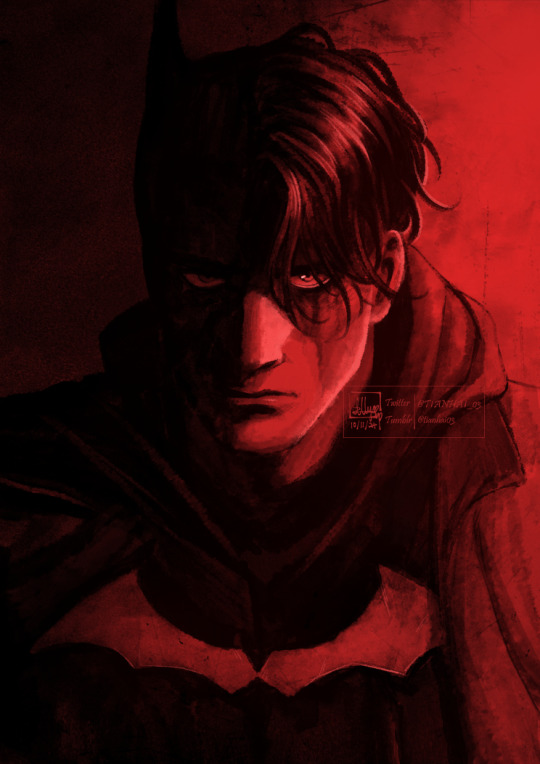
had to do poster making as an exercise and the theme was superheroes, so of course i drew mr. vengeance for it🦇
#this isnt the poster version ofc its just the drawing i did for it on its own#im not that happy with the poster version but i had a lot of fun drawing this and thats all that matters to me <3#im not a graphic designer anyway im an illustrator at heart. and my illustrator heart is super happy how this turned out#i dont think i ever mentioned it here but i love the batman 2022 its one of my favorite movies of all time :)#thats a yap session for another day though ill talk abt it in a post separate from this. maybe#allyart#the batman 2022#batman#bruce wayne#cw // eye strain#putting that just in case bc i know the red shows up super saturated on some screens and the contrast with the black is a lot#its like blindingly red on my phone but its fine on my laptop LMAO#anyways ill be going now 🏃➡️
137 notes
·
View notes
Text

DAY 1079 - FIRST SERVE
IG: @futureselfbeats
#abstract#art#surreal#scifi#daily#futuristic#trippy#neon#graphic design#3d#3d artist#3d art#artists of tumblr#artists on tumblr#film#grain#analog#glitch#cyberpunk#acidgraphix#techno#album art#album cover#cover art#daily art#daily art challenge#everyday#vibrant#high contrast
37 notes
·
View notes
Text

#retro aesthetic#retrowave#vintage#a e s t h e t i c#80s aesthetic#firearm#poster#novel#graphic design#backdrop#webnovel#graphic novel#writing#literature#hitman#hitman fandom#hitman world of assassination#agent 47#video games#minimalism#important psa#contrast#memes#funny#poster design#graphic art
13 notes
·
View notes
Text

.338.
#digital art#geometry#dark#graphic art#digital design#illustration#art#graphic design#linework#design#contrast#astronomy#celestial#cosmos#universe#space#inner space#poster design
9 notes
·
View notes
Text

Architecture , Anglet
Jean-Marie SUHUBIETTE
8 notes
·
View notes
Text
Casual analysis of graphic design and composition (ft. a bit of colour theory) since I’m a bit rusty and haven’t thought about them in a while
Hm? Some shots in Al-Haitham’s and Kaveh’s demos share a similar composition…
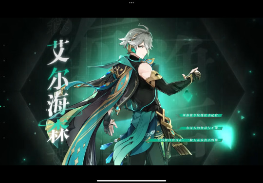
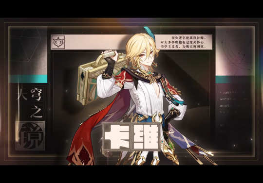
But it’s interesting that the more logical one uses informal symmetry in his character title card and the more emotional one uses formal symmetry… So many rectangles in Kaveh’s card (‘course it helps that hanzi characters are in squares)… It’s kinda surprising, but still it brings out the flow of the illustration well. (Of course, Chinese hanzi can be read horizontally or vertically, so they’ve more freedom in typography, but I bet they changed the graphic layout a bit for the English demo…)
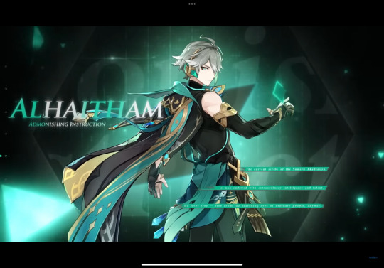
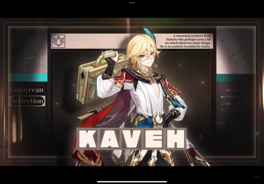
hah, yeah, I thought so. See how Kaveh’s cape can’t frame the center boxes anymore, and how there’s no space to the right of the synopsis in the upper right, and most of all how the two squares on the bottom left is now a quarter of the original size, leaving an empty space there (though if they rotated the words vertically it could fit into the rectangular space well).
Al-Haitham’s English title card isn’t bad, per se, but they could’ve put some shadow on the left side of the illustration so the text could stand out, and move the three green lines to the right side a bit more, so not everything is slightly to the left side when there’s no reason to. (The negative space on the two sides in the Chinese version is roughly the same size.)


These two shots are both long shots that show the character’s full body, but Al-Haitham is in a slightly low angle, and Kaveh is eye-level with the “camera”
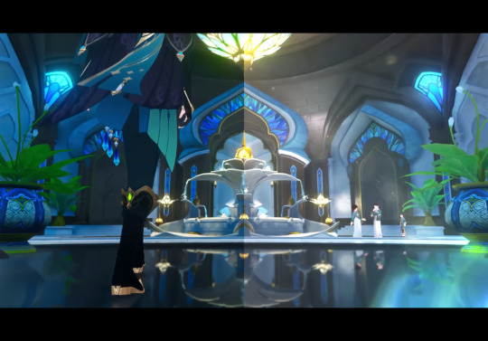
This one’s another low angle full shot with Al-Haitham’s lower body, with a bunch of analogous colours. Also this one’s background uses formal symmetry again (even reflecting off the ground) while the placement of the characters are in informal symmetry (the large image of Al-Haitham balances out the small figures near the fountain)
#procrastinating… on syntax assignment#Al-Haitham would probably tell me to go finish it#but. if their models have dark skin#to reflect their inspirations#of the Arab mathematician and physicist al-Haytham#and Iranian mythological figure Kaveh the Blacksmith#then their title cards have to use different colours since the official colour scheme#(the value contrast) in the demos ride on the fact that the characters are pale-skinned#in other words#the illusts stand out against the dark background because the characters are pale-skinned#dusk analysis#Genshin impact#kaveh#genshin kaveh#composition#art composition#graphic design#al haitham#al-haitham#alhaitham#genshin alhaitham#genshin analysis#long post
45 notes
·
View notes
Text


i'm back in the trenches of makin recolors
#if he had curly hair he'd be Actually perfect but. website im watchin sg on threw universe at me for some reason n i went Oh Hello#for neow carlyle is. mwuah mwuah mwuah mwua#i need to fiddle w the psd some more to make some more contrast pop but i do Nawt have it in me tonight#ooc. oh mein gott this stage is full of kuntenserven.#graphic design is my passion.
2 notes
·
View notes
Text

Layered Waves, 2024
#art#digital illustration#digital#digital art#Illustration#pattern#glitchart#design#graphic design#graphic art#computer graphics#graphic#bw#black and white#proceduralart#waves#contrast
3 notes
·
View notes
Text
you could kiss a hundred boys in bars
shoot another shot, try to stop the feeling :((
#sidenote the song is just#ughhhh anguish (in a good way)#all the feels PLSSS#but also the contrast of the lyric video's aesthetic#“graphic design is my passion” ahhh but it's on purpose and they make it work!!#i love it lmao#pristelle's pondering
2 notes
·
View notes
Text
@ all art people that ever made prints or stickers: do you have any tips and tricks on how to convert rgb to cmyk so it still looks good?
#my graphic designer friends always say to use rgb first bc bigger colour spectrum and worry later abt converting it#and it makes sense and I agree but when I covert its suddenly darker than the blackest part of my soul and so low contrast :(#idk shoot me anything you have and thanks in advance!!!!!#<3#mieke talks
5 notes
·
View notes
Text

DAY 953 - CAVERN
IG: @futureselfbeats
#abstract#art#surreal#scifi#daily#futuristic#trippy#neon#graphic design#3d#artists of tumblr#artists on tumblr#linework#line art#black and white#texture#detailed#high contrast#film#grain#analog#vintage#retro
8 notes
·
View notes
Text
I repeat again what I said sometime last year, I think?
I don't care about the aesthetic and artsy look of your videos.
if you can't make your text legible without causing someone to head a headache from the strain on their eyes, or worse with the constant flashing and effects, you probably shouldn't be making that video to begin with.
It bothers even those without epilepsy or the like, including me. It is not good and ends up actually looking kinda bad.
Just found a video whose intro with the 'content warning' repeatedly flashed over by images erratically every other second making it more difficult to read the already eye straining text of the warning itself that has chromatic aberration and a zoom blur vignette around it. it is very VERY annoying to look at and just sucks so bad overall to view.
your video may have some good study on whatever the subject matter is, but it is being docked like 90 points right off the bat for this visual display that is an assault on my eyes. I give only 5 points, however, due to the fact I could at least read the text despite the annoying visual effects overlaid.
Please why is it so hard for some people to create something aesthetic and artsy WITHOUT doing THAT? I promise you. Using a basic clean bg with basic clean text with 0 effects that obscure or affect the legibility is NOT going to diminish whatever your video may be about that requires a "content warning" screen before the main content of the video.
I hate the most when they're flashing it or having the visuals rapidly move and jerk around the screen. It makes it so much more difficult and aggravating to try to read.
#ghostie mumbles#//delete later#aaaaaaaaaaaaa... GRAPHIC DESIGN IS NOT YOUR PASSION. I AM SO SORRY.#please... a clean black or white bg with a clean and clear color contrasted text font is not going to diminish your videos!!
11 notes
·
View notes
Text
been thinking a lot about this specific phenomenon that's hard to put into words (so bear with me) where the technological limitations of the medium at the time a work of art was created are sometimes exactly the thing that helps lend it the atmosphere that makes it so compelling. and how sometimes superior technology is, despite the progress that's been made in so many ways, entirely unable to capture that same atmosphere for a multitude of reasons.
like, there's that brian eno quote ("whatever you now find weird, ugly, uncomfortable and nasty about a new medium will surely become its signature") that gets at some of what i mean, but not all of it.
i'm thinking about video games in particular, the way the forward march of technology does open new avenues but at the same time it inherently disappears older technologies and their aesthetics in the process, which is so tragic to me. and of course there's always nostalgia-driven attempts to recreate them, but those recreations inherently can't ever be entirely faithful to the specific charm of those older technologies and their drawbacks. (pixel art is a good example because sure, there's pixel art games being made now, but on modern LCDs they just won't ever look the same as they did on fuzzy CRTs; the fuzziness of the image made the pixel art come alive in a way modern TVs just can't.)
and this is extra amplified if games are set in a specific real world period or trying to emulate a specific real world aesthetic. because there's a little golden window of time where a game's technical limitations and the resulting art direction, and the period of time the game is meant to be set in, can perfectly compliment each other, like some sort of time prism. and any games made after that point can still do a good job at capturing the aesthetic of the era, but they won't ever be able to harness the inherent authenticity and atmosphere that e.g. noughties games and their 5 polygons can lend to a game set in the noughties.
there's no real solution to this and i'm obviously not advocating that we should be stopping any and all technological progress in favour of preserving certain aesthetics in amber, but it's still really melancholy that this is all so transitory. but i guess on the other hand we do get to enjoy those moments when technology and art/narrative can converge in the exact way they need to.
anyway, this was all just a really longwinded way to say that persona 4 is actually the best video game of all time. sorry if you thought this was about literally anything else
#genuinely have SO many thoughts abt the art direction in p4#the specific flavour of rural late 90s early noughties bleakness it manages to capture SO faithfully#these towns that seem to be perpetually stuck backward in time even if the rest of the world moves on around them#the immense amounts of detail and thought that clearly went into every single part of the environmental design#from the little details on every single set and backdrop to the specific textures they ysed#the contrast between the two incredibly different styles of retro that the game goes for between inaba and the tv world#where inaba is a very earnest straightforward portrayal and the tv world is an exaggerated one#like e.g. the tv world tvs being 'typical' 60s tvs bc that's what most ppl think of when u say retro#whereas you have the clunky 90s CRT version in the protagonist's room in the real world#and how all of this detail and care and forethought just oh so perfectly collides with the ps2 graphics#could write a whole dissertation on this alone fr#and that's just the art style!!!! that's not even getting into the deliberateness and interconnectedness of the writing!!!!!#anyway. don't play p4 it's really bad sorry. like yea its the best video game of all time i did say that it's just also rly rly bad#txt
20 notes
·
View notes
Text

.320.
#graphic design#art#illustration#digital art#geometry#dark#graphic art#linework#digital design#design#moons#moon#crescent moons#cycles#shadow#moon shadow#contrast#astronomy#astrology#space#space art#outter space#planets#solar system
13 notes
·
View notes
Text

Bancs publics, Biarritz
Jean-Marie SUHUBIETTE
15 notes
·
View notes