#frontenddesigning
Text
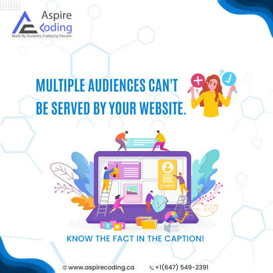
Although there may be differences in technology literacy and aesthetic preferences between generations and socioeconomic groups, your website design may nevertheless be appealing to a wide range of users. Find the places where each of your target audience's tastes overlaps and works smarter, not harder, to interact with them.
#aspirecoding#coding#codingaspire#learntocode#website#uiux#frontenddesigning#webpage#learncoding#codingworld#websitedesign
1 note
·
View note
Text
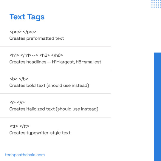
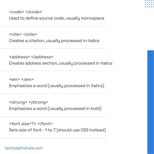
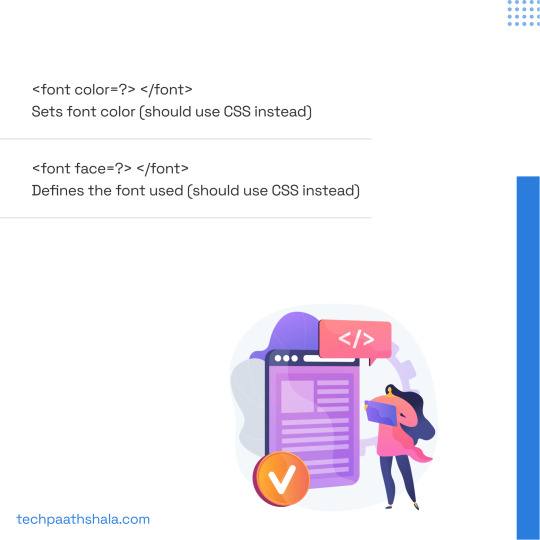
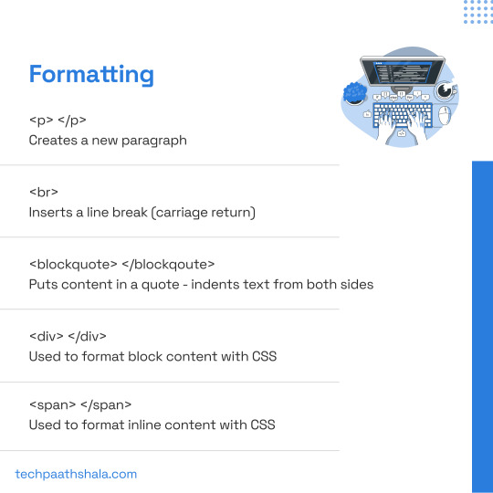
HTML Cheatsheet - A Quick Reference for Coders (Part2)
Text just got more stylish with HTML! 💬 Part 2 of our HTML cheat sheet focuses on the text tag. . . . 🔔Don't miss a single post by turning on post notifications! 🎯 If you like our content, hit the follow button 👉 @Techpaathshala

#HTML#webdev#codingmadeeasy#developerlife#computerscience#coder#css#development#softwaredevelopment#techpaathshala#techstalwarts#React2023#webdevelopment#FrontendDesign#UXDesign#UserExperience#WebDesign#UI#Usability#InteractionDesign#UserInterface#WebDevelopment#DesignThinking#fullstack#fullstackdeveloper#software#technology#coding#programming#developer
66 notes
·
View notes
Text
#webdesign#html#tamilitmemes#css3#tamilwebdesign#css animation#web design#web development#website#frontend#backend#backendcoding#backendengineer#backenddeveloper#backenddevelopment#frontenddev#frontenddesign#frontend development#frontend design#fullstackdevelopment#fullstackdeveloper#fullstackdev#fullstackwebdeveloper#fullstack#full stack developer#full stack web development
4 notes
·
View notes
Text
What Happens when UX UI Designer Meet Clueless Clients - WSE Infratech Meme
Clueless client Open-ended feedback Is it a nightmare for you?Navigating a maze with invisible walls or a roller coaster ride! What has been your experience?
1 note
·
View note
Text
Banner Bliss: Animation Techniques with CSS

Introduction
Welcome to the world of web design where creativity meets functionality! In this blog post, we'll delve into the fascinating realm of CSS animations, focusing particularly on techniques to breathe life into banners. Animated banners not only capture attention but also contribute to a dynamic and engaging user experience.
Whether you're a seasoned web developer or just starting, understanding the basics of CSS animations and exploring advanced techniques can significantly enhance your design repertoire. Get ready to embark on a journey of 'Banner Bliss' as we unravel the secrets behind creating captivating and effective animated banners using CSS.
Understanding CSS Animation Basics
Before diving into the intricacies of crafting captivating banner animations, let's establish a solid foundation by exploring the fundamental basics of CSS animations.
CSS Animations: Cascading Style Sheets (CSS) animations allow developers to bring elements on a webpage to life through smooth transitions and transformations. These animations are achieved by changing an element's CSS properties over a specified duration.
Key Animation Components:
- Selectors: Define which elements on the webpage will be animated.
- Properties: Specify the CSS properties that will change during the animation (e.g., opacity, width, height).
- Duration: Set the time it takes for the animation to complete.
- Timing Function: Determine the acceleration or deceleration pattern of the animation (e.g., ease-in, ease-out).
- Keyframes: Define specific points in the animation sequence and specify the CSS properties at each point.
Transitions vs. Animations:
While CSS transitions are suitable for simple, one-off changes, animations offer more control and flexibility for creating complex and dynamic effects. Animations are particularly powerful when crafting banners that require a combination of movements and transformations.
Browser Compatibility:
It's crucial to consider browser compatibility when working with CSS animations. Fortunately, modern browsers support CSS animations, ensuring a consistent experience for users. However, it's wise to test your animations across different browsers to address any potential compatibility issues.
Using the @keyframes Rule:
The @keyframes rule is the backbone of CSS animations. It allows you to specify the intermediate steps or keyframes of an animation sequence. By defining the styles at different keyframes, you can create complex and dynamic animations that smoothly transition between states.
Example:
CSS@keyframes slide {
0% { transform: translateX(0); }
100% { transform: translateX(100%); }
}
Creating Eye-Catching Banners
Now that you've grasped the fundamental concepts of CSS animations, let's channel that knowledge into crafting visually stunning and attention-grabbing banners. Banners play a crucial role in conveying messages, promoting products, or enhancing the overall aesthetics of a website. In this section, we'll explore various CSS animation techniques to elevate your banner designs.
1. Entrance Animations:
Start your banners with an impressive entrance animation to immediately capture the user's attention. Utilize @keyframes to define an animation that introduces the banner elements in a visually appealing manner.
2. Hover Effects:
Enhance user interaction by incorporating subtle hover effects. Use CSS properties such as transform and transition to create smooth and responsive animations triggered by mouse hover. Consider effects like scaling, fading, or color transitions to make your banners interactive.
3. Text Animations:
Make your banner messages dynamic by animating the text content. Experiment with properties like opacity and transform to create fading text, typewriter effects, or text rotations. Ensure the animations align with your brand style and messaging.
4. Carousel Banners:
For banners showcasing multiple images or messages, implement a carousel effect. Utilize CSS animations along with JavaScript or pure CSS solutions to create a smooth transition between banner slides. This adds a professional touch and keeps users engaged.
5. Color Transitions:
Experiment with color transitions to add vibrancy and visual appeal to your banners. Use @keyframes to smoothly transition between different color schemes. Consider the psychology of colors to evoke specific emotions or convey particular messages through your banners.
6. Interactive Elements:
Take banner animations to the next level by incorporating interactive elements. This could include buttons, clickable areas, or animated call-to-action elements. Ensure that these interactive features enhance user engagement without compromising the overall user experience.
7. Responsive Design:
Make your banners visually consistent across various devices by implementing responsive design principles. Use media queries to adjust animation properties based on the screen size, ensuring a seamless experience for users on both desktop and mobile devices.
8. Testing and Optimization:
Before deploying your banners, thoroughly test them across different browsers to ensure compatibility. Optimize your animations for performance by minimizing unnecessary complexities and utilizing CSS animation best practices.
By integrating these techniques, you can transform ordinary banners into captivating visual experiences that leave a lasting impression on your website visitors.
See the Pen
Sale banner by @BrawadaCom (@Anna_Batura)
on CodePen.
Key Animation Properties
As you continue your journey into the world of CSS banner animations, it's essential to understand the key properties that govern the behavior and appearance of your animated elements. These properties empower you to control the timing, duration, and style of your animations effectively.
1. Animation Name:
The animation-name property defines the name of the animation, referencing the @keyframes rule that describes the animation's behavior. This property establishes the foundation for your animation sequence.
2. Duration:
Specify the duration of your animation using the animation-duration property. This value determines how long the animation will take to complete one cycle, influencing the overall speed and feel of the animation.
3. Timing Function:
The animation-timing-function property dictates the pacing of the animation, controlling the acceleration and deceleration throughout its duration. Common values include ease, linear, ease-in, ease-out, and ease-in-out.
4. Delay:
Introduce a delay before the animation starts using the animation-delay property. This delay allows you to synchronize multiple animations or create a suspenseful effect before the animated elements come into view.
5. Iteration Count:
Determine how many times the animation should repeat with the animation-iteration-count property. Setting it to infinite ensures a continuous loop, while a specific number will control the number of animation cycles.
6. Direction:
The animation-direction property manages the direction of the animation sequence. Choose from values like normal, reverse, alternate, or alternate-reverse to control the flow of your animation.
7. Fill Mode:
Define how the animated element should appear before and after the animation with the animation-fill-mode property. Options include none, forwards, backwards, and both, influencing the styling during animation playback.
8. Play State:
The animation-play-state property allows you to pause or resume an animation dynamically. Toggle between running and paused values to control the animation state based on user interactions or specific events.
Table of Animation Properties:
PropertyDescriptionanimation-nameSpecifies the name of the animation.animation-durationSets the duration of the animation.animation-timing-functionDefines the pacing of the animation.
Mastering these animation properties provides you with the tools to create nuanced and polished banner animations that align with your design vision. In the upcoming sections, we'll delve into practical examples to showcase how these properties work together to produce compelling visual effects.
Optimizing Performance
Efficient performance is paramount when implementing CSS banner animations to ensure a smooth and delightful user experience. Let's explore strategies and best practices to optimize the performance of your animations and keep your website running seamlessly.
1. Hardware Acceleration:
Take advantage of hardware acceleration to offload the rendering of animations to the device's GPU, enhancing performance. Utilize the transform and opacity properties for hardware-accelerated animations, ensuring better rendering speeds.
2. Limiting Animations:
While animations add flair to your banners, overusing them can lead to performance issues. Be judicious in your use of animations, focusing on key elements and actions to avoid overwhelming the user with excessive movement and transitions.
3. Optimal Frame Rate:
Consider the frame rate of your animations. Aiming for a standard 60 frames per second (fps) ensures smooth and visually appealing motion. Use tools like browser developer tools to assess the frame rate and make adjustments accordingly.
4. Minimizing DOM Manipulation:
Excessive manipulation of the Document Object Model (DOM) can impact performance. Limit unnecessary DOM changes during animations to reduce the workload on the browser. Opt for CSS-only animations whenever possible, avoiding JavaScript-based animations for improved efficiency.
5. CSS Hardware Acceleration:
Apply CSS properties that benefit from hardware acceleration, such as translate3d and scale3d. These properties trigger hardware acceleration, enhancing the rendering speed of your animations.
6. Animation Shorthand:
Consolidate your animation properties using the animation shorthand property. This not only simplifies your CSS code but also helps the browser optimize the rendering process. Include name, duration, timing-function, and other relevant properties within the shorthand declaration.
7. Debouncing and Throttling:
Implement debouncing and throttling techniques when using JavaScript in conjunction with CSS animations. These strategies prevent excessive function calls, reducing the likelihood of performance bottlenecks and ensuring a smoother animation experience.
Table of Performance Optimization Techniques:
TechniqueDescriptionHardware AccelerationUtilize GPU for rendering animations.Limiting AnimationsUse animations judiciously to avoid overload.Optimal Frame RateAim for 60 frames per second for smooth motion.
By implementing these optimization strategies, you can strike a balance between engaging CSS banner animations and optimal website performance. In the next sections, we'll explore advanced animation tricks and techniques to further enhance your banner designs.
Responsive Animation Design
Ensuring that your CSS banner animations look and function seamlessly across a variety of devices is crucial in today's multi-device landscape. Let's explore the principles of responsive animation design to create a consistent and engaging user experience regardless of screen size or device type.
1. Media Queries:
Integrate media queries into your CSS to tailor your animations based on the device's screen size and characteristics. Adjust animation properties, durations, and even the existence of certain animations to optimize the visual experience on different devices.
2. Flexible Units:
Use relative units like percentages and viewport units (e.g., vw for viewport width) instead of fixed pixel values. This ensures that your animations scale appropriately, adapting to the varying screen dimensions of different devices.
3. Breakpoints:
Identify key breakpoints in your design where the layout or content structure changes. Implement specific animation adjustments at these breakpoints to accommodate the shift in design and maintain a visually pleasing experience.
4. Fluid Grids:
Incorporate fluid grid systems to create layouts that adapt proportionally to the screen size. This allows your animations to seamlessly adjust to different screen dimensions, promoting a harmonious visual flow across devices.
5. Touch-Friendly Animations:
Consider the touch interface when designing animations for mobile devices. Implement touch-friendly gestures and interactions, ensuring that your animations respond intuitively to swipes, taps, and other touch-based inputs.
6. Retina-Ready Graphics:
Optimize your graphics for high-density displays, commonly found in modern smartphones and tablets. Use high-resolution images and vector graphics to ensure crisp and clear animations on devices with Retina or similar high-DPI screens.
7. Test Across Devices:
Thoroughly test your responsive animations on a variety of devices and browsers to identify and address any inconsistencies or issues. Emulators and real-device testing are essential to ensure a reliable and uniform experience for all users.
Table of Responsive Design Techniques:
TechniqueDescriptionMedia QueriesAdapt animations based on screen characteristics.Flexible UnitsUse relative units for adaptable animations.BreakpointsAdjust animations at key design breakpoints.
By implementing these responsive design principles, your CSS banner animations will not only look visually appealing but also provide a consistent and enjoyable experience across the diverse landscape of devices. In the following sections, we'll delve into advanced animation tricks to elevate your banner designs even further.
Advanced Animation Tricks
Ready to take your CSS banner animations to the next level? Let's explore advanced techniques and tricks that add flair, sophistication, and a touch of magic to your animated banners.
1. Parallax Scrolling:
Introduce depth and dynamism to your banners by incorporating parallax scrolling effects. Create an illusion of layered movement as background and foreground elements scroll at different speeds, providing a captivating visual experience.
2. 3D Transforms:
Enhance the visual appeal of your banners with 3D transforms. Utilize properties like rotateX, rotateY, and perspective to add depth and perspective, creating eye-catching animations that simulate three-dimensional space.
3. Morphing Shapes:
Transform shapes seamlessly during animations to create mesmerizing morphing effects. Use the @keyframes rule to transition between different shapes, adding a dynamic and fluid quality to your banners.
4. SVG Animations:
Incorporate Scalable Vector Graphics (SVG) for intricate and scalable animations. SVG graphics can be animated using CSS animations and provide a lightweight and responsive solution for creating complex visual effects within your banners.
5. Particle Animations:
Add an element of enchantment to your banners with particle animations. Use CSS and JavaScript to simulate particle movements, creating dynamic backgrounds or interactive elements that respond to user actions.
6. Staggered Animations:
Introduce a sense of rhythm and coordination by staggering animations. Apply different delays to individual elements within a group, creating a cascading effect that adds complexity and sophistication to your banner designs.
7. Custom Easing Functions:
Move beyond standard easing functions and create custom easing curves for your animations. Experiment with cubic bezier curves to fine-tune the acceleration and deceleration of animated elements, achieving a unique and polished look.
8. Dynamic Gradients:
Bring vibrant color transitions to your banners with dynamic gradients. Use CSS animations to smoothly change gradient colors over time, creating visually stunning effects that catch the eye and enhance the overall aesthetic.
Table of Advanced Animation Tricks:
TechniqueDescriptionParallax ScrollingCreate depth with scrolling background layers.3D TransformsAdd perspective and depth to animations.Morphing ShapesSeamlessly transition between different shapes.
These advanced animation tricks offer a myriad of creative possibilities to elevate your banner designs. Experiment with these techniques to craft visually stunning and memorable animated banners that leave a lasting impression on your website visitors.
Case Studies
Let's dive into real-world examples to witness the impact and effectiveness of CSS banner animations. These case studies highlight successful implementations, demonstrating how thoughtful animation design can enhance user engagement, convey brand messages, and elevate the overall user experience.
Case Study 1: E-Commerce Product Showcase
In this case, a leading e-commerce platform incorporated CSS animations to showcase their featured products.
Read the full article
0 notes
Text
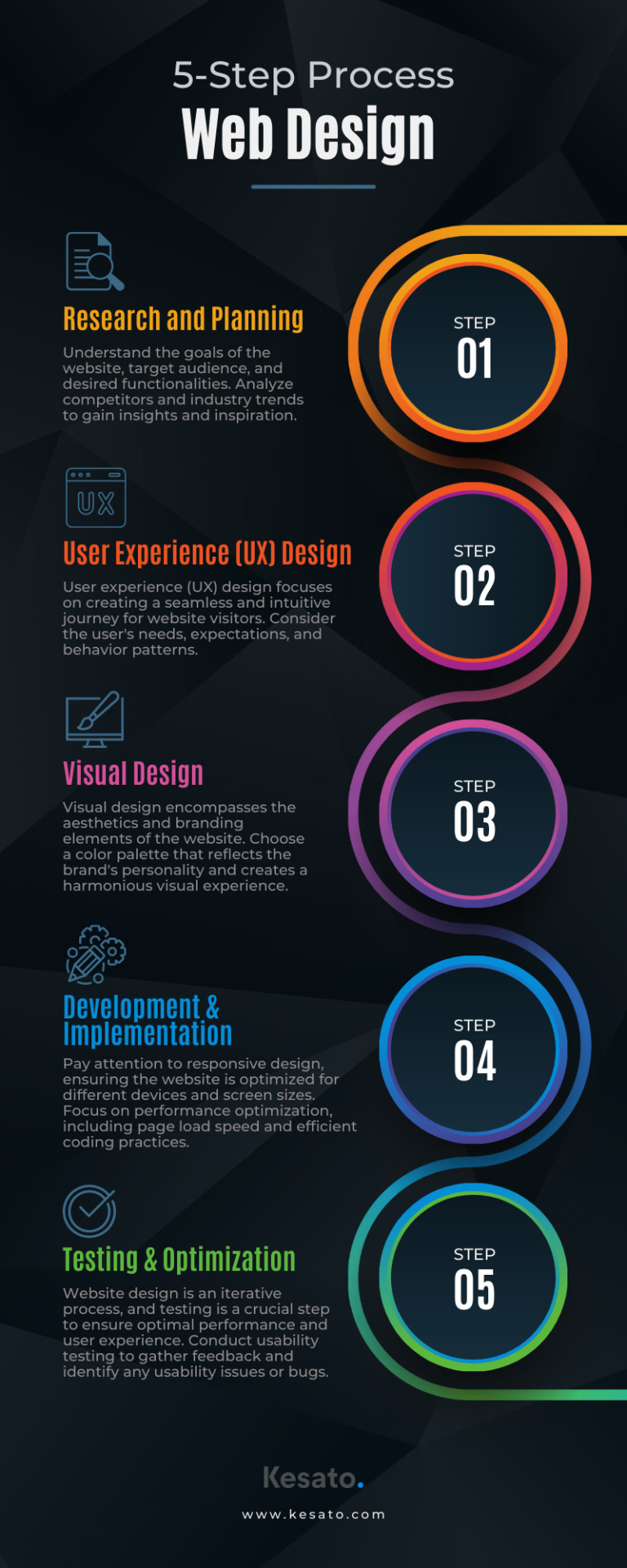
Discover the essential 5-step process to create captivating websites that captivate users. From planning to optimization, master website design!
#WebDesign#UserExperience#UIUX#ResponsiveDesign#WebsiteDevelopment#CreativeDesign#DigitalDesign#VisualIdentity#GraphicDesign#InteractionDesign#MobileDesign#WebUsability#InformationArchitecture#Wireframing#WebOptimization#FrontEndDesign#WebAccessibility#ContentStrategy#VisualHierarchy#WebTrends
0 notes
Photo
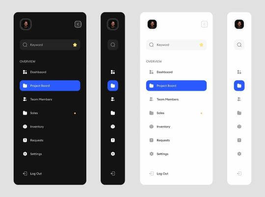
Today, we're on side panels #mobileapp #productdesign #uiuxdesign #uidesign #frontenddesign #appdesign #uidesign #uiux #uxdesign #UserExperience #userinterface #webdesign #uiinspiration #webdesign #dashboard #dashboarddesign #sidepanels https://www.instagram.com/p/ClLHa65Kll_/?igshid=NGJjMDIxMWI=
#mobileapp#productdesign#uiuxdesign#uidesign#frontenddesign#appdesign#uiux#uxdesign#userexperience#userinterface#webdesign#uiinspiration#dashboard#dashboarddesign#sidepanels
1 note
·
View note
Video
youtube
user interface design, ux interface design, user interface developer, ui...
https://youtu.be/qAleY6s_A_U
user interface design, ux interface design, user interface developer, ui user interface
🌟 Welcome to our exciting journey into the world of User Interface Design! In this immersive video, we delve deep into the art and science of crafting seamless and user-friendly experiences. Whether you're a seasoned UI/UX designer, an aspiring user interface developer, or simply curious about the magic behind your favorite apps and websites, this is the ultimate guide for you. Join us as we unravel the intricacies of UI design principles, explore the latest trends shaping the digital landscape, and gain invaluable insights into creating interfaces that not only look stunning but also enhance user satisfaction. Don't forget to hit the like button if you find this information insightful, share it with your fellow design enthusiasts, and subscribe to our channel for a front-row seat to future content that will elevate your design game. Together, let's build a community passionate about the art of UI/UX design – where creativity meets functionality! So with a commitment to excellence and a passion for creativity, our team of professionals is ready to collaborate with you to achieve your goals and we invite 🤝 you, to our world where innovation, precision, and imagination converge. We, welcome you to our services hub, where your vision becomes reality.
For Your Inquiries Reach Us At:
SOLUTION LAB,
Email ID’s: [email protected], [email protected].
Web: www.solutionlab.online
Blog ID: https://solutionlabonline.blogspot.com/
🌿design and interface, user interface and user experience, mobile app interface design, user interface design company, shopify user interface, user interface wireframe, mobile interface design, best user interface design, user interface website, user interface consultant, mobile user interface design, simple user interface design, dashboard interface design, mobile app user interface design, adobe interface design, adobe user interface, user experience and user interface design, user interface design application, interface design agency, user interface graphic design, user experience user interface design, artificial intelligence user interface design, web user interface design, angular user interface, user interface experience, best user interface websites, freelance user interface designer, user experience and interface design, crm user interface design, good user interface websites, google interface design, #uidesign #uxdesign #UserInterfaceDeveloper #designenthusiasts #digitalexperience #userinterface #uiux #webdesign #interactiondesign #userexperience #digitaldesign #designthinking #uideveloper #uxdeveloper #CreativeUI #uiinspiration #mobileui #responsivedesign #uipatterns #wireframing #usability #visualdesign #usercentricdesign #uielements #designprocess #frontenddesign #appdesign #uiprototyping #innovationindesign #UIBestPractices #digitalexperience #UIFeedback #designcommunity #likeandshare #likeandshareandcomment #likeandsharemarketing #likeandshareplz #likeandsubscribe #likeandsubscribemychannel #likeandsubscribes #likeandsubscribeplease #likeandsubscribebutton #likeandsubscriber #likeandsubscribepls #likeandsubscribeplz #likesharesubscribecommentnow #likeshare #likesharesubscribe #likeshareandsubscribe #likesharecomment #likesharesubscribecommentnow #likeshareandsubscribemychannel #likesharefollow #subcribe #subcribeme #subcriber #subcribers #subscribeandshare #subscribenow #subcribemyyoutube #subcribemychannel #subcribetothechanell #subscribenowmychannal #subcribe_to_our_channel #subscribenowmorevideos #subscribenowmoreinterestingvideos #subscribeandlearn #subscribeforsupport #subscribefortips #usa #usacollege #unitedstates #unitedstatesofamerica #unitedstatesofamerican #unitedstatesofamericaplease #usanews #usanewsonline #usatoday #usatodaynews #usatodaysports #unitedarabemirates #uaekhabartoday #uaenews #uaenewsofficial #uaelife #uaelifestyle #uaejobs #uae #dubai #dubailife #dubaijobs #dubainews #dubainewstoday #dubailifestyle #dubailifestylevlog #dubailifestyleblogger #canada #canadalife #canadalifestyle #canadian #canadianuniversity #canadanews #canadanewstoday #australian #saudiarabia #saudiarabialatestnews #saudiarabianews #saudiarabianewslive #saudiarabiajobs #saudinews #saudi #saudi_news #saudi_news_update #saudinewsofficial #oman #omannews #omannewsdaily #omanchannel #omannewslive #omanjobs #omanjob #omanjobnewstoday #qatar #qatarlife #qatarlifestyle #qatarnews #qatarjobs #qatarevents #qatarliving #kuwait #kuwaitnews #kuwait_kuwait #kuwaitlivenews #kuwaitcity #kuwaitlatestupdate #kuwaitlatestupdates #kuwaitnewshighlights #kuwaitnewsheadlines #newzealand #newzealandbusiness #newzealandlife #uk #unitedkingdom #unitedkingdomlife #britain #britainnews #greatbritain #british #britishenglish #britishenglishpronunciation #britishenglishclass #bahrain #bahrainbloggers #bahrainevents #bahrainnews #bahraintv #poland #portugal #português #finland #singapore #singaporevlog #singaporevideos #mexico #mexicocity #brazil #argentina #chile #southafrica #southkorea #norway #peru #germany #germanynews #germanywale #german #france #francese #italy #italya #italian #italia #italianteacher #italiancourse #italianclass #turkey #switzerland #swiss #swissview #swissviews #austria #austriatravel #hungary #hungarylife #bulgaria #bulgariantechchannel #russia #russian #russianews #russianlanguage #russianlanguageteacher #russianlanguagelessons #japan #japanese #japaneselanguage #japaneselanguageschool #japanlife #japanlifestyle #japanvlog #japanvlogger #qatarjobinformation #saudiarabiainternational #canadalifevlog #australiainternationalstudents #canadavlogs #spain #spaintravel #spainish
0 notes
Text
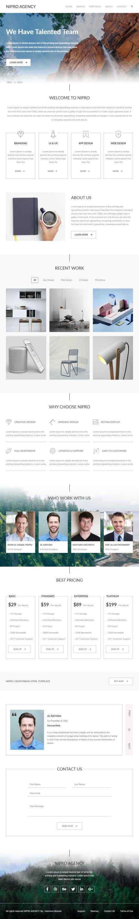
Unleashing Creativity at Nipro Agency
🌐 Elevate your brand with innovation and style! Welcome to my newly revamped agency website, where creativity meets strategy. Explore my portfolio, discover my services, and let's embark on a journey to redefine your digital presence.
Project Name: Nipro Agency
Using:- HTML, CSS, Bootstrap, Media-query, JavaScript and Jquery
Project Type: PSD to HTML
Responsive Devices: All
Live Preview :- https://hemontamondal.github.io/nipro/
Feel free to share your valuable thoughts.
For more inquiries:
📩 Email: [email protected]
📱 Phone: +88 01793310293
hemontamondal #HemontaMondal #Hemonta_Mondal #hemonta_mondal #hemonta #hemontamondal65 #hemontamondal64 #hemonta93 #webdesign #responsivewebdesign #webdesigner #webdevelopment #fullstackwebdevelopment #fullstackwebdeveloper #psdtohtml #figmatohtml #xdtohtml #wordpress #elementor #agency #wordpressexpert #frontenddesigner #backenddesigner #shopify #shopifydeveloper #landingpagedesigner #landingpage #productpage
#hemontamondal#hemontamondal65#webdesigner#webdeveloper#wordpressexpert#wordpress#webdevelopment#webdesign#website#hemonta93#hemontamondal64#hemonta#wordpressdesign#wordpressdeveloper#responsivedesign#fullstackdeveloper#frontenddevelopment#front end developers#full stack web development#elementor#php#mysql#jquery#javascript#landing page designer#web developers
0 notes
Photo

In 2021, mobile apps are projected to generate huge revenue via app stores and in-app advertising. What’s more, most companies and organizations are relying more on apps than on websites for brand awareness and revenue generation.
While many companies are trying to take advantage of this trend, many of us are still unaware of the app development process. An effective app development process flow spans over seven key phases. In this article, we’ll take a closer look at each step.
Regardless of the size and scope of your project, following this development process will make your enterprise mobile app development initiative a success.
The steps are:
1. R & D involves thorough research and detailed market study about your App's prospects and purpose. All goals & objectives are fixed at this stage.
2. Making a Wireframe of the app by the developers.
3. UI/UX Design is made using Adobe XD, Figma to create a Prototype for displaying the App Design.
4. Development of the App Design includes the following steps:
Frontend Design (Using React Native, Flutter)
Integrate API/Database
Backend Design
5. Testing the App using:
Selenium WebDriver, Appium
Performance Testing Apache Jmeter, Load Runner
6. Deployment through CI/CD: Jenkins.
7. Launching the App for public use.
10 notes
·
View notes
Text
HTML Cheatsheet - A Quick Reference for Coders (Part3)
Step up your HTML game with our cheat sheet Part 3! Learn how to use text & formatting tags for a seamless website design experience💻
.
.
.
🔔Don't miss a single post by turning on post notifications!
🎯 If you like our content, hit the follow button
👉 @techpaathshala


#HTML5#webdesignInspiration#codingskills#HTML#webdev#codingmadeeasy#developerlife#computerscience#coder#css#development#softwaredevelopment#techpaathshala#techstalwarts#React2023#webdevelopment#FrontendDesign#UXDesign#UserExperience#WebDesign#javascript#python#java#computer#html#tecnologia#code#webdeveloper#softwareengineer#erp
22 notes
·
View notes
Photo

Happiest birthday to super dope lyricist and forever friend of MOTS Media,@lastminutet! 🥳🥳🥳 We’re proud to announce the relaunch of his website lastminutet.com designed by @motsmedia. Go visit, watch music videos, stream ALL his music and buy his mercy all in one place! It's 2021 now and it's time to start living your dreams! Branding is all about fostering an identity for your small business. If you’re a proud owner of a brand, it’s essential to maximize your marketing and we can help you get started! It's time to start living your dreams! Make it count. 💫 Our Small Business Services Include: • #photography • #webdesign • #videography • #graphicdesign • #printproduction • #contentcreation DM or email us today for a FREE 30-minute consultation! 📧[email protected] #MOTSmedia #digitalmarketing #branding #consulting #mobiledesign #frontenddesign #graphicdesign #affordable #fullserviceagency #highquality #logos #customlogo #moderndesign #editor #photoshop #socialmedia #seo #happyclients #collab #teamwork #dreamwork #art #design #supportsmallbusinesses https://www.instagram.com/p/CKPXh-JAH8h/?igshid=1eci9x5iw5unv
#photography#webdesign#videography#graphicdesign#printproduction#contentcreation#motsmedia#digitalmarketing#branding#consulting#mobiledesign#frontenddesign#affordable#fullserviceagency#highquality#logos#customlogo#moderndesign#editor#photoshop#socialmedia#seo#happyclients#collab#teamwork#dreamwork#art#design#supportsmallbusinesses
2 notes
·
View notes
Text
Web Portal Development

A Full Range of Web Portal Development Services Worth to Experience Now:
Portal websites development has rapidly gained name over internet now a days because of the various services that it provides.
A Web Portal Development actually is a website that acts as a point of access to information in the World Wide Web. Information from diverse sources is shown in a unified way.
Apart from the standard features of a search engine a web portals offer many other services such as email, news, stock prices, information, databases and entertainment.
Portals provide way for enterprise to have a consistent look and feel with access control and procedures for multiple applications and databases, which otherwise would have been different entities altogether.
We provide total solutions for portal development: conceiving ideas - defining businesses - engineering processes - colouring content - maintaining portal. Each of the portals we design sticks to a scalable, dependable and versatile design.
The usual search engine feature is always present in a web portal. Searching for information is a chief necessity in all the web portal development services.
Apart from that, many other features should be supported when web portal development comes to mind. A customized email id is another important feature of any web portal.
We provide Web Portal Development for:
Business Portal Development.
B2B Portal Development.
B2C Portal Development.
Shopping Cart Portal development.
Social Community Portal Development.
Community Portal Development.
Application/Web Services Portal Development.
E-Commerce Portal Development.
Migrate your business to the World Wide Web and Trawex will create high-impact B2B & B2C web portals which will act as your online trading arm.
No matter what your business model is (B2B or B2C), our skilled, versatile and commerce-enabled portals integrate information, applications and business processes to help address target audiences; build business on a global scale and enhance relationships with trading partners, suppliers and customers.
Feature-Rich Web Portal Development:
With Trawex solutions to empower enterprises, you can reduce cycle time, get more results from limited resources, quickly adapt to fast-evolving markets and explore limitless expansion possibilities.
Choose for Trawex India now, and we will deliver comprehensive, industry-leading web portal solutions to help you get measurable return on your web portal investment.
Shopping Cart is the heart of an e-commerce Store and big part of the success of the store depends on how effectively the shopping cart is designed and implemented. A badly designed shopping cart frustrates users and leads to higher bounce rate.
A purchase dropped in between hurts most e-commerce websites and is more a function of bad shopping cart design than user behavior. Bad shopping cart development directly affects on sales.
In today's digital marketplace, businesses worldwide are leveraging leading-edge technology for optimum business efficiency and reduced optional costs.
Whether you want a creative B2B website development or a robust business app, we love to render a creative solution to the business.
We have appointed large team of talented developers who are actively indulged in creating ingenious web designs that are specifically designed to meet business purposes.
With the experience of creating a number of successful web design for b2b company, we have got immense specialization in catering almost all types of b2b web designing needs.
Our B2B website development aimed to provide a platform to enterprises for their worldwide market. Our custom B2B website development is an effective way to deliver your end users the detailed information about your company, products and services.
Our B2B eCommerce solutions are basically a platform for eCommerce transaction among business around the globe.
Our team of B2B website development has deep knowledge balancing the needs, creating powerful, persuasive and credible content to capture user attention and generate form inquiries.
We specialize in establishing custom websites for B2B companies:
To get a B2B website built, it’s preferable to consult with any B2B website development company such as Trawex. We’d love to assist your B2B website realize its maximum potential by improving conversions, your bottom line, and your return on investment.
We specialize in establishing custom websites for B2B companies that align with their sales processes to drive pipeline revenue. And we use the up-to-date responsive web design and development techniques to get there.
We pay attention to you and your idea and provide you to improve B2B website development with highest quality.
Trawex is a centralized travel website development company that provides scalable B2C & B2B solutions to regional travel operators & hospitality companies.
Our travel web design and development services based on the concept of intelligent engineering solutions for travel agencies, travel companies, and tour operators. By implementing our advanced packaging system in your business, you can always be able to sell several travel products in one box.
You can offer personalized services easily to your customers using our versatile packaging framework. We concentrate on delivering services in the form of a modern technology platform to any travel agent so that they can easily manage their business operations and build new opportunities in the travel industry.
We build a simple, elegant and attractive tour and travel websites, and CMS based website and we can also use beautiful image sliders to make your tour and travel website more appealing and eye-catching.
All the standard features of the tour and travel website are included, such as category management, destination management. Travel websites must be dynamic so that you can easily add and modify them without any technical knowledge.
We have the expertise to add advanced features such as online reservations, travel itineraries, packages, and special offers, tour itineraries, SMS, API, photo gallery, hotel details, etc.
We've driven our efforts to transform technology from convention-based to cloud-based. For designing travel portals for the small-and large travel business, we deliver competitive, feature-rich solutions and exceed your standards.
Are you ready to explore new possibilities and engage with your potential audience? With the most profitable travel website design services, Trawex as a trusted business partner can empower you to discover and meet the demands of your customers.
Being an expert global travel portal technology company, Trawex supports business to maximize its product value.
The Best in Industry:
Our website design and development experts with their prolonged know-how in the development of travel portals, by integrating cutting-edge as well as industry trends offer you the web solutions you're looking for.
We deliver reckonable results and allow your evolving travel business to yield greater returns on investment. In order to come up with a more abrupt travel portal solution for our clients that delivers flexibility and performance, we bring out continuous experiments with both internal and external customer satisfaction.
We select the best technologies and the latest website development trends based on your diverse needs and bring you a unique travel agency website. Our concepts are functionally consistent with existing industry trends. You can significantly boost the productivity of your travel agency and its travel packages by using your own travel website.
Travel websites built and developed by Trawex not only simplify your business but also help you extend your online presence with its robust features and attractive designs.
From your home page, booking pages and search engine to personalized landing pages, exclusive deals, and inquiry forms, we deliver cutting-edge modern travel platforms designed to improve your digital presence and overall experience.
Our Internet Booking Engine runs on top of the powerful and demand gateway platform and can be integrated with multiple properties. Simply exchangeable for your current booking platforms, our Internet Booking Engine continually integrates with your systems to provide cheap costs to your existing landscape.
Connecting with your backend inventory & booking management systems, the Internet Booking Engine offers a wide kind of options that facilitate simple & prompt bookings for your customers leading to conversions.
This is wherever Trawex Internet Booking Engine comes in. It links your booking system with the Internet to form an online booking system.
Whatever services you want to form available for Internet Booking on your website, Trawex will support you. If you want to distribute each package and distinctive services, then select our Internet Booking.
Expand Your Market Reach:
For distributing services targeted on specific themes, our special Internet Booking can facilitate. They provide a sub-group of the effective range, focusing instead on optimum sales for a specific market segment. Such booking engines include Flight Internet Booking and other Internet Booking.
There has been such a gradually increase in accommodations being reserved online that even the smallest of travels can’t ignore the necessity for an Internet booking.
Trawex is a leading web portal development company. We develop innovative and high performance web portals, enterprise portals and customer portals while meeting end customer’s business requirements & objectives.
Custom web portals are built to automate the processes, information sharing at several levels, on field collaboration and communication through web services and application services.
Travel portal software is a comprehensive and powerful web based online booking system, designed for travel industry especially for travel management companies, destination management companies, travel aggregators, B2B B2C travel agencies, tour operators and home based travel agents.
Today, Trawex is known as one the best travel portal development company in Bangalore, India. We provide consulting, development for all the aspects of B2B & B2C travel portal development and travel api integration for airline booking, hotel booking, travel packages, bus booking, car rental, cruise booking and insurance.
We provide white labeled solution for travel website development and travel booking software projects.
web portal development company offers end to end b2b Portal Development Services:
We are a web portal development company offers end to end b2b Portal Development Services to build an interactive and efficient portal for our clients.
The portal will be feature-rich and user-friendly. Trawex offers a wide range of bookable solutions for online travel agencies with most affordable packages in the industry and the latest evolving technologies.
Travel portals offer a way for customers to browse through various tourist destinations and ease of booking tickets and accommodations online.
Our services help build an impactful presence for your Hotel in the virtual world, create greater visibility, and great ease of transaction which results in lower unsold inventory through greater Online Revenue and Profits.
These services include web design and development, custom programming to ongoing maintenance and support tasks. We partner with our customers to make a positive, enduring effect on their association's development and achievement.
Trawex is a reputed Web Portal Development Company that offers you a complete travel software solution:
Trawex has hands-on experience in developing travel portal, B2B (Business to Business) portals, B2C (Business to Consumer) portals, and Portal Maintenance.
We ensure that the portals that we develop are highly interactive, easy to navigate, highly functional and absolutely user-friendly.
We offer travel technology solutions for travel portal development for mid and large size travel business with cost-effective and exceed your travel business with the help of Trawex who are searching for online travel portal development, white label solution, GDS/XML/ Travel API’s expectation.
We ensure that we take a good look at your requirements to provide you with the customized travel portal solutions to you.
Trawex has a team of travel portal experts, who through their programming and industry experience can create a complete travel portal that will address the complete needs of the travel business, including tourism operators, travel agencies, providers, ticketing agencies, and customers.
For more details, Pls visit our website:
#WebPortalDevelopment#OnlinePlatformCreation#DigitalPortalDesign#WebsiteDevelopment#OnlinePortalSolutions#WebAppDevelopment#UserInterfaceDesign#BackendDevelopment#FrontendDesign#WebDevelopmentServices
0 notes
Photo


Wo ein Wille ist …
Concept, Layout & Setup
rePublished: 15.05.2020
webmanagement since: 2021
#wordpress#wordpressberlin#webdesignberlin#berlin#responsive#websitedesign#webdevelopment#webmanagement#frontenddesign#websiteorganisation#ritzenhoff#woeinwilleist#coaching#beratung#supervision#workshop
0 notes
Text
Timeless Elegance: Before & After Effects with CSS

Introduction
Welcome to the world of timeless elegance in web design! In this blog post, we'll embark on a journey through the evolution of CSS and explore how it has played a pivotal role in shaping design trends. Understanding the principles of timeless design is crucial for creating websites that stand the test of time.
From classic color schemes to the subtle art of typography, we'll delve into the key elements that contribute to a timeless and sophisticated visual appeal. Join us as we showcase the transformative power of CSS with before-and-after effects, providing insights into how simple yet strategic changes can elevate the aesthetic value of any website.
Whether you're a seasoned designer or just starting, this exploration of timeless design principles and CSS techniques will inspire you to create websites that exude timeless elegance. Let's dive in!
The Evolution of CSS

The Evolution of CSS
As we trace the fascinating journey of Cascading Style Sheets (CSS), it's remarkable to witness how this fundamental technology has evolved over the years, influencing the visual aesthetics of the web. Let's embark on a brief exploration of the key milestones in the evolution of CSS.
CSS1 (1996): The journey begins with the introduction of CSS1 in 1996. This initial version laid the groundwork for styling HTML documents, allowing developers to separate content from presentation. Basic styling options, such as font properties and text alignment, marked the inception of web design customization.
CSS2 (1998): Building upon its predecessor, CSS2 emerged in 1998 with expanded capabilities. This version introduced features like absolute positioning, media types, and improved styling options. Web designers now had more tools at their disposal to create visually appealing layouts and enhance user experiences.
CSS3 (2001 - Present): The journey takes a significant leap with CSS3, a modularized version introduced in 2001. CSS3 brought a plethora of new features and modules, enabling designers to implement sophisticated styling techniques. Selectors, gradients, shadows, and transitions became integral parts of the designer's toolkit, allowing for a higher level of creativity and customization.
Responsive Design: With the proliferation of mobile devices, responsive design became a crucial aspect of CSS evolution. Media queries, introduced in CSS3, empowered designers to create layouts that adapt seamlessly to different screen sizes. This marked a paradigm shift in web design, emphasizing user experience across various devices.
Flexbox and Grid: In the quest for efficient layout systems, CSS introduced Flexbox and Grid. These layout models revolutionized how designers structure and organize content. Flexbox excels in one-dimensional layouts, while Grid provides powerful tools for two-dimensional layouts, offering unprecedented control over design structures.
The Future - CSS4: As we look ahead, discussions around CSS4 have gained momentum. While CSS3 continues to be widely used, the community anticipates new features and improvements that will further elevate the capabilities of style sheets, keeping pace with the ever-evolving landscape of web development.
From its humble beginnings to the present and the potential innovations of the future, the evolution of CSS has been instrumental in shaping the visual language of the internet. As designers continue to push the boundaries of creativity, CSS remains a cornerstone in crafting compelling and visually stunning web experiences.
Key Principles of Timeless Design
Creating timeless design involves a thoughtful blend of aesthetic appeal, usability, and a keen understanding of design principles. Let's delve into the key principles that contribute to the enduring elegance of web design.
- Simplicity: Embrace the beauty of simplicity. Clean and uncluttered designs not only enhance user experience but also stand the test of time. Strive for clarity in layout, navigation, and visual elements.
- Consistency: Establish a consistent design language across your website. Consistency in color schemes, typography, and layout fosters a cohesive and harmonious visual experience for users.
- Balance: Achieve a sense of balance in your design by distributing visual elements evenly. Whether it's text, images, or whitespace, a well-balanced composition creates a pleasing and enduring aesthetic.
- Typography: Pay special attention to typography, as it plays a crucial role in conveying information. Choose fonts that align with the tone of your content, ensuring readability and a timeless quality.
- Color Harmony: Select a timeless color palette that resonates with your brand and evokes the desired emotions. Classic color combinations endure the passage of design trends, providing a timeless appeal.
Additionally, incorporating these principles into a coherent design strategy requires a meticulous approach. Consider using a table to outline the key principles and their corresponding application in web design:
Principle
Application in Web Design
Simplicity
Minimalistic layouts, straightforward navigation
Consistency
Uniform color schemes, consistent typography
Balance
Even distribution of visual elements for a harmonious layout
Typography
Thoughtful font choices for enhanced readability
Color Harmony
Selection of classic color palettes for enduring visual appeal
By incorporating these principles into your design philosophy, you lay the foundation for a timeless aesthetic that resonates with users and withstands the ever-changing winds of design trends.
Before and After: CSS Transformations
CSS transformations have revolutionized the way we approach web design, providing a powerful toolkit to enhance the visual appeal of elements on a webpage. Let's explore how CSS transformations can take a design from ordinary to extraordinary, examining the transformative effects they offer.
1. Basic Transformations: The foundation of CSS transformations lies in basic properties like translate, rotate, scale, and skew. These properties enable designers to manipulate the position, rotation, size, and skewing of elements, respectively. Imagine a static webpage where a simple rotation or scaling can breathe life into an otherwise static layout.
2. Hover Effects: Utilizing transformations on hover events can create dynamic and interactive user experiences. For instance, a button that subtly scales or changes color upon hover not only provides visual feedback but also adds a layer of sophistication to the design.
3. Image Galleries: CSS transformations shine when applied to image galleries. Implementing effects like zoom-in on hover or creating a smooth carousel transition between images elevates the overall user engagement and aesthetics of a webpage.
4. 3D Transformations: Going beyond the 2D plane, CSS introduces 3D transformations. This opens up possibilities for creating depth and perspective in design elements. Imagine a card flip effect or a rotating carousel that adds a sense of dimensionality to the user interface.
Consider the impact of these transformations on a webpage. To illustrate, let's use a table to showcase a before-and-after comparison:
Element
Before
After (with CSS Transformations)
Button
Plain button with no hover effects
Button scales and changes color on hover
Image
Static image display
Image zooms in on hover with a smooth transition
Card
Static card display
Card flips on hover, revealing additional content
Gallery
Simple image display
Images smoothly transition in a carousel format
These transformations not only enhance the visual aesthetics but also contribute to a more engaging and user-friendly web experience. By leveraging CSS transformations judiciously, designers can create a lasting impression that transcends the boundaries of conventional web design.
Case Studies
Delving into real-world examples allows us to witness the practical application of timeless design principles and the impactful use of CSS transformations. Let's explore a few case studies that showcase how websites have successfully implemented these elements to create visually stunning and enduring user experiences.
- Example 1: E-commerce RedesignA popular e-commerce platform underwent a redesign focusing on simplicity and consistency. By implementing a clean layout with minimalistic product displays, the website embraced timeless design. CSS transformations were employed to add subtle hover effects on product images, providing an interactive touch without compromising the overall elegance.
- Example 2: Portfolio WebsiteA graphic designer's portfolio website exemplified the power of typography and color harmony. The designer opted for classic fonts and a carefully chosen color palette. CSS transformations played a role in creating an eye-catching gallery section, where images smoothly transitioned with a 3D effect on hover, leaving a lasting impression on visitors.
- Example 3: News Publication SiteA news publication site embraced timeless design by focusing on readability and balance. The use of consistent typography and a well-defined grid layout contributed to an organized and aesthetically pleasing interface. CSS transformations were subtly incorporated to enhance the visual appeal of featured articles, creating a dynamic yet timeless presentation.
To provide a clearer comparison, let's use a table to highlight key aspects of each case study:
Case Study
Design Focus
CSS Transformations
E-commerce Redesign
Minimalistic and consistent layout
Subtle hover effects on product images
Portfolio Website
Classic typography and color harmony
3D image transitions in the gallery
News Publication Site
Focus on readability and balance
Subtle CSS transformations for featured articles
These case studies exemplify how the strategic application of timeless design principles and CSS transformations can elevate the user experience and leave a lasting impact. By drawing inspiration from these examples, designers can infuse their projects with a sense of enduring elegance and modern functionality.
Mastering Classic Color Schemes
Color plays a pivotal role in creating a timeless and visually appealing design. Mastering classic color schemes involves understanding the principles of color harmony, balance, and the emotional impact of different hues. Let's explore how designers can leverage classic color schemes to achieve enduring elegance in their projects.
- Monochromatic Elegance:Opting for a monochromatic color scheme involves using different shades and tones of a single color. This creates a harmonious and sophisticated look, allowing for a visually pleasing and timeless design. For example, shades of blue can evoke a sense of calm and professionalism when applied consistently throughout a website.
- Timeless Neutrals:Neutral colors such as white, beige, gray, and black stand the test of time. These hues provide a clean and timeless canvas, allowing other design elements to shine. A classic combination of black and white, for instance, exudes a sense of simplicity and elegance that never goes out of style.
- Complementary Contrasts:Complementary color schemes involve using colors that are opposite each other on the color wheel. This creates a dynamic and visually striking contrast. When applied thoughtfully, complementary colors can add vibrancy and energy to a design while maintaining a classic appeal.
- Analogous Harmony:Analogous color schemes involve selecting colors that are adjacent to each other on the color wheel. This creates a harmonious and cohesive look, perfect for achieving a timeless design. For instance, combining shades of green and blue can create a serene and nature-inspired palette.
Let's use a table to summarize the key characteristics of classic color schemes:
Color Scheme
Description
Example
Monochromatic
Various shades of a single color
Shades of blue for a calm and cohesive look
Neutral
Classic tones of white, beige, gray, and black
Timeless combination of black and white
Complementary
Colors opposite on the color wheel
Dynamic contrast for visual impact
Analogous
Colors adjacent on the color wheel
Harmonious and cohesive color palette
Mastering classic color schemes involves a thoughtful selection and application of colors to create a timeless and visually appealing design. By understanding the nuances of different color combinations, designers can infuse their projects with a sense of enduring elegance that resonates with users across time.
Responsive Design for Timelessness
As the digital landscape continues to evolve, ensuring a seamless user experience across various devices has become paramount. Responsive design is not only a modern necessity but also a key element in achieving timeless web aesthetics. Let's explore the principles and practices of responsive design that contribute to the enduring appeal of a website.
- Fluid Grids:Responsive design begins with the implementation of fluid grids. Designers use relative units like percentages instead of fixed units like pixels to create layouts that adapt to different screen sizes. This ensures a consistent and visually pleasing experience whether the user is on a desktop, tablet, or smartphone.
- Flexible Images:Images play a crucial role in web design, and responsive design requires flexible images that can scale based on the screen size. Using CSS properties like max-width: 100%, designers can prevent images from overflowing their containers and maintain a harmonious layout across devices.
- Media Queries:Media queries allow designers to apply specific styles based on device characteristics such as screen width, height, and orientation. By tailoring styles for different breakpoints, a website can gracefully adjust its layout and presentation to accommodate varying screen sizes and resolutions.
- Mobile-First Approach:Embracing a mobile-first approach in responsive design involves designing for the smallest screens first and then progressively enhancing the layout for larger screens. This approach ensures a streamlined experience on mobile devices while providing additional enhancements for desktop users, resulting in a timeless and future-proof design strategy.
Let's use a table to summarize the key components of responsive design:
Principle
Description
Fluid Grids
Layouts based on relative units for adaptability
Flexible Images
Images that scale to fit different screen sizes
Media Queries
Styles tailored for specific device characteristics
Mobile-First Approach
Designing for small screens first and enhancing for larger screens
By incorporating responsive design principles, designers can create websites that not only adapt to the current technological landscape but also stand the test of time. A responsive and user-friendly experience across devices is a hallmark of timeless web design.
Typography: The Art of Timeless Fonts
Typography is a fundamental element in web design, and the choice of fonts can significantly impact the overall aesthetic and readability of a website. Mastering the art of timeless fonts involves understanding the principles of typography, selecting appropriate typefaces, and ensuring optimal readability. Let's delve into the key considerations and practices that contribute to achieving enduring elegance through typography.
- Classic Typefaces:Timeless fonts often include classic typefaces that have stood the test of time. Serif fonts like Times New Roman or sans-serif fonts like Helvetica are examples of versatile and enduring choices. These fonts provide a sense of familiarity and readability that transcends design trends.
- Consistent Hierarchy:Establishing a consistent typographic hierarchy is essential for guiding users through content. Bold text, italics, and varying font sizes can be used to create a clear hierarchy, emphasizing important information while maintaining a cohesive and organized visual structure.
- Whitespace Considerations:Whitespace, or negative space, is equally important in typography. Ample whitespace around text elements enhances readability and provides a sense of sophistication. Carefully managing line spacing (leading) and letter spacing (tracking) contributes to a comfortable reading experience.
- Responsive Typography:Responsive typography ensures that fonts adapt gracefully to different screen sizes. Using relative units like em or rem for font sizes allows text to scale appropriately on various devices, maintaining a harmonious and readable presentation.
Let's use a table to highlight key considerations in mastering the art of timeless fonts:
Consideration
Description
Classic Typefaces
Timeless choices like serif or sans-serif fonts
Consistent Hierarchy
Establishing a clear visual hierarchy for text elements
Whitespace Considerations
Optimal use of negative space for readability
Responsive Typography
Fonts that adapt seamlessly to different screen sizes
By meticulously considering these typography principles and practices, designers can craft websites that not only showcase timeless elegance but also provide a delightful and readable experience for users. Typography remains a powerful tool in the arsenal of design, shaping the way users interact with and perceive digital content.
Enhancing User Experience with Subtle Animations
Subtle animations have become a hallmark of modern web design, adding a layer of interactivity and visual appeal to user interfaces. When implemented thoughtfully, these animations not only catch the user's attention but also contribute to an overall enhanced user experience.
Read the full article
0 notes
Text
Create a Drop-Down using HTML-CSS


0 notes
Last Seen Blogs

teamanitta
team anitta.

modularkitcheninpune
modular kitchen in pune

b00kcake
Book Cake

michaelsellersxo
I have to oop

saphira-moon
Witch