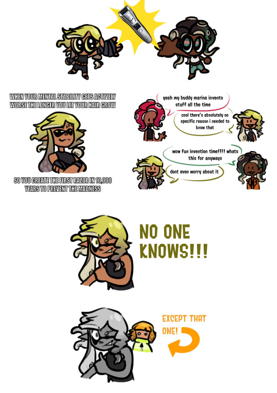
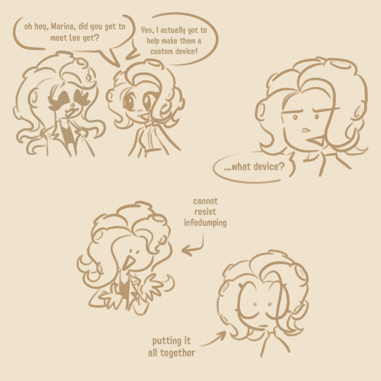
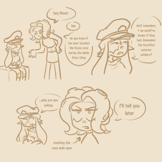
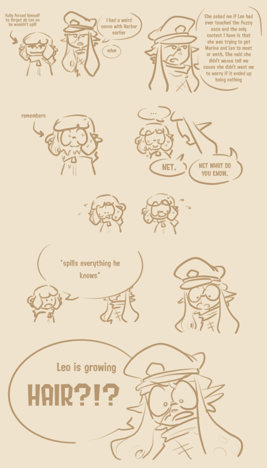
#first page is basically a summary of the others via memes lol
Explore tagged Tumblr posts
Text


hey remember in my agents post when i said not to worry about the page with leo growing hair. so funny story
#splatoon#agent 3#agent neo 3#neo agent 3#captain 3#agent 4#agent 8#marina ida#rocketdoodles#first page is basically a summary of the others via memes lol#im having such a silly goofy time can you tell#do you know how tough it is to find a good png of an electric razor btw. because it was tougher than expected
1K notes
·
View notes
Text
Hello everyone! When I first started blogging, I had no idea what I was doing and it stayed that way for two years until I joined WordPress and participated in challenges and read about what to do. Now, I’m still learning, but I’ve got a better handle of the ins and outs of what to put on a blog/website and what NOT to do, but it’s taken me 6 yrs to get here.
Today, though, I figured I’d list what bloggers should and shouldn’t have on their website, all of which would help them reach more readers and get more views so that no one else has to take at least 2 yrs to figure out what they’re doing. Let’s go…
What To Include (general page ideas):
Landing page aka Home (optional)
as an alternative for readers to land first on your blog, you can have a static home page which gives a little intro to who you are and what you blog about. It can either serve as a short version of your About Me/Blog sections or it can actually be the sections.
the only thing you should watch out for is that if your end goal is for people to read your blog posts, you would be increasing the number of steps it would take for readers to get there, which decreases the likelihood they will actually press on a post and read it.
About Me
this is the page where you introduce yourself. Some things to include are:
your name (either real one or that of your online persona)
what reading means to you
how you got into blogging or why you’re blogging aka what’s the goal that you want to accomplish with the blog. It doesn’t have to be big or overly ambitious. It can just be to “help readers find good books” or something.
your social media
About The Blog (optional)
you can combine this with your About Me page if you want (I did!) and summarize what types of books, genres or topics you like reading about, what kinds of blog posts you do (reviews, discussions, blog tours etc) and how often you post. It’s best to only disclose how often you post if you are good about being consistent, otherwise, readers might get confused/lose faith in you if you say you post twice a week when you might only post twice a month.
Blog
this is basically the page where all your blog posts show up – regardless of what type of post they are. You can create extra pages that specifically show one type of post (see next section) but that is optional and, regardless, you should have all your blog posts together on one page
Blog Category Pages (optional)
Along with their general blog page, some bloggers will also create pages from various blog categories. Some of the most common pages I’ve seen are:
Discussions
Reviews (A – Z)
Reviews (by author)
Memes page(s) like Top Ten Tuesdays or Waiting on Wednesdays
Interviews
Blog Tours
again, these are all optional and, in my opinion, neither especially help or hurt your blog. TBH, you can just create a “categories” widget (which you can see on my sidebar) so that people can easily see only one type of post.
(Review) Policy
this is where you talk about what you are willing to accept from authors, publishers and companies and what you are willing to do. some examples of things to mention or keep in mind are:
what genres of books will you read? what will you definitely not read?
are you willing to read e-books (and more specifically, pdfs, e-pub, kindle)? or do you only read paperbacks/hardcovers?
will you do only book reviews or might you also be willing to collaborate on doing interviews, subscription box reviews, giveaways, blog tours etc?
what’s the best way to contact you? you can link them to your contact form and/or give them your email address
Contact Me
the best way(s) to contact you whether it’s a contact form on the website, social media, letters, email etc.
a brief summary of what people can and can’t contact you about
a link to your policies page for the specifics of what to contact you about
[Related – DISCUSSION: 15+ Author Website Tips]
What To Include (specific content):
Search bar – pleaseeeeee put a search bar somewhere on your website whether it’s up top or on the sidebar where it is immediately visible (aka don’t put your search bar in just the footer). Search bars are you and your reader’s best friends because it is a lot easier to find a post using the search bar than having to comb through post archives.
Blog follow buttons – whether you want them to follow on WordPress, via email, BlogLovin’ or an RSS feed, make sure you have a follow button on your sidebar and your footer so your readers know when you have new posts out and can keep coming back!
Social media buttons – if you have any social media relating to your blog (and you really should have at least one!), then you need to include a way for your readers to jump to said social media and follow you. I personally recommend you put them either up top or on your sidebar, as well as down in your footer.
A blog graphic in every post – images catch people’s eyes much faster than texts do (an image is worth a thousand words) so, by adding an image to your post, you can catch the attention of the reader and draw them into reading the post. Of course, the image should be appropriate to the topic and, typically, follows a consistent style. For me, when I need to create my own image (aka I’m not using a book cover or blog tour banner), I tend to do the same kind of thing. As you can see from the gallery below, I have the same background in each of my images, the font is the same, and the size of the words are typically the same (tho there are some outliers depending on the post). This consistency allows readers to become familiar with you and your blog in another way so that, if they saw one of your images on social media, they would immediately know “hey this is from X’s blog!” even if they’ve never read the post or seen the pic before.
This slideshow requires JavaScript.
What NOT to do:
use weird coloured backgrounds or writing (like yellow, purple or green) PLEASE – My eyes are already bad we don’t need to make them even worse lol
show your entire blog post on the blog home page – in doing so, people are not going to press on the specific post and read it there. This means that all your blog views will show up as “home” and you won’t see any stats about the specific articles people are reading which you need to help you understand what types of posts are doing well and which aren’t. To fix this, just go to your blog settings and make sure the “Limit feed to excerpt only” option is on. For bloggers on WordPress, this can be found by going to settings –> writing –> feed settings.
not personalizing your website – if you have any free blogging account (aka free WordPress, free Blogger, free Tumblr etc) you are most definitely going to pick a theme that hundreds of others have used before. The key to making YOU and your blog stand out is in how you design it. This happens by changing around
the colour palette you use (mine is primarily white, turquoise, black)
your blog header and other blog images
the formatting
fonts
Tips:
Put the link to your website in all your social media bios
Have at least one social media that you can focus and build an audience on, as well as share your posts to. For me, my main social media is Twitter (though I am on others) and it’s where I get the majority of my blog views. Every time a new blog post is published, it gets automatically shared to Twitter and I spend time marketing posts on Twitter to drive up views on the blog.
Make sure your posts will automatically be shared on your social media(s) when they are published. On WordPress, you can do this via Publicize.
Don’t include more than 3 category-like blog pages otherwise, you’re just crowding the top of your blog for no reason
Have a master spreadsheet or list of any and all blog post ideas you think of. This will better help you when you’re in the writing mood but can’t think of any ideas.
Also, when you’re in the writing mood, write as many blog posts as you can – whether partly or fully – ahead of time so that it’s easier when you have less motivation or need to post something ASAP (seriously scheduling posts out are the absolute best!)
If you aren’t art or design-inclined, make sure you hire someone to make your blog header and other blog graphics and help you design your website. I’m a graphic designer (and former website designer) and I love helping people out with their blog headers, business cards, post graphics etc. If you want to know more about how I can help, tweet me, contact me or email me and I’ll get back to you within 24 hrs (twitter is definitely faster tho)!
Other Blogging Guides
All About ARCs (Advance Reader’s Copies)
Book Publicity Contacts Directory
Writing Tools, Resources & Tips
And that’s really all I can think of in terms of tips and tricks. What do you guys think? Do you have any cool blogging tips or tricks? Let me know in the comments below! If you have any questions, concerns, or ideas, comment them below! Lastly, don’t forget, I’m always happy to either casually or completely audit your website and see what you’re doing well & what you can improve on, as well as make any graphic designs, blog headers, business cards etc for you! Just tweet me, contact me or email me and I’ll get back to you within 24 hrs! Thanks, have a great day/night and tata for now!
Angel
Red Bubble ❙ Society 6
DISCUSSION: 15+ Blogger Website Tips & Tricks Hello everyone! When I first started blogging, I had no idea what I was doing and it stayed that way for two years until I joined Wordpress and participated in challenges and read about what to do.
#audit#blog#bloggers#book#books#do#don&039;t#feedback#help#helpful#how to#marketing#marketing plan#plan#service#services#tip#tips#trick#tricks#website#websites
1 note
·
View note