#compared to irl work
Text

Quick! Another one, because I cannot get them out of my head!
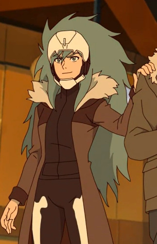
#deadpool 3#deadpool and wolverine#deadpool#wolverine#wade wilson#logan howlett#poolverine#loganpool#art#doodle#marvel#mcu#i still chuckle at hugh's height compared to comic height#they're pretty close in height but we all know ryan/wade/dp would climb him at any given opportunity#whatever the hell we call him. they're the same person irl and mcu#FUCK ITS 4AM I GOTTA SLEEP#i'm gonna be god's eepiest soldier at work holy shit#crnl's dp journal
555 notes
·
View notes
Text
Another Käärijä Research Project
aka: käärijä style-shifting project
as a preface, here are my (non) qualifications for this project and the circumstances under which it happened:
I am a linguistics student, and this past semester I took a course on sociolinguistics. the goal of this project was to become familiar with the concept of and analyze style-shifting (it's more commonly known as code-switching online but theres a difference and this is style-shifting), specifically by analyzing the speech of one person. We had the option to study oprah or to have someone else approved by my prof, so you know I had to ask my prof if I could study jere. This project is solely my intellectual property; even though I had a tutor help me a lot, everything written in this paper and on this post was my work alone.
now, on to the actual findings! the full paper and transcripts will be linked at the end :D
the actual variables (words or sounds) that I studied were the pronunciation of r, and use of the word "the".
to make things a lot easier from the get-go, i'm going to introduce you all to one of my favorite websites, ipachart.com (the international phonetic alphabet [ipa] chart is a big chart with an entry for every sound that exists in a language. this handy dandy website has an audio recording for each one of those sounds).
go to this website, and then scroll down to the table. go to the column labeled "post alveolar" and then click on ɾ and ɹ. those are the sounds i studied in this paper! ɾ is the finnish r and ɹ is the american r :)
so basically what i did to find instances of my variable was i just looked up a bunch of esc interviews and listened out for use of the different r sounds. i also transcribed the entire dinner date live because i love torture apparently :) the specific interviews and lives/stories are in the bibliography of the paper :p
after i transcribed all the interviews and lives/stories i went through and highlighted every instance of the r sound. then i calculated the ratios of ɾ to ɹ based on the context they were spoken in. the two contexts i looked for were formal contexts (sit-down interviews) and informal contexts (literally anything else).
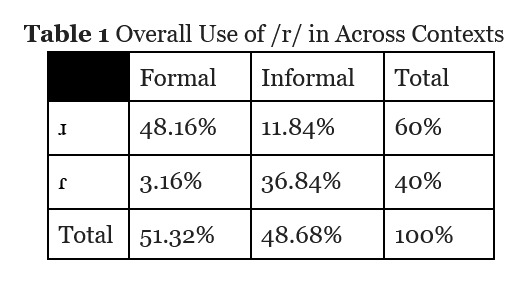
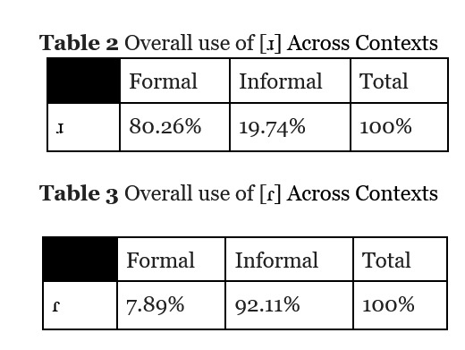
i found that jere uses ɹ WAY more often in formal contexts than he does in informal contexts, and the same in reverse with ɾ.
i then went back to the transcripts and looked for all instances of the word "the". i also looked for instances where i thought it should be present, but was omitted. i calculated the ratio of present vs omitted "the"s in formal vs informal contexts and made some charts.
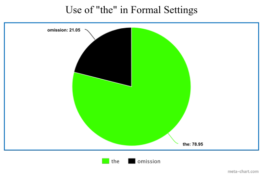

the graph with the smaller black section is "use of 'the' in formal settings" and the one with the smaller green section is "use of 'the' in informal settings" (the images are transparent, sorry)
i found that jere uses "the" WAY more often when in formal settings! there were also some instances where he added a "the" where it was unnecessary, which is studied at length in this wonderful paper by @alien-girl-21
something i also noticed that i elected not to study because this paper took enough energy on its own was that in formal contexts, whenever the "or" sound came in the middle or at the end of a word, jere wouldn't pronounce the r. it stuck out to me mostly because i heard words like "performance" turning into "perfomance", which i thought was an interesting quirk.
unfortunately i was somewhat limited by both my brainpower and capacity to do more work on this paper in the relatively short timeframe i was given (2 weeks) and the fact that i was given a 5 page MAX for this paper (not including a bibliography). i had a lot of fun doing this though and am definitely planning on studying jere for for academic credit again in the future if given the chance!
also i would like it to be known that i spent an hour searching for that 5 second clip of the urheilucast where jere said that he used to sell kitchens and understands english better than he can speak it.
link to a google drive folder with the actual paper i wrote and the transcripts of the interviews with notation:
please feel free to send me asks and dms with questions or comments about this paper! i absolutely love rambling about linguistics :3!!
#i think this is everything!#it always feels so much shorter than i think its going to be#both because of how much effort i put in#and also because i was constantly comparing myself to cyns paper 😅#my irls kept reminding me that i didnt have to and in fact wasnt allowed to write 43 pages analyzing jeres speech#but i kinda wanted to#i also wrote this paper on april 2nd#i remember that because the previous day i spent all day booping#and then i literally worked all day from 9.30 until 23.30 on stuff for my linguistics class#because i had this paper due on friday or saturday and i had a research summary due on that thursday (the 4th)#it was so much work that made some things worse but god was it worth it#linguistics my beloved <3#käärijä#into the tag you go#i reserve the right to edit this post if i realize there are any problems#linguistics
49 notes
·
View notes
Note
saw your most recent post about really good fics that contain uncomfortable kinks and i immediately thought "ah, biscia must be reading the mpreg soriel fic" and almost left a reply talking about it but i stopped myself because i realized that would be an insane assumption to make. needless to say i felt so vindicated when i saw you link it in an earlier post.

like. HELLO?
HELLO???????
#answered asks#''I fear nothing good ever comes of it when it does'' is straight up SEARED into my brain as the toriel line of all time I've ever read#there's some character interpretations I don't share there. like i said i don't think either of them would cry that easily#and while the different conception (badumtss) of sex/gender in various monsters was interesting#i felt like it didn't quite deal with the ramifications of not strictly binary reproductions on social perception of gender like I could've#eg the part about boss monsters being closer to humans in how it works and thus having a different concept of mom/dad compared to skeletons#was pretty nice. but if you establish that skeletons work like ghosts but distinguish she/he ''for some reason'' even though all of them#can bear kids. and then you make a comment about ''the child possibly growing into a woman considering the shape of the pelvis'' it's like#why??????? why. whywhywhy. why would that be a factor. even hypothesizing a certain physical dimorphism. WHY pick the one tied to pregnancy#the ONE ASPECT that you decided was shared between both ''male'' and ''female'' skeletons#it's also like. objectively an argument that is leveraged to hurt and deny trans people irl so it was just. unbelievably uncomfortable#this is what we mean with mpreg and transphobia btw#not that the concept is inherently transphobic or hurtful to trans people#but that that kind of alternative biological worldbuilding implies an alternative social conception of gender role for the characters#that a lot of authors just. straight up miss. because their view of the world is still very cis/perisexist#BUT!!!!!!!!!!#it was still over all a very good fic. I'd rec it to pll not into that for the initial 2 chapters alone
58 notes
·
View notes
Text
the special relationship between arthur (england) and amelia (america), to me:


#hetalia#ukus#amelia f jones#arthur kirkland#aph america#aph england#nyotalia#the special relationship#it is beautiful and awful and unlike anything else either has experienced#tw inc*st#anais nin#amelia/arthur#even irl the relationship to me has always seemed incestuous#both nations will compare themselves to members of a family and lovers all at the same time#its hard for it not to feel that way when the similarities sometimes outweigh the differences. the intimacy feels wrong but it works right
20 notes
·
View notes
Text


Zero Day (2002)
#movies film cinema#zero day#ben coccio#I actually talked to the director on Facebook super nice guy and he told#me a lot about the filmmaking process and even helped me with tips on directing non-actors and new actors#I remember him telling me to always be supportive and tell your new actors they're doing a good job even if they aren't in the first take#cause you can instill confidence and still reshape and change their choices and mistakes later#Sometimes I'd message him for advice when I was running into problems on some of my early projects#he told me once ''did ya choose to collaborate with this actor cause you were lonely or you guys had passion and chemistry''#“collaborating is like a relationship” and he was so right#there's nothing worse than working with people you disdain cause there's no communication and no trust.#he told me how he wrote the first couple of drafts of Place Beyond the Pines but his take on the 3rd act wasn't clicking for the director#so he took the script and went and had another writer rewrite the 3rd act but he liked the process cause he learned a lot and still got pai#but I'd still like to see Ben Coccio's take on Place Beyond The Pines he says the 1st and 2nd act are mostly unchanged#Ryan Gosling's scenes are still mostly the same he said but he couldn't tell me too much cause of the NDA he signed#The bloopers of Zero Day are hilarious his tip he gave me about being supportive#“This is actually great but can we-” and Cal interrupts him “He says that no matter what if you're doing good or bad!” and everyone lols#I hope I can make it and ask him to collab with me on a script#He's such a nice dude compared to the harrowing film he made.#I wish there was BTS but he had only one tape to film on and this was made when digital camcorders were infants#I think he had only one 2 hour tape that's how low budget#The bloopers is just Cal or Andre secretly filming and Ben getting annoyed “Is it recording?” and Cal going “Nah..."#Cal is such a funny guy IRL I wanna see him act more cause he's so good. He was so great at playing a sadistic psychopath in this.#the final shooting is so harrowing and disturbing#I told Ben he srsly gut punched me/disturbed me and this is what made him really open up.
15 notes
·
View notes
Text
I need F1 fans from TikTok to stay as far as possible from MotoGP and I’m so fucking serious. I’m already tired of all the bullshit they are saying on that app.
#if i see another person comparing f1 drivers to motogp riders#AND ALL THEY KNOW ABOUT IS ROSQUEZ#and what they know it’s not even correct!!#rosquez isn’t even a real thing#irl it’s just to rivals who were friends that became enemies#bc that’s literally what’s supposed to happen when you compete in a sport#either you put some effort to get to know things that are actually important to motogp and start to understand how this sport work#and which rider do you actually like instead of starting to stan a rider only because you see a lot of people doing it#or it’s better if you get the fuck away and leave this sport alone bc it’s clearly not for u#like what happened to motogp being a sport for motorcycle enthusiasts#sorry about the rant but someone had to say this#i’m all for new people to become fan of the sport but I need them to be fan of the actual sport and not ONLY of the rpf aspect of it#motogp
8 notes
·
View notes
Text
ive actually put myself in so many situations and seem to come out doing socially well, youd think at some point i could get it in my head im not irredeemably bad
#that post about dysphoria like ‘u feel like ur covered in slime and people will eventually see the rot’ rly truly hits it#idek if its dysphoria or autism or what at this point#maybe its everything#but shit#ive stayed at hostels and hung out with and chatted w complete strangers#i went back to my hs reunion this week and actually hung out w people i thought didnt fw me anymore#my coworkers generally seem to like me- its felt rare when one didnt which is a shocking percentage#ive maintained friendships with my core group of friends despite living w them for over a year (u know how that can go) and not#being able to participate in like half the activities they do (sex parties i dont wanna attend or im busy at work)#made internet friends. believe it or not there was a time as a teen i thought id never be able to do that!#shit bitch even the guy i like who i constantly worry secretly hates me#and i constantly worry only puts up with me etc#yeah he doesnt always seem to let me in much but he barely lets anyone in?#comparatively he does seem to let me in a lot#i really have to remember to put things in perspective sometimes#just bc im not in my holmes/watson era or facetiming someone all day doesnt mean im a lonely loser……. smh#there was once a time i had no irl friends. I CHANGED THAT. I DID THAT. i can do anything
10 notes
·
View notes
Text

#found out my dad doesn't/didn't like me :/#screamed about it for a bit#but i also worked out my feeling by talking about Akutagawas and dazais relationship?#and how it both compares and comtrasts and even can be a reflection of my own relationship????#what my neighbours heard: “AT LEAST DAZAI SAID AKUTAGAWA WAS GOING SOMEWHERE IN HIS LIFE AND HE WAS PROUD OF HIM”#my neighbours: “who tf are akutagwa and dazai??? those arent the crazy people in that house??????#we are the crazy people on your street lol#anyways if you know me irl and you see this... no you dont#bsd#bungo stray dogs#bungou stray dogs#bungou gay dogs#bsd memes#bsd meme#daddy issues#lol
15 notes
·
View notes
Text
trying to pep talk myself like "its FINE if people dont like you, or your art, you are NOT lesser for less people liking your art, its not a judgement of EITHER your skill or your personality, appreciate the people that ARE there and DO like it, less popular posts does NOT mean you are worth less and engagement getting lower and lower with time does also NOT automatically mean you are somehow evil, internet points are NOT an indicator of worthiness or goodness, being into niche things is FINE and its NORMAL for it to not be popular, thats kinda the POINT of niche actually now KEEP going or what was the point of all the struggle you duMBASS SON OF A BI-"
#ganondoodles talks#im fine dw#just the usual -low-#and having seen and compared myself to much to internet numbers again#and to people that are somehow just more liked and popular whicle i feel like im doing somethign wrong (again)#bc everything i do is going downhill#also IRL stuff is stressful#dont midn this rant too much im trying to fight back these thoughs but unfortunately for everyone have to post about it#also im sorry to everyone i have let down#esepcialyl those really heartfelt and super nice asks i keep not asnwering bc i love them too much to see them leave my inbox#-lies down-#ok im good now#gonna keep working
70 notes
·
View notes
Text
Ok... I swore to myself I wasn't gonna make another negative MAWS post, that I was just gonna leave it at the Twink Slade disappointment post.
But apparently there's this trend that's been happening on Twitter, where people are trying to bring up the 2004 "The Batman" designs to try and defend the designs of the MAWS rogue gallery. And that was the territory I CANNOT let go, as someone who is a fan of Jeff Matsuda and his character designs.
SO FIRST, LET ME CLARIFY: I'm simply making ONE post about ONE factor of MAWS that irritates me. I'm not here to just sit and constantly bash on the show. I wouldn't do that, I have a personal close friend of mine who enjoys the show and I'm happy for her and I want her to enjoy the show. I have SO many gripes and reservations but I recognize those are personal.
I'll be putting this under a Read More and tagging it as Anti-MAWS so MAWS fans don't have to read/deal with this post. Probably just don't read my tags as well.
So if there's one thing that has irked me the most about MAWS, it's the redesigns and rewrites of Supes' rogue galleries. Mostly the redesigns though. MAWS took a bunch of colorful, diverse, and fantastical designs and made them monotonous, bland, and simply not fun at all. And yes, while the in-universe explanation (Being that they're all mechanically enhanced rather than freak accidents or born that way) makes sense, it still makes the villains incredibly un-appealing. EVERYONE is in boring black, white, and gray armor (aside from Parasite and while I think his physical design is neat I have issues with his character rewrite too, I'm just not here to discuss that). Everyone who had incredibly fun or creative designs was horribly washed out. Silver Banshee went from being a literal ghostly wraith to a boring motorcycle-looking chick. Livewire went from a vibrant blue lightning motif (that SHE herself created) to boring merc armor. And yes, I have issues with Slade's armor, the head was promising but the overall design has color-balancing issues.
Now let's look at the redesigns of the rogue gallery for the 2004 "The Batman" show. These are mostly drastically different from their original design counterparts, just like MAWS. But the massive difference is that most of these designs are still colorful (where it applies, obviously not to Penguin), recognizable, and push the borders of imagination; They're so ludicrous and exaggerated in their design and their physical features. Even if I was disappointed in some of the character rewrites (Like Mr. Freeze having only a small cameo to Nora in the flashback, but mainly being another selfish thug), the designs are still great. You can look at The Batman villain designs and easily recognize them because they follow the basic structure of their original designs.
Joker:
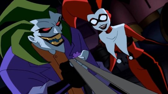
Is still in his green, purple, and orange color palette, with his trademark freakish grin. The design takes creative liberties with the spiked hair, the more athletic physique, and the actual clothing style of his outfit, but this is clearly meant to be Joker.
Mr. Freeze:
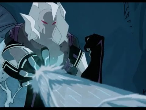
Is now essentially a cryomancer thanks to his mutation, but this is still obviously Mr. Freeze. Some kind of helmet (in this case encased in his own ice) wearing a thermal freeze suit, and his red eyes invoking the red goggles he wore in his original iteration.
Catwoman:
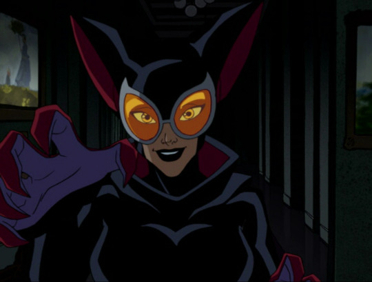
The design exaggerates a lot of features of the OG outfit, like the ears and the goggles (though the OG design really just has eye spaces), and uses shades of crimson and purple, but you look at the black bodysuit and the whip around her waist and she can clearly be identified.
The main argument I'm making with the 2004 Batman designs is that they're A) recognizable to their original counterparts by invoking the same color scheme and basic design points, B) Colorful and pushing the lunacy of a world full of supervillains, and C) Completely stand out from each other, no two villains look as though they're of similar origins (besides obvious pairs like Joker/Harley Quinn and the two Clayfaces, the latter which was a guy who took concentrated serum made from Ethan Bennett's Clayface DNA). The Batman designs are good because while they ARE drastically different from their original counterparts, they honor the original designs.
Whereas in the MAWS redesigns, none of the redesigns are reminiscent of their original counterparts (besides the obvious Brain and Monsieur Mallah, kind of hard to fuck that up), and lack the fantastical element that The Batman redesigns (And the original Superman show, where it applies) had.
Livewire:
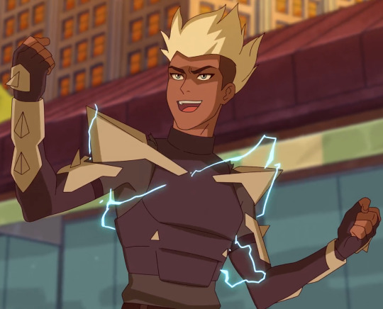
Looks nothing like her original counterpart. The armored clothes, the lack of lightning motif, lack of color to her outfit (I'm not here to talk about the race-swapping), none of it is supposed to tip you off to being Livewire, especially when her character is written so drastically different. You should be able to tell who Livewire is BEFORE you see her powers.
When OG Livewire looks like this:

Silver Banshee:
Is just a regular human in drab clothing. There's some kind of attempt to give her the hint of a ghost motif with the bone legs, but then that disappears in her later costume design. Same later costume that tries to half-ass a skull motif on the helmet but it doesn't work with the helmet's angles.
When this is Silver Banshee's original design (going with a still from Batman Unlimited)

And if they wanted to stray from the whole "supernatural" aspect, they could have compromised like they did in Suicide Squad: Hell to Pay:
Which I mean I still don't like that redesign as much as Silver Banshee's OG design, but it's still recognizable and it's still cool.
The bottom line is basically this: You don't have to justify liking this new Superman show and its take on new characters. But to try and say the character designs on MAWS are like the 2004 "The Batman" cartoon redesigns is such an unequal and imbalanced comparison. The thought process for the character designs in these shows are so drastically different from each other, and the execution of said character designs aren't comparable.
#discourse#Anti MAWS#Anti My Adventures with Superman#Listen I'm not saying any other gripes publicly about the show; Again I have an irl friend who watches it#and I'm absolutely not about to drag her down or just rag on the show; so I get it#But if there is one thing that can really make or break something for me it's character design#And the one thing I'll openly criticize MAWS for is how basic their character design process seems to be#The showrunners FROM THEIR OWN MOUTHS said that they purposely made Lois look like Luz from Owl House#So there is NOT a lot of creative thought process going into these redesigns#And to compare that to Jeff Matsuda who is an industry veteran and who's worked on MANY shows with incredibly kick-ass designs#Well that is a stick in my craw that I can't let slide#'BUT AURA DON'T YOU LIKE THE 3D HE-MAN SHOW AND THEIR DESIGNS?!'#Yes I do but A) I'm not out here claiming that they're faithful designs to the original characters (Because Duncan and Teela clearly aren't#B) Nor are they badly designed characters that I'm trying to compare to a whole different level of character design#The Batman 2004 show was an incredibly fun show that captured the dark and melancholy nature of Batman; and the villain designs were fun#MAWS isn't on the same level as The Batman
26 notes
·
View notes
Text

#okay I know I'm contradicting myself all the time but smash#look I don't know how my brain works#I'm purely a manliker irl and this artstyle makes me want to squish these character's cheeks more compared to araki's#but I can't describe it. I'd smash her#also I fully understand the irony of not finding the artstyle from this specific oneshot “sexy” considering the entire plot of it iykyk#fujiko fujiyama#fujiko's bizarre worldly wisdom#jojo's bizarre adventure
10 notes
·
View notes
Text
I deleted the ask because I didn't even want mention of it on my page, but now I feel like I should instead clarify; this blog is absolutely not an alt account for a b//anksh//ipper!! I think that's pretty clear!!!!
#context: I was asked if i was tomorobo because our artstyles were compared somewhere apparently#??#I don't know who compared the two or where this statement came from#no judgement on anon just wanting to make sure thank you#but i want to be CRYSTAL CLEAR#because I don't know where this statement came from but now I'm concerned people think this??#I am ABSOLUTELY NOT a b//anksh//ipper#I am an IRL twin and that whole thing makes me sick#if you think my artstyle is similar to a b//anksh//ipper's work then you can rest assured it's just a coincidence#I think it's pretty clear that this is not an alt account I can barely keep up with this one blog haha
53 notes
·
View notes
Text

I don't really get into the top/bottom discussions anymore since I think they're kind of silly (tho not fake performative, I can guarantee almost everyone involved is DEAD serious on both sides) but this argument is one I haven't seen before and like. okay point. I see it. a lot of fics where lwj bottoms make him ooc in ways that also play into stereotypes too...like even if you're coming at it purely from a cql characterization there's fics where I'm like hm. he wouldn't do that. and in concept I do rly like the sexual dynamic of lwj taking care of wwx and I think that suits their characters and their romance really well (however that manifests). like I like to see them switching and wwx topping but I also don't think lwj being a top is like, bad or offensive either
I didnt rb this post bc the rest of it goes on to make arguments like 'mxy and therefore wwx is more feminine because he was the son of a pretty 16 yr old' which like ???? I didn't know the younger the mom, the prettier the son... also watsonian vs. doyleist explanations etc. etc. I do think RELATIVELY speaking the novel really isn't so bad with the crazy top/bottom stereotypes and that's not where my criticisms of it lie anyway, honestly the adaptations and fandom run with it way more than the actual book did...when I was reading it I was surprised that wwx-as-mxy was literally less than an inch shorter than lwj. fanart rly exaggerates it
#and like in the end yeah as much as I dislike how certain topics were handled....like they were happy and what they were doing was really#working for them#honestly a relatively healthy relationship compared to what it had been or compared to plenty of other bls...#also yeah some ppl are way too invested in their preferences and all but like at this point#I kind am on board w service top lwj...and like ppl are tops and bottoms irl its fine#there was so much hostility a few years ago I feel bad. like I still have my criticisms but I do feel bad bc I do think#a lot of it was overblown or ppl were just jumping on the hate bandwagon#but also. ugh those scenes really were handled so poorly. it's complicated#also some of the fans rly were so willfully ignorant and refused to consider any critiques#and I still block for that!#it's just. there's so much there to talk about#mdzs txp
2 notes
·
View notes
Text
T shirt that says I still have social issues and trauma from things that happened over a decade ago
#captain’s log#I am getting back in to therapy to process things dw#I just find myself in these spaces and spiraling#because of how much I want to be friends with people or want people to like me#to think I’m fine and normal even or worthwhile but that feeling of wanting to be friends or needing to somehow#in the nebulous space of interaction irl or social media try to cut through and#communicate my personality my worth and my desire for friendship all while risking rejecting#rejection* feels impossible and is within itself very triggering#especially because I get stuck in these spaces of always feeling stupid ugly and like an 11 year old kid who doesn’t understand#but just feels like somethings WRONG with them and keeps saying the wrong things when he tries to make people like him#and that assumed wrongness which begates assumed rejection only makes the spiral worse#hi I will be okay I am fine I am just like. struggling and wanting to not feel weird or stupid or annoying#my last two work environments have been incredibly unprofessional and toxic which I think has triggered all of this#several people I worked with in both places have compared it to high school so I think there’s that#also I’ve made some fantastic and really cool new friends and I feel so frightened of rejection and so unworthy of friendship#also if I ever don’t respond to people it is because I panic and shutdown! haha sorry about that#I’m starting EDMR again this fall so hopefully I will see a turn around#I also think my anti-depressants have stopped working. also thinking about taking my psych up on the referral for Ketemine#anyway sorry I’ll be fine I’m going to wake Will up now so I’m not alone jdkdkskssksksks also eat something
4 notes
·
View notes
Text
Listen everyone has their own metric for what good writing is and isn’t but I’d be lying if I said it didn’t get me down a little to see one of my faves dragged through the mud by both haters and fans alike on a pretty much weekly basis
#yes this is about Salvatore#I don’t mean this to say you can’t dislike or hate his work because that’s valid too#I just mean that he’s become one of those writers where it’s okay and trendy to shit on him and he’s popular enough that it’s excused#I feel like there’s a lot of irl fans who crap on him because they inherently don’t like the over-the-top rule-of-cool style that is FR#and it’s okay to not be into that side of fantasy#but you aren’t the superior reader because you love GRRM-esque super serious grim dark content#also I haven’t personally met a long running series where I loved every single book or plot point#it’s pretty normal when you look at a 40 book series to find that some arcs/books are a bit better than others#and I feel like people jump on certain books and take it as ‘see? any talent he ever had has gone down the drain’#like my dude it’s okay if you didn’t love a few of the books just skip and move on#add to that he’s a prolific writer in general and I’m sure some books got more time and effort from him than others#it’s fine and normal and not a sign that he’s the worse ever ffs#also there’s a part of me that doesn’t like comparing authors working in shared worlds to authors writing totally independently#because some plot points are set by the publisher before pen ever hits the paper#and again you don’t have to think Salvatore or anyone is a good writer#but I always factor it in when I see plots that seem to come out of nowhere and the like#anyways that’s my rant lmao#constructive criticism of any writer is fine and I’m not knocking that before anyone gets their knickers twisted
25 notes
·
View notes
Text
have come to the conclusion it's impossible to feel normal over summer. this is the most normal ive felt in years but still.
#im either depressed or anxious theres no in between#at least im working and busy enough to keep me occupied#and a couple of summers ago i was kinda suicidal so things can only get better ig#if you know me irl dont worry#compared to then im doing amazingly
4 notes
·
View notes
Last Seen Blogs

carlolola
IBARZABAL

lagrottedepopacubede
La Grotte de Popa Cubede

gemlab
Gemlab

captainditrag
Captain Ditrag's Movie Reviews & Singing Videos
captainditrag
Captain Ditrag's Movie Reviews & Singing Videos