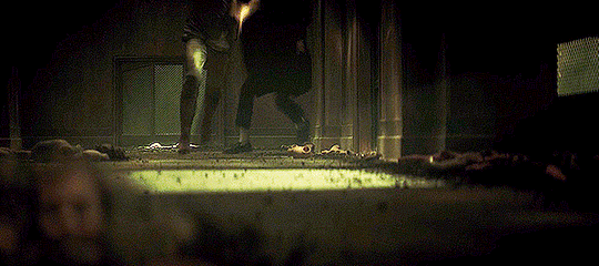
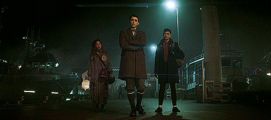
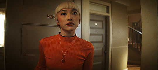
#cinematic aspect ratio
Photo


Typical middle management.
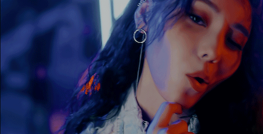
Original art and story by DWC Marshal Arts
Ft. Damek by DamekCritou
#thepercivals#damek critou#rafan spex#spaceship#sci fi#starship#collar#anthro#furry#furries#furry art#digital painting#uniforms#cinematic aspect ratio#digital art#illustration
69 notes
·
View notes
Video
undefined
tumblr
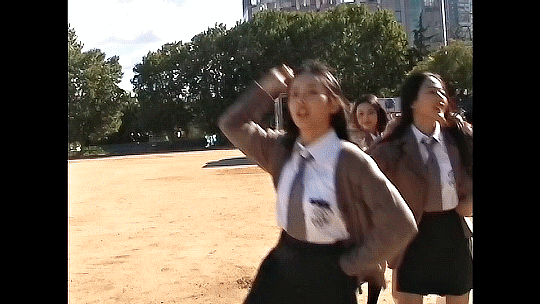
Since the trailer is out soon I wanted to share my fan made storyboard for a cinematic mario story!
#mario#super mario#mario movie#mario bros#nintendo#storyboard#art#cinematic shot#film shot#aspect ratio#digital art#digital drawing#drawing#digitalpainting#mushroom kingdom#peach#bowser#drybones#toad#toad mario#princess peach
28 notes
·
View notes
Note
6, 17!
6. Good song for writing
Shadows on the Walls by Gareth Coker, from the Ruined King OST.
youtube
17. Underrated song
*whips out the kpop playlist*
youtube
Winner, my best boys, and this lovely quirky song that makes me just as happy as it did when I first heard it.
#answeredasks#thethrillof#ask games#elletalks#also the cinnamon tography on that video still gets me#the cinematic aspect ratio? the color grading? the selective slowmo? mwah
3 notes
·
View notes
Text
4 Minutes and the Cinematography of Nipples
I said before that I thought 4 Minutes was pretty instantaneously the best looking BL on the market for 2024 after one episode. Which, not gonna lie, is a pretty big fucking claim. There’s been a lot of BL that’s come out that’s looked good, and I do think there’s been a steady improvement overall in the market in the last few years. Personally I think Japanese and Korean BL have a stronger production quality over a majority of Thai BL but like, if that’s a hot take I guess I prefer my food spicy.
The point being~ if I’m gonna make such a hyperbolic statement, well I better back it up right?
So I’m gonna break down a few scenes from the first episode, what I liked about them, why they worked for me, and why on a technical level I think 4 Minutes has just got it going on.
For better readability you can also check out this essay here.
Sidenote: my google docs kept trying to autocorrect “Bible” to “the Bible” and idk how to teach google I mean the hot Thai actor and not the book of Jesus.
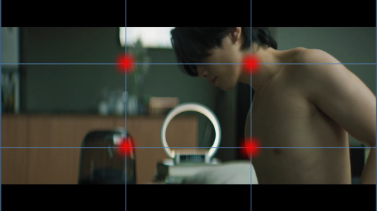
To start, I’m going to break down this scene featuring Great and his nepo baby cat:
I thought starting with this scene would be good because it’s such a low-key scene and honestly making these simplistic scenes visually interesting is very difficult! But if you have the basics down, the foundations of cinematography and film making, these simpler scenes can be really memorable.
Like yeah we’re all gonna remember this scene because shirtless Bible and oh my god Akira!? - I have only recently learned who Akira is; why is this cat getting a bigger bag than me? - but beyond that, what makes it cool to watch? What makes it interesting? What information does it showcase to the audience?
One thing I added to the video was a grid for the rule of thirds.
Rule of thirds is a shot composition technique applied to both film and photography. It’s the grid you see if you film a homevideo and helps a Director and Cinematographer figure out where to place the subject or subjects of the shot. The idea is the gridlines show you where you “should” place the subject(s) of said shot.
Like everything, the rule of thirds is a guideline in filmmaking, not a hard and fast unbreakable rule. Filmmakers like Wes Anderson like to play more with central composition shots, rather than ROT.
Anyway on to the opening shot, right after our credits and we’re moving into the shot.
To start, the first thing I notice is the scene’s color grading. Color grading in film is the manipulation of raw film footage to create specific color tones throughout a project. Sometimes this grading is more pointed and obvious, think The Matrix, while in other films it’s not as obvious but still very prominent, think Killers of the Flower Moon.
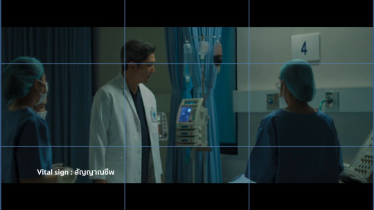
It’s not that the before credits scene looks entirely, jarringly different from the opening scene, but the hospital scene is surrounded by whites and blue tones, it’s darker, and only a single source of light exists. It gives the entire scene a much more frantic, uneasy aesthetic but it’s not so far off from the darker muted tones of the next scene that it feels jarring or out of place.
The second big thing I noticed in the episode is the use of aspect ratio. I’m not 100% sure what aspect ratio the production used exactly, but the use of widescreen as opposed to full screen in my opinion, gives the episode a more cinematic feel to it in comparison to other Thai BLs.
Example, if you look at Century of Love (2024) it appears to be filmed in the standard full screen - which I believe is 16:9? - while 4 Minutes is widescreen (thus the black bars at the top and bottom). Widescreen can give a show a more “movie like” quality to it which is part of the vibes I get from 4 Minutes.

(source)
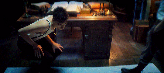
Onto Great’s actual introduction scene.
We’re not starting the shot with static movement, but with a camera panning right. I’ve talked about camera panning and such in BL before and it’s something I’ve found doesn’t happen as often as it should. Which is a shame! It’s such a simple technique but it adds so much.
Imagine if we entered the frame with a static center shot, and then a cut to Great sleeping and turning off his alarm clock, and then another cut to above the bed. Think about how much more boring that could be visually.
Instead, we enter the scene with movement, panning over and creating some interesting visual framing.
So here’s our opening shot, do you notice anything interesting? To start, what I like about this shot other than the panning movement in, is that we don’t see Great’s face yet. In fact we don’t see his face in full until about 30 seconds into the scene. This builds anticipation, yeah we all know what Bible looks like, but for the audience who doesn’t this helps build anticipation.
Who is this character? What does he look like? What’s his deal?
It also engages the audience more, if you notice part of the composition of the shot has Great in the mid-ground slightly blurred out, while the foreground emphasizes the things on his desk. He’s distant from us, the audience, sleeping off his hangover not yet ready to “join” the world yet.
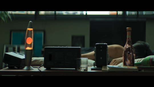
Here’s another two more things I like about this shot:

Lines.
Using lines and shapes can make a scene more visually interesting and invoke different feelings to the viewer. In this shot, I get a sense of symmetry, the camera panning right, lightly drags across the screen alongside the lines below and above Great, almost creating a frame within a frame effect. As if Great is boxed into a clock in and of itself.
You can also see the use of balance in the scene as well, connecting back to that visual theme of symmetry as well as blocking our view of Great’s face. The lava lamb and champagne bottle are almost the same height, which helps create balance in the shot. The champagne bottle informs us Great has been drinking or does drink since it’s positioned so close to his bed, whilst also continuing to hide his face away from the viewer.
I also like that the lava lamp is a bright spot of color. The tone of the scene is mostly muted greens, and gray, but the bright orange lava lamp and even the pink champagne bottle draw our attention but don’t overwhelm us either. It provides the scene with some warmth but doesn’t offset the overall tone of the color grading.
And then, the last bit of this shot:
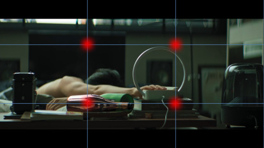
We have Great knocking over the champagne bottom, and turning off his alarm clock. Notice that the alarm clock and the champagne bottle hit those ROT dots almost exactly. There’s also the use of lines by the length of Great’s arm - I just forgot to add a line I’m a failure, a fake, fml - we see him knock over the bottle, and then we follow the line of his arm directly to the alarm clock which is also a shape, a circle.
I like that they used a clock with a specific notable shape, since by the end of this scene the clock is relevant to the story as a whole. Using a shape makes the clock more visually noticeable and memorable to the audience.
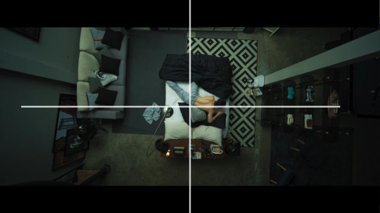
So in the next cut we’re above Great - just like Great’s gonna be above Tyme, fuckin hell I’m corny - in a medium-full shot and there’s a couple things I really like here.
I really like the use of lines here with the bed going in one direction but Great’s body going another. It’s disconcerting, and off kilter a bit.
The use of patterns plus the opposing symmetry, whereas in the previous shot the lava lamp and champagne bottle were providing balance, here one side of the bed is patterned, while the other isn’t. This creates a sense of imbalance and makes the shot more visually interesting.
This medium-full shot at a high angle makes Great smaller, and continues to showcase his dishevelment, keeping him distant from the world itself. Also notice the lack of color here as well.
What could this say about Great as a character? Or his story?

So this next cut is the one that actually inspired me to write this essay to begin with and know what I’ma eat some crow here. I originally said it was a great ROT shot but I was wrooooooong. It’s definitely a center composition shot.
Notice as well, the bed itself is its own shape - rectangle - center in the frame, and yet the shot almost looks unbalanced again because of that singular patterned rug. It’s the only pattern in the entire shot, not even Great’s pillows have noticeable patterns on them.
The above view camera angle in a full shot creates almost an omnipresent feel, as if the audience - or something else? - were looking down upon Great. Whose face we still haven’t seen! It makes him smaller, less powerful, and almost vulnerable. Shots like this are often used in horror films like James Wan’s Malignant (2021) where the horror spector will be looking down above the would-be victim.
Another thing I like about this scene though is we have Great moving. It would be simpler and easier to have his phone just by his alarm clock, or under his pillow, but think about how much more visually interesting it is that he has to move down the bed and reach for his phone. It creates action in an actionless low stakes scene.
And now, 30 whole seconds in and we’ve finally seen Great’s face!
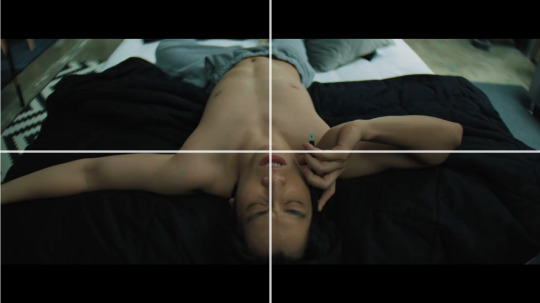
Fun fact, with the ROT grid the gridlines fall right across Bible’s nipples. That’s not a film analysis, just something I noticed entirely intentionally. Thanks Madam Director Ning Bhanbhassa Dhubthien.
The actual shot is in center composition again, as Great rolls over and reveals his face the camera begins to zoom in.
This creates movement in the scene instead of leaving the camera to statically observe it’s now, finally, inviting the audience to meet Great. Pulling us in towards him whereas before we were kept at a distance. Great’s awake and, well as ready to meet the world as somebody with a raging hangover can be.
I also like how Bible is moving constantly in this scene; he rubs his eyes and nose, he twitches his fingers, titles his head back and forth, etc it’s nothing revolutionary but it’s appreciated.
When the scene cuts, we get this shot:

I didn’t put the red dot on his nipple, it just landed there. This is all Madam Director Ning chepie.
But you can see how Great’s body is landing on all those gridlines pretty solidly. Also in the background we see his alarm clock again, a bright blurred circle in the distance. I also like the angle of this shot, as it creates depth in the frame, with Great’s head being in the foreground his lower body in the mid-ground and the background blurred out.
What follows is Akira appearing in frame. Which was really difficult to capture so I don’t have a screenshot. But what I really like is Akira entering the frame out of focus. They could have just cut to Akira, but instead they opted for Akira to enter the frame which is more interesting.
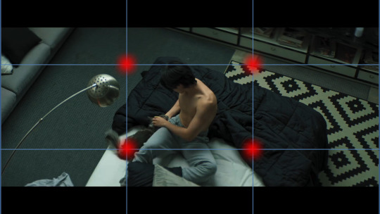
When we do cut, Akira is firmly on one of those dots so we don’t miss them in the frame. I think it’s also interesting that we’ve pulled out again, into a mid-full shot, hanging above Great, and we see that clear symmetry line again between the patterned rug and the regular carpet.
I also really love that when we got to Great sweet-talking Akira and feeding them we’re not just doing a cut, we’re panning downwards which continues to add movement to the scene. And we get that moneyed sponsor shot!

Durex can’t pay for everything okay?
So in the final bit of this scene we get focus on Great, who’s in focus, before he gets up and leaves the frame where the camera then focuses on the clock behind him.
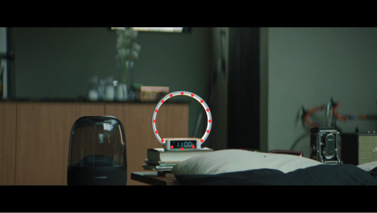
See how in the first frame the background is all blurred out, but once Great walks out of the frame - again, great that he walks out, movement!! Y’all don’t understand how boring 1000 Stars was for me to watch because of the lack of this stuff okay? - and then the focus shifts to the clock. Which is round.
God I know that sounds so dumb, but imagine the clock without that ring light bit on it, it’s just a tiny little rectangle. Not as fun or interesting to look at right? Or as noticeable especially from a distance?
This shift in focus also tells us “this is important” whatever “this” is. The subject of the shot goes from Great to the alarm clock but they are positioned as equally important. We’re meant to pay attention to this seemingly innocuous item, which we learn later in the episode is time. We’re meant to remember and note that time will be important to the story - I know with a title like 4 Minutes you’d fucking hope time would be important but have y’all ever read Youtube comments? It’s rough out there for visual comprehension okay?
So all in all this scene is only 1 minute and 40 seconds give or take. It’s very short, but I don’t think it was boring at all. I think it’s a really solid introduction to a main character. Think, Korn didn’t get this much time to showcase his introduction, his scene is shorter - though also well done - which showcases which character is more of a story priority.
This scene eases the audience into the story, inviting us to wake up into the world like Great is. It uses techniques like lines, shapes, symmetry, color and focus to make what could be a very boring scene into an interesting one.
There’s so so much I probably and certainly missed, I’m far from an expert, but I hope I was able to articulate what I liked about this scene, and why I think it looks good.
Stay tuned for more if I can manage to focus long enough to breakdown more scenes lol
Also red dots on Bible’s nipples are just funny to me it be what it be.
Further Reading:
Composition in Cinematography / THE LAST OF US
Center-Framing vs Chaos-Cinema: Mad Max vs Transformers
Camera Framing: Shot Composition & Cinematography Techniques Explained [The Shot List, Ep 2]
The Ultimate Guide to Camera Shots (50+ Types of Shots and Angles in Film)
Color Grading 101 - Everything You Need to Know
Mixing Film And Digital Footage: Killers Of The Flower Moon
In Praise of Subtle Cinematography
#4 minutes#4 minutes the series#bible sumettikul#4minutes#jesbib#chaos pikachu speaks#pikachu's bl film series
249 notes
·
View notes
Text
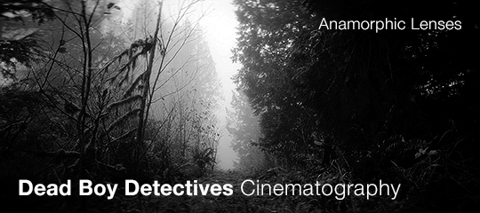
Part 1 of looking into some of the technical cinematography aspects of the show
(or, why does Dead Boy Detectives look Like That?)
(update 6/30/24: there's now a part 2! check it out here)
Dead Boy Detectives has some interesting things going on with the cameras. You probably noticed it at some point while watching the show. Whether it was the weird blurs or the sort-of-fisheye, there’s something about many of the shots that doesn’t look the way many people expect TV shows to look.
The main reason why is because it uses an anamorphic lens instead of a spherical lens. These lenses are pretty different from spherical lenses, and the recent rise of anamorphic lenses in TV has not been without some pushback, as viewers unaccustomed to them may find the look weird, distorted, or that it pulls their focus away from the content. Whether you enjoy how Dead Boy Detectives looks or find the cinematography distracting, this post is designed to explain the different effects that the lens has on the show.
This post is very long and very graphics heavy (I made lots of gifs to illustrate my points) so the rest is under a read more.
What is an anamorphic lens and what is it used for?
To begin with, a bit of history and technical info. Say you’re making a movie at most any point before the mid-'90s and you want it to be widescreen. However, the 35mm film you’re shooting on has a smaller aspect ratio (closer to a square than widescreen). You could use letterboxing (black bars on top and bottom) but then you waste the top and bottom parts of the film, and it ends up being slightly lower in ‘resolution.’ The solution: use a lens that records the full height onto the film, but squishes the picture horizontally so that it fills up the whole film frame without any letterboxing. Then, a projector (or a computer) can stretch it out again to display the whole thing in widescreen. The kind of lens that can do that is an anamorphic lens. They've technically been around since before the 1920s but were mostly used between the 1950s and the 1990s.
Up until sort of recently, television networks broadcasted using a smaller aspect ratio that they required shows to be in, and TV shows were not given the kind of cinematography budgets that movies were afforded. Anamorphic lenses are expensive and for widescreen, so they really just weren’t used for TV shows. Instead, a spherical lens was used, which is just the standard lens you think of when you picture a camera lens.
In the 90s, new flat/spherical film formats came out that allowed for widescreen (one of the popular ones being Super 35) caused anamorphic lenses to drastically drop in popularity. However, there has been a recent resurgence, one that you’ve probably subconsciously noticed in both film and television.
In the last 10-15 years, TV has been given larger and larger budgets. Additionally, the rise of streaming services and the use of phones and computers to watch shows rather than actual televisions has meant that networks have started allowing wider aspect ratios, paving the way for anamorphic lenses to begin to be used for series.
The history of these lens’ usage means they’re associated with a ‘cinematic’ look. They have a lot of characteristic effects that are not really ‘natural’ and depending on the viewer, this either enhances the experience or detracts from it.
Lots of recent series have been embracing these lenses (to varying degrees of success), including The Witcher, Sandman, Shōgun, Narcos: Mexico, The Mandalorian, Andor and Chilling Adventures of Sabrina. Doctor Who also started using anamorphic lenses at the switch to the 13th Doctor, so that may be a good reference point. For some of these, it’s a very subtle look, for others, the lens choice is glaringly obvious and overdone (I’m looking at you Sabrina), and sometimes, as is the case with Dead Boy Detectives, it’s really obvious but it remains an effective and compelling choice.
Why use an anamorphic lens in the 21st century when you could just use a spherical lens?
Anamorphic lenses create a look that some filmmakers desire, whether for their associations with a more cinematic look or their sometimes unusual quirks. In a film and tv world filled with spherical lenses that are nice, clean, and precise, anamorphic lenses introduce some irregularity and character. Making an informed decision on what kind of lens to use can enhance different themes of the work.
I want to briefly bring up Moonlight to illustrate this point. Go watch the trailer if you haven’t seen it, and you’ll probably see some parallels with the cinematography of Dead Boy Detectives. There’s less of the ‘radial’ look, but otherwise, there’s a lot of the same kinds of things. Moonlight uses an anamorphic lens and it makes the whole thing look dream-like, nostalgic, and a bit like we’re getting into the character’s heads. To me, it indicates that the story is being filtered through people. We’re not detached from the characters, observing them. The story we are watching is personal, emotional, and necessitates intimacy.
Dead Boy Detectives really benefits from the same visual effects. This is not because it enhances a dream-like or nostalgic quality, but because in the context of the show, it makes it look a bit otherworldly, magical, or otherwise supernatural. Additionally, the constraints of the lens means we get lots of focusing in on individual characters, with nice long looks at their faces allowing for more reflection on their dialogue and reactions.
So, here’s 5 different effects of anamorphic lenses to point out to you all. Starting with the one that allows us to easily identify that anamorphic lenses are being used in the first place.
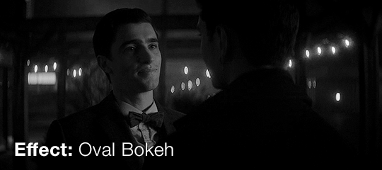
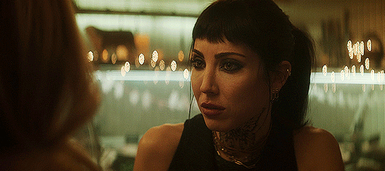
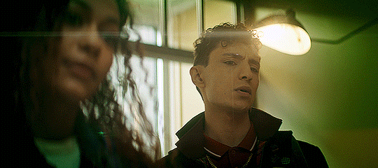
You’ve probably heard of bokeh before. It's the way the lens renders the direct sources of light that are in the background but out-of-focus. You can see in this shot of Jenny how all the string lights are not circular, but elongated. On a spherical lens, these would be round.
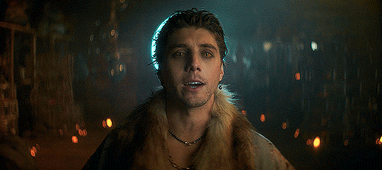
In this next shot of the Cat King, the candles around the floor are all those elliptical shapes. Additionally, lots of other details in the background that aren’t from direct light sources also have an elongated shape. This is sometimes called waterfall bokeh.
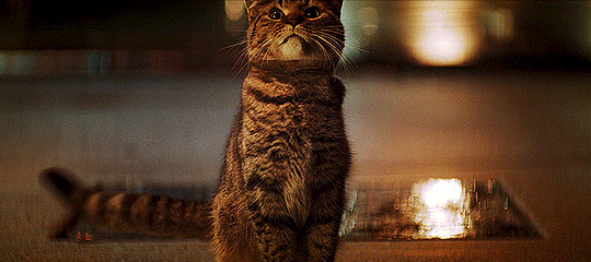
Finally, check out this shot of one of the cats. Not only are the lights in the background irregular and elongated, but if you look to the left where the ‘horizon’ line is, there's a series of elliptical shapes where the light hits the edge of the docks.
The bokeh effect is one of those things that just happens because of the lens, and makes it pretty easy to identify that an anamorphic lens is being used. Unlike some of the other effects I’ll mention, I don’t have much to say about how this does or doesn’t add to the visuals.
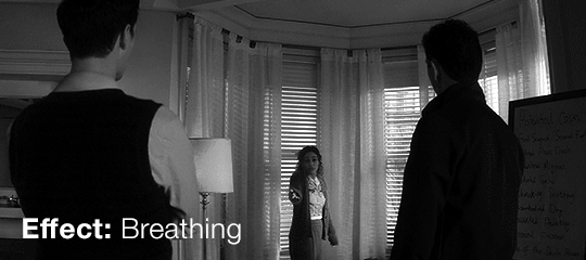
Breathing is how the field of view changes when you refocus to a subject closer or farther from the lens. While spherical lenses also breathe, there’s a much more distorted look to the breathing that occurs with an anamorphic lens.
Lets start with this shot:
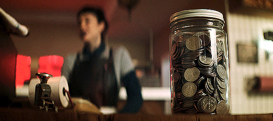
You can see how much the frame widens when the focus shifts from the jar of coins to Jenny. It affects the edges much more than the middle of the frame. Here’s the same shot, but with some of the features outlined (forgive my messy outlining, I used my laptop trackpad) so you can see the movement.
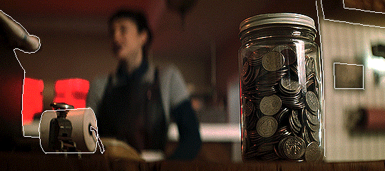
The frame widens when the focus goes from the foreground to the background. It appears like the whole shot is being stretched apart horizontally and compressed vertically.
However, it also does the reverse, narrowing as the focus moves from the background to the foreground.
(also in that last shot of hell, notice how the two points of light in the background elongate into those oval bokeh once they are no longer in focus)
Breathing is a very dramatic way of refocusing, and it forces us to pay attention to different things. In the shot of the Night Nurse, we have a light but the important thing after it turns on is not the light but the reaction that the people have to the cause of the light. In that shot of Niko and Edwin, it’s telling us: listen to Niko. In the shot of hell, it’s not letting us forget what the characters are running from.
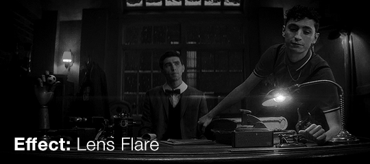
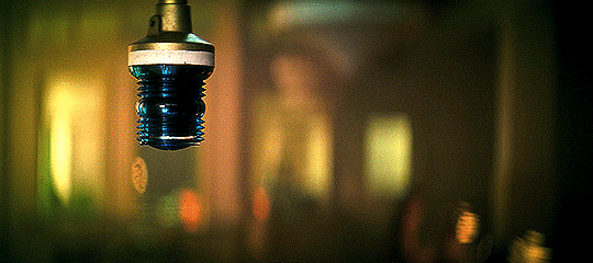
The next effect is the lens flare. You can get a lens flare from a spherical lens too, but anamorphic lenses typically generate strong, horizontal flares. A spherical lens would typically create a more radial flare, with multiple lines shooting out in different directions from the light source like rays from the sun.
We see these all over the show, sometimes they’re very prominent, such as in these shots with obvious light sources:
And sometimes they're a bit more subtle. Take this shot of Edwin, Charles, and Crystal on the dock:
While the lens flare at the top of the frame has a clear source, there’s a bunch of other horizontal lines cutting across near the middle and bottom half of the frame. These likely come from light sources outside of the frame.
Some directors, cinematographers, and other creators really like anamorphic flares. Others don’t. For a show with so many dark scenes that have colorful and dramatic lighting, the lens flares seem to enhance this. They are also a constant reminder of the interaction between the lights and the camera, kind of a fingerprint of the production. Sure, they make it seem more ‘cinematic,’ but I think they also ground us in the physicality of the production. (Kind of ironic given the lack of physicality of the main characters, and also you could consider the flares themselves to be the ghosts of the lights and the camera!)
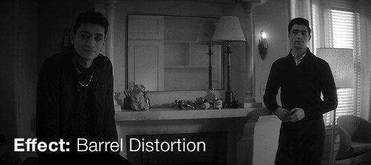
Barrel distortion is where we start getting into why exactly the show looks the way it does. This is basically a subtle fisheye effect. Because of the squishing and stretching of the footage, anamorphic lenses have more distortion than spherical lenses, and it is strongest around the edges.
You can see it most clearly in shots that have lots of vertical lines. They are relatively straight in the middle of the frame, but the closer to the edges, the more they are warped.
Looking at that shame shot of Niko in the bathroom, I have set it to stop at 3 different spots. Pay attention to the shape of the edge of the door.
At the start, it’s curved outward, like an open parentheses: (
Then, in the middle, it’s a vertical line: |
Finally, as the door passes all the way across the frame to the opposite side, it curves inward, like a closed parentheses: )

Again, notice how the lines in this shot of the Lost & Found Department change as they move from the outside towards the center. The door has an outward bulge at the beginning but becomes more 'normal’ shaped as it gets further away.
Anamorphic lenses can also have a pretty shallow depth of field and it’s used a lot in this show which is why we get a lot of those centered close-ups, and why we get that ‘radial blur.’
The center of the frame is where the actors are least likely to be distorted, meaning its easiest to have just one character in the dead center (pun intended). With a shallow depth of field, the background is out of focus, and since the actor is in the center, the background gets the most affected by the barrel distortion, leading to the sense that the background has been radially blurred.
This blurred background with a strong, centered foreground really makes objects in the foreground pop. We are then able to really focus in on different objects and characters. It brings immediacy and intimacy. Here, we have nothing to do but consider Charles. He isn’t speaking so we must consider his reaction to what’s being said.
Also, the further a character is from the center of a shot, the more they are distorted, such as Edwin and Charles in this still:
This kind of distortion definitely lends a more unnatural look to the shots, which definitely supports a show about ghosts and the supernatural. If the subjects are able to see things in our world in a way the viewers cannot, then why display the physical world the way we see it?
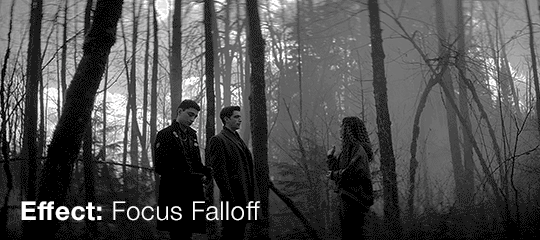
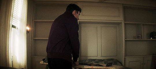
Finally, we have focus falloff. This is (like some of the other effects) a distortion that occurs around the edges. Here, the focus decreases the further from the center of the frame even if they’re all about the same distance from the camera.
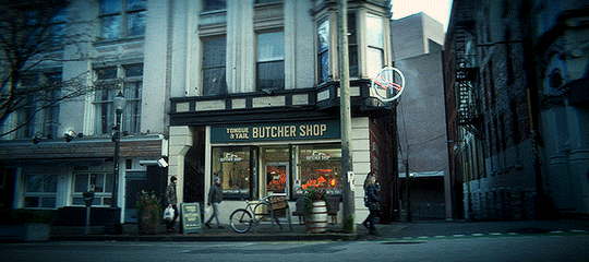
In this shot of the Tongue & Tail, the sign 'Butcher Shop’ is clear and legible. But imagine if that sign was up in the top left or right corners, where things start to get blurry. We probably wouldn’t be able to read it.
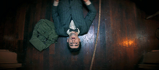
It's also visible in this shot of Edwin. Not only does the floor get blurrier the further you get from the center, but you can see how the rope is less in focus in very top and very bottom of the frame.
The falloff (combined with the barrel distortion) is how we get the really unique dream-like look of the Edwin and Niko scene on the roof in Episode 8. (If you’re having a hard time spotting the falloff here, look at their legs)
When you start looking for falloff in this show, you start to see it everywhere. It’s easiest to spot in the corners of shots, but you can usually see all the way around the edges.
Look at the corners of this still of Edwin, or the way the top and bottom of Niko’s rent envelope aren’t as clear as the middle of it.
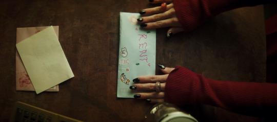
Or in this still, look at Charles’ jacket. The arm closest to the center has a much more defined line between it and the background compared to the arm closest to the edge.

This blur definitely is one of the more noticeable effects in the show, and it’s good at focusing our attention on the center of the frame. It guides the viewer exactly to what we should be looking at. We get tons of centered shots in this show because of this and the barrel distortion.
The falloff makes the show look softer and artistic, sometimes painterly or impressionistic. More than any other effect, the falloff is what makes me feel like I’m watching a dream or a vision. It puts us into the sensation of being fully immersed in a story.
I would argue that all of these effects (but especially the last two) not only enhace the supernatural aspect of the show, but they help us fall in love with the characters. They focus us on their faces, and encourage us to reflect on their motivations, reactions, and thoughts. The lens is telling us that we are not to take things at face value. It’s not letting us forget that there are multiple people and multiple stories involved, that things are blurry around the edges, and that things are not perfect and clean-cut.
-----------
Sometime in the next week or so I’ll be working on part 2, where we’ll take a closer look at the cinematography of Edwin’s flashback to 1916 in Episode 1. It's posted! Read it here.
I really wanted to highlight the work of the cinematographers, Marc Laliberté, Craig Powell, and Pierre Gill because it’s clear that there was so much care and intention put into every aspect of this show.
I’m so glad fans of this show are really embracing the work of different crew members, like the work of costume designer Kelli Dunsmore (and if you somehow haven’t seen @captainfantasticalright's posts about the costumes and other aspects of the show, please go check them out right now. My roommates and I have a kind of 'stop everything, new costume analysis dropped' attitude towards their posts, and their approach to show analysis was definiteily an inspiration for this)
If you want to read more about anamorphic lenses, the article Why ‘Shogun’ (and the Rest of TV) Is Slightly Out of Focus in The Ringer is about Shōgun and the rise of anamorphic lenses in TV (Marc Laliberté also worked on a few episodes of Shōgun) and it's a great place to start.
Finally, I want to first thank @skyvoice for these tags on one of my gifsets for semi-inspiring this post (I was already considering making this but these made it into a reality).
#dead boy detectives#charles rowland#edwin payne#niko sasaki#crystal palace#cinematography#cinematography analysis#dbda#mygifs#dbda meta#dead boy detectives analysis#dbdagifs
349 notes
·
View notes
Text

A new blog post from BioWare in which they talk about the PC experience for Dragon Age: The Veilguard. The blog covers display features, graphics settings and controls. "We're PC players ourselves and have a dedicated team focused on PC."
"Journal #4
PC Features for Dragon Age: The Veilguard
A look into the PC Experience in Dragon Age: The Veilguard
Hello everyone,
Today, we want to specifically touch on the PC experience for Dragon Age: The Veilguard. The Dragon Age franchise started out on PC, and we wanted to make sure PC is a great place to play our game. Many of us at BioWare are PC players ourselves, and when testing, PCs made up 40% of our platform testing effort, with over 200,000 hours of performance and compatibility testing. Getting the PC experience just right was crucial to us and we created a dedicated team to focus on PC. We can’t wait for you to experience it for yourselves!
Let’s talk about inputs first. We wanted to ensure the controls and UI are a good experience for both KBM and controllers; so we did close to 10,000 hours of user research testing to make sure of it. Dragon Age: The Veilguard will feature native support for PS5 DualSense controllers with haptics support in addition to the standard of Xbox controllers & keyboard + mouse. Additionally, you can seamlessly transition between controllers or keyboard + mouse while playing or in menus. There are many different ways to play our game; so, in order to allow you to find the most comfortable set-up, we’ve added the ability to customize class-specific keybinds that you can easily switch between. This means that your Rogue Rook can use a different set of keybinds than your Warrior Rook, if you’d like!
Along with the standard resolution options, we also have full support for 21:9 Ultrawide monitors. Don’t worry; we didn’t forget the cinematics, either - just disable the option titled “Cinematic Aspect Ratio.” This will remove the enforced black bars; so you can watch the cinematics in full ultra widescreen glory. No matter what size monitor you’re rocking, you can adjust your FOV with an FOV slider in the Settings. There will be an option for uncapped framerate, as well. We’re also launching with full HDR support.
Most changes to Graphics and Display Settings are reflected in real time, and you can see the impacts of those changes through the cutout in the UI. This will help you make informed decisions as you tweak your game to look exactly how you want. For a full list of Settings, check the rest of the blog below!
We know a lot of you play on Steam, and we wanted to meet you where you are. We’re happy to be completely Steam Native for Dragon Age: The Veilguard! We’re already Steam Deck Verified; and with Cloud Save on Steam supported, you can seamlessly switch back and forth between your PC and your Steam Deck as much as you want, with no interruption to your progress. We also have Remote Play enabled if you’d rather play on your TV! If you’d like to utilize it, there will be a completely optional linking process to your EA Account."
"If you want to hear about a few advanced settings and options for the PC community, let’s go over that now. We support a suite of Ray Tracing features, as well as an “Ultra RT” mode for extremely high end rigs. We have several types of upscaling available: NVIDIA DLSS 3, FSR 2.2 which has been heavily modified, specifically for the game, and XeSS. We also support DLSS 3 with frame generation and NVIDIA Reflex. As we have more PC features to share, we’ll circle back on those before launch.
We’re inching closer to our release date of October 31, 2024! We still have more information coming on Combat, the Companions, Exploration, and more; so keep your eyes peeled on our socials. We are eager to see your battle stations running Dragon Age: The Veilguard and the resulting screenshots. Chat soon!
— The Dragon Age Community Team"
"To summarize the above, check out an overview of the PC specs and features we’re ready to unveil now:
DISPLAY FEATURES
- Full Support for 21:9 Ultra Wide Resolutions
- Ability to Uncap Frame Rate
- VSync, including fractional rate VSync
- HDR Support
- Optional Upscaling (DLSS 3, FSR 2.2, XeSS)
- NVIDIA Reflex
- DLSS 3 Frame Generation
- Optional Dynamic Resolution Scaling
- Cinematic Aspect Ratio (Disable this option for cinematic 21:9 ratio)
GRAPHICS SETTINGS
- Presets Available (Low, Medium, High, Ultra)
Texture settings:
- Texture Quality, Texture Filtering
Light & Shadow Settings:
- Lighting Quality, Contact Shadow, Ambient Occlusion, Screen Space Reflections, Volumetric Lighting, Sky Quality
Ray Traced Settings*:
- Ray-Traced Reflections, Ray-Traced Ambient Occlusion, Ultra Ray Tracing
Geometry Settings:
- Level of Detail, Strand Hair, Terrain Quality, Terrain Decoration Quality, Visual Effects Quality
Camera Effects:
- Depth of Filed, Vignette, Motion Blur, Post Processing Quality, Field of View
Controls:
- Class-specific Keybinds, Keyboard + Controller Bindings
* Ray Tracing can be “ON” or turned to “Selective”. Selective Mode enables Ray Tracing features in specific areas that can best take advantage of the feature."
[source] <- at the source link there is also some new screenshots/clips
#dragon age: the veilguard#dragon age the veilguard spoilers#dragon age: dreadwolf#dragon age 4#the dread wolf rises#da4#dragon age#bioware#video games#long post#longpost
91 notes
·
View notes
Text
comics and animation have a lot in common, but one interesting difference is that arranging pictures in space rather than time means there's a tradeoff between the amount of drawings you use to show an action, the amount of space each drawing is given, and the amount of pages you cover which determines the 'pacing' of the comic.
if you slice the page up into a lot of tiny boxes to show many stages of a motion like an animation, then each panel has correspondingly less space for background details, and it may affect the aspect ratio of panels. if you give yourself space for a large splash panel, then the pace will slow.
one solution to this problem is to break the convention that a panel is a single 'frame' of action and show multiple images of a character in the same background. Kentaro Miura did this sometimes, and Tradd Moore (on here - @traddmoore) is an expert who uses it frequently (I'll reblog his spiderman comic in a minute). Kamome Shirahama, a genius at creative paneling, also uses it in a couple of places.

a similar trick will have a single background continuous across multiple panels, showing a static 'camera shot' at different times.
the limitation of these methods is that breaking convention makes the panel a little harder to process - you need to make absolutely sure you cue the reader clearly about where to enter the panel. and it requires action that involves a large movement so the drawings don't overlap. so most authors use it as a 'once in a while' thing.
an opposite approach, used in early parts of Superpose by Seosamh and Anka and Goodbye, Eri by Tatsuki Fujimoto, is to go even harder with the cinematic convention and give each panel the aspect ratio and detailed backgrounds of a film camera, taking all the space you need - Superpose opens with about two panels per page which may be very similar to each other, creating a very deliberate sense of pacing. to pull this off you need to be either extremely fast at drawing like Fujimoto, or accept your comic taking a long time to get anywhere - and you also need to be very good at placing the camera in space. you're basically drawing fully rendered storyboards at that point.
one of the interesting difficulties of comic-making is controlling pacing. if you draw many very similar panels it will convey a sense of high concentration and intensity, or a heavy atmosphere, like a long take in a film. much like in prose, if you spend a lot of pictures on something it draws attention to it. so you want to use the 'slow down' sparingly for effect.
as in animation, you're also limited by your own capacity to draw all those pictures, and moreover the space to put them. this is one reason why comics in magazines tend to be sharply limited in page count, and webcomics tend to be very slow compared to other forms of serial fiction. (perhaps manga can make heavier use of pacing tricks by virtue of cheaper printing and endemic overwork. i don't think that's the full story though.) meanwhile, when Transmetropolitan started to experiment with manga-style pacing, apparently it upset fans who felt the story progression was being diluted. when reading Transmet in one go, though, you don't even notice. what works well in an anthology of hundreds of pages may work poorly in a serial.
i think the pace of the reader is often controlled primarily by the text - at least for me I find I sometimes have a tendency to jump very quickly over panels to get to the next bit of the story and have to consciously slow myself down to make sure I don't fail to appreciate the art. so while a series of text-less panels is effective artistically, you might want some words to act as speed bumps. but too much text per picture and your comic becomes exhausting to read, like Subnormality. and you don't want to over-explain what's conveyed perfectly well by the pictures, as many older comics do.
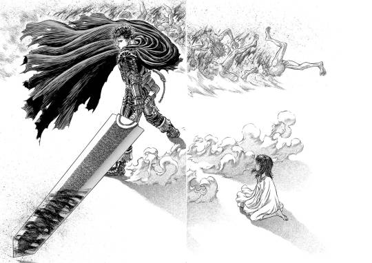
ideally, you use your text, small panels and large panels to create a sense of rhythm. a big splash panel can act as the full stop in a sentence, or a longer take after a series of rapid cuts. negative space is an especially powerful device in the right hands: when you hit a page of Chainsaw Man or Berserk that is almost entirely white after several pages of dense illustration, a character bursting into the void, there's an immediate 'wow' effect before you even process what's happening in the illustration. (i can't seem to find the chainsaw man example i had in mind, so here's one from berserk.)
and on that note, the other thing that comics have that animation doesn't is the impact of being confronted with the whole gestalt page. in the manga I was helping Fall translate when she died, We Are Magical Boys (Bokura wa Mahou Shounen), Fukushima Teppei frequently puts one panel much larger than the others so it dominates the page, usually a close-up or full length character portrait, allowing the cuteness of their unique art style to treasure centre stage. Sandman, which I'm currently rereading, is full of elaborate page compositions, where a drawing might not even be a panel per se, but a visual element. Witch Hat Atelier is full of elaborate borders and clever compositions. just look at this...

how did she come up with that! the absolute madwoman! the right side is relatively standard Atelier (establishing shots, the main cast eagerly stepping out of their panel) but on the left, we have a set of panels falling down from above onto a large splash panel. even though this image is concurrent, the panels invite us to appreciate it in chunks, and the page as a whole has this great visual of the pages of a book, continuing the image of the previous page. (more of this on upcoming post on Atelier)
a character emerging from their panel to overlap others, breaking up the monotony of the grid and adding a sense of depth to the page as a whole, is a reliably appealing motif. also, drawing one panel borderless, so it implicitly continues behind the other panels. large areas of black and white and choices of colour saturation can convey a mood to the page as a whole.
the danger you run is always the loss of clarity. the reader must be able to tell what panels to read in what order without thinking about it. Sandman will sometimes do a double page spread where you're supposed to read across both pages, and this consistently trips me up. Dresden Codak is by an adhd author and her drive to give every page an elaborate layout is very familiar to me, but especially in Hob, it messes with the flow of the comic overall.
so every comic page, every comic, is a fascinating balance of all these factors. how to create a strong, visually interesting composition, control the pacing appropriate to tone, create a thrilling sense of rhythm... all without sacrificing clarity.
not much more to say about this as yet, it's just something I'm thinking about while trying to lay out a page of Ghost Barrier. my tendency is to generally use larger panels, and try to be creative with layouts, but you have to consider not just each page in isolation but how they relate to other pages. so to make the splash panel land, I need to contrast with a denser page immediately beforehand.
the more I make comics the more of a feel I'll get. cool medium!
903 notes
·
View notes
Text
Longlegs: Hmm.... *SPOILERS*
PLEASE DON'T READ IF YOU HAVE NOT SEEN THE MOVIE! Don't let me ruin it for you!
Tbh I found out I might lose my job today so that may have affected my ability to watch this movie and think critically. There is a LOT of thinking involved this movie. Overall, I'd say most people would have to watch this twice to fully understand (I will certainly watch again). I liked what I understood, but I would not go as far as to say "Movie of the Year" like some. Why are people NOT saying that this movie is so similar in tone and (sort of) plot to Sinister? It's like, religious Sinister. And I fucking LOVE Sinister.
Cinematically? Chef's kiss. Score? Chef's fucking kiss. Smooch, even. The use of aspect ratio made it far more understandable and I appreciate that. The mood of the cinematography was clear and consistent. The score ties you down to your seat. I was definitely immersed.
Nicolas Cage's appearance: Meh. I HATE that it is meh. He played a creepy guy very well, and I suppose they had to make him look like a regular guy plot-wise. I knew the "Maika Monroe's heartbeat when she saw Cage in costume for the first time!" was gimmicky, and I played in anyway. Ugh. It was serving Jeff the Killer. He felt a little corny, especially in the polaroid scene.
There are a lot of "HOLY SHIT what was that???" moments. The background is just as important as the foreground in a lot of scenes, which is.... disorienting, I guess. I found it hard to get the full picture of what's happening because these ambiguous shapes and silhouettes are taking away from like, what I thought were significant plot points. Throwing in a few, absolutely. But this felt like there were maybe 10+ moments like that.
All in all: This movie keeps your attention the whole time. The opening scene is fucking electric. Solid 7 out of 10, it could be a 9 out of 10 if I understood the missing pieces. Minus 1 point for multiple distracting foreground/background scenes.
Questions I still have:
Carrie Anne: Why was her family's execution so fucked up? Why would they go through with it if she was not there? This is somewhere I may have missed something.
Why on earth would the FBI give Lee a psychic test? Do they actually do that? I mean, for being psychic, nobody fucking listened to her.
What is the significance of the number 6 on the clock in Lee's home in that whole scene where her doll gets shot? If it's just a simple like "ooooh devil 666" that's a little annoying.
Where the fuck are the other dolls from the other murder scenes? What usually happens to them?
Did Agent Carter know he was the next family? Is that why he had such a visceral reaction to Lee's suggestion of an accomplice?
What the fuck happened to her when her doll got shot? Did she lose her "psychic" ability?
Sorry if you read all of this, it's a lot. I'm using this as an excuse to not think about how I might lose my job :) The mega plus is that it was a very fun date night with my husband <3
23 notes
·
View notes
Text
A Meal to Remember by @iwtvfanevents
Part 2: I am suddenly Megan Ellison, a wealthy lesbian, my father is a billionaire who has allowed me to start my own production company to make films I want to see. Money is no object. Here are the fics I would adapt and who I would hire (bully into) directing.
1. Reformation by verseau - first of all, I would pay $1 billion to acquire the rights outcompeting Amazon, Netflix and Apple and I would make Betsy adapt the screenplay. I maintain this must be cinematic because Ldpdl’s hole needs to be experienced in 70mm imax AND I would not allow any countries to censor like they did to Florence’s boobs. This would be like an Eternal Sunshine/Blue Valentine/Two for the Road type romantic dramedy that jumps back and forth in time to show the couple’s struggles and progression, and the non-linear storytelling means it automatically becomes an Oscar frontrunner. I would try to hire Barry Jenkins first but he is occupied with The Lion King 2 at Disney so then I would go to Mia Hansen-Love to direct. Beyoncé does the soundtrack. I didn’t even have to ask her she just wanted to.
2. Part of Your World by weathermood - I will imprison Mr. Monsterfucker himself Guillermo Del Toro until he agrees to direct this film like I am Kathy Bates in Misery. He will read it and then be like okay I agree you don’t need to kidnap me I will make this movie. We are going full Avatar 2 level budget to make sure underwater scenes are believable cause I won’t tolerate bad Aquaman CGI. The budget balloons to $400m but that’s okay cause it makes $2.7b worldwide and there’s 2 sequels greenlit immediately cause the world wants to see Louis get pregnant.
3. A Potentiality for Corruption by vampdf - Guillermo is occupied with Part of Your World and its sequels now so I turn to Robert Eggers to help bring to life this gothic horror romance. It’s 3 hours long. Parts of it are in black and white and there’s aspect ratio changes that confuse and unsettle the audience. We debut at Cannes. We get a 47 minute standing ovation but also some walkouts and fainting in the crowd because some vanilla viewers couldn’t handle the ending, which is controversial but has everyone talking.
4. Cord of Communion by themasterletters- this has now become a #1 nyt best selling novel so we have a built in audience and they want it to be a tv show cause of its length and we can’t skip out on any important points. Every streamer wants it but I choose HBO cause of the prestige factor and I’m an Emmy whore. It becomes Sunday night essential viewing replacing Succession it’s like if The Idol was actually good. I hire many talented directors such as Raine Allen Miller (Rye Lane), Francis Lee (God’s Own Country), Gina Prince Bythewood (Beyond the Lights) and I make Rolin Jones be my showrunner. We sweep the Emmys. The episode where Lestat fires Louis becomes the new Red Wedding traumatizing millions.
5. Pieta by baberainbow - When iwtv the amc show ends, I hire Paul Verhoeven to direct a standalone sequel film based on this fic. It’s as insane as you could ever imagine. The Catholic Church is mad at us. It’s condemned by the Vatican and the anti-feminization police. They’re protesting outside our premiere like they did to Benedetta. It doesn’t matter cause it just makes the film an even bigger hit.
6. Hand to God by boltcutters - first I pay Ziska $1 billion to finish writing this. Then I go back in time to 1933 first to make Hollywood not adopt the Hays Code so we can have gay and interracial stuff in movies and then to 1946 so Howard Hawks can direct this Danlou version of The Big Sleep.
PSA: some of my links aren’t working cause I’m on my phone (on vaca) so please forgive me but y’all know where these fics are don’t lie!!!
82 notes
·
View notes
Text
Monochrome beauty
Thomas Zane wasn't the only person who could shape the dark world around him and the people within it, he knew that, but being caught in the currents of someone else's art was… Interesting, to say the least. To be at the mercy of a muse, for a change.
Pairing: Alice Wake/Thomas Zane ♦ Words: 862
[on ao3] ♦ [on squidgeworld] ♦ [read on site]
With a startle Alice grabbed her camera faster than she could see what was coming for her, or rather, who was coming for her, curious and delighted. Accustomed to the cozy darkness of the hotel Zane squinted at the bright flash of it, hissing a bit before the strangest of sensations flooded him. In an instant, the vibrant color of his world turned black and white, greys seemingly shying away as the contrast of object and shapes left no ambiguity, and the electricity in the air fizzled into nothing. It felt like holding his breath, as for the first time in who knew how long, he simply couldn't move.
Frozen in place Zane stared at Alice staring at him. Like an old movie star she moved in this barren land devoid of color like she belonged to it. Or rather, as Zane quickly realized, like it belonged to her.
Huh.
She seemed to be in a hurry, her legs ready to bolt yet stuck in place just as much as his, before surprisingly inching closer. Alice looked for something on his face, her frown digging deep lines on her forehead that he so wanted to smooth over. Pretty girl like her shouldn't frown so much. And she was so pretty...
Alice... Wake. A muse, lovely Alan's muse that couldn't compare to Barbara's (his Barbara's) own majesty, but still had an old fashioned charm to her. Typecasted as the damsel in distress, a spiraling friend, a faltering artist... yet she cunningly stood her ground as she faced him, stuck in time.
Zane struggled against the invisible restrains without being able to move a muscle. Against her wide gaze, the feeling was exhilarating.
"It appears you've caught me, dear..." He tried to say, jaw slack and tongue dead, yet the woman in front of him appeared to catch his meaning as she squinted. He wanted to smile, curious, oh so curious about this ability of her. "What will you do to me now?"
Maybe she heard him. Maybe not. He couldn't tell with the way she refused to dignify him with an answer. Instead, Alice only hesitated a second before raising her hand to touch his face. If Zane could have the ability to do anything he would've gasped, if only for the cinematic feel of the scene. Her touch, cold, on his cheek, on his chin, her grasp cautious yet firm as she maneuvered his face to examine him.
"Why... why do you look like him? Why do you look like Alan?" She asked, beginning of a cold anger that he guessed didn't see the light of day too often.
Would it be so hard to believe that maybe Alan was the one who looked like him? A character played by him and brought to life? He wondered for a second before his thoughts crumbled again, against the feeling of touch, and the ache of restrain.
Is this what it meant to be captured in a still picture? Devoid of color, devoid of context, the derivative memory of a derivative man. Put in a shoebox to be forgotten, to be kept forever in stasis. To be a picture was a cruel existence, and he wanted to shiver, oh, he wanted to shake in fear for the camera to capture his trembling lips and wide eyes as her touch lingered on his skin...
It would certainly make a pretty scene. His thoughts wondered wild as his body couldn't, thinking of angles and aspect ratios and wistfully wishing for the contact to run deeper. For that snapshot to capture something illicit, for the muse to take full advantage of the medium.
Alice wasn't strong enough to keep him trapped for a long time, though, he was sure of that, and the fact that she probably knew as well. Despite her control she nervously glanced at the world around her, and he almost wanted to fake his stillness to keep her around when it was over, just to see what she would do. Instead, when she cupped his face in her hands Zane tried to close his eyes, succeeding this time.
It had been a while since he's been touched like that... A gesture with a character in mind, would it be so terrible for an actor to enjoy it instead?
Taking a deep breath, Zane could almost smell and feel the blinding whiteness of a blizzard, drops of the blackest ink falling down through it. Was it ink? Was it blood? The monochromatic nature of the medium left it ambiguous. Was he resting? Was he dying? You couldn't know with a picture.
When he opened his eyes, Alice was gone, and the drained color slowly arose again like an arctic spring. He sighed, a bit disappointed.
Oh well.
Zane could only hope to find her again in the twisting corridors of the hotel.
In the ever so dark forest.
At the bottom of the ocean itself.
For now, all he could do was to fix himself a drink in preparation, awaiting excitedly for his opportunity to capture her living picture, to direct her movement with acute precision and to see her face in beautiful technicolor.
16 notes
·
View notes
Text
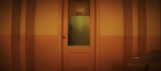
Here's how I interpret that brief change in aspect ratio in 5x09...
This season is all about turning the movie on its head. The kidnapped housewife is the protagonist this time. She fights back and gets away. And as we see at the end of this episode, the man who kidnapped her ends up saving her instead of killing her.
Changing the aspect ratio from full-screen to widescreen gives the episode a cinematic quality. It makes us feel like we're watching a movie. And it's no coincidence that we're in this aspect ratio when Roy orders Dot to be killed.
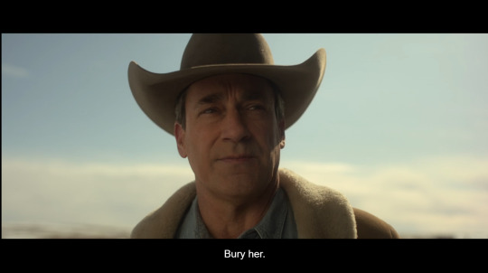
As soon as he says to "bury her," the episode switches back to full-screen, and we're reminded that we're not watching a movie -- we're watching a TV show.

Bowman goes in to follow Roy's orders, but Dot has outsmarted him. Interesting that she's under the floorboards, as if literally buried... and then she spots her means of escape and finds the daylight, as Roy says in 5x06.
Because this isn't Fargo the movie. This is Fargo the TV series.
The show is drawing a disparity (Jean to Scotty: "You know what a disparity is?") between the movie and the TV show to highlight the differences.
#or at least that's what i'd argue in a college paper lol#fargo#fargo season 5#fargo fx#fargo spoilers#roy tillman#dorothy lyon#season 5#my posts#dot#roy
27 notes
·
View notes
Photo
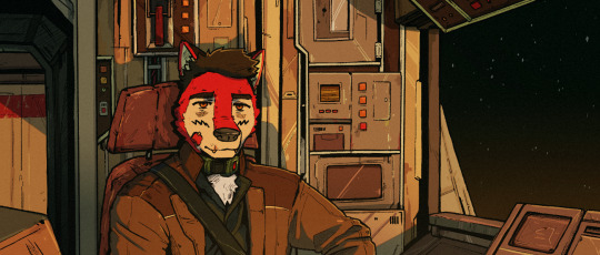
Ezo has a moment of reflection near the Saldropis system.
Character by WolfEzo.
Original art and story by DWC Marshal Arts
#the percivals#dwc marshal arts#dwcmarshalarts#ezo#wolfezo#anthro#furry#furryart#furry art#illustration#digital art#sci fi#space ship#cockpit#space#cinematic aspect ratio
25 notes
·
View notes
Text
my 5 favourite k-pop music videos <3
I love music videos, and in k-pop there are a lot of mildy shitty ones, but there are also some amazing ones that are just as iconic as they are aesthetically pleasing. Obviously budget will come into play here, so big 4 groups will be more prevalent on this list, but I tried to be as fair as possible, within reason. Also, I'm a girl group stan, so don't expect many boy groups. Obviously I will forget some, but maybe I'll make a part two, and you are very welcome to leave your fave mvs in the rbs or comments. This list is in no particular order, lets gaur
1. 'Feel Special' - TWICE (JYP Ent.)
This music video inspired this list, and for good reason. 'Feel Special' is in my opinion, the epitome of Twice, as they stand today. It encapsulates their more mature concept post 'Yes Or Yes', but it doesn't alienate their debut cuter concept, it rather welcomes it with open arms and celebrates it as a part of Twice's history, something their newer releases occasionally struggle with. Visually its a feast, its decadent and lavish, and positively gorgeous. Each member has her own movie-esque set, employing various genres and aesthetics, and then the members unite in the most glittery set ever concieved, the gold contrasting their raspberry and champagne outfits magnificently, while also referencing the group's official colours, as seen on their lightstick. The whole video is cinematic and opulent, and every detail, down to Sana's dip died pink hair, and Nayeon's stunning ginger curls which I wish she would bring back, is flawless. The only gripe I have is Chaeyoung's unblended foundation in her solo scene, but hey, we aren't all be perfect. My favourite scenes in this video are the afor-mentioned glittery golden arches group scene, as well as Jihyo's rainbow vintage television scene, that was surprisingly ahead of its time in terms of its retro aesthetics. It's a must-watch music video for the history books, and it's Twice's best song too - it deserves no less.
2. 'Why Not?' - LOONA (BlockBerry Creative - ew)
Note: If you would like to watch this m/v, please stream it from a non official yt channel, in accordance with the boycott. They will usually be marked with 'Boycott Ver.' in the title or something similar.
Loona has a lot of amazing music videos in their arsenal, but 'Why Not?' goes above and beyond. It's one of the most visually striking music videos I have ever seen, and its grasp on colour, composition, and rhythm is completely unparalleled. It's vibrancy is just gorgeous, full of neon lights and shining metallics. The video exists in a constant state of dichotomy: both cool and warm, metropolitan and pastoral, manmade and fantastical. You would assume this would ruin the video's visual message, but the contrast actually enhances it, as well as furthering the group's lore. it's unafraid to experiment with aspect ratio and camera movement, and along with the subversive editing, the final product is unique as well as timeless. Who cares that the last five scenes were neon and retro-futuristic? It's time for Heejin and Hyunjin's black and white minimalist mildly 1920s suited up dance break with a 4:3 aspect ratio of course! As the song itself says, why not? It's as playful as the song, as well as being visually stunning. My favourite scenes include Choerry's upside down mirror moment with the neon lights, as well as Kim Lip in the field with the funky glowing orbs, and of course the cult circle on the moon scene. Fucking iconic.
3. 'Ditto' (Sides A & B) - NewJeans (Ador)
Note: I have a full review of this song, if you are interested.
Where the other videos on this list are overwhelmingly vibrant or cinematic, 'Ditto' is understated and personal. Arguably one of the most influential k-pop music videos of all time, it breaks every rule of what a music video of this genre looks and feels like, rejecting glamour and high fashion for an unromanticized schoolgirl aesthetic surrounded with melancholy. It's heartfelt and unassumingly tragic, and truly makes the viewer yearn for a time they only half remember. It is one of the most beautiful pieces of cinema I have ever seen, and I am so happy that K-pop stans loved it to death as I did, despite how starkly different it is to most everything in k-pop before it. It does however remind me of f(x)'s '4 Walls' m/v, which isn't a shock as Min Heejin (ew) was their creative director also. It also has vibes of the cult classic (?) Japanese movie 'All About Lily Chou Chou'. It has sparked many trends in the industry, including but not limited to: b-roll interspersions, the typical schoolgirl aesthetic, and the general rejection of the polished, glitzy vibe we expect of k-pop idols. Their impact on trends is notable, but in my opinion, no one has executed this aesthetic to the standard that NewJeans has. The unassuming tragic beauty of 'Ditto' is difficult to put into words, you must go and watch the two music videos for it - they are life changing.
4. 'Kill This Love' - BLACKPINK (YG Ent.)
Say what you will about Blackpink, but they KNOW how to do a music video, and 'Kill This Love' is one of their best; it is beyond extravagant. The sets are huge and striking and insane - Jennie floats on the heads of two enormous swans and all four girls dance in the middle of a huge fucking BEAR TRAP and its ridiculously cool. The fashion and styling is amazing too - my fave looks include Jennie's Lara Croft moment with the braid, Lisa's big ass fur coat from her cereal scene, and Jennie's gorgeous eye makeup from her shopping scene with Lisa. In a word, 'Kill This Love' is extra(vagant). Even the scenes that are conceptually ordinary - Lisa's cereal aisle, Rosé crying in her car - are elevated into the extraordinary. There is no real storyline or through line between the scenes other than their saturated colour palettes and the members themselves, but who cares? The members look like fucking goddesses, the dance looks amazing, and there are MULTIPLE jaw-drop moments throughout the runtime - what more do you want? Where 'Ditto' rejects the typical k-pop visual aesthetics, 'Kill This Love' epitomizes them. If I wanted to explain to western pop stan what k-pop is about, this is the video I would show them first. My favourite scenes include: the group scene with the exploding statues and the bad bitch combat outfits, Rosé caught in the storm with beautiful lighting, and THE BEST SCENE IN A BLACKPINK MUSIC VIDEO EVERRRR... Jisoo's goddess moment with the sun and the reflections. Nobody does music videos quite like Blackpink.
5. 'What Is Love?' - TWICE (JYP Ent.)
This music video is so unbelievably special to me. It doesn't break any boundaries with camera movement, editing, or aspect ratio like 'Why Not?', and it doesn't entirely reinvent the typical k-pop music video like 'Ditto' either, but I think it is one of the best music videos ever because it is so FUN. 'What Is Love' is a music video that is a series of references to iconic movies, most of which being about love, as the title suggests. It harkens back to 'La La Land', 'La Boum', 'Pulp Fiction', 'The Princess Diaries', and many more, with the girls playing the characters, on their fictional discovery of what love truly is. It's so special to me because it reminds me of doing exactly what the girls are doing with my best friends and my big sister - trying to learn what love is from the movies is something almost everyone has experienced, and thus the whole video feels nostalgic both for its references, and for its overall concept. It's fun and lighthearted and a memory of simpler times. Oh, to be a 12 year old obsessed with 'The Princess Diaries' again, to be a tween watching 'Pulp Fiction' with your big sister when it's probably not age appropriate, to be young teen watching 'La La Land' right when it came out. What a time to be alive. That's what 'What Is Love?' is, it's a celebration of life, of growing up, of being just a little naive and knowing it. Iconic, truly.
#this was so fun#should i do a part 2???#lmk ur fave mvs too#twice#feel special#what is love#sana#mina#momo#jihyo#nayeon#jeongyeon#tzuyu#dahyun#chaeyoung#loona#loona boycott#why not#loona why not#loona ot12#jinsoul#choerry#kim lip#yves#chuu#olivia hye#gowon#yeojin#heejin#hyunjin
39 notes
·
View notes
Text
@hallasurvivor and i were talking about this last night but also i LOVE how beep the meep looked like a puppet and how the bug guys looked like guys in masks. they were so chunky!! they were so real!! they were just costumes enough to have depth and texture i felt like i could grab them off the screen. ik beep is at least partially cgi but they did a great job with the fur looking closer to a puppet than that super fake glossy cgi fur. i love when the creatures on my screen look like creatures i could grab
also whoever made the decision for beep to be like 3ft tall instead of tribble sized deserves a raise. it makes the meep look so much more unsettling
also also rachel talalay i am sending you flowers for the directing in this episode. besides the obvious excellence of the star trek ii scene the amount of wide shots in this ep!! the amount of frames with 4+ characters in them!! this episode felt so EXPANSIVE which is something i've been sorely missing. she really used the cinematic aspect ratio to her advantage ms talalay i love u
#i have so many thoughts about the tech of this episode#i need to rewatch for the finer plot points since chris and i talked thru half the ep (affectionate)#dw spoilers#ren speaks
29 notes
·
View notes
Text
Cliff notes from the latest blogpost:
BioWare created a dedicated team to focus on PC & the PC experience
PC made up 40% of their platform testing effort
They did 200,000+ hours of performance and compatibility testing
They did almost 10,000 hours of user research testing to ensure good controls and UI for both KBM and controllers
Native support for PS5 DualSense controllers with haptics support (along with Xbox & KBM)
Seamlessly transition between controllers and KBM in gameplay or menus
Customize class-specific keybinds
Full HDR support at launch
Full support for 21:9 Ultrawide monitors
Disabling the Cinematic Aspect Ratio option removes the enforced black bars so cinematics aren't affected
Adjust FOV with FOV slider
Uncapped framerate option
Most changes to graphics & display settings are reflected in real time
The cutout in UI allows you to see the effects of settings changes
DA:TV is Steam Native
DA:TV is Steam Deck Verified
Support for Cloud Save on Steam
Switch seamlessly between PC & Steamdeck
Remote Play (for TV) enabled. To utilize it EA account linking is optional
Support for suite of Ray Tracing features
"Ultra RT" mode for very high end PCs
Several types of upscaling available: NVIDIA DLSS 3, FSR 2.2, and XeSS
FSR 2.2 has been heavily modified specifically for DA:TV
DLSS3 with frame generation supported
NVIDIA Reflex supported
PC specs and details summary
More info on PC features to come
More info on combat, companions, explorations and more also to come
[source]
#dragon age: the veilguard#dragon age: dreadwolf#dragon age 4#the dread wolf rises#da4#dragon age#bioware#video games#long post#longpost#i will never tire of the unveil pun :)
124 notes
·
View notes
Text
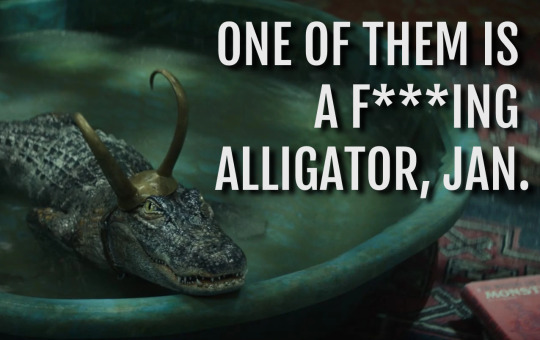
Okay actually I do have a proper thought on the "sylki is incest" wank. which is that the "anti" take seems to be that Loki/Sylvie is obviously, glaringly, an incestuous pairing but its shippers deliberately ignore that because they like the pairing otherwise (yet also the accusation involves them liking the incest element... honestly it's a bit of a muddle, but let's move on). But. Well, here's the thing that is obvious, at least to me...
Go to AO3 and have a look to find the most popular (in terms of number of works) Loki pairing in the Marvel Cinematic Universe fandom as a whole. Actually, i'll save you the effort:

(These numbers are slightly out-of-date but the ratios remain accurate. I checked.)
Now, that. That is an incest pairing, isn't it? There is some fic which specifies an AU of some sort in which Thor and Loki are not related to each other but most of it is about brothers who are also lovers.
"But they're not really related," you say? Sorry, but in the important ways, they are. Every one of those films, and the Loki series, frames them as siblings-with-issues, and yes one of those issues is whether or not they agree that they are siblings, but I'd say the MCU comes down pretty firmly on the side of "they totally are."
And the point I'm making here is that the actual incest pairing is treated as such by its fans. If you don't feel up to reading any thorki fic I'll save you again and say that it overall leans into the "forbidden love" angle, and the shame and internal conflict of an incestuous attraction or relationship. So shippers of a given pairing do indeed know what incest is and they rarely try to avoid that aspect of such pairings.
Whereas. If you read the Loki/Sylvie stuff, that whole "thorki vibe" is entirely absent. Fans vary on variants, in terms of in what ways these two are or are not "the same person" but they agree on one thing: fucking some other version of yourself is not incest. This is pretty much a unanimous belief, and here I'll mention something else I think is relevant: there are a few sylki twincest AUs (many of which seem to have been written out of spite - LOL, fandom!) and in all of those the AU also features another crucial change - they are not both Loki variants in those fics.
Yeah, that's right! To make Loki and Sylvie siblings you have to remove the selfcest element entirely. Because - this may shock some of you, so sit down before you read this next part - you are not your own sibling. Even identical twins are obviously different people. A clone of yourself might get us into more philosophical territory but that's not what multiversal variants are either. Allow me to illustrate with another informative image:
You get me? Yeah, you get me.
So, to meander towards an actual conclusion here. The MCU!Loki fandom does not, in general, refuse to accept that romantic/sexual pairings that would be incestuous actually are incestuous. In fact if anything it embraces that element of such pairings. It is usually seen as the defining feature of them. If they think siblings are fucking then they will write about those siblings fucking, and they will not be shy about it!
And aside from that mentioned handful of AU fics, sylki is not written as incest. Because it just isn't incest. Look, if you personally see Loki and Sylvie as siblings to the point where the pairing squicks you out, then fair enough there's not much either of us can do about that. Do your best to avoid that content and don't be a wanker about it and I wish you well in your endeavours. But that isn't what most of the complaints stem from, is it? As usual in recent years fans who didn't like a pairing (which, btw, is allowed) wanted to have the moral high ground and some bright spark hit upon "this pairing is INCEST" via some slightly odd logic and it spread from there. Because we can't just not like something, can we? (Actually, that's also allowed!) No, we have to be better than those fans over there, who are all terrible people in some way. They are problematic.
And this is a lot of words for me to essentially say "no, the sylki fic and the thorki fic have very different vibes actually" but... well, they do. The sylki shippers are not denying the incest, because there is no incest there, and even if we for a moment pretend that "siblings" is a reasonable and indeed expected interpretation of the variants concept, it is clear from their content that the people who ship Loki/Sylvie do not see them that way. And that has nothing to do with DNA or otherwise, which I can prove with this very quick question: in one word (or less, if you can), what is the relationship between Loki and Thor?
You said "brothers" or "siblings," didn't you? No, you did. I know for a fact that you did, don't play coy with me on this. We all understand that these two characters who definitely share no DNA are, in every way that matters, brothers. This is not a difficult concept, it's not somehow confusing large numbers of fans either way.
tl;dr - Sylki isn't incest but if it was we'd all know that because the fans of it would not be constantly denying what would, almost certainly, be the main appeal of that pairing for them if that was the case. You can deny that all you want but 11,731 thorki fics (as of 10th December 2023) back me up on this one.
So there.
#sylki#thorki#loki series#cw: incest#like actually incest WHICH WE ALL RECOGNISE WHEN WE SEE IT DON'T WE JAN???#fandom wank#wow that was a lot of words to state the completely obvious#if anyone's wondering yes i have read and written both sylki and thorki fic. PLEASE be sure to cancel me for the right one.
25 notes
·
View notes
Last Seen Blogs