#but i just think he would have a lasting impact on how people perceived vivienne in a place where she is already harshly looked down upon!
Explore tagged Tumblr posts
Text
the fact that severan was a rivaini mage and court advisor to king meghren during orlais' occupation of fereldan and volunteered for the position to escape templar control should be talked about more, me thinks, in relation to vivienne being a rivaini mage and court advisor to empress celene to escape the rigid power structure of the circle. idk just thinking about them atm
#dragon age#vivienne de fer#vivienne#severan#stolen throne#dai#dragon age: inquisition#shredding severan with my teeth while saying this btw#i need to sit down and finished reading stolen throne i need to. i need to actually remember what im talking about when it comes to severan#because i only remember scraps atm#but i just think he would have a lasting impact on how people perceived vivienne in a place where she is already harshly looked down upon!#idk. i need to read
22 notes
·
View notes
Photo
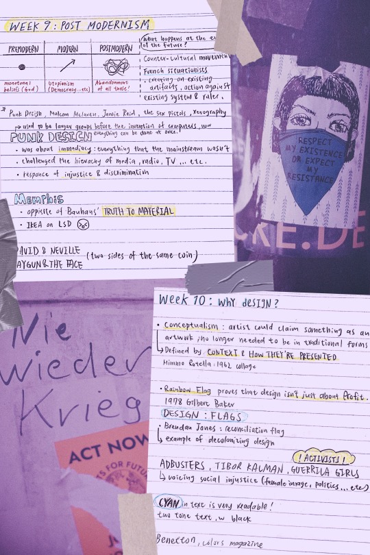
week 9 and 10 lecture
NIE WIEDER KRIEG!!! NO MORE WAR – ACT NOW – Urban street art sticker
RESPECT MY EXISTENCE OR EXPECT MY RESISTANCE - Urban street art sticker
photos from Markus Spiske
I was catching up on past lectures when I realized week 10′s content ties back to what is happening in the US right now, which made me decide to create my cover photo in relations to the event.
My intention is to pay my respect- as well as acknowledge- the rights of the community that is in pain at the moment, and reflect on ways of improvement when it comes to racial equality.
knowing that design is closely related to activism really gave me a new perspective, which is the power of design: the fact that we can make a difference by creating, expressing, and voicing an opinion. Design is so much more than just making a profit, it is a tool that comes with great responsibility and potential. Learning how to utilize it to spread importance is what I shall be thinking in my future years.
----------------
WEEK 9
PUNK: a counter-cultural movement
PUNK DESIGN, A SUMMARY: despise typesetter, prefer DIY
collage-style 1: ripping up and starting again
Takes a commercial image and repurposes it for revolutionary purposes.
collage-style 2: the use of stencils
stencils had frequently been used for their ease of use and acquisition, their association with the underground through graffiti, denoting something raw and urban, as well as its nature as simply being flawed by design.
zines: using illegible and garish styles to shock the viewer out of apathy, the punk movement gave little thought to the commonly perceived ‘good’ design practices.
parody and politics: using images from a media-saturated culture for a new purpose, they meant to trigger recognition in the viewer and include them on the subversive in-joke.
All ripped up: Punk influences on graphic design
MALCOLM MCLAREN: A multi-talented man
promoter and manager of bands the New York Dolls and the Sex Pistols
he was one of the first white music producers to bring hip-hop to a wider audience and one of the first to popularise world music in the west
partnership with fashion designer Vivienne Westwood: SEX
In a new, in-depth biography, Paul Gorman offers a vivid portrait of the postmodernist impresario who conjured up punk’s angry pose, the Sex Pistols, and much more.
Malcolm McLaren's Life of Chaos, Music, and Art
JAMIE REID Jamie Reid’s artworks
A GUIDE FOR ANYONE WANTING TO DO IT THEIR WAY, FROM REID:
Destroy Your Computer: The more we get drawn into this mad digital world, the more we lose contact with each other. “Most jobs are about enslavement, break free if you can”
Study Art: If I hadn���t gone to Croydon I would never have met Malcolm McLaren, not just for what he did with the Pistols but for everything else he did. The irony is that neither Malcolm or I would have got into Croydon if it was today. What does that tell you about what’s happened to our education system?
Have a Sense of Humour
Learn from the Past
Look to the Future: Radical ideas will always get appropriated by the mainstream, people in authority lack the ability to be creative, and they rob everything they can. you have to keep moving on to new things.
Iconic Punk Artist Jamie Reid Has Some Advice for Young Creatives
XEROGRAPHY ART: is an art form that began in the 1960s. Prints are created by putting objects on the glass, or platen, of a copying machine and by pressing "start" to produce an image.
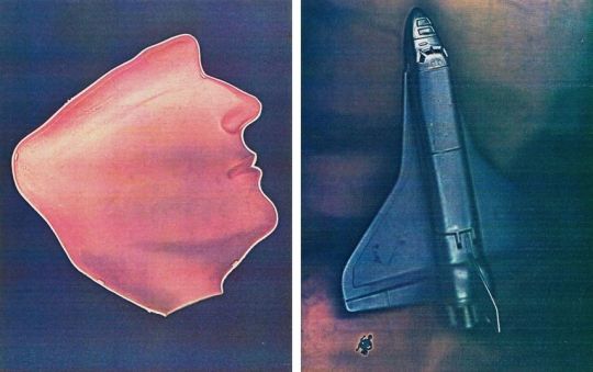
What Happens When a Photocopy Machine Becomes an Art Tool?
MEMPHIS DESIGN (MILAN 1980’S): its aesthetic embodies the 1980s
Simple geometric shapes; flat colours combined in bold, contrasting palettes; stylised graphic patterns defined by black-and-white stripes and abstract squiggles – these are the ingredients of Memphis-inspired design, fuelled by influences from earlier movements such as Pop Art and Art Deco.
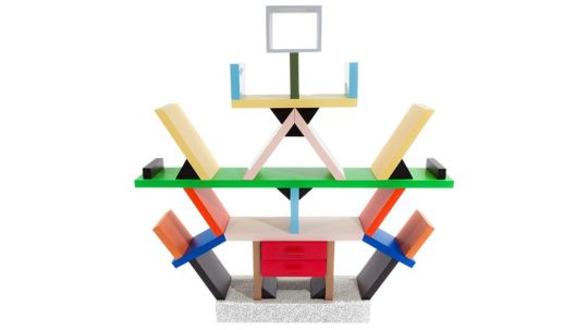
10 iconic examples of Memphis design
ETTORE SOTTSASS: One of the most influential and important figures of the last century, Architect and Designer, founded the Memphis group In 1981, a group that has radically changed the scenario of Italian and world design.
Ettore Sottsass’ works
DAVID CARSON: RAYGUN David Carson design
David Carson’s deconstructed style for Ray Gun, was very much a design aesthetic that blurred the lines of visual communication and challenged its readers to interpret the text in their own way. Much like the youths that he targeted throughout the 90s, they were rule breakers themselves that rebelled against society. His use of non-hierarchical text and visually complex, layered compositions, spoke ‘their language.’
“I’ve never used grids; I still don’t. I never studied or learned about them, and when I did I saw no reason to use them.”
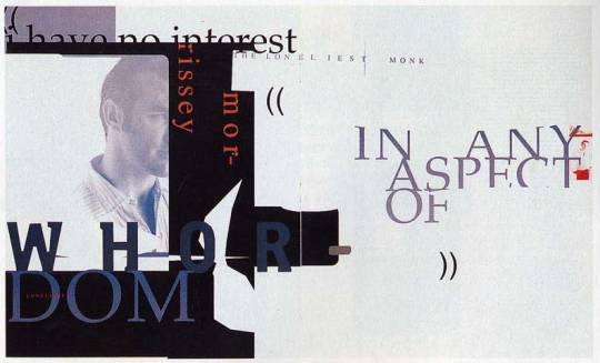
STREET PRESS ANALYSIS: RAY GUN COVER — David Carson, Anti-grid Design Icon David Carson Says Computers Make You Lazy, Contextual Studies: David Carson
NEVILLE BRODY: THE FACE
The Face, drawing freely for his visually exciting layouts and typography on avant-garde artistic ideas. Brody was thoughtful to the construction of its layouts, with blocks of texts often placed horizontally or vertically on the page, the layouts contrasting strikingly with hand-mediated imagery and photography. Such ideas exerted a significant international impact on the appearance of the magazine, advertising, and retailing design.
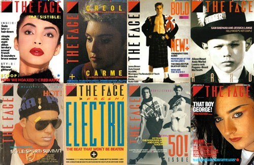
POST 14 – 1980's – 'The Face' Neville Brody – Monique
-----------------------------
WEEK 10
MIMMO ROTELLA
'With a Smile', Mimmo Rotella, 1962
Mimmo Rotella - 324
ROBERT RAUSCENBERG
Robert Rauschenberg 1925–2008
JACEK TYLICKI
Jacek Tylicki Art and Artworks
FISCHLI & WEISS
Fischli & Weiss: Flowers & Questions. A Retrospective – Exhibition at Tate Modern
GILBERT BAKER: RAINBOW FLAG
“Our job as gay people was to come out, to be visible, to live in the truth, as I say, to get out of the lie. A flag really fit that mission, because that’s a way of proclaiming your visibility or saying, ‘This is who I am!’”
Baker saw the rainbow as a natural flag from the sky, so he adopted eight colors for the stripes, each color with its own meaning (hot pink for sex, red for life, orange for healing, yellow for sunlight, green for nature, turquoise for art, indigo for harmony, and violet for spirit).
How Did the Rainbow Flag Become a Symbol of LGBTQ Pride?
FLAG IN DESIGN: the lecture talked about how flags influence to power of design, this is an interesting article of how flags can go beyond the rules of design, but still make it work.
7 fantastic flags that break every design rule
ACTIVISTS (ADBUSTER, TIBOR KALMAN, GUERRILA GIRLS, BENETTON: COLORS MAGAZINE)
A Review of COLORS
“Oliviero Toscani and Tibor Kalman launched “a magazine about the rest of the world” for United Colors of Benetton in 1991. It seems only fitting that an unconventional title like this should be documented in an unconventional way.”
“Toscani wanted a magazine without any stars, without any celebrities, and without any news. He decided they’d interview people nobody knew, and they’d use the internet to find stories. This approach- a combination of dynamic graphics, striking photographic imagery, provocative themes, and an unwaveringly global outlook—has become familiar to magazine readers now, they hope to firmly establish COLORS’ status as the founder not only of today’s independent magazines, but of mainstream media as well.”
SHEPARD FAIREY: HOPE POSTER Visual Analysis of Shepard Fairey's 'Hope'
Color: Red, blue and beige are representative of the American flag, illustrating his patriotism. Blue help to define his features, the beige on his face might be to say that race doesn’t matter.
Typography: provides the concept that the poster is trying to communicate. HOPE’s typeface used is Gotham, a strong slab sans serif, the use of Gotham in this work creates a sense of authority and a bold assertive statement in which there is no uncertainty. These clean letterforms grab the viewers’ attention and makes a statement, permitting for maximum legibility and objectivity.
3 notes
·
View notes