#bright’s artspace
Text
A headcanon guide to the Bright I draw + write about, though a little text-heavy.

feel free to ask me more about my Bright, cause I GOT A LOT MORE HEADCANONS.
askbox is open, after all!
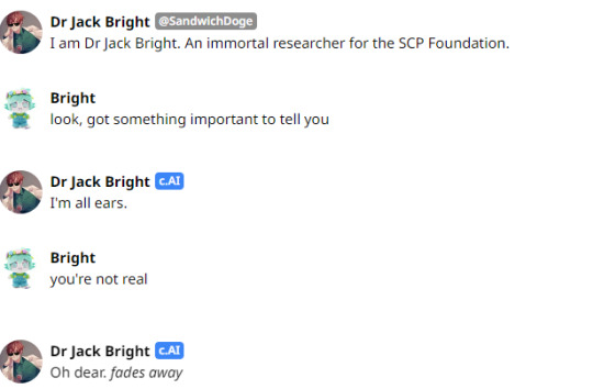
#ITS FINALLY DONE#AFTER ALL THESE DAYS#AND ALL THE COMBING THROUGH ME AND MY FRIENDS’ DMS#my scrunkly my blorbo auuuugh /vvvvpos#stimmed so fucking hard making this#dr bright#jack bright#scp foundation#scp fanart#scp#scp 963#dr jack bright#bright’s artspace#tag this as shaw and i will dropkick you#do not tag as kin/me/id#this applies to all art with the second bright design#the brightening#legacy art#legacy reblog
19 notes
·
View notes
Text
I sincerely congratulate all the winners of my #art #giveaways for winning free NFTs from the #BonusCollection! 🥳🥳🥳✨🎊🎉🎉🎉(Don't worry - gradually after 4 months -even if noone buys anything from main collection- I will start sending NFTs from giveaways to you all on a first come, first serve basis. Please be patient and respectful) 😁😊🥰🤩🙂💟
I hope that the #possession of these NFTs will bring brightness, harmony, health, success, reliability and warmth into your life! 🙂🌝🌞🌍🌏🌎🎨🖼🐖🐽🐷🐌🧠🫀💳💸🌃🌌🛸🚀
May the God of Fate helps each of you to be in the right place at the right time! 😇🙏🥰
On this #artnote, I am finishing this #SOUL #ART #CHANNEL!
I thank you all (my subscribers and secret guests) for your interest in me as an artist (whose #nickname will never appear in this #artSPACE again) and in the MAN with whom I was in love for 3 years from the beginning of maintaining this art blog… Each of my posts was filled with a piece of my soul and #MYheart…
One of the artists once said that every painting is a window into the artist’s soul… Well, my NFT collection and this art blog is my Dubai Skyscraper of my soul…
… During the time of running this art channel, I realized that I am grateful to have each of you, because even in moments of your anger and misunderstanding me, you all were honest with me and said openly everything that was in your hearts.. With this you motivated me to analyze my behavior and improve myself for the better :)
I saw that each of you has many hidden and obvious advantages, tact, manners and specific humor :)
I really like you all and I sincerely hope that each of you will have your dreams come true - and may your #HEART shows you the true direction to your dreams!
Dear subscribers and secret guests, PLEASE BE OPEN AND COURAGEOUS in the pursuit of “your dream” - after all, even if you receive “NO” as an answer, it will be a million times better for you than STAYING WITH THE PHRASE ALL YOUR LIFE: “WHAT IF” . WHICH WILL CONSTANTLY KNOCK IN YOUR HEAD AND ECHO ENDLESSLY IN YOUR HEART…. WHAT IF!?!… WHAT!?!… IF… WHAT IF….
PS. I dedicated this #SONG to all My Dear followers and Secret guests :) Guys, each of you all, are worthy for me and for this #WORLD! :)
Have a nice day to you all and may God bless you all and your Families 🌞 Good bye :) Love you all :)
Link on NFT collection: https://rarible.com/hughrlgrosvenor11/sale
instagram
#NFT#NFTart#art#ARTweek#NFTartist#SALE#ART4SALE#artforSale#cryptoguys#blockchain#Ethereum#maincollection#digitalguy#NFTcollector#eth#ethwetrust#$eth#digitalguys#OpenSea#Rarible#Nifty#token#tokens#NFTcollection#Instagram
2 notes
·
View notes
Text

Photobooth by @tomybright1227 - Bright 25th Birthday Cafe and Exhibition - Graduation and Birthday - Project 2022
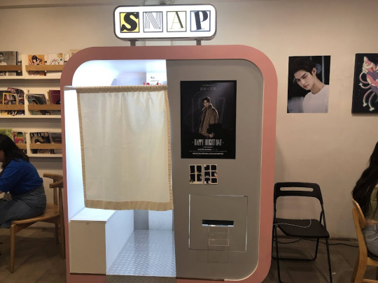
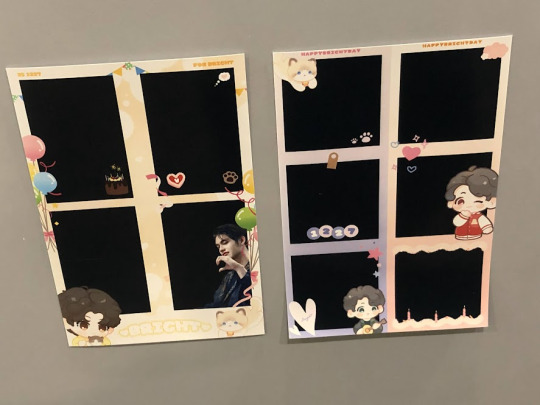
Location: PALLETE ARTSPACE
0 notes
Text
Van gogh chicago

#Van gogh chicago full#
Though finally settled in his career, his home life was anything but-Van Gogh remained a wanderer until his death 10 years later, despite his dream of a permanent home. You can read more about the event here.When Vincent van Gogh decided to become an artist at the age of 27, he had already lived in 16 cities and had failed at five different professions. This is an important consideration for visitors who are susceptible to photosensitive epilepsy and those who are sensitive to moving lights.Ī different immersive experience for van Gogh lovers can be viewed in St. Tickets for children are $24.99.įinally, we think it’s important to note that the exhibit contains sequences of bright flashing lights. The exhibit runs from February 11 to May 2, 2021.Ī range of ticket options are available, beginning at $39.99.
#Van gogh chicago full#
What’s more, face coverings are required for all staff and guests, as are temperature checks.įor more information, please check the full list of safety measures. Touchless hand sanitization stations are also placed throughout the venue. Among other steps taken to ensure safety, the venue will operate at reduced capacity, contactless payment is encouraged, and social distancing circles are projected throughout the exhibition gallery space. The producers point out that, “With over 170,000 visitors in Toronto during COVID-19, and zero reported cases associated with the exhibition since opening, we’re proud to be operating an experience where it is safe to GOGH.” “Patrons will walk through two giant ballrooms and side rooms, which will all be animated with moving projections of van Gogh’s work.” “This exhibit is custom designed for the Germania Club Building, and it incorporates the building’s Victorian Era architecture - including walls, 35-foot ceilings, and mezzanines,” Ross said in the interview. The exhibit also marks the grand opening of Lighthouse ArtSpace Chicago, a new venue within the recently renovated Germania Club Building. It’s a very moving, and emotional, experience.” Instead, Massimiliano Siccardi took a unique approach to create a story that flows through the piece to show what was flashing through van Gogh’s life. “The work also isn’t shown in a linear timeline. “The exhibit isn’t just van Gogh’s work projected onto walls,” co-producer Corey Ross said in an original interview. The exhibit is designed and conceived by Artistic Director Massimiliano Siccardi and features mood-setting music by Italian composer and pianist Luca Longobardi. The installation includes The Potato Eaters, Starry Night, Sunflowers, The Bedroom, and other works. The experience uses 500,000 cubic feet of high-def digital projections, including 60,600 frames of video, along with music, so art lovers can “step inside” van Gogh’s works. The “Immersive Van Gogh” experience made its world premiere in Toronto, where it is still impressing crowds. The Dutch post-impressionist painter’s work is noted for his bold colors, thick brushstrokes, and liberal amounts of paint to create landscapes, still lifes, portraits, and self-portraits. One of the world’s most well-known artists, van Gogh is famous for oil-on-canvas paintings including Starry Night and Sunflowers. premiere of “ Immersive Van Gogh,” a massive, digital presentation of his work, will open in Chicago on February 11, 2021, at the Lighthouse ArtSpace Chicago venue inside the landmark Germania Club Building. especially those in Chicago - have a reason to rejoice.
0 notes
Photo

Situated at the foot of Signal Hill, on the fringe of the city centre, and formerly known as the Malay Quarter, the Bo-Kaap’s origins date back to the 1760s. The choice of colour is said to be attributed to the fact that while on lease, all the houses had to be white. When this rule was eventually lifted, families were allowed to buy the properties and all the houses were painted bright colours by their owners as an expression of their freedom.. #watuspaces #visitafrica #africa #african #africanlens #africanculture #africanart #africantourism #atlasofhumanity #africanphotography #potraitphotography #tribesofafrica #africantribes #contemporaryart #art #artspaces #africanpainting #hyperrealism #afrorealism #natgeoafrica #natgeoyourshot #photooftheday #photography #quoteoftheday (at Cape Town) https://www.instagram.com/p/CjOK7mZNyUg/?igshid=NGJjMDIxMWI=
#watuspaces#visitafrica#africa#african#africanlens#africanculture#africanart#africantourism#atlasofhumanity#africanphotography#potraitphotography#tribesofafrica#africantribes#contemporaryart#art#artspaces#africanpainting#hyperrealism#afrorealism#natgeoafrica#natgeoyourshot#photooftheday#photography#quoteoftheday
0 notes
Text
Opening tomorrow—Rudolf Polanszky at Gagosian Paris
January 15, 2020

RUDOLF POLANSZKY
Opening reception: Saturday, January 16, 12–5pm
January 16–April 24, 2021
4 rue de Ponthieu, Paris
__________
Freedom is a chimera in a sense, but this illusion is realized as far as is possible in art. I can do something, and you can say, “No, don’t do that, that’s wrong,” but I’ll do it anyway.
—Rudolf Polanszky
Gagosian is pleased to present new and recent paintings and sculptures by Rudolf Polanszky. This is the first exhibition of the artist’s work at Gagosian in Paris.
A key figure in the Vienna art scene, Polanszky creates cerebral yet tactile works that embrace chance occurrence. From the early 1990s, he began experimenting in mixed-media painting with the series Reconstructions (1991–). To make these subtle compositions, he uses salvaged industrial materials such as acrylic glass, aluminum, mirrored foil, resin, silicone, and wire, decontextualizing them from their original uses and recombining them into aesthetic forms. Polanszky’s process of “ad hoc synthesis” produces works that oscillate between material constructions and symbols of subjective perception.
In this exhibition, the Reconstructions newly incorporate copper foil. Interspersed between fields of white corrugated cardboard and silvery aluminum, these gleaming, gently creased metal sheets add an entirely new tonal and textural dimension to the surface of each painting. In some compositions, Polanszky combines copper with silver or deep purplish mirrored foil, recalling the rippling, reflective surfaces of the Bright Mirrors and Dark Mirrors—two paired subseries of the Reconstructions first seen in his exhibition at Gagosian New York last year.
Also on view are two recent sculptures in which Polanszky makes use of the rough-hewn edges of the same repurposed objects, manipulating strips of metal and acrylic glass into curved forms and dynamic abstractions. Polanszky’s handling of material is intuitive and improvisational; he often leaves the individual components of his works outdoors, letting the natural elements help determine his constructions’ final surfaces and forms. Yet these works also reveal his acute consideration of the properties and possibilities of materials. In Polanszky’s hands, industrial fragments are transformed into shimmering arrangements that transcend their mundane origins.
Rudolf Polanszky was born in 1951 in Vienna, where he lives and works. Collections include the Centre Pompidou, Paris; Kadist Art Foundation, Paris; Werkstadt Graz, Austria; Landessammlungen Niederösterreich, St. Pölten, Austria; Museum Liaunig, Neuhaus, Austria; Sammlung SpallArt, Salzburg, Austria; and Belvedere Museum, Vienna; Rubell Museum, Miami; and Bunker Artspace, West Palm Beach, FL. Exhibitions include Translinear Structures, Zeit Kunst Niederösterreich, Krems an der Donau, Austria (2015); Paradox Transformations, Museo Madre, Naples, Italy (2015–16); and Eidola, Secession, Vienna (2018).
_____
Rudolf Polanszky, Reconstructions / Choros / Ecliptics, 2020, copper foil, aluminum, resin, silicone, acrylic glass, mirrored foil, and acrylic on wood, in artist’s frame, 59 3/4 × 59 1/2 inches (151.6 × 150.9 cm) © Rudolf Polanszky. Photo: Jorit Aust
4 notes
·
View notes
Text
10 Unmissable Art Exhibitions Of 2020
10 Unmissable Art Exhibitions Of 2020
Art
by Sally Tabart
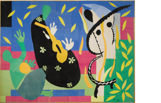
Henri Matisse – ‘The sorrow of the king (La tristesse du roi)’ , 1952. gouache on paper, cut and pasted, mounted on canvas. Courtesy of AGNSW.
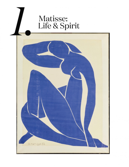
Henri Matisse – ‘Blue nude II (Nu bleu II)’ 1952. Courtesy of AGNSW.
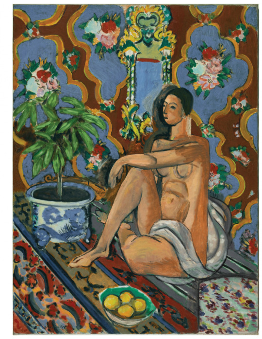
Henri Matisse – ‘Decorative figure on an ornamental ground (Figure décorative sur fond ornemental)’, 1925. Courtesy of AGNSW.
Matisse: Life & Spirit
November 2020 – March 2021
Art Gallery of New South Wales, NSW
It’s no surprise that one of the most prestigious galleries in the country, Art Gallery of New South Wales (AGNSW) will show a dynamic exhibition from one of the most famous and influential artists of all time, Henri Matisse.
Exclusive to AGNSW, Matisse: life & spirit, masterpieces from the Centre Pompidou will show over 100 works spanning six decades from the French master.
Developed alongside the Centre Pompidou in Paris, known for its unmatched collection of Matisse works, Matisse: life & spirit will be the greatest single exhibition of Matisse masterworks ever to be seen in Sydney. Yep – you’ll be able to see his famed cut-outs, but also his adventures in paintings, sculptures, and drawings, tracking the vast and varied exploration of his artistic career. This is TRULY unmissable!
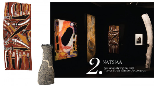
Left to right: Dhuwarrwarr Marika Makassan, swords and long knives, Carlene Thompson, Kipara and Kalaya. Photo – courtesy of MAGNT.
Telstra National Aboriginal and Torres Strait Islander Art Awards (NATSIAA)
August 8th 2020 – January 31st 2021
Museum and Art Gallery Northern Territory, NT
Now in its 36th year, the Telstra National Aboriginal and Torres Strait Islander Art Awards (NATSIAA) is a major highlight for the Museum and Art Gallery of Northern Territory (MAGNT) in Darwin. This fantastic exhibition spotlights emerging and established Aboriginal and Torres Strait Islander artists across a varying range of mediums, and attracts more than 85,000 visitors.
This exhibition is so important for visitors to gain an insight into First Nations People’s perspective in both contemporary interpretations, as well as those steeped in generations of tradition. It also offers some prize money of up to $50,000 for winning artists, courtesy of longtime sponsor Telstra. All finalists’ work will be displayed in the world-class exhibition, opening in August.
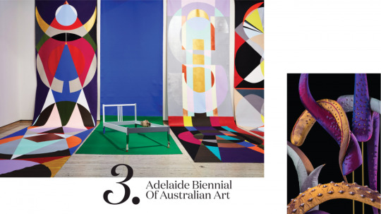
Left: Mikala Dwyer: a shape of thought featuring The Angel; Possession; Sigil for Heaven and Earth by Mikala Dwyer, Art Gallery of New South Wales, Sydney, 2017. Photo – Mim Stirling. Right: Julia Robinson, Australia, 1981, Beatrice, 2019–20.
Adelaide Biennial of Australian Art
February 29th – June 8th 2020
Art Gallery South Australia, SA
This year the Art Gallery of South Australia welcomes the hugely popular Adelaide Biennial of Australian Art back for its 30th year. Known for its risk-taking and expansive vision, the Biennial welcomes the wild, wacky, weird and wonderful.
The theme of the 2020 iteration is Monster Theatres, inviting artists to bring to life the ‘monsters’ of today. As described by curator Leigh Robb, ‘Monsters ask us to interrogate our relationships with each other, the environment and technology. They force us to question our empathy towards differences across race, gender, sexuality and spirituality.’
Artists involved in the Biennial include Abdul Abdullah, Polly Borland, Yhonnie Scarce + many more!
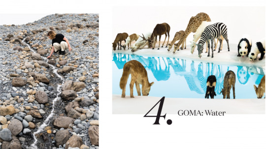
Olafur Eliasson, Riverbed 2014. Photo – Natasha Harth, QAGOMA.
Water
December 7th 2019 – April 26th 2020
Gallery of Modern Art, QLD
Brisbane’s Gallery of Modern Art never fails to disappoint with its innovative, world-class programming – and Water is no exception! Exploring the theme of, you guessed it, Water, this exhibition explores this vital element from the perspective of artists around the world.
Here is some of what you can expect, according to GOMA:
‘Walk across a vast, rocky riverbed created by Olafur Eliasson. See animals from around the world gather together to drink from Cai Guo-Qiang’s brilliant blue waterhole. Gaze at Peter Fischli and David Weiss’s snowman frozen in Brisbane’s summer heat. Traverse a cloud of suspended gymnastic rings in a participatory artwork by William Forsythe. View the tidal currents rise and fall around Angela Tiatia. Reflect on the cultural traditions of bodies of water with Judy Watson, and on the long history of our reliance on water through Megan Cope’s re-created midden.’

Left to Right: Photo by Beth Wilkinson for Lindsay. Stanislava Pinchuk, ‘Topography : Topsoil Storage II, Fukushima Nuclear Exclusion Zone.’ Pin-holes on paper, 2017. Image courtesy of the artist. Photo – Matthew R. Stanton. Stanislava Pinchuk, ‘Topography : The Road to the Fukushima Daiichi Nuclear Plant’. Pin-holes on paper, 2017. Photo – Matthew R. Stanton.
Stanislava Pinchuk
June 27th – October 4th 2020
Heide Museum of Modern Art, VIC
Stanislava Pinchuk (also known by her pseudonym, Miso) has emerged as one of Australia’s intriguing contemporary artists in the last decade. The Ukranian-born, Melbourne-based artist captures the changing topographies of war and conflict zones through data mapping, making tiny, individual pin pricks to realise these patterns – an incredibly labour-intensive and mentally and physically draining process that appears effortless, and beautiful.
This major exhibition at Heide Museum of Modern Art in Melbourne will feature a survey of Stanislava’s most powerful pinprick projects from the past five years, accompanied by terrazzo-like sculptures comprised of pieces of debris left behind in conflict zones.
Know My Name: Australian Women Artists 1900 to Now
May 30th – September 13th 2020
National Gallery of Australia, ACT
The National Gallery of Australia (NGA) celebrates its ongoing initiative to increase representation of artists who identify as women with Know My Name: Australian Women Artists 1900 to Now.
Drawing on works from the National Gallery’s own collection, as well as others from across Australia, Know My Name showcases the work of lesser-known artists alongside Australian greats from different times, places and cultures.
As part of the broader Know My Name initiative, a new commission by the Tjanpi Desert Weavers will be on display at the National Gallery. Patricia Piccinini’s iconic Skywhale (2013) will also see its new counterpart, Skywhalepapa (2020) ascend over Canberra on its maiden voyage, travelling alongside Skywhale eight times during the exhibition period.
Left: Pierre Bonnard – French 1867–1947 The dining room in the country, 1913. Right: India Mahdavi (designer). Jardin d’intérieur – collection for La Manufacture de Cogolin. Images courtesy of the NGV.
Pierre Bonnard designed by India Mahdavi
June 5th – October 4th 2020
National Gallery of Victoria
While Sydney-siders enjoy the masterful works of Henri Matisse, Melbournites won’t miss out on the opportunity to experience an incredible exhibition of another beloved French painter! The exquisite works of Pierre Bonnard will be on show at the National Gallery of Victoria (NGV) for their major winter showcase, a kaleidoscopic exhibition of 150 works from the painter with a fondness for domestic scenes and rural life. Pierre Bonnard has been developed in partnership with Musee d’Orsay in Paris.
Described by Matisse, a close friend of Bonnard’s, as ‘a great painter, for today and definitely also for the future’, this groundbreaking exhibition spans paintings, drawings, photographs, folding screens and early cinema, depicting scenes of modern 20th century France in bright, vivid colours.
Aside from the opportunity to see one of the works of this beloved painter, what makes this exhibition absolutely unmissable is the design of the show itself. Iranian Paris-based designer India Mahdavi (the interiors genius behind the iconic pink Gallery at Sketch restaurant in London) has been commissioned by the NGV to bring Bonnard’s extraordinary works to life, elegantly balancing historical references with contemporary culture in an immersive experience.
22nd Biennale of Sydney, NIRIN
November 8th 2020 – 16th February 2021
Various locations, NSW
First held in 1973 as part of the opening celebrations of the Sydney Opera House, the Biennale of Sydney is now in its 22nd year and is one of Australia’s blockbuster contemporary art events.
Taking place across six major sites – Art Gallery of New South Wales, Artspace, Campbelltown Arts Centre, Cockatoo Island, Museum of Contemporary Art Australia and the National Art School – the Biennale of Sydney will see 94 artists from 47 countries
Under the guidance of multidisciplinary artist and this year’s Biennale Artistic Director Brook Andrew, the 12-week exhibition is titled NIRIN, meaning ‘edge’ in Brook’s mother’s Nation – the Wiradjuri people of western New South Wales. He says, ‘Optimism from chaos drives artists in NIRIN to resolve the often hidden or ignored urgency surrounding contemporary life.’

Carriageworks Commissions
Rebecca Baumann: Radiant Flux, January 8th – June 14th
Reko Rennie: REMEMBER ME, January 2020 – January 2021
Kate Mitchell: All Auras Touch, January 8th – March 1st
Daniel Boyd: Video Works, January 8th – March 1st
Australia’s largest multi-arts centre, Carriageworks, has been home to some pretty major large-scale installation commissions in its time (who could forget German artist Katherina Grosse’s otherworldly technicoloured universe in 2018?). This summer, four new site-specific commissions from leading Australian artists Rebecca Baumann, Daniel Boyd, Kate Mitchell and Reko Rennie have taken residence in the epic historical space.
Spanning over 100-metres, Rebecca Baumann’s Radiant Flux sees every glass surface of the building’s exterior covered in a film that changes colour at every angle, flooding the space with kaleidoscopic light that will never be the same twice.
A study in human energy, All Aurus Touch by Kate Mitchell captures an aura portrait for each of the 1,023 census-recognised occupations.
Video Works by Kudjala/Gangalu artist Daniel Boyd features three major video installations, where gallery walls will be mapped with the artist’s otherworldly, infinite cosmos.
Interdisciplinary Kamilaroi artist Reko Rennie references the massacre of First Nations people in Remember Me, a massive illuminated sign that will remain on display for the whole of 2020, the year marking the 250th anniversary of Captain Cook’s first landfall.
Installation view of the Archibald, Wynne and Sulman Prizes 2019 exhibition at the Art Gallery of New South Wales, Sydney. Photo: AGNSW.
Archibald, Wynne & Sulman Prizes
May 9th – September 6th 2020
Art Gallery of New South Wales, NSW
The Archibald, Wynne & Sulman Prizes are some of the most prestigious and highly anticipated art events in the country. Since its inception in 1921, The Archibald Prize the most well-known of the three awards celebrates paintings of notable figures that reflect Australian culture across areas including art, media, entertainment, politics, sports and more. The works are always a great capsule to represent Australian culture of the moment.
Finalists for the Archibald (portrait), Wynne (landscape/scenery) and Sulman (genre/subject) are shown in an exhibition that starts at the Art Gallery of New South Wales, and tours at select galleries around Australia for the remainder of the year.
1 note
·
View note
Photo

Sun is coming through bright on my painting! Painting by Robert Gregory Phillips #robertgregoryphillips #contemporarypainting #artgallery #artcollector #mafdad #siaalumni #fortnum #artadvisor #artdealer #artcurator #artwatchers #abex #contemporaryartcollectors #artreview #artcritic #artlover #historyofart #artbaselmiami #frieze #tefaf_art_fair #artbusiness #arthistorian #artspace #artnet #artforum #theotherartfairla #friezeartfair #artbaselhongkong #armoryartsweek (at Austin, Texas) https://www.instagram.com/p/BvnDQKel5FG/?utm_source=ig_tumblr_share&igshid=vz1ibze8z14n
#robertgregoryphillips#contemporarypainting#artgallery#artcollector#mafdad#siaalumni#fortnum#artadvisor#artdealer#artcurator#artwatchers#abex#contemporaryartcollectors#artreview#artcritic#artlover#historyofart#artbaselmiami#frieze#tefaf_art_fair#artbusiness#arthistorian#artspace#artnet#artforum#theotherartfairla#friezeartfair#artbaselhongkong#armoryartsweek
1 note
·
View note
Text
12.08.22
Second Entrepreneurship lecture with Giles
Net-Work: Building your portfolio website by Shelley Simpson
Website as a creative project
Talking about portfolio-style website today: Planning and Website Creation ‘Wix’
Katevanderdrift.com
Deborahrundle.com
fionajack.et
Planning:
Identifying audience and their needs
List all content you’d like to include
Create site map, where specific content goes
What content you already have, what content do you need to create?
Organizing your domain name
How to choose and prepare images
Using Wix- Choosing a template, the Wix workspace, making changes to text and background
Key Considerations:
Clean design
Work is the focus- big high quality photographs
Simple menu structure
Images with consistent captions
Easy to use, clear easy to find information
What does your website do for you?
Presenting your work- current and your archive
Your biography- the official version
Exhibition history- CV
Writings and text
Providing contact information
1 Audience: identify your audience. Curator for a gallery, a young art student/ fellow artist/ a client or someone who wants to purchase your work? What do each of these categories need from your site?
Giles: teacher/ art educator/ curator/ nominator/ judge of competitions, Brands looking for collaborations or merchandising, pop culture/ lowbrow events with art alleys, digital art groups
2 Core content to include: Contact details. Biography, About, CV. Press, Text. Projects (text, images, video, audio). Links to social media.
CV: Menu commission design Vibe Cafe, BFA, Overload Convention, Depot Artspace Internship
3 Site Map: Branching out My Art Portfolio (home page) to main menu About, Projects (Subpages: Project 1, Project 2, Project 3), Exhibitions (Subpages: Exhib 1, Exhib 2), Contact, Press
Draw yourself out a site map
4 Planning the Homepage: What will go on your home page? List the content you will put on the homepage
5 Information about your Images: be consistent with the information you provide. Decide what you want people to know about the work: size, medium, year, name, edition. Provide context for the work with text. Organising your projects- How? By year, by project, by discipline or medium?
Domain Names: Use your name if possible. Check availability https://1stdomains.nz/register/. Co.nz, .com or something else? Juroart.co.nz?
Register as soon as you can
Design:
Consider legibility/ readability
Have consistency in design from page to page. Keep text in narrow columns
Use accepted website conventions like positioning the menu at the top or on the left. Logo top left
Use clear labelling/ names for your links and buttons
Estabish hierarchy in menus- most important at the top or left
Make sure people know where they are going and have access to the menu
Make sure images are good quality. Jpegs, rgb colour files.
Always have an on/off option if using audio
Preparing Photos: 72 DPI. Resizing to 1500px on long side. Do not over compress. Adjust brightness and contrast. Jpg files, gifs work too.
Using Wix:
https://www.websiteplanet.com/wix-guide.pdf
Youtube videos
WIX tutorials and help sections
Build your site using the free service, then sign up when you want to link your domain name
Choosing a template:
Suggestion to build a site using blank pages
Find the template that is as close as possible to what you want in a design
You cannot swap out templates once you have chosen one
Justine Giles:
Artists Online: Managing your online presence
Wordpress (blogging) and Instagram
Important to make online presence professional so people are inclined to take you seriously- think of it as a performative space rather than a professional space. Professional self, not private self.
What is a blog?
An accessible archive of your notes
A community of your peers
An informal testing ground for ideas
An online presence
A living document: it can be changed and updated
How can you use your blog:
Brainstorm
Document your practice
Document your thinking
Present your research
Scrapbook of quotes and images
Reviews of books and exhibitions
Wordpress:
Suitable for sharing writing as well as images/ videos
You can use it like a website or like a blod
Templates available- more flexibility with the look and feel
Easier to include detailed bio, art CV, Press Release info
What about Instagram? Images and videos- visual material- strength in simplicity
Stay on topic- avoid personal and unrelated content
User-friendly
Focus on visuals
Can’t write much
Easy to find and connect with other galleries/ artists
Instagram Handles: Marymacgregorreid, Yvonne__todd
Annshelton_, Yukikihara
What to have in a Biography- focus on who, where and what
Name/ location
Credentials/ background (where, what did you study. Exhibitions, awards)
Art Practice info (what does your art practice involve? Materials, mediums, themes, concepts)
Write biographies in third person
General statement:
What sort of art do you make? What is it, what is it made of?
What are the themes or concerns of your work? What is it about, what does it do?
David Cowlard
What to include in your Art CV: (Send this to Giles as a separate PDF document. Start at most recent)
Name
Location
Education/ qualifications
Exhibitions of shows
Art awards or achievements
Texts or Publications
Internships
Press Release:
What is it?
When is it?
Who is involved?
Where is it happening?
0 notes
Photo

Like Van Gogh's artwork 🎨 That's Jupiter's atmosphere in contrast. The images were taken by the Juno spacecraft from a distance of ~12500 km. Bright spots in wide swaths of Jupiter could be emissions of sulfur and phosphorus-containing gases rising from the warmer layers of the atmosphere. These cloud formations, like on Earth, surround the planet in the form of massive streams. . . . #art #vangogh #jupiter #artistsoninstagram #art_community #artofdrawingg #artiseverywhere #arteveryday #artinstagram #arteducation #arttattoo #artforyourhome #art_dailydose #artspace #artsupport #artsketch #artsviral #art2021 #artprompt #art_collective_mag #artistinstagram #artofmagic #artchallenge2021 #artmeetsfashion #artrepreneur #spacefacts #thetornbytes #atmosphere #blueaesthetic #factsforall (at Jupiter) https://www.instagram.com/p/CenIvqAvssn/?igshid=NGJjMDIxMWI=
#art#vangogh#jupiter#artistsoninstagram#art_community#artofdrawingg#artiseverywhere#arteveryday#artinstagram#arteducation#arttattoo#artforyourhome#art_dailydose#artspace#artsupport#artsketch#artsviral#art2021#artprompt#art_collective_mag#artistinstagram#artofmagic#artchallenge2021#artmeetsfashion#artrepreneur#spacefacts#thetornbytes#atmosphere#blueaesthetic#factsforall
0 notes
Text


WEEK 5: MARKET RESEARCH- EXISTING STUDIO SPACES AND THEIR POSITIONING ON SOCIAL MEDIA.
As my specialism is within fashion marketing and promotions, it made sense for my role within the start up group to involve the marketing and digital positioning within a social media setting. This could involve the development of online account(s)- such as a website layout and Instagram feed and posts, for example.
To begin understanding the existing market, I explored local creative studio spaces boasting a similar brand identity to ours; providing a rentable, open and easily accessible studio space for local practitioners to create, collaborative and exhibit within. More specifically, I investigated their Instagram accounts, considering factors such as their icon picture, information included in their bio, overall feed appearance and individual post content to gain an insight into who they are as a brand, the artists residing within their studio space and the general message(s) they are aiming to communicate to their audience.
Example one is Aire Place Studios, based within Leeds. My first impressions were rather positive; the feed itself is very colourful and eye- catching, using a mixture of outputs such as photography, illustrations, typography, including content such as ‘meet the team’ style posts, examples of artists work and promotions of upcoming events. The mixed- media approach allows for a diverse and exciting feed; however, from an aesthetic perspective, I feel the layout lacks consistency or any intentional layout, making it appear slightly sporadic. There is also a lack of consistent colour scheme; although its bright tones are enticing and attention grabbing, it does not reflect the brand identity, making it unrecognisable as a feed without the brand name itself. The second brand explored was Yorkshire Artspace, based in Sheffield. Upon first glance, their overall feed appearance is very photography- heavy, with all the posts in the example screenshot shown consisting of such. Saying this, they are very high quality, aesthetic images, reflecting both the artists and artworks based at the studio. Again, similarly to Aire Place Studios’ feed, there is a lack of intention behind the order in which the imagery is posted; a clear example of this is within a screenshot demonstrating 15 posts, 9 of such are ‘meet the team’ style posts, which are in succession of one another, bar one photograph demonstrating an exhibition space. To the average person, the consideration of an overall aesthetic/ theme for an Instagram feed may seem unnecessary, sparking the question as to ‘why bother’? Maria Ganta explores this theory in an article provided by the Social Insider, “The answer is quite simple: to gain attention immediately. If you create a theme and stick to it, people will associate that with your name, and that is the way your photos will become more recognisable” (Ganta, 2021). This evidences the importance of considering the the appearance of the feed as a whole, just as much as the content of the individual posts themselves. I myself feel I can support this as when viewing both accounts I did not feel enticed to keep scrolling or exploring, as much as I possibly would have if the overall theme was more considered and visually appealing. To confirm this, more exploration into further brands’ social media presence will be required. Individual posts and their specific influence is explored within the above slides.
Although exploring the two discussed brands and their social media presence has been very informative in what techniques and approaches are affective and what are not- based on my opinion as a viewer myself- I feel they lacked the inspiration I intended to gain from this exercise in regards to feed layout, content and aesthetic qualities. This requires further exploration into more creative studio spaces, possibly further afield. From an aesthetic and stylistic standpoint, I will explore a wider example of brands- not restricted to rentable studio spaces- to gain a body of inspiration based solely on stylistic approach and feed layout; this may involve fashion and lifestyle brands.
Aire Place Studio’s. (Accessed 22nd February 2022). APS - Studios & Gallery. Instagram. https://www.instagram.com/aireplacestudios/
Ganta, M. (2021). The Importance Of An Instagram Theme. Social Insider. https://www.socialinsider.io/blog/the-importance-of-the-instagram-theme/
Yorkshire Artspace. (Accessed 22nd February 2022). Yorkshire Artspace. Instagram. https://www.instagram.com/yartspace/
0 notes
Text
Knight House, University of Sheffield
Knight House, University of Sheffield, New Yorkshire Housing Architecture, English Project
Knight House for University of Sheffield
7 Nov 2020
Knight House
Design: AHR, Architects
Location: Sheffield, northern England, UK
74 creates stunning landmark and interiors at Knight House, University of Sheffield, for iQ Student Accommodation
New landmark student accommodation Knight House in Sheffield has been masterplanned and designed by Manchester-based architects and designers 74, who additionally created the project’s full interiors scheme, including bedrooms, corridors, wayfinding and all amenity spaces. The new-build architecture for the class-leading student accommodation offer was implemented by Leeds-based architects Cunniff Design, with 74 acting as client-side architectural advisor.
’We worked on this project from its very earliest days’, 74 Founder David Holt commented. ’74 was initially engaged to examine the ongoing strategy of iQ Student Accommodation’s Sheffield campus, made up of three buildings adjacent to the University of Sheffield. The brief was to re-organise the existing buildings on the site, but further study of the plans and immediate environs revealed the potential of an adjacent site that turned out to be in the company’s ownership, in use at the time as a car park. A promising further discovery was a lapsed planning permission for a 12-storey building on the site, whilst under previous ownership. Once we had the client’s go-ahead to propose a new building, we sought to maximise the development volume and created the design for a 257-bed, 17-storey student accommodation building, which we are delighted to say has now completed and is set to become a key part of the iQ Student Accommodation Sheffield campus.’
Architectural Brief
The brief for the building was to design a high-quality landmark structure to serve as a focal point for the area and to sit harmoniously within the context of both large- and smaller-scale existing buildings in the vicinity. The design proposal consisted of two main forms: a 6-storey podium and a tower element which rises above the podium by a further 11 storeys to create the final 17-storey building.
‘Although the planning process was challenging, we developed a very positive relationship with the urban planning team and planning permission for the proposed scheme was eventually obtained’ David Holt explained.
74 designed the building form, the proportions of the apertures and spaces between to create an elegant overall building appearance, exemplified by the slender vertical emphasis of the façade articulation, which includes bronze, anodised metal feature panels. Large windows run along the full length of the ground floor and lower ground floor amenity spaces.
Anne Knight Lobby Artwork
Knight House was named after feminist pioneer Anne Knight (1786-1862). A notable public art piece dedicated to Anne Knight now greets visitors in the building’s lobby, in the form of a mosaic wall installation by artist Coralie Turpin. 74 was closely involved in the initial artist interviews and design-stage review process for the commission, as well as inputting into the final colour scheme, using the same yellow as used within the interior scheme.
Entitled ‘Anne Knight and the Dawning of the Women’s Movement in the UK’, the mosaic was constructed by the artist in her studio at Yorkshire Artspace and installed by Anglian Tiling. Anne Knight was a Quaker and anti-slavery activist and formed the first women’s suffrage society in Sheffield in 1851. The mural represents Anne’s legacy as a pioneer feminist, and the cyclical progress of the women’s movement in Britain from the era in which she was born to our present day. Like this mural, the women’s movement has developed in waves, but consistent throughout has been the aim to achieve equality for women in political rights and representation, education, work, health, sexuality and in the family.
‘It is something special that Sheffield is the birthplace of a campaign that finally attained its objectives when Parliament passed the Representation of the People Act (1918), and, a decade later, the Equal Franchise Act (1928)’, Julie V. Gottlieb, Professor of Modern History, University of Sheffield, who created the historical timeline for the commission, explained. ‘These achievements are not to the credit of great leaders alone but to the power of collective action, solidarity and sisterhood. An artwork conceived as we marked the centenaries of women’s (partial) suffrage and women’s entry into Parliament, artist Coralie Turpin gives visual form and texture to the uneven and fluctuating yet overall progressive movement towards gender equality in Britain.’
Interior Design Scheme
After the lobby, visitors go through to the reception and waiting lounge area, allowing glimpses down to the main amenity space on the lower-ground floor. There are postboxes in red for each student directly opposite, sourced from The Safety Letterbox Company. The reception zone to the left features a bespoke desk with a ply geometric pattern-printed front, designed by 74, and an emerald green marmoleum desktop, along with green wallpaper to the rear and a green ceiling area above, whose shape directly reflects the deskfront.
The new logo for iQ Student Accommodation sits behind reception in neon, whilst three pendant lights with an orange knot hang over the reception desk, ‘The interiors concept was inspired by the surrounding landmark architecture and great natural landscapes all around the city’ Bianca Yousef, Associate at 74 commented, ‘as well as by the city’s industrial ties to the steel industry, taking form in both a bold colour palette, with a core emerald green supplemented by red, yellow and orange and strong geometric patterning throughout.’
Alongside reception is a waiting lounge, with a variety of seating arrangements. Acoustic panels on the ceiling are a motif used throughout, whilst in other areas, the ceiling is treated as a part of the design canvas and features green timber slats, interspersed with strip lighting. Pillars throughout are in a half-and-half colour scheme, using one of scheme’s three main colours, together with a marble-effect film, adding a playful take on classicism in the midst of an otherwise highly-contemporary treatment. Curtains are also split at the same level as the pillars (1500mm), in a green and orange colourway.
Furniture in this space includes high-level red chairs at a laptop table, with a bespoke red rope back feature, another motif of the whole amenity-space the scheme. Flooring is a two-tone Amtico vinyl in an oak effect, with a darker-toned floor set at ninety degrees to designate the circulation areas. Feature inset carpeting in a geometric pattern beneath the casual seating arrangements is from Newhay.
A new set of iQ Student Accommodation brand language and illustrations was employed on this scheme. As well as the new identity, the branding also includes a series of bespoke, new, playful and location-specific illustrations, with the first iteration applied to the glazing here, in the form of a continuous line tracing out icon silhouettes of, for example, mortar board hats, pens, hands and laptops.
To the left of reception is the private dining area. A further brand illustration is located here, depicting a chef, whilst a wraparound linking wall features iconic images of Sheffield, from music to parks to famous buildings such as The Crucible Theatre. The private dining room features a blue Howdens kitchen with a stainless-steel splashback and geometric-patterned wallpaper on the opposite wall to the illustration. The communal dining table and chairs are by Telegraph Contract Furniture, who supplied furniture throughout.
To the right beyond reception, a red feature stair leads down to the lower ground floor, where the scheme’s social and activity spaces are located. The first area is an inset lounge area for board games and hanging out, with the printed plywood treatment used on the reception deskfront applied once again to the lower wall ply cladding that wraps around the inset seating booths and the TV and gaming screens. Yellow pendant lights and table legs add a bright highlight to the booths. Further illustrations from the new branding are used on the glazing here, featuring faces and hands to denote social exchange, whilst faux leather booth seating is complemented by freestanding furniture, once again featuring red rope-threaded backs. A small nook area has a darker and quieter feel, with a backing of geometric wallpaper, in grey this time. The metal studs on the banquettes here allude to Sheffield’s great steel industry heritage.
Huge overhead ceiling rafts over the lounge and gaming areas are in strong geometric patterns and are made of plywood with integrated lighting. A dry bar features bespoke lights and three sets of demarcating red metal grids in powder-coated steel – two zoning the lounge area and one forming the back rear wall of the kitchen, where cupboards are in a dark grey concrete-effect laminate. Three lights on giant steel U-shaped loop frames against the kitchen back wall were bespoke-made for the project by Enigma Lighting.
Leading off to the right from the social area is the TV amphitheatre, where pegboard ply steps and integrated seating with emerald green faux-leather seat pads are arranged to face the screen wall. The ceiling slats continue into this space, as do the two-tone curtains and the oak-effect flooring, although laid in a straight, non-herringbone pattern.
The game area to the rear of the main space includes pool, table tennis and table football. The same long pendants used over the main reception, with orange knots, feature here and there are also acoustic panels in red in the ceiling. A window bench seat in emerald green faux leather is by Telegraph Contract Furniture, whilst black demarcating panels in the flooring echo the acoustic ceiling panels in their zigzag shape.
Up on the first floor is a further amenity space, overlooking the entrance lobby, in the form of a small study area with a teapoint, herringbone flooring, two curving banquettes, geometric wallpaper, acoustic ceiling panels, faux-leather benches in green and grey with metal studs, plus a herringbone timber effect floor. Other elements of the ground-floor amenity space also repeat here to link the spaces, including two-tone columns, inset Newhay carpets, red geometric frames to demarcate separate areas and a ‘student at work’ brand illustration on one wall.
The bedroom designs, with each room slightly different, feature a similar palette. Dressed with a strong use of yellow, the furniture is in oak, grey and white, with a feature wall in dark green and others in papyrus white with a slight grey-green tint. Flooring is oak-effect by Amtico. Two-tone pillars feature in some of the rooms, which are arranged either as cluster rooms, with a communal kitchen, or as individual studio rooms with built-in kitchens. The bathrooms feature an acrylic-panel pod design and were pre-fabricated and craned in, with shower pods and backlit mirrors, manufactured by Walker Modular to 74’s design.
Knight House for University of Sheffield, England – Building Information
Architectural Design: 74
Implementing Architect: Cunniff Design
Client Architectural Advisor: 74
Interior Designer: 74
Anne Knight Artwork: Coralie Turpin
Installed by Anglian Tiling
Contractor: nmcn
Furniture Supplier: Telegraph Contract Furniture
Lighting Supplier: Enigma Lighting
Flooring: Amtico Newhay
Joinery: Manufactured by Andy Thornton & installed by PDS Design & Build
Postboxes: Safety Letterbox Company
Bathroom Pods: Walker Modular
About 74:
74 are architects, interior designers and placemakers, specialising in student living, workplace, hospitality and BTR projects. The Manchester-based practice, named Commercial Interior Design Practice of the Year at the Northern Design Awards 2019, offers clients a design-led, commercial approach and a thoroughly integrated mix of disciplines. Clients include iQ Student Accommodation, Future Generation, Grainger, Moorfield Group, Wyndham Hotel Group, Greystar, Ekistics, UrbanSplash, and Royalton Group.
Photographer credit: Gu Shi Yin
Barbara Hepworth Building at the University of Huddersfield images / information received 071120
AHR Architects
Another University of Huddersfield building on e-architect:
Oastler Building at the University of Huddersfield
Design: AHR Architects
image courtesy of architects
Oastler Building at the University of Huddersfield
Address: Queensgate, University of Huddersfield, Yorkshire, northern England, HD1 3DH, UK
Phone: +44 1484 422288
Yorkshire Architecture
New Yorkshire Architecture
Yorkshire Architecture:
RIBA Yorkshire Awards
York Theatre Royal Building Redevelopment
Design: De Matos Ryan
Artists’ Impression : De Matos Ryan
York Theatre Royal Building
Hepworth Gallery, Wakefield
David Chipperfield Architects
photograph © Iwan Baan
The Hepworth
Building for sculptures by late Barbara Hepworth + Wakefield public art collection
Yorkshire Buildings in Major Cities
Leeds Buildings
Sheffield Buildings
Bradford Buildings
FUTURE PARK
Design: Bond Bryan / Fallon
image courtesy of architecture practice
FUTURE PARK Yorkshire Building
Yorkshire Higher Education Buildings
York St. John University Creative Centre Building
Design: Tate Harmer, Architects
image courtesy of architects
Creative Centre at York St. John University Building
Bradford Academy
Bond Bryan Architects
Bradford Academy building
Castleford Bridge
McDowell+Bendetti with Alan Baxter Associates and Arup
Castleford Bridge
Castleford Project Bridge
DSDHA
Tickle Cock Bridge
Sheffield Hallam University Furnival Building
Bond Bryan Architects
Yorkshire building
Sheffield Hallam University Faculty Building
Bond Bryan Architects
Sheffield Hallam University
Sheffield University Building
RMJM
Yorkshire University Building
University of Sheffield – Advanced Manufacturing Research Centre
Bond Bryan Architects
Yorkshire building
University of Sheffield Environmental Research Centre
Bond Bryan Architects
Yorkshire building
English Architect
County Architecture adjacent to Yorkshire
County Durham buildings
Humberside Buildings
Lincolnshire Buildings
Website: Oastler Building at the University of Huddersfield
Yorkshire Building Designs
Comments / photos for the Knight House, University of Sheffield page welcome
Website: University of Sheffield
The post Knight House, University of Sheffield appeared first on e-architect.
0 notes
Text
some more brightposting due to me neglecting this account


context for this one:
#dr bright#scp 963#scp dr bright#scp fanart#scp#jack bright#dr jack bright#scp jack bright#scp bright#tag this as shaw and i will dropkick you#legacy art#do not tag as any 963 variation!!!!#mark’s artspace
98 notes
·
View notes
Photo

All the art supplies I use for my paintings 🌸⠀ ~⠀ Necessary to my painting process is water, food, and a cup of tea/coffee. I get into the flow and by the end of the day I have a headache from dehydration and a sad, empty stummy.⠀ ~⠀ Necessary for painting: Brushes, paints, and paper! I have an assortment of brushes, but the ones I'm using the most are my recently acquired Escoda Prado 👍👍 #6 and #2. Paints: I also use a couple of paint brands, but mostly @mijello_mission and @caseformaking, both are extremely vibrant which I LOVE 💖🌈 Paper: I use both cold and rough press watercolor papers, I use @archespapers they've been crafting beautiful papers since 1492!!! I love the experience of painting on arches, the feeling of the tooth, and watching the colors appear bold and bright. ⠀ ~⠀ I work with these tools because they aid me in creating exactly how I want to create. It's a privelage to work with high quality materials. ⠀ ~⠀ What are your favorite supplies? I'm always looking for bright pinks to add to my collection, and watercolor papers to experiment with. ⠀ ~⠀ See you later this evening for an extra treat!! Happy Samhain 💖⠀ ~⠀ .⠀ .⠀ .⠀ .⠀ .⠀ #artdesk #artmaterials #watercolorsupplies #inthestudio #aestheticworkspace #artspace #athomestudio #artathome #fairylights #homegallery #artistdayinthelife #messyartist #happyartist #pinkaddict #artsupplies #painteveryday #behindthescenes #smallartstudio #creativespace #watercolorsetup #mydesktoday #artsetup #watercolorworld #artistworld (at Charlotte, North Carolina) https://www.instagram.com/p/CHBawFgDtXR/?igshid=1gb986aqwl7jq
#6#2#artdesk#artmaterials#watercolorsupplies#inthestudio#aestheticworkspace#artspace#athomestudio#artathome#fairylights#homegallery#artistdayinthelife#messyartist#happyartist#pinkaddict#artsupplies#painteveryday#behindthescenes#smallartstudio#creativespace#watercolorsetup#mydesktoday#artsetup#watercolorworld#artistworld
0 notes
Text
Artist Inspiration (Embroidery)
After creating some initial embroidery samples, I have decided to research into artists and create work inspired by their style and aesthetic. Hopefully, from doing this I gain inspiration for up coming work including my final outcome. I am going to strive to be influenced by the artists colour choices, shapes, stitch types/ lengths.
Maurizio Anzeri


Maurizio Anzeri is an Italian artist who lives and works in London. His work mainly consists of old-fashioned photographs directly embroidered into intricately with coloured thread and contrasts with the monochrome finish of the photos. The faces include those of serious looking children, sophisticated adults and newlyweds obscured by intricate thread work masks, while leaving elements of the face exposed such as an eye, mouth and ear. His aesthetic transforms vintage portraits into surreal, psychological charged images, while not displaying the original finish of the photos.
What attracted me to this artist is his used of vintage imagery, my project so far has involved original photos of my grandmother and great aunts that were taken around 50 years ago. Like Anzeri, I want to incorporate bright vivid intricate patterns, so that I can embrace femininity and the personalities of the inspiring women in my life.
Work inspired by this artist


To work in the style of Anzeri I incorporated embroidery into family/ friend photographs to include the style he displays. Using offcuts of thread, I couched them down using machine embroidery onto certain features of the face, increasing the obscurity of the figures. I made sure the colour thread I was using was vibrant as this is a key element of Anzeri’s work. I believe these samples were a success as it embodies both the style of the artist aswell as the narrative of my own project. This is because the use of family photos has allowed me to incorporate inspiration women with this specific style of embroidery.
Josh Blackwell

Working across multiple mediums, Blackwell creates objects that explore the purpose of the everyday, such as disposable items. Embracing bold hues and textured surfaces, he develops 2-dimensional boundaries using paper sweaters, plastic bags, which allows him to transform discarded materials into works of art. The additions of embroidery create a diverse body of work while rendering the object useless (Artspace 2010). His work is a symbol of the fight against climate change. Incorporating his skills in painting, he embellishes the single use plastic with embroidery stitches, beading, weaving and painting. The creations are now shells of their former selves. (Brown Paper Bag, S.Barnes, 2019)
Work inspired by Josh Blackwell


To create work inspired by Blackwell I decided to incorporate key materials and colours that’s in his work. Firstly to incorporate materials I embroidered am the figure of my grandmother into a shopping bag, focusing on creating similar bold shapes. Sewing straight into the bag allowed me to destroy its original use, similar to Blackwells creations. The second sample includes examples of the older generation of women in my family.
0 notes
Photo

Apollo, A Greek god of #Art and #poetry, something that has a big impact in my life...i had fun doing this, messing with hue, vibrancy, brightness...was a bit of a challenge. Anyways i hope you like as much as i do, your feedback is always welcomed and i will use it to better myself. This design is available for sale as #prints and #tshirt Design, hit me up for information! Taking designing commissions for cheap! (Arts, Apparel designs, symbols, cartoon... anything that is in my power to do) AND STAY VIBRANT! IF YOU ENJOY THIS PLEASE FOLLOW AND LEAVE A LIKE! HASHTAGS: #artspace #artaccount #artist #artistsoninstagram #artcommissions #cartoon #cartoonist #apparel #tshirt #prints #designer #logos #vibrant #pink #blue #greekgod #apollogod #digitalartists #digitalmarketing #digitaldrawing #digitalart #digitalpainting #photoshop #photosh #illustration #funart #commisions https://www.instagram.com/p/Byvd6E_HPOq/?igshid=dh8qgbdxomgb
#art#poetry#prints#tshirt#artspace#artaccount#artist#artistsoninstagram#artcommissions#cartoon#cartoonist#apparel#designer#logos#vibrant#pink#blue#greekgod#apollogod#digitalartists#digitalmarketing#digitaldrawing#digitalart#digitalpainting#photoshop#photosh#illustration#funart#commisions
0 notes
Last Seen Blogs

thesewersofparis
༼ つ ◕_◕ ༽つ

bienvestir
Tu Estilo lo Es Todo

hardnova
Things I like

meescuchasahoraofficial
Me Escuchas Ahora?
