#and then also add in my editing process making things longer 90% of the time.
Explore tagged Tumblr posts
Text

“I tried!” Cindra glared at him, “They keep lying about it. And telling me they’ll talk to me in a year or two about it. You’re the only person here who doesn’t lie to me.”
Jorah tried his best not to grimace again while she was looking right at him. One of his parents should be the person to explain all this, but as usual, they were mostly concerned with Ulyssa. It certainly wasn’t new by any count. That was how their entire childhood had gone. Jorah had always been easy to keep in check. He’d been a good kid, which meant all of their attention had gone to Ulyssa’s bad behaviour.
He’d heard his mother say the same thing about Cindra. How she was good at keeping out of trouble, as long as she was around Shiloh.
He sighed heavily, “Okay, listen. I uh… I can’t explain that.”
Cindra looked up to him. He didn’t want to disappoint her, especially not after she went into it saying something like that, but he really wasn’t equipped to handle this topic either. He didn’t have real answers. Jorah had barely even kissed someone before, and even that hadn’t really counted. He didn’t know how to explain to his baby sister how Ulyssa had ended up in the situation she was in, let alone “accidentally”. (He would argue that she could have been more on top of things, but he wasn’t really sure his parents had explained that well either. They’d been too busy just trying to stop her from having relations in the first place.)
Cindra wouldn’t be willing to ask their grandmother, and frankly that was probably a good thing in this scenario. And Gods knew Ulyssa herself wouldn’t explain, even if she were here instead of hiding away in some uni apartment alone. Their eldest sibling was intent on pretending none of it was happening anyways, so she would be a dead end even if she’d been around.
He could only really think of one other option. Cindra was already starting to sulk next to him, He bit his lip and hoped their parents wouldn’t be too upset, “Look. I’ll… I’ll ask Mrs. Mishra to explain it if mom won’t…. But do me a favor and don’t tell mom that I did, okay?”
If his parents wanted to be upset about it later, he’d deal with it. Mom would probably end up upset to know he was delegating the topic of sexual education to Shiloh’s mother instead, but really, none of this would’ve happened if they’d been on top of parenting to begin with.
Cindra raised an eyebrow. She looked about ready to call him on his suspicious answer, but instead, she glanced away and simply said, “Okay.”
“Okay,” Jorah only sighed in relief. He knew better than to think his sister would give up, and if this meant he didn’t have to explain, then it was the easiest way to go.
“Can I ask you a another question?” Cindra squinted at him, and Jorah nodded warily.
“Why does grandma not like momma? Shiloh’s family never fights.” Cindra looked at her shoes, “She says them yelling all the time isn’t normal.”
Jorah coughed out a dry laugh, “Wow, you sure have a lot of hard questions today, huh?”
#arkhelios#sims stories#sims 2#sims 2 stories#sims 2 gameplay#ts2#my posts#Arkh Ch6#Cindra Durant#Jorah Durant#god sorry this one got long. -insert me realizing I didn't take enough screenshots for this scene-#and then also add in my editing process making things longer 90% of the time.#long post
11 notes
·
View notes
Note
Tell us your secret! What’s your process for making such gorgeous gifs?
hi!! first of all thank you SO much for the compliment 🫶🏻🫶🏻 it means the world to me that you guys like the things i do!
Now for the process: How i make the basic gif
I get my source material from the best quality i can! (1080p or 2160p if im lucky) I wouldn't say that this is a *must do* and that you can't gif things of lower quality and make it look good bc that would be a lie! But the more pixels the better!
I choose the scenes trim them down and select on photoshop -> archive -> import -> video to frames
When I have the frames (the amount of frames truly varies if you have more than 90 frames you would probably need to make your gif more small in terms of size, or with less light/colors, etc) i set the time of the frames to 0,05 (if it's a really short gif i put it at 0,1 or sometimes if it's a really short gif at 0,2 - usually if i want to use it in an edit and i need to make it last longer to have multiple gifs of the same time-)
Then I convert to the frames to timeline and select all the layers of the gif and convert them to smart object
MOST IMPORTANT PART: It doesn't matter if your gif is 1million pixels or 2 the sharpen is and will always be your best friend and it is a little tricky at the start but once you find the way you like it it would be the love of your life! I will give you my sharpening adjustments: I select the smart object i have and then I go to filters-> sharpening -> smart sharpen Here i go with amount: 500 and reduce noise: 0,5 or 0,3 (the first one really works with lower quality things and yt videos!). Then I duplicate the smart object with the filter and change the sharpening to 60px and 10, and to finish it of this one I reduce the opacity to 60% or 70%
Then here comes my fav part that is coloring and making your gifs feel alive! I use curves and base all the rest in this adjustment layer. I usually take the thing in letter D and place it in a lighter place so then the curves make the gif brighter and changes the colors (for the color part if you have a gif that the predominant color is more to the warm colors then this tool will make the blue curve more prominent and the other way around). I usually don't like my gifs to be in the red side, specially the red that comes with warm lighting like with candles so when i click on the lighter part of the gif that it's on the res hue it will bring my blues and greens more prominent than the red one. Then I just play around with the curves. The RGB curve is for all lights, where the H is signally is the lighter part of the gifs, the I is the like kind of all lights combined, and the J is the dark parts (shadows and those things).

Then I add a Brightness and Contrast adjustment layer and I put the contrast to 100%.
And then I make colors pop out with selective color (This also helps when you make a dark gif v light to play with the black parts to prevent their pixels to show, by adding % to the black, this also helps with the size of the archive, it usually brings it down that it's important sometimes bc tumblr has a limit of 10mb :/) and if it is not enough I use Hue and Saturation!
And last but not list I export the gif (export-> save for web) and the configuration where it says usually diffusion by default i change it to pattern! And then I save it! C'est Fini!
That's the most basic thing I do, specially when I need yo make quick gifs! But I do tend to add more things if I have the time, or it's a more complex gif. But this is how I made the last riverdale ones!
#ask#anonymous#tutorial#ps tutorial#photoshop tutorial#gif tutorial#im so sleepy sorry if this is a little bit of a mess#i can clarify things if you send more asks!
25 notes
·
View notes
Note
Any or all of: 10, 25, 43, 51, 78, 79
(for this ask game)
10. Do you work on multiple wips or stick to one fic at a time?
Bare minimum two, so I can switch off and take a break on one if I'm not feeling it, but I try to limit myself to (actively) writing no more than four at a time. Like, if I want to add in a new one, I need to at least move one to 'editing'.
25. What’s your favorite part of the writing process (worldbuilding, brainstorming/outlining, writing, editing, etc)?
Editing! This isn't an original thought, but I like having written. I'm no longer staring at a blank page, I'm simply rearranging things I've already written to make them fit better or work better or deciding I don't even need them. More fun, less pressure.
43. Is there a trope or idea that you’d really like to write but haven’t yet?
I don't think I've mentioned this one yet? I've been trying to talk myself into tackling Obikin Thomas Crown Affair for *years*. Not because I don't want to write it (I really, really do), just that I don't think I'm ready to do it justice yet. But I *want* it.
(I am going to do it. Even if it's not perfect, I'm going to do it. I'm just full up right now. See #10 above.)
51. Does what you like to write differ from what you like to read?
Ooh, tough question! Yes and no. I write what I like to read, but I also read a lot of stuff that others do so, so much better than I would. I have very few hard 'no's' in my reading, and I can appreciate a lot of stuff that would simply be too far out of my wheelhouse to write. (Off the top of my head, this includes but is not limited to, PWP, heavy angst, historical fiction...)
78. What motivates you during the writing process?
Being done, lol. (See #25.) Moving from first draft to second draft, more specifically. Once I have a beginning, a middle, and an end - even if I don't particularly *like* any of them - that's when the real fun begins.
I find the actual act of creation - moving from 'ooh, that's a cool idea' to 'words on a page' - frustrating and difficult 90% of the time, is what I'm trying to say, and try to move past it as quickly as possible.
79. Do you have any writing advice you want to share?
I think the only writing advice worth a damn is 'read'.
In terms of inspiration, though, a random selection of some things that have meant something to me:
Lemony Snicket's NaNoWriMo pep talk
Bob Dylan's Nobel Lecture
I can't find it again to link to it, which is an important lesson in backing up your shit all on its own, I suppose (maybe 'back up your work' also counts as writing advice?), but I once read an interview with Steven Spielberg where he talked about the truck chase scene in Raiders of the Lost Ark, and that he always tries to establish very clearly what is happening, and where it is happening. Don't use up your audience's brainpower making them wonder, even subconsciously, where people are or where they're going or what direction they're coming from. Keep it simple. Establish what is happening, when, and where. Then, that frees your audience up to pay attention to the why this is happening, and why those characters are making those decisions, and that's where the real story happens.
(What I'm learning from typing all this out is, I need to start taking advice from people other than white men. Yeesh, that's embarrassing.)
Thank you, @palfriendpatine66, this was fun!
5 notes
·
View notes
Text
Sunday 25/9/21 - Media Recommendations #19
Contents:
Twilight Princess (Manga)
Dr Stone (manga/anime)

Lately, I have had a lot I want to write about on this blog, but lack that activation energy to actually start writing an article. Ideally I will at least word vomit more onto the blog in the coming week or so, because I have the topics in mind, just unsure how to start any of it.
Media Consumption has also slowed to a crawl, but I'm getting back into it. This week I wanna discuss a manga series I've been reading slowly as it has released, and an anime I have long been reading the manga for.
The Legend of Zelda Twilight Princess (Manga)
Akira Himekawa

Zelda fans have a unique schism between their fans that many other longer running series may not experience. Because most games star a relatively unique cast of characters, a unique spin on the world, gameplay, and even artistic style, what your favourite in the series is will throw you into a hard debate against fans of other games. There's this post i saw somewhere(?) once where it was said your favourite Zelda game is the one that came out when you were 12, presumably because this is the one you experience first, or at least earlier in your Zelda journey, and I can completely relate to that.
The Legend of Zelda Twilight Princess was the first Zelda game I played, and it has been my number 1 or 2 in the series consistently. Compared to the games that came before it, it was darker, had a richer world, and just a grander scope. But today I'm not here to explain the game, I'm here to talk about the manga.

Akira Himekawa is a pseudonym for a pair of female manga artists that have been writing manga together since the early 90s, and I know them well for their Legend of Zelda adaptations. They have covered most of the main games everyone knows, Ocarina of Time, Majoras Mask, A Link to the Past, and even a couple volumes of Four Swords Adventures. Their most recent work has also been the most long and in depth adaptation, my first Zelda game, Twilight Princess.
Like all of their Zelda adaptations, Akira Himekawa's Twilight Princess follows all the same plot beats as the main games. The order places are visited, the main characters Link encounters, the dungeons and their bosses, but the mangaka add... more to the world. Link has a deeper back story explaining what led to the start of the adventure. What in the games are essentially blank slate NPCs become characters in their own rights with personalities and arcs and motivations. The Twilight Realm, which is essentially just a dungeon in the game, is fleshed out as its entire world, with society, and lore.
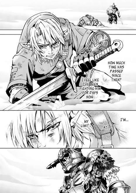
In the game, Link is cool, and a bit of a himbo, but the manga's take on him is so much more interesting. He's a brooding edge lord, with a damaged past. He's a do-gooder, but he's also flawed and suffers from caring too much. Link is a character full of regrets who constantly bounces between "become a hero to prevent the atrocities of the past coming back" and "give up so that you don't make things worse". I understand that the games leave Link as a blank slate so that players can fill in their own ideals, but seeing Link as a fully fleshed character with his own motivations is cool as hell.
The supporting cast is similarly fleshed out compared to the game's take. Zelda, Illia, and Midna have complex motivations and evolving personalities. Midna was already a great character, but the manga truly does not skip out on making her deep and interesting. The "Resistance", for those who've played the game, are all multilayered characters now, all with arcs that are actively explored as they actually go help Link on his adventures, instead of just telling him info and leaving him to it. The dungeons do not take nearly as much plot time as they do in the games, essentially minimal theme building and then boss, but this works better for the format in my opinion.

If you like high fantasy manga, or are just a Zelda fan, I highly recommend this series. I haven't finished reading it, but Book 9, which I think is the final in the series, has recently been released in English. Obviously playing the game first is a good background, but I think you could 100% enjoy the series without it.
Edit: Finished book 9 and there's definitely at least one more book to go.
Dr Stone (anime/manga)
Inagaki, Boichi; TMS Entertainment
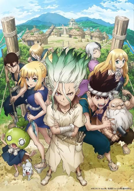
Ok so must I remember wrong because I thought I recommended this one, but apparently I never talked about Dr Stone before, which is a complete travesty. But now I am both up to date with the manga and most of a season deep into the anime, and I have A LOT to talk about.
As those who have also read my dinosaur blogposts will understand, I am a big science nerd. Biology, palaeontology, space, chemistry, it's all so interesting, and sometimes I struggle to understand how a passion for science is not a universal human experience. I share that in common with the main character of a manga I've been reading for maybe a year now, Dr Stone.

In Dr Stone, the world of 21st Century humanity is brought crashing to a halt when a bright wave of mysterious light blankets the entire planet, and everywhere on the entire globe, humans have been turned to stone. 3700 years later, a young man who has kept his mind active within the stone forces himself awake and breaks out. Around him, nature has reclaimed the Earth and millennia of human progress has been all but buried.

Senku is a young man of science, and spent years obsessing over every scientific domain he could comprehend in order to one day travel to space. In this stone world, armed with this wealth of science progress in his mind, Senku begins efforts to restart the scientific age, and free every single person frozen in stone. He starts with a mysterious acid that breaks down the stone. Then he develops tools, machinery, electricity, and eventually, he wants to push humanity back to the space age within his lifetime. Senku may be a know it all, but knowledge only gets you so far. Thanks to the allies he makes, a wealth of expertise will be harnessed to bring his dream to fruition.
Dr Stone is a must read for anyone who enjoys Scifi. Although the rate at which progress is made seems absurd, every single scientific process the kingdom of science works on is real science. Although post apocalyptic themes establish the base for the story and the supernatural force that turned humanity to stone is the main adversary, Dr Stone is a very scientific story based on real Earth and its just... exhilarating!

The scope of the story begins on the small scale in primitive villages, but the story eventually reaches a global scale. There are adversaries at each step, those who wish to rule the Stone World with might, free of the tyranny science had in our age, and there are also those who wish to use science as its own form of might, but Senku and his allies want to use science for the benefit of everyone. So that one day, all of humanity will be restored, and that eventually, he will get to moon.
I will refrain from speaking any further on story specifics because you really should experience the plot for yourself. So I will end with the presentation itself. The art and format of the manga are beautiful. Character designs are rugged, stylised, and exciting, it's very easy to determine what a character is all about just by their unique appearance.

In the last week, I have begun watching the anime, as it has been long enough since I started reading that I can experience parts of the plot anew. The anime is very beautifully made, the world is lush and beautiful, and characters move in such a fun and interesting way. I'm watching the English dub, and characters sound exactly like the voices I had for them in my head.
If you have even an inkling of interest in Dr Stone after reading what I've said today, you should definitely experience the story for yourself, 1 billion percent.
#blog#blogpost#media recommendations#anime recommendations#manga recommendation#the legend of zelda twilight princess#the legend of zelda#twilight princess#twilight princess manga#akira himekawa#dr stone#dr stone manga#dr stone anime#boichi#inagaki
29 notes
·
View notes
Text
How to gif without photoshop
Hello! By popular demand (of like 4 people) I am going to write out a tutorial of how I make gifs when I’m on my personal laptop and don’t have access to photoshop. There is another method I use with a different software that is a bit more complicated and if people are interested, I will make a tutorial of that method as well. I’ll do my best to keep this concise, so let’s get started.
Warning that this is VERY text and image heavy because I know how frustrating it can be when a tutorial feels like it’s skipping steps and I want this to be as clear as possible. Also please read this on desktop, tumblr mobile kills the quality of gifs inside text posts.
This is the video I will be giffing and here is the gif I will be making!

What you need:
A video to gif
For the best results, I recommend a video that is either 720p or 1080p (basically the higher the quality, the better). Videos with good lighting and bright colors also turn out the best. Unfortunately for me, I gif the TV show Prodigal Son a lot and that show has neither of those things, which is why my gif example is from that show; if you can make a scene with zero lighting or vibrancy look even somewhat decent, you can make anything else look good.
A video downloader or screen recorder
This is the video downloader I use and this is the screen recorder but basically any youtube video download website or screen recorder program works. Keep in mind that ezgif has a pretty low upload limit for videos, so if you want to gif something longer than like ~4 minutes, cut the video down to the specific parts you want first on a website like this one.
ezgif
A very straight forward website that anyone can access. You don’t need to download anything, it’s all online.
Bonus: Online Image Editor (not required, but I use this website to add text to gifs)
1. Making the gif:
Once you have a video downloaded, you go to ezgif.com and go to the section video to gif. Click choose a file, scroll to your downloaded video, and hit upload video. Your screen should look like this now.
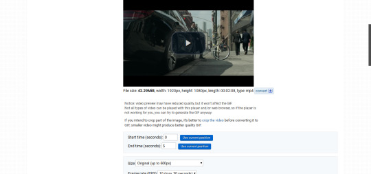
There are two ways to pull out the sections of the video you want to gif. You can either write in the start and end time in the little sections (you have to convert them to seconds: for example, if my gif started at 1:16 and ended at 1:20, it would be 76 seconds and 80 seconds respectively). Or you can do the method that I feel is easier, where you go to the section you want it to start on, hit pause, and hit the blue button that says “use current position” then let the video play until it hits your stopping point, hit pause again, and click on the second “use current position” button.

Once you have the start and end time recorded, scroll down to the next part of the screen with the size options. For size, select “540xAUTO (for Tumblr)” since tumblr gif sizes start at 540p and go down the more gifs are in a row. For frame rate, try to do either 20 or 25; the higher the frame rate, the smoother the gif will look. If you are trying to gif something in 540p that is longer, you might need to chose 10 to keep it under 5mb, which is the tumblr gif size limit. For method, leave it on FFMPEG. Then hit, convert to gif.

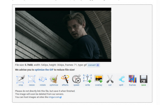
your gif will now look something like this!
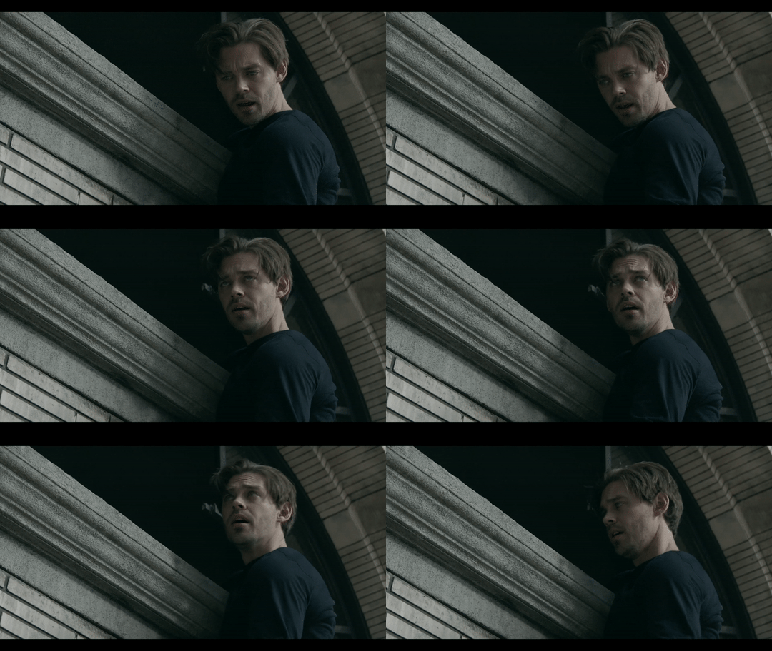
Now, this gif is currently 5.7mb, which is above the size limit for tumblr (5mb or above gifs will still play if I recall, but the quality will be really bad when you post them). If I was planning on keeping the gif this size, I would go back and change the frame rate to either 20 or 10 to get the size down. However, I am going to resize the gif to 268p, so I don’t need to worry about it being to big.
Using the correct gif size for tumblr is one of the easiest ways to make sure the gif looks good! For gifs that take up a whole row, the size should be 540p wide. For two gifs in one row, the size is 268p each. For three gifs in one row, the sizes are 177p, 178p, and 177p in that order. Here is a visual of it.
The next step would normally be resizing the gif, but Prodigal Son youtube videos come with a black banner on the top and bottom that I need to crop out. You will see a menu full of options under your gif, and you want to click on “crop.”
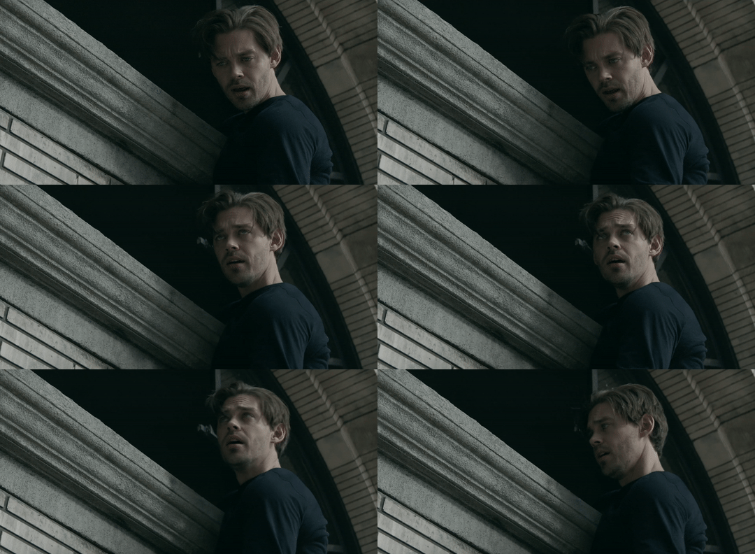
Cropping is pretty straight forward; you just move the little box over the part you want cropped, then hit the “crop image” button. Make sure width stays 540p!

Your gif now looks like this
Next, you look at the options under your gif again, and go to “resize.”
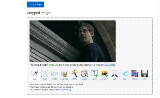
Again, resizing is pretty straight forward. I just put in 268 into the “width” section and leave the “height” section blank since the site will automatically resize the height. You can ignore the other menu options.

Your gif now looks like this

Next step is optional, but I usually do it. Once again, you go to the menu of options under your gif and select “speed.”

Speed is also super straight forward. I almost always reduce the speed of my gifs somewhere from 90% to 80% no matter what, just because I think it makes it look smoother. For gifs that are of short scenes that go really fast, I will reduce it to anywhere from 70% to 50%. You can try different speeds to test out what you think looks best. For this gif, I’m going to put it at 80%.

Here’s what we have so far. Congrats, you have made a gif!

Now for the fun part!
2. Coloring the gif
Go to the “effects” option, in the menu under your gif. You will see a LOT of options, but the panels I’m going to focus on are “colorize”, “brightness and contrast” and “color presets”. This section is going to vary a lot depending on what specific video you are giffing so remember to be flexible and try lots of different options out! It took me a while to get to a place where I can just eye a scene and know what settings to use. It’s super easy to go back and tweak a setting if the gif doesn’t look like how you want it the first time, but it’s a lot of trial and error.
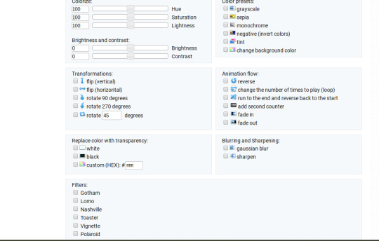
The main option I focus on in the “colorize” section, is “saturation.” This is what will make all the color in your gif pop out. The saturation I use varies a ton; for scenes that already are colorful/bright, I usually keep it around 120 to 150, since you don’t want it to be over saturated. If I’m making an edit that is supposed to look toned down or more grey/neutral tones, I’ll decreases the saturation in the range of like 90-40. For a show like Prodigal Son, where there is basically zero color vibrancy, I tend to go full out with saturation, usually in the 150-200 range. For this gif, I have it all the way up to 200.
Next is brightness and contrast. This also varies wildly, but a good rule of thumb is I always try to keep my contrast at least 5 points higher than whatever my brightness is, it just makes the lighting more even. You need to find a good balance; obviously, the darker the scene, the higher you want the brightness and contrast, but if you go too high, the gif with be staticy/grainy. For Prodigal Son, which has horrible lighting, my brightness is anywhere from 10-30 and my contrast is anywhere from 15-35. For this gif, my brightness is on the lower side since the scene is outside in natural light; brightness is 16, contrast is 26.

After you get those settings, I go over to “color presets” section and click on the “tint” option. It will pull up a color chart that looks like this
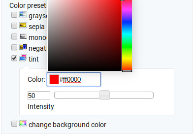
You ALWAYS want the intensity up to 100. This part is where the most trial and error occurs; there isn’t any one color option that works for every gif. The shade I use most often is light red/pink or light blue/light purple. For scenes that are lacking warm tones (which is almost all of Prodigal Son) I tend to go to the light reds, and for scenes that are lacking cool tones, I go to the light blues. The light reds are best for making characters skin tones look more...like actual skin tones and not totally washed out. To select a color, you just move your mouse around the chart. This is the range of color codes I tend to use.
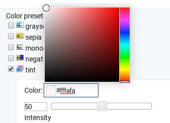
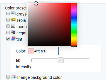
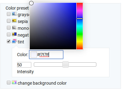
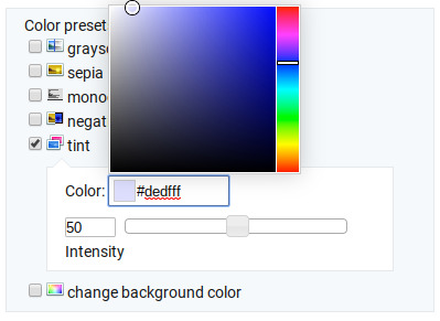
Again, intensity should be up to 100 (it automatically starts at 50 and I was too lazy to move it while getting screen shots :P).
For this gif, I actually used a new technique I’ve been trying out where I start with a light blue tint to even out the color tones, then once that gif is done, I go back to effects and add a layer of pink to make the colors brighter. Usually, one color works fine, but sometimes it’s hard to find a good balance (the red colors can get too red and the blue sometimes brings out too much of a yellow shade). For now, I have my color tint set at #eeebff.
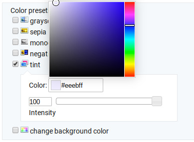
Ultimately, this is what my effect settings look like and this is what the gif looks like now.
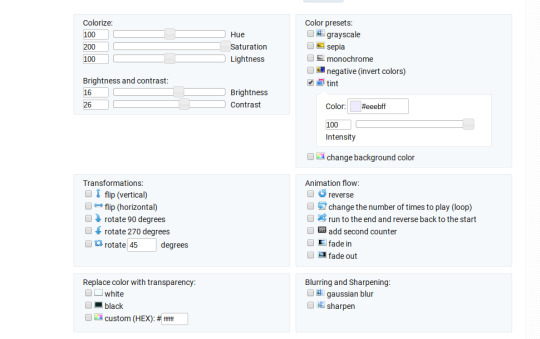

Now, like I said before, I added another layer of tint to this gif. All you have to do is go to the menu under your gif, and click on effects again.
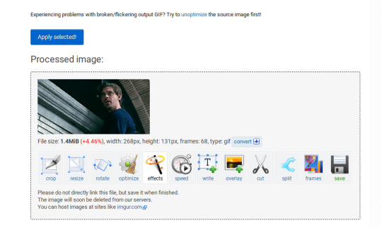
It will take you back to the panel you were just on, expect now your colored gif is on the top and all the settings are blank again. The only setting you need to use now is the tint option; go there, and select a light red shade. I used #fff0f0.

And here is the final gif! To save it, just right click and hit “save image as.”

I know it seems like a long process, but once you get a hang of it, it goes by super fast, especially if all your gifs are coming from the same video.
BONUS: Adding text
If you are trying to gif something with dialogue or you want a quote to put over your gif, you will want to put text over it. ezgif has a “text” option that you can use if you want, but I personally don’t really like their font options, so I use the website Online Image Editor.

This is what it looks like. You can either hit “upload an image” and upload your saved gif, or you can go back to ezgif, right click the gif, hit “copy image url” and paste that url into the “upload from url” option. The web page should now look like this.
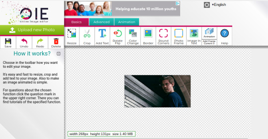
It’s pretty straight forward from here; click on the “add text” button and a menu will appear on the left hand with options for the text.
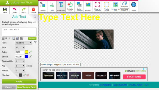
Type whatever you want the caption to be in the “type text here” box. This website has a ton of font options you can play around with, but when I just want to caption a gif, I stick with “Arial Bold Italic.” For a 268p gif, the font size should be 10-12, depending on how much writing you plan to put on each gif (if some gifs are going to have more writing than others, pick a smaller font size so it stays consistent!) When I make a 540p, the font goes up to 14-16. I use white for the color and black for the stroke. I make the strokewith 3 because it makes the caption stand out more. Once all these settings are selected, hit the “preview” button under the text box.
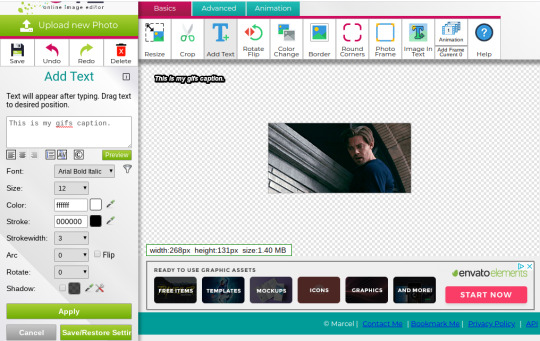
You can now drag your text anywhere you want on the image! The only bad thing about this website is that it doesn’t automatically center text, so you either have to eyeball it, or if you’re picky, like me, open up one of those online ruler applications and use it to measure out the center. For captions, I move the text just slightly above the bottom of the gif.
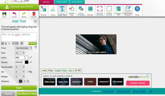
Finally, you hit apply. Once your gif has the text on it, all you have to do to save it is right click it and hit “save image as.” And here is the finished project!
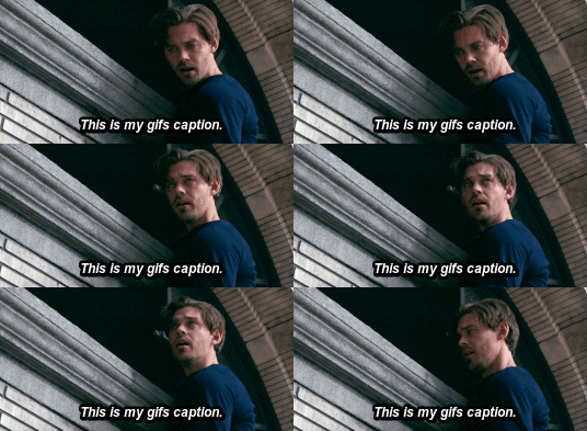
That got a lot longer than I thought it would, but I hope it was informative! If anything was unclear or if you have further questions, feel free to send me an ask. Thank you for reading.
#gif tutorial#giffing tutorial#giffing#gifmaking#mine#my gifs#long post#I hope this makes sense lol#pls rb if it helped!!!#also if mobile doesn't keep the read more...idek
351 notes
·
View notes
Note
Happy birthday Myx! 🥳🎂 Have Several questions because I Want To Know Things. ^^; Illness & Injury 6 for everyone, Whump 2 & 3 for everyone, and Writer's 2, 13, 19, and 46 for you!
thank you Mel! ♡ and oh my gosh I’m so delighted by this abundance of questions!
6. What is their go-to remedy for an upset stomach?
Kara and Bramley both like some warmth on unhappy tummy. They’ll make themselves tea, more for the warmth than anything else, and sip it while taking it easy. Kara is likely to get herself a little warm pack too if she can.
Malia tends to go straight for medicine or a tonic. She doesn’t like to be slowed down by her body, and so will opt for whatever she thinks will be most effective in the shortest amount of time.
Si, being a song-mage, was once surrounded by fellow song-mage friends they could ask to cast a stomach-settling healing spell on them. With that option off the table, they'll also look for a fast-acting medicine or tonic.
Grayson and Elliott both try to ignore an upset stomach for a little while in the hopes that it’ll settle. When that fails, Grayson will go get himself a tonic and complain to his friends until it kicks in, while Elliott will either try sitting quietly and sipping on water or tea, or if he can get away, just sleeping it off.
Ryder is knowledgeable enough to take a different approach depending on how upset his stomach is. For something minor, he’ll make himself a digestion-easing tea, like mint or chamomile. If he knows that won’t be effective, he’ll go straight to a tonic. When it’s something he’s eaten that’s not agreeing with him, sometimes he’ll just go make himself throw up to get it out of his system.
2. What is their pain tolerance? Do they close their eyes and block it out, or go into a full blown panic?
Grayson really hates tolerating pain, but if he has to, he can take a lot. Most of the time, he will remove himself from painful situations as quickly as possible and complain bitterly about anything that hurts. But if the chips were down, he would turn out to be a lot tougher than anyone expected.
Bramley is a Sweet Baby and We Do Not Harm Him is not really used to enduring pain and has a low tolerance for it. He would close his eyes and block it out rather than panicking, but not really be able to do anything except sit there and block pain until he was Helped. c’:
Kara is Pure Sunshine and We Do Not Harm Her Either has a pretty high tolerance for acute pain and doesn’t panic about injuries, but she has been known to get faint from them. She’s also easily worn down by chronic discomfort, like being too hot or cold or just having a constant dull ache of some kind.
Malia is the opposite. She can put up with low-key pain or discomfort for a long time, but an acute injury would freak her out a lot more than she’d like to admit.
Ryder has a high pain tolerance on all fronts, honestly. As soon as he feels pain, he looks for a solution to ease it, and if there are none to be had, he’ll grit his teeth and block it out.
Meanwhile, poor dear Si is not great with pain. Song-mages are primarily healers, and so Si is really used to having even little hurts soothed quickly and easily. They don’t panic when in pain, but they do get extremely miserable.
Elliott has a very high pain tolerance when the pain feels within his control; he can power through even the worst headaches or stomachaches, for example. But as soon as the pain feels out of his control (i.e. he gets injured), he panics.
3. How long do they typically take to recover from illness or injury compared to average?
Ryder and Kara, by virtue of Robustness and Being Sensible People who largely take care of themselves when under the weather, are quick to recover.
Grayson and Malia both heal quickly from injuries, but take a little longer with illnesses. With Grayson, it’s more a matter of him not being back to himself until his symptoms are completely gone (he is very much a Man Flu type of guy.) Meanwhile Malia will treat an injury with appropriate care, but is likely to push herself back to full capacity before she’s fully better from an illness, leading to a slower recovery.
As big and strong as Bramley is, he’s actually a little more delicate immune system-wise. He tends to be a slow recoverer, even though he’s good about looking after himself when sick or hurt.
Elliott and Si also tend to have slow and uneven recoveries, but in their cases, it’s due to hooliganery. Si takes good care of themself during the uncomfortable phase of their illness or injury, but as soon as they feel 90% better, they’re eager to leap back into life with their usual zeal. That’s not always a great idea and can lead to them prolonging whatever is afflicting them. Elliott, on the other hand, is just a stubborn idiot who doesn’t take care of himself. He’s particularly bad about this with injuries, often aggravating them and even making them worse because he won’t give them the rest they need to heal.
2. Are you a pantser or plotter?
Usually I lean more towards plotting, although I do leave a lot of room for the new directions and ideas I know I’ll discover during the process of writing itself. But Ginger and Mint is the big exception -- I started writing it with zero plan whatsoever. I do have an outline for it now, but I was probably eight or nine chapters in before I made it.
While the final product is definitely not as a polished as it would’ve been if I’d planned it from the start, it was honestly super refreshing to not worry and just write. I’ve been trying to bring a little of that experience over into my more serious writing -- it’s so easy to get caught up in plotting and forget to leave room for writing itself to be a generative process.
13. Describe your writing process from idea to polished
Have idea. Whee!
“Mark out” the things I want to happen in the story or chapter:
I usually do this by writing out short snippets of prose or dialogue related to the ideas I’ve had about each moment. For example, let’s say I know I want a moment where Grayson talks to Ryder. I’d type up a couple lines of dialogue and/or maybe a line about Grayson encountering Ryder and noting what he’s doing or how he’s looking -- whatever’s relevant to the scene. Basically, whatever ideas I have about that scene will be represented in writing in the “mark.”
I have all these marks ordered in the document in the same way the scenes will eventually be chronologically ordered. For me, having visual space is important for my ability to think, so I hit the enter key enough times between the marks that I can see only blank space when I want to work with a certain moment.
Build out each mark until I have a full scene. I do try to go roughly start to finish, but definitely jump back and forth depending on what I’m feeling most inspired by or what my brain seems to be spitting up ideas about. I also skip ahead whenever I feel stuck, which is both a blessing and a curse.
Go back and string the scenes together. Add transitions, fill in any missing pieces, etc.
Re-read the full thing from start to finish and make final edits. Yay, done!
19. How do you keep yourself motivated?
goooood question fam
I struggle with this as much as the next person (see: 2.5 year G&M hiatus). I haven’t discovered a foolproof method of motivation yet (pls advise if you have), but I do tend to feel inspired whenever something reminds me why I want to write this story. That could be thinking about a scene I’m really excited to share, re-reading a scene that reminds me why I enjoy portraying a certain character or environment -- anything along those lines.
46. Do you reread your own stories?
Yes, the ones that I like! Some things I’m not particularly proud of and don’t go back to very often, but re-reading pieces of writing I do like helps me feel motivated, inspired, and confident.
#thank you so much these were so FUN#asks#gnm asks#lessthanconventional#nausea#just the briefest mention
4 notes
·
View notes
Photo
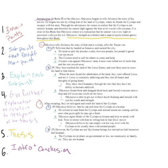
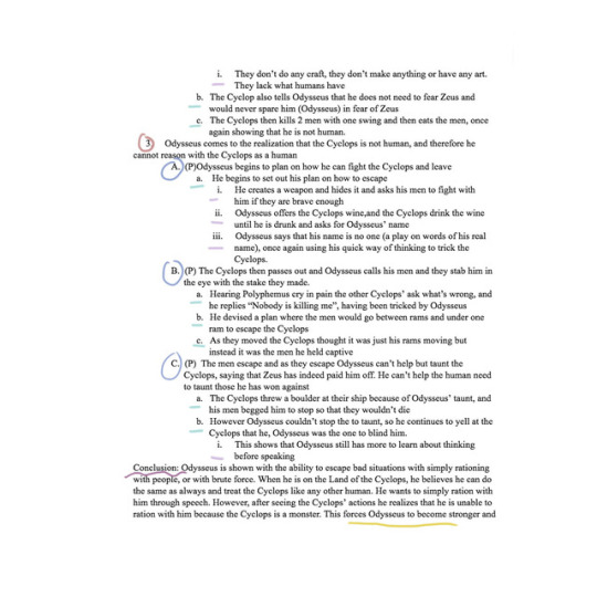
How To Write a University-Level Essay in 9 Steps
I use this every time I write an essay! It helps me a lot, and since I started using it I haven’t gotten lower than an A on any of my papers! (minus one lol)
First things first, every prof and every teacher expects a different thing. The essay I’m using as an example is from my first year class and was around 1600 words — so not very long. It’s also not a research essay. The prof called it an exegetical essay, but don’t get it mixed up with Bible Exegesis. We studied the Odyssey and the Iliad for the semester and had to write on them and explain them. Despite this! The form of an outline will help literally every kind of essay.
SO this isn’t exactly a how-to-write-an-essay post, but instead its more like how to make sure your essay is bomb as fuck. My first year prof forced us to do an outline for all of our essays (yes forced, we automatically failed if we didn’t hand it in along with our essays). At first it was annoying, I’m not going to lie, but once you get used to it, this sort of outline literally saves your life. What I like to do is make sure it’s detailed enough that all I need to do is erase all the spaces between the points, and explain my ideas a little bit more. To give an idea of how much I actually write after this, this outline is 900 words, and my final essay was 1600. It makes writing your essay go by a LOT faster, and makes sure you can easily see all your points laid out in front of you.
1. Find out what your topic is and what you want your thesis to generally be. I never write my thesis out right away, because when I write outlines I tend to change my mind on things a lot as I discover new topics. So I start out general and get more detailed later on.
2. Write out your main points. In this essay I was explaining how Odysseus’ encounter with the Cyclops was the first step in a many step process to make him a stronger and more intelligent man so that he would be able to fight off the suiters when he arrived in Ithaca. Each of my main points is the part in the book that has to do with this idea. My main points are: Odysseus tells Alcinous the story of him and a cyclops, after the Trojan war. // After escaping, they set sail again and reach the land of the Cyclops // Odysseus comes to the realization that the Cyclops is not human, and therefore he cannot reason with the Cyclops as a human. At first glance none of these points have Anything to do with my thesis, but I chose parts in the book that show Odysseus’ growth. I go on to explain my ideas within each of the points. Another thing to help you is to make sure each of these can read like a sentence. So you should be able to read Point 1 2 and 3 consecutively and have it flow well. It will help you when you write your good copy.
3. Once you have your main points, create what I call “sub-points” in each of the main points. The number varies, as you can see in my example, but use as many as you need to make your point clear.When I was writing essays about Homer I usually stuck to explaining Odysseus’ actions, or the actions of other characters in this section. This year when I was writing philosophy papers I used this part to fully explain each of the ideas in my own words. Also you may be noticing a (P) beside some of the points, this is what I’ve sectioned off to be a paragraph. As you may notice the “main point” doesn’t have a P beside it; it is its own paragraph, but I use those as transition paragraphs to help my paper flow and to show the reader what I’m going to be talking about. It’s a grounding point. I usually opted for shorter paragraphs when writing about Homer because I broke things up by event; when writing philosophy papers my paragraphs are usually much longer. These points should tie back into your main idea for you paper. Each point should tie back into the one above it to create a nice flow, this will help orientate your reader but also make it a lot easier for you to write.
4.Now is the time to explain each sub point. Explain why the point was important enough to be in your paper; I often chose to explain how it changed Odysseus’ actions or actions that he chose to do. I usually use this section as an opportunity to clarify my points and to look back at the section I’ve put the sub-point in to make sure it fits. It around this time that I switch things around
5. Give any further explanation you may need. Sometimes I find that I need to explain things just a little bit more. Or if I’m not 100% sure on my point yet, I use this section to write down my explanation rather than waiting to write it when I write my good copy.
6.After this I write my thesis out. I know this may seem like a late point in the essay to write a thesis, but like I said I find waiting helps me really settle down with what I want to get across. I tend to have a hard time finding my thesis before I’ve written out all my points
7.Then I write my Introduction and Conclusion. I don’t write these in the broken down way that I do for the rest of my essay. I write them in full to help ground myself
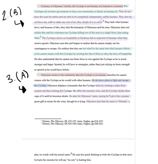
8. Finally, I delete all of the points and spaces to create a solid paragraph. I do it point by point to make sure each sentence is a complete sentence, and then make sure I add on any explanation or detail that may be missing. Once thats done I usually have a solid essay with just some missing “gaps”. I.e. I need to further explain my point. So I go in and fill in the gaps, add my explanations to tie it back into the thesis completely, and then I move onto the next paragraph. The third picture shows my sentences in my actual essay that I directly pulled from my outline (highlighted to match the outline), while the sentences that aren’t highlighted were the sentences written to fill in the gaps.
9. Once that’s all done I send my essay to a friend and we face time while she edits mine. She reads it out loud to me and we stop when something sounds funny (and then we switch and I do the same for her). I high recommend peer-editing and making sure you read it out loud! Its how I catch 90% of my mistakes.
And that’s it! Keep in mind that you should be gathering quotes, sources, or whatever BEFORE you write your outline, and it helps A LOT if you write in the sources in your outline so that you know where to put it in your essay!
#studyblr#essay tips#study tips#classics studyblr#essay#how to write an essay#university essay#college essay#mine
2K notes
·
View notes
Text
FEATURE: Happy 10th Anniversary To Every Anime Opening Ever Made (The Video)
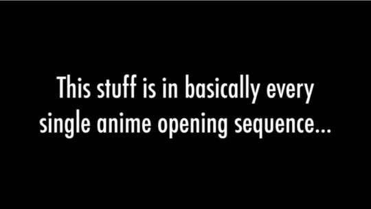
I don't remember where I was at when I first watched "Supercut - Every Anime Opening Ever Made," but I do remember the inescapable truth it showed me after I watched it. Maybe I was on Gaia Online or some other forum when someone posted the link and asked "have you seen this?" I started the video and saw the seagulls flying in the sky. Then the white text on a black background showed up, saying that the following was in every single anime opening sequence...

The montage began! Cameras heading towards the sun! Going right into the character's eyes! The running! This dude was right: This stuff IS in every anime opening!
youtube
This Youtube supercut turns ten years old today, and if you were in the anime fandom around 2010 you had probably seen this video at some point. Now with 3 Million views, I think the reason it resonated with so many people is that for as much anime we watched, we probably noticed these trends but didn't make the full connection until it was fully presented in front of us. Regardless of genre or tone, there was this underlying connective tissue across dozens of shows that we may or may not have seen before. And shown in such a slick and edited fashion provided a connection across the shows we love. While videos like this are likely uploaded onto Youtube now more than I can imagine (maybe even right now as I write this!), this supercut was the original, back in a time when fandom was certainly a lot smaller and growing. Even though Youtube was becoming more of a hub for anime content (as we were slowly getting out of the Bleach-episode-split-into-three-parts era), fandom was more split in the sense that everyone had their own particular hub or forum they claimed home. There was no AniTwitter or Youtube Community tab to trudge around and find out what wider fandom was talking about. And yet, everyone seemed to have come around and appreciated this, a small stepping stone to what the community would end up becoming today. I was just going to celebrate this little piece of fandom fun with an article going down memory lane, but I decided to try to reach out to Derek Lieu, the original creator of the video, to see if he had anything to add for this retrospective. And luckily he got back to me really quickly! Can you first introduce yourself and what you do? My name is Derek Lieu, I currently live in Brooklyn NY and I make video game trailers! I’ve worked on trailers for Firewatch, Subnautica, Spelunky 2, Ooblets, Dead Cells, Half-Life: Alyx, and a lot more. How did you get the idea to make the "Every Anime Opening Ever Made" video? When I learned the American X-Men animated series from the 90s had alternate opening sequences made for when it aired in Japan I became fascinated by what made those openings so distinctly Japanese. I don’t remember my precise thought process, but I started downloading textless versions of anime openings from YouTube to start, and started sorting the footage. I think the one exception I made was for Neon Genesis Evangelion because I couldn’t not include it. About how long do you think it took to edit? Believe it or not the whole project took about an afternoon and maybe part of the evening. Downloading all the openings took longer than the actual editing. After downloading them I sorted the different tropes into categories like I normally do when editing stuff. Once the footage was sorted I barely moved anything around except to adjust for music sync and also where each chunk of tropes fit into the video. I used a specific Ayumi Hamasaki song which was used for the cel-shaded Molly Star Racer trailer (which much later became Oban Star Racers). The original remix song is much longer so I edited it down to about 3.5 minutes.
youtube
Is there anything in particular that stood out to you when you were making it? (Outside of so many shows using the same shots, obviously haha) I think the main thing that occurred to me is that so many of these tropes are just great ways to create cool moving images using as little animation as possible, but which still feel dynamic and fun to watch. One interesting bit of trivia is Trigun is one of the few series whose opening is footage from episodes cut together. This was by far the exception to the rule. I remember this video very fondly back in the earlier Youtube days, and it has 3 Million views as to date. Did you ever expect it to be that successful? Haha, not in the slightest. It seems the videos I give the least amount of thought always get the most number of views and the ones I spend a lot of time get the fewest. What do you think is your favorite and least favorite "trope" in the original video? I like the head turns. I didn’t even give attention to that one when I started the project, but it very quickly revealed itself as one of the most common ones. I don’t think I have a least favorite; they’re all fun to watch. One of the funniest is a person reaching their hand out to someone on the ground; I like this one because it’s so incredibly specific.
youtube
Do you still watch any anime? And if you do, do you see any of those same shots/frames/movements in particular still being used today? I don’t currently watch any anime, but I assume a lot of openings still use a lot of these tropes. Because they cover everything from standing still to running. I later made a video for unique anime openings because there are some which have really great stylized art and interesting images. I also made one for classic anime from the 80s and earlier which helped me see where a lot of the tropes originates. Do you have any other thoughts on the video looking back on it ten years later? Reading comments from people who watched it as a kid and now are rewatching it as adults makes me feel old, haha. Also, people keep telling me I “forgot” an anime. I once tallied all the anime people say I excluded and the list was far far longer than the number of anime in my video. Also, a lot of people mention anime which released after the video was made :P One bit of trivia, I didn’t include any Naruto because at the time I thought it would’ve been funny to exclude the most popular anime at the time. Sorry, Naruto fans. We'd like to thank Derek Lieu for not only making the video, but also for taking the time to speak to us. You can find him on Twitter and Youtube.

Kyle Cardine is an Editor for Crunchyroll. You can find his Twitter here.
2 notes
·
View notes
Text
“OH, DROKK THIS!”
Anyone that knows me will be aware of my love for 2000AD, a sci-fi anthology comic that’s been going for longer than I have been on this earth. Since its inception in 1977, 2000AD has featured thousands of stories, giving birth to some of the greatest comic characters of all time.
One of which is, Judge Joseph Dredd, a hard-hearted, law enforcement officer in a far flung American future. Judge Dredd featured a cynical new world, where cops (Judges) could execute on the spot and throw people in the slammer for the pettiest of crimes.
Mega City One, is a mass of ‘Blocs’, entire towns condensed into gigantic, rocket-shaped apartment buildings, usually named after minor British celebrities (There is a ‘Sue Perkins Bloc’ for example) or politicians. This world saw humans, mutants and droids live side-by-side, mostly at odds with each other, or the various (sometimes surreal) criminal elements that threatened an already shaky and paranoid city.
Judge Dredd is not a hero, not in the conventional sense. He is a mostly cold, blank slate of a man whose sole purpose is to uphold the law and literally nothing else.
Dredd has killed MILLIONS of people in the years he has been active. In one story, Dredd dropped a nuclear weapon on Russia, ending a war but killing millions of innocent people in the process. He is a machine of little sympathy and patience. Dredd is so infused with the law, and the upholding thereof, that he NEVER TAKES HIS HELMET OFF (Please, remember this) and he literally has no time for friendships or human things like emotion. Judges are sworn to not have romantic relationships and Dredd is above all of that. He doesn’t even think about it. Love is for creeps.
In the comics, Dredd may as well be a robot, or a Robocop. (Dredd inspired that classic film) but, unlike Alex Murphy, Joe Dredd has no family (Well, not in the conventional sense but we’ll get to that in a wee while)
Basically, Judge Dredd is awesome. I advise you to dig out the books and throw yourself into a world I’ve been enjoying since I was 8. Also, check out the 2012 film adaption called ‘Dredd’ because it NAILS the comic, the world and the character (with loads of cool references for longtime fans). It also features Judge Anderson, my absolute favourite female comic book character. 2000AD has, for the most part, featured strong female characters and the Dredd universe is no exception.
1995 then. ‘Stallone IS Dredd’
Sly Stallone. Is. Dredd. Judge Dredd. A unfeeling, facially unknown, killer for the law. A character to be booed as well as cheered.
I was 15 when Judge Dredd came out. I was pretty excited. Didn’t last.
In less than ten minutes in, Judge Dredd takes his helmet off and by the end, he’s smooching Judge Hershey.
I get why fans get annoyed when films mess up their characters. Sometimes, it’s a little off kilter. I care not for changing the race of a character. Who cares as long as they embody that person? I would have taken a non-white Dredd. All the actor had to do was live by the code of the character, to be best representation of the man on the big screen. (Yes, Dredd has to be male. It kind of doesn’t work if he isn’t)
Stallone was not that man. The only thing that made him remotely qualified to be Dredd was that they both have distinguishable chins.
Judge Dredd: The Movie was a cynical cash grab for a character that was kind of niche. Dredd wasn’t huge in America, even when he fought Batman. He was cult, through and through. It was a film that needed to be made by people that KNEW the material, that honoured the little/big things. Karl Urban, who played ‘The One True Dredd’ was a fan of the character and you can tell he was having a blast bringing him to life. When you watch Sly, you can see that one eye is on the scene, and the other is on the sack of money in the corner.
The film, to delve into the travesty, is mostly harmless to those that just want to watch Sly wobble about like he does. For fans (I’d go as far to say that I’m a ‘super fan’, I’ve paid my dues) it’s like watching a shit cover of a great song on ‘X-Factor’. It’s soulless, lifeless and so lazy. No one wins in this, even 2000AD who, after it came out, could barely hide their dislike for it.
It takes an old story and adds a few things to it. To give the film one single positive point, it looks the business. Chris Cunningham did a great job of the special effects, The Angel Gang and Hammerstein look awesome. THERE was the love and passion, all around people that couldn’t care less.
Judge Dredd: 1995 Edition worst crime is that it’s boring. It’s really, really boring. It tries to be funny, even drafting in Deuce Bigelow in as ‘comic relief’, again playing a character that’s completely different to the original material. Judge Anderson isn’t in it, which is a blessing. They would have probably re-imagined this cool, smart and female hero into a ditzy, blonde bimbo who keeps going all ga-ga over Rambo.
They would have cast Pamela Anderson, wouldn’t they?
Diane Lane is in there, playing an equally iconic female character, Judge Hershey. She does, indeed, go ga-ga over Rambo and they have a kiss at the end. No real reason why. It doesn’t even make sense in the film and in the comic, they would never do that for about a million reasons.
While they do use the famous ‘I AM THE LAW’ catchphrase, they also give the helmet-free, happy-go-lucky Dredd a new motto. In the film, he keeps saying “I knew you’d say that”, which is like something a sales manager would say, not an action hero. They really try to ram it home during the film. I bet Sly thought it was great, probably because when he says “Law” it sounds like he’s about to shit himself.
When Armand Assante (playing Dredd’s ‘brother’ Rico) says ‘LAAAAAAAAAAAW’ to mock Dredd, it sounds like he’s reached a climax. Maybe he was channelling hopeless directer Danny Cannon who was hoping that this shit show would be that years ‘The Fifth Element’ (The film seems to take more cues from that movie than it does the comics)
Films are just fluff though, aren’t they? It’s kind of pointless to get all wound up about what is ultimately fleeting. I feel bad for feeling anything towards it. It’s probably the last time I was ‘angry’ at a film. Although, that being said, I saw ‘Batman Forever’ not long after and watched another favourite character be reduced to a dancing bear. Embarrassingly, I came out and, annoyed about a two-punch combo of crappy comic movies, I booted a cardboard cutout of ‘Batman Forever’ and declared, overly loudly, that I would never go to the cinema again. I did, about a year later but by then I was getting into indie-films and just wanted to watch people talking for 90 minutes.
Judge Dredd is a bad film, whether you love the source material or not. I’m more annoyed at it for tarnishing the later, superior Dredd film. A sequel and a series is so long overdue and it bothers me that the best representation of Judge Dredd and his universe is ‘I knew you’d say that’
As a little caveat, I did manage to get a measure of ‘revenge’ (probably too strong a word but there you go) with regards to JD 1995, In 2006, I ended up working on a film (didn’t come out) with a producer that knew Danny ‘Judge Dredd’ Cannon. He had actually tried to get his friend involved, giving him a copy of the film I wrote. In one of my many, many phone calls from sunny L.A to shady Quarry Bank, I was picked up on an exchange within in the film, where the two main characters, briefly take about Judge Dredd being terrible. There was a line (I won’t repeat it here) that, apparently, Danny Cannon was very offended by and I was asked to remove it. I was 26 at the time, sat on the stairs of my shared house, and it felt like a one in the eye for Hollywood. I am the law, thank you very much.
1 note
·
View note
Text
Another Gif Tutorial
No one asked for this, but I thought I’d make another gif tutorial on how I do my gifs now. I’ve changed the process over the last two months. Granted, the other is still useful as well.
This will end up being long so everything will be under the cut!
Previously, I used AviSynth. And while I like AviSynth, and there’s nothing wrong with it I recently decided to try out VapourSynth. It was recommended to me by a few other gif makers in a chat with. For reference, the other one, here.
Why do I use VapourSynth?
Easier to find the exact time stamp that you want/need. It also reduces the loss of quality when importing the frames into photoshop. You can also use Avisynth to crop the gif that you need, but I often just crop in photoshop for personal preference on how I edit my gifs.
However, here is a link on how to install on Windows. The video is at the top on how to install it. It can be complicated, but it’s soooo worth it! If you need any help, feel free to ask me!
Drag your video to VapourScript (I put mine on the desktop like in the video)
This CMD prompt will open.

From there, you will add in the start of the time stamp. So I did 00:00:09 (i want it to start at 9 seconds.
The next is encoding duration, which just means how many seconds of it do you want. I normally just always use 00:00:03 (this gives me 90 frames). Just hit enter next.
Just like AviSnyth, another window will pop up in your browser so you can see the settings you want. For this, I only use the denoise filter KNLM.
Settings for KNLM: 0, 6, 4, 1.9 (you can play around with these if you’d like.
I also use 30fps fast, but you don’t have too. It’s what you like and how you want your timing to be.
Once it cropped the time stamp, another pop was open, right? The VaporSynth Editor. This is where it can get a bit tricky.
The video goes into detail on where to copy and paste the code from the resizer, but it also allows you to trim the frames you want, but I don’t want to go through that. So I’ll just put the # sign there to cancel that out. Just like below.
So you see here the trim is grayed out, it just means I won’t use that feature of it.
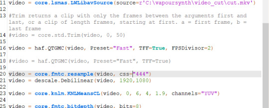
Normally you’ll see this :
video = core.fmtc.resample(video, css="444")
video = descale.Debilinear(video, 630,354)
Instead of:
video = core.fmtc.resample(video, css="444")
video = descale.Debilinear(video, 1920,1080)
I personally like to change it to the original size of the video so when you crop it, it doesn’t come out stretched or weird looking when you use 630,354.
You’ll also see where I used:
video = haf.QTGMC(video, Preset="Fast", TFF=True, FPSDivisor=2)
This is just the present for 30fps fast. That’s optional.
From here once your settings look good, you go to file save script and then script encode video.
Where it says header change it to Y4M (always).
Hit start, and let it do its thing. Then after it's finished you can close it. Sometimes it can take a minute or two once you change the size of the video.
Photoshop
If you haven’t already cut your gif in another program, then you can use photoshop to crop. I, however, recommend that you do. I started using Avisynth maybe a month ago, and it’s the best thing ever. I won’t force that on you, get comfortable with photoshop first if you’re new to PS.
Importing and Resizing
Import video into photoshop (file > import > video frames to layers)
Use these settings
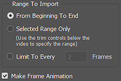
Using the sliders, select the part that you want with the sliders to the left and the right.

Once it’s all open in photoshop, you will need to make sure you have timeline open. window > timeline.
If you used VapourSynth, and have cropped to the frames that you want. Then all you need to do is crop the gif.
So you’ll just go to import > video frames to layers > windows > vapoursynth > output > select output.move
NOTE: IF YOU USE PS CS6 for some reason it doesn’t open MOV files. My mutual found a way to work, so I’ll have to ask her if it’s alright to direct her to you to see how she got it to work.
When I crop my gif to the correct size for Tumblr to keep it under 3MB.
Go in with the rectangular marquee tool. With sizes below:
268 x 360 - 400
268 x 200
540 x 280
Position it to the place that you want. Then go to image > crop.
Once it’s cropped, you will then go to image > image size.
I normally set it to bicubic (smooth gradients).
Also always lock in the width & height.
Here is tumblr’s sizing.
Delete any unwanted frames you don’t want.
Sharpening
I use a varies of settings when sharpening and clearing my gifs how I like.
Select all your frames, and then at the bottom of that timeline window click the convert to video timeline.
Select all your layers, and then convert to smart filters. (filter > convert to smart object)

I no longer use topaz settings. It takes entirely too long, and I’m lazy. So now to get my gifs smooth looking I use gaussian blur and smart sharpen only.
So the steps I take are:
Duplicate your smart filter
On the bottom filter, I use smart sharpen
I normally keep it at 500 / 0.2 or 500 / 0.3.
Copied smart filter:
Filter > Gaussian Blur > I usually use between 1.0-1.6 just depends.
You can lower the opacity of the gaussian blur like below:
Double click the one next to the gaussian blur I usually lower it between 50 to 80% just depends on the look I’m going for.
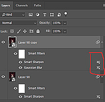
Filter > Smart Sharpen > 500 / 0.3 (a second time)
Convert frames > flatten frames into clips.
Click the bottom button again to convert video to timeline (using that same button as before).
Then delete the first two layers. It’s the one that says layer, the others will say frame.
Once it’s deleted, go to the timeline option button. It’s located at the top right corner of the timeline.
Select the option to make frames from layers.
Coloring + Timing + Saving
To avoid this being longer than it is, I’ll link the original tutorial on coloring, timing, and saving gifs, here.

14 notes
·
View notes
Text
Seven Years of Writing Fanfics
I’m being a little premature- I’ll celebrate seven years of writing as ahiddenpath in September- but I’ve been thinking a lot lately about what I’ve learned. Please read on if you want to hear about the writing habits I wish I had when I started in 2012, and about the habits I wish I didn’t have back then!
I’ll also be talking about my writing plans in general. Check it out below the cut!
1.) Make a story bible.
A story bible is a reference document for your story. Before you post a new fic, I strongly suggest creating one. For digimon specifically, this means making some choices before you begin:
Which version of the character names will you use? Do you intend to remain consistent with this choice? For example, I’ve seen a lot of writers use Japanese character names and English digimon names. Will you use official honorifics? Custom honorifics? Will you use terminology from one translation of the show, or a mashup?
Make these choices upfront, create reference charts, and remain consistent.
After that, you can also keep references for topics such as characterization details (if you say that Bob’s favorite drink is coffee in one chapter and tea twenty chapters later, be prepared for a flood of comments pointing out the inconsistency), setting details, and anything that you don’t want to forget. Spending half an hour hunting down a silly detail instead of writing is a huge bummer.
Growing Up with You is my worst offender of ‘problems a story bible would have fixed.’ It’s got... every issue you can imagine, lol! For example, pairing Hikari with Gatomon (instead of Tailmon), using ‘digitama’ and ‘digimental’ interchangeably in the 02 arc, using the English terms for evolution stages while using Japanese names for other things, confusing Bakemon and Bakumon, it’s a mess. It’s so bad that a complete, painstaking edit is the only thing that can fix it... Which is enough to make me weep, given that the story is over 400K words long.
Organize yourself before you start. Here’s a link to some printable Digimon Adventure and Digimon Adventure 02 references.
2.) Avoid Longfics.
I know I’ve said this before, but it bears repeating. NEVER PUBLISH A NEW STORY WITHOUT HAVING AN ENDING IN SIGHT FROM THE BEGINNING.
I’m not saying you can’t write huge, epic tales. God knows I’m unlikely to stop doing that. But, if I could go back in time, I would separate Growing Up with You into four fics. It would be something like this:
Growing Up with You I: Childhood
Growing Up with You II: Digimon Adventure
Growing Up with You III: Liminal Space
Growing Up with You IV: Digimon Adventure 02
I’m sure some arcs would be longer than others, but this way, I’d have four stories that are roughly 100K words long.
A lot of folks just... don’t want to read a 400K story. It’s intimidating, man! Although it varies by genre, the average word count for a fiction novel aimed at adults is 80K words. That 400K fic is like FIVE NOVELS, DUDE!!!! That’s a commitment for readers!
Shorter stories are more reader friendly, but there’s also a huge benefit to you, the writer. Separating your longfic into multiple stories allows you more opportunities to write towards an ending. Breaking your story into digestible chunks decreases the writing paralysis that comes with being nowhere near the ending. It also cuts back on meandering chapters that don’t carry the narrative closer to that ending. Furthermore, thinking of the story in arcs before you start writing forces you to plan more... Something I never did in 2012!!!!
Best of all, once you reach the end of an arc, you can take a break before launching the next one. It’s hard on a writer to continue endlessly producing without a break. It’s hard on a reader to hit the final available chapter in a fic and wonder if it will ever update again. But if you complete an arc and take a break to plan and write a few buffer chapters, the tension and impatience is gone for your audience, and you get to breathe. It’s a win-win!
3.) Avoid long chapters.
Back in 2012, I often posted chapters that were 10K words and longer! Here are some benefits to posting shorter updates more frequently:
-Shorter wait times between updates.
Let’s say your planned chapter is 15K words long. I could update my story once in the span of a month, or I could break the chapter into three parts and update three times in a month! This keeps readers happy and interested in your work.
Over time, you’ll develop the ability to create sub arcs/movements, finding spots to break them up into separate updates. This also creates natural moments for cliffhangers, tension, and mini resolutions. It’s a great way to insert more moods and movement into your narrative.
-More exposure for your story.
Every time you update your fanfic, it gets pushed to the top of the update list on fanfiction.net or AO3. The more you update it, the more hits your story will receive, thanks to all the extra time it will spend on the first page of newly-updated fics.
-Easier editing.
I do my best editing when I’m working with 5K words or fewer at a time. Personally, I can only focus on close editing for about 90 minutes before I start missing mistakes and forgetting details. I could edit a 10K word update in two sittings, but then it’s possible to forget about details and moods from the previous editing session! So, unless your story bible is really hardcore, your editing process could benefit from shorter updates.
-More feedback/support
I have a few amazing readers who leave some form of feedback/appreciation for me whenever I post a new chapter. A supported writer is a happy, productive writer! More updates means more chances for feedback and support from your readers, which in turn can fuel and direct your writing! Again, everyone wins! (Thanks, guys, I love you!).
4.) Publish your story on both fanfiction.net and AO3.
Why reach one audience when you could potentially reach two? There are plenty of readers who only use one platform or the other.
At this point, it would be ridiculously difficult to post my 70+ chapter fanfics to AO3... Do yourself a favor and post to both from the start!
5.) Remember: writing and editing are two separate processes.
Guys guys guys guys guys. Lemme be real here.
I used to painstakingly write a first draft, check for spelling/grammar errors on my word processor, and then post it.
Here’s what my process looks like now: word vomit a first draft, do an edit in my word processor, print the edited draft, make edits on paper, transfer edits to word processor, print new draft, make edits on paper, transfer edits to word processor, final read through, post
If my new method looks more time intensive... In a way, it is, but in a way, it isn’t? I bang out that first rough draft without a care in the world, where I used to agonize over every word. Agonizing is not fun. Word vomiting can produce some, ah, discouraging results, but it feels like creative play. It’s fun, it’s flexible, it’s fast... And you can fix it later through the magic of editing. And if you’re having fun, you’ll keep writing. If you’re agonizing, you’ll find yourself making excuses to avoid writing.
Plus, my current method produces tighter, more deliberate prose, while maintaining the freedom and energy of word vomiting... And avoiding the angst and doubt. This is my best defense against writing paralysis and my greatest weapon in the battle of producing words.
My method can’t be right for everyone, but I do encourage you to try it out, especially if your writing hasn’t been joyful lately.
6.) Don’t run too many fics at one time.
I encourage writers to have one longer fic open and one shorter fic, preferably of different tones/settings/main characters. This gives you a way to keep writing when you’re sick of one project without bogging you down.
You will likely have some readers who love everything you do (god bless), but many people have particular genre, character, and setting preferences. If you have three fics open, then readers of any one story have to wait much longer for the next update while you alternate updating each fic.
And more importantly, having a ton of open stories just... It feels heavy, guys. It’s a weight, a pressure. Trust me. Forgive me, fanfic gods, for I have sinned.
7.) Maintain a buffer
Okay, so my Nanowrimo project for 2018 was to write 50,000 words for After August, my current open fic. By the end of the month, I had a roughly 80% complete first draft of the entire fic.
Guys! Guys! It’s so cool to know exactly where the story is going, from start to finish. My editing is so deliberate on this piece! I can spot repetition and inconsistencies, since the draft is printed and sitting in front of me in a binder. I can tweak emphasis and maintain more balance between character appearances. It’s a whole new ballpark for me, someone who always wrote one update at a time and posted it upon completion (or worse, wrote ahead and lost the material when I changed my mind about the plot before reaching that future point).
Plus, even if my life gets extra busy or hard, I can still maintain my updating schedule. I can print out a chapter, take it to work, and do hard edits during my lunch break (I realize that makes me antisocial, but have you ever endured coworkers telling you all of their problems while you try to eat a sandwich in peace? The editing is much more fun. I am antisocial, is what I’m saying. Born into it, baby).
Regular updates are a big part of maintaining steady readership, so having a buffer both increases the quality of your work (since you know where the story is going for sure) and ensures that more people read it. Awww yisssss.
Okay, well, my concentration is gone now, so that’s the end of my advice! If I think of anything else, maybe I’ll add it?
I do want to touch base with my writing plans, though. Currently, of course, my goal is to complete After August. If I can post one chapter per week, it will be compete in early March, but I’m going to aim for completing the story in May, to allow for any issues that might come up (for example, Kingdom Hearts III is coming out soon!).
After that, I want to complete Seeking Resonance... Although I have no idea how long that will take? I just know that the heavy atmosphere was really starting to weigh on me.
After that... Well, do you remember that survey I made a while back? It looks like my next project should probably be completing Four Years.
I might simultaneously work on one of these two stories and Tales of REM, or maybe I’ll alternate between SR and FY for a while? To be honest, though, I would really like to wrap up SR as soon as I can.
Either way, completion is the name of the game this year. Please look forward to it! Let me know if you have any ideas for future fics, or if you have a favorite from my list of potential future projects!
24 notes
·
View notes
Text
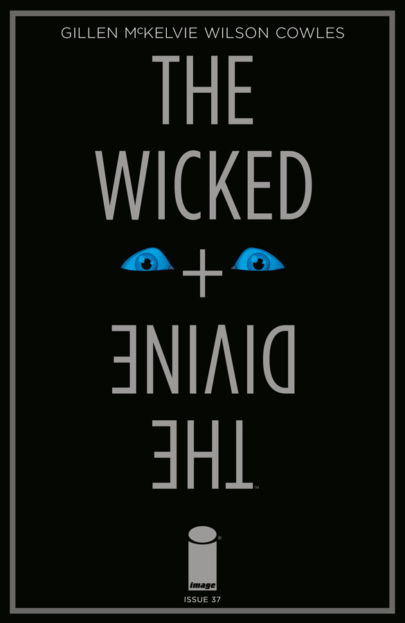
Writer Notes: the Wicked + the Divine 37
Spoilers, obv.
It's a strange job, writing. You think you know something, and you do, and then you realise it's something else. Or rather, something else as well.
While I'd advise against hard categories, there's certainly types of writers. When I was on a panel with Hickman, I believe he described me as god. Which amused me. He was saying that I'm the sort of writer who works like a Christian god, knowing the place and positioning of every leaf, every tree beam, every mote of dust. I see writing as a sprawling machine. I'm the Watchmaker.
This isn't quite the same thing as being a complete planner, but my decisions are deliberate. I'm not someone who doesn't generally know why he's doing something.
Writers who lean more improvisational talk often about looking back and realising what their theme was, or what they were mining and not aware of. I rarely get that. Or rather, it happens so rarely, that I tend to remember almost every occasion I get that perspective. Frankly, more common is making a decision for a reason, forgetting why, and then reverse engineering my own thought process years down the line and realising why past-me made what I felt was the only reasonable decision.
Which isn't to say that's everything. I know what I'm doing for a plan, but there's also the magic of ideas. What hits me, what feels right, places I want to go, and then only realise along the way exactly what part of me is having a conversation with me. This is normally stuff that I'm hiding from myself a little. This is stuff I have trouble admitting. This isn't just stuff that is bad about myself – there's lots of stuff which is bad about myself which I'm explicitly interrogating – but stuff I may not want to deal with until down the path. There's been a few of them. Not many, but a few.
Which makes this issue strange, as it's ended up being both.
It's an issue which was mainly conceived of before the first issue was drawn, set up entirely in issue 3, and has been thought about and talked about internally since (both internally team WicDiv and internally in my own head).
And then, only when the issue drops, do I realise what part of myself I've been mining for a character all along, while consciously thinking I was keeping her at arm’s reach, because I'm petrified of her. It's actually a realisation that's made me alter some things in my daily cycle, as I recognise the place they're from, and why it's bad for me.
As I said, writing is an interesting job. I don't consciously do it for these reasons... but I must do, at least on some level. "What is wrong with us?" is at the heart of most my work, which translates to "What is wrong with me?"
Of course, this is also not exactly necessarily relevant for you, and not the primary thrust of any of this, but it's there, and as these are writer notes, you're going to get some of it. Weird issue.
Preamble over.
Jamie/Matt's Cover: Foreshadowing the darkness section of the issue. We like doing a minimalistic one now and again.
Erica Henderson: This is just an amazing cover. After Squirrel Girl, you'd have an idea what an Erica cover would be, and it wouldn't be this wonderful homage to the the Caravaggio picture. Having a Gentle Annie cover this late is a good thing as well. In love with this.
IFC
The "Ananke. Or Ananke?" was a cut and paste error. We're just relieved it happens now, as I was petrified of typoing an Ananke when I meant Minerva or vice versa for the whole run.
Page 3-14
I suspect by now the past/present structure is pretty clear. We change it up considerably, with what they're showing. Issue 34 was the (majority) of the structure Ananke is working under. 35 is an example of what she does when things go right. 36 is showing the scale of what she did, and a taste of the tactics and so on. 37 is showing what happens when it goes wrong. I suspect by actively saying this in the notes, this is where a certain stripe of reader will try and work out what the other two bits of information are, but relax, we're nearly there and we'll tell you soon enough.
I had drafts of this when the past sequence was longer, but I cut it to the bone. After last issue, I wanted to spend the majority of the issue in the present day. If I could do it in 2 pages, that'd give me 18 pages for the present day.
In my longer drafts, I played with having the opening being 2 pages – so the falling apart starts on a page turn – and the reincarnation was over two pages, so featured a more active freak out that the sensory deprivation is over. Even with space, I'd have likely lost it – scrambling and that kind of panic in comics eats up panels, and isn't always effective. Cutting it to the three panels, showing the highly naturalistic magical appearance, and a single panel of the semi-comatose Minerva, clearly having been through hell.
(I'm going with Minerva as a name, as it's the name we know her by.)
A few words about what Matt did in colours – this just makes me want to go on holiday. Just weird and sad and horrible. Also, a note about "freaking out not always working in comics"? An expression like that does at the bottom of the page.
And then we have the black pages.
So, we're trying to show complete sensory deprivation for ninety years. How do you do it? I've seen people do deprivation comics, and they do it with a panel. For obvious reasons, because by definition nothing happens. In a standard comics world, we would do something like drop a CAP at the start of the page when she's back...
CAP: I SPENT THE LAST 90 YEARS IN NOTHINGNESS.
And then perhaps, if we really wanted to hand hold, on panel 2 add a...
CAP: THEN I WAS BACK.
But we're not a normal comic. Can we try and to show not tell? Try and get people to have the sense of what that actually is, and force a confrontation of the reality of it (or at least a fraction of the reality of it). Of course we can. As I joke in the back, if we were feeling really fancy, we'd have done 90 black pages.
As the issue was crammed with more interstitials than usual, there was no way this could possibly fit inside a normal sized issue. So we upped the issue size and, equally obviously, kept the price the same, because we're not complete shits.
Now, we're aware that some people won't get it. Some people may not have realised, despite the fact we've done it all the way through, that we've never done less than 20 pages of comics. We've often done more.
We actually put more of a tell than we normally would, in that we mention in the backmatter about how this actually cost us more money than usual, which we ate. Our general go-to motivation is to try and give people stuff they're not expecting, make them think about the form (and structure in life) from every possible angle. Yes, we're over four years into the comic, and we're still pushing stuff where we can.
There was a lot more here (as in, about a thousand words) but I'll spare you – fundamentally, I was fascinated that even with me trying to leave more space for the readers in this final year, we still do those little pushes, which is a symptom of a streak of control-freakery. Thinking about that and my feelings around it finally made me have the realisation I mentioned above – specifically, a “Oh – I know what part of me goes into Morrigan.” All the characters in WicDiv are me, I say. She was an exception. I felt I was mining a lot of things with her, but not necessary myself. I was always scared of her, but she was me all along. Deleting the above is in part about recognising my own control-freakery. I'm increasingly suspicious about these Writer Notes. Yes, they're about sharing and talking and craft, but I'm also aware it's at least in part about not wanting to let go. I have to get over that. I'll be surprised if I do Writer Notes like this for any future project.
So yeah. That was a journey.
Re: Page of blackness. Would I go back and not do it? Of course. I think it's a neat idea, and fun. It's the emotional mess that is me that I worry about.
15
NOTHING TO BE SCARED OF is a lift from Adam Ant's ‘Prince Charming’ (whose video take on Cinderella is actually 100% a WicDiv origin sequence, which makes me think of the edited Disney Cinderella gif with the exploding head. Cinderella is very WicDiv.
Anyway – a lift from ‘Prince Charming’, but perverted and turned very literal. Minerva is evidently afraid of a literal nothing.
16-17
As I said last time, I decided to concentrate on Baph's confession (and Laura's reveal) last issue, so I had moved a bunch of plot beats from there to here. I knew I had 18 pages, so more space to work. I obviously played with the idea of doing the Cassandra arrest this issue, but realised I could do the reveal from Baph's text at the end of last issue, to give an actual minor cliffhanger. As such, this means that we have to explain what happened here. How to do that?
Well, obviously we could do it with just Baph and Persephone chatting, but that seems like dead pages. I had the idea of doing it from the outside, to move the focus away from the pantheon out into the world. We don't get many moments of perspective any more (though I suspect they'll come back hard in the last arc) so this was useful.
It's also another example of particularly pointed glaring at fan behaviour. There is a lot of casual cruelty here.
The scene they describe is literally Cassandra's Cassandra moment. We see a little footage of this next issue.
I originally wanted this sequence to be at Elephant & Castle, as its curling mess of tunnels struck me as a good pace for such a confrontation. There's no escalators though, which creates a few limits, and I realised it'd likely be better to return to Highbury & Islington.
You'll also note the other thing this sequence does – which is orientate the reader with the layout of the station. When Morrigan and Baphomet actually fight, they go the opposite direction to where these two walk. It's a fairly common action film trick – travel through the setting so you know where stuff is, and then blow it up.
I love the pinky purple shirt here. Nice call, Matt. If I wore colours, you could dress me.
18-19
This issue, despite the space, is cut really tight. I look at this and wonder if I'd have cut it a different way to get more pages to use later.
Back to the Underground, limited backgrounds, handy when you're heading towards a visual showcase like the last half of the issue, both in terms of workload, and also to create a dark visual which is then exploded.
"Can everyone stop dying? It's getting really fucking depressing" has been in the Baph dialogue file ever since issue 1, I think. "How to get ahead in show business" was one of the titles I played with for the end of issue 33's interstitial, but went with Talking Heads. Clearly, it's a very Baph line.
The Fancy Pager, as seen back in Imperial Phase II when Dio gave it him.
It's good to see these two talking. It's very strong moves by Jamie, with lots of tiny nods. The "why I like him" sequence is very human.
20-21
This is one I feel I could have cut to a page if I really wanted to, but when Minerva is only lightly in play this issue, giving her more screen time seemed worthwhile. Space = Meaning remember. Plus it means showing more of the heads as well. See what I mean? I could have cut it, sure, but I know why I didn't.
Like the lighting here as well. Matt does great stuff.
I'll say this – Minerva has been a delight to write this arc. I mean, horrible as well. I'm amazed at her casual villainy, and how she turns a scene. I realised early in the arc this is basically me flexing the Kid Loki muscles, in a different kind of workout.
Another text-based scene. I'm thinking about how we use text messages so much in this book. Hmm.
The last expression with the needle is golden.
22-23-24
And the gears start turning on this awful machine.
Second panel is a little like the "Morrigan merges from behind shot from issue 5 and issue 12". I'd have made it a 1:1 copy of it, but it's a space-jealous approach.
Persephone removed, leaving us with Baphomet and Morrigan.
From now on is an odd one. It's what I can only think of as a set-piece. A series of beats we've been chewing over and moving around and talking about forever. The road is set in issue three. In anything like this, it's complicated. When I talk about WicDiv becoming messier as it heads into its final year, it's things like this.
Want to talk about structure? I don't normally do this, but it strikes me as a useful focus.
As far as I can see, the rest of the issue is primarily wrestling with three main plot threads, to different degrees. There's more, but I think they're the main ones.
Firstly, and probably least, is Baphomet. It's a little early to explicitly name his hamartia, but throughout Baphomet's failings are primarily responses to his feelings around death, and as a sub-set to that, his relationship to violence. He's killed accidentally. We've seen him try to kill repeatedly. Is Baphomet actually capable of cold-blooded murder?
Secondly, there's Morrigan. I think Dionysus nailed Morrigan back in Imperial Phase. Dio wants the best for people. Morrigan thinks she knows what's best for people. When people do not skew to her narrative, she turns frustrated, angry and uses increasingly immoral and abusive tactics to make people obey her. People make her so angry, because if only they would play their part, and do exactly what she says, it'd be better for everyone. She sees herself as the good person who knows what makes people happy. In the most basic terms, she's a control freak who has a story she wants everyone to conform to.
Thirdly, there's Baphomet and Morrigan's relationship. Which is more complicated than I could put into a paragraph, but is mainly about the two lines of their bullshit intersecting. It can be compelling. At a distance, it looks like a gothic romance. That's what Morrigan thinks it is. That's what Morrigan needs it to be. She's the heroine. Baph's the hero. He just keeps on fucking up his lines. Morrigan does not understand or agree that her relationship is abusive, and does not understand that she's using Baph as a narcissistic prop to satisfy her own needs.
While it's important for all of them, I think only one of these three threads climaxes here.
Anyway – this sets up. We slow down, and Baphomet actually realises what's happening. Baphomet, on some level, believes he deserves his treatment, as much as he chafes and pulls away. When he sees what Morrigan is capable of doing to someone else, he gets a moment of clarity.
Badb, the symbol of all of Morrigan's frustrations when her self-image is questioned, arrives.
God, Page 24, depresses me. It's such a stark page by Jamie and Matt. Everything slows down. Big panels. Big expressions.
25-30
When we originally conceived this, I thought it may be actually the whole issue, and do this, juxtaposed with a whole look at their relationship. In the end, I didn't have space, and likely didn't like it either. It'd have ended up juxtaposing more violence with sex, which I find distasteful and cheap.
Instead, it's written in a Marvel Method structure. I write the fight sequence and the flashbacks in parallel – there's a suggested solution to it, which Jamie went another direction on. I think it was basically a column on the right.
The original draft had more panels, and went on further in the flashback to the morning after. We then played with doing more periods – I had a version where it'd run through the entire length of Baph and Morri's relationship (I even put the whole thing in a document). But, as I was writing that, I realised the best solution was to just crop to the initial meeting in a shitty university club.
Yes, there was dialogue to this exchange. I may find a home for it before the end of WicDiv.
I mean – that's something odd about writing. For something like this, you generate so much stuff to even find what's going to go on the page. Fraction was talking about this in the latest Image+, in terms of the stuff that doesn't go on the page. Chrissy occasionally talks about comic writing having a lot to do with poetry, in terms of being about intensifying meaning into as small a space as possible.
Jamie and Matt do astounding things in this sequence. It's a fight sequence, and in genre comics, fight sequences take the place that songs do in musicals. Jamie chooses his moments, and Matt finds a way to navigate between the dancing timelines. Things like the third panel on 25, with the uncanny greens of Morrigan and Baph's red bisecting the panel says a lot. The divisions between the two in Jamie's art is also fascinating.
Christ – the mess of people in the first panel, and what happens to bodies when they get in the way.
I had a draft where Baph making this a nod to Sandman more explicit, but cut it.
In the flashback sequence, Cam saying something and Morrigan wincing, and me not needing to say that clearly Cam is making a crap joke is pleasing. It obviously is Jamie, but it also speaks to the characters. You know exactly how the first flirtation would go.
Jamie asked me "Does the fight have to be on an escalator?" and I basically said no, but... escalators are liminal spaces between the underworld and the surface world. They just seem loaded. And just as importantly, it's a place I just haven't seen nearly as much action as I'd like in genre comics. It's a space that many city people cross daily, and so will be familiar with, and so will perhaps think about as they go about. Jamie got it. Thanks, Jamie.
Morrigan as crow-beast is horrible.
Various people have asked what the notes are. It's ‘Welcome To The Black Parade’. I think I wrote ‘I'm Not Okay (I Promise)’ in the script. I think Jamie did it as you can get the notes right with ‘Black Parade’, which is a good call. The ‘I'm not okay’ was a callback to issue seven, but MCR generally is good.
Top of page 28 is another one for Matt – just how he works the long horizontal space.
End of Page 29 – Baphomet has his moment. He could end this now. And he finds he can't.
I don't know about you, but – for all his posture – I don't think Baphomet can kill anyone, and certainly not Morrigan. You can compare and contrast with Baal, if you wish. They're very much the bookends of certain forms of performed masculinity.
I wrote this as an impaling kind of move – but due to the panel shape, you can't show that, and capture the expression simultaneously. Instead, Jamie frames it as a swing, which does the same job.
30 – Baphomet may not be able to, but Morrigan certainly can.
This is horrible too, though Matt's colouring makes it a little more distancing. I suspect if I did have an extra page, I'd have used it here, to both make Baph's death clearer, and spend more space on Morrigan's realisation of what she's done.
31
This works, but I suspect for the trade I may change this interstitial to Baphomet. Baphomet's symbol is a skull here, but a little more stressing would likely help.
Title here is an early Nick Cave & the Bad Seeds single.
32-34
Persephone's captions are back – the stumble through an underworld path to find them made me think of the scene in issue seven, so the howl of the Morrigan, then comedy, now something else, is nodded to.
I love how Jamie and Matt have moved the mood from supernatural to hard disaster movie realism instantly. This is a tonal snap. The bodies, the people lying down. This is really horrible.
I suspect "Tragedy gives ‘clusterfuck’ ideas above its station" is one of my harder nods towards intent.
And back to Marian, the heroine of her gothic novel, confronted with undeniable evidence that she's a murdering monster who absolutely was driven by her own selfish desires. She denies it anyway, finding a way to persuade herself it's not true.
No, she's the hero. She's going to bring Baphomet back at the cost of her own life. That must prove she's the good person, right?
Morrigan is continuing her abuse the only way she can, while preserving her all-important idea that she was the good person.
So, of the three stories I mention, the one which climaxes is Morrigan's solo plot. She rode her own story off the edge of a cliff rather than face the reality of what she has done. The other two, and the other ones, carry on, especially Baph and Morri's relationship. Baph has to live with this.
When I was first explaining this to C, it had the desired effect. I then talked about my actual concern with it – that Marian's too convincing. Some people will take it as a "She loved him really" beat, and could then be taken as Abusers Love Their Victims Really. C got it, but noted, it's just too good to not do. I agree. I think it's one of the best scenes in WicDiv, and I had to hit it as hard as we could, and then go on to deal with the aftermath of it.
See you next issue.
164 notes
·
View notes
Text
15 Awesome Marketing Tools I Use Daily
There are so many tools at a marketer’s disposal.
With all the options, it can be come a little overwhelming — to the point that a lot of these powerhouse, unicorn tools get lost in the shuffle.
That’s why I rounded up the marketing tools you actually need.
Every tool on this list is a tool I stand behind, and use in my day-to-day work life.
Read on to discover the 15 tools I can’t live without!
Facebook Messenger messages earn an 80% average open rate an 20% open rate — and those numbers blow email marketing out of the water.
If you want those impressive levels of engagement for your own brand, then the first thing you need to do is a build a Facebook Messenger chatbot.
MobileMonkey is the best Facebook Messenger chatbot builder out there — and did I mention it’s free?
With this MobileMonkey, you can build your first Messenger chatbot easily, with no coding required.
You can use your bot to send out messages (a.k.a. chatblast), answer questions, interact with contacts, conduct surveys, and so much more.
It can help jumpstart your Messenger live support and marketing campaign.
Use your MobileMonkey-powered chatbot to attract leads and drive engagement!
Good content marketing involves having high quality images to go with your text.
Having a source of those high quality images is necessary to deliver the best content possible.
VisualHunt is a great source of free high quality images pulled from many online sources.
Their photos have Creative Commons Zero license, making them free for commercial use.
They also have Creative Commons and Public Domain photos you can embed on your content directly from the website.
Just search the keyword or theme you’re looking for and you should find the images you need.
Nothing beats infographics for delivering information in a visually engaging way.
They’re often better than text, video, and photographs alone, making them a must-have in your content marketing.
With Venngage, you can create amazing infographics for your content in three easy steps.
You can choose a template in Venngage, add your data into charts and visuals, and then customize your design.
With over a hundred templates to choose from, Venngage is one of the best places to create infographics quickly and easily.
If you’re looking to get serious with your digital marketing, then you need an all-in-one SEO platform you can depend on.
Serpstat was designed for professional marketers who are looking to gain that extra edge.
You can get that by having all the data before you to make decisions on any online business marketing plan.
Serpstat has research tools with advanced analytics for you to learn about your audience.
It keeps record of historical data over time, giving you a bird’s eye view of your performance.
You can also group keywords by tags while also gathering insights in your traffic distribution.
That lets you know where you’re getting results from and what needs improving.
This service is great for those looking to add more juice to their content marketing efforts.
Contentful boasts a new, more flexible approach to content management, promising to make blogging and content creation a breeze.
It’s an API-driven content management infrastructure designed to create, manage, and distribute content to any platform or device easily.
Basically, it’s like WordPress, but has a lot more bells and whistles that make it more secure and does your content management for you.
Companies like Spotify, Urban Outfitters, Red Bull, and so on make use of Contentful for their websites.
Running your website on Contentful lets you be steps ahead of everyone else with your content marketing.
Being able to understand how your audience behaves when they view your website can give you tremendous insight.
Hotjar lets you see where your visitors tend to click with its heatmap, letting you know what catches their attention.
You can then adjust your web design and content to encourage more clicks and engagement with your content.
It can also give you recordings of where their mouse cursors tend to go, how fast they scroll, and so on.
You also get to see your conversion funnel, showing how much of your audience goes from landing page to actual conversion.
With the information you get from Hotjar, you can fine-tune your website to bring in more customers and increase your revenue.
Having a Facebook Messenger-powered chat widget on your website is a surefire way to take your engagement and time on page to the next level.
The WP-Chatbot plugin adds a Facebook Messenger widget on your website.
It has complete integration with Messenger and your Facebook business page.
Visitors can then engage with your business easily without having to leave your website.
Since chatbot is integrated with Facebook Messenger, every person who interacts with you on the site will be added to your ever-growing Facebook Messenger contact list — which means you’ll be able to follow up with your chat participants after that initial site chat.
No doubt about it, adding a MobileMonkey chat widget to your site will increase engagement, provide new leads, drive conversions and boost revenue.
Adding an app to your business can be quite an upgrade, letting you reach even more users who use mobile devices.
Buildfire lets you build your own app from simple templates with no coding required.
If you know how to build stuff like websites, chatbots, and so on with templates, then you should be able to build an app here.
It’s almost like MobileMonkey, but for mobile apps on iOS or Android instead of chatbots in terms of what you can do with it.
Of course, building apps involves a lot more than just setting triggers and tasks for a chatbot.
Buildfire helps you throughout that process, letting you create an app that works for your business as you like it.
The best thing about it is it’s free to build an app in Buildfire by yourself, and you can also choose to hire Buildfire to do it for you.
If you’re looking for more help on your content and social media marketing, then this app may be for you.
DrumUp is a free and easy-to-use app that lets you manage multiple social media accounts more easily.
You can curate top content in your niche easily and save time on managing all your accounts by up to 90%.
It can even help you do more and reach out to more people with its great features and compatibility with many platforms.
DrumUp also lets you measure the social media engagement you’re getting through its analytics.
Keeping your profiles updated need not be such a big chore anymore thanks to DrumUp.
Artificial intelligence has made digital marketing even more convenient in recent years, and BrightEdge takes advantage of it.
It lets you do SEO and content marketing more effectively through its AI to power organic search performance.
BrightEdge lets you track and use deep data and context to better your search engine optimization.
It also helps you run a high-performing website through its data intelligence.
You can then create high-quality content that satisfies customer demand through BrightEdge.
The rigors of day-to-day digital marketing work can bog you down over time, making it seem like you’re no longer in control.
Todoist can help you take that control back by doing things like give you reminders on things you tend to forget.
You can enter your tasks for the day and have a list that lets you remember what to prioritize.
But Todoist isn’t just like any other productivity service as it’s designed mostly for business.
This lets you use a sleek interface for tracking your own thoughts, work tasks, errands, and so on easily.
Todoist can definitely help organize your work life with greater deal of clarity.
Visual storytelling is an art on its own, as it’s all about showing instead of just telling.
Visage is a visualization platform that lets content marketers create on-brand visual content easily.
This relatively new app features enable data visualization without all the finangling and hair-splitting.
You just need to enter your data and choose how it can be best shown, and you can edit it there like in Canva.
It also has additional features that makes it great for collaboration, which makes for seamless for group work.
Visage enables seamless ideation, design, distribution, and analytics for your visual content.
Managing all your social media activities can be tedious over time, especially for businesses.
Oktopost makes that easier for B2B enterprises, combining three separate solutions into one.
You get social media management, social employee advocacy, and social media promotions in one tight package.
If you’re looking to up your social media game for your B2B business, Oktopost is worth looking into.
Videos can be some of the best content you can make to increase engagement and conversions.
Vidyard is a tool you can use to make personalized videos easily without having to be an expert at video editing.
It lets you customize your video with ease, and you can then embed it anywhere you want.
With videos you make with Vidyard, you can maximize your first impressions and endear your business more to the people.
Making content is one of the more daunting tasks in marketing, but also one of the most crucial as it’s the meat of the campaign.
But it does get tedious over time and it may seem like you’re no longer in control of your time when you’re in the thick of it.
ContentCal can help you take back control with its visual calendar designed for planning and auto-publishing your social media content.
It’s used by many big companies and agencies for their content and social media marketing needs.
You can learn more on how to go about your content and social media through its analytics.
It also lets you customize your setup so you can tailor-fit ContentCal for every sub-brand, client, or company you work with.
Victory loves preparation, and you too can taste success every single day with a plan laid out in ContentCal.
The opinions expressed here by Inc.com columnists are their own, not those of Inc.com.
Source link
from Marketing Automation and Digital Marketing Blog http://amarketingautomation.com/15-awesome-marketing-tools-i-use-daily/
1 note
·
View note
Text
Video Creation
Hi, It's Max again. So now that you have the basic rundown of everything I am just gonna be talking about my process. And reviewing one of my friends I make videos with. And he also makes YouTube videos sometimes.
So I start by getting a basic Idea of what I want to do. And since I make gaming videos its usually a challenge or I talk about a topic. Or my favorite. Just sitting down having fun on a game with a friend and turning it into a video. So I usually try to have 30+ minutes of footage but I try to keep it under 2 hours. Just because you don't want to have your video be super long. Unless that's the type of content you make then have fun with it. So after I get my footage I chop everything up. A big tip I wish I heard a long time ago was to chop it up so that you don't have a ton of silence. For example if you're making a call of duty video if you're not talking or there isn't something interesting happening. Cut it out. No one wants to look at you run around. Unless you're like hacking.

After I chop up my videos I add captioning. Which is more of an advanced thing and I don't even do it in every video because it takes SO LONG. If I chose you chose to do it though just know depending on how long your video already is it will take around 2 hours longer to edit the video.
Following my captioning I add background music. I usually use instrumentals from musicians like Playboi Carti, Kanye West, Tyler The Creator and more 80s/90s songs are good for it aswell. Just know that you might run the risk of getting a copyright claim. Which would matter if you made money from monetization on YouTube but since you're just starting out it wont be a problem. If you want to play it safe here is a link to a ton of non-copyrighted music.
Then I make the thumbnail in Photoshop take it over yo YouTube and think of a title. Try to search videos like yours look what the most popular videos have in their titles. Try to make it similar to theirs. Try to make your thumbnail flashy as well. Just so people get interested. Press the upload button and BAM A BILLION VIEWS.
Obviously im joking. But share your videos on social medias. it helps for growth.
Now I will be interviewing my friend Tyson who I make videos with and hes made a few videos himself.
“What do you think is the hardest part abut making videos?”
“Personally I think that one of the hardest parts of making videos is the editing process because you need so much experience to be a good editor.”
“Do you enjoy the recording process?”
“I do enjoy the recording process because it isn't fake, we are genuinely having fun when we are recording.”
“What do you like about my videos? What could I do better?”
“I really enjoy watching your videos knowing what happened while making the video and I think that this is some real skill that will help you a lot later on in your career. You could be better at getting your content out there I see the Tik Toks on my fyp every once in a while but otherwise I don't see it And you could upload more because you haven't posted in two months from the day i'm writing this.”
I agree with his points on what I could do better. I do plan on posting TikToks and Instagram posts to promote my videos. And yes. I need to get better at posting. I will hopefully get a video out tomorrow from when this is being posted.
#youtube#gaming#video games#video editing#video production#youtube shorts#youtube channel#callofduty
0 notes
Text
A Promise
I try so hard to help you
but just as I’m about to grasp your hand
our fingertips briefly kissing in desperation
you slip.
Deeper and deeper into the chasm you fall
as the darkness envelops you
a fair-weathered friend to cushion your impact
only to disappear as you become acquainted.
I can hear your silent screams
that emit from your horrified mouth
which forms a perfect circle of gentle surprise
though the calmness of the rest of your face
betrays exactly how many times you’ve gone through this routine of falling.
My piercing screams are less subtle
loud only in a room filled with thousands of chatting people
because this routine of yours
is a heartbreaking tragedy to me
that which I refuse to become accustomed.
Your screams
though the discord to our harmony
remind both of us you’re still falling
anticipating the welcoming ledge below with wide arms
that’s going to break your fall
but it’s there I’ll be waiting with even wider arms
to carry you back to the top
each grueling step.
I promise.
(Group Critique // Thank you!)
@love-is-overrated-and-addicting
__________________________
Our Critique
@cruxymox response:
for me, ‘a promise’ touches upon an important topic - how those who are close to one who has depression may feel and react. the poet succeeds in conveying that sense of frustration.
read out loud, the poem flows very well, and the ending is strong.
that being said, there is a major issue. while the overall theme is tight, the specifics feel scattered, and i think it comes across that way because the narrator is physically ungrounded.
first, we are at the top of the chasm. then, we are cushioning the impact at the bottom. we then hear the subject’s screaming. next we ourselves are screaming in a loud room (what room and where did the chasm go?). finally, we are back at the chasm, with the ledge.
obviously, the poet does not intend the above physicalities to be literal, but something needs to be done to tie it all together in regards to location and chronology. (i might not cut the room out altogether - the concept fits in very well with the general theme.)
a few minor notes:
while i don’t know how common the concept of ‘kissing fingertips’ is, i quite enjoyed seeing that.
a “fair weather friend” would be the one that abandons others during hard times, not the one to comfort.
“chatting” is the only word i found to be a bit jarring when i read the poem out loud.
“though the discord” - should it be ‘though’ or ‘through’?
i like the ‘horrified mouth / gentle surprise’, screaming vs. calm contradictions. they make total sense.
thank you for this.
@reinventing-wednesday response:
I agree with @cruxymox with the lines about ‘kissing fingertips’ and horrified mouth / gentle surprise’. I like the uniqueness of the concept of fingertips kissing, and enjoyed the contrast of screaming vs calm contradictions that he mentions.
This reads too long for me, I would consider condensing it, or maybe revising it into a prose piece. It can work as a longer poem, but it needs to be constructed so the reader knows where they are when they are reading the poem. As cruxy mentioned, it goes from being at the top of the chasm, to the bottom, then screaming, and so on. Try revising the lines themselves and placing them in a chronological order. Reading it out loud helps with line breaks, some of them end abruptly and it throws off the meter of the poem. If you do keep this as a poem, break it up with stanzas to wrap it up a bit. That can make lines have more of an impact, and the extra pause allows the reader time to process before moving on.
I would replace the use of ‘fair weather friend’, I don’t know why but this tripped me up when I read it. Omitting that line and the next would help with the flow, or changing it up a bit would help too. I also think the word ‘chatting’ doesn’t fit right. It doesn’t match the maturity in this piece.
I would love to see this more as a prose piece. It feels like there is so much more that you wanted to say, so much more detail that could have been provided if it wasn’t in poem format.
Thanks for submitting, and please do so again!
@renegadegirl13 response:
I can't say very much outside of repeating what the others did. Here are my thoughts: When I first scanned this piece, I felt it overwhelmed as a poem. A prose piece would be more fitting. Your use of fair weather friend is appropriate, once the next line is read. Then later, you are there to cushion the fall... Where is the continuity? The imagery is good, though a bit scattered. Your lines are too "run-on for poetry and lack punctuation. Try re-reworking this using the suggestions provided. Thanks for sharing.
@foreveratlas response:
I enjoyed the imagery here a lot, and you have a lot of solid, visual lines. You've patented beautiful, thought provoking imagery in this and that should be celebrated.
Lets touch on one thing: punctuation. This piece needs punctuation. Breaks in lines tell readers where to pause but it does not tell readers how you want them to pause. A comma, a long dash, periods-- punctuation is necessary to drive the emphasis of your emotions across. If you dont utilize dashes and commas besides just periods, your piece looks like one long run-on sentence. And that is not what you want. Because of that, I feel like 90% of your issues with this poem would be resolved.
As it is, because of how much emphasis you have put into descriptions, Less is More may not work for you. Agreeing with others, this should either be a Long Line Poem (look into C.K. Williams) or it needs to be prose, plain and simple. You do have a sense of scattering about the piece and at times it does feel like I'm reading more than one poem here. Consider omitting lines or phrases that dont drive the emotional context home.
And that's another thing-- I'm not emotionally drawn into this. There is no AHA moment or a "but" moment to give it clarity that the reader can relate to. You have all these beautiful lines filled with imagery but it's unsettled and unpersonable.
Consider where the others have pointed out for you on what to edit and look to add more emotional depth and form to this. You've created beauty but it's not complete. You've definitely got the ability to bring it home.
3 notes
·
View notes
Text
Email Marketing Strategy-2021
Email Marketing is the cornerstone of digital commerce. Not only is it one of the oldest forms of digital commerce, but it has also proven to be a very effective way to transform the financial system. As a successful salesperson and/or business owner, you may know this.
But do you know the value of the letter? Can Email Be Your Email Business? Appreciation goes hand in hand with the commitment and commitment to providing the time, money, and success needed to develop a plan that not only produces results but fits well with your marketing plan. I encourage you to create your own email address. Email Marketing Policy. I tell you how free e-mail news has been twenty-seven million. This is the story of that Hustle.
$ 27 million news
If you’re not a subscriber to The Hustle now (and if not), it’s fun, entertaining, informative, and addictive (probably like morning coffee). This email teaches me every day. The letter contains up-to-date information on various industries and topics. Each email plan can be described as “eye-catching”; View easily and accurately the latest exciting and embarrassing events, statistics, trends, and trade events.
Fortunately, it is topped with a beautiful modern GIF that includes designs and themes for the theme of the day. It combines Hustle design, integrated production, integrated content, and solid structure, and has a messaging system that can attract up to 1.5 million people.
2021 Mara. Hubspot, an advertising software company, acquired The Hustle for $ 27 million (according to Axios). Hustle has shown that email can be physically organized. The shipping list costs over a million. Authors, but also 22.6 billion.
If you think about how long it took to start and sell a successful shipping business like The Hustle, it took less than six years. The publication was first published in 2016, using the interior design business you see today. If you have been in this situation for a long time, you are sending an e-mail. In email trading, this should indicate that your text is working / not working.
But do you know the value of the letter? Can Email Be Your Email Business?
Do you have an email? Email Marketing Strategy?
I think you have no idea, and if you have, it’s unclear and likely to be fixed in the past. Worse, this may not be in line with your marketing strategy. If you are not sure if you have a sales letter. With a well-defined email solution tailored to specific advertising events, answer these questions.
My message for this month/quarter/year is the email I am currently sending is linked to my PPC / social media / SEO / advertising campaign as follows:
My most effective 30/60/90 day RI campaign as I know (by heart) my current opening, clickthrough rate, transition rate, flow rate, flow rate, growth rate, report of engagement, email rate. Mail and money for each person who writes.
What did you do If you can answer many of these questions logically, you have more opportunities than many business owners. Even in these cases, there is still room for improvement, and we are still working to find out here.
The real reason you don’t have email. Email Marketing Strategies You do not have a valid email. Strategies for email trading because you think you don’t like it.
For many companies, email marketing is an important part of the “first” marketing strategy. This is a small part of a funnel, an imperfect trace, or a rapid explosion that triggers 24-hour lightning to work.
Email marketing is as simple as advertising (for example, something you only use to sell to old customers or publications), but the goal can be too great. In an emergency, it should be used for parking, traffic, storage, direct sales, shipping, reset, storage, and retrieval.
Advertising emails There should only be three emails to send. In the case of letters, everything is commercial and related. Also, in the realm of e-commerce, customer movement must take place in eight stages: knowledge, order, action, conversion, enthusiasm, marketing, empowerment, and promotion.
These are all good things, and you really know how to advertise a letter online. Send an e-mail using amazing certificates to host the site (embarrassing/shameless and embarrassed), but this is not a text on this issue. Here we would like to discuss this in your email. It is a marketing ploy and as an example of speed, you can completely change your email. Email marketing.
Email Marketing Strategies to develop a five-stage trading strategy for 2021
Email Hustle. Represents email trading. Not only did they send a well-used email. Email marketing, however, has also proven to be the first way to send an email. Email is another effective form of traditional advertising.
This five-step process is in line with The Hustle’s timeless model. A practical guide to doing tips and instructions and advice on all things can be found here.
STEP 1: Decide how online advertising fits into your marketing strategy.
Before you can do anything, you have to decide when and how to use email regularly. Email marketing to find out where He thinks He Hustle, visit his website:
The answer, of course, came out. The Hustle website is simple and encourages you to enter your mailing list. The openness is enhanced with a large number of sites, the design of the mobile newspaper, the subscriber statement (“Trust from 1.5 million readers …”), and satisfactory response from the reader. They don’t have a head or leg to walk on because they cry a lot!
If you measure Hustle’s marketing skills on a scale of 1 to 10, email trading will be 10. Where do you go with your entire trading strategy? To determine if an ad matches your ad criteria, answer only the following questions:
What trading strategies do you use? Do you rate all your trading strategies from 1 to 10 (the 1 most important and the 10 most important)? How much time and money does each method spend each month? Do you create your own cookies and tax sources for email trading? Does the text indicate your willingness to use this method?
STEP 2: Create a long-term email. The purpose of email trading
Many business owners and marketers focus on short-term email marketing events. You need the new “x”. You need that part of the “x” keys. You need an “x” conversion rate. All of these short-term and business goals are necessary, but they may not help you create an email. Email trading strategies; You only know if it works or not.
Your long-term business plan should be comprehensive, engaging, and influencing your entire business and your audience. You can find Hustle targets in the first line of the “About” page:
In the Hustle, we tell people (like you) what they want to know. Although the sentence is broad and clear, she chooses your letter. Tons of email marketing. We examine the judgment from the information.
Here is the violence: the universal meaning of the show tell people: a clear pattern of actions that only tell them what they are doing (like you) – explanation and encouragement to the reader
What you want to know. – Exciting presentation from the construction service
What if all your e-mail could summarize your email marketing tips in one of your favorites? Here are some examples to start with:
True Education Technology Page: Inform families about the importance of academic progress.
He. Retail Clothing Company Newsletter: We have your daily sauce in your favorite box.
Letters to local restaurants, we will let you know before you eat.
Create a long-term email. The purpose of email marketing
STEP 3: Choose an introduction for a great email. Web page
While some Model Pictures emails may vary, it is important to create a good database for a large database. For many companies, this is your standard letter. Once you have established, you can find or add items to your email section. Scripture maintains stability. Looking at The Hustle, there are five main types of chapters:
GREAT VISION
Pieces
FREE LANGUAGE (1 OR OTHER)
“FROM DAY” (same day, daily jacket, daily numbers, etc.)
Sharing going on
A consistent plan allows readers to predict what information to expect and what to expect from it. Your goal should be to create a Mcdonald’s email. Email marketing … no matter how much the speaker uses the information, knows what to expect.
First, try to balance your chapters into five. You want to make enough chapters to cover thousands of topics and focus well on making them fun and interesting. Write each e-mail. Insert a campaign letter and divide it into five parts. This should give you the basics of the features used.
STEP 4: Explain the overall design process
Most people usually put a dime and plan in one group, but this is the way it goes wrong. Placement, which can be called a word, plan, language, hearing, and so on. It should reflect your marketing strategy, not just email. Email campaign.
If your name is weird, flattering, and disrespectful, send us an email. The plan should not be small, dark, or religious. If your email lasts too long The purpose of email marketing is to “Give business owners secret information that the media won’t tell you.” how to smile.
The Hustle design, as shown in a recent campaign image above, includes simple, bold, moderate, and “shocking” images (with punches) that capture bright colors, pleasing designs, and eye shadows.
The reader should explain your full plan title in a few seconds of the letter. Open the letter. If there’s confusion in this, it’s because you haven’t defined your plan clearly. Some of the questions you need to answer.
What three words summarize your understanding of the letter? Email Marketing? If you could summarize all your tips in another image or graph, what could it be? If your Mother’s Day letter campaign could be a movie star, who would it be or who would it be?
STEP 5: Set a time to work
As with any program, it takes time to create, test, and edit your email. Email Marketing Policy. That all takes longer. Future schedules will make you take this job seriously while giving you a real sense of accomplishment.
Hustle adds: Sam Parr 2015 published a list of 300 authors and in 2016. The April updated issue has $ 1.5 million. Passport of subscribers in mid-2021 (period of 5 years). This is an average annual growth rate of about three hundred authors. Although it was a remarkable step forward, it did not happen overnight and the current list of writers, though interesting, is not very large.
If your company is fully committed to an email letter. Any advice on email marketing, 10,000, 100,000 or a million writers can do that for you? Even a small part of it can seriously affect your business.
With this in mind, we recommend spending 90 days developing a new strategy. Your email details describe this installation, and we encourage you to get started.
0 notes