#also should start thinking/working on the finished look: icons; colours; texts; etc
Explore tagged Tumblr posts
Text
813 is one of my favourite Lupin stories for many reasons, one of these being that it's one of the only stories where Lupin has such an entourage, both with the law and outside of the law (even more so when you check the text originally published in the paper).
The Doudeville brothers, Marco, Jérôme, Charolais, Octave, etc vs. the Doudeville brothers (so funny having double agents playing both sides, and it's actually the same side lmao), Gourel, Formerie, Weber, Valenglay, etc... Interestingly, his relationships with representatives of the law are usually more developed (or at least depicted) than the ones with his accomplices. There's this moment with Valenglay at the end of the book that I especially love, right after Lupin learned the execution of Léon Massier :

Lupin faints in front of the Président du Conseil, he's at his most vulnerable, and Valenglay does this??? I do believe that he does it mostly for political reasons and out of fear of a scandal, but idk, it's so interesting to me the way Leblanc wrote this; Valenglay was a fan of Lenormand, and not particularly hostile towards Lupin either, and he sees this broken man before him, and decides to just. take control. Get him back on his feet, but it almost reads like one of these instances where Lupin quasi-hypnotises people with his iron will except this time he's at the receiving end of it.
+ the way Lupin deals with police throughout the book is so flippant (as per usual mdr (except Gourel, rip)), mocking them at every turn and in the end it comes down to this... "I'm counting on you" seems very ambiguous to me, kinda condescending in a way? But also trusting. It just feels like Valenglay is sending one of his dogs to get the job done, which is downright humiliating for Lupin, but also he could have had him arrested right there and then so yknow 🤷
#Arsène Lupin#Leblanc Lupin#basically done with the mapping of 813 yippeeeeee#and seriously considering adhering to the AAAL because guess what they've also done a map of Lupin locations 🙃#BUT i believe it's only Paris (which is still a good chunk of the whole thing tho) sooo my stuff isn't totally useless yet#confidences is next short story format my beloved 💖#also should start thinking/working on the finished look: icons; colours; texts; etc#a bit overwhelming but i'll try and have fun with it
15 notes
·
View notes
Text
Content creator 2021 wrapped tag game
Cut this into what works for you. Want to do only one instead of five? Do it. Tag 2 people? Do it. This game is not your mum or the Apple App store to tell you what to do. But there are a couple of rules:
RULE 1: Review your creations over 2021. Tag some gifmakers/creators, friends and strangers to get them to do the same.
RULE 2: Link to the content, commentary optional.
thank you to @robinsonjudy for tagging me on this! i was hoping to be tagged in something like this so i could gush about how talented my mutuals are hehe <33
5 (or more!) creations from others that made you smash the reblog button hard, closely followed by your ‘insp’ tag or ‘fave tag’. Link to sets that started conversations, outstanding composition, colouring, etc.
this the descent gifset by @bongjoonsho because it’s such a perfect horror edit and everything i aspire to make in terms of big gifs/colouring/quality!!! it looks sooo good and hq and crisp. i normally find it hard to color horror sets properly and i feel like lera did such a great job with this one.
this inej ghafa edit by @oliviarodriog which is not just stunning in terms of blending (all her edits are!!) but also made my heart so happy because the quote fits so well with inej and who she is as a person who doesn’t give up. AND!! the color of inej’s skin is so rich and beautiful?? we don’t know white-washing in this house. and the blue is GORGEOUS.
this kanej set by @milesgmorales has a very special place in my heart because it includes one of my absolute favorite pairings and the most perfect song for them. kanej and tightrope are forever linked for me and i can’t think of one without the other now. the blending is gorgeous, i adore the blue and i really like the fonts rajan chose.
this jesper fahey gifset by @tedlass literally made me cry when i saw it. jesper is probably my favorite bisexual character of all time and i don’t usually see that many sets about his family so this made my heart feel incredibly full. the shots look so pretty and the whole gifset is so soft.
this crows set by @hunterschafer is one of my favorite creations ever!!! the format is soo creative and cool, the crows shots are all so crisp and pretty, the little icons and the fonts are perfect?? i can’t imagine how long this must’ve taken to make and the kind of Big Brain moment it came from.
4 5 creations of which you’re proud. These are goals you scored. Nothing to do with notes.
i'm gonna go ahead and link my 100 female characters in 2021 tag because i was ready to accept defeat (i thought i wouldn’t get to finish before the end of the year) but i managed to gif A LOT during the last month and a half and i'm proud of reaching my goal!
this malina set i made for malina week because i love mitski and i think ‘i will’ fits them really well. i also worked really, really hard on this!
both of these jesper fahey sets x x. the first one because i think jesper’s hands deserve more love. the second because i love how the coloring screams bi rights.
2 3 creations that stretched you as a creator: style, colouring, blending, text, etc. include the one that should have got more notes.
this malina edit that i truly, deeply love 🥺🥺 maybe the prettiest thing i made this year!! i love it because it was the first time i combined different things such as blending, big gifs, colors and fonts.
this inej ghafa gifset!!! one of the very first times i experimented with blending too, and i love it because1) it came out much better that i hoped and 2) i could include some of my favorite inej quotes/moments from the books.
1 creation of yours that you find most aesthetically pleasing to the eye and self AND 1 creation that broke and (maybe remade you) as a creator – we all have that one.
again, this malina set!! i’m just really proud of it and think it looks really good.
this inej set was hard for me and took soo long. i know it’s not perfect but i worked on it for hours, trying to get the colors and the fonts right. i wanted something different from the stuff i usually made and i was quite happy with how it turned out.
0 the creation that never was because nothing was working that day.
Overall comment on your creativity year 2021: i’m happy to say that i managed to step out of my comfort zone this year and experiment with new things such as BLENDING!!! which i was really scared of trying. i also like that i came up with the 100 female characters in 2021 idea because it pushed me to make content from different sources (tv, film, books) and it pushed me to not be lazy because i hate to leave things unfinished fdjfg
i’m tagging the people whose sets i linked here and a couple more: (i adore all your wonderful creations too and you’re all really talented; i wish i’d had more time to link more sets because i’m honestly in awe of everything you all make) @bongjoonsho @oliviarodriog @milesgmorales @tedlass @hunterschafer @montygreen @magnusedom @julietmolina @poppywright
happy 2022 to you all 🥺💕🌻
#omg this took me so long to write sdkjfjh#cant believe i made this many gifsets i n s a n e#im so happy i did this though because it really shows i put a lot of love and dedication into giffing this year :')#tagged#obviously no pressure to the people i tagged to do this!!! love u all mwah#.txt
20 notes
·
View notes
Text
10 Minute Lesson Project: Video Process
01.02.19
I am here, and I have finally finished my video for this teaching project. It took around 14 hours if I had to estimate (not in one sitting, over two weeks). It’s interesting that it took so long to create a three minute and thirty second video—which reminds me of Wallace and Gromit and how long that took to create just one single frame. I think that the final piece is decent. It’s not like I’m extremely pleased with it, but overall I do like it and I am proud of what I’ve created. I think that it is good for what it is and does its job well; to teach a young class about a chosen subject while also still being fun. At the time of writing, I have not yet imported sound, nor have I created the work sheet that I will be handing out after the video has finished playing, but I will add the sound later, and I will probably detail that later on in this post when I have (if not it will be in a separate post). The work sheet process will most likely be a separate post.
Now I must write about my process of the entire thing. Now, I’m not about to bore everyone and use 50 screenshots detailing every single thing that I did throughout, but I have some of the most important ones, which I will be talking about briefly. So firstly, how it all started. I made black solid layer and immediately got to animating the words to come onto the screen. I’d had the idea to have each word separately fly onto the screen to form a sentence for a while, and now was time to put that idea in to motion. This wasn’t so hard to do, but it definitely took the longest time to make out of everything that is in the video. It was very tedious to be honest, there was a lot of duplicating and fiddling with layers etc. The final animation of these parts honestly doesn’t look great, since some of the words follow each other a bit slowly, but I couldn’t do anything about that as that would interrupt everything that came after it.
Once I’d done this part, and added all the easy ease to make it look more fluid, I decided to use a technique that I had recently learned from Irene, which involves using trim paths to create some confetti-like things that look like they’re flying around the place. Here’s a link to my experience with this technique. I made the colours correspond to the flags of the UK and USA, which conveniently have the same colours (albeit with different shades).
The screenshot below shows a dark screen with a flag in the background. This was the first image to appear after the black screen, which I made fade out using opacity keyframes. I chose to start with USA for no particular reason, and then move onto the Union Jack shortly after. A lot of the early parts of this video are drawn out maybe a little longer than they should be due to me being stressed over the fact that I needed to get the video to four minutes. I was taught by another tutor how to make the flag wave a bit using some technique called turbulent displace, which I couldn’t tell you how to do now, but it definitely adds to the video, instead of having static footage. In fact, I originally had planned to have footage for every single different segment of the video, but I was quickly shot down as soon as I visited various different stock footage websites, and found that there was a lot of bad footage. That or it was incredibly expensive. I quickly abandoned the idea of trying to find footage for flags, though luckily, I was much more fortunate in my search for other footage of the later sections.
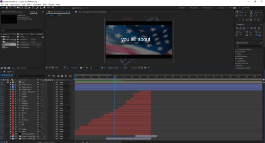
I wrote out some messages that would appear on screen while the flags would be in the background, like “I hope that you enjoy, and learn something new.” and the screenshot below. I had them last for a while to draw out the video, but I also knew that drawing something out for so long would not be entertaining for an audience, so I didn’t go overboard, hopefully. Not much else to say about this screenshot.
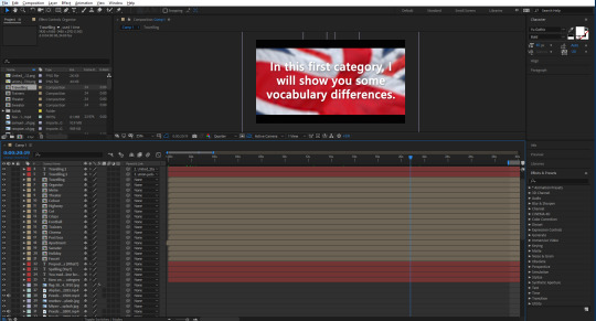
Now I will briefly talk about some of the footage and images that I used for the video. This first part of the video was going to be about the vocabulary, by the way. The first image that I used was one of a faucet, or tap. I got all of my images from Unsplash, and footage was from Pexels. I simply placed the image and then had it move slightly throughout its duration of being there, so that it wouldn’t look too boring. Next, I made the flags that I would be using to differentiate each word. There was a lot of duplicating and then removing things etc. I wrote a word out, and then parented that word to the image of the flag, so that they would move at the same time, but I could simply edit the word to whatever I wanted to without everything messing up. I tried to get each flag and word to move on the screen in a unique way, though I ended up running out of ideas later on, so some of them copy the earlier ones, but I don’t think you would really think that unless I pointed it out. Like right now. I chose to screenshot this scene, as I really like the footage that I chose for it—it may be my favourite footage. Not much else to say, though there were some more creative ones that I did after this one, like with the cinema, I made the words appear on the big screen. The footage for the apartment scene was also nice, it almost looks like I went out and filmed it myself.
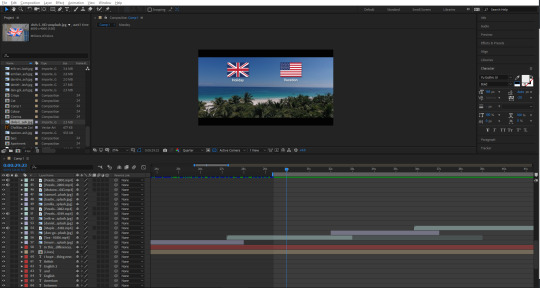
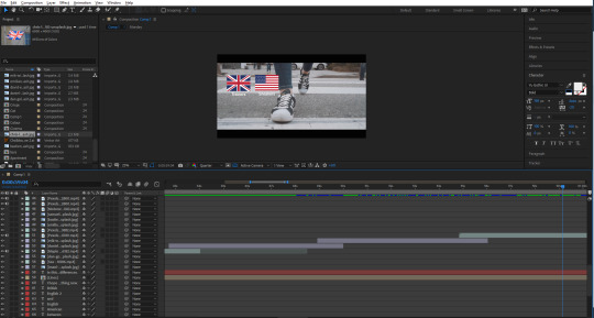
Another scene I liked was this one below, of a girl walking on the street, wearing trainers/sneakers. The way that it is zoomed in looks really good, as well as the flags that fall onto the screen, and then fall off at the end. I think that the contrast between the real life footage with the little icons I made in Illustrator is probably best showcased here, in my opinion. After this was a football/soccer scene, where I ran into a little mishap—there was this short black screen that appeared for half a second, which I was able to avoid by duplicating the footage and moving part of it just before the glitch, which covered it up nicely. That’s pretty much it for this screenshot.
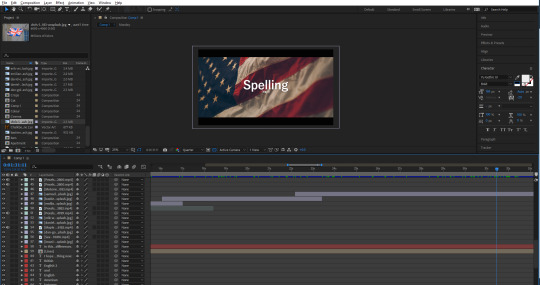
The next part of the video was going to be about spelling, which may be my favourite aesthetically pleasing segment that I made throughout the video. I really like the specific image of the flag, along with the white text over the top of it. I tried to keep it lighthearted, and added a little “(yay!)” under the big word “Spelling”. Some people may catch it. I’ve noticed that throughout the video, the font seems to switch up a lot. I always used the same font, yet it still looked different.
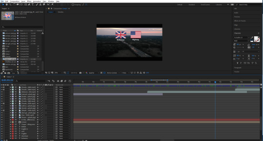
The first part of this category would start with the motorway/highway, which again, very aesthetically pleasing to me. I think that it is pretty perfect footage for this particular part. After this was one about colour/color, which also had the same error that the football/soccer scene had. I was able to cover it using the same technique. After this, theater/theatre, meter/metre, which I think I chose a pretty nice image for from Unsplash, and then organize/organise, which again had some really cool footage to accompany it, and it also looks like I could have filmed it.
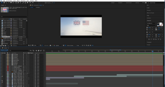
Next is undeniably my favourite scene from the whole video. It was of a plane that was just barely in the shot, while there were clouds blowing across the screen. I used this to my advantage and decided to try something new with the animated flags and words. This time, I lowered the opacity of both flags once the cloud went over it. Also, the way they appear on the screen also looks really good (albeit unintentional) as they look as if they’re blowing onto the screen following a cloud that seems to have blown them along with it. The whiter the screen got, the more I lowered the opacity of the flags—even going down to 15% when a big cloud essentially covered the screen. I think that this ended up looking really good, and honestly like it could be a separate thing of its own. I’m hoping my audience will be able to catch the words, with them being covered by the clouds as well. It doesn’t help that the words in this case are incredibly similar; traveled/travelled.
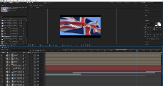
After this was the segment that introduced prepositions into the video. I didn’t exactly know what those were, so I thought I would add a little “(what?)” under the word, just a little lighthearted addition, as I assumed that not everybody would know the word either. Also, before this, I typed: “You made it! Now it’s time for...”. In retrospect, this may seem like I’m being patronizing, but at the end of the day, this was created with the intention of appealing to younger people.
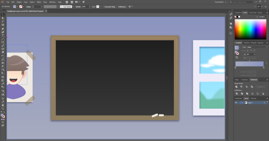
Next, I thought about how I wanted these prepositions to be for awhile, until coming up with the idea of having a chalkboard as a way of teaching. I had no idea what stock footage of image that I would use, so I thought to just make my own thing this time. I took to Illustrator and started working on a little scene that would have a chalkboard in. The chalkboard itself was easy to create. I just made a square and gave it a slight dark grey to darker grey gradient. Just to give it some slight detail. I also did this with the wall in the back, just going from light purple to a more blue purple. I made a border for the chalkboard, and added some chalk sticks using the rounded rectangle tool. I resized them and placed them on the corner of the board. Then next thing I made was the window on the right. This was easy to make, all I did was create a little scene of some hills, and some clouds, then blur them using the gaussian blur to make the whole scene look like it was in the distance. I then made a border around this, and them thick line through the middle to make it look like a window frame.
The last thing that I did for this scene was create a little picture for the wall. I made a white rectangle and then gave it a drop shadow. I made a small rectangle and then made some triangles to cut into the rectangle. I then coloured it the same as the border of the chalkboard, and shrunk it. I then duplicated it and placed it over the paper on the wall—to look like tape. I then made a character out of some shapes and the pen tool. I guess you could call it an Easter egg, since it kind of resembles me.
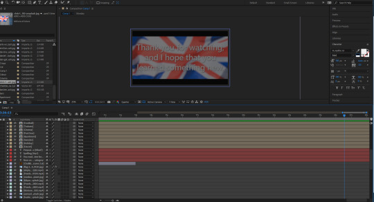
After this graphic, I made the second to last segment—Past vs Present Tense. I got another American flag and placed it into the background. This lead into the final part of the lesson which was just using the graphic that I made of the chalkboard again, and then it came to the final slide, which thanks the audience, and then fades to black, which I did by getting a solid shape layer which I coloured black, and adding a keyframe at the start set to 0%, which moved to 100% at the end.
1 note
·
View note
Text
Usability Testing - 1
User Group - Early 20s - Student & UX Designer - Avid Reader
After finishing my alpha prototype for Bookmark, I decided I wanted to carry out some usability testing on someone my age to see how they find the app and whether there are any issues with font size/ colours/ spacing etc.
My main objective - To get an overview of how easy the app is to use, the layout of the onboarding and startup screens and if any features didn't work as expected.
The Results
Aspect of my app do they enjoy the most:
Love how you used book pages for the onboarding swipe through!
The Issues
Onboarding Screens
The last two steps of the swipe through could maybe be linked from 'get started', rather than part of the swipe through. I didn't expect that from an overview and feels like maybe it would fit better with 'get started'.
Especially because I really like the log in/account being after you get a taste for what you’ll be getting so you can see the benefits, instead of being hit from it up front, but you don't get that if you don't swipe through every screen
How I resolved this
My Initial Onboarding For User

Above is a photo of how my initial onboarding screens looked which was in the prototype I received my first usability feedback on. So it was the initial logo screen which then goes onto three screens with my illustrations explaining the three key features of Bookmark. After this, users need to select up to three genres they enjoy reading, and then they need to select five books they’ve read.
I realised this is quite a long onboarding experience. Still, I thought it worked as it was personalised for the users in regards to finding out the necessary information on their prior reading history.
What I learned & Changed
The feedback was constructive as it made me reevaluate my onboarding and think of it in the perspective of someone using the app for the first time. It makes a lot more sense for users to first see the initial logo screen, then onto the three key features of why they should use the app.

My refined onboarding is in the screenshot above. I have made the flow of the onboarding experience more useful now. Users will be able to have a brief intro to the app then users should be able to click a large CTA to Get Started. Through this, they will then need to select their top 3 genres and then inform me of what books they’ve read.
So through just improving the order and layout of these screens has made a massive difference already and it’s something I would never have noticed otherwise.
Other Minor Issues
Welcome Home Screen
Text in the welcome window is very small (I am looking at it on a laptop, so hard to gauge accurately)
My Welcome Screen Before This Feedback

My Welcome Screen after Feedback and refinements

I realised in my initial prototype just how small the welcome screen text was and that although it was viewed on a laptop rather than a phone, it was difficult to read.
So, I increased the size of my font, added in an illustration to make it more effective in reflecting Bookmarks brand and also a large CTA, so users understand clearly they need to click on it in order to start using the app.
Final Comments From Feedback
Friends Screen
I missed the add friend button at first. If XD can do sticky navigation, might be worth making the (+) sticky so it is always floating at the bottom of the screen whether you scroll or not.

My Refinements
I removed this icon as I realised it was unnecessary when I have another icon doing the same thing, but the difference is it's pinned to the top as you can see below. I want to make sure my UI is as clean as possible and that I wasn't cluttering it with ineffective use of icons or CTAs.

Overall I’m pleased with how my first usability test has gone, and the feedback was mostly very positive with just minor issues I overlooked when designing the app. So I’m going to ensure all these refinements get made to my prototype before sending it out for a second usability test.
0 notes
Link
SQL Server query plans AKA execution plans are one of the greatest assets when it comes to tuning, optimizing, and troubleshooting our queries. Transact-SQL is a declarative language that can be used to query data without requiring a human interaction to specify an exact execution plan to be followed. This simply means that we are not telling SQL Server how to go and fetch the data, we’re just telling it what data we want it to get. So, think of an execution plan as a map. It is a map that the query optimizer is drawing that represents an efficient execution plan to retrieve the data.
From our point of view having access to these maps provides us with a whole welt of information on how SQL Server fetches the data under the hood and it can answer a lot of questions. One of the most asked questions is why is this query running so slow? So, in this article, we’re going to get familiar with SQL Server query plans and see how we can use them to tune and troubleshoot slow running queries. Furthermore, we’re going to mention top things that we need in a SQL Server query plan analysis tool.
One of those tools is ApexSQL Plan. Deployed both as a standalone application and an SSMS add-in, ApexSQL Plan is a free query analysis and optimization tool for the database administrator who is looking to detect issues that affect the database query speed and work to remove such deadlocks. Furthermore, this tool can build an overview of the query performance and has the must-have features for you to analyze wait times for executed queries, or check the costs of all operations in the graphical execution plan, etc.
Let’s start at the top level and take a high-level look at what the execution plans are all about. We pretty much explained the basics in the intro, but here’s the quick recap and a few additional notes of what executions plans are:
Shows how query results were or will be retrieved
Detailed map of type and order of operations
Plans can help diagnose problems or tune queries
The very first thing that we need in a query plan analysis tool is a graphical execution plan. Here is an example from ApexSQL Plan:
What you need to know in this graphical execution plan is that the execution of the plan starts from left to right. On the opposite side, we have data flow from right to left and that’s how SQL Server gets the data. So, when you’re looking through the plans, you really want to start by analyzing them from right to left. The plan itself should contain the following essential information about query execution:
Type of operations
Order of operations
Indexes to use
Row count estimates from stats
Row count actual from results
In other words, the plan itself should contain steps. All of these steps are known as operations. The plan shows the type of operation that was performed and the order. That’s why everything is connected in the flow diagram. One of the more important things we can get from these is to see if the indexes are used because it shows us the exact indexes that are used to fetch the data. When it comes to indexes, a must-have thing that these tools should have is the missing indexes creation. This feature can help with making the best possible decisions about your indexes. For example, use the query below to get an execution plan:
SELECT LastName AS EmployeeLastName, SalesOrderID, OrderDate FROM AdventureWorks2014.HumanResources.Employee AS e JOIN AdventureWorks2014.Sales.SalesOrderHeader AS soh ON soh.SalesPersonID = e.BusinessEntityID JOIN AdventureWorks2014.Person.Person AS p ON e.BusinessEntityID =p.BusinessEntityID WHERE OrderDate > '20020531';
ApexSQL Plan will not only show the execution plan but it will also point out that there’s a missing index:
From here, it’s up to the user to either copy the creation script to the clipboard and use it later or open the Index creation window and execute it right away against the targeted database:
Just like an index in a book, an index in SQL Server is designed to save time when SQL Server is trying to look up information. Bear in mind that creating indexes requires analysis because in general, they are most effective when a table contains a large number of records but they can also backfire and end up adding significantly more time to Insert, Update, and Delete statements. Furthermore, keep in mind that indexes take up disk space as any other type of data does.
Here’s a list of articles that can help you with query performance tuning when it comes to indexes:
How to create and optimize SQL Server indexes for better performance
How to identify and solve SQL Server index scan problems
How to optimize SQL Server query performance – Statistics, Joins and Index Tuning
When the execution plan is complex with a lot of operators, try to break it down, piece by piece and then it’s just the matter of identifying the hot spots, finding the areas in the query that are not performing well, can be tuned, rewritten or indexed and then taking action. This might sound like easier said than done but this can actually be pretty easy to do. We got a lot of information in the tooltips that is displayed when the mouse is positioned over an operator. Here is an example of a tooltip from the hash match (inner join) operation:
The tooltips are very neat as they provide additional information that can help with the cost base analysis like percentage attached, I/O cost, CPU cost, memory consumption, description of the operator itself, etc. The information displayed in the tooltips may differ depending on the type of operation.
Moving on, also worth mentioning, are row counts. As we said before, there’re two types: estimated and actual. Just by comparing those two we can identify if the SQL Server is using the right execution plan or if our statistics (find out more about statistics by reading the article above) are out-of-date. Just look at the example from the screenshot above. Estimated and actual number of rows are widely off. Such a big difference in the number of returned rows means that statistics are out-of-date and here’s the elaboration why…
Estimated execution plan is a compile-time plan of what might happen (statistics). SQL Server will accept the query we submitted, read the statistics, and show us the plan that it will most likely use to fetch the data. This, of course, means that there’s a chance the plan generated using statistics is inaccurate. This type of plan is popular/useful when dealing with inserts, updates, deletes… those statements should not be run just to see the execution plan anyway.
Actual execution plan as the name implies is the real plan of what really happened to retrieve the results. Simple as that.
In ApexSQL Plan both execution plans can be generated from the Management tab under the Execution plan ribbon:
In addition to those two, there’s also an ability to view the live execution plan of a query. This type of plan provides real-time insights into the query execution process as the controls flow from one operator to another. To view the live query execution plan, on the Actual icon click the arrow pointing down and choose the Live icon:
These execution plans can be very useful for debugging query performance issues because data is available in real-time without needing to wait for the query to complete.
Query performance is not only the initial query design, but also continuous monitoring and troubleshooting, so this should also be an iterative process. The Query Store is a feature that was introduced in SQL Server 2016. It is designed to troubleshoot and solve performance issues related to changes in execution plans by capturing the history of queries, runtime statistics, identifying expensive queries and their execution plans. In ApexSQL Plan you can set and use the Query store in a few easy steps.
To start monitoring queries performance, under the Home tab, press the Query store (1) button:
This will open the Database connection window inside the main Query store window. Here, just choose the Server, Authentication method, Database (2) to be monitored and hit the OK (3) button to proceed.
As a final step, click the Start Query store button and then the Yes button to allow application to enable SQL Server Query store on the targeted database:
Let it run for a while in the background and the captured data will be populated in the Query store window:
From here, any data in the columns can be sorted out for easier reading. For example, the Duration column is sorted and the most expensive query is showed at the very top. In this particular case, it took 102,672,660 milliseconds which is an extremely long period. To troubleshoot this query, let’s take a quick look at the execution plan. Just right-click the problematic query and from the right-click context menu choose the View execution plan command:
This will open a new query editor text tab and place the script in it right from the Query store window. Just by looking at the estimated number of rows we can see that something is off. With such a high number of results, it’s best to generate an estimated plan as the actual would require the query to actually finish fetching the data:
The result of this query is a very artificial example. We took two tables with the most rows in our sample database and did an inner join on unindexed tables. This is one of those queries that could run for hours in the background without us even knowing it. Operation tooltips are not the only tooltips available. Almost every graphical item in the map has additional information when the cursor is positioned over it:
Cost thresholds are displayed beside an operator and those can be configured under the Layout and colours tab of the options dialog:
Numbers can be sometimes hard to read. That’s why all the captured data in the Query store can be graphically presented in form of various graphs. To view them, just hit the Dashboard tab right next to the Data:
Each section of the additional query performance information can be exported as an image for later viewing e.g. presentation. Right-click any graph and choose either Export diagram to save only the current graph or Export all diagrams to save them all:
For more detailed information about SQL Server Query Store check out the following articles:
Query store
Query store dashboard
SQL Server Query Store – Overview
As mentioned above, the Query Store was first introduced in SQL Server 2016 but ApexSQL Plan offers Query Store functionality without SQL Server 2016. This is supported by installing OpenQueryStore as a part of regular Query Store which supports SQL Server 2008 and higher.
SQL Server Wait times are well-known cause of the slow running queries that can be used to track and troubleshoot query performance by identifying resource bottlenecks the query is waiting for. Queue waits occur when a worker is idle, waiting for work to be assigned. ApexSQL Plan can capture all wait times encountered by threads that are executed but the problem is how to resolve them. Why? Because there are so many.
Here’s the list of SQL Server wait types that can be encountered commonly. For the full list, please check the sys.dm_os_wait_stats (Transact-SQL) DMV on Microsoft docs.
ApexSQL Plan has Wait times descriptions that provide the information inside tooltips for each wait type. This information includes the description when it occurs, steps that can be taken to resolve it and external resources that could be used for in-depth troubleshooting (articles). Wait times descriptions are available from Wait times tab under the Results analysis ribbon:
Wait times descriptions are also available directly from the Query store, under the Dashboard tab for Top 10 longest wait types graph. Just hover the mouse over a graph item and the tooltip will appear:
Another essential component when it comes to analyzing and optimizing SQL query execution plans is their comparison. This feature allows a comparison of the current plan against a previously saved plan. To show this in an example, consider the following view in our sample database:
USE AdventureWorks2014; GO CREATE VIEW EmployeeName AS SELECT h.BusinessEntityID, p.LastName, p.FirstName FROM HumanResources.Employee AS h JOIN Person.Person AS p ON h.BusinessEntityID = p.BusinessEntityID; GO
Paste the code in SSMS and run it:
Based on this view, paste the script below in ApexSQL Plan and get the actual execution plan. :
SELECT LastName AS EmployeeLastName, SalesOrderID, OrderDate FROM AdventureWorks2014.Sales.SalesOrderHeader AS soh JOIN AdventureWorks2014.dbo.EmployeeName AS EmpN ON (soh.SalesPersonID = EmpN.BusinessEntityID) WHERE OrderDate > '20020531';
Right-click anywhere inside the graphical execution plan and from the context menu choose the Save for comparison option:
Create a new session, paste the script from below, and and get the actual execution plan one more time:
SELECT LastName AS EmployeeLastName, SalesOrderID, OrderDate FROM AdventureWorks2014.HumanResources.Employee AS e JOIN AdventureWorks2014.Sales.SalesOrderHeader AS soh ON soh.SalesPersonID = e.BusinessEntityID JOIN AdventureWorks2014.Person.Person AS p ON e.BusinessEntityID =p.BusinessEntityID WHERE OrderDate > '20020531';
Right-click anywhere inside the graphical execution plan and this time choose the Compare with saved option:
Both of these Select statements perform the exact same operations and fetch the same results. At this point, a comparison would show that the execution plan is the same for both the Select referencing the EmployeeName view we previously created and the Person and Employee tables directly. So, let’s go back to referencing the tables directly and create the missing index using the feature we mentioned earlier. Just hit the Execute button in the Index creation dialog:
Close the confirmation message by clicking OK:
Compare with saved one more time and note the differences in running both queries before/after creating the index. The differences are shown with an (x) icon within the Value column in the Properties pane:
In this particular case, it’s obvious that we went from clustered index scan to non-clustered index seek but more importantly we reduced the total cost of the operator from 53.9% to 18.3%. Feel free to scroll up and down thru the Properties of compared plans as you’ll find all differences and see improvements/deteriorations.
Next, imagine how big/complex execution plans could get. In the real world, there are queries selecting data from multiple tables, having over 100 operators performing all kinds of index scans/seeks, hash matches, nested loops, etc. In such cases, even viewing the execution plan in full screen makes it hard to visualize the whole plan. Luckily, ApexSQL plan can find any node that executed plan contains using the node search feature. Simple use the shortcut Ctrl + F from the keyboard which will open a new sub-window (search box) within the execution plan. From the drop-down box, choose an operator and those will be highlighted in the plan. Use the arrows to move back (Shift + F3) and forward (F3) thru the map from node to node:
List of all the stuff that a query plan analysis tool should have is long and mentioning all of them would require a lot more words. Check out the ApexSQL Plan web page for the full overview. To wrap things up, here are a few additional features which stand ApexSQL Plan out from other tools:
Visual themes to match hosts (automatic host matching)
4K/high resolution support
Microsoft iconography and colors to match host environment
Azure, Express, Amazon RDS support
0 notes