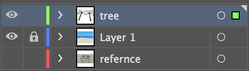
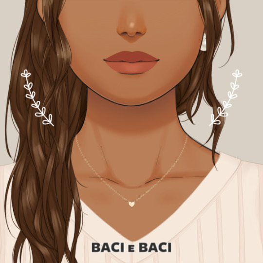
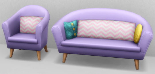
#also added colour swatches since i shaded it
Text

alRIGHT height chart time @venomous-qwille
#kandidandi drew a thing#holy shit holy shit oh my god my hands are in so much pain#AHGFSFHGDSGJDHGS#also added colour swatches since i shaded it#probably not THE colours but its the ones i used#wwahgaskfgdfs
693 notes
·
View notes
Note
hi im so sorry if youve already answered this but how do u go about selecting the colors you use for your works!
hi! i've had this question a few times and every time i've only been able to answer with a vague sort of 'ehhh i just pick them'. but i think i'll actually talk some more about it now since a lot of my art actually takes a lot of beating before i decide on a final palette. but with a lot of them admittedly i already know what palette i'm using, and i organise the whole composition around those colours.
i use like two main palette methods and here they are (once you see it in my art, you won't unsee it). It mainly involves picking one main hue, and then a contrasting secondary colour.

So the most basic is to have a drawing be mostly a small range of hues, in this case the reds and oranges, and adding a single contrasting shade. Here it is the bounce light on the metallic metal parts, and doesn't appear anywhere else. It looks blue but it isn't - if I used actual blue, it would be too jarring and the colours would not appear unified. This is a warm and nice scene. So instead I pick that strong blue and blend it into a small swatch of the base colour. Then I pick from the blended portion, and what I get will be more blue than the base, but not actually blue. In fact it is yellow-orange :) The entire drawing looks warm as a result.
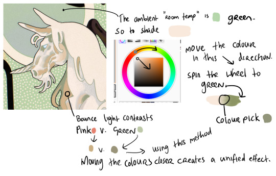
When working with marginally stronger contrast, here I have a cream unicorn on a green background. The main shadows on the unicorn will be the colour of that ambient room temperature bg - green. So I use the same test swatch method to pick a shadow colour which LOOKS green without being too disruptive of the cream unicorn. I increase the saturation and darken the value (moving the colour dot diagonally to the lower right hand corner of the box) and also spin the whole wheel towards green just a bit. Then I blend into the cream and colour pick a shade in the middle. But for the bounce light, I chose to use a common contrast of green - pink. It looks like pink in the drawing but in fact it is a low saturation orange! Using that real pink would be disharmonious. I do the exact same thing - I blend the pink into the bg colour and come up with that orange shade. It looks harmonious.
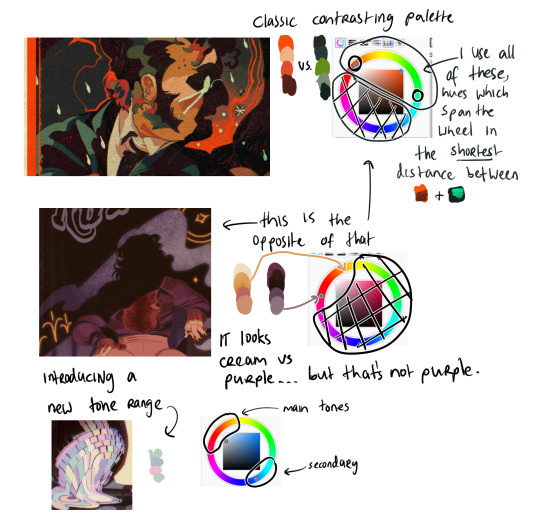
Now (top example) I am using two contrasting hues side by side. I decide the shadows will be warm, and the highlights in that contrasting zone. That means that for every colour i pick - Islin's skin, hair, his glasses, his shirt collar, his coat - every colour gets slid around the colour wheel until it falls inside that narrow band. And when I am highlighting his skin, I turn the wheel towards green. When I am shading his skin, I turn the wheel more red. I do this for every single element in the drawing.
It's the same for the Rua cover but this time I am not using such a wide band of available hues on the colour wheel, it's much tighter. I did this to replicate the look of a faded print, intentionally lowering the available contrast I had to work with by removing black as tool. It's all in that small cream to red window but it LOOKS purple - it looks like Pascal wears a purple shirt and that the smoke in the bg is lilac. Well, it isn't. That's all red and orange. I pick those colours by, again, choosing my goal "look" - a low-saturation purple, and then turning the wheel into the red range.
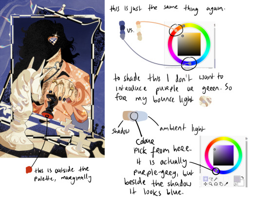
Okay so! for this it's just... the exact same thing again. Literally it always is. But since this one is recent I still have the process fresh in my mind. I envisioned it in the car, and I wanted this empty sort of desolate blue bg and a cold, distant overall tone. I ended up making the white on the chessboard & white pieces warmer, cream instead of white-grey, which worked out great. I wanted the blue, I wanted the pale cream/white, and the black of the chessboard. I didn't envision a colour for Pascal's shirt. but when the time came it was an obvious choice. It has to contrast with the bg both in value and hue, without falling outside the cream range already established by the chess pieces. So it's shiny salmon pink :) or orange, whatever you think it is. The only disharmonious part of this palette is the red velvet under the black knight piece - it works, but if I'd taken more care I might have spun the wheel more into orange and it would stand out less. But I don't mind.
599 notes
·
View notes
Text


More 'how to make Paint Mode actually viable to help reduce the borderline-criminal compression and add HQ support' experiments - Turns out adding custom nose swatches isn't that hard and it's actually super easy to export a painted coat (again, via Cmar's Coat Converter tool that I linked in my previous reverse engineering post) and then spank it onto an additional swatch after it gets cleaned up. Plus, this gives the massive boon of being able to then paint on top of that 'exported' Paint Mode coat, which when the coat was a hoof overlay, you couldn't do. Also you don't even need to make the texture fully opaque; in the previews above Schrodcat painted a sooty dapple overlay in Paint Mode that can then be applied on top of any base coat preset.
This then can lead to a very interesting 'making a cool horse coat' workflow of;
Painting an initial pass of a coat in Paint Mode.
Exporting that Paint Mode coat with Cmar's tool.
Fixing the compression of the texture via ChaiNNer or PS/whatever.
Making it a nose colour swatch.
Painting more details on the coat in Paint Mode, on top of that nose colour swatch.
Repeating steps 2 and 3, and then overlaying the new exported coat with the one exported initially in PS/whatever.
Rinse and repeat as often as you'd like to add more details/shading/etc.
Make it all into one nose colour swatch and bingbangboom, custom horse coat with no compression artifacts that you can still paint on top of for things like shine stencils, etc. & just requires you to share the custom nose swatch .package when gifting the horse around.
"Well, okay, Maddie," You may be thinking now, "That's cool for nose colours, even though not having a thumbnail might be kind of annoying. But what can hoof colours be used for now?"
Excellent question, and my answer is they're perfect for custom white markings, since, like I addressed last time, you can't paint over them in Paint Mode; anything you paint will always be drawn under the texture that is in hoof colour slot.


So if you make custom white markings (Heck, you can even paint one in Paint Mode if you'd like, so long as you don't add a base colour beneath it in Paint Mode, Cmar's tool will export with full transparency since the tool doesn't export things like the underlying coat preset) and turn them into a hoof colour, you can continue to paint the base coat beneath the markings and you'll never risk painting over them and/or needing to paint around them.
Ezpz, as the kids say.
In terms of HQ, this is probably an even better way to translate Paint Mode coats for use with the HQ mod too.
87 notes
·
View notes
Text
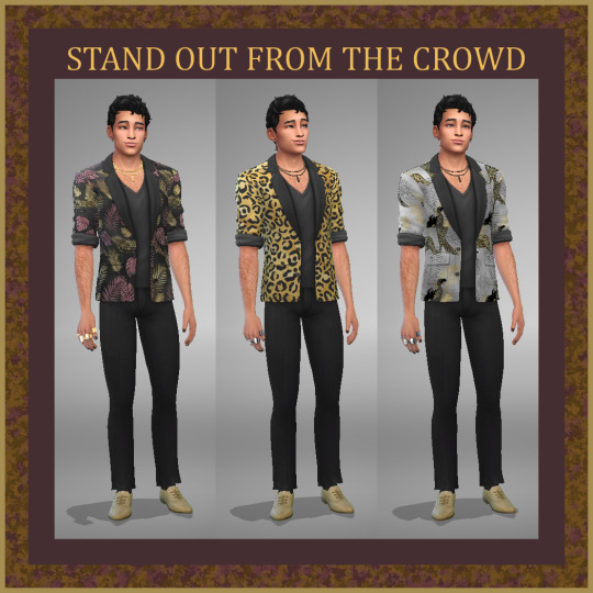


SIMS 4 - STAND OUT FROM THE CROWD - AM SUIT JACKET AND SHOES - BASE GAME AND CATS AND DOGS EP
It's time to help our male sims Stand Out from the Crowd with these flashy silk suit jackets and matching leather shoes!
Animal and jungle prints adorn the suit jackets to really make a statement in shades of black, amaranth, and gold. The shoes come in subdued colours to match, and can be used separately.
Suit Jacket - 14 Swatches - Cats and Dogs EP
LOCATION: CAS>Clothing>Tops>Suit Jackets
AM - teen-elder, appropriate tags for Young Adult and Adult
Masculine
Human, Vampire, Spellcaster
Formal, Party, Situation
Silk
STYLES: Arts Quarter, Fashion District, Formal-Modern and Trendy, Contemporary-Designer, Party-Trendy, Polished, Jungle
Allowed for Random
Shoes - 5 Swatches - Base Game
LOCATION: CAS>Shoes>Laceup and Loafers
AM - teen-elder, appropriate tags for Young Adult, Adult, and Elder
Masculine
Human, Vampire, Spellcaster
Everyday, Formal, Party, Retail Uniform, Situation
Leather
STYLES: Arts Quarter, Business, 21st Anniversary, Classics, Fashion District, Formal-Modern and Trendy, City-Sleek, Contemporary-Basic and Designer, Party-Trendy, Polished, Preppy, Romantic, Professor-Good-Grumpy-Hip-Smart, Seasonal-Spring-Summer-Fall
VAMPIRE STYLE: Archetype-Modern and Victorian, Walkby-Modern and Victorian
Allowed for Random
As always, please feel free to adjust the tags to suit your own personal needs/tastes. Since the shoes have not been altered other than by colour, go ahead and do whatever with them as far as more colours or adding patterns, they are a base game shoe easily found in Sims 4 Studio. The suit jacket is from the Cats and Dogs EP (required), and I spent a lot of time adding the patterns and colours, so please, go ahead and recolour, but also be considerate and link this post as the original pattern designs. Much appreciated!
PATREON
#ts4 clothes#sims 4 clothes#s4 clothes#ts4 clothing#sims 4 clothing#s4 clothing#ts4 male#sims 4 male#s4 male#curseforge#simblr
9 notes
·
View notes
Text
fundies (software) homework task
brief:
plan and draw simple objects of your choosing
apply colour to objects and change the thickness of the stroke
use the gradient palettes and gizmo
use the pathfinder tool to create objects from two or more objects
use 'paste in place'
use the layers palette to organise things in front and back
requirements:
look on moodle tutiorals for help: here
planning:
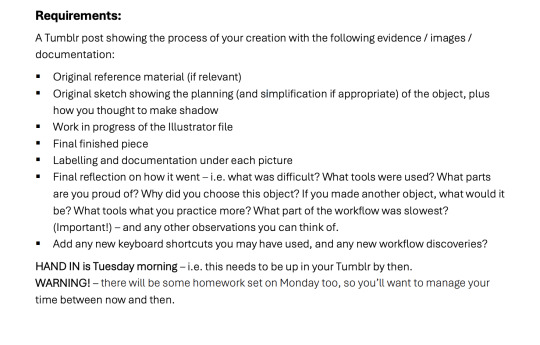
thought of shapes i could use hybrid curves/broken points on, thought of palm trees.
I wanted to keep it simple, so the backround is a simple block (or maybe gradient) colour sky, sea and sand. The tree branches I decided on design 3 (earlier planning) cause it's easy but I'll do some freehand shading with the pen and opacity and maybe some free hand lines with pen for details. I wanted to include coconuts so I could freehand some circles (more like elipses). I might add more details to the leafs with broken points and hybrid curves. I think the hammock will be the hardest so will only do it if I have time. I want to add some shadow to the ground as well, to give the illustration more depth. I might use something like paste and rotate for this.

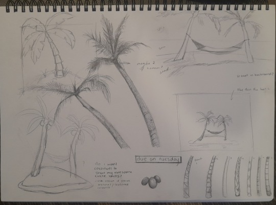
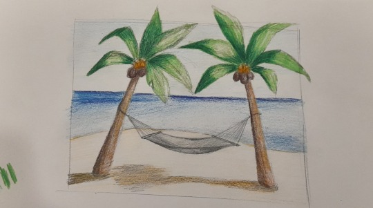
i started with creating a layer 1 - which was my background. I used gradient to create the ocean. For the sky i picked one colour and freehanded pen shapes and used swatches to keep the same colour and make it lighter. for the sand i used freehand pen and just make the shape I wanted that looked like sand. I ended up adding a white strip to look like the white water I waves. So the waves looked like it was coming onto the shore. I did this with freehand pen again. Layer 2 was called "tree" in which I created the tree branch and leaves of the palm tree. I freehanded the tree trunks using lots of better curves. I then added a gradient to the tree and changed the angle so it would align to the tree. i went from dark brown to light brown to add a shadow and colour variation. I used hybrid curves and broken points to make the leaves. I also used the "pen +" tool to add points if I needed more. I used / tool a lot when making my leaves beacsue the lines kept having fills. I probably could have used shift c as well to swtich curves to corners, but i sort of forgot some of the tools we learned when i was making the illistration. When i finished all my leaves I ended up grouping all the origanal leave parts together so each leaf had its own group, but when I went to use fill to colour it in the fill want working and I realised I had to ungroup everything and have the middle lines on top in adjust object order. I origanally made the coconuts on this tree layer too, but when I tried to add shadows on a new layer the rest to the trees, the coconuts kept getting in the way, so I ended up giving the coconuts their own layer. For shadows I wanted more shadow on the tree so I did what we did for the penguin task and just freehanded a shadow with pen tool and lowered the opacity to 26%. I tried to make the shadows look realistic on the tree without going overboard. I tried to add some shadow to the coconuts too but i made the back ones darker originally so it didn't need too much shading. I didn't really add that many highlights which could have made it better. Maybe that's a good step for next project. I then used option shift to make copy of the entire trees and rotated them + changed fill to create shadows along the sand. I used the swatch colour tool to make the shadow colour a shade darker than the origanal sand colour.

Thursday morning due date now

I rotated the shadow on the left tree beacsue the shadow was on to much of an angle and looked unnatural. I found and removed a random line on horizon. Then I decided to add a fallen coconut on the sand and gave it some shadow.
Had fun with this especially since I haven't really used illistator before and it's fun to learn new things. Could have been better and used some better tools but I thinks it's a good first attempt.
0 notes
Text
Tagged by @yennas to make my characters in this picrew!! Thank you, I love this one since it's lipstick-centric lol. Tagging fellow lipstick people @black-rose4 and @frogprincelucio as well as @elmha and @yenanng idek how much you like lipstick but yeah. but @ anyone tag me if you wanna do this bc it's so cute tbh!
Ririka Shepard/Kitty Ryder
Aria Surana/Leithianel Lavellan/Grey Shirazi
It's gonna be a long time before I draw lipstick/perfume ads for them, so I'm gonna ramble about their lipstick bc I own colours for all of them (and working on perfume for some 💀) lmao. I don't expect people to read it but tell me if you do lksfjdlskfds I would read if anyone did this too negl. this is the only makeup I know about lol
Ririka: Safe Word by Smashbox. But sometimes she'll use the NARS oil-infused lip tint in Orgasm over top or by itself! So exciting. Yes I own them bc the names are hilarious and that's partly why I made Ririka use them but they're legit her style. I pixelled them before.
Kitty: Wild Spirit by NYX (portrait), but I can't remember if I eventually tossed mine bc it had a weird smell. Alternatively, Violet Fury by Fenty. There wasn't a cooler purple in the picrew, so that was closest. Fenty Clapback and Anastasia Beverly Hills Requiem for blue shades. Also I think she'd wear Wild Night by NARS for formal things lol. She's a collector so she's got a ton of different colours/finishes.
Aria: this is subject to change since I only thought about her recently lol but I think she leans darker, so I'm gonna go with Trax by Marc Jacobs. That's the only lipstick Mayari wears too, and it's my favourite dark red lipstick, but it's unfortunately limited edition. Or possibly Vin Chaud by The Face Shop, which is discontinued, but it's one of the first colours I got when I first got into lipstick. I can't find a swatch but it's like a lighter Trax.
Leithianel: def more of just a balm/tint sort of person but I think I typically colour her lips a little dark for that lol. So probably Film Noir or Antique Velvet by MAC, if anything. Otherwise realistically it's probably some random balm from Burt's Bees etc on sale bc I don't think she's too concerned lol
Grey: Dior 999 — I think mine is satin (swatch defaults to velvet; it's 4th last) but I'm not looking rn. I tend to colour darker/less saturated but I always imagine her with it anyway. Maybe in a new drawing. Alternatively Oxblood by Burberry since it's darker but not too dark? She's also a collector but everything is red and she has a bunch of lipstick that are practically identical to each other (but she'll explain to you why they're actually different).
if you're reading this thank you bc this took way too long wtf lmao
#i s2g all their skintones are different but it's just the closest#without getting too light ok lol#memes of sorts#idek if i wanna tag them all rn so#character things#also l and k's noses are too narrow but i picked them bc upturned
12 notes
·
View notes
Text


Hey guys,
Last year Charlotte Tilbury brought out a range of products that have honestly been my ride or die product for over a year. I'm talking about Charlotte's Jewel Pot's , £24.00 each. These Jewel Pot's came out last year in the shades Pillow Talk and Walk Of No Shame.
Now for those who have no idea what I'm talking about with this product lets chat details. The Jewel Pot's are essentially glittery cream eyeshadows that honestly look like diamonds on the eyes. You can wear them by themselves on your eye lids or you can layer them on top of other eyeshadows to build intensity. In this collection Pillow Talk is described as "pink cream eyeshadow with a pink diamond-like sparkle to light up your eyes!". Walk of No Shame on the other hand is described as "copper red cream eyeshadow with a divine golden sparkle".
These Jewel Pots are products I would highly recommend for anyone who is new to eye makeup and wants something easy to apply or you're looking for something quick to apply with high impact. This formula is just flawless and it's worth mentioning a little goes a long way so these pots will last a long time and I think are easily worth the £24.00 each. I have been using these pots weekly since I first got them around this time last year and I'm only about half way through my Pillow Talk pot.
Above I have added a pic of swatches with flash on so you can see the high shine of each colour and I have also linked them both below.
https://www.charlottetilbury.com/uk/product/jewel-pot-pillow-talk
https://www.charlottetilbury.com/uk/product/jewel-pot-walk-of-no-shame
Lots of love
Bella x x
#Pillow Talk Jewel Pot#Walk Of No Shame Jewel Pot#Jewel Pot#charlotte tilbury jewel pot#charlotte tilbury#photography#make up#cosmetics#me#my photography#makeup look#beauty#girl#makeup blogger#makeup#cream eyeshadow#cream glitter eyeshadow#eyeshadow#cream eyeshadow review#eyeshadow review#pretty eyes#eyes#beauty blogger#beauty blogging#beauty blog#lifestyle blog#lifestyle blogging#lifestyle blogger#blog#blogger
4 notes
·
View notes
Photo
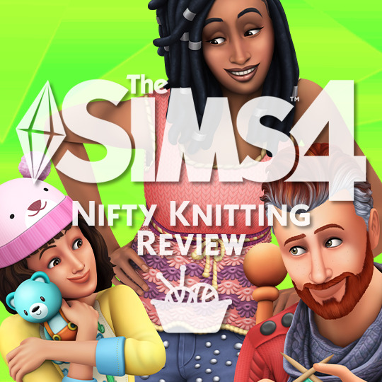
Nifty Knitting Review → ★ ★ ★ ☆ ☆
To be entirely honest I’d give this pack 2 ½ stars out of 5, but, no half star symbol means a more generous rating! This isn’t a complete in depth review by any means! I only cover CAS objects, Build/Buy objects, and other opinions! The review is completely honest however (always have been), and I am not sugar coating anything (guilty, oops). But anyhow, I have thoughts to share so here we goooo!

Thanks to the EA Game Changers for providing me with an early access copy of The Sims 4 Nifty Knitting for review!

Nifty Knitting CAS → ★ ★ ☆ ☆ ☆
CAS in one word: Disappointing.
As with every pack, the quality of the meshes just gets better and better and the devs that bust their buns creating these objects deserve nothing but praise. We’ve come REAL far from TS4′s horribly textured origins- there’s no denying that! Credit where credit is due!
However.
The choices in regards to what items get put in? Who’s calling these shots?
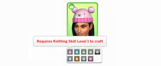
I know this pack was community voted, so the community is partially to blame, but whomst on the team is constantly suggesting these items that just make you go, “well that sure is a choice”. Who keeps pushing the incredibly high hairlines? Who has the fascination with making the hair volume that tall? For the love of everything who is in charge of the pants???

There are a few solid pieces and the colour choices range from more vibrant and fun to toned down shades and they mix and match with other packs wonderfully! The amount of objects is slim but it is a Stuff Pack and to be expected. Style choices aside, the main drawback is that since the pack is all about knitting the majority of the CAS items are locked behind your sims knitting skill. I mean, yeah I get it, but also? Gonna be downloading unlocked versions of those ASAP cause not every single one of my sims are gonna knit. I think having clothes be locked is a great idea and ties in wonderfully! It’s fun! But when most of your CAS objects are locked behind a skill? Ehhhh... Knitting skill clothes and regular CAS content should be separate, in my opinion.
Other than that there’s really not much to say about CAS. It’s unremarkable, I didn’t even make my usual CAS favourites posts because, well, I don’t really have any favourites from this pack. Some of the tops are very cute and I’m sure I’ll use them a ton, same with the couple items for kids and tots, but other than that nothing really stands out. Well, a couple things stand out but not in a positive light...
• First - Why do we keep getting the same ill-fitting jeans over and over? The single pair of jeans from this pack look fine on feminine-framed sims, but when you use the masculine version it’s extremely apparent who they were designed for. Also why don’t the guys get the glitter pants option by default? It’s the SAME mesh! I just! Who is in charge of PANTS???

• Second - That one hair. You know the one. Look, maybe they genuinely hadn’t seen the CC version, but we’re meant to believe that the folks that gave us the shake n go from Discover University and the crunchy crimped chip bag from Eco Living pulled this one out?? *squints loudly* I dunnoooo!

Nifty Knitting Build & Buy → ★ ★ ★ ★ ☆
Build /Buy for this pack is harder to critique because the art direction of the was voted on by the community. The objects are all super well done and I’ll be using them all a ton! Everything has matching colour swatches that include fun bright options as well as natural tones and solid white and solid black. All in all the art style isn’t bad! It’s very cute to be honest! Some of the objects give off a very “crafty-youtuber-chic” vibe, and while that isn’t my thing, it is incredibly cute! Regardless of if you’re into it or not, the objects mix and match with previous packs really well and can easily be integrated into any sort of build! Also I need to give credit to (I believe it’s Sim Guru Kimmi) whoever did the adorable art in the embroidery rings. It’s so flippin cute y’all. I’m not into the flower things that go with them but that’s nothing a lil CC can’t fix!


At first there doesn’t seem to be a lot for Build/Buy but that’s because a lot of the goodies are hidden in debug because your sim needs to knit them! The items your sim can create are absolutely adorable and I know I’ll be cramming my builds with all of them! (seriously those hanging plants, poufs, and rugs? they’re going everywhere. no build is safe.)
My largest complaint with Build/Buy is the four “unique” objects that are the same rocking chair four times... This seems to have become a trend since Tiny Living where “unique” items are just the same items with little to no change, and this pack isn’t immune to it. Like I get it, one has arms and the other doesn’t, and one has a cushion.. But come on now. At least make the style of the chair different from arms to no arms. I really hope this is the last we see of this trend but I’m not holding my breath...

Nifty Knitting Gameplay → n/a
I haven’t actually tried out gameplay yet because I’m going to explore it while streaming!
If you want to hang out and watch you can follow here to see when I go live!~
Nifty Knitting Would I Buy This at Release → Probably Not
All in all, while it is a very cute pack, I think I’d wait and buy it on sale.
The CAS is just so lackluster, and while the Build/Buy is cute it isn’t enough to solely pull the weight of the pack. I’m excited to play and see the cute interactions between sims, like parents and grandparents teaching kids and teens to knit, but I’m not sure how much more into the gameplay I’ll actually be, seeing as, well, there really isn’t any gameplay added. I know it adds a whole new skill and aspiration, as well as the Plopsy feature which I’m sure I’ll get a ton of use out of, but for me personally, the pack still falls short. As someone who loves crochet I was super excited for this, but in the end it just feels incomplete somehow.
This is a harder one to critique since it was community voted, so some people are going to LOVE it, while others might not! Both are valid!! Everyone has their own tastes and interests! So make sure you check out what other Game Changers are saying and see how you feel about it!~ ♡
35 notes
·
View notes
Text


Cruelty free face-makeup edition (it’ll be a lengthy one). I’m currently still using a non-cf product most of the time, as I’ve been using it and only it since I started wearing makeup, and I have a few I’ve been collecting up whilst on offers (not bought any since going cf)... Collection Pressed Powder- Ivory. That’s the top swatched shade. Downwards from that top shade...
MUA PRO/BASE- #100 ~ which wouldn’t be a terrible alternative, if, it wasn’t shimmery, which is really quite odd for a matte finishing powder. It’s also a tad too yellow for winter, found it was fine during the summer. No plans to bin it just yet.
Revolution Matte Base Powder- PO ~ the white shade, which is actually quite good the best of these top powders overall, a tad too matte to wear all day at work during the cold months with the central air heating. I only wear powder (and concealer here and there) it doesn’t go on as white as it appears, and neither translucent which was a pleasant surprise, I expected to look ghostly or as if I’d not used makeup, I imagine over foundation would be a different story... however...
What I could really do with is a shade between the P0 and the P1, as there’s quite a difference, as you can see by the 3rd and 4th swatches. P1 was okay-ish during the Summer, far too dark for most of the year. It would be nice if they had a P0.5 like they do in their concealers. Doubt I’ll get much use out of this one. Might be gifting this to a family member to get some use out of.
Revolution Pressed Powder- Porcelain Soft Pink ~ the best feel/consistency of all the powders but far too pink and it oxidises and appears to get pinker, if I was desperate it’s okay during the Summer, but even then, I flush quite easily enough as it is I don’t need help. Disappointed they don’t do a paler shade in this formula, it’s not at all drying, the ‘translucent’ shade appears quite orangey, not going near that one. Doubt I’d use this again, but I’m not binning it yet.


My most recent purchase Revolution PRO Powder Foundation- F1, the last swatch above, the other two for shade comparison...
top; Revolution Matte Base Powder- P1 (very different to the F1 not much shade consistency between the different products)
middle; Collection Pressed Powder- Ivory
I’ve tried this powder foundation once so far with a brush, and it was a disaster, I put too much on and it settled in creases that don’t normally exist, had to wipe most of it off and really brush/buff it into my skin. I’m definitely going to keep experimenting, different brushes, puffs etc... as it is definitely the closest to my shade I’ve found yet. I’m determined to get wear out of it!


Above pic just to illustrate that the Revolution concealers are available in more shades than the powder products, this is a great concealer, I can understand why people like these for round the eye as it creamy and doesn’t dry out. Definitely want to try different ones, they have different formulas/applications... this is the Matte Base Full Coverage stick concealer. You get 8g of product for £4, my usual trusted concealer MUA Hide and Conceal- Fair is £1 for 3g, this does eventually dry out in the tube so I end up binning around a 1/5 of it, but for a £1 I keep buying one or two when on an offer as until I discovered Revolution this was the only shade perfect concealer I’d ever found (currently have 5x). I use concealer for blemishes and hiding/improving the appearance of healing patches of red skin, where I’ve picked/peeled dry skin 😬 (can’t help myself), used in conjunction with a green colour corrector it’s a confidence booster when my skin’s being shitty.


Lastly (phew!!!)... Whilst I had the gift card from work I picked up this The Ordinary Serum Foundation- 1.0N. I don’t wear foundation, I don’t like foundation, I’ve never found the right consistency and I’ve never found a perfect shade at an affordable price. I tried adding white lightening drops years ago, but found my usual powder was still preferable. I thought I’d give it a go after reading some favourable reviews. The shade is off (how this can be described as very fair is beyond me), this is the lightest shade, it’s a shade or two too dark for my preferences (evidence shown on face wipe, compared to any of the powders it’s not light enough for me). It is a very light liquid consistency, surprisingly good coverage, which for me, isn’t really a good thing, I hoped it was more likely to be tinted moisturiser/tinted bb cream -ish. I’ve tried it once, and I wasn’t keen that I could noticeably tell I was wearing more makeup than usual in both feel and appearance (I like makeup to match my skin tone not add any colour to it). I used my fingers to blend so I’d definitely try it again with a blending sponge, using less product maybe with a touch of the white shade powder (not gifting it to a family member just yet). I don’t mind blemishes being covered, but I’m not looking to have add blusher and contouring just to look ‘natural’/like me again, pointless waste of bloody time. My skin also doesn’t like to not be able to breathe easily.
(thoughts, opinions and pics belonging to thesumofallmyfears)
#cruelty free journey#scratches are from making the bed... its hanging on...#extra screws everywhere underneath... just needs to make it into the new year
1 note
·
View note
Text
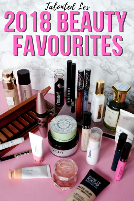
I can’t really believe that it’s been a year since the last round up, but here we are! If you want to see what made it into 2017’s favourites post you can read it HERE (spoiler, there may be some repeats as we all know I’m a creature of habit!) But let’s crack on with my 2018 favourites!
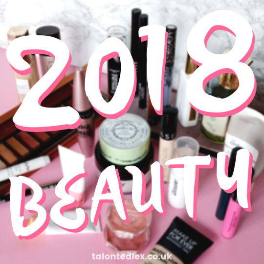
This has been a strange year for me, both in general and when it comes to beauty. I started my own business at the start of the year which I’m incredibly proud of but it has also meant that blogging has taken a bit of a backseat for me. I’m hoping to find a better balance in 2019 as I do miss writing and sharing my discoveries with you all, thank you to everyone who has stuck around through the quieter times – forget make up, YOU’RE my true 2018 favourites!
As with last year, I’ve tried to list every make up product in order of application rather than in order of preference. Some of these are products I’ve used for years, some are very new discoveries, but for me all of them are worthy of the title of ‘best of 2018’.
Once you’ve finished reading, please do head to the comments to let me know what your 2018 favourites were so I can check them out!
PRIMER
Winner – Sofina Primavista Long Keep Base
Highly commended – The Ordinary High Adherence Silicone Primer
I am an oily gal so a primer is always necessary in my make up routine. If you’re not a primer convert, you can read more about primers and why I recommend them to everyone HERE: they’re a wonderful way to help your make up go on smoother, last longer, hydrate the skin, add glow… so many benefits! I stocked up on the Primavista primer in Japan at the beginning of the year as it’s wonderfully light but keeps my foundation in place all day – however it’s ridiculously expensive to buy here so I apologise for including it (and haven’t linked it for that reason), but I couldn’t lie and say I didn’t use it! If you want something more affordable and accessible, The Ordinary primer featured in last year’s round up and I still really like it, but all the Deciem founder drama put me off using it if I’m honest.
FOUNDATION
Winner – Make Up Forever Matte Velvet Skin*
Highly commended – L’Oreal Age Perfect
The MUFE foundation is probably the newest entry into my 2018 favourites, having only launched towards the end of the year, but it is BRILLIANT: it’s matte and lasts really well on my oily skin, but doesn’t cling to my dry patches; it looks glowy without being greasy; and it doesn’t irritate my sensitive skin. The L’Oreal Age Perfect foundation is very similar to one of my all-time favourites (L’Oreal True Match) but is a little bit more glowy and natural-looking so I tend to swing between those two when picking my base. I’ve reviewed it in full HERE.
CONCEALER
Winner – Sephora High Coverage Gel Concealer
Highly commended – IT Cosmetics Bye Bye Undereye*
This Sephora concealer is another non-mover in my favourites. Unfortunately Sephora have now stopped shipping to the UK so I’m loathe to include this product but it really is my most used concealer. It’s high coverage but light enough for the delicate under eye area and affordable (if you’re near a Sephora!) The IT Cosmetics concealer is pricey but believe me when I say you need to use a blob the size of a grain of rice for both eyes, so it’ll last ages. This is the one I use when I need to bring out the big guns (e.g. red wine hangover…)
POWDER
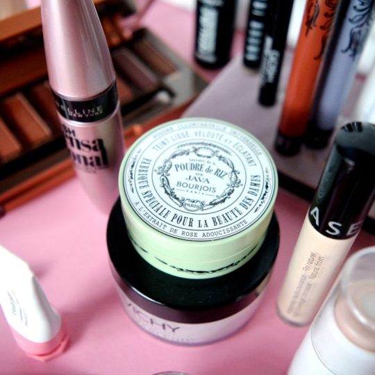
Winner – Bourjois Poudre De Riz De Java loose powder
Highly commended – Vichy Dermablend loose powder
I can’t count how many years I’ve been using this Bourjois powder, but it just ticks all the boxes for me. Very finely milled, with a slight sparkle to reflect the light (ideal for under-eyes), and doesn’t annoy my eyes – it does contain fragrance but it’s never annoyed my skin. If you’re very sensitive to fragrance, you may prefer the Dermablend powder, which is a great standard setting powder with a matte, sparkle-free finish. It’s more pricey, but it’s a huge pot.
BROWS
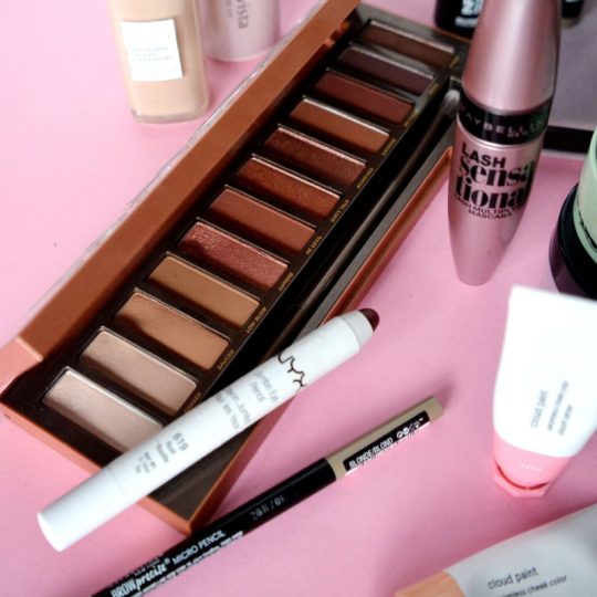
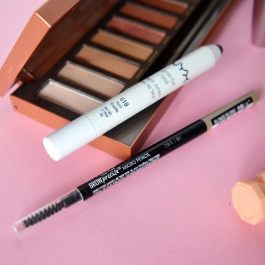
Winner – Maybelline Brow Precise Micro Pencil
Highly commended – GOSH Shape & Fill
I love a strong brow and am quite picky about the products I use, especially as brow products for blondes are tricky to get right… many are either too warm or too ashy. The Maybelline brow pencil reminds me a lot of the Sephora version …. which I originally bought as an Anastasia Beverly Hills Brow Wiz dupe! All three have a fine nib and give a very natural, but long-lasting, finish. The GOSH brow product has a wedge-shaped pencil on one end and a powder on the other end (which I don’t use). If you like a stronger brow, I think the latter will be a better fit for you.
EYESHADOW
Winner – Urban Decay Naked Heat*
Highly commended – Anastasia Beverly Hills Modern Renaissance*
This category was tricky as I would say my Urban Decay Naked Heat palette was definitely my most used again this year, but I fell hard for the ABH Modern Renaissance palette (but didn’t use it nearly as much). Naked Heat featured in last year’s favourites post, which shows just how great it is. If you’re a fan of warm eyeshadows (or have blue/green eyes) then this will be so far up your street. Modern Renaissance is quite intense, with a high proportion of darker pink-toned shades so it’s definitely not for the faint hearted, but I do a little sigh every time I open it!
BLUSHER
Winner – Glossier Cloud Paints (P.S. that’s an affiliate link that will give you 10% off your order and me a credit on my account for sending you! Win-win!)
Highly commended – CanMake Cream Cheek Tint
Another new discovery for me (but not a new product by any means!) are the Glossier Cloud Paints. You can read my post about them HERE, but since then I’ve bought two more shades – I now have Puff (pale pink), Dusk (nude brown), and Beam (pale peach). These are cream liquid blushers that are lightweight on the skin and quite subtle so you can build them up really nicely. Following on my cream blusher obsession this year, I stocked up on CanMake cream blushers in Japan. I first discovered these on my first Japan trip a few years ago and they are brilliant – very easy to wear and ridiculously affordable (about £4 so please don’t pay the £30 some Amazon sellers are asking for!)
HIGHLIGHTER
Winner – Glossier Haloscope ‘Quartz’
Highly commended – Maybelline Master Strobing Stick Highlighter
I can’t believe that I avoided Glossier for so long as I didn’t buy into the subtle, natural make up look they embody. What a fool! The Haloscope highlighter is flipping dreamy: it gives a beautiful sheen to the skin without making you look greasy or like a glitter ball. I’ve been using it non-stop since it arrived. Before Haloscope converted me, I used the Maybelline stick highlighter. It’s a great stand-in if you are looking for a high-street option. I apply both with my fingertips to avoid disturbing the make up underneath and don’t think I’ll ever go back to powder highlighter!
MASCARA
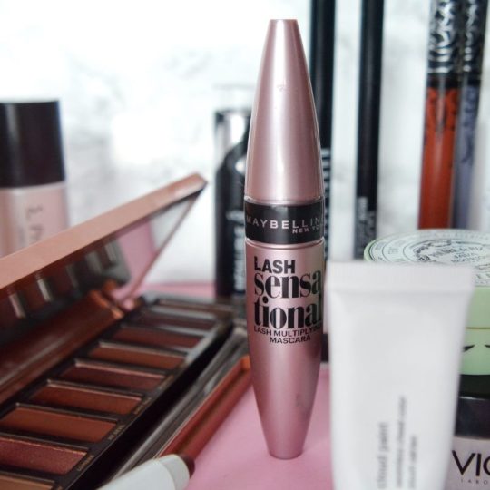
Winner – Maybelline Lash Sensational
Highly commended – N/A
If you’re a regular reader you can’t be shocked by the inclusion of Maybelline Lash Sensational. It was my favourite last year and I have no doubt that it will be my favourite next year. It is my holy grail mascara and I will probably be buried with it. It lifts and separates lashes, is very black, doesn’t run even with my incredibly sensitive watery eyes, and doesn’t flake or transfer onto my brow bone. Plus it’s always on offer in Boots or Superdrug. Hand claps all round!
EYELINER
Winner – NYX Jumbo Eyeliner and Eyeshadow Pencil
Highly commended – Bobbi Brown Longwear Cream Shadow Stick*
I haven’t used liquid eyeliner or traditional pencil eyeliners much this year, but chunky crayon-type eyeliners will always be staples in my make up bag. Both the NYX and Bobbi Brown crayons are wonderful for either defining the eyes, an overall wash of colour, or building up a smokey, smudgy eye.
LIPSTICK
Winner – Sephora Cream Lip Stains
Highly commended – Kat Von D Everlasting Liquid Lipsticks
This is always the hardest category for me as lipstick is what makes me happiest when it comes to make up. But when I think of my most used and relied-on, the Sephora Cream Lip Stains are always number one. The name is a bit misleading, as they don’t stain at all – they are a standard matte liquid lipstick – but they do last very well, don’t dry the lips, and the colour range is great. You can watch a video containing swatches of my collection (I’ve added even more since!) HERE. The Kat von D lipsticks have an even better colour range (if you prefer more unique shades!) I find the formula a bit hit and miss, with some lasting all day and some fading within an hour so I have to pick and choose when I wear them but the colours are enough to keep me going back!
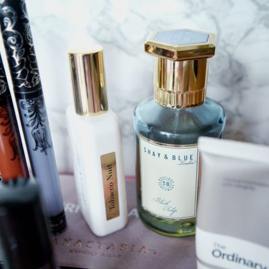
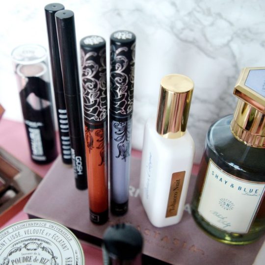
PERFUME
Winner – Shay & Blue Black Tulip*
Highly commended – Atelier Cologne Tobacco Nuit*
I was gifted Black Tulip last December and I’m still wearing and loving it – it’s warm and sweet without being cloying plus I think it’s a great size for the price. I always get comments on it because it’s pretty but slightly unusual as well. Atelier Cologne is a pricier brand but if you want to treat yourself, I think perfume is absolutely the way to do it. Tobacco Nuit is the sexiest perfume I own – tobacco flower, tangerine, labdanum… if you’re near a stockist I really recommend going in and smelling the entire range because they are just stunning. The only reason this isn’t my 2018 favourite is because I only have the travel-sized bottle and so I’ve been eking it out! There’s also one called Orange Sanguine that is summer in a bottle and it’s on my wishlist for next year.
NAIL VARNISH
Winner – Essie Go Go Ginza
Highly commended – Essie Tart Deco
Choosing favourite nail varnishes is like choosing a favourite child for me… basically impossible. But I purposefully wore Go Go Ginza for our trip to Japan as I knew we’d be visiting Ginza, so that polish has such lovely memories for me. I need to replace my bottle as it’s severely depleted, but it is a beautiful pale grey-toned pink so I knew it would go with anything I chose to wear over those three weeks. The runner up, Tart Deco is a cult classic Essie shade for a reason – it’s like summer in a bottle for me, the perfect peach colour.
And that’s your lot! So many amazing products, a lot of which are keepers from last year’s favourites which I think is a really good sign. Don’t forget to head straight to the comments to let me know what your 2018 favourites were!
Lex
*PR sample. Links may be affiliate. For more information please see the Disclaimer or Privacy Policy tabs at the top of the page.
== PIN THIS IMAGE TO READ LATER!==
2018 Favourites: The Best Beauty Of The Year I can’t really believe that it’s been a year since the last round up, but here we are!
1 note
·
View note
Text
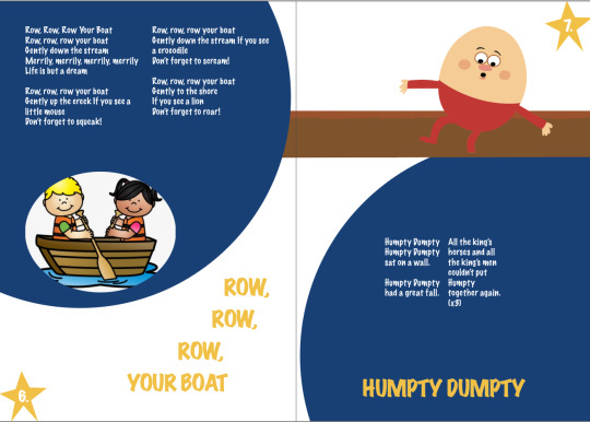
Final Assignment
WK - 10/11 - We had to design a 12 page A5 book. Including 5 or more nursery rhymes as content. We had to include, paragraph styles, Character styles, Images (at least one per song, and at least 2 of them hand-drawn vector), page numbers, custom margins and columns applied via the parent/master pages.
Document setup -
First i created a 12 page A5 portrait, print document by using the preset document settings when i first opened up InDesign. I made sure to set the bleed to 3mm as these would be used if the book was to be printed.
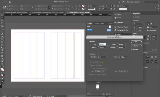
In this screenshot above, you can see i have used the master pages to create 4 column grid system across both seperate pages.


I also added in page numbers, by using my endpapers as inspiration and using the starts as page numbers.
Page 1 - Cover
For the cover, i took two images from Google, the first one being the clouds image, and the music notes/symbols. I used both of these and then used another text box on the bottom as a background and used the eyedropper tool to get the same colour. I then used a nursery rhymes book cover from Google as well as inspiration for my book title. I named it “sing with Toby” - since my lecturer Toby (yes you reading this) always sings in class. I trialled many different colour combinations for the text but i ended up using different colours for each letter as i think this looked the most ‘kid/children’ aesthetic, and created a specific character styles option for this.


Final front cover design below:

Page 2/3 & endpapers -
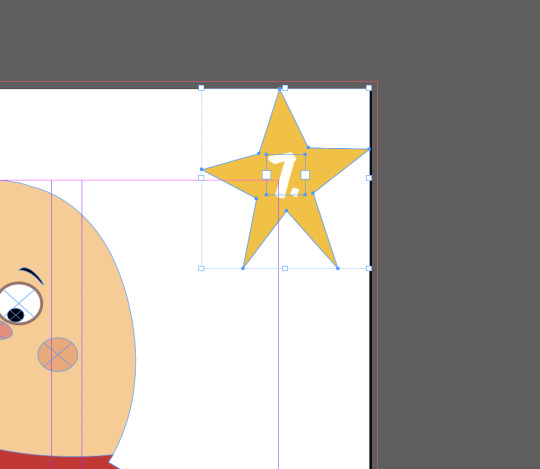
For my endpapers, i used the pen tool in illustrator and just drew a basic star, i ended up going back and using the A -direct selection tool to just make it a bit wonky and look like a kid drew it. I put a blue background on it and ended up changing it to a darker blue later. Then i grouped them together, dragged it into the swatches box, made a box and selected the star, which made a repeating star pattern throughout throughout the whole box.


Final endpaper design below:

Page 4 - Contents page / Page 5 - First Nursery Rhyme
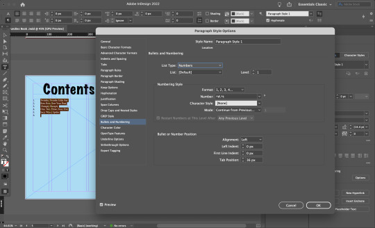
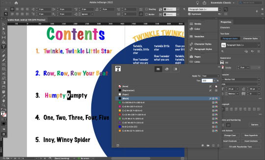
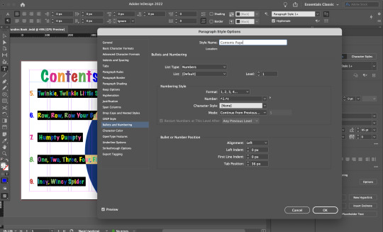
I made paragraph styles for my body texts and a seperate one for my titles. I did this by using the “paragraph styles” option and selected the text and then created a new style and saved it according to what it was e.g. “contents page” and “body text” or “song titles”. I also added in page numbers into the specific contents page and applied this in my “contents page” style.

Took an image from Google, used the pen tool to recreate, this was one of my “hand drawn vectors”.
Final spread of contents page and page 5 design:

I changed the star to two different shades of yellow and added in a blue circle in the background using the ellipse tool.
Page 6-9 - 5 Nursery Rhymes...

Row row - i used an image from Google, placed it into an ellipse that i created using the ellipse tool. I used the same blue background ellipse from the previous page. I also applied the “body text” paragraph styles into the lyrics, and the “song titles” into the title.

Humpty Dumpty - i used an image from Google as inspiration, then i created my own using the pen tool. This was my second ‘hand-drawn vector image’.
Final page 6-7 design:
I used the blue ellipses again from previous page to keep the same flow throughout the book.

one two three four - used an image from online, placed it under the ellipse using the layers option.

Incy wincy spider - used an image from Google and placed it into an ellipse that i created.
Final pages 8-9 design:

Page 1&11 - Endpapers -
Used the same endpaper design from the beginning endpapers.
Page 12 - Back cover -
For the back cover design i used the same cloud image from the front cover, but i just used another image from google, to continue the music notes/symbols idea from the front cover.
Overall, i think i like parts of my final outcome, however i could have done so much more with it if i spent more time on it and i could have used more of the InDesign skills that i have learnt e.g. using the master pages more, using character/paragraph styles and using the ‘text around an image’ - which i did not include in this book design. I also only used the column/grid system for my body text, and next time i would try to use it more for the other elements/content on my page. I also did not end up putting my book into the mockup layout from Moodle, that we were supposed to present it in, as i tried to do it in photoshop and failed so i gave up and just used my final screenshots.
0 notes
Text
Lip balm
Inspired by my new lipbalm as well as my brother’s rather pertinent observations about female makeup. Boruto and Sarada are nearly fourteen out here.
……
Boruto stared blankly at the blue sky above in a daze. If one were to ask him about the stupidly mellow look on his face, he was sure that he could only gurgle out something incoherent. His entire face was burning red. The tips of his limbs felt as though they have been set on fire. His brain was mush. His entire body felt though it had been turned to jelly. His lips still tasted like berries.
Berry-flavoured lipbalm.
Sarada’s lipbalm.
Boruto felt his entire body explode like a supernova at the thought of her. Falling on the ground over his back, Boruto tried to fight back the urge to squeal indecently and grabbed onto thin air to get himself back under control. Beating his thoughts back into coherence, Boruto tried to make sense of the events that transpired over the past few hours.
…..
Sarada, on their way back to Konoha from a three-day long escort mission, had requested for a short shopping break. “It will be only for an hour, Konohamaru-sensei.” was all she quipped before she ran off towards the very glitzy and very feminine looking shop. Large posters advertising abominable amounts of feminine products completely eclipsed its glass windows.
Boruto had known his childhood friend to be a tomboy but not a stereotypical one. She liked her clothes stylish, elegant and neatly ironed. She was not scared of lizards and cockroaches. She liked her nails clean and shurikens hitting the target perfectly. She liked history books, mystery movies and romance novels. She had a sweet tooth and liked black tea. She liked breaking her targets’ jaws with a single punch.
So, when that weird specimen of the female species came up with the sudden demand that she needed to buy a certain beauty product that was recently launched only in the Land of Wind and yet to be available in the Land of Fire, the looks she received from her three male teammates ranged from mild surprise to genuine dumbfoundedness. It’s not that they had had never seen Sarada using beauty products, it’s just that she never brought up such a topic with them, especially during missions. Sarada was always focused during her missions and “beauty” was the sacred territory which could only be shared with Chocho or her mother.
The marketplace of the town they were halting at in the Land of Wind was bustling with people. After Sarada had left without revealing what this urgently needed beauty product was, Konohamaru-sensei and Mitsuki decided to look for supplies. It’s November and tonight was going to be especially chilly but Konohamaru wanted to reach Konoha as soon as possible. Hence, the night will be spent camping outdoors covering as much distance as possible.
“Stay with her.” Konohamaru instructed his blonde student prior to leaving.
“Huh, why do I need to? Sarada can handle herself.”
“I know - kore. But I don’t like sending her off alone. Just stay with her.”
“Ugh, alright - ttebasa.”
It was no secret that the team led by Konohamaru was politically high profile, consisting of the Hokage’s eldest child, the younger child of the Leader of the Village Hidden in Sound, and the sole heiress to the prestigious Uchiha clan. Criminals and worse had tried to abduct all three members of the genin team individually at one point of time or the other. However, when the three were together, nobody stood a chance. The trio were the miniature neo-Sannin in making, together overcoming whatever shortcomings they might have individually.
Sighing to himself and crossing his arms up behind his head, Boruto manages to slip into the ridiculously overcrowded shop. Letting his arms fall with a sigh and scanning around for his teammate, his eyes found Sarada.
She was standing at a heavily advertised counter. An elegantly dressed shop helper is presenting her a shade-card of numerous swatches of what seemed to be chapsticks. No, tinted chapsticks. Ah, tinted lip balm, he thought as his eyes read the name of the product that Sarada seems to favour as she is handed her chosen product. The crimson-coloured cover of the newly launched product in her hand flashes the words “Berry Sherbet” in cursive. She wears tinted lip balm these days, Boruto comes to an amused conclusion. The growing realisation that his childhood friend likes fruity-flavoured makeup is amusing.
Yup. Definitely amusing.
Wading through the crowd, Boruto reaches her. Sarada is holding a demo stick of the lip balm and looking the crimson-coloured swatch across her wrist contemplatively.
“You like this one - ttebasa?” Sarada whips around, her eyes widening and cheeks flaming up, her face wearing an expression of a deer caught in headlights. Boruto grins like a Cheshire cat. This is going to be fun.
“What is with women and their fascination to smell and taste like fruit salad?” Boruto said, grinning while pointing towards the numerous products stacked up on the racks - moisturisers, hand creams, face washes, scrubs and other products he cannot recognise - all expounding the delights and benefits of added “fruit extract” and “fruity flavours”. The elegantly dressed shop helper gives him a scandalised look. Boruto ignores her.
“It’s - not that - no, I like it. Yup. It’s what I agree to be. I like it.”
“You are not making any sense.”
“I like makeup.”
“And that was already an established fact before you stepped into this shop.”
“Uh…”
“What are you so nervous about?”
Boruto frowned at the utterly floundering Sarada. There is no need to so nervous. Until and unless….
“Whatever are you buying this for?” Sarada only flushed red in response.
“Did Chocho put something stupid in your head again?”
“What?! Ugh! No!”
“Really? Because you have a tendency to go along with her crazy ideas.”
“Uh…”
“You are a terrible liar. You know that?”
“….”
Boruto frowns at the flushing girl in front of him. She never gets this nervous unless she is going to try something very out of character and highly embarrassing by her standards. He knows this with absolute certainty because no matter how much he (or she for that matter) pins down the origins of their friendship to that of their parents’, they are still friends in their own right. Childhood friends at that.
A gentle smacking noise brings his attention back to Sarada. Sarada had turned her back to him. Her entire body was now devoid of its earlier tension and now was casually leaning towards a body length mirror. Boruto’s eyes fell on her slightly curvaceous body.
Attractive.
Boruto shook his head as soon as the word appeared in his mind.
It wasn’t enough that he was always hyper aware of her presence while in his vicinity or her staring at him. Now he had to go ahead and be hyper aware of the her body as well. Boruto looked up into the mirror, freezing immediately as his eyes met Sarada’s in the mirror. Her eyes had lit up in amusement. She was slowly applying her new bought lipbalm. The crimson colour slowly stained her natural pink lips, the stick moving in slow, alluring manner. Sarada turns around to Boruto. The crimson tinted smirk on her face grows wider.
The next thing Boruto remembers is Sarada.
Her slender neck and wrists. Her porcelain skin. Her dark and long eyelashes.
Her scent. Her taste.
His lips tasting hers.
…..
“I AM AN IDIOT! IDIOT! IDIOT! IDIOT! IDIOT!” Sarada screeched out while burying her head in her pillow.
“Well not so much of an idiot. More like an absolute moron.” Chocho looked at her best friend with an absolute lack of sympathy, continuing to munch on her chips.
“Ugh! He has become an absolute pervert and creep since that day.” Sarada looked up at her in a frenzy.
“Stalking you, turning up on your balcony in the middle of the night, asking you out on dates, sending you bouquets of your favourite red roses and teddy bears, randomly touching you, blushing like a tomato, writing poetry about you….” Chocho ticked off her fingers with feigned disinterest. “Sounds pretty romantic but yeah, also creepy.”
“You said kissing him would tell him my feelings -shannaro!” Sarada pouted.
“Well yeah. That's what it did and this is his answer. That he can’t get enough of you. That he wants more.” Chocho said seriously. Sarada frowned at this thought.
“So if I accepted his advances, this craziness would stop.” Sarada put forward doubtfully.
“Well it would definitely hopefully tone down a lot. I agree with Mitsuki on this.” Chocho grimaced at the thought of the good looking jerk.
“Well….if that’s the case. I guess I should go and meet him.” Sarada got up from her bed.
“Yeah and take that lip balm along with you. Since he looked positively starved….” Chocho laughed out with mirth.
Sarada threw her pillow in her friend’s way before grabbing hold of her purse and a pair of sandals and jumping out of her window.
As she sauntered out on the path which lead to Boruto’s current location, she smirked. Having a positively lovesick boyfriend was not that bad of an idea.
……
This is not my best work. It gave a lot of trouble. Took me nearly six months to complete it. Please review my work. Thank you.
#boruto#boruto uzumaki#sarada uchiha#naruto#fanfiction#naruto fanfiction#boruto fanfiction#borusara#boruto x sarada#borusara fanfiction#boruto and sarada#mitsuki#konohamaru sarutobi#team konohamaru#chocho akimichi
173 notes
·
View notes
Text
The Retailers at Christmas

Summary: you get yourself a Christmas Temp job at Sephora, in a well known shopping mall. Only the thing is, you didn’t expect every shops workers to be so involved with one another, and you didn’t expect to be added to the ‘Retail Workers of Avengers Mall Secret Santa Party’ but… at least you got the job, right?
Warnings: This is a modern AU; This is completely for entertainment purposes/ all in humour. I got a retail job and, honestly, most of everything that happens has happened to me. Swearing/ Steve being a creep at times.
Characters: Loki (Sephora store manager), Steve Rogers (Art Supply retail worker), Bucky Barnes (Starbucks employee), Scott Lang (Baskins and Robins employee), Natasha Romanoff (New shop opening), Clint Barton (Nick’s Bits & Bobs), Sam Wilson (Sports shop), Pietro Maximoff (sports shop), Thor (Hardware store), Tony Stark (Starks Gadgets), Peter Parker (Apprentice to Stark) & Sharon Carter (The Tea Rooms)
Pairings: Bucky Barnes x Reader x Loki // Steve Rogers x Natasha// Sharon Carter x Thor // Bucky Barnes x Reader
Chapter Two: Where the hell does Nat work?
Your P.O.V (I’m still editing this, but wanted chapter two up)
You sighed gently, working in retail wasn’t really what you expected. You knew it would be difficult, extremely tiresome but you didn’t think it would be this hard. You were constantly going back and forth from makeup stands, tidying them up and helping customers, having to deal with horrible people too. Your co-workers aren’t all that much better, except Loki, most were actually extremely bitchy and not that much help in your first week.
A part of you thought this was a mistake, that maybe you should quit this job and try something more suited for your skill set. But another part of you was telling you to stick it out also, to just give it a few more days and weeks, to really give this a chance.
“Hello?” You are pulled out of your thoughts by a customer, an extremely pretty customer. Blonde, long glossy hair and deep green eyes and a kind smile. “Sorry to be a bother but I really need help picking a lipstick colour for my skin tone.” She looked oddly familiar, perhaps you had seen her before?
You gave a slight nod, allowing her to lead you to the Urban Decay stand. “Is there a certain type of shade you’d like?” You asked already eyeing her and then looking at the lipsticks and comparing them to her skin tone.
She gave a gentle sigh almost. “Honestly, it’s not entirely for me. There’s this guy, I think he likes me and I kinda want to make a statement, attract him to my lips? That doesn’t make any sense, does it?” She chuckles at herself, thinking she sounds like an idiot, but you quickly shake your head.
“No, no, it makes sense. You want him to notice you more? But more so that area, just to be sure if he does like you?” You worded it as more of a question, she nodded quickly, grinning and showing off her perfectly white teeth. After swatching shades for her, which took around fifteen minutes, not that you minded because she was actually extremely nice. “I feel like I know you from somewhere, is that crazy?”
“I’m Natalia Romanova, famously Natasha Romanoff to my American fans, a Russian model that has recently made her own clothing brand and makeup.” Your eyes widen, you had been following her on Instagram since… well, since Clint had shown you her underwear photoshoot last year. “Yeah, I’m launching my first store opening in January and wanted to be around for the renovation of it, plus I heard this shopping Mall is one of the best.” Natasha shrugged with one shoulder. “It also explains the uniform,” She gestures to the uniform she is wearing, a pastel blue polo shirt with her logo embroidered in a dark blue, “It’s kinda a prototype, I’m undecided on the colour scheme.”
You nodded for a few seconds. “Wow. This is kinda surreal, I am so happy that you’re finally bringing your collection over here, I’ve been staring at your clothes in wonder over Instagram.” You chuckled along with her, “So, does this mean you’re going to be part of the Secret Santa party this year too?” You asked and she quirked an eyebrow, “Man, oh man, I’ve got to update you on some stuff.”
Bucky’s P.O.V
“Worst shift ever,” Bucky tiredly sighs as he plops down in the empty seat opposite his best friend. Wiping his hands on the Starbucks apron. Glancing up in time to see Steve quickly divert his attention to him, looking shifty as hell. “What are you doing?” Bucky sighs, already looking around the food court for what could be the source of his friend's distraction.
“Nothing, forget it.” Steve quickly dismisses, “what’s the worst Starbucks shift? Thought every shift was that?” The blonde changes the subject.
Bucky’s eyes still sweep the area and shrugs. “Yeah, that’s right. Heard Tony finally got an apprentice, some kid that’s still in school. Gonna be working weekends,” Bucky fills Steve in on the gossip he missed this morning before opening. “Why do you have taco-bell, Panda Express AND a burger meal from Coulson's Grill?” Finally noting the table filled with food, not being eaten.
Steve’s face turns a bright red, looking almost sheepish too. “Well… uh- I couldn’t decide what I wanted.” He stumbles, looking up at Bucky’s unamused glare. “Fine,” he sighs, shoulders slumping, “I looked suspicious going into each place and looking around, asking about employees that worked there, I had to buy something.”
“Steve, I say this cause I love you, dearly. You’re like a son to me-“
“I’m older than-“
“You’re acting like a creep. This is coming from me, the guy that used to write his number on every girl Starbucks cup. Stop it, I don’t want you getting fired ‘cause you got some weird pervy crush on Nat.”
“HA! So you do know her?” Steve yelled, earning weird looks. “And it’s not a crush, she walks around in an employee uniform that I never saw before. I’ve looked on every floor for the store, can’t find it. Figured it might be a restaurant-“ Steve stopped abruptly at the look on Bucky’s face. “Okay, so… I’m a creep. Just tell me, where does she work?”
Bucky laughs, “No way. Besides, she orders stuff from Starbucks, I see her name tag. That’s how I know her name.” Bucky shrugs, “Y/N also talks to her when working shifts at Sephora.”
“So… what time does she go to Starbucks?”
“Around ni- Hey, no. You’re not hanging around Starbucks in the hopes of getting a glimpse. You’re insane, this is from that Sam guy, stop hanging out with him. I’ll tell her you’ve been asking about her, she might pay you a visit.”
Steve’s eyes widen and he shakes his head. “Don’t you dare!”
“Then stop being creepy, okay?” Steve nodded slowly, watching Bucky eat one of the many meals, eyebrows furrowing slightly also.
“Wait, who is Y/N?” Steve watched as Bucky slowly stopped chewing his food, eyes shifting around nervously and he smiled bashfully. “... Do you have the hots for Loki’s new employee? I thought you were strict ‘No Sephora chicks’? Because they’re stuck up and talk about make up all day long.” Steve was grinning wildly at his best friend, Bucky sighed.
It took Bucky a few seconds before he replied. “She ain’t like those other girls, she’s actually pretty cool and funny, she’s friends with Clint! That says a lot about a person. She comes in and orders coffee’s sometimes, we got chatting over some stuff.” he shrugged, muttering the last sentence and biting his food to stop from talking. He glances up to see Steve’s smug face, arms crossed and a look of ‘this is gold gossip’. “Aw, Stevie, c’mon… don’t look at me like that, dude.”
“Just it’s been three years since you actually took an interest in someone, good to know you aren’t just the Starbucks Fuckboi.”
“You need to stop hanging around Sam, he’s a bad influence, can’t believe he branded me as that.” Bucky sulked pushing the food away. “Him and Sharon, need to be stopped. Speak of the devil and it will come,” Steve turned his head in time to see Sharon Carter walking up to them, a big smile on her face as she looks at Steve who greets her with the same back. “Hey, Sharon!” Bucky says in an overly enthusiastic voice.

Sharon tilts her head, crossing her arms. The lilac shirt with the cursive font on the left, her name badge just underneath. “Barnes, Steven, how are you both?” Steve shrugs and Bucky just ‘mehs’ at her question. “Wow, lively bunch today, Tony wanted me to remind you both that the annual ceremony of the name picking is this Saturday. It’s being held at The Tea Room, I’m sure you remember where that is, right Barnes?” Sharon bats her lashes at him, his smile drops and he rolls his eyes. “Just making my rounds, boys.” She nods before leaving, chuckling as she does so.
“Can you believe her?” Bucky hisses at Steve. “She acts so high and mighty because she works at ‘The Tea Room’” Bucky puts on a fake British accent, “Ugh. British chicks, fuck ‘em. So prude and high class, so I tried getting a job there, didn’t want it anyway. Starbucks is so much better, at least people my age like me.” Steve just smiled and nodded along, chuckling at Bucky’s childish behaviour towards Sharon.
“Sharon isn’t British.” Bucky frowned and looked at Steve, “She isn’t British, Buck. She was born here, her sister, Peggy is the British one.”
Bucky scoffs. “Don’t say her name in front of me, I’m still mad at her.” Steve sighed and shakes his head, “no matter how much pain she caused you, you still choose to defend her. No wonder you stalk Nat instead of talking to her, issues, you’ve got ‘em.”
*
Bucky went back to Starbucks, sighing as he stood behind the counter beside his usual work buddy, Scott. They both had been hired around the same time last year, neither knowing how to make coffee’s or any of the fancy shit that happens as Starbucks, but they gave it their best. Usually, Scott makes the drinks and Bucky get the orders unless it’s super busy, then they both make drinks and take orders.
“How’s Cassie?” Bucky asked when the crowd had thinned out, Scott looked up from the cleaning the hot chocolate machine with raised eyebrows. “Wasn’t it her Birthday like four days ago?”
Scott nodded and chuckled. “Yes sir, took her to the zoo.” Bucky chuckled, he had met Cassie a few times, she would sit at one of the tables waiting for Scott to finish a shift. “She’s growing up too fast, Maggie is thinking of having another one with the douchebag but… I don’t think me and Hope are at that stage, yet.” Scott sighs and Bucky nods, “so, Y/N, huh? Got a thing for her.” Bucky whipped his head to glare at the chuckling, smaller, man. “Steve sent it in a group text to me and Sam, plus Clint.”
“That fucker. I’m getting him a punch in the face for Christmas.” Bucky seethed.
“Brightside, you might pull her name Saturday.” Scott nudges him to take the ladies order, leaving Bucky to blush at the thought of that.
~ I hope people are liking this, it’s actually difficult trying to introduce all the characters, hence why I put Shar, Steve, Bucky and slightly Scott in this chapter along with Natasha. What do people think of the characters so far? Let me know what you think will happen? Who you think people will get as their secret santa! Still so much more to happen!~
(Thank you, all so much, for allowing me to do this instead of requests this year. Wanted to focus on a series. I do have a job, working in retail, hence the inspiration for this. So, updates will be all over the place, which I am sorry for. Hope you enjoy this. - Rosalie)
Tag List ( Technically CLOSED but- if you want to be added; comment on this post, no asks)
@promarvelfangirl @zombiewerewolfqueen @avengersandchill @reniescarlett @taylorjacksonandtheolympians @therealtrashhere @jamesbuckybananabarnes @2-many-fandoms95 @the-resident-demon @medusassirene @writingcameos @fleurs-en-ruines @mpmark @spookyphsyco @awwtommo @cheshiresmiles @sabrinawalden510 @theonlymoosewhoeatssalad @eggsyunwincankillme @pure-fitz @hdthdthdt @millie-saurus-rex @the-great-escapist99 @meowmeow230 @earinafae @chronicles-of-my-chocolate @wolfgamzee @destroy-society @somewereinthegalaxi @niallandsebastianaremylife @tum-icanteven-blr @woo0t @timemngmtoptimisationproblems
#avengers one shot#avengers imagines#bucky barnes x reader#bucky barnes one shot#natasha romanoff x reader#natasha romanoff one shot#steve rogers x bucky barnes#steve rogers x reader#steve rogers imagine#sharon carter one shot#scott lang imagines#scott lang one shot
167 notes
·
View notes
Photo


First in my Project workout 2018 are children! This is something I’ve wanted for a long time, since I love that outfit but it never had the right shoes. Admittedly it’s a little boyish, but my girls don’t mind. ;)
This is for CU-- meaning both girls and boys.
It has fat morph, which can be seen on the girl in red.
They come in a variety of colours-- I transferred Charterzard’s recolours + some of Fakepeeps’s original ones, and also made three of my own (darkblue, darkgreen and red), for a total of 24!
Swatch. Fakepeeps are bottom right, mine are top left, rest are Charterzard’s.
They’re categorised only as gym clothes, and all colours are available for both genders, if I remember correctly.
Download.
Files are compressed, clearly named and tooltipped. Charterzard’s were originally numbered, so I’ve kept the numbers and added the base shade of the recolour, so if it’s a variation of blue, it will have blue at the end and so on.
Credits: Fakepeeps, Charterzard.
#The sims 2#Sims 2 download#Sims 2 clothes#CU clothes#CF clothes#CM clothes#Sims 2 project workout 2018
94 notes
·
View notes
Text


Hi guys,
Since I have no self control I decided to treat myself to the new Jaclyn Hill Vol 2 palette in collaboration with Morphe ,£39.00. I love my original Jaclyn Hill palette I got for Christmas and have used it a lot so when I saw this palette I just new I would end up getting it eventually. I still don’t really know a lot about Jaclyn Hill but I love her colour choices in her palettes with Morphe. ( FYI Before we start the review I did use the code JStar on Morphes website to get discount off the palette and it’s Jeffree Star’s discount code that works for everything on the site so if you want the palette don’t forget to add the discount code.)
So I said this year I wanted to do brighter looks and following on from my Blood Lust palette I decided this palette was the perfect direction to add more colour. This palette is the perfect sunshine summer palette, I mean all the colours just scream bright and beautiful. This palette as you can see has the perfect balance of nude / light wearable colours and then deeper brighter colours to add some neon to your eye looks. Like before this palette has a mixed or matte, shimmer and pressed glitter formulas so you really can do a lot with this palette. I really love the colour story in this palette because while this is a brighter palette to the original it’s still so wearable that anyone at any makeup level can wear and enjoy it.
Palettes like these really get me excited about adding more colour and being a bit braver with my eye looks. When I got the original palette it had a few bright colours that really got me into using colour and this palette is the perfect push to play with brighter colours. Since using my Blood Lust palette I don’t find the idea of bright eyeshadows so scary anymore. The colours in this palette are also so pigmented that a little goes a long way. I’ve swatched a few of the brighter shades to see how bright they actually are and wow it’s genuinely insane how bright the colours actually are outside of the pan.
But we do have to mention packaging. Like last time this palette has a gorgeous white packaging going on with Jaclyn’s name in the middle but unlike last time they have now added the shade names in the palette underneath each colour unlike last time when they were at the back on the palette. I’m so happy they made this change because that was a little annoying to keep going back and forth. You can tell with the packaging now only have they improved the design but they clearly listened to feedback which I always respect.
Anyway I’m so excited to start using this palette and create lots of different looks to show you all.
Lots of love
Bella x x
#make up#makeup#photography#beauty#me#cosmetics#makeup look#my photography#girl#makeup blogger#jaclyn hill#morphe#jaclyn hill x morphe#morphe palette#morphe eyeshadow#eyeshadow#new in make up#make up tag#beauty blog#beauty blogger#beauty blogging#make up blog#eyeshadow look#eyeshadow palette#lifestyle blog#lifestyle blogger#blogger#blog#blogging#morphe babe
7 notes
·
View notes
Text
Print Textural Collage - Part 3.
Mixed Media Rubbings
Here are mixed media studies I have completed using my textured collage from a couple posts ago. Mixed media is combining materials together such as biro and watercolour to create a finished outcome.
1.

I used 2B pencil, Highlighter, Oil Pastel and Charcoal for this work. I like the sectioned effect by using media in split areas to create division and movement within in the work. The colours also blend together and I like the textures I was able to pick up with the pencil and emphasise with the other media over the top. In addition I like the texture of the charcoal from where I have rubbed this along the bottom and sides. I would have liked the textures to come across more though in the base layer to create more depth in the work. I like this work.
2.

I like the abstract approach I took to create this piece. I used pencil, felt tip and oil pastel to create this work. I used one media and shades small areas over the page moving my collage underneath. I moved this around and rotated it to create interesting sections and textures. I repeated this for oil pastel and this creates an effect as if I pieced this work together seperatly. I enjoy the outline with maker pen to enhance the fractured effect which I really like and is a strength. The colours also work well together and clash against eachother nicely creating a contrast. Another effect I like is that the textures can be seen especially with the yellow and card swatches. A weakness is that I wish I layered the colours and areas more to choose any gaps and create a piled effect. I like this work because of the abstract and wacky approach.
3.

I experimented with red and blue paint and biro. For this study I did not move around the collage I wanted to see how the colours look once layered. I watered the acrylic paints down with water to thin them out and using a brush I lightly glided across the page. I started with the red first and I was easily able to pick up textures and definite features especially the hand and face. The blue further picked up texture especially around the hair compared to the red and I created harsher patches with more product on purpose around for an unblended look. Once dried using a biro I was able to outline areas where texture was picked up the most and with the heavy paint switches I outlined around following the brush strokes enhancing the effect. The red and blue work together strikingly and create a contrast I really enjoy. The style I also like and the textures with the biro also pop adding depth and dimension. Out of these mixed media experiments this is my favourite and most successful in my opinion and the second study is the least successful for me.
4.

I used coloured pencils, charcoal, oil pastel, marker pen and 2B pencil. I took rubbings of the face in red, orange and yellow coloured pencils across the page and the I worked over the top using the rest of the media for sections. This method creates a collage and overlapped style which I like and reminds me of abstract artwork. A strength is that the textures come through well and are distinctive showing the textures clearly. This imagery creates an interesting layer and brings movement to the work. Another aspect which is strong is that the media works together and to me appears balanced and a chaotic appearance which to me works well. A weakness is that the yellow rubbing of the face did not worm and this could be due to how light this is. This is strong.
5.

I used a 2B pencil and blue acrylic paint. I took a rubbing of the entire portrait in pencil and then turned the portrait upside down and took a rubbing in watered down acrylic. A strength is that the acrylic paint is not too thick and the pencil rubbing is visible underneath. This works really well and I like the layering effect. Another strength is that the colour blue works well since this is bright and contrasts nicely with the pencil. The acrylic also seemed to pick up several textures which was successful. A weakness is that I wish the pencil was darker so the first layer shined through more brightly creating more contrast. This will be down to me not pressing down enough. Overall, this is among my favourites of mixed media studies. Simple but very strong.
6.

I used 2B pencil, charcoal, red pencil, oil pastel, biro, magazine, tissue paper and book page. I took a 2B pencil rubbing and then torn sections of the different media stucking this down. I then lined my page with the texture portrait and went over the sections with different media to fill in the gaps. A strength is that this looks like a collage and I like the use of new surface media such as tissue paper because more texture is added. This also makes the work more interesting. A weakness is that the red coloured pencil was not very strong and failed to pick up textures. I do not like this study since this came out different to how I expected.
Working with mixed media has been fun and allowed me to explore avenues that the single rubbings did not. I played around by moving the collage, experimented with composition, layers and colours to create these works.
0 notes
Last Seen Blogs
hello-last-days
I Need Time

edgelord-kyloren
Kylo Ren
edgelord-kyloren
Kylo Ren
melissacorpeno
Luna 🌙

ophiaihel
I'VE MOVED!