#YouTube Cover Photo Size
Text
Ultimate Guide Of YouTube Cover Photo Size In 2023
Your cover photo is one of the first things people see when they visit your YouTube channel, so it’s important to make a good impression. The size of your cover photo should be 2560×1440 pixels for the best results.
In this guide, we’ll show you how to create a great-looking YouTube cover photo that will make your channel stand out. We’ll also provide some tips on what kind of image works best as a cover photo. Read more
0 notes
Text
@steddieas-shegoes :)
the media and fans have a field day with it. steve and eddie have been public for years yet there's pictures all over twitter of steve cozied up in a booth in the corner of whatever bar, tucked tight into gareth's side under his arm with eddie nowhere in sight. a different fan posts a tiktok of them from a different angle and a little closer and you can clearly see that steve is drunk. his eyes shine unfocused in the camera flash and his cheeks are flushed. in the video he laughs loudly at something and just before one of cc's security guards blocks the view, steve leans in and buries his face in gareth's neck and gareth's fingers go to his hair.
the cheating allegations come out after that. article after article with the photo on the front page but it's nothing but radio silence from the band's twitter. no statement from eddie or gareth. fans think they're hashing it out behind the scenes and are preparing themselves for gareth's exit statement from the band or for the news to hit of steve and eddie breaking up.
none of that happens.
gareth stays in the band, steve and eddie go on like normal. they're papped in a starbucks in new york looking just as much in love as they were before the scandal. eddie and gareth don't behave any different in the videos they post of each other or on stage.
it kind of dies down after that- until a video goes up on the band's youtube one afternoon, shot that morning.
they try to keep themselves as authentic as they can, show the fans that not everything is sunshine and rainbows in the industry, and that they're real people who do real people things, too.
in the video, someone knocks on a hotel door and jeff answers. he says something that's purposefully scripted very badly and it gets a laugh out of the guys. the video shows them walking into jeff's room and it's revealed that it's a room tour. they pan around the corner into the main room and there's a lump in the bed.
there's no awkward silence between them, just a laugh from freak and a "jeeeff, it's almost ten a.m." and then eddie's pulling back the covers to reveal a slumbering steve.
people watching expect the footage to cut off abruptly or for eddie to angrily demand the situation, but again, it doesn't happen. he just laughs and squats down on the side of the bed and runs his hand through steve's hair until he wakes up.
"hey, sweetheart," he says, his voice dripping with fondness as he smiles a syrupy smile that hundreds of fans have dreampt of being on the receiving end of. "have a good sleep?"
they see steve reach out and pull eddie in by the head for a kiss. the video goes back to its scheduled programing after that, eddie following steve into the bathroom to get ready.
they don't do many interviews in the span of all this happening so fans and the media are left wondering what in the world is going on between the five of them. the boys act the same on stage every night without any signs of jealousy between them.
and then steve is photographed wearing a hoodie that fans can clearly see belongs to freak just from the size alone. neither steve or freak are small guys, but the garment is like a dress on steve. it almost goes down to his knees and the arms hang at least three inches passed his hands. it threatens to hang off of one shoulder but goddamn does steve look cozy and comfortable, burrowing into the hood pulled over his head like a little hamster.
the hoodie isn't what gets their attention, though.
it's the fact that the picture is from the band's soundcheck, to the band's twitter, and that steve is sitting on gareth's lap at his drum kit, while wearing the hoodie, and while eddie is leaning down and kissing him. gareth doesn't look put off by it. he's looking somewhere off camera and laughing but his hand is still on steve's waist and steve's is tangled in eddie's wild hair.
it answers all and none of everyone's questions.
4K notes
·
View notes
Text

blender lighting tutorial + tips.
requested by @thecrimsonsimmer + recommended viewing: youtube video one, two, three, and four. this post will be dealing with newer versions of blender (2.8+) and cycles since that's what i'm more familiar with + commonly used for rendering. this is coming from me as an artist with some dabbling in photography and things i've learned in college!
references and setting the mood
are you basing your render on an existing photo? study the light source and what direction it's coming from: that's what's going to tell you your set up for a similar effect.
if you're not basing it on an existing piece, a good start is knowing How you want to set your subject (your sim) up - do you want them to be in the spotlight? are they in a specific environment that has neon lights? are you going for moody or something fresh, bright? definitely look up colors and their meaning (color theory, movie screencaps, etc.) to create a stronger image!
using resources to start the set up
it's always a good thing to mix your tools with different communities, such as the art community! many have lighting tools to figure out how to color their subject, such as this free-to-use head figure that depicts where the lighting source should be placed.

there's also the photography community and teaching people how to set up their lights for certain setups. video three and four linked in the beginning are from photography viewpoints.
spot? area? point? sun?
let's think of the lighting types as objects - a spot is like a plain lightbulb, area is a reflective sheet, spot is a flashlight, and the sun... well is the sun!
a spot is similar to an area light, but triangular/a cone. think of a helicopter search light, it's focused on a small area with the most light concentration. these can be used for lamps with lampshades, car headlights, or a lighthouse.
an area light is great for lighting up technology. a phone screen, tv screen, tablet, anything that's an LED screen emitting from a surface. the light is not as concentrated as a spot and is meant to cover more flatly (hence the rectangular source)
a point is best used for small pops of colors such as candlelight, lamppost, lightning bug tail, etc. a small source that has nothing covering it.
a sun covers the entire area and can be used as the overall mood setter. it can create filter over the entire render by just shifting the color like you would see in a movie. you'll be given a line with a sun light that gives the direction of where the sun is coming from. basically a spot light just on a much larger scale LOL.
power + coloring

this screenshot is mostly what you'll only use to start off with. watts is the unit of measurement and the higher you go, the brighter the light will be.
examples with a white colored point light
10W-20W: general portrait lighting
30W-50W: bright source, close flashlight for example
60W+: blinding
coloring is just like the system for in game lights for ts4. shift it to whatever you want it to be (click the white bar, that's the color preview) and mess around with the vibrancy. the darker, more intense color, the less it's going to appear on the sim.

closeness and intensity
similar to what's shown in the head lighting tool shown earlier, the closer the light is, the more that specific area is lit up. go too close and your sim could be completely washed out. it helps to change the size of the light (change with the radius slider) to better imitate what you're wanting. the larger the radius, the more diffused and softer the light source will be.
close + small = very clear of the light source shape, can obviously tell where it is in relation to the subject
far away + large = soft lighting, more of a hazy lighting of the color you choose.


to quickly adjust the light, press "G" and hold down your middle mouse button to adjust which axis you'd like to edit along. green is the x-axis, blue is the y-axis, and red is the z-axis. you can also press "G" and type the letter of the axis you want to use. drag the mouse to change the placement on that specific axis to however you want. if you want to freely edit the placement, just press "G" to move it out of the axis bounds.
world lighting
take this step as setting your canvas color before you start painting. in order for the values to look their best, change the world color to the same hue of the color you are mostly using. for example, this is set in a red-toned environment:


this is essentially changing the cast shadow onto the sim. the default is gray and will muddy up your undertones if not changed properly. for this instance, if you were to still use the same red point light in a gray world color it'd look like this:

of course, this will be based on if you have an environment image or not that can affect your lighting overall. this post is based on the fact there is no environment image and what not! if you need a visual demonstration on how to mess with the world lighting, check out this short video.

i hope that helped anyone beginning to render or wanting to light up your own scenes! i'm no rendering expert, but here's some of the helpful tricks i've learned and collected over the years<3 if you have any other questions feel free to send an ask!
#ts4 blender tutorial#sims 4 blender tutorial#ts4 render tutorial#sims 4 render tutorial#lighting tutorial#lyko posts#tutorial#long post
204 notes
·
View notes
Text
About my new camera
Yes, I bought a new camera, but it was not a last minute decision. Well, the camera purchase was pretty much last minute after I saw a video about the camera I chose and did some research on the Web & Youtube.
For about a year I've been wondering if I should sell my Sony a7r3 body and Sony/Zeiss Sonnar T* 55mm f/1.8 lens, which came highly recommended, including by Ken Rockwell, who I also turned to for advice about my new camera. The 55mm f/1.8 lens was highly recommended; it was one of the original set of lenses for the Sony a7 line of mirrorless cameras.
I wondered about getting rid of it because, while I enjoyed using it and got some great photos with it, my 24-105mm f/4 Sony G lens also took great photos, and it covered the 55 mm range. Granted, the 55mm produced super creamy bokeh, but the 24-105 f/4 did too, though maybe not as creamy. Maybe for me, as a vegan, the 24-105mm f/4 bokeh was (is) creamy enough?
Anyway, here is one of my favorites, taken with the 24-105mm f/4 about 6 months after I bought the a7r3. (I've owned an a7r3 for over 6 years now...)

Like butter?
Back to the new camera story. About a year ago, I saw this video about "one camera/one lens."
youtube
I also watched a video where he discussed keeping camera gear down to a useful minimum "5 Reasons to Keep Your Equipment Simple feat. Documentary Photography Daniel Milnor." His insights resonated with me because I am not a gear head. I like having one lens on each camera body and not having to fidget. I like to keep it simple.
Then, about 3 weeks ago, I watched this video.
youtube
Now, I go make photos in SF often. Every once in a while I also go to Oakland, which has, at least in the 30 years I've been in living in California, a super bad reputation. I've never felt unsafe in either city walking around with my a7r3 with the medium sized 24-105mm f/4 lens on it. Granted, I carry it in the original, small, Peak Design sling bag, which I immediately christened my Audrey Hepburn camera bag because it is so elegant, especially with the little brown leather handle on top.
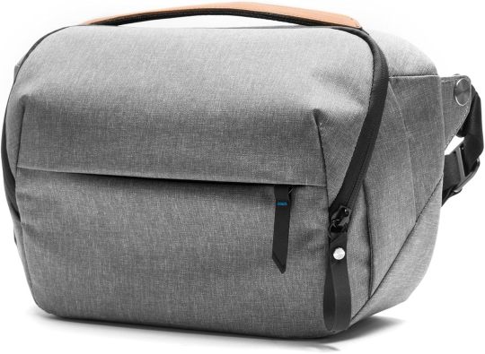
BTW, I also own the Peak Design messenger bag, but I almost always use this one for my camera and use the messenger bag for when I need to carry my laptop. The 5L sling bag had a bonus: Both my a7r3s with their respective lenses attached fit in this one little bag. Tight, but they fit.
Anyway, that video about feeling safe did set me to thinking, since I am getting older and walk around alone, but it also made go back to wondering if I should carry both cameras, which I rarely do anymore.
Then Adrian Vila posted this video.
youtube
And then I found his original video, about 4 years old, about the RX100 vii.
youtube
the idea of carrying a smaller camera with a 24-200 zoom intrigued me, I did some research, including visiting Ken Rockwell's site, where he highly recommended this camera (see the review here).
I was convinced, but I knew that the camera is 5 years old (and Sony has no plans of releasing a newer model), so I looked up prices for used, and if I could find them, new cameras. I eventually just opted to get a new one and am going to sell my a7r3 with the 55mm f/1.8 lens. Interesting fact: The Sony RX100 line (7 models) all have a Zeiss Sonnar T* zoom lens. Mine has a 24-200mm f/2.8-4.5 variable lens, so I am still going to have a Zeiss lens, even after I sell my 55mm Zeiss.
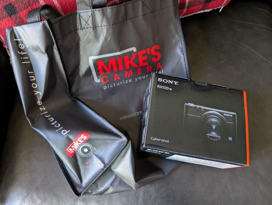
Then there was the coincidence that they actually had an RX100 vii in stock at the Sacramento store. I visited the Mike's Camera Website, choosing specifically the Sacramento location (they have several locations in California and Colorado) and saw they had one for sale, so I drove last there Wednesday to buy the camera.
Funny thing is, I learned they don't usually carry the RX100 vii anymore (it is, after all, discontinued) but they happened to get a delivery of one just that day from their warehouse. (I could have ordered it and it would be delivered to the store or to my apartment.) The sales person (Colton) went to check if it was ordered by someone, but no, so the camera was mine.
I explained to Colton how when I went in to buy my first a7r3 on 12-26-17, they did have it, but I wanted the 24-105mm lens, which was just released (and in popular demand) and was told they only had one, which someone pre-ordered. However, the salesperson (Taek) checked and it turned out that person had not gone in to pick up the lens or contacted them about it, and it was sitting in the store for 6 weeks, so Taek opted to let me have it. As Colton said, I have good camera Karma.
So, yes, I am going to be using a smaller camera with a smaller sensor (1 inch) that has only 20 MP as opposed to my a7r3's 42 MP in a larger full frame sensor. However, while thinking the new camera purchase over, I thought about the awesome photos I got from my Nikon D50 with its dinky 28-80mm f/2.5-5.6 lens, and the RX100 is a huge step up.
Finally, here are 2 photos of my new camera.
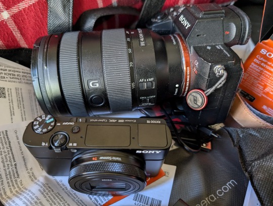
OMG, my a7r3 is dusty...
Ok. That's all for now.
The adventure continues...
49 notes
·
View notes
Text

𝙈𝙮 𝘾𝙧𝙚𝙖𝙩𝙞𝙫𝙚 𝙋𝙧𝙤𝙘𝙚𝙨𝙨 & 𝙋𝙡𝙖𝙣𝙣𝙞𝙣𝙜
A while back I received this question asking if I'd mind explaining what my creative process is like and some wanted further explanation about what goes into planning multiple generations & arcs. I do apologize that this is so overdue, and it's literally taken me months to get to. My process is always changing, and I'm constantly adding in pieces that help make the process easier. Because of this, the way I answered the question back then is also quite outdated, at least in terms of how I plan each shoot/post, and I'll hopefully provide further clarification below the cut.
However, first and foremost, I want to say I am by no means an expert and different processes work for different people. Your creative process might look totally different than mine, and that's okay! Whatever keeps you coming back and sharing your work is always going to be the best & most efficient way of doing things.
But I do think it's helpful to get insight into what works for others when you have no clue how to plan things like this, or where to even begin. So, without further ado, here is my process.
Mainly, I use a website called Milanote. It's super helpful for organization purposes, and it's mostly free. They have free templates you can use, or you can make your own. The only downside to it is you're limited on the number of "cards" that are available to you. They do have a promo that you can use where if you get someone else to sign up, you get more cards, which is what I did.
My main folder basically looks like this:
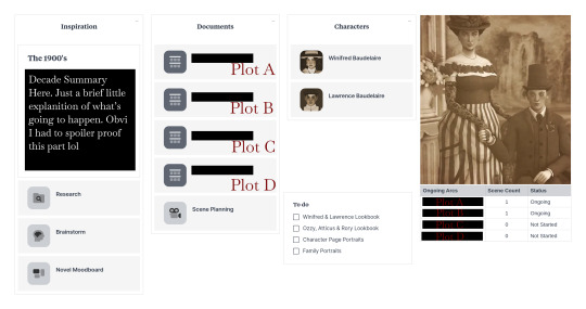
𝙏𝙃𝙀 𝙍𝙀𝙎𝙀𝘼𝙍𝘾𝙃
The research folder is an unorganized, organized mess and basically just looks like this:
This is where I keep all my resources, and all of the things I've researched for my story. As you can see, this includes various sources like YouTube videos, various articles, quotes, photos and even some music as well. I like having this all in one place so it's easily accessible for me, but you could just easily keep all of this in a Google or Word doc if you're low on 'cards'.
𝙏𝙃𝙀 𝘼𝙍𝘾𝙎
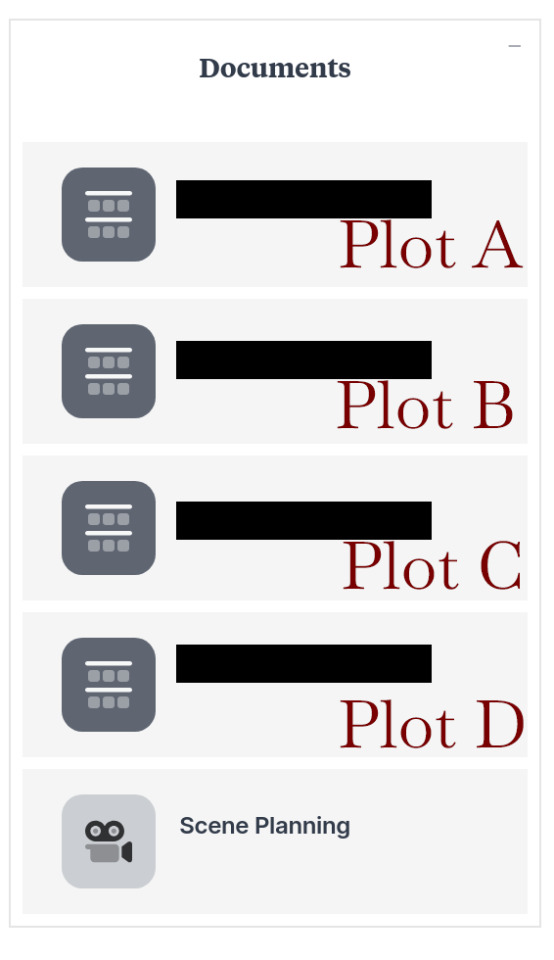
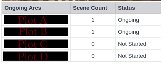
Next we have these two sections. Obviously, I had to cover them up to avoid spoilers but I did label them to hopefully provide insight. Essentially, for this decade in particular, there are going to be various arcs happening at once, especially since the children will be growing into adults and laying their foundation is going to become crucial to the story. However, I'm trying to limit myself from having too much going on at once, which is why I try to limit myself to only four arcs playing out at once.
I will also say that Plot's A through C are interconnected, or at least they will be eventually, while Plot D concerns one of the children and will impact things later down the line. This is super important for really tying different ideas together, and making sure random plots don't seem to just pop up out of the blue.
The table for myself helps a lot with this, so that I can easily see what arcs have been started, and how many 'scenes' each one has. I find this to be useful because then I know that none of the arcs are stretching too long, which ones might need more fine tuning and which ones have yet to flourish or even begin.
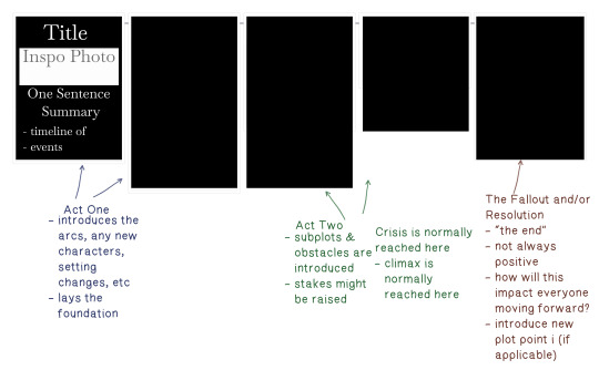
Each arc basically has something like this going from beginning to end, essentially following the classic three act structure. Not all of them have five components, some more or less, but generally it ends up being five. Now, this doesn't mean every plot is only five posts or anything like that. Most of the time, the timeline of events needs to be broken off into bite sized pieces and that's okay.
The resolution doesn't always mean a happy ending, and can also serve as a way for me to introduce any new arcs for a specific character, which would then start the process over. You can kind of think about this when watching a lot of television shows. We watch all this build up starting on episode one, and things get more and more intense until we finally reach the season finale. And then woah, with two minutes left of the episode, we see that the character they just thought was dead is actually alive?! Which then leads us into season two.
I do think planning this way could feel really tedious for some, but I like to map things out before I start introducing any arcs so I at least know it isn't a quick "one shot" plot, something without actual purpose or an arc that doesn't really seem to have any sort of end goal that makes logical sense. It also just helps me remember what everyone's up to, especially when there are so many characters to keep track of.
𝙎𝙃𝙊𝙊𝙏𝙄𝙉𝙂 𝙏𝙃𝙀 𝙎𝘾𝙀𝙉𝙀
Before I go into the game, I basically write out a "rough draft" of sorts. This includes dialogue, any background noises (things like a clock ticking or the tapping of a pencil), a brief description of each shot/photo (including any post-editing things like adding blur effect), and a summary of what's happening in each panel.
Because I only use one document for this, and clear it out once I complete a scene, I do not have any examples to show from The Baudelaire Legacy, so I created a mock-up scenario in which Ozzy flunks a difficult test at school, as seen below.
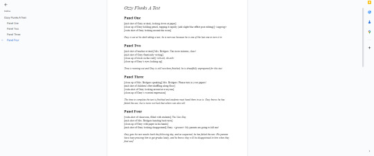
Once I have that written, I plug it into my 'scene planning' board. However, I only include the shot/photos, and the short summary. On Milanote, I also plug in the location, time of day, attire and any pose accessories I might need (so that I remember to create an extra outfit for it). This ends up looking like the example below.

I typically will only have this open on my second monitor while I'm shooting the scene, and I just tick the boxes as I go along. This is really nice if you have to stop mid-shoot, and helps me pick up where I left off without getting confused.
I do also edit each panel in-between shooting to make sure I'm getting the shots I want, however, I don't encourage everyone to have Photoshop and Sims 4 open at the same time.
𝙏𝙃𝙀 𝘾𝙃𝘼𝙍𝘼𝘾𝙏𝙀𝙍𝙎
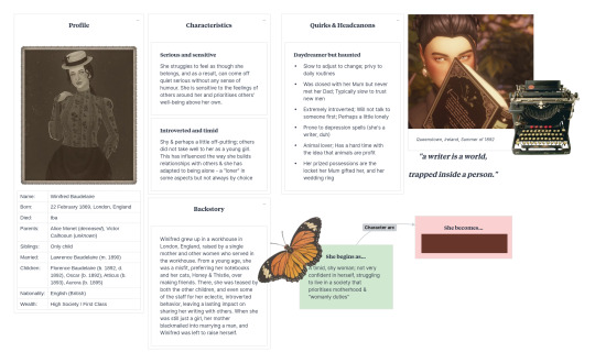
Then we have the character sheets for each of our characters. Right now, I'm only focusing on Lawrence & Winifred (though, the children's arcs are in a 'idea dump' document).
For me, this is the most important piece of the story. One of the reasons shows like The Sopranos and Breaking Bad are considered some of the best writing in television history, is mostly due to the fact that, in my opinion, they prioritize this as well. It's always good to have a strong character in mind before you begin, and this is because you don't want them to step outside themselves.
Of course, your character can change and bend within their environment or plots happening around them, and they certainly should, but you also need to ask yourself if it's being done logically. Asking yourself, 'Why did they end up this way?', 'How did we get here?' and 'How would this character specifically react to an intense situation, stress or hardship?' is crucial when writing a character that feels alive.
Having something like this helps me build their "character arc" and map it out so no one ends up being left in the dust and makes sure that everyone is important in some way. Each of the children will have a sheet created for them once they reach the teen life state as well.
I also use this page as a way to record any quirks, or habits they have. These don't have to be major or super important either. So for example, on Lawrence's character sheet, I have it written down that he wears glasses to read; a very small thing casual readers probably wouldn't even pay attention to, so it feels like an important detail to me.
𝙈𝙔 𝙎𝙋𝙍𝙀𝘼𝘿𝙎𝙃𝙀𝙀𝙏𝙎
In addition to Milanote, I also Google Sheets/Docs. This is where I keep my spreadsheet and write / keep a hard copy of my story.
My spreadsheet is basically broken up into four different tabs - one for the main sims information (the Baudelaire's), side household information, my story posts and my ageing table.
My information tables look something like this:
For story posts, I use @aheathen-conceivably's method of tracking, which you can read about here. The only thing I have added in addition to what she has is a "notes" section, and this where I include any sort of post that doesn't specifically fit into any arc but is still important - things like birthdays, marriages, holidays, etc.
𝙈𝙄𝙎𝘾𝙀𝙇𝙇𝘼𝙉𝙀𝙊𝙐𝙎 𝙄𝙉𝙁𝙊𝙍𝙈𝘼𝙏𝙄𝙊𝙉
In addition to all of these things, I also use Pinterest to create moodboards for each decade, as well as each character. I like to include all sorts of things like any inspiration I'm drawing from (so, things like Greta Gerwig's Little Women or HBO's Gilded Age), photos, quotes, etc.
Annnnd that's basically it! I'm hoping this provides some good insight, and is helpful in some way. I know it seems like a lot, but the more you do it, and the more you plan, the more natural it will start to feel. Again, I am not an expert in any way, and it's always difficult to explain your process in this way (and probably why I put off trying to do so for such a long time). So, please feel free to ask for clarification in regards to any part of the above.
Happy Simming ‧₊˚ ☁️⋅♡𓂃
#i have started and stopped writing this out so many times since i first got this ask#like why was this so hard#anyway...this is the level of madness that goes into the baudelaire legacy 🫡#it's a labour of love though i swear!!!#resources and tutorials#baudelaire extras
23 notes
·
View notes
Note
I need to know: how you think bill would be in chat if he ever got the priviledge to get a phone or use a PC?What social networks would he use?
Types in all caps at all times. Punctuation optional. If someone asks him to turn off caps he instead doubles the font size. He can do this even on sites/apps that don't allow you to change the size. He won't say how.
Considering this is 2013? He's probably a pioneer in spreading misinformation and bullshit on twitter. He's one of those "MANIFEST LOVE and $$$ get your DREAM JOB through the POWER of the LAW OF ATTRACTION" cultish New Age grifters making money off a website selling self help PDFs. He's building an internet cult.
Anyone who knows him IRL gets to hear him laughing about how stupid his followers are. However it sounds like he kind of buys some of his own New Age BS to a degree that worries people.
He gets in stupid drama and then spends all night digging up something to cancel his opponent over and sic his followers on them, not because he thinks he's justified, but sheerly for the thrill of the hunt. It makes him feel powerful. His twitter has been banned four times. People run webpages dedicated to documenting his heinous bullshit. He reads them regularly.
He's waiting til 2014 when bitcoin prices drop to like $50, buying as much as he can, spending six years waiting, and selling them in 2020 for like $69,000. He runs a blog telling people to buy crypto. He can actually foresee when the prices are going to peak and fall. He doesn't share this info. He makes bank himself and gleefully ruins everyone else's finances with no regrets. (He would encourage Mabel to buy and tell her exactly what day to sell.) (He would not tell Dipper when to sell.)
He hangs out in doomsday prepper forums so that he can make up new conspiracies and see if he can make everyone even more paranoid.
He's got a youtube channel that's a mix of all of the above BS. New Age self-help buy-crypto buy-gold our-universe-isn't-real access-the-higher-planes doomsday conspiracy mishmash. You can imagine the viewers he attracts. He disdains them all and tries to make them worse on purpose. Never shows his face, every video is a slideshow of psychedelic & pseudo-religious art (mostly stolen) with a voiceover and mystical-sounding music.
Mabel gets him on tumblr, because if Mabel has any social media of course it'd be 2013 tumblr, and probably a deviantart. She's posting her art and really badly photoshopped gif edits of her favorite cartoons and musicians, and generally acts like a normal person online.
Bill's tumblr is completely divorced from all his other horrible online activity. All he posts is cryptic rhyming couplets and terrible local photos of things that fascinate him. The photos could be anything from a car with a really sweet flaming paint job to a stunningly beautiful double rainbow over pine-covered mountains to a literal pile of dog shit because he thought it was interesting how it was drying out unevenly. Once he gets investigated for arson because he posted a picture of the house in flames within three hours of the crime. (He was, in fact, guilty, but he wheedled an alibi out of friends before they knew what he was being investigated for.)
He has like eight followers. The only content he reblogs is Eye of Providence images and pyramid images, which he tags #LITERALLY ME and thinks he's hilarious for; and also every single thing Mabel posts without exception until the end of time.
62 notes
·
View notes
Text

Store Specific Original Tokutens Revealed
We finally have visuals for the postcard tokuten (Source). As I expected, the HMV one is VERY pretty (although so far I am not seeing anything about the tokuten on their website).
Amazon.co.jp: “Mega Jacket”
Other stores: Postcard [A]
Tower Records: Postcard [B]
Lawson HMV: Postcard [C]
NEOWING: Postcard [D]
Animate: Postcard [E]
■FC shop “KEIKO Official Fan Club Meat and Chocolate CD/DVD OFFICIAL SHOP” tokuten
FC Shop: Postcard [F]
Online Sign Event
In celebration of Keiko’s upcoming physical single release, she will be holding two online sign events (as she did previously for her album release of "dew"). If you pre-order the target products at the target shop within the target period, you will either receive one out of two original photo designs or one of the cover images with your name and Keiko’s handwritten signature. The present will be shipped together with the ordered product. The sign events will be live streamed on the KEIKO Official YouTube Channel for everyone to watch (Source).
■ Date and time
#1 Event: January 18, 2024 19:00- (JST)
#2 Event: Janaury 23, 2024 19:00- (JST)
※The broadcasts are scheduled to be archived for one week.
■ Stream
URL https://www.youtube.com/c/KEIKOOfficialYouTubeChannel?app=desktop
■ Target Products
Single 「夕闇のうた」 released on 2024/1/24
① 【CD+Blu-ray Disc】 (AVCD-61396/B) ¥2,420
② 【CD+DVD】 (AVCD-61395/B) ¥2,200
③ 【CD only】 (AVCD-61397) ¥1,540
[#1 Event: January 18, 2024 19:00- Bonus Details]
A) ①【CD+Blu-ray Disc】 + ③【CD only】 ¥3,960
⇒ Bonus: Original photo (pattern A in size L), with customer's name (nickname) and Keiko's signature.
B) ②【CD+DVD】 + ③【CD only】 ¥3,740 tax included
⇒ Bonus: Original photo (pattern B in size L), with customer's name (nickname) and Keiko's signature.
[#2 Event: January 23, 2024 19:00- Bonus Details]
A) ①【CD+Blu-ray Disc】 + ③【CD only】 ¥3,960 (tax included)
⇒ Bonus: Cover image of ①[CD+Blu-ray Disc] with customer's name (nickname) and Keiko's signature
B) ②【CD+DVD】 + ③【CD only】 ¥3,740 (tax included)
⇒ Bonus: Cover image of ② [CD+DVD] with customer's name (nickname) and Keiko's signature
C) ①【CD+Blu-ray Disc】+③【CD only】 ¥3,960 (tax included)
⇒ Bonus: Cover image of ③ [CD only] with customer's name (nickname) and Keiko's signature
D) ②【CD+DVD】+③【CD only】 ¥3,740 (tax included)
⇒ Bonus: Cover image of ③ [CD only] with customer's name (nickname) and Keiko's signature
■ Target sales period
#1 Event on January 18: January 11 (20:00 JST) - January 17
#2 Event on January 23: January 11 (20:00 JST) - January 22
■ Target store: https://www.corazon-store.com/event/2023/12-06/9497/
※Shipping fee is ¥880
※Registration to the CORAZON site is required for purchases
※Please note that the number of products is limited. As soon as the target store runs out of stock, sales will end.
※The number of characters for the nickname is limited to 10 characters. Refrain from using inappropriate language or emojis. Kanji, hiragana, katakana and romaji are all eligible.
※The store only ships within Japan so you will have to use a proxy service like Tenso
※Overseas credit cards work
#kalafina#keiko#news#keiko news#keiko solo work#夕闇のうた#yūyami no uta#corazon#corazon online event#online sign event#tokutens#too many choices
31 notes
·
View notes
Text
SO @32girassoisdevangogh! REMEMBER WHEN YOU TOLD ME YOU WANTED MY DESIGNS TO BE MARKETABLE PLUSHIES?!
Well. These are not exactly plushies but…
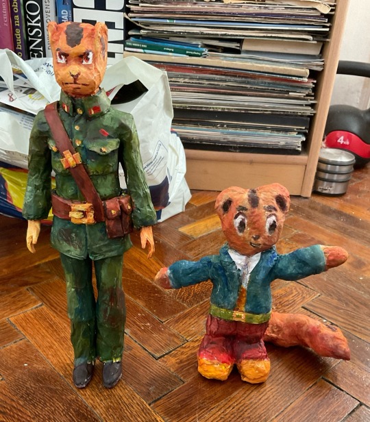
Tada! I can’t believe I actually managed to “finish” them in time. We’re leaving for England on Monday so it was a race to have them somewhat finished. I made Bamsaegi first. Originally the plan was to make these “dolls” completely out of cotton, loads of glue, some pipe cleaners and sting. It did not go as planned. First up instead of cotton I ended up buying wool because I figured it’s close enough.
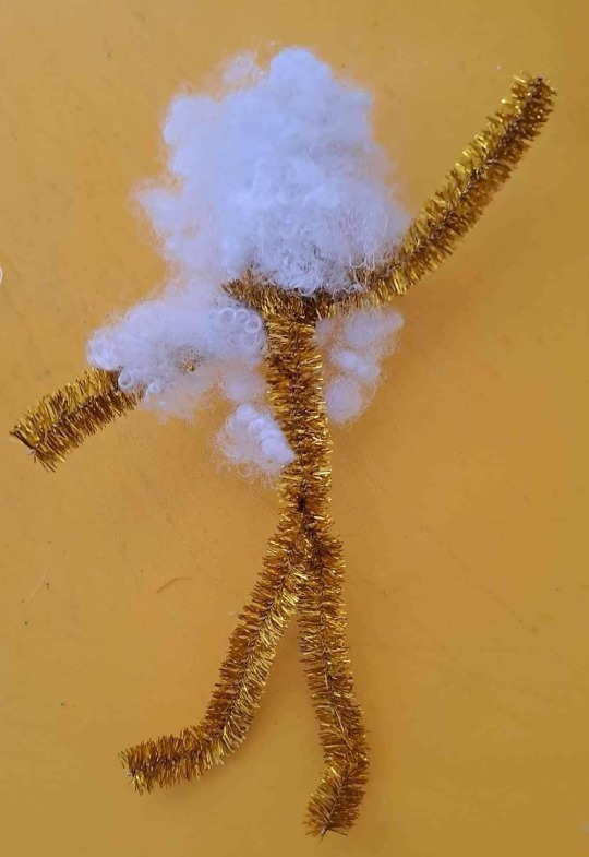
It was just SOOO MESSY and wouldn’t keep its shape no matter what. My mom saw it wasn’t working and asked me why I didn’t get proper cotton from the drug store. I only went looking in arts and crafts because I thought what they would have in the drug store would be pressed into round shapes. You know. Those things you use to remove your make up. The next day mom took me to the drug store and turns out they had exactly what I wanted.
Finally. I could get properly started. Except no! It was a horrible material to work with! The cotton constantly kept sticking to my paintbrush I used to apply the glue. Additionally the cotton kept picking up all kinds of dirt. At times turning black. Would not recommend. I don’t know how the YouTuber I watched made it look so easy.
I was at the end of my patience. If I want to make 3D stuff I would have to go and use DUN DUN DUN polymer clay. Or regular clay. JUST NO. I hate the feeling of clay stuck to my hands. Autism? What are you doing here?! I had to figure something else out. I didn’t feel like learning to sow. So. This thing with cotton and glue reminds me of something else. Papier Mache!
I actually used to think that this cotton mess would be better. I thought that papier mache takes an enormous amount of paper. Probably because the one time I did it prior to this project was in art school as a kid with a neurotic teacher. So. Where was I going to find the paper I would need?
There’s this saying in Slovakia that we’re one hundred years behind monkeys (joke about evolution meaning we’re behind the rest of the world). I didn’t even need to leave the house to get what I needed. The mail box was full to brim with catalogs. Plus there were recently the EU elections. Which meant a large news paper looking thing with all the parties written out on it. Perfect!
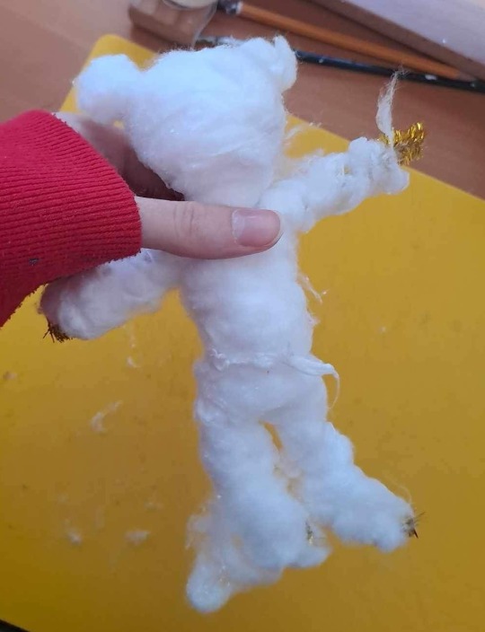
So that’s how Bamsaegi came to be. I first made a skeleton out of pipe cleaners. Covered that with crumpled paper. I found it kind of ironic that I’m making a character from a communist propaganda cartoon out of a bunch of advertisements. Additionally papier mache would be something you couldn’t do in North Korea. From the book I read paper there is rare and kept a close eye on. For obvious reasons of course. If I would ever have a serious gallery exhibition of these dolls/sculptures I think I would expand on that.
As you can see I ended up covering him in cotton. I wanted the texture and also it smoothed out the bumps. This was before I learned that if you want it smooth you got to cover it in a bunch of small pieces of paper. I first covered the base with glue. Then took a thin bunch of cotton. To smooth it out and to make it stick better I would run the paint brush across it in the direction of the fibbers. Lastly I painted it with watered down acrylic colours after it dried. I was surprised at how painting it went so smooth. Very satisfying.
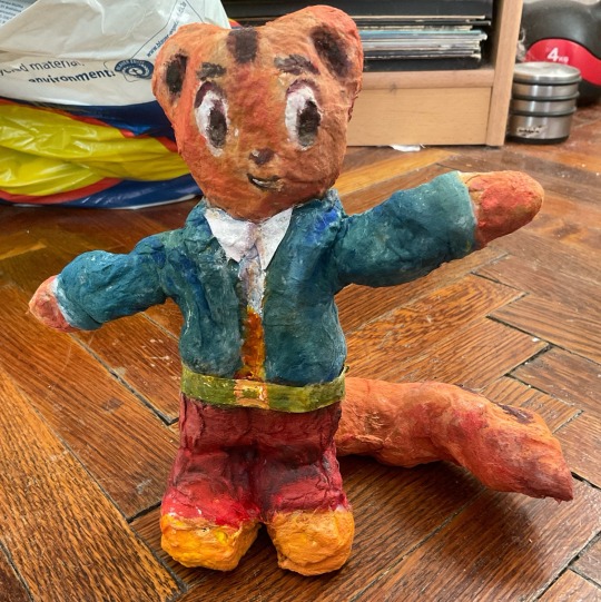
I decided to first do a more show accurate character. I thought the stylised proportions would be easier. Obviously he’s not perfect. With the colours and the off proportions he’s looking very retro. Like the 70s and 80s communist era toys I saw in an antique shop. I like to think that if they made official toys back then they would look like this.
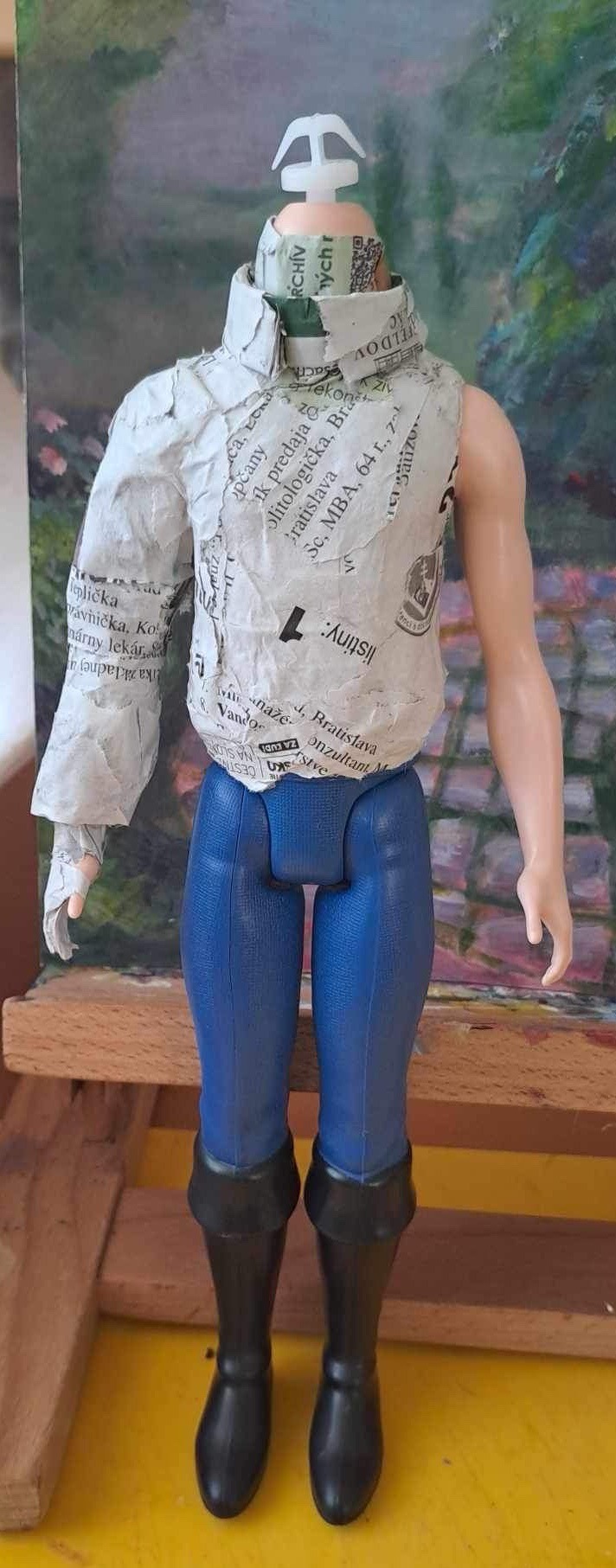
Onto Geumseagi. He started off as a Disney Prince Eric from Little Mermaid doll by Mattel. So the size of your average Ken. I sadly don’t have the original doll photo. He cost 14 euros (technically 13,99). I thought I would cut him out of the papier mache and use him as base for other dolls. He’s still buried in Geumseagi today. I didn’t want to risk cutting him out of there. And I like the added weight. Those stupid boots were a terror so I don’t think I would want to deal with them when making a new project.
So the head. Originally I wanted to mould it out of clay. But once I realized that I wouldn’t be cutting him off the doll I decided to use the original one. The clay one would be too heavy and hard to keep on the neck. As you can see I chopped off his nose, chin and let’s say gave him a rather brutal hair cut. Knowing what I know now I would have cut off even more of the hair. From my drawings I know big foreheads on squirrels do not look good.
And there we have it. Geumseagi in my style. In 3D. There are 2 tiny spots on the legs where the original doll pokes throught. The pants were rushed not gonna lie. I like that it’s a bit wrinkly. It reminds me of my paintings with the different thicknesses of paint. Making something 3D that looks like my paintings is something I wanted to achieve for a while. I’m glad I don’t have to learn how to use Blender. Unfortunately it does mean I can’t use the dry brush technique because it emphasises those crevices. For shading I then have to go manually where I want it. Like under the chin and around the pockets.
I’m excited to see what ya’ll will think. Sad that I discovered this just when I’m leaving. Grandma probably won’t want ripped up news paper and glue all over her kitchen.
PS. I’m adding his tail when I return. Too much work.
#It was a lot of fun using a new technique#I’m proud of myself#but I have to stop procrastinating on my main project#sucks that they never made official toys#at least it’s motivating to make your own#furry art#my art#fanart#squirrel and hedgehog#papier mache
11 notes
·
View notes
Text
Checklist For Writing Essay:
Masterlist
BUY ME A COFFEE
More of a person note for me, when polishing off an essay to double check the criteria.
Times New Roman
Size 12
10% of word count over if needed.
Italicize works of art.
“_” for chapters/books.
Name of Artwork, Artist name, Date, Size, Location
Try to find images of the work with people/in the gallery space.
Spell out any number below 100 (eg. Three dimensional)
Double Spaced
(Not cheating to share your work with someone on the course and discuss)
Must use Footnotes, MHRA refrencing style
Footnotes sometimes count in word count DOUBLE CHECK
Footnote numbers should always appear after the full stop at the end of the relevant sentence, even when they refer to a point made
midsentence.
When writing visual analysis, consider closing your eyes as someone reads back what you’ve written about the artwork, and consider if you can clearly visualise in your mind from what you’ve written.
Paragraph organisation by: Intro/ paragraphs on separate ideas/ conclusion
Online walkthrough gallery. Make arguments/convince when writing, of what you see/ how you understand it.
Talk about materials used.
Space it inhabits and effect on observer.
Academic sources must be used.
Short comings in the essay/academic paper to be discussed and evaluated.
JSTOR
Website and access to academic papers usually needed to have uni library sign in. Some museums have sources too. Browse library or articles in library database.
Find interesting texts, then use and write about it. Footnotes included in work count.
Museum repository, Wikipedia to start.
WHAT IS MOST SIGNIFICANT TO YOU?
ADDITIONAL RESOURCES:
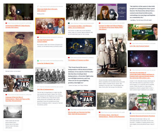
London Metropolitan Archives picture library, aka 'Collage' - all things London
London Metropolitan Archives youtube channel
BFI Player film archive - shorts and features from the BFI, national and regional archives
BFI Player - Britain on Film, with searchable map
RibaPix - UK's largest architectural photo library
Pathe Newsreel - great way of quickly diving into historical news items, and fascinating for the visuals as well as the thorough textual transcripts
British Cartoon Archive - 200,000 British editorial, socio-political, and pocket cartoons covering 200 years
Black in the Day - A submission based archive documenting the lives of black people living in the UK
Wellcome Library - not all but many items are digitised
For those students with a particular interest in museums and museum studies, check out our very own Mapping Museums website:
https://museweb.dcs.bbk.ac.uk/home
Researching Online: A Guide
Below are worked examples of how to do an essay or research project using only online resources.
Don’t spend ages looking for one article or book unless it is really essential and even then, you may not be able to get it, but you will find something related.
Vary your search terms, e.g. for the examples below: early modern, renaissance, reformation, sixteenth century might all be relevant.
Follow links in articles and on collections – often, footnotes in journals online may be hyperlinked to the item (especially in more recent publications), you can see similar items, or who has cited that work. For primary sources/collections, catalogues may suggest similar items too.
There will be dead ends and frustrations but persevere – there is lots of material out there.
Save things using a citation programme like Zotero or Mendeley
If you find something interesting and potentially useful for another topic, bank it for later
Be creative and use sources you might not have thought about before, for example the sound archive in the British Library and think across period and geography.
Google Scholar and on JSTOR/other platforms, Project Muse
which is another very good platform with loads of open access material.
USTC: the USTC is a database of early modern printed books across Europe
Interesting source:
#art gallery#writing#essay#paintings#art tag#art exhibition#art show#artwork#art#art hitory#essay writing#history#historical#artists#artists on tumblr#drawings#illustration#art style#writers#creative writing#writers on tumblr#writeblr#writers and poets#lecture#art history#photography#antiques#sculptor#sculpture#screen printing
20 notes
·
View notes
Text
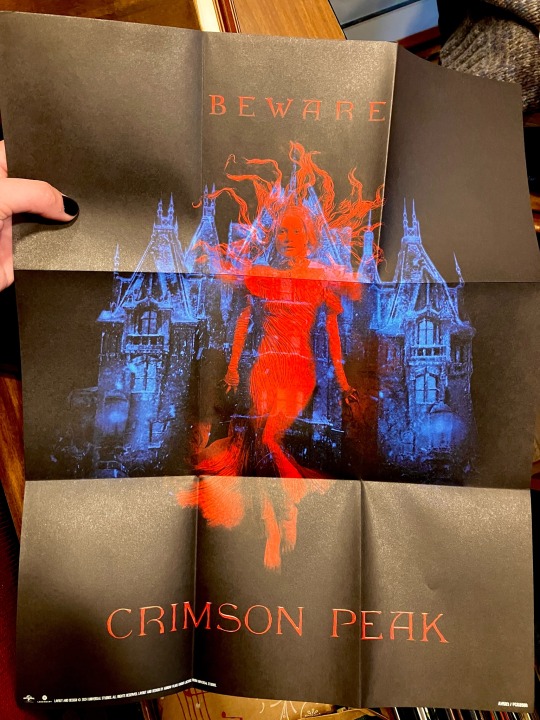
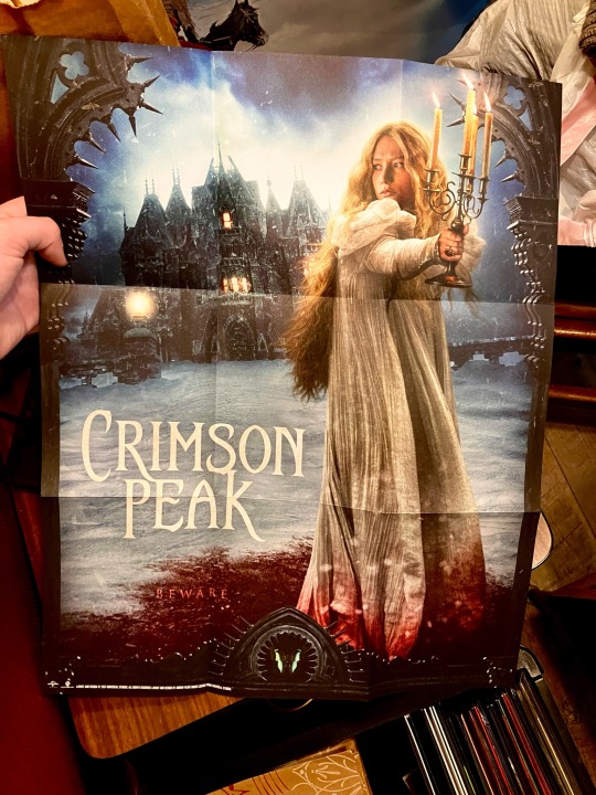
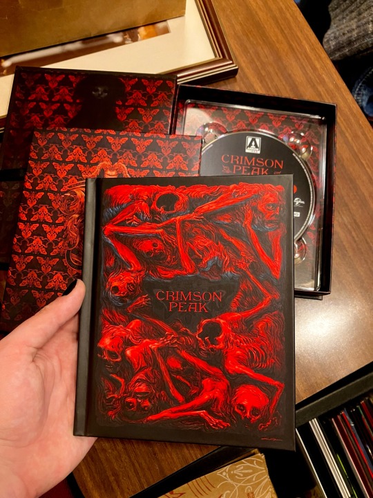
Crimson Peak Limited 4k UHD
don’t usually do long posts, but wanted to show off all the stuff that came in the new Crimson Peak release from Arrow! they also did a release in 2019, so i guess they still have the rights.
specs-wise, it obviously looks gorgeous, though there’s not as drastic of an increase in quality from the 2019 Bluray as there might be with other films, since Crimson Peak wasn’t originally filmed in 4k, so it’s an upscale rather than “true 4k”. not a slight against it at all, Crimson Peak is already an incredible looking film that obviously looks beautiful in 4k. the audio is also largely the same, which, again, is fine because the movie already sounds great. but if you’re just upgrading for technical specs then that’s important to know. (got all this info from Jeff Rauseo on Youtube, ty Jeff)
but a lot of people are probably buying for the packaging/inclusions! so i took a bunch of pictures. images look a bit more saturated than they do in real life bc i’m compensating for my shitty camera lol.

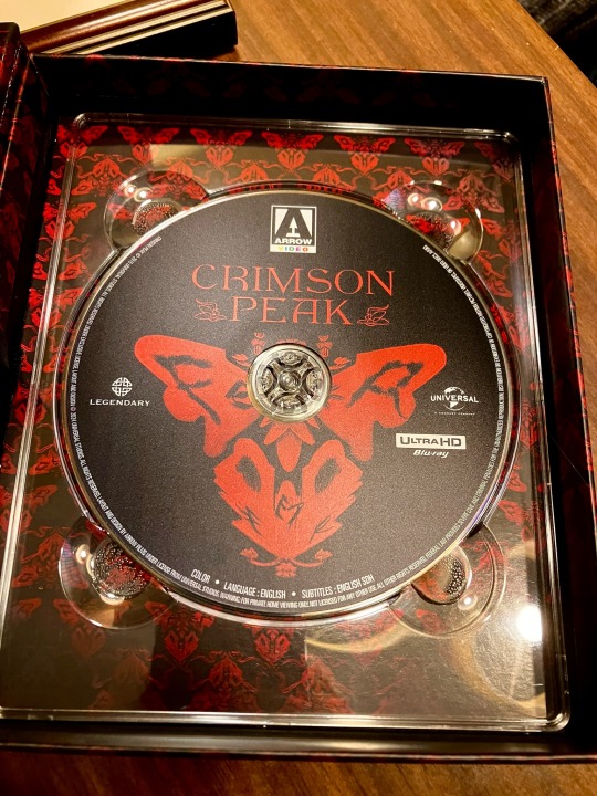
the casing is really nice, it has a spine to resemble a book, when you open it up you get these cool splash pages. you pull on the ribbon to remove the second case with the booklet in it (not the disc, which i thought would be in there).
from there, we have four double-sided photo cards showing Edith, Thomas, Lucille, and Alan. the front side is the classic promotional art, i think the back side are new renders? i might be wrong, not sure.
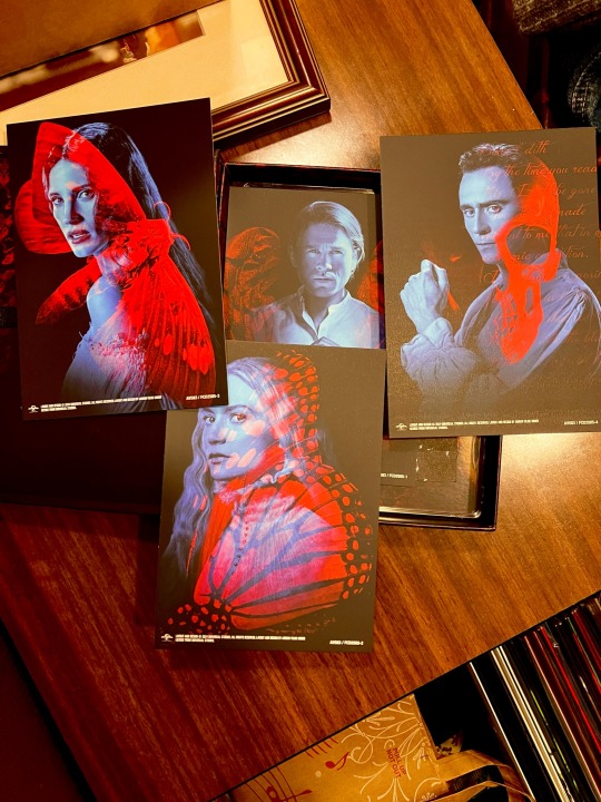
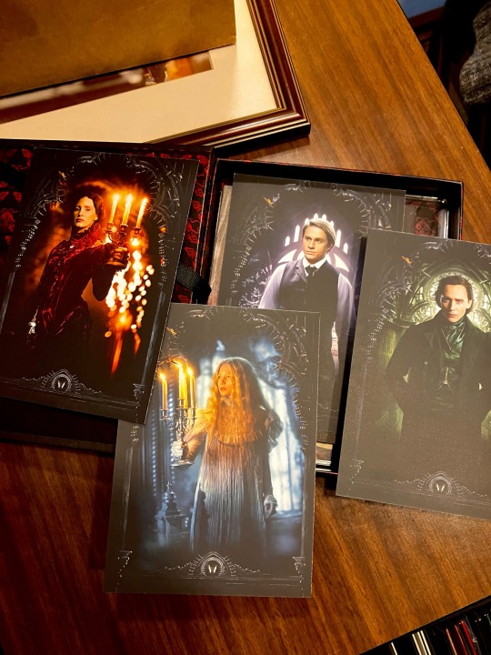
also included is a double-sided mini-poster, again with the front being one of the original theatrical posters, and the back being what i think is a new render. (if anyone wants exact size i can measure it.)
then we have the disc itself! not much to say, some nice art that matches the case. it doesn’t come with a DVD/HD Bluray, so if you have the 2019 Bluray, there’s a reason to hang onto it even if you get this new release.
lastly, the booklet! i LOVE the cover on this thing. i sort of wish one of the sides of the mini-poster was done in a style like the casing/disc/booklet cover, because it looks sick as hell, but i’m probably just going to use the theatrical poster side when/if i hang it.
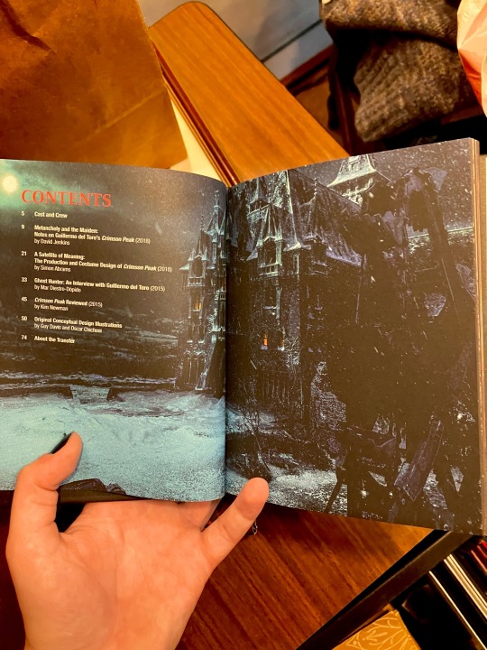
included a picture of the table of contents! has some interviews and essays, pretty standard for these nicer Arrow releases (i also have the Re-Animator and Bride of Re-Animator boxsets).
can’t include anymore pictures in this post, but i can take some pictures of the inside of the booklet if anyone’s interested!
overall, i am obsessed with this release. Crimson Peak absolutely deserves this kind of technical upgrade, and the care that went into this release is obvious. if you’re a physical media collector, or just a big fan of the movie, i would definitely recommend picking this up!
7 notes
·
View notes
Text
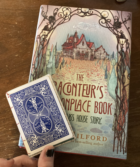
adventures in bookbinding: making the negret colophon playing card book!
it's diy girl summer and i am Bored. time to attempt a completely new craft with zero research except for like. 3 youtube videos!
so, to start off, i suppose i will ramble a wee bit about my plans/goals/reasoning. truth be told, i just really really like my blorbo who book binds and i think it would be very fun to become Just like him for real. therefore we will be embarking on a journey!! to become my blorbo and also find something crafty to do today. quick psa that this is not a real tutorial because i have absolutely zero experience, but more of a general guide and/or craft with me! let's do this in sectionssss!!
1 - the plan!!
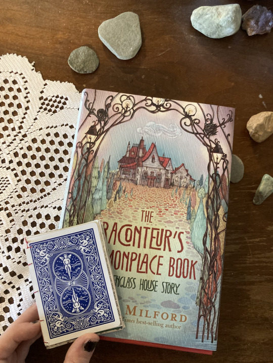
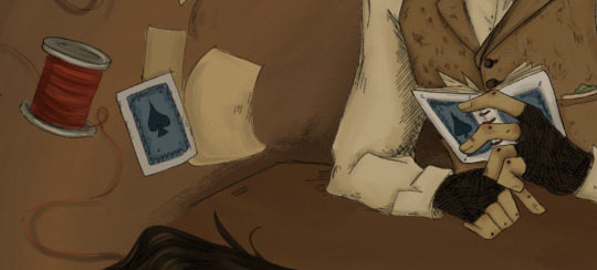
so for my first bookbinding project we are going to do something small, starting out by being silly and taking a page (lol) out of negret colophon's book (lol....) when he makes a tiny book and uses two playing cards as the covers. this will give me a little tiny trial run so i can learn the basic skills and use easily available materials around my house!! afterwards i think i'll sketch out a more ambitious journal idea - i have lots of fabric lying around that would work perfectly to cover a cardboard cover. wow, that's wordy! so! without further ado let's begin :) negret's little bookbinding project is described in the first chapter of raconteurs in this little excerpt here.
seems simple enough!! also the absolute perfect beginner project. it is tiny and the materials consist of Literally Anything. let's get groovy!!
2. materials!!

here's what we're working with:
playing cards! i found a deck lying around in a random drawer somewhere and chances are you have one laying around too. i chose the ace of spades and diamonds, because the text specifies a pair of aces but i couldn't find a matching pair, lol. i was also very tempted to choose one of the king cards as an homage to maisie's story later on (and because the king cards are absolutely gorgeous and detailed) but we're sticking to canon right now. we'll use the other cards for a future project.
needles!! a lot of the tutorials i see use very big or thick needles but i don't have those and this is also a very small project, not a huge journal, so any can work.
thread!! use whatever color you would like! at this point i was very indecisive because i have a lot of options and they're all quite pretty colors, but i settled on red later.
an assortment of papers!! use literally whatever you have lying around. for me, i managed to dig up the one scrap of newspaper in my house, since that's specifically listed, but most of my pages were from a book i sacrificed for an old art project, magazines and flyers, a lot of which were college mail because we're at that point in my life, lol. this is a recycling sort of project. choose anything! the more variety the better :)
i didn't display these in the photo, but if you have an awl, use an awl! i do not have one so i improvised, which i'll elaborate upon later. also, scissors! to cut the pages to scale. a ruler also came in handy :)
alright, now that we have all our tools in order, it's time to get into it :)
3. creating the pages!!
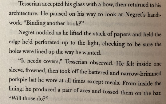
our first step is to measure our playing cards! you might not have to do this step because i'm fairly certain most cards are uniform in size/make, but check just in case, lol.

my cards measured to be 2.5" wide and 3.5" tall. i am no mathematician but using my singular brain cell i deduced that the papers should be twice the width of our cover, since those will fold to be the same size. so, using my Expert calculations, i made a little template cut from an index card measuring 3.5" x 5".

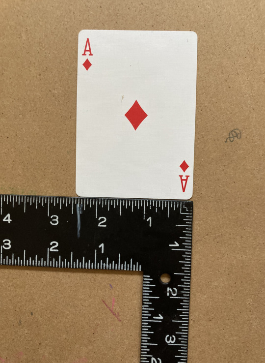
now we get to cutting!! using your various materials, cut out a bunch of papers to the size of your template. i just cut around it because i could not be bothered enough to waste time tracing, lol. i didn't go in with a plan, but i cut 16 papers to this size, which ended up being perfect. here are all my pages !! look at all the colors and textures!! the fun thing about the project being so small is that you can specifically cut the pages as the most interesting photos or sections, or you can even do it at angles too. as long as it ends up the right size, anything is fair game

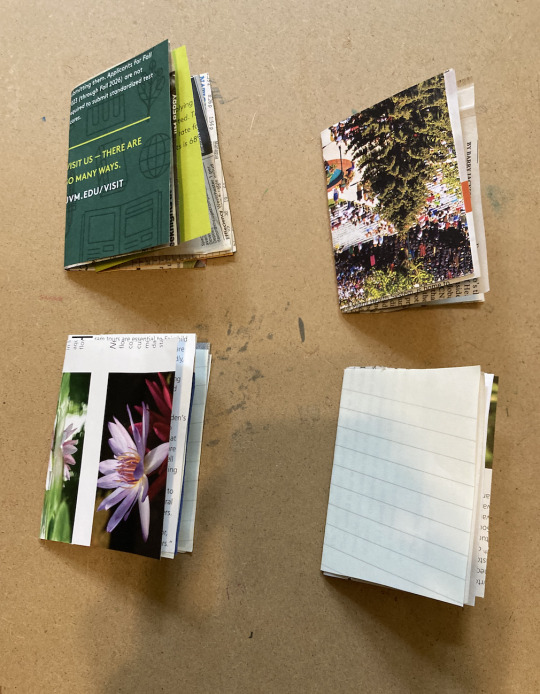
now, we're going to make the papers into signatures! i just learned this word today lol. essentially, we will be grouping our papers and then folding those in half to become little mini books/pages. since i had 16 papers, i made 4 signatures with 4 pages each.
at this point i was tempted to go cut up more and make a fifth signature, but i decided against it since i didn't want the book to become too thick, and 4 sets with 4 papers each ended up being just about right. one of the tutorials i watched suggested that you group your signatures with paperclips or bobby pins, and at the time i waved off the suggestion but i totally agree now. i didn't have any clips to work with and i managed fine without them, but it definitely would have been easier if i had. so if you have them, use them! it'll make your life better lol. at this point you can stack your signatures together and itll look like a book!
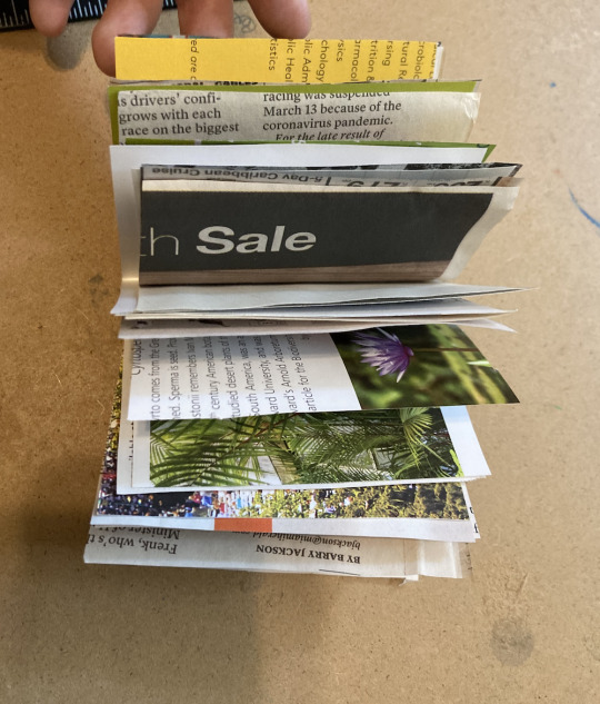
oh yeah now we're cooking!!
4. preparing for binding!!
it was at this point in the process where i ventured out from knowing what i was doing to completely balling, but everything turned out okay and i'll walk you through it! our next step is to create the holes with which we will sew our signatures together. we're going to mark those off. once again i have zero clue how to do math but i managed to use my giant incredible smooth brain one more time to mark my template with a few equidistant points with which we can mark our signatures.
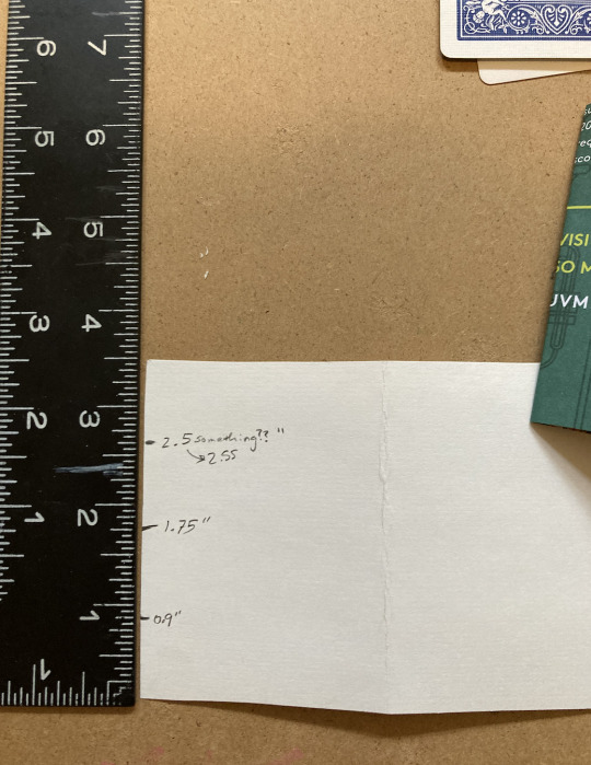
in case it's not clear, i kind of just counted the lines and then had to look up how much that was, but you can also just eyeball it if you're good enough. side note, i added two more holes after this, with one just below the very top and one just below the very bottom.

pardon my very unsightly nails, lol - here's how i used my template to mark the very center of each of my signature. you'll want to mark the point on the center line where you folded it while keeping the pages of each signature together. HOPEFULLY WITH A PAPERCLIP. and without further ado it's time for the stabbing!
now...here's where i got a little bit sacrilegious. you'll recall that earlier i mentioned how i don't have an awl in my possession yet? well, i managed to improvise a solution...

yes that is a sewing pin. IN MY DEFENSE it's all i had, and functionally it's basically the same as an awl! just on a much smaller scale. it worked out though - i imagine that if i'd been using thicker paper it would have posed a bit of a problem but for this project specifically, it was fine. do not kill me book binders. now it's time to get serious...
5. the binding
everyone stay calm! stay calm! it will be okay. i was lowkey intimidated by this part as this was Truly out of my depth of expertise, but i promise it's not that complicated. you're going to get your needle and thread now - i settled upon this gorgeous red color because it contrasted nicely with the playing cards, and there really wasn't much red in the papers i chose.
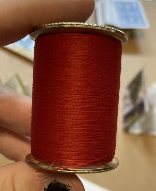
gorgeous!! tbh i always knew i'd go with the red because i've always envisioned the book with red thread anyways. like come on look at my very first drawing of negret WITH it. literally the exact same materials. i simply had to.
okay. now to the binding part. i don't have any real photos or insights or instructions for this whole stage because 1. i was deep in focus mode and 2. entirely relied on a tutorial for this part. here's the tutorial i used - massive shoutout to this lovely lady ! my spine didn't turn out nearly as neat as hers because i did not properly follow directions for the first bunch of knots (and i had to kind of improvise with the cover) but here's how it turned out!

not too bad for my first book, lol. try not to stress out about it being perfect because this book is not supposed to be perfect! the imperfections give it character. worst case scenario, if you really mess up, your eclectic book is just a little more eclectic than intended. and that's never a crime :)
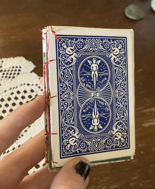
now the one problem i had to figure out on my own was how to attach the covers, since most tutorials explain how to attach actual big separate covers and not - essentially paper. i ended up just... attaching them as if they were another page or signature to the front and back. my holes on the covers were a few millimeters away from the edge, though, since there's no crease or fold to align them with. what i did was essentially do the first knots/stitching on the signature like the tutorial said, but for each hole i sewed through in the first/last signature, i also made an additional loop through the adjacent hole on the cover. you can kind of see how i passed my needle through like instructed and then took a little extra detour to stitch the card as well. in some places i ended up making new holes in the signature too that were closer to where the cards' holes lined up?? try not to do that but it worked and it looks fine so really whatever makes it attach and hold is perfect.
6. bask in your glory!!!
aaaand that's it!! you did it!! this was a ton of fun to work on and i absolutely loved making this little adventure into a new craft with something so near and dear to my heart. if you make one please be sure to tag me!! i would love love LOVE to see :) here's an additional picture of my little monster (+ next to the legend himself. art credit to me lol. look the books are twinning!!)

#the raconteurs commonplace book#raconteurs commonplace book#green glass house#nagspeake#roaming world#uhhhh#bookbinding#book binding#genuinely i dont know if those are separate words or not. either way LDJKGLHSDJG#crafts#crafting#arts and crafts#yippee this was actually so much fun#to quote alex of vfdiscord fame “the self blorbofication of quill”#it's too late i'm in too deep i'm literally him now#quill crafts
53 notes
·
View notes
Text
Jamming it up in Roller Derby
Had I been in this rink before? If so, it was back in Junior high school in the late 1970s, when roller skating added music, lights, and fun to a teen’s life. If you were lucky, the rink dimmed the overhead lights so strobes and fluorescent lighting illuminated the ground where your quad skates slid across the wooden floor. But today was 2024 and this ole 59’er hadn’t tried roller skating since she was a teen, making this new sport of Roller Derby an interesting prospect.
The thing that happens as you approach your sixth decade of life is your center of weight shifts as your weight increases. Sure, I run half marathons, but that’s easy when your feet hit the pavement and nothing is rolling beneath you. I think my last 8-mile run, which took over an hour, was easier than standing on roller skates for one hour. New experiences give you realistic points of view you wouldn’t gain otherwise.
So, there I was, along with one other 50-year-old woman celebrating her birthday by trying roller derby, and twenty 20- and 30-year-olds, prime for the adventure. The women there were fantastic – friendly, some apprehensive like me, some excellent at the sport already, and accepting of all others in the room. No matter your size, age, gender identification, or skill, every woman was welcome, just like rugby.
The Central New York Roller Derby organization based in my hometown of Rome, NY was well organized and coached. Their leaders made sure we had the essential equipment on – helmet, elbow pads, mouth guards, wrist guards, knee pads, and quad skates. For $50, you get all the rented equipment plus eight weeks of lessons and activity making it a reasonably priced sport to try. They were patient and helpful with the newbies.
Like every sport, we began with warmups. I particularly liked doing pushups and sit-ups with roller skates on. It added some weight to the exercises. Then it was time to stand up and try gliding on the skates. I say this with the hesitation that’s intended. It takes a while to find your center of gravity and fearlessness to push off, glide, and stop without falling down. Okay, I did fall two times until I figured out to lean forward not back in my stance. Like anything in life, you have to adjust to new centers of balance.
Then we got off our skates and learned about the key derby positions of jammers and blockers and did a few activities like getting into positions as blockers to stop the jammers and how to become a pivot blocker if you receive the jammer star/cover when it is handed to you. What I learned only from this small exercise is I need to watch a YouTube video on roller derby to piece it all together so I understand it better the next time I try it. I did this before trying rugby and it helped my comprehension level immediately. Don’t call it necessary due to my age, but rather because I learn best by seeing, and not hearing.
As our two-hour stint came to an end, we gathered for a group photo as buddies who experienced something new and fun for the first time. I vowed to go back next week to try it again since I felt it needed more time to say I tried the sport. I already have a new group of Syracuse roller derby sisters who want to carpool to Rome and a new roller derby name to try out – Pinky Habanero. Every roller derby chick has a nickname. I met Squash, BAM, Dead, Sunshine, Meli, and more.
All I can tell you is if you want to feel young again (in some ways) and old (in other ways), try out roller derby at your local skating rink. Put on those four quads, helmet, and find your center of balance, smile, give yourself a badass name, and get into the rink. I promise you’ll smile, laugh at yourself, and even realize you can be humble, and somewhat graceful while trying something new.
10 notes
·
View notes
Note
can i ask how you do your lookbooks? i've been wanting to do the same thing (obvi going to credit you unless me using this idea makes you uncomfy so i just wont copy the lookbook layout) but i havent been able to figure out your getting all the outfits side by side
hi!! doesn't bother me at all, i am far from the only person who formats lookbooks the ways i do and i was of course also inspired by many other simblrs when i started making them!
i have a couple different things i'm happy to share, though i'm afraid none are very scientific. note that i use photoshop for all my editing and most of this advice assumes basic photo editing knowledge:
now, i almost always take outfit screenshots with a transparent background in gshade. i take pictures of every outfit in different poses. this way, i can simply drag the full body outfit pictures onto my photoshop canvas. i play the sizing by ear every time and crop as needed, if you want a starting place with spacing feel free to save one of my lookbooks as an image to your computer and cover my sims with yours. once all my outfits are in place i just add a solid color background, merge the layers, and edit as usual.
before i used this method, i used to just take screenshots of all my outfits that included my cas background and crop them. most of the time it doesn't have to be neat, just erase the extra space around your sim and place all the pics next to each other. if you add a solid color background the same color as your cas background it looks the same. this way also doesn't require gshade.
as far as spacing, like i said i'm always winging it to make sure the sim always looks the same size. i often will turn down the opacity on one pic and place it on top of another to make sure the face and body are about the same for every pic.
i can't tell from your question if you realize that every outfit is a different pic i merge together, i'm not displaying them all side by side until i put them all on the same photoshop canvas.
i hope this made sense/helps somewhat, if you have no idea what i'm talking about it is very basic photoshop, if i managed to learn it by myself truly anyone can lmao. i watched sims 4 editing tutorials on youtube just to get familiar with the basic terminology, i'm def not the best person to explain that.
57 notes
·
View notes
Text
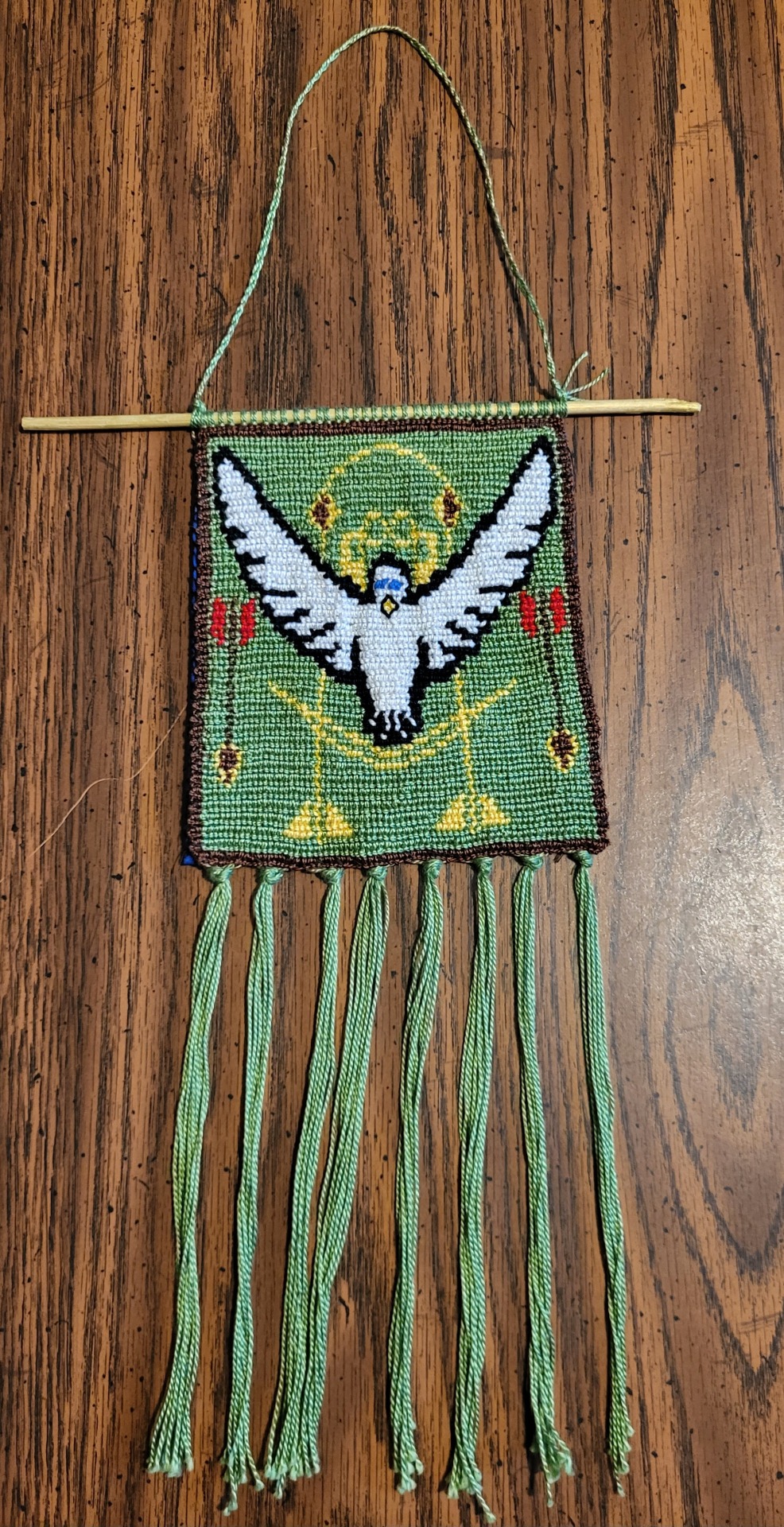
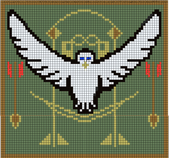
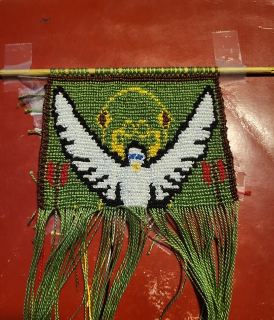
Fanart for Doves and Arrows
So there’s this amazing Tf2 Bushmedicine fic called Doves and Arrows, by @anonymous-astronaut, and I decided to make a thing for it. Astro at one point put the title of his fic into an ai generator, which produced this image:
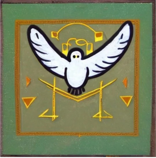
I got permission to turn it into a wall hanging, and have finished this after almost 3 weeks of work (front and back):

If anyone wants to see my explanation for choices I made or in progress photos I took, I’ll put them under the cut since I tend to ramble. Please go read Doves and arrows, it is fantastic.
https://archiveofourown.org/works/23886154/chapters/57423127
So, I started out by trying to make sense of the original ai image. I threw it into an art program and made 2 copies of it. One sticking closely to the original image, just cleaned up. The other changing some of the weirder shapes into something recognizable. I especially focused on including actual arrows into the second image.


I decided to use the second image, and put it into a site called Bracelet Book, in order to get a pattern to use. I did my best to make the pattern as symmetrical as I could on the first pass, but the dove was very difficult to work with.
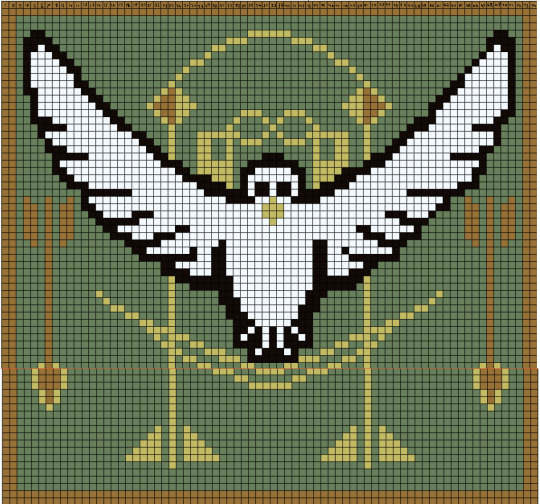
People looking closely may see that the final project looks a little different from the pattern. Especially the dove’s eyes and the fletching on the arrows. That’s because I would sometimes make on the fly decisions to alter parts of the pattern, since it’s pretty flexible like that. Most edits were done to make parts look more even or less cluttered (except for 2 specific changes). Here is the edited pattern I had by the end of all this. The edits are a little messy since most were drawn using my phone. :P
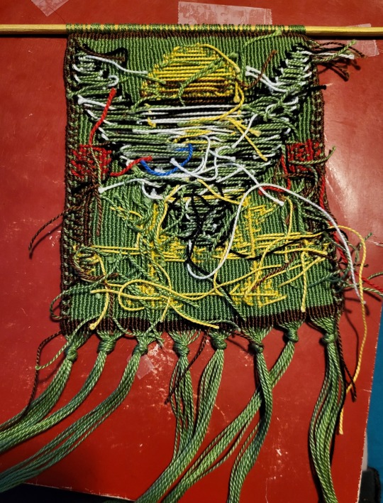
Once I had a pattern, I started working on making it. The kind of method I used is used for what’s called Alpha bracelet patterns. If anyone wants to know more, I recommend looking up tutorials by the youtuber Masha Knots, as she was the one I learned from. Here’s some progress photos, as you can see it’s a pretty messy looking process.


I changed the eyes and and arrow fletching colors for a specific reason actually. I wanted the eyes to be blue since the dove represents the BLU Medic, Josef. The arrows fletching then became red for the RED Sniper, Mick. I just felt like the plainer pattern wasn’t as clearly a Tf2 thing.
Once I finished off the pattern, I tied the strings I had been tying my knots on into little tassels. I sewed a black outline around the beak, since it didn’t stand out against the body as well as I hoped. I also decided to make a cover for the back. This is because, for anyone who doesn’t know, the back of an alpha pattern pretty much always looks like a disaster. It takes a lot of work to hide the mess, so I like to make fabric covers for it. I did neaten up the mess where I could before sewing on the cover though.
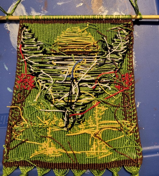
When I made the fabric backing, I originally just planned something simple and plain, but the only fabric I had was blue, which didn’t match the look of the piece. So I got the idea to paint it to lean into the red and blue theme, complete with the characters class symbols. I cut out the fabric, hand hemmed it as best I could, and painted it with some acrylic paints I had.

Then it was just a matter of sewing it on and adding a string for the wall hanging to hang from! This is the biggest project of this sort I have ever made, nearly twice the size of the second largest wall hanging I’ve done. It’s about 5 1/2 inches tall (not counting tassels), and 5 1/4 inches wide. If anyone is interested in making anything like this, I have some advice. One, always get way more string than you think you need. I got two bundles of each kind of thread I purchased, since I got some specifically to color match as best I could. By the end I had to make another run to Michaels for more green since what I had wasn’t enough. Also, try to keep your knots neat and evenly sized. Some parts of the pattern aren’t clear on the final project because the knots are hard to see.
If you actually read through this whole thing, I hope you have a good day!
#general post#Tf2#bushmedicine#doves and arrows#this took me so long to make you have no Idea#It doesn't help that I am also trying to get my drivers license#so I literally finished this final test for an online driving course right before making this post#I'm very tired but very satisfied
27 notes
·
View notes
Text

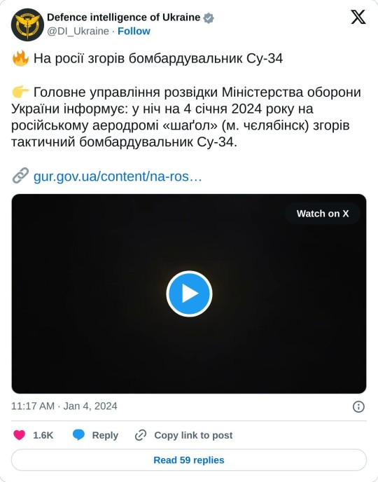
VIDEO: Ukrainian saboteurs set fire to Su-34 fighter bomber in eastern Russia
The Ukrainian intelligence board posted a video of a fire near the fuselage of the Su-34 jet.
Fernando Valduga By Fernando Valduga 04/01/2024 - 23:10in Military, War Zones
Saboters working for Ukrainian Intelligence set fire to a Su-34 bomber at the Shagol airfield in Chelyabinsk, 1,500 km inside Russia, in the east of the country.
The group of Ukrainians entered Russia, traveled the 1,500 kilometers to the Chelyabinsk air base in northern Kazakhstan, sneaked into the snow-covered runway under the cloak of darkness and set fire to a Sukhoi Su-34 Fullback bomber of the Russian Air Force.

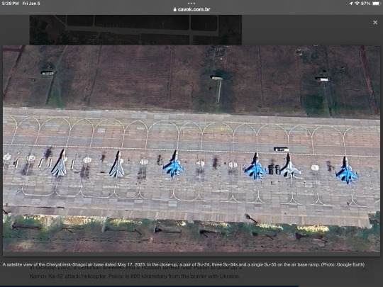
The approximate location of the Chelyabinsk-Shagol air base in Russia. (Photo: Google Maps)
The Chief Intelligence Directorate of Ukraine (GUR) released images on YouTube of a Russian Su-34 tactical bomber being set on fire at the Chelyabinsk aviation camp on the night of January 4. Several Ukrainian media outlets released the video.
youtube
Citing the GUR, the reports reported that the aircraft belonged to the aviation regiment of the 21ª mixed aviation division of the aerospace forces of the Russian Armed Forces.
TAP ARROW BUTTON TO VIEW VIDEO ☝️
The extent of the damage to the aircraft cannot be determined by the video, which shows only a small fire the size of a candle in the fuselage, near the engine compartment.
Near the end of the video, the flames inside the aircraft began to get more and more intense.

The right air intake of the Su-34 fighter-bomber
Video images make it difficult to assess possible damage to the aircraft, but the high temperature may have deformed the fuselage.
The Su-34 supersonic fighter-bombers are among the best in the Russian air force - and the most active along the 1,000-km front line of Russia's broader war against Ukraine, which has already lasted 23 months.

Russian Air Force Su-34 Fullback fighter. (Photo: Alex Beltyukov / Wikimedia Commons)
The Ukrainian forces are doing everything they can to shoot down all the Su-34s they can. Quickly repositioning long-range air defenses in southern Ukraine last month, the Ukrainian air force slashed four Su-34s in the space of a week. If the sabotaged jet leaves service, the Russians may be reduced to about 125 Su-34, in a pre-war fleet of no more than 150.

A satellite view of the Chelyabinsk-Shagol air base dated May 17, 2023. In the close-up, a pair of Su-24, three Su-34s and a single Su-35 on the air base ramp. (Photo: Google Earth)
It is not the first act of sabotage committed by a Ukrainian agent within Russia, but it may be the most daring. And it may have cost the Russian Air Force another of its increasingly threatened Su-34s.
In October 2022, a Ukrainian sneaked into a Russian airfield near Pskov to blow up a Kamov Ka-52 attack helicopter. Pskov is 800 kilometers from the border with Ukraine.
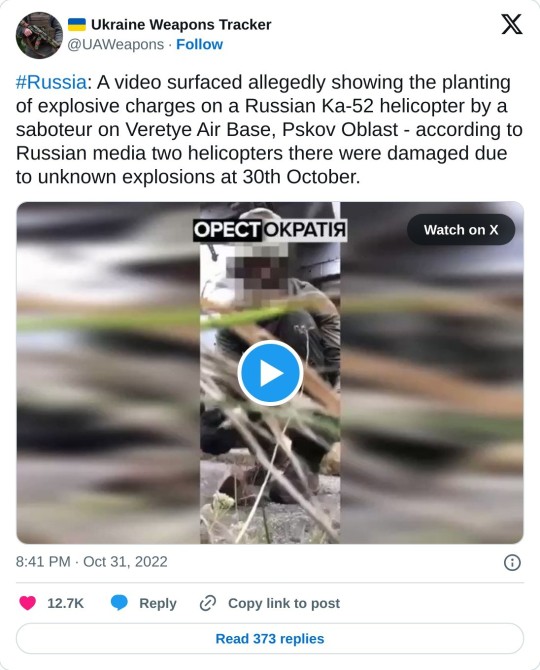
TAP ARROW BUTTON TO VIEW VIDEO ☝️
In September 2023, saboteurs blew up An-148 and Il-20 planes in an aviation field in the Moscow region, as well as a Mi-28N helicopter, which had previously been actively involved in the shooting down of attack drones in the Moscow region.
Previously, several parked long-range bombers would have been damaged in an aviation field near the border with Ukraine due to a drone attack launched from within Russia.
Tags: Military AviationSukhoi Su-34 FullbackWar Zones - Russia/Ukraine
Sharing
tweet
Fernando Valduga
Fernando Valduga
Aviation photographer and pilot since 1992, he has participated in several events and air operations, such as Cruzex, AirVenture, Dayton Airshow and FIDAE. He has works published in specialized aviation magazines in Brazil and abroad. He uses Canon equipment during his photographic work in the world of aviation.
Related news
EMBRAER
Saudi Arabia should replace 42 Lockheed C-130 with 33 Embraer C-390
04/01/2024 - 20:07
MILITARY
Lockheed Martin delivered less F-35 in 2023 than planned
04/01/2024 - 16:00
MILITARY
General Atomics completes fatigue test in NATO certification for the MQ-9B drone
04/01/2024 - 14:00
MILITARY
China releases new images of its next-generation aircraft carrier
04/01/2024 - 11:00
MILITARY
Indonesia plans to modernize its fleet of Su-30 and F-16 aircraft
04/01/2024 - 08:40
MILITARY
US and allies warn Houthis of "consequences" if attacks on ships continue
03/01/2024 - 23:58
homeMain PageEditorialsINFORMATIONeventsCooperateSpecialitiesadvertiseabout
Cavok Brazil - Digital Tchê Web Creation
Commercial
Executive
Helicopters
HISTORY
Military
Brazilian Air Force
Space
Specialities
Cavok Brazil - Digital Tchê Web Creation
12 notes
·
View notes
Text
I have two oneshot ideas duking it out in my head rn, so help me out. (See below the poll/cut for more information.)
Everyone Knows AU:
Things changed slowly at first. Donnie’s scrubber caught every photo posted online, every smudge of green, every flash of yellow that could even remotely be April, every small, Splinter-sized gray blob, but it couldn’t reach the ones that were never posted. Donnie tried, but it was a Polaroid that did them in. Blurry, but still distinct enough, digitized on a computer that wasn’t connected to the internet, cleaned up, and clear as smog.
Four green mutants, one huge, one small, two somewhere in the middle. Red, orange, purple, blue spots of color. Two rounded backs, one spiky, one blocky, all solid. Inhuman.
“Seems like someone is trying really hard to cover this up,” the quote that accompanied the photo said, blared across the Channel 6 news, then the New York Times, the Washington Post, The Times, then every publication, every YouTube channel worth mentioning, every social media site, translated over and over again until everyone with internet access had seen the green frogs, turtles, deepfaked, ninjas, mutants, freaks, samurai, wizards, aliens, government coverup, heroes—
Post-movie. A world where everyone knows, and the first step to testing the waters is a midnight showing at a run-down movie theater.
Quadruplets:
“You ever think about how we’re basically quadruplets?” Leo asked, nonchalant.
“Of course I have,” Donnie answered without looking up from his phone. “Don’t ever mention it to Raph though. You’ll give him a complex.”
Or:
Draxum had to begrudgingly admit that Splinter had done a good job raising them. If raising his four genetically-engineered killing machines to be kind, golden-hearted, and good was a good job.
Post-Season 2. Confronting the occasion and process of your creation head-on.
#ashe talks#i considered adding old college try as a vanilla extract answer but then decided i want real answers#anyway#rottmnt#ashe writes#everyone knows au#fic: quadruplets#these are working titles of course but ig these are the tags now
33 notes
·
View notes
Last Seen Blogs

obijoesfabrics-blog
Untitled

thedreadnoughtcrew
The Dreadnought Crew

indojatimebel-blog
Untitled

chae-hyeonmoon-blog
문채현 - SNS 홍보/디자인

chaoticcollectionvoid-b12a7-blog
Untitled