#Typeface Influences
Explore tagged Tumblr posts
Text

FT Scenik
#FT Scenik#FROST#type#influenced by Margate#modernist typography#UK#one page#white#typographic#typography#typeface#font#2024#Week 25#website#web design#inspire#inspiration#happywebdesign
6 notes
·
View notes
Note
jealous dg hcs💗
anon, thank you for your patience and the ask!😅
DG x Reader: Jealous hc

You may think that DG is above sulking, and unable to throw a tantrum.
That is a misconception. He's subtle and controlled. His pout is something out of a photoshoot, and his form of tantrum is demanding all your attention to be focused on him. After all, you don't make it as an idol without knowing how to throw your influence around.
Cunning and crafty, you find yourself spending almost all your time and energy on him without you even noticing. Whether that is physically or responding to his messages or calls.
Somehow, he picks the most opportune moment as well. Some boy in your class trying to flirt with you? Hold on, you just need to take his call. Someone trying to approach you as you're in a coffee shop on your own? Nevermind, an arm is around your shoulder and kiss on your cheek, "fancy seeing you here," breathed into your ear.
Just because DG is busy, doesn't mean he won't make time for you. Especially if he thinks someone is getting a bit too close for comfort.
As 'DG', the biggest weapon he has at his disposal is his presence and reputation. He will absolutely make a quick pitstop to see you and make himself known as the boyfriend if there are undesirables hanging around.
This is all assuming you're innocent and naive to other people's advances of course. If you're well aware and causing these emotions on purpose? First - do not play that game. He will reciprocate a hundred-fold. DG has a legion of stans willing to throw themselves at him.
Otherwise he's not the type to have a partner that indulges in this sort of mind-games. DG really does not need the headache.
He'll give you a stern warning on your first offence, along with showcasing physical possessiveness so everyone else will back off. Repeated offences though? You're out the door.
As a final play though with jealous DG, if you were keeping your relationship on the down-low and relatively secretive...
"What's this?" you hold a tabloid rag in your fist.
"It's a newspaper."
"Don't give me that!" You shove it in your boyfriend's face.
'DG AND Y/N OFFICIAL!' headlines the front page. In smaller black typeface, reads: 'Who is this mystery person that has captured our nation's favourite idol's heart? Our journalists have investigated...'
Unconcerned, DG just pushes it aside. His lip quirks at your annoyance, and you want to wipe that smug look off his face.
"Guess everyone now knows."
The whole plan of keeping your relationship secretive was a mutual decision, and now he has sprung this on you. Your hands are at the ready to strangle this menace, you're ready to become a widow-
...when an incoming call drains the blood completely from your face.
'Dad' flashes across your phone screen.
Dread fills your body as you imagine the conversation and questions that are coming your way.
#lookism#lookism headcanons#lookism x reader#lookism hc#lookism fic#lookism webtoon#lookism manhwa#dg#dg x reader#lookism dg#diego kang#kang dagyeom#kang dagyum#james lee x reader#james lee#wannaeatramyeon
416 notes
·
View notes
Text





Typography Tuesday
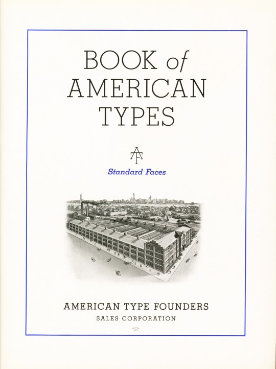
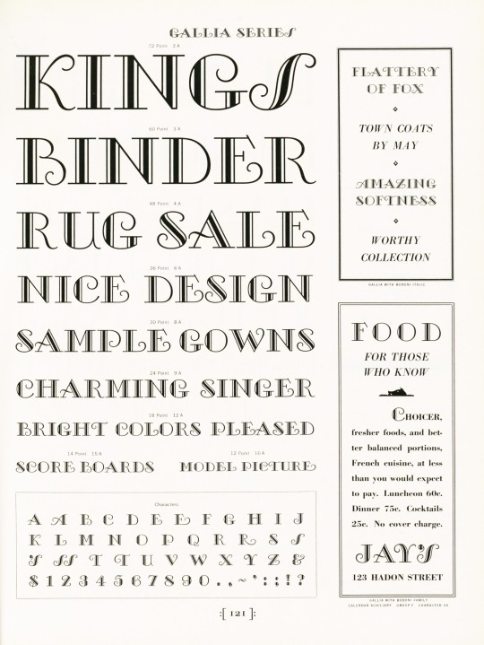
American Type Founders (ATF), established in 1892 with the merger of 23 type foundries, was the predominant producer of metal type in America for the first 50 years of its existence, and remained influential in the industry almost until its closing in the early 1990s. In its heyday, this conglomeration of foundries produced about 85 percent of all type manufactured in the United States at the time. As a behemoth type manufacturer, it also had most of the nation's top type designers producing original typefaces for the foundry, including Will Bradley, Frederic Goudy, Oz Cooper, T.M. Cleland, and the prolific Morris Fuller Benton, who was also the head of the ATF design department.
This ATF type specimen book, Book of American Types, published in 1934 presents some of the "Standard Types" offered by ATF. As the Preface notes:
During the last decade there has been a period of experimental effort in typography the influence of which at times has carried us a long way from the traditional past. . . . No type specimen book can ever be complete in the strictest sense. As printing proceeds, new designs enter the early stages of preparation. Alphabets from leading artists and from our own pre-eminent staff of designers are being continually studied in the effort to anticipate style trends. . . . Change is inherent in progress and every effort will be made to have these separate specimens reflect the most recent trends while at all times maintaining the highest typographic standards.
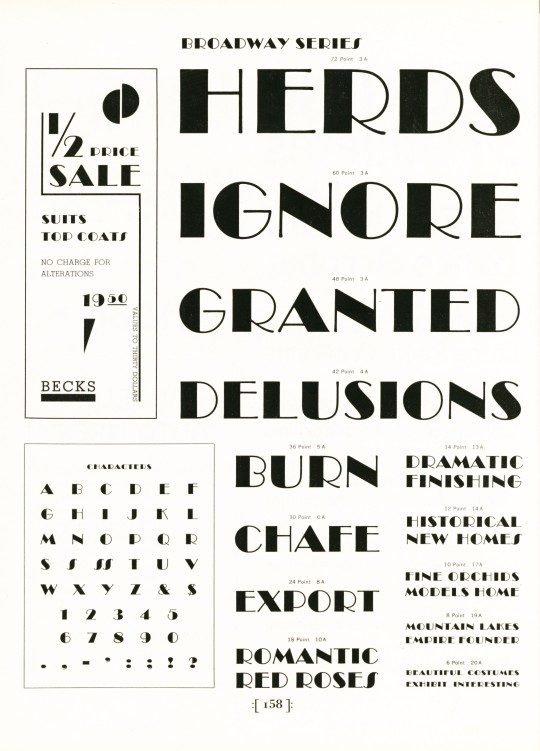
This statement, along with the title and the name of the corporation, place an emphasis on the spirit of progressivism during the interwar period, as well as the exceptionalism of American initiative and design. But as the display of the Broadway Series of type (designed by Benton in the late 1920s) reminds us, "Herds Ignore Granted Delusions." Our copy of Book of American Types is another donation from the estate of our late friend Dennis Bayuzick.
View other books from the collection of Dennis Bayuzick.
View other type specimen books.
View more Typography Tuesday posts.
#Typography Tuesday#typetuesday#typography#American Type Founders#ATF#Book of American Types#Morris Fuller Benton#Type display books#type specimen books#type specimens#Dennis Bayuzick#20th century type
213 notes
·
View notes
Photo


Envelopes from Alan Blackman’s Letters to Myself project
In 1968 well-known San Francisco lettering artist Alan A. Blackman began sending hand-written envelopes as a surprise for his young son, Stephen, across the bay in Berkeley. Blackman had been an avid stamp collector in childhood and remembered the excitement that a new postage stamp could create—and the excitement of receiving his own personal mail. At the same time he addressed an envelope to his son, he addressed a similar one to himself.
youtube
Blackman recently died at the age of 96. From his obituary in the San Franciso Chronicle:
Blackman was part of a community of stamp collectors who pursue first-day cover stamps. On the day the U.S. Postal Service issues a new commemorative stamp, such collectors stick it on an envelope, take it to the post office to get it postmarked that day, and mail it to themselves. Where he elevated the hobby was in the handwriting of the address....
The envelopes were addressed in uniform style when he started out, but his creativity overtook him. “It dawned on me that since the stamps were always different, the design on the stamp could influence what the address looked like,” he told the Chronicle in 2015. “That was quite a departure. I had not anticipated it, but once I discovered it, it became a subject of great fascination to me and to my friends who had seen these things.”
Blackman also designed two typefaces: Galahad and Say Cheese.
20 notes
·
View notes
Note
(from the matching icon and my domi/my mor name girlfriends) we were reading the motifs explanations, and my mor said that modeling is very 'material', very physical as produced and experienced; whereas graphic design is 'immaterial' and processed and appreciated via the mind. i countered the opposite-modeling is more immaterial, ephemeral, the clothes often have to be ripped off at the end of the show, while graphic design is a very 'useful' art with practical purposes, and much more material to me. i guess we were just wondering, beyond the fact that mor struggles with the immaterial and domi with the material, are these subtler themes part of the motif?
OOH I love both these interpretations!!! Their jobs are a little less to do with the material/immaterial themes and more to do with their Thinking & Feeling theme!
Mor is Thinking, mainly bc she's an over thinker and rationalizer. She's a character driven by love and beauty and emotion, but in her pursuit of it, she has to be so so cerebral about everything. She's overthinking her tone, her presentation, her entire being, all the time. She's very emotionally cognizant, but it comes from her being very knowledgeable, not necessarily intuitive. As an artist, I chose graphic design bc it's a very exact art, a synthesis of right and left brain, creative and mathematical. It's why her focus is on typefaces, and why her illustration style utilizes a lot of precise, geometric shapes
Dom is Feeling, she feels things before she understands them, and actually takes quite a while to process her emotions. To a degree I think she has alexithymia from PTSD, but it doesn't mean her feelings are less, just harder to name. As an artist, Dom's modeling is focused a lot on how things make the audience feel. It's not always about the clothes-- that's the designer's job-- it's about how the model makes someone feel about those clothes. It's a visual art that aims to influence the audience through the emotions. I often compare Dom to Eros or Cupid thru her modeling
28 notes
·
View notes
Text
Undertwins Headcanon:
(This is diving into lore for this AU specifically, but I really wanted to talk about it, because it's really fascinating to me)
Back where Sans and Papyrus came from, skeletons put a huge emphasis on their fonts. Fonts are very important for skeletons since they not only influence their voices and how they talk, but they're also an indication of a skeleton's temperament, as well as an influence on their appearance.
Because skeletons don't have organs, they of course don't have a voice box. Instead they have a font, which is closely connected to the soul and takes the form of an invisible... thing somewhere inside their skull, just above the beginning of their spine. Like all parts of a monster's body, it is, of course, magic, and thus a reflection of their soul. Therefore, skeletons speak in fonts as that's the way their soul expresses their temperament, NOT their full personality.
There are also different Types of skeletons. Sans Serifs and Serifs are the most common, while the Modern fonts are the rarest. The Types all have unique appearances that indicate what they are. Sans and Papyrus are Script skeletons, snow white in colour and slightly fuzzy in texture.
Skeletons name their children based on the fonts they have. They could either be the actual font itself or a variant of the name (e.g. Arial Black can be called Arial, Ari, A.B., Arblak etc as a given name). This is mainly because of tradition.
Fonts also have various rarities. As stated above, Sans Serifs and Serifs are the most common, followed distantly by Scripts. And within those Types, there are various rarities of fonts. Comic Sans and Papyrus as fonts are generally quite rare among skeletons, in contrast to the human typeface world where the fonts can be seen semi-regularly.
In addition, whether the skeleton is an uppercaser or a lowercaser also matters in their temperament and build. Uppercasers are generally louder, stronger and tougher than their lowercased counterparts, while lowercasers are soft-spoken, perceptive and excel in stealth.
As for the temperaments themselves, fonts generally have labels to identify what temperament is connected to their font.
Comic Sans is labelled as the "Comedy" or the "Laughter" font. They thrive off of laughter and making others happy. Comic Sans babies tend to laugh a lot and tend to repeat behaviours that seem to elicit joy and laughter out of others. As they grow up, they tend to have a casual, jovial demeanour. They don't tend to stay serious for long, nor do they like seeing others upset.
Papyrus is labelled as the "Cheerleader" font. They have an innate desire for confidence and to inspire others, to be a role model for other people to look up to. Papyrus babies tend to latch onto behaviours that impress their parents and peers. As they grow up, they tend to see themselves as a role model for everyone around them and strive to live up to that image. They tend to be supportive and optimistic, as well as very social.
It's very important to note that fonts are a reflection of the soul and do not dictate a skeleton's personality. It is there only to clue in what the skeleton's temperament is.
9 notes
·
View notes
Text
TYPEFACES I THINK THE MOBSAI MAIN CAST WOULD USE
Decided to be insane and come up with some headcanons on the typefaces each character would use. Please shout at me about it on the psychohelmet forum if you get the chance. I've copied and pasted the headcanons under the read more for your viewing pleasure.
I wanted to share my headcanons for the different fonts (using this term very generally) each of the mobsai main cast would use (if we are imagining that they were given free rein to do so for some reason, and also that they wrote using a latin alphabet, obviously) which I just made up off the top of my head right now.
Anyway, here we go:
Mob - Calibri
I think this one makes a lot of sense, just off the bat. I really don't think Mob would be a serif sort of guy, he's too plain and unassuming for that. What better than to make him a very default font. I honestly don't think you can even get more default than calibri. It even sounds a little lame when you say it. Despite that, it's a pretty dependable font, it appears everywhere, and I would argue is very powerful due to its universality and legibility on any-sized devices. But don't just take my word for it, here's what Microsoft has to say about it: "Its proportions allow high impact in tightly set lines of big and small text alike. Calibri’s many curves and the new rasteriser team up in bigger sizes to reveal a warm and soft character." I would argue that this clearly reflects Mob's welcoming character and desire to understand and empathise with any number of characters within the show.
Reigen - Arial
Again, I do feel like this just makes sense to me. Reigen is also a real sans-serif sort of guy, he's the greatest psychic of the 21st century, he's spice city's bro! Arial I feel is also a little more professional than calibri, while still being quite similar in appearance, which I feel reflects the influence Reigen has over Mob's character and development within the story. Described by Microsoft as an "extremely versatile" typeface, especially "for display use in newspapers, advertising and promotions", I think this works well for Reigen's character. It's also a pretty dyslexia friendly font, which I think would be a fun fact he'd shoot at Mob.
Dimple - Papyrus
This one was a little tricky. I wanted it to look dated, considering Dimple's been dead for some time, while also being a little flashy to reflect his desires for godhood. I settled on papyrus because, well, look at it. It's definitely what I'd consider a meme typeface (which I think is fitting for a sentient fart, honestly), but it's also loud without being too out there, and a popular and fun font to use. It's unapologetic and real, which I think Dimple represents as a character, and the complete opposite of a font like calibri. It also looks good in green.
Ritsu - Times New Roman
Ritsu is absolutely a serif guy, through and through. He's always on that 12pt Times New Roman shit, even if he's just writing a casual email to someone. Ritsu is someone who takes things seriously, and has a reputation he wants/needs to uphold. I'm sure he read somewhere that TNR (I'm not writing that shit out again) was the professional font and just made it his whole personality or something. It looks good, so I'm not complaining. I've also heard that TNR is a good font to make study notes in, because you remember it better (I think this was a myth uni students used to tell each other though) but I'm sure he stands behind this fact wholeheartedly.
Teru - Blackadder ITC
Just listen to what Microsoft has to say here in its overview of this font: "Blackadder ITC font is an elegant, yet menacing display face is perfect for theatrical uses and scare tactics." Not only is it elegant and swirly, but works well with his flashy appearances and fashion choices throughout the show. It's impressive and makes a scene when it appears, and walks the line between impressive and gaudy very well for someone as in-TERU-sting as Hanazawa. I do think he'd switch around fonts a little, but this would be his favourite for sure.
Serizawa - Roboto
This one was also hard, and I'm not sure I did him justice. I think, given Serizawa's lack of real-life experience outside of a terrorist organisation as well as his time online, I wanted to go with a font that was professionally acceptable, but still a bit of an outlier. Roboto is also the default font on android devices, and all other google services, which I figured would reflect the 'shut in' phase of his life. It's sorta plain, but does the job and follows the rules without asking too many questions. I think if we were talking specifics, he'd be Roboto Mono.
Tome - Courier New
I need to preface this explanation by saying I love Tome. More than almost all of the characters in this show. She reminds me a lot of myself as a kid. This one's personal. Tome is obsessed with proving the existence of aliens, or any sort of extraterrestrial and paranormal activity. She starts the Telepathy club to research these phenomena, she's absolutely committed (apart from in that one episode) to show the world she's right, to have her friends take her interests seriously. I think she'd want to use a font that was interesting to look at, while still being serious-enough to reflect her passion for pursuing the truth. She probably watched the X-Files as a kid and really wanted to type up some legit-looking reports on the unexplained. No I'm not projecting.
Shou - Comic Sans MS
I mean, what did you expect. He uses Comic Sans for all his reports and thinks he's the funniest guy ever for doing so. He also just likes how it looks, I think he'd be into superhero comics and would love to make any work he does look similar. Not only is it a funny text face, Microsoft also calls it "useful" due to its readability. I think that definitely mirrors Shou's extraversion and his role as a helpful figure, both to Ritsu and to his father at the conclusion of his arc. I also bet he logs on to Toichiro's desktop sometimes and changes his default email font to comic sans too, probably makes the fantastic five or whatever they're called piss themselves with laughter. Also a frequent Wingdings user, for sure.
Toichiro - Futura
Guess I have to put him in here too, since I talked about Shou. I chose Futura here for what it stands for, a purely geometric and efficient typeface which I feel reflects Suzuki's ethos of wanting to be the best and creating a world where 'supreme beings' rule over normal humans. The progressive feel Futura has here becomes skewed, not towards a bright future but towards a descruction of the old order and a rebuilding of an ESPer-led world. An incredibly popular font, which I feel is all about appearances and precision, it wants its letters to stand in line, breaking away from the old 'grotesque' style of former sans-serif fonts. Do you see my vision?
Sample of their fonts below:

15 notes
·
View notes
Note
Explanation:
______________________________________________________________
Sentences showing disorder, confusion, loss of control, distortion of reality, emotional
reality, emotional instability, are represented by writing in ZALGO
font.
̼͓͎̩͖̳̞̟̪͉͕͍̘̮͈̠̦͉̦̠̃͊̃̂̽̑̍͒ͦ̊Z̬̖̙̤͙̝̰̯̟̝̯̱̗͑̌̓ͮͩ͂͋͒̓ͨ̋ͩA̝͙̾̾̿ͥ͑̽͂̆ͧ̎ͧ̑L̞̘̮̰̳̰͚̮̪̼̙͇͇̹̉̈́͋̅̽ͮ̑͋ͭ̓ͣͮ̽ͪ͌ͧ͛ͫ́̚ͅG̠̭̦̺̤̤̍ͥO̘͙̥̟͉̝͉͉̠̥̞̞̫̲̗̦͓͎̭̤̱̊̃͆̓ͭ͐̑ͭ̀̌ͧ̒́̋ͨ̔̎̽̚ ͍̙̤͚̙͙̗̰͍̬͐ͮͩ̈́͂̉̍̋̌̈ͮͫ͆̒͛̀̂̚T̝̻̭̘̰͓̖͍̎̓ͮ̌ͨ̿̓͌ͧ̌ͧ̒ͦͫH̘̖̞ͪ͋ͮ̍̐̚̚E̲̰͍̱̤̻͕̮̖͈̯̥̫̳̓̔͊̂̉̊̒ͅ ͙̞̻͙̰͕̳͔͎̮̟̗̰̤̼̞͙̬̣̠̤̘ͧ͆́̎̅W̹̲͇̟͚̱͈͓̖̥͍̳̝̣̖͉̭͓̲͌̃̂́ͫͦṞ͓̬̞͕͈̼̼̬̜̘̤̝̰̺͈͈̯͈̠̒ͣͫ̆̆ͧ̽̀́I̫̰͚͕̮̱̻͚̙͈̥͇͖̍̀ͣ̔̓ͬ̾T͖͇̺͎̙̞̰̰̺̠̰̗̮̭͙͗Ǐ̤̮̭͎̠͉͈̭̞͛̈̆ͩ͛̔̇ͥ̉͆̎ͯ̚N̘̬̘̪̯̞̠̺̲͇̣̯͇͎̭̩͚̮̭ͮ̇ͪ̊ͤ͛͆ͫ̎͐̔̚G̞̜̮̩̓̌͒ͧ́̚̚ͅ ͍͗̈̉̔͂̉ͭO̼̖̹̹̠̳̬̼̪͊̒̅͌F͖̟͎̬͉͎̲͎̥̝̗̤̻͎̥̱̈̀̌ͮ̃́̒̾ͣ̍̎́ ̮͉̅ͅͅT̖̦̣̤͍͔̪͎̖̗̗̰͔̏̓ͫ̉̿͊̍̔̾̄ͅH̘̲̠̠̦͙̗̞͎̗̞̱̯̼͆͑́ͫ̎̋̎̄̿͋ͦͯ̅͛̑E̱͕̣̲̭̼̜̬͖̱͙̪̫͎̒̆̅̏̋͒̚ͅ ̭̖̖͈̮̱͇̲̣̮̟͎̲̪̤̲̎ͣͧͧͦ̇̓̏̐ͅͅR̝͕͓̞̱͉̟̠ͪͨ͛ͪͣ̑ͬ̋ͯ̋ͦ̊͑̐͒ͫ͑͗̀ͭ̿͛ͅͅU̮̼̬̙̹̲̯̮͗͋̃̎́̍͌̾I̝̜̺̩͖̤ͩ̔ͬ̊ͤ̉̋̓͌̆ͬ̊̅̾̅̾N̙̦̬̠̦̹͈̹̜̝̯̗ͬͨĔ̮͇̩̪͎̱̺͇̹̣̗͈́ͤ̆͋ͯ̈̃̚Ďͧ͌��͕̦̖͇̹̺̲̠̫̘͎̙̭̝͚̦̠̬́̍̓̂ͧ̄̐ͩ̅ͮͦ͗ͨ̿ͬ ͙̜͈̮̣̭̯̝̪̣͎͍̬͍͎̺̰̹̘ͧ̉ͅK̠̙̬̳͖̞̮͔̯̹̻͇͙̻̞̫͙̮̩̓̎̊̈̓͑̈̓ͨ͆̓͐ͭ̚ͅİ̳͙̜̤͔̭̺͉̂̈́ͧ̃͛̋̂̉ͧ̋͗̅̏ͯ̇̓̚ͅN̝͕̼̳̫̝͔͇͆ͪ̋̔ͭ̐G͚͕̠̠̼̩̺̪̋̄͑̃̓̓ͥ̉ͫ̉͊̈́̃ͤͫ̄̈̍̉̈
There are some interesting quotes in this source.
Zalgo is a being classified as a cosmic terror where various descriptions characterize him as having seven mouths (six speaking different languages and the seventh singing the song of closure), in his right hand he holds a dead star that consumes everything in its path and in his left hand a candle that produces no light, but rather darkness that will dominate every remnant of light it passes through (the light of the shadow).
A being who cannot come directly into our world, but who can influence minds to sing his song, inviting him to take control of his actions.
H̷̲ͧĘ̅̏̾̋̎̽̚҉̴̢̕͠͏͍̬̝̣͉̬ͅ ̴̡͓̬͍̱̜̝͍̞͈͈̎̑ͪ͊͒̓ͩ̾ͮͯ̀́͟͝͡͞͠͡C̷̸̷̸̡̘̯̮̦̯̳͙̻͙̳̩ͦ̍̂́ͩ́ͯ͊͋͂̊̕͢͜͟͢͝Ǫ̶̴̷̛̣̼̺̩͔̺̭̲͍̝ͭ̌̍̅ͩ̋̎̒̇̊ͧ́̀̕̕͘͠ͅM͆͗ͫ͌ͮ̋͑̂͌̾̈́҉̵̵̧̛̕͜͜͝͏̷̘̭̤̻̘̜̪̮̮̖̺Ȩ̷̡̡ͮͭ̑ͭ̿ͧ́ͩͥ̀̚҉̴̻̭̦͉̝̜̮̻͓̭́̀͘S̵̸̡̢̛͉̙̘̘͚̫̻͋̔̀̋̿̅́̚͢
Zalgo can drive a person to insanity just by its presence, with the result that the person ceases to be who they were forever. When in the creature's presence, their eyes will lose their former sparkle and only take on a deep, lifeless black.
______________________________________________________________
Observations:
I see some similarities with the Super character in his story, he may have references to Fleetway Sonic, but it surprised me that the meaning of the typeface used is as insane as the character it's supposed to portray.
The first thing that alerted me was the Zalgo conversion site, Where there is a theme “What is Zalgo?”, it describes the creature. The highlight of this paragraph is what happens when the creature is nearby
“the people around will have a black hole in their eyes...”
In this sentence, I was able to compare Super's always-mentioned bizarre features in his story.
“Deep, lifeless onyx-colored eyes, an uncomfortable and disturbing sight”
After researching Zalgo on the website there is the phrase
“He is said to be the embodiment of omnipresent chaos”
The Serum takes over, what Sonic wants to bury about him in his subconscious is now present in Super form, something that should and does represent the limitless, a vision that should be the pinnacle of security, but is tainted with inky blackness.
Interestingly, a song called “The Song of the Soul” is mentioned, which Zalgo can invoke. A song is also present in the story in the act of Shadow's drowning (chapter 16), a song that is heard by Sonic as the river beneath him darkens into deep black.
There's a quote in which it's pointed out that Zalgo can manipulate and interact with liquids. Whenever Super appears, the black sea accompanies it, a representation that embodies fears, anxieties and traumas.
Just a few points of comparison, between the meaning of the font used and your Super🙂
I ask you now, was that on purpose? The general meaning of using the specific font. My comparisons may be wrong.
References links 1 . 2 . 3 . 4 . 5 . 6 . 7

I will say this is not on purpose, as everything with Sonic's/"Super's" actions is entirely based on Sonic lore/Sonic's personality + my own headcanons for it. HOWEVER, this might be the most insane coincidence of all time and I loved reading all that LMFAO
We haven't really gotten into Sonic's perspective on "Super" too much since the fic started, and while it may not happen so soon there are a lot of little things about "Super" that should tell you how Sonic sees himself. I think this comparison to a horror creature makes me smile because... well actually, I shouldn't say. We just have to wait and see! Sorry to be so secretive, I wish I could dive into your epic analysis and apply it to the fic but SPOILERS MAN...
Oh BTW you will know what "the music/song" is by chapter 20 or 21 if chapter 19 goes well. :>
10 notes
·
View notes
Text
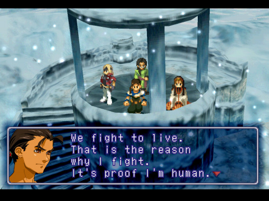
Been working on again off again on a Xenogears portrait mod for two years now, started in Sept 2021 right before I actually finished the game for the first time. Some time ago I started adding upscaled (hand painted) versions of UI elements, so I guess its now a general texture pack I'm working on.
Its done through RetroArch's Beetle PSX HW core real-time texture replacer.
My goal with this is to make a texture pack that stays very true to the original look of the game. I don't want to redesign elements, impose too much of my own influence into it, and make the game look like it had an identity crisis. I still want it to look like Xenogears in the end, just upscaled, and where the portraits are concerned I want it to look as close to the original artwork as possible, with no scanning artifacts and low res quality- as if we actually had digital versions of Tanaka's original artwork.
Also, this isn't intended to be super high res 4k or anything, idc about that.
Figured I'd make a full post here going over everything I've done so far. I'm on the home stretch! Just a few more left.
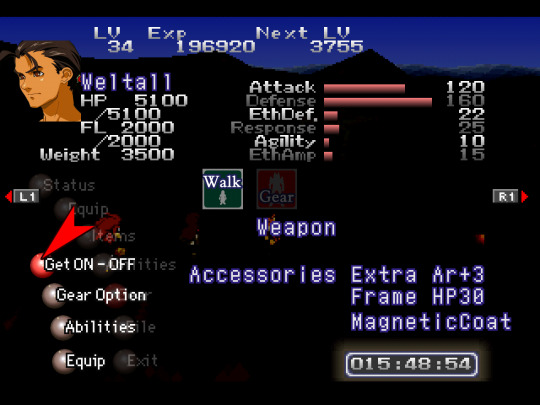

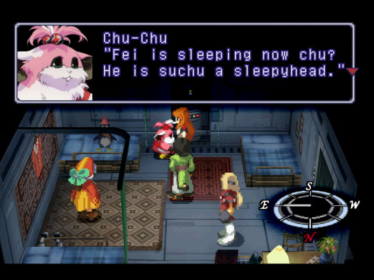
⬆ Starting with UI. I replaced the red selection arrow, the red/grey spheres, save block icon, save/load text/bar, Walk/Gear icons (more about that one later), compass cardinal points (was unable to get a proper dump of the circular compass texture), and the dialogue diamond and selection diamond within menus.
I totally get it if someone wouldn't want to use something like the dialogue diamond, as you see it all the time right beside the pixelated text and it seems to stand out more in dialogue vs the one in menuing bc your attention is typically focused elsewhere while menuing. In the end, all changes are optional and to remove something all you have to do is move/delete the equivalent img file from the texture replacement folder. Within said folder I have a sub-folder titled "alternate portraits" where I keep alts and things I want to "disable" without outright deleting.
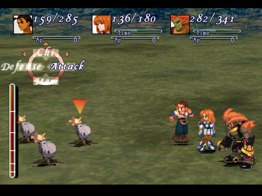
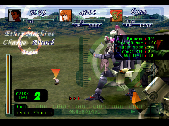
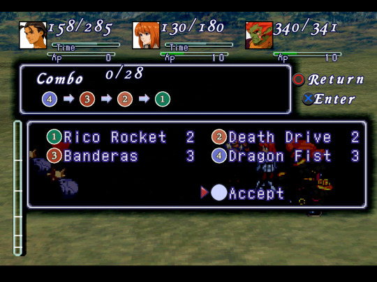
⬆ In combat UI I've replaced the HP/dmg numbers, the Time/AP/numbers, battle palette text (used for other text as well), the circle and tags of the battle palette, Time/AP/fuel bars, green Gear text and numbers, Gear attack level/♾ indicator, black Gear UI backgrounds, and combo icons. The red arrows have been replaced, but unfortunately the black arrows around the red cannot be replaced based on how the game does it; it is not a texture you can change, it is a triangular shaped box that the game fills with the black texture from behind Gear UI.
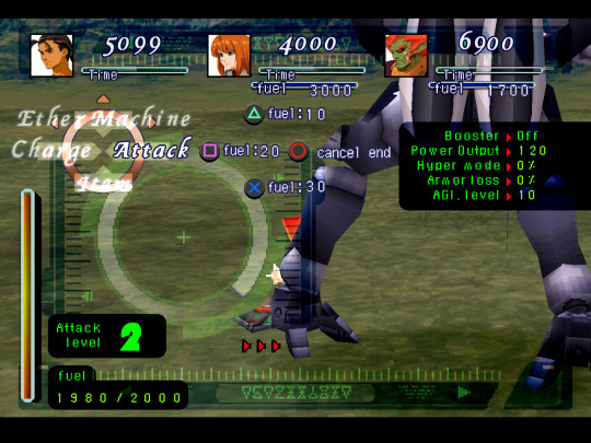
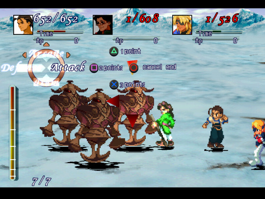

⬆ Menu/gameplay buttons. Also numbers/"points/fuel/cancel end" Someone mentioned playing with a switch pro controller or joy-cons so I threw an ABXY version together as an alternate button display option. Used the same typeface as the combo icons to keep some consistency with a typeface already in-use as well as for overall clarity.
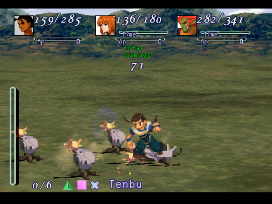
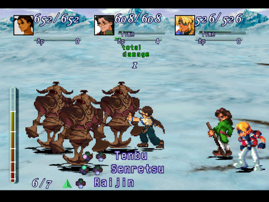
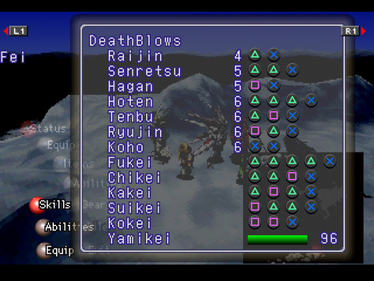
⬆ Also, DB icons, EP/Fuel/Miss text, and "total damage". Unfortunately, the other DB icons (showing the △🞪☐ highlighted) cannot be replaced as far as I can tell. The battle UI textures (the 17 or so textures of the same thing in varying hues) shows them on it, but changing them in each one of these textures does not change the icons. It does not pull from these specific texture dumps, in other words; its just one of those that doesn't dump, like the circular compass texture.
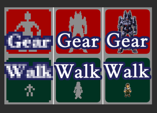
⬆ In working on the Walk/Gear icons I wasn't sure exactly how I'd go about doing it because the original is literally just that tiny. So I had the idea of putting a little Fei & Weltall in it, outlined by the same grey. Thought it might be weird in the other party members' menus, idk, and I don't like changing things too much from the original, so I decided to just use Fei/Weltall as the grey silhouettes instead. Ill keep the Fei/Weltall one as an alt option if anyone wants to use it.
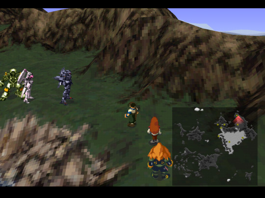
⬆ And the minimap. Kept B&W so that the colored dots (indicators of where all you can enter an area) aren't difficult to see. I do have a colored version as an alt, though. Credit to Adelinold for having ripped the 3D maps and made a bird's eye view "minimap" esque screenshot of the world map some years back because it is absolutely perfect for use here.
~~~~~
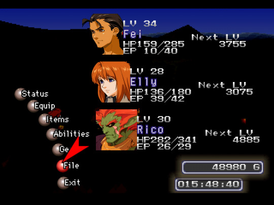
Now onto portraits, the main bulk of the work. This includes dialogue portraits, menu portraits, and gameplay portraits. I go through each one individually, find the highest quality version of the art, and clean it up manually, painting over it to get rid of any jpg rot, scanning artifacts, or print dots from scans while keeping it as close to the artwork as possible. In order to keep colors consistent across the board (because scans of the artwork can vary) I'm picking from the sprites. One portrait typically takes 2.5+ hours, not including testing them in-game. Each one needs to be tested in-game and edited to make sure semi-transparent pixels around the portraits don't result in black or white pixels in the area that should be transparent.
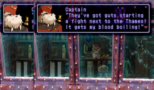
⬆ Direct comparison to the sprites. I'm not too strict about how I match how much of the art is shown, but in instances like this I like to show more of the character than the pixelated portraits allowed for. However, this wouldn't work for everyone as Fei's default portrait is also used when Kim is naked from the hips up.
For the Captain I specifically wanted to get his pipe within frame. Typically the portraits end just behind their ear, have the eyes at 1/2 to 2/3 height, and end just above the clavicle.
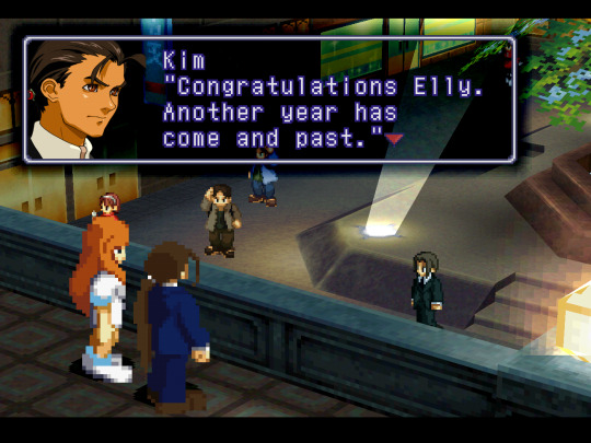

⬆ Some portraits like Kim and Elly have no artwork equivalent, but were pretty basic to make with the artwork of Fei & Elly that we do have.

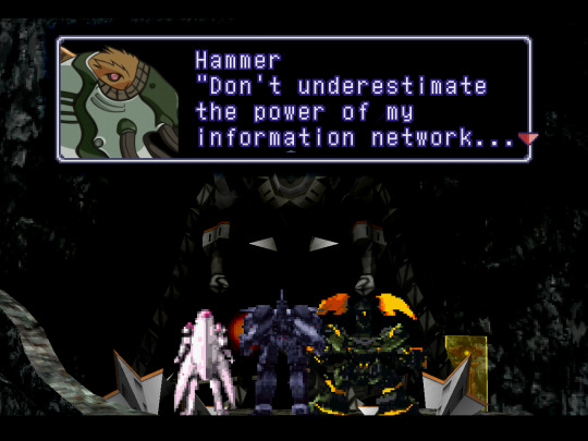
⬆ Other characters have no artwork equivalent whatsoever, like Stein and Wel-Gear Hammer. For Stein I had to take the collar from Stone's artwork and paint something from scratch using Stein's sprite as reference. This one was more fun to do than I expected because its a special case, entirely different from all of the other portraits. For example, usually the artwork has 4 colors for skin- base color, shadow color, deep shadow color (usually seen directly under the chin, used sparingly), and a highlight color for on the nose or lip. But with Stein his skin had many different colors you could pick from the sprite and no equivalent artwork to limit yourself in how many there actually are. So in trying to get it looking just right it took something like 7 different shades of varying pink, red, and orange. It clearly has more dynamic shading compared to all of the other portraits.
For Wel-Gear Hammer... I did my best given what all I could see was even happening in the sprite.
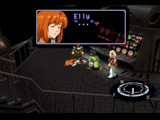
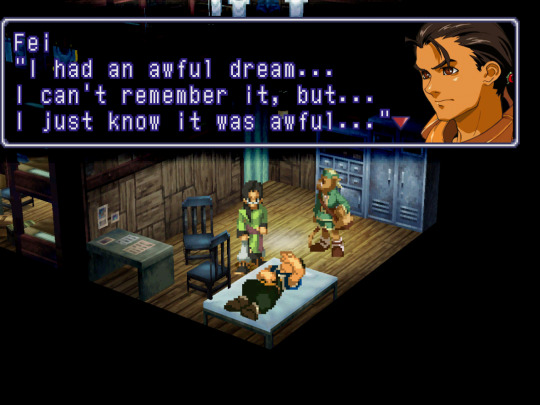
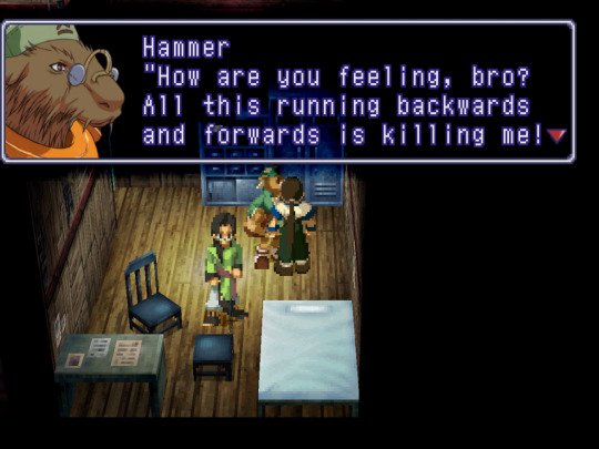
⬆ I made a close eyed Elly portrait as there is no artwork of it and a bomb collar Fei and Hammer portrait using the bomb collar in Rico's art. Its fun playing around with them when there is no equivalent artwork.
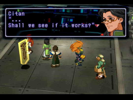
⬆ Made an unsmiling Citan to mirror his unsmiling dialogue sprite vs his smiling menu sprites as well as alt Krelians to better match the expression of his mouth that the sprite has vs the artwork. (sprites are always a bit stretched compared to the artwork, btw. even when you rip them from the disc)
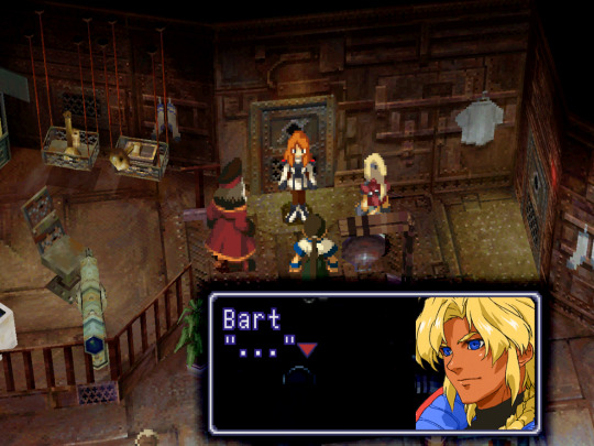
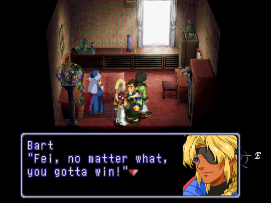
⬆ I'm also working on alternate versions, like a two-eyed Bart I did for fun.
~~~~~
It is finished! 1.0 anyway. Right in time for the North American 25th Anniversary! I just gotta get it uploaded somewhere.
I'll continue to work on the ones that I think still need more work, but for now even the ones that are in rougher shape are passable.
Ill have two versions of the mod- one with stretched and cropped portraits that work in 4:3 (much like the sprite portrait bmps in the base-game that end up looking fine in true 4:3. they kind of end up blurrier due to stretching the artwork) (with Crop Overscan set to None) and another version which isn't stretched or cropped so its as crisp as I could get them, but in order to get them to display the image exactly as they are in-game without squishing you need Crop Overscan set to Static (removes horizontal padding) which makes it just slightly off 4:3. Honestly, to the untrained eye its hard to tell it isn't 4:3. 🤷♀️ The only thing you might notice it really affecting would be the animated cutscenes.
I'll make a master post for the mod itself, separate from this. This'll end up being a bit of a time capsule for me.
#Xenogears#xenogears spoilers#Xenogears texture mod#texture pack#modding#Playstation 1#PS1 classic#long post#oh cool this was my 100th post huh lol#updated 10/14/23
81 notes
·
View notes
Text
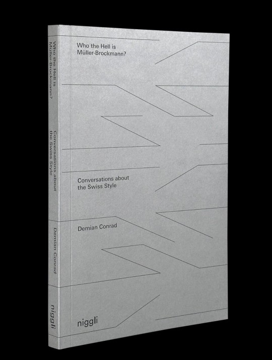
Who the Hell is Müller-Brockmann?
What are the underlying reasons for the success or failure of a design manifesto? How can cultural exchange bring new value to the field of graphic design? At the end of the day is the contemporary scene still truly innovative or simply basking in past glories?
Over the course of a residency at a London gallery, Swiss designer Demian Conrad invited an array of graphic designers and typographers past and present to share the anecdotes, stories and scandals that have marked the international design scene over the course of the last century. The result is Who the Hell is Müller-Brockmann? an examination of the ways in which the Swiss Style influenced British graphic design and vice versa.
This celebration of the ongoing dialogue and collaboration that has existed between the design traditions of these two countries also lays bare the divergences and conflicts that lie beneath the surface, and examines how such things as a typeface or a layout grid can come to have such an enduring impact on a global community and elicit such strong emotions.
Each participant was asked to bring a design-related artifact that represents their personal connection with the Swiss Style, all of which are presented in this volume. These images and the dialogues they generate create a bridge between the typographic traditions and practices of Britain and Switzerland.
With an essay by Adrian Shaughnessy
Contributors include Bruno Maag, Fraser Muggeridge, Freda Sack, Holger Jacobs, Michele Jannuzzi, Richard Hollis, Robin Kinross, and Sara De Bondt
Edited by Demian Conrad
Published by Niggli Verlag, 2022
Softcover, 208 pages, 150 images, 4.76 × 7.28 inches
ISBN: 978-3-72-121007-1
#graphic design books#typography books#graphic design history#Swiss Style#graphic design#Demian Conrad#Niggli Verlag#Draw Down Books
22 notes
·
View notes
Text

Kinfolk
#Kinfolk#magazine#books#lifestyle#slow life#quality of life#community of creative#print#online media#The Influence Issue#Issue 52#typography#type#typeface#font#Kinfolk Serif#Kinfolk Sans#2024#Week 24#website#web design#inspire#inspiration#happywebdesign
6 notes
·
View notes
Text
Before lexember season is officially upon us, I suppose I should update the progress I've been making with my conlangs.
Regarding the Faerûnian Elven (the conlang I've spoken about the most on this blog), that's going fine and I'm slowly chipping away at putting in dictionary entries into my personal worldbuilding wiki.
The Infernal lang I used in the 2023 lexember has finally had its backwards evolution done and I'm in the process of creating the Supernalese Language Family from it.
The language family has a pseudo-proto-language (Supernal) and I say pseudo because it's technically still in limited use in some contexts.
Two daughter languages (Dark Speech) and (Light Speech aka Words of Creation), though I feel like I should mention I really do not like the implications of Light/Dark Speech and I'm trying to find an equivalent name for Dark Speech along the lines of Words of Creation, but I haven't landed on anything that's stuck yet.
And of these daughter languages they both have two granddaughter languages respectively. Infernal and Abyssal, and Celestial and Planar respectively. From what I understand, Planar is entirely homebrewed on my part, and I included it to complete some symmetry in the family. I don't really have a logical reason for this other than I plan on having balance and numerology be of some cultural significance to the Supernalese speakers and I wanted to ensure I had enough linguistic wiggle room to have fun with interlinguisitic family loanwords. Which is to say aesthetic and functional reasoning was my priority.
Of the granddaughter languages there are currently two major diaspora Faerûnian dialects of Infernal and Celestial (of which only one is of true concern to me), though I have made space for more dialects on the assumption there would be.
I've done little to expand upon the Celestial dialect, but the Faerûnian Infernal is markedly different from the more fixed High Infernal (spoken on an entirely different plane to Faerûn) and more influenced by surrounding languages such as Faerûnian Elven, Chondanthan and other Thorass languages including the ever in flux Trade Pidgins/Common. Of these influences, this has resulted in adapting the traditionally base 12 number system to be more in line with the more common base 10 and base 20 systems.
This year I was really hoping to be able to work on refining the scripts I have made but unfortunately I do not have better crunchier typefaces to share ready for Lexember, but what I do have... is a Celestial relative of the Infernal script. At some point I will force myself to sit down and sketch out each goddamn character by hand in one (or more) of my several grid-lined journals, but to be perfectly honest this year has been extremely draining and neography is not what's currently scratching the itch in my brain, so it's okay how it is for now I guess.
Overall I'm pretty happy with where I am at. I had kinda hoped that I could blast all this out in 6 months and return to my own personal project unrelated to dnd but it's been so much of a learning experience it's hard to be disappointed in everything I've done up until this point.
3 notes
·
View notes
Text
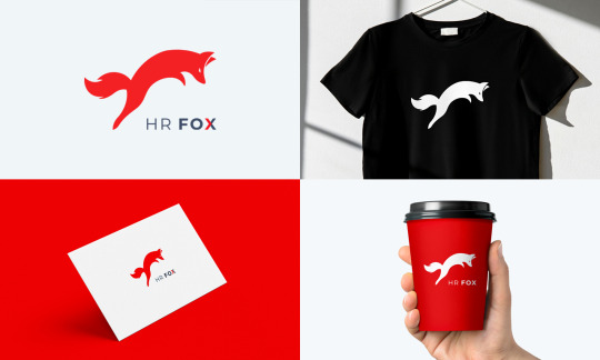
Unique Minimalist Logo Design | Custom Business Branding & Typography
Unique Minimalist Logo Design | Custom Business Branding & Typography
In today’s competitive market, your brand's identity is everything. A unique minimalist logo not only strengthens your brand but also sets you apart, making a lasting impression on your target audience. This article dives into the significance of a minimalist logo design, the advantages of custom business branding, and the power of effective typography.

Why Choose a Minimalist Logo?
Minimalist logo design has taken the world by storm, with businesses of all sizes embracing simplicity. The key to a successful minimalist logo is focusing on core elements while removing unnecessary details. This approach creates a clean, professional look that speaks volumes about a brand’s values. Some advantages include:
Clear Message: A minimalist logo communicates the brand's identity instantly. With fewer elements, it becomes easier for customers to recognize and remember the logo.
Versatility: Minimalist logos are adaptable to various formats and sizes, from social media profiles to large billboards.
Timelessness: Trends come and go, but minimalism remains timeless. A well-designed minimalist logo will look as fresh years from now as it does today.
Professionalism: A simple, clean logo suggests a serious, quality-driven business, which can positively influence customer perception.
The Power of Custom Branding
Custom branding involves crafting every element of your brand to reflect its unique personality. It’s more than just a logo—it’s an experience that ties together colors, typography, imagery, and tone of voice. Custom business branding not only ensures that your brand looks different but also creates an emotional connection with your audience. Here’s how a custom minimalist logo can help:
Brand Differentiation: In competitive markets, a custom logo can be a distinguishing factor. A unique design sets you apart from competitors and builds brand recall.
Customer Trust: A personalized, thought-out logo design gives a strong impression of professionalism and commitment, which can lead to customer loyalty.
Increased Value: Custom branding adds perceived value to a business. A strong, cohesive brand attracts attention and builds credibility, which can be a game-changer for growth.
Typography: The Secret Weapon in Minimalist Logos
Typography is the art of arranging letters to make the text legible, readable, and visually appealing. In minimalist logos, typography often takes center stage. When done right, typography can communicate personality, values, and even the type of products or services a brand offers. Here are a few ways typography strengthens minimalist logo design:
Enhanced Readability: Minimalist logos with clean, well-chosen typography ensure your brand name is easily readable at a glance.
Mood Setting: Different typefaces evoke different emotions. A modern sans-serif font might feel professional and straightforward, while a classic serif font gives a timeless, trustworthy vibe.
Balance and Composition: In minimalist designs, typography becomes an essential element to balance and structure the logo. The right typeface can transform simple text into a visually compelling design.
Are you looking for a Killer Logo Designer check out OmoGfx
Choosing the Right Designer for Unique Minimalist Logo Design
To achieve a unique, minimalist logo that speaks to your brand’s identity, it's crucial to work with a skilled designer. Here are qualities to look for:

Experience in Minimalism: Not every designer specializes in minimalist design. Seek out someone who has experience creating sleek, impactful logos.
Portfolio Review: Reviewing past work gives insight into the designer’s style and how they handle different brands.
Understanding of Brand Identity: A good designer will ask about your business, audience, and values to create a logo that truly represents your brand.
Conclusion: Elevate Your Brand with a Unique Minimalist Logo
In a world where consumers are bombarded with information, a unique minimalist logo is a breath of fresh air. It combines simplicity, clarity, and power, creating a memorable brand identity that connects with your audience. Custom branding and thoughtful typography elevate this design approach further, allowing businesses to create a lasting impression that translates into customer loyalty and business success. Embrace the power of minimalist design today and let your logo speak volumes about your brand’s true identity.
#business logo#creative logo#minimalist logo#unique logo#logo design#logotype#wordmark#typography#abstract#brand identity#visual identity#modern logo#graphic design#logodesigner#custombranding#brandingexperts
2 notes
·
View notes
Text


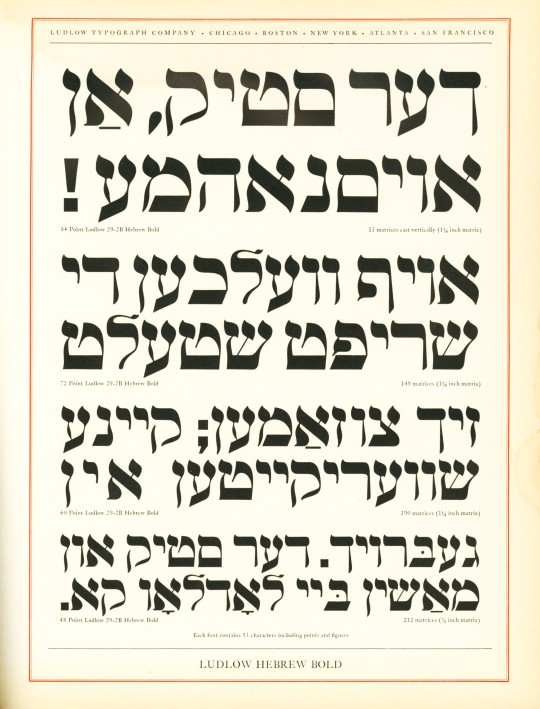

Typography Tuesday
Ludlow Fraktur and Hebrew
The Ludlow Typograph was one of the four major type composing systems that survived through the 20th century (the others were Monotype, Linotype, and Intertype), and numerous typefaces were designed specifically for its system. Today we show some Fraktur and Hebrew typefaces designed for the Ludlow Typograph.
German-reading peoples were the last group to relinquish the use of Gothic typefaces like Fraktur in the mid-20th century, and since, in our post-WWII imaginations, this kind of letterform is often associated with the Nazis (even though the Nazis themselves abolished it in 1941 after associating it with Jewish influences), it seems odd and even wrong to have it displayed along with Hebrew typefaces.
These specimens are displayed side by side in Ludlow Typefaces: A Specimen Book of Matrix Fonts, produced in Chicago around 1940, just before the Nazis jettisoned the use of Fraktur. The letterform itself has its roots in the late 12th century, and so has nothing to do with the National Socialist Party, except that the Nazis and all German-reading peoples used it until the 1940s because it was a letterform long associated with German national identity. And, of course, German Jews comfortably used Fraktur to read and write in German.
Read more about the Ludlow Typograph and its composing system in this post.
View some Ludlow ornaments and borders from this specimen book.
View our other Typography Tuesday posts.
#Typography Tuesday#typetuesday#Ludlow Typograph Company#Ludlow Typograph#Ludlow Typefaces: A Specimen Book of Matrix Fonts#Fraktur type#Hebrew type#Type specimen books#type display books#type specimens#specimen books#20th century type
38 notes
·
View notes
Video
Cold Cookery : cold recipes : booklet issued by The British Electrical Development Association : London : nd [c.1937] : cover by mikeyashworth Via Flickr: One of the many publicity booklets issued by the propoganda arm of the electrical industries in the UK, the British Electrical Development Association, to help consumers both choose electrical equipment and use it. The EDA had been formed in 1919 and it survived through nationalisation of the industry in 1948 until its various functions were taken over, at different times, by the Electricity Council. The promotion of domestic appliances, such as refrigerators, was much increased in the 1930s as efforts to sell the domestic use of electricity, especially to new suburban families, developed. Much of the publicity issued at the time was specifically aimed at a more female audience both in terms of the influence on the purchase of 'time saving appliances' as well as assisting in the use of them. The latter was often a case of when new 'modern' householders no longer had access to a more traditional domestic help. The booklet states that it was "issued for the convenience of owners of electric refrigerators" and inlcludes advice as to the use of the 'fridge and recipes that required refrigeration to prepare or store. The colourful cover sadly is uncredited and no printer is shown. The titles are set in the German designed Corvinus Skyline typeface that was available in the UK through the London agency of Soldans Ltd.
#Mike Ashworth Collection#publicity#advertising#booklet#recipe booklet#refrigeration#domestic appliance#domestic electrification#UK#London#British Electrical Development Association#I'M Electric!#logo#mascot#c.1935#cookery#cookery book#The Electric Refrigerator Home Handbook#typeface#typography#Corvinus Skyline typeface#flickr
3 notes
·
View notes
Note
Metalheart and acid design. For the kink thing uhhhhh. Slime bc I feel like its polarizing
“Metalheart (also known as Depthcore or Trendwhore) is a Cyberpunk aesthetic that was prevalent from roughly 1998 to 2004, during the Y2K Futurism Era. It was characterized by deformed abstract shapes and futuristic fonts on blurry backgrounds.”


this aesthetic is kind of like if “blue” by eiffel 65 and “in the end” by linkin park had a baby. 7/10
“Acid Design is a graphic design aesthetic heavily associated with Rave culture, particularly influenced by Acid House and New Beat music. This style is primarily present in EDM cover arts, flyers, music clubs, and other trendy brands, among other scenes. The style of this aesthetic is characterized by its dystopian style and trippy imagery, including motifs like Psychedelic art, distorted patterns and typefaces, smiley faces, wireframe objects, world maps and globes, technology and geometric shapes.”


this fucks severely. i feel like stoners in the 90s went wild for this. 9/10
slime: i think i understand the appeal of why people would be into this (wet, viscous fluid) but it grosses me out. 1/10
3 notes
·
View notes
![Cold Cookery : cold recipes : booklet issued by The British Electrical Development Association : London : nd [c.1937] : cover](https://live.staticflickr.com/65535/53899184283_cf210089d1_b.jpg)