#Softcover Photo Books
Explore tagged Tumblr posts
Text
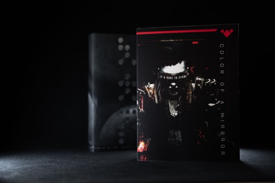

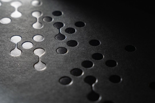
“Many say the moon is closer to the dead.”
This is COLOR OF A MIRROR, my debut novel with an original, dark ambient soundtrack by composer Josh McCausland to go along with it.
Written, designed, and published by me, it’s the culmination of years of work, and it’s exactly the story I wanted to tell. It’s not loud or bombastic, but rather a cerebral, slow-burn cyberpunk narrative lingering on themes of fame, paranoia, religion, and technology. If you’re a fan of the brooding futures of William Gibson, Blade Runner, or anything with a mood like the movie Drive, I think you’ll find something to love here.
Available exclusively on my website, it comes in limited edition deluxe-hardcover, softcover, and e-book. (And if you’re a vinyl lover, the soundtrack is pressed in 180g Moondust White; also available on my site.)
Welcome to the Dive. Hope to see you around.
-Dan
•
colorofamirror.net
(Book photos by Josh McCausland.)
#debut author#cyberpunk#cyberpunknovel#cerebral#slowburn#futuristic#dark science fiction#brutalism#minimalism#graphic design#typography#abstract art#independent publishing#dark ambient music#soundtrack#original score#tech noir#bladerunner#neuromancer#darkfuturism
329 notes
·
View notes
Text

THE BEAST HAS ARRIVED.
It's so much thicker than I even anticipated. What a doorstop. I took the photo hoping it would be dramatic but it came out a bit more dramatic than intended so I also tormented my cat with it to give a better sense of scale.

You could kill a man with this thing. Probably me.
Anyway, now that I've got the proof, I just need to tweak the cover, read it for typos and typesetting errors, fix those up, and fire it off. It'll take some time but I think I can safely predict a February release. Ooh, I should release it on the 29th, that'd be fun. Hm, time to consider.
[ID: Two images; top, the first proof copy of my latest novel, The Royals And The Ramblers, a large softcover book taking up most of the acreage on a red leather chair. Bottom, the same book is sitting on Dearborn the tortie, who looks philosophical about this (she was not). It is about the size of her torso, and half as thick as her head. Mind you, she's a six-pound cat, so take that into account.]
116 notes
·
View notes
Text
I made myself a little softcover photo book of my tarot series, on one side there's the tarot and the other some meanings/ reverse meanings I found for each card. I didn't put the descriptions since there's a lot out there and they all conflict but it looks good, and I'm happy with it.


If you're interested in one for yourself, I'll show you how the one I ordered turned out and I'll see if I want to put it in my Ko-fi shop. It'll probably be around £20-25 since shipping is beyond a joke these days and making them is a lot more expensive than it is for a calendar. But yeah, it's a 46 page book that I actually managed to make this year. I'm very proud of myself.
66 notes
·
View notes
Note
I'm piggybacking a bit off of the last ask of asking for writing tips but I have an odd question... Am I the only person that struggles actually PICKING a book? It's the absolute bane of my existence because I feel like I can be so picky... Don't get me wrong, I love being a bookworm, and I'm trying to get back into reading physical books but it's so difficult to find a real taste of what the book is like without being completely spoiled or something... I miss when backs of books had an actual summary and not just NO.1 NEW YORK BESTSELLER!!!! It's so frustrating... I've been trying to get back into it by re-reading fond chapter childhood books read to me (The Miraculous Journey of Edward Tulane & A Wrinkle In Time). But at the same time I'm also trying to get into more "adult" books that isn't... Well, you try googling "adult books" and see how that goes, I didn't think too hard about what a poor decision THAT was. But I'm working up the courage to read Cat's Cradle right now to start with "Classic Authors" I guess!
Anyway I'm rambling here, I guess my question is... How do you pick out the books you read? I don't really have friends that read many books to recommend to me :')
Thank you in advance, Bog! I hope you get a callback from that interview soon!
no ok actually you've mentioned something that's been bothering me for a while - What The Hell Do Y'all Mea, Books Don't Have Summaries Anymore???? i have not once in my life found a book that didn't have a summary. i was in barnes & noble recently and everything i looked at had a summary. i have literally never seen a book without one in my life of reading & looking at new books on a regular basis
softcovers have theirs on the back. hardcovers are on the inside of the sleeve - lift the cover and it should be printed right there on the inside flap! summaries aren't legally required but both the author and Especially the publisher(s) know that no one's gonna buy a book without a summary. trust me, all books worth reading have a summary. if a book doesn't have one, it's probably not worth your time anyway. you just gotta know where to look!
so my answer to how i choose books... i read the summary lmao. if it seems interesting, ill either write it down to get later or ill get it there and then.
Before the summary though, i look for any titles that jump out at me from the shelf. then i look at the thickness. i like a bit of meat in my literature, so i tend to shy away from thinner books. thicker ones grab my attention more easily. then i look at the cover - if it interests me, then ill read the summary. i don't have specific tastes in title or cover. as long as it makes my brain "hm" thoughtfully, ill take a gander!
and really, if you have access to a bookstore (chain or not, ive found plenty of bangers in tiny used bookshops) or library, the best way to find a book is to physically browse. even if you dont buy anything, you can take pictures of books / write them down to buy online. but going to the store lets you search them out, examine the length, cover, title, summary - and easily put it back on the shelf or keep it. i hate shopping online bc there's ads, you can't examine the product, nothing really stands out since it's all portrayed similarly, there's limited pictures instead of the physical thing, and photos can lie.
plus, everything is (typically) meticulously sorted by genre & age range. when you go into a section with literature aimed at adults, you'll find exactly that instead of smut novels lmao. real life bookstores can be more accurate than online searches. & there's just something so good about walking through shelves, searching for that one book before you know it exists, smelling the paper... yeah...
#like for example i recently bought priory of the orange tree#ive been wanting it for a while and havent read it yet since im finishing something else#BUT! i remember when i first saw it#nothing had gotten my attention for a while#but then i saw the thickest fucking book ive seen in ages - which was automatically very sexy of it#and then the title was unique - priory of the orange tree??? whoah! what the fuck does that mean!!!#so automatically there was the interest of neat title + a new word that i get to learn + the implications of the word now that i understand#and then i picked the book up and it was deliciously heavy - & there was a Dragon on the cover. which. YES PLEASE#then the summary was fascinating!! the book was immediately seared into my brain! im very excited to read it#so thats a highly successful example of my book choosing Process#it checked all of my boxes so it was a win#most books dont check all of my boxes but as long as it hits most of them im down to clown yk yk#but yeah im picky too so! nothing wrong with being picky or having high standards!#rambles from the bog#my shelves are fuckin Full of books ranging from 'it was ok' to 'I WILL RECOMMEND THIS TO ALL WHO WILL LISTEN'#and then i have a drawer filled with books that i just could not care less about / dont like#but dont have the heart to throw away bc. well putting a book in the trash kills a part of my soul#i need to donate them...#but yes! i hope that helps!#and Thank You! i hope i get a callback as well...
23 notes
·
View notes
Text
IT’S HERE. My first book. 100 pages, with 77 photos from my collection, most of which have never been seen. I’ve been working on this off and on for years and I’m so so happy to finally put it out into the world. It’s not perfect, but I’m insanely proud of it.
It’s available in two versions - a softcover, and a hardcover limited edition that comes with an original photo. Available here: https://www.photosobscura.com/category-s/101.htm
50 notes
·
View notes
Text
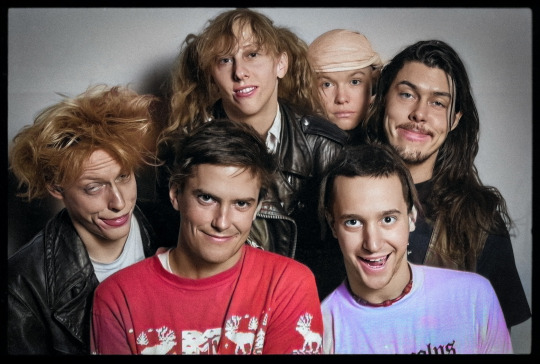
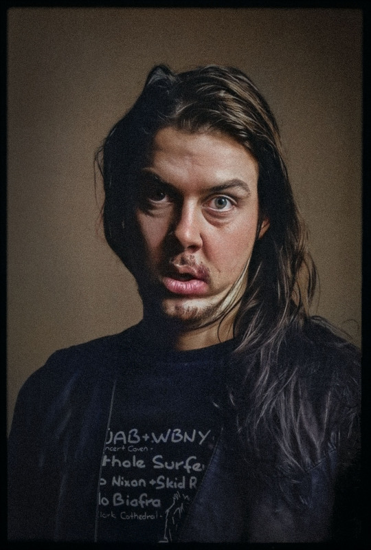
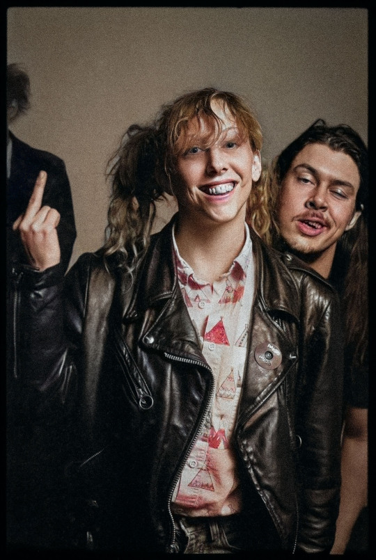
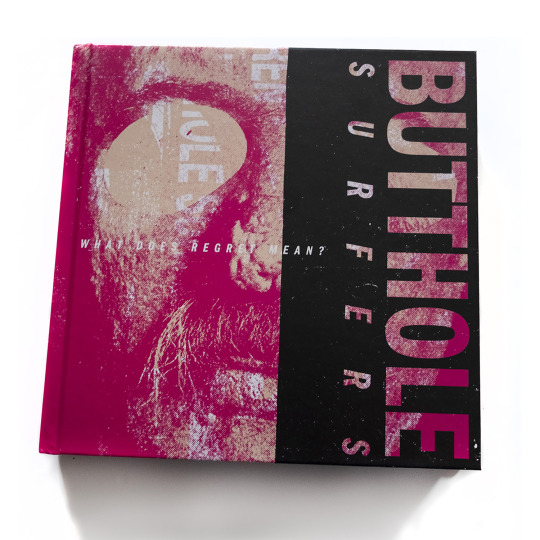

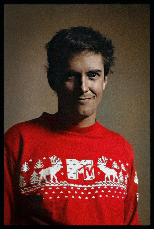
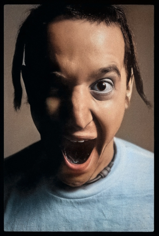

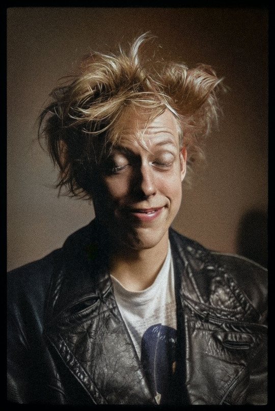
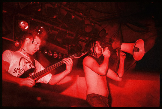
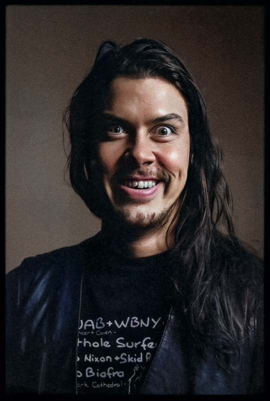
BUTTHOLE SURFERS, TORONTO, 1987
One of the highlights of 2019 was the publication of What Does Regret Mean? - a thick coffee table book about the career of the Butthole Surfers, published by Melodic Virtue. It wasn't just that such a thing existed, but also that it contained two double-page spreads from my 1987 portrait shoot with the band when they came through Toronto to play RPM, a big dance club on the waterfront here (long since demolished). If you were around when the Buttholes were releasing their first records, the thought that they might have had the longevity or mainstream appeal necessary for such a souvenir record of their work would have been inconceivable. But here it is, in multiple hardcover and softcover editions.
Like almost everything I shot back then, the Butthole Surfers shoot was a fluke. I went down hoping to get a group photo, and discovered that the band were even more difficult to corral than their reputation had suggested. I got a handful of sloppy group shots and then pivoted to asking them to line up for individual portraits. I had to move fast, and shifted my only light - a flash bounced into an umbrella on a portable light stand - a few feet away from the back wall of the club and invited lead singer Gibby Haynes to be the first sitter. He stepped smartly into the frame and I did a fast light reading. Looking at my camera I realized I had just enough film to take precisely two photos of each band member.
Years later the Buttholes' drummer, Jeffrey "King" Coffey, saw my photos when I posted them on my old blog, and complimented me on being organized enough to not just keep them but find them again and post them online. He also recalled that the band were more likely than not tripping balls when I took these shots. Coffey and Haynes, along with guitarist Paul Leary, drummer Teresa Taylor (aka Teresa Nervosa), bassist Jeff Pinkus and the band's tour dancer Kathleen Lynch (aka Ta-Da the Shit Lady) all presented themselves for my camera and I took a pair of shots each, then packed up my gear to take home before heading back to shoot the show that night.
Shooting austere photos of such an over-the-top band might have looked like a contrary creative choice, but it wasn't. I was merely working at the limits of my competence at the time, which is what inspired me to revisit this shoot using some of the digital technology available to me today. If I could have shot the band in colour I probably would have. (I was frankly too poor and inexperienced to have been so bold nearly forty years ago.) So I've re-scanned these old negatives today and run them through Photoshop's suite of AI photo enhancement and colourizing filters to give them at least a hint of AI unreality that suits this shoot and this band more than most other work I did way back then. Sadly, drummer Teresa Taylor passed away this year after a battle with lung disease.
#butthole surfers#portrait photography#portrait#photography#film photography#old photos#some old pictures i took#punk rock#pre-grunge#musicians#music photography#pentax spotmatic
11 notes
·
View notes
Text
Made Men
Made Men, Employee Games, 2016
I sure do have a lot of games about playing robots on my list.
The term "made man" comes from the Mafia - it means you're officially in the club, as it were. Here, there's a double meaning, because you're also playing an android. You look basically human, but were built at a secret Mafia robot factory. The game is set in the futuristic year 2008, so the authors are clearly just putting a lampshade on the fact that we still can't make androids today.
The basic setup involves your crew creating a conspiracy-within-a-conspiracy. You balance doing successful jobs, knocking off those above you, and not getting caught (of course). You slowly take over the Mafia and run it, thus making your creator the de facto head of the whole operation. Unless you all decide to turn on him. Your characters are all male-presenting, which is presented as a choice on the part of the androids' creator to make it easier to infiltrate the Mafia.
The art and layout are the best things in the book. It's a softcover, but designed to look like printed sheets with photos attached by paperclip. The photos are subtly 'shopped to give people duplicate faces, especially in the background of some of the major figures' photos. There are pieces of Delta Green that do this to good effect, and Made Men does it even slightly better.
The rules are uninspired. They aren't tailored to the setting, so everyone has a set of generic stats (Physical, Mental, and Social), a set of skills, and a few options for Advantages and Disadvantages. Some of the skills, like Biology or Painting, seem totally unhelpful in a mafia game. It's point-buy. There's an "Iron Stomach" advantage in a game where your characters don't eat. Combat is a boring back-and-forth roll-off until someone runs out of HP. I think this was someone's Tri-Stat-meets-HERO house system that they just slapped onto an interesting concept.
The game includes tons of NPCs with fairly good plot hooks. It's another game where it's worth throwing out the system and playing it in whatever generic system you prefer.
The first edition of Made Men was published back to back with another game, Maid Men. The second edition is a stand-alone. I'm not sure what the story is there.
7 notes
·
View notes
Text
Friday, January 12, 2024
Day 10 of Bookbinding: Trying a New Bookbinding form!!
I am so happy with today's product (and this time I took photos and videos of parts of the process!)
It was a more difficult type of book to bind than my previous ones (I followed this tutorial) and although there are things I can improve on, I think it turned out really well.
Here is the finished product! It's a softcover bound book with six signatures, an inner-cover flap, and exposed sewing on the spine:


Beneath the cut are some photos and a video of parts of the process
I laid out the six signatures on top of each other and the cover paper I chose from this collection of Van Gogh art paper:


Here is a technique I'e learned for folding paper to make the book's edge look neater:
Here was me measuring out the cover length including the spine and folds and then folding the spine on that cover:


Here is a photo of the angle for the awl when poking sewing holes in the signatures and the finished poked holes:


#bookbinding#book binding#book art#bookblr#book blog#books#book history#books & libraries#books and literature#book
5 notes
·
View notes
Text


“Orig4mi” (2021)
(1 of 1) 8x10 softcover photo book
56 pages (photos from 2017-2021)
All iphone 4 photos
Iphone 4 attached to cover
(Forgot who bought it back then)
7 notes
·
View notes
Photo


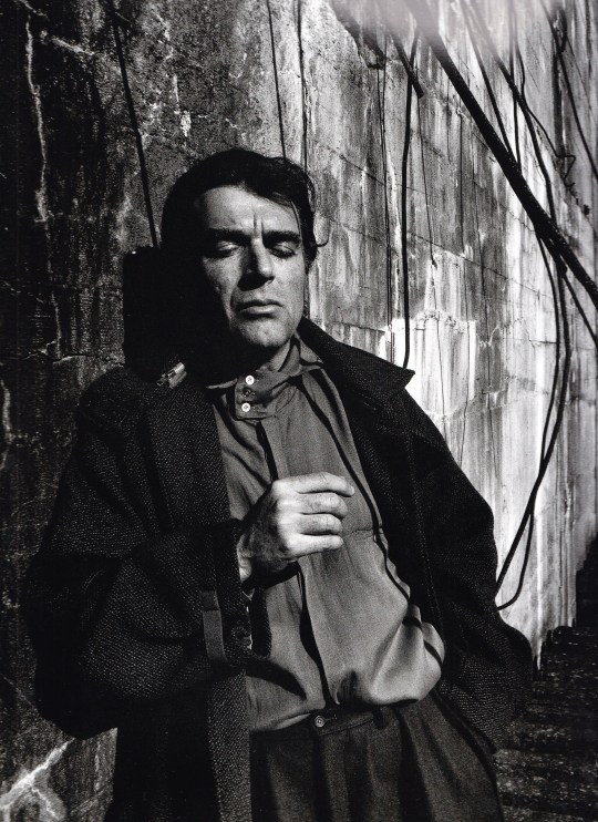
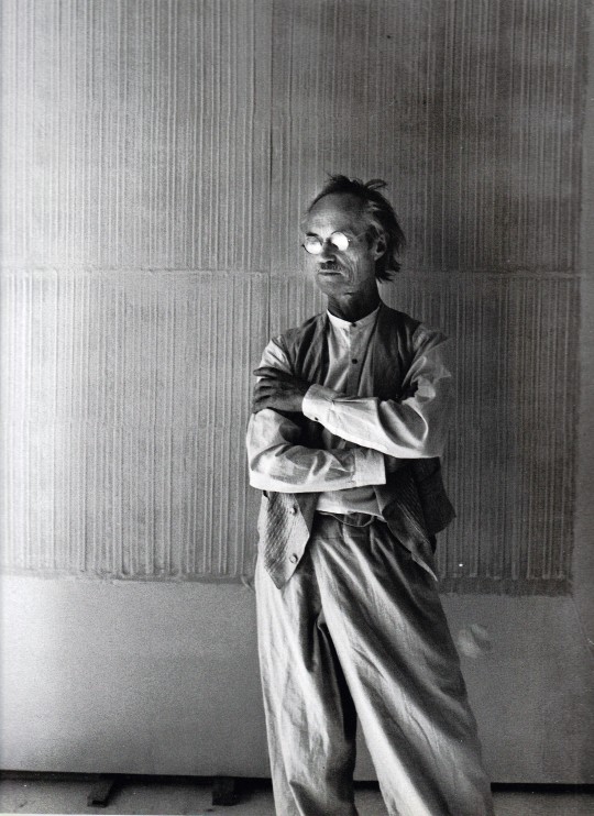
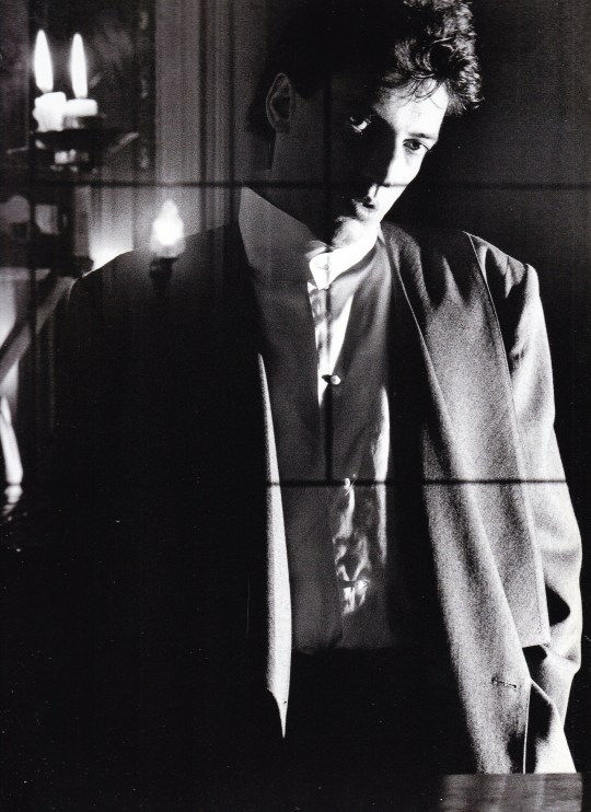
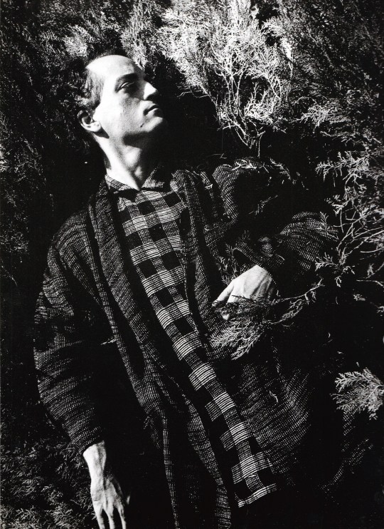

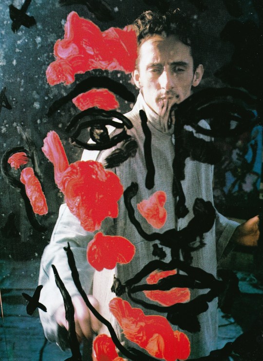

Métaphore Keiichi Tahara
Kyuryudo Art Publishing, Tokyo 1986, 178 pages, 26,5 x 36,5 cm, softcover, ISBN 9784763086198
euro 160,00
email if you want to buy [email protected]
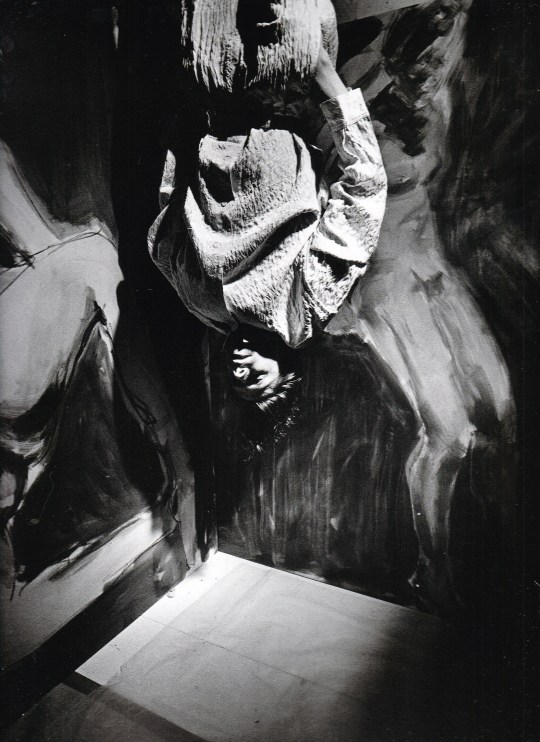
A photo book "Metaphore" by Keiichi Tahara (1951-2017), one of Japan's leading photographers after the war. Since the 1970s, based in Paris, he has been attracting attention for his sculptural and visual monochrome works that skillfully use "light and shadow", and has been highly acclaimed for his contemporary art works with the motifs of "city" and "window". increase. Since then, he has been active in a wide range of fields such as architecture, sculpture, and installation, as well as photography. This is a collection of works composed of "fashion photographs" that are unique to Tahara, and is a collaboration with Yohji Yamamoto. In 1982, Yohji boarded Paris Fashion Week with Comme des Garcons and announced a collection called "The Impact of Black". In this book, Tahara modeled the artist, 1981-86. The portrait taken during is posted. A number of works in the black world with a strong masculine element, which are rare in this era.
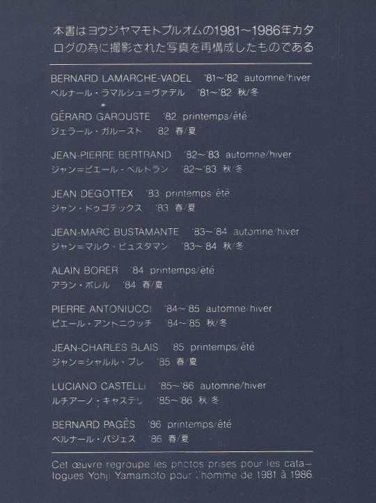
Photographs of French artists, plus examples of their work. Artists include Bernard Lamarche-Vadel, Gérard Garouste, Jean-Pierre Bertrand, Jean Degottex, Jean-Marc Bustamante, Alain Borer, Pierre Antoniucci, Jean-Charles Blais, Luciano Castelli and Bernard Pagès.
Cet oeuvre regroupe les photos prises pour les catalogue Yohji Yamamoto pour l’homme de 1981 à 1986
28/02/23
orders to: [email protected]
ordini a: [email protected]
twitter: @fashionbooksmi
instagram: fashionbooksmilano, designbooksmilano tumblr: fashionbooksmilano, designbooksmilano
#Keiichi Tahara#Yohji Yamamoto#homme de 1981 ò 1986#The Impact of Black#French artists#photography books#fashion books#fashionbooksmilano
13 notes
·
View notes
Text

MARIPOSA
AN EROTIC MONOGRAPH BY HONEYCOCOA
YAZET PHOTOGRAPHED BY APHRO ONER
WORDS BY YAZET
Letter-sized perfect bound glossy softcover
240 pages
80# semi-gloss matte paper
Over 250 photos
AVAILABLE NOW!!!!
7 years in the making, MARIPOSA is finally here. A retrospective of our work, between 2016 and 2023. It's an epic collection of photos. A lot of them are very erotic...some are extremely explicit. But overall, when you flip through the pages of this zine, you are witnessing the metamorphosis of a beautiful young woman, as she navigates her way through addiction, loss, and the toxicity of her hometown. Eventually leaving it, and her cocoon, to become the butterfly she was meant to be. Mariposa.
Visit
unicornpuncher.com/mariposa 👈
for all things MARIPOSA.
Music produced and mixed by Aphro Oner
Vocals by Yazet
#model #girl #street #satx #sanantonio #texas #beautiful #zine #book #artbook #art #alternativegirl #tattoomodel #altmodel #alternativemodel
5 notes
·
View notes
Text
時計の外の時間 A TIMELESS LIFE


山上高人写真集/Takahito Yamanoue, 時計の外の時間/A TIMELESS LIFE (1994, BeeBooks). Softcover photobook, 96 pages, 22 x 20 cm. A collection of photographs by Japanese photographer Takahito Yamanoue. In 1974, he started taking photographs on his own and was selected at an exhibition in the local city of Okayama.
A Timeless Life is a book that summarizes about 20 years of shooting on the mountain, where the “worms of photography” started to make noise after a break. It consists of three parts: a “boring afternoon” taken in 1974-75, “then”, taking a picture of his child intermittently during the break, and a “mental sketch” taken in 1992-93. The “boring afternoon” was taken when I was living with my grandfather in the countryside, and was a snap shot of familiar objects such as indoors and domestic cats and scenery of the Seto Inland Sea. "And then" are family photos and child portraits. And in “Mental Sketch”, which is a “sense-only world” that leaves the daily routine as a doctor, we photographed a desolate landscape. This is a photographer's work collection that makes me feel close to Yoichi Midorikawa, who was also a doctor from Okayama.
2 notes
·
View notes
Text


*2023年5月5日セカンドエディション(ハードカバー)で再入荷しました。
2023年1月22日
【新入荷・新本】
Miguel Milá: A Life in Design, Apartamento, 2022 2023
Softcover. Hardcover. 160 pages. 240 x 295 mm. Color, black and white.
価格:8,360円(税込)9,020円(税込)
/
スペイン人工業デザイナー、ミゲル・ミラ(Miguel Milá)の作品集。作者は、スペインの工業デザインの第一人者であり、最も影響力のある工業デザイナーの一人でもある。スペインの初期モダニズムの中、インテリアデザイナーとして活躍し始めた作者は、自分が必要としながらも市場に出回っていないものを作り始めた。再生可能な素材を使い、手作業で試作品を作り、時にはデザインを進化させながら、今や象徴的な照明や家具を完成させた。
本書は、1956年から2021年にかけて制作された代表的な作品を、アーカイブ写真やドローイング、また、『Apartamento』の共同創設者であり写真家、クリエイティブディレクターのナチョ・アレグレ(Nacho Alegre)が作者のバルセロナの自宅で撮影した写真を通じて詳しく紹介している。今最も影響力のあるデザイナーの一人であるイギリス人プロダクトデザイナー、ジャスパー・モリソン(Jasper Morrison)による序文をはじめ、作者が手掛けた製品のカタログと解説が収録されているほか、作者の生涯とキャリア、そしてそこから生まれた理念について、デザイン学者であるフランシスコ・ガスパール・ケベード(Francisco Gaspar Quevedo)が伝記的な文章を寄稿している。
(twelvebooksによる本書紹介文)
Miguel Milá is considered one of Spain’s first and most influential industrial designers. Starting out as an interior designer amid the country’s early modernist movement, Milá began making the objects he needed but couldn’t yet find on the market. He took raw and renewable materials and crafted prototypes by hand, occasionally evolving designs to perfect his now-iconic lighting and furniture.
Miguel Milá: A Life in Design is a detailed look back through his most emblematic works, produced between 1956 and 2021, with archival photos and drawings, as well as original photos shot at Milá’s Barcelona home by Nacho Alegre. Introducing the book is seminal English designer Jasper Morrison, while the products are catalogued and described by design academic Francisco Gaspar Quevedo, who also contributed a biographical text on Miguel’s life, career, and the principles that sprang from both.
9 notes
·
View notes
Photo

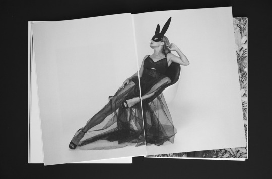
I’m so excited to announce my new book.
In 2020, I started a new photo project in his new photo studio. In this project, I explored my love for fetish and women's clothing without making obvious fetish pictures.
This book is printed in a softcover edition using a Swiss binding and comes with a foil stamped cover. The book is printed in a high-quality manner on high-quality paper.
https://zaptronic.nl/books/dressed
#photobooks#photobookjousting#myphotobook#fashionphotography#fetishwear#fetishqueen#fashionmodel#bnwphotography#bnw_captures
8 notes
·
View notes
Text
Petra Collins
CV
Petra Collins is a multi-talented artist and director whose photography set the stylistic tone for much of the 2010s. Shooting since the age of 15, her work is fueled by self-discovery and a contemporary femininity which explore the complex intersection of life as a young woman online and off. Collins weaves through the worlds of art, fashion, film, and music. She is currently working on her narrative feature debut set to shoot in 2021.
Books
2021
Fairytales Rizzoli, 1st edition, 152 pages, Hardcover, 9 x 11
Fairy Tales is an erotic folklore of short stories shot by Petra Collins starring Alexa Demie. The pair created the concept and text collaboratively. Alexa portrays nine characters that embody new stories they would have liked to see. As children, Petra and Alexa were both enamored with fairy tales, which provided an escape from their own painful realities.
Each of the nine tales are set in unique spaces, ranging from suburban homes and parking lots to fantastical sets. Petra and Alexa’s chapters of elves, mermaids, sirens, water sprites, fallen angels, fairies, witches, and banshees blend their own stories with retold fairy tales. The photos combine elements of camp, prosthetics, and shibari in a surreal update to the imagery of the Brothers Grimm, Hans Christian Anderson, Charles Perrault, and others.
2020
Miért vagy te, ha lehetsz én is? Baron Books, 1st edition, 166 pages, Hardcover, 22.00 × 28.50 cm
With the book’s Hungarian title Miért vagy te, ha lehetsz én is? Collins asks us: Why be you, when you can be me? Collins uses the camera as the third person. It captures historical truths (such as a time and place) and an emotional reality with a complicated relationship to intention and perception. Working with the sculptor Sarah Sitkin, Collins creates moulds of her body as well as her sisters to gain ownership, in a world where our bodies live in multiple realities. This new body of work features Collins first experiments with self-portraiture.
2019
OMG, I’m Being Killed SUPER LABO BOOKS, 1st Edition, Soft Cover.
In a world where filters give us solace, OMG! I’m being killed, is the baby that was birthed in response to 2019. This book is Petra’s ultimate fashion magazine – one that she feels is a good representation of the truth about the age we live in. Filled with unpublished editorials and new works this book offers horrendously satisfying images.
2018
SIX BY XX Nazraeli Press, 1st Edition, Hardcover
The six titles (and print image sizes on 11 x 14-inch paper) are: * Petra Collins: “Kamasz Nyar” (print image size 14 x 11 inches – no border) * Lalla Essaydi: “Lalla Essaydi” (print image size 12 x 9.5 inches) * Marilyn Minter: “Cunt” (print image size 11 x 14 inches – no border) * Catherine Opie: “Girlfriends” (print image size 8 x 8 inches) * Laurie Simmons: “How We See” (“Doll Girls”) (print image size 13.5 x 9.5 inches) * Mickalene Thomas: “Black is Beautiful” (print image size 13.5 x 10.5 n inches)
2017
Petra Collins: Coming of Age Rizzoli, 1st Edition, Hardcover
The first monograph by photographer Petra Collins presents the world of a thoroughly modern creative.
2015
Babe Prestel, 1st Edition, Hardcover
Curated by Petra Collins, featuring artists Arvida Bystrom, Harley Weir, Sandy Kim, Jeanette Hayes, Kristie Muller, and more. Forward by Tavi Gevinson.
Discharge Capricious. 1st Edition, Softcover
Select Exhibitions
2018, Pacifier (solo exhibition), CONTACT Photography Festival, Toronto 2017, A Magazine Curated By (solo exhibition), Art Basel Hong Kong 2017, In Search Of Us(curated), MoMA, New York 2017, CUZ THE GRASS DON’T GROW GREENER AND THE SKY IS BLUE, Praz-Delavallade, Paris 2017, A Magazine Curated By (solo exhibition), Art Basel Hong Kong 2016, FEMALE GAZE, BASE , Milan 2016, The Collective,Uncontaminated Art Festival, Oslo 2016, 24 Hour Psycho” (solo exhibition),Evergold, San Francisco 2016, Sans Titre,Quai de la Tournelle , Paris 2016, Comforter (curated),SFAQ Project Space, San Francisco 2015, Pussy Pat,Mud Guts, Brooklyn 2015, Discharge(solo exhibition), Capricious 88, New York 2015, It’s an Invasion, The National Arts Club, New York
#artist research#research#art photographer#woman photographer#petra collins#artist from girl on girl book
3 notes
·
View notes
Text
The Teenage Smokers Collection
The first time I ever looked at anything Ed Templeton had done was when I was trying to figure out how I wanted my first photobook to look like. What type of paper I wanted to use, heck how heavy I wanted the paper to be. There is so much thought and process which goes into creating a photobook, a zine or any form of physical media that displays the work that you have created. Ed Templeton was no stranger to this. You see Templeton is a little bit of a dabbler, being a skateboarder, photographer, contemporary artist and vegan activist all at the same time. You name it, he has made it.
In 1999 Templeton published a breakout Zine titled 'Teenage Smokers', the whole project is pretty self explanatory. He took photos of teenagers smoking and the point of it was to explain that any of these images featured in the Zine are timeless based on the fact that there will always be teenagers smoking. I wanted to reflect on this project in particular, especially in a time where the vape is becoming more popular and more accessible to teenagers everywhere.

I feel as though there has always been something so cool about smoking. Not literally smoking and all the terrible effects it has for your health, but instead more how glamorised it was. We have only just began to enter a new era where it's no longer seen plastered over the pages of magazines, super models aren't photographed walking the streets holding a cigarette in their hand the way they used to. Actors are no longer smoking on TV shows, this mostly down to new legal rules in TV studios. Look at the way all of the characters looked on Twin Peaks chain smoking anywhere and any time, they all looked so cool. It just wouldn't really have the same effect if they were huffing a Lost Mary would it?
People back in the day looked so cool smoking that even David Bowie has a whole Instagram account dedicated to him smoking the cancer stick. But I'm trying to figure out why it was so cool in the Ed Templeton selection of images. Was it the rebellion, looking cooler because you simply didn't care and smoked because you enjoyed it or was it something such as lighting up a cigarette was the difference between being a child and being an adult?
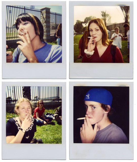
But also, why do teenagers look so cool smoking too? I feel it has to be the sense of fashion, the attitude it feels like we receive from looking at these images. The way it feels that most products that have ever been created feel like they are being made for a teenage audience. It feels like there's a shamelessness to it.
The very first edition of Teenage Smokers was presented as more of a zine. A small collection of smoking teenagers, these people mostly photographed around the skateboarding park where they would take breaks every so often to light one up. The softcover book itself was only 36 pages long and mostly consisted of Polaroid images.
Templeton described the notion of how he came up with the concept in the first place; the idea of him once as a kid thinking that smoking looked really cool. He tore a piece of paper which was length wise long enough to be a cigarette, stuffed it with grass from the front garden, set it on fire and toked it. He explained that the 'cigarette' he had just tried tasted like glass and from that moment on, he couldn't understand how teenagers would indulge in the pain just to look cool. The first edition zine is the most interesting in terms of its full creation. Low budget because he barely had any money, only 36 pages and once that original collection was sold out, they never sold again.

In 2015 came a brand new release of Teenage Smokers 2, a brand new hardback cover featuring nothing except for an illustration of a hand with painted red nails as a cigarette burns. The book itself doesn't have a correlation with the original zine, rather it is a whole new book of original images that were taken after the release of the first. I feel as though Templeton could have left Teenage Smokers as its own singular project, for that one zine to be the only format of work to ever exist on the piece. It keeps it original, especially with the whole original set of works being created in the 90s; times have changed so much since that it could have been left as a standalone.
It is interesting for one artist to simply use smoking as its main subject in all of the images, it doesn't feel deeply thought out at all. There doesn't feel like there was a deep research project that came with the works behind the scenes. It feels more of a spur of the moment, as if Templeton waited for these people to come along and carried his camera with him at all times to ensure he got the shots he wanted. To be able to see so many people from so many different passages of life all come together through their passion for skateboarding and their hobby of smoking is an oddly wonderful thing, something that is so simple yet so effective for their community. I truly don't think there is much to say about these images other than they're fact they're nice,,, my lecturers would have hated me looking at an image and just saying they're nice, but they are. It's so refreshing to me to be able to look at a set of photos and just agree that they're simple and effective. They work well as a collection and they also work well as their own separate shots.
5 notes
·
View notes