#Slay in Character
Explore tagged Tumblr posts
Text

Eldritch Miku omgggg
#HATSUNE MIKU????#art#slay#my art#hatsune miku#fanart#I fear that drawing Miku is the sole thing that powers my life force#concept art#vocaloid#vocaloid fanart#hatsune miku fanart#long ass shoes#character design#HATSUNE MIKU!!!!
37K notes
·
View notes
Text


even a worm will turn.
15K notes
·
View notes
Text

Some fan princesses before i go to bed. Lore on them in the morning if anyone cares put ut in the tags if ya want that ig
#art blog#digital art#digital artist#digital drawing#drawing#artists on tumblr#original character#ocs#slay the princess
1K notes
·
View notes
Text
defending arcane characters is OUT. thinking theyre hot while they make terrible decisions is IN
#idc what jinx does shes funny. caitlyn can continue to descend into grief-stricken insanity#if viktor creates a cult through his jesus slaying ways who am i to stop him#'this is why this character is TERRIBLE and MEAN' idgaf. 'this is why this characters actions are justifed and theyre so innocent' IDGAF#they SUCK and its FUNNY#arcane
1K notes
·
View notes
Text
omw to help every child in need and lost puppy in faerun with a hungry vampire, a dark cultist, and hell's favourite warrior at my side

#bg3#astarion#shadowheart#karlach#the characters in this game r just so fun#and then we all walk into a trap and die cuz our passive perception is piss poor#but its ok because we slay cuntaciously
6K notes
·
View notes
Text
Slay the Princess Concept Art
We shared a bunch of concept art on Twitter today. Sharing it here, too, where you can find it all in one post. Post contains spoilers, so proceed with caution (or just play the game already if you haven't 😉)
Going to start with the first piece of concept art Abby drew for the game.
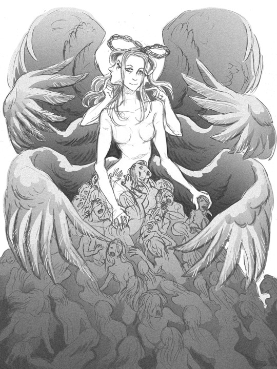
In the earliest stages of development, we toyed around with the concept of there being multiple "end game" forms of the Princess.
The initial outline, rather than being tied together by an overarching metanarrative, structured a full playthrough as a 5-6 chapter long, self-contained journey down a single route, determined by your decisions in chapter 1. Here's an alternative late-game form:
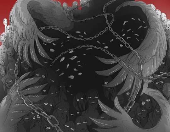
The idea of deviating end-game forms didn't lost for very long, though. As we explored the game's themes more deeply, it made the most sense for there to be a singular "true" form.
If your reality is shaped by subjectivity and perception, then the "truth" has to be what's left when that subjectivity is swept away. the Shifting Mound's final design feels like that initial truth for the Princess, though there's also another truth if you push back against her and press on into the final cabin.
We really liked this "void" design, and I played around with the idea of it being an intermediary to the final form. The "void" Princess would be what you saw upon encountering the final Princess without understanding your own truth, but once you had that understanding, you would see her as the Shifting Mound, as depicted in the game.
That gave way to the intermediary design of the SM being a sea of disembodied limbs, and we also took parts of both designs and incorporated them into the protagonist (particularly the wings.) You can see the eyes and feathers for this void form in the ending card of the original trailer below:

You can see extremely early concept art for the spectre (top), nightmare (top-right), stranger (left), beast (bottom) and ??? (right) as well!
The eyes became a motif in the Nightmare route (Paranoid's manifestation of the fear of being watched), but I also like to think of them as a part of The Long Quiet's truth. You are space and emptiness, but you're also that which observes those things, and it's your perceptions that give the Shifting Mound shape.

Anyways, on the note of the original original concepts for the game, the Princess was initially going to remain human for several loops before taking on more monstrous forms. Some concepts of that are below. Had to get Abby to tone down some of the more horrifically cartoonish designs because they creeped me out and I didn't want to romance them in a video game.
We had to hold our cards close to our chest in the non-metanarrative early drafts, which is part of why, even in the first demo, the cabin doesn't really change much in chapter 2. More room to subtly play with the concept of transformation over time.
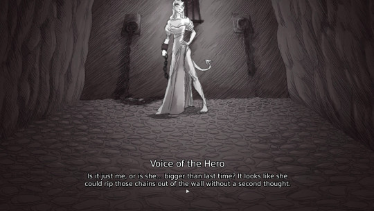
There were a lot of reasons we moved in a different direction for the full release. The branching was unmanageably large to write, and the game felt like a slog to write.
Using an overarching narrative as a framing mechanism in the final version gave us a lot more freedom to explore wildly divergent ideas within routes while still driving the player towards the originally planned finale.
Anyways, now we've got some concept art for individual princesses. There's a lot more than this lying around somewhere, but it's all in sketchbooks, and we'll probably wait until we make an art book to show it off.
First is the tower, who really didn't change much at all. (She got a little thicker, I guess. All of the Princesses did)
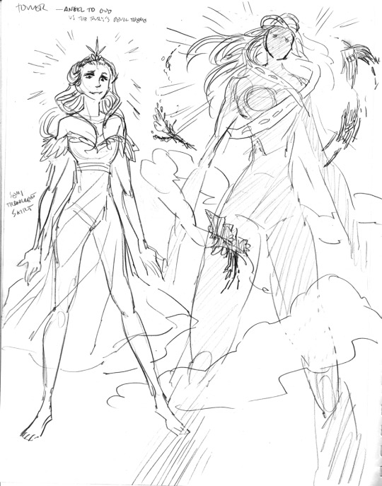
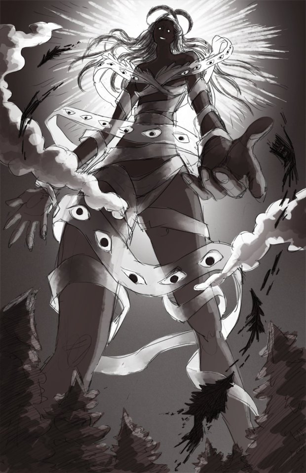
Not a lot to say about her, other than the fact that we knew we wanted a set piece where she gets so big that the trees and cabin orbit around her.
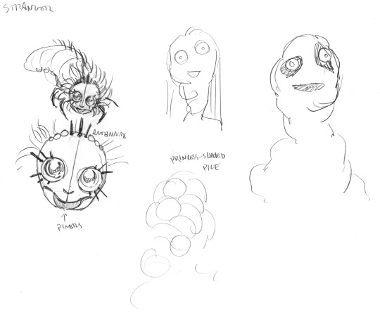
The stranger went through many many redesigns over the course of development. Here, she was a "princess skin" filled with a hive of sentient bugs. The script wasn't working for me, though, so instead she became a peak behind the curtains without the necessary context to know her.
A lot of people ask how these earlier drafts of the Stranger route would have played out, and the answer is I can't tell you, because I couldn't figure out something worth writing.
The writing process for individual routes didn't really start with outlines or plot beats. Rather, the routes started from a theme and a relationship dynamic, and I organically found their outcomes by exploring actions within those themes, and then seeing if those passed Abby's editor brain.
Neither of us found actions we wanted to explore with those versions of the Stranger, at least actions that weren't a beat-by-beat retelling of chapter 1, which contained way too much variation to put on a single chapter 2 route.
If each princess examines a relationship formed by perception and first impressions, the Stranger examines one that's fundamentally unknowable. One where you've seen too much, too quickly.
An insect hive-mind pretending to be a person seemed like a good starting point, but it was too difficult to write any interactions that didn't immediately feel knowable, if still strange. So the final version of the Stranger was designed in such a way where her unknowability makes interacting with her on a human level fundamentally impossible, and you don't get to have a real conversation with her unless you satisfy extremely specific criteria.
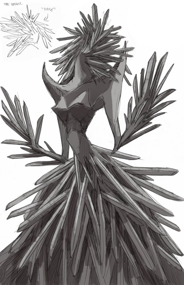
Anyways next up is the razor's final form. We decided she needed more swords.
Hearts became an accidental motif very quickly in the development process, too. (The fact that it is only strikes to the heart that fell her in the demo was accidental, but it felt poetic so we extended it to the rest of the game.)
So on top of adding more swords, we made her heart visible. This is something we did with the fury as well, as a way of showing their emotional (and physical) vulnerability.
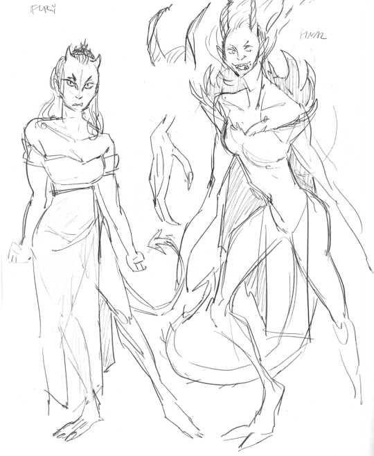
Here's an early version of the Adversary and what would eventually become the Eye of the Needle, back when she was still called the Fury. Originally her hair was going to be fire (as seen on the right), but it didn't feel right in its execution.
She's hit the gym since this concept art. Good for her :)

And we're going to end with the Beast, who at this point was called the Adversary. I think this was before the Witch was added? The Beast was originally designed to be a Questing Beast who lurked in the shadows, where you'd only see glimpses of her, and where each glimpse would make her appear to be a different animal. This was too difficult to execute, though we gave her a more chimera-like appearance in the final game.
This design was from when we still has the Voice of the Obsessed, and the route was going to be a more feral mirror of what eventually became the Adversary, but it felt too thematically similar while being less interesting, so we moved in the direction of making the Beast about consumption as a form of love.
Anyways, that's all we've got for you right now. Hope this was fun!
4K notes
·
View notes
Text


charlie mojis ! neutral , flustered , cheeky/cocky , horrified , cringe , and love drunk .
#。chocoperrito#digital art#character artist#smiling friends emotes#f2u emotes#discord emojis#discord emotes#smiling friends#smiling friends graphics#smiling friends fanart#smiling friends charlie#sf charlie#charlie dompler#charlie sf#artists on tumblr#digital artist#character art#god okay i slayed here
1K notes
·
View notes
Text

HAPPY BIRTHDAY TO THE BOY EVER !!!
#my art#genshin impact#genshinimpact#cyno#genshin impact cyno#MY BOY SLAYING#ty for being my comfort character since sumeru out...
1K notes
·
View notes
Text
I can't stop thinking about the dichotomy of the Long Quiet and the Shifting Mound: specifically, the metaphor of a rock in a river.
He is a stone. A constant, unyielding force. Capable of being changed, of course- sharpened into a weapon, stacked into the walls of a prison- but entirely inert.
She is a river. Ebbing and flowing, never retaining a constant shape. The waters can be cleared, deepened, displaced momentarily, but you will not change its course by plunging a hand or a blade into it. You will not still it.
The rock is what moves the stream.
The waters meet this unyielding surface and flow around it. Their path is altered ever so slightly, but it is altered. A well-placed rock can change the trajectory of a river's flow, can be shifted to allow the waters to flow in more directions or with more power, can block it off entirely until it stills to a stagnant pool.
And all the while, changes begin to happen. Things that couldn't, had the rock not been placed. The rock's edges are smoothed and its layers peeled back to reveal glimpses of its core, while imperceptibly tiny pieces of it join the river's flow. They understand each other just a little bit better, now.
Be it a bridge, or a dam, or a reservoir, or simply a stone sitting in a stream... the fact remains that the rock met the river. Change met stagnancy, and something new was created.
#slay the princess#poetry#character analysis#this game makes me SICK /pos#the shifting mound#the long quiet#shifting quiet
1K notes
·
View notes
Text

a commission i especially enjoyed working on! character belongs to @genkishoujo :3 thank you for letting me put her in my peony skirt!!
#sergle art#artists on tumblr#illustration#sergle commissions#you were really sweet and nice to work w!!! makes my life easier#it's always slay when someone brings me a really cute character design like this#jello fruit salad innit????
1K notes
·
View notes
Text
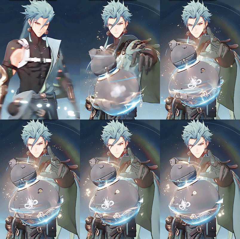
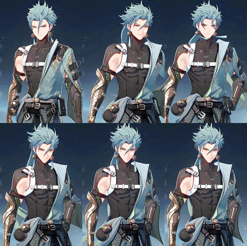
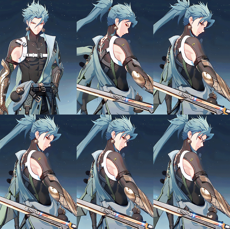
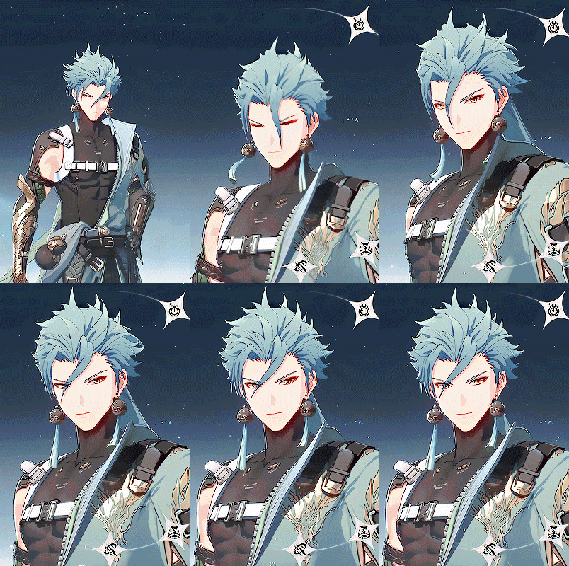
Jiyan ⟡
#wuthering waves#wuwa#wuwaedit#wutheringwavesedit#gamingedit#jiyan#videogamemen#video games#gifus#he's so cool#I still prefer Yinlin but omg#all the characters slay tbh
1K notes
·
View notes
Text
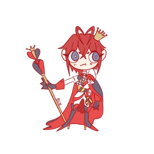
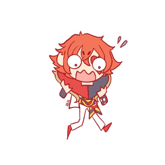
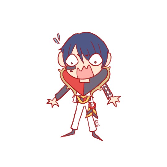
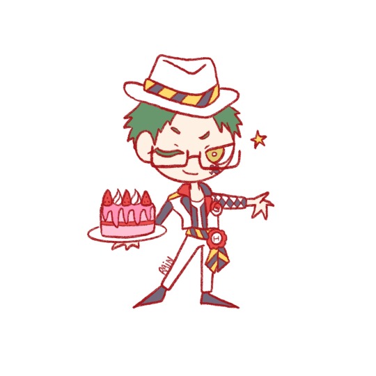
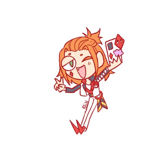
Magic jail for the first years
#twisted wonderland#riddle rosehearts#twst riddle#ace trappola#twst ace#deuce spade#twst deuce#trey clover#twst trey#cater diamond#twst cater#why is in the official game cater mentioned before trey this drives me insane#why did they not keep the number order omg#why why why 1 2 4 3 no this is like seeing a crooked painting on a wall and you can't fix it because you're idk in a musemum#design wise riddle is my fav from heartslabyul#but character wise I'd say I prefer the chronically online internally tired and a bit sad but slaying one#working on the diasomnia boys tomorrow aaaaaadfsjzqb thank god they have little to no white on their uniforms#it's a bit of a pain do add on a png drawing somehow idk how to explain it
1K notes
·
View notes
Text


Lovers, come get your groom!
Smitten is here to look dashing ✨ and sweep you off of your feet — and he's already dressed up!
Design notes:
Based on a peacock; symbol of love, vanity and cosmic majesty.
As a part of Slayer's psyche, represents Passion + Uncritical Infatuation
Inspiration: a swashbuckling adventurer (boots, trousers and duelist cape) and a prince (flowing poet's shirt, lavish decorations to match the Princess).
Every design element directs your eye to his chest/heart. ("I wouldn't mess with him. He has very strong feelings.")
The duelist cape is not only fancy and theatrical to fit his personality, but also wide open (vulnerable) and asymmetrical (skewed priorities).
Is part of "the knights" (him, Hero and Skeptic) but wears no protective gear whatsoever. Smitten is confident that he won't get hurt unless he thinks he deserves it.
The frills on the shirt matches Damsel's frilly dress.
Big love = big man = big arms for carrying his beloved to safety!
Heart-shaped hair buns for a relaxed, soft look. He's all friendly curves.
Peacock antennae = hair pins, with more hearts like visual noises. Surely, she can hear his spirit!
Peacock face markings = fluffy, shapely beard for a virile, masculine energy (and for the record, I ADORE butch Smitten headcanons)
Default/Damsel look is gold + crystal. Here, the cape decoration is directly modeled after Base Princess' crown, while the gold comes from the single color mentioned from Damsel's basement. He's a simple rescuer, a golden trophy. His boots are brown for the classic swashbuckler boot (+ matches Hero's brown feathers).
Burned Grey look is black (both a groom about to be wed and a widower) with the cape tattered (love lost/tarnished). The white pearls on the brooch are the same kind as Grey's crown.
Thorn look is dark red with black boots, a somber and bloody color scheme for our history with the Witch and Thorn's mood. And yet a passionate, romantic red. Wears a single poppy, picked from Thorn's cabin... it's as if he's dressed for a date, with a flower in his lapel.
#stp voices#slay the princess#voice of the smitten#stp#stp damsel#character design#art#stp spoilers#fat art
748 notes
·
View notes
Text
my dealer: got some straight gas 🔥😜 this strain is called “urca de lima” 😳 youll be zonked out of your gourd
me: yeah whatever -_- i dont feel shit
5 min later: dude i swear i just saw a witch of a puritan woman
my buddy dufresne pacing: captain flint is lying to us
#black sails#i need to process it somehow#ive had james my truest love stuck in my head on a loop half day and it's driving me spare#flint could murder every character on the show and i'd still be like good for HER#james my truest queen keep slaying!#mine
4K notes
·
View notes
Text

Chapter III: The Jack of All Trades
Theoretical continuation of my Hare idea. Hare's basement can be seen here.
Some route details below the cut.
The Hare is a coward, but after you chase her upstairs to the cabin, you goad her into some kind of conflict in an attempt to get her to stop running. It succeeds, but you only cause her even more panic as she shoves you into the small fireplace. She holds you there for a time as your entire body catches fire. Once you're engulfed, she pushes herself away, and as you writhe, burning an agonizing death before her, the last thing you see is her face wince in anger.
Everything goes dark, and you die.
The Jack of All Trades is Hare's Chapter 3. She's found that she's capable of so much more than she thought. She is potential incarnate: Not yet the master of anything, but she's well on her way.
I'm not super certain of this ending argument, as it's very similar to Hare's, but then that's kind of how several of the Chapter 3 Princesses go, isn't it? Double down on Chapter 2, frame it in a different light.
"Fear tells us we're weak, but a moment of courage, anger, or panic can spark in us a strength we never knew we had. Only through risk can we find our limits. Only through risk can we grow.
As you gave me a choice between dying to the elements, and fighting for my life, I took a risk that taught me of my potential. I found I was so much stronger than I thought, as I wrestled you into that fire. With a single brick laid, the foundation of my growth began.
But that risk would mean nothing without consequence. What risk is there without a threat of the end? Why even take that risk if there's no fear of repercussion? Would you damn all who live to complacency? Or worse, to an eternity of fearing being so much less than they truly are?" -Risk itself brings a fear of action, and a moment's hesitation can lead to a lifetime of guilt. "And yet springing into action would only mean anything if there were stakes, and without an end, there are no stakes." -I don't want anyone to be content with such apathy, or to suffer such terrible fear. "Then take a risk, right now, with me, and together we can keep that from happening."
679 notes
·
View notes
Note
in the wraiths route TLQs legs seem plantigrade/humanoid but in the princess and the dragon they seem digitigrade/bird-like. is that an in-universe change, or a retcon? or is it just because of the different angle?

Abby says: It's the angle! The player was always intended to be digitigrade. But as with most digitigrade animals, that arrangement is most obvious when the toes are actually planted on the ground. They kinda look like normal feet without that. In fact, I was kind of banking on that bit of visual confusion to keep his appearance ambiguous. I like the thought that, until you see yourself from the outside, you assume yourself to be kind of normal-ish (I know I always get a jumpscare when I see a picture of myself next to other people and the differences between us really stand out) Not that this changes the actual structure of your body, just that you don't see the moments where you would be obviously monstrous. Say, when your toes are planted on the ground and it becomes clear that you aren't a normal dude. I've included some examples of what I was goin for with the Wraith and Drowned Grey shots-- the player's anatomy is somewhere between bird and mammal!(edited)


694 notes
·
View notes