#Just a few minor photoshop edits for style
Text
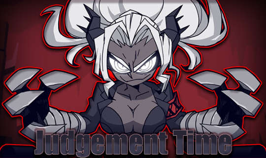
"IGNITE THE SIN MACHINE! SUFFERING MUST BE MADE! YOUR EGO. YOUR GREED. YOUR LUST. YOU ARE YOUR OWN TORTURER." - Judgement
#Helltaker#Not my art#Just a few minor photoshop edits for style#Judgement#High Prosecutor of Hell#Cinnamon Roll that can kill you
23 notes
·
View notes
Note
Hello there! I'm Eden :D I LOVE your renders! I've been rendering for well over a year at this point, however I only stuck to the super basic stuff since it took me a year before that to even know how to do it at all. I've wanted to up my game and get to where you are now. I'm SO SORRY if this question was asked already (I haven't gotten too far in your posts yet), but;
How do you personally edit your renders? I understand you use photoshop, but how do you do it exactly? Your renders have that kind of digital art style, like you drew them yourself. Feel free to be as descriptive or brief as you'd like!
Hi Eden!!! Thank you so much! 🥹😍♥️
I've followed you back and glad we're moots! I'd love to see some of your work!
I'm not sure if I've answered this before but I'm happy to answer it again! Also I haven't advertised it in a while (and I really need to try to get up a new tut, maybe soon), but my alt account is a Render School where I post tutorials, with plans to post editing tutorials in the future!
But honestly as far as my editing, I really don't do much.
Actions are my secret weapon, and I have a few favorites/go-tos I'll link! A few are by simmers and a few are just action sets. I'm in a family of photographers, so I have access to a wealth of resources for my editing.
Sonder set by @intramoon
Cold Water set by @intramoon
Retro Prime photoshop actions
Indie camera photoshop actions
But my "secret weapon," as it were, and the set of actions that I think most helps me accomplish that digital art style is a set of actions that are sadly expensive and hard to find now.
My favorite set is by Totally Rad! and I think in recent years it's been folded in to this Pixel Sugar product on their website. I know that's a steep price point but it's possible you can find it around the corners of the Internet for less, or if you can't, you might be able to find "dupes" of the better ones, which imo are:
Technicolor dream world
Super Fun Happy
Bullet Tooth
Grandma's Tap Shoes
As for my method, I know a lot of simmers paint over their renders, and I've done that a few times but find I'm too impatient tbh. My goal is always to have to do only minor touchups over my renders and some color/vibe adjustments before the finished product. My "raw" files are always exactly what blender spits out for me, unaltered in any way except to resize them for Tumblr.
To get that digital art style, I'd recommend rendering with alpha details if you don't already. If your computer can't handle alpha cc in the game, DM me and I can give you some pointers (sneak peek info for a future tut lmao) on how to accomplish it without bogging down your game.
When I go into photoshop I adjust the brightness and contrast, as I tend to personally prefer high contrast pieces that contain dark subject matter but you can still see the details. Then I'll paint/blur/clone/adjust anything that needs it, then I'll "stack" and adjust a handful of actions before applying edge blur and vignette and any other color adjustments (levels, curves, etc).
That's a very oversimplified rundown of what I do, but really overall my editing process is simple. The bulk of my work happens in blender itself. I find that the more time I take to perfect the lighting and shadows and angles in blender, the less frustrating the editing process and the happier I am with the end result. So, that said, be sure you're spending a lot of time in blender getting the light and shadows to be exactly where you need/want them to be before running it.
I know this is a bit long I'm sorry! If any of it is super confusing or you'd like a more in-depth look at any of it please let me know! I do plan to do editing tutorials for my side blog, but the latter half of this year has kind of run over me like a train, and for now I'm just trying to get by day by day. But I'm happy to help if you have more specific questions!
& thank you again!! ♥️
#replies#thank you so much this literally made my day#I was having a bad one too ugh I needed this#mini blender tutorial#tutorial ish#sims 4 blender tutorial#sims 4 render tutorial#sims 4 editing tutorial#I can't tell yall how happy it makes me when yall love my work#legit holding back tears#♥️♥️♥️
24 notes
·
View notes
Text
BESTIE @aliengirl tagged me, thankou !!!!!!!!!!!!!!!!!!!!!!!!!!
Sims Tag
1. What’s your favourite sims death? The city living pufferfish one 😭 its kinda silly hgishughuhdg
2. Alpha CC or Maxis Match? well i used to be maxis match but idk anymore hiushguriugiosrhig alpha cc is so pretty on the previews but often looks... crunchy????? in game... so i guess i tend to stick to mostly mm???
3. Do you cheat when your sims gain weight? I've never played far enough of any household to notice weight gain 😭😭😭
4. Do you use move objects? GIRL YES 😍😍
5. Favorite mod? i CANNOT live without more columns in cas & no cc wrench 😭😭
6. First expansion/game/stuff pack you got? first one i got back when my game was still a legal copy was city living !
7. Do you pronounce “live mode” like aLIVE or LIVing? LIVing !!!!!!!!!!!!!
8. Who’s your favorite sim that you’ve made? i have an unhealthy attachment to veronique, the model sim i made back in 2020. (Shes the one i used to model my recent Octavia hair) her tag
9. Have you made a simself? yes on multiple occasions 😭here
10. What sim traits do you give yourself? I just choose random ones most of the time???? but after checking creative seems to be a common one??
11. Which is your favorite EA hair color? Oh the fourth one, that new warm brown one, i keep needing to restrict myself from using it on every single sim i ever make....
12. Favorite EA hair? really love the short parted one from the free update back in september?????? of 2021
13. Favorite life stage? the few times ive tried playing in live mode its been young adults so that one????????
14. Are you a builder or are you in it for the gameplay? im only ever really in cas eiughisghiruhg. i build sometimes but i really never play in live mode so i guess builder????????????
15. Are you a CC creator? well im supposed to be but cc creating is just on the backburner rn 🤭 also bugfixing gives me anxiety
16. Do you have any simblr friends/a sim squad? i have the 5-ish mutuals that i keep harassing with my silly comments, but definitely no full on squad
17. What’s your favorite game? (1, 2, 3, or 4) ts4 was the first one i got, and the only one ive really played, so i guess that one
18. Do you have any sims merch? nough 🥰😍🤪👍
19. Do you have a YouTube for sims? i tried and forgot about it 😭😭😭 so currently no
20. How has your “sim style” changed throughout your years of playing? i think i used alpha cc back in like 2017????????????? and then i transitioned to my hardcore maxismatch era back during the early times of this simblr if you were there no you dont i ate your memories of me and now its just all over the place (maxis mix????????? idk)
21. What’s your Origin ID? i think its just catnipsims????? i could be wrong but i dont use the gallery anyway....
22. Who’s your favorite CC creator? oh thats a difficult question 😭😭 id say @pralinesims, @simandy, @clumsyalienn, and @marsosims !!!!!!!!!!
23. How long have you had a simblr? since summer of 2019 i think???? yes i was 12 dont bully me
24. How do you edit your pictures? editing???? never heard of her.... no but i use photoshop for whatever minor adjustments i want to make through liquify and adjusting contrast and whatnot
25. What expansion/game/stuff pack do you want next? any occult related anything will fullfill my sim creating needs 🤭🤭
25. What expansion/game/stuff pack is your favorite so far? since im so rarely in live mode i dont really have any opinion on gameplay ghihuighruie but i really really love the aesthetics of snowy escape in like every aspect but gameplay (cas, buildbuy, world etc.)
tag @barbieaiden, @marsosims, @eva-andsomenumbers, @avornalino, @woosteru, @ravensim, @wastelandwhisperer / @adrasteamoon, @radical-sims, & @chelseasasimmer and anyone else who i forgor 😭😭 sorry my brain is not the best
12 notes
·
View notes
Text
sims get to know me tag!
thank you for the tag @jonquilyst @aurorangen & @seokolat 🥰
1. what’s your favourite sims death? pufferfish!
2. alpha cc or maxis match? maxis match! i used to be maxis mix and may go back, but for now mm!
3. do you cheat when your sims gain weight? maybe minor tweaks but nothing major.
4. do you use move objects? yes! always!
5. favorite mod? mccc and ui cheats are the classic 2. probably also the more kisses mod adds so many cute animations.
6. first expansion/game/stuff pack you got? whatever came out first! get to work? or outdoor retreat? i can’t remember now haha
7. do you pronounce “live mode” like alive or living? always living
8. who’s your favorite sim that you’ve made? hmmmm to be fair i’m pretty happy with gabriel & makenzie’s little one 👀
9. have you made a simself? once! it looked nothing like me lol
10. what sim traits do you give yourself? foodie, clumsy and perfectionist. for 5 i would add cat lover and loyal.
11. which is your favorite ea hair color? i’m quite boring probs the dark brown haha
12. favorite ea hair? i only really use cc hairs tbh. but i do really like that laundry day(?) hair with the claw clip?
13. favorite life stage? i do love infants… but i think still has to be ya now with university too.
14. are you a builder or are you in it for the gameplay? definitely gameplay, i like decorating but suck at building. i do love cas too.
15. are you a cc creator? nope!
16. do you have any simblr friends/a sim squad? i did when i used to blog in 2017 but now i’m new again and just having fun posting for myself hehe
17. what’s your favorite game? sims 4! sims 3 was my first game but i do think despite its flaws sims 4 is my favourite.
18. do you have any sims merch? no.
19. do you have a youtube for sims? no.
20. how has your “sim style” changed throughout your years of playing? my sims defo used to have quite large eyes lol think i’ve improved. and yeah less alpha eyes and clothes
21. what’s your origin id? there’s nothing to see on my gallery, not sure what it is probs one of my personal usernames
22. who’s your favorite cc creator? too many creators i use to choose
23. how long have you had a simblr? this simblr is a few months old now since infants came out. i posted consistently back in 2017-2019 before.
24. how do you edit your pictures? i just use gshade and maybe paint to add the moodlets 😂 i used to spend hours using photoshop actions and manually blurring bgs on a macbook back in 2017, now i’m just posting for fun with no pressure!
25. what expansion/game/stuff pack is your favorite so far? i actually love island living for the world, it’s so pretty. i also really love growing together for the milestones.
26. what expansion/game/stuff pack do you want next? i would love pack refreshes of ones like get to work, outdoor retreat. as for new content, i’m not sure - but not horses 😭
i am not sure who to tag as i am late to post this! so pls if u want to do this, say i tagged you 🩷
7 notes
·
View notes
Text
been a while since the last behind the curtain! also probably bc i haven't done anything too crazy edit-wise as of late. anyway this was a fun one! been wanting to edit the style ever since yrs dropped this mep, but i just never got around to it lol.
my ingredients:
- after effects cc 2022
- red giant universe
- sapphire distort
- video copilot twitch
so the first step was figure out how to do the melty text effect--i knew how to do it in photoshop, but it's a little different in motion! i figured there were a few ways to do it, so i narrowed the most likely down methods to:
scale wipe + wave warp effects
text to shapes + crazy keyframing action
shape layers + linear fades or something along those lines
photoshop + liquify
and i am so sick of animating shape layers i feel like it's all i do. it literally is like 70% of what we do in motion graphics. i'm sick. i went with the scale wipe + wave warp method because fuck this LMAO. the process was like type > precompose > slap effects on > keyframe. to an exaggerated extent, this is what you get:

you could probably achieve a similar wave warp effect with ae's plugin btw! but i liked that sapphire gave me a bit more customization. once i had the movement i liked, it was a simple keyframe job.
then because i am LAZY and cannot be arsed to deal with manually separating colour channels or triplicating multiple text layers just to get a chromatic aberration effect, i stuck uni.Chromatic Aberration and uni.RGB Separation onto the precomp and fiddled with those settings until i thought it was appropriately eyestrain-y.

for the edit itself, i finally put my money where my mouth is and Thought About Form And Content. shoutout to my students for their relentless teasing. i set my comps at 12 fps to enhance the somewhat disjointed editing, and then i actually planned out the composition of my gifs instead of just throwing things at the wall and hoping something stuck. the background is black ice + a halftone overlay for the comic-y aesthetic. font is arial black (cheated with geller sans ultrabold for the "7" and "1") because #typography history and #cheeky references to the genre.
panels 2 + 3 basically employed the scale wipe + wave warp method in addition to my usual mograph bullshit (rotation, text animation, fake 3d using gaussian blur instead of adding a camera), but i changed minor things around. panel 3 especially, i gave the liquify tool a shot--and i don't like, hate it, but it was harder to map.
everything else seems pretty self-explanatory--stretch + center keyframes for the scale wipes in panel 1 (for the text effect), but aside from that, basic movement animations, basic glitches. i didn't reinvent the wheel! just added seb to it and spun.
9 notes
·
View notes
Text
Step-by-Step Process for Taking a Perfect Chinese Passport Photo at Home

Taking a perfect passport photo at home can be a convenient and cost-effective option, but it requires careful attention to detail to meet the specific requirements. This guide will walk you through each step of the process to ensure your photo meets the standards set by the Chinese government.
1. Understanding the Requirements
Before you start, it's crucial to understand the specific requirements for a Chinese passport photo. Here are the key specifications:
Size: The photo should be 48mm x 33mm.
Background: The background must be plain white.
Head Position: Your head should be centered and occupy 70-80% of the photo.
Expression: A neutral expression is required, with both eyes open and mouth closed.
Lighting: The photo should be well-lit without shadows.
Clothing: Wear dark clothing that contrasts with the white background.
Make sure to review these guidelines thoroughly to avoid common mistakes.
2. Setting Up Your Space
Creating the right environment is critical for taking a good passport photo. Follow these steps to set up your space:
Choose a Plain Background: Find a plain white wall or hang a white sheet to create a seamless background.
Position Your Camera: Use a tripod or place your camera on a stable surface. The camera should be at eye level to avoid unflattering angles.
Lighting: Ensure the room is well-lit. Use natural light if possible, but avoid direct sunlight that can cast harsh shadows. If using artificial lights, position them evenly on both sides of your face.
3. Preparing Yourself
Preparation is key to looking your best in your passport photo. Here’s what you need to do:
Dress Appropriately: Wear a dark-colored shirt to stand out against the white background. Avoid wearing uniforms or overly patterned clothing.
Grooming: Ensure your hair is neatly styled and away from your face. Avoid heavy makeup and excessive accessories.
Expression: Practice a neutral expression. Stand in front of a mirror and relax your facial muscles. Keep both eyes open and your mouth closed.
4. Taking the Photo
Now that you’re set up and prepared, it’s time to take the photo. Follow these steps carefully:
Positioning: Stand or sit straight, with your shoulders back. Ensure your head is centered and facing the camera directly.
Frame the Shot: Adjust the camera or your position so that your head occupies 70-80% of the frame. There should be enough space around your head for cropping if needed.
Take Multiple Shots: Take several photos to ensure you have options to choose from. Check each photo for lighting, shadows, and adherence to guidelines.
5. Editing the Photo
Once you have taken a few photos, select the best one for editing. Here’s how to proceed:
Choose the Best Photo: Select the photo that best meets the guidelines and has good lighting and clarity.
Use Editing Software: Open your chosen photo in an editing software like Adobe Photoshop or a free alternative like GIMP.
Crop and Resize: Crop the photo to 48mm x 33mm. Ensure your head size and positioning meet the specifications.
Adjust Brightness and Contrast: Make minor adjustments to brightness and contrast to enhance the photo without altering your appearance.
Remove Background Imperfections: If there are any shadows or imperfections in the background, use the editing tools to make it a uniform white.
6. Printing the Photo
Printing the photo correctly is just as important as taking it. Follow these steps:
Choose Quality Photo Paper: Use high-quality photo paper for printing. Matte or glossy paper can be used, but ensure it’s suitable for passport photos.
Set Print Settings: Check your printer settings to ensure the photo prints at the correct size and quality. Use the highest resolution setting available.
Print and Inspect: Print the photo and inspect it for any issues. Ensure the colors are accurate and the photo is clear.
7. Common Mistakes to Avoid
Avoiding common mistakes can save you from having to retake your photo. Here are some to watch out for:
Improper Background: Ensure the background is plain white without any patterns or colors.
Shadows and Lighting: Avoid shadows on your face or background by using even lighting.
Incorrect Size: Double-check the dimensions of the photo before printing.
Head Tilt or Expression: Make sure your head is straight and your expression is neutral.
8. Final Checklist
Before submitting your photo, go through this final checklist:
Size and Dimensions: Confirm the photo is 48mm x 33mm.
Head Position and Size: Ensure your head is centered and occupies the correct portion of the photo.
Background: Verify the background is plain white and free from shadows.
Expression: Check that you have a neutral expression with eyes open and mouth closed.
Clothing: Make sure you’re wearing dark clothing that contrasts with the background.
9. Submitting Your Photo
Once you have a perfect photo, it’s time to submit it along with your passport application. Follow these steps:
Attach Photo to Application: Affix the photo to the designated area on your passport application form. Ensure it’s securely attached.
Review Application: Double-check all details on your application to avoid delays.
Submit: Submit your application to the relevant authority, either in person or via mail, as per the instructions.
10. Conclusion
Taking a perfect Chinese passport photo at home is entirely possible with the right preparation and attention to detail. By following this step-by-step guide, you can ensure your photo meets all the requirements, saving you time and money. Remember to double-check each step, from setting up your space to submitting your application, to ensure a smooth process.
0 notes
Text
Understanding Camera Lens Flare
At some time you have actually probably encountered lens flare, that brilliant glaring light that sweeps into pictures, causing them to have a blurred, dappled appearance. Lens flare can occur when any brilliant, non-image forming light from the sun, or another light source strikes the front aspect of your lens.
While flare is sometimes utilized deliberately as an artistic improvement, for the majority of landscape photographers, it can be an unwanted addition in photos and something that you'll often want to prevent or prevent. With this in mind, let's have a look at a few things that you can do to avoid flare in your landscape images.
Lens Flare: What You Need To Know
One of the most convenient ways to assist remove lens style is by purchasing a lens hood to help block direct sun rays from reaching your front component. As a perk, a lens hood will likewise protect your camera from minor knocks and dents. While a lot of lenses feature a lens hood, if yours didn't, they are low-cost and simple to get ahold of.
If you're fighting flare, another choice is to change your angle. Flare is triggered by direct light striking the sensor, so standing in the shade can help to prevent this from happening. Furthermore, you could try angling your video camera in a various instructions, so you're not shooting straight into the sun.
Flare Photography Tips
Changing the focal length of your cam can likewise assist to get rid of lens flare. While merely zooming to a various focal length may not remove flare totally, often, it can lower unwanted sunspots. A dirty or smudged lens is more susceptible to lens flare.|Adjusting the focal length of your video camera can also assist to get rid of lens flare. A filthy or smudged lens is more prone to lens flare.
To clean your lens, usage lens tissues or a microfiber cloth and begin wiping from the center working to the outside of the lens. Just take care that there are no smidgens of grit in the fabric or on the lens itself, eliminate these with a blower or brush first, to prevent polishing them into the lens and scratching it.
Want Better Photos Or Video? Avoid Lens Flares
Particular equipment, such as prime lenses are less susceptible to lens flare that others. One factor for this is due to the fact that they have fewer internal parts for the light to disperse through. In addition, layered filters, while more expensive than routine filters, are also less prone to lens flare than regular filters considering that they do not smear as easily.
Naturally, you might likewise modify out the lens flare in post processing. While it would be hard to edit out the haze that frequently accompanies lens flare, the shapes of light could be modified out quickly enough. Consider using the brush tool or the area recovery tool to conceal or clone out the areas.
Lens Flare In Photography: How To Deal With It
Finally, while all of us understand that lens flare is typically unwanted in numerous images, sometimes it can be utilized to enhance an image also.|Finally, while we all know that lens flare is typically unwanted in many images, in some cases it can be utilized to improve an image. In reality, there's even a Photoshop filter that can assist you to place flare into your images. In many landscape images, you'll want to keep the flare to in one area of the structure, instead of allowing it to take over the entire image.
Camera producers have utilized nano-crystal coatings in their designs to restrict ghosting and flare, but unfortunately, light flare is still a really genuine thing. To decrease light flares in your shots, consider following the recommendations. Shooting into the sun is a proven method to create undesirable lens flare. While flare can in some cases be used to great effect, it's primarily to be avoided.
How To Deal With Lens Flare
The hood serves as a type of guard obstructing any scattering light from striking the lens. The lens hood purpose is to prevent the sun from getting in your eyes, just as you would by placing your hand over your forehead. What is a lens hood for when you're out shooting? It'll protect your lens from any damage.
Side note: If you're utilizing filters on your lens, a lens hood may not fit over it. Because case, you can attempt using your hand to protect the lens from the sun's rays. Obviously, you can get camera flare with any lens. But prime lenses are considerably less susceptible to camera flare than zoom lenses.
What Is Lens Flare? How To Get It & How To Avoid It
Better quality prime lenses are a more secure alternative if flare is an issue. Blocking your source of light is a simple method to avoid sun lens flare. Try utilizing trees and even mountains if you're shooting in these type of conditions and if you have enough light without it.
|
What Is Lens Flare In Photography?
As a photographer, you need to comprehend light perfectly. You can do both accidental and deliberate lens flare results. Some professional photographers like this because it enables you to add some creativity to the shot. All of it depends upon your shooting style and the result you wish to attain. Lens flare in photography includes a touch of spice and originality to every photo.
Anyway, it is useful to know what causes lens flare so that you can find out how to prevent it or, in some cases, purposefully accomplish this effect in your images. From a technical point of view, lens flare (or light flare) is a reflection of roaming light on your cam lens, triggering streaks of sunshine in addition to a reduction in the contrast and saturation in your photo.
How To Prevent Lens Flare In Your Landscape Photography
All professional photographers have a love-hate relationship with types of lens flares. When you do not desire them to appear, eliminating them is impossible. And when you do seek them out, they are tough to produce and manage.
In addition, there are numerous lens flare types that can help include imagination to your work and stick out from the rest. If you wish to add lens flare to the photo and get a really chic effect, think about contending the golden hour. Dawn and sundown are the very best times of day to achieve the softest, finest natural light.
Control Lens Flare For Portraits
In photography, we call this duration around sunrise and sunset, the golden hour. At these early and late hours, the sun is at the optimum angle for achieving quality lens flare, and light streaks and orbs are plainly noticeable in the photo. Another advantage of shooting throughout the golden hour is that you don't have to be in an awkward yoga position to get the wanted impact, as you would throughout other times of the day.
What does a lens hood do? Typically, the anti-reflective hood secures your images from a flare. A lens hood is actually a very essential thing, however not when it comes to shooting golden lens flares. By getting rid of the lens hood, you'll probably attain fairy light flares in your images.
Top Tips On Controlling And Using Flare In Your Photographs
Lens flare can be immediately achieved by shooting into the sun. Simply permit the sunlight to hit the lens at the right angle. What you require to do here is to reroute the light so that rather of straight reaching the sensing unit it shows several times internally in the past hitting the sensing unit.
If you want to include some imagination, you can partly obstruct the natural light source. If you're using the sun as your light, that will be much more magical. But even for an indoor photoshoot, the partially blocked light coming through the window will still have the very same impact.
Flare Photography Tips
As soon as you have actually chosen a subject and placed it in the preferred position, begin shooting a series of test shots to discover out which angle will give the very best optical flares. Bear in mind that when recording lens flares with the sun as your light source, they'll change considerably and quickly as the sun constantly moves.
Keep in mind that when we say small aperture, we are referring to the actual size of the aperture, not the number itself. So a small aperture will represent a high f-stop number, such as f/22. At a little aperture, you will get a more detailed lens flare. Your aperture can affect the appearance of the lens flare.
What Is Lens Flare And How To Deal With It In Photography
And if your video camera is set to automatically pick the ISO, it will also immediately choose the shutter speed. This allows you to quickly switch between apertures and see the distinction it makes to your golden lens flares. When you shoot straight into a light source, your electronic camera will have a difficult time focusing and will blur background.
Apply one image with flares on another one you wish to get innovative with. Change the quantity of the texture impact, and utilize mix modes for more alternatives. This tool permits you to play with different colors of flares. If you love red flares or possibly wish to include a blue lens flare, just discover a suitable image on the internet and blend it with yours.
|
Lens Flare Tips For Creative Photos
You can get amazing pictures as an outcome of shooting into the sun + selective focus + shallow depth of field + lens flare. Follow these simple actions and you'll immediately get a top quality shot. The smaller sized the aperture, the sharper and clearer the flare effect. However utilizing a little aperture likewise suggests it will take more time to take the picture.
You can hold a reflector in your hand, hang it on a freestanding base, or location it on the ground. Using a reflector can be efficient if your design stays in the shade. It will assist in lightening up the design's face, making the image look more pleasing. So you also get a truly elegant flare in images.
What's Lens Flare? (How To Remove It)
When it comes to pictures, the cam flare impact has actually been thought about a bothersome flaw that harms photos and ought to be eliminated with making use of a lens hood. Simply like the bokeh result, the optical flare has ended up being popular amongst professional photographers for shooting individuals with intense lights.
youtube
It's likewise simple to attain; all you require is a source of bright light (the sun in our case) and a prepared model. The secret to getting incredible lens flares is in the positioning, particularly in the angle at which light bounces off the front element of your lens. Positioning yourself so that the sun has to do with 45 from the front element is an excellent starting point.
Flare Photography Tips
The size of the front component of your lens will contribute in the type of lens flare you achieve. Bigger lenses tend to create a soft haze, while smaller lenses supply clear rings and orbs of light. Explore your lenses, change the brightness, discover which offers the most eye-catching flare, and create images that leave everyone speechless.
Go out with your video camera and devices on a great day, discover the area you wish to photograph, and try to get lens flare using some basic pointers provided here. There are still cases when lens flare in photography is not preferable.
Understanding Lens Flare In Landscape Photography
You don't desire your topic to be rinsed by flare and end up being unrecognizable. You still have a great deal of imaginative freedom in your decision to consist of lens flare. That's why it's so important to take multiple shots whenever you decide to consist of lens flare as part of your structure.
If you have multiple shots, you can pick the very best, whether with or without the sun flare result. Shoot during the golden hour when the sun offers a dreamy, soft light. Eliminate the lens hood to ensure your cam will produce flares. Utilize an appropriate lens: large or extreme wide-angle.
Understanding Camera Lens Flare
While your first run through of this may take a while, after masking a couple of images this whole technique will take you less than a few minutes to do. Compare that to the difficult job of attempting to remove flare out of an image in post-processing. Not just does it conserve you time, it likewise increases the quality of your last images.
What's Lens Flare? (How To Remove It)
You might not observe those tiny water areas on your iPhone cam lens, but you will if they add to lens flare. Attempt cleansing your camera lens with a dry, lint-free fabric to make sure there are no beads, spots, or wetness developed. There are some fantastic image modifying apps that can help you get rid of areas, lines, and circles from lens flare after the reality.
0 notes
Text
Control Lens Flare For Portraits
Eventually you have actually probably come across lens flare, that brilliant glaring light that sweeps into images, causing them to have a fuzzy, dappled look. Lens flare can take place when any bright, non-image forming light from the sun, or another light source strikes the front aspect of your lens.
While flare is in some cases utilized deliberately as a creative enhancement, for many landscape photographers, it can be an unwanted addition in photos and something that you'll often wish to avoid or prevent. With this in mind, let's have a look at a few things that you can do to prevent flare in your landscape images.
What Is Lens Flare In Photography?
One of the most convenient methods to assist eliminate lens flair is by purchasing a lens hood to assist block direct sun rays from reaching your front aspect. As a perk, a lens hood will also secure your electronic camera from minor knocks and dings. While many lenses include a lens hood, if yours didn't, they are economical and easy to get ahold of.
If you're fighting flare, another choice is to adjust your angle. Flare is triggered by direct light striking the sensor, so standing in the shade can help to avoid this from taking place. Additionally, you could attempt angling your cam in a different instructions, so you're not shooting straight into the sun.
What's Lens Flare? (How To Remove It)
Changing the focal length of your video camera can likewise help to remove lens flare. While just zooming to a different focal length may not get rid of flare totally, frequently, it can decrease unwanted sunspots. A filthy or smudged lens is more prone to lens flare.|Adjusting the focal length of your camera can also assist to eliminate lens flare. An unclean or smudged lens is more susceptible to lens flare.
To clean your lens, usage lens tissues or a microfiber cloth and start wiping from the center working to the beyond the lens. Just take care that there are no little bits of grit in the fabric or on the lens itself, eliminate these with a blower or brush initially, to avoid polishing them into the lens and scratching it.
How To Prevent Lens Flare In Your Landscape Photography
Particular equipment, such as prime lenses are less prone to lens flare that others. One factor for this is because they have fewer internal parts for the light to disperse through. Furthermore, coated filters, while more costly than regular filters, are also less vulnerable to lens flare than routine filters because they don't smudge as easily.
Of course, you might also edit out the lens flare in post processing. While it would be tough to modify out the haze that frequently accompanies lens flare, the shapes of light might be edited out easily enough. Consider using the brush tool or the area recovery tool to conceal or clone out the areas.
How To Prevent Lens Flare In Your Landscape Photography
Lastly, while we all understand that lens flare is frequently unwanted in many images, in many cases it can be used to boost an image as well.|Finally, while we all know that lens flare is frequently unwanted in many images, in some cases it can be utilized to enhance an image. In truth, there's even a Photoshop filter that can help you to insert flare into your images. In the majority of landscape images, you'll wish to keep the flare to in one area of the composition, instead of permitting it to take over the entire image.
Electronic camera producers have actually utilized nano-crystal finishings in their styles to restrict ghosting and flare, however unfortunately, light flare is still a very genuine thing. To decrease light flares in your shots, consider following the suggestions. Shooting into the sun is a proven way to create undesirable lens flare. While flare can in some cases be used to terrific result, it's primarily to be prevented.
What's Lens Flare? (How To Remove It)
The hood serves as a type of shield obstructing any scattering light from striking the lens. The lens hood function is to prevent the sun from getting in your eyes, simply as you would by positioning your turn over your forehead. What is a lens hood for when you're out shooting? It'll protect your lens from any damage.
Side note: If you're utilizing filters on your lens, a lens hood may not fit over it. In that case, you can try utilizing your hand to protect the lens from the sun's rays. Naturally, you can get cam flare with any lens. prime lenses are significantly less prone to camera flare than zoom lenses.
Lens Flare In Photography: How To Deal With It
Much better quality prime lenses are a more secure option if flare is an issue. Obstructing your light source is a simple way to prevent sun lens flare. Attempt using trees and even mountains if you're shooting in these sort of conditions and if you have enough light without it.

|
What Is Lens Flare In Photography?
As a professional photographer, you need to comprehend light completely. You can do both unintentional and deliberate lens flare impacts. Some photographers like this since it allows you to include some imagination to the shot. All of it depends upon your shooting style and the result you wish to achieve. Lens flare in photography includes a touch of spice and uniqueness to every image.
Anyhow, it works to know what causes lens flare so that you can learn how to prevent it or, in some cases, purposefully achieve this result in your images. From a technical viewpoint, lens flare (or light flare) is a reflection of stray light on your camera lens, triggering streaks of sunshine along with a decrease in the contrast and saturation in your photo.
Lens Flare In Photography: How To Deal With It
All photographers have a love-hate relationship with types of lens flares. When you don't desire them to appear, eliminating them is difficult. And when you do seek them out, they are hard to produce and manage.
In addition, there are numerous lens flare types that can help add creativity to your work and stand out from the rest. If you desire to add lens flare to the image and get a really elegant impact, think about shooting at the golden hour. Daybreak and sundown are the best times of day to attain the softest, finest natural light.
How To Prevent Lens Flare In Your Landscape Photography
In photography, we call this duration around sunrise and sunset, the golden hour. At these early and late hours, the sun is at the optimum angle for accomplishing quality lens flare, and light streaks and orbs are plainly noticeable in the image. Another advantage of shooting during the golden hour is that you do not have to remain in an awkward yoga position to get the desired effect, as you would throughout other times of the day.
What does a lens hood do? Typically, the anti-reflective hood safeguards your images from a flare. A lens hood is actually an extremely crucial thing, but not when it pertains to shooting golden lens flares. By getting rid of the lens hood, you'll more than likely attain fairy light flares in your images.
What Is "Lens Flare" And How Do I Avoid It?
youtube
Lens flare can be immediately accomplished by shooting into the sun. Just permit the sunshine to strike the lens at the best angle. What you require to do here is to redirect the light so that instead of straight reaching the sensor it reflects several times internally in the past striking the sensing unit.
If you want to add some creativity, you can partly block the natural light source. If you're utilizing the sun as your light, that will be even more magical. However even for an indoor photoshoot, the partially blocked light coming through the window will still have the same impact.
How Can Lens Flare Be Avoided?
Once you've selected a subject and positioned it in the preferred position, begin shooting a series of test shots to learn which angle will provide the finest optical flares. Bear in mind that when capturing lens flares with the sun as your light, they'll change considerably and quickly as the sun continuously moves.
Bear in mind that when we state little aperture, we are referring to the actual size of the aperture, not the number itself. So a small aperture will represent a high f-stop number, such as f/22. At a small aperture, you will get a more comprehensive lens flare. Your aperture can impact the appearance of the lens flare.
Want Better Photos Or Video? Avoid Lens Flares
And if your video camera is set to immediately choose the ISO, it will likewise immediately choose the shutter speed. This enables you to rapidly switch between apertures and see the difference it makes to your golden lens flares. When you shoot directly into a light source, your video camera will have a bumpy ride focusing and will blur background.
Use one image with flares on another one you desire to get innovative with. Change the quantity of the texture effect, and use blend modes for more options. This tool enables you to play with different colors of flares. If you love red flares or maybe want to add a blue lens flare, just discover a suitable photo on the internet and blend it with yours.
|
How To Prevent Lens Flare In Your Landscape Photography
You can get unbelievable images as an outcome of shooting into the sun + selective focus + shallow depth of field + lens flare. Follow these easy actions and you'll instantly get a premium shot. The smaller the aperture, the sharper and clearer the flare impact. However using a small aperture also indicates it will take more time to take the picture.
You can hold a reflector in your hand, hang it on a freestanding base, or place it on the ground. Utilizing a reflector can be reliable if your model remains in the shade. It will aid in lightening up the model's face, making the photo look more pleasing. So you also get an actually stylish flare in pictures.
Understanding Camera Lens Flare
When it concerns portraits, the electronic camera flare effect has actually been considered a bothersome flaw that damages photographs and must be removed with making use of a lens hood. However similar to the bokeh impact, the optical flare has actually become popular amongst photographers for shooting people with bright lights.
It's also easy to achieve; all you require provides bright light (the sun in our case) and a prepared model. The key to getting incredible lens flares is in the positioning, specifically in the angle at which light bounces off the front aspect of your lens. Placing yourself so that the sun is about 45 from the front component is an excellent starting point.
What Is Lens Flare And How To Avoid It
The size of the front component of your lens will play a role in the kind of lens flare you accomplish. Bigger lenses tend to create a soft haze, while smaller lenses supply clear rings and orbs of light. Experiment with your lenses, adjust the brightness, discover which supplies the most eye-catching flare, and create images that leave everybody speechless.
Go out with your camera and equipment on a nice day, find the area you wish to picture, and try to get lens flare using some simple suggestions provided here. There are still cases when lens flare in photography is not desirable.
How To Prevent Lens Flare
You do not desire your subject to be washed out by flare and end up being indistinguishable. You still have a great deal of imaginative liberty in your choice to consist of lens flare. That's why it's so important to take numerous shots whenever you decide to include lens flare as part of your composition.
If you have multiple shots, you can pick the very best, whether with or without the sun flare result. Shoot during the golden hour when the sun offers a dreamy, soft light. Remove the lens hood to ensure your video camera will produce flares. Use a proper lens: broad or extreme wide-angle.
Understanding Lens Flare In Landscape Photography
While your first run through of this might spend some time, after masking a couple of images this whole method will take you less than a couple of minutes to do. Compare that to the daunting job of trying to remove flare out of an image in post-processing. Not only does it conserve you time, it likewise increases the quality of your last images.
Top Tips On Controlling And Using Flare In Your Photographs
You might not see those small water spots on your iPhone cam lens, but you will if they contribute to lens flare. Try cleaning your camera lens with a dry, lint-free fabric to ensure there are no droplets, areas, or moisture developed up. There are some wonderful photo editing apps that can assist you eliminate areas, lines, and circles from lens flare after the fact.
0 notes
Photo

Hey guys! I got an ask wondering how I make my gifs and some people have asked me how I color my gifs, so here you go!
We’re going to be making this:

You’ll need:
VLC Media Player
Photoshop with working Import Video Frames to Layers function and timeline. I use Photoshop 2020, but any older versions with these functions will work!
A high-quality video (preferably 1080p)
Tutorial under the cut!
PART ONE: MAKING YOUR GIFS
You’re going to want to open up your video in VLC Media Player and open it to around a few seconds before your scene appears. If you’re giffing from a small YouTube video you can ignore this step, but for movies and TV, you’ll want to use VLC to extract the tiny part of it you want.
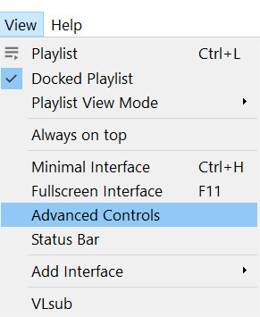
Pause it before your scene and click View >> Advanced Controls.
Above the play button, you should see a bunch of new controls. Focus on the red button I circled below:

Click this button and press play. VLC records are a little bit off, so this is why you want to be a few seconds before your scene actually starts so you catch it all! When your scene has played, press the button again. You’ve now recorded your scene and you can record as many scenes as you like for a full gifset.
You can find your recorded videos in the Videos folder. It’ll be named something like vlc-record-a bunch of letters and numbers.
Now that you have your scenes, it’s time to open Photoshop! When Photoshop has loaded, go to File >> Import >> Video Frames to Layers, which is a bit down to the bottom. It’ll prompt you to select a video; click on the video you just recorded, and a screen like this will pop up:
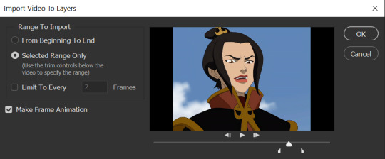
Use the white sliders to select the parameters of your scene. I would recommend going a little bit more on both sides so you catch your whole scene.
TIP: Make sure you do NOT select the button that says “Limit to Every 2 Frames,” because that will make your gifs look choppy and ugly. Love yourself!
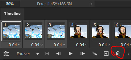
Once your frames have loaded, you might not see them on Photoshop the way mine looks. If that’s the case, make sure you go to Window >> Timeline so you can see the frames!
Delete the extra frames in your gif that you don’t need by selecting the frames you want to delete and pressing the trash can button, circled below:
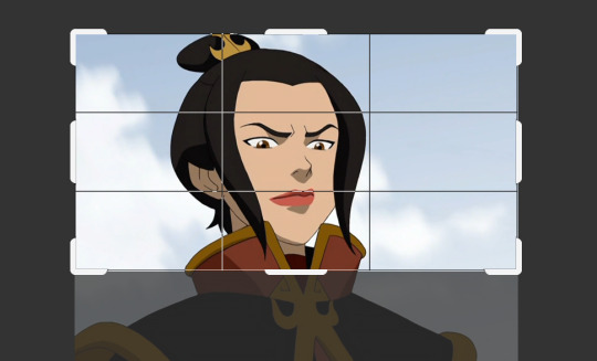
Now that you’ve done that, it’s time to crop. For this particular gif, I’m going for a full-width one, so the width I chose is 540px and I chose a height of 290px. Click on the crop tool and make sure your crop settings are at W x H x Resolution, or you won’t be able to input specific dimensions the way I’ve done here:

Position the crop tool where you want your gif to be:
And now that your gif is all cropped and sized, it’s time to sharpen! I have a pretty specific sharpening process that I’ll outline in detail here, but I have an action for this purpose so as to save time. I’m just making this part of the tutorial so you know what you’re meant to do in Photoshop.
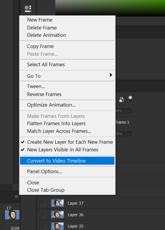
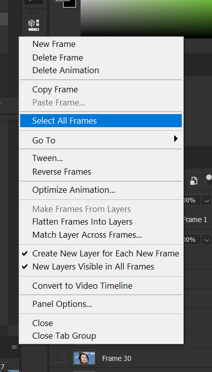
First, go ahead and click the three little bars at the right edge of the Timeline/Frames tab and hit Convert to Video Timeline.
Now, your timeline should look like this:
Go to Select >> All Layers, and right-click on one of the layers in the Layers tab once they’ve all been selected. Select Convert to Smart Object. This allows us to sharpen the entire gif at once as opposed to by frame! Your timeline should now look like this, with all the little purple parts condensed into one:
It’s time to sharpen! Go to Filter >> Sharpen >> Smart Sharpen. I do two passes with the Sharpening tool; here are my settings for both:

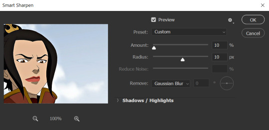
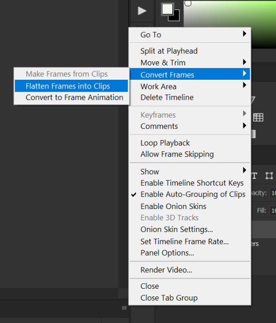
It’s not too apparent in the pictures, but it does make a difference. Don’t worry about your gifs looking too sharp; I use this action on every single one of my gifs and it always works like a charm.
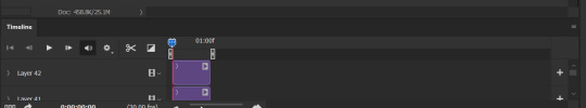
Now that our gifs are nice and sharp, it’s time to take them back to frames. This is because of a glitch in Photoshop that makes gifs saved in Smart Object form much faster than they would be in frames. Click on the small bars on the right of the timeline again and select Convert Frames >> Flatten Frames into Clips.
Your gif should have all those little clips that we had before we converted it into a Smart Object.
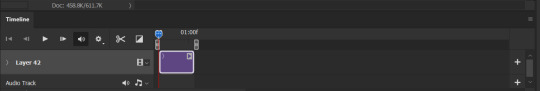
Then, go to Convert Frames >> Convert to Frame Animation.

Your gif should be back in frames again, but it’s all one frame. Don’t worry; we’re going to fix that by clicking Make Frames from Layers from the menu with the three little bars again.

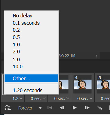
Now all your frames should be back! We’re going to set the speed of the gif now. Hit those three little bars again and click Select All Frames. Now click on the little triangle under any frame and click Other, and a little popup will appear. I always set my gifs to a speed of 0.05.

At this point, I save my gifs as a .PSD file. You can delete these PSDS after you’ve posted your gifset (I usually do to save space!), but it helps to have them so you can edit your gifs later if you want. Hit Ctrl+S, and now the screen to save it should pop up. Make sure you save it as a PSD file and not something else.

Now you have a gif that you can color! Which brings us to…
PART TWO: COLORING, ADDING SUBTITLES, AND SAVING YOUR GIFS
I do run a pale blog so this is going to be a pale coloring tutorial. You can check some popular resource blogs to see if they have any tutorials for colorful gifs!
I start out by making a group with the little folder below the layers tab; I title it “coloring.” (Not pictured: I added a layer mask and painted one black dot over it so I could reference the original!)

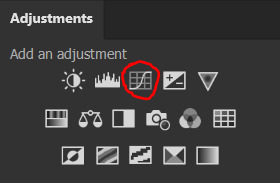
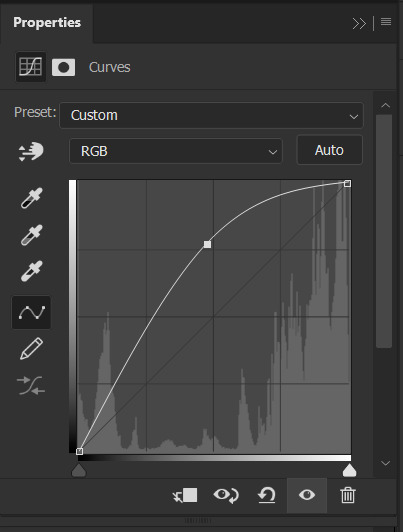
I always start out with a Curves layer; here are my settings:
The gif at this point:
Next, I decrease saturation using the Hue/Saturation adjustment:
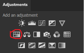

After this, I add a black and white Gradient Map layer and set it to blend mode Exclusion at 10% Opacity.


Then, (not pictured), I add a Selective Color layer and reduce blacks in Whites and Neutrals while increasing them in Blacks.
To make the background pale, I added a Hue/Sat layer, applying 100% Lightness to the Cyan and Blue channels and adding color to Azula’s skin by saturating the Yellows.

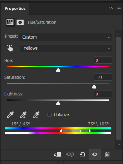
Here’s the gif after those adjustments:

Now I’m going to restore color to Azula’s skin following my own tutorial, so I’m not going to go into those details here. However, here’s the gif after all this. It’s not totally the same as Azula’s skin, but going any pinker makes the gif look awkward and oversaturated, which isn’t a good look:

After some minor adjustments and removal of the layer mask:

Now for subtitles!
Use the Text tool and make a rectangle at the bottom of your gif where subtitles go. I use Arial Rounded MT Bold, with Regular style, at 3.36pt and Sharp anti-aliasing.


Create a rectangle at the bottom of the gif where subtitles go and type in your text; then right-click on the text layer and select Blending Options and check Stroke, and these are my settings:

Now your subtitles are all ready! I’d recommend duplicating one frame of the gif and then duplicating the text layer onto a new canvas and saving it as a PSD so your settings and placement are always consistent across your gifsets!
Time to save your gif. Here are my settings, circled ones important:
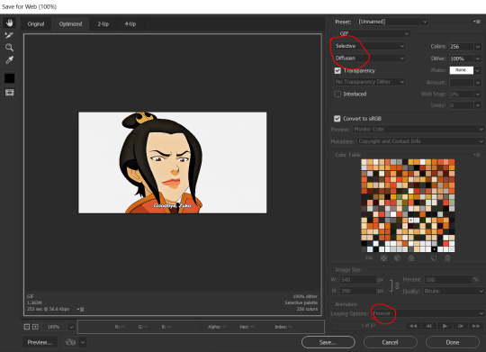
I’ve seen gifmakers use Adaptive+Pattern but I personally think that looks grainier and the pattern is really obvious; in my opinion Selective+Diffusion looks smoother, but it’s all up to you! Experiment with what you think looks best.
Make sure your gifs are set to loop Forever or they’ll only loop a limited amount.
Here’s your finished gif!
I hope this tutorial was helpful! Please reblog this if you learned something, and I hope you have a wonderful day. Happy gifmaking ❤
#allresources#chaoticresources#yeahps#biresources#resourcemarket#useradeela#usermaira#userdanisaur#userchelsea#tuserivy#*mine#resources#tutorial
409 notes
·
View notes
Text
How to edit and color manga-caps
This is a tutorial on how I personally color and edit manga caps in photoshop. I’ve done my best to explain my editing and coloring process but English isn’t my native language so please excuse any grammatical errors! Anyway, let’s get started💛
Clean-up
First of all you need a clean manga cap to work with. Start by erasing the parts of the image that you don’t want to keep and redraw parts if necessary. In this case I erased the speech bubble and redrew parts of the sparkles surrounding Komurasaki. Try to stay consistent with the artists original style If you redraw parts of the image as it will be very noticeable if you’ve strayed too far from the original style. I recommend that you study the line width especially and try to emulate that!
Then level the image as seen in this tutorial by @aldiwali, by leveling the image you erase some of those grainy dots surrounding the line-art. I’ve also found that it helps darken the line art! When you are done with clean-up separate the line art from the background. I’ve already made an in-depth tutorial how to do that (and erase more of those grainy dots) so I’ll link that here: X.
Once you’ve cleaned your manga cap and separated the line art from the background you can start putting down your base colors and flats!
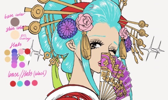
Coloring process
Start with a simple base color for the skin, I usually go for #9e7e7d as that will give the skin a nice warm tone once your done! Then make a copy of your base layer. Go to your copy of your base layer, right click and create clipping mask and color it with something more akin to an actual skin tone. Combine the clipping mask and the copy of your base layer, then lower the opacity to your liking, I usually go for around 85% opacity.
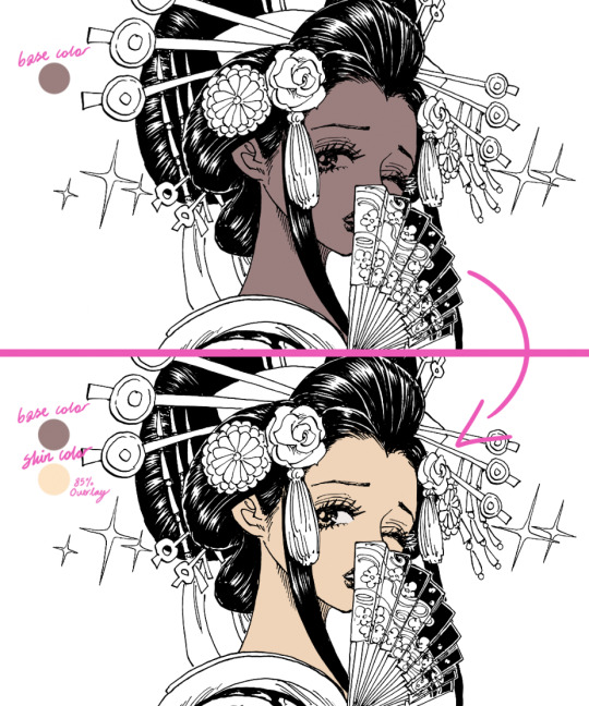
This step is very unnecessary and you don’t need to actually do this (just a normal skin-tone as a base) but I do it out of habit. If you look at some of my older stuff it’s way more noticeable (see example down below).

If you use this method please be aware of that it does tend to lighten colors so I don’t recommend that you use this method for when you’re using darker colors.
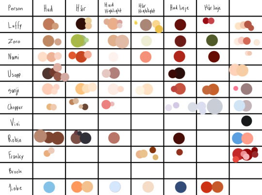
BONUS TIP for when you’re coloring: Make a color palette! I try to keep track of what colors I use for different characters but it’s easy to get a bit lost so I actually made a little color palette as a reference for myself. That way I can easily keep track of what colors I like to use for a base and for shading.
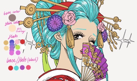
Anyways.... back to the actual tutorial! Time to color the rest of the image! Try to get some good reference pictures of the character/characters (preferably something that was colored by the actual artist) if you’re going for canon colors. I usually play around with hues for a bit before I’m happy with results! For example I gave Komurasakis red dress more of a purple/pink undertone to make it work better with her fan and the flowers in her hair.

Try to divide your colors into different layers to make the shading process easier but don’t make to many separate layers as that can get a bit confusing! I try to divide my layer based on color and placement!
If you’re not using a reference for what colors you’re going to use I recommend that you at least follow a color scheme. Try to find colors that work with each other but still contrast each other. A lot of people will be looking at your graphics trough their phone and a lot of details will be lost so by making your colors contrast each other you keep some of clarity! I’m not saying that you shouldn’t use colors that are very similar but you should keep the format which your graphics will be looked at in mind.
Anyways now that we’ve colored everything we need to add color to the parts of the line-art that aren’t supposed be black, in this case we need to add color to the hair, lips, fan and dress. Go to your line-art layer, right click, make a clipping mask and then you can color the line-art. Your layers should look similar to this:

Make a base which you can work off later as seen below.
I usually color everything first and then I refine the outlines with the help of the eraser. Try to keep the width of the outline consistent with the rest of the line-art, otherwise it won’t be as seamless. (I did’t outline her hairline as it’s very “feathered” and I wanted to keep that feeling, but I usually outline the hairline too)
You don’t have to separate each color into its own clipping mask as that isn’t going to make any difference when you shade everything later. Now time to add the line-art to the hair!
Line-art
I do recommend using some sort of drawing tablet to make your new line-art. It’s not that isn’t possible to do it without one but it’s a bit tedious to it with a mouse or touchpad.
If you use a drawing tablet use a brush that allows you to control the stroke weight of the brush. I usually go for one of the default brushes but I’m sure that there are a tons of fun brushes out there to play with!
Create another layer just above your manga-cap, this is where we’ll draw the new line-art! Try to follow the “flow” of the original line-art. In this case it’s fairly easy for me to see where line-art would fit naturally thanks to the way Oda choose to illustrate the “shine” on Komurasakis hair!

Look at the area that I’ve encircled, it’s easy to imagine that that’s where Oda would have chosen to add the line-art if he hadn’t colored the hair black. If you can’t find any of these spots try to find a few references for how the original artist does the line-art when it’s in full color. For example I used the cover of volume 92 to get a feeling of how I wanted my line-art to look.

Basically try to find what makes the original artists line-art distinct and copy that for your own line-art!
After I’m done with my line-art I go back to the black base and fill in some of the empty spaces that were left by the artist for clarity. Like the gap between the line-art and the deep purple parts of the her fan. When your happy with your base and line-art you can start shading!
Shading
(Before I start shading I generally color in all the stuff I left out like her eyes, makeup and the shine on her hair. I also decided to outline her eyebrows.)
Let’s start with shading the flats! Add a clipping mask to your layer and set the layer style to multiply. The amount of layers I use differ from color to color but I tend to stick between two our four layers of shading. When you’re shading use a color that is soft but with enough contrast to your base so it doesn’t blend into it. I generally use a color with a warmer tone to shade but the you can play around with colors and tones to add different effects.

Create a clipping mask and set the layer style to overlay or soft light to highlight certain areas with a lighter color. I tend to play around a bit with the opacity before I’m happy the results. When you’re finished with shading the flats you can start shading the base!
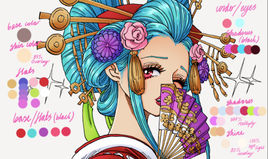
It’s basically the same thought process as before, just add a clipping mask your base layer and set to multiply! Your layers should look like this:

And that’s it! We’ve shaded everything and we’re basically done! There’s just a few more minor things to do.
Details / Coloring the line-art
I like coloring the line-art as it gives the graphic some extra color. To add color to your line-art just do as we did before. Make a clipping mask and color the lines, simple as that! Try to use colors that are dark enough that the line-art isn’t lost.

I did some finale clean-up, colored the sparkles surrounding Komurasaki, added som motion filters to that, fixed the background and that’s that! We’re done! That’s how I edit and color manga-caps! I hope this helps! I might have gotten lost on a few tangents so please feel free to ask questions if you need clarification on anything💛
#gahhhh I hope I spelled everything right#anyways I hope you guys enjoy this#this isnt the only way to color#and edit manga caps its just the way I do it!!! and im not a professional or anything I simply do this because it's fun!#tutorial#coloring tutorial#coloring#manga coloring#manga#one piece#op#shonen jump#opgraphics
635 notes
·
View notes
Text
How to Get Roleplay on F-List: A Guide
Hey all. So I’ve had a few people ask me how on earth to get RP over F-List, or for those that have tried, say its too confusing. While F-List is a much different format than I think a lot of people are used to, it’s a pretty reliable source of RP once you get used to it. So I’m going to walk you through, step by step, how to start from nothing and get a profile set up to start RPing. F-List is 18+ Only and is a Restricted To Adults® Verified website. You can learn more about it by clicking the RTA logo at the bottom of f-list’s main page.
F-list’s main landing page can be located at https://www.f-list.net/.
Note that my f-list may look different from yours because I’m using dark mode (which can be set in the account tab) and I’m a subscriber, so I don’t see ads.
Step One: Make a Profile
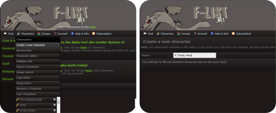
Making a profile, or as they’re known on F-List, a character, is your jumping off point for getting started. There are three main factions on F-List: Anthro Characters, Canon Characters, and Original Characters, with subcategories of each. You also have hub profiles. There is a right way to make a hub profile, but that’s not something I’ll be talking about on this post. Hub profiles are pretty universally disliked on F-List and are often seen as a mark of laziness, and I do not recommend making one to look for RP on. You should make a separate Profile for each character you want to play as. If you have a normal account, you can make up to 150 different characters. If you’re a subscriber, you can make significantly more than that depending on your tier.
Choosing a name for your character is very important! You want something attention grabbing, but since each character has to have a unique name, this can get a little tricky. Today I’m choosing to create a Link from the Legend of Zelda Ocarina of Time. As this is a popular character, it can be difficult to track down a good name. You can be clever with naming conventions, while making it obvious who you’re playing, or you can add in underscores, hyphens, numbers, etc. It’s really up to personal preference. I advise not getting too abstract with your character name. Just pick something easy to read and to the point. Once you’ve decided on a name, click the create character button to open up the character editor.
Step Two: Holy Fuck Dude That’s a Lot of Shit To Fill Out
Take a deep breath. The character editor is very intimidating to those that haven’t used F-List before. Perhaps you have used F-List for it’s old intended purpose, just to list your kinks to link people to when RPing on other sites. Your first instinct might be to scroll down there and start picking kinks willy-nilly. Stop. In the grand scheme of things, this is not as important for getting Roleplay and if you do it incorrectly you might actually hurt your chances.
Now that we’ve calmed down you’ll notice two things at the top of the page. A big white text field, and this guy:
This, more than anything on your profile, is the most important thing. If you have this on profile, you will almost never get any roleplay. This is your character icon, and it’s the first step on your journey to doing this whole thing correctly. All you need to do is find an image that’s 300x300 pixels or smaller and upload it with the Choose File button. Then scroll down to the very bottom of the page and hit save. Search on google, and if you have a hard time finding something of that size, A great site to use is https://lunapic.com/ to edit pics if you don’t have Photoshop or Gimp. Choosing or creating an image with some sort of transparency layer is recommended because it makes your icon look more polished, but you don’t really need to do that. This isn’t an image software guide so I’ll leave that to you to figure out. If all you can do is crop an image into a square, that will do perfectly. But you need to have something here. Besides your character name, it’s the first impression you’re going to give to people when using the site. I have honest to god had people message me on empty profiles that having nothing but a character name and an icon.
Sourcing your images is a bit of a grey area on f-list. It’s not really an art sharing site, but if you choose fanart that someone doesn’t want to be reposted, it can be removed by the mods if you’re reported for it. So we’ll just use some official art that already has a transparency channel and crop it using Lunapic.
Step Three: How To Set the Profile Up
If you’re following along, you should have something like this by now. This already gives us an idea of who you’re playing, and what they look like, and while you might get a couple of weirdos messaging you already, there’s still a lot to do. So let’s go over what to do next.
Now that you’ve already created a character, it will be listed under the character tab. Further characters will be listed in alphabetical order. Navigate to your character and click the “Edit” button underneath their icon.
We’re back to the big scary page. Remember that big text field? We’re going to ignore everything else and focus on this first.
F-List uses standard BBC code tags with [square brackets.] You can find some buttons that will give you tools like bold, italics, color, hyperlinks, and quote blocks. There are many different ways to create eye-catching descriptions. I would say the three basic ways are minimalist, inline based, and heavy BBC code. We’ll go through the first option in detail but if you’re interested in the the latter, there is actually a few F-List profiles that teach coding and even have a few templates to use. User beware, though. Many F-List users use these templates and they can sometimes look a bit generic as they are overused.
Templates: https://www.f-list.net/c/profile%20templates
Coding Help: https://www.f-list.net/c/profile%20references
If you want to make an inline based profile, having access to software like Illustrator, Photoshop, GIMP, and similar content is good to have as well. You can also make a blend of the three styles of profiles. I’ll link some examples of my own profiles for reference. Some of these have text included in the inline. Some of them just have an image with the text written out underneath. Again, it’s really up to your personal preference.
https://www.f-list.net/c/Rival%20II/
https://www.f-list.net/c/Lion%20Heart/
https://www.f-list.net/c/The%20Fire%20of%20Tamaran/
Now would also be a great time to familiarize yourself with the rules. Keep an eye on these, especially if you play contentious content.
https://wiki.f-list.net/Code_of_Conduct
Some big things to look out for and not to do: Photographs and realistic images of animals are not allowed. Even Nonsexual ones. Photographs and 3D renders of minors (even nonsexual images or nonsexual profiles) are not allowed. If there is even a hint of the character being a minor, do not use photographic or 3D renders. (For example: Tom Holland’s depiction of Spiderman. Even though Tom Holland was an adult when he played the role, the character is a minor.) Sometimes these can run into a lot of grey areas, but it’s better safe than sorry!
Step Four: Creating A Minimalist Profile
We’ll start with a short description. It’s really important to make sure your character’s name is present in your descriptio, especially if it’s not the profile name. If you’re feeling particularly lazy, you can copypaste something from a wiki or official description. Let’s start with something like this.
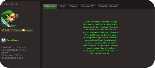
Link had humble beginnings as a boy that lived in the forest with the Kokiri. Known as the boy without a fairy, Link led a simple life until one day, the dying Guardian of the forest, the Deku Tree, set him upon a Quest to save the Kingdom of Hyrule from darkness. Arming himself with the elemental powers of Hyrule and the legendary Master Sword, Link journeyed through time to the Dark Era of Hyrule to challenge the evil Ganondorf and save his Kingdom from evil.
Shoving this into the Description box and hitting save will generate something like this.
You might notice that this looks like crap. And it does! however, we can very easily fix that with the power of just three simple BBC tags. Those being [center], [color], and [sub]. plus a little something extra I’ll explain in a moment. Let’s add those in like so.
[center][color=green][sub]Link had humble beginnings as a boy that lived in the forest with the Kokiri. Known as the boy without a fairy, Link led a simple life until one day, the dying Guardian of the forest, the Deku Tree, set him upon a Quest to save the Kingdom of Hyrule from darkness. Arming himself with the elemental powers of Hyrule and the legendary Master Sword, Link journeyed through time to the Dark Era of Hyrule to challenge the evil Ganondorf and save his Kingdom from evil.[/sub][/color][/center]
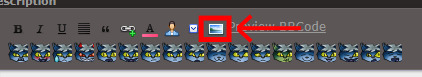
Instead of hitting save at the bottom of the profile this time, we’re going to click “Preview BBC Code” to get a look at what our coding has done.

Fancy.
But it could use a little work. When I’m making minimalist profiles, I like to make the lines of text a little shorter so it’s a little easier to read and looks nicer. Make sure each line of text is about the same length as the previous (minus any BBC tags)
[eicon]blank[/eicon]
[center][color=green][sub]Link had humble beginnings as a boy
that lived in the forest with the Kokiri.
Known as the boy without a fairy, Link
led a simple life until one day, the
dying Guardian of the forest, the Deku
Tree, set him upon a Quest to save
the Kingdom of Hyrule from darkness.
Arming himself with the elemental
powers of Hyrule and the legendary
Master Sword, Link journeyed through
time to the Dark Era of Hyrule to
challenge the evil Ganondorf and save
his Kingdom from evil.[/sub][/color][/center]
[eicon]blank[/eicon]
You’ll also notice that I placed an eicon tag with a “blank” body. Eicons are essentially image macros that can be used all over the site. Using the blank one here is a good way to put a block of empty space on the top and bottom so the text isn’t too crowded by the frame of the description box. Another couple to keep in mind are [eicon]under construction[/eicon] or [eicon]WIP[/eicon] if you want to save your work now and get right to chatting and exploring the site. This signifies that you’re still working on your profile and more will be added later. You can create your own eicons by going to Account > Icon gallery. Keep in mind each eicon must have a unique name across all users. Inputting this into the description and checking how it looks in the preview, we end up getting something that looks like this:
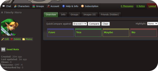
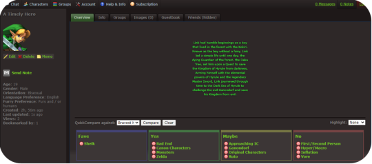
Looks like we got a bookmark while we were setting the profile up. That means someone saw us while browsing new characters and decided they want to keep an eye on our profile and are likely interested in RPing! If you like, you can disable bookmarks per character in the character editor under settings. Generally speaking though, bookmarks are your friend and it’s how people will find you to RP later.
Optionally if you want to add an inline, just upload an image of your choice in Account > Inline Images. You can then add it in the character editor using this button.
This isn’t a tutorial for creating inlines, but a general rule is to make sure it’s sized well, and transparent images tend to look better than non-transparent images.
Step Five: Character Details
Opening the Character Editor once more, a couple basic things should be filled out. We will take this section by section.
Settings: Some general tweaks to change and edit. Personally, I like to turn my timezone off, and besides that, I like to have my Guestbook and Bookmarks turned on as well, but all of these settings are up to you. A big one a I suggest turning on is “Custom Kinks Sort First.” This will come up later but it’s good to turn it on.
Character List: For now, you can ignore this part. You can use this to have certain characters grouped together and will show up in the sidebars of these characters. I haven’t run into any limits for how many character lists you can have, but keep in mind a character can only belong to one list at a time.
Images: If you have any images you want to upload, this is the place to do it. Headcanons of body types, additional art you’ve drawn or found, can be added here. You can add descriptions to each image that will appear when a user hovers over the image. Keep in mind, again, that usage of fan art is a grey area on F-List. It’s not an image posting site, but some artists do not want their art reposted at all.
Profile Info: You don’t need to fill out every single detail here. Bits that aren’t filled in will just not appear on your profile. It’s a good idea to fill out your gender, and in many cases, your orientation. Both are under General Details. Filling out RPing preferences is also a good idea. It’ll keep people from approaching you IC using first person posts if that’s not your thing.
Step Six: Kinks and Custom Kinks
This is probably one of the most overwhelming parts of the process. My first tip: Ignore the Kink section for now. Instead, skip ahead to the Custom Kink section.
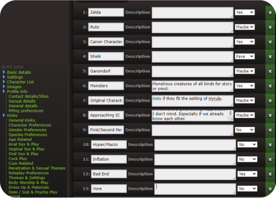
Custom Kinks are a good way to tell people what you really want. Click the Add +1 Custom Kink button to make a new custom kink. You can fill out the basic title of the kink, and a description. Or if you prefer to leave the description blank, just press the spacebar. Select what category you want the kink to appear in (Fave, Yes, Maybe, No.) Try to avoid using inflammatory language against different races, genders, identities, and don’t kinkshame. This is a site based primarily around finding rpers that have the same interests and kinks that you do. Save the profile when you’re done and we’ve got something like this.
And really, you can probably start roleplaying like this. Maybe add a couple of images, and tweak a few things. So if you like, skip to the next step. But for now, I’ll go over the kink list.
The most important think to remember is you don’t have to add every single kink to your profile. Try to select the most relevant things, and avoid redundancies.
For example, I’m not interested in Vore of any kind. So I can put the kinks Vore (Being Predator) and Vore (Being Prey) Into my No category. Or, if I want to make it even more simplified, I can add a custom Vore kink and put that in my No category. Likewise, if I don’t want to do any sex driven play, I can probably go ahead and just put sex driven there and ignore most of the kink list. Kinks that are not relevant such as Vaginal Sex (Receiving) on a cis male can also be ignored. Kinks are broken up into sections, and while it is a lot, just take your time, go through it sensibly, and take a break if you want to. Remember you don’t have to add every single one to your profile. This will ultimately be easier on you and make your profile easier to read.
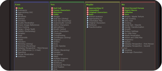
After a bit of editing, this is what my kink list ends up looking like:
You can try exploring the Subfetish editor but it’s a little confusing to navigate and isn’t very necessary. And now, your profile is done!
Step Six: Using F-Chat
So now that we have a profile set up, it’s time to find some partners. Regardless of what way you want to connect, if you prefer script or para, the main place you’re going to find RP is through F-Chat. There is currently both a desktop and mobile client. if you select Chat you’ll see the option for both, and clicking on them will take you to instructions on how to set those up. We will however be using the Browser client in this example. Go ahead and select F-Chat 3.0.
You will be taken to a landing page with a drop down of your characters, with the first character you created selected as the default. (You can change your default character in your account settings.) You can have up to three characters online at once. Keep in mind this goes by IP address, so if you have a roommate that also uses F-List, those will count towards your total number of online characters. If this becomes a problem for you, just use a virtual machine or connect to the internet via a different method, such as with data. (F-List is not that much of a data drain.)
Here is what you’ll see when you open F-Chat. You’ll see I already have people in my friends list and my bookmarks (that I’ve blurred out for courtesy.) These will appear the same on all the characters you sign in as. I will be notified whenever one of my friends signs in or sets a status. You can set these notifications to show only on the console if you’d like to in the settings. Let’s set a status first.
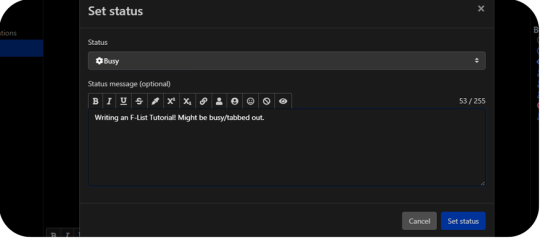
Here, you have the options of selecting from the default Online status to Looking, Away, Busy, and Do Not Disturb. These all do what you’d expect, with Do Not Disturb turning off the sound that would play when you get notifications from personal messages or pings.
The Status Message is an optional addition, and it’s great for if you’re looking for specific things or want your friends and bookmarks to know what you’re doing. Be careful not to post anything that breaks F-Lists code of conduct. F-List does have an aggregate of every status you ever posted logged on their server, so throwing a temper tantrum and posting something inappropriate and then taking it back later might still get you in trouble.
While the Character Search Option is available to you, I’ve personally never found it very effective. You can search users by kinks, but keep in mind it doesn’t search by gender or orientation, or what species or even if they’re canon or original. Instead, we’ll go right to the settings tab.
General: Just your general settings. You have a few options here to tweak and while most of it is personal preference, I’ll highlight a few to keep in mind.
Disallowed BBC Code Tag: good for if you find a particular colour particularly garish as a text colour, or if you find an eicon that you no longer want to see anymore.
Enter Sends Messages: I have this set to off so I can avoid accidentally sending a message for when I post. When this is enabled, just press the send button on screen to send messages. Otherwise, if you want to linebreak in one post, just press Shift + Enter.
Animate eicons: If you’re running a slow computer, or have a slow connection, turn this to off. Eicons are used as memes a lot in F-Chat, and some of them can get a little ridiculous. (Someone has compressed the entire Shrek movie into an eicon and uploaded to the site in very poor quality for example.) There can also be bright flashing colours or even nsfw images. In general these eicons are all 100x100 pixels in size, but some users like to tile them together to create bigger images so it can sometimes get out of hand. This is something up to personal preference, and while I have Animate eicons turned on, I can see why some people wouldn’t like it.
Idle Timer: If you are the kind of person that walks away from your computer without changing your status, or you have fallen asleep with F-Chat open, it’s good to set this to a reasonable time. If you’re in Online or Looking, after you’ve been inactive for the depicted number of seconds, your status will be set to Idle. This is so other users know that you’re not ignoring them if you don’t respond to their messages. A downside to this is if you’re tabbed out or multitasking, it’ll set you to idle when you may not intend it to and going back to the window switches you to Online again. It can be a little spammy if you’re constantly switching between Online and Idle.
Font Size: If you find F-Chat’s font too big or too small, you can edit that here.
Notifications: While this section is pretty self explanatory, I’d like to specifically go over the Custom Highlight Notify Words.
Now, because each profile has to have a unique name, you might want to select additional pings. For example I might want to add Link,Zelda,Hyrule,Hero,Hero of Time to my list. Everything is comma seperated and not case sensitive. There are a few things to keep in mind.
Common word pings: If I add Link to my list of pings, I might get pinged whenever someone talks about a url link, or a chain link, or any other common use of the word link. It therefore might be better to not use the word. If you have a profile name that is a common word, it might be better to also uncheck the option for Notify Messages Containing your name.
Similar Profiles: If there’s another Link in chat, then I will be notified everytime someone refers to him by name as well. This is less of a problem on more niche characters, but it’s something to keep in mind! You can set pings by room, so perhaps a solution to this is using Link as a highlight word in the Canon Characters room, but not using it as a highlight word in the Nintendo room. More about how to do that later.
Hidden Users: Pretty self explanatory once click over. If you keep seeing an ad you dislike, you can hide all advertisements from said user (re: character) going forward. Keep in mind this is not your block list.
Import: If you make two profiles and want to have these settings copied from one to the other, just log into the profile you want to import to, and select the profile you want to import from. Make sure to go back to change your pings if needed.
Lastly, we’ll be looking at the channel section.
You might be starting to be overwhelmed again, and that’s okay. There are a lot of options, but most of the time, you’ll only want to select the options that are relevant to us. Check off the list of rooms you want to open a tab for. These will begin to be added to your sidebar. the number in brackets signifies the number of users thats joined that room. By default, this list is most popular to least popular, but I personally prefer alphabetical. There may be some channels that you find inappropriate, offensive, or contentious, but your best bet is to ignore those parts of the site. It’s an Adult site that is heavily moderated by a mixture of paid and volunteer staff. Every effort is made to ensure that no real people get hurt, but it is understood that as an adult, you are responsible for curating the content that you consume. This is one of the fundamental principals that F-List is built upon.
For now, I’m going to go with Canon Characters and Canon Characters OOC from this list.
You will also notice an Open Room tab. Unlike the Official Channels which are moderated by F-List staff, Open Rooms are chat rooms created by the userbase, and moderated by the userbase. While the standard F-List code of content is applicable to all areas of the site, special rules may apply in these rooms, and you’ll find things like rooms dedicated to certain kinks, species, and fandoms. I can try searching for a few things I think might be applicable to me, such as Hyrule, Zelda, Nintendo, and Elf. Some of those get hits, and some of those don’t. I can also check them off to add them to my list. (Note that search terms have to be entered one at a time. I cannot search for multiple things at once.)
Once you’ve selected the channels and rooms you want to join, you can click and drag on the tabs to reorder them on the sidebar. If you’d like to pin a chat, You can just press the little push pin symbol, which will then turn green. (You can do this for User Messages as well.) This means when you sign out, these chats will still be there when you sign back in. Note that settings and pinned chats are device by device only, and furthermore, channels and logs will not carry over between characters.
Make sure to read the description of each room you join. There are often specific rules (such as no ooc talk in the canon characters room, and no male characters in the lesbians room.) Clicking the gear will allow you to change settings on a per-room basis.
Step Seven: Actually Finding some RP
Now, after all that effort, we’re finally ready to find some RP. You have a few options on how to do this.
You could just join a few rooms and set your status to looking with a status message on what you want, but this is considered very passive. You may get some people that reach out (As you saw, someone had bookmarked my Link less than an hour after I made the profile before logging into f-chat.) But your best bet is one of three options.
Look at the Ads: Whenever you’re in a room that allows ads, you will sometimes notice a differently coloured message fly by looking for roleplay. This is an ad. If you see one that seems to fit what you have to offer, you can right-click on their username and select “Open Conversation.” A chat window will be open under the PMs section on your sidebar. You can view this conversation like you would a channel. Keep in mind that users are not notified if you open a conversation with them, only if you send them a message.
Create an Ad: Make sure you are in a room or channel that allows ads by checking the description, you can select the ad tab in the lower right hand corner above the text input box to write an ad instead of a chat message.
Making a normal chat post saying “hey does anyone want to roleplay with me” is considered spam and could result in the mods having a word with you.
You have similar tools to what you do in the character descriptions, and clicking each one will automatically place the tags in the text box, with the eyeball being a preview and the question mark being a how to. You want your ads to stand out, but you don’t want them to be too obnoxious. Take a look at what kind of ads other people are posting to get an idea of what’s expected.
Talk to Others: And lastly, you can just play in public rooms or chat with people in ooc channels. This is a great way for others to sample what you’re like to play with and vice versa, or even just to get to know potential partners. In my general experience, you’ll have more luck finding people to play with long term in the user created Open Rooms than in the Official Channels, but ever case is different. There are a vast number of styles, methods of RP, and types of partners you can find.
That’s basically the ins and outs of F-List! The more you’ll use it, the more you’ll understand how it works and the social etiquette on the platform. Like many sites, it certainly has it’s share of dark corners and flaws, but all in all it’s a pretty good website to find people to play with! Have fun!
#cherp#mxrp#rp#tumblr rp#flist#no tea no shade for tagging other RP sites#just giving people more options and I've been asked about it a few times
60 notes
·
View notes
Note
I also have... thoughts on the new Mirai game. Don’t get me wrong — I played it for 6 hrs straight w/o realizing bc it was so fun and I’ve been waiting for it to come out in English we since they made the announcement for the Japanese version. 💖 But Project Mirai DX’ on 3DS controls are waaaay more comfortable for me and seem more in sync With the right and left hand?? I don’t really know how to explain... What are your thoughts on it??
I will NEVER stop my promoing for Project Mirai DX. I want Project Diva to be MORE like Project Mirai. I genuinely wanted a new, amazing installment of Project Mirai on the Switch as opposed this Diva game. This is my unpopular take and I will not repent for it. Also, I hope you realize what a wall of text you unleashed by asking for my thoughts.
About Mirai vs Diva in general:
The use of the track that notes were placed on in Project Mirai was so good and I really miss it going into Diva. The random placement of upcoming notes in Diva, especially with busy background pvs or fast notes, leaves me scrambling sometimes. Not to mention the way the track would be incorporated as almost another level to the PV in some songs, like it tracing rabbit shapes in Lots of Laugh or making liberal use of the rainbow colored hold bonuses in Reverse Rainbow. It really felt like an extra level of care from the creators.
Also the timing is so much harder in Diva oh my god. Project Diva is so demanding. Janitor Mod enjoyed the few songs that had an Extreme Mode chart in Mirai, but is struggling with Hard Mode in Diva. (Edit: I found out recently that her issue is most likely caused by lag from the joy-cons while I had the Switch hooked up to the TV. There’s a way to calibrate your lag, although I wish the game would have told you up front about the option kinda like Taiko no Tatsujin does. It really seems either playing in handheld mode or with a wired procontroller is the most recommended.) As someone who objectively sucks at rhythm games, it’s been kicking my butt.
I loved the level of customization in the outfits. The outfit swaps were not limited by character, only by gender. I think this would be appreciated a lot be people who’s favorite character is less loved in the outfit department too, it really expands the outfit selection when Meiko can wear the other girls’ clothes and whatnot. Not to mention that some outfits have recolorable sections that allowed you to really tie more disparate designs together.
Minor and inconsequential note in the grand scheme of things, Mirai felt like a bigger game with all of the tiny random things you could do, like the mini games and music editor and the buddy system. It probably doesn’t matter to people more invested in core rhythm gameplay, but even when I wasn’t in the headspace for rhythm games (or in a physical space that would prevent uninterrupted timed play), I still had other options to be engaged with. I miss that in Megamix.
About Megamix specifically:
Most of the issues I have are minor. This is my first Project Diva game, and as such, it doesn’t bother me in particular that its basically a simple rehash of Future Tone. I never had any of the previous games to get bummed that this is the same thing. Obviously, your mileage may vary. From what I’ve heard from others: don’t bother if you already have Future Tone really.
I’m also kinda peeved that there’s no physical English release, not even a limited preorder run. I’m a huge proponent of physical media for a few reasons, but come on. Previous English Diva series got physical releases.
I really dislike the art direction of the actual characters. I prefered the look of the models from Diva F and Diva X more than these. I just like the less exaggerated anatomy.
And yeah, the shader sucks. I tried not to hate it, but it does just look like someone was abusing the saturation sliders in a bad photoshop. It’s too bright and washes away already subtle facial features, almost always leaving them noseless. Characters look especially out of place in any stage that isn’t entirely abstract lights or shapes, as the backgrounds seem to use a different shader? If they really wanted to use the toon shader for the whole game, I wish at least they would have used the Diva F models. I think the simpler style of those models would have fit better at least.
Also, why no new modules besides Catch the Wave?? I know that the ones that stick to 2D pvs are by choice of the producer, but what about the 3D pvs? Seriously why couldn’t they have added Magical Mirai 2016 in for 39 Music?? They already have the design for it. No new design for Alien Alien, nothing for Teo or Hibana. And Roki just reuses the modules that are for Kodoku no Hate.
I personally don’t find any of the the DLC packs as enticing enough to actually buy. None of them have more than one or two songs I want. This will obviously vary on your taste.
I can’t wait for touch play mode to be added to the English version, I really preferred tap mode in Mirai so I’m was really pleasantly surprised to hear it would be added to Megamix.
That said, the menus are clean and mostly user-friendly with the exception of a few confusing names. The game play is fun, the load times are quick, and the song choices are safe but fine. Very Miku heavy, but that’s what I like. The shader means Future Tone’s unholy lighting bloom issue is reeled in (even it just looks bad in a new and different way). I’m glad the hairstyles are interchangeable even if I miss Mirai’s outft swaps not being character locked. The important points of it, you know, being a rhythm game are good. I’m just forever, and probably annoyingly, bogged down in aesthetics.
Post Touch Play addition edit: The system for choosing Touch Play vs button mode, quite frankly I’m sorry, fucking sucks. Having it be buried under layers of menus instead of a separate category like Mix Mode is infuriating. Just have the option come up along with the other two in the selection page. If you didn’t know it was an option, you would never find Touch Play. You would never even know about this whole game mode. As for how the mode actually plays, it’s fine. It feels really crowded on the bottom of the screen, but I’m not sure how else I would have done it? I don’t actually know which I prefer, button or touch screen.
I hope that if you’ve never played a Project Diva game before due to not having a Playstation, that you can get Megamix, I certainly don’t regret the purchase.
#Anonymous#haha sorry for the long post but you asked and i love to talk#not a module#answers#mikumod
84 notes
·
View notes
Text
All About RP Icons For Beginners by Birdy
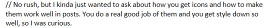

Hi OP, I’m not sure how experienced you are with all the nonsense surrounding the making and using of RP icons, so I’m gonna come at it as though you don’t have any experience with it at all and I’m sorry if that’s too simplified for you, but also if I’m gonna write many paragraphs about one topic I may as well make it accessible for as many people as possible ¯\_(ツ)_/¯
This post goes into what tools are out there for the popular methods of finding/making RP icons in the first half and my personal methodology for choosing and using them in my RP for the second half. This is a very surface level answer to the question and is not meant to be an in depth tutorial for the more labor intensive aspects of the process, but if you guys want more information and can’t find it elsewhere, please ask and I'll know what I should be talking about next.
Also I’m also contractually obligated to mention to the masses that I do take commissions both for the drawing of RP icons and the service of capping, cutting, recoloring, and framing canon icons. Sometimes I even post batches of canon character icons for free on this blog so like,,,,, hit me up if you want. But!! You don’t need me, you can absolutely do all of it yourself!! I go into the broad strokes below.
Question 1: “How do you get icons?”
This is kind of a broad question and the answer depends on what your needs are. The right answer for you is gonna live in one of two camps
Find some that already exist that are free to use
Make them yourself / commission somebody else to make them for you.
What you'll choose is gonna depend a lot on your character first and foremost. The big determining factor in most cases is whether or not the face you want has been in anything you can take pictures of.
If you have a canon character who exists in visible media--
--you're in luck! The chances of you finding some resources that exist already is higher when you have a canon character who is in at least a few pieces of media. OP asked about Pearl from Steven Universe, and she's a great example of a character with a lot of resources. Searching for rp icons of a popular character will often yield packs of icons on Tumblr, Dreamwidth, Livejournal, etc. Most of these will be completely free to use or have very reasonable conditions for use (like credit the person who made them for example.) It's often a good first step to see what preexisting resources are available to you even if you still plan on making your own icons.
If you have an OC or a character that's not all that popular--
--you're gonna fall into the second camp. If you want icons, you have to have them made. So what are your options?
Help! My character appears in no media! What are my options?
If your character appears in no media you're in a tough spot. Different people approach this problem in different ways.
Face Claims
One option you have is to choose a face claim to represent your character. In roleplay a face claim or ‘FC’ is a person or character whose appearance you use for the physical description of your character. I personally am not big on doing this, I prefer drawn icons and I tend to RP as animated characters, but some people really like using celebrities and stuff to represent their characters. When I was playing Angus McDonald he hadn't appeared in any visual media yet, so I sometimes used Bryce Clyde Jenkins as the face claim for certain types of threads.
If you're somebody who likes to use face claims there are loads of resources out there for finding the perfect one, including here on tumblr. Try searching up RP Faceclaim Directory and playing around with some of the ones that pop up.
DIY RP Icons
The other option you have is to create those icons from scratch. Draw them yourself based on icons you like or commission an artist to draw some for you. If you can't draw yourself, I've seen some people get really creative with this. Some people create their character in the sims, dollmakers, or their favorite RPG and then take screenshots of that to use for icons. There's also no law that says every icon you use has to be your character's face. When I was writing a trashy mermaid AU I got a lot of mileage out of icons that depicted harbor and oceanic scenes with no actual faces. Get creative, go nuts, have fun.
Icons Aren’t That Important
The other thing to remember that icons are not a must in many RP circles. It's perfectly possible to have a great time and write cool stuff without any pictures at all. Depending on your platform of choice there are probably also other interesting ways you can make your posts unique to you by formatting the text or using symbols or emojis or otherwise denoting your personal style in text.
Help! My character appears in lots of media! How do I make icons?
Again, there are a million and one answers to this question and it really depends on what tools are available to you and what your preferences are. This section is not a tutorial but it will outline some of the options you can look into.
The icon making process is typically in 2 stages-- stage 1: get all your images of your character, and stage 2: edit all of those images into icons.
If you have access to the source material, any version of Photoshop, and software that automates the collection screencaps from video (KM Player, VLC, etc) you're pretty much gucci. You're gonna have no problem getting loads of nice icons in a reasonably short amount of time and there are a million different tutorials on how to use those things whichever way you prefer.
If you don't have access to those things you still have options.
You can still screencap things manually, and you can screencap in batches by holding down the windows key and pressing PrtSc any time you want to save an image. They should be saving to >pictures>screenshots unless you’ve set things up differently. It’s a good way to take a lot of screenshots without stopping in between.
( EDIT / UPDATE: to say that if you use automation for taking screencaps remember to turn that shit off when you’re not using because it oh mylanta it WILL continue to take images without you realizing. Figured out where all my disk space has been going with this rookie mistake, thanks OP)

Additionally, PhotoScape X is a really great little tool for windows and mac that I've never seen anybody talk about, but I use it sometimes and it's totally free with the exception of a few paid features I’ve never once needed or wanted. This program is not as efficient as using Photoshop but it has presets for cropping images easily as well as batch editing options for some basic borders and color retouching. While it’s not as powerful as Photoshop, you can get a lot done with it reasonably quickly compared to other choices. You can also take and edit snips of anything on your screen with it, which is really really useful if you don’t have access to the video or image files you would need on your hard drive for other version of this process. The program looks like this:
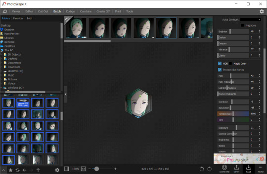
Also, not to be like a minimalist about it, but you can also just fucken use Microsoft Paint or whatever you have. Like, whatever, there’s no law. You graphics dont have to be comlpex or deep fried. Half of my icons have been made or edited in paint at some point. It wont be as fast as some of these other methods but a lot of us aren't out here making icons in batches of 100 at a time.
Anything that you can use to make smallish images of your characters face will work to make icons.
If you want more information about any of these methods of icon creation let me know and I’ll talk about them.
Question 2: “How do you make your icons ‘work’ in posts?”
I'm a little confused on what you mean by "make them work" so I'm gonna cover my bases here. I'm assuming what you're getting at is a sort of sense of cohesion in the icons I use, or having the "right" expression for the scene I'm writing. Either that or them not stretching and looking weird thanks to tumblr. I’ll get to both of those.
And before I go into my own rationale for icon choices I feel I should point out that a lot of people who aren't me do successfully manufacture cohesion out of their images by doing fun stylistic things like recoloring their images all the same way or putting cute borders and stuff around them or making them fun shapes, and that's totally something you can learn how to do if it interests you. I do this for icons commissioned by other people and I’m not against talking about how to do those things, but I don’t really bother with them for my own icons all that much. That stuff is all fun and it’s a neat thing you could get into that can make your icons all look really nice together.
BUT ANYWAY --
Since the character you asked about is Pearl, I’m going to focus on her. Nearly all of my Pearl icons are completely unedited and a lot of the credit I would have to give regarding icon quality goes to Pearl herself and the consistently good lighting that the show uses. I don’t have a huge need for editing or color retouching beyond making memes or whatever other goofy things I might be getting up to. Pearl is extremely expressive compared to other characters I have written and since she's in nearly every episode, I've managed to collect…
...oh god, that’s too many icons.
Pearl is a main character and I've been RPing as her for over 6 years now so I have a fuckload of images to choose from and I'm not gonna pretend that doesn't help when I wanna “make things work”. She gives me a lot of options.
That said, you absolutely don't need 3000 images to make a good post. The way I've collected and organized these images may be of use to you even if you dont have as many icons. I've done a lot with my setup to make finding the right icon very easy.
For starters, a minor subset of my Pearl icons are grouped by a particular defining feature. I have one large Pearly folder full of icons and then a few smaller folders inside for icons I thought worth grouping separately. For example, all icons of SUF Pearl in her new jacket are in the same folder. All icons of Pearl in short term alternate outfits are in the same folder. Anything I sourced from Attack the Light is in its own folder. I do this with anything that has a very specific use, such as writing AU content or flashbacks to specific time periods. If I can picture an icon in my head, I usually know where in my ridiculous hell collection to go to find it.
This folder was originally just for her pre-canon outfit but now all of her outfits that only appeared temporarily are in there.
Perhaps more important for the sake of cohesion is that nearly all of my icons that aren’t squirreled away in some smaller folder are loosely arranged by episode. What that means is that most of the time I have icons from the same scene right next to one another. It makes it incredibly easy to make my RP replies appear as though it's all one cohesive scene even if I use more than one icon. When you do it this way it becomes very easy to choose icons that have the same lighting or that appear to lead from one expression seamlessly into another. Exhibit A:
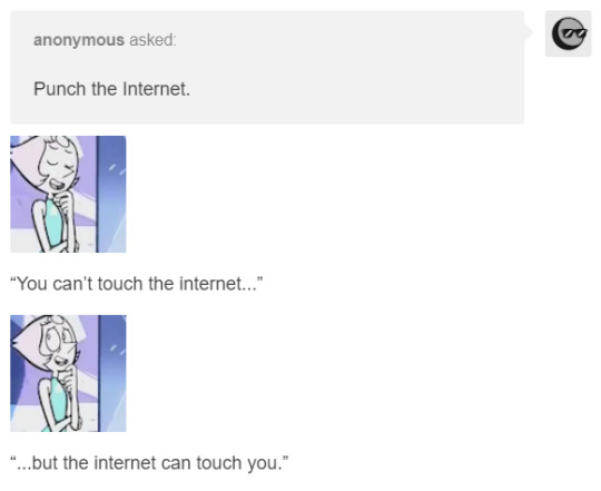
While the vast majority of my icons are numbered, I do take the time to name ones I find myself using a lot or that have particularly unique expressions. Usually I'll choose names that I'll find descriptive or easy to remember based on the context of the icon. You can have a lot of fun with that and never lose your favorites.
Also don't be afraid to lean on icons you got from weird places if you like them. The icons of Pearl from the official comics run don’t look like most of what I have. I think them being different would turn a lot of RPers off, but I use them a lot because I like the style and I almost never see other Pearl RPers using them. It either makes me stand out or it makes me tacky, one of the two, haven’t figured out which, but also I’m not stopping.

And just to reiterate, you can use icons that aren’t your character if they’re thematically relevant or vague enough to look like them. When I’m capping I’ve started saving a folder of miscellaneous environments of interests, hands, and other everyday types of scenery that appear in the thing I’m taking screencaps of.
You can use any size you want for RP icons but the most common is 100x100 or 150x150 pixels. Any smaller than that and the image gets to be difficult to read and work with in my opinion. That doesn’t stop people, of course, but I’m elderly and need glasses now, so no tiny icons for me. On that note, I rarely see RP icons larger than 300x300. Any larger than that it tends to get bulky and be in the way of other people’s comfortable internet browsing experience, especially on mobile. Of course, these are just my suggestions. What you choose will ultimately be up to you, but somewhere in that 100 to 300 px range is pretty safe.
A very tumblr specific thing to know is that any image that is wider than 300 pixels will be stretched to hell, so you probably want to keep it smaller than that.
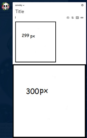
Thanks, Tumblr, I hate it!
Also, don’t be afraid to make trash images for fun if you’re so inclined. People love that, or at least I do. Not having the right icon can be fun and lead to a very silly solution. Lean into being a shitposter if that’s what you’re called to do.
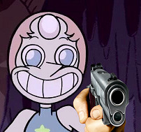


So yeah, that’s basically what my suggestions are. Collect your images in a way that helps cohesion and ease of use. Keep them a good size. Don’t be afraid to get unconventional with your choices or make memes or whatever. It’s all for a fun time.
Anyway, that’s all I can think of right now, but more info on any of this can be obtained at the price of one ask, I know it was a lot of different moving parts.
15 notes
·
View notes
Text
An Amateur’s 3D Creation Tutorial
Intro
Hi, it’s Kai Yuan, your resident 3D generalist of Noodlets Studio. I’m currently writing this while having a minor cold so I’m sniffling every 5 seconds while bopping to the range of Lady Gaga to Lorde to Conan Gray, stay healthy everyone! In order to make up for my apparent lack of dev logs, I’m going to show you how I create a little stove for Yi’s Eatery. All points made here are going to be super condensed for the sake of not running this article too long.
As with all of our tutorials, we are just amateurs having fun making games and sharing our experience as amateurs with you! :D
The Process
Step 1: Preparation
Always start with a plan in mind! I say that although I always start creating 3D assets with only 2 active brain cells half the time. Either way, you should still have a plan. This means first of all, gathering references of whatever object you want to create (even if you have a concept art to work off from) and beginning to understand your object’s form. With the stove I created, I used this particular reference image.

You can already see the similarities but these similarities help to sell the object as real. The closer the form of the object is to an actual reference in real life, the more believable it is even if rendered in a non-realistic way.
Once you have enough references and you start to slowly grasp the object you want to create, you should start pinpointing the basic shapes and forms of the object. In the example of the stove, it’s easy to notice that it has a cylindrical shape. Some objects have different components (EG: A car engine) and each component may have a different shape. It’s all about analysing your object and deepening your understanding of the object you want to create.
This preparation process doesn’t take too long for most objects, since a google search and basic shape knowledge is all you need. But taking the effort to prepare will save you a lot of blank staring at your 3D software.
Step 2: Modelling
Here’s where the nitty gritty starts to happen. I will preface this by saying that I frankly can’t show you the full process because you’d be reading this till the next day. We have a Youtube video on our Noodlets Studio channel where I modelled the stove on a livestream if you’re interested. In this article, I will just mainly share the important concepts for 3D modelling using the example of the stove.
The creation of all 3D objects follows the simple process of starting with big shapes and then slowly “zooming in” and editing the 3D object with increasing detail.

The above picture illustrates this concept of going from big forms to small details. This is where the knowledge from your preparation comes in. It really helps during the start when you have to block in your big forms. In the example of the stove, I start from a single cylinder and slowly build out the shape as shown in the picture above.
A few functions I like to use (in Maya) when adding in details are the “Bevel” function and the “Insert Edge Loop/Multi-cut” function.
These functions simply revolve around adding more edges/points to manipulate, which is the basis of how you add more details in your 3D object. More points = more details.
When you are adding details to your objects, you have to be mindful you are not adding too much details. Not every corner needs to be beveled and you certainly do not need to unnecessarily cut edges if you are not going to move/extrude them. More points = more details BUT also = more computational power used to render 3D objects. The art style of your game also determines how you model your 3D objects, some require low polygon counts to achieve a cartoon look, some require higher polygon counts to achieve a realistic look. Although, most of us generally prefer the former because it’s easier to do.
Step 3: Texturing
The next step after modelling your object is to UV unwrap it. UV unwrapping is the process of creating a UV map where a 2D image can be projected onto the 3D object’s surface.

In the example above, all the faces of the cube were laid out on a 2D plane, which then a texture can be projected onto the UV map and have it reflected on the 3D cube. This is merely the simplest example of a UV map, most UV maps are more complex and require a strong understanding of shapes. For example, this is the UV map for our stove that we created.

Most 3D software allow you to do UV unwrapping of your 3D models, although, you might want to look up a few dedicated tutorials first before jumping into it. This part of 3D modelling is easily one of the most frustrating and difficult parts to understand as there is 0 creativity involved, just pure brain power. :(
Once your 3D model is fully unwrapped, now you want to actually texture it. The simplest way of doing this is to export your UV map into Photoshop or any painting software of your choice and simply paint on it. However, there are a few caveats to take note of. You cannot physically see how your painting affects your 3D model without exporting the texture out into your 3D software. Thus, editing your texture map will be a long arduous process of importing and re-exporting.
In order to circumvent this, we can use dedicated 3D texturing software like Substance Painter which lets you see how your texture is reflected on the model itself. It has the further advantage of allowing you to further enhance your texture with some neat tricks. With a normal map, it will create the illusion of details on a flat surface.
These maps can actually be hand painted in Photoshop, but everything is packaged together in a 3D texturing software like Substance Painter so it’s easier to implement all these details.
Step 4: Finalising
Once you got your textures ready, now it’s time to bring it all together! If you are creating a game, you would bring this into your game engine like I did. Or you could also keep it in your 3D software and render it, but that’s a whole other bag of worms.
For the video you saw on our socials, I just slammed a quick backdrop and gave it some lighting to bring out the details of the stove and the final result is as you have seen before.
That’s about it for my tutorial. I hope I have given you an insight into how 3D game objects are created, even if you are just a random passerby. For actual 3D artists out there, hopefully your eyes didn’t burn too much, I’m still trying to get better and I hope to create better 3D models in the future.
Thanks for reading this! My cold has slightly healed while writing this article, remember to stay safe out there! :D
-Kai Yuan
2 notes
·
View notes
Text
PSA: The Problem With RPF
This is gonna be a long post, so buckle up kiddos.
As I logged on today to a private message, I assumed I got one of two different messages: a) a fic prompt on my kink blog (hi, btw, you are here) or b) a thirst message to my non-kink blog (hi, you are not here, but this is actually relevant to this whole thing).
Boy was I surprised to find neither, but instead a message from an empty blog inquiring about rpf (or real person fiction if you’re not in the know), my stance, among other things. Thankfully, the person in question was very respectful in their inquiries, which is a breath of fresh air, but I thought I’d write this up just because I know that these issues aren’t something we ever talk about and a large reason why they continue to be a problem today.
Firstly, a large issue with rpf is the lack of consent. It’s not just a matter of people writing pedo shit and kids not being able to consent. That shit is unacceptable regardless of rpf or non-rpf. Don’t lewd kids, don’t kink kids, don’t do fucked up adult shit with kids. I don’t care if they’re real, fake, ocs, whatever. Stop it. It’s one thing if you’re underage and you’re fantasizing about people your age, but like, this is largely an issue with older people thinking “no victim, no harm” and it’s not okay.
Adults can consent, but being a public figure does not mean they consent. Signing their name on a contract does not give the world consent to do as they wish with their personhood. Ever heard of libel, defamation, slander? These are generally not things that you’re gonna be hearing about because of your RPF unless you MEGA fuck up in the most spectacular of ways, but I mention them as a way of saying we as people, famous or not, have ways of protecting ourselves against people saying shit about us that we’re not okay with. See also, Harassment suits literally anywhere.
Does this mean that RPF is suddenly okay if your fave comes out and says (verbally, it has to be verbally cause we all know how to use photoshop to edit silly sign pictures) that they consent to their self being put into sexual/non-sexual fics/art/ect? Sure! I mean, go off, if they cool with it then go. But the likelihood of that happening is slim to none unless their image already includes that sort of thing. Even then, it’s not likely.
Celebs have to package their selves in a certain way. When YOU are your greatest asset, there’s a certain way your are styled to appeal and stand out, so that you both conform to a certain standard, but also have your own niche to keep you standing out. There are very few exceptions to the rule, and those exceptions tend to be so niche-heavy that they draw people in out of sheer curiosity. But that being said, it’s very likely your fave would never say “hey, sure, I want you all to write the dirtiest, raunchiest, most sexual shit about me” because, well, a lot of legal fallout can happen. Anything that comes of the stuff created they’re responsible for.
A good example, since this was a topic of conversation, would be BTS or anyone with a large amount of underaged fans. It’s pretty much known what teenyboppers are reading online or writing online. Trust, I was one too. Fanfic is the safest way to explore your identity, likes, ect. I get that. You’re also, as a teenager, too young to be consuming the things you’re producing when it comes to that kind of content. And for BTS to come out and give the okay, it’d be the same as them telling (and easily spun as encouraging) minors to be creating sexual content of them (and in many cases with that minor).
As you can imagine, that would pretty much ruin their image.
On another hand, people like youtubers, cosplayers, influencers, ect...these every day people who may not have the resources of everyone else and are pretty much self-made...rpf can be a great source of issues in their life. I was told about a youtuber who was reluctant to come out because of all the rpf about him and his friend. As many of you know, I’m a cosplayer. The amount of anxiety I have about doing events because people like to be very vocal about the things they’d like to do to me? It’s uncomfortable as fuck.
I’m not even a celebrity, not even close to it. I’ve guested at a convention, and that’s about it. Yet, I still get that kind of attention. Now imagine someone with literal millions of fans...
And it’s probably good for you to turn it on yourself. How would you like to have a stranger writing this stuff about you? They could be literally anyone, any age, anywhere, fantasizing and writing stuff with your actual name, and any time you were googled, it was popping up. Your parents, your eventual kids, your job prospects. They look you up and all they find are these layers of nsfw stuff about you. Your job may not want it around (especially if you’re trying to be a teacher or work with kids in any way). Your parents would be appalled, your kids would be disgusted and subjected to shit you don’t want them to see.
So when you’re seeing people, and in this case the emeto community, being very anti-rpf, think about these things. It’s not an anti-kink thing. It’s just literally a human decency thing.
74 notes
·
View notes
Note
Hello! Could you share some psds, our tips etc that you use to edit? :0 Thanks in advance!
hi!! i’d be happy to share some tips!! this might be a bit long, i think i went a bit overboard…… i hope it helps a bit though… !!! also im assuming you have access to a program that can open psd files. and i use photoshop so i’m not sure this will be very helpful unless you have access to it or a program with similar capabilities..
i’ve made up a few examples (using the so what mv bc i just edited that) of how i usually go about editing, you can find the file here but i’ll explain a bit here as well!
0 : psd & general stuff
i feel kinda weird about this but i’ve included my psd in the attached file... if you’re going to use it i dont mind but please don’t say that you made it yourself, and a credit would be nice but i guess it’s not strictly necessary.
first of all, i pretty much always use the same psd with very minor adjustments. i do this to try to maintain a similar look to all of my edits & because i like this psd (i’ve been evolving it with minor adjustments every so often for years…). i always edit below the psd (as in the psd is applied over all the layers of my editing) and i usually edit with the psd on (i used to edit and then put the psd on after and that took so much longer because i couldnt see how the psd was affecting the way the image looked as i was working..)
this is basically how all of the psd files for my graphics look (usually with more descriptive names rather than numbers though), where each of the numbered groups is a graphic panel...

1 : colour correction
i basically start off by trying to normalise(?) the image as much as possible (trying to return the colours to what they would be naturally, without colour correction/filtering…)
first i use curves!!! curves are a lifesaver for me. most images/screencaps will have some kind of colour correction / filtering, i use curves to (somewhat) remove those effects. if you go here, i use the method described as “remove colour cast using auto colour” (except i basically ignore the steps 4/5)! sometimes this works, sometimes it doesnt… if the result isnt quite right i lower the opacity on the curves layer until it looks right to my eye.
if the image is still too bright/dark i add another curves layer with auto set to enhance brightness and contrast! and i again use opacity to make this look more natural!
if the image is still looking unnatural (usually this occurs on especially dark images, and the problem areas are usually on faces…) i use colour fill layers set to soft light or colour balance layers to adjust the colours until the image looks more natural? you can see this in group 8. yves face has a blue discolouration on it (if you untick the colour fill & balance layers you should see what im talking about), to counteract this i added a yellow/red layer and set it to soft light & then added a colour balance layer to make the image a bit more yellow/green. overall the image doesnt look exactly natural, but the colours are more smooth and i’d probably lean into the yellow/green tinge if i was making a graphic with this image!
2 : selecting subjects
there are so so so many ways to extract people or objects from images. i vary the method i use depending on the image in question and the effect im going for. i’m not going to explain every method because you can google “how to cut out an image in photoshop” and get some pretty good tutorials on how to do it in lots of different ways.
recently i’ve been using “select subject” (described here). you’ll likely have to clean up the selection using other tools such as lasso & selection tools, and it helps if you cut out a smaller square/area around the subject before trying to use the select subject tool. theres an example of this in group 9.
another method i use is selecting a range of colours from an image using “colour range” (described here). i use this to both change colours in an image and to remove backgrounds that are of a (relatively) uniform colour. you can see an example of this in group 10, i isolated the fire from the dark background by selecting the shadows & then inverting the selection but because olivia hye was also quite dark i had to select her separately.
theres no real easy or quick way to cut out things, it takes time and effort if you want it to look neat. but it really depends on how you want it to look and basically just practicing is the most important thing… over time it will get more straightforward and you will understand how to cut out different things depending on the image..
3 : colours & textures
probably my favourite part of editing! the fun bit!!
i’m not going to explain much of this right now bc i’m exhausted & i’m not sure how detailed this should be. but if you have specific questions i’ll be happy to try to answer them!!
anyway here are some basic notes on my editing style:
if i’m editing a music video i try to use other caps as textures, you can see this in groups 11, 14 & 15.
i like to layer different caps as seen in group 12
i use colour fill layers set to different blending modes (i mainly use soft light, color/hue, screen and multiply) as seen in basically all of the examples
i havent really put in any examples of this here but i use selective colour & hue/saturation adjustment layers to change/enhance specific colours
i have this one texture that i put on basically all of my edits, i’m not sure why but i like the way it looks... its in the “PSD + TXT” folder and its set to soft light & i put it on top of the psd bc otherwise the psd messes with the smoothness of the texture
(fyi,,, i shrunk the image size just so the file size wouldnt be too big and so the sitting kimlip is bigger than the cap it came from bc of that; the mv was in 4k so the caps were HUGE)
4 : other tips/notes......?
don’t get discouraged if you find it difficult at first
i’ve been editing for years and i’m still not that great and i find it hard sometimes but i do it for fun. i make probably 3 times as many things as i end up posting because i enjoy it and because i use it as an artistic outlet.
i hope someone found this useful? i think i went way overboard but i thought it was better to be thorough !! anyway i hope you have fun editing ! its always great to have more creators in the tumblr community!
8 notes
·
View notes
Last Seen Blogs

christianqueerfanboy
BlueDemiboy

bi-and-cry
Im Just Trash

partycentre2596
Party Centre Supplies

feahroa
His

cheztamitam
Chez Tamitam