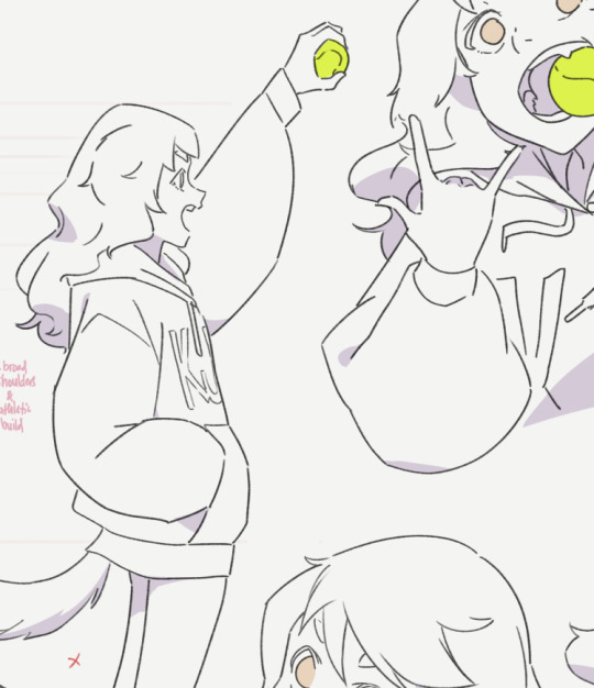
#I was just testing out a different brush to switch lineart to and so you guys get this yay yahoo yippie
Explore tagged Tumblr posts
Visit Tumblr Blog
Explore Tumblr blogs with no restrictions, modern design and the best experience.
Last Seen Tumblr Blogs


Fun Fact
Tumblr posted its first advertisements in May 2012 and subsequently earned $13M in revenue.
Text

Wow Glindas so smaaaart she thinks in her sleep
Some extra bits below:
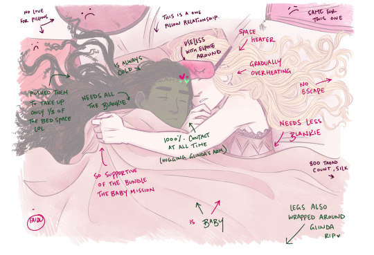
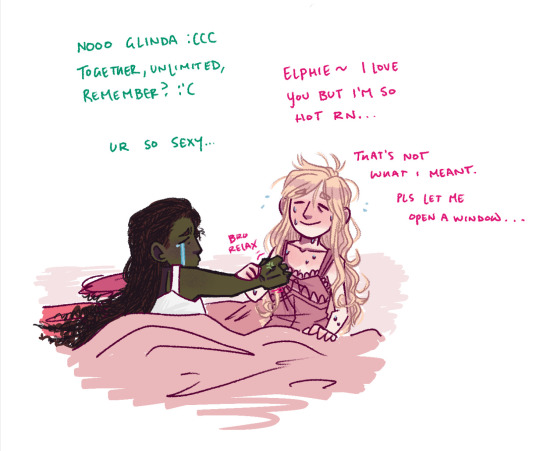
#fooze#wicked fanart#wicked the movie#wicked the musical#wicked#gelphie#glinda upland#elphaba thropp#they’re stupid your honor#I was just testing out a different brush to switch lineart to and so you guys get this yay yahoo yippie#I know Glindas the silly™️ one but miss me with that forever serious elphaba she’s also a goober#these two are a married couple idc idc#I’m kidding I do care#it’s just me making a joke out of a hc that elphies the cold one and Glindas the warm one that’s all#Glindas literal sunlight she’s gonna harness the heat of the sun too#once Elphaba got to share Glindas bed she basically moved into it lmao
3K notes
·
View notes
Note
do you have any tips for thin (anime-style) lineart? I always tend to end up with much thicker lines unintentionally X-x
It depends a lot on what exactly you’d like to achieve, but my biggest recommendation would be to change brushes if your lines are naturally coming out too thick. Not just because of brush size, but because the kind of brush you use will change how you line things, technique-wise.
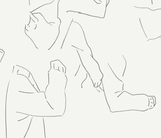
As an example I’ve tried lining a sketch using two different brushes here:
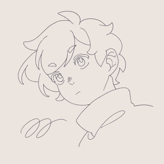
Though they’re both from the same sketch, in the first I used a thin brush with high stablization and almost no pressure sensitivity. As a result, I’m forced to line slightly slower, and it looks slightly stiff but achieves the sort of clean anime look you usually expect to see— almost no line breaks! This is the standard for anime I think because you have to have clean and closed line boundaries so that coloring and shading can go quickly.
On the other hand, on the right, I’ve used one I’m a bit more accustomed to, a round textured brush with a lot of pressure sensitivity. It’s also got lower stabilization, meaning I work quicker, my strokes are a lot more spontaneous, and you see a lot more natural variation in line width. That’s what I mean also by it depends on what you want to achieve— though this is also an anime style you wouldn’t find it as a screenshot anywhere because that line width variance would probably look really inconsistent in animation.
I als only switched to this round brush relatively recently, about half a year ago now??? Previously most of my lineart was done with a rectangular brush which also tended to yield thicker lineart than expected.
I would suggest playing around with different brush shapes and settings, especially in stabilization and pressure sensitivity, since I think those are often what affects my drawing style the most! You can do a similar exercise to this and try lining the same sketch multiple times with different brushes to test which feels best for you. Hope this helps!
102 notes
·
View notes
Text
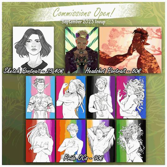
I'm opening a handful of small commission slots o.o Let's see if I still know how this works, it's been a while! xD
No but for real, send me a DM on tumblr or Discord (if we're in contact there already) if you're interested in a portrait of 1 character in any of the types and styles listed above (Sketch, Headshot fully rendered, Pride OC half-body)! This is going to be a "test round" to see if my old prices can still keep up with the risen costs of living here since the last time I did these. So, this might be the last time I'm offering stuff for the prices listed and may switch to a different price model next time around, depending on my findings XD
For the Sketch Portrait and Headshot Portrait you can choose two cel-shading styles:

Photoshop - just a style example, I do these in Photoshop with a clean, fine lineart brush, so the lines are gonna be very crisp and sharp.

Procreate - just a style example, I work in Procreate with a textured brush that makes lines and shadows/shading a bit more sketchy or grainy-looking. Edges and details are sketchier and softer.
The Pride OCs I'm traditionally always doing in Procreate xD
This round of commission is open for OC Portraits - your own or your friends' original characters - and I'd preferrably work on Cyberpunk 2077 or DnD/tabletop characters :3 But all other fandoms I've drawn for before, as well as ones I don't know yet, are obviously welcome too! Just bear in mind my "dos and donts" and my general [Terms of Service] when contacting me for a slot. I reserve the right to refuse any commission request.
Currently I'm planning to get started working on these next week, but at the latest in September! Please do not contact me with time-sensitive requests this time around.
Thanks for sharing and I'm looking forward to hearing from you! If I don't get back in touch with you immediately, I usually do within 12 hours, depending on timezones :D Also, if you have questions about my process, turnaround times, etc. don't hesitate to reach out either or check out my (slightly dated, update in progress) commissions page: elvenbeard.tumblr.com/commissions
Status below the cut.
Commission Status: open
Slots (taken | completed): (4 | 0)
#artists on tumblr#art commissions#oc commissions#cyberpunk 2077#dnd#original characters#indie artist#small artist#queer artist#fandom commissions#open commissions#commissions#my commissions#kerry eurodyne#kerry eurodyne x v#jackie welles#male v cyberpunk#cyberpunk v
49 notes
·
View notes
Text
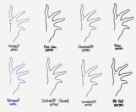
EnpitsuP Settei
I'm trying to finish up on the few demo/showcase/test uses for the EnpitsuP Settei
I figured the better way to document these brushes in a way that's actually usable for users is to just put down my thoughts as I go. So I started this separate blog.
Motivation
The Settei set was inspired by a pretty common need that comes up for me:
Sometimes, I just need a pencil or line brush that's not overly clean (has some texture and grit) and doesn't have too much variation in opacity and thickness.
What is it for?
I know some people just like the feel of this style of brush. But for me, this is particularly useful for:
animation and animation tests, where variations in thickness and opacity causes distracting flickering; A little bit of it can add to a charming look, but too much will make movements fall apart.
writing, where the evenness helps readability;
clean, uniform lineart, like simple, cute illustrations, or anime-inspired illustrations;
and just certain of styles of studies and line doodles in general.
Why have pressure response at all?
This is sort of halfway towards having a plain brush with the pressure sensitivity turned off altogether, which makes me feel uneasy when I use it because it feels a bit like an uncontrollable firehose when I just press the pen lightly.
The Settei set is designed to have a little bit of pressure response so I can at least still feel like it's obeying my stroke, but still mostly stay within a narrow and predictable range of thickness and density so that it's easy to achieve uniform lines. It's a bit more like a pen with flowy ink than a straight binary tool.
The pencil ones retain their ability to side-shade with a really low opacity. I'm actually not sure how useful this will be in most cases, or if it will adversely affect iPad users in particular. I’ll have to update it if it becomes a problem but from testing, it has been okay.
On pencils and [Compare Density]
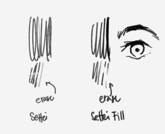
I've chosen to set the brush blend mode of the pencilly ones like Quackwell to [Compare Density] which serves the purpose of better uniformity. But that makes it not work well as an eraser (when you switch to Transparent color). Not everyone uses this but I recognize that enough people do, so I included a "Settei Fill” version of Quackwell as an example of how to make it work better for that purpose, which is just to set the brush blend mode to [Normal].
Incidentally, this is useful in cases where you may prefer to sculpt the strokes or fill-in areas with black, like parts of anime-style eyes.
Of course, it's not for everything
Like most brushes, I don't think think this is a literally-use-it-for-everything-now brush.
For sketching most things, I'm more comfortable with pencil-like brushes that do have opacity response. And I know a lot of artists who prefer to work that way too. I'd be pretty stressed out while drawing if I used the Settei brushes for the sketch stage of a big, clean drawing and I didn't know where it was supposed to go both in big chunks and in the small details.
On "standard" anime cels
The actual typical anime pipeline requires a lot of things to be predictable, efficient and easy to edit and process. So don't misunderstand this set as anything close to what is actually used to produce anime frames.
The standard practice for anime production is to use pure black, aliased/pixelated pen brushes and curve tools.
This is necessary to make it easy for different artists to work on different steps and pass it to each other for editing, correction or completion. And the aliased lines and blocks of colors are especially important for the compositing step (in a program like After Effects), where colors are adjusted, final lines are smoothed, and overlays and effects and motions are added.
One type of character sheet specifically uses the same aliased brushes to be used in their actual production to help different animators keep the same look (brush size, simplification levels, etc) when making actual frames for the animation.
Using custom textured brushes for a finished animation is a deliberate artistic direction that has to be made, and comes at a cost of increased complexity to a scaled up anime production.
If you're just one or two people making stuff for fun though, using something like the Settei set for short animations is not a problem at all.
12 notes
·
View notes
Photo

~ Tony Stark, Marvel
I tried something new! I watched a SAI tutorial on Lighting and Glow effect, and of course I had to test them out on Tony! I love the way it turned out, and I had way more fun doing this than any other drawing I’ve done (except for that jellyfish I did years back).
Oh! And I also downloaded some SAI brushes and I urge anyone using SAI to switch from the default brushes to others! The difference this new brush had on my lineart compared to the default pencil was amazing! It perfectly captured how I wanted my lines to flow and the pen pressure actually worked!
Sorry for the long post, I’m just so happy! For once, I’m happy with the lineart and the result! Oh, and another tip, make the canvas size bigger. It’ll help with zooming in and adding in those small details. I would recommend something around 2000x4000 pixel, and experiment around with what size you would prefer. I’m not an expert, just someone who took some tips and would gladly share them!
~ Galaxy
#tony stark#marvel#fanart#tony stark fanart#iron man#digital art#digital drawing#paint tool sai#artists on tumblr#space#glow#quietbegalaxy
4 notes
·
View notes