#I think it's visually much more rich. from the settings to the costumes
Explore tagged Tumblr posts
Text
yeah. I don't care what anyone says I still love 2005 p&p more than 1995 bbc p&p
#it's just way more visually interesting! it actually uses form to tell story! what a concept#I think it's visually much more rich. from the settings to the costumes#there's a lot to be said for how the settings and the houses actually speak to the class difference that p&p is all about#not to mention I'm obsessed with the mom and the way that she wears old dresses from HER generation rather than the kids#(WHICH WAS A COMMON PRACTICE!! and it shows her class by doing that!!! )#you can be as faithful as you want to the original text but the joy of adapting to film should be the visual language you use to tell#the goddamn story and 2005 p&p does it much better I will die on this hill#I also love that lizzy is smart as hell ofc but also like. a little bit of a losergirl I'm tired of girlboss lizzie agenda#anyway 2005 p&p I love you never change colin firth go suck a toad#ALSO!!!! THE WAY MUSIC IS USED!!!! how motifs reappear constantly but also show character and skill. it's fucking magnificent#and it will make me sit down and watch the entire thing every single time youtube foists it upon me
2 notes
·
View notes
Text
IWTV S2 Ep1 Musings - Daciana: History through Visual Context in Ploiești, Romania
I immediately fell in love with The Vampire Daciana & her Romanian castle, and wanted to know more about it all.
We already know how much the set/costume designers on IWTV looooove attention to detail; they tell whole stories just through architecture, furniture, clothes, etc. So I was like OK, AMC, I see you; lemme start doing some reading up on Romania, so I can try to figure out what might be going on with Daciana. (Warning: I know eff all about Romania or Eastern Europe.)
ROMANIA
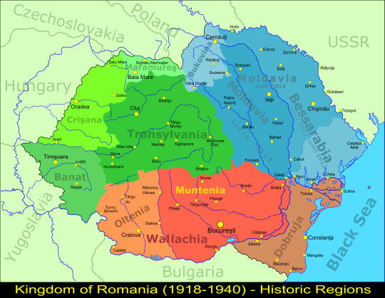
Map of Romania. Ploiești's the dot just under Muntenia, north of Bucharest, the capital. Ploiești's part of Wallachia, the IRL kingdom of Vlad Tepes (aka Dracula). Louis & Claudia went there in the 1940s, so I hope this map is accurate enough. (There's this map, but I dunno the date.)
DACIANA
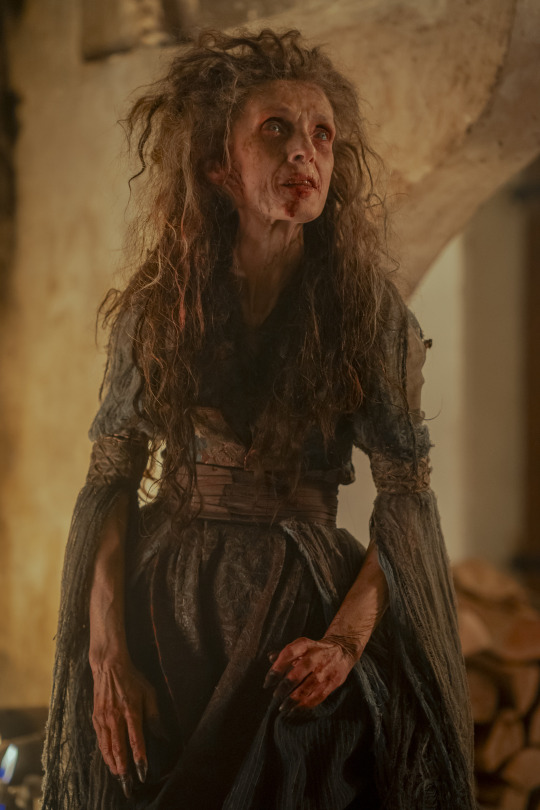
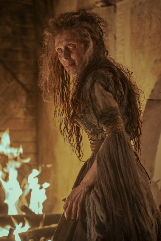
The most obvious thing about her is that she's not dressed in the typical traditional Romanian folk clothing I see all over Google, full of white-red-blue/black palettes.
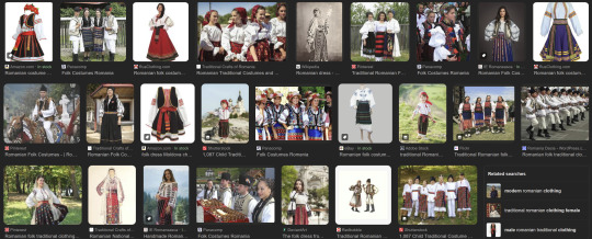
Daciana's not following traditional 19th/20th-century Romanian nationalist images. Her green/brown palette & silhouette is telling, as she lacks the puffy white blouses & dark skirts. (Despite her name, I'm ruling out her being Dacian (X X)--you think you're FUNNY, AMC! But IDK about Cezare Romulo (X X); might do a Pt2!)
Sleeves
First thing's her trailing slashed open sleeves, which were screaming Medieval! at me. Here's some 15th century Renaissance examples, but with surcoats, which is different, but the sleeves reminded me of hers so IDFK.
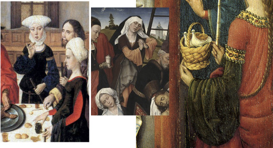
We could chalk this up to Daciana's design as just generic "medieval" fairytale stuff and keep it moving. But to give her a fair shake, I looked at local examples for anything similar that's more recent.
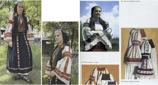
Traditional clothing from Huedin, Romania (north Transylvania), (X X).
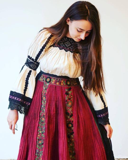
Traditional clothing from Cluj, Romania (north Transylvania).
Keep Transylvanian/Muntenian cross-cultural contacts in mind when we get to Daciana's castle, cuz it's important!
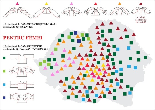
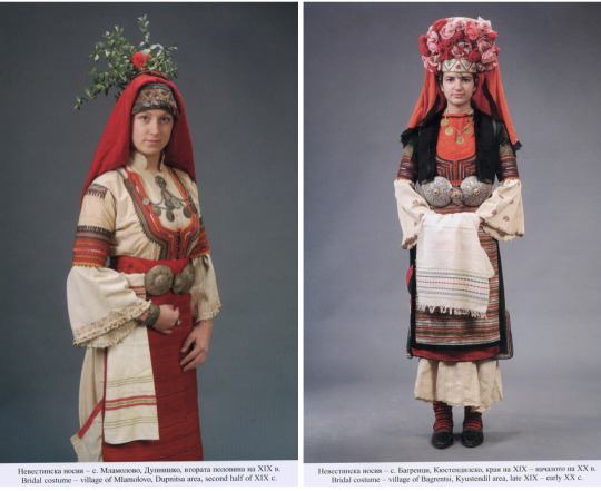
Wrt rarer non-puffy sleeves, the square cut (light blue) seems to be more prevalent in Wallachia/Moldavia/Bessarabia (southern & eastern Romania); while the rectangular cut (dark green) is all over Romania, but definitely has a concentration in Wallachia & Moldavia.
And this makes sense, cuz the style seems to also be prevalent in 19th - 20th century Bulgaria, just south of Wallachia. Hrm....
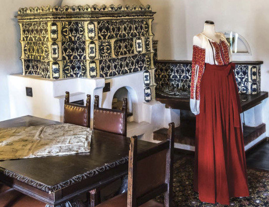
Daciana's sleeves hang very long--the only example of super long sleeves I could find is a 19th century one at the Met (C.I.47.3.4a–d). The only example of slashed sleeves I could find is in this museum exhibit at Bran Castle (yes, THE Bran Castle--I'll get to it in a minute!)
Belt, Bodice, & Fabric
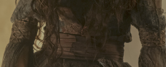
Daciana's belt is so plain compared to everything else. Is it supposed to be a leather Romanian chimir (worn by mountain/forest folk)? Those are only worn by men though? Or it depends? Or is it a just a plain cloth belt? It's reminding me of these examples (X X):
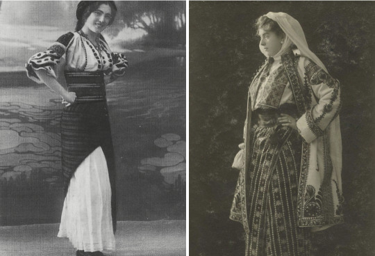
I wish I could see more of Daciana's bodice, if there's any particular kind of cut or patterns. Is the diamond netted/knotted/roped pattern on her arms significant? Her fabric is interesting, too:
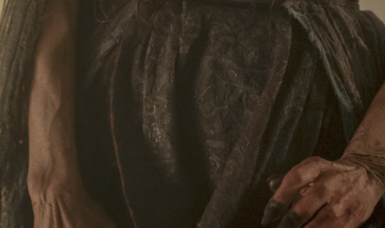
What's this embroidery? Brocade? (Byzantine-Renaissance?) Damask? (c. 14th-16th century?) Lace? Something else? My brain wants to assume it's imported? Meaning: she's hella rich. Cuz like, the traditional Romanian blouse & skirt used to belong solely to peasants, b4 19th-20th century aristocrats started wearing it, too.
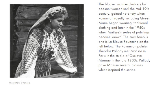
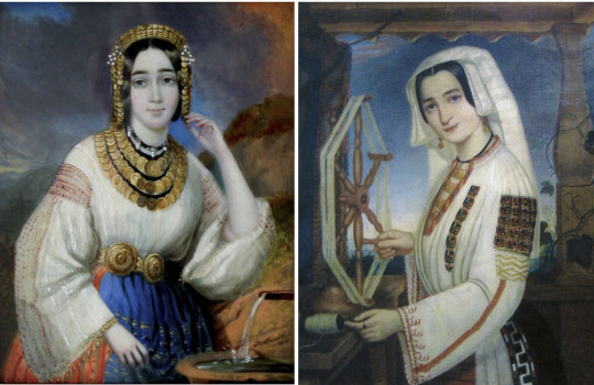
IDKY--more reading led me to a whole bunch of complicated stuff, that can probably be simplified by just saying: The Ottomans. XD
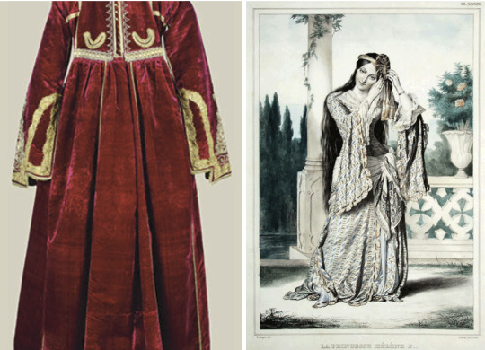
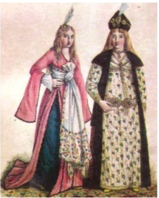
The pre-19th century Romanian aristocracy wore super opulent clothes, inspired by not just the Ottomans (X), but also the Byzantine Greeks (via 18th century Romanian Phanariote boyars (X X X)), etc. But aside from the hanging sleeves, Daciana's dress doesn't really resemble any of these foreign examples. However, it does track with my theory that Daciana predates the 19th-century Romanian nationalist/traditional clothes that became so iconic later on.
Like Louis & Claudia did, let's follow Daciana to her castle! ^0^
DACIANA'S CASTLE
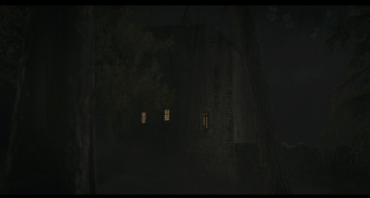
I NEED to know if AMC filmed on location in Romania, or if Daciana's castle is just a studio set/green screen.
The interior's nowhere near what I expected, considering Daciana's haggard appearance. It's really nice--clean & tidy. No spiderwebs, no chipped plaster/paint, not even any bloodstains--but I've mentioned before that I think it's indicating that Daciana's a mother who takes better care of her home (and "child") than herself.
Archway
The first thing is the arch when they first come in (noticeable mostly cuz of how Louis had to bend down to get in, he's so tall).
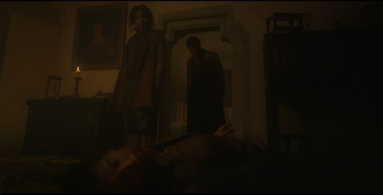
These types of doors/arches are called "shouldered arches," dating from the Medieval-Gothic periods, which Europeans adapted from Islamic architecture during the medieval Crusades. (Examples inc. Lainici Monastery in Wallachia, and the Academy of Art in Cluj-Napoca (north Transylvania).)
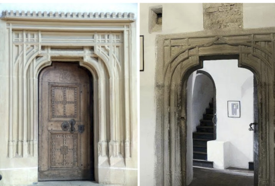
The left pic's Biertan Fortified Church, in Sibiu (south Transylvania). (Another door.) The right pic's Bran Castle, in Brasov (south Transylvania). (Another door.) (Vlad Tepes/Dracula historically never owned this castle, but pop culture says otherwise.) Both places were built by the German/Saxon Transylvanians in the 14th-16th centuries; which might help date Daciana's castle, if not Daciana herself? (The Saxon Transylvanians were in Wallachia, too.)
Wall Ornamentation
The last thing I'll discuss is the wall ornamentation/decoration:
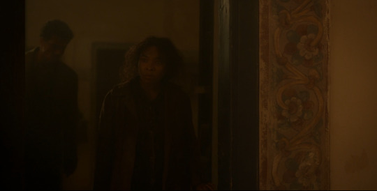
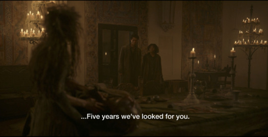
The painted floral trim everywhere instantly reminded me of The Witcher 3, as found in Hungarian, Polish, Ukranian etc buildings. Apparently the designs are all related to fertility, growth/luck, and the Tree of Life. Walls (X X X) and doors (X X) were painted. You can see northern Romanian painted ornamentation in Suceava (Bukovina).

There's painted wall designs in southern Romania, too.
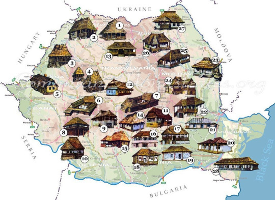
"The research of the popular interior in the Argeş and Muscel areas leads to the determination, along with a local specificity, and some Transylvanian influences, in the contact areas between southern Transylvania and northern Muntenia. In the researched areas, two lines of development of the popular interior can be observed, one relatively simple and the other complex. If the first is the prerogative of a typical Subcarpathian interior, the second represents a distinctly Transylvanian form, which was also imposed due to the presence of the Transylvanian population in the south of the Carpathians, settled in numerous villages." -- (Google Translated from Arta populară din zonele Argeș și Muscel, 1967)
(The website RomaniaDacia has A LOT to say about Transylvania, and the impact of the Germans, Saxons, Hungarians, etc on Wallachia & the rest of Romania.)
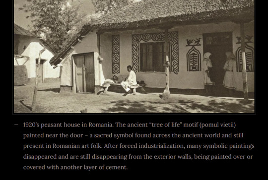
Sure enough, I was finding way more carved ornamentation (X X X X X X) than painted ones.
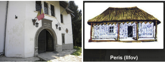
But I wonder if that's why a lot of southern traditional Romanian interiors I've been finding have totally plain whitewashed walls, too, with no painted ornaments, just tapestries (X X). I did find Romanian interior floral wall painted trims (X), but not nearly as much.
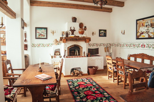
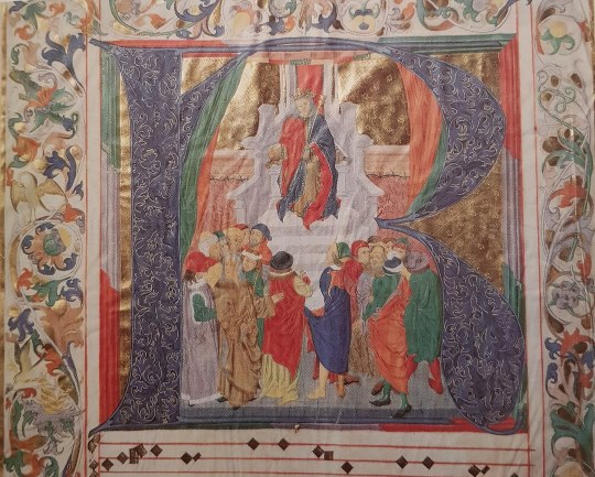
Cuz actually, the closest comparanda I was finding for Daciana was Northern European rosemaling (X X), which is also giving me medieval vibes (X); specifically: trims on illuminated manuscripts like the Book of Hours (X X X)--which we know from Lestat in S01E06.
And we do see some Romanian medieval fresco borders & frescoes that had been plastered over & whitewashed, in Biertan's 15th century churches, and in 13th-15th century Darjiu (Transylvania).
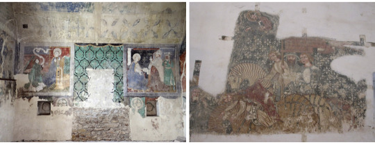
So, I wouldn't be surprised if a lot of Romanian buildings (especially castles with whitewashed plastered walls) were formerly painted similar to Daciana's. Unfortunately, I just can't find an example or figure out what AMC might've been inspired by--Romania has hundreds of castles & churches.
So, I'm tapping out--this is the most I could find so far. U_U
Results? Inconclusive! 😭 My Google-fu has failed me, LOL!
I still have no idea what time period Daciana could be from. We could go several routes:
Go by her name, and say she's ooooold AF, an actual Dacian. She's just been collating Eastern European culture as she ages, but stopped at some point (as her mind deteriorated)
She's medieval, somewhere roundabouts the 14th-16th century (making her ~500 years old, the same age as Armand--but she's weaker (as I've theorized b4), which is why she was able to burn herself up.)
Settle on her being a local Wallachian from Southern Romania, likely pre-19th century / pre-industrial early-modern Europe
Handwave everything aside as Renn-Faire fairytale fantasy; let the tale seduce you~!
OR, we can just bully AMC until they give us an extended BTS look at how Daciana was conceptualized, telling us all the tea about her! 😈
#interview with the vampire#iwtv tvc metas#fashion history#architecture#medieval europe#read a dang history book#the vampire daciana
89 notes
·
View notes
Text
I'll see you at the end.
I can't believe we are here already. I'm excited and sad in equal measure.
This show has been such a delightful surprise. I went into it without expecting anything in particular - I loved Wandavision and I loved Kathryn Hahn and that was that. I didn't expect to be literally bewitched by the magic I saw on the screen.
Put simply, the power of AAA is that it is clearly a product of love - from Jac Schaeffer, the actors, the writers, the directors, the set and costume designers, the composers (and THE GODDAMN LOPEZES!), the producers... I could go on.
That level of dedication shines despite (or maybe BECAUSE) the low budget, and it has two massive effects: 1) it creates a truly compelling and stunning story; 2) it sends a very loud, clear message that representation not only matters, but is NEEDED.
Of course it's not the first show that does this, but I cannot tell you how refreshing it is to me to watch something in mainstream media that is centred around sapphic women where their sexuality is NOT the plot of a show. It is not something anyone ever needs to ask about or question. They don't pretend to be younger characters either, they are all 38+ and proud of it, as they should. Instead they focus on what actually matters - their rich, complex stories.
But the diversity is also within the creators - of the producers, half of them were women, headed by superb Mary Livanos (a queer woman herself), costume designer Daniel Selon (also queer), all of the directors were women and there is also of course a diversity of ethnicities. I am a big believer of the power of diversity as it allows you to go places you wouldn't normally consider, and really round the story. And I love this quote from Jac Schaeffer who states "My prerequisites for writers who work with me are first, they have to be kind, respectful humans."
And what stories the writers tell! In the limited time they had, they managed to create these seven multidimensional characters that were all different, yet similar in a lot of ways. My only criticism would be that we really could do with longer episodes to actually allow some more meaningful conversations and connections. All beautifully complemented by the visuals - the practical sets as well as the costumes. I love how the costume designer took his time to consult with the actors for their interpretations, before even starting to create every single design.
And on top of the great character stories and visual , we then have an engaging plot with mysteries to solve on the way. I cannot emphasise enough how fantastic it felt to follow the breadcrumbs. To spot all those little details that would foreshadow what's to come. The different ways they appeared - through dialogue, visual clues, music themes, lore symbolism and so so many art and literature references. The knowledge and confidence that they were left there on purpose too, because the creators took the show seriously - it literally felt like finding little personal messages!
This is why I've decided I need to pick them up and then try to piece them all together - just to see if I could make my sense of it, since the creators clearly put so much love and effort. No other show has ever made me do it to this extent. And it's been so much fun! I loved I wasn't alone with this and that I could discuss and read others' theories too. It's like we've formed this awesome coven.
So in my post-AAA blues, I don't think I will have it in me to just take my "murder board" down. I feel there is still so much to explore so I will probably keep looking for any more cool details to cheer me up.
I've not been actually particularly precious about whether or not my theories could be right or wrong. If some of them are - great, bonus! If not, also great, I am looking forward to being surprised!
Although we haven't seen the ending yet, I have ultimate trust in Jac. After all, she once said:
"I believe so strongly in sticking the landing and it's always up to the audience whether or not you truly stick the landing. But I believe that you have to put all your energy toward that. It's your job to try the best you absolutely can to stick the landing. You have to plot your mysteries, figure out what they are. It’s like a good murder mystery. The feeling that you want at the end of a murder mystery is you want to be surprised, but not. It still needs to feel within the realm of possibility, right? It needs to make sense and still surprise you."
So I trust we will have a solid ending, wherever it lands. And afterwards - I will always remember the time when a show has made me feel this way. Thank you!

#agatha all along#agatha harkness#kathryn hahn#aubrey plaza#rio vidal#agatha all along spoilers#agathario#lilia calderu#patti lupone#alice wu gulliver#ali ahn#jennifer kale#sasheer zamata#joe locke#teen#billy maximoff#william kaplan#sharon davis#mrs hart#debra jo rupp#mcu#marvel#marvel mcu#mcu fandom
24 notes
·
View notes
Text
WandaVision: A Genre-Bending Exploration of Grief, Identity, and Superhero Storytelling
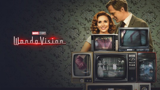
WandaVision is a bold, genre-bending triumph that redefines what superhero storytelling can be. The series opens with a surreal plunge into classic TV sitcoms, paying homage to I Love Lucy and Bewitched—a bold move that quickly proves its worth. WandaVision reminds us that emotional stakes can hit the hardest in a universe of super-powered battles.
Elizabeth Olsen is mesmerizing. Her portrayal of Wanda Maximoff is a masterclass in character evolution, as she moves effortlessly between sitcom whimsy and gut-wrenching emotional depth. Wanda’s desperate attempt to control her unraveling world is heartbreaking and terrifying, and Olsen makes you feel every ounce of that pain. Paul Bettany matches her performance with a comedic brilliance that brings new layers to Vision, turning their shared scenes into captivating emotional duets.
But WandaVision is far more than a love letter to nostalgia—it’s a fully immersive experience. Each episode meticulously recreates a different TV era, from the black-and-white charm of the 1950s to the neon flash of the 80s. The period details, from set designs to costumes, are spot-on, giving the series a rich visual texture. You’d be forgiven for thinking you were watching an episode of The Dick Van Dyke Show—until the cracks in the facade start to show, hinting at a far darker reality lurking underneath.
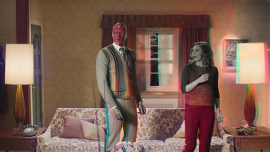
Visually, WandaVision is a feast. The shifting aesthetics aren’t just clever flourishes but integral to the story. As the series moves through different eras of TV, the visual style mirrors Wanda’s emotional unraveling. The glossy perfection of early sitcoms begins to fracture, reflecting the way grief and trauma distort her perception of reality. This isn’t just a fun gimmick—it’s a profoundly affecting metaphor for Wanda’s internal collapse, making her unravel something you feel as much as you see.
At its core, WandaVision is about grief, trauma, and identity. Wanda isn’t just mourning Vision—she’s grappling with who she is after everything she’s lost. Her immense power allows her to bend reality to her will, yet she’s unable to confront the emotional wreckage inside. The show visually represents this struggle, with each glitch and shift in her constructed reality as a metaphor for her fractured sense of self. WandaVision brilliantly captures a woman at war with her identity, trying to reconcile her past, pain, and future.
This identity crisis shapes Wanda’s every decision. Unable to let go of her trauma, she creates a world where she can hide from it. But as the cracks in her illusion grow, it becomes clear that even her immense power can’t protect her from the truth. The show’s layered narrative and visual style turn Wanda’s story into a poignant meditation on how trauma reshapes our sense of self and how running from grief only deepens the wounds.

One scene that perfectly encapsulates this tension is the dinner sequence in the first episode. What starts as a lighthearted sitcom fare quickly spirals into something unsettling as Wanda struggles to control her reality. The laughter fades, the lighting shifts and the discomfort is palpable as her carefully constructed world teeters on the edge of collapse. In moments like these, WandaVision masterfully balances its tonal shifts, moving from quirky homage to psychological thriller with a deft touch.
The series is a slow burn, but that deliberate pacing makes its emotional depth possible. WandaVision takes its time, allowing the audience to sit with Wanda’s grief and confusion. This might feel jarring for some, especially for those expecting the fast-paced action Marvel is known for. But this slower pace is essential to the show’s impact—it gives the emotional stakes time to breathe, and the payoff is worth the wait. As Wanda’s world unravels, the tension builds not through action but through her illusions’ slow, steady collapse.
Marvel’s decision to prioritize emotional complexity over explosive action in WandaVision significantly departs from its usual formula. This shift signals a broader evolution in superhero media that embraces introspection and character-driven storytelling. WandaVision shows that superhero stories can be just as much about our internal battles as the external ones, setting a new standard for what the genre can achieve.
While Olsen and Bettany are the heart of the series, the supporting cast also shines. Kathryn Hahn is a standout as Agnes, bringing comedic flair and a sinister undercurrent to her role. Her shift from a nosy neighbor to something far more ominous is one of the series’ most thrilling transformations. Teyonah Parris, as Monica Rambeau, adds emotional depth to the broader MCU connections, grounding the story while bringing her vulnerabilities to the forefront. Monica’s own experience with loss, having been snapped away and returning to find her mother gone, mirrors Wanda’s grief, adding layers to the show’s exploration of trauma. Both actresses enhance the ensemble, making WandaVision a rich tapestry of performances.
Matt Shakman and Jac Schaeffer deserve immense credit for crafting a show that blends absurdity with emotional resonance. The tonal shifts—from sitcom pastiche to psychological horror—could have easily derailed the narrative, but instead, they heighten the series’ complexity. Shakman’s direction and Schaeffer’s writing push the boundaries of superhero storytelling, resulting in a series that feels as innovative as it does intimate.
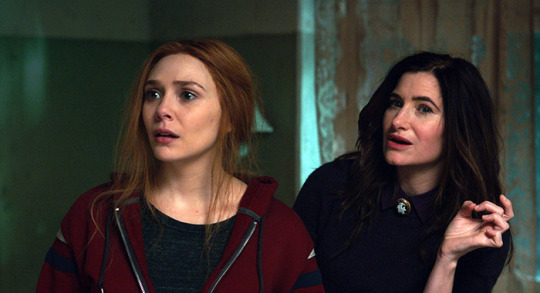
Another scene that stands out is Wanda’s confrontation with Agatha Harkness (Kathryn Hahn) in later episodes. This moment exemplifies the total collapse of Wanda’s illusion, and Agatha’s role as a manipulator intensifies the tension. The scene is a high-stakes emotional showdown that strips away Wanda’s defenses, forcing her to confront the pain she’s buried under layers of sitcom facades. This confrontation highlights the show’s seamless ability to shift from personal drama to supernatural spectacle, all while keeping the emotional core intact.
Of course, WandaVision isn’t for everyone. Its experimental structure and slower pacing may alienate viewers expecting the fast-paced, action-heavy fare typical of the MCU. But for those willing to embrace its reflective nature, the series offers a more profound, more emotionally charged experience. It’s a gamble that pays off in ways that redefine what superhero television can be.
WandaVision isn’t just a standout in the MCU—it’s a standout in modern television. Its blend of genres and experimentation with form transcends the superhero genre, positioning itself alongside Legion, which uses genre as a framework to explore deep emotional and psychological territory. WandaVision proves that superhero stories can be as rich, layered, and complex as any prestige drama, showing that sometimes, the most compelling battles are the ones we fight within ourselves.
So, is WandaVision a triumph? Absolutely. By blending sitcom nostalgia with emotional depth and mind-bending twists, WandaVision redefines what superhero storytelling can be. Marvel has set a new bar for its TV future, and if this is the direction they’re headed, count me in.
#wandavision#marvel#mcu#marvel cinematic universe#elizabeth olsen#paul bettany#wanda maximoff#vision#agatha harkness#agatha all along#tv series review#tv show review#tv review#review#grief#trauma#nostalgia#marvel mcu#marvel studios#superheroes#scarlet witch#the scarlet witch#writerblr#artists on tumblr#witchcraft#witches#witchblr#magic#wicca#halloween
12 notes
·
View notes
Note
👕 & 🍽️? For the trek ask game
Heheh thanks for Asking Meg!!! All aboard another long winded ramble about my wife ST: Voyager!!!!!
👕 Character whose fashion you like.
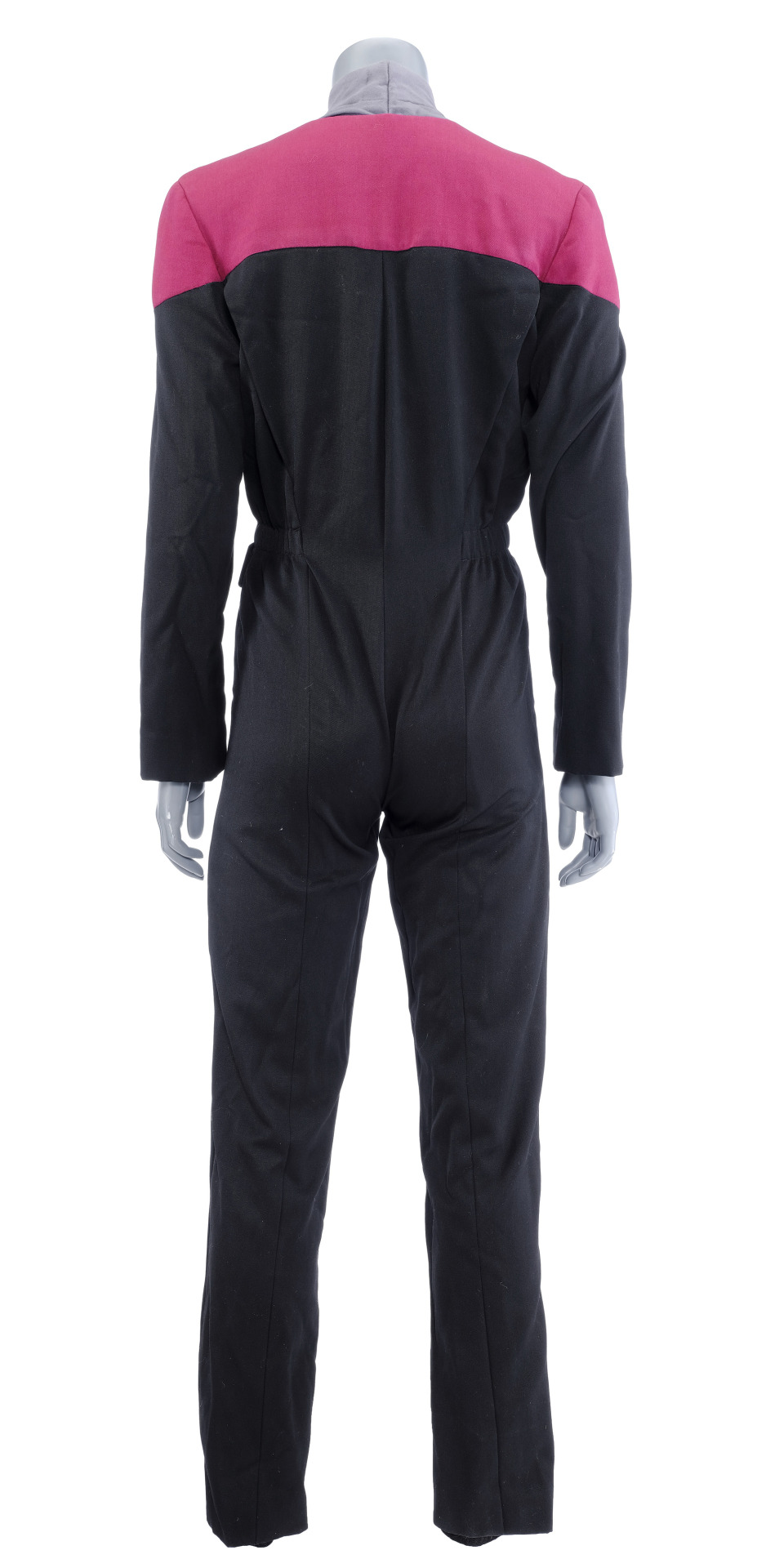
While I answered in the last one, I think I'll add to it by saying I love the Ds9/Voyager Uniforms--Infact I'm a HUGE sucker for them--At least to me, they feel like THE signature trek costume rather than TNG or TOS ones. Plus, they are fun to draw! I love how they look on the actors with the structured upper half, and loose, high-waisted pants that give everyone the illusion of height.
Those that are dressed in the uniform are portrayed with a respectable heft and a pleasant, overall shape. I know it's not the case, but they look like they are really practical. This is fully intentional as the lead costume designer said they wanted the suits to appear modular and have advantages in different environments. That's why sometimes they are unzipped or twisted around, depending on the narrative.
I could go on and on about them. I act feral over how they look when when all the actors stand together, turned in various ways, posing so that that folds pucker on their joints, or when subtle differences in their body sizes take up screen. It just looks so cool! I'm a big fan of squad-based, colour-coded uniforms and clean silhouettes.
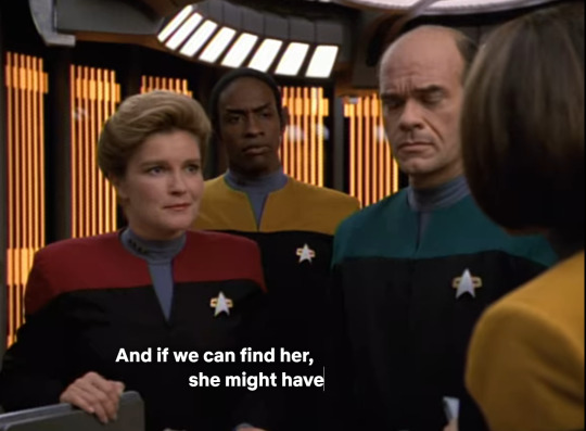
Most importantly though, it gives them all BODY-ODY-ODY!!!
youtube
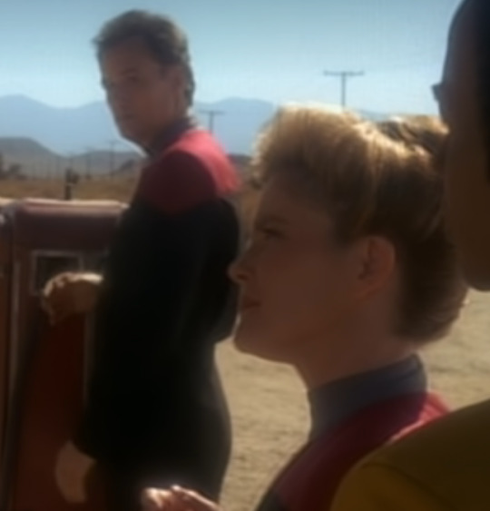

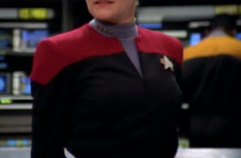
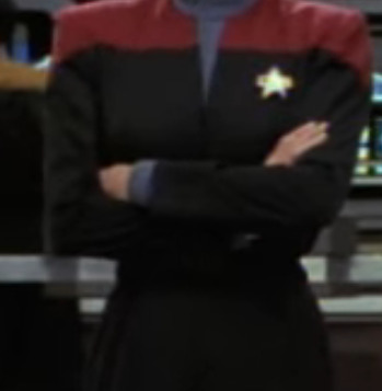
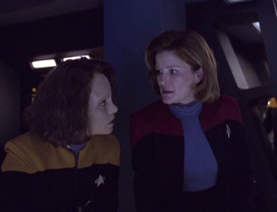
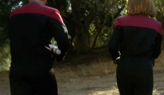

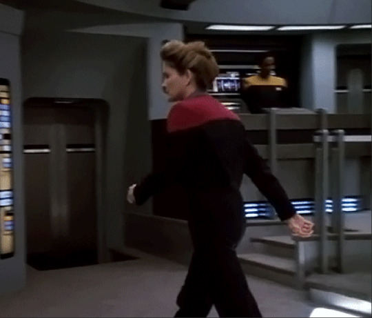
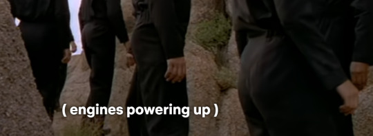
AYO WHICH LOCATION THEY AT??? CW: GORILLA DUMPIES!!! 👀👀👀 😳😳😳😳
🍽️What alien food/drink would you want to try?
I wish I could find the video but I've seen bits and pieces about how they designed the food on the sets and I think it's super charming!
Lots of effort went into considering the cuisine. It just about decorates every set and It was important to the show. Voyager engaged in a lot visual gags, or dialog discussing food. It was in a comforting way that would present the characters with their personal ideals of home.I find that subtext of world-building really endearing.
Many scenes involved characters bonding in the mess hall, socializing around food, or isolating with it to gain a sense of self. In contrast, it's used as a device for diplomacy, or to make settings seem more alien, unnavigated and removed from regular comforts. It's even incorporated into main plot points, such as with Tuvok in ''Riddles'', when he gains a newfound skill around cooking after a serious accident, and he solves the plot by decorating a code on a cake. Through food, we saw a lot of what it could be like to be a crew member on the ship, and live inside their Universe. It wasn't always pretty but they made it work.
We have a really rich food bowl and diverse food-culture In Australia, I love noticing exotic food that are used as set decoration of as props--I am used to seeing tropical fruit or Asian ingredients around my community, so it's fun to see it transformed. And much like the characters in Voyager, I relate to the comfort and the charting of new territories when it comes to seeing/ eating food.
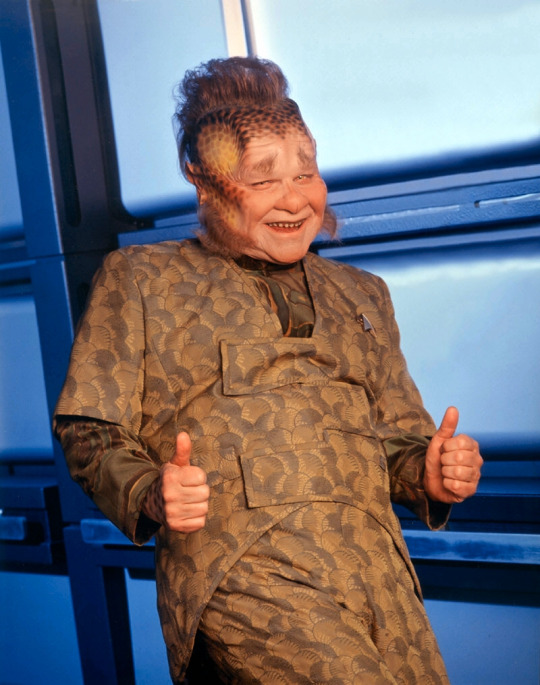
I suspect being a chef / working in hospitality would be an interesting occupation in Trek. Everyone complains about the lack of authenticity from replicated food, so I'm sure being a good Chef would be worth your while.
I genuinely want to try Old-mate Neelix's cooking. He seems so creative and passionate about what he plates up, and he CLEARLY (they all put on weight haha) kept the crew well-fed. ''Bitches make do'', but you can tell he cares by the questions he askes everyone, or the detail he places into his recipes. I'd like to see what all the fuss is about with Leeola Root Stew. I bet it's not that bad! (I like bitter food) Or better, serve me up a Jimbalian Fudge cake! It's so quaint how there is an evolution to his work as he gets more integrated with everyone.
(crying over this ^) Neelix Nation Rise Up!!!!
#SOBBING I LOVE STARTREK VOYAGER SO MUCH!!!!!!#thankyou if you read my thoughts again lmao the other one is popping off hahaha#i did not proof read this at all so sorry if it's a fucking mess (not much unlike my other textposts lolololol)#now i just want to redraw frames of the body music video with the command crew lmao#i think about this stuff & how it's so underrated in the way that the the REAL subtext behind the characters is right there but y'all slee#instead people are busy infighting or making up stuff little truth behind it when it's actually alot of sincere material is available#dont mind me being a FREAK over their visual language and body dimensions idk#i fucking love just SCANNING the frames and being like YUM A CURVE ON THEIR ARM or a WOW THE SHAPE OF THEIR WAIST#TY MEGGG I HOPE THIS ISNT A BAD RESPONSE IM SO BAD AT PROSE LMAO#neelix#kathryn janeway#chakotay#tuvok#star trek voyager#startrek voyager#st voyager#SORRY ANOTHER BIG TEXT POST#theartmeg
17 notes
·
View notes
Text
Going to London on a whim definitely paid off cause I managed to wrangle my way into Macbeth twice
Some further thoughts:
1. Okay so I think it might have been the arts interview where Tennant says not to worry about understanding Shakespeare because if the actors are doing their job right you will be fine. He's right and this cast utterly succeeds at that.
2. I'm generally terrible for my mind wandering when I'm watching things (the rewind button on my remote is much abused) but I was enthralled from start to finish. Even with having seen it multiple times. Not a hint of my mental shopping list.
3. My potentially controversial opinion is that I might like the cheap seats better? When I was in the stalls I was off to the side, whereas the standing tickets obviously you're looking at the stage head on. I think some of the visuals were far more striking from the back - you get full impact from the lighting and the blood seeping out at the death scene and the people behind the screen at the back. I don't think the warm to cool light changes are as noticeable from the front. However, you obviously have a much better view of the actors and the nuances of their performances (although because of the set up of the theatre from the side you are blocked from seeing everyone on stage at some points). It's a bit more intense up close, and it does feel like the actors are looking directly at you (Not me quailing in my seat during prolonged eye contact 😅)
4. I think I went through the overall choices made before but some more things I enjoyed: how much humour is imbued throughout, Lady Macbeth being warm and likeable, Macbeth lying prone multiple times through the play mirroring his final send off, Macduff "all my pretty ones?", Macbeth's little face when he gets both swords, him questioning the manhood of the cutthroats, the absolute softness of Macbeth's embrace before completely pulling the rug out from under you and murdering a child in the same gesture.
4. Minor miracle how Cush Jumbo managed not to get her bloodied hands on her very white dress? Very impressed with this.
5. I think the one thing I would say is that they should have made Fleance/Macduff's son/Young Siward have more obvious costume changes between them
6. I still love how pared back the stage and costumes are. It's incredible how rich the experience is with actually not a lot.
7. I think I'm sold on the binaural audio; the play opens in darkness and you hear a bird move from one side to the other in your headset. Not only do I look from one side to the other like a fool, but my brain reckons it can see the wings in the gloom. There are multiple moments that the delivery is far more intimate than would be allowed without use of the audio. I think this could be really beneficial for larger theatres for those in the cheaper seats too. Also, maybe better for inclusivity for those with visual or aural impairments if everyone has a headset? The drawbacks for me are the occasional crackle you get from the mic pack, and I guess maybe it feels like you're further removed from the actors themselves. Also I guess if I'm sitting at the side my left and right sounds don't quite match up with where the actors are looking based on where the left to right sounds are for those sitting centrally? It didn't really affect my enjoyment any, but would perhaps need to be considered if this was used in different performances/larger theatres etc.
8. What the binaural audio did not stop was me hearing the woman sitting next to me gasping and jumping about ten foot into the air multiple times during the performance. She absolutely had not noticed anything going on behind the screen at the back until they started hammering, and of course I then jumped myself cause I was not expecting noise/motion from that side. This was incredibly funny but awkwardly coincided with some of the most intense parts of the play. (Although I imagine if I hadn't already seen it I might have been less entertained)
9. Have I said how good it was? It bears repeating
10. Standing Ovation discourse: Friday night I was surprised by how few stood? As the painfully British person I am, I was hoping that someone else would stand up first but they didn't in my block. Also I almost garotted myself on the headphone wire when I stood up so maybe this was a consideration others were having. I was sort of shocked that others didn't stand after we did (not because I think I'm some kind of influencer but IME British standing ovations are motivated by social pressure in a "oh gosh all these other people are standing up, I guess I better had too" sort of way. There has to be enough people doing it to overcome the innate "you must not make a scene" directive that burns within our souls.) No one stood in the front row of my bit at all. Sat Mat had noticeably more people standing, including in the front row.
11. The person sat next to me said to her husband as it ended "I certainly wasn't wowed by it" and I was utterly shook. I don't think I heard any one else being particularly critical (but also I would never say anything so damning about a show I'd seen in the theatre itself so maybe it's not a fair sample)
12. Honestly I needed a full on hour or so to decompress after seeing this, I was fizzing under the surface.
#jammy git#macbeth#donmar warehouse#david tennant#cush jumbo#do i need to spoiler tag for a 400 year old play?#shakespeare#theatre
6 notes
·
View notes
Text
I finished watching the latest The Witcher season and I kind of understand that Henry Cavill is leaving, as he seems to be an uber-nerd when it comes to Sapkowski’s book series. I,too, love the books and games...and I know that any adaptation has to make changes because some things might work in writing but not on the screen, but some story points and the behavior of some characters
do not make sense to me in that show. I think the show is at its strongest when it follows the narrative of the book series more closely, as soon as it deviates to much, well, the writing just becomes bad e.g. the character development of some side characters felt very erratic at times. Even as someone who knows the narrative, I had trouble following the story and making sense of why this character suddenly behaved in a completely different way than before. I suppose it might be even worse for people who don’t know the books. It just felt like things and events, especially the whole political aspect of the story, were brushed aside or over-simplified for the series compared to the books. And what is worse is that it felt like some characters have been dumbed down. Moreover, the pacing just felt off at times and I somehow did not care most of the time for the characters and what was happening to them, especially in the first half of the season. That changed somewhat with the last four episodes. In my opinion, the fifth episode is the strongest of this season. Probably because I usually enjoy non-linear story telling and it is the closest to the books, they even used a good chunk of dialogue from the books. I also liked episode seven and eight, especially Ciri’s journey - which was also rather truthful to the events in the book, plus it was really cool to see The Rats for the first time, which I thought were introduced very well.
The costume design and the set pieces as well as the visual effects are still hit and miss in my opinon. Though, one thing that stood out for me in a positive way was the new design of the Dryads. I think they looked really amazing and it fit with who they are, a definitiv improvement over how they were portrayed in season 1.
In conclusion, the show had it moments, but they were to far and few to make it an enjoyable watching experience. I mean, as a lover of the books I could go on a rant about some creative choices, but the thing that annoys me the most is how it feels like the creators themselves or at least those in charge do not understand the appeal of Sapkowski’s narrative. He has created such an intriguing and rich universe with political intrigues and literally warring parties, the threath of world changing events constantly hanging in the air, and somehow the series lacks all of the interesting aspects or simplifies them in a way that makes them boring. Sapkowski’s series is like a 12-course menu and I guess, I just expected the show to deliver a full healthy meal and what I got instead was a meager unhealthy snack that is soon forgotten because there is nothing memorable enough about it except a dull aftertaste.
#my opinion#witchernetflix#the witcher season 3#rather spoilerfree review#I really don't know if I wanna watch season 4#and not even because of Henry Cavill leaving#it's just that the next book on which season 4 will be based#is my favorite of the series#and I don't know if I can stand watching how they butcher that one on screen
3 notes
·
View notes
Text
'Last Night in Soho' Review

Last Night in Soho' directed by Edgar Wright, includes great visuals and a story that keeps you hooked throughout the film. However it makes sense why it didn't do so well in cinemas.
The film starts in a teenager girl's bedroom , Eloise (Thomasin McKenzie) is seen in her own world dancing around her room that seems to be set in the 60's. Music is blasting and as always fits with the film perfectly, one thing Wright has down to a T and that stays consistent from start to end. When Eloise moves to London to study fashion its revealed that the story is actually set in modern day, indicted by a bright orange 'Sainsburys' sign that completely sticks out.
Eloise moves into a house clearly rich with history and starts having visions of the past, she is unable to differentiate between her reality and the story of a woman named Sandie (Anya Taylor-Joy) . An aspiring singer that gets into the wrong crowd after being taken advantage of by a man named Jack (Matt Smith) . The costumes give a very tasteful call back to the 60s and remain very true to the time, I specifically love the pink flowy dress Sandie wears a number of times that Eloise then takes inspiration showing how obsessed she becomes with Sandie.
The visual effects in the film are mostly done well, however I think the CGI gets to a point where it is slightly over the top and unneeded in some scenes. This took me away from the film as I felt it wasn't done very tastefully and seemed like they were trying too hard to make it like a horror with jump scares and scary images. It just fell flat overall, and was one of the reasons why the film turned out as average.
The story itself had great potential, however like the CGI was not pulled off as well as it could have. The film clearly had a stronger first half that made you want to keep watching, but it started weakening by the second half and became messy. It felt rushed and disorganised like it wasn't thought through properly. I think there where too many villains that then took away from the message of the film, about women being manipulated and abused and being trapped in these situations. It made it unclear who you where supposed to hate and who you were rooting for . And as much as they tried to make it a big reveal it was too predictable and it wasn't as impactful as they wanted it to be. I think a great psychological thrillers leaves you mind blown at the end, some questions left unanswered so to have some mystery but overall a plot twist that was clever and creative. This is what the story lacks.
Overall the film was a good watch, that included a great group of actors that performance helped carry a story that could have been more.
Written by Erin McGorm
2 notes
·
View notes
Text
Justice in the Dark, more on ep 2 since I can't shut the fuck up apparently even tho I just wrote a whole essay ToT
I get why the casting is who it is. In retrospect. In sitting here now lmao. Like I said I like who they cast performance wise they're doing perfect. But looks wise not all match exactly what was in my head. (Tao Ran does perfectly utterly in every way though lol). I think Fei Du was cast cause he looks a lot like fandom drawings of fei du. Not my personal image of him (my personal image of him is like slightly to the left of his most usual drawn look). But I can see a casting director thinking "yeah he'll look so much like the audio drama art and fanart etc" (also any skin smoothing just further highlights that). And Luo? Parts are clearly from the book, parts are from Zhao Yunlan (I imagine they wanted a specific kind of appeal you see in certain lead actors which he's also got here), and then i in reflection like how he looks "less intense" than fei du.
1 because fei du looks like he needs a home-cooked meal and Luo looks like he can cook it (which goes a lot more into their both romance dynamics and bigger dynamic of Luo being Feis path to healing, life, warmth, growth, him looking visually more soft and touchable and healthy and in touch with a realistic world all add to him being that For Fei Du).
2 Luo looks a bit older, just actor has quite distinct eyes (they could be similar age actors idk) and Luo seems Iike the increased stubble is more a present thing (with no facial hair in past scenes) so I think there's some choices there with age trying to be a noticeable trait. Versus Fei Du where he feels Iike a rich fantastical cold masked character out of an anime or out of Flower of Evil (he Screams protagonist from Flower of Evil energy but with even less convincing "ordinary approachable guy" ability to act, actually I think in general Flower of Evil fans and Beyond Evil fans would probably really like Fei Du). If costuming and makeup love me, over time fei dus visuals in the show may look less almost unreal and become more "looks like a random person you'd walk past" Iike Luo and Tao. As he opens up more and Luo becomes a part of his life more. So like... I get the choices on who to cast and why someone thought they'd look the part. Luo also we are seeing from Fei Dus pov (like most of the show), and Luos often snippy and ordery and it's in a way funny we see him as plain when Fei du does. In the scenes emotionally charged between them, I think Luos actor is shot quite handsomely, who's to say if that'll also be a trend of him looking more Model esque when Fei Du is emotionally open around him. (I also now that I'm settling into this show, appreciate that Luo looks like a plain everyday man sometimes. He's got model looks when the lighting flatters him. But also it not purposely played up constantly reminds me of the book - fei du in the show visually is constantly Model esque, in the book he's constantly dressed up and has peach blossom eyes and it's part of the Performance, and these visual drama choices echo that Feeling of the characters).
For the people like Me who prefer (or even need) action in their romance, im happy to report this is indeed a Flower of Evil situation! Lots of dollops of murder mystery, romance, and action! A nice little car chase was in episode 1 to set that expectation. I personally love me a good action scene, and the car scene looked significantly better than my (very low) expectations (Till Death Tear Us Apart cdrama looked decent to me though so temper yourself). Just wanted to happily report thank goodness there's murder and action in this.
Luo is handsome. (Don't trust my rants dissing on him lol) Like the scene of Fei Du as a child? I totally get why he's Captain Luo, why he's the guy who "wanted to save the whole universe." Why that day when he saw Fei Du absolutely destroyed, scared, he wanted to do anything to help him. And why he kept helping him for years after and still keeps track of him now. This is the "superhero" Luo that his team at their fondest see him as, that Tao sees him as at his best, that Fei Du saw him as when he was a child until Luo failed him (the whole world did) and Fei as a child blamed Luo for all of it to cope with the hopelessness he felt.
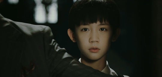
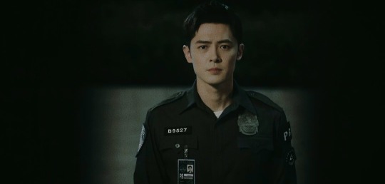


Just. This entire scene. I really felt that awful hopelessness. Luo Wenzhou realizing its hard to save even just one person, the looming threat he will soon try and fail to protect Fei Du and fail and fail and it will haunt him and cling on and he'll try so hard to Keep Trying as hard as it is and as much as Fei Du pushes him away and how awful it feels to Keep failing fei du. Fei Du looking at him for help, the only hand he can reach out to for it, and the realization that even this man who's like a superhero to him and an angel... can't. That no force in this world can fix this.
6 notes
·
View notes
Text
Jina’s dramas awards 2022
It’s here! I had less time this year to devote to dramas because of a variety of reasons, but I still want to share the love. (Check out my favs from 2020 and from 2021.)
As usual, these are mostly Chinese dramas and they’re typically historical or period costume or VR-historical dramas but I do have a category for modern dramas specifically. Also, this is based on dramas that I finished. So, if I started but didn’t get through it yet, it won’t show up on this list.
A new addition this year: best short drama! With cdrama entertainment really putting more money and time into making their mini dramas, I think they deserve their own category.
best overall drama:
love between fairy and devil: no surprises here. it’s a devil x fairy drama aka brooding man x bright girl dynamic and it’s so so good. it really took all of us by a storm and we enjoyed it so much. the cgi is pretty good, the soundtrack is fantastic, and just everything hits my fangirl’s heart so well.
most delightful/fun drama:
night of love with you (modern short drama): i was seeking more short dramas to watch and am so glad i came across this. it’s funny, it’s well paced for a short drama, the couple’s chemistry is amazing, and their visuals look great too. also, the tinge of tragedy? love it. obsessed.
most impactful drama:
rainless love in a godless land (Taiwanese modern drama, technically aired in 2021 but finished in 2022 so it counts!!): i love this kind of modern fantasy stories and i especially loved that this drama incorporated indigenous beliefs and myths and had all these larger questions. i probably watched this all in like three days (the eps were so long!) and was captivated.
most unexpected drama (aka the dark horse):
sassy beauty: i don’t think i had any specific expectations for this drama, I was just looking for VR-historical drama and came across this. It also happened to have Yan Zidong as the ML, who I adore, so I gave it a chance and I’m so glad I did! Especially letting myself get past the first 4 episodes because the female lead’s growth was so so gooood. and again, the tragedy of it all?? yeah yeah, it’s everything.
drama with the best soundtrack:
love between fairy and devil: do I need to say more? it’s got all the bangers.
best costume/design/set drama:
love in flames of war (republican era): disregarding the story/plot, i really liked how this drama looked. maybe they looked a little too pristine for a republican era? but the male lead’s a warlord and rich and stuff so i didn’t question it too much.
best short drama:
a familiar stranger: cdrama ent is finally putting money and time into short series! this year we really saw an improvement in this genre and several other dramas did really well, but this drama had my heart because of ryan cheng. he’s my boy. but really, this drama had solid acting, story, with strong cinematography and soundtrack. just chef’s kiss.
favorite modern drama:
be my princess: granted, I didn’t watch many this year, but this is the only one I finished and actually spent VIP money to watch the last few episodes. I really adored this drama and the questions it asked and I was pleasantly surprised by this couple pairing.
favorite drama from any year not aired in 2022:
dreaming back to the qing dynasty (2019): I haven’t watched a drama based in qing dynasty (with some time-traveling) in years! I fell in love with so many of the princes but especially wang anyu as 13th prince. it’s the first drama i’ve seen of him and i’ll be keeping an eye out for his future historical/period dramas!
drama with a soft spot in my heart:
lost track of time: i’m obsessed with this drama greatly thanks to jing chao but yeah also obsessed with irony and revenge and the fight against fate and doomed endings. yeah, this drama had me buying VIP. the production and cinematography was just okay but the acting? the tragedy of it all? i’m kissing jing chao.
favorite scene from a drama:
a familiar stranger: this is a random category just so that I can say I absolutely love the fireflies scene. it’s so so good, so soft, so tender. he saved her and then she saved him in the most beautiful way.
That’s all for me! Did we share any favs? Are you obsessed with bits of tragedy too or are you normal lol. Which drama would you in what category? Feel free to let me know. :)
#no surprises here i think if you saw me liveblog it i probably loved it lol#a familiar stranger#lost track of time#love between fairy and devil#dreaming back to the Qing Dynasty#be my princess#sassy beauty#rainless love in a godless land#love in flames of war#night of love with you#i'm sad for 2023 because i probably wont have too much time to watch dramas#but also not much seems good ???#idk suggest 2023 dramas for meee#especially romcom dramas especially romcoms in historical settings#i'm still working on new life begins which is why it's not on here#it's cute but it's also like 36 eps long which feels too long for its premise lol#i'm like halfway though so im working on it#jina dramas awards 2022#jina dramas awards list#jina watches cdramas
9 notes
·
View notes
Text
The Hunger Games: The Ballad of Songbirds and Snakes


I can't lie and say I was a massive Hunger games fan when I was younger, I watched the first two films and enjoyed them but never watched the Mockingjay films. It is strange to look back that only a decade ago this genre of dystopian teen drama was so prevalent in the film industry and very successful financially, there was Hunger Games, The Maze runner trilogy and The Divergent trilogy. Despite this genre dying out the new Hunger Games prequel has just been released to a very mixed reception. I thought the trailers looked promising but were definitely overly long and gave away too much. I am very mixed on this film but I would say I enjoyed it, I will mainly be criticising its mistakes in this review but don't think its a bad film.
My biggest issue is definitely the characters. I think the two leads of Snow and Lucy Gray have some good chemistry and an engaging dynamic. The way they grow closer and genuinely get invested in saving the other, eventually falling in love was great. However, the end of their stories ruin their relationship for me. Lucy Gray is on board with Snow's actions until the very end where she suddenly starts acting strange and implying she will report him and get him hung for murdering people he needed to kill for both their survival. She then just runs away never to be seen again, not showing the audience anything that happened to her, creating a completely inconclusive and wholly unsatisfying non ending for her character. Snow's arc I was enjoying at first, the scene of him killing a tribute was excellent and a good hint to his future villainy but then the film rushes to him becoming ruthless and seemingly insane within a couple scenes, hunting Lucy Gray down trying to kill her and then joining forces with the antagonists and murdering Peter Dinklage's character, it all felt quite forced and underdeveloped. Sadly these two are still the bets character, most of the side characters are underwhelming. To start off Peter Dinklage has a great final scene revealing the truth of his cruelty but I still don't think it explains why his character seemed so inexplicably evil and it confuses his motivation as if he wanted the hunger games to end why did he promote changing and improving it? The most out of place and strange character for me was Viola Davis, her character acted as a mad scientist caricature who was comically evil at times and felt very tonally inconsistent with the more gritty realistic world the film wanted.
The rest of the side characters are all lackluster, the tributes besides Lucy Gray are given nothing, some are just blatantly evil, others are given no personality and basically no lines at all, ones only characters trait is literally just that she has a cough, very weak writing. Similarly, Snow's classmates and friends are all just rich and pompous, ones entire character being she takes credit for Snow's work. The one with the most character is his *closest* friend who I felt never seemed like a good friend, they didn't have enough time together so Snow's breakdown and final turn being centred around him felt weak. I know not every character can have lots but something more, even one little scene of the tributes bonding or telling their stories could've worked.
Overall I actually enjoyed the hunger games part of the story despite my complaints, it was tense and there was some good action and smart trickery by Snow. My main issues come from the last 1/3rd of the film which focused on Snow in district 12 and his turn, it killed the pacing and just all felt rushed and underdeveloped, wanting to turn into a full blown political war drama but doing it unsuccessfully.
The best part of this film is easily the set and costume design. The red uniforms of the capital children is so visually striking and the contrast of the poorer rags of district people to the lavish capital costumes is simple but effective. All the production design feels grand and has a great sense of scale. The steam punk aesthetic in the district also has a clear visually style.
I have some final random negative aspects to discuss. Some dialogue moments felt awkward and like a first draft such as Snow saying paste tasted *pasty* and Snow's final line *Snow always lands on top* being a call back sure but feeling cringe and unrealistic for someone to actually say. I also don't like the reference and nods to the original quadrilogy. Having Lucy Gray sing the hanging tree song which was non-diegetic in the original films feels distracting. Even worse having Lucy name the root she finds a Katniss was absolutely eye roll and groan inducing. Finally, some of the editing felt amateurish, there were some very abrupt cuts and some continuity issues that ended up being distracting.
0 notes
Text
Blog Post #3
This week we discussed a lot about the film "Daughters of the Dust". To me, I got a lot from watching and analyzing the various details of the film. I really liked how thought-provoking it was and how it was so culturally rich in terms of the characters, costumes, and settings. I also really liked that we got an introduction to who Julie Dash is and how we as an audience could better understand what she is trying to send over to her viewers. The fact that she produced the first national distribution by a Black woman really made me appreciate how special this film is in it of itself. In addition to the gorgeous cinematography, such as the repeated visual of trees and nature, Dash amazingly captures their cultural richness through the dialect and emotional themes. The significance of the film is so far-reaching. I like how Professor Due pointed out how the film shows a lof of cutting edge technology for its time. The cameraman in the photography scene, the bubbles, and so many other scenes show how the film has forward-thinking themes. This added many elements of looking back into the past through its cultural symbolism while also having messages that are directed toward the future. The themes of memory and ancestry through the rituals which are shown throughout the film, such as the bottle tree and teaching the slowly lost language of Indigo make the film so much more rich and powerful and truly enable it to leave a lasting impact on its audience, regardless of their own culture and spiritual background. To me, the theme of familial bonds and sexuality are so universal, and they way in which Dash conveys these themes enables the viewer to appreciate those themes as their own lives as well. Thursday’s class we talked about Brother from Another Planet. This was one of the most interesting of all the things we have watched in class thus far. I loved how lively and busy the scenes were and how the story kind of developed on its own. One thing I liked how was Professor pointed out that the Alien noticed the gun. Although the scenes serve to be a metaphor, I appreciated how Professor Due recognized the inconsistency. To me, the two lectures we had this week were so interesting and truly were so thought-provoking. I was very intrigued as Professor analyzed the film and I honestly didn’t want it to end.
0 notes
Text
Polly Borland
There's pretty much nothing I don't love about Polly Borland. Her practice is so spectacularly weird and surreal it's visually right up my alley, and I resonate with her profound irreverence to the world. She started her career as a working photographer, doing editorials, portrait work, fashion and reportage while always having personal projects going on the side.
Borland's first commercial, artistic success was Babies, documenting a world of men who derive sexual pleasure from dressing and behaving as infants. In fact, one of the reasons Borland inspires me is that she didn't start getting artistic recognition until she was in her 40s. As a late starter, that gives me hope!
Following Babies came Bunny (2004-5), an absurd play on the Playboy Bunny where Borland explored the sexualisation of women's bodies. Here, Borland starts playing with ludicrous costuming and very awkward poses.
For her next major series, Smudge (2012), Borland had models dress in ever increasingly weird arrangements of body suits, stockings, wigs, pillow stuffing, makeup, and polystyrene balls that abstract the bodies to such a degree that gender and age became irrelevant. In this series, she lovingly embraces a sense of dysmorphia and the outright peculiar. This is where my practice starts to parallel with hers. I also abstract bodies so that they become less identifiable, with a love for the inclusion of everything unique. Our difference is she embraces abstracted emotional mindscapes that feel a bit 'straighjacketey', whereas I prefer the spot where we release ourselves from the straight jacket.
I want to take a moment here to appreciate Borland's use of banal items to create such absurd images. At the beginning of my RMIT journey I was very self conscious about using materials I'd found at craft and $2 shops to make sculpture and costumes. However, looking at how Borland has constructed her work makes me feel more secure in my use of similar objects.
In Morph (2018), Borland takes body obfuscation to the next level using a rich array of background and foreground colours. Her model is enclosed in huge body stockings crammed and sculpted with cushion stuffing. Posed in a myriad of awkward, absurd, amorphous shapes that only hint at the human, Borland says 'I'm going even further in my reduction of visual language, so there is even less bodily detail; it's less identifiable in its humanness. It's pushing into a realm of preconsciousness.' For me, the actual images that I saw during Polyverse at the NGV in 2018 are sublime. The size, colour and quality of the prints are inspirational. The construction and posing of the model are the root inspiration for my current work, as I'm wondering what does it look like if we could burst through our 'straitjackety' minds.
Most recently, coming of the back of Morph, Polly has been making humanesque sculptural forms. Made from stuffed stockings sculpted into abstracted humanesque shape, then cast in resin, are a spectacular balance between hard and soft, the beautiful and the grotesque. The quality and tension of these sculptures is something I aspire to.
In very broad brush strokes, Borland's oeuvre shows the development of physical and emotional constriction and restraint. She says, 'My art is very existential. I use figurative abstraction to reduce body parts to shapes that hint at this psychological interior or allude to existential crises.' Similarly, I also intentionally use figurative abstraction. My work is also an existential exploration as I wonder how I can be free from social constraints. I believe we are composed of three parts – mind, body, and soul. Borland's work focuses on the mind and body, while I focus more on body and soul. Borland seems to be digging deep into the constriction of the mind, whereas I'm thinking about releasing the soul from the confinement of the mind.


0 notes
Text
Why Doctor Strange 2 has FREAKING AMAZING visuals
In my opinion, to my taste, I think DSMOM was a lot richer in visual than most movies. We have more variety of spells, more vivid colors, more angles, richer scenarios and I think all the costumes/clothing are better. Of course it's a matter of style, while DS1 is darker and more Baroque like and Infinity War follows general Avengers movies patterns, DS2MOM has it's own style, with a different direction and special effects. I really loved how the movie is clear, even in the darker scenes such as when Wanda attacks Kamar Taj or in Sinister's Sanctum, you can see all the elements you need to see. All the costumes, even the casual ones, are so so pretty, with so many details. The scenario interacts with the story- we have America and Stephen always falling in the same spot of NY (by that roof, then there's the fence). The direction showed great skill with ALL SORTS of scenarios- wide open places gave the sensation they needed to, to either give the false sensation of peace and freedom (the apple field) or to give us fear/shivers of desolation (Sinister's reality). I absolutely LOVED Kamar Taj, we see the courtyard, we see the desks where they study, we see the rooms where they meet, the place from inside, the place from above, we see from afar the HUGE structure and how close to the mountains it is... Then we have 3 different Sanctums, all 3 unique full of details, we have different Stranges with different spells and magic. If anyone saw the Marvel Assembled about DSMOM, you'll see how they put so much effort- they glued each petals of those apple trees because of the pandemic delays because they didn't want to CGI it, they improved all the wire work so the actors had more mobility when doing flying scenes, and each figurine is so rich and symbolic, such as how Wanda's clothing has this dark stain that comes from her chest and spreads, as Sinister's robes have this darkness musk, Wong's robes has golden and purple details and Stephen's robes even have flowers in detail on his back.
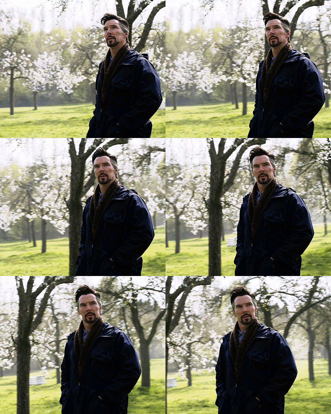
I know DSMOM isn't most people's favorite, but when it comes to that aspect of the movie, I loved it absolutely. We get SO MANY ANGLES and SO MANY VIBES- darker scenes are well executed, funny scenes are well executed, sad scenes are well executed, and all the elements of the visuals contribute to that- it's not isolated, it's interactive.
The Temple of Vishanti is one of the most beautiful visual I have EVER seen, the cover of the books, its light, the lights in the eyes and faces of the actors- all what's around them interacts with them. They actually exploded entire sets to film the actions scenes, they seem to have done their best to avoid CGI in the visuals they could and considering the chaos of the pandemic and all the changes and delay in filming, I think it's a golden pearl that it has the best visuals.
The movies explores all sorts of environments and everything is pretty. We have wedding scenes, NY scenes, crumbling reality scenes, reality warp scenes, futuristic reality, indoor, outdoor. Earth 838 has SO many details, like, did you notice everyone wears hat? Did you notice the colors are opposite? Did you notice there are technologies that can read people's memories and they showed us all that instead of just plain exposition?

The scene in which Wanda dreamwalks into Earth 838 while Mordo is talking to Stephen and America is visually stunning- there are like 3 things happening at the same time and you understand it all while it's so pretty to see.
I mean check this image of Stephen's robes detail. It's stunning to me. And remember when I said the visuals have a role? Example- Stephen is a master now, and well, masters choose their robes. With that detail, we indirectly might be told that Stephen CHOSE those details, those flowers, that color, that style. The Ahnk like symbol on his chest- it has so many meanings such as life, rebirth, etc. BECAUSE of the excellent visuals, if we sit to theorize a bit, we can get to SO MANY conclusions about the story. Did you notice the Ultron lights were yellow? Remember what Infinity Stone was Yellow? Remember how Vision was supposed to be Ultron? Did you notice Reed's portal is the same sort of portal Kang uses? Did you notice Black Bolt's eyes almost popped out and blood spilled from his nose? And how the Iluminati's base seemed so COLD and EMOTIONLESS while Kamar Taj feels so warm and cozy, like a place I would love to sit and study with a hot drink. I think the visuals of DSMOM ARE STUNNING and it's not because it's just pretty, it's because it interacts with the story and the characters so well, it has an ACTIVE ROLE in the story, and I love it.
Here's the robe details I mentioned:

26 notes
·
View notes
Photo


Kinn’s Family Is Rich As Fuck - Tankhun Edition
I was gonna do Kinn’s costume meta post first but @moerusai requested Tankhun so here we are!
Ok so we all know that Tankhun is a Fashion Icon in the show, I said in a joke post that his style was a combo of peak Elton John and Lady Gaga (monster era). I hold to that, partially. I think another influence in Tankhun’s fashion is Billy Porter:
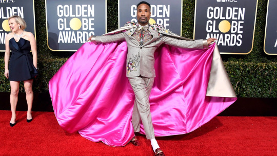
What’s cool about Tankhun’s costuming is that his styling is purposeful. It’s not just a bunch of mix-matched colorful items. There’s thought and purposeful to Tankhun’s style, without being overly complicated. Like, for example, Tankhun wears a lot of sets, patterned pieces, and textures. Which gives me a lot of Randid Rahm, Francis Libiran, and The Blondes influences.
His style is flamboyant perhaps, but neither strictly what is considered masculine or feminine. He operates in a fashionable in between that resembles a lot of big couture collections.


Tell me Tankhun wouldn’t rock one of these outfits with some modifications. The cape from Randid is actually similar to the one he wore in ep02 as well.
Tankhun is supposed to look rich as fuck.
And he does! And you can see from the following pictures, his outfits work as a unit. Whether they’re a set - like in image 4 - or just complementary pieces - images 1, and 2 especially - there’s thought being put into each outfit.
What this is meant to instill to the audience is a couple things: 1) set him apart visually from his brothers Kinn and Kim, 2) showcase his wealth, 3) make him visually loud looking which enhances his personality


Tankhun is chaotic, he’s loud, and he’s very separate from the others in the estate. We know that he doesn’t leave the estate because he was kidnapped and as such as developed agoraphobia. This leaves him unfortunately very isolated, removed from much of society and other people. I believe @the-wayside had some really good meta on Tankhun and his agoraphobia.
So what way does he choose to express himself? Via clothing. His clothing is a way to express himself in an otherwise cramped world of walls, suits, and glittering objects. It’s the one form of physical self-express we’ve seen that he can employ in narrative.
Out of narrative - a Doylst view - his clothing signposts to the audience that this character is LOUD, he’s in your face, but he’s not unlikable. He’s not weird for the sake of being weird, or a punchline. Like his outfits, carefully put together and crafted, Tankhun has personality and character. He’s quite likable and his reasons for staying at the estate are understandable. It also says this character is RICH and places him visually above other characters - namely his bodyguards, Porsche etc as they are all presumably of a middle class to poor background.
I think what I want to reiterate is Tankhun’s styling is, again, very purposeful. It has influences in couture/runway-esque fashion, it speaks to his personality and his personal self-expression, and it showcases his class status.
Now, what I’m really curious about is if Tankhun’s costuming will change if his character changes in the show. His character poster was much more toned down in comparison to his in-show looks.
His shirt and pants are all monochromatic, and he lacks any major embellishments save the fur coat which breaks up the outfit with a strong textural element. It gives a POP while still feeling overall cohesive with his character. But the lack of bright eye-catching colors (as seen above) make me wonder if his character also goes through a minor transformation as the show goes along. Perhaps he gets more comfortable going outside, or being a part of the family business, or begins to recover from his trauma(s). All speculation on my part - idk if he had any major role in the novel - but I’m curious!

When I breakdown Kinn’s costuming I’ll probably talk more about class status as his wardrobe is often directly compared to Porsche’s (especially in the dock scene!! Chucks vs Loafers!!).
**disclaimer: I am not an expert in fashion, check out ModernGurlz and Mina Le on youtube for an experts breakdown of costuming, I’m just a simple puta that loves costumes and kinnporsche**
#kinnporsche#kinnporsche the series#tankhun theerapanyakul#long post#idk what our mafia tag is lol#but behold! more costume meta!#this is how I'm entertaining myself until saturday#chaos elmo spoketh#chaos pikachu metas
138 notes
·
View notes
Text
a lot of hot takes about Batman and Gotham in general feel off to me because generally they seem to assume gotham is a normal place that has an unusually large number of costumed criminals and heroes to fight them but is otherwise conventional and, its really not.
there’s a secret society of malevolent rich people who are orchestrating things behind the scenes to keep things getting worse forever. they wear owl masks all the time and meet in deep underground battle arenas beneath the ocean. they use a secret assassin (who is visually based on Batman’s evil counterpart from the crime universe) in an owl costume, presumably completely unrelated to Batman’s own bat themes.
Not that far from Gotham itself is a swamp called SLAUGHTER SWAMP. they dumped a mob boss in there and he rose from the dead as a hulk zombie that used a nursery rhyme as the basis for his entire new personality and sometimes he can only talk in verse from that nursury rhyme. For a while Batman wasn’t even involved with him at all, he was fighting the magic version of Green Lantern who couldn’t affect his powers with wood and also that zombie mob guy was... internally made of wood at the time, i think.
in one continuity the whole city is built on top of a steampunk wonder city powered by energies from a weird chemical pool that heals people real fast and can straight up bring the dead back to life but it also drives you violently irrational and the chemicals drove the entire city into a killing frenzy and then they built Gotham on top of it and straight up forgot about having a city built on top of a murder-laboratory. (If you assume the chemicals are STILL affecting people and are partially responsible for at least influencing people, this explains a LOT about Gotham.)
In most continuities, until the rise of super criminals, Gotham was straight up run by the mafia. The mayor was super corrupt, outright admitted that his fondest desire was to kill all the poor by setting them on fire, and was essentially a criminal head in his own right. The police weren’t just dirty and power-mad, they were an arm of the crime families and they were literally just gangsters in uniforms.
The infamous mental insititution was founded by a guy that ended up being tormented by nightmares of a bat over a hundred years before Bruce Wayne was ever borne, with strong implications that somehow the horrors and madness afflicting modern Gotham were so bad they went back in time and drove the founder of Arkham to madness out of the horror he saw coming. (Gotham is so fucked up it screwed itself up RETROACTIVELY.)
Gotham is so weird and so screwed up that Batman doing his thing isn’t him LARPing, no more than Zorro is LARPing, and its not a case of him not applying his money to charity and public works. He already does that, as well as giving henchmen stable jobs. No, supervillains just keep popping up anyway and odds are good that the average guy running a charity is gonna get a costume and get guns out and start a hold up during the next function while declaring themselves the Flamingo and staggering around on stilts and talking about how they will filter-feed what they deserve from the people of the world and start mugging people
GOTHAM HAS ZEPPELINS FOR NO REASON
basically if you approach Gotham like its any kind of normal city that has some costumed criminals and heroes, that’s kind of missing the point! GOTHAM IS FUCKING WEIRD AND SCREWED UP and it really says a lot that the one time the Joker edited old timey photos to make it look like he was an immortal spirit of discord plaguing Gotham for centuries, a lot of people just went ‘okay that sounds about right’ without actually being shocked
(also it says a lot about Gotham that Mayor Hamilton Hill, exposed to truth chemicals, ranted about how much he really wanted to murder the poor and thought every single horrible thing he did was their fault, and no one even blinked or thought this was unusual.)
27 notes
·
View notes