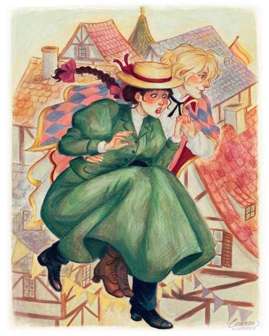
#Color Studio
Photo
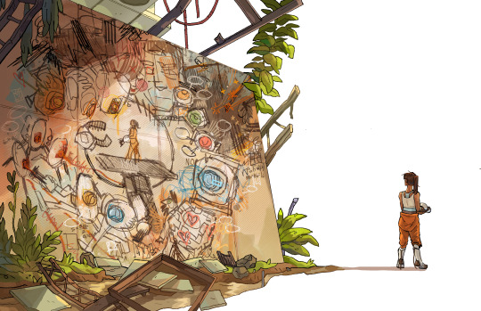
Look how far we’ve come
#portal 2#portal#chell#glados#wheatley#art#my art#digital art#artist on tumblr#artists on tumblr#illustration#character design#drawing#color#painting#doodle#photoshop#clip studio paint#fan art#fanart#vavle
61K notes
·
View notes
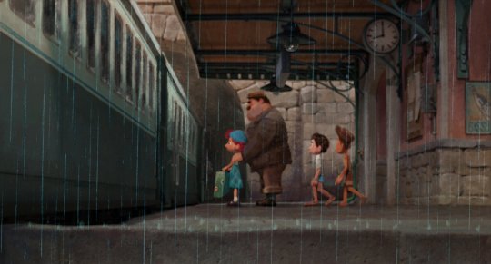
Text

silly
#the studio that covered this episodes animation really did it justice.. its my favourite out of the bunch#the off model#or the color pallete#the strech and bounce of the movement#everything was so niceys !!#dungeon meshi#laios touden#falin touden#arts
7K notes
·
View notes
Photo
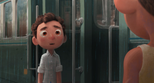


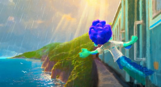
Luca color keys by Daniel Lopez Muñoz
#disney#pixar#luca#color key#daniel lopez munoz#disney concept art#pixar animation studios#art#artwork#animation art
5K notes
·
View notes
Text


🌻🃏

#joker#batman#joker fanart#fanart#batman x joker#artist#digitalart#myart#dc joker#dc#clip studio illustration#digital drawing#color inspo#artist on tumblr
2K notes
·
View notes
Text

no talk me i angy cant stop thinking about my girlfriend who's been kidnapped by a crazy powerful ancient magician
#art#dunmeshi#dungeon meshi#delicious in dungeon#marcille#dunmeshi spoilers#dunmeshi fanart#marcille fanart#falin x marcille#marcille dunmeshi#digital art#artists on tumblr#illustration#queer art#clip studio paint#my art#hmmmm this took me about an hour i think#maybe a lil more#thats fast for me#still thinking abt how to open commissions in a way taht works for me#technically i have doodle coms open but i only advertised them on tumblr and i think the price is a bit low#sorry i mean tiktok#anyway ill delete that post and make an official ad#im thinking 30 for lineart#50 for color#that way ppl will be more likely to order#and i wont feel too pressured to spend hours or days on each one#but also its not too cheap#i gotta make money!!!#i gotta make about $900 in the next 3 months
2K notes
·
View notes
Text
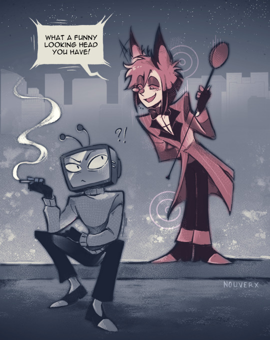
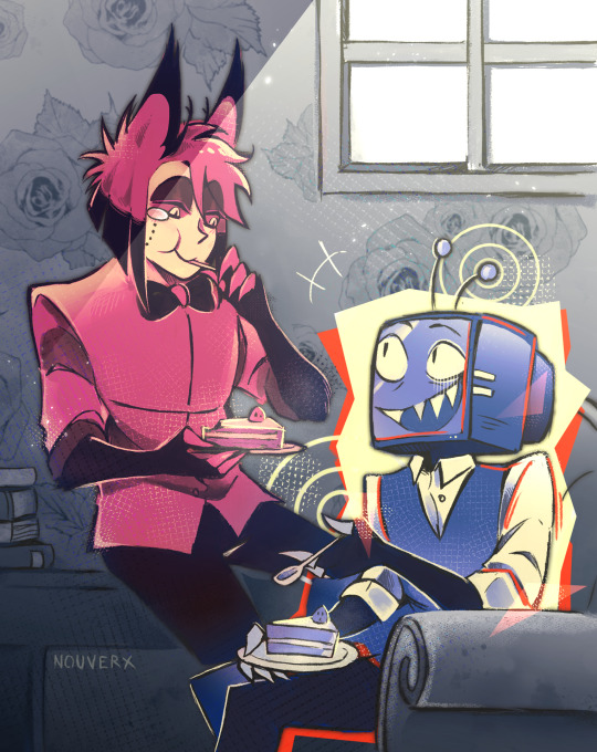
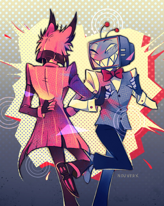
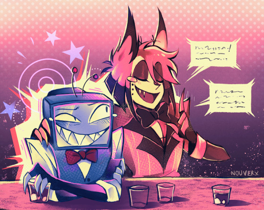
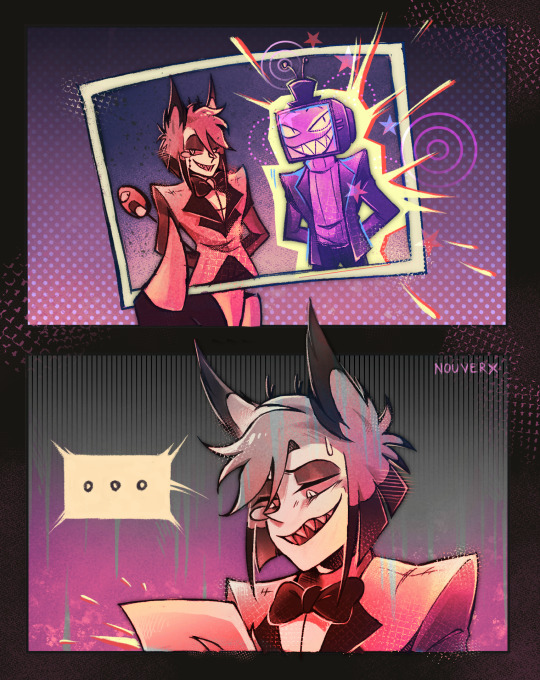
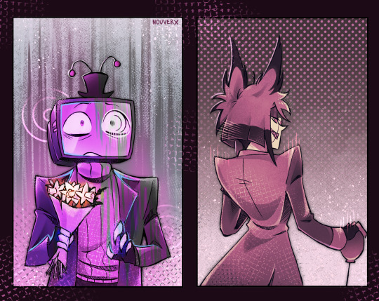
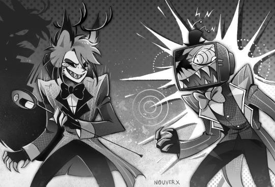
Radiostatic week 2024 illustrations compiled in a single post because I like how they look all together
#hazbin hotel#hazbin hotel fanart#hazbin vox#hazbin alastor#radiostatic#one sided radiostatic#radiostatic week#radiostaticweek#radiostatic week 2024#digital art#my art#clip studio paint#I will never be tired of showing them I love them so much#again I am so proud of this project and so happy with how it turned out#+ I was testing a new coloring workflow for the first time that I applied to all of them so to turn out this good on the first test WOW#sorry if I dont post new stuff for a while after this I need to rest
2K notes
·
View notes
Text

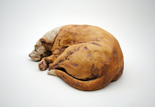
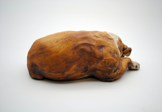
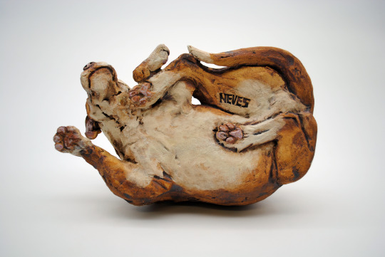
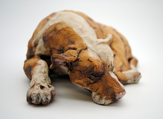
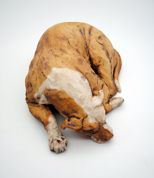
Sun Worshipper (Empire)
cone 6 stoneware, underglaze, iron oxide wash
#a gift portrait for the owner of my last studio! he's a great studio buddy#favorite part is the brown fur color is just the clay body :) it got super toasty at cone six and I'm loving it#even if the pink underglaze on his nose and paws burnt out......#ceramics#clay#sculpture#animal art#finished work#pottery#dog#bully breed#portrait#pet portrait
2K notes
·
View notes
Text

inspired by niigo's cutlery cover
#project sekai#prsk fa#nightcord at 25:00#fanart#clip studio paint#digital art#artists on tumblr#prsk art#digital painting#kanade yoisaki#25ji kanade#pjsk#project sekai colorful stage#cutlery
2K notes
·
View notes
Text
A Walk in the Skies 👒
Howl’s Moving Castle illustration!
#howls moving castle#sophie and howl#howl pendragon#howl jenkins pendragon#howls moving castle art#studio ghibli art#character art#illustration#traditional drawing#traditional illustration#cute illustration#gouache art#colored pencil art#character illustration#kids illustration#book illustration
2K notes
·
View notes
Text

🇬🇧 Hello, here is a Color Studio painting, that was done like two weeks ago, why did I just post just now? Because now I gather all paintings in a month in one post, which I think is better. I'm working on an animation for a school project. This one is quite simple, but there's a bunch other things I want to do that I often forget about the activity, please wait.
🇮🇩 Halo, lukisan Color Studio ini dua minggu yang lalu, kenapa baru sekarang terkirim? Karena sekarang aku kumpul semua lukisan di sebulan dalam satu postingan, menurutku lebih baik. Aku sedang buat animasi baru untuk tugas sekolah. Yang ini cukup sederhana, tapi masih banyak hal lain yang ingin aku lakukan sehingga sering lupa tentang aktivitasnya, mohon tunggu.
🇷🇺 Привет, у меня картина с Color Studio, доделанная недельки две назад, чё только сИй час запостил я? Ведь теперь собираю все картины в одном месяце в один пост, что по-моему лучше. Над новою анимациею работаю к школьному проекту. Именно эта довольно проста, но много прочего, которым хочу заниматься, что зачастую про активность забиваю, прошу ждите.
#Drawings In Drawers#animation#art#school project#news#animasi#lukisan#Color Studio#Color Studio Indonesia#tugas sekolah#berita#картина#новость#анимация#школьный проект#арт
0 notes
Text
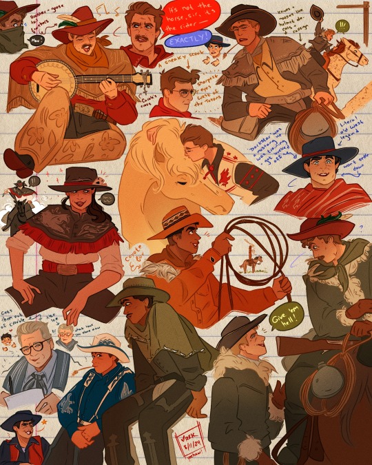
i've wanted to practice drawing cowboys for some time now and so the daggers have turned in their helmets and fighter jets for stetsons and horses! yeehawwww
#cowboys#tgm#top gun fanart#top gun#top gun maverick#top gun maverick fanart#au?#idk i just really wanted to draw western stuff and didn't want to draw random cowboys lol#bradley rooster bradshaw#pete maverick mitchell#tom iceman kazansky#natasha phoenix trace#robert bob floyd#reuben payback fitch#mickey fanboy garcia#jake hangman seresin#javy coyote machado#whew i think that's everybody!#ALSO I BASED THEIR OUTFITS OFF OF THE IMAGES AND COLOR SCHEMES OF THEIR HELMETS AND IT TOOK SO MUCH PINTEREST SEARCHING TO FIND WHAT THEIR#HELMETS LOOKED LIKE UP CLOSE#i'm so proud#it was a very fun exercise#art#illustration#digital art#artists on tumblr#clip studio paint#csp#dagger squad
844 notes
·
View notes
Text
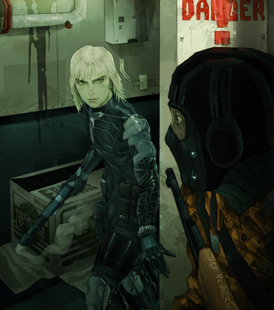
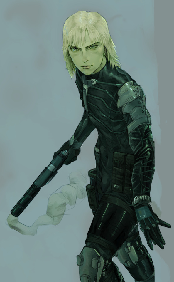
drawing of raiden from mgs cuz hes in fortnite getting W's , done in january 2024 !
#art#drawing#illustration#color#colorful#character art#fanart#metal gear solid#mgs#mgs2#raiden#clip studio paint#y2k#rendering#background
2K notes
·
View notes
Text

collection of some molly sketches :]
im obsessed with drawing him smiling hugely looking mischievous
#mollymauk tealeaf#mollymauk fanart#critical role#critical role fanart#mighty nein#the mighty nein#critrole#m9#clip studio paint#id in alt text#artistic nudity#kind of? you cant even really see his ass bc of the tail so its pretty tame. but idk#anyways big smile screen right hand gesture is apparently my go too molly pose#ive been itching 2 color these for ages#im so swamped with stuff for school that its hard to justify fanart LMAO but i finished a lot of stuff this week so i gave myself a treat#YAYYYYYY#itseart#ALSO i think im realizing i dont work with purples as a base color that often???#but its rlly fun to paint purple skin
1K notes
·
View notes
Text


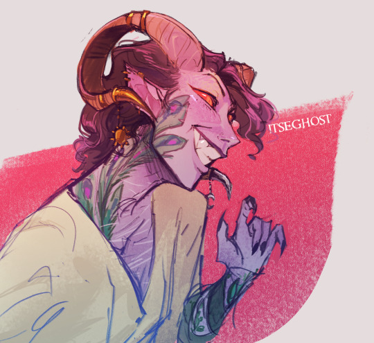
justice design concepts
#joy.jpg#anders#justice#justanders#dragon age#dragon age awakening#dragon age 2#dragon age origins#dao#daa#da2#art#fanart#artists on tumblr#digital art#clip studio paint#i think inviting someone else into your body permanently and doing away with any notion of privacy for the rest of your life is so intimate#you will never have a secret again. you will be entirely known to someone else. you will become their eyes their hands their home#and everything they know from that moment on will be colored by a lens of you. you are as inextricable as you are cherished#no one else will ever love you like that. no one else has the capacity to. is that okay?
542 notes
·
View notes
Text
I think 90% of my gripes with how modern anime looks comes down to flat color design/palettes.
Non-cohesive, washed-out color palettes can destroy lineart quality. I see this all the time when comparing an anime's lineart/layout to its colored/post-processed final product and it's heartbreaking. Compare this pre-color vs. final frame from Dungeon Meshi's OP.


So much sharpness and detail and weight gets washed out and flattened by 'meh' color design. I LOVE the flow and thickness and shadows in the fabrics on the left. The white against pastel really brings it out. Check out all the detail in their hair, the highlights in Rin's, the different hues to denote hair color, the blue tint in the clothes' shadows, and how all of that just gets... lost. It works, but it's not particularly good and does a disservice to the line-artist.
I'm using Dungeon Meshi as an example not because it's bad, I'm just especially disappointed because this is Studio Trigger we're talking about. The character animation is fantastic, but the color design is usually much more exciting. We're not seeing Trigger at their full potential, so I'm focusing on them.
Here's a very quick and messy color correct. Not meant to be taken seriously, just to provide comparison to see why colors can feel "washed out." Top is edit, bottom is original.
You can really see how desaturated and "white fluorescent lighting" the original color palettes are.
[Remember: the easiest way to make your colors more lively is to choose a warm or cool tint. From there, you can play around with bringing out complementary colors for a cohesive palette (I warmed Marcille's skintone and hair but made sure to bring out her deep blue clothes). Avoid using too many blend mode layers; hand-picking colors will really help you build your innate color sense and find a color style. Try using saturated colors in unexpected places! If you're coloring a night scene, try using deep blues or greens or magentas. You see these deep colors used all the time in older anime because they couldn't rely on a lightness scale to make colors darker, they had to use darker paints with specific hues. Don't overthink it, simpler is better!]
#not art#dungeon meshi#rant#i'm someone who can get obsessive over colors in my own art#will stare at the screen adjusting hues/saturation for hours#luckily i've gotten faster at color picking#but yeah modern anime's color design is saddening to me. the general trend leans towards white/grey desaturated palettes#simply because they're easier to pick digitally#this is not the colorists fault mind you. the anime industry's problems are also labor problems. artists are severely underpaid#and overworked. colorists literally aren't paid enough to do their best#there isn't a “creative drought” in the anime industry. this trend is widespread across studios purely BECAUSE it's not up to individuals#until work conditions improve anime will unfortunately continue to miss its fullest potential visually#don't even GET ME STARTED ON THE USE OF POST-PROCESSING FILTERS AND LIGHTING IN ANIME THOUGH#SOMEONE HOLD ME BACK. I HATE LENS FLARES I HATE GRADIENT SHADING I HATE CHROMATIC ABBERATION AND BLUR
2K notes
·
View notes
Note
Pomni with fangs?
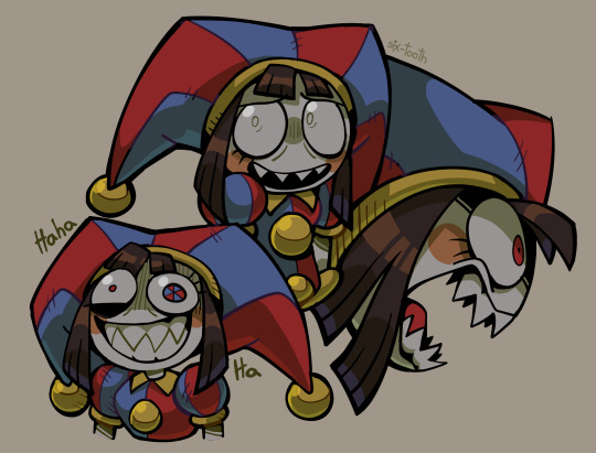
fanged pomni my beloved
#my art#fanart#the amazing digital circus#tadc#pomni#gonna be honest I have no idea what happened to the colors on this one#I just kept playing with stuff until it got out of control#also this is my first drawing with clip studio paint woohoo
2K notes
·
View notes
Last Seen Blogs

