#10-HDR
Text


AHSOKA (2023-)
+ bonus detail

#star wars#ahsoka#ray stevenson#baylan skoll#shin hati#morgan elsbeth#starwarsedit#swedit#ahsokaedit#starwarsblr#swsource#usernik#usermelanie#userjasmine#tuserpolly#tusercora#*#if hdr caps have one hater then it's me. if hdr caps have 10 fans then it's not me. if hdr caps don't have a hater then it means i'm dead#ray stevenson's presence is phenomenal. he has such an aura!!! i'm really interested in their arc 👀#ahsoka spoilers
2K notes
·
View notes
Video
Meandering Amongst the Mountains (Denali National Park & Preserve) by Mark Stevens
Via Flickr:
A view of tundra, evergreens, and ridgelines, stretching across the Denali National Park landscape while walking along the Wonder Lake Trail. This is looking to the southeast with the snowcapped peaks of Denali and the Alaska Range off in the distance on a walk not long after leaving the North Face Lodge area. From the rise in the trail, I was able to capture this image looking over this setting and bring the mountain peaks into the upper part of the image so that I had a more sweeping view captured with the image. I did some initial post-processing work making adjustments to contrast, brightness and saturation while playing around as I learned how to work with DxO PhotoLab 3 that I’d recently purchased after moving away from Capture NX2.
#Alaska 2019#Alaska Range#Alaska-Yukon Ranges#Azimuth 158#Blue Skies#Blues Skies with Clouds#Cloud Wisps#Day 10#Day Hiking in Denali#Denali#Denali National Park#Denali National Park & Preserve#Denali National Park and Preserve#DxO PhotoLab 3 Edited#Evergreen Trees#Evergreens#Hillside of Trees#Image Capture With Arsenal#In Camera HDR#Landscape#Landscape - Scenery#Looking SE#Mount Brooks#Mount Koven#Mount McKinley#Mountain Peak#Mountains#Mountains in Distance#Mountains off in Distance#Mountainside
2 notes
·
View notes
Video
#hbp_pix#winter#snow#covered#trees#boston#charles#river#canon#hdr#bestcapturesaoi#artofimages#ABigFave#10-22#ImpressedBeauty#my_gear_and_me_premium#elitegalleryaoi#ringexcellence#my_gear_and_me_bronze#TripleNiceShot#4TimesAsNice#my_gear_and_me_silver#dblringexcellence#my_gear_and_me_gold#eltringexcellence#my_gear_and_me_platinum#my_gear_and_me_diamond#mt.#auburn#cemetery
2 notes
·
View notes
Video

flickr
HKW - HDRI by Pascal Volk
#Europe#Germany#Berlin#Berlin Mitte#Tiergarten#John-Foster-Dulles-Allee#Schwangere Auster#Haus der Kulturen der Welt#House of the Cultures of the World#HKW#Casa de las Culturas del Mundo#Alto rango dinámico#High dynamic range Image#HDR#HDRI#HDR addicted#Wide Angle#Weitwinkel#gran angular#WA#WW#Herbst#fall#autumn#otoño#Architecture#Architektur#arquitectura#Canon EOS R7#Canon RF 10-20mm F4L IS STM
0 notes
Text


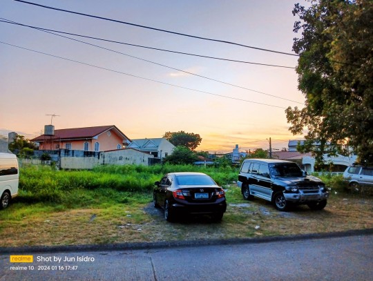

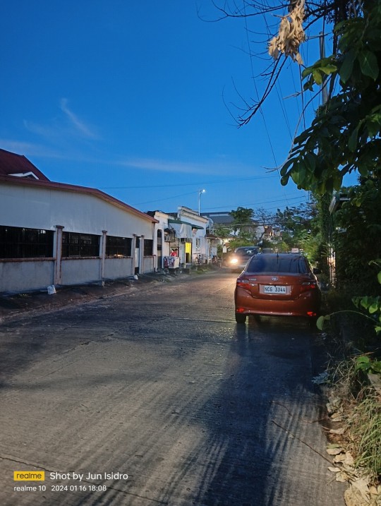


Page 16 of 366. Brisk #walking for 30 mins and taking these #sunset pics in the hood in #Manila, #Philippines. 🇵🇭
#Realme10 is the best affordable mid-range phone under $160 (₱9k or less when on sale) with Mediatek Helio G99 chipset that is similar to Snapdragon 778G, 90Hz AMOLED screen, good for casual #gaming and takes decent pics becoming great when brightened by HDR+. HDR+ is a feature available on the #GoogleCamera app and #GooglePixel phones.
📸 Normal field of view (1x), 2x optical zoom, brightened by HDR+. No ultra-wide lens. Night photos. Black cat photo.
#Realme #TeamRealme #nightmode #nightphotography #nightphoto #petlovers #catlovers #AI #AICamera #ComputationalPhotography
#Realme#Realme 10#photography#gaming#sunset#Manila#Philippines#night photoshoot#night mode#night photos#AI#AI Camera#Computational Photography#pet lovers#cat lovers#cat#black cat#hdr photography#hdr plus
0 notes
Text
OnePlus Launches its First 5G Flagship: The OnePlus 11

OnePlus, a leading smartphone brand has launched its first 5G flagship smartphone in India, the OnePlus 11 5G. The device boasts impressive specifications and features, including a Qualcomm Snapdragon 8 Gen 2 chipset with up to 16GB of RAM and 256GB of storage. The phone runs on the latest Android 13 operating system, with the OxygenOS 13 interface for a smooth and seamless user experience.
One of the key features of the OnePlus 11 5G is its 6.7-inch LTPO 3.0 AMOLED screen with a dynamic refresh rate of 0-120Hz and Corning Gorilla Glass Victus protection. The phone also packs a powerful 5,000mAh battery with 100W SuperVOOC fast charging.
In terms of pricing and availability, the OnePlus 11 5G will be available in two storage variants, starting at Rs. 56,999 for 8GB + 128GB and going up to Rs. 61,999 for 12GB + 256GB. The device will be sold in Eternal Green and Titan Black color options, with preorders starting today and sales set to begin on February 14th.
Additionally, users who purchase the phone will receive a Google One subscription with 100GB of storage for six months.
Overall, the OnePlus 11 5G offers an impressive array of features and specifications, making it a strong competitor in the 5G smartphone market. With preorders now available, consumers can look forward to experiencing the latest and greatest from OnePlus.
#OnePlus 11 5G#Android 13#OxygenOS 13#Qualcomm Snapdragon 8 Gen 2 chipset#6.7-inch LTPO 3.0 AMOLED screen#refresh rate#120Hz#SuperVOOC fast charging#Google One subscription#Eternal Green#Titan Black#price in India#sale on February 14#dual SIM#Nano#Quad-HD+#10-bit#touch sampling rate#Corning Gorilla Glass Victus#HDR 10+#Adreno 740 GPU#LPDDR5X RAM#HyperBoost Gaming Engine#5#000mAh
0 notes
Video
Cascade de Pissevieille par adrien bonvalot
Via Flickr :
HDR 4 raw
#adrien#bonvalot#adrien bonvalot#nikon D7100#sigma 10-20mm#jura#franche comté#france#cascade#pissevieille#casacade de pissevieille#pose longue#long exposure#nature#HDR#nd400#flickr
1 note
·
View note
Text
You should donate or subscribe to Consumer Reports
So this was one of those things I thought everyone knew about, and I was very wrong about that.
If you are looking to buy something expensive and don't trust the ratings on Amazon or random websites that make you wonder if they're sponsored by a company, Consumer Reports is your answer.
You can get a one month subscription for $10, and if you're going to be buying a $1000 TV, that's absolutely worth it.
CR is a not-for-profit. They buy everything they test, and are only sponsored by donations and subscriptions to their magazine.
Here's what you get for that $10:
articles on how to decide what kind of thing to buy -- don't know the difference between OLED and LCD and other kinds of TVs? They'll tell you the difference. How big a TV is worthwhile in a space the size of your living room? What is HDR? Is it better to get a streaming box separate, or stream directly through the TV? They have guides for everything.

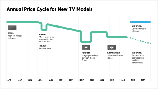
Price guides -- they will tell you, for instance, that new TV models tend to get released in the spring, so late spring/early summer is when you get slightly discounted rates on the last year's models
How to take care of your thing -- what should you use to clean a flat-screen TV? Does it matter if it's antistatic or antidust? Should you shade it from the sun? What features are worth turning off if you don't use live TV?

And then the big one: their rating guides

They rate hundreds of products in dozens of categories. You can then filter down. Say you live in an apartment and you can only afford $500 for a TV, and you really care about data privacy.

Those are your top 3 options for a 52 inch or smaller TV in your price range with better than average privacy. Click that Shop button and it'll show you where to buy it. Want to know how those ratings were created?

You can then add up to 5 products to a 'compare' grid.
Want to know how many products they've tested and have guides for?
Pet GPS collars. Countertop icemakers. Streaming services. Air travel. Seriously, this should be your first stop before making any big purchase, and if you subscribe it can be your first stop for ANY purchase.
242 notes
·
View notes
Text

No, it's a good format.
It's got an efficient file size, transparency, animation, extra colors.
And it is much more archival than JPEG, which suffers from bit rot over time and degrades when being saved over and over.
I'm afraid the frustration here is actually just capitalism.
Everything bad is capitalism.
There are currently multiple competing standards trying to replace JPEG and GIF and there is a ton of money involved. And until these entities are done with their format war and everyone agrees to integrate and accept the winner, we all have to suffer.
I hope that happens sooner than later. Or they decide to accept all of the formats. Because photography is being held back and it sucks. We have the tools to create 10 bit HDR photos just like movies are already doing. There are billions of colors and tons of dynamic range that you all never get to see in our photos. All of this extra beauty is inaccessible because Google and Apple (and a few other companies) are fighting.
144 notes
·
View notes
Text
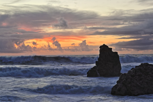
Blue hour winter sunset over rocky surf near Carmet, Sonoma County. The rocks mirror the clouds in form. HDR process, color, saturation, contrast, denoise and sharpening in Canon's DPP4.17.10. Canon SL3, 50mm, f/9, ISO 100; 1/10, 1/25, 1/66s. Cheers!
68 notes
·
View notes
Text
canmom's notes on fixing the colours
ok so if you've been following along on this blog for the last week or two i've been banging on about colour calibration. and i feel like it would be good to sum up what i've learned in a poast!
quick rundown on colour spaces
So. When you represent colour on a computer, you just have some numbers. Those numbers are passed to the monitor to tell it to turn some tiny lights up and down. The human visual system is capable of seeing a lot of colours, but your monitor can only display some of them. That's determined by its primaries, basically the exact colour* of its red, green and blue lights.
(*if you're wondering, the primaries are specified in terms of something called the CIELAB colour space, which is a model of all the different colours that humans can possibly see, devised by experiments in the early-mid 20th century where the subjects would turn lights at different frequencies up and down until they appeared visually the same. Through this, we mapped out how eyes respond to light, enabling basically everything that follows. Most human eyes tend to respond in pretty close to identical ways - of course, some people are colourblind, which adds an extra complication!)
Now, the problem we face is that every display is different. In particular, different displays have different primaries. The space in between the primaries is the gamut - the set of all colours that a display can represent. You can learn more about this concept on this excellent interactive page by Bartosz Ciechanowski.
The gamut is combined with other things like a white point and a gamma function to map numbers nonlinearly to amounts of light. All these bits of info in combination declare exactly what colour your computer should display for any given triplet of numbers. We call this a colour space.
There are various standard sets of primaries, the most famous being the ITU-R Rec.709 primaries used in sRGB, first defined in 1993, often just called the sRGB primaries - this is a fairly restricted colour space, intended to be an easy target for monitor manufacturers and to achieve some degree of colour consistency on the web (lol).
Since then, a much wider gamut called Rec.2020 has recently been defined for 'HDR' video. This is a very wide gamut, and no existing displays can actually show it in full. Besides that, there are various other colour spaces such as AdobeRGB and P3, which are used in art and design and video editing.
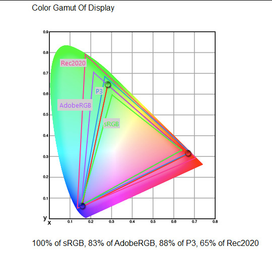
What you see above is something called a 'chromaticity diagram'. the coordinate system is CIE xyY with fixed Y. The curved upper edge to the shape is the line of monochromatic colours (colours created by a single frequency of light); everything other colour must be created by combining multiple frequencies of light. (Note that the colours inside the shape are not the actual colours of those points in CIE XY, they're mapped into sRGB.)
In this case, the red, green and blue dots are the primaries of my display. Since they are outside the green triangle marked sRGB, it qualifies as a 'wide gamut' display which can display more vivid colours.
Sidebar: you might ask why we didn't define the widest possible gamut we could think of at the start of all this. Well, besides consistency, the problem is that you only have so many bits per channel. For a given bit depth (e.g. 8 bits per channel per pixel), you have a finite number of possible colours you can display. Any colours in between get snapped to the nearest rung of the ladder. The upshot is that if you use a higher gamut, you need to increase the bit depth in order to avoid ugly colour banding, which means your images take up more space and take more time to process. But this is why HDR videos in Rec.2020 should always be using at least 10 bits per colour channel.
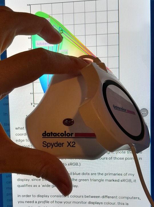
in order to display consistent colours between different computers, you need a profile of how your monitor displays colour. Yhis is something that has to be measured empirically, because even two monitors of the same model will be slightly different. You get this information by essentially taking a little gadget which has a lens and a sensitive, factory-calibrated colour meter, and holding it against your screen, then making the screen display various colours to measure what light actually comes out of it. This information is packed into a file called an ICC profile.
(Above is the one I got, the Spyder X2. I didn't put a lot of thought into this, and unfortunately it turns out that the Spyder X2 is not yet supported by programs like DisplayCal. The Spyder software did a pretty good job though.)
Wonderfully, if you have two different ICC profiles, and you want to display the same colour in each space, you can do some maths to map one into the other. So, to make sure that a picture created on one computer looks the same on another computer, you need two things: the colour space (ICC profile) of the image and the colour space (ICC profile) of the screen.

Now different operating systems handle colour differently, but basically for all three major operating systems there is somewhere you can set 'here is the icc profile for this screen'. You might think that's the whole battle: calibrate screen, get ICC profile, you're done! Welcome to the world of consistent colour.
Unfortunately we're not done.
the devil in the details
The problem is the way applications tell the operating system about colour is... spotty, inconsistent, unreliable. Applications can either present their colours in a standard space called sRGB, and let the OS handle the rest - or they can bypass that entirely and just send their numbers straight to the monitor without regard for what space it's in.
Then we have some applications that are 'colour managed', meaning you can tell the application about an ICC profile (or some other colour space representation), and it will handle converting colours into that space. This allows applications to deal with wider colour gamuts than sRGB/Rec.709, which is very restricted, without sacrificing consistency between different screens.
So to sum up, we have three types of program:
programs which only speak sRGB and let the OS correct the colours
programs which aren't colour aware and talk straight to the monitor without any correction (usually games)
programs which do colour correction themselves and talk straight to the monitor.
That last category is the fiddly one. It's a domain that typically includes art programs, video editors and web browsers. Some of them will read your ICC profile from the operating system, some have to be explicitly told which one to use.
Historically, most monitors besides the very high end were designed to support sRGB colours and not much more. However, recently it's become easier to get your hands on a wide gamut screen. This is theoretically great because it means we can use more vivid colours, but... as always the devil is in the details. What we want is that sRGB colours stay the same, but we have the option to reach for the wider gamut deliberately.
Conversely, when converting between colour spaces, you have to make a decision of what to do with colours that are 'out of gamut' - colours that one space can represent and another space can't. There's no 'correct' way to do this, but there are four standard approaches, which make different tradeoffs of what is preserved and what is sacrificed. So if you look at an image defined in a wide colour space such as Rec.2020, you need to use one of these to put it into your screen's colour space. This is handled automatically in colour managed applications, but it's good to understand what's going on!
(*You may notice a difference in games even if they're not colour managed. This is because one of the things the calibration does is update the 'gamma table' on your graphics card, which maps from numeric colour values to brightness. Since the human eye is more sensitive to differences between dark colours, this uses a nonlinear function - a power law whose exponent is called gamma. That nonlinear function also differs between screens, and your graphics card can be adjusted to compensate and make sure everyone stays on the standard gamma 2.2. Many games offer you a slider to adjust the gamma, as a stopgap measure to deal with the fact that your computer's screen probably isn't calibrated.)
For what follows, any time you need the ICC profile, Windows users should look in C:\Windows\System32\spool\drivers\color. MacOS and Linux users, see this page for places it might be. Some applications can automatically detect the OS's ICC profile, but if not, that's where you should look.
on the web
Theoretically, on the web, colours are supposed to be specified in sRGB if not specified otherwise. But when you put an image on the web, you can include an ICC profile along with it to say exactly what colours to use. Both Firefox and Chrome are colour-managed browsers, and able to read your ICC profile right from the operating system. So an image with a profile should be handled correctly in both (with certain caveats in Chrome).
However, Firefox by default for some reason doesn't do any correction on any colours that don't have a profile, instead passing them through without correction. This can be fixed by changing a setting in about:config: gfx.color_management.mode. If you set this to 1 instead of the default 2, Firefox will assume colours are in sRGB unless it's told otherwise, and correct them.
Here is a great test page to see if your browser is handling colour correctly.
Chrome has fewer options to configure. by default it's almost correctly colour-managed but not quite. So just set the ICC on your OS and you're as good as it's gonna get. The same applies to Electron apps, such as Discord.
To embed a colour profile in an image, hopefully your art program has the ability to do this when saving, but if not, you can use ImageMagick on the command line (see below). Some websites will strip metadata including ICC profile - Tumblr, fortunately, does not.
For the rest of this post I'm going to talk about how to set up colour management in certain programs I use regularly (Krita, Blender, mpv, and games).
in Krita
Krita makes it pretty easy: you go into the settings and give it the ICC profile of your monitor. You can create images in a huge variety of spaces and bit depths and gamma profiles. When copying and pasting between images inside Krita, it will convert it for you.
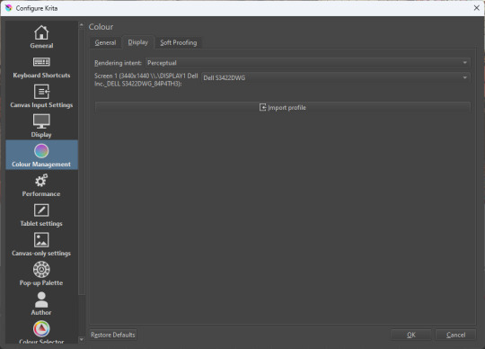
The tricky thing to consider is pasting into Krita from outside. By default, your copy-paste buffer does not have colour space metadata. Krita gives you the option to interpret it with your monitor's profile, or as sRGB. I believe the correct use is: if you're copying and pasting an image from the web, then sRGB is right; if you're pasting a screenshot, it has already been colour corrected, you should use 'as on monitor' so Krita will convert it back into the image's colour space.
in Blender
Blender does not use ICC profiles, but a more complicated system called OpenColorIO. Blender supports various models of mapping between colour spaces, including Filmic and ACES, to go from its internal scene-referred HDR floating-point working space (basically, a space that measures how much light there is in absolute terms) to other spaces such as sRGB. By default, Blender assumes it can output to sRGB, P3, etc. without any further correction.
So. What we need to do is add another layer after that which takes the sRGB data and corrects it for our screen. This requires something called a Lookup Table (LUT), which is basically just a 3D texture that maps colours to other colours. You can generate a LUT using a program called DisplayCal, which can also be used for display calibration - note that you don't use the main DisplayCal program for this, but instead a tool called 3DLUT Maker that's packaged along with it. see this Stack Overflow thread for details.
Then, you describe in the OpenColorIO file how to use that LUT, defining a colour space.

The procedure described in the thread recommends you set up colour calibration as an additional view transform targeting sRGB. This works, but strictly speaking it's not a correct use of the OpenColorIO model. We should also set up our calibrated screen as an additional display definition, and attach our new colour spaces to that display. Also, if you want to use the 'Filmic' View Transform with corrected colours (or indeed any other), you need to define that in the OpenColorIO file too. Basically, copy whatever transform you want, and insert an extra line with the 3D LUT.
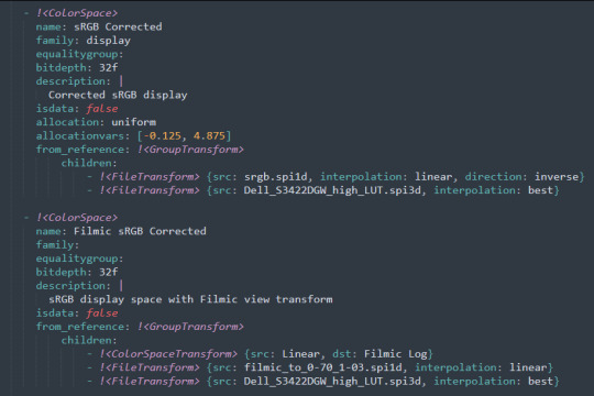
Here's how it looks for me:
in games (using ReShade)
So I mentioned above that games do not generally speaking do any colour correction beyond the option to manually adjust a gamma slider. However, by using a post-processing injection framework such as ReShade, you can correct colours in games.
If you want to get the game looking as close to the original artistic intent as possible, you can use the LUT generator to generate a PNG lookup table, save it in the Reshade textures folder, then you load it into the LUT shader that comes packaged with Reshade. Make sure to set the width, height and number of tiles correctly or you'll get janked up results.
However... that might not be what you want. Especially with older games, there is often a heavy green filter or some other weird choice in the colour design. Or maybe you don't want to follow the 'original artistic intent' and would rather enjoy the full vividness your screen is capable of displaying. (I certainly like FFXIV a lot better with a colour grade applied to it using the full monitor gamut.)
A 3D Lookup Table can actually be used for more than simply calibrating colour to match a monitor - it is in general a very powerful tool for colour correction. A good workflow is to open a screenshot in an image editor along with a base lookup table, adjust the colours in certain ways, and save the edited lookup table as an image texture; you can then use it to apply colour correction throughout the game. This procedure is described here.
Whatever approach you take, when you save screenshots with Reshade, it will not include any colour information. If you want screenshots to look like they do in-game when displayed in a properly colour managed application, you need to attach your monitor's ICC profile to the image. You can do this with an ImageMagick command:
magick convert "{path to screenshot}" -strip -profile "{path to ICC profile}" "{output file name}.webp"
This also works with TIFF and JPEG; for some reason I couldn't get it to work with PNG (you generate a PNG but no colour profile is attached.)
It's possible to write a post-save command in ReShade which could be used to attach this colour space info. If I get round to doing that, I'll edit into this post.
video
In MPV, you can get a colour-corrected video player by setting an appropriate line in mpv.conf, assuming you're using vo=gpu or vo=gpu-next (recommended). icc-profile-auto=yes should automatically load the monitor ICC profile from the operating system, or you can specify a specific one with icc-profile={path to ICC profile}.
For watching online videos, it seems that neither Firefox nor Chrome applies colour correction, even though the rest of the browser is colour-managed. If you don't want to put up with this, you can open Youtube videos in MPV, which internally downloads them using Youtube-DL or yt-dlp. This is inconvenient! Still haven't found a way to make it colour-corrected in-browser.
For other players like VLC or MPC-HC, I'm not so familiar with the procedure, you'll need to research this on your own.
what about HDR?
HDR is a marketing term, and a set of standards for monitor features (the VESA DisplayHDR series), but it does also refer to a new set of protocols around displaying colour, known as Rec. 2100. This defines the use of a 'perceptual quantiser' function in lieu of the old gamma function. HDR screens are able to support extreme ranges of brightness using techniques like local dimming and typically have a wider colour gamut.
If your screen supports it, Windows has a HDR mode which (I believe) switches the output to use Rec.2100. The problem is deciding what to do with SDR content on your screen (which is to say most things) - you have very little control over anything besides brightness, and for some reason Windows screws up the gamma. Turning on HDR introduced truly severe colour banding all over the shop for me.
My colorimeter claims to be able to profile high brightness/hdr screens, but I haven't tested the effect of profiling in HDR mode yet. There is also a Windows HDR calibration tool, but this is only available on the Microsoft store, which makes it a real pain to set up if you've deleted that from your operating system in a fit of pique. (Ameliorated Edition is great until it isn't.)
Anyway, if I get around to profiling my monitor in HDR mode, I will report back. However, for accurate SDR colour, the general recommendation seems to be to simply turn it off. Only turn it on if you want to watch content specifically authored for HDR (some recent games, and HDR videos are available on some platforms like Youtube). It's a pain.
is this all really worth the effort?
Obviously I've really nerded out about all this, and I know the likely feeling you get looking at this wall of text is 'fuck this, I'll just put up with it'. But my monitor's gamma was pretty severely off, and when I was trying to make a video recently I had no idea that my screen was making the red way more saturated and deep than I would see on most monitors.
If you're a digital artist or photographer, I think it's pretty essential to get accurate colour. Of course the pros will spend thousands on a high end screen which may have built in colour correction, but even with a screen at the level I'm looking at (costing a few hundred quid), you can do a lot to improve how it looks 'out of the box'.
So that's the long and short of it. I hope this is useful to someone to have all of this in one place!
I don't know if we'll ever reach a stage where most monitors in use are calibrated, so on some level it's a bit of a fool's errand, but at least with calibration I have some more hope that what I put in is at least on average close to what comes out the other end.
94 notes
·
View notes

Text
New Sony Xperia 1 V: A High-End Smartphone to Look Forward To

Sony, the Japanese smartphone manufacturer, is rumored to launch its new smartphone, the Sony Xperia 1 V. Although the company has not officially announced the phone, leaks, and rumors have been circulating online. The Sony Xperia 1 V is expected to succeed the Sony Xperia 10 IV, which was launched last year in May.
Design and Features:
The leaked images of the Sony Xperia 1 V suggest that the phone will have a sleek design, featuring a triple camera setup on the rear panel with an LED flash placed inside the camera island, different from the Sony Xperia 10 IV. In addition, the image also reveals an NFC logo on the right of the camera island.

Display and Performance:
The Sony Xperia 1 V is expected to come with a 6.5-inch 4K HDR OLED display with bezels and a 120Hz refresh rate, making it ideal for gaming. The display has an aspect ratio of 21:9 and a touch sampling rate of 240 Hz. The phone will be powered by a Snapdragon 8 Gen 1 SoC and will have 12GB of RAM and 512GB of storage. It will run on Android 12.
Camera and Price:
The Sony Xperia 1 V is rumored to come with a triple rear camera setup, equipped with three 12-megapixel Exmor RS image sensors. As for the price, the Sony Xperia 10 IV was priced at $1,599 (approximately Rs. 1,23,500) in the US, and it is expected that the Sony Xperia 1 V will also be priced similarly.
Unveiling Event:
According to a report by Sumaho Digest, Sony may unveil the Sony Xperia 1 V at MWC 2023, which is set to begin on February 27 in Barcelona.
In conclusion, the Sony Xperia 1 V is a high-end smartphone to look forward to, with its sleek design, powerful performance, and advanced camera capabilities. With MWC 2023 just around the corner, we can expect to hear more about the phone soon.
#Sony Xperia 1 V#Japanese smartphone manufacturer#key specifications#Weibo#successor#Sony Xperia 10 IV#leaked image#triple camera setup#LED flash#NFC logo#MWC 2023#6.5-inch 4K HDR OLED display#120Hz refresh rate#21:9 aspect ratio#touch sampling rate#240Hz#Snapdragon 8 Gen 1 SoC#12GB RAM#512GB storage#Android 12#Exmor RS image sensors#high-end smartphone
0 notes
Text

Previously available as a Best Buy exclusive, Scream Factory's The Blob Steelbook 4K Ultra HD + Blu-ray will receive a wide release on October 1. The 1988 sci-fi/horror film is a remake of the 1958 classic.
Chuck Russell (A Nightmare on Elm Street 3: Dream Warriors, The Mask) directs from a script he co-wrote with Frank Darabont (The Shawshank Redemption). Kevin Dillon, Shawnee Smith, Donovan Leitch, Jeffrey DeMunn, Candy Clark, and Joe Seneca star.
The Blob has been mastered in 4K and is HDR-10 compatible. Special features are listed below, where you can also see the full Steelbook layout.

Disc 1 - 4K UHD:
Audio commentary with director Chuck Russell, cinematographer Mark Irwin, and special effects artist Tony Gardner, moderated by filmmaker Joe Lynch
Audio commentary with actress Shawnee Smith
Disc 2 - Blu-ray:
Audio commentary with director Chuck Russell, cinematographer Mark Irwin, and special effects artist Tony Gardner, moderated by filmmaker Joe Lynch
Audio commentary with actress Shawnee Smith
Audio commentary with director Chuck Russell, moderated by film producer Ryan Turek
Interview with director Chuck Russell
Interview with actor Jeffrey DeMunn
Interview with actress Candy Clark
Interview with actor Donovan Leitch Jr.
Interview with actor Bill Moseley
Interview with cinematographer Mark Irwin
Interview with special effects artist Tony Gardner
Interview with special effects supervisor Christopher Gilman
Interview with production designer Craig Stearns
Interview with mechanical designer Mark Setrakian
Interview with blob mechanic Peter Abrahamson
Behind-the-scenes footage of Tony Gardner and his special effects team
Theatrical trailers
TV spot
Still gallery

The Blob is back in this horrific tale about a vile, malignant life-form that crashes to Earth in a cozy, rural American town called Arborville. Untroubled by conscience or intellect, the Blob does only one thing – and it does it well. It eats anything and everything that moves: men, women, and children. And tonight it wants to swallow the town of Arborville.
Pre-order The Blob.
#the blob#kevin dillon#shawnee smith#donovan leitch#horror#80s horror#1980s horror#scream factory#dvd#gift#jeffrey demunn#candy clark#chuck russell#frank darabont#80s movies
27 notes
·
View notes
Last Seen Blogs

wrighterlights
WrighterLights

wowright-art
Doodles and Stuff?!

sailor-goth
sailor-goth

omar973
Untitled

selectsydneyescorts-blog
Select Sydney Escorts