
Last Seen Blogs
hamosart
ART OF MATTHEW HAMILTON

cats-trolls-and-other-mischiefs
My little corner

jeniferperez1506
Online Dating Reviews

bts-great
BTS

blumedicangel
+||Elias Octario||+
Text
Final Cover outcome
For the Final cover design I kept the distant castle but instead of having the adventurers look at it from the distance I decided to have it silhouetted on a mountain with a ghost moon behind it to add an ominous vibe to the whole thing.
I really like how the base cover turned out so I decided to add some stars to the image as well. I thought that would look quite nice and it did because that represents the fantastical element of the game.
The final big thing to consider was the text and how I would present it on the actual cover as well. I initially did it either side of the castle in a slightly fantasy based text that I used for the book cover for my last project. I didn’t end up liking that so I switched to a more pain splatter effect over the base of the mountain which I really like. I initially had this in a grey/aluminium coloured text but I soon changed that to a proper red as it looked more deadly and ominous which is what I want almost like dripping blood.


0 notes
Text
Covers and Posters
As an added extra to the project we are required to also make a cover design ro a promo poster of sorts for our game. Usually we would use the things we have created but The Sculpture I created was just a physical rendition and therefore It doesn’t make any sense to me for it to be part of the main cover if it is just a representation of one of the characters.
I have then looked at different posters from a couple of different games like Darkest Dungeon and Castlevania as they have the styles of posters I want to try and do. I looked into Darkest Dungeon and Castlevania as I wanted to try and achieve the feeling of seeing the end goal in the distance of the poster which both of these games do. Castlevania is the more pixel arty version of this which I quite like. I just don’t think I am that skilled yet to accomplish a full pixel art cover so I will stick with this simplistic design for the time being.
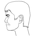
I also want to do some more realistic promo posters using the model I have created as an added extra to the main cover just because I may not get the full cover done in time or by itself it may not look that good. For this I am just adding in the image of the face with some simple text displaying the name and a little made up quote which fits with the character. I may try and do this in the theme of the Darkest dungeon Character Introductions because it is simplistic but may look pretty good in the end.
Im ay also do a cover design in that style or the normal darkest dungeon style as it is simplistic but also looks quite good.


0 notes
Text
Finishing touches for the Sculpture
With the main parts of the Sculpture done, all I wanted to do now was to paint the mechanical part of the face with some different bronzes and silvers to make it look more metallic. For this I Got some thinner based paints from the Tamiya brand which I really like using and have used them extensively in the past and some official D&D miniature paint bottles as I hadn’t used them yet and wanted to see how they looked.
I started out by Drybrushing some of my flat aluminium Tamiya paint all over the edges of the torn skin and all of the components to give it a metallic touch. I was going to stop there but the aluminum looked a little too bright for my liking so I also used some metallic copper paint to try and dirty the aluminum up a bit which ended up working quite well. I also end up using some red and grey D&D paint to add some blood like oil substance coming from the corner of the mouth and onto the beard just to add a little bit of detail and to reference the fact that this sculpture is dead, well would be dead if it was real.
I also added a little grey around the three screws I had in one of my thicker clay wires in the head of my sculpture just to add some detail before I started to fix up the sculpture ready for photographing.
Too fix up the sculpture all I did was remove some little clay stragglers and smooth and cut various bits on the face and head just to make it that little bit more realistic which I am really glad I did as it does add that little bit of realism to he sculpture which really elevates it to another level.


0 notes
Text
Smoothing (and why it is a bad thing)
With the important parts of the head made and somewhat finished I had the amazing Idea to smooth down all of the head using water and various wooden tools because that is what I thought I needed to do next as I was practically still guessing at how to do this project which wasn’t good.
I spent maybe a week and a half smoothing this sculpture before realizing that with it being smooth it looked far too young to be an old man which was not good at all so I had to try and put some wrinkles in this man's face which was a little difficult at the beginning. Putting in wrinkles themselves wasn't too bad; it was just the more saggy bits of skin that older men tend to have or the sunken eye’s that older men also seem to have.
This took a little bit of time but in the end I managed to make something that I am actually quite proud of and that looks like an old man which is surprising for me. I did also have trouble trying to make the beard as clay hair seems quite difficult to do and it is difficult to do, but after an hour or two I had managed to carve the beard so that it gave the illusion of a beard which I am also quite happy about.
This marked the end of the physical making section of the Sculpture. All I had to do now was to paint and detail various parts and clean up the sculpture a little bit so that it was picture ready.


0 notes
Text
Finer Sculpture Details (2)
The next detail I needed to do for the sculpture was to make some ears and to start defining the wire like hair on the back of the head. The ears were the first on the agenda and were an absolute nightmare to achieve as ears are apparently incredibly difficult to sculpt for the first time.
The first ear I made ended up as a literal pile of misshapen clay that looked nothing like an ear. This was because I was trying to make the ear separate to the head which doesn’t work so the next attempt I Slapped a whole load of clay onto the side of the head and started to sculpt an ear with the help of my teacher and peers. This ear ended up looking quite realistic after I had gotten the basic shape of it. The only issue is that it was sculpted on the mechanical side of the face which is where I wanted to make a mechanical ear. This presented a problem which I promptly fixed by simply adding the mechanical ear to the other side of the head which did seem to work pretty well.
This mechanical ear was very simple too make as I took the fan motor from a computer fan and put that for the ear hole and then added some circuit board I cut into an ear shape around that before finally adding some electrical wire for the top of the ear and some clay to give the ear the illusion of only having part of it exposed. The original Clay I used, which was the normal brown clay, kept breaking off of the ear so I had to change to an oil based chavant clay which worked a lot better.
I did also add some exposed wires leading from the humanoid eye to the mechanical ear just to link the ear to the sculpture so that it did not feel to out of place.
The hair wires were next, which was just a simple case of making thicker wires out of clay and then inserting various small and thick real wires to make an almost Borg like appearance which I actually really like.


0 notes
Text
Finer details for sculptures 1
With the base sculpt of the face completed I needed to add a whole load more clay to make it look more like a face. This is where I added details like cheekbones, eyes and the proper nose. I also added the large scar like rip in the side of the face mainly to add the robotic element to the face but also so I could try and incorporate real objects into the robotic side and for it to look good.
I did do the humanoid side of the face first which took a little bit of time as faces are a difficult thing to do but I managed to create a very rough and ready face on top of the original face which I am now glad I made as it helped me to guide how the face looks.
I was styling an older face as the humanoid man I had originally planned to do so I needed to make things like ears and noses quite large which was a challenge but doable as the larger the piece the easier it would be to make as it is less finely detailed. I did unfortunately attach the ear to the wrong side of the head so the massive scar along the head is now just over the right side of the face and over the right eye.
The face was then smoothed out and little details were added to try and make it look more like a face which has worked fairly well so far. I will add an update post when I add more to the face and the head.


0 notes
Text
The Mask stage of the sculpture
The next substantial leap for the sculpt was to make a general mask like face for the actual face to sit on which was an experience since I have never made something like this before so trying to designa face was difficult for me at least. I started with the idea that the entire face would be full and like a mask on top of cybernetics and not a more borg-like construct so that is why the face was made as a full mask at this stage to reflect that.
I started to add clay and smooth the clay on the front of the face to create a basis to work from which did work pretty well until I got two places like the nose and the eyebrows which was hard to accomplish as I don’t really deal with humanoid faces a lot so I winged the design and got a decent face roughly layed out.
This is where the smoothing process and the fine detailing process occurred which went fairly well but took a long time because I am new to this and haven’t been comfortable with doing rough sculptures quickly. I initially tried to detail this mask-like face too much because I didn’t realise that it was a base and not the final face shape.
That is good that it wasn’t the final face shape as I could add the giant scar like rip through the face when I would come to do it next.


0 notes
Text
Ex Machina
Uncanny valley is in fact not an actual valley but rather a dip or valley in a graph relating to how comfortable a human is with different robots that look more and more human. This graph is called the uncanny valley for a few different reasons. The first reason that would make sense is that they are measuring humans discomfort towards robots that look uncanny to humans hence the uncanny part of the name. The other reason why it could have been given this name is that the actual graph has an uncanny likeness towards what a cross section of a valley would look like. To understand why the graph would look like this I want to first go through what the different axes are.
The x-axis represents human likeness or how much the product looks like a human. The y-axis represents affinity or a natural understanding or liking towards said objects. With these two axes explained I can now go on to what the graph looks like a valley. It looks like a valley because the more human something non human looks the more unsettled we are when we look at it. Combining this with things that don’t look like a human and then a human we get this large dip within the gap that looks a lot like a valley.
I do not think that this applies too much to my project because even though the sculpture has very distinct human elements to it it has enough mechanical elements to offset that so that it doesn't fall into the Uncanny valley graph too much. I have purposely tried to do this sculpture this way as I don’t want to try and imitate perfect realism as I know I can’t do that yet with a sculpture and then the sculpture would look worse since the original idea was to make it hyper realistic which is why I have also stuck with the fantasy theme with this sculpture.


0 notes
Text
Uncanny Valley
Uncanny valley is in fact not an actual valley but rather a dip or valley in a graph relating to how comfortable a human is with different robots that look more and more human. This graph is called the uncanny valley for a few different reasons. The first reason that would make sense is that they are measuring humans discomfort towards robots that look uncanny to humans hence the uncanny part of the name. The other reason why it could have been given this name is that the actual graph has an uncanny likeness towards what a cross section of a valley would look like. To understand why the graph would look like this I want to first go through what the different axes are.
The x-axis represents human likeness or how much the product looks like a human. The y-axis represents affinity or a natural understanding or liking towards said objects. With these two axes explained I can now go on to what the graph looks like a valley. It looks like a valley because the more human something non human looks the more unsettled we are when we look at it. Combining this with things that don’t look like a human and then a human we get this large dip within the gap that looks a lot like a valley.
I do not think that this applies too much to my project because even though the sculpture has very distinct human elements to it it has enough mechanical elements to offset that so that it doesn't fall into the Uncanny valley graph too much. I have purposely tried to do this sculpture this way as I don’t want to try and imitate perfect realism as I know I can’t do that yet with a sculpture and then the sculpture would look worse since the original idea was to make it hyper realistic which is why I have also stuck with the fantasy theme with this sculpture.
1 note
·
View note
Text
The Borg/Matrix/Idea change
As part of my research for this project I am going to look at Star-Trek's version of the Cybermen being the Borg which are a collective hive mind of cyborgs with very human-like features. I do not know a lot about Star Trek but I do like these designs of the mostly humanoid faces with technology implanted into their bodies as it is very reminiscent of what I am currently doing with my sculpture.
My sculpture however is a little different From the Borg in that the exposed machinery is under a lye roof ripped off flesh rather than being part of the design of the character. The head and hair replacements are very similar to what I am doing with my sculpture and are also very reminiscent of the matrix with what the plugs look like that plug the people into the matrix.
As I have mentioned the Cybermen I want to quickly talk about how they don’t really help with this project's designs because they are essentially human tissue in suits of mechanised armour which isn't what this character is so that is why I have looked at The Borg Instead.
I have also slightly changed my original plan for how the sculpture will look as now it is more android like rather than a face over a dome of electronics and magic.


0 notes
Text
Character Backstory
A construct born to look like a human but with Organs of steel isn’t something you'd expect to come from one of the most powerful wizards of all time being Mordenkained but old age will do that to even the most brilliant of minds. Zemenar was born as an experiment to see what emotions could be pumped into a robotic creature via heavy uses of magic. Initially it worked with Zemenar being able to feel sad or happy or angry at the correct things but still in a very robotic way which lacked soul as some would call it.
This led Mordenkainen to throw Zemenar away like a used toy into the darkest depths of the pile of failed junk that Mordenkainen once loved. This is where mom would lose the will to carry on, but not Zemenar, Zemenar still had that magic coursing through their robotic veins that gave them the human determination which was as real as it could get. This attracted a lesser known devil who seeked to make a bargain with this curious creature because the world it was from was slowly beginning to face what would become a soul calamity and this devil needed souls to sustain itself, so what better way to preserve souls than getting an almost physically perfect construct to do the preserving for you.
This is where Mordenkainen’s experiment would have succeeded because the devil implanted a soul into Zemenar’s chest and then whisked them away to, a unique world of black and white with brief flashes of colour could be seen around people. This is where Zemenar remains perpetually waiting for the right people to come along and help them to stop the passing of this soul calamity for the better good of their master.
0 notes
Text
Character name
Character names are difficult ones to initially make because in my experience they either come from something like a translation of another word or they just come naturally from a moment of brilliance. This name of Zemenar Mordenkainen came from both of those categories because Zemenar was straight from a random name generator I used and Mordenkainen was from Dungeons and Dragons as they are an insanely powerful wizard that has developed a lot of spells for the forgotten realms (where the majority of base D&D is set). I chose to do a hybrid between these two names as I can quite easily use these name to come up with a backstory for this character by making their creator be Mordenkainen or someone closely linked to Mordenkainen and the android like being wants to try and re find them despite them being very dead.
I was also debating a more demonic name from the Divinity series of Adrahmalik as a sort of link to perhaps a devil or demon breathing life into an android like being to cause some mischief or to try and help the world that they are stuck in perhaps because these devils feed of the souls of the people who souls are slowly diminishing.
I am actually going to combine both of the ideas and keep the name but incorporate the demonic story into the backstory as I quite like that twist to it. I will also add some screenshots and a link to the random name generator I used as well.
link - https://www.name-generator.org.uk/character/

0 notes
Text
Character Backstory design
Since this character I am making is an android of sorts I need to change their backstory to reflect that more as I am fairly sure the last character post I did on this cleric wizard combination was more related to humanoid people.
This has led me to try and make some new character choices for this character which is a little difficult as all the other character stories I have made come from people who aren’t humanoid beings.
Despite this I want this character to think that they are human but they are obviously an android with perhaps a damaged mental core leading them to believe that they are human in a sense. This android-like being could be the result of some ancient colony who built the ancient artifacts who also wanted to try and build a robotic humanoid but it failed and now tries to seek revenge for its [previous fathers.
I quite like this idea and so I might try to write it into a proper backstory for this character if I ever make a proper character sheet for them which I might do. I did say that I wanted to make them into like a cleric wizard combination as they would play the role of the buffer/healer of the party because the rest of the characters apart from the bard do not really do that and because cleric wizard combos in D&D tend to be quite good in general.
I still need to think of a name for this character so I will most likely hit a random name generator and keep rerolling names until I find one I like or find one where I can alter it so I like it.
0 notes
Text
Mask Inspiration
For this change in project I had immediately thought of the clockwork french soldiers from doctor who and how they have older cog like space tech which I really liked the idea of. I did however misremember them as I had thought they had masks as well but their masks were like literal pull off masks and not a part of their face as I want to make mine look like.
Despite this they still are a good inspiration for this project as they are literal clockwork soldiers which fits with my character theme incredibly well. I might change how clockworky my design is as that would involve designing, cutting and painting loads of small pieces which I might not have the time for so I might make a more futuristic looking one with more modern computer components like in the film I, Robot which is another large inspiration for this idea.
The idea of a robot gone rogue is an idea I might play with fully fleshing out the character I want to design because of their robotic nature and what they do as a caster in this game. Uncanny valley is a good real life source of inspiration though despite how creepy it is as they are literal human looking robots that people have literally made in today's world which is helpful for a project like this.


0 notes
Text
Drawings/change of project
For my first set of physical drawings I set to and tried (key word tried) to make some sketches using some pens as a base. It did not go too well. This ended up as six brown blobs on the page with 1 decent image which my friend drew as a tutorial. My drawings skills have improved since my last project though despite this as I went on to make some proper measured drawings using some proper gridded blue paper as I thought it might prove a lot easier to draw on.
I was right and I have figured out that I do better at measured drawing with lines than free hand drawing so I have stuck with that for the time being. I ended up making 6 staff designs in this style before I had to change my project to better suit my university choices.
This new project was in a whole different style to what I was originally doing as this will be a sculpture so I will have to develop a whole new style of drawing which I am going to develop soon. As I said This new project is a sculpture of the man who would wield the staff, which is going to be interesting as I have never made a large bus like the sculpture of a head.
I am going to mention that this head is more of an android head with a face on it and then steampunk like gears on the back of the head which should look pretty cool when it is done depending on how well I make this sculpture.
0 notes
Text
Voxel Trials 2
For this Next step in these trials I began to make the gem and paint the top of the staff. The gem was a diamond shaped slender gem that went from dark red in the middle to a normal red colour. This ended up making the gem look like an eye of Sauron of sorts but I still quite liked this design. I am unsure how I'd do this in real life but that is what trials are for.
Colouring the staff came next and I had decided to do a fading brown texture to the top of the staff so that it went from almost black like brown to a very light brown . This gave the staff a sort of earthen look which I quite like and will most likely keep the brown colouring to the top of the staff. I do however want to change the gem colour to a more transparent pearly white sort of colour but I will do physical drawings to try out those colours.
Next came Painting the staff and adding a bottom onto it. For the bottom I simply round of the end as best that I can in a program all about squares and then I painted the staff alight yellow oak colour which I might change to be a darker colour to match the top of the staff but as with the gem I will trial different colours for this in my physical drawings.
With that done I now needed to create the box for the Staff for where the Heroes would find it. For this I made a grey box with equally inset lines of electricity light blue to give off a sci-fi sort of feeling because I wanted the Staff to feel alien and a little out of this world because it is a legendary artefact from a time gone by.
Overall I quite like how this turned out despite the colour changes I want to make and as I said in my last post about this I will have to use Voxel software's more often as they are incredibly useful for prototyping.


0 notes
Text
Voxel Trials 1
To Aid me further in my design process I decided to have a go at making a little voxel diorama of the staff in a box just to have a look at what the end product should hopefully look like. I actually enjoyed making this and it only took me a few hours to make so I might be doing more 3D trials in Voxel format as they actually look really helpful.
To start off this process I made a giant cylinder for the staff handle which was very simple and just involved me making a circle and then extruding the circle to another approximate height I wanted the Staff handle to be. I will say that this design was not done with any measurements in mind and was just a visual representation of what I wanted to do.
The next part to do was the actual staff top which was an interesting experience as I also dabbled in depth with this design as well which was a little bit of a mind bend to figure out but I managed it in the end. I Started off with a basic crane claw like shape which would make up the sides of the Staff head and the Holder for the Crystal gem. This is where I address the inside layer of this and then make it more 3D than it already was by adding a slant like texture to the crane claw-like shape of the Staff head. I really liked how this has turned out so far and will need to make a background and a gem for it as well to complete the design.


0 notes